The paints colours that will lift your mood this January according to a colour psychologist
These are the paint colours that will boost your mood and combat winter gloom, say colour psychologists and paint experts
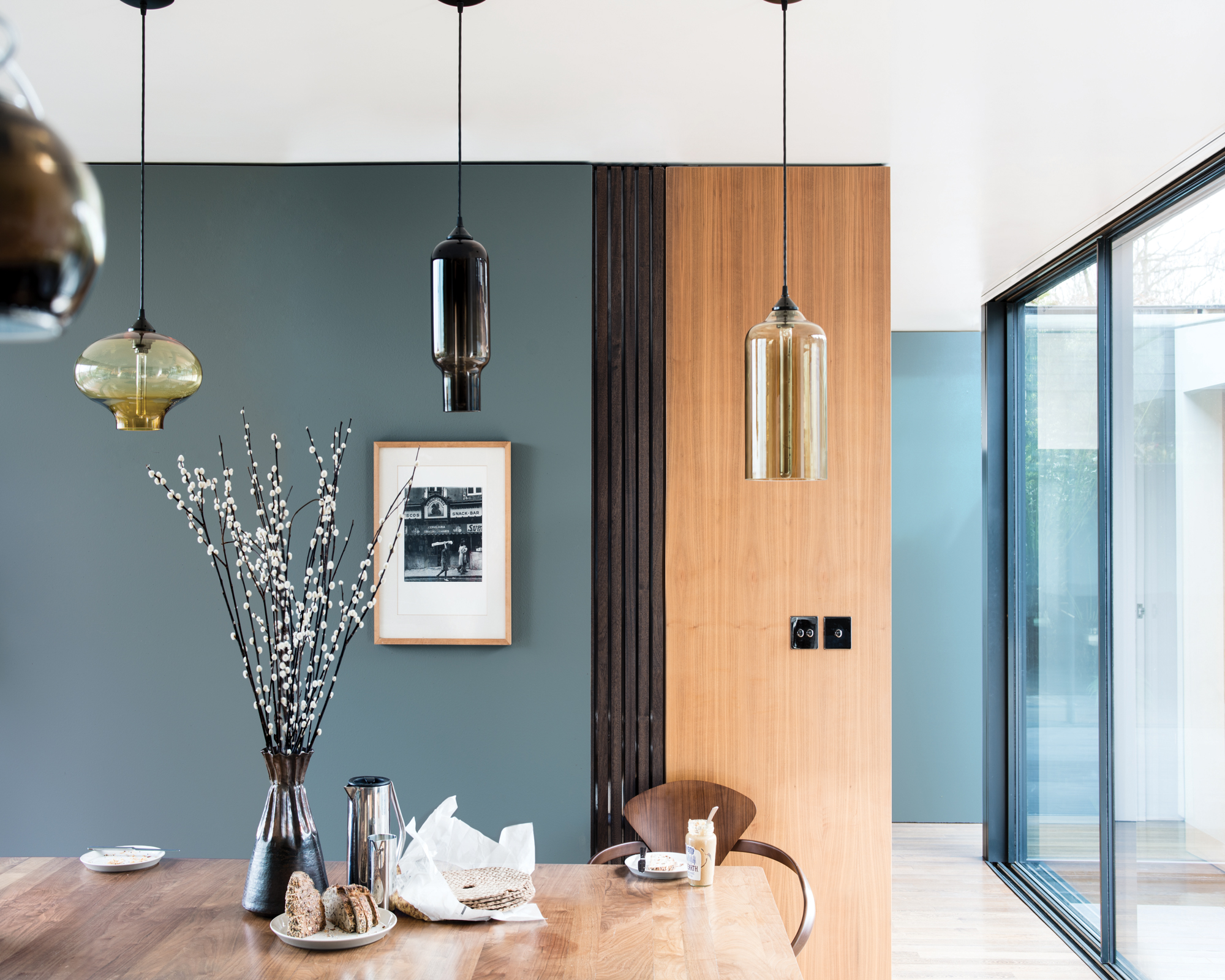
It's no secret that paint colours can completely transform a room – but colour can do so much more, including lifting our mood during the grey winter months. If you're suffering from January Blues, or you just would like a pick-me-up during this long lockdown winter, then updating your interiors with carefully chosen colours can have a significant positive impact on your wellbeing.
So before you start looking for living room ideas that make you happy, we've spoken to an environmental psychologist, Lee Chambers, and paint experts from Little Greene and Farrow & Ball to identify the top five colours that will deliver a much-needed mood boost to your living spaces.
1. Green
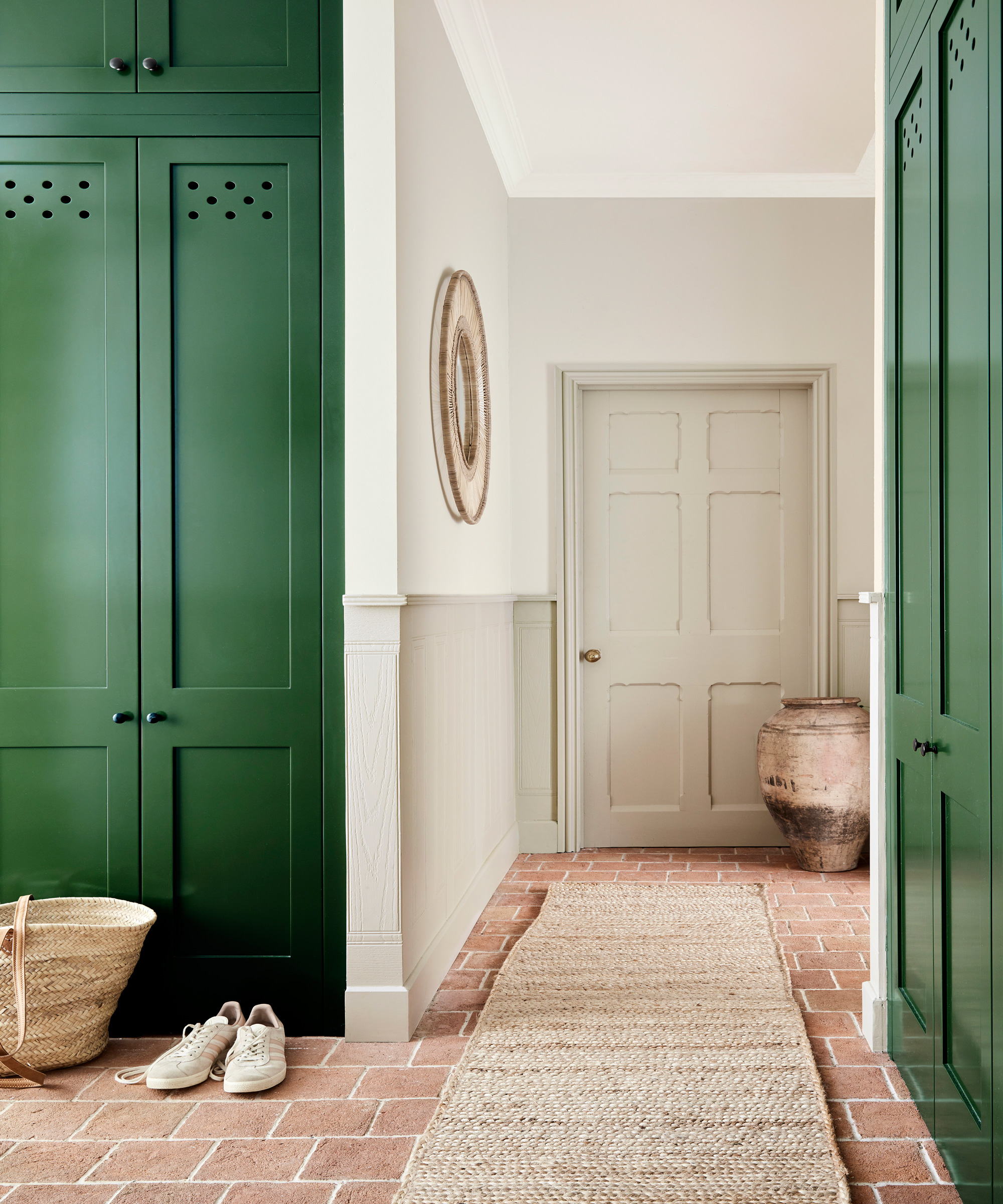
Dark Brunswick Green, Little Greene
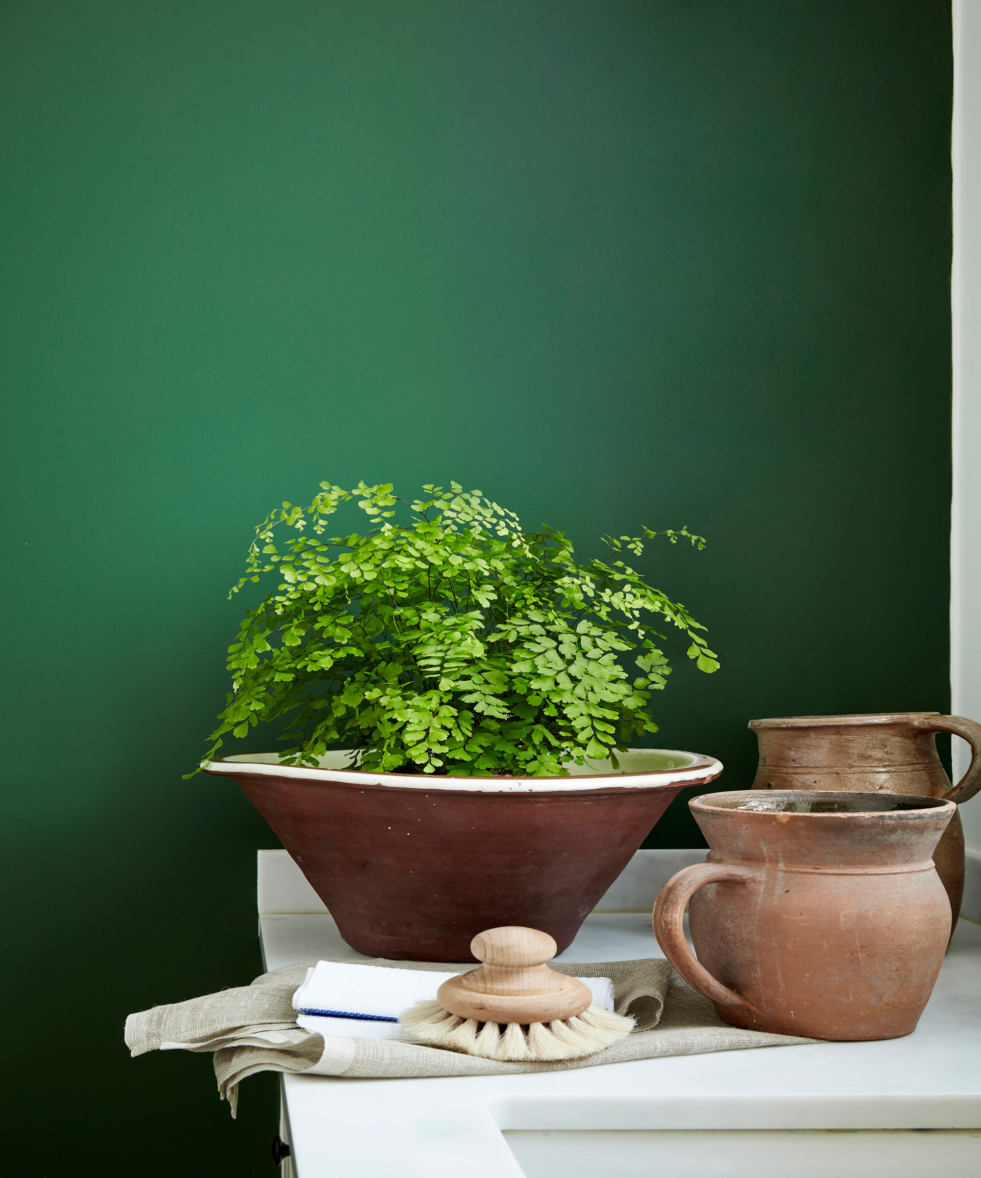
The colour of spring and renewal, green is the most mood-boosting colour that works especially well in living rooms, kitchens, and dining rooms. According to Lee, green can be particularly stimulating to those who are striving for personal growth.
Ruth Mottershead, creative Director at Little Greene, names green as one of the most tranquil and uplifting colours: 'For a soothing interior scheme, green is a great choice, as the true colour of nature it makes us feel comfortable within the home. It is a shade that we associate with the tranquillity of the outdoors.
'From earthy, muted tones such as ‘Sage Green’, which is soft yet sophisticated, to deeper shades such as ‘Dark Brunswick Green’, or the lighter shade of gentle ‘Book Room Green’. Green is a colour that brings a sense of peace and soothes the soul. '
2. Blue
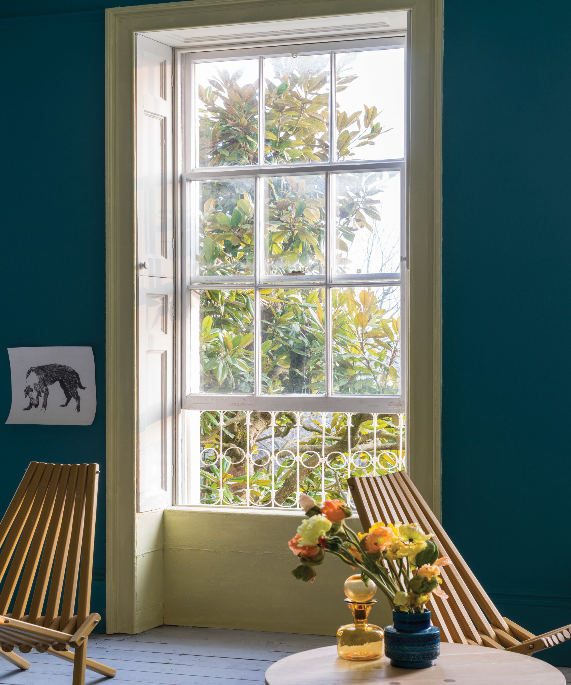
Living room in Vardo, Farrow & Ball
A colour that has had a resurgence in popularity over the past couple of years, blue is more interesting than the ubiquitous grey but can have much the same grounding and calming effect. Lee explains that 'this colour can be soothing and make you feel secure. However, much like grey, certain shades can evoke an element of coldness and sadness.'
Indeed, the potential for blue to evoke sadness is in our language: we 'feel blue' and get the 'January Blue'. A way to use blue that works around that potential problem is to opt for warmer shades that have some green in them, like the gorgeous Vardo from Farrow & Ball. Or, opt for lighter, softer shade, like the elegantly muted De Nimes.
Be The First To Know
The Livingetc newsletters are your inside source for what’s shaping interiors now - and what’s next. Discover trend forecasts, smart style ideas, and curated shopping inspiration that brings design to life. Subscribe today and stay ahead of the curve.

Dining room in De Nimes, Farrow & Ball
3. Pink
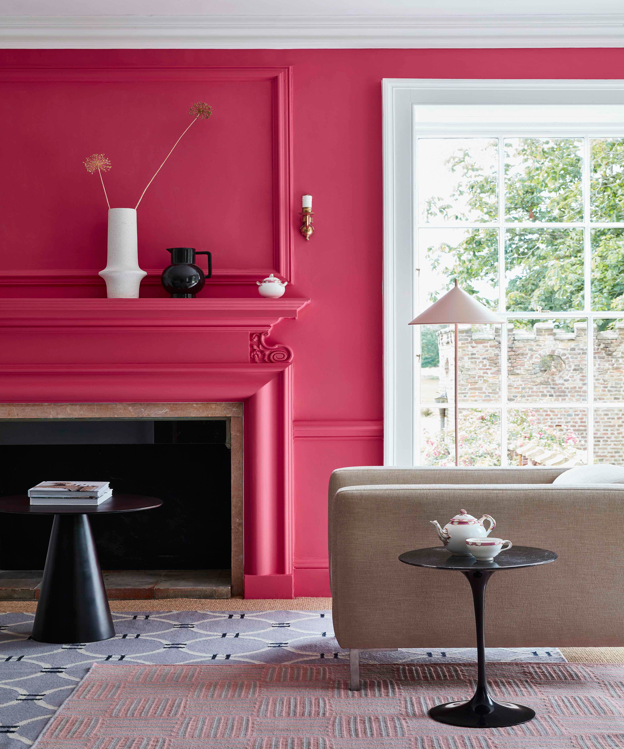
Living room in Leather, Little Greene
Pink is irrepressibly cheerful and is the perfect choice for those who enjoy an experiment. In colour psychology pink is the colour of hope, making you feel empowered. Lee notes that evoking such emotions increase your energy and motivation – a colour perfect to wake up to in your bedroom.
Pink, in fact, is versatile enough for any room in the home, adding a touch of playfulness or even flamboyance to living rooms and kitchens.
4. Yellow
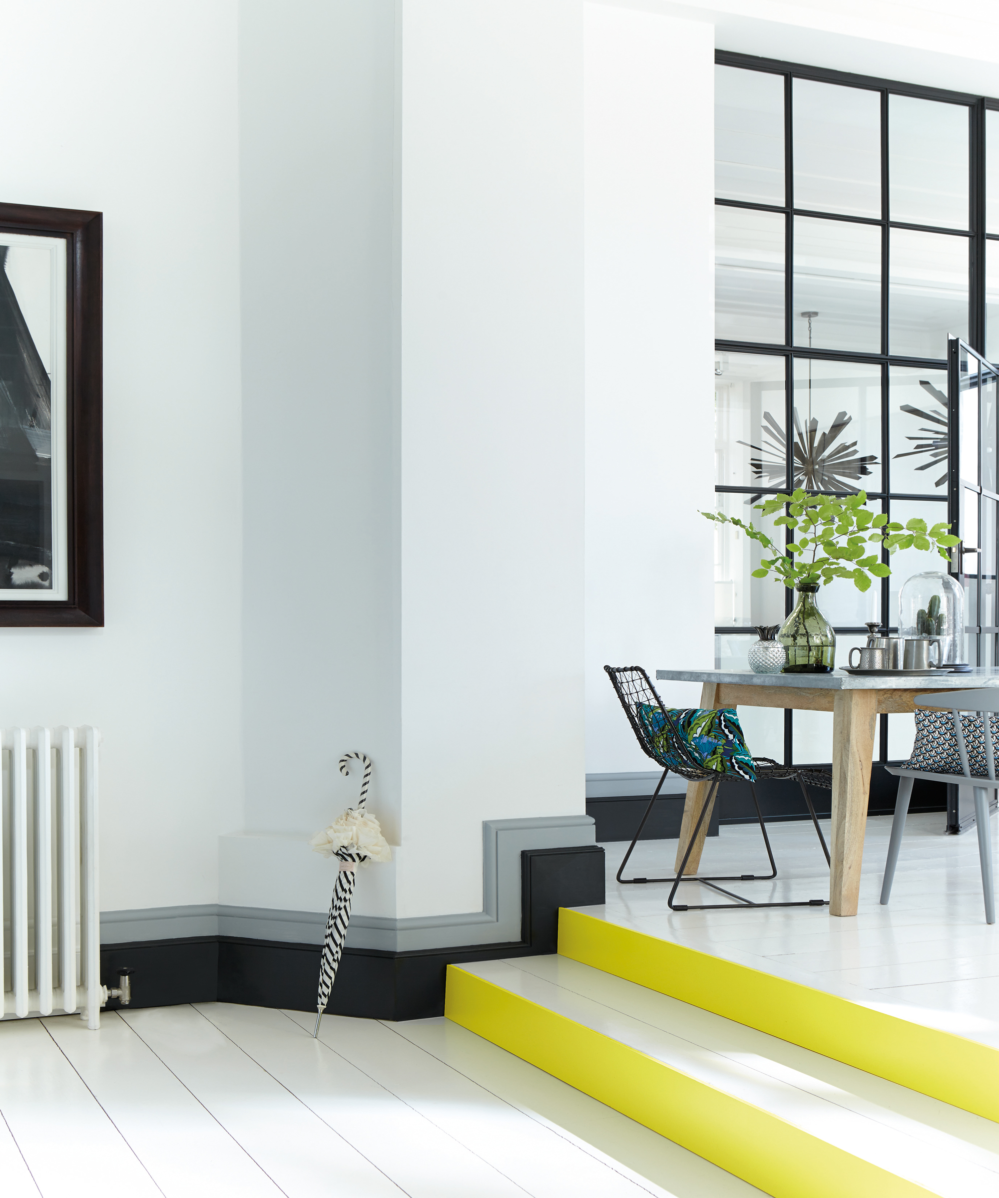
Living room with steps in Carys, Little Greene
The colour of sunshine, ripe lemons, or golden sand – happiness is in its DNA. Patrick O'Donnell, Farrow & Ball Brand Ambassador, calls yellow 'the ultimate revitalising feel-good colour.' And Ruth Mottershead says: 'Yellow creates a feeling of warmth; it is sunshine in your home and is perfect for spaces with a high level of activity – noise, laughter and fun. It’s a great colour for adding in small amounts too; consider just the woodwork or stair treads in a hallway for a colour highlight.'
Yellow is also the colour of concentration and imagination, making it a superb choice for a home office or study. However, you should avoid this colour in a children's room or nursery; 'darker shades of yellow have been shown to make babies cry more often, and cause tension,' explains Lee.
5. Purple
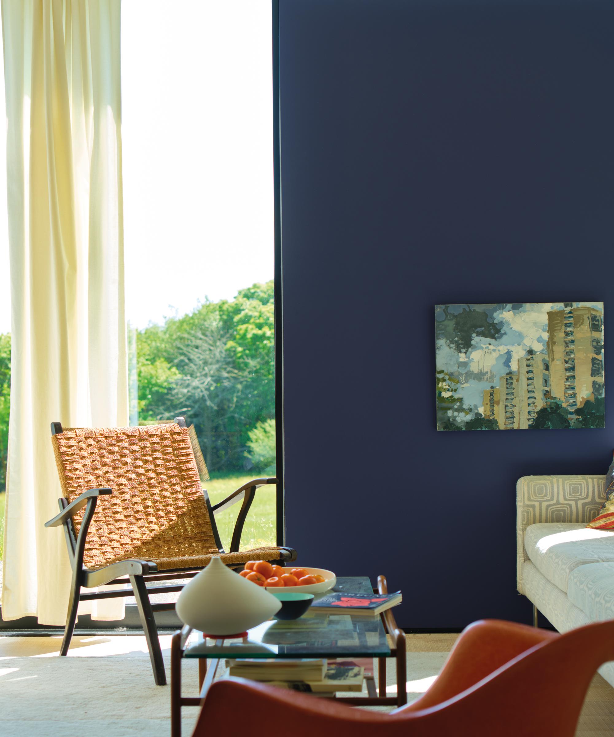
Living room in Imperial Purple, Farrow & Ball
The colour of luxury and relaxation, purple has clinically been proven to reduce stress and enhance wellbeing, whichever room it's used in. Purple is also associated with creativity and concentration: perfect if you're experiencing a slump at work or are a writer suffering from a block. Purple can be a bright statement colour, but there are plenty of shades that are calm and can even be used instead of neutrals.
* Lee Chambers quotes kindly provided by MyJobQuote.co.uk
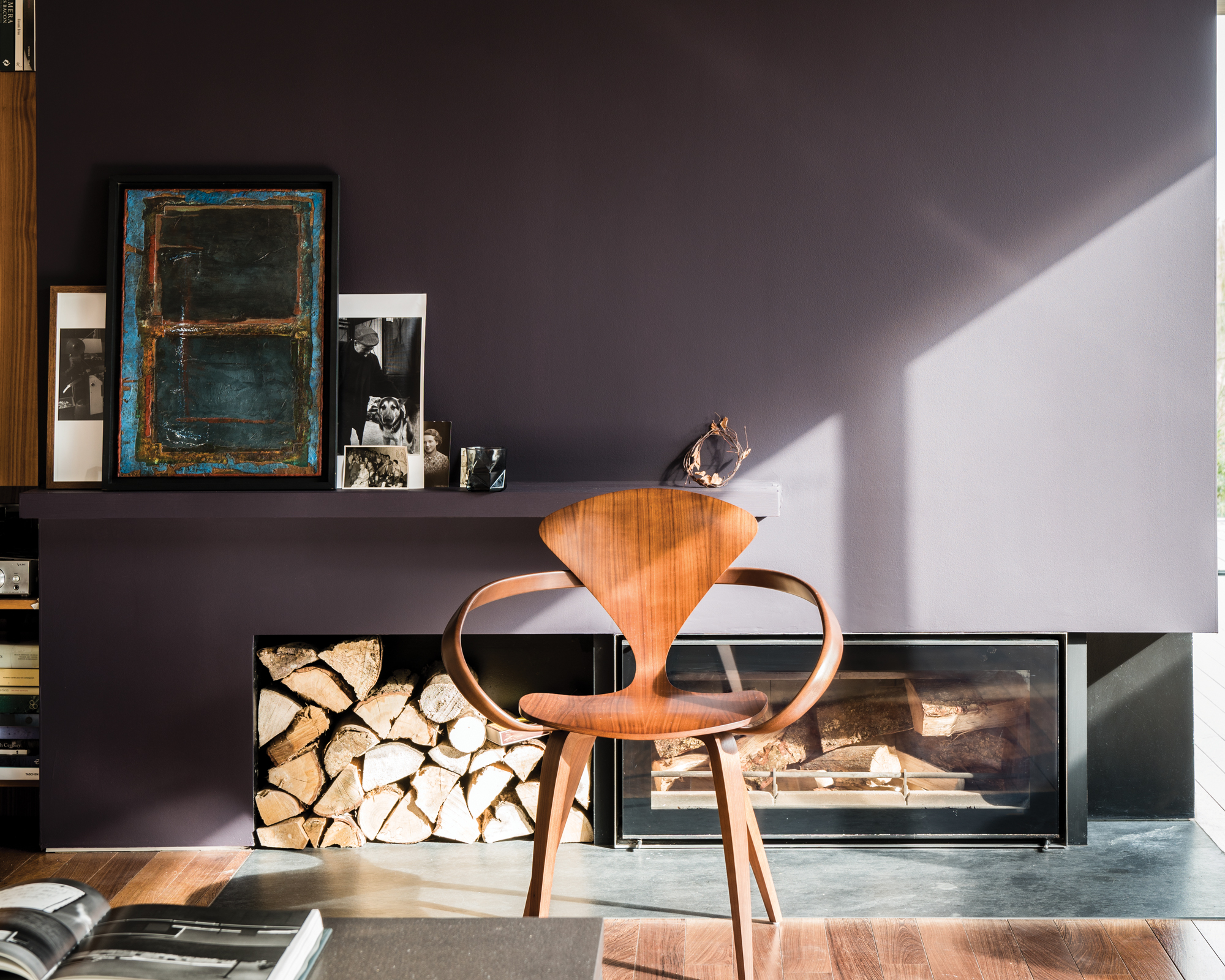
Living room in Paean Black, Farrow & Ball

Anna is a professional writer with many years' experience. She has special interests in architecture, photography, and high-end interior design. Her work has appeared in Homes & Gardens, Gardeningetc, and many other publications.
-
 5 Things You Should Never Buy From a Thrift Store, According to People Who Know About Antiques
It may look like treasure, but it may also just be trash. Here is how to know what to avoid while thrifting, and what to look for instead
By Olivia Wolfe Published
-
 7 Pantry Organization Mistakes That Are an Organizer's Worst Nightmare
Get that Pinterest-perfect pantry by avoiding these certified organization faux pas
By Amiya Baratan Published