Want the Soho House look? This color palette captures the interior mood perfectly for your home
From smoky blues to airy beiges, this Soho House-approved color palette speaks to the mood of now
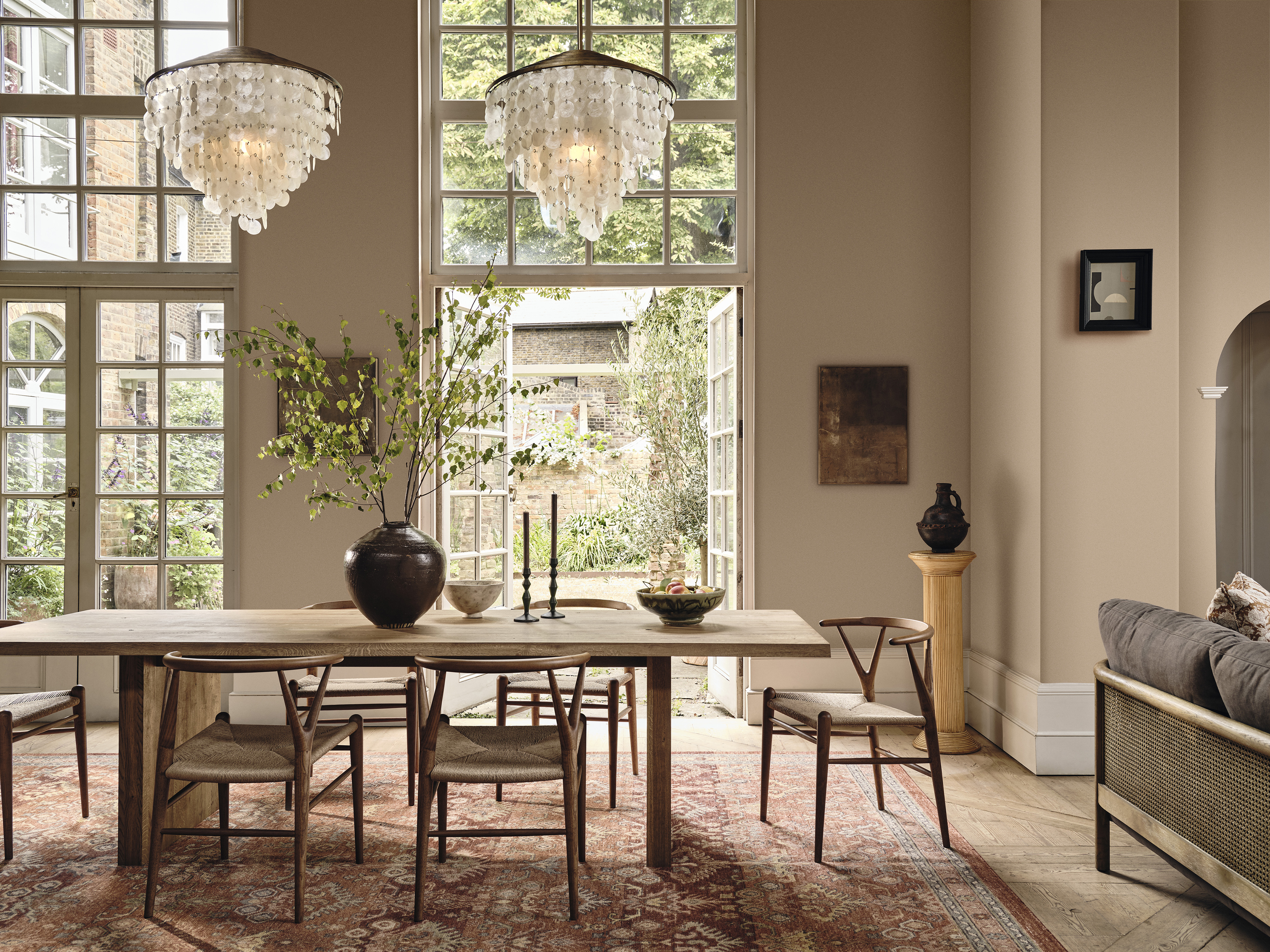

If you're interiors obsessed, you're likely to know about Soho House. The exclusive members club has sites all around the globe, but even if you don't have a membership, you might be familiar with its beautiful aesthetic style. It's traditional with a modern twist, both in its approach to texture and pattern, and its use of color.
'Color is such a key part of how we design the Houses,' says Candy Murray, interior design manager at Soho Home. 'We like to use color in a non-traditional way and that color story runs as a thread throughout the spaces in the Houses, giving each one a unique color identity.'
We can imagine that many a color scheme has begun with a Soho House room serving as inspiration, so it makes total sense that they'd team up with Lick Home Décor to hone in on how exactly they use paint ideas to make their designs enticing.
The brands have co-created a bespoke color palette inspired by the interiors of eight Soho House locations around the world, including 76 Dean Street in London, Soho Roc House in Greece, Soho House Nashville and Soho House Rome.
The colors range from smoky purple, blue and green to delicate neutral beiges. Think grounding, earthy tones paired with calming neutrals that hint at what's to come in 2023 - rich, warm hues having been a key color trend of the year so far. Here's how to embrace this color palette in your home.

Lilith is an expert at following news and trends across the world of interior design. She regularly shares color stories with readers to help them keep up-to-date with ever-changing trends that promise to add personality into the home. For this piece, she spoke with the creative minds behind Lick's new color palette in collaboration with Soho House, an array of colors sure to define the year ahead.
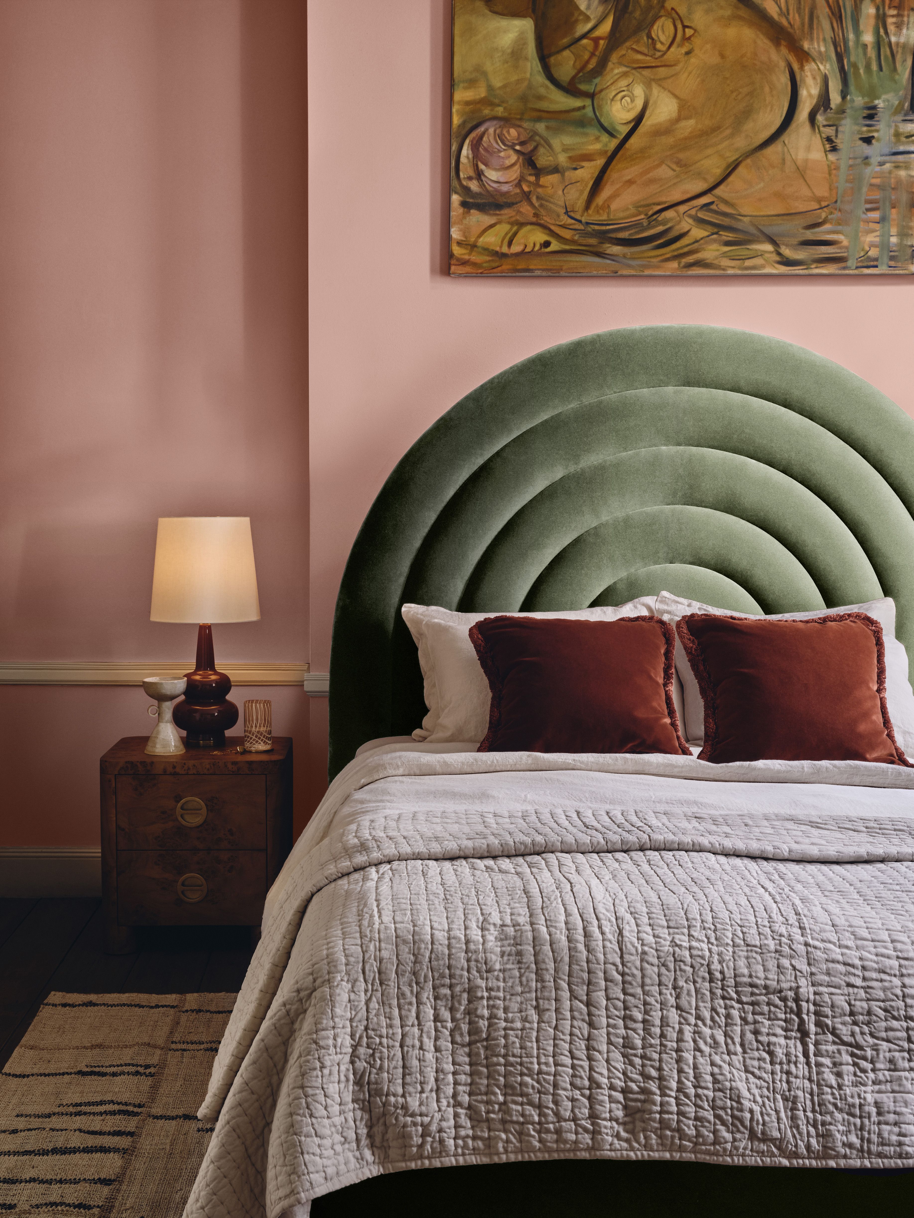
Bedroom painted in Pink 13 Nashville House from the Lick X Soho House collection.
When it comes to how to create a color palette, Tash Bradley, director of interior design and color psychologist at Lick, knows a thing or two. 'The array of colors within the curated palette are individually comforting and inspiring, with each color having its own personality,' she explains.
From calming neutrals inspired by Soho Farmhouse to warming jewel tones that echo Brooklyn’s Dumbo House, the Soho House look transcends a certain fixed color palette. Instead, it's about creating a scheme that not only feels rich and deep, but also balanced and, often, unexpected in its pairings.
Be The First To Know
The Livingetc newsletters are your inside source for what’s shaping interiors now - and what’s next. Discover trend forecasts, smart style ideas, and curated shopping inspiration that brings design to life. Subscribe today and stay ahead of the curve.
Use delicate Taupe 03 with its pink undertones alongside Greige 02, a gentle blend of grey and beige with a green undertone, for a Scandi decor style that's understated, soft and inviting.
For a moodier feel, use cool charcoal-toned Grey 08 in a scheme with the deeply rich Purple 03 for a luxurious and earthy interior.
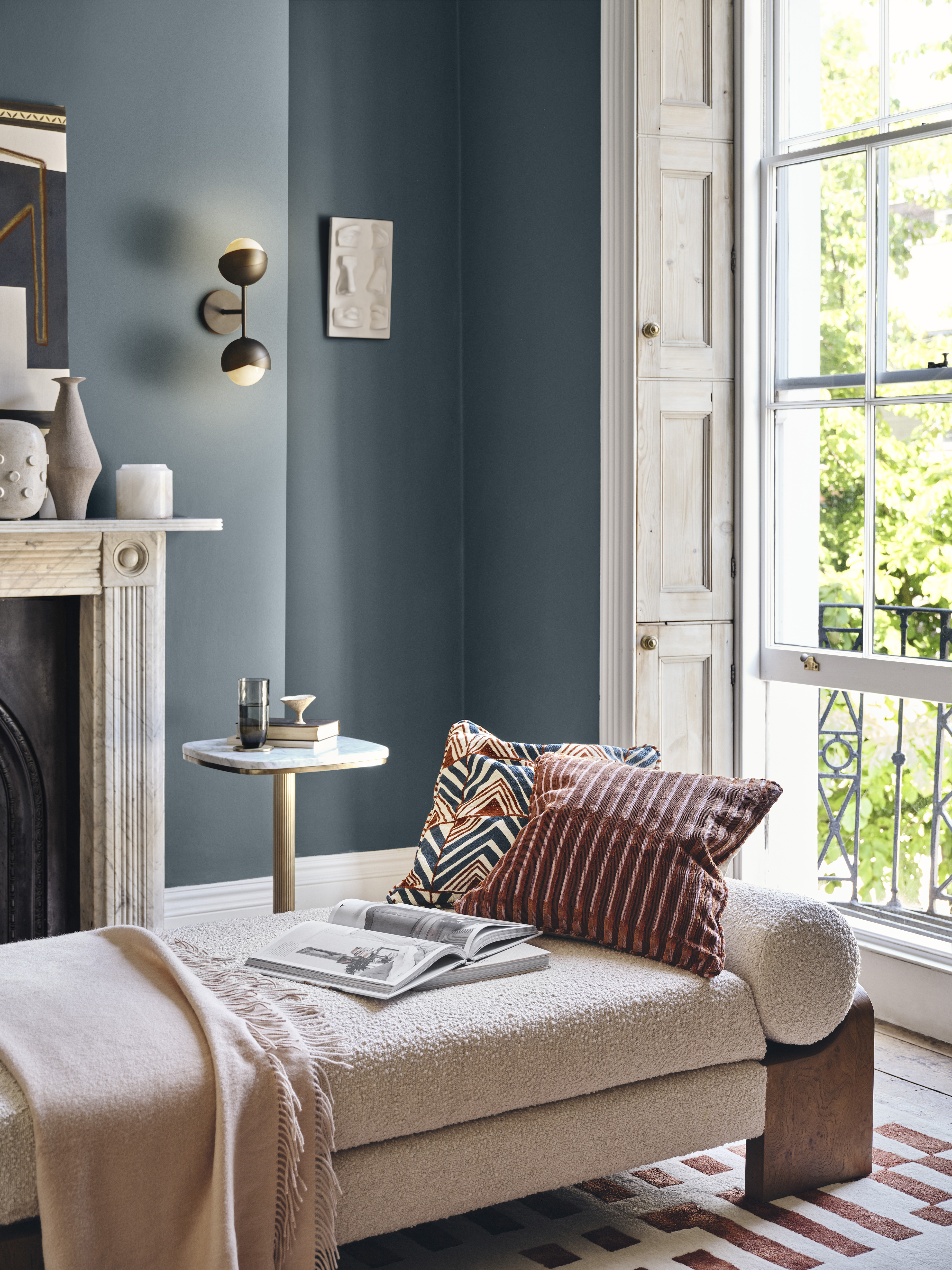
Living room painted in Grey 08 Amsterdam House from the Lick X Soho House collection.
For Tash, the colors are all about injecting unique character in the home. 'Beige 02 Soho Farmhouse is wonderfully soft yet simultaneously makes you feel connected to the outdoors with its modern rustic edge,' she explains. 'Meanwhile, Pink 13 Nashville House draws in light and evokes a light-hearted "country glam" feel reminiscent of Nashville's musical heritage.'
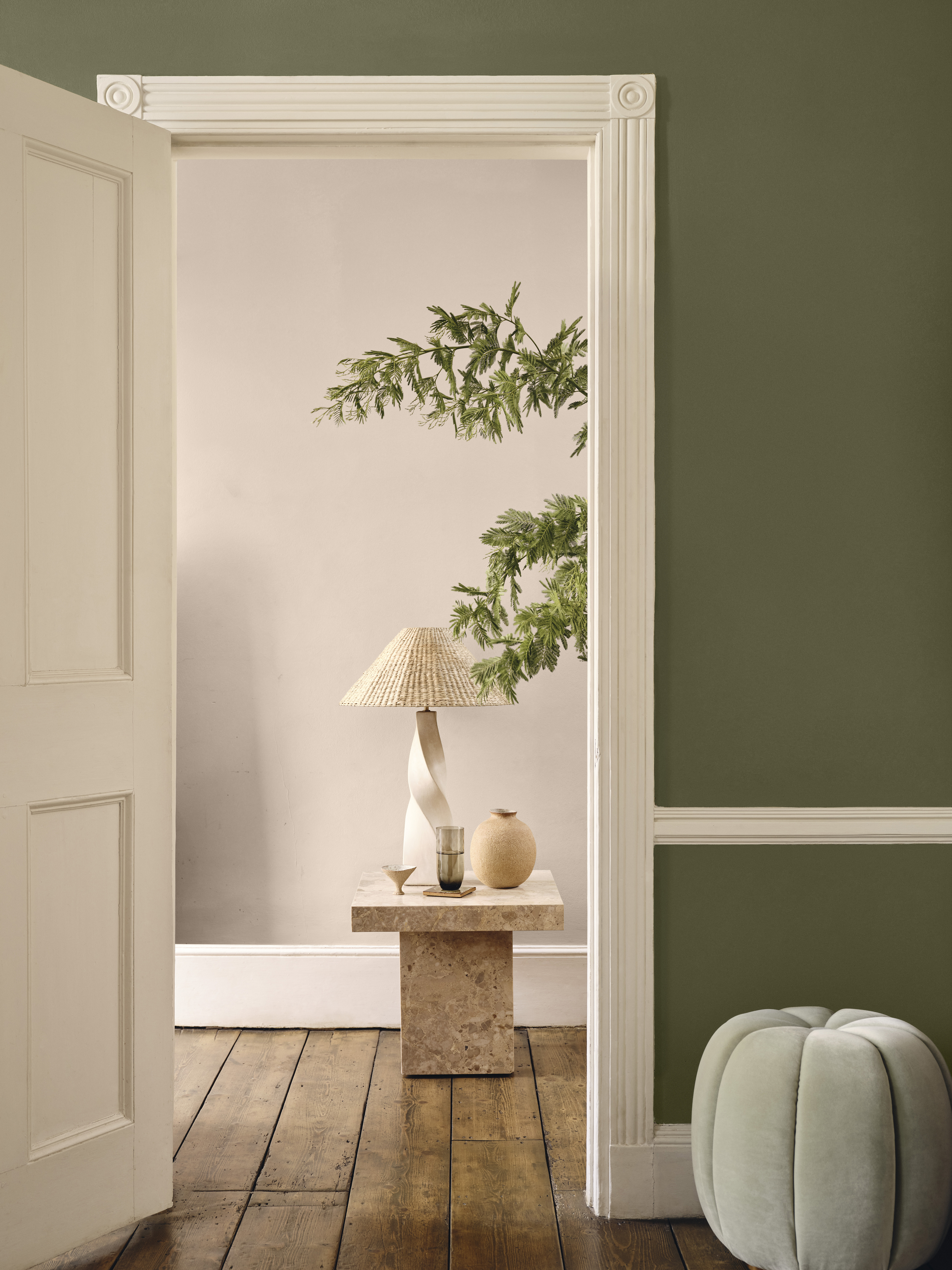
Room painted in Green 05 Rome House and entryway painted in Taupe 03 Roc House.
It's this sense of individuality and the notion of sociable spaces that Tash and Candy hope will inspire our own designs. Since emerging from the pandemic, making our homes a place to come together and enjoy one another's company has been at the forefront of design - something this color palette seems to encapsulate perfectly.

Lilith Hudson is a freelance writer and regular contributor to Livingetc. She holds an MA in Magazine Journalism from City, University of London, and has written for various titles including Homes & Gardens, House Beautiful, Advnture, the Saturday Times Magazine, Evening Standard, DJ Mag, Metro, and The Simple Things Magazine.
Prior to going freelance, Lilith was the News and Trends Editor at Livingetc. It was a role that helped her develop a keen eye for spotting all the latest micro-trends, interior hacks, and viral decor must-haves you need in your home. With a constant ear to the ground on the design scene, she's ahead of the curve when it comes to the latest color that's sweeping interiors or the hot new style to decorate our homes.
-
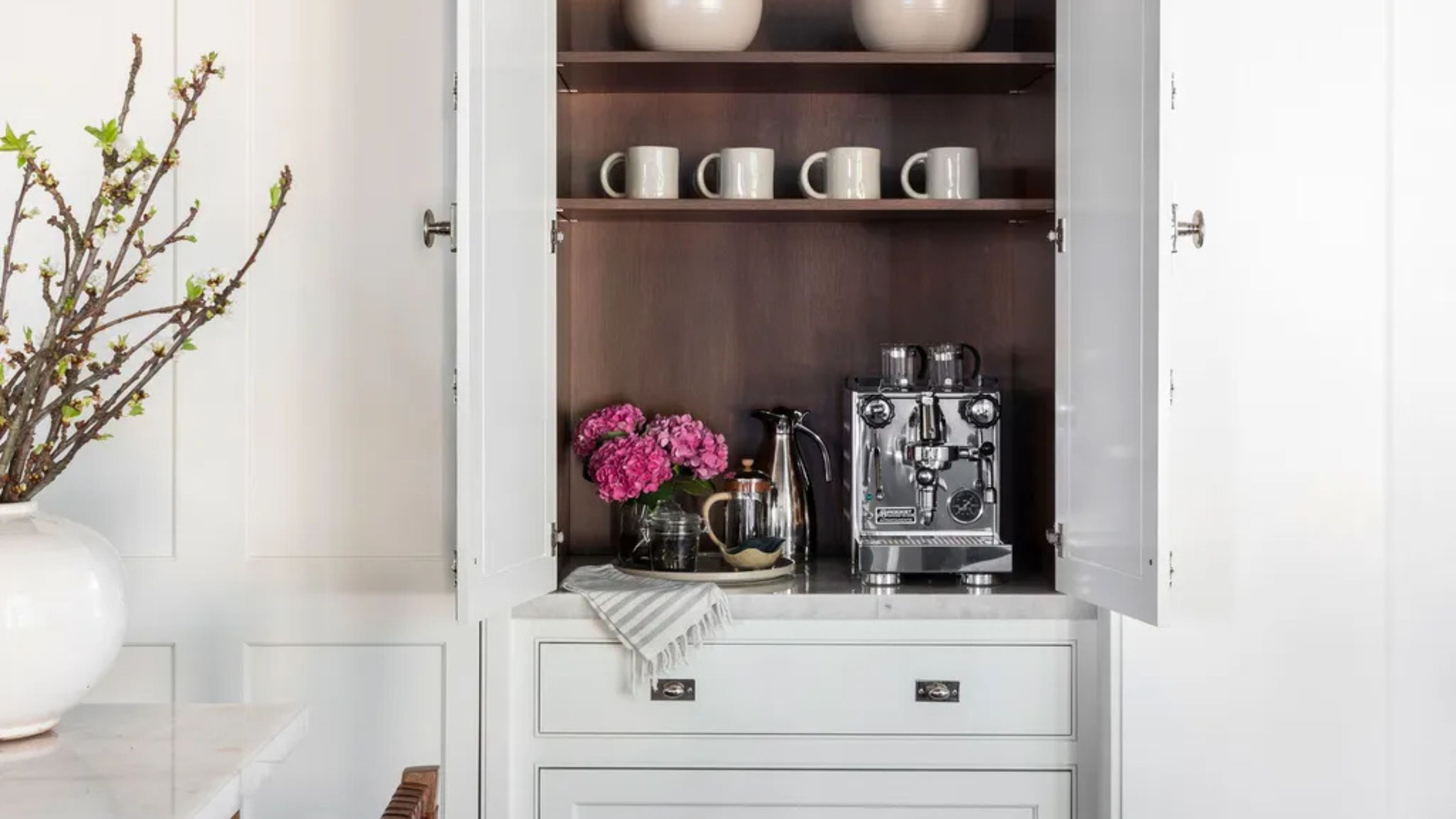 Turns Out the Coolest New Café is Actually In Your Kitchen — Here's How to Steal the Style of TikTok's Latest Trend
Goodbye, over-priced lattes. Hello, home-brewed coffee with friends. TikTok's 'Home Cafe' trend brings stylish cafe culture into the comfort of your own home
By Devin Toolen Published
-
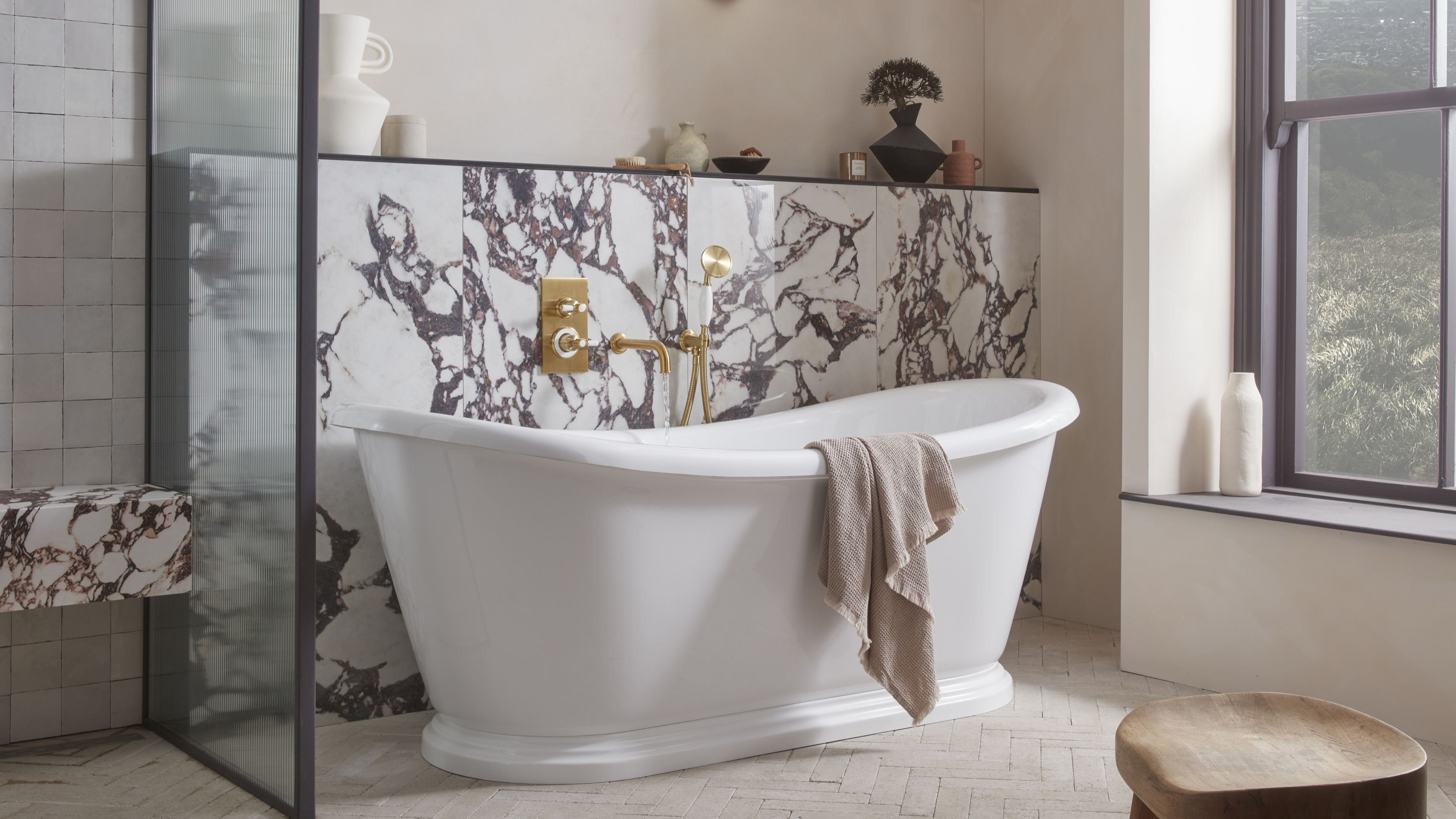 5 Bathroom Layouts That Look Dated in 2025 — Plus the Alternatives Designers Use Instead for a More Contemporary Space
For a bathroom that feels in line with the times, avoid these layouts and be more intentional with the placement and positioning of your features and fixtures
By Lilith Hudson Published