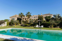
This Spanish hotel suite might be my favorite example of modern rustic style ever
Natural plaster, exposed wooden beams and patterned tiles culminate in a beautiful example of modern rustic style in this boutique Spanish hotel
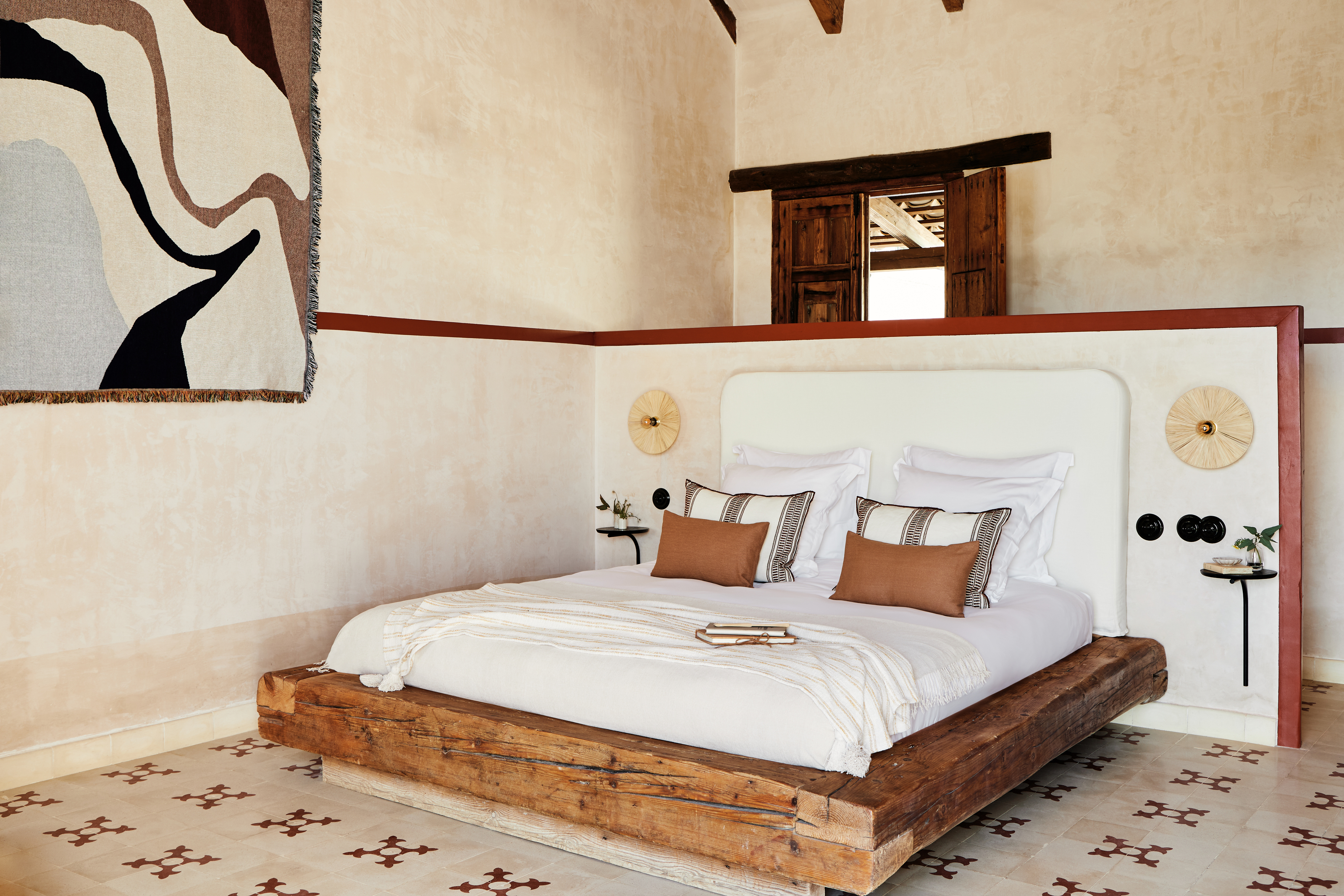
This suite within a boutique Spanish hotel is possibly the most beautiful example of modern rustic decor that we've ever seen. Designed by London-based studio Kitesgrove, the suite features exposed beams, plaster walls, and beautiful patterned tiles tied together with an earthy color palette - the perfect restful retreat.
This rural getaway can be found within the Casa la Siesta - a hotel created by Bert & May founder Lee Thornley - in Andalusia, southern Spain. It features tiles from a recent collaboration between the two interior design brands alongside plenty of organic materials and warm textures. The resulting space is imbued with quiet luxury and Spanish charm.
An earthy palette of neutral tones with rich accents of terracotta is in keeping with the Mediterranean setting, while the warm undertones on the walls and floor inject the feel of the Spanish sunshine into the space.
'We were delighted to work on this suite within such inspiring surroundings,' says Katie Lion, Senior Interior Designer at Kitesgrove. 'The rich Andalusian landscapes informed many of our design choices with a focus on deep earthy colors and natural, tactile textures.' We take a look inside for some design inspiration.

Lilith is an expert at following news and trends across the world of interior design. She regularly shares color stories with readers to help them keep up-to-date with ever-changing trends that promise to add personality into the home.
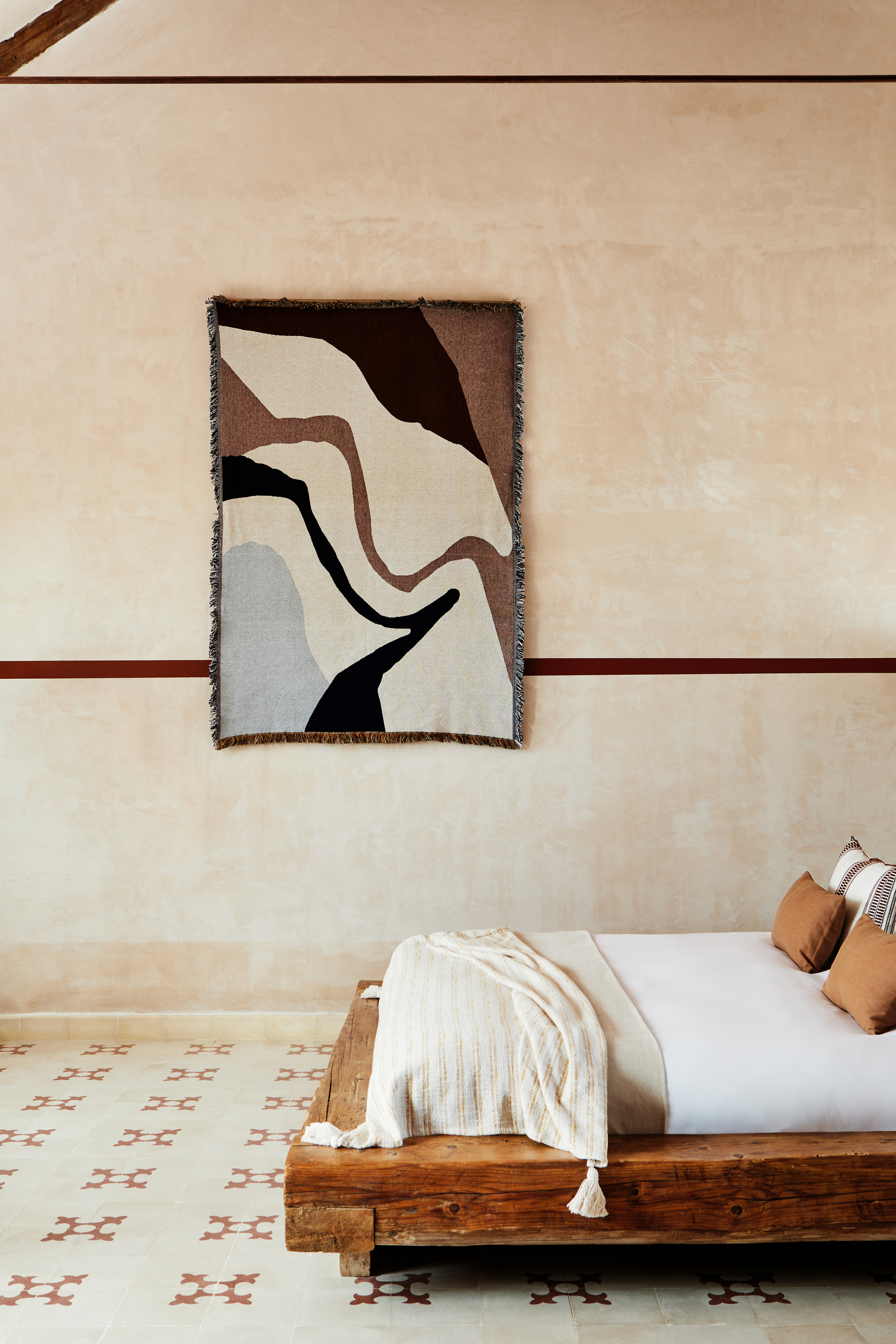
The star appeal of any hotel suite is, of course, the bed - and this one doesn't disappoint. A mattress sits on a low, reclaimed wood base, part of the original hotel’s inventory, immediately introducing the rustic vibe.
Reclaimed tiles from Bert & May are used on the floor to ground the neutral color scheme. The geometric design with its earthy pink shade is subtle and delicate but creates an impressive visual statement that we're eager to try ourselves.
A wall hanging from Ferm Living also helps to create a cohesive feel by reflecting the different tones used within the room but in the form of a textural artwork. If you love the look of the tapestry, the Vista Blanket in Off White is available from Burke Decor.
Be The First To Know
The Livingetc newsletters are your inside source for what’s shaping interiors now - and what’s next. Discover trend forecasts, smart style ideas, and curated shopping inspiration that brings design to life. Subscribe today and stay ahead of the curve.
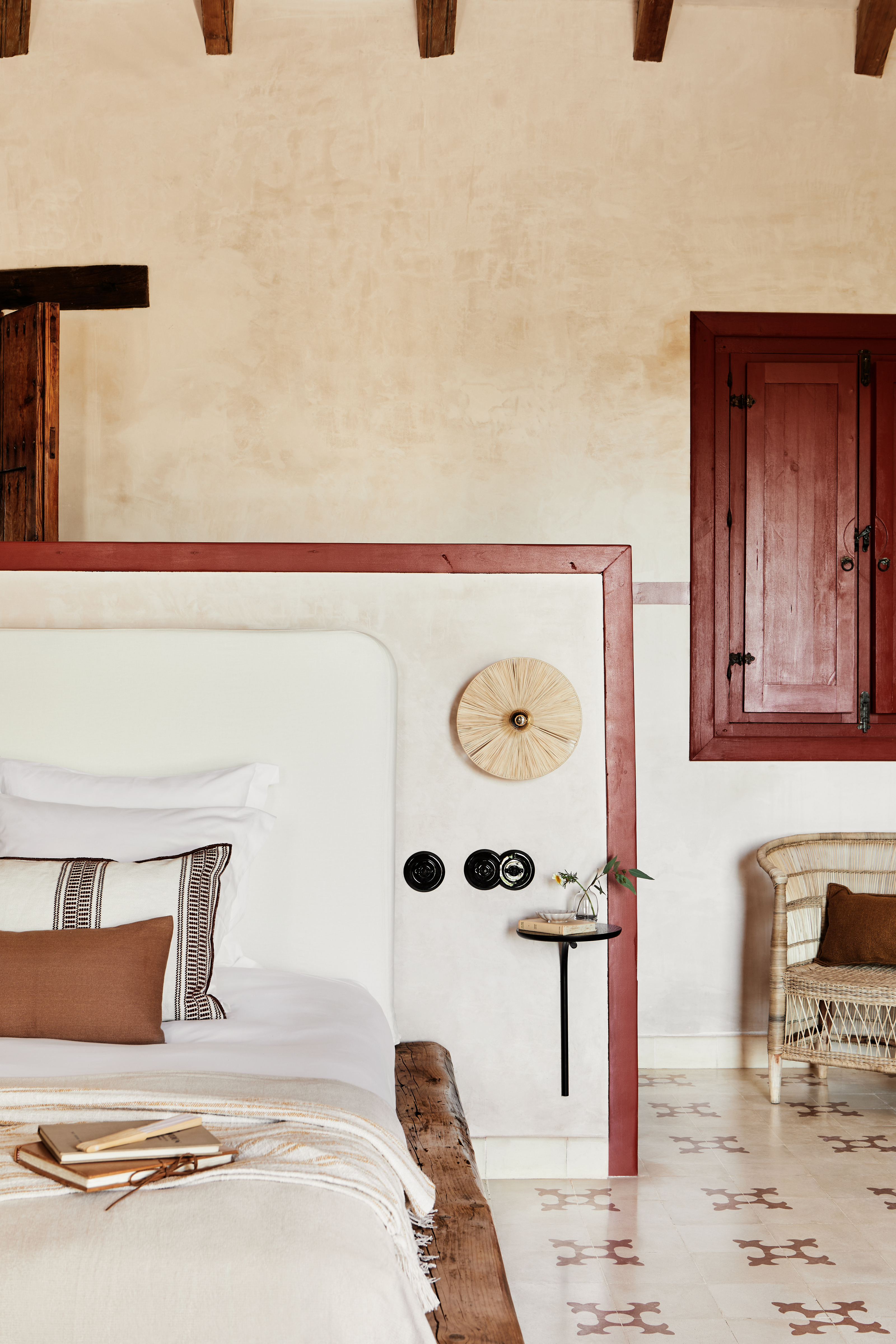
The headboard, pushed against the wall partition, is flanked by two raffia wall lights made by La Fabrique a Abat-Jour and a pair of black Pujo Wall Tables from Ferm Living which add a monochrome edge to the rustic bedroom.
The use of raw, organic and characterful finishes including wood, rattan and wicker against a soft pink backdrop of natural plaster walls creates subtle layers of interesting textures and shades. The comforting color scheme and warm textures create a relaxing atmosphere.
'We wanted to create a space which was calming and tranquil, yet still retained some Spanish flair and drama,' explains Katie of Kitesgrove. 'It was important not to overshadow the rich warmth of the beautiful reclaimed woods and tiles, therefore our palette choice was subtle with accents of stronger color.'
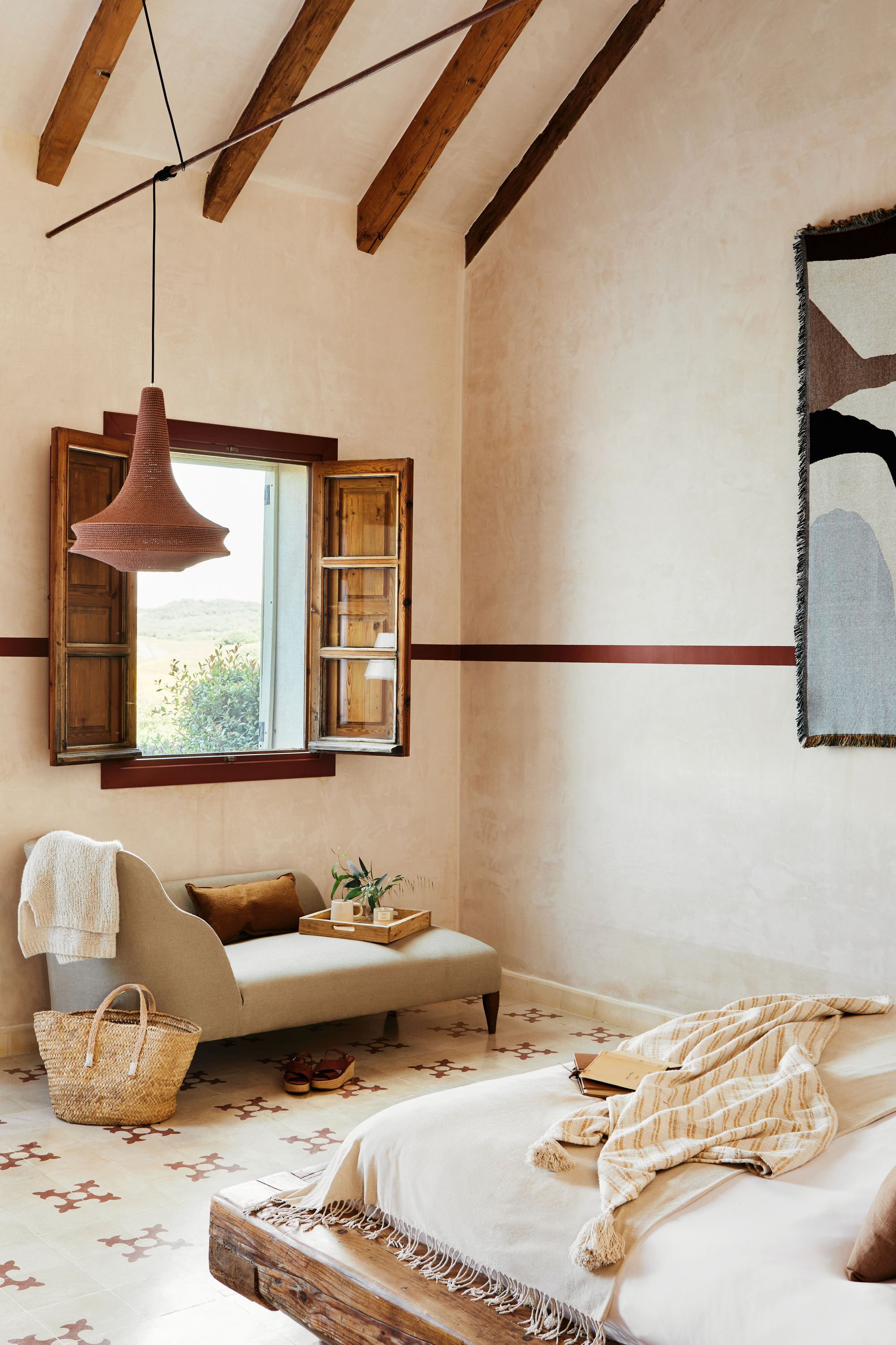
A glimpse of the exposed wooden beams brings this rustic feel home, as echoed in the wooden shutters shown here. Below the window, an upholstered linen chaise sits under a pendant light with a rich red shade. This sun-drenched window, with it's beautiful views of the rolling landscape beyond, is the perfect spot for a repose with a book. We know this design idea would work wonderfully in a modern rustic living room.
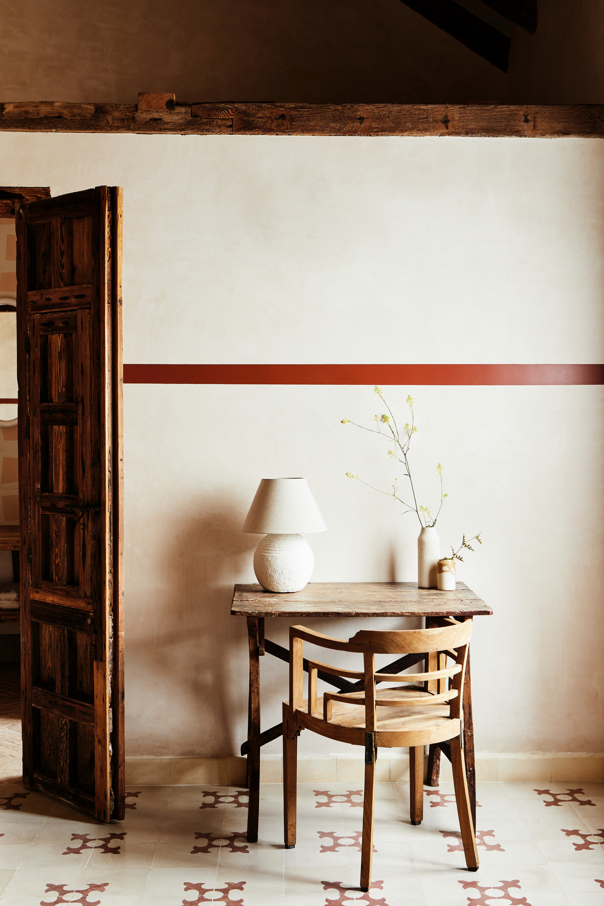
The addition of a small wooden vintage desk and chair adds a subtle elegance to the suite while simultaneously introducing a more homely feel to the space. This charming little space makes us feel as though we've stepped back in time. Yet, Kitesgrove's designers have put a modern spin on the overall look with their bold paint idea. The horizontal oxblood line breaks up the room and adds a unique and characterful effect to this quaint space.
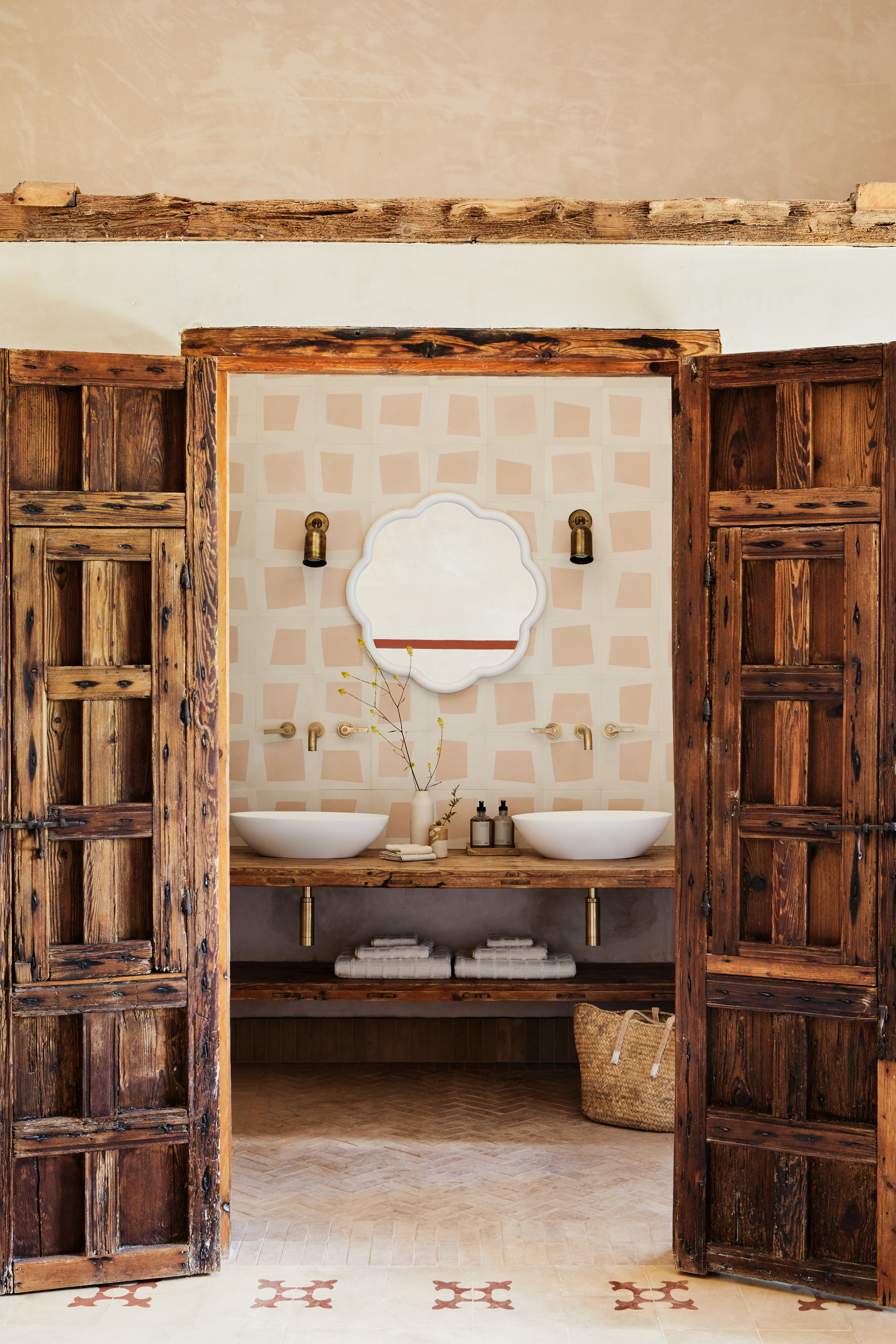
Continuity from the bedroom to the bathroom is established through the color palette and the wooden accents. Antique brass wall lights from Fosbery Studio and brass taps add sophisticated metallic detail to the space while a double vanity with curved vessel sinks from Fired Earth shows the enduring popularity of the curved bathroom trend. It's a luxurious, spa-like bathroom if we ever saw one.
The chevron terracotta floor tiles in the bathroom work harmoniously with the natural elements of the room and echo the whimsical tiles on the wall. These are Kitesgrove X Bert & May's Quad tiles in Brighton Stone and Mandarin Orange from the new Irregular collection.
'We are thrilled with how the Quad tiles look in the bathroom,' says Katie. 'The milky off white and pale pink tones sit beautifully amongst the bright white and deep wood.'
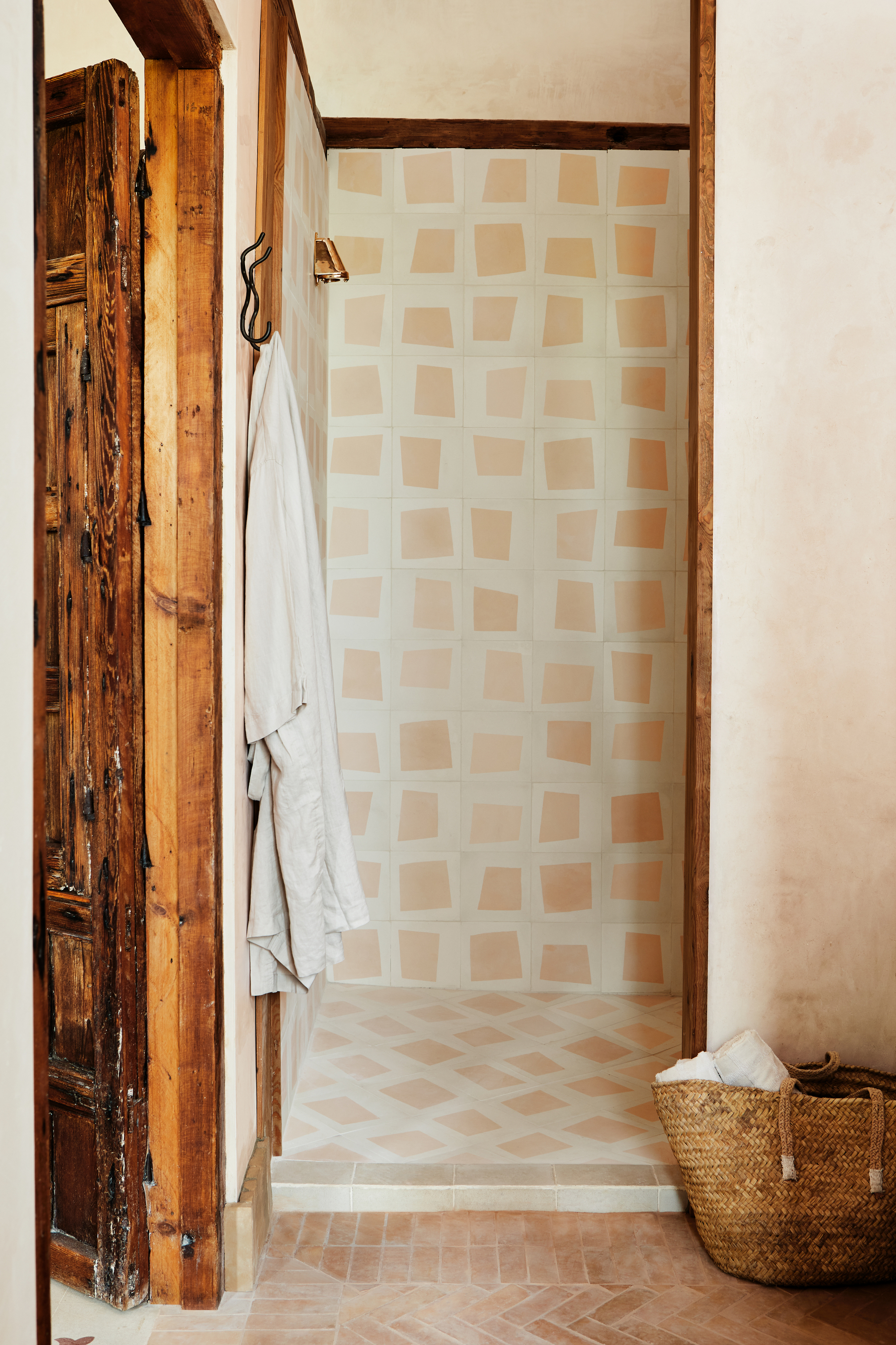
The design, also used in the shower, is made up of four similar designs, each contained within the tile’s border allowing for a nuanced yet dynamic tessellation. The uneven, 'irregular' quality of the tiles creates fluidity and contrasting shapes that is playful and unique.
This bathroom tile idea is one we'll certainly be trying ourselves, after we've booked our trip to Casa la Siesta, of course.
Casa la Siesta, Vejer de la Frontera, Spain
You can book to stay at this picturesque Spanish property through boutique travel agents such as Mr and Mrs Smith.

Lilith Hudson is a freelance writer and regular contributor to Livingetc. She holds an MA in Magazine Journalism from City, University of London, and has written for various titles including Homes & Gardens, House Beautiful, Advnture, the Saturday Times Magazine, Evening Standard, DJ Mag, Metro, and The Simple Things Magazine.
Prior to going freelance, Lilith was the News and Trends Editor at Livingetc. It was a role that helped her develop a keen eye for spotting all the latest micro-trends, interior hacks, and viral decor must-haves you need in your home. With a constant ear to the ground on the design scene, she's ahead of the curve when it comes to the latest color that's sweeping interiors or the hot new style to decorate our homes.
-
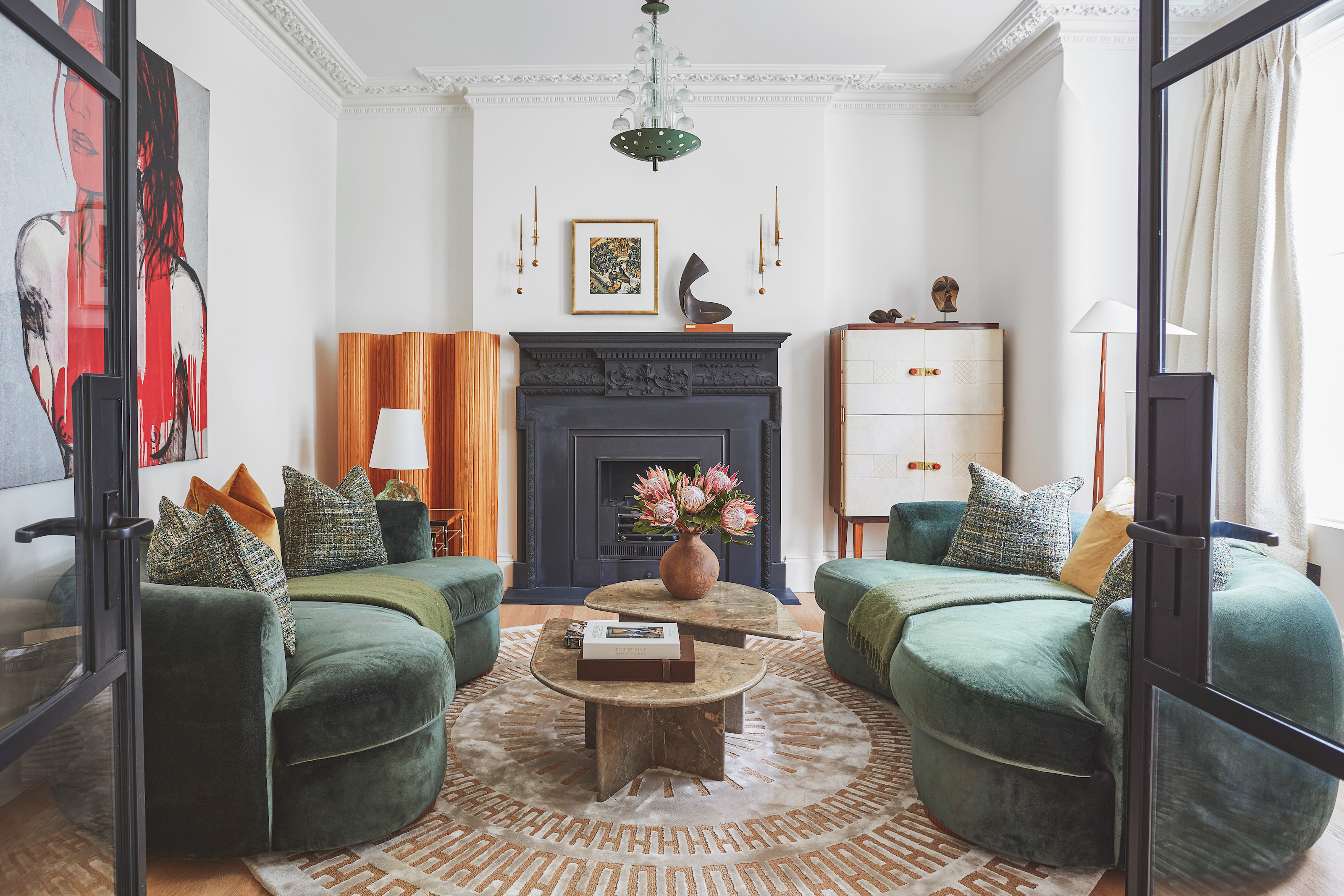 The 'New British' Style? This Victorian London Home Embraces Its Owners' Global Background
Warm timber details, confident color pops, and an uninterrupted connection to the garden are the hallmarks of this relaxed yet design-forward family home
By Emma J Page
-
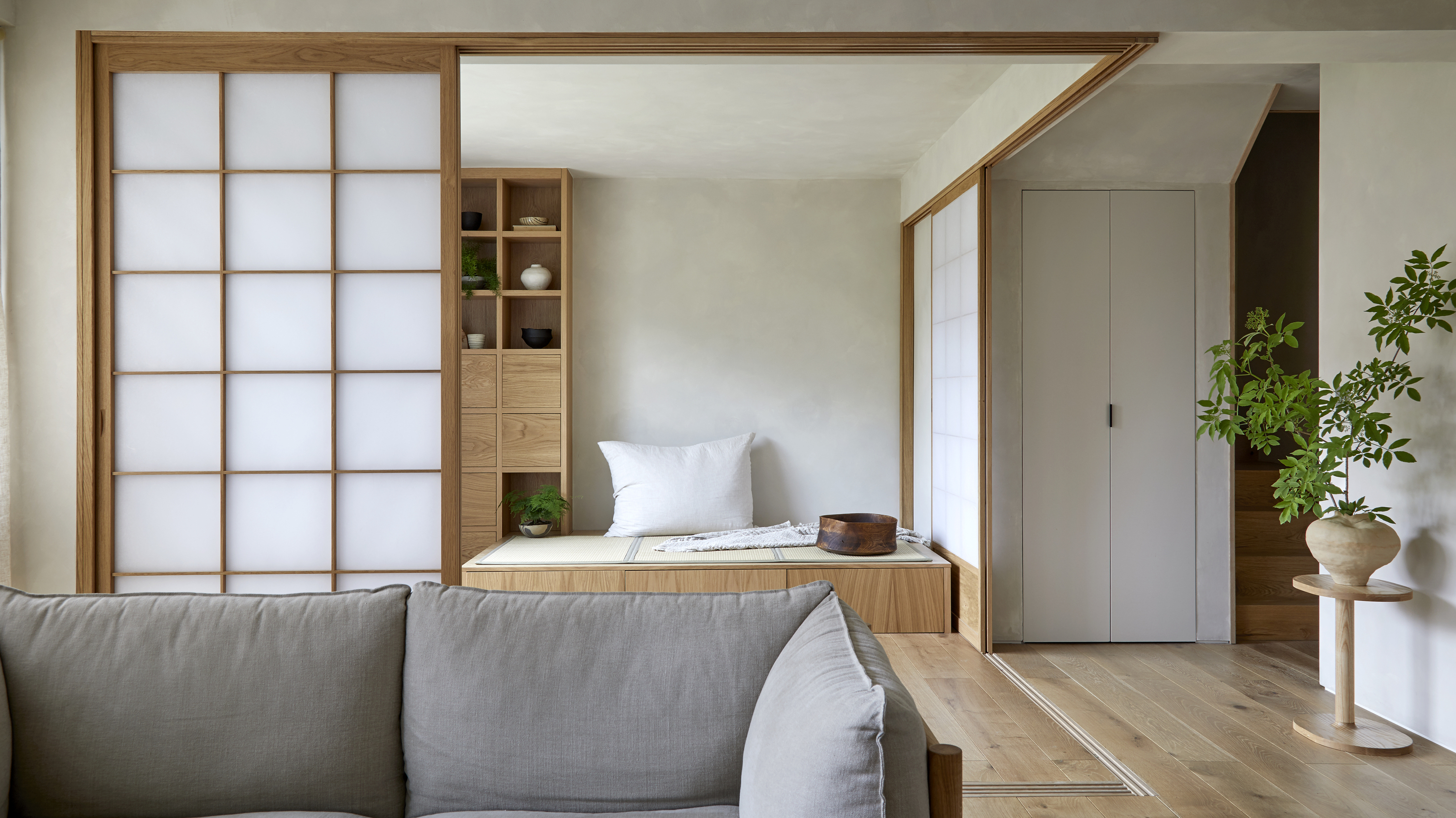 Muji Living Room Ideas — 5 Ways to Harness The Calming Qualities of This Japanese Design Style
Inspired by Japanese "zen" principles, Muji living rooms are all about cultivating a calming, tranquil space that nourishes the soul
By Lilith Hudson
-
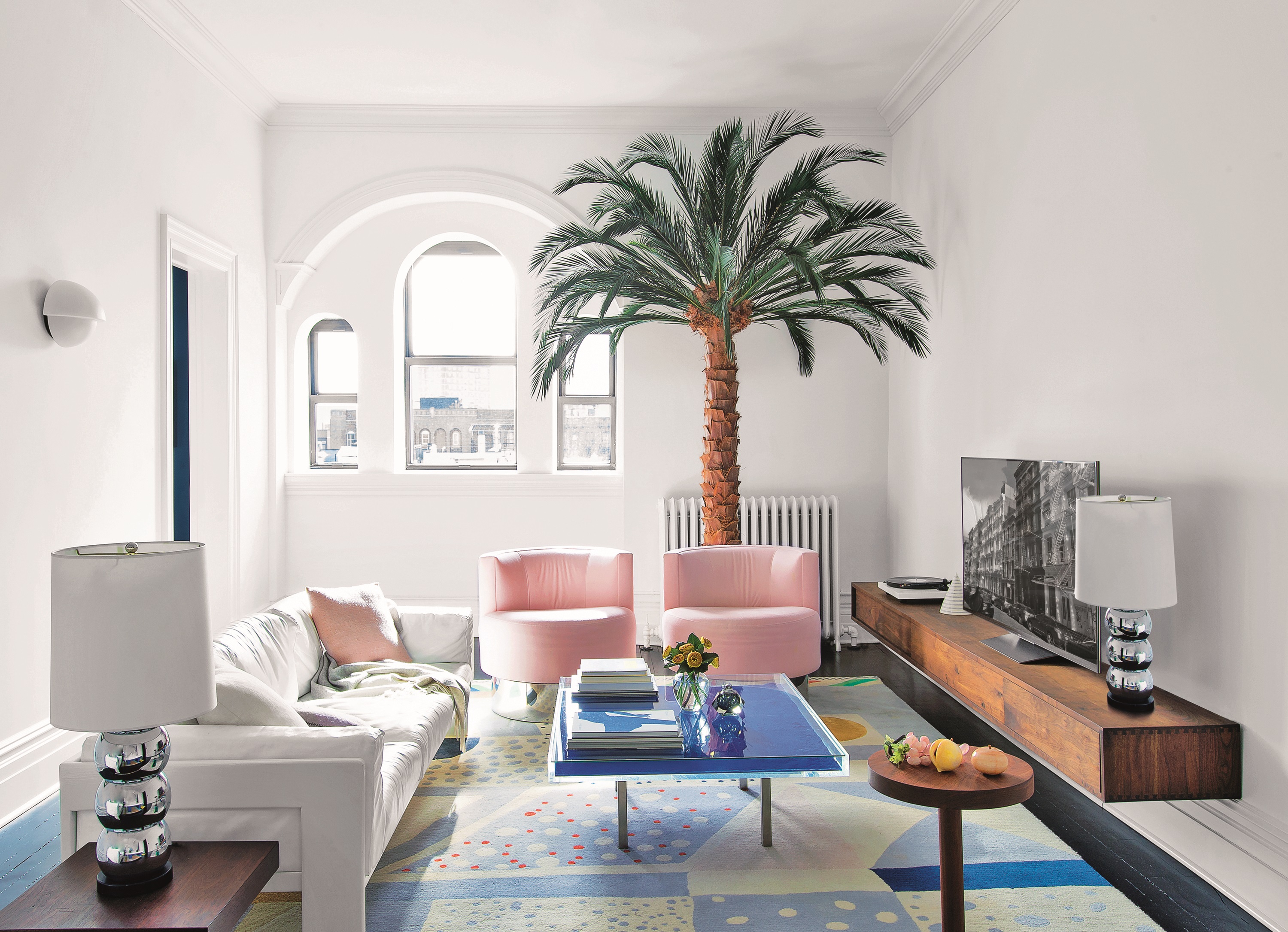 The Y2K interiors trend is a controversial look. But we found these 3 things to love about it
Y2K is here to stay. Forget contemporary interiors – these designers predict that 2023 will resemble something closer to 2003...
By Lilith Hudson
-
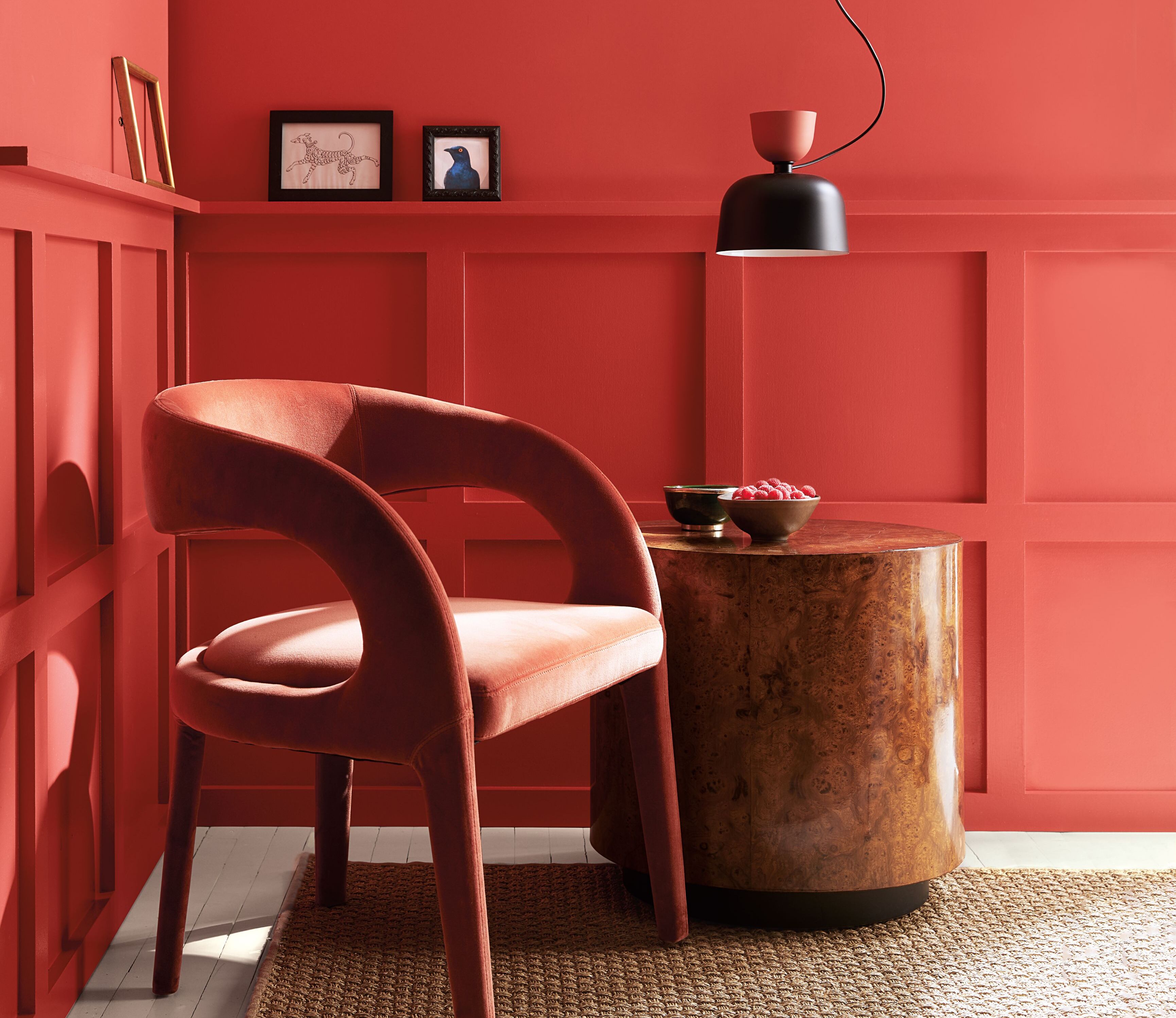 We're itching to decorate with Benjamin Moore's Color of the Year 2023 – this insider explains how it's done
Benjamin Moore's Color of the Year, Raspberry Blush, is a vibrant and vivacious shade we can't wait to decorate with. Their Director shares her tips on how it's done
By Lilith Hudson
-
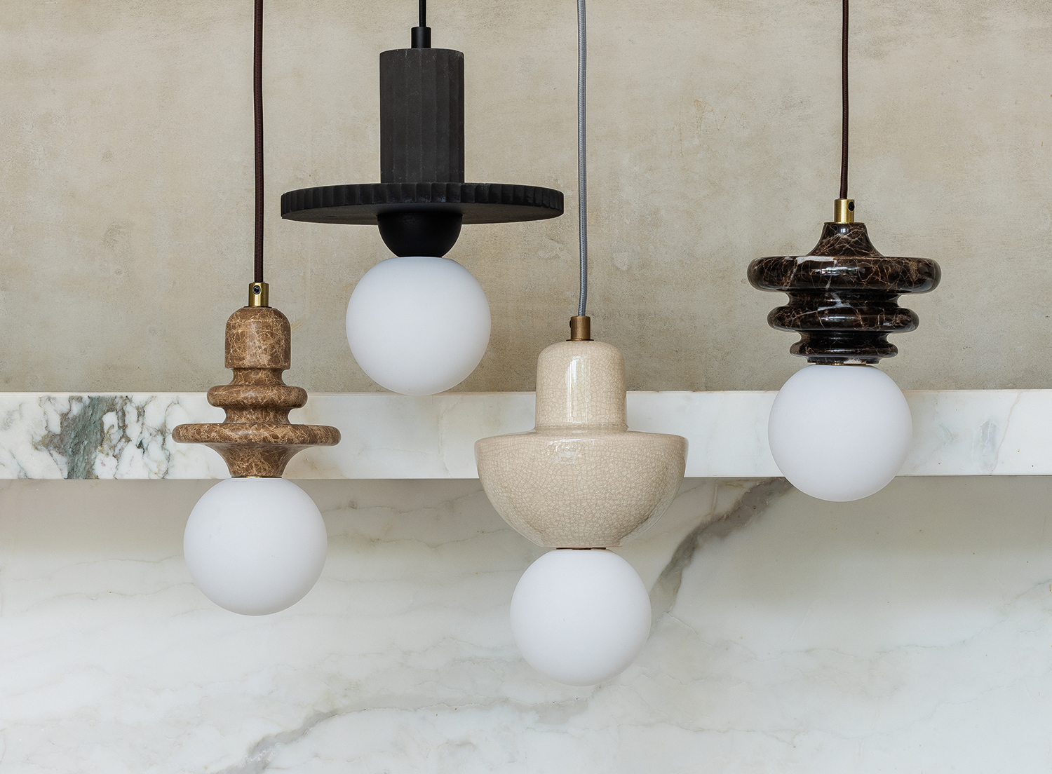 Be the first to see the new lighting collection Livingetc has designed for Lights & Lamps
Marble, concrete, rattan and crackle glaze, we couldn't be prouder of our second lighting collection for Lights & Lamps
By Pip Rich
-
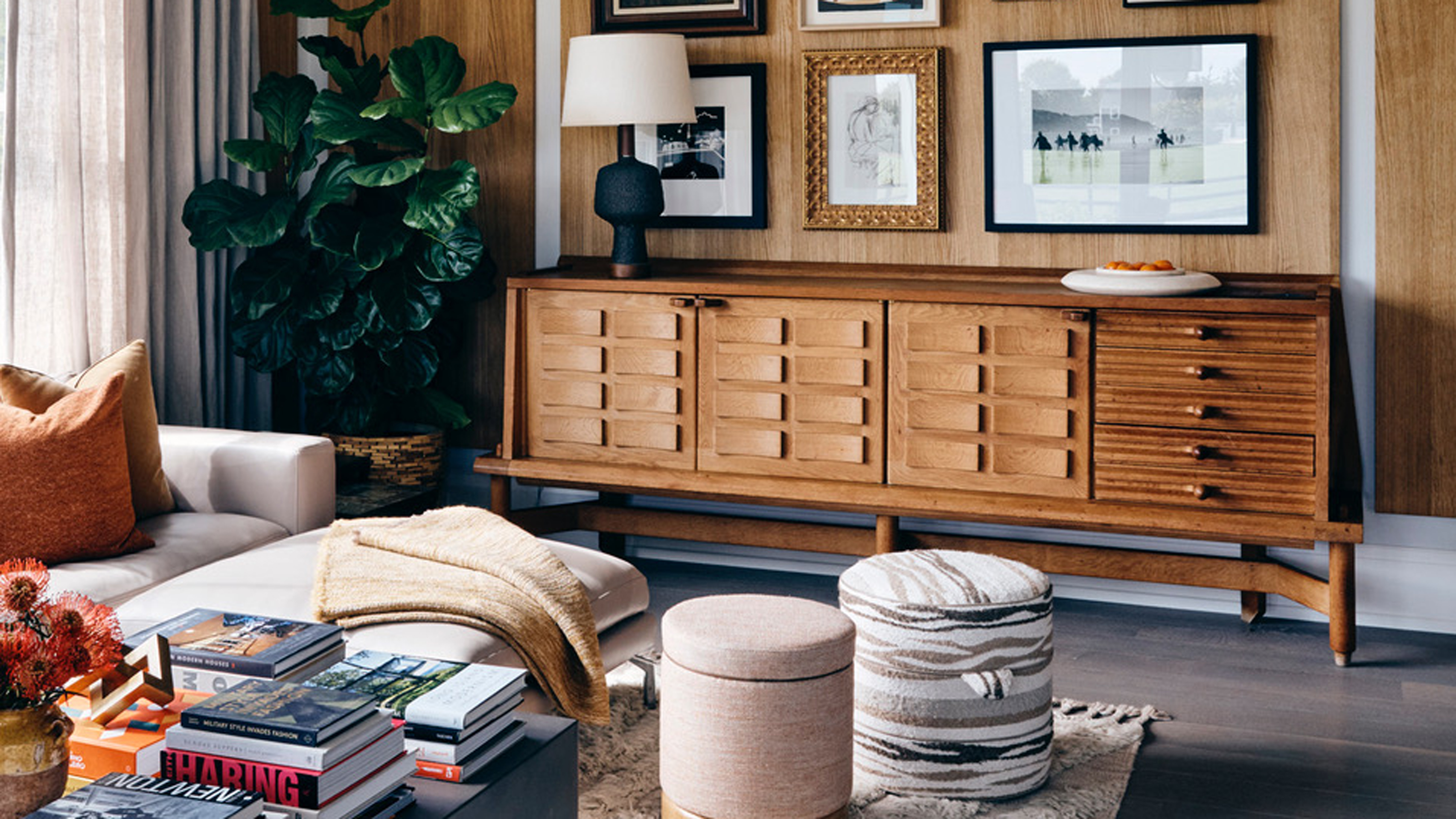 There's a new coffee table styling trend designers are loving for a less pretentious living room
Stacking coffee tables high with books is the interior trend we didn't know we needed. Here's why you should try it, and why it might just have been inspired by Elton John
By Luke Arthur Wells
-
 Livingetc Style Awards 2022 - see the best in modern design as the winners are announced
Our judges have chosen the very best products for your home now
By Livingetc
-
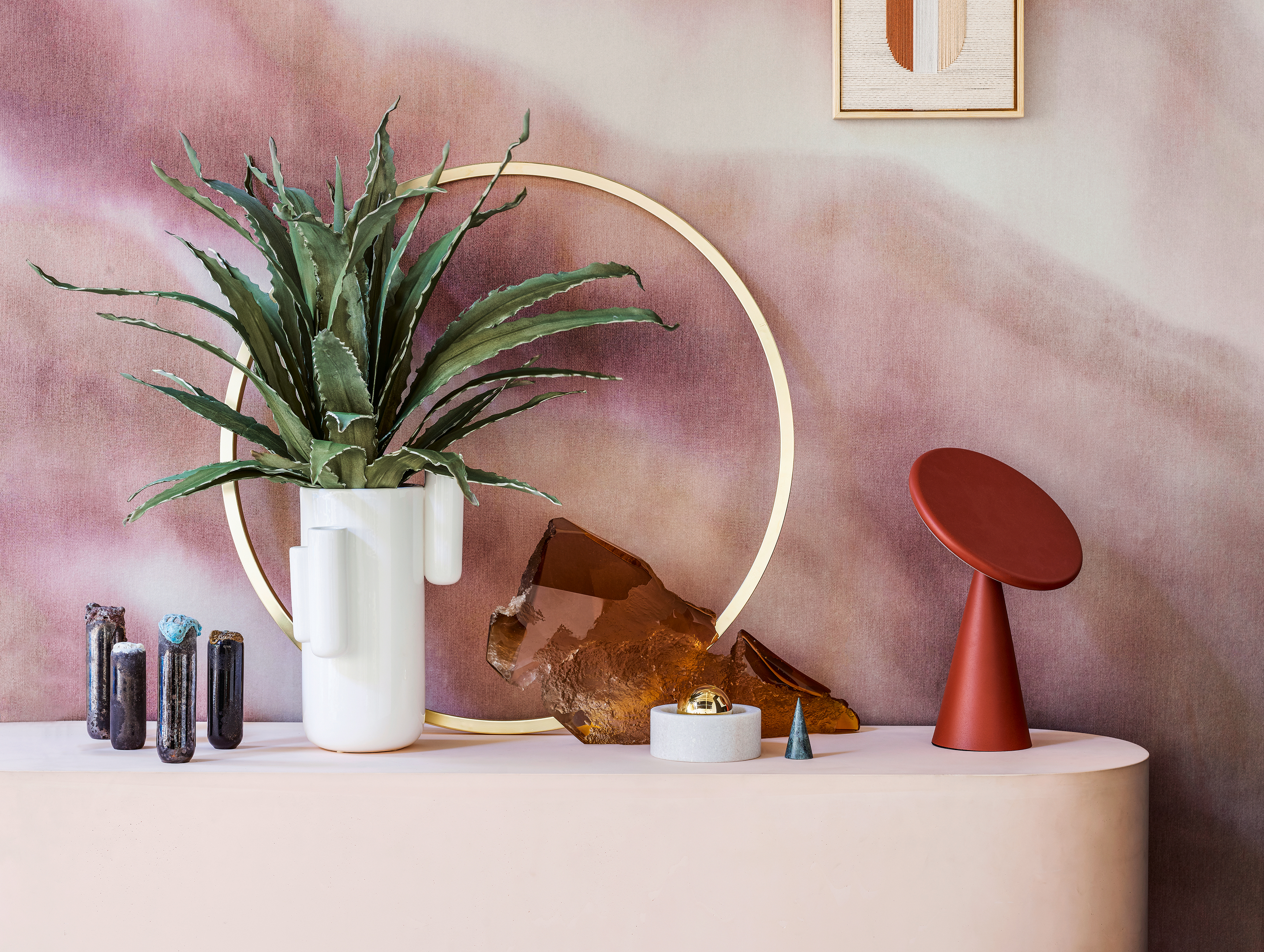 What is Barbiecore? Top designers on this fun new decor trend that's perfect for summer
So much more than just plastic and pink, Barbiecore takes its lead from Margot Robbie's movie style for a fun new decor trend
By Lilith Hudson
-
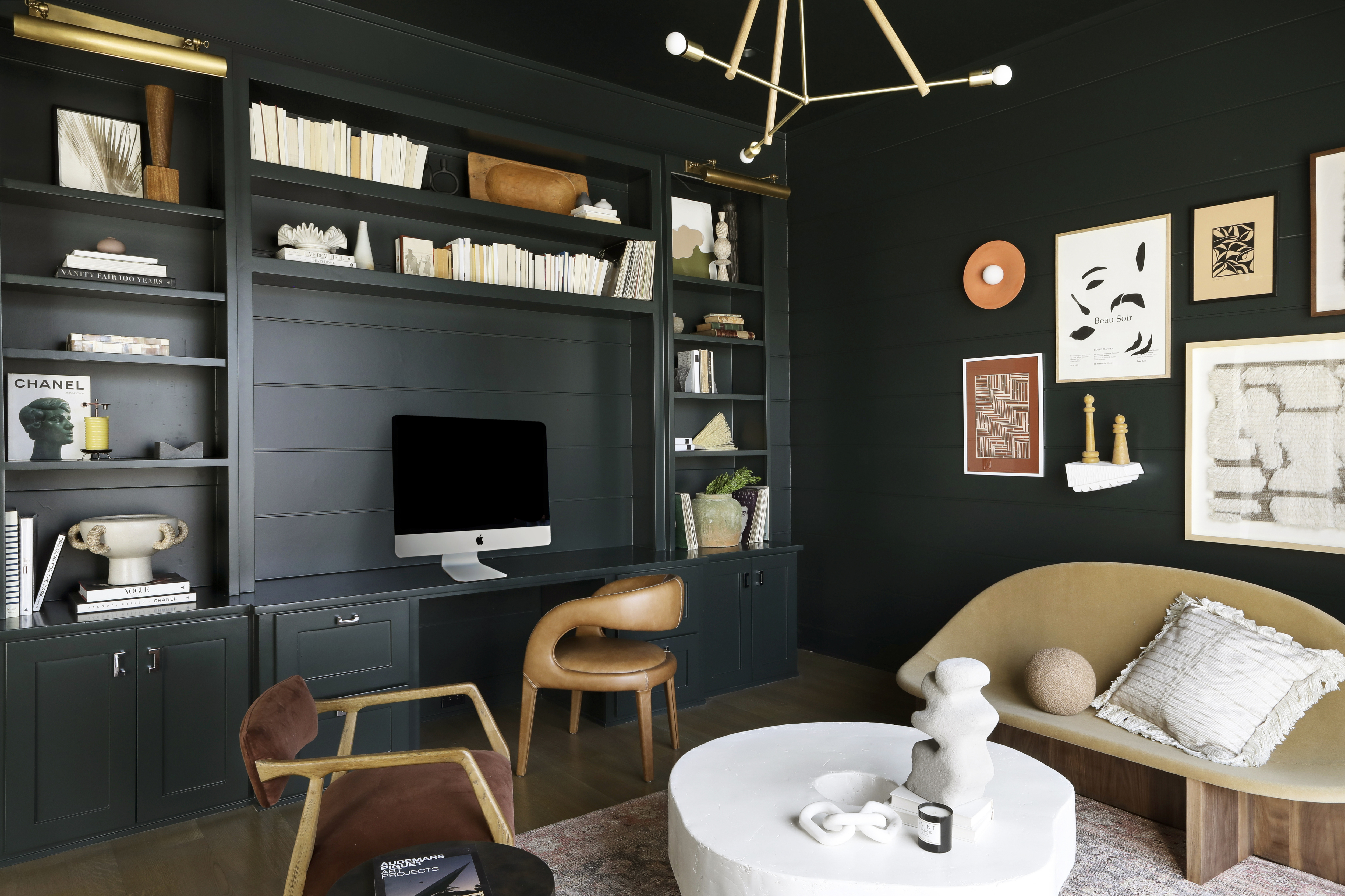 Top designers are all following this new trend that makes your home office a much more creative space
Hint: it's a piece of furniture you wouldn't have thought of but that changes everything about how your office feels
By Aditi Sharma Maheshwari
-
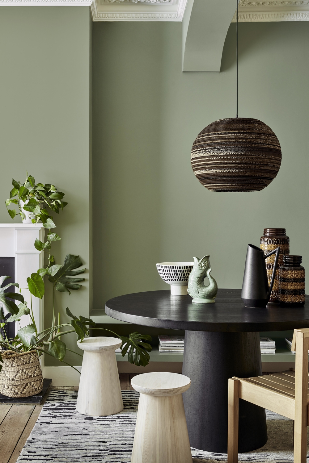 5 ways to make the right color choices to totally transform your space, by Little Greene's Creative Director
Little Greene's Creative Director Ruth Mottershead knows the power the perfect palette can have. Here's how to get it right
By Ruth Mottershead
