Architects Love This Brand New Kitchen Trend That Makes Spaces Look So Well Designed - We've Never Seen This Before
Architects are embracing this brand new trend for statement kitchen hoods in all shapes, sizes and colors - creating spaces that look and feel modern and well-designed
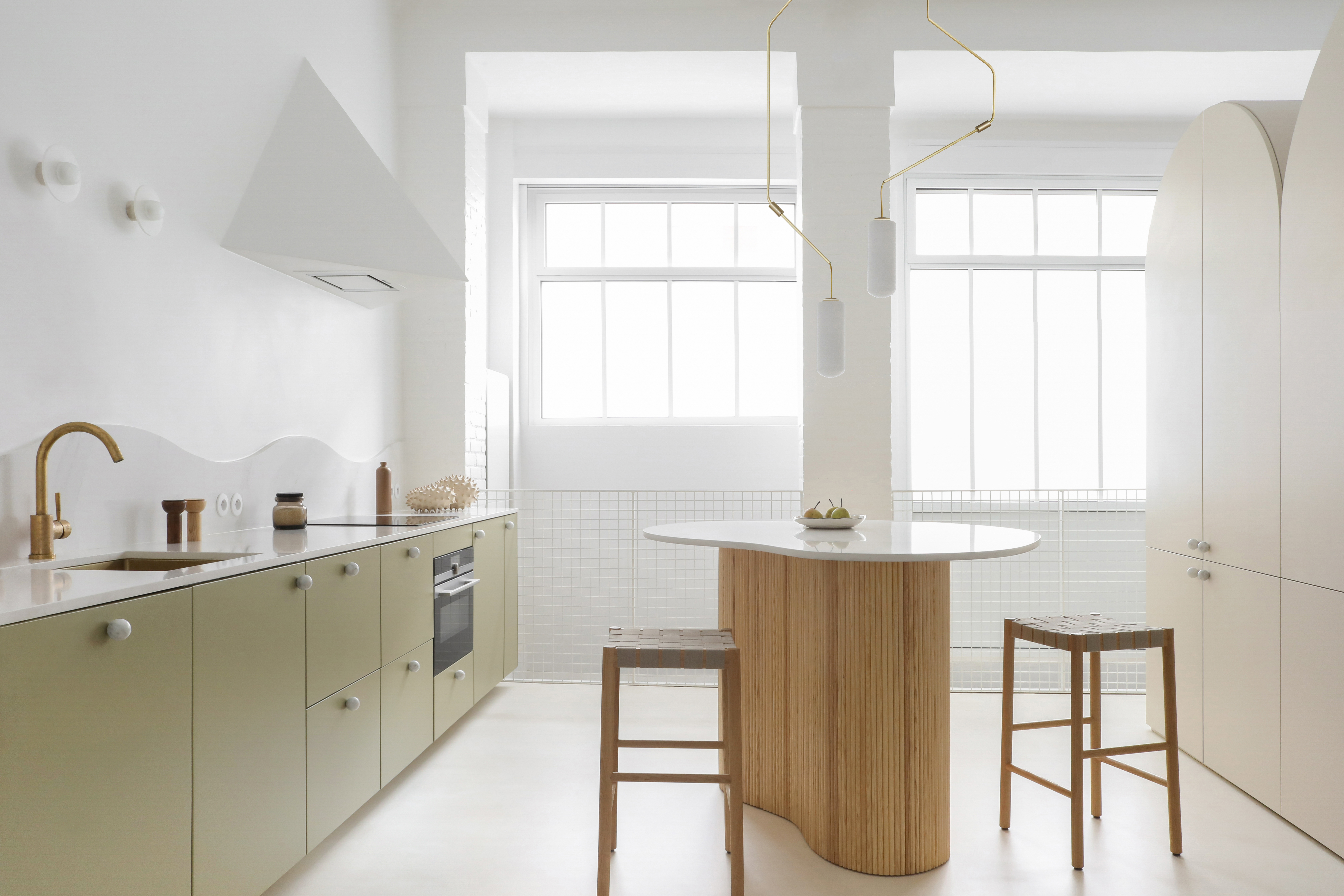
Seamless integration has rendered many of our kitchen appliances invisible (think dishwashers and refrigerators, concealed behind cabinetry) while range hoods often remain a stubborn focal point. But instead of making them disappear, some architects are leaning in, letting the hood stand out.
Often considered an ugly duckling in any modern kitchen, the appliance is designed with gritty functionality in mind: to capture unsavory byproducts like smoke and grease. Thus, conventional materials prioritize practicality (like stainless steel, easier to clean and durable) and purpose-driven shapes (often bulky forms, especially for ducted varieties).
The result? Commercial hoods aren’t always perfect matches for highly custom interiors. ‘[Their] visual expression is not in line with the way our kitchens are evolving,’ says interior architect Jesper Mellgren of Stockholm’s Note (design studio), referring to streamlined products on the market. ‘There is no standard any more, each situation is unique, meaning there is a demand for more flexibility.’
Not to mention, the range hood is even more prominent in today’s open plan kitchens, where appliances are on full display from the rest of the home as we remove walls. ‘Since kitchens become more visible, the design of a kitchen has evolved from a rather practical to a more integrated and cosy atmosphere,’ says Belgium-based interior architect Dries Otten.
And so these hardworking appliances can look especially clumsy without an aesthetic touch, especially since range hoods tend to pull focus. ‘We like to approach the design of spaces in a holistic way and given the range hood typically takes such a central position in the kitchen it’s important that it feels as considered as every other element,’ explains Phoebe Lipscombe, Associate at Australia’s Studio Doherty.
This means a little creativity can turn these eyesores into eye-catching moments of design – and here are just a few range hoods that pop.
1. Use the hood to conceal
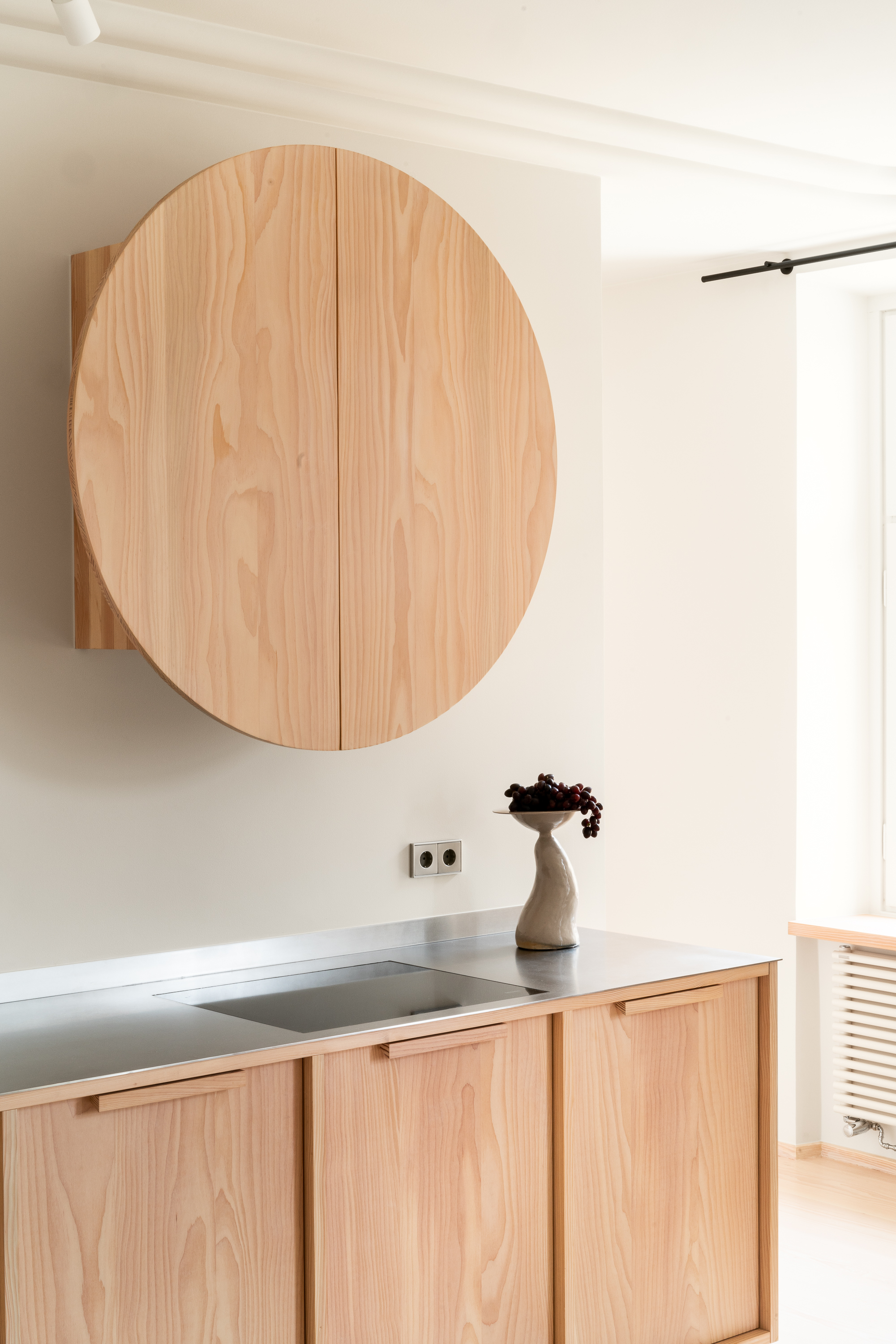
If designing a range hood from scratch sounds like a task best left to engineers, you’re right. But most of these designs are more akin to building cabinetry that surrounds the appliance. Case in point, this brilliant circular hood brings visual interest to a Stockholm home’s otherwise ‘sober’ interior architecture – all while cleverly covering up the mechanics of this minimalist kitchen. ‘The design is simple: An integrated kitchen hood in a squared cabinet with the doors made in two half-circles attached with piano hinges,’ says interior architect Jesper Mellgren.
Be The First To Know
The Livingetc newsletters are your inside source for what’s shaping interiors now - and what’s next. Discover trend forecasts, smart style ideas, and curated shopping inspiration that brings design to life. Subscribe today and stay ahead of the curve.
For Jesper, the range hood represents a chance to create a standout element worthy of attention. “I would like to encourage people to take advantage of the kitchen hood, sometimes being a solitaire in the kitchen,” he says. “It allows you to have a more sculptural approach and treat it as a jewel or icon. The rest of the kitchen is often so regulated by practicalities and more dependent on the design to be coherent.”
2. Use a removable design

When designing your surround, don’t forget that you’ll need to access interior mechanics if the hood needs repair. In this particular design, the elegant built-in construction belies a practical feature. ‘The pyramidal shape is made of plasterboard so it seems to come out of the wall,’ says Hélène Pinaud of Paris’ Heju Studio. ‘But the bottom is made with a screwed plank of MDF so it can be removable — really important if there is a problem with the hood.’
Perfectly integrated, this range hood hints at a deeper design integration throughout the entire studio space. “This workshop has become a unique and unexpected place inspired by vernacular Mediterranean architecture: all in curves, raw materials and masonry furniture,” adds Hélène. “To dress up this place and give it personality, a lot of furniture has been carved directly into the architecture, such as organic reliefs: the daring bench seat in the living room, the sideboard covered in terracotta in the dining room or the pyramidal hood.”
3. Tie in the hood with the backsplash
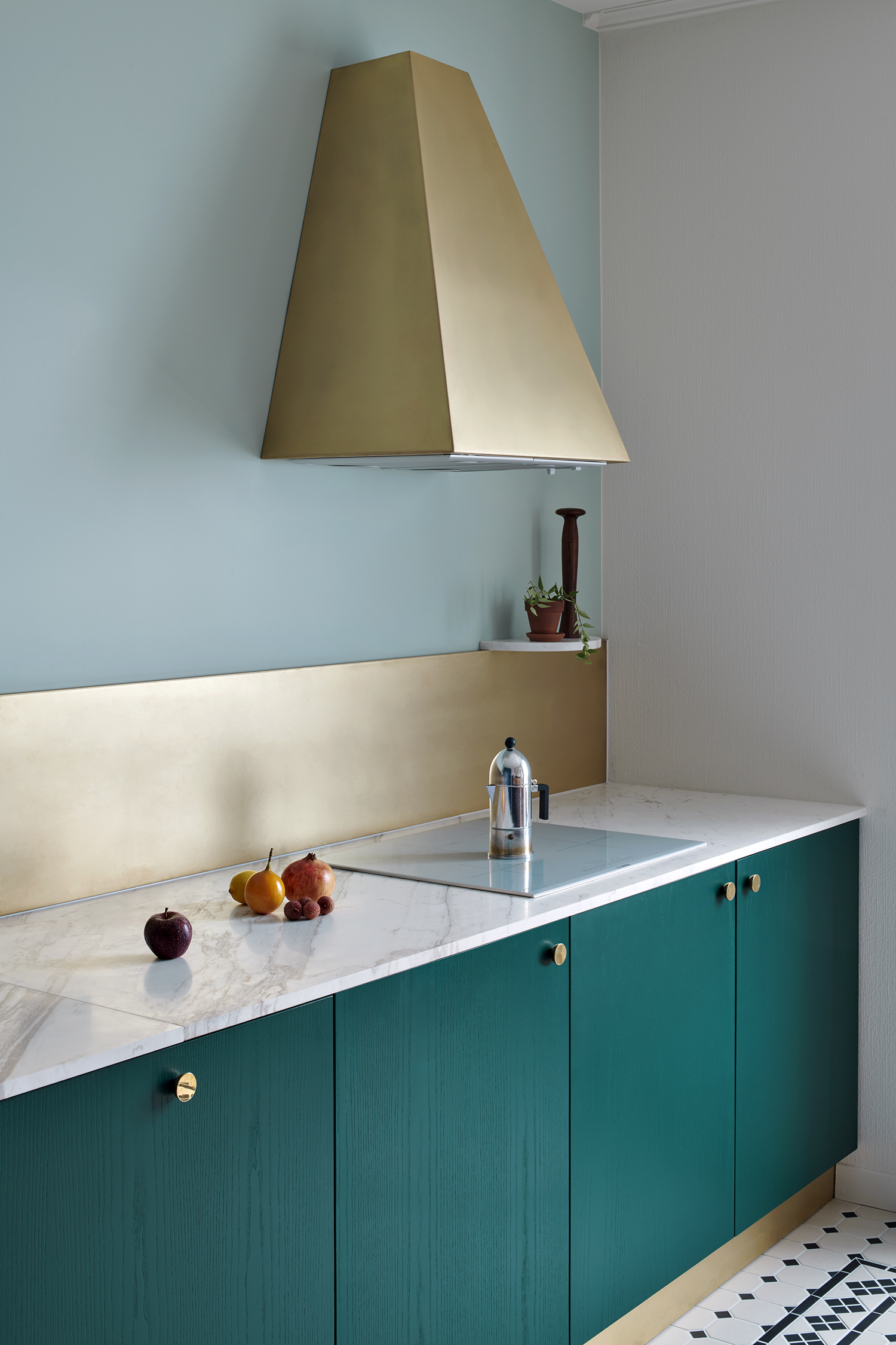
Some architects think of the range hood as a missed opportunity; a moment for cohesive design that shouldn’t be overlooked. ‘We like to give new value and meaning to very simple elements, like plinths, handles, hoods — to all essential elements composing an interior,’ says Camille Bagnoud of Coci Studio, based between Lausanne and London. That impetus takes shape with the hood pictured here, with a unique form and material palette that ties in key elements throughout the kitchen. ‘The brass backsplash and sink echo the truncated pyramid used as a hood,’ adds Camille.
How can you pull all of these elements together in one interior scheme? According to Camille, it helps to simplify the space in your mind before designing. ‘We first think in black and white – the space and the composition come first,” she says. “Then we highlight the elements with colors. We created a palette we enjoy playing with, both in our projects and drawings.’
4. Try lightweight materials
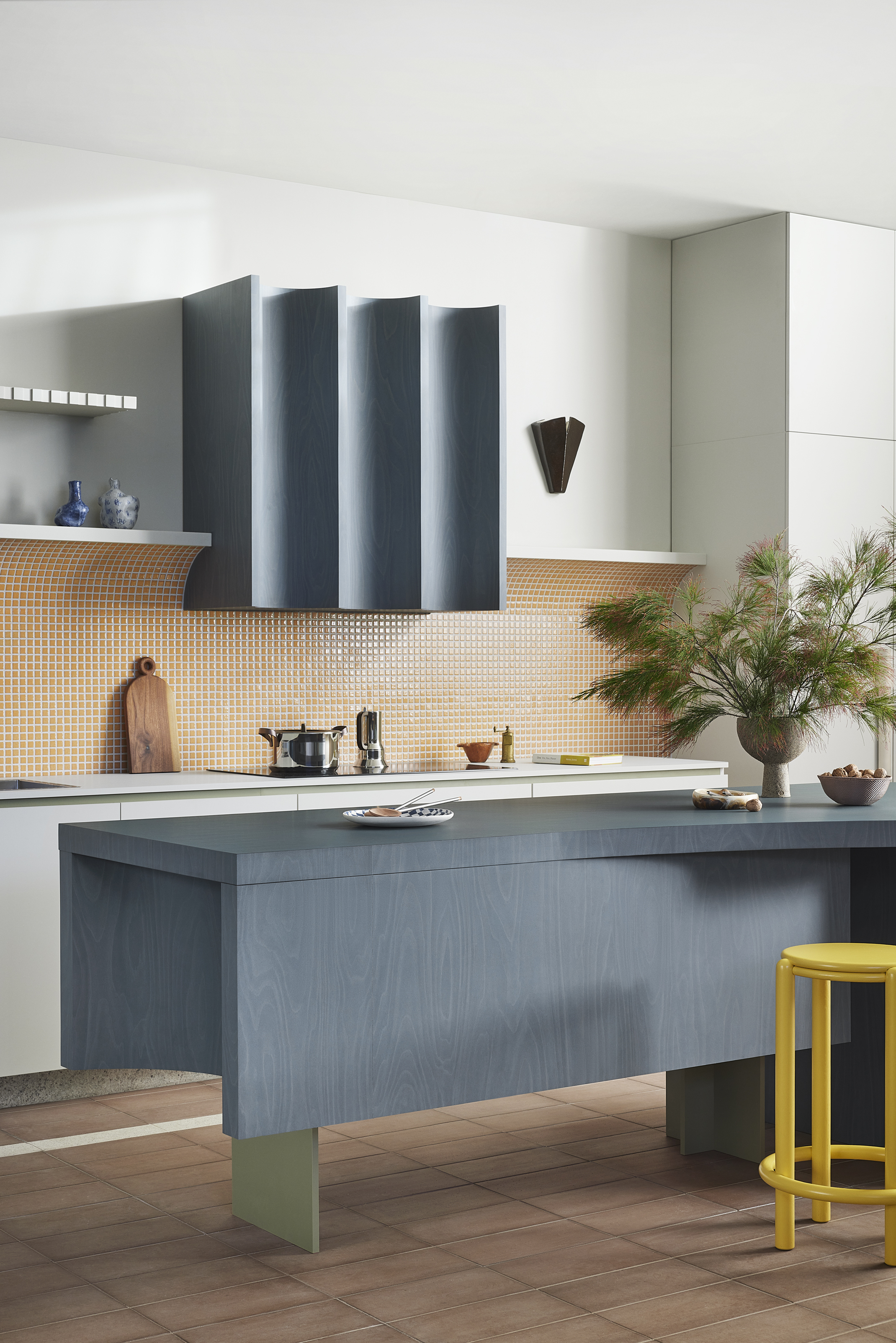
Conventional range hoods are often rendered in metal, but this shell finds a whole new groove. ‘Among the materials we’ve used to cover range hoods are stone, metal, tiles and — as seen in this case — laminate,’ says Phoebe Lipscombe, Associate at Studio Doherty who partnered with Australia’s Laminex on the design. ‘A key thing to keep in mind is the environmental factors: range hood surrounds will attract grease from your cooktop, so make sure whatever material you land on has variation as this will hide all those annoying marks. Also make sure it’s a material that is easy to clean.’
And while you’re experimenting with material, why not mix up the shape? “Playing around with form is also something that could be explored – don’t feel like you have to be wedded to a rectilinear box — although this can also be beautiful in the right setting!” adds Phoebe. The result pictured here brings concave scoops into the fold. “We wanted to see how laminate could be used in a way we hadn’t seen before and expressing the pliability of the material and embracing a sculptural form for the range hood seemed like the best way to create an unexpected kitchen space and design,” she adds.
5. Have fun with the design
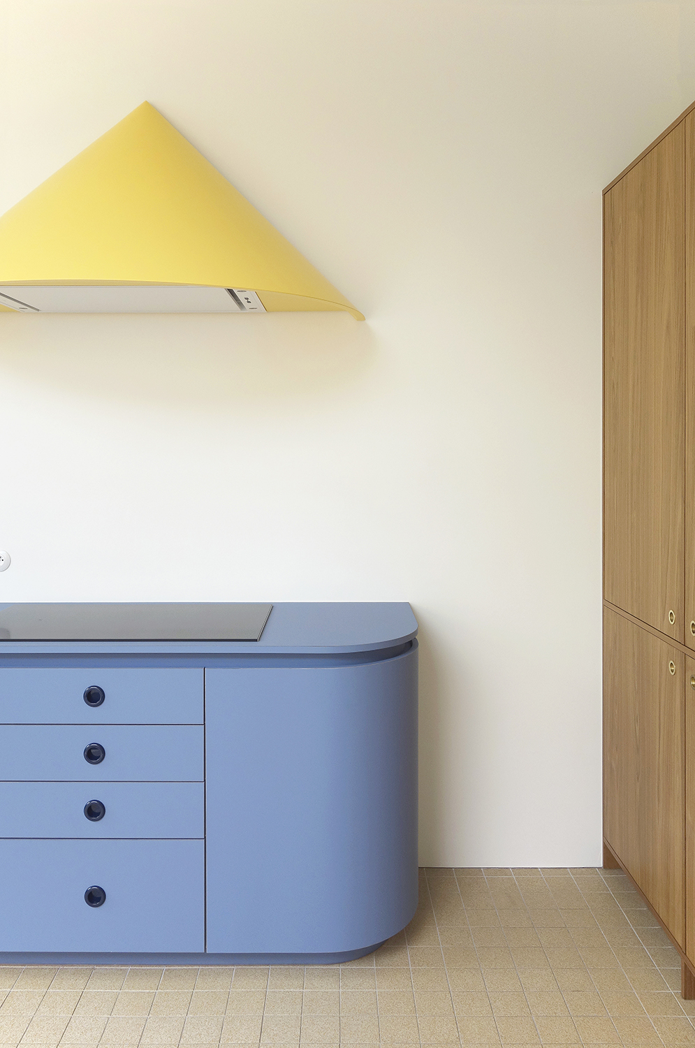
This pointed wooden unit is just one of many cheeky hoods by interior architect Dries Otten, who has explored a range of clever shapes from diamonds to basketball hoops and even disco balls. ‘All choices are good, some choices are funnier,’ he says of his playful designs. For Dries, this particular hood was influenced by the rounded surface beneath it; embracing the kitchen countertop's curved corners, the rounded cone feels right at home. And for this type of hood, Dries recommends giving it space. ‘A similar hood will work best without hanging storage around it,’ he adds.
For Dries, the range hood is an excuse to have a bit of fun — especially in modern open spaces that tend to be visible from other parts of the home. ‘The cooker hood is a necessary part of a kitchen,’ he says. “So we have the choice of trying to hide it or rather emphasizing the hood.” And, since hiding the hood isn’t always an option, Dries often leans into the problem with an eye-popping solution; here, he even painted the hood a sunny yellow, giving it an extra dose of visual interest.
Keith Flanagan is a New York based journalist specialising in design, food and travel. He has been an editor at Time Out New York, and has written for such publications as Architectural Digest, Conde Nast Traveller, Food 52 and USA Today. He regularly contributes to Livingetc, reporting on design trends and offering insight from the biggest names in the US. His intelligent approach to interiors also sees him as an expert in explaining the different disciplines in design.
-
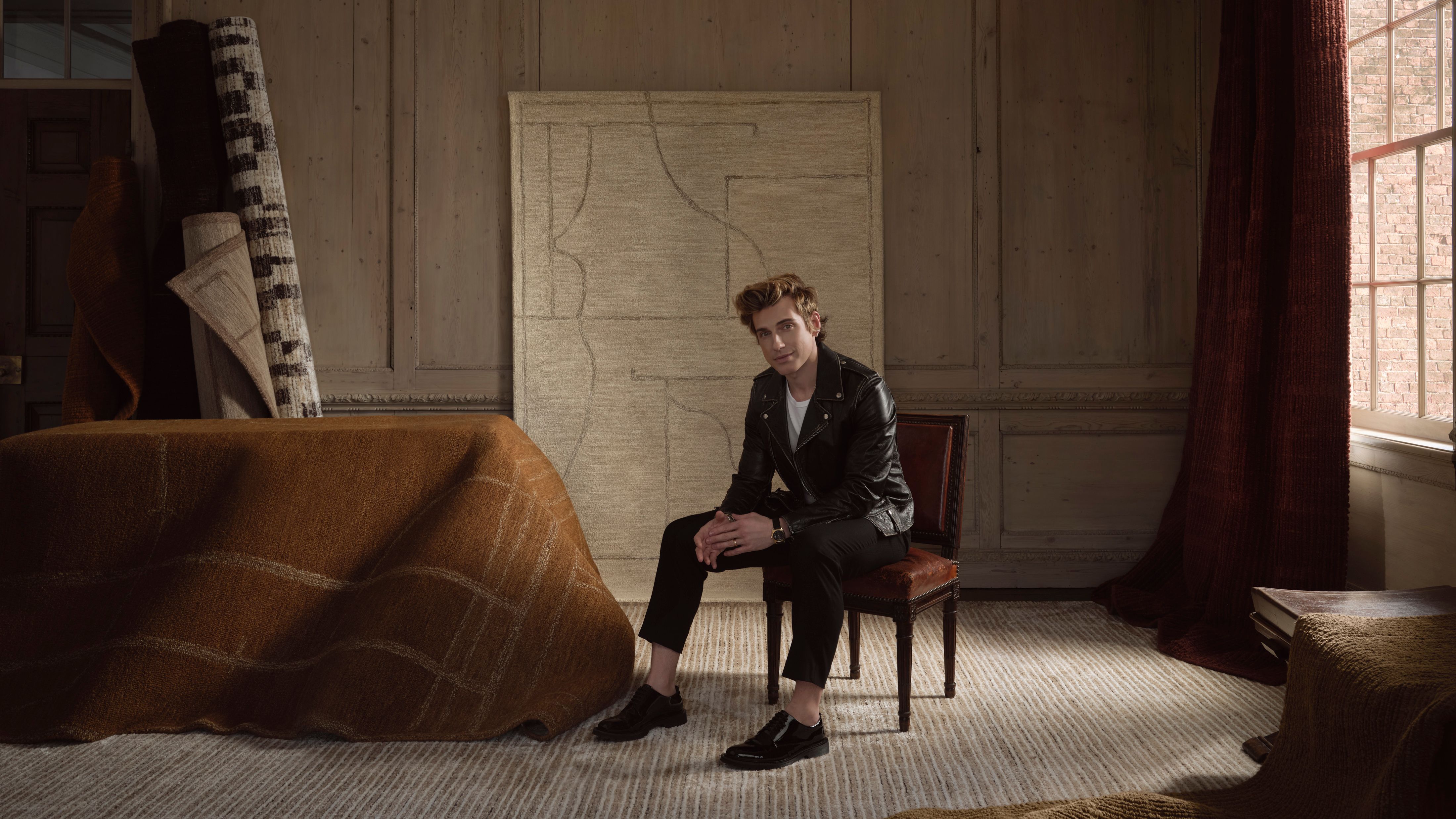 Jeremiah Brent Captures the Grit and Glamour of NYC in His New Loloi Collaboration
The TV-famous interior designer looked out of his own window — and hit the pavement — for a collection that turns city spirit into tactile design
By Julia Demer
-
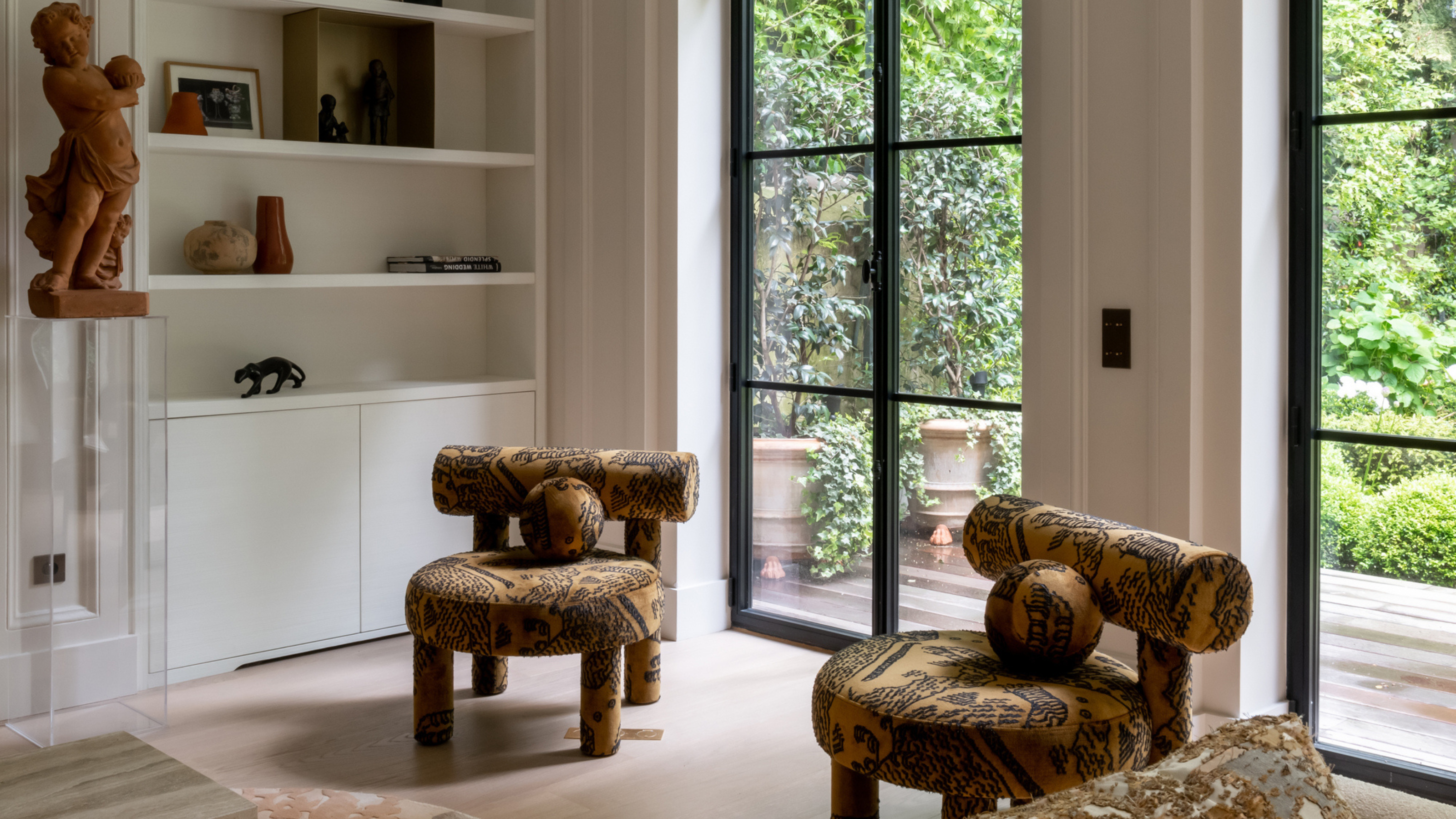 This Specific Fabric Print Is Literally Everywhere Right Now — Here's Why
It's whimsical, artistic, and full of character. We've called it already: Dedar's 'Tiger Mountain' is the fabric that will define 2025
By Devin Toolen