We're calling it – the supersized grouting used in this L.A. home might just be the next big bathroom trend
Chunky grouting is the bathroom trend we didn't know we needed. Take inspiration from how an interior designer used grout in this Los Angeles home and never look back

Tile trends can be a defining part of how we style our bathrooms. For years, the white metro tile and grey grout combination had a grip on homes around the world, while in more recent times it's been all about making bathrooms feel sleeker and almost seamless.
This has meant the use of larger-scale tiles and finer, more delicate grout lines. In fact, even with smaller styles, grout has become something to fade into the background, rather than become a feature. Of course, for every trend, there's a counter-reaction, and the antidote to the monolithic bathroom look is one of our favorite interior design trends right now for a modern bathroom.
The trend sees tiles used with chunky, supersized grouting bringing an unexpected graphic quality to these spaces. 'Using grout lines as a design tool, instead of making them disappear, results in the grout becoming a part of the overall composition,' interior designer Jessica Hansen of Tandem Interiors tells us. 'This allows solid color tiles to become a pattern in a whole new way.'
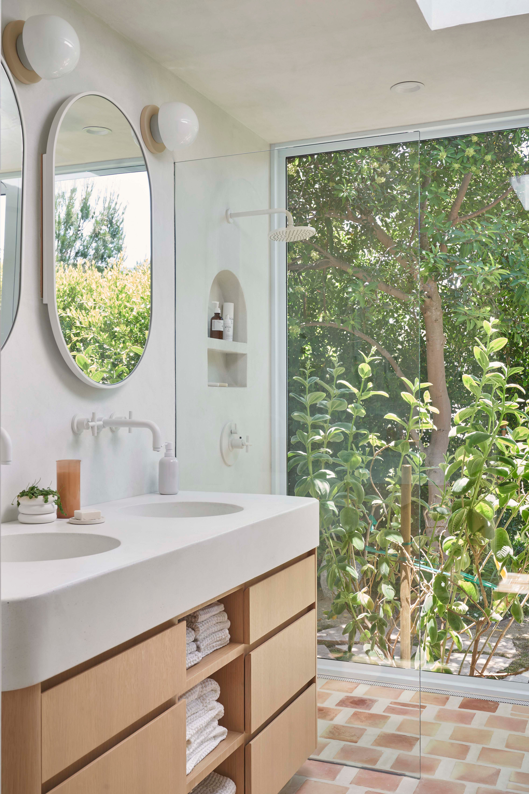
To find examples of how to style the chunky grouting trend in our homes, we didn't have to look far. Jessica, who was the lead designer for this Laurel Canyon property in Los Angeles, used the idea in not one, but three bathrooms when designing the home, playing with scale, composition and proportion in different ways.
Former fashion stylist Jessica Hansen is the founder and lead designer of Tandem Interiors. Here, Livingetc's Hugh Metcalf spoke to her about the innovative use of grout and tile in the bathrooms of this creative Los Angeles home.
One house, four ways to embrace this tile trend
Kids bathroom
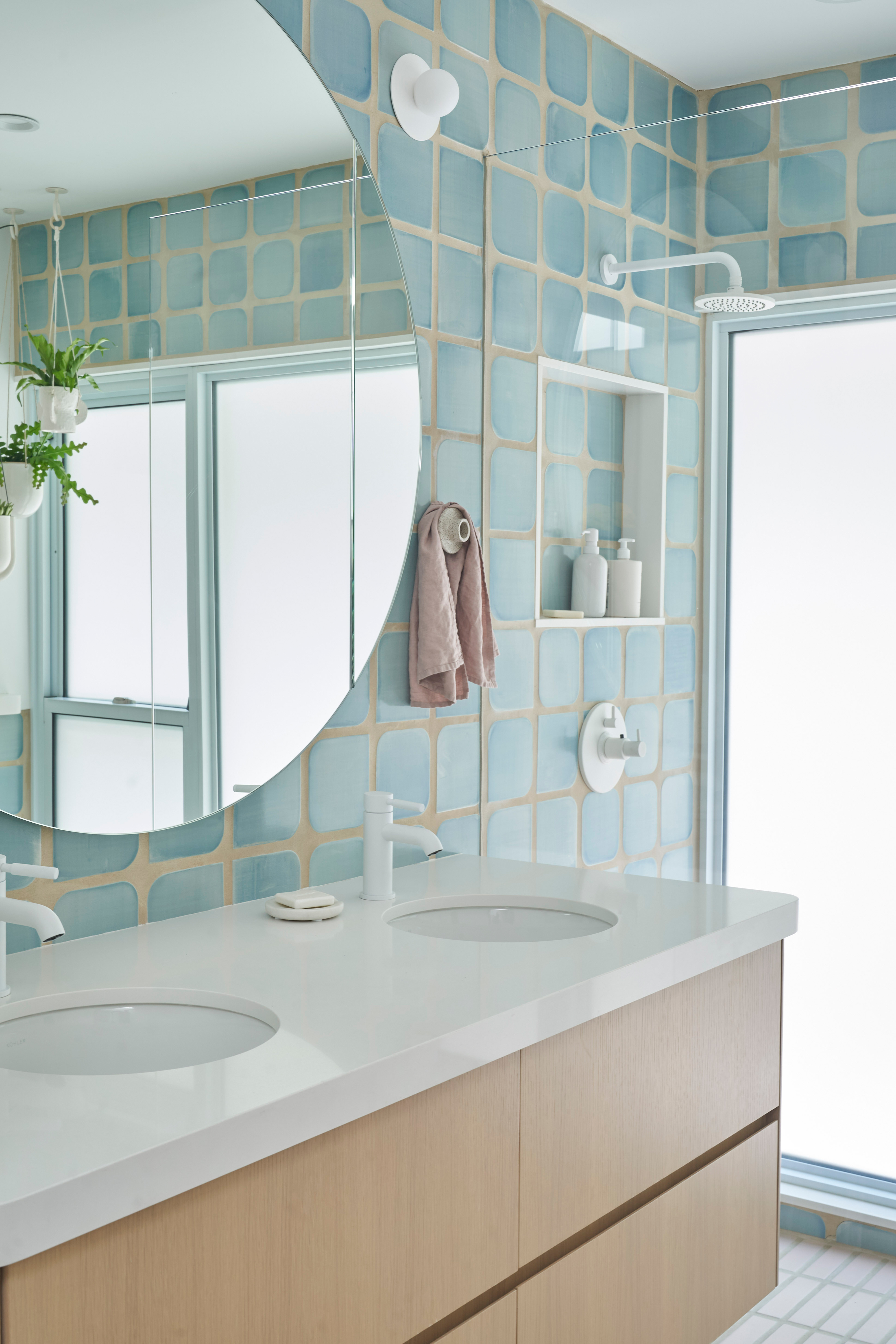
Though you might not believe it, this incredibly stylish space is actually the kids' bathroom, in which Jessica of Tandem Interiors chose a soft blue tile with irregular curved edges. The oversized grouting helps to play up this design detail, where it might have been lost in a tighter tile layout.
'Without the large grout spacing the unique shape of the squircle tile by Tempest Tileworks in the kids bath would be lost,' says Jessica. 'The grout here really allows us to frame each individual tile.'
Be The First To Know
The Livingetc newsletters are your inside source for what’s shaping interiors now - and what’s next. Discover trend forecasts, smart style ideas, and curated shopping inspiration that brings design to life. Subscribe today and stay ahead of the curve.
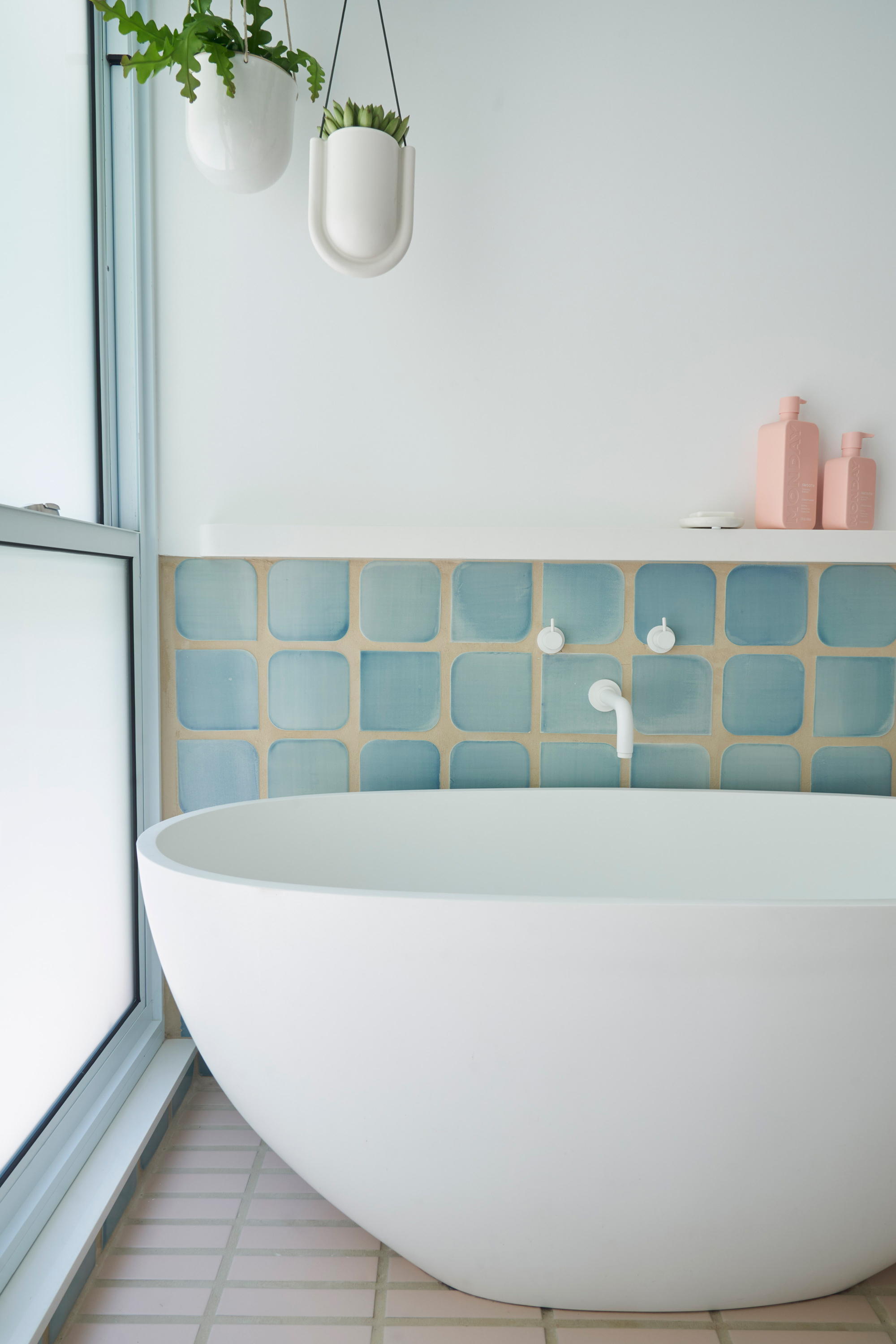
Color also had an important role to play in uniting the designs. 'We chose white hardware, white faucets, white paint. We wanted to bring all of the outside light in and have it be reflected throughout,' Jessica says.
Each room with tile has a dominant pale color - pale blue in the kids bathroom, pale terracotta in the primary bath, pale butter in the guest, and pale green in the kitchen. 'These serene bathroom colors don't detract from the serenity of the outdoor space,' the interior designer explains.
In the kids' bathroom, a different approach was taken with the floors to the walls, using a stack bond layout combined with the chunky grouting for a modern, graphic edge.
Main bathroom
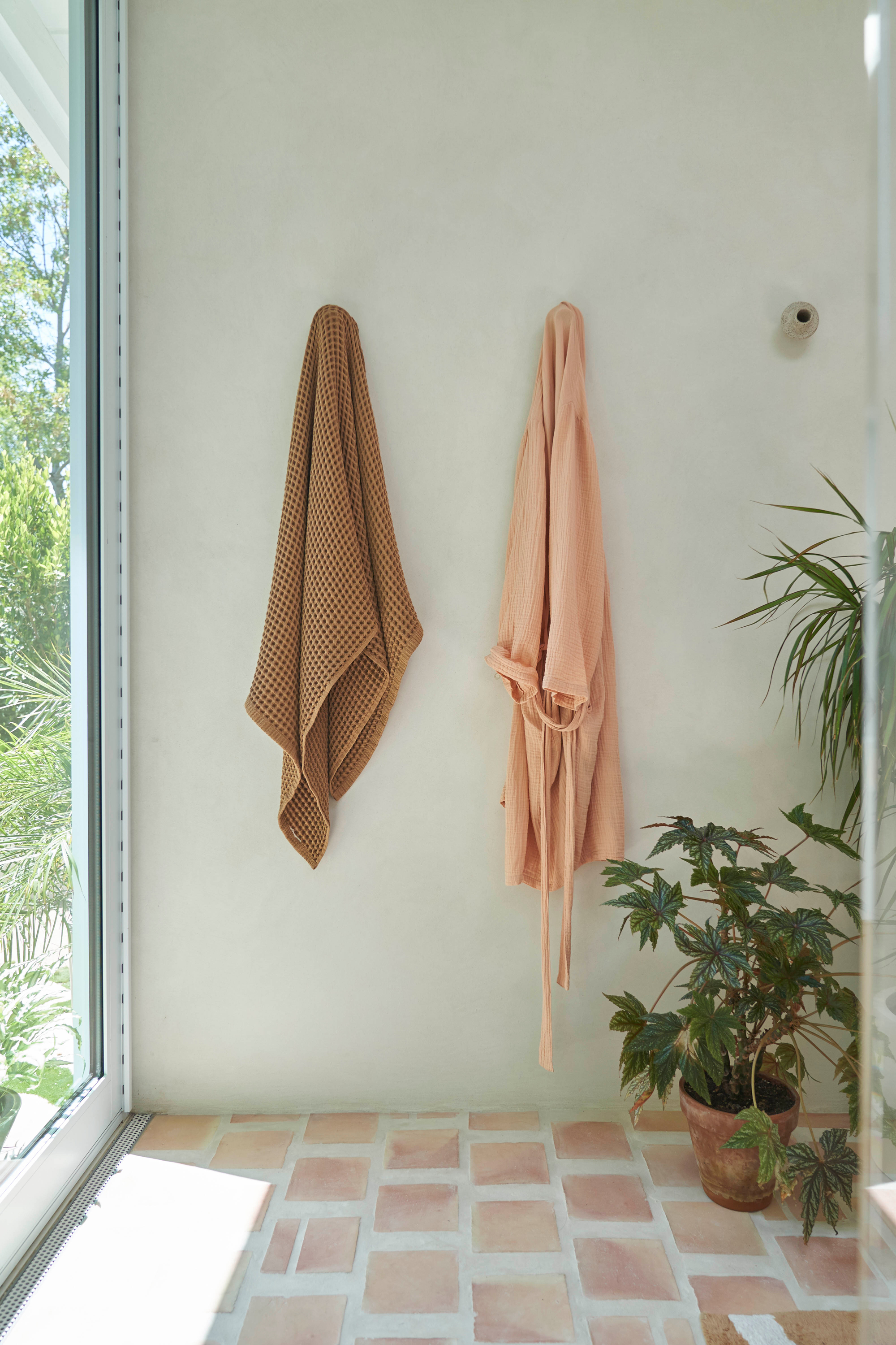
The one thing all the bathrooms of the home do have in common is the type of tile considered to be paired with the more substantial grout lines. 'The type of tile that suits this look is definitely solid color,' Jessica says, 'with maybe a slight variation – tiles that do not have an intrinsic pattern of their own.'
The terracotta tile used in the main bathroom perhaps best demonstrates how this variation in tile color adds softness to the bathroom, especially with the warm neutral tile and grout color combination.
The main bathroom tile layout gives a modern twist on a traditional brick bond that feels both charmingly rustic yet fresh and exciting, too.
Guest bathroom
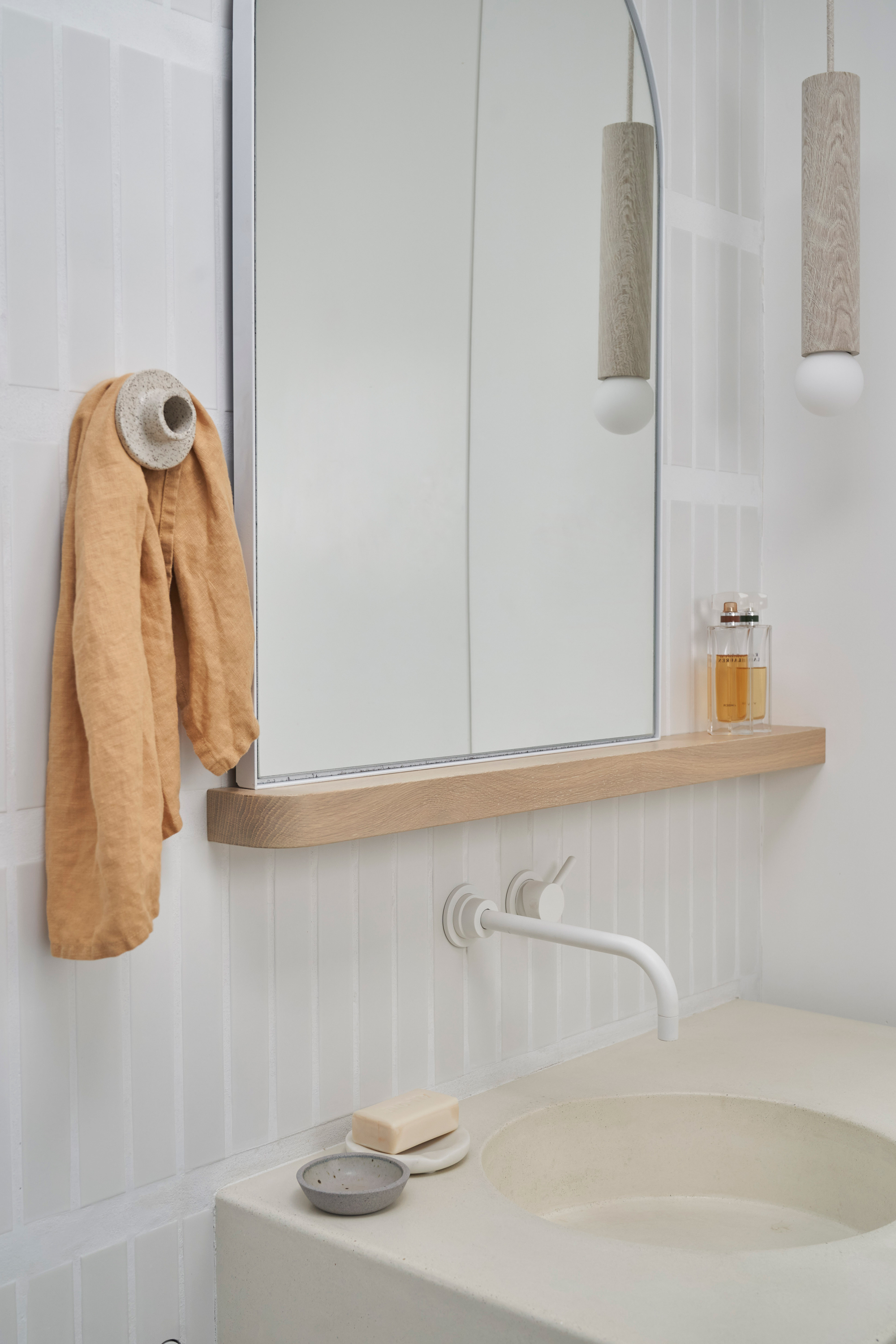
Undoubtedly the guest bathroom is the most subtle use of this idea, but showcases how it can serve a purpose in a completely different way. Using a pale tile and matching grout doesn't create the same contrast as the other spaces, but still offers a sense of texture, while the non-uniformity of oversized horizontal grouting versus the narrow lines between the tiles vertically even adds some rhythm to the bathroom walls.
'The right choice of grout color is essential,' says Jessica of the chunky grouting trend. 'We use an incredible grout company called Grout 360 who will custom match anything. The options are endless and become a design detail all their own.'
It goes to show that this property just tips its toes in the potential design applications of this bathroom trend.
Where can I buy tiles online?
Everyone's favorite DIY store has a surprisingly broad tile choice to consider for your bathroom reno.
You might not expect to be able to find tiles on Wayfair, but there's plenty of innovative options if you don't mind not seeing samples before buying.
For your everyday porcelain and ceramic tiles, Lowes has a great selection to choose from in modern styles.

Hugh is Livingetc.com’s editor. With 8 years in the interiors industry under his belt, he has the nose for what people want to know about re-decorating their homes. He prides himself as an expert trend forecaster, visiting design fairs, showrooms and keeping an eye out for emerging designers to hone his eye. He joined Livingetc back in 2022 as a content editor, as a long-time reader of the print magazine, before becoming its online editor. Hugh has previously spent time as an editor for a kitchen and bathroom magazine, and has written for “hands-on” home brands such as Homebuilding & Renovating and Grand Designs magazine, so his knowledge of what it takes to create a home goes beyond the surface, too. Though not a trained interior designer, Hugh has cut his design teeth by managing several major interior design projects to date, each for private clients. He's also a keen DIYer — he's done everything from laying his own patio and building an integrated cooker hood from scratch, to undertaking plenty of creative IKEA hacks to help achieve the luxurious look he loves in design, when his budget doesn't always stretch that far.
-
 Burl Wood Decor Is 2025’s Most Coveted Comeback — Here’s How to Get the Storied Swirls for Less
Irregularity is the ultimate luxury, but you don’t need an antiques dealer to find it
By Julia Demer Published
-
 5 Garden Features That Instantly Add Value to Your Home — While Making Your Outdoor Space More Practical, too
Get to know all the expert tips and tricks for making your backyard a standout selling point for your home.
By Maya Glantz Published