This Sydney hotel's rooftop restaurant shows how to use 2023's big color trends to perfection
A Sydney rooftop hotel where layered textures, angular lines, and earthy tones culminate in a beautiful contemporary space
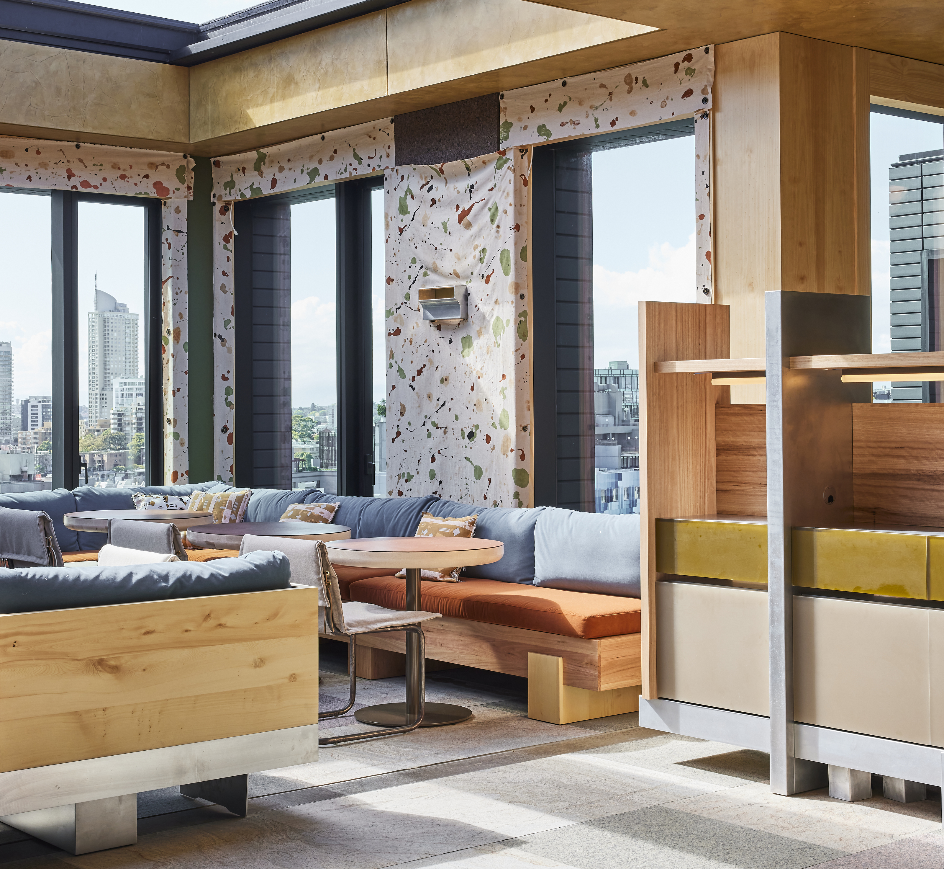
On the sprawling rooftop of the Ace Hotel in Sydney with vistas overlooking the Surry Hills skyline lies Kiln, a restaurant that's just had a complete redesign at the hands of the famed designer, Fiona Lynch. Her colorful design acts as a masterclass in how to mix contrasting materials with angular lines for a contemporary, visually intriguing space.
Kiln – comprising a lounge, two restaurant spaces, and multiple bars and outdoor terraces – was inspired by the building's former site as a garment trade building and before that, Australia's first-ever ceramics kiln. The result is a combination of contrasting textures, earthy tones, and angular lines for a look that's as welcoming as it is modern.
'We were tasked with creating something distinct from the rest of the hotel spaces,' says Fiona Lynch, owner and founder of the firm, Fiona Lynch Office. 'We wanted to offer a vantage point into a distinctly Australian space – one that reflects Australia’s culture, colors, and design language through the lens of the Ace Hotel's unique style.'
It's this unique style of gorgeous fabrics in pretty patterns juxtaposed with harsh, angular surfaces, that we just can't get enough of.
We spoke with Fiona to learn three of her valuable interior design lessons on how to mix materials and textures for a cohesive look so you can put them to the test.
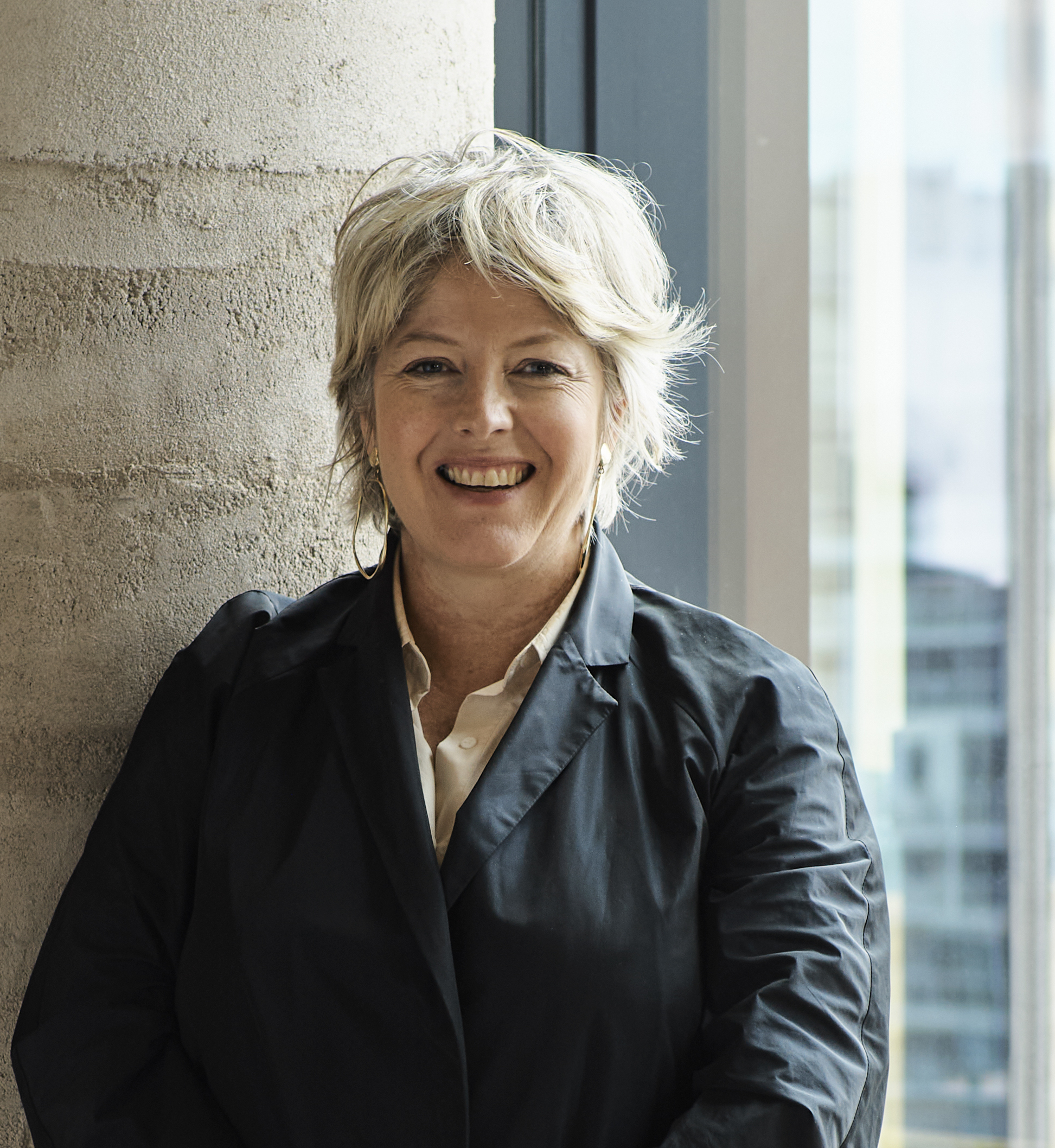
Fiona is the owner and founder of Fiona Lynch Office, an Australia-based interior design studio that services architectural and interior design projects for both commercial and residential properties. Their style of spirited minimalism incorporates bespoke furniture, lighting, and joinery with an emphasis on ecological responsibility.
1. Contrast materials for a layered look
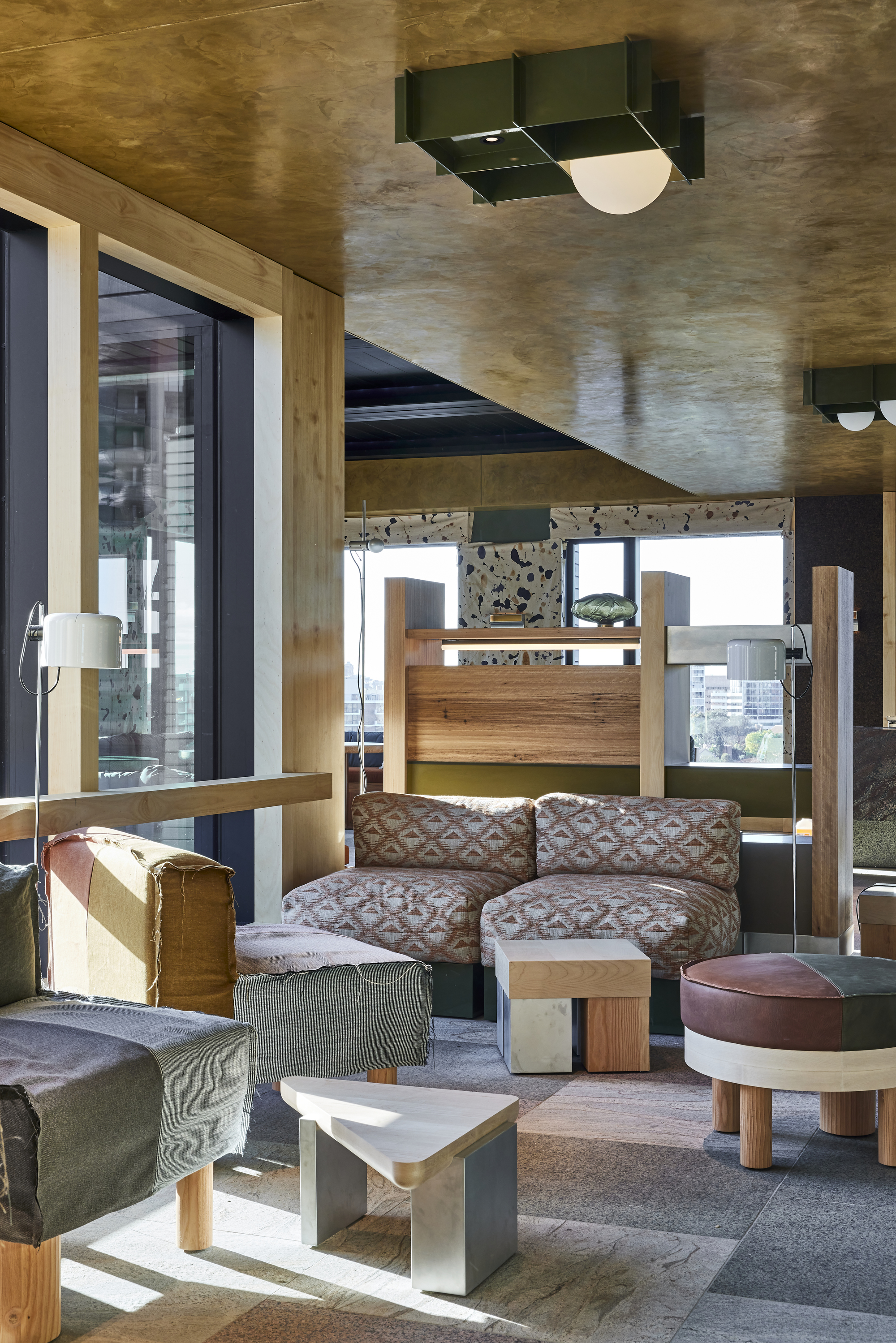
For a lesson on layered textures, you needn't look any further than Kiln's lounge (pictured here). The soft patchwork style upholstery on the colorful seating contrasts with the modern rustic living room interior designed in wood and stone.
'Layered materiality is a hallmark of our studio, which is evident in the mix of woods and metals with stones and textiles that were used in the Kiln project,' says Fiona of Fiona Lynch Office. 'The combined tactility of these materials (however unexpected) is somehow familiar while offering a contrast between natural and built environments.'
Be The First To Know
The Livingetc newsletters are your inside source for what’s shaping interiors now - and what’s next. Discover trend forecasts, smart style ideas, and curated shopping inspiration that brings design to life. Subscribe today and stay ahead of the curve.
Despite such stark contrasts in materials, the overall look is nonetheless cohesive with a warm, relaxing feel. The rich earth tones in the fabric are echoed in the leather accents on the stool which, in turn, marry beautifully with the warmth of the surrounding wood. According to Fiona, this idea of mirroring concepts is key to making contrasting materials gel with one another.
'It's a pairing that can be created within a residential interior through the use of upholstery or textiles against harder, more natural materials like timber, stone, or metals like brass and steel, and it can also be softened through color,' she explains. 'We used a careful selection of mixed materials to create an ambiance that transcends the space.'
2. Take inspiration from natural surroundings for your color palette
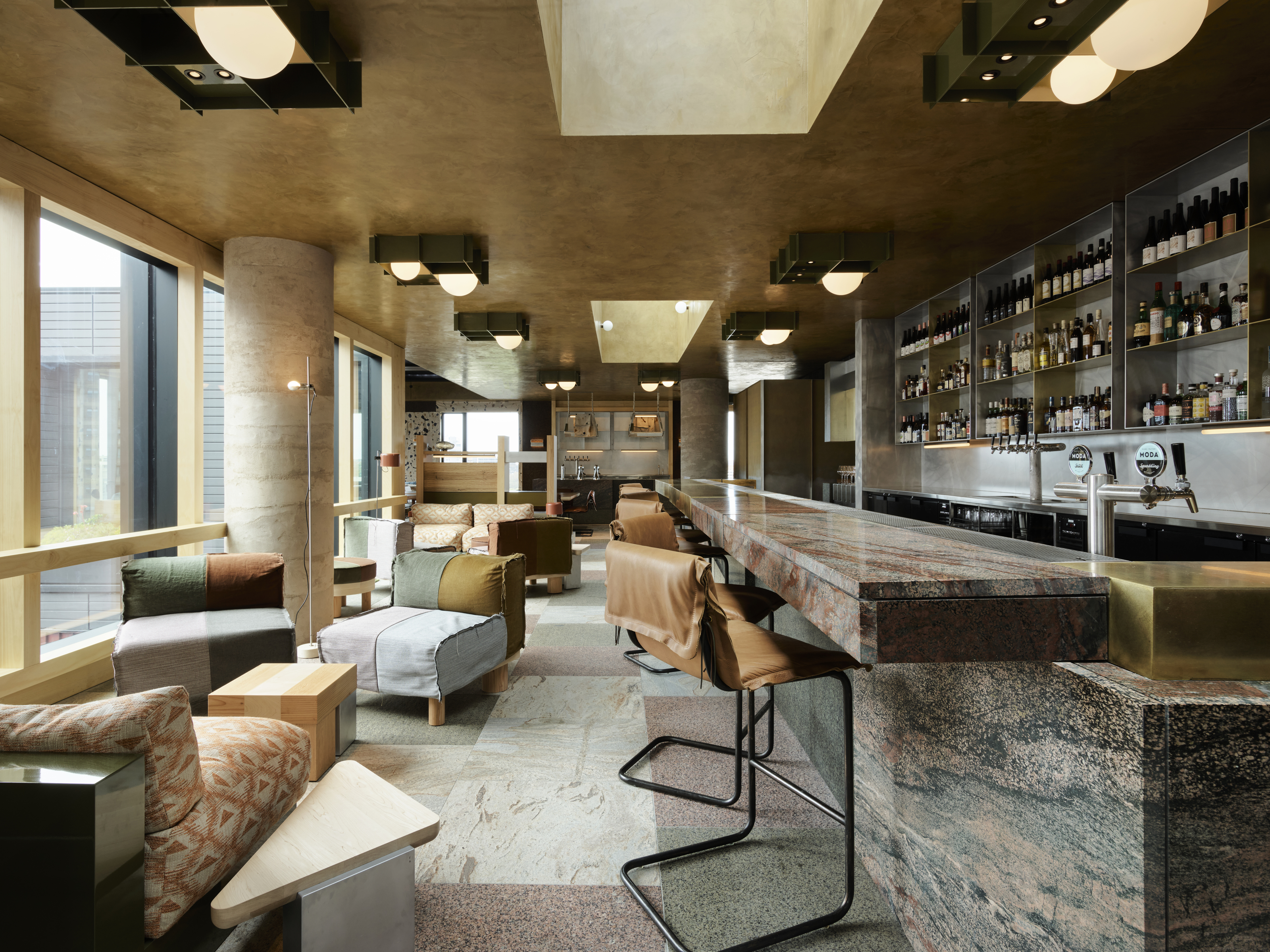
When experimenting with an eclectic style through mixed materials, considered use of color should never be underestimated. If you're wondering how to create a color palette that will tie your design together, Fiona suggests taking inspiration from your natural surroundings.
'We used a mix of colors, from warm to cool, which transition through the spaces, giving each its patina,' she explains. 'The colors are evocative of the Australian landscape with a palette inspired by the country’s luminescent hues, and include a striking blue resin wall, an alchemically nuanced ombré finish, and other impactful design details.'
Kiln's grounding color palette is echoed on every surface from floor to ceiling. This helps make the space feel homogenous despite the different materials and textures used.
'In your own home, creating a scheme that reflects what's outside your window, in your natural vicinity, or on your horizon line is the perfect localized inspiration when it comes to color,' says Fiona. That way, not only does the cohesive feel run throughout your home as the space unfolds, but it blurs the boundaries of interior and exterior, too.
3. Use angular shapes and clean lines
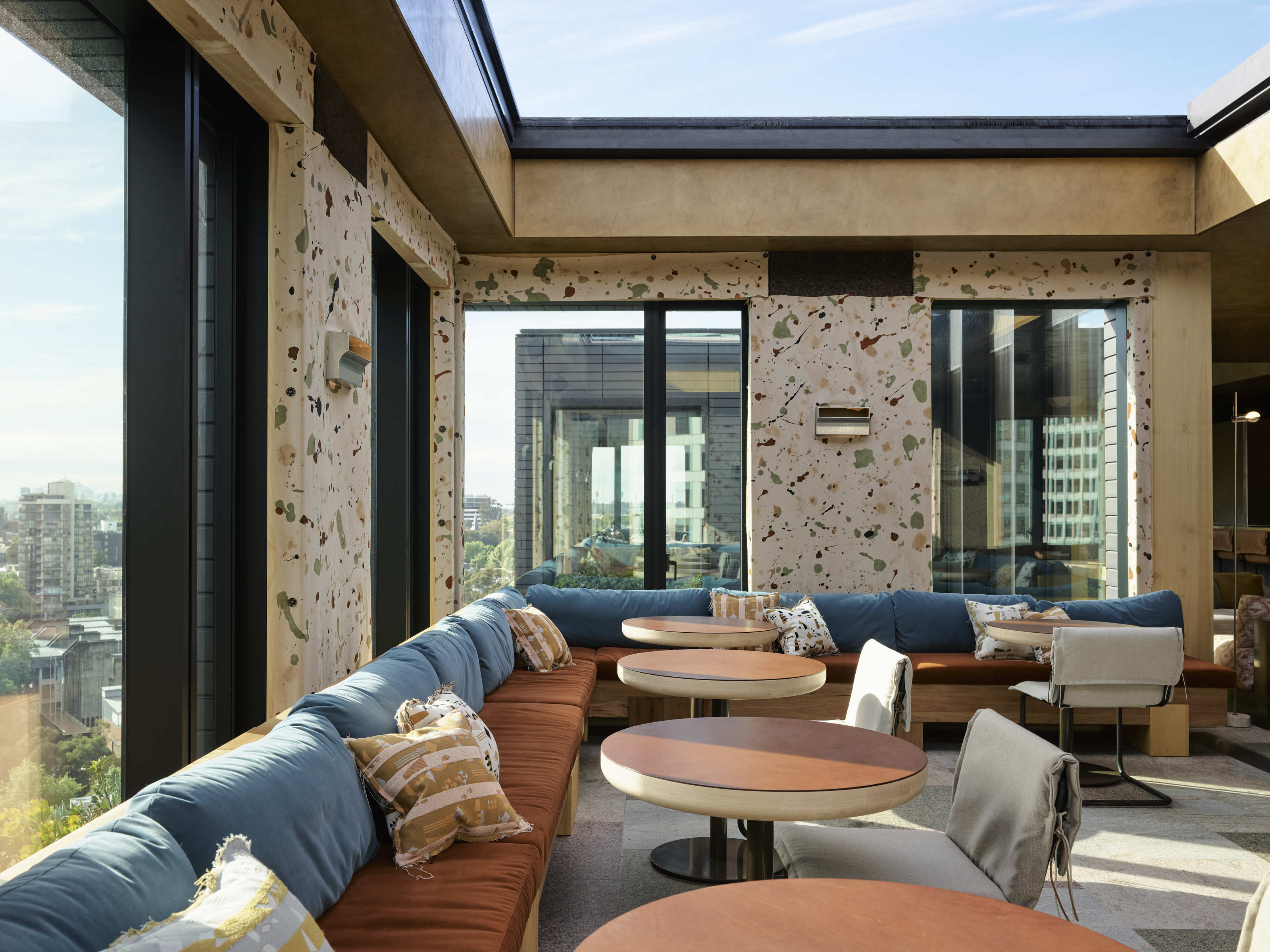
Although the curved furniture trend has dominated design in the past year, clean and straight lines have proven to be a timeless classic. In Fiona's design, she uses angular shapes to create geometric furniture that forms its tessellations.
These harsh lines pair well with the stone surfaces on the bar while likewise complimenting the softer spaces, like the seating, through their direct contrasts. 'Our designs focus on longevity and timelessness, so for us, it was about respecting the space and its intrinsic historical characteristics,' Fiona says.
The stunning views from the 18-story high dining space reveal Central Station's sandstone façade, the surrounding train tracks, plus a single sail of the Opera House beyond. It was these views that inspired Fiona's design of the banquette seating around the perimeters of the dining room.
'The angularity of some of the other furnishings was created by using the multitude of woods native to Australia,' adds Fiona. 'And the distinctive Australian stone flooring and bar were inspired by the sculptor Isamu Noguchi, iconic for his use of interesting geometries in supple ways, with materials that were usually more stoic.'
Similar shapes (and colors) are also echoed in the paint spatter effect on the wallcovering in the dining spaces. Ecological aims have always been at the forefront of Fiona's designs. This custom-designed, hand-printed textile was made using a pigment from waste materials.
'Our team salvaged materials from the actual construction site then crushed this refuse to create a first-of-its-kind pigment,' she notes. Whoever said you had to sacrifice beauty for sustainability?

Lilith Hudson is a freelance writer and regular contributor to Livingetc. She holds an MA in Magazine Journalism from City, University of London, and has written for various titles including Homes & Gardens, House Beautiful, Advnture, the Saturday Times Magazine, Evening Standard, DJ Mag, Metro, and The Simple Things Magazine.
Prior to going freelance, Lilith was the News and Trends Editor at Livingetc. It was a role that helped her develop a keen eye for spotting all the latest micro-trends, interior hacks, and viral decor must-haves you need in your home. With a constant ear to the ground on the design scene, she's ahead of the curve when it comes to the latest color that's sweeping interiors or the hot new style to decorate our homes.
-
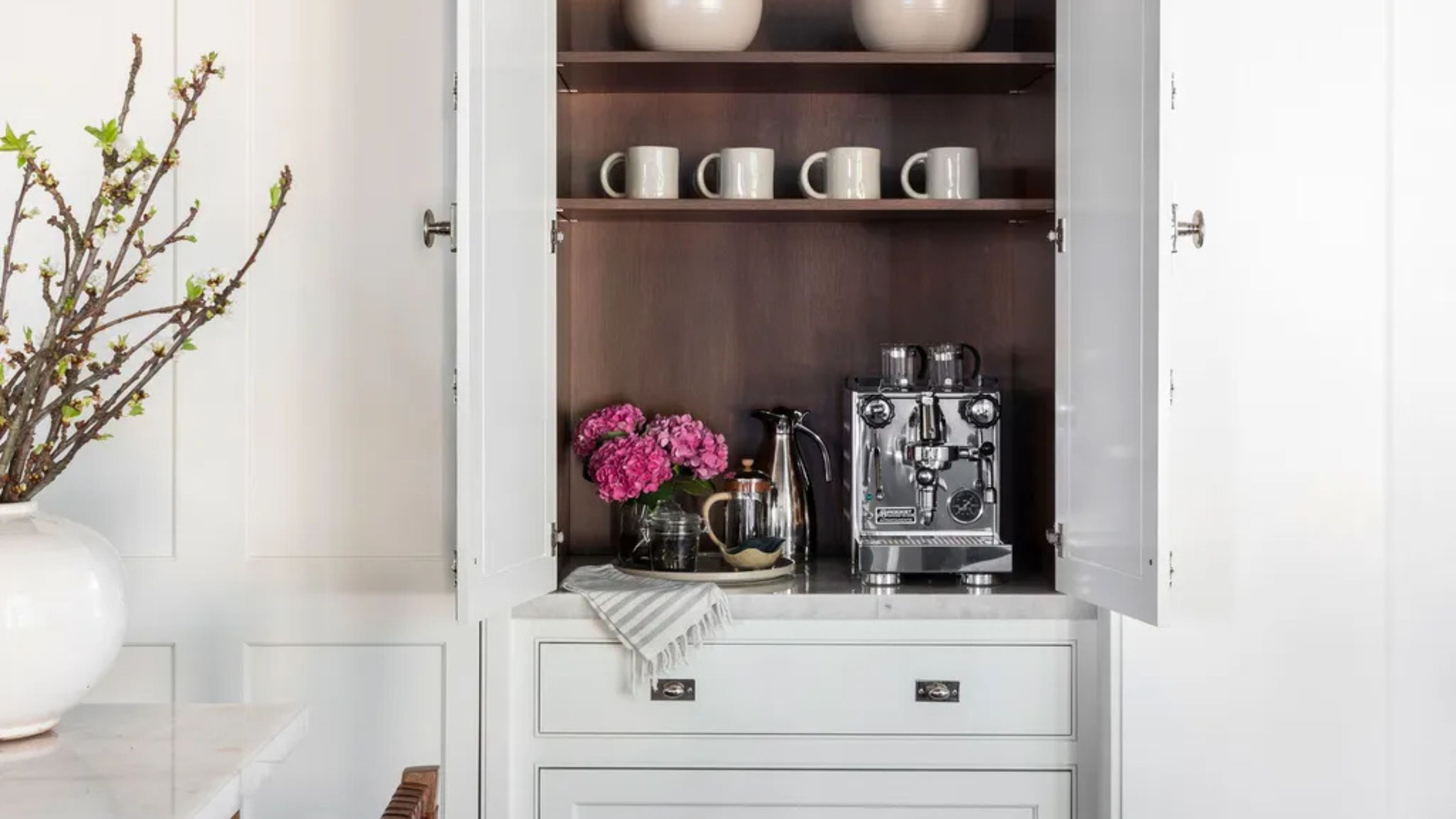 Turns Out the Coolest New Café is Actually In Your Kitchen — Here's How to Steal the Style of TikTok's Latest Trend
Goodbye, over-priced lattes. Hello, home-brewed coffee with friends. TikTok's 'Home Cafe' trend brings stylish cafe culture into the comfort of your own home
By Devin Toolen Published
-
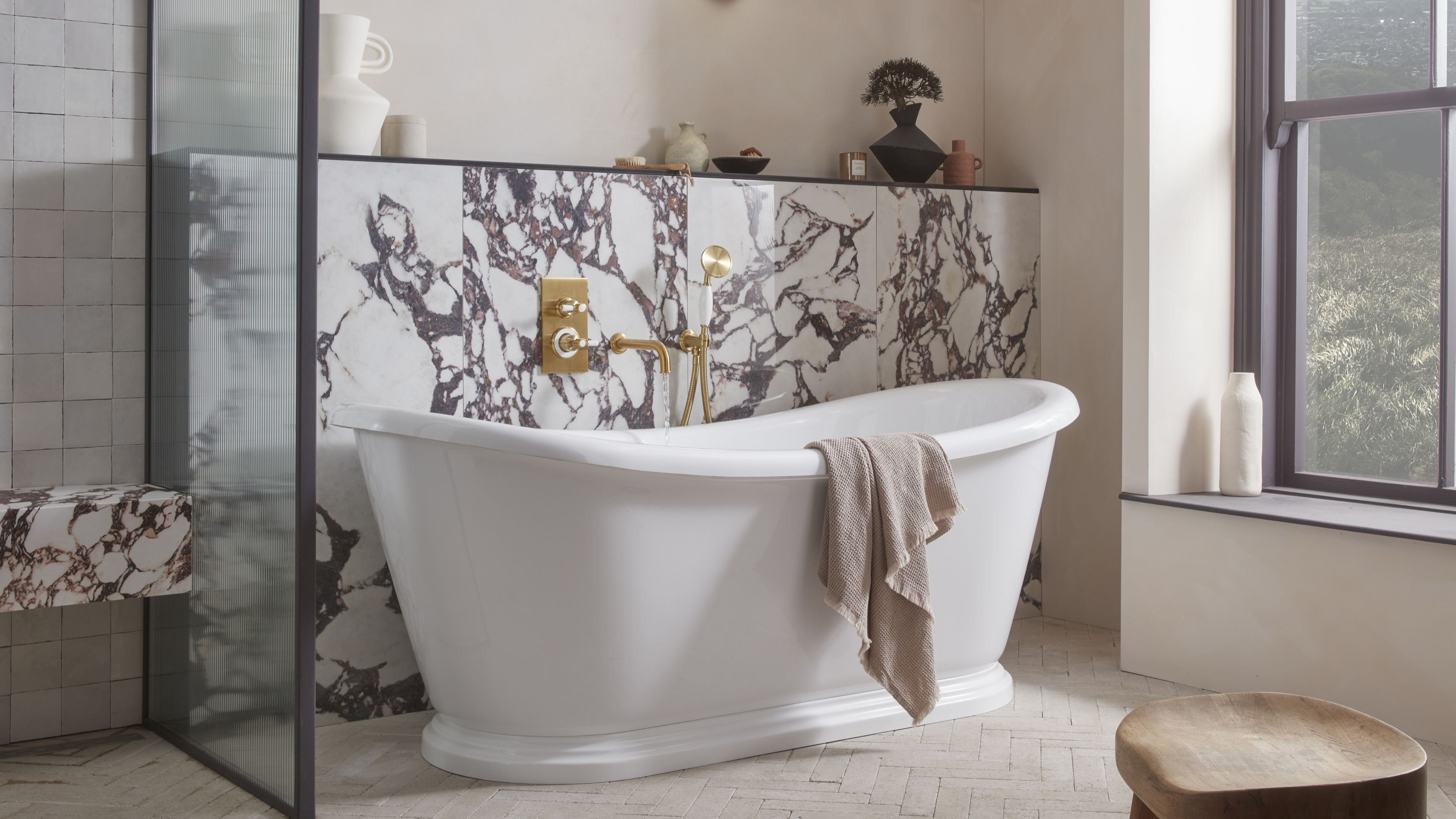 5 Bathroom Layouts That Look Dated in 2025 — Plus the Alternatives Designers Use Instead for a More Contemporary Space
For a bathroom that feels in line with the times, avoid these layouts and be more intentional with the placement and positioning of your features and fixtures
By Lilith Hudson Published