Designers Love To Use This Peaceful Decor Trend — "It Transforms The Ordinary Into The Extraordinary"
Interior experts use tadelakt, a waterproof Moroccan plaster with a polished finish, to shine up contemporary walls and surfaces
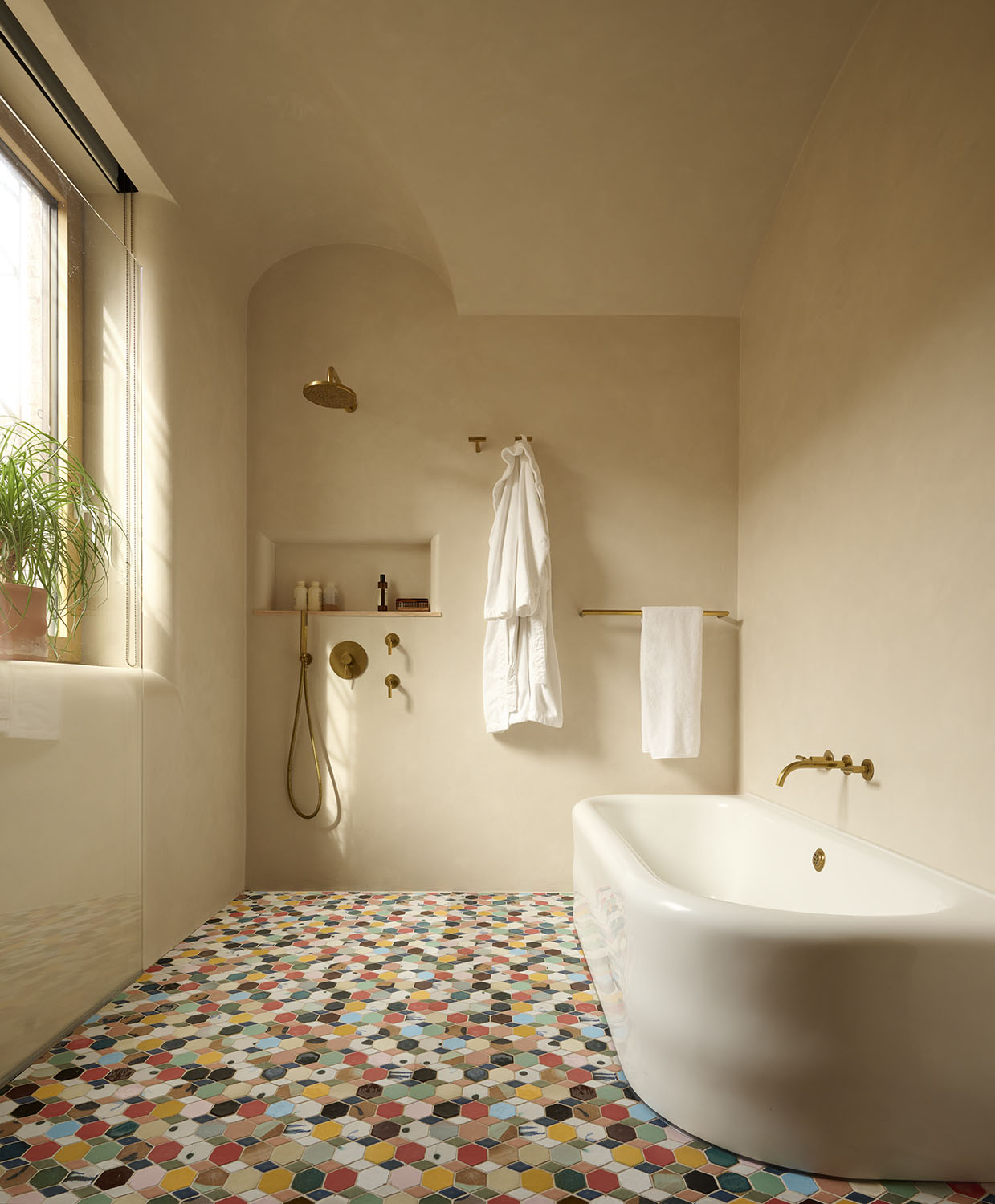
There are many types of plaster wall effects, but tadelakt, a rather durable product that made waves over the past decade, is still on the rise thanks to its luxurious luster and water resistant qualities. Yes, unlike, say, limewash, this one is splash proof.
So tadelakt is well suited for surfaces bound to get wet, like those in modern bathrooms and kitchens. The method itself is ancient, arriving by way of Morocco where it's a staple in the traditional hammam.
What’s its secret sauce? Lime plaster is burnished with olive oil soap to create a protective membrane unlike other plasters; when properly sealed, tadelakt is both water and mildew resistant. But it’s also an aesthetic choice: its signature shine adds texture to walls, and unlike tile, it covers surfaces seamlessly, making an entire space glow without a single grout line.
‘It’s most captivating feature is its waterproof nature, making it perfect for moisture-prone areas, but its allure goes beyond practicality,’ says Amy Morgenstern, co-founder of Brooklyn’s Kamp Studios, which specializes in plaster installations. ‘The real charm of Tadelakt lies in its tactile sensation–a silky, earthen, waxy feel that transforms ordinary surfaces into extraordinary sensory experiences.’
According to Guy Valentine, a London-based clay and plaster artisan, contemporary interiors of late often use imitation plaster, a new breed of tadelakt-style products (such as Germany’s Kreidezeit) created to work with modern building materials. But whether old or new, the process is laborious, taking artisans several days to complete (it’s best applied by a skilled artisan with experience using tadelakt). But despite all the effort, it can be worthwhile and beautiful–so much so that designers are even using it beyond areas that need its extra resistance qualities.
‘If it's done properly it's super nice and smooth and has loads of variations—you can see that it's hand-applied, not a painted finish,’ says Guy of the silky texture. ‘You just want to touch it.’
1. Create a serene scheme
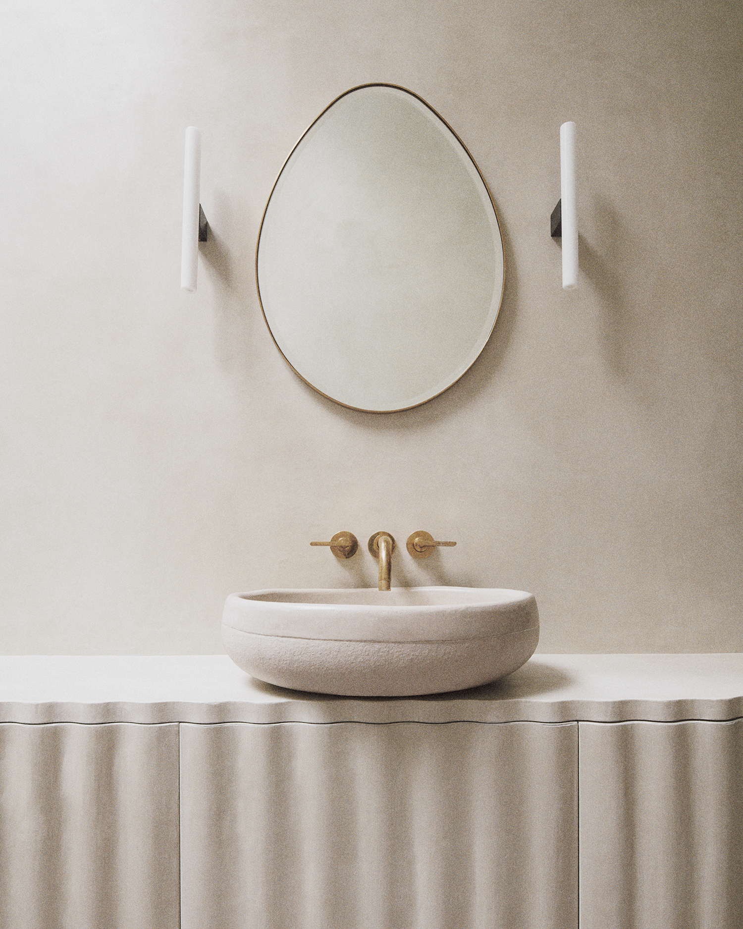
Channeling serenity in full force, London’s House of Grey chose tadelakt for its versatility to complete this bathroom, first applying it across the shower and walls. ‘If you know how to work with it, it can be used in many ways and we find it to be extremely adaptable,’ says founder Louisa Grey. But the studio flexed tadelakt’s potential even further across a bespoke ‘wave’ bathroom vanity (with help from local artisan Guy Valentine, who used a thinner imitation by Tadelakt London) to create a surface that gently undulates, a calm moment that washes over the sink area.
Be The First To Know
The Livingetc newsletters are your inside source for what’s shaping interiors now - and what’s next. Discover trend forecasts, smart style ideas, and curated shopping inspiration that brings design to life. Subscribe today and stay ahead of the curve.
This level of craftsmanship requires a deft hand–it can be tempting to DIY, but tadelakt is best left to experts. “We would always advise working with a qualified specialist as there are different types of tadelakt and we always insist on any corners being finished with mesh tape to allow some flexibility, but not too much,” adds Louisa. “Our design principles have always centered around using natural materials to create calm spaces of reflection and relaxation to improve health and contentment, using elements of nature.”
2. Up the brightness with white
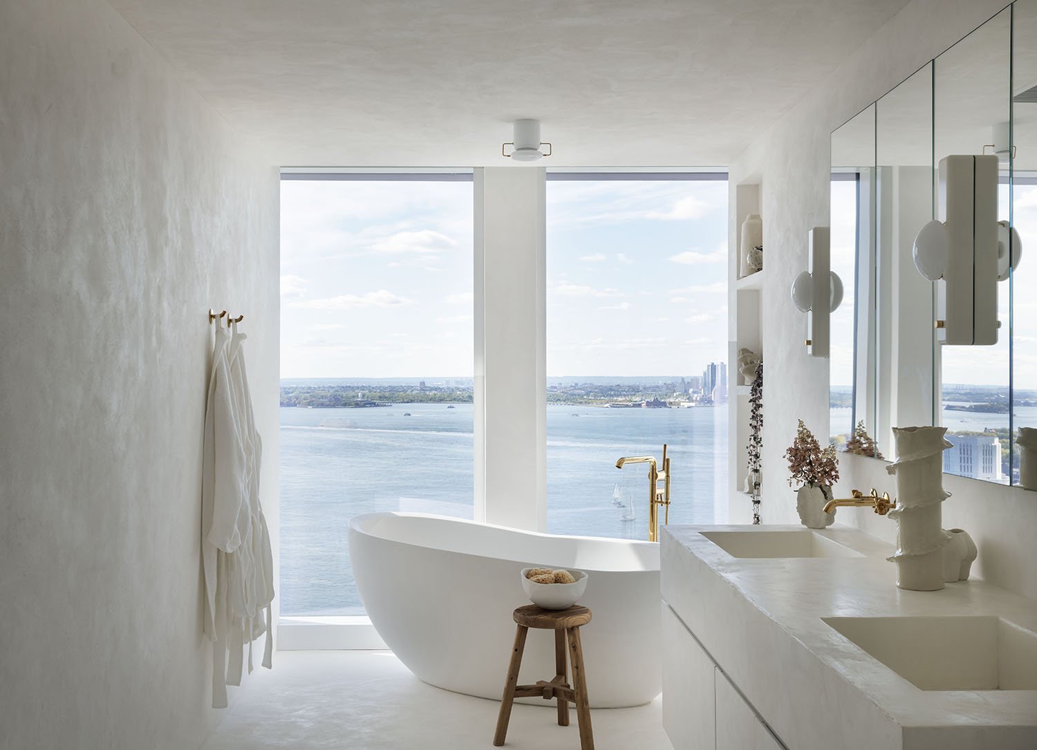
Usually bathroom floors take on a different material than your walls and ceiling, but this bright waterfront aerie in NYC creates a whiteout. Thanks to its water resistant qualities, designers applied tadelakt across all planes–walls, ceilings, the sinks’ surface, and a daringly white floor–without any seams. ‘A white Tadelakt creates a clean, bright monolithic look,’ says Bill Caleo, co-founder of The Brooklyn Home Company. ‘It’s hard to get the same effect with tile or slabs of marble due to grout lines and seams.’
Of course, tadelakt isn’t without faults, especially when applied in spots prone to traffic. “As time goes on the Tadelakt finish patinas and wears in,” explains Bill. “There are small superficial imperfections like hairline cracks and small crevices that develop in some areas, and you need to be mentally prepared and willing to accept those.” Embracing those slight imperfections can be part of the appeal, adding more character to the space, but if those tiny flaws bother you, Bill assures that a qualified contractor can fix them up within a two to three-day period: “one day to make repairs, one day to dry, and one day for touch-ups, if needed.”
3. Accentuate curves

In this spacious wet room by Brooklyn’s GRT Architects, tadelakt brings a sculptural look to gentle architectural lines surrounding the shower. ‘When incorporating Tadelakt into your design, leverage its unique ability to enhance spaces with organic shapes and curves, a quality unmatched by other materials,’ says Amy Morgenstern of Kamp Studios, the specialist responsible for the plaster installation. ‘This approach was flawlessly executed in this project, where the architecture found its perfect match in the smooth, natural finish of Tadelakt.’
Used across the shower walls, tadelakt offers a cleaner look than typical materials like tile, which could interrupt the architectural features with grout lines. “In our Harlem project with GRT, we went with Tadelakt for its practicality—it's waterproof and looks amazing on the bathroom walls,” adds Amy. “The smooth finish really brings out the elegance, making those arches and curves really something special. It was a smart choice that paid off in both function and style.”
4. Add depth to large spaces
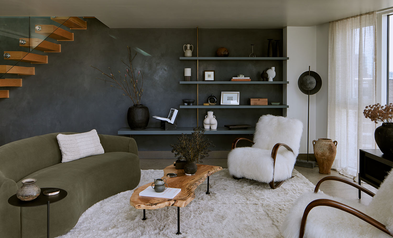
Tadelakt may not be an obvious choice for rooms that don’t require waterproofing – compared to other plaster products, the budget and labor are steep – but some designers embrace the effort in order to get tadelakt’s subtle shine, like the dark, dramatic, and dynamic walls in this soaring London penthouse. ‘The penthouse is very new and crisp and boasts 180-degree double-height windows that capture various types of light,’ says Annabel Harrison, founder of FARE INC. ‘This architectural choice allows the tadelakt to exhibit a shimmering and glowing effect in different spots throughout the day.’
Choosing a darker shade (in this case, a deep whale blue tadelakt) also works wonders when sunlight fades. “Its glossy, dark color also proves effective at night, serving as a deep and complementary backdrop against the lighter, softer finishes while emanting a gentle glow from the decorative lighting features,” adds Annabel.
5. Be inspired by natural colors
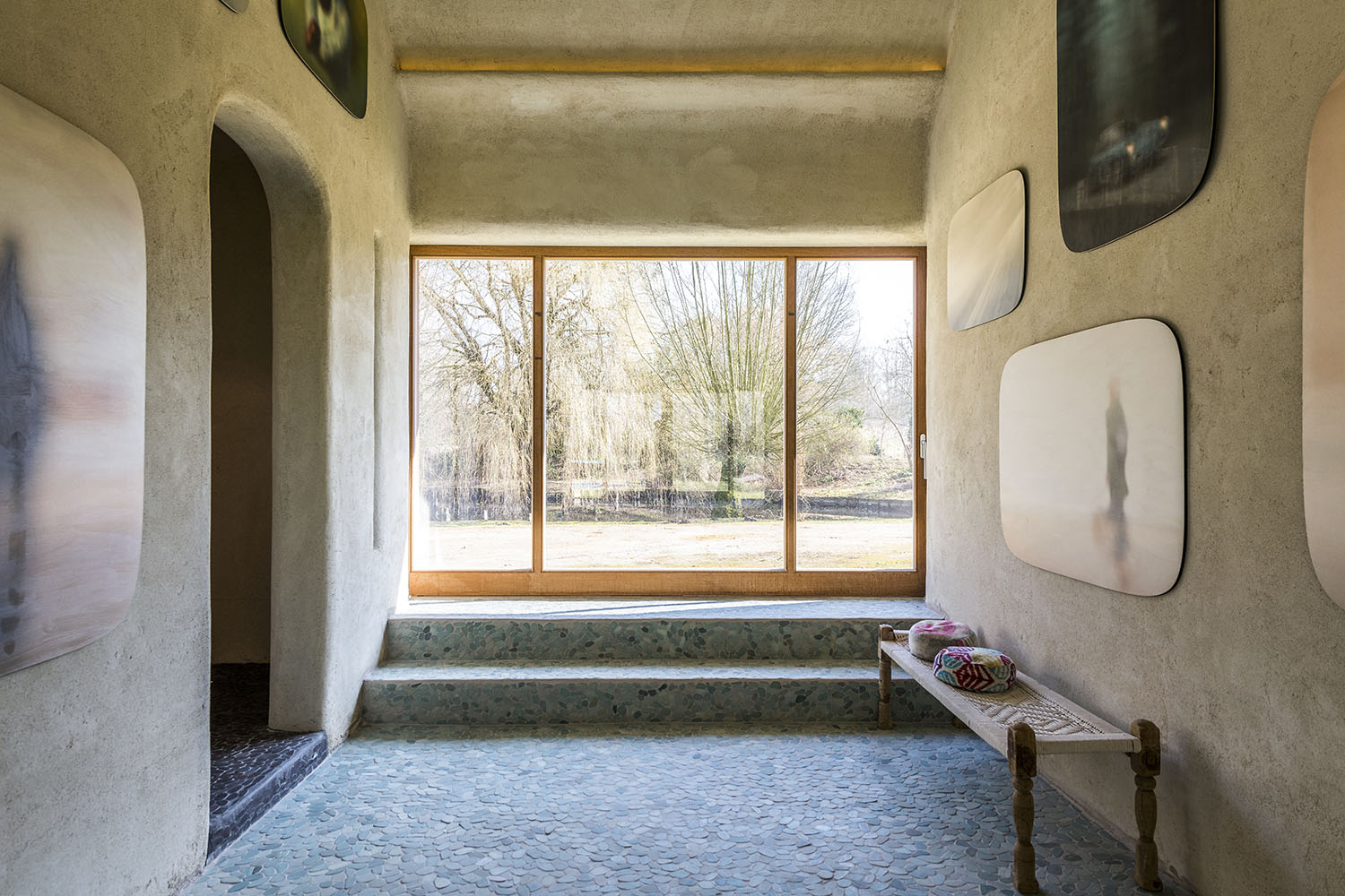
Crafted by artist and designer Sven Bullaert, founder of UMU, this Belgian home is a haven of sustainable materials (think hemp, cob, willow branches, crushed seashells). But when it came to Sven’s home gallery, where his ‘sfumato’ painting method is on display (art made with many thin layers), the dynamic and layered nature of tadelakt fit perfectly within context. ‘To present the artworks, we tried several walls, and it was clear that tadelakt was the best match as both sfumato and tadelakt bring 'life' into a (almost) flat surface,’ says Sven.
Ultimately for Sven, the choice to use tadalakt rested on its organic quality: the finish is notably free of volatile organic compounds. “Nature has been the greatest inspiration in this project, which is also one reason for using only natural materials,” he adds, noting that a primary bathroom was also covered wall to wall in tadelakt.
6. Be vibrant
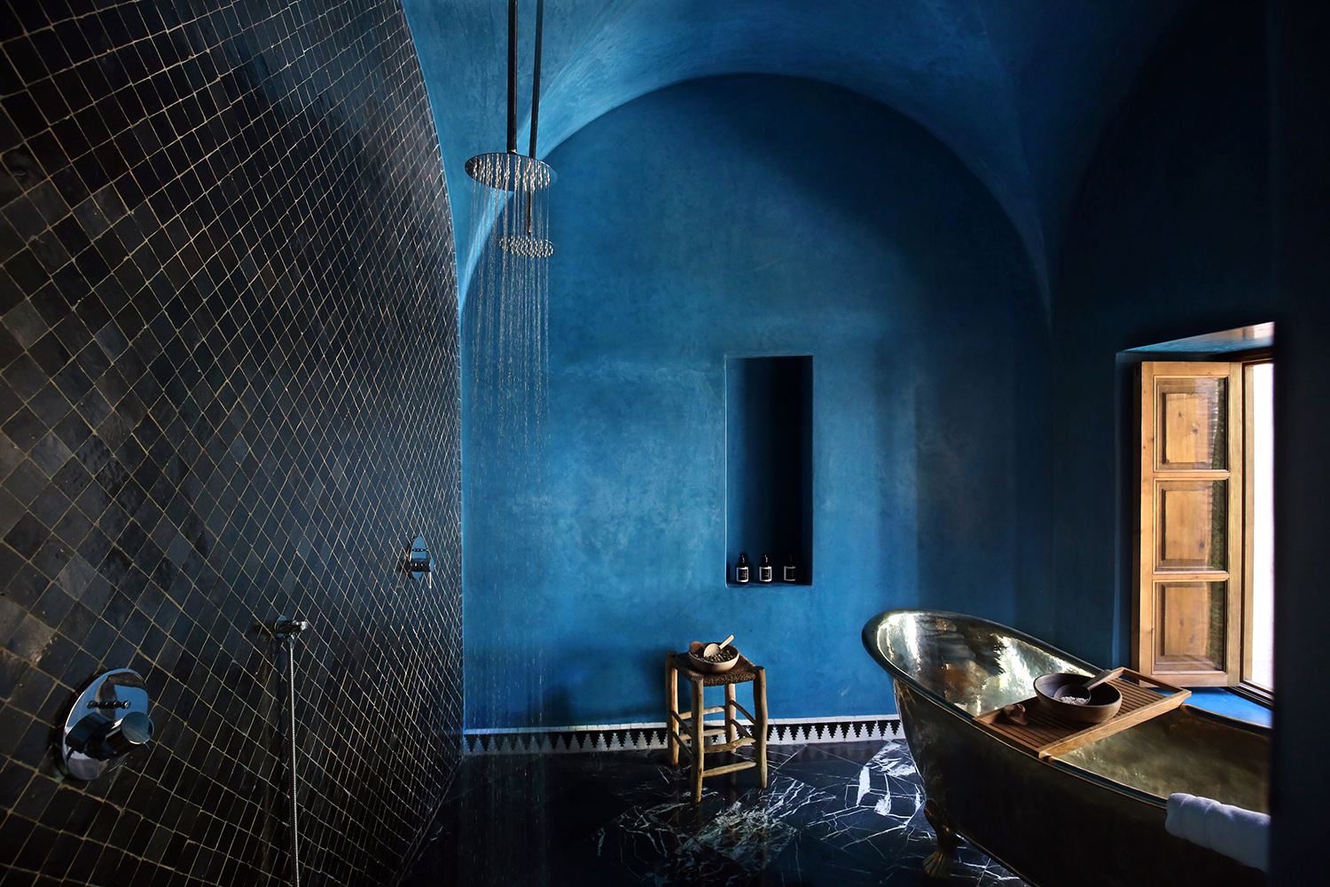
The tadelakt spaces we see today may well draw inspiration from hospitality, particularly the traditional hammam, as homeowners continue to incorporate wellness spaces at home. Hotels like Marrakesh’s beloved and recently renovated El Fenn hotel are both a source of inspiration as well as a template for the types of colorful palettes you can achieve with tadelakt. 'Color is intrinsic to Morocco and so from the outset our palette was bold,’ says Howell James, the hotel’s co-owner. Using natural or even synthetic pigments, specialists can easily tint tadelakt to create an array of colors.
While earth tones are a natural choice for such an organic finish, artisans can customize the finish with truly vibrant tones, like the bright blue bathroom pictured here.
Keith Flanagan is a New York based journalist specialising in design, food and travel. He has been an editor at Time Out New York, and has written for such publications as Architectural Digest, Conde Nast Traveller, Food 52 and USA Today. He regularly contributes to Livingetc, reporting on design trends and offering insight from the biggest names in the US. His intelligent approach to interiors also sees him as an expert in explaining the different disciplines in design.
-
 Parachute Just Dropped a Collection at Target and It's A Guaranteed Sell Out
High quality bedding and bath linens just got a lot more accessible. Parachute's signature effortlessly chic style is now available in over 200+ pieces at Target
By Devin Toolen
-
 Now Serving: Jewelry for Dinner — Alighieri Brings Its Signature Raw Beauty to the Table
Alighieri CASA is what happens when a jewelry house designs your cutlery — and yes, it’s just as fabulous as it sounds
By Julia Demer
-
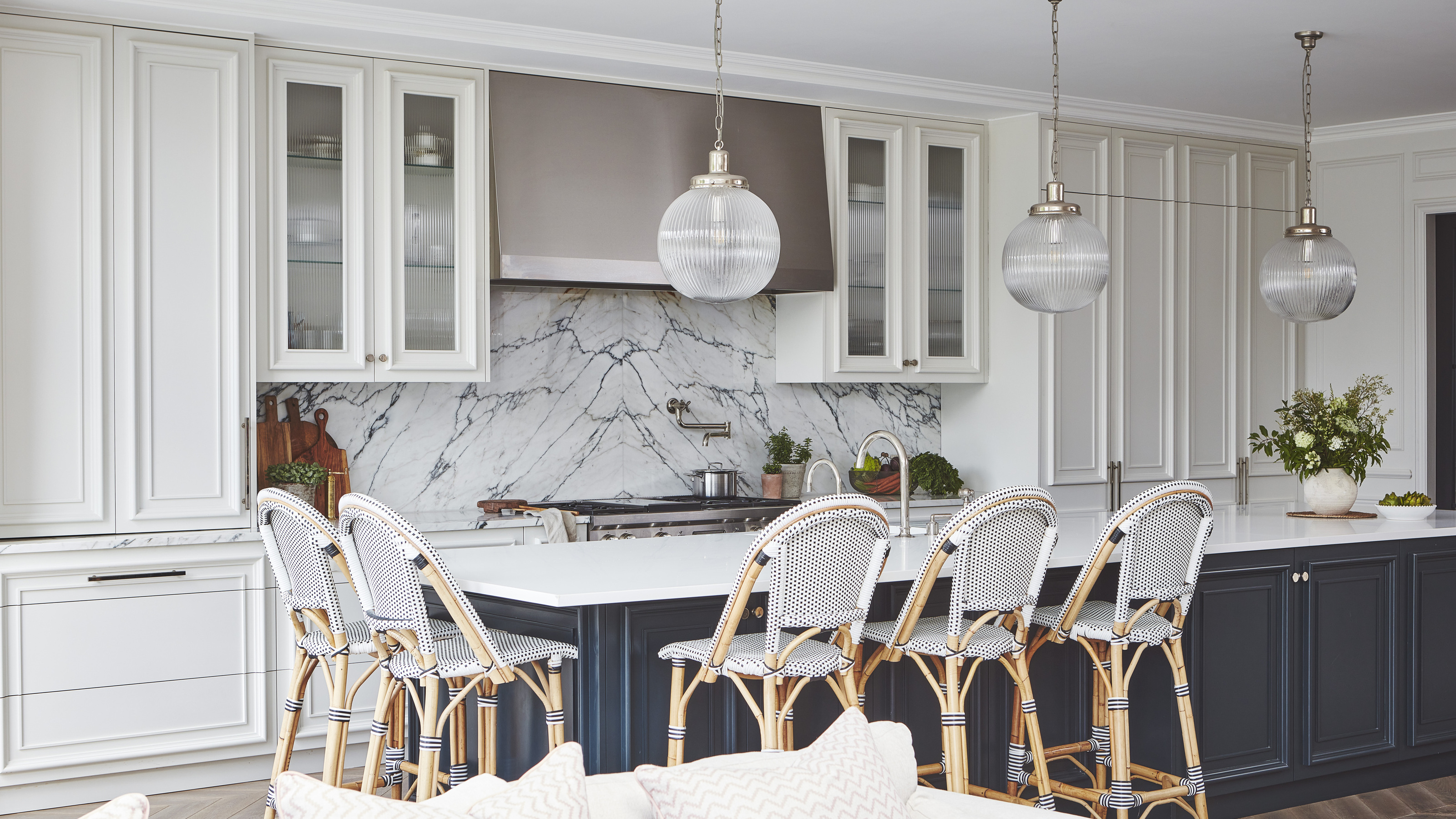 The 90s Kitchen Trends We're Seeing Come Back in 2025 — 5 Features Making Waves in Modern Designs
A quarter of a century later, 90s-inspired interiors are back, serving kitchen nostalgia with a contemporary twist
By Lilith Hudson
-
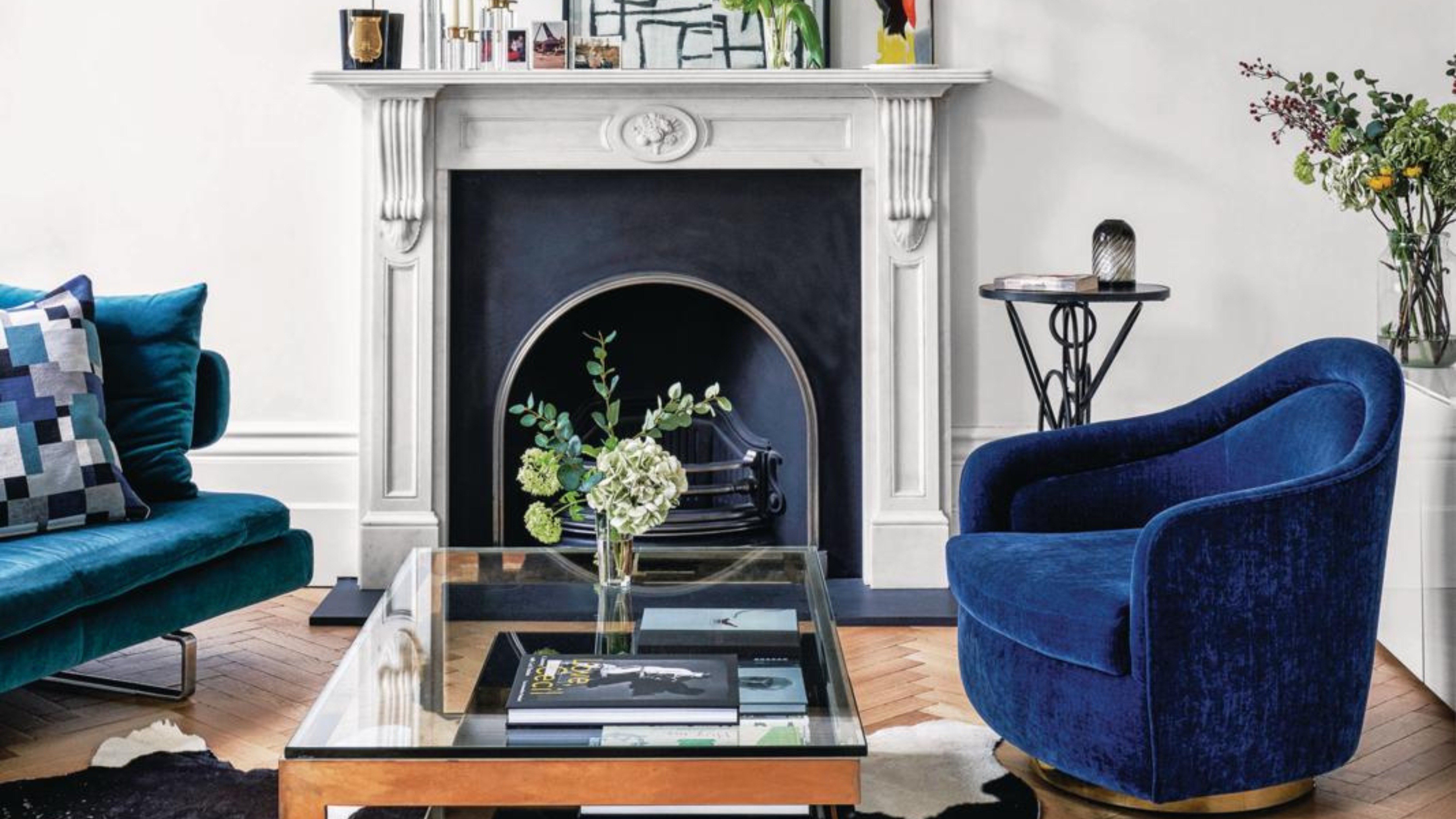 IKEA Reveals Its 2025 Color of the Year — An Electric Blue Hue, That Is Enticingly Bold and Brilliant
Though unexpected, this shade of blue may be my favorite color of the year prediction yet
By Olivia Wolfe
-
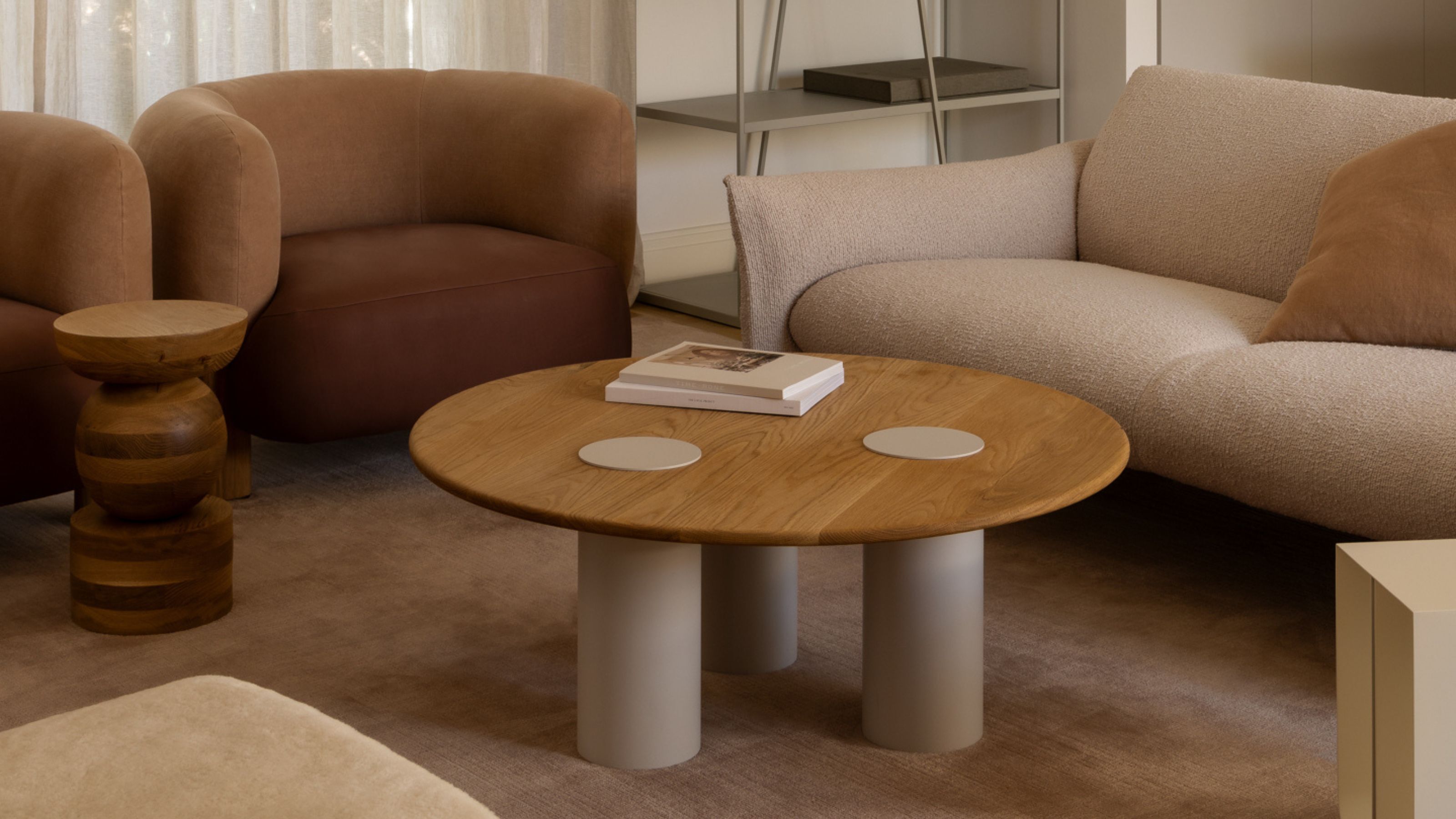 Pantone's Color of the Year for 2025 Has Been Announced — Meet 'Mocha Mousse'
We share how to style it, shop it, and everything else you need to know about the subtle yet elegant soft brown shade
By Olivia Wolfe
-
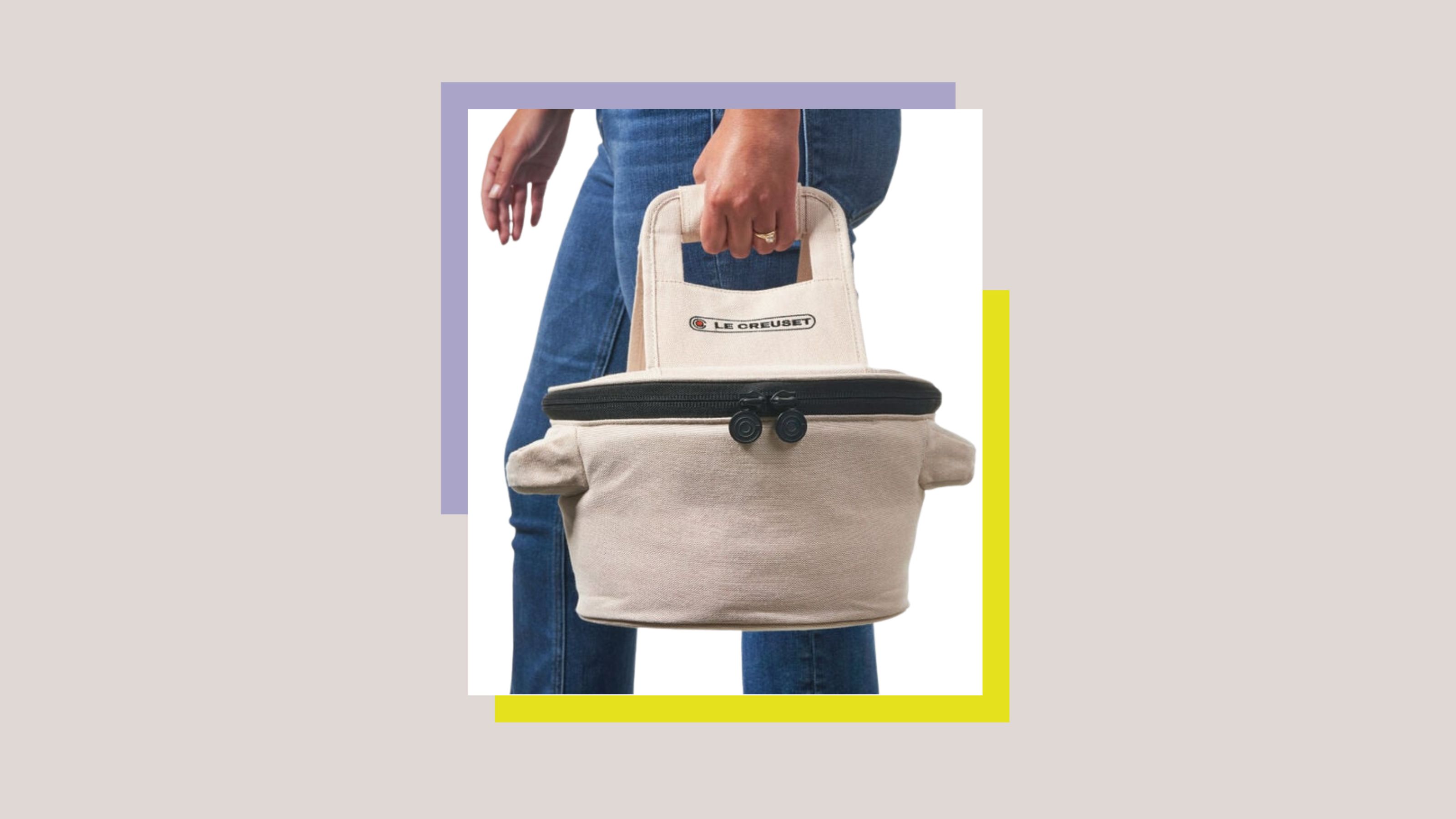 Le Creuset Just Released a Ridiculous Tote Bag for Transporting Their Dutch Oven to Dinner Parties — I'm Obsessed
Whether you need it is certainly not the question, here. But whether you want it... well, why wouldn't you?
By Olivia Wolfe
-
 A Little Birdie Said Monitoring Your Air Quality Just Got a Stylish New Look
This Amazon buy is promising a healthier home with no style expense
By Olivia Wolfe
-
 The "Chair-and-a-Half" Is the Goldilocks of Seating — Not Too Big, Not Too Small, but Just Right for Snuggling Up This Season
This accent chair trend is perfect for the cozy season, and it's on sale at Wayfair
By Olivia Wolfe
-
 Textured Walls Are Still Trending (And Just Got a Whole Lot More Chic Thanks to This Jeremiah Brent Collaboration)
'Nostalgia' is the name, and texture is the game; this moody new peel-and-stick wallpaper collection is bringing all the fall vibes to interior design
By Olivia Wolfe
-
 Ruggable's Latest Collection is Dripping in What We're Calling the Season's Go-To Fruit-Inspired Hue
We're seeing the sunny, mango-inspired shade cropping up in new collections across the design world — and it's surprisingly perfect for fall. Here's why
By Olivia Wolfe