This is how designers plan to use Lick's Color Palette of the Year for 2024, and we'll be following suit
Interior designers reveal their tips for using this optimistic and energizing palette from Lick
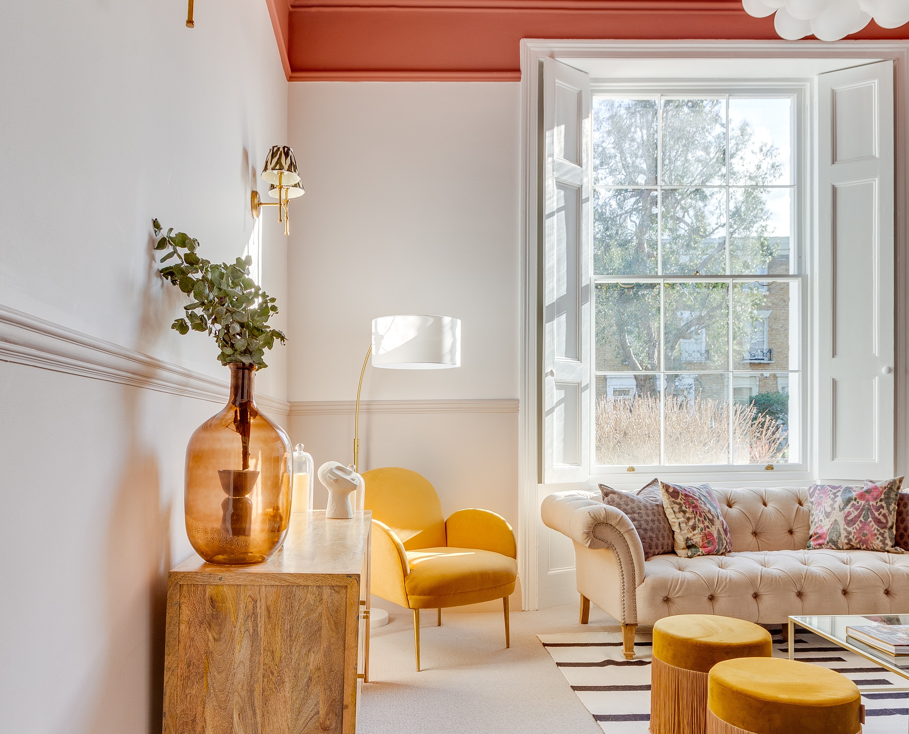

If you're searching for color inspiration for your next home project, look no further than Lick's Color Palette of the Year for 2024. Unlike other paint brands, the brand has chosen to release an 8-piece palette that speaks to the mood of the year ahead rather than just a single shade, and designers agree that the colors complement each other perfectly.
The overall theme of the palette is optimism, with every shade a considered choice aimed to both uplift and ground. It has three core color trends within it: grounding neutrals, energizing reds and oranges, and uplifting blues and greens, hues that reflect the general move toward energy and optimism when it comes to decorating our interiors.
'In 2024 we are going to see people celebrating color in a more contemporary way,' predicts Tash Bradley, color expert at Lick. 'Grey-based neutrals are being swapped for warmer, yellow-based neutrals. Enduring and timeless, and subtle and soothing, they pair beautifully with the fresher, more vibrant colors in our palette, creating a sense of balance and harmony.'
The opportunities for using the color palette truly are endless, but to prevent anyone from throwing all eight shades at a room, we've asked interior designers to reveal how they plan to pair the shades to create a harmonized space. Here's what they had to say.
Cozy and warm neutral layering
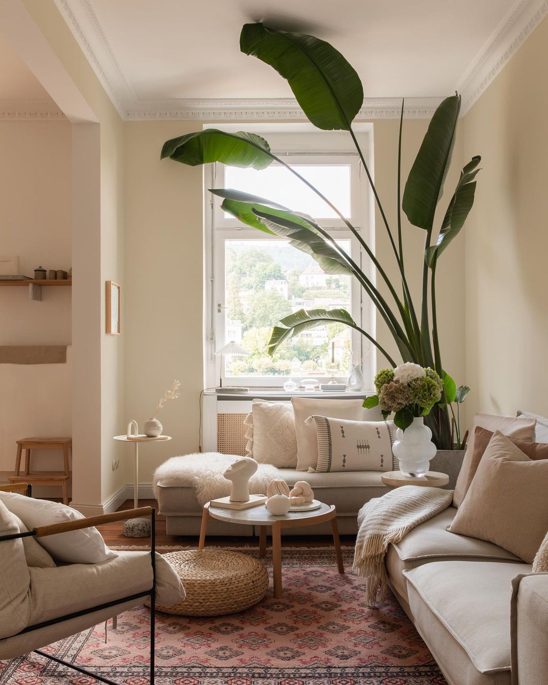
You might be thinking that decorating with neutrals is nothing new, and to some extent, you're right. However, in 2024 we'll see them being used in an entirely different way, with new hues making a statement. Tash says the dominance of grey-based neutrals is over, and while greige will remain a timeless classic, we'll see it frequently being exchanged for warmer yellow-based neutrals.
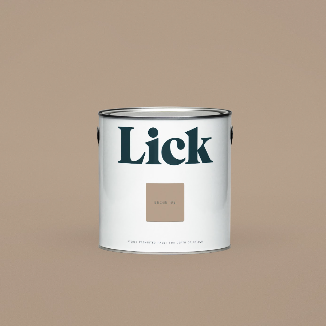
The two neutral shades in this palette, White 05 and Beige 03, have warm undertones that instantly create a comforting and cocooning environment, perfect for completing a cozy living room. 'The understated elegance of this muted whitish beige is its biggest strength,' says Artem Kropovinsky, interior designer at Arsight, of Beige 03. 'It's a color that invites layering — be it with patterned rugs, eclectic furniture, or even metallic light fixtures. This color isn’t just versatile; it's transformative.'
As Artem has alluded to, these shades offer the opportunity to layer color. We love the blank canvas it offers for other shades in the palette and how they seem to pull everything together. For something a bit brighter, add steely blues or refreshing greens on top of Beige 02 for a restorative space that is simultaneously uplifting and grounding.
Be The First To Know
The Livingetc newsletters are your inside source for what’s shaping interiors now - and what’s next. Discover trend forecasts, smart style ideas, and curated shopping inspiration that brings design to life. Subscribe today and stay ahead of the curve.
Color drenching with energizing reds
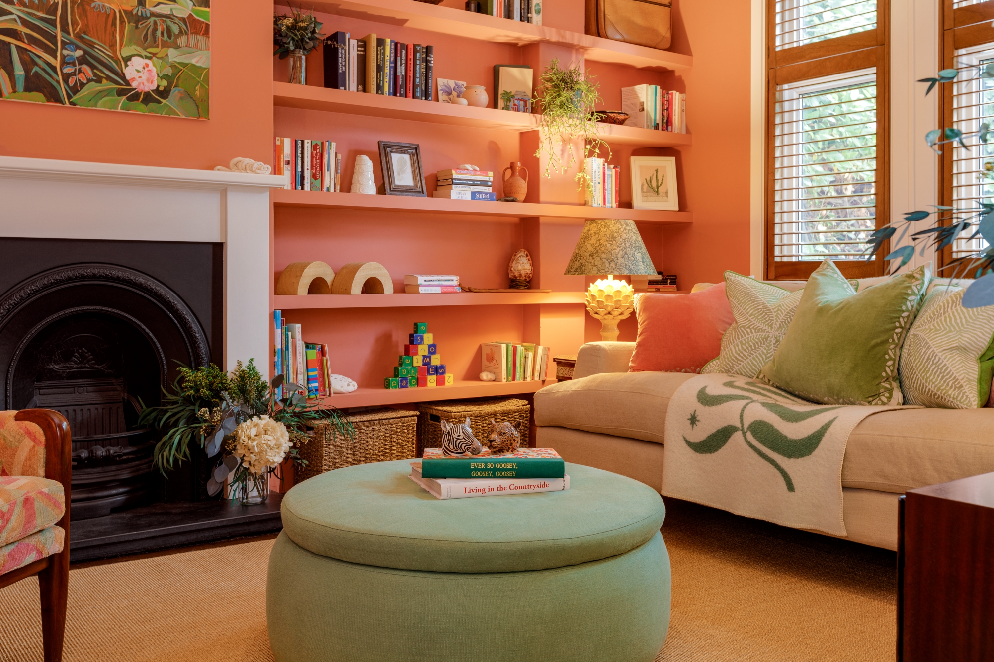
Although there's a move towards warmer neutral tones, unlike the previous domination of greige, this is now being paired with 'brighter, zestier, more uplifting colors'. 'Red and orange are social colors,' says Tash. 'Both colors have the ability to stimulate, energize, and spark conversation,' she explains, making it an ideal shade for a living room paint idea.
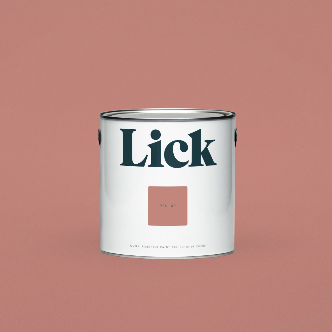
Utilizing these vibrant shades as an accent or a base shade works well. Emma Solway, Principle interior designer at EMH London, used Red 03 to color drench her client's room and used other shades from the palette to add balance. 'We painted the entire room including shelving, doors, and skirtings in Red 03 and accessorized with green and neutral colors to create a natural warmth to the room,' she says.
Red can be a difficult color to work with, but this earthy terracotta lends itself well to pairings with other grounding shades in the palette for a calm feel. For something more vibrant, the orange shade, Orange 05, is on the bolder side, therefore we would recommend it as an accent shade. Try it on some shelves against a neutral wall or upcycle a piece of furniture to add a burst of energy.
Pairing blues and greens for a fresher, airy feel
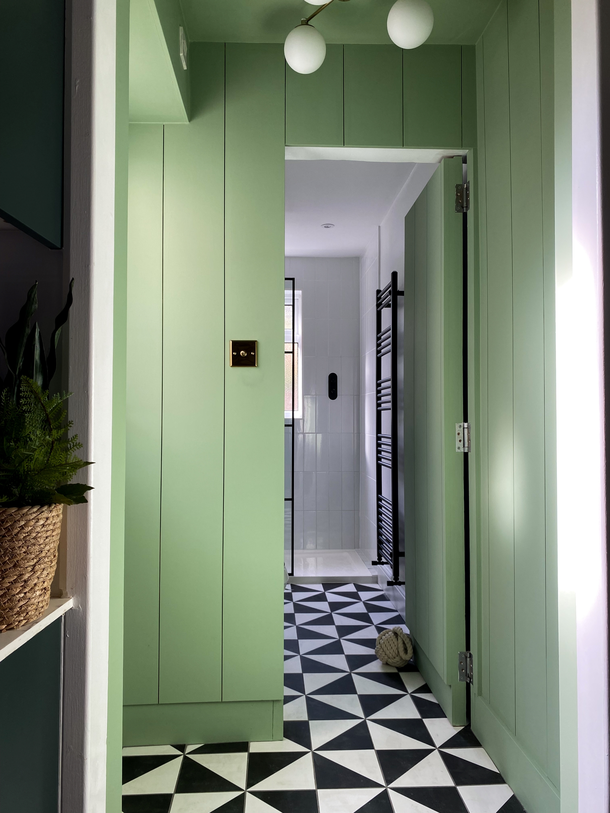
'More and more, I’ve seen clients leaning towards these fresher blues and greens due to their uplifting, contemporary feel,' says Tash. These shades make a room feel bigger, brighter, and more open, leaving you feeling instantly refreshed.
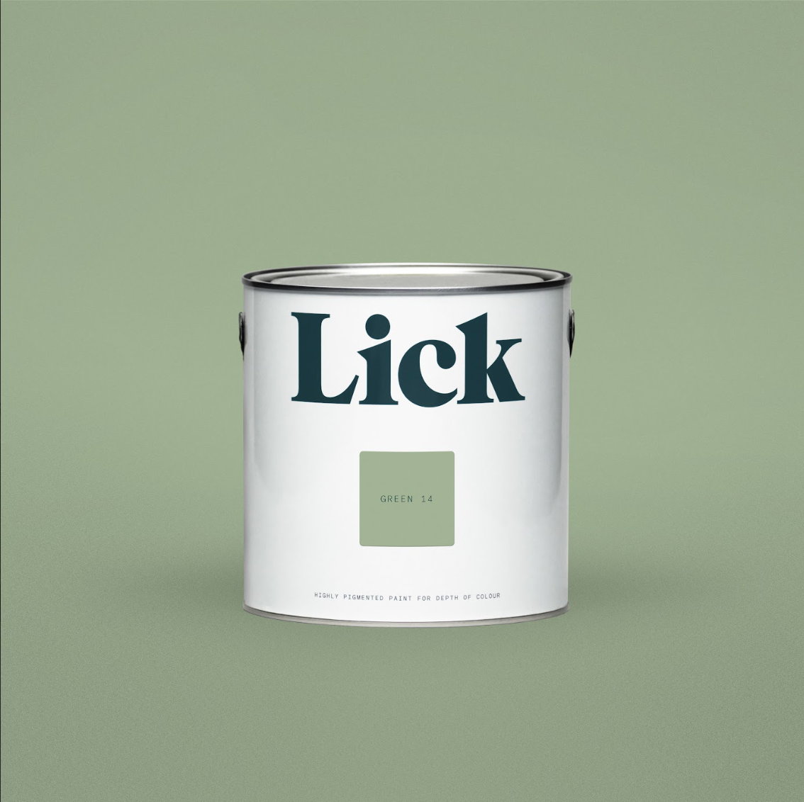
Each of the colors in this palette has been selected for its uplifting and revitalizing properties, but the blues and greens arguably do that best. Blue 03 connects you to nature and provides a calming quality in any room it enters, while Green 08 and Green 14 are more fresh and balanced. 'The latter two are great for creating a space that awakens you and helps you feel open-minded and energized,' says Tash.
The shades also capture the essence of nature. 'This pale muted light green exudes freshness and an organic essence,' says Artem, of Green 14. 'Its calming undertones would be at home in a personal sanctuary, perhaps a bedroom or a serene home office. While it's muted, the hue is potent enough to be the centerpiece in a space — think of walls clad in this shade, offset by monochromatic artwork or accented with raw, unfinished woods.'
It's clear these shades are inspiring designers to think of color in different ways. Hopefully, this palette can also inspire you to incorporate color into your home - we're sure the result will be an optimistic space that leaves you feeling revitalized and balanced.
Our favorite shades from Lick's new color palette

Formerly a news writer for Livingetc, Amy completed an MA in Magazine Journalism at City, University of London, and has experience writing for Women’s lifestyle publications across arts, culture, and beauty. She has a particular love for the minimalist aesthetic mixed with mid-century furniture, especially combining unique vintage finds with more modern pieces. Her previous work in luxury jewellery has given her a keen eye for beautiful things and clever design, that plays into her love of interiors. As a result, Amy will often be heard justifying homeware purchases as 'an investment', wise words to live by.
-
 This Outdoor Lounger Is the Color of the Season for Garden Furniture — And It's on Sale This Weekend
This year, it's all about the contrast, and this bright, sunny hue is the perfect foil to your green outdoor spaces
By Hugh Metcalf
-
 Kelly Wearstler Designed an Animal Hospital Where "Anxiety Just Melts Away", and I'm Taking Notes for My Own Home
The renowned designer's foray into healthcare demonstrates have even the most functional of spaces can still be design-forward
By Devin Toolen
