'It's where minimalism meets comfort' – Tom Dixon on how he finds balance when designing minimalist spaces
The British designer explains how to execute a simplistically neutral space that's still layered with nuance

The Livingetc newsletters are your inside source for what’s shaping interiors now - and what’s next. Discover trend forecasts, smart style ideas, and curated shopping inspiration that brings design to life. Subscribe today and stay ahead of the curve.
You are now subscribed
Your newsletter sign-up was successful
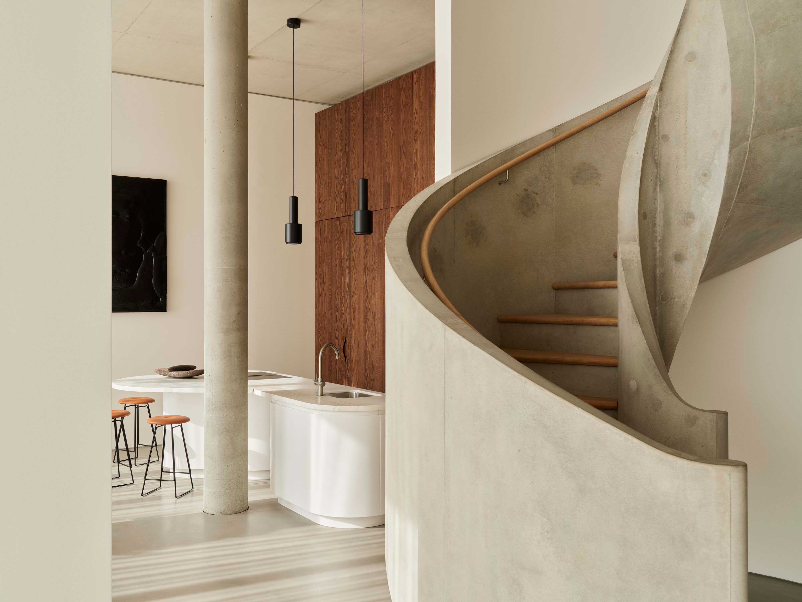
High above London's Canary Wharf - 57 storeys to be exact - are the penthouses of One Park Drive. These luxury apartments, with interior architecture by Herzog & de Meuron, have been carefully curated with dressings and furnishings by Tom Dixon’s Design Research Studio - and they're a perfect example of how to master minimalist comfort.
Amongst the concrete columns and sculpted staircases of Herzog & de Meuron's stark architecture, Tom Dixon has created an immersive interior design concept dubbed ‘Home of the Collector’ through his furnishings. Unique artworks and bespoke designs culminate in a minimalist palette that's at once simplistically neutral yet layered with nuance, and it's a look that we're loving for a modern home.
To learn more about making neutral spaces dimensional, rich, and rounded in this way, as opposed to just ‘beige’, we caught up with the British designer. Here, he shares his six tips for mastering a minimalist palette in your own home.

Tom Dixon is a self-taught British designer and the Creative Director of his eponymous brand 'Tom Dixon Studio' which specializes in the design of lighting, furniture and accessories.
1. Play with texture rather than color for dimension
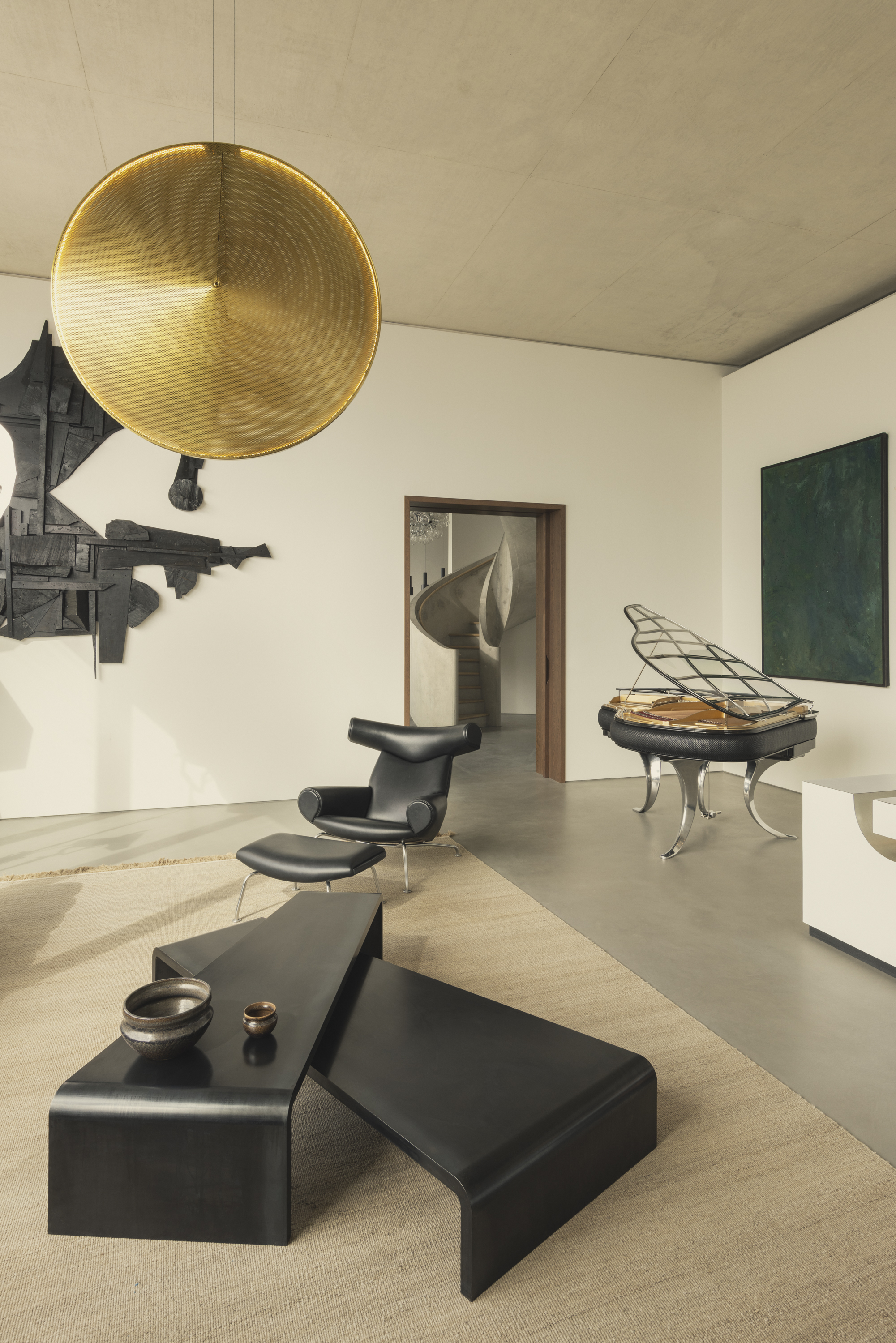
A quick glance at the penthouses of One Park Drive reveals one stand-out feature - a lack of vibrant hues. And yet, for such a neutral color scheme, there's still a miscellany of different tones that bring depth and dimension to the space. The trick, says Tom, is experimenting with texture.
'We're working in a fairly slim space between minimalism and comfort, so we tend to play a lot with texture rather than color,' he says. 'Trying to find extra textural woods, leathers, or ceramics and treating them in a way that's respectful of their origin was key.'
He adds: 'We took the cue from this idea of materials in their state of origin - our leathers are not bright colors or heavily varnished, the wood and the aluminum is used in a simple, honest, and generous way. These allow you to work with a palette of materiality and get quite a lot of different tones, hues and reflection.'
As well as introducing dimension to the space, these textures are also responsible for the warm and cozy feel within the apartments. Woven rugs, soft leathers, and reflective materials introduce a softness that dramatically contrasts with the harsh concrete architecture. 'Given that - as in most modern skyscrapers - there's a lot of glass, a lot of concrete, and really high ceilings, we were trying to find a way of making the spaces feel warm without detracting from the minimalism,' says Tom.
The Livingetc newsletters are your inside source for what’s shaping interiors now - and what’s next. Discover trend forecasts, smart style ideas, and curated shopping inspiration that brings design to life. Subscribe today and stay ahead of the curve.
2. Take inspiration from your natural surroundings
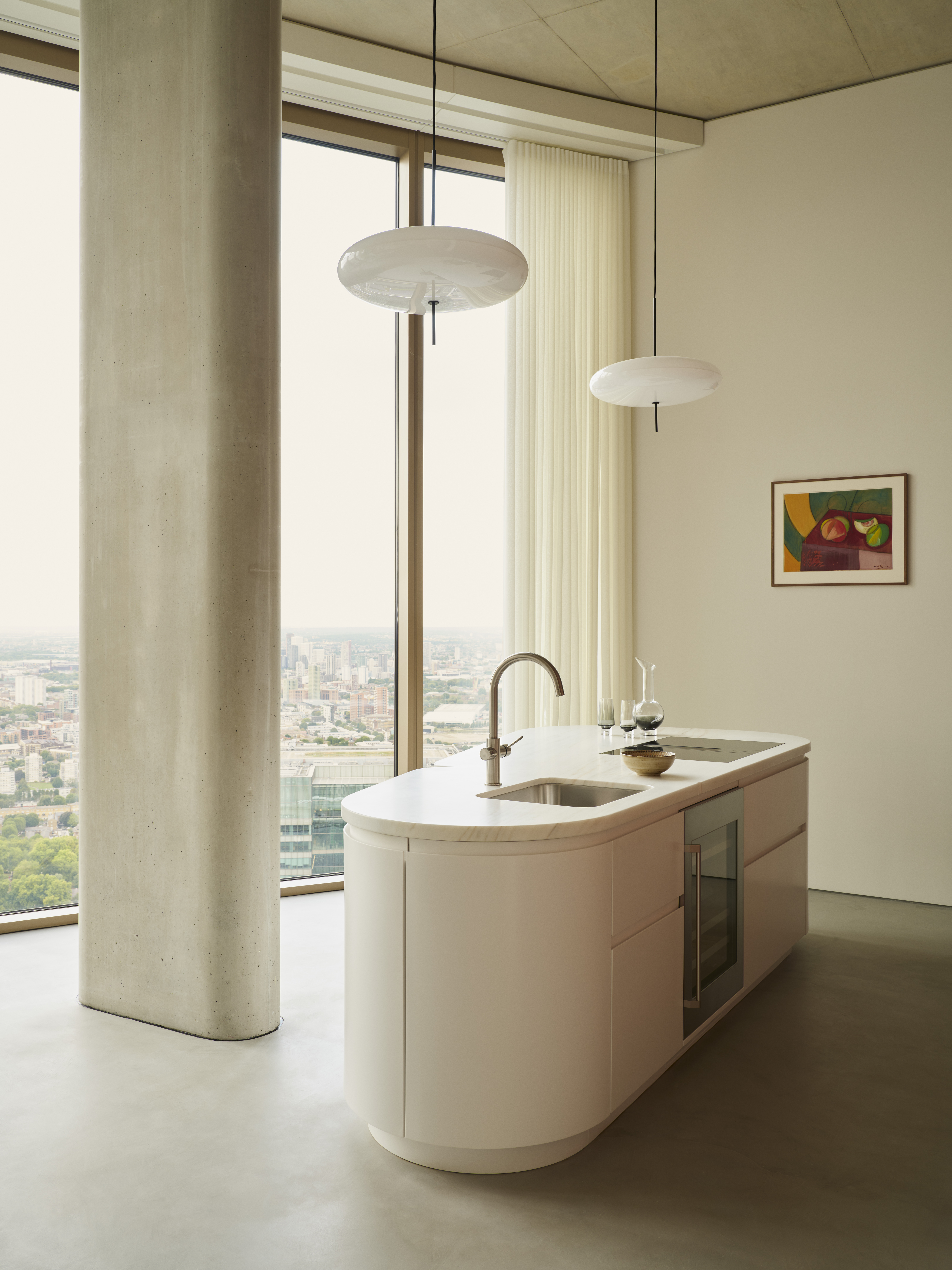
Every designer will tell you that the natural world beyond your home's four walls is just as important as what's within them. In a penthouse with floor-to-ceiling windows, the cityscape beyond played an important role in influencing Tom's design.
'From the weather patterns to the Thames estuary, you get this mixture of nature contrasted with the city, all of which is very man-made, very concrete, and very grey,' he explains. 'Together they're a series of muted colors that work really well together.'
By taking inspiration from the views outside, the landscape translates to the interior, the large windows blurring the liminal space in between. 'The furniture was positioned to encourage the idea of looking out and looking in,' Tom says. 'Where traditional houses or living rooms might have a fireplace or television to draw your focus, we tried to make it so there were these two distinct vistas, out and in.'
3. Contrast materials for visual interest
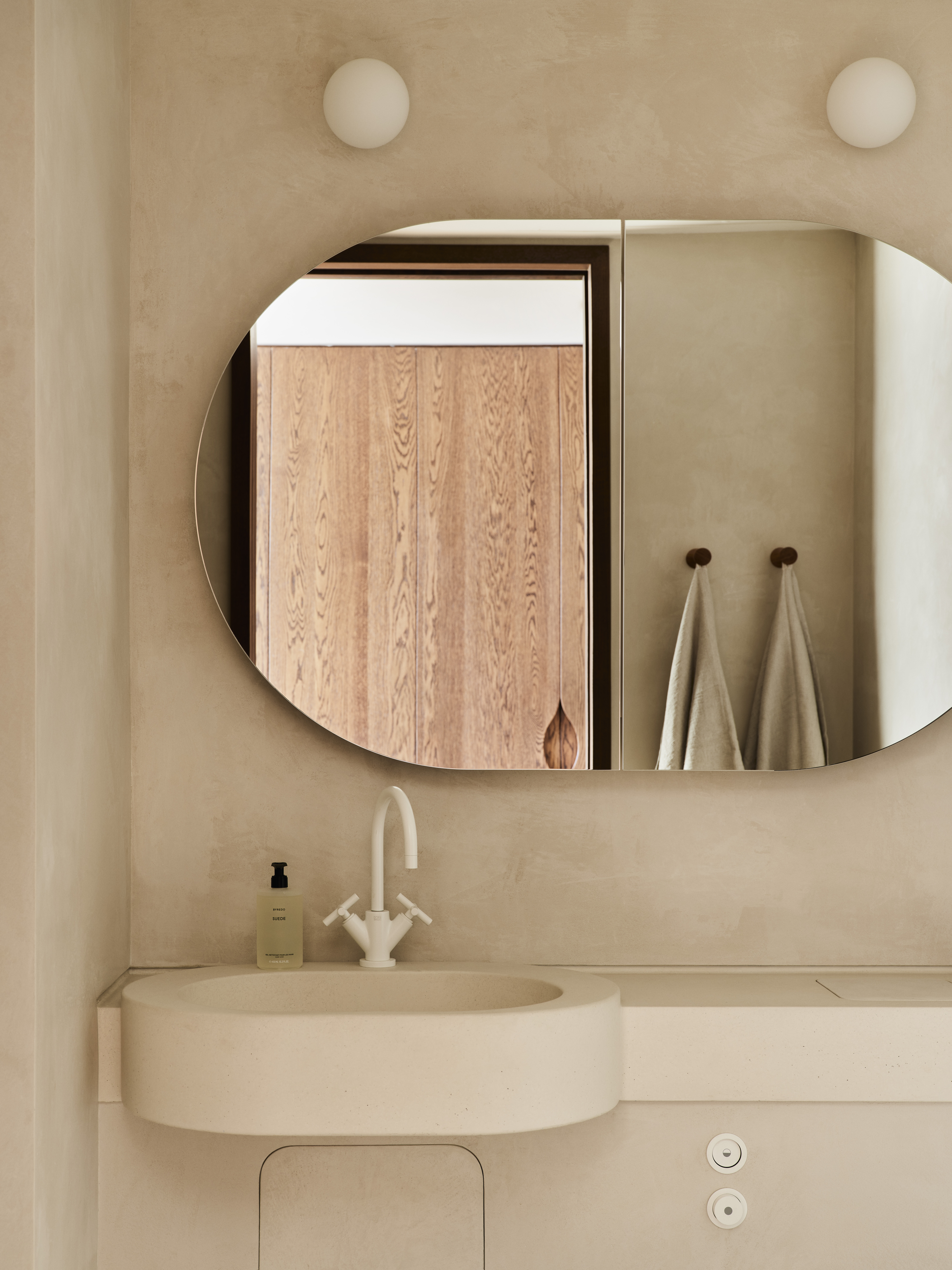
Minimalism isn't just stark or invariant materials - these apartments beautifully juxtapose the warm tones of wooden accents with solid stone architecture, evidencing the importance of contrast.
Embracing minimalism in interior design doesn't haven't to mean bland and beige. To ensure your design is appealing to the eye, incorporate plenty of contrasting details. 'Rough and smooth, shiny and matte, black and white - we still wanted a lot of materials to avoid too much monotony,' says Tom.
4. Use metallic accents to add warmth

Throughout the apartments, metallic motifs are used to make a statement. From light fixtures to furniture trim, their reflective qualities are used to emphasize natural light and add warmth to the space. This trick, one of the oldest in the design book, is so simple yet extremely effective.
‘Going back to that contrast between rough and smooth, metals are great because they add a sharpness to that object,' Tom explains. 'A golden metal immediately softens it, but still, the impression is of a sharp and hard material against which some of the woods and textiles act as a counterpoint.’
5. Embrace vintage and contemporary pieces
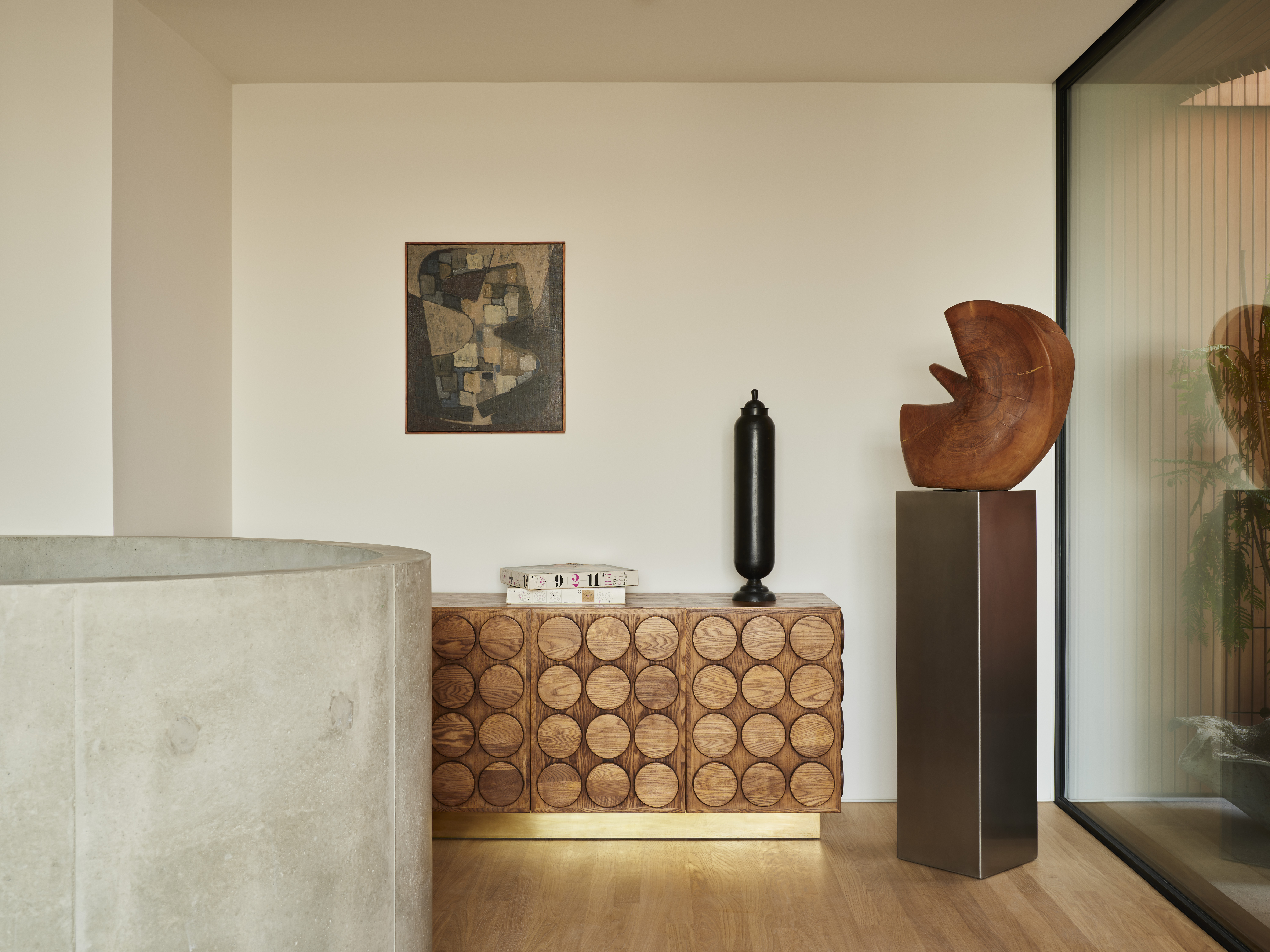
For a unique and personalized space, avoid uniformity through your furniture and instead incorporate vintage furniture, heritage pieces, and any decor with personal meaning.
‘I'm not pro the total look where all the furniture you buy is from one place and of one period,' says Tom. 'Layering with a bit of antique, a bit of art, some memories from your travels - that was a feeling we wanted to get across, that somebody had assembled a personal collection of objects.’
Once again, contrast is the defining takeaway, this time of old and new. ‘Look for things with age and patina and contrast those with the things that are new and shiny,' Tom advises. ‘You get more soul also from things that have lived a bit.'
6. Don't rely on textiles for coziness
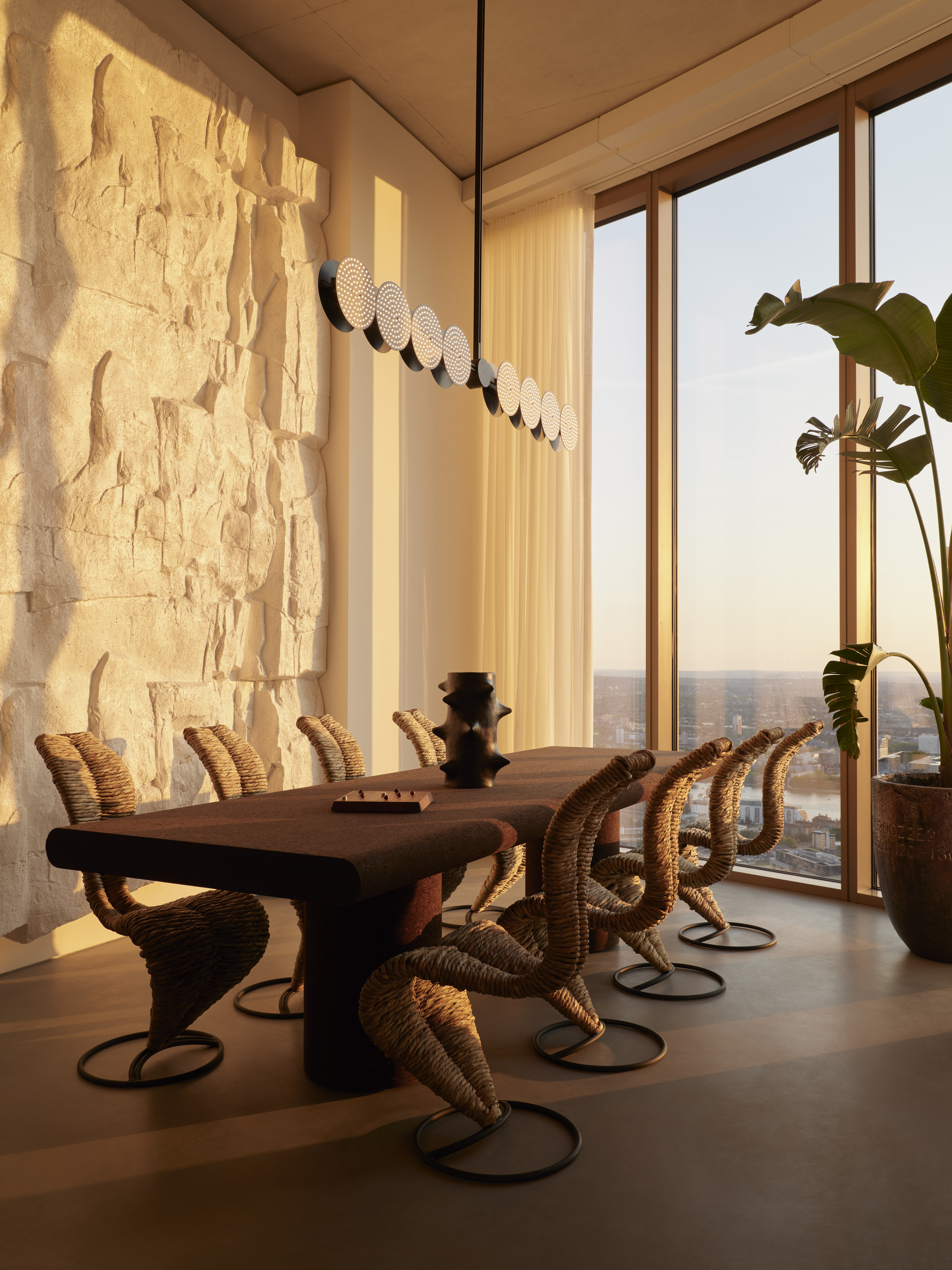
Take a closer look at the One Park Drive apartments and you'll notice there isn't a single cushion or fluffy rug in sight. Soft textiles are kept to a bare minimum, and yet coziness and comfort still prevail.
An example is in the dining room where a cork table, voile curtains, and rush fiber chairs are used to add an understated softness while still keeping with the minimalist theme. ‘They're all made out of soft materials and together they're more than enough,' says Tom. 'You don't need added decoration on top of that.'
Get the look
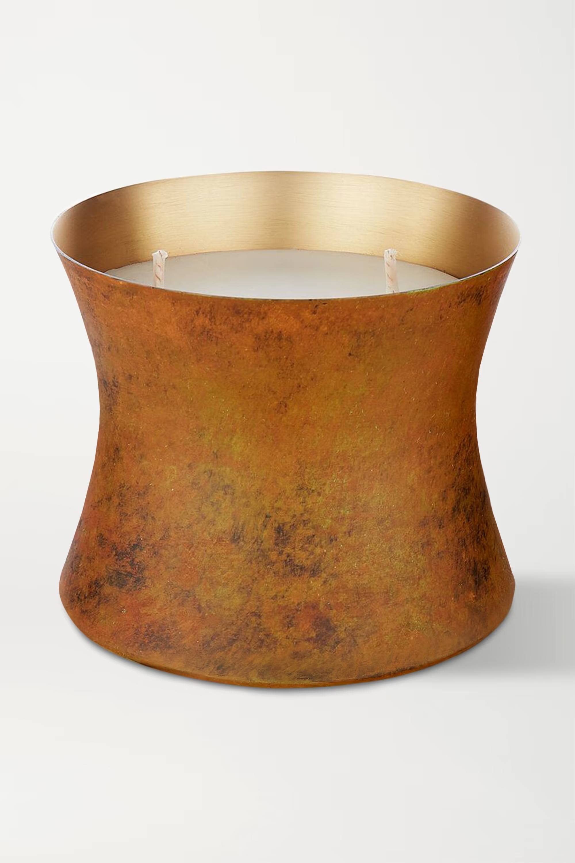
One of the newest additions to Tom Dixon's 'Eclectic' home fragrance collection, this 'Underground' candle, available at Net-A-Porter, is inspired by rich subterranean scents. The metallic container promises to bounce light around your room and offer a striking contrast to the softer materials in your interior design scheme.
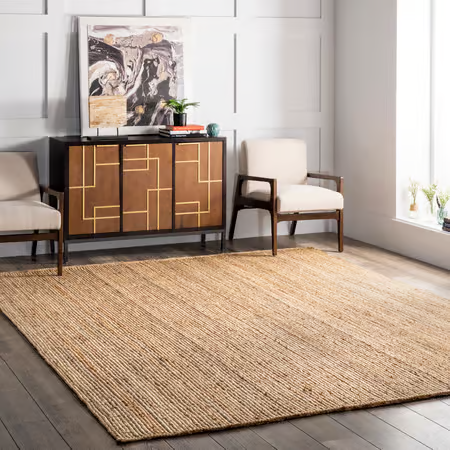
This jute rug from Rugs USA introduces just enough softness through it's natural woven texture, without a need for high pile textiles. The neutral shade will make an understated foundation in any space, but is especially ideal in minimalist spaces where it won't detract from your decor.
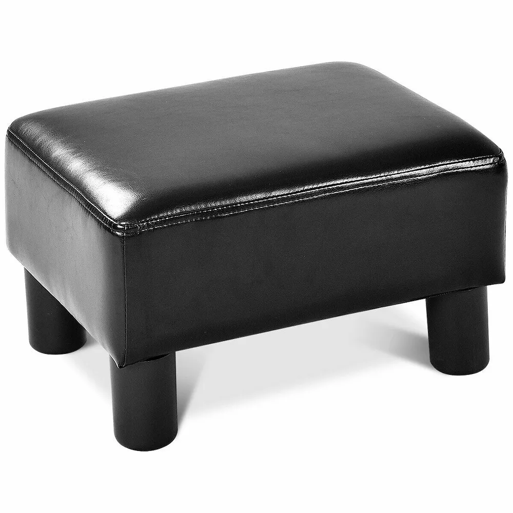
This leather ottoman footstall from Target is has a classic and chic design to enhance your living room furniture, and a great way of introducing texture. The rectangular frame has simple and clean lines perfect for a minimalist design while still bringing a sense of coziness and comfort to your home.

Lilith Hudson is a freelance writer and regular contributor to Livingetc. She holds an MA in Magazine Journalism from City, University of London, and has written for various titles including Homes & Gardens, House Beautiful, Advnture, the Saturday Times Magazine, Evening Standard, DJ Mag, Metro, and The Simple Things Magazine.
Prior to going freelance, Lilith was the News and Trends Editor at Livingetc. It was a role that helped her develop a keen eye for spotting all the latest micro-trends, interior hacks, and viral decor must-haves you need in your home. With a constant ear to the ground on the design scene, she's ahead of the curve when it comes to the latest color that's sweeping interiors or the hot new style to decorate our homes.