A ketchup-colored paint? It might sound like a gimmick, but "tomato red" really is the trend to look out for in 2024
This collaboration between Heinz and paint brand Lick might sound like an unlikely partnership, but these bold tomato-inspired tones are surprisingly stylish
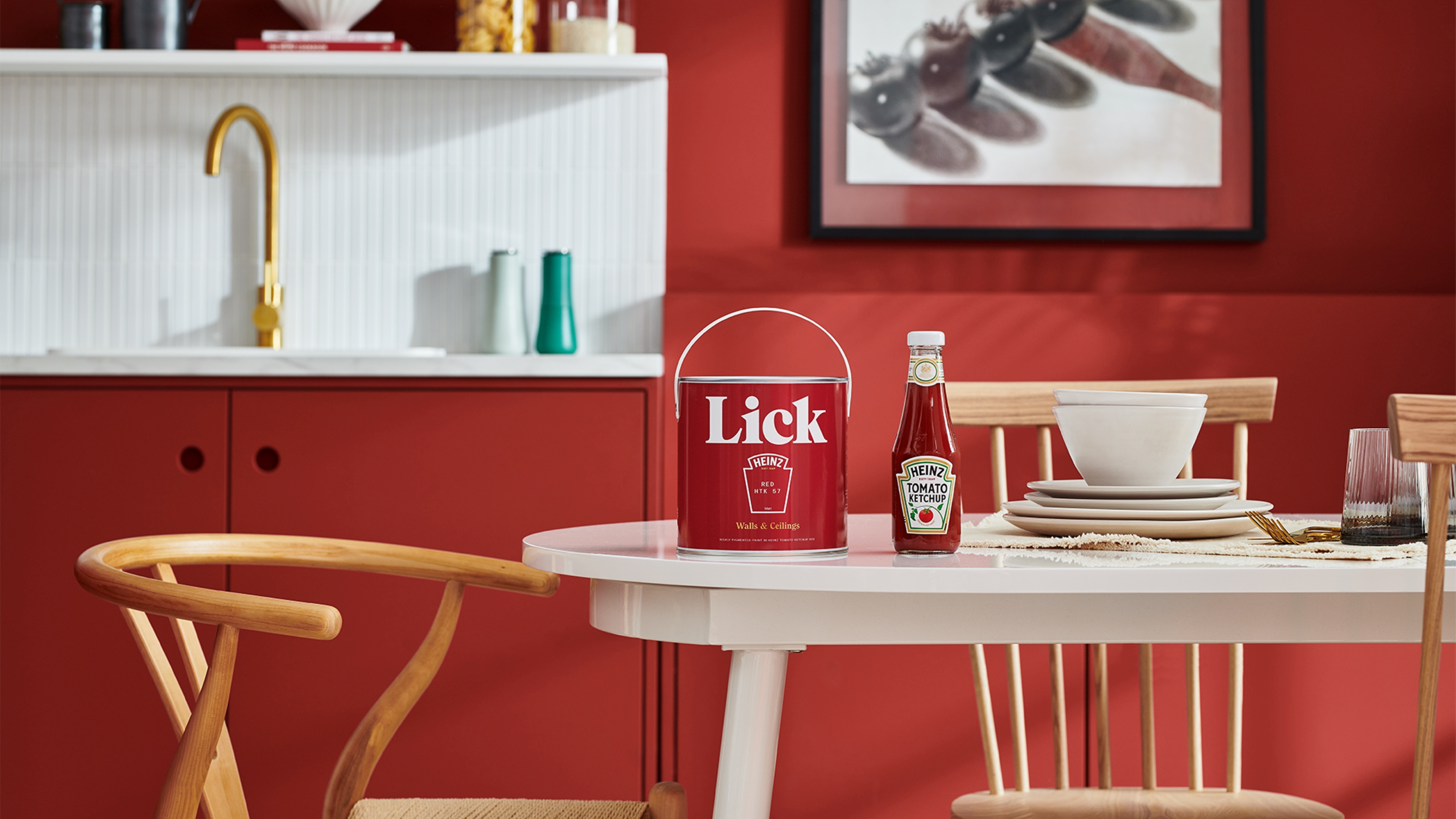

A tomato ketchup-inspired paint color? It's one of those news stories that has us checking the date isn't April 1st. But when you get past the idea that paint brand Lick has perfectly color-matched a bottle of Heinz ketchup, there's method to the madness.
Lick isn't shy of using their color expertise to create paint shades for brands, such as the collaboration with Soho House which gave us with the opportunity to emulate the luxe of a private member's club in our own homes, but their latest collaboration seems a bit more unlikely. It's seen the paint brand meticulously color-match Heinz's tomato ketchup for a striking modern paint idea.
But while it's undoubtedly a bit of a gimmick, there's something to "Tomato Ketchup Red HTK 57" which actually captures a color trend that we're seeing come through in the most modern homes.
What makes it Heinz red?
This isn't just any old red, it has been formulated to mimic the complexities of tomato ketchup. The unique shade is a deep red with balanced black and yellow undertones, making it a more versatile hue.
Think of it as a grown-up shade of red which has an enhanced level of depth without taking away from its vibrance. Tomato red is one of our color trends of 2024 and this paint really hits the spot. You can get ahead of the trend with this collaboration, which perfectly captures a tomato hue, but be quick there are only 570 pots of this limited edition shade.
How do I decorate with tomato red?
As a color to paint your walls, red needs to be approached with caution, so you'll find it's often used tentatively in interior design. 'In color psychology, red is incredibly stimulating and triggers a powerful physical response in the body,' says Tash Bradley, Director of Interior Design at Lick and color psychologist. 'It symbolizes excitement, courage, strength, energy, and warmth. When red is used in the right proportions, it really commands attention and makes an impact.'
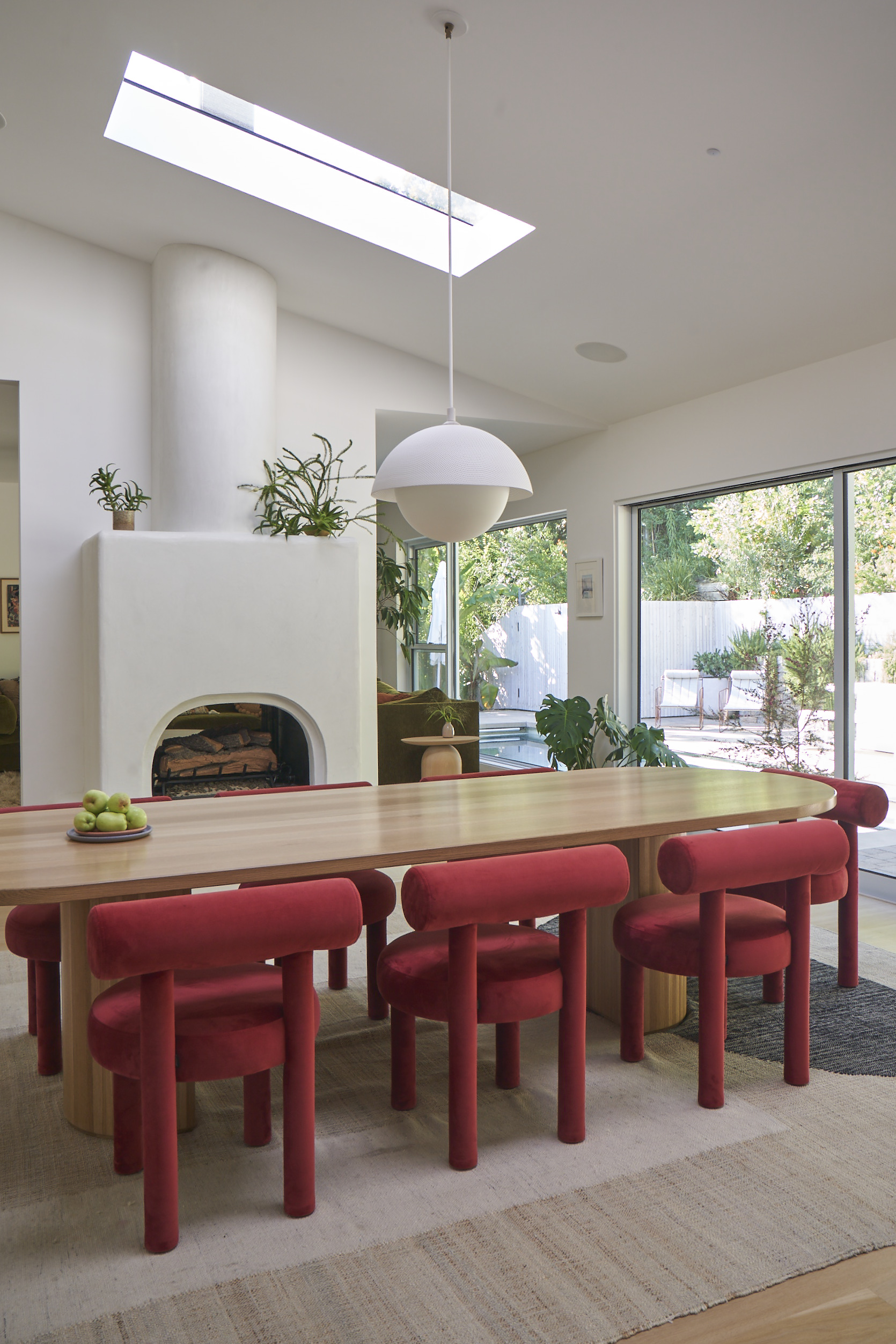
So how are modern interior designers using it in their schemes? As an accent, tomato red provides an interesting prospect. It can stand in place of similarly energetic color pops, whether that be electric blue or vibrant saffron yellow, both color trends in their own right.
Be The First To Know
The Livingetc newsletters are your inside source for what’s shaping interiors now - and what’s next. Discover trend forecasts, smart style ideas, and curated shopping inspiration that brings design to life. Subscribe today and stay ahead of the curve.
'I'm definitely seeing these bold, near-primary reds used in otherwise neutral schemes,' says Livingetc's deputy editor, Hugh Metcalf. 'Designs like this dining room, created by Tandem Interiors, use them to highlight a bold, sculptural form. I think it's a way to use color that not only elevates the space, but that makes it feel modern and design-forward.'
'With the current fondness for warm neutrals, this tomato red provides a softer contrast to modern schemes than some other accents,' Hugh adds. 'It sits more happily alongside beiges and off-whites, which tempers down its energy somewhat, making it feel less intense.'
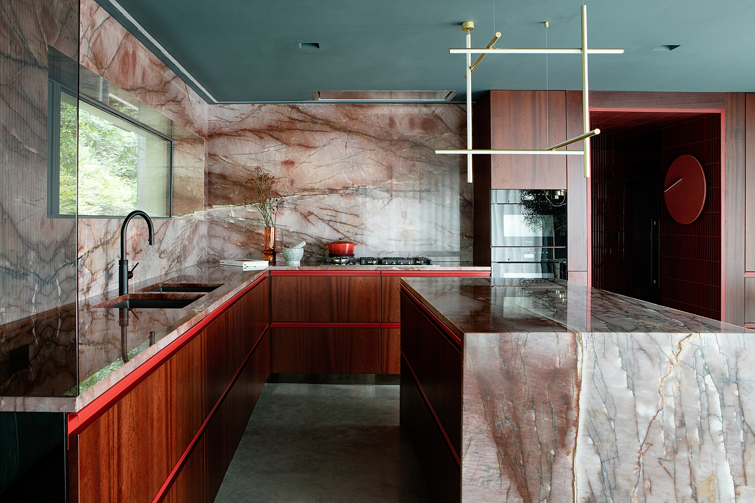
However, sometimes, it's this intenseness that's exactly why you'd choose tomato red. Interior design studio Kingston Lafferty used it as an accent in this modern kitchen design to bring some extra drama to the design. 'To complement the countertop stone, we populated the kitchen with these subtle hints of red,' says interior designer Fiona Stone. 'Choosing red tones here encourages people to act and feel differently within the space: sexy and powerful.'
Should I paint my walls tomato red?
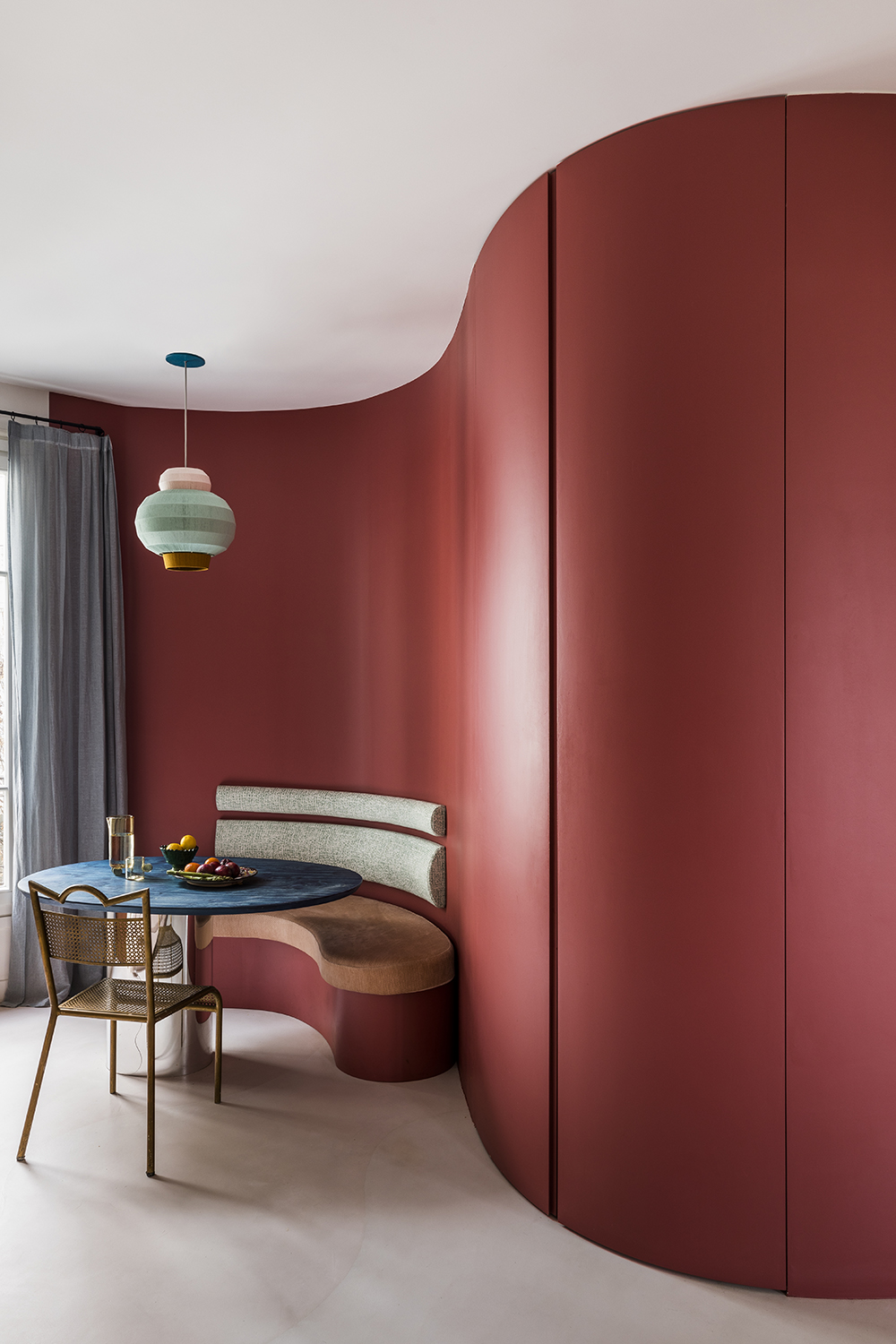
'One of my favorite ways to use Red HTK in a home is by color drenching,' says Tash. Painting your room one color is visually striking and makes any room feel modern and fresh. It can also help to make a smaller room feel larger by blurring the lines between the wall and ceiling, helping to make a room feel bigger.
However, it's a color that needs to be approached with caution. 'Choose the right red for the right room is so important,' Hugh says. 'It's easy for a color that looks relatively subtle as a tester to become overwhelming once you've painted the whole room, with the hue reflecting from wall to wall - and this is only compounded when you paint the ceiling, too
That's something Lick have considered with this collaboration, however. 'We’ve designed Red HTK 57 with a dose of black pigment to tone down its intensity and give you the confidence to drench all four walls and your ceiling in color,' says Tash.
What colors go with tomato red?
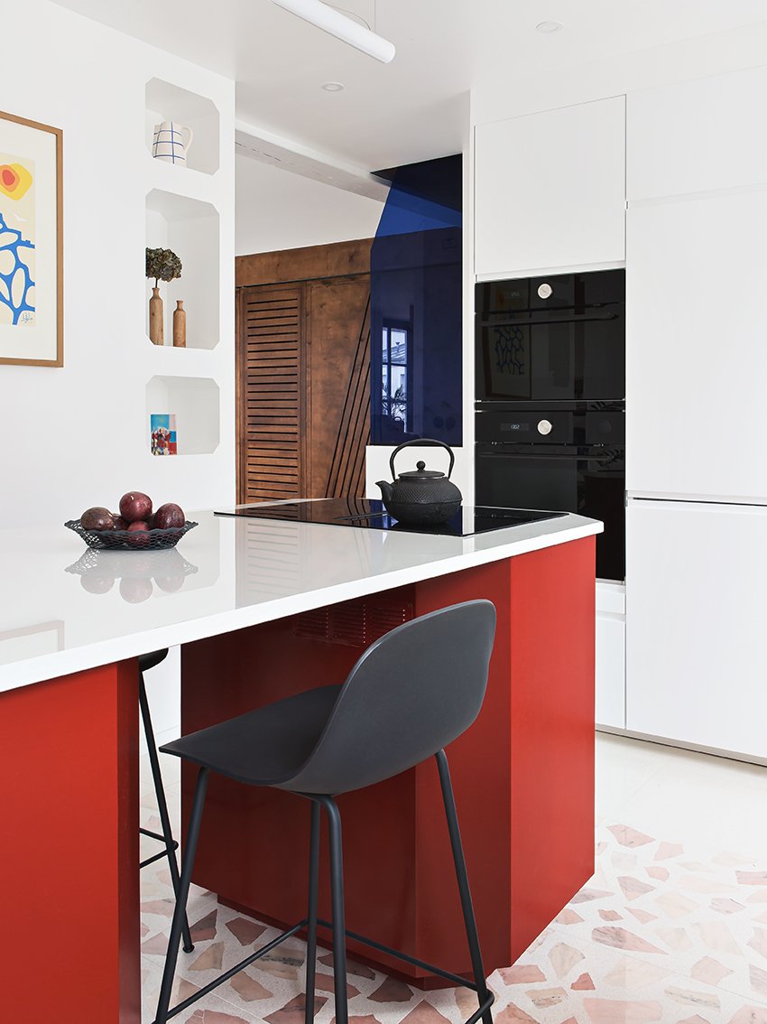
If color drenching isn't your thing, but you're desperate to get this shade in your home, it works just as well as an accent color.
Colors that go with red can be tricky, but when done well it can be incredibly effective. 'We never see color in isolation, so when red is used as an accent color against softer tones, it really stands out,' says Tash.
'Red has the longest wavelength of all the colors, meaning that it advances towards you and you’ll be drawn to it the most,' she explains. Combining the shade with softer neutrals or pinks with elevate your color palette and uplift the whole room. Try tying the room together with pops of color in the same shade family, this will create harmony without looking monochromatic.

Formerly a news writer for Livingetc, Amy completed an MA in Magazine Journalism at City, University of London, and has experience writing for Women’s lifestyle publications across arts, culture, and beauty. She has a particular love for the minimalist aesthetic mixed with mid-century furniture, especially combining unique vintage finds with more modern pieces. Her previous work in luxury jewellery has given her a keen eye for beautiful things and clever design, that plays into her love of interiors. As a result, Amy will often be heard justifying homeware purchases as 'an investment', wise words to live by.
-
 7 Sustainable Product Designs That Are Setting the Agenda for Environmentally-Conscious Homes in 2025
From pillows made from textile waste to sanitaryware made in the world's first electric kiln, these brands are revolutionizing sustainable design — for the better
By Devin Toolen
-
 NYC's New Rules Forced Me to Find a Chic Compost Bin — Here's 7 Options Significantly Cheaper Than the $300 Fine
Composting is now mandatory in NYC. Here’s how to do it stylishly
By Julia Demer
-
 The 90s Kitchen Trends We're Seeing Come Back in 2025 — 5 Features Making Waves in Modern Designs
A quarter of a century later, 90s-inspired interiors are back, serving kitchen nostalgia with a contemporary twist
By Lilith Hudson
-
 IKEA Reveals Its 2025 Color of the Year — An Electric Blue Hue, That Is Enticingly Bold and Brilliant
Though unexpected, this shade of blue may be my favorite color of the year prediction yet
By Olivia Wolfe
-
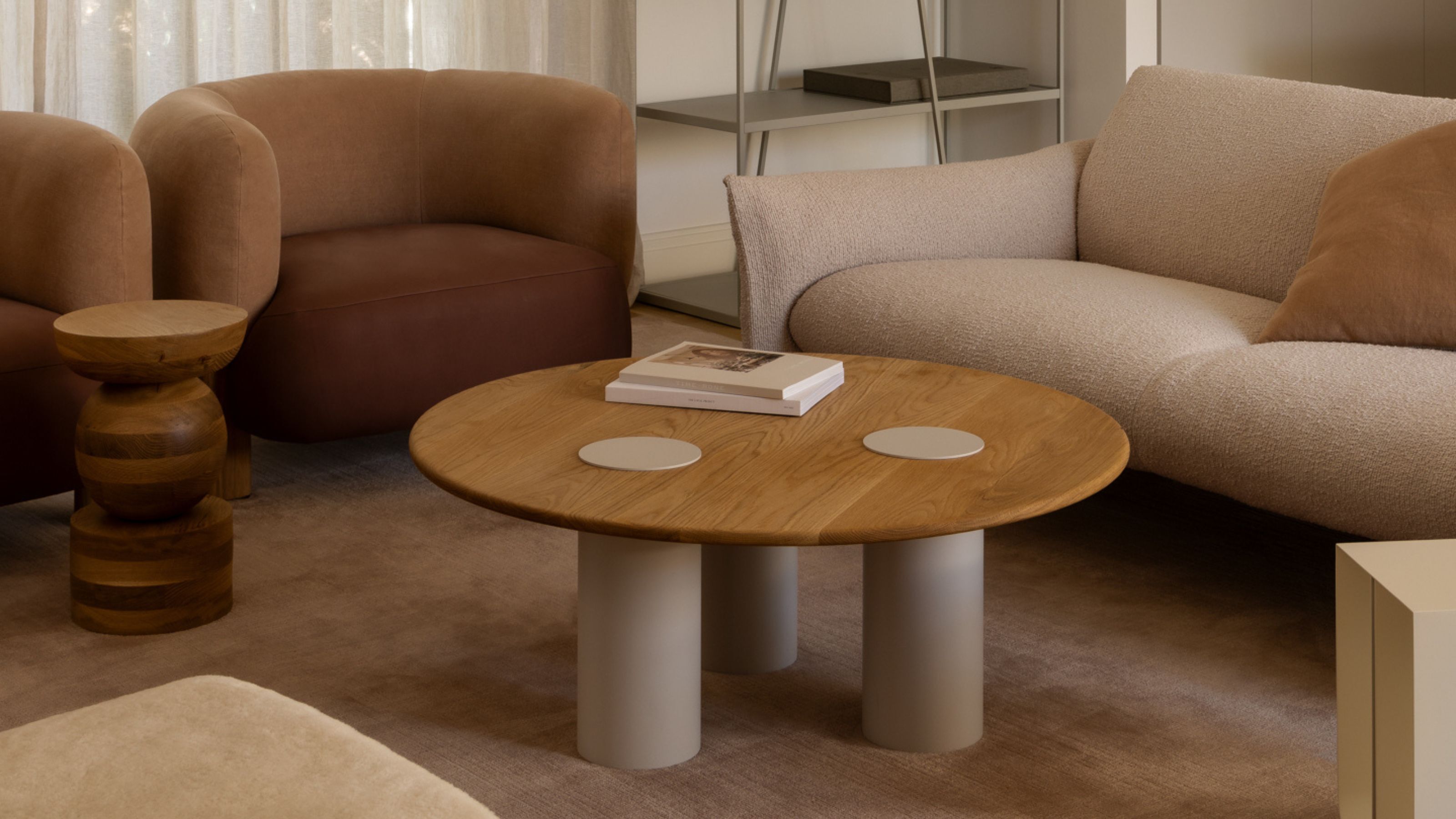 Pantone's Color of the Year for 2025 Has Been Announced — Meet 'Mocha Mousse'
We share how to style it, shop it, and everything else you need to know about the subtle yet elegant soft brown shade
By Olivia Wolfe
-
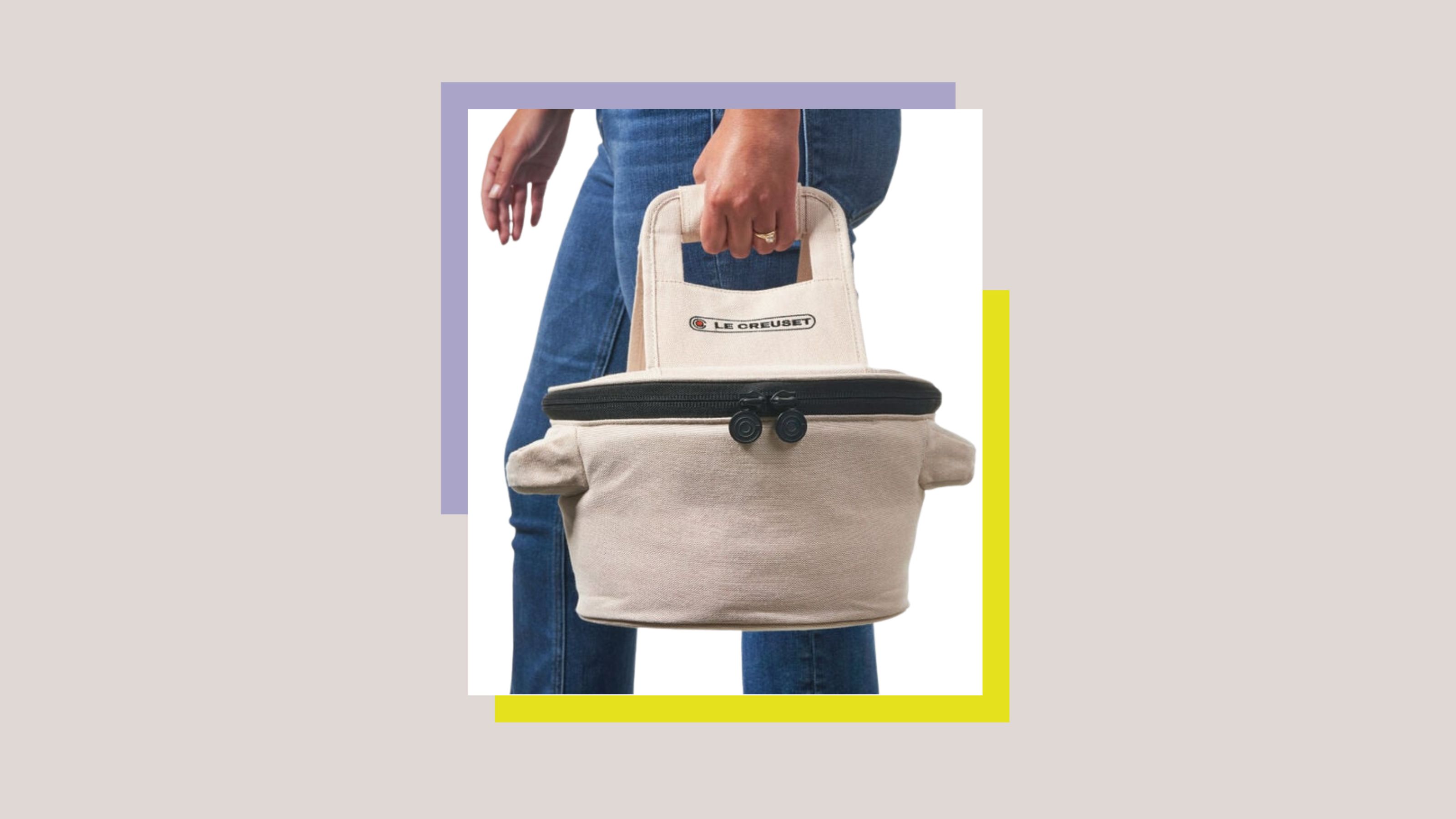 Le Creuset Just Released a Ridiculous Tote Bag for Transporting Their Dutch Oven to Dinner Parties — I'm Obsessed
Whether you need it is certainly not the question, here. But whether you want it... well, why wouldn't you?
By Olivia Wolfe
-
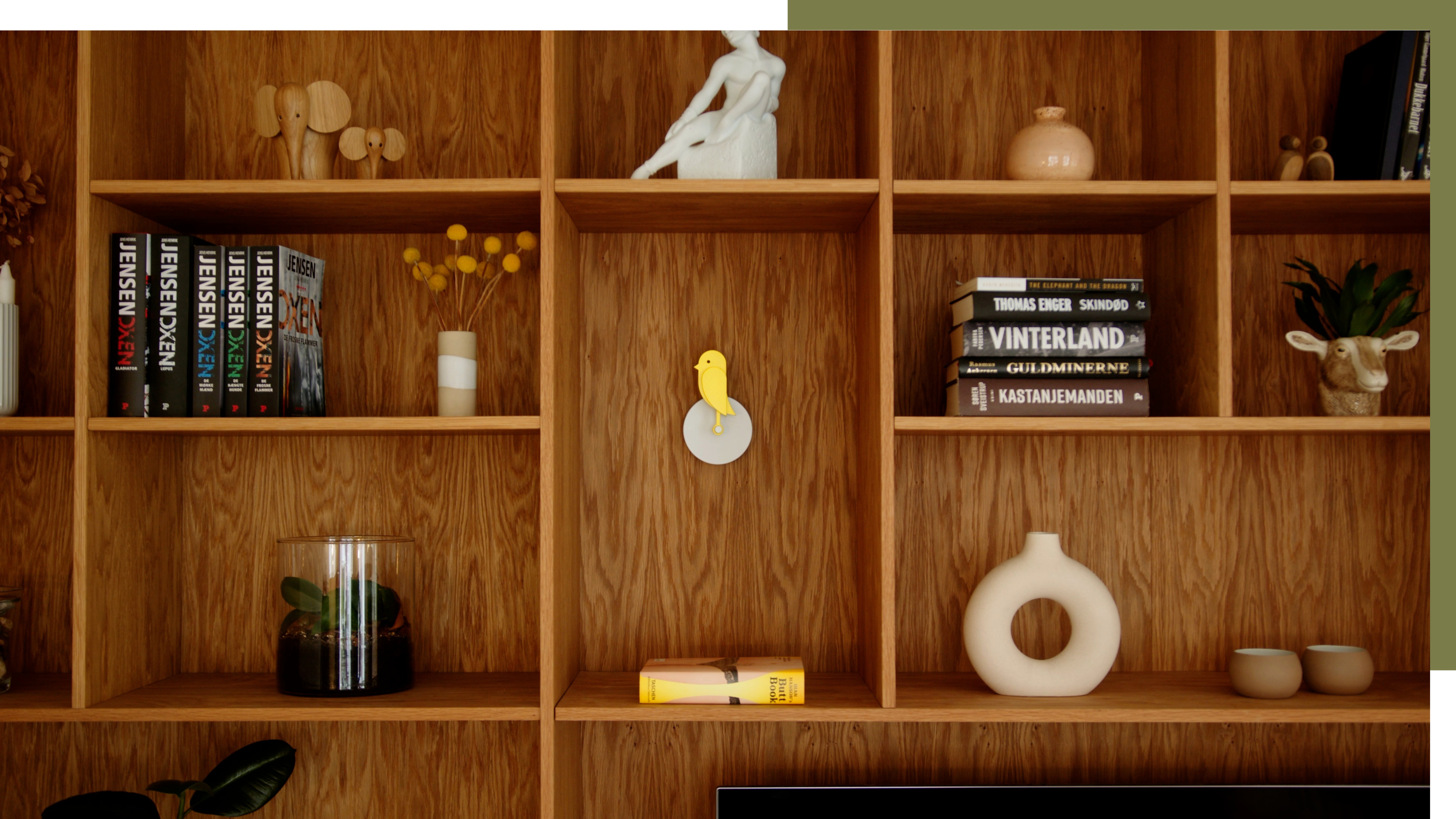 A Little Birdie Said Monitoring Your Air Quality Just Got a Stylish New Look
This Amazon buy is promising a healthier home with no style expense
By Olivia Wolfe
-
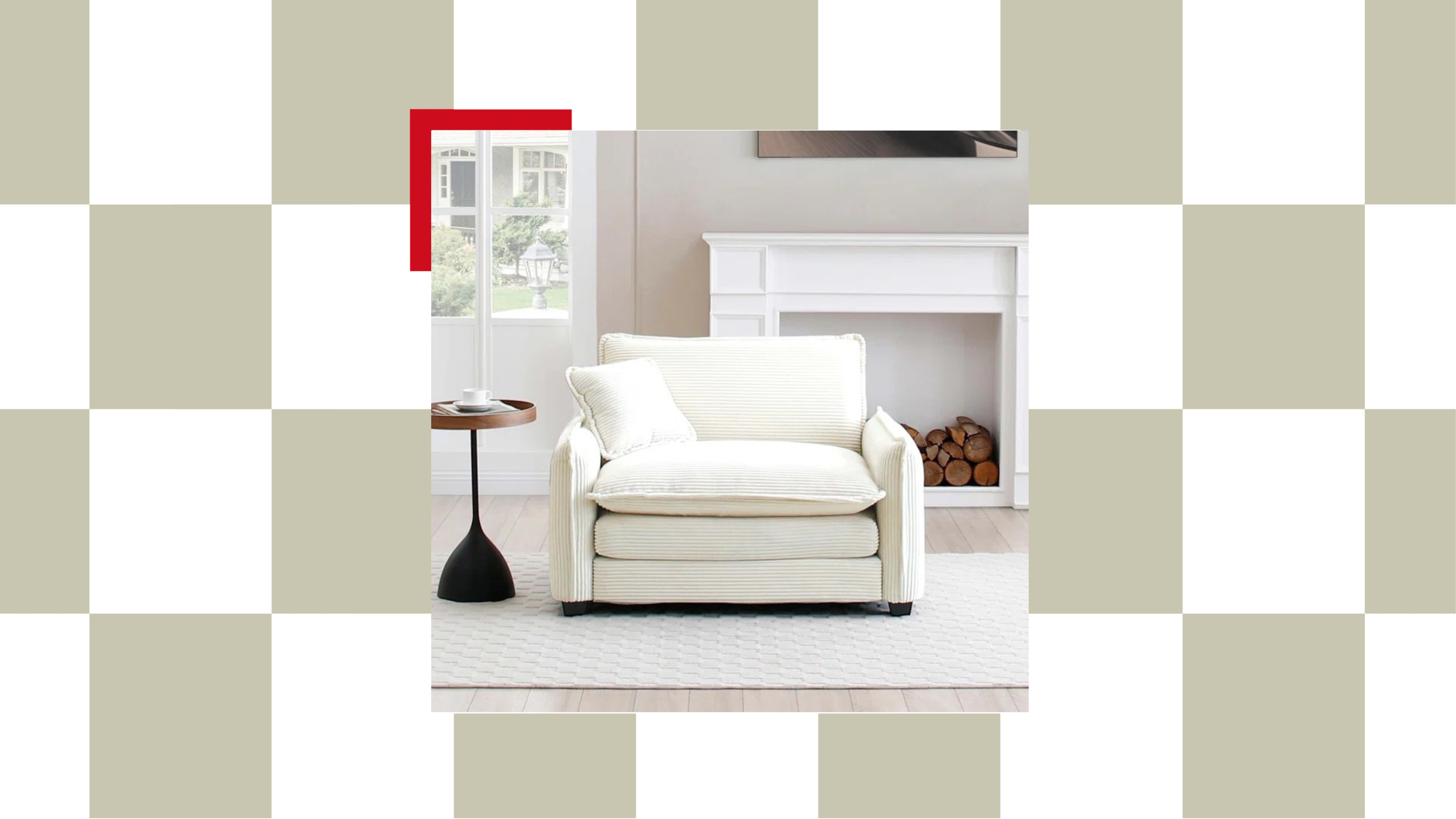 The "Chair-and-a-Half" Is the Goldilocks of Seating — Not Too Big, Not Too Small, but Just Right for Snuggling Up This Season
This accent chair trend is perfect for the cozy season, and it's on sale at Wayfair
By Olivia Wolfe
-
 Textured Walls Are Still Trending (And Just Got a Whole Lot More Chic Thanks to This Jeremiah Brent Collaboration)
'Nostalgia' is the name, and texture is the game; this moody new peel-and-stick wallpaper collection is bringing all the fall vibes to interior design
By Olivia Wolfe
-
 Ruggable's Latest Collection is Dripping in What We're Calling the Season's Go-To Fruit-Inspired Hue
We're seeing the sunny, mango-inspired shade cropping up in new collections across the design world — and it's surprisingly perfect for fall. Here's why
By Olivia Wolfe