4 decorating trends we spotted in Kelly Wearstler's latest projects that any home can copy
Kelly Wearstler’s new book, Synchronicity, is a lesson in taking risks and embracing authenticity - here are the 4 trends from the book to get inspired by
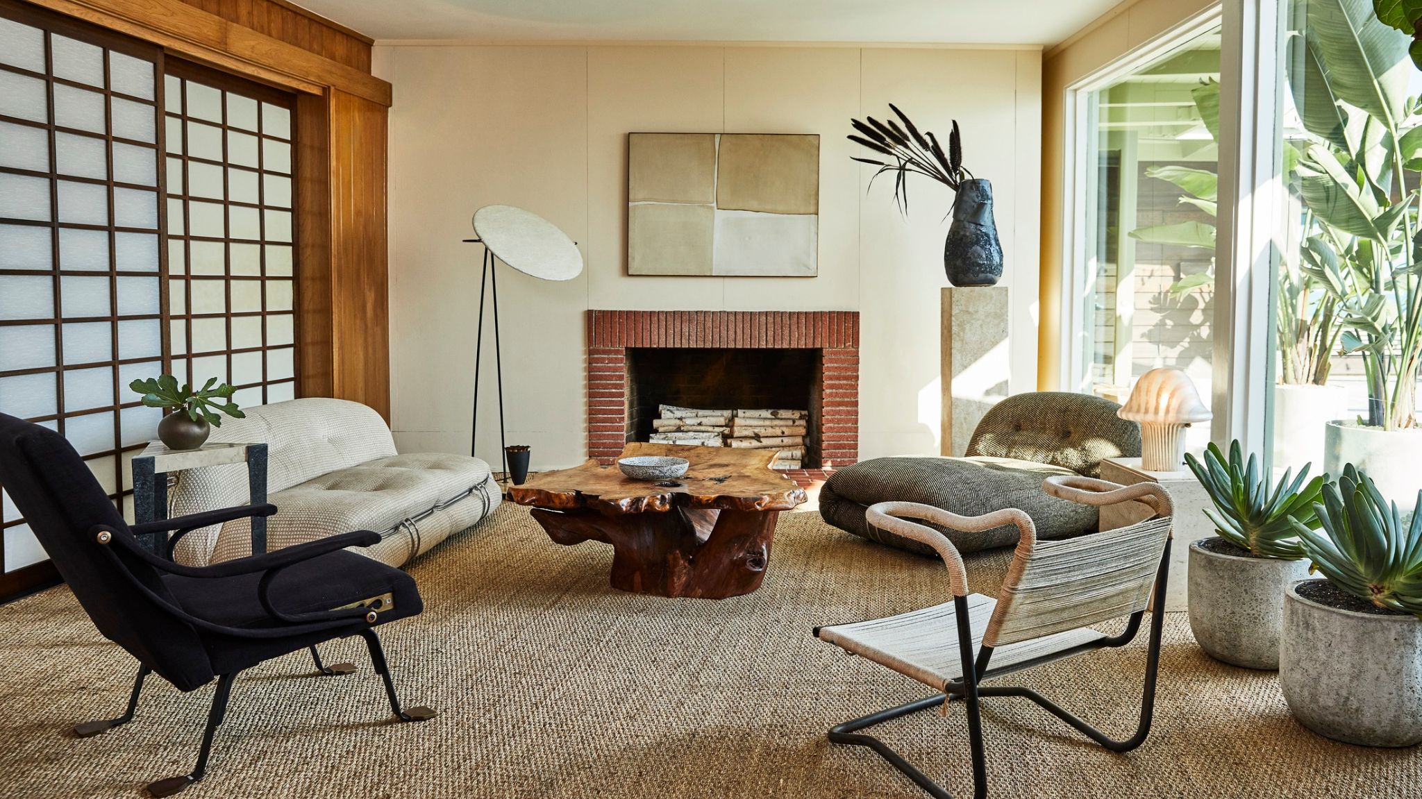
With every project delivered by Kelly Wearstler, the world stops and pays attention. We’ve seen her incredibly creative vision and artistic flair be delivered to create beautiful homes but also restaurants and hotels, each with a completely unique vision and own story to tell. Somehow, ideas don’t cease to flourish for the designer whose aesthetic is recognizable yet always lending a different facet of itself to each new project that comes along.
Luxurious, even opulent interiors are no stranger to Wearstler who has a very keen eye for mixing beautiful textures and colors to create interiors that are almost cinematic in look, yet inviting and comfortable. The making of a Wearstler interior, as well as the final product, reminds one more of creating art, rather than design. The launch of her latest book is a collection of project imagery that is a testament to the designer's vision, and I've spotted four emerging interior design trends that you should definitely keep an eye on, and get inspired by if you want to recreate the designer's impossibly cool look at home.
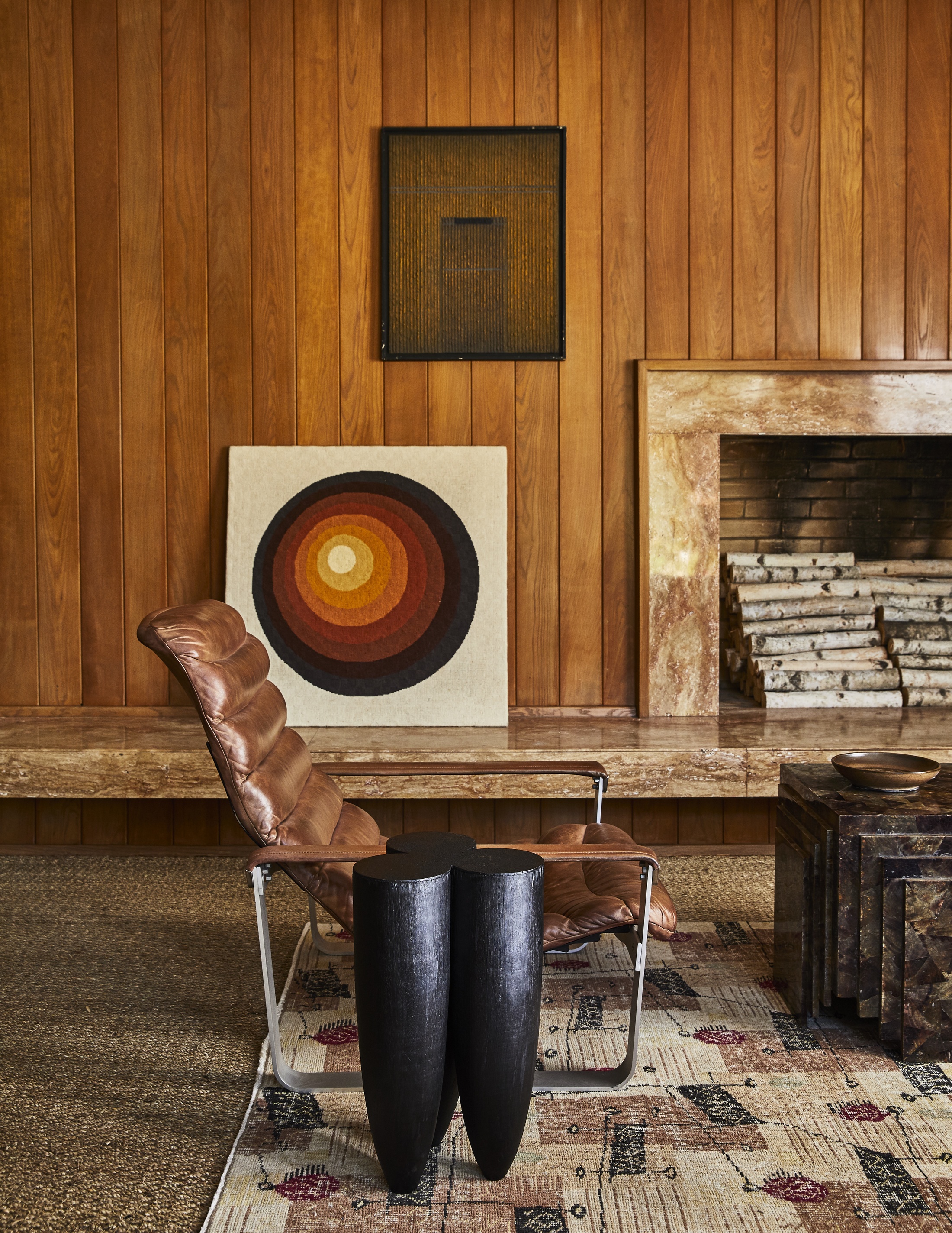
Kelly Wearstler’s latest book, her sixth so far, will debut in October and is set to explore her vivid interiors and distinctive ideologies at the heart of her practice. Synchronicity gives us a glimpse into her boundary-pushing designs, with a focus on both her residential and commercial projects.
Going through this book you’ll absolutely get lost in the highly detailed, stunning imagery of seven of her most striking projects. It’s hard not to linger over every image as there is so much to take in from the seamless mix of colors, the juxtaposition of materials, and the choice of furniture and art. Each item is curated with immense care and thought, but somehow appears seamless.
An important message of the book, also reflected in the title, is linked to the designer’s collaborative process which she celebrates and finds vital for achieving such monumental results. The synchronicity of crafts, visions, and skills nourished over years of practice are poured into every project, and the results, showcased in detail in the book, reflect it.
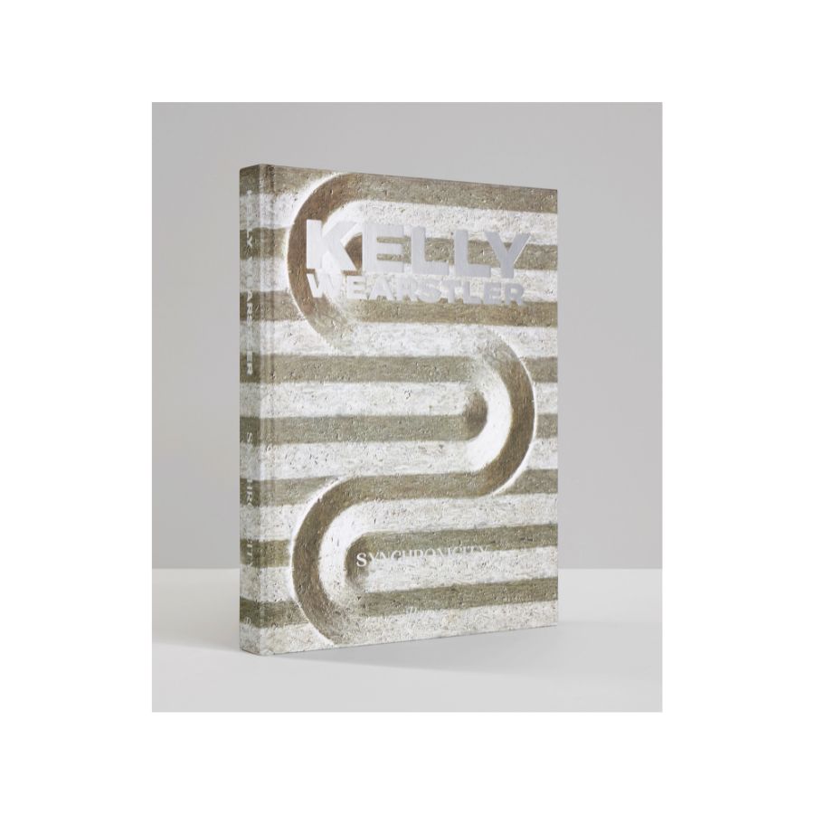
Price: $60
A comprehensive compilation of never-before-photographed interiors, Synchronicity is an expansive resource for designers, creatives, and homeowners alike, looking for rule-bending yet elegant inspiration.
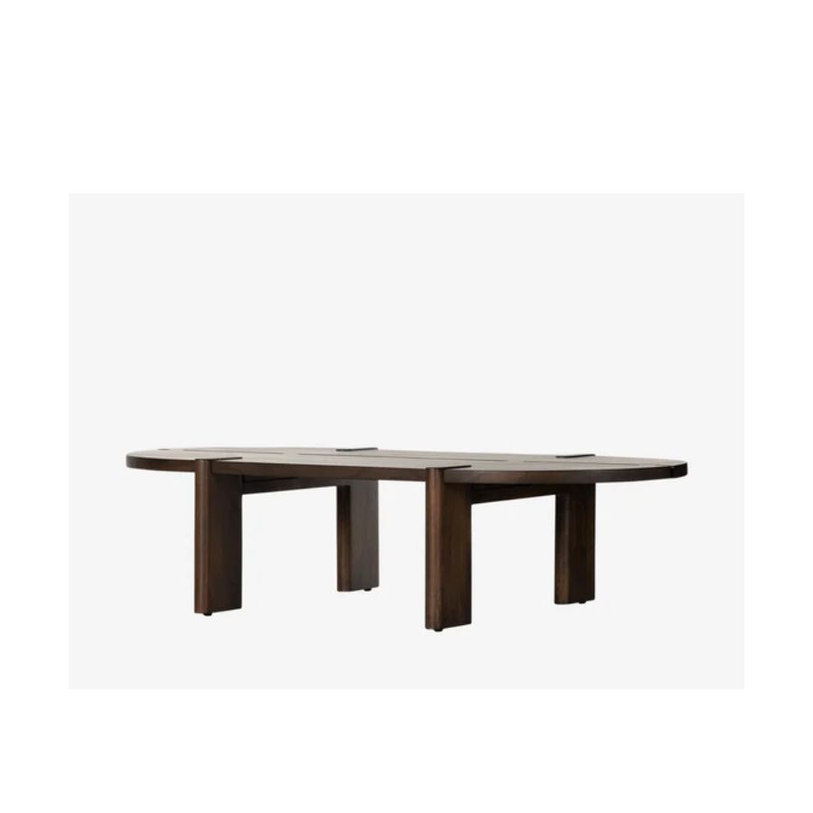
1. The interesting coffee table
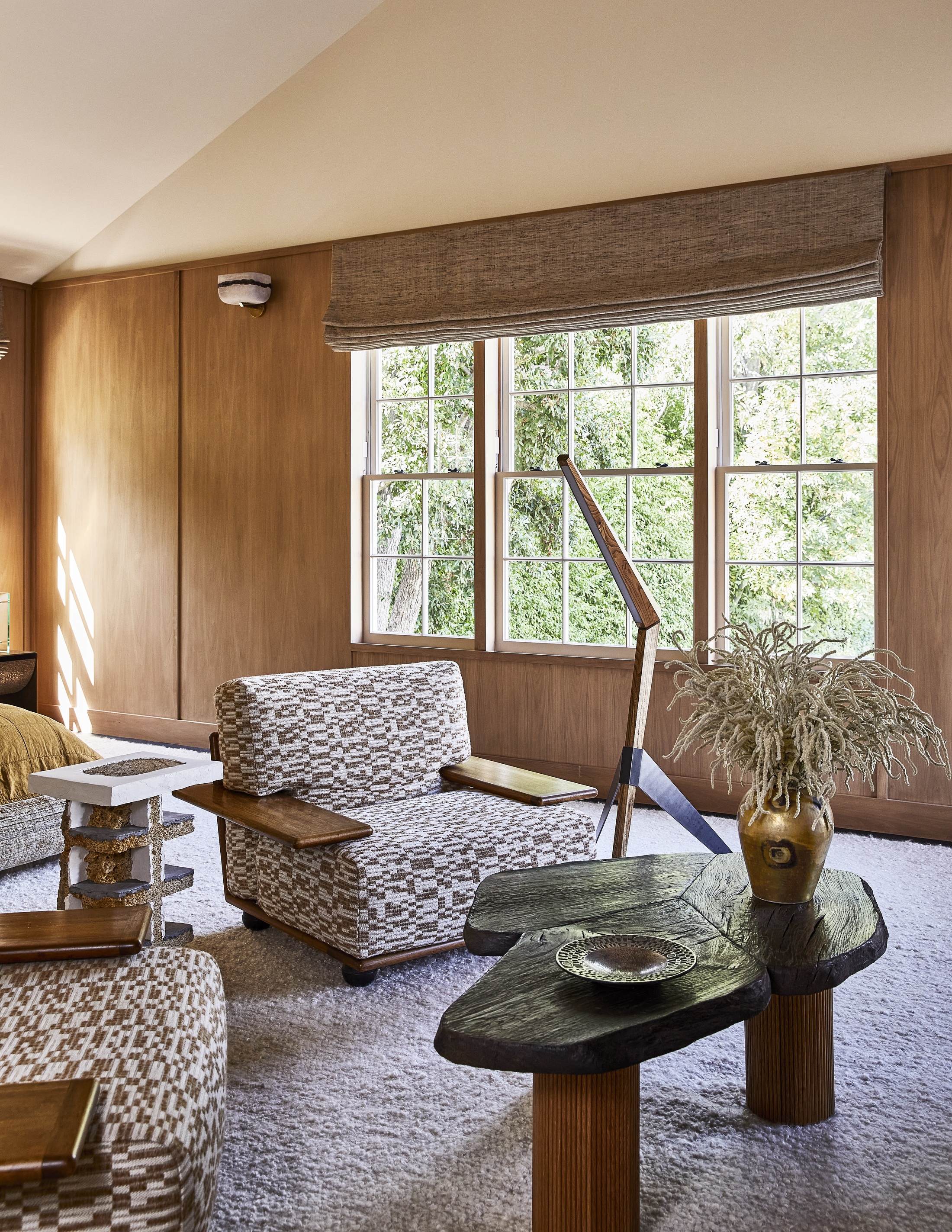
There is something about a beautiful coffee table that is so now and incredibly chic. Not something to add as an afterthought, but to be considered, carefully chosen, and curated just so with a display of beautiful objects.
Wearstler's designs feature the most interesting and unique coffee tables in irregular shapes and special materials, that really stand out and make a mark of their own in the design of the room.
Be The First To Know
The Livingetc newsletters are your inside source for what’s shaping interiors now - and what’s next. Discover trend forecasts, smart style ideas, and curated shopping inspiration that brings design to life. Subscribe today and stay ahead of the curve.
2. The mix of luxurious materials
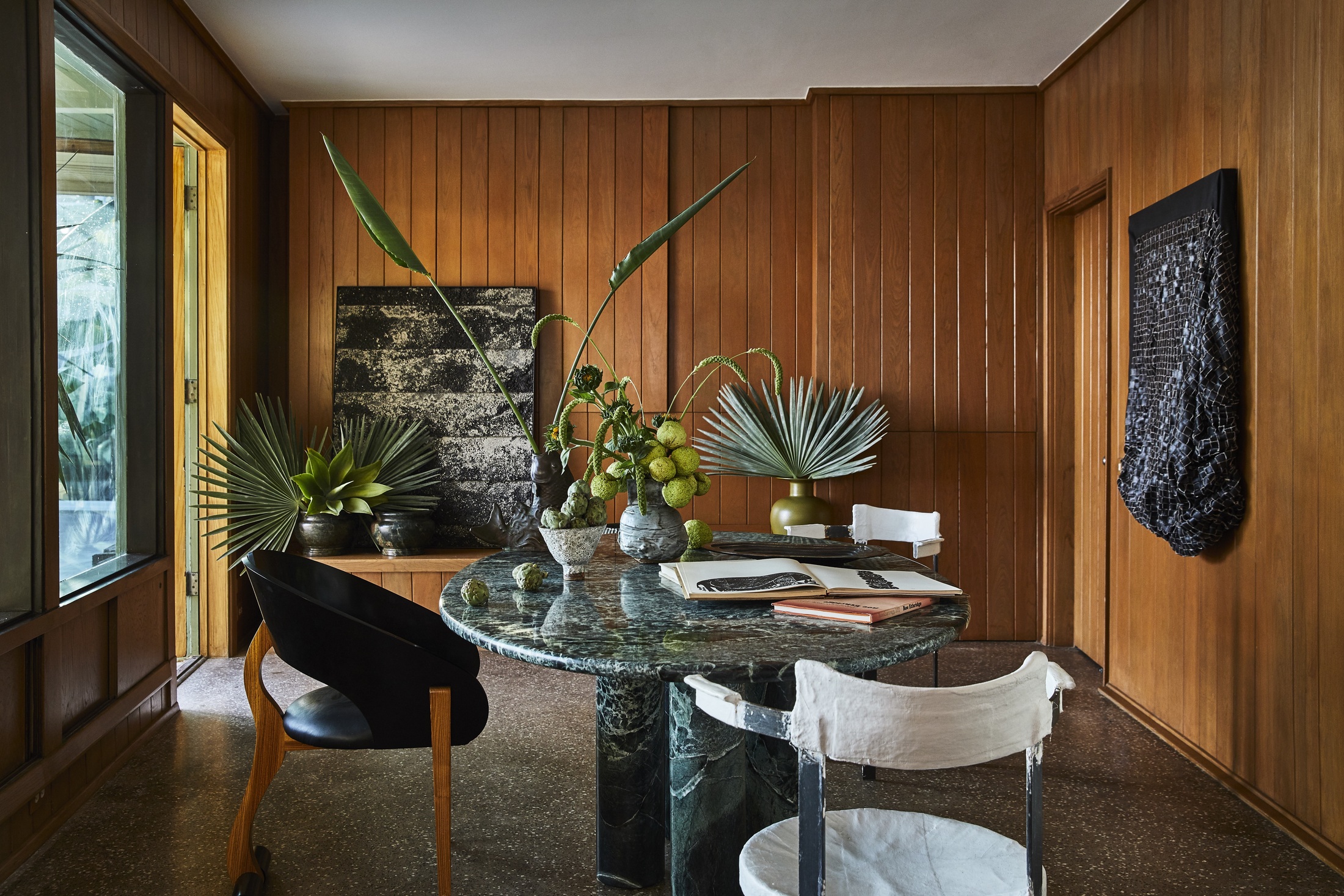
There is something unique to the way Wearstler plays with different materials. In each of her designs, there is a symphony of textures that makes the spaces look so interesting. They add depth and make one's eye search the room with curiosity as it travels over each and every surface. Marble, wood, leather, and textiles all merge to create a comfortable space that feels rich and inviting.
3. Rich, saturated colors
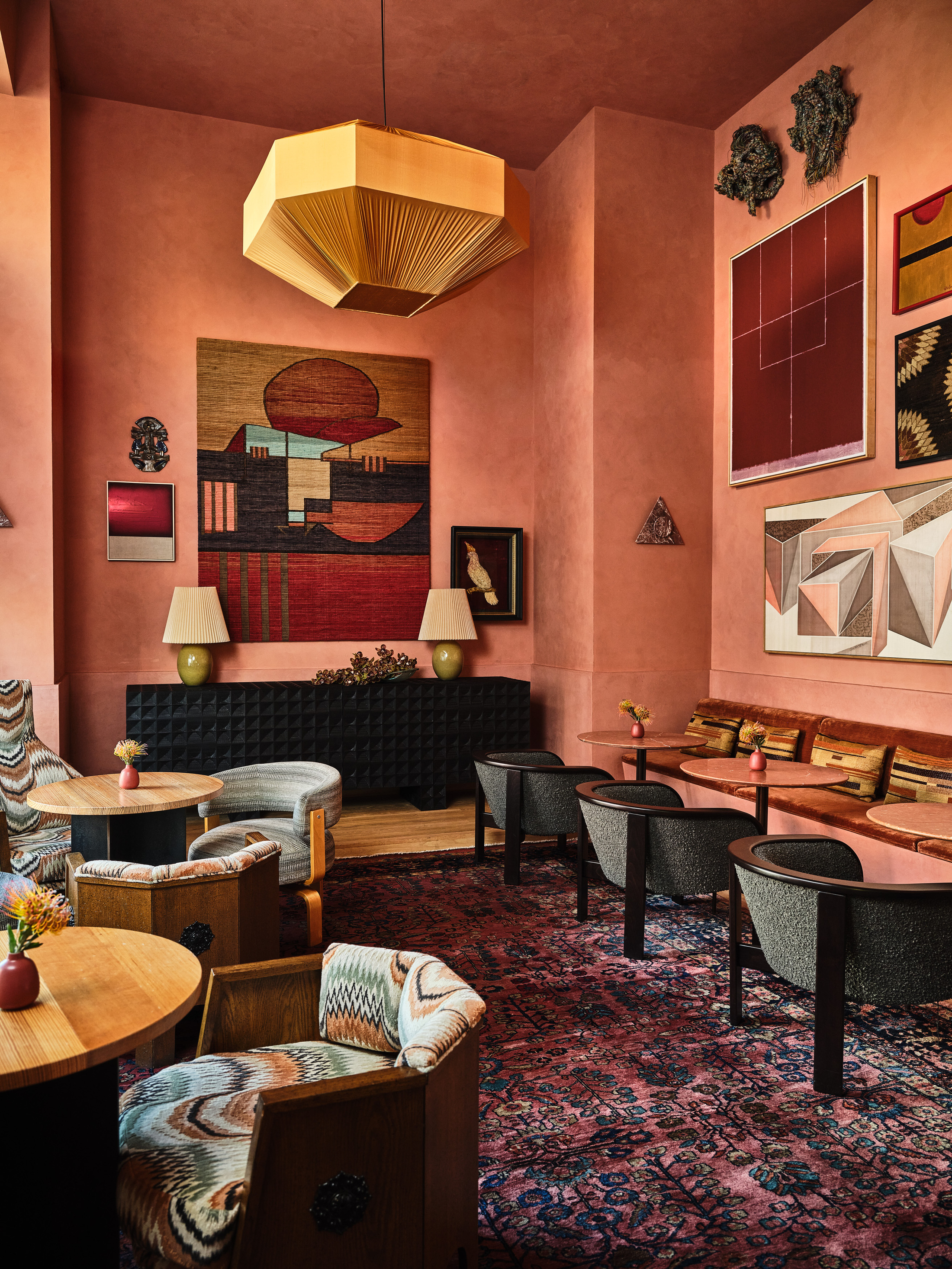
You can't argue Wearstler's mastery of color. The designer is well known for her very warm palettes in very rich, deep tones of rust, greens, and terracotta pinks that we see covering walls and furniture alike in a perfect balance that creates a sense of elegance and calm.
The materials she uses are also used to add color to the palette, such as warm wood tones, or different colored stones.
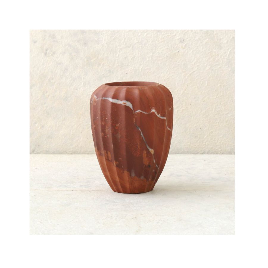
4. The artistic vase displays
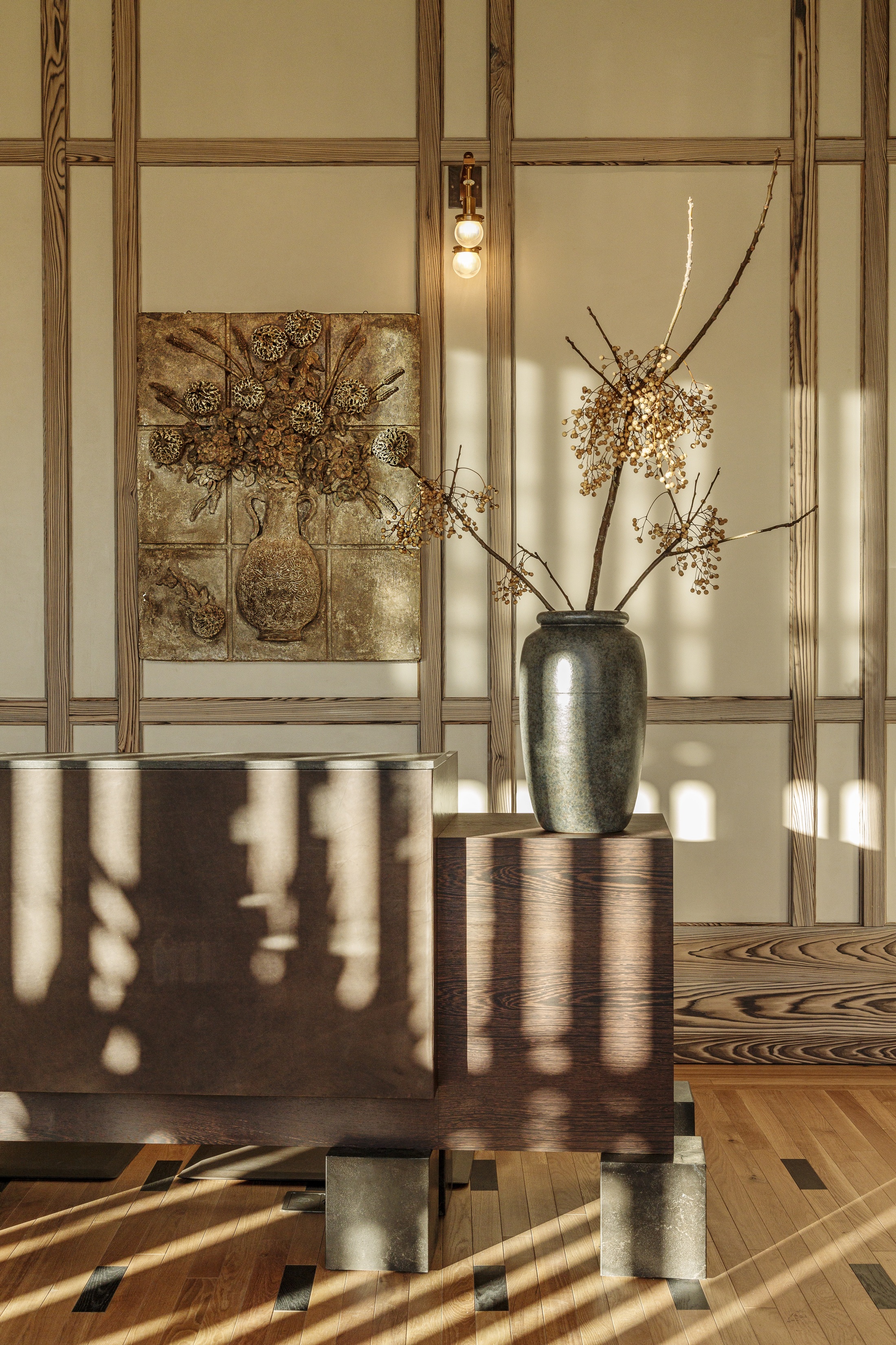
I love this design element that you can easily take home and implement. Wearstler knows how to style a vase and make it look like an actual work of art. The vase becomes a carefully curated object that further tells the story of the space it's in, with flowers, branches, or foliage arranged just so, clearly thought through but looking relaxed at the same time. This is definitely something you can experiment with at home. Think scale, and go for larger displays.
Get the look of Kelly Wearstler's designs with these buys
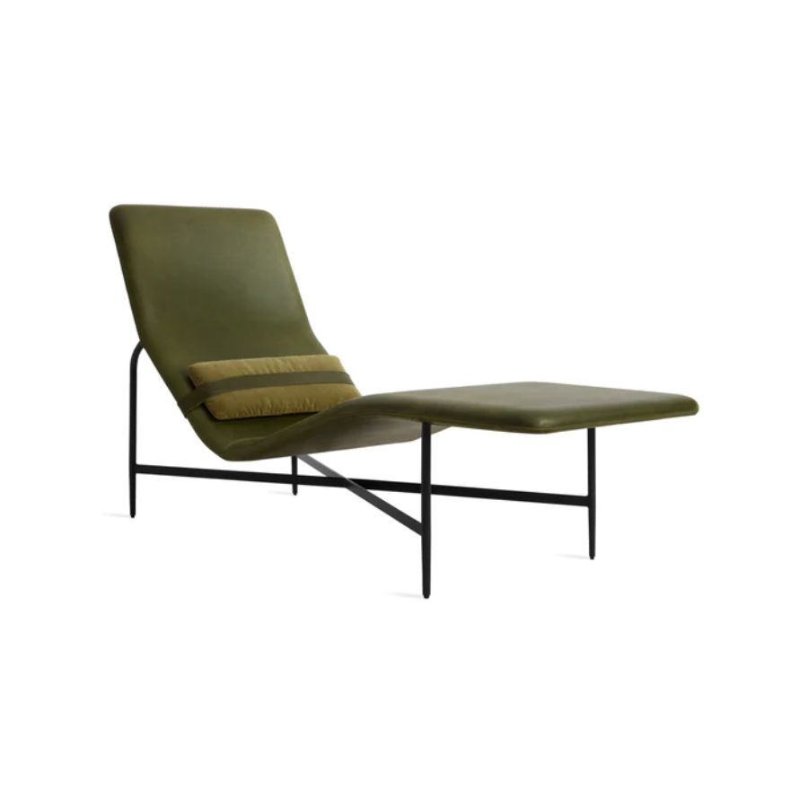
Price: $2,495
Wearstler's interiors are luxurious yet comfortable, and her mix of materials is unique. This leather chaise lounge in deep green is mid-century inspired and will look very elegant in a living room with a natural palette.
Raluca formerly worked at Livingetc.com and is now a contributor with a passion for all things interior and living beautifully. Coming from a background writing and styling shoots for fashion magazines such as Marie Claire Raluca’s love for design started at a very young age when her family’s favourite weekend activity was moving the furniture around the house ‘for fun’. Always happiest in creative environments in her spare time she loves designing mindful spaces and doing colour consultations. She finds the best inspiration in art, nature, and the way we live, and thinks that a home should serve our mental and emotional wellbeing as well as our lifestyle.
-
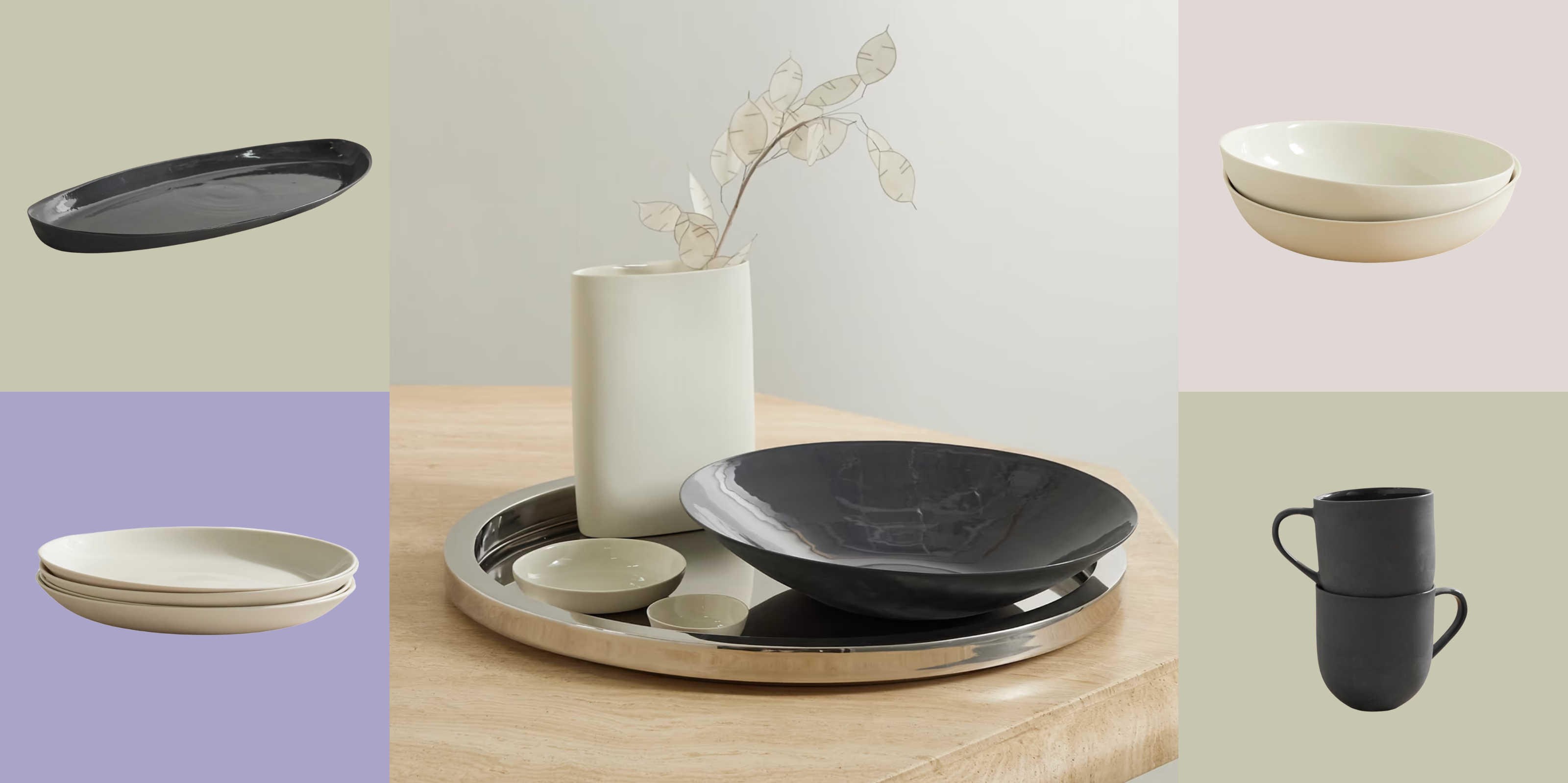 Turns Out, Sustainable Design Can Be Chic, and Net-a-Porter's 'Net Sustain' Curation Is Proof — Here's What I'm Shopping
From the Net Sustain collection, Mud Australia's homeware is not only design-oriented, but eco-focused, too
By Devin Toolen
-
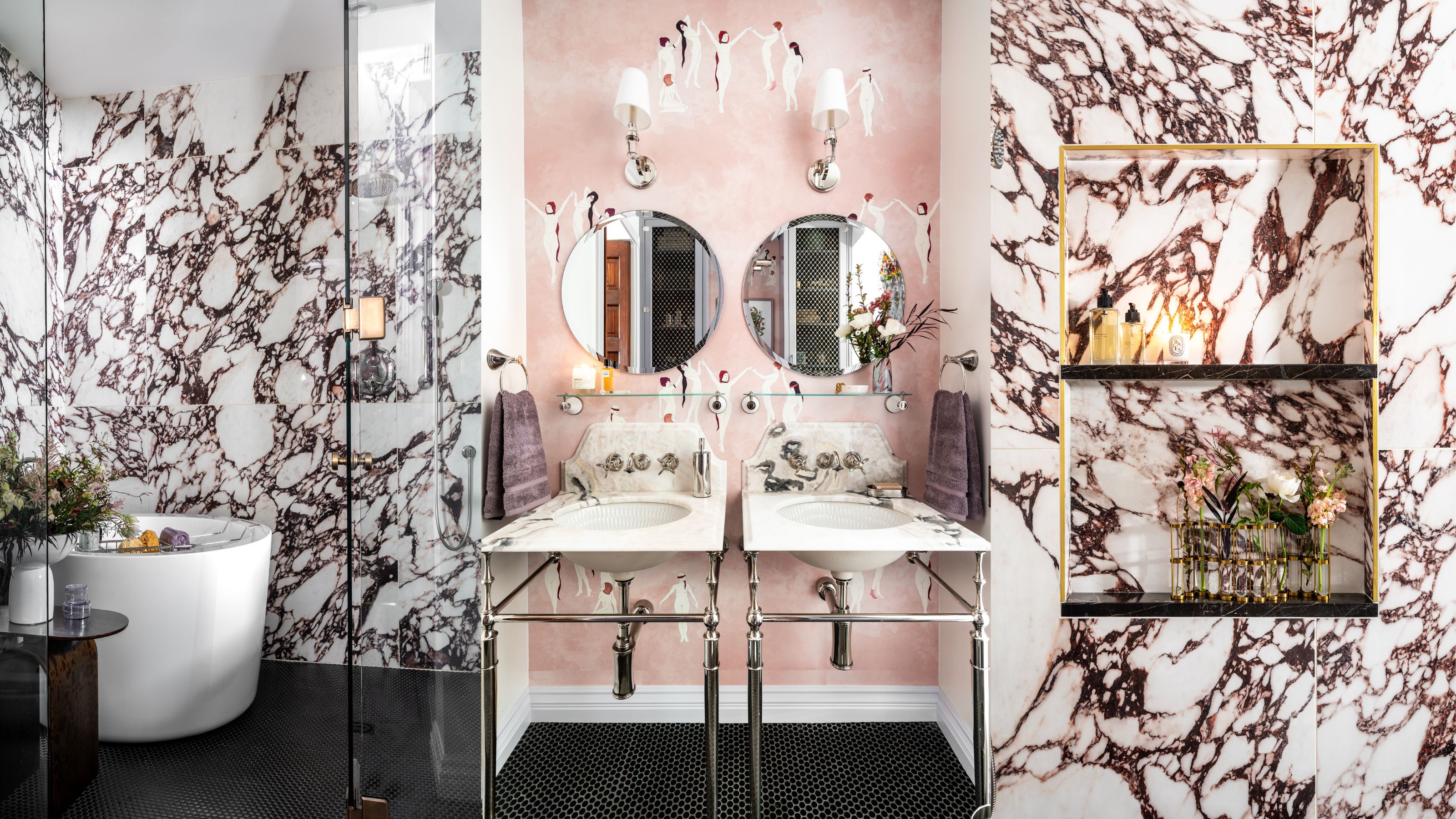 Before and After — How This Jewel-Box Bathroom Made the Most of Its Proportions With Maximalist Design and a 'Soaking Tub'
This design offers a masterclass on creating a luxurious bathroom that is equally playful and elegant.
By Maya Glantz
