Architects love this new design trend which makes rooms lighter, calmer and warmer
Designers and architects are embracing wooden slats as a home decor trend, using them to create spaces where air and light flow and textures feel warm
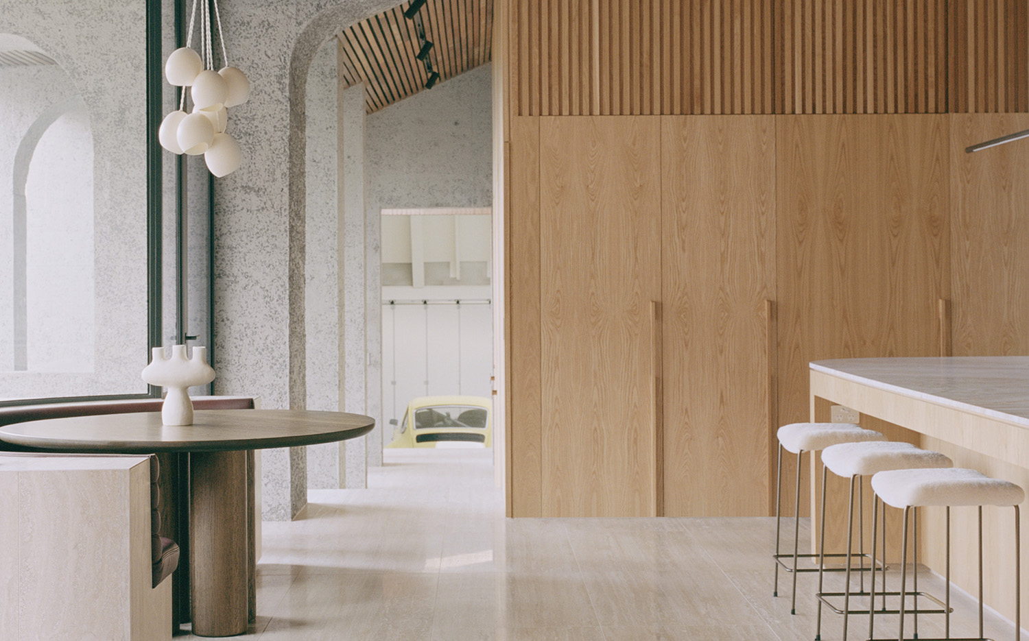
Once you start noticing wood slats in modern interiors, you’re bound to see them everywhere. The narrow wooden planks (also referred to as wood lath) are so versatile, and so prone to DIY projects, you’ll spot them inside and outside the home, across ceilings, walls, decor and furniture.
Used for centuries as a structural material (think roof construction, and even sliding screens found in traditional Japanese architecture), they are now often an aesthetic – albeit functional – choice for modern and minimal interiors (think accent walls, or George Nelson’s iconic mid century Platform Bench). An interior design trend that has been around forever.
‘They delineate space and add texture, but are also porous and create effect,’ says Ian Starling, founder of Brooklyn’s Starling Architecture, who recently used wood slats to create a soft barrier in a recent project. ‘The elemental nature of slats and screens naturally lends itself to contemporary architecture, where you are often trying to create impactful moments through minimally detailed design elements.’
The long and repeating strips of wood can help accentuate a room’s height when placed upright, and can usher in strikingly crisp lines in pretty much any direction you install them – simple and minimal yet full of warmth and texture. ‘We believe they have a highly interesting graphic effect,’ says Samantha Hauvette, cofounder of Paris’ Hauvette & Madani. ‘It’s an interesting tool to create patterns and rhythm at a very reasonable cost.’
While there’s plenty of room for customization (from the type of wood used to the amount of space left between each board), plenty of panels can be purchased readymade and simply tacked onto the wall. Here’s a look at how architects and designers are making the most of wood slats, from clean-lined accents to clever partitions, from modern kitchens to bunk bedrooms.
1. Create an airy partition
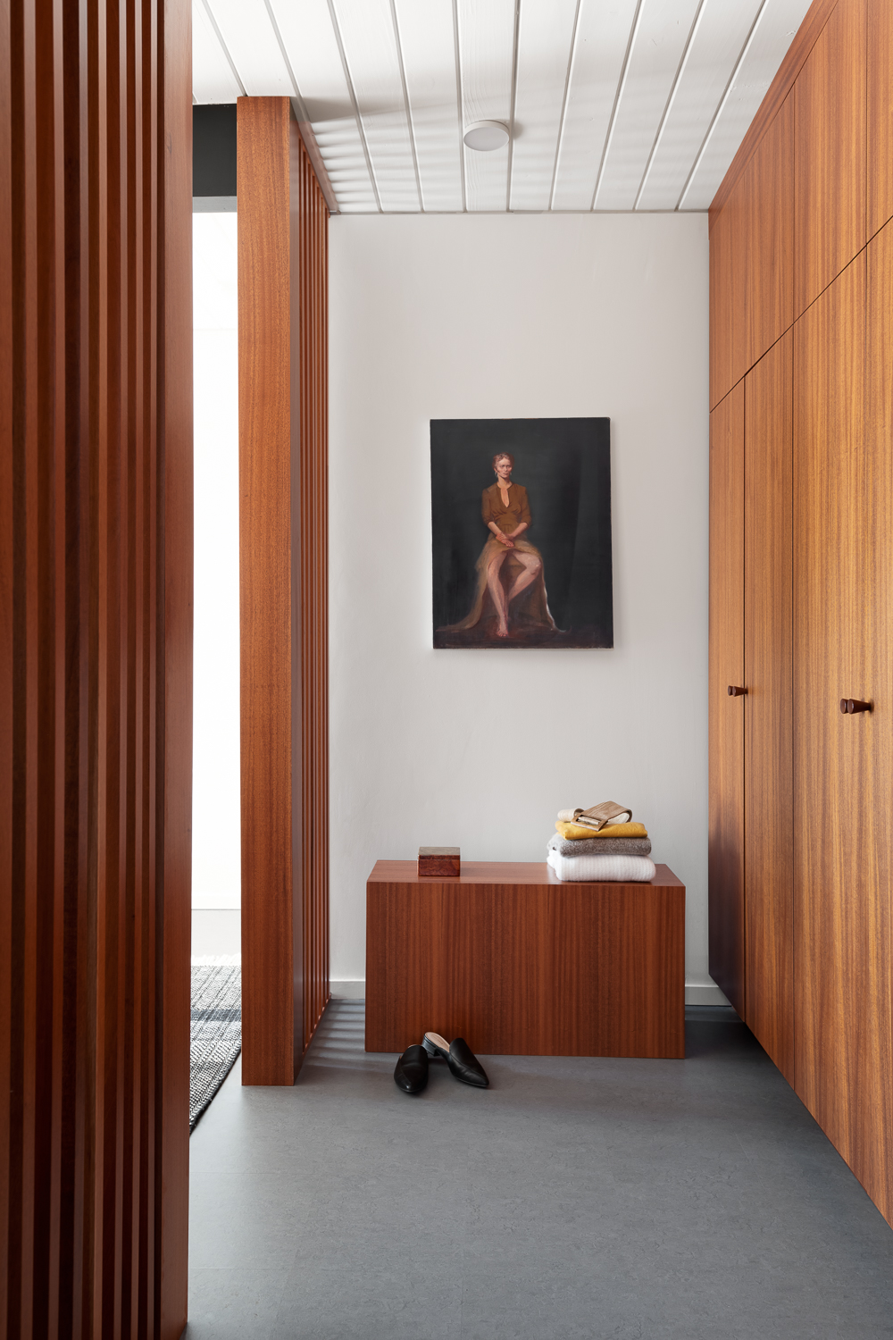
When you don’t want to build a solid wall, slatted wood can fill in the gap – and its overall light feel can help you delineate zones, creating rooms within rooms – without a proper wall in sight.
Here, architects designed a hotel-like space that creates a dressing room inside a modern bedroom without closing it off entirely. ‘Wood slats are a great way to create separation within a space or between spaces because you can control how much light and visibility flows between them,’ says interior designer Karina Marshall.
Be The First To Know
The Livingetc newsletters are your inside source for what’s shaping interiors now - and what’s next. Discover trend forecasts, smart style ideas, and curated shopping inspiration that brings design to life. Subscribe today and stay ahead of the curve.
If you are designing slatted walls from scratch, you can customize how they look and function. “There are many considerations when designing and building wood slat partitions, including how wide and deep the slats should be, and how far apart they should be placed,” adds Karina. “The deeper the slats and the closer together they are the more privacy they provide. Slats can also be placed at an angle to really control what is visible from each space.”
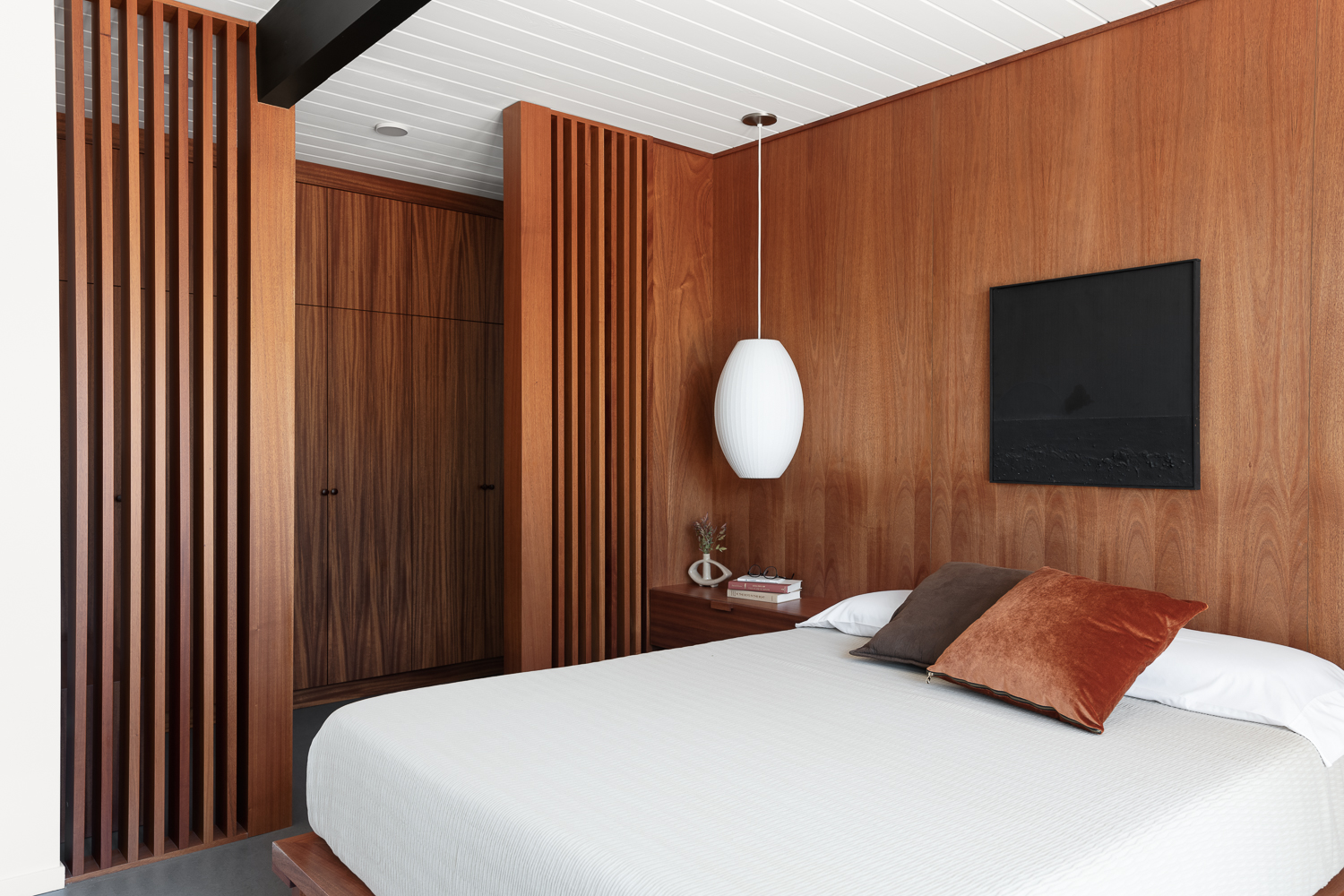
2. Allow a way to check in on a kid's room
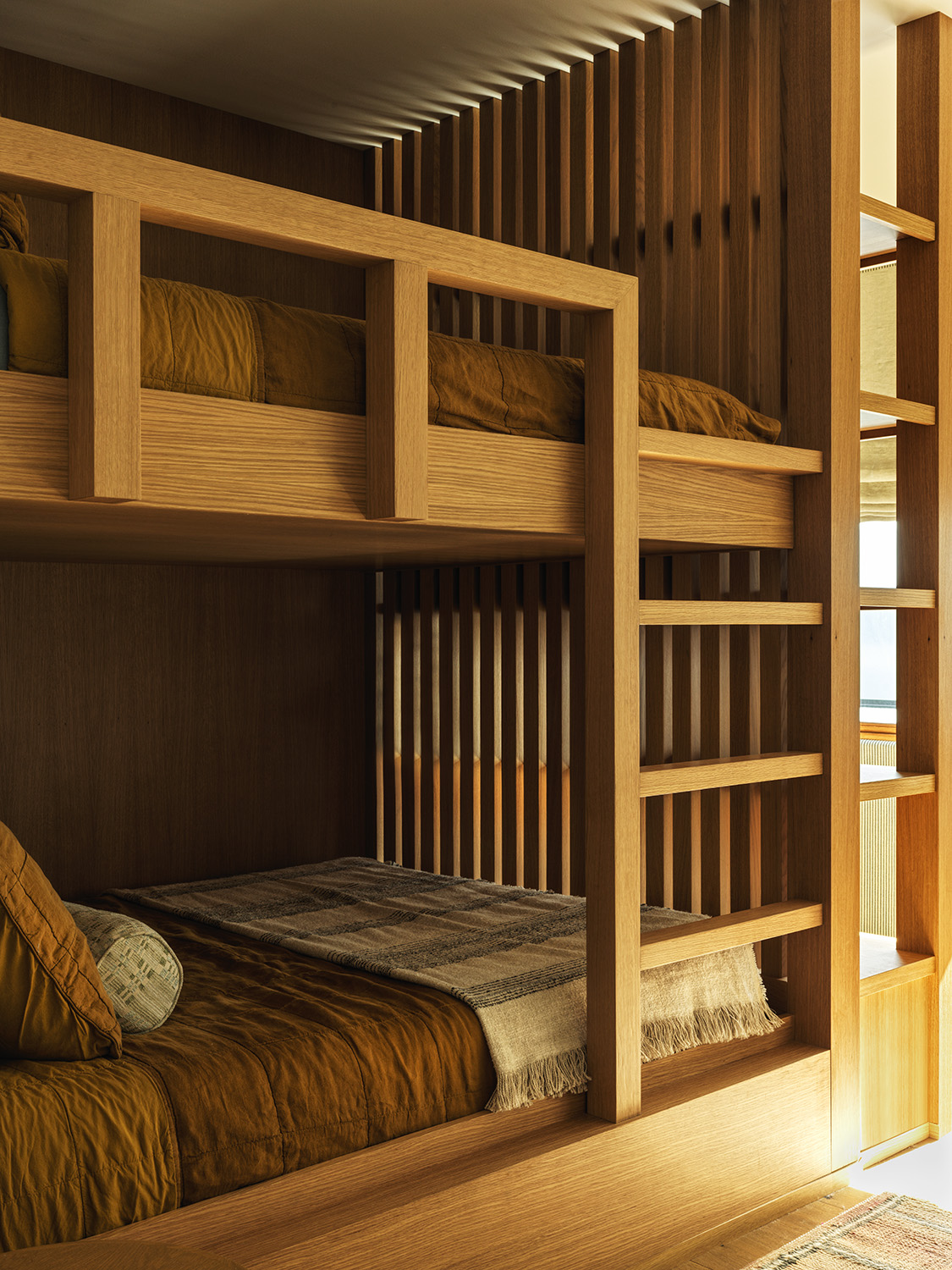
At the end of the day – or even the beginning – slatted walls are all about natural light. ‘In the case of this children's sleeping nook, I liked the idea of raising a wall to act as a cocoon for a sleeping child, but also as a transparent surface through which parents could check in on their child,’ says designer Nina Freudenberger on this elevated kid's room. ‘The child is also shielded from harsh morning light, however still exposed enough to be gently and slowly awakened by daylight when the sun rises.’
In effect, it provides just enough shade and just enough light – not to mention its very own light patterns. “I think that the resulting light shapes on the ceiling from the cast shadows and the light coming through the wood bars are just beautiful, lending so much more interest and depth to a small sleeping nook like this one, which would otherwise risk feeling closed-off and dark,” adds Nina.
3. Warm up raw materials
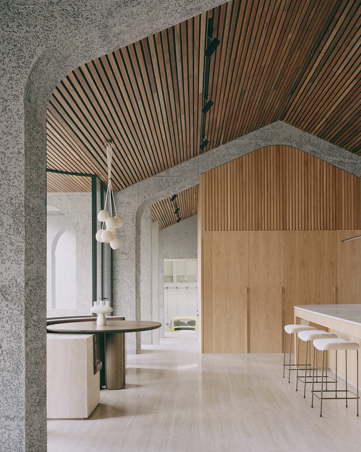
Throughout this minimalist kitchen and living area in Melbourne, a mixture of wooden slats across multiple planes warm up raw architectural materials without weighing them down. ‘The ceiling at our Glen Iris House contrasts the coldness of the concrete and tiles, the Spotted Gum providing a warmth and richness to a space,’ says Philip Vasilevski, Associate of Pandolfini Architects. Along the walls, architects also used American Oak battens to create a perpendicular pattern in contrast with the ceiling.
You can customize the dimensions of your wooden strips to your liking as well as the spacing. “The walls at our Glen Iris House are lined in a slim American Oak batten with a natural clear stain, whilst the ceiling is lined with a Spotted Gum batten,” adds Philip. “A spacing of 1 inch between each batten has been allowed for.”
4. Create sliding screens
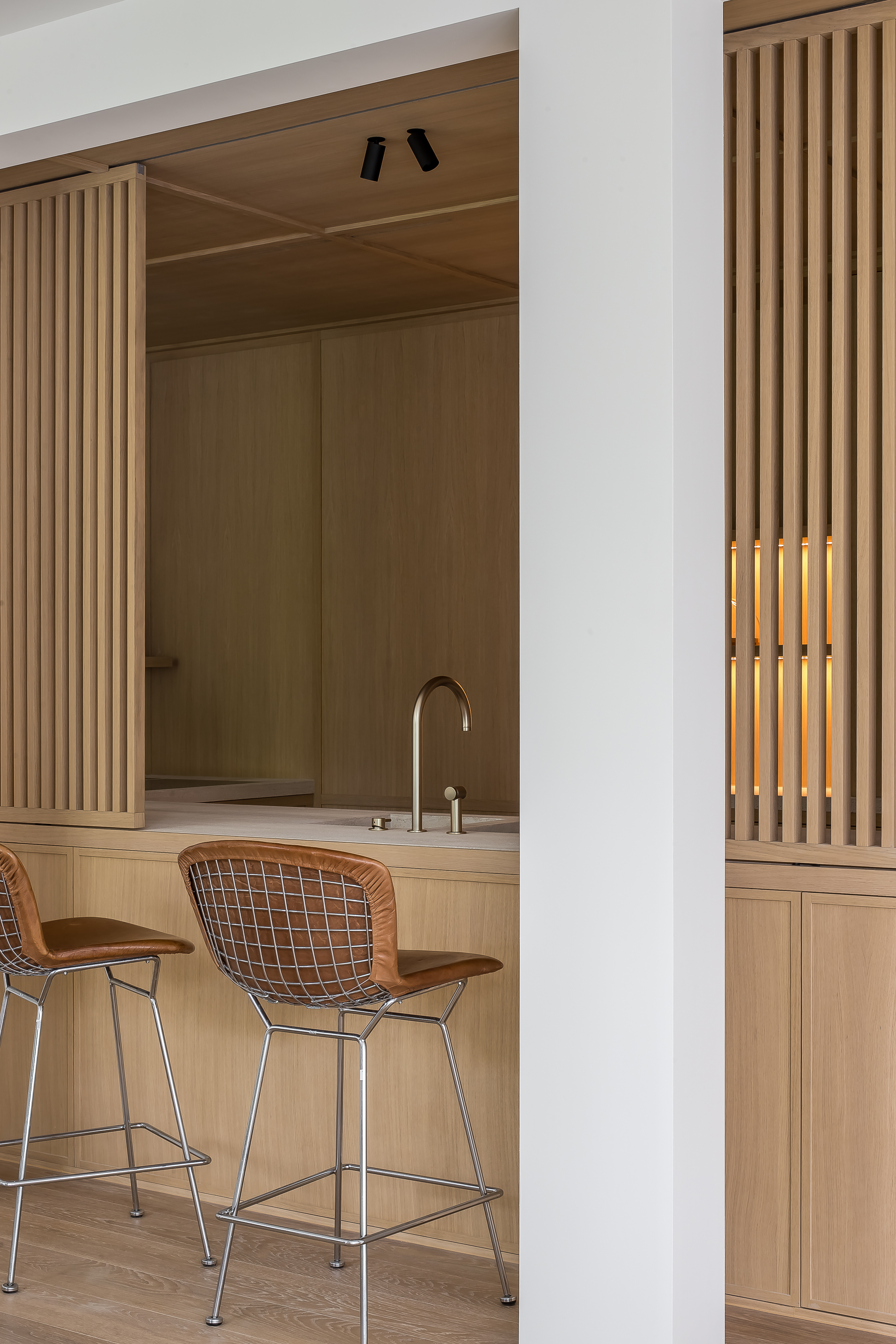
Part of the rise of open kitchens with partitioned walls, slatted screens slide back and forth above this stylish cooking counter, creating a simple barrier between the dining area when the kitchen is in use. ‘For this project, the use of wooden slats as sliding screens is successful because it offers a harmonious blend of functionality and aesthetics,’ says designer Nathalie Deboel. ‘The screens provide privacy and spatial division while adding an element of natural beauty and texture to the space.’
Beyond blocking out the view, the aesthetic choice adds depth, warmth, and texture to the overall scheme. “As designers, we’re always seeking unique and engaging design solutions,” adds Nathalie. ‘Wood slats offer a compelling option to enhance interior spaces.’
5. Make a barrier between functional and living areas
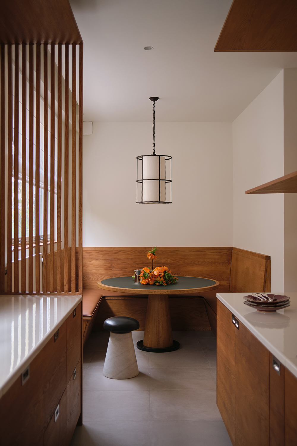
Slat screens need not slide at all – here, they offer a permanent barrier between the cooking area and built-in banquette, creating a box-like feel that encloses the kitchen while adding clean lines to the millwork . ‘Added together as in this kitchen project, they serve as a separator, only to put a kind of distance between spaces without closing them entirely,’ says Samantha Hauvette. ‘In this case, they are used to create a visual separation between the workstation of the kitchen and the dining part of the kitchen.’
Here, it’s about filtering the view without blocking it off entirely, all while introducing a patterned design element to the space. “Allowing light to go through but ‘blurring’ the possible mess made while cooking!” adds Samantha.
6. Make a light flow
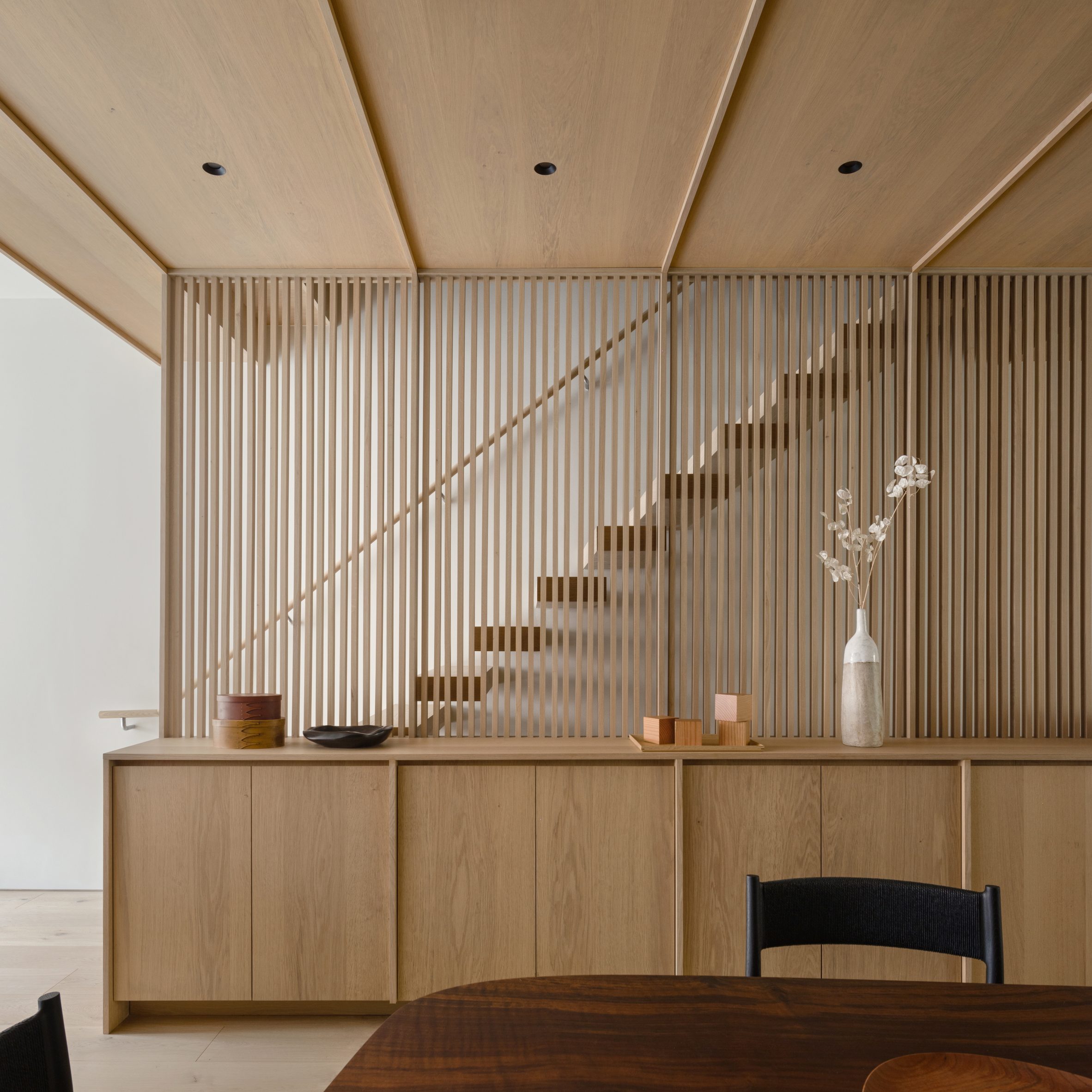
Slatted walls create a soft division between the staircase and living space in this five-story townhouse, creating an open feel while also increasing the flow of light and air. ‘The screen in this case provides a safety measure to enclose the stair, but it also introduces a warm wooden texture into the space and is a means of allowing light from the skylight at the top of the stairs to filter into the spaces on each floor,’ explains Ian Starling.
The clever staircase idea went beyond functionality, of course, as the slatted walls were an essential part of Ian’s scheme to stitch all five floors together. “With the staircase, we wanted to create a cohesive design language that connected all of the floors,” adds Ian. “We did this through two related design moves: the box treads that cantilever and float out of the perimeter walls, and the elemental wood screen element.”
Keith Flanagan is a New York based journalist specialising in design, food and travel. He has been an editor at Time Out New York, and has written for such publications as Architectural Digest, Conde Nast Traveller, Food 52 and USA Today. He regularly contributes to Livingetc, reporting on design trends and offering insight from the biggest names in the US. His intelligent approach to interiors also sees him as an expert in explaining the different disciplines in design.
-
 These Are the Flower Crowns I’m Wearing This Spring (Spoiler: They’re Actually for My Door)
Coachella confirmed the comeback of flower crowns. At home, they just go by another name: the spring wreath
By Julia Demer
-
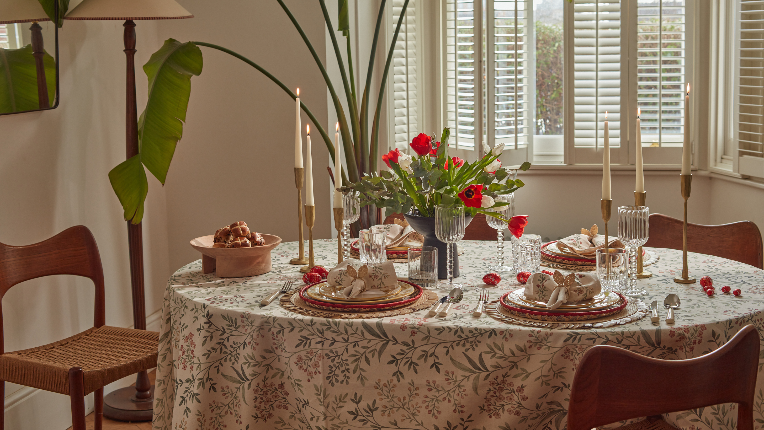 Bunny Ears, Be Gone — 7 Easter Table Styling Mistakes That Will Take Your Setting from Tawdry to Tasteful
From fussy floral displays that disrupt conversation to over-relying on tacky tropes, don't fall victim to these errors when decorating your Easter table
By Lilith Hudson