Interior designers reveal the worst decorating trends and how to avoid them
Following trends can give your home a much-needed update, but it can also be a mistake. These interior designer tips will help you identify the trends that you should steer clear of
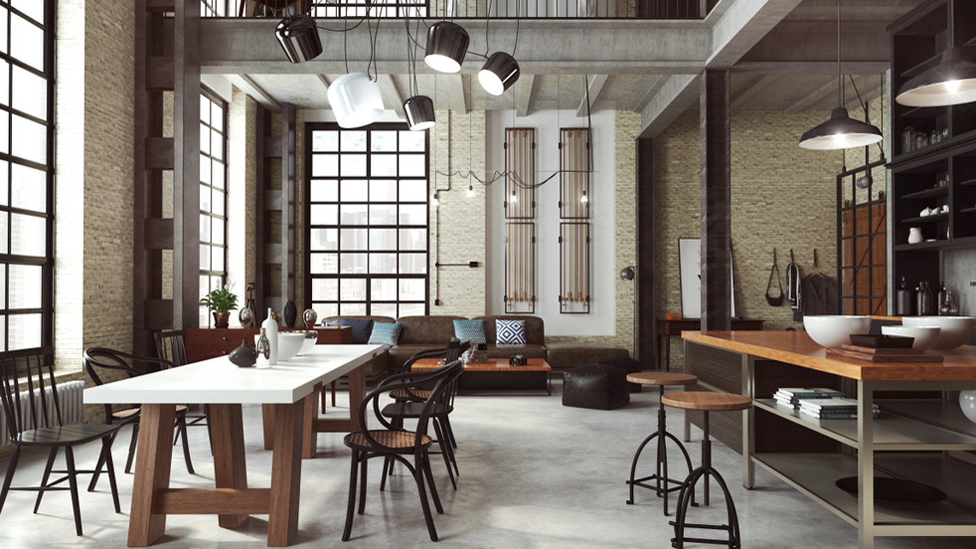

Following interior design trends can be a double-edged sword; on the one hand, a cleverly incorporated new trend can instantly revitalise your interior decor. On the other hand, following a trend too literally can result in a decorating scheme that looks generic and lack personality.
We've asked interior designers and stylists what decorating trends they think are best avoided – and what's worth giving a try instead.
1. Grey-washing
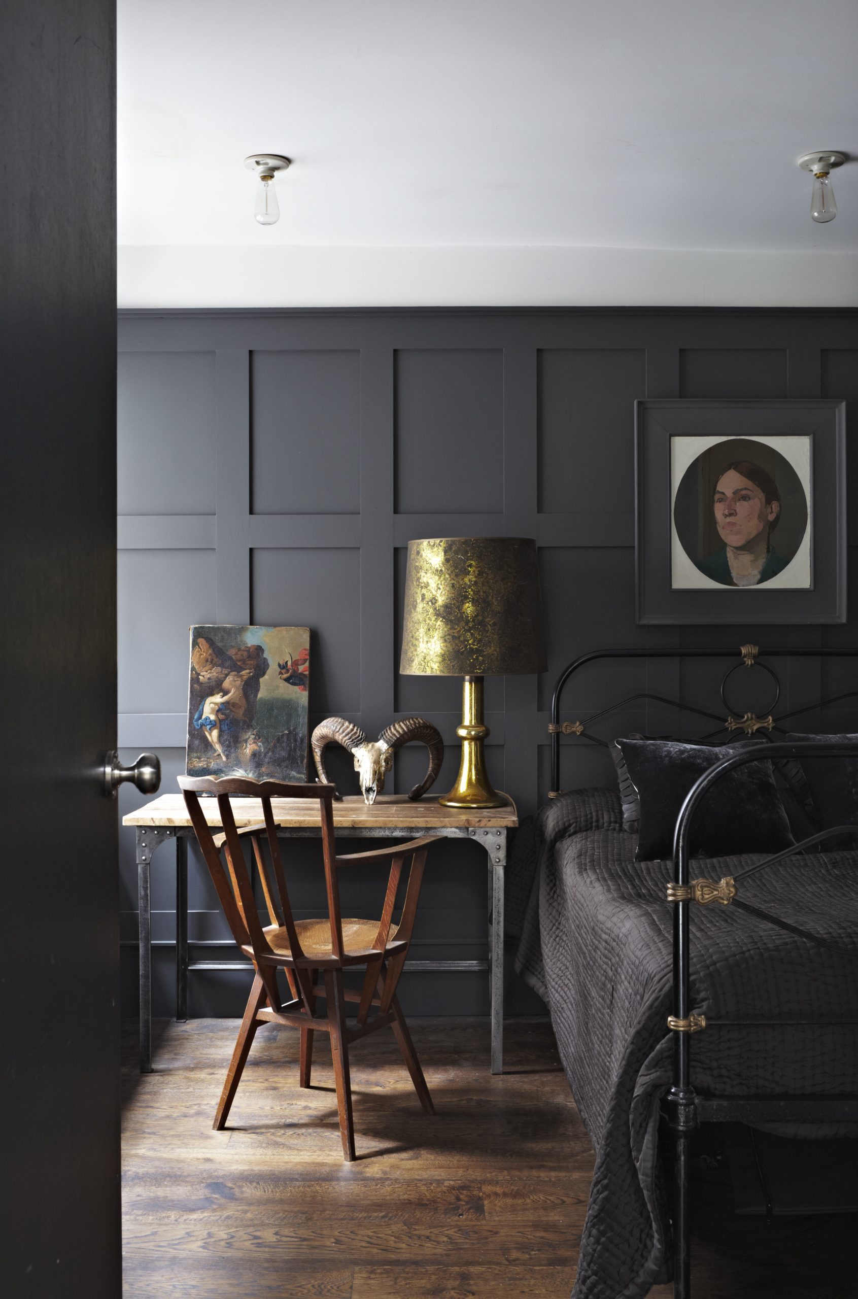
Grey is a popular colour for a reason – it's elegant and a more daring neutral than beige or cream. Grey bedrooms and grey living rooms have been everywhere for years. And yet, it's easy to overdo the grey trend, which will result in a flat and undistinguished decorating scheme.
Camilla Clarke, creative director of Albion Nord, advises to 'avoid 'grey-washing' in an attempt to channel Pantone's Ultimate Grey colour of the year. Instead, introduce layers of neutrals, interspersed with tonal, textural accents that bring the sleekness of the colour without sacrificing depth or tactility.'
Grey is fine, but avoid using too much of it in the same shade to prevent your rooms looking like a paint catalogue.
2. One-stop-shop gallery walls
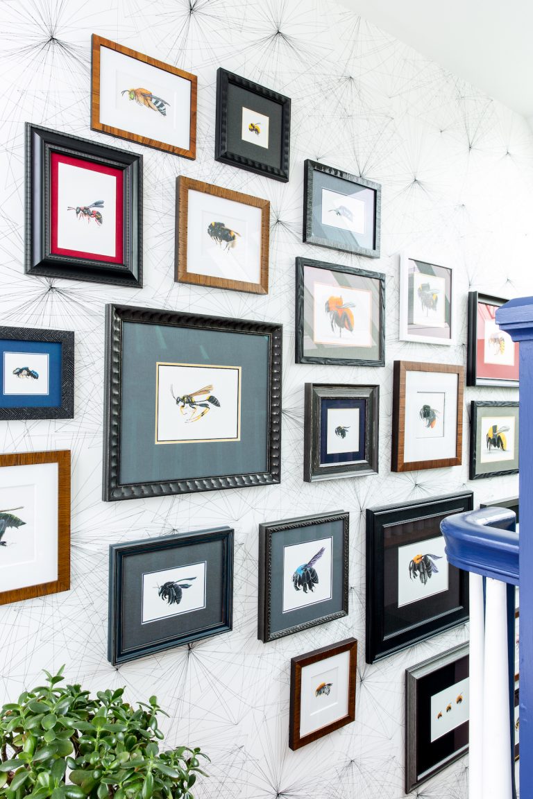
Gallery walls have had a surge in popularity over the past several years, in no small part due to the rise of the Instagrammed home. All those frames might look great on an Instagram feed. However, the question is whether a decorating scheme created with Instagram in mind is desirable.
It can be tempting to buy all your prints from the same shop for an instant gallery wall, but Camilla strongly advises against this. 'There are many companies providing 'one-stop-shop' services where you can purchase prints and frames from the same vendor to 'get the look.'
Be The First To Know
The Livingetc newsletters are your inside source for what’s shaping interiors now - and what’s next. Discover trend forecasts, smart style ideas, and curated shopping inspiration that brings design to life. Subscribe today and stay ahead of the curve.
A far more appealing way to create your own gallery wall is to collect prints you love over time, visiting antique or vintage sellers for limited print runs or little framed oils. This way, your collection will be entirely unique, bringing a sense of your own personality to your home, rather than opting for ''Insta-approved'' artworks.'
3. Going too industrial
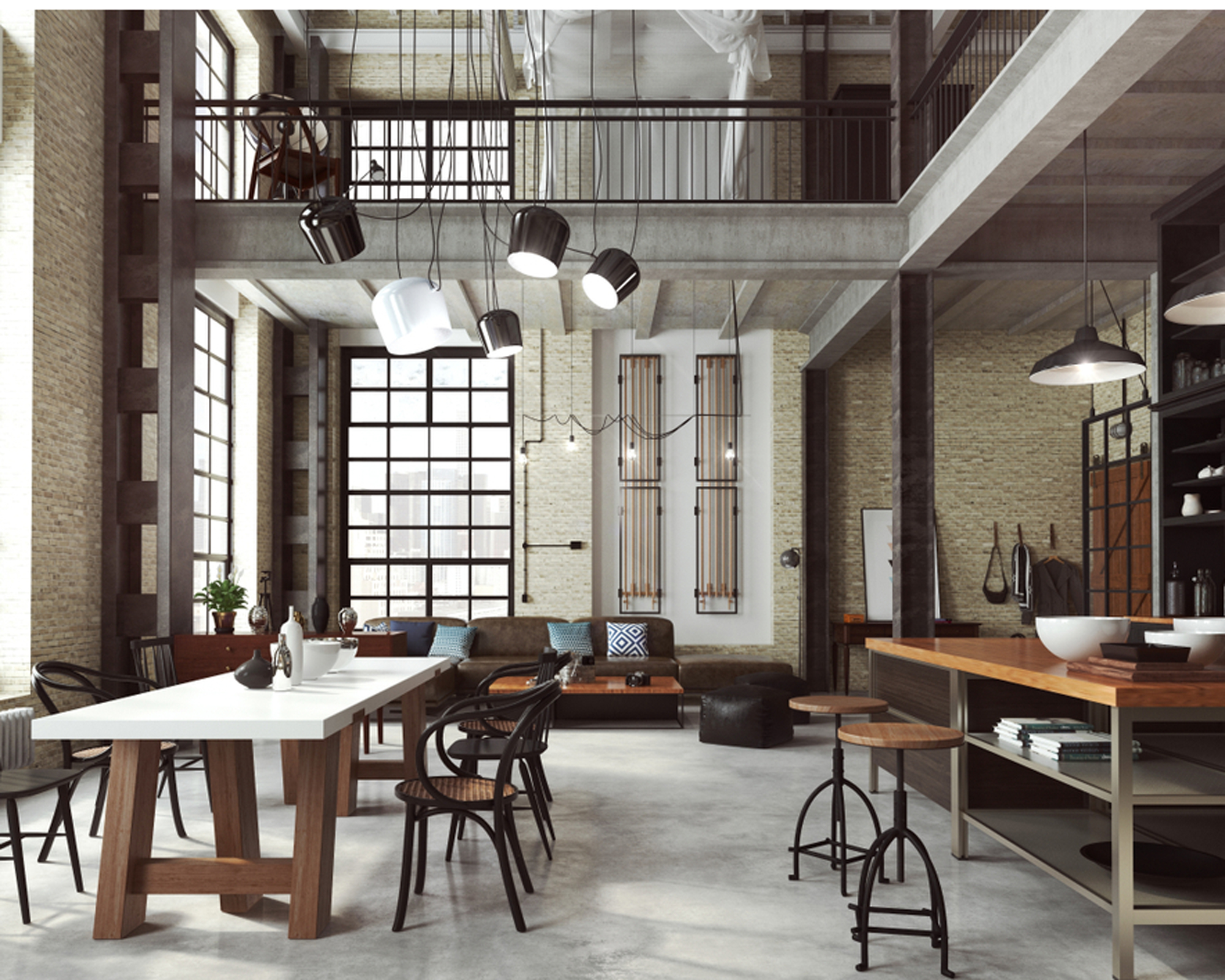
Industrial touches can add a wonderful edge to both contemporary and more traditional homes – but less definitely is more when it comes to this style. In fact, the 'industrial overdo' has been named as the most regretted design decision in a recent poll.*
Fiving your home's interior an empty warehouse look can make it look cold and clinical, but it can also lose you money if you decide to sell. Homes that have been given the industrial overkill treatment sell for 10 per cent less than their better-decorated counterparts.
If you are fond of an industrial vice, keep it to one or two special pieces and mix them up with softer, gentler decorating elements.
4. Painting floorboards
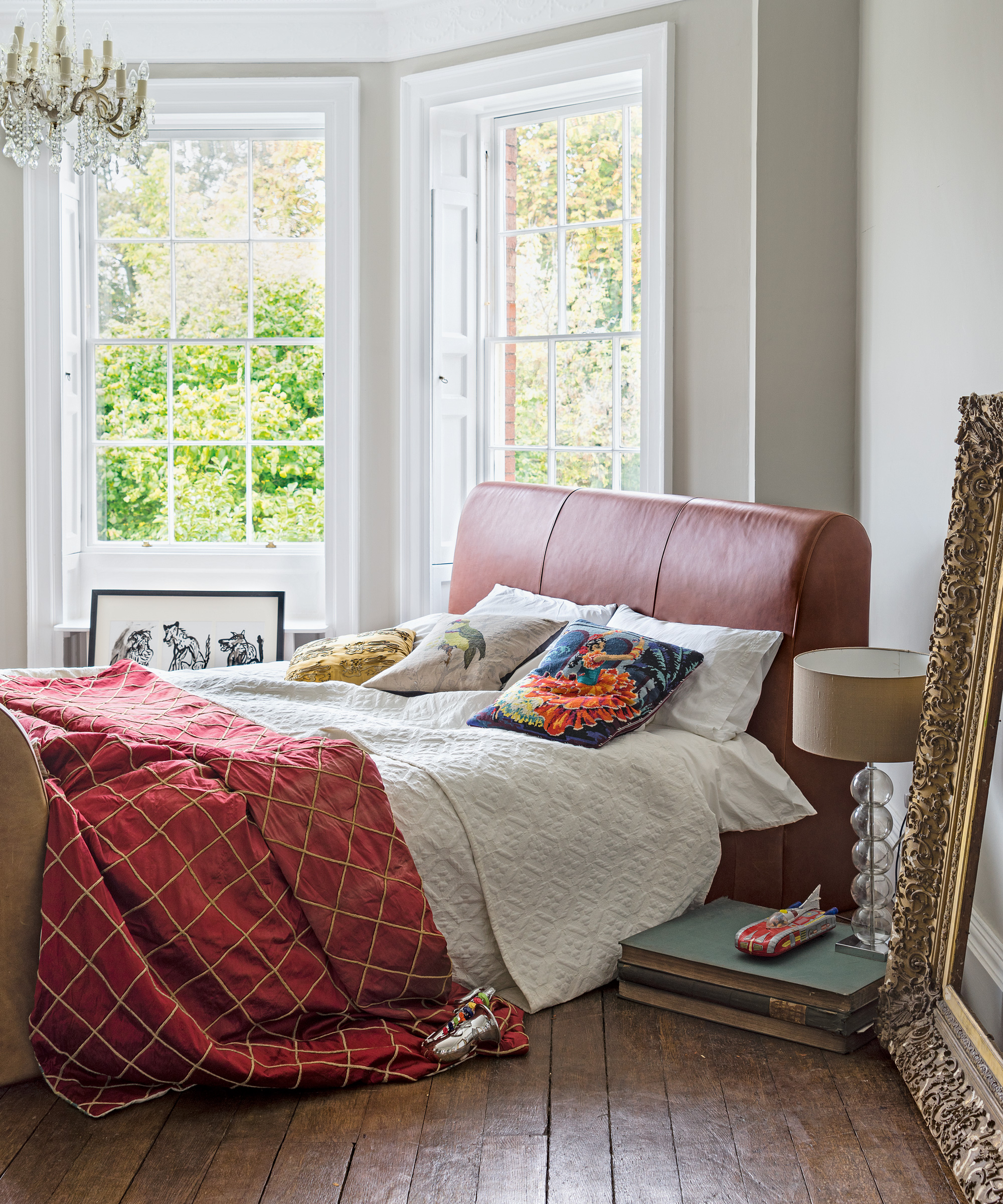
Painted floorboards can add a vintage, shabby-chic look many people appreciate; the only issue with it is that once you've painted your floors, it's difficult to undo.
Matthew Williamson advises to make the most of the natural quality of the wood and accessorising with bright rugs instead. 'While the trend for painted floors can add real drama to a space, sometimes it's best to appreciate the natural wood grain instead, treating floorboards as you would a prized piece of wooden furniture.'
'Allow the wood to really sing by pairing it with vibrant rugs, clashing the natural, earthy tones with the electric zing of the floor covering. By introducing layers to a space from the floor up, you can build up texture, colour and pattern in far more interesting ways than by painting your gorgeous floorboards white.'
5. Playing it too safe with bedroom design
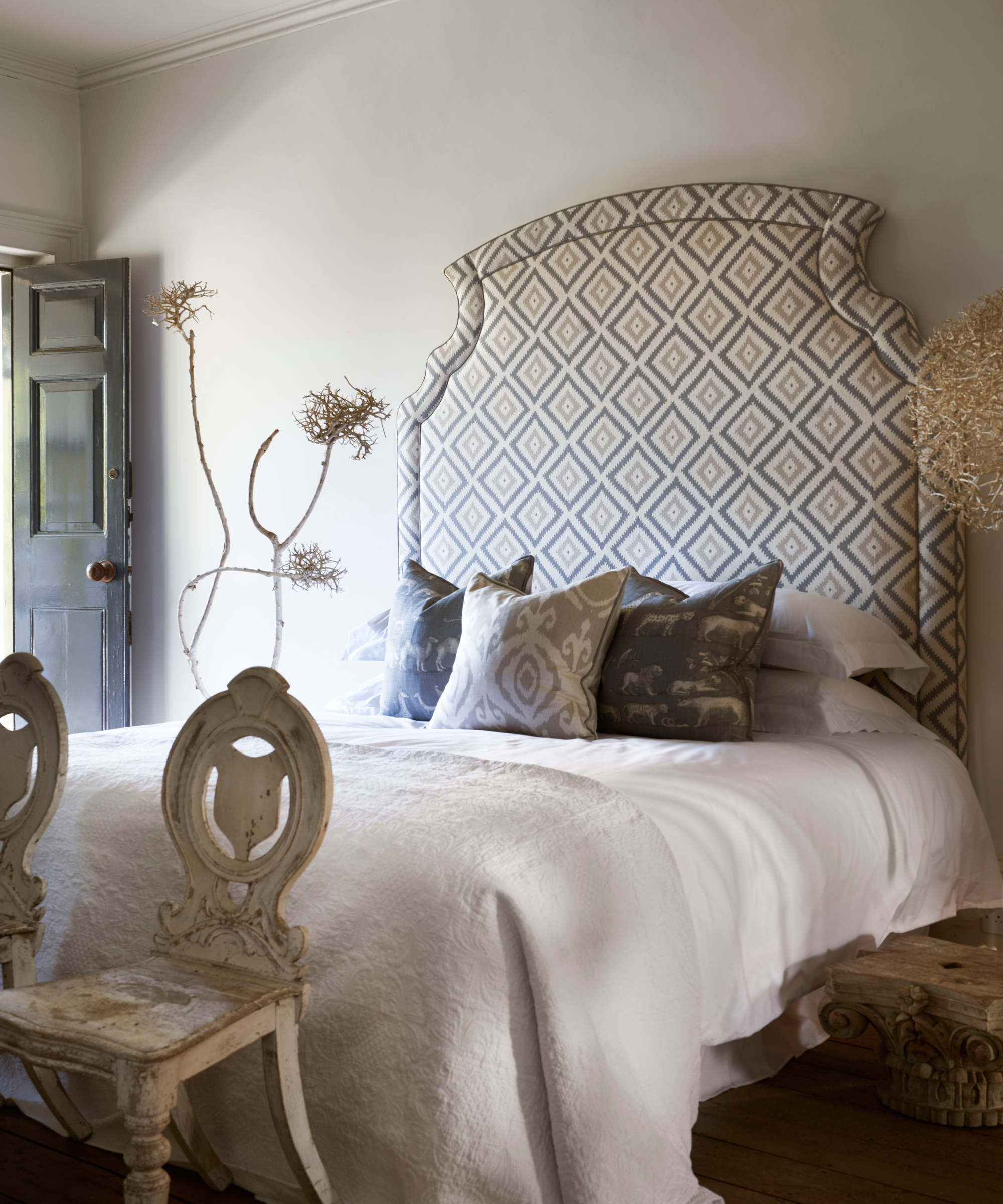
The bedroom is the room where many people veer on the conservative side of design, opting for matching furniture sets and a painting somewhere on the wall. Avoid these overly safe choice and personalise your bedroom with a colourful headboard instead, says Martin Waller, founder of Andrew Martin.
'Our bedroom interiors should be as individual as the people that inhabit them. Don’t be afraid to choose a more outlandish style as this only adds more character.'
'We no longer need artwork in bedrooms when we have a headboard shaped to elaborate perfection or upholstered in a bold-patterned fabric acting as a piece of artwork itself.'
*Data courtesy of HomeHow.co.uk.

Anna is a professional writer with many years' experience. She has special interests in architecture, photography, and high-end interior design. Her work has appeared in Homes & Gardens, Gardeningetc, and many other publications.
-
 Sateen vs Percale Sheets — What's the Difference, and Which Are Better?
Who would have thought a simple weave pattern could make all the difference to your sleep
By Devin Toolen
-
 I Asked Interior Designers to Share the Worst Design Trends They've Seen on Social Media — And What They Want to See Instead
Just because something is trending, doesn't mean it's tasteful — from dupe-culture to OTT lighting, here's what designers hate seeing in homes
By Devin Toolen