Bobby Berk May Be Selling His LA Property, But We’re Buying the Look — Here’s How to Steal the Interior Designer's Style
It's time for the TV personality and designer to say goodbye to his headquarters, but not its timeless sense of style

If there is one thing we love about celebrities listing their homes for sale, it's the excuse to snoop around inside and see which design ideas we can steal. The latest to hit the market: Bobby Berk's modern LA property. While the four-bedroom, three-bathroom home may seem like a home, the well-known designer has actually been using the space as his design firm's headquarters for the past few years.
Regardless, it's been completely renovated over that time by Bobby, and, to no one's surprise, it incorporates several major interior design trends we're loving right now. From beautiful textures and metallic accents to bold patterns on the walls, no room has a skippable moment.
Sure, Bobby may have "outgrown" the property (something he told Livingetc he always knew would happen, and why he designed the space to be "a residential home someday"), but we're seizing the moment to shop the look. We spoke to the designer to find out which features he'll miss, which ones he's happy to be leaving behind, and more importantly, where to get the look for each room.
The Living Room
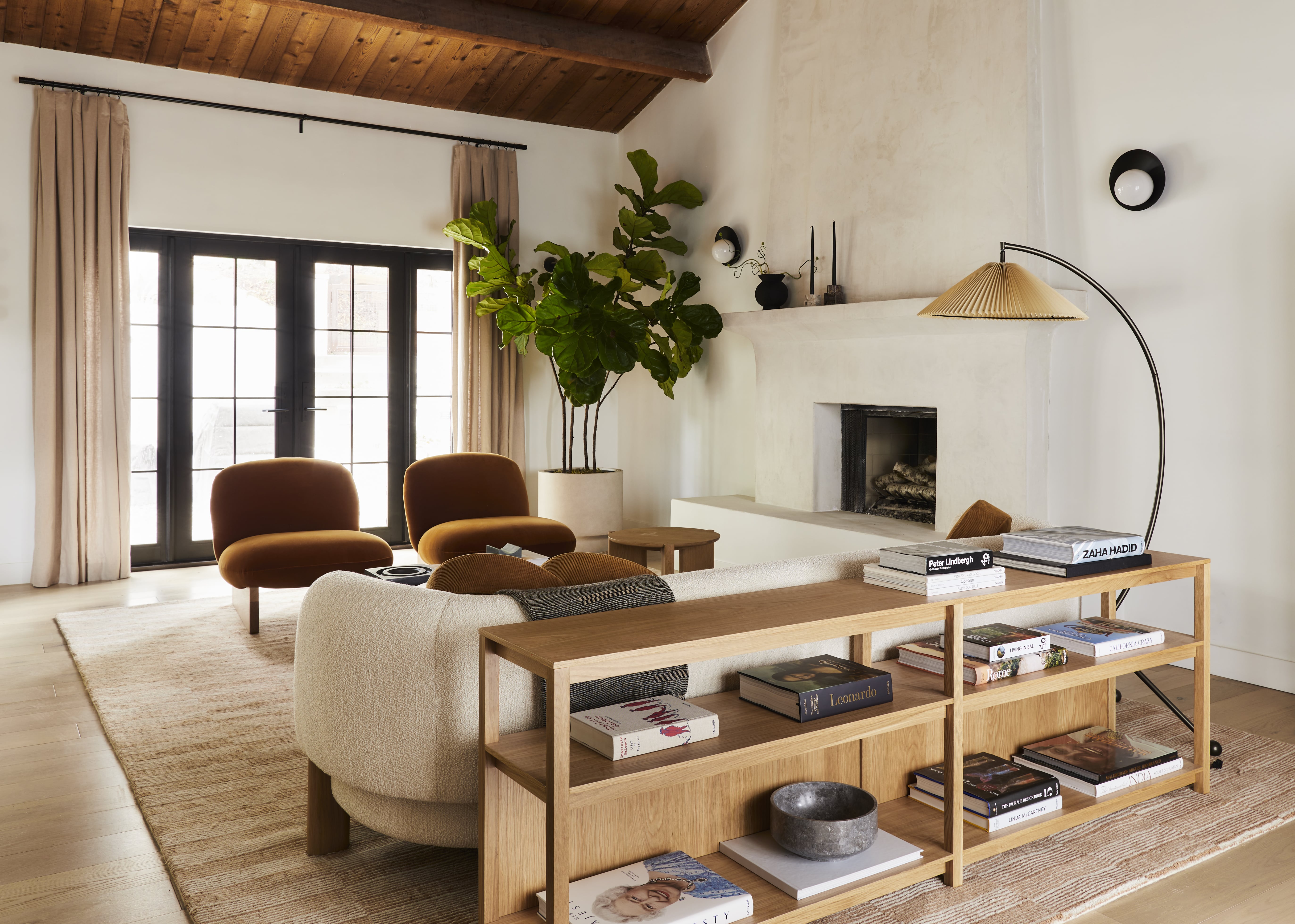
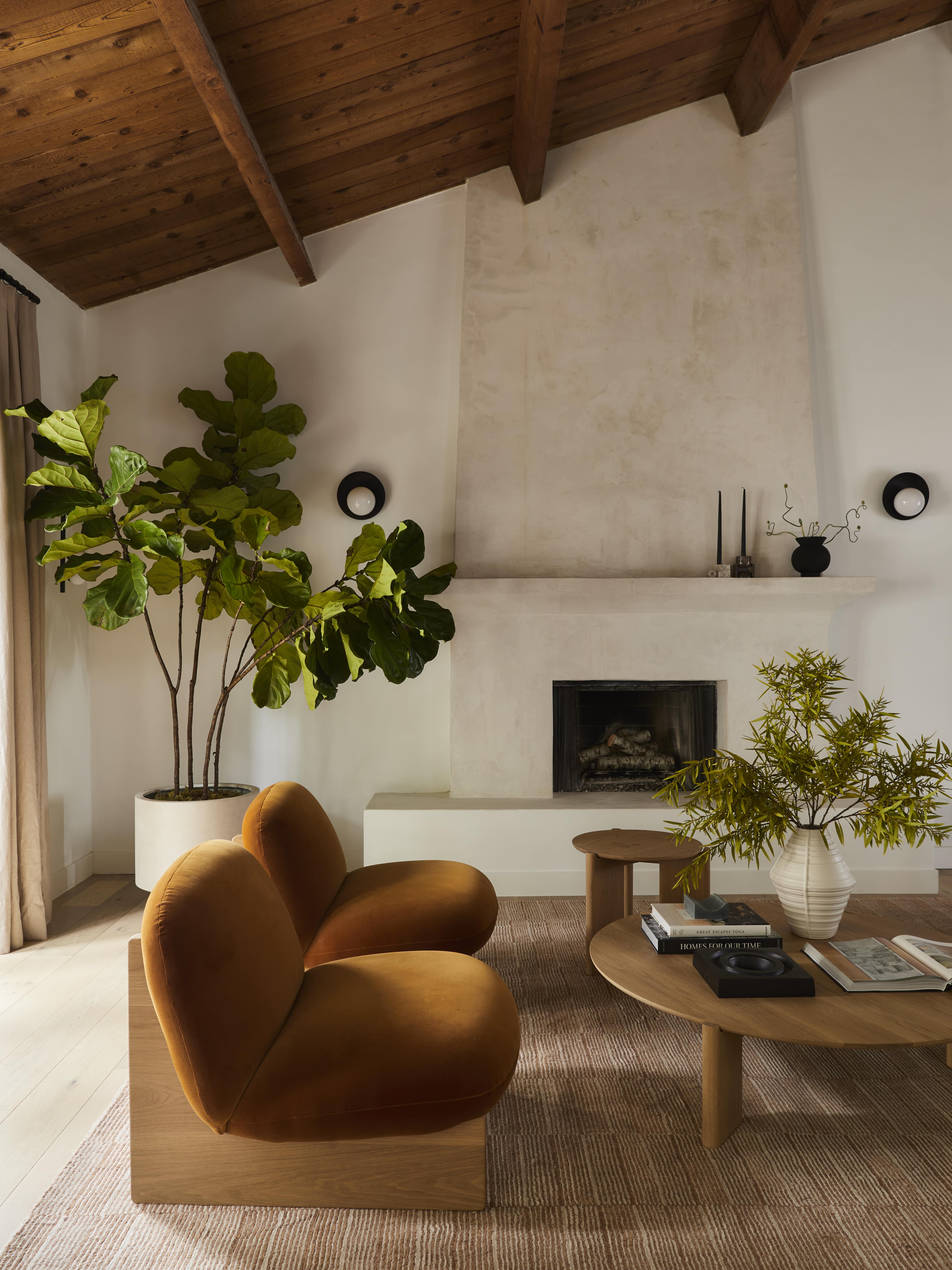
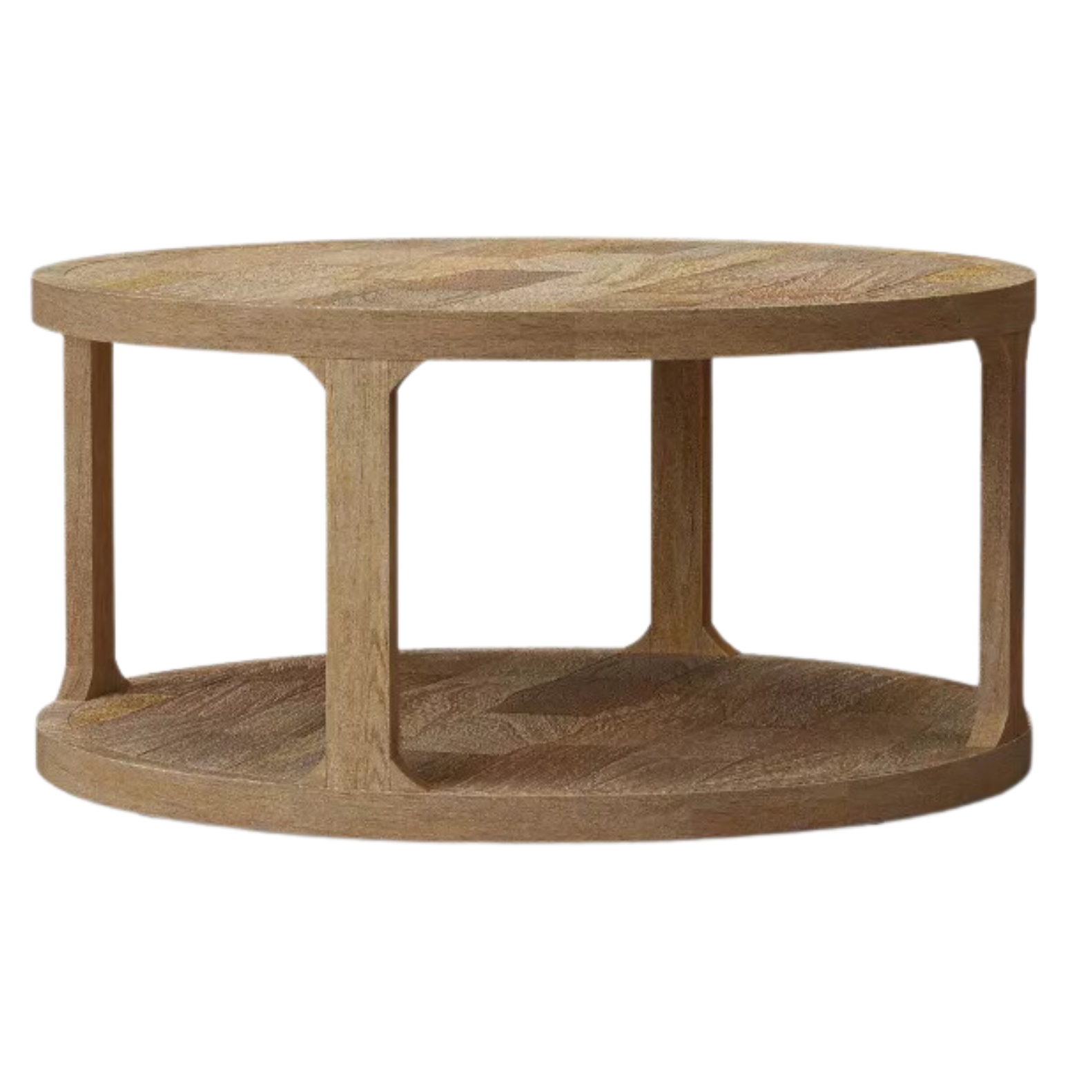
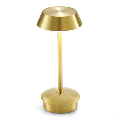
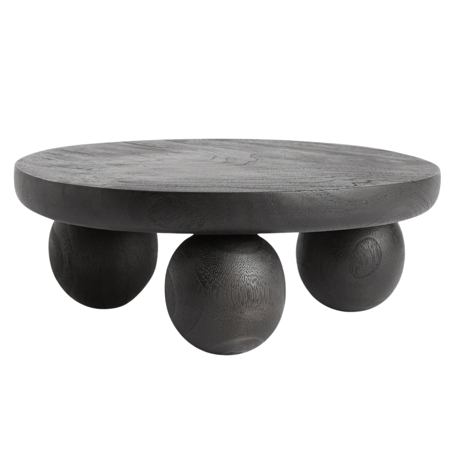
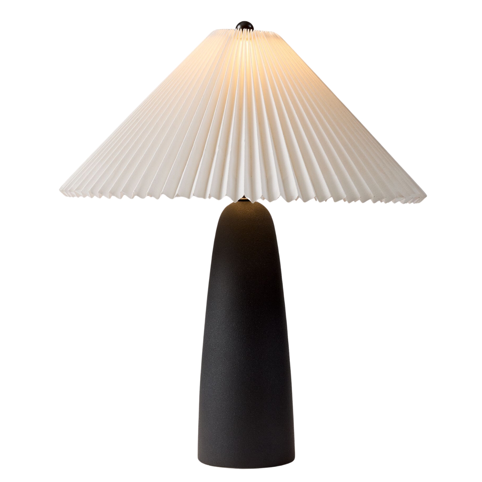
Cozy living room ideas should always create tranquility and comfort. Bobby's space has a mix of warm and cool neutrals, along with a blend of strong textures that give the space its rich visual appeal. And though color trends for 2025 are leaning towards bolder and more maximalist hues, neutrals will never be totally left behind. Bobby explained that when choosing your color palette, it's important to first establish the intention of the space.
"In this case, a neutral color palette seemed to work perfectly with the house's style and was also an ideal calming backdrop for my team to work from," he told Livingetc.
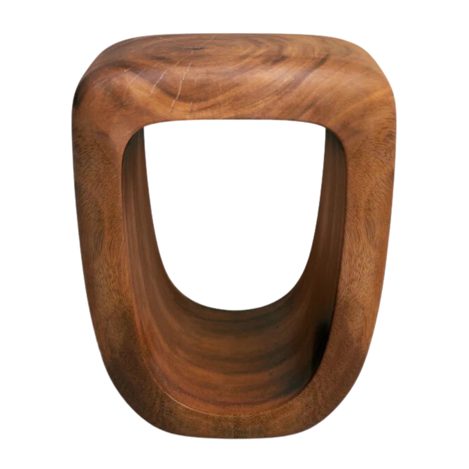
Decorating with earth tones is a subtle way to introduce more of the natural world outside into your home, ensuring it has a sense of serenity. The verdant green plants and dark timber ceilings, along with the ochre yellow accent chairs all pop in the space, but still feel cohesive and calm.
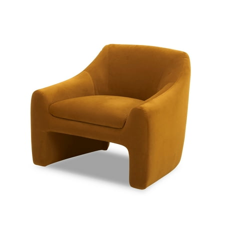
Price: $238
Color: Ochre Velvet
Rating: 4.8/5-stars (93 reviews)
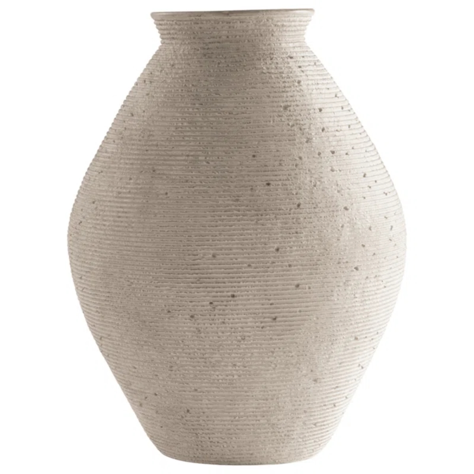
Price: $59.99, Was: $112.71
Size: 12" H
Rating: 4.8/5-stars (287 reviews)
The Kitchen
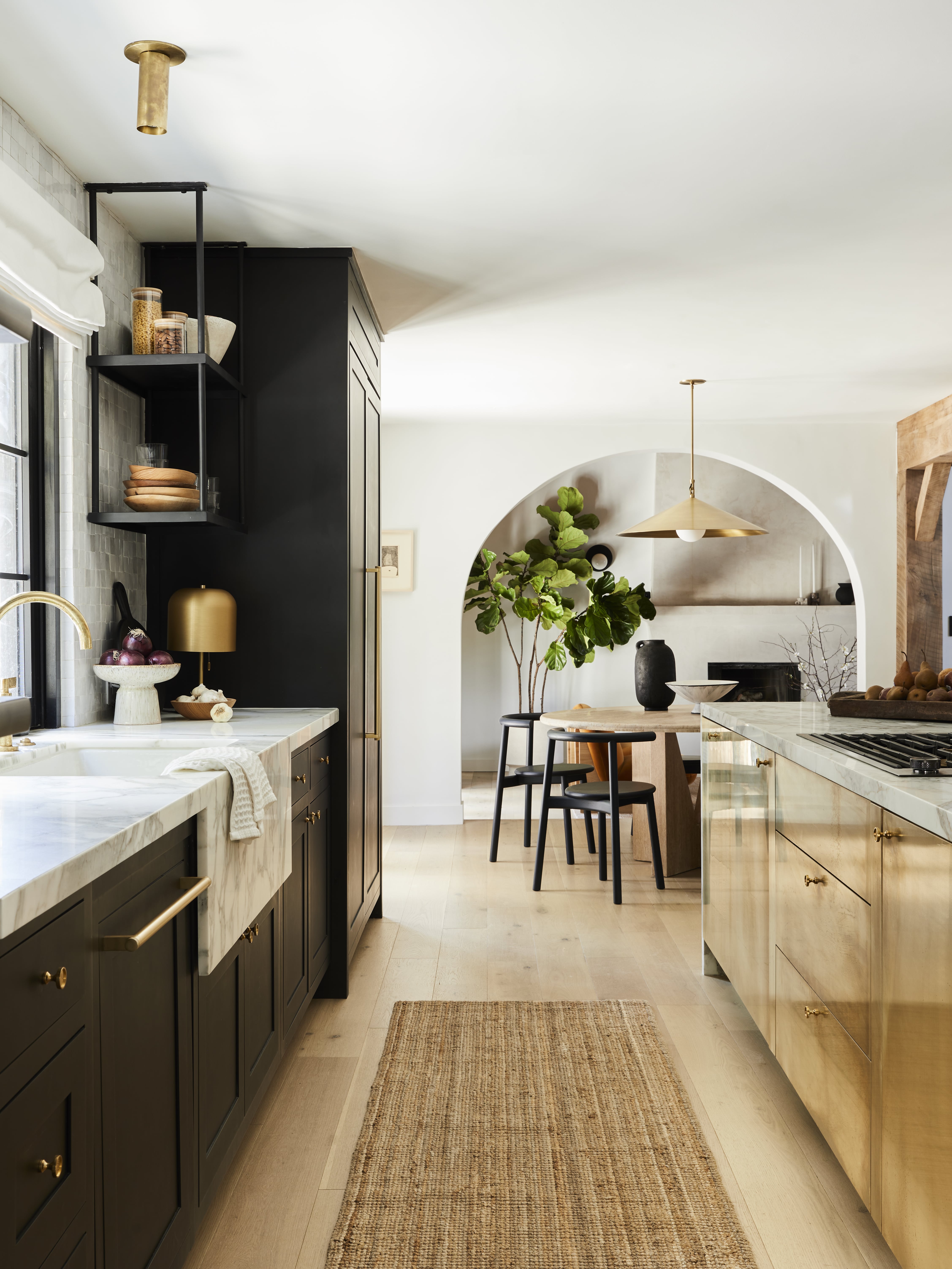
It was the layered texture design that caught our eye in the kitchen. "Texture plays a big role in all my design projects," shares Bobby. "I love the interest, variety, and visual appeal it brings. I made sure to incorporate different types of texture, whether rough, smooth, shiny, matte, nubby, or flat, into every space in the home."
Be The First To Know
The Livingetc newsletters are your inside source for what’s shaping interiors now - and what’s next. Discover trend forecasts, smart style ideas, and curated shopping inspiration that brings design to life. Subscribe today and stay ahead of the curve.
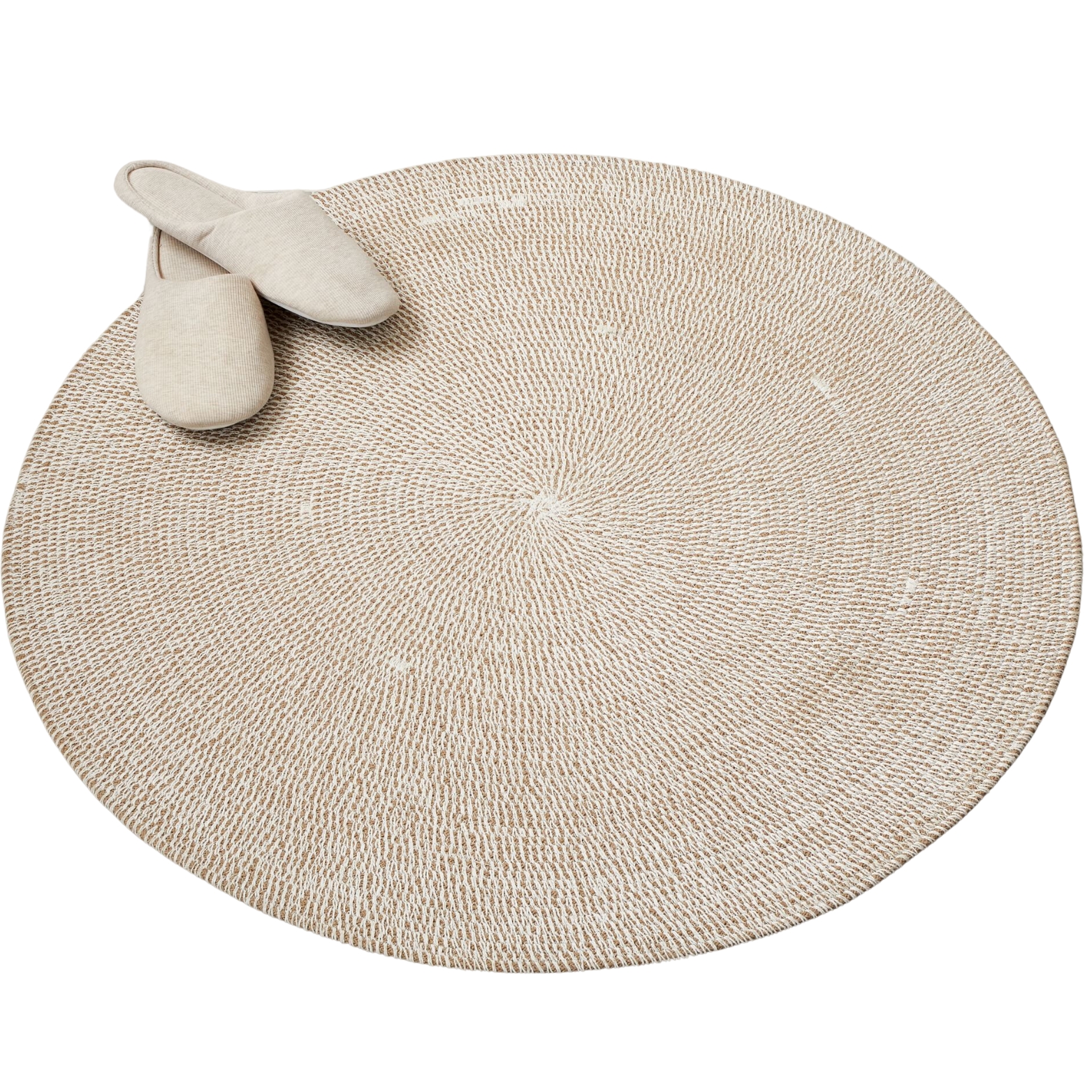
And it's a trend worth picking up and running with in 2025 (if you haven't already). Texture plays a vital role in creating a stylish home. Take notes from Bobby's kitchen design and try mixing wood and chrome, or opt for a woven runner rug to add a moment of textured charm to your space.
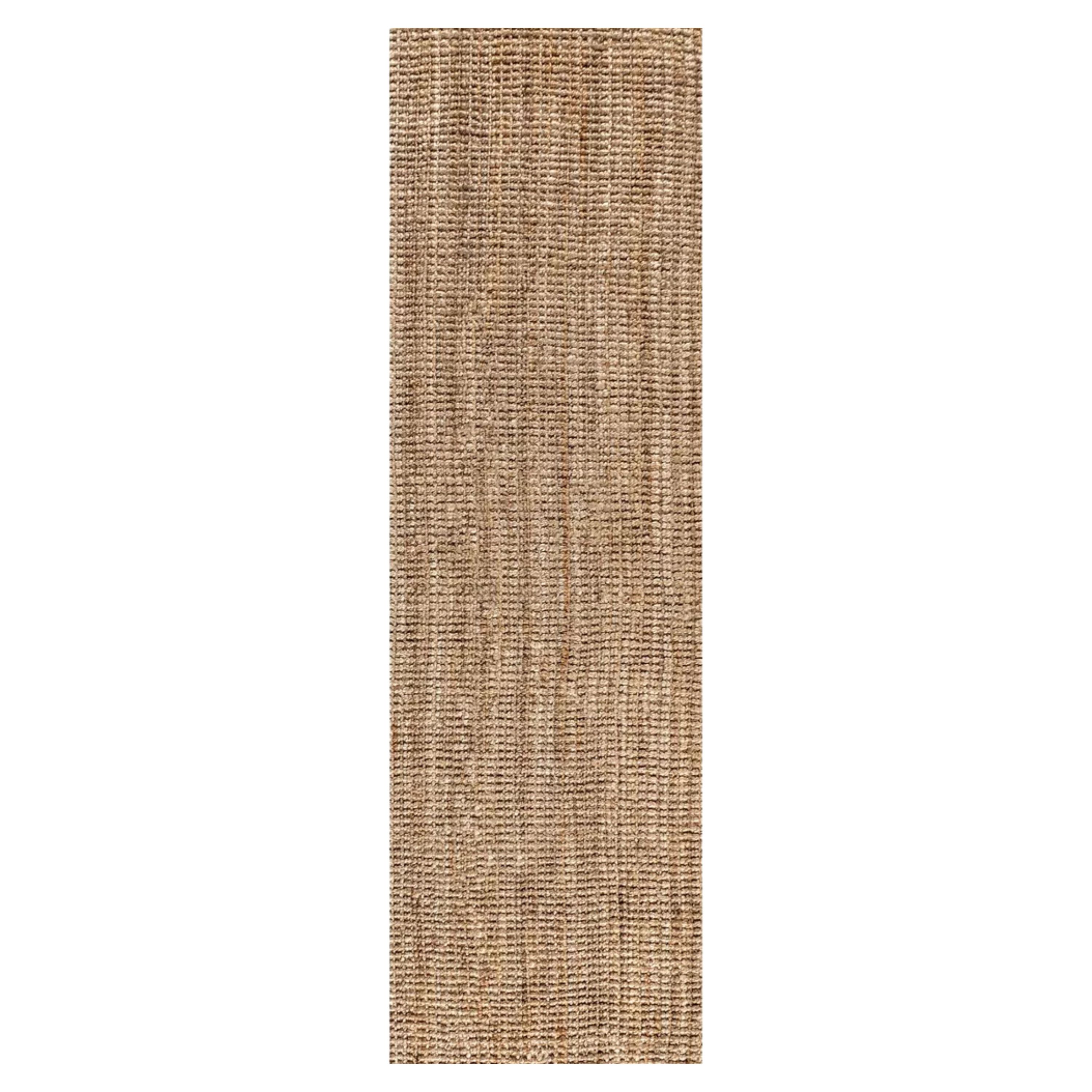
Price: $75.99, Was: $164.44
Color: Natural
Rating: 4/5-stars (39 reviews)
The Office
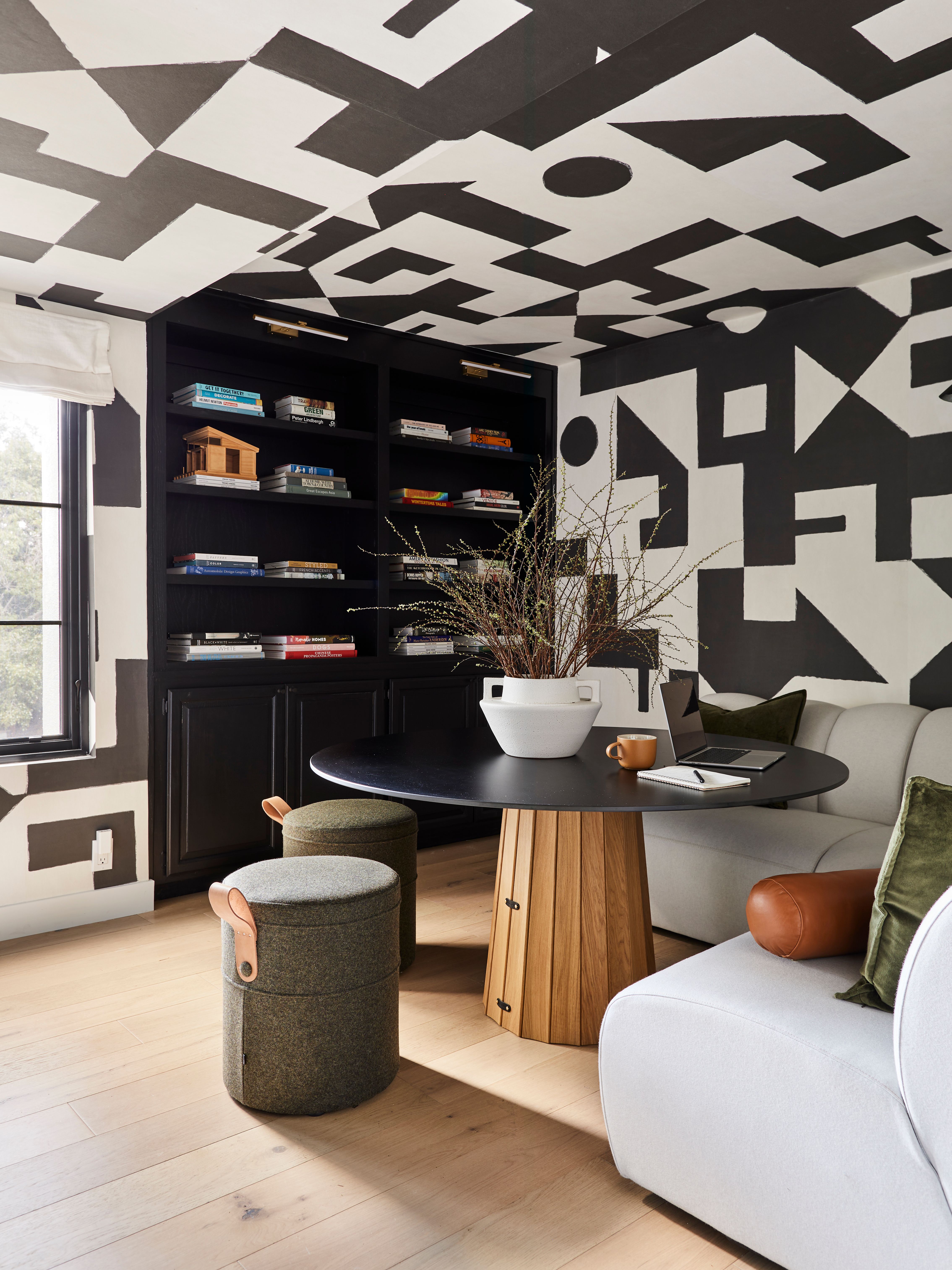
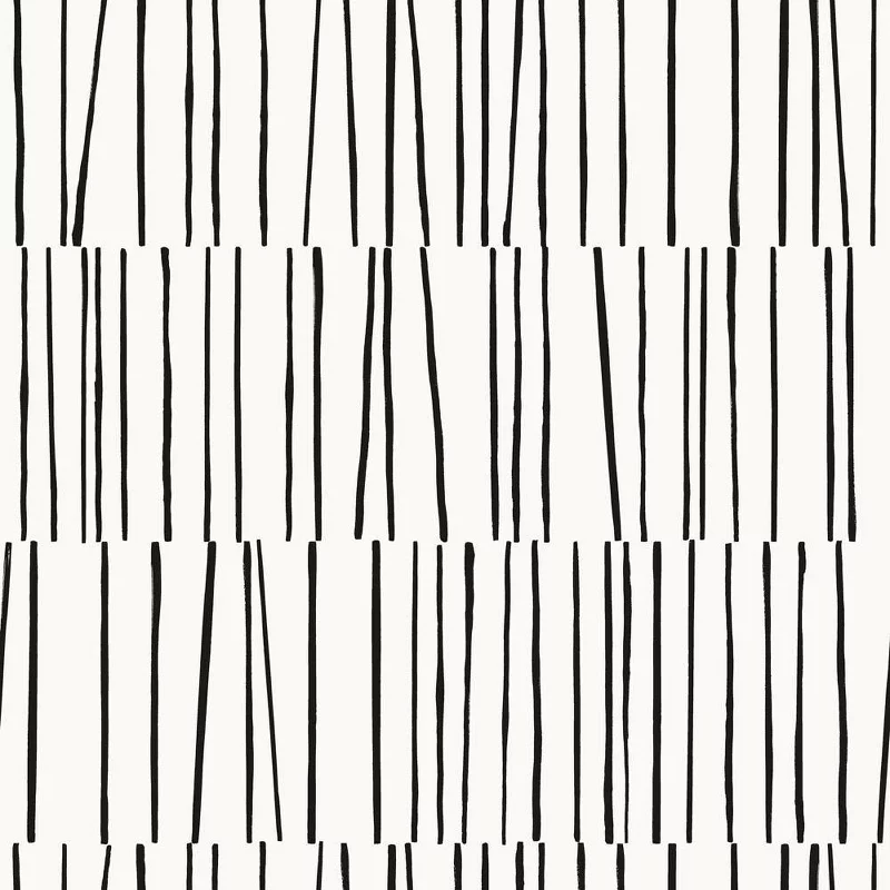
Now, the bold, patterned wallpaper in Bobby's home office is perhaps one of the most eye-catching moments in the house. Maximalism in interior design is having its moment to shine right now, but effectively achieving this daring look is really all about how you pair it.
Funky wallpaper trends are not easy to pull off, especially bold geometric patterns like this one. The key is balance. Balance, balance, balance. The black of the bookshelf breaks up the look of the wall, while the warm wood table and sage green stools ground the room with natural elements. The result —chef's kiss.
It is easy for a style like this to feel overwhelming, but running the same wallpaper up the walls and as a ceiling wallpaper idea can actually make it feel less jarring, and make the space more cohesive and calming, as there are no harsh contrasts or severe lines. Perhaps it's time to ditch the traditional home office in place of something a bit more...creative?
The Dining Room
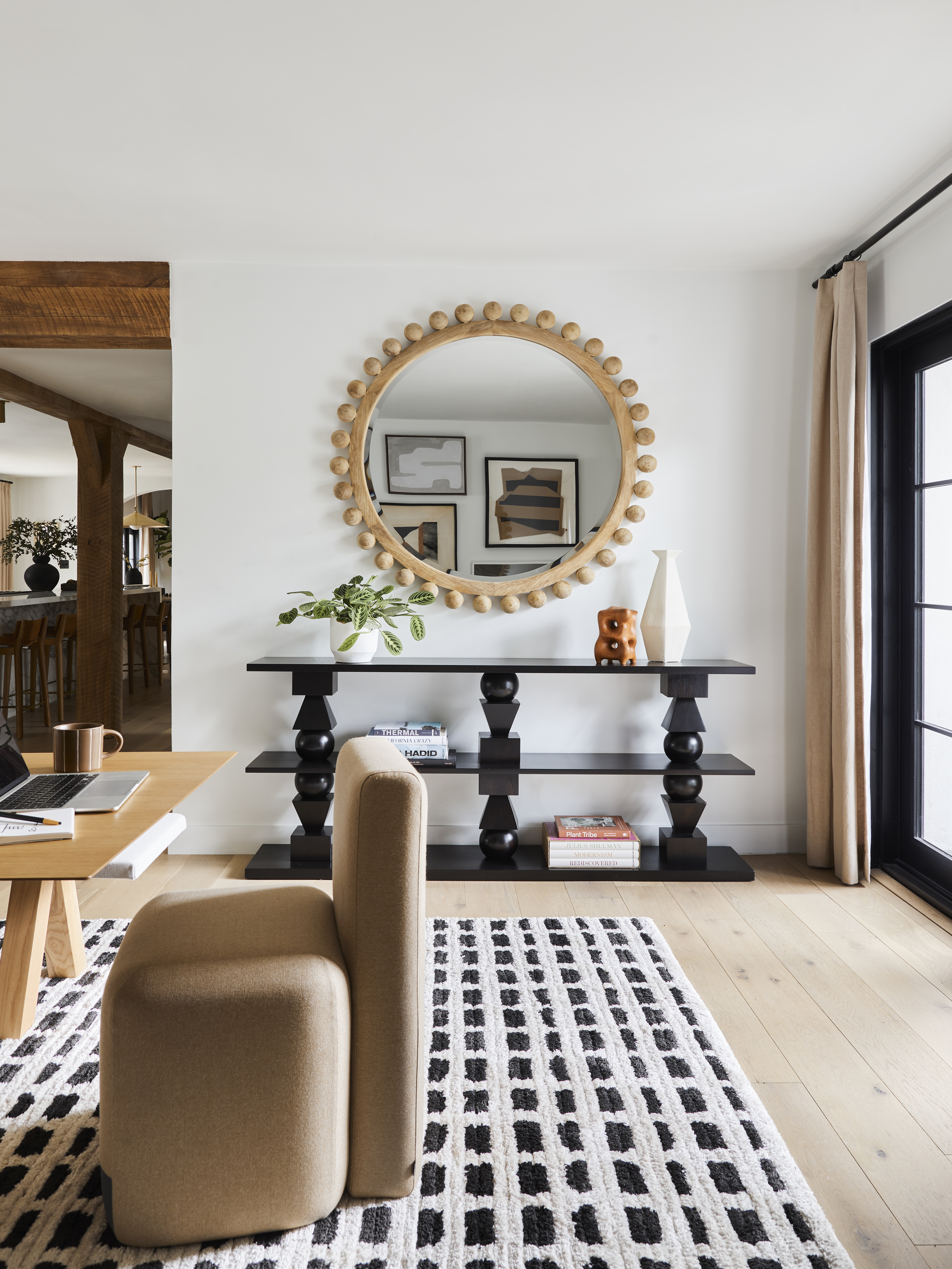
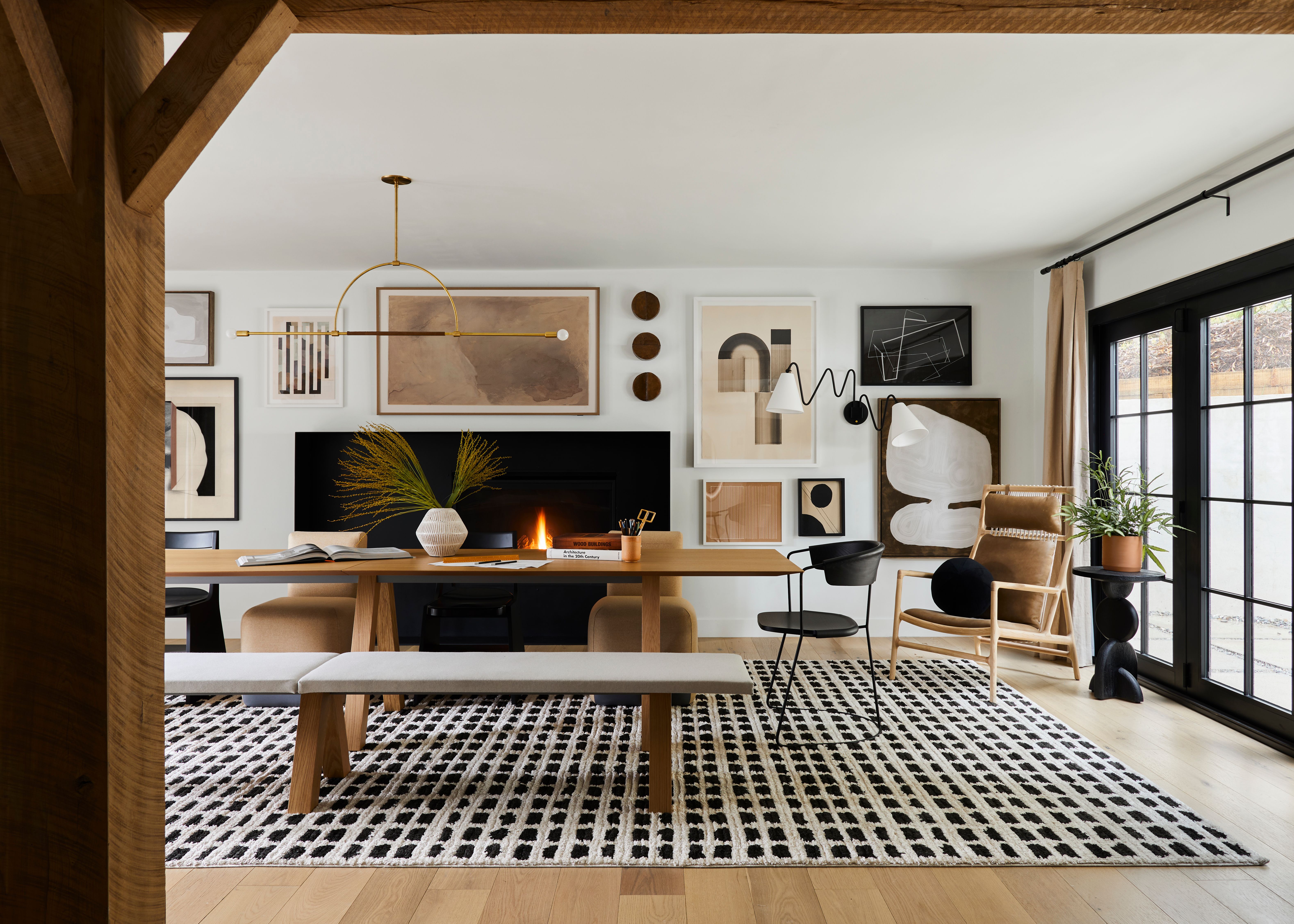
Keeping in mind this was the office for Bobby's design firm, this "dining" room was most likely used for meetings and business chats. Yet, when looking through the lens of a traditional home, it's easy to pull inspiration for your own dining room from the space.
When it comes to designing any space, Bobby says "First things first: think about how you want each room to function for you and go from there."
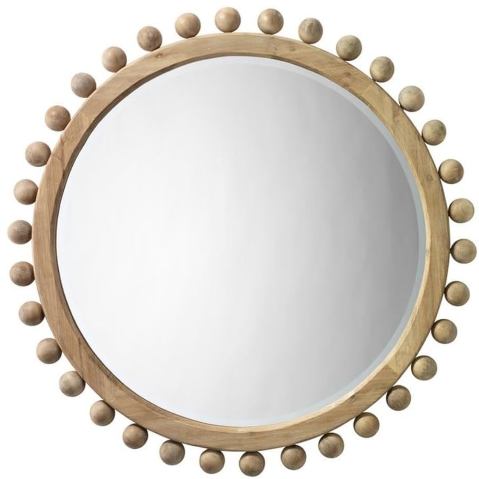
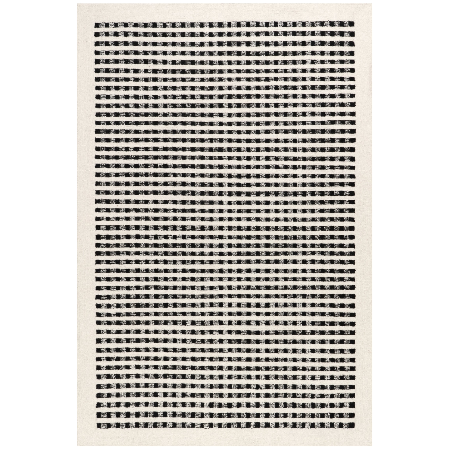
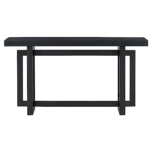
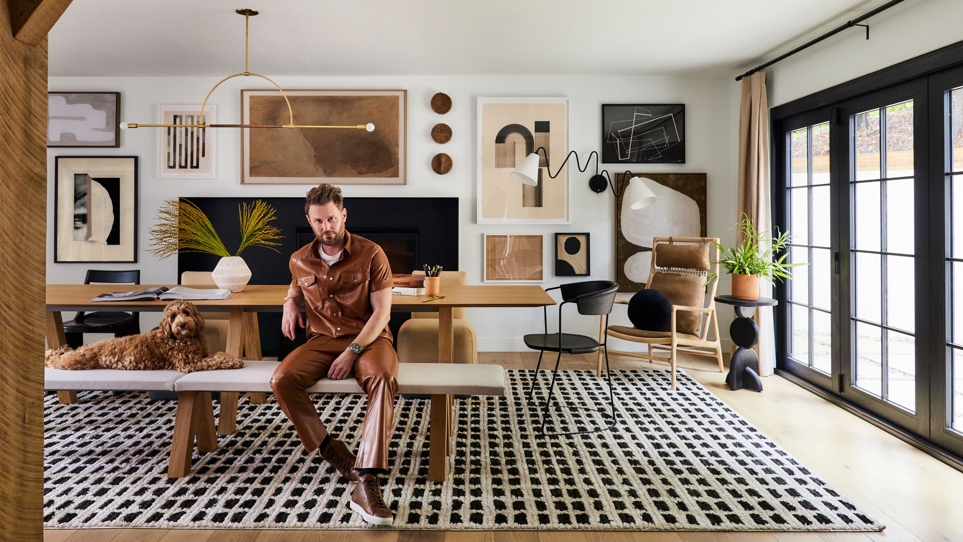
You can tell this room was meant to host a lot of people at once. Even the gallery wall adds moments of movement and liveliness. Pieces like the black and white patterned rug and geometric side table keep this professional space feeling warm and playful. It may not be a traditional dining room, but I will be taking my dining room idea inspiration from this stylish look.
The Bathroom
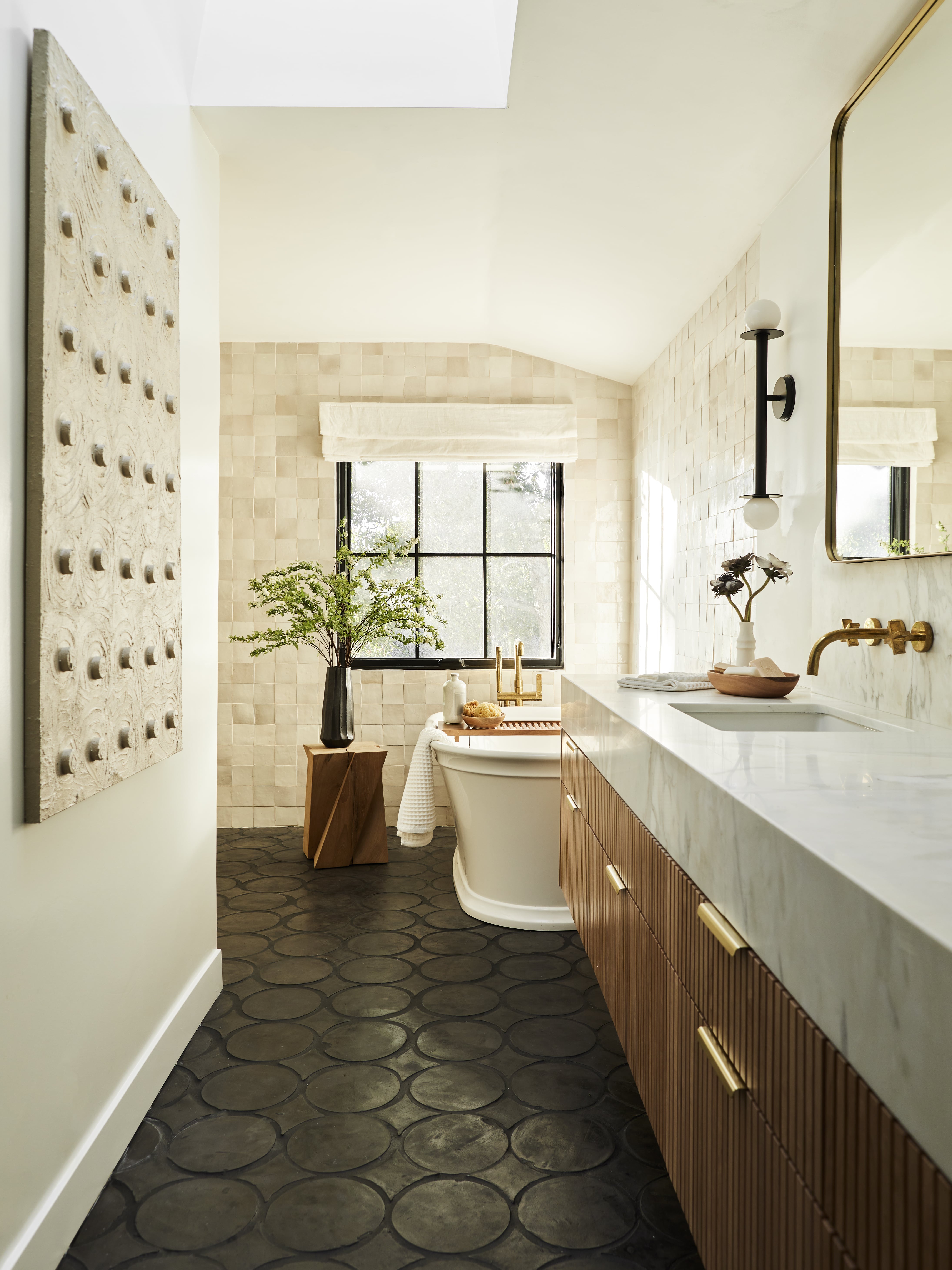
Bobby's bathroom idea has a spa-like atmosphere and that is why it might just be our favorite part of the house. The designer agrees, adding "I really enjoyed the primary bathroom. It felt like a beautiful high-end spa and the afternoon light would filter in magically."
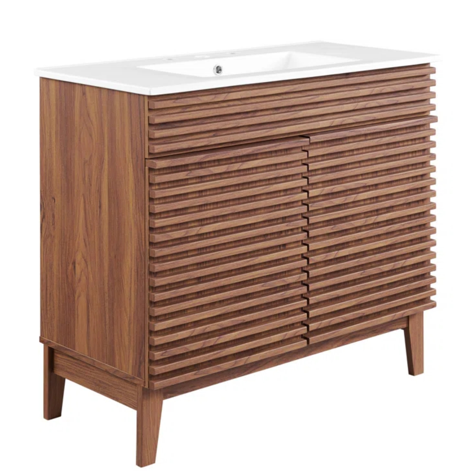
You can never go wrong with a black-and-white palette in a bathroom. However, one detail that sets Bobby's space apart is the fluted wooden vanity. Fluted wood designs, tile backsplashes, and floors are all perfect examples of how to subtly add texture to a room.
As you scroll through the full listing of Bobby Berk's LA property there are so many other design ideas to take note of, and we know this is a home that Bobby will be sad to see go.
"Designing a space that is well-thought-out and truly reflects who you are isn’t just about picking out pretty pieces; it's about creating a place that supports your life, nurtures you, and brings joy every time you walk through the door," he tells us.
As for where he's going next, we can't wait to see more.

Olivia Wolfe is a Design Writer at Livingetc. She recently graduated from University of the Arts London, London College of Communication with a Masters Degree in Arts and Lifestyle Journalism. In her previous experience, she has worked with multiple multimedia publications in both London and the United States covering a range of culture-related topics, with an expertise in art and design. At the weekends she can be found working on her oil paintings, reading, or antique shopping at one of London's many vintage markets.
-
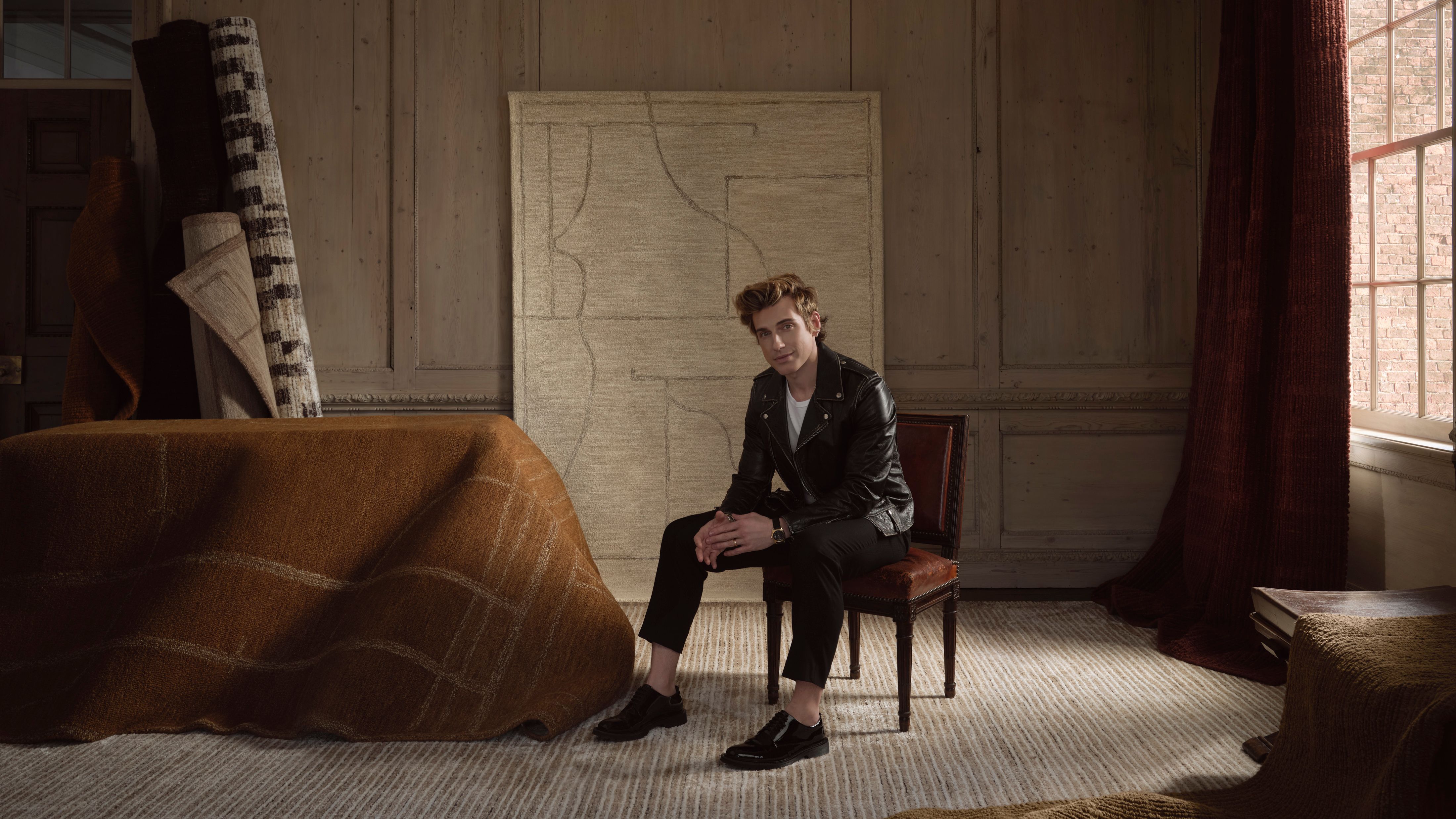 Jeremiah Brent Captures the Grit and Glamour of NYC in His New Loloi Collaboration
The TV-famous interior designer looked out of his own window — and hit the pavement — for a collection that turns city spirit into tactile design
By Julia Demer
-
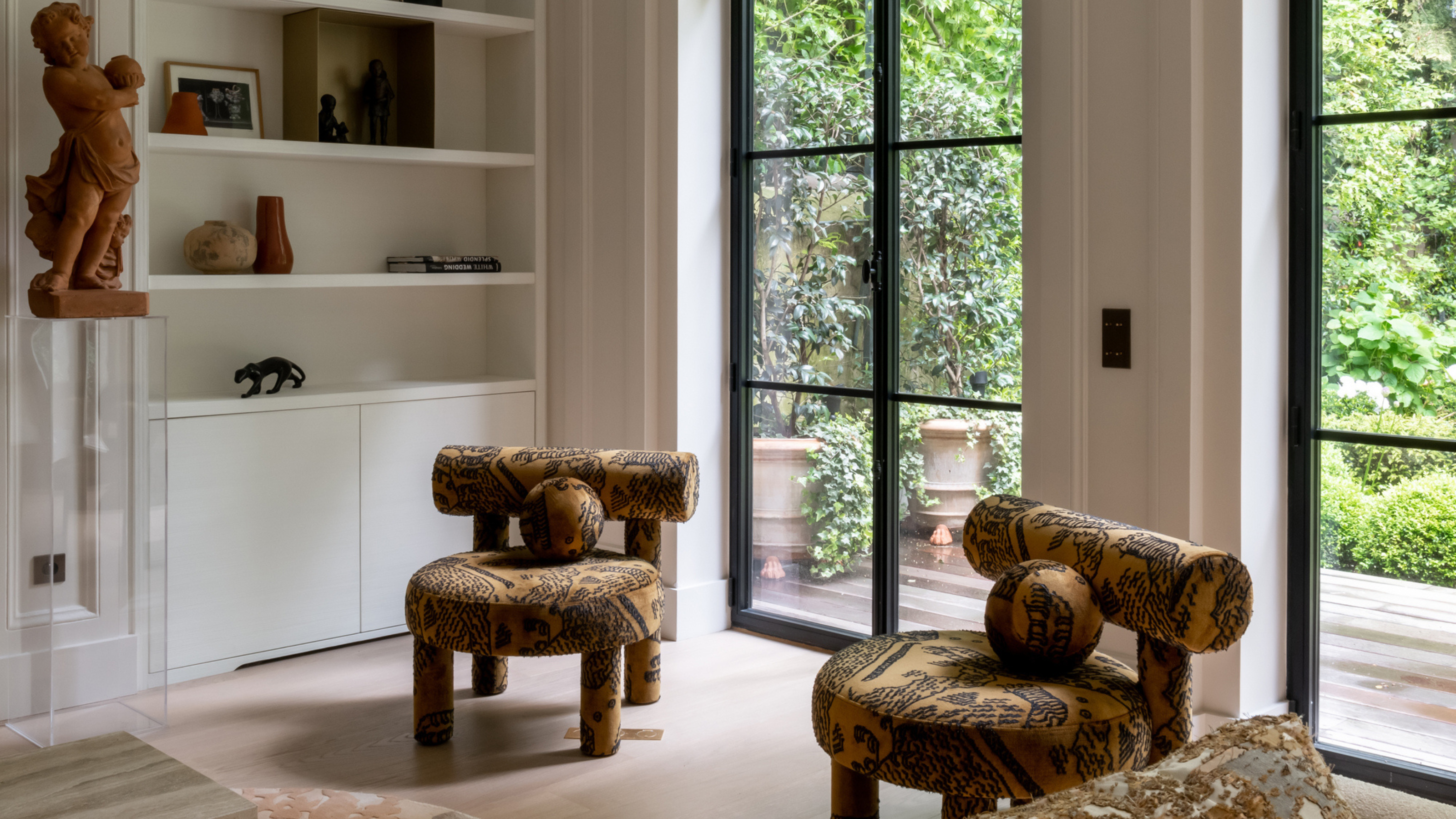 This Specific Fabric Print Is Literally Everywhere Right Now — Here's Why
It's whimsical, artistic, and full of character. We've called it already: Dedar's 'Tiger Mountain' is the fabric that will define 2025
By Devin Toolen
