This Designer's "Anti-Minimalist" Trick is a Genius Way to Elevate a Living Room — Plus, It's Easy to Try
Including a side table in your living room shouldn't be an afterthought — these designers are curating them to create interesting and layered schemes

Most Curated is a monthly series in which one editor, team member or friend of Livingetc will share the top 15 items on their current wish list.
If there's one thing that all my favorite interior designer-designed living rooms have in common, it's not a particular couch or a trendy color palette, it's how their creators use modern side tables in their schemes.
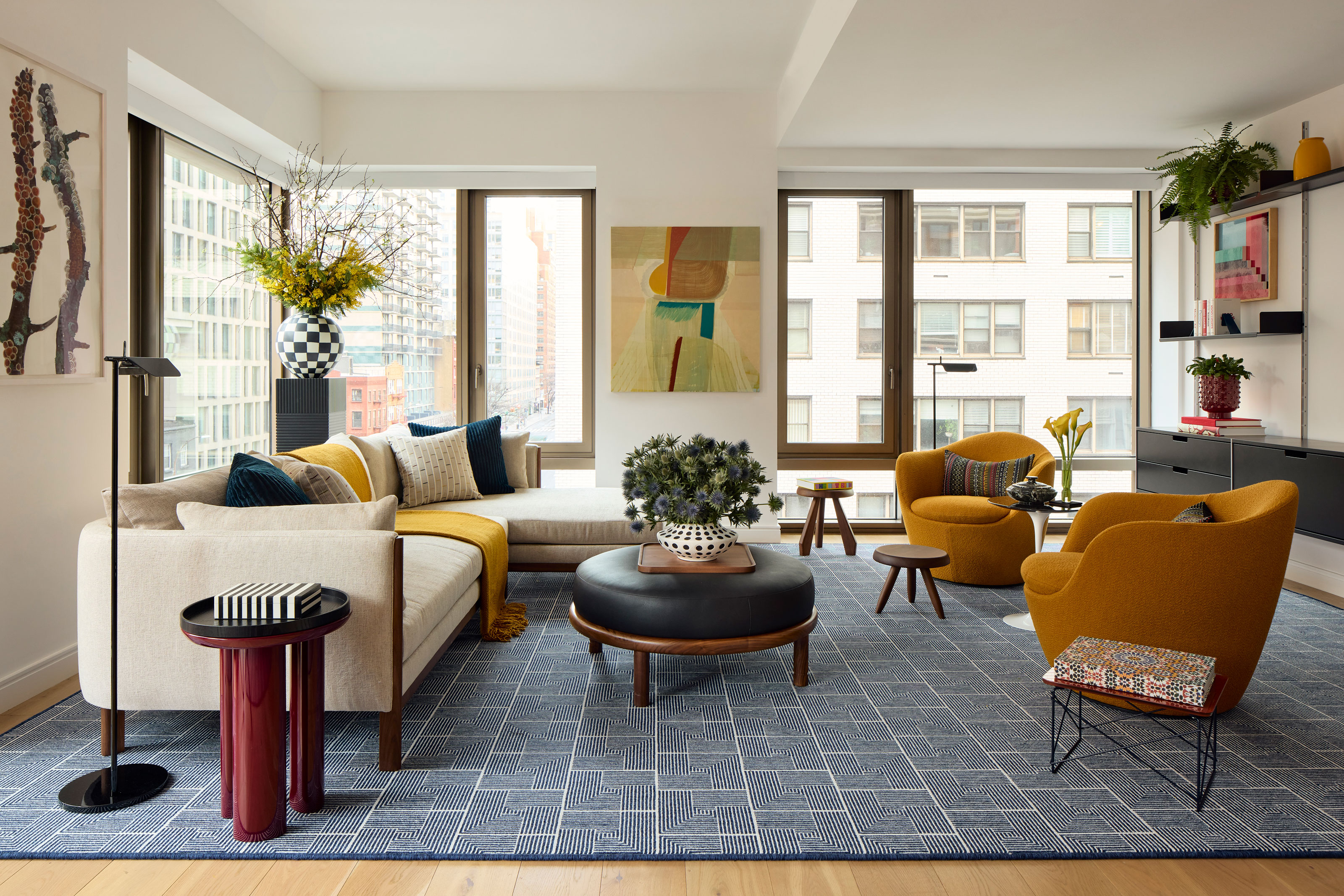
There's more to creating a living room-scape with side or end tables than plunking one on the end of the sofa — designers are using the best side tables as a device to define areas and add "pacing" to a seating arrangement, as well as just acknowledging their practical use for a room in your home that often needs to adapt. 'When I contemplate tables and stools I think in levels,' New York-based interior designer Justin Charette tells me. 'Some place to rest a drink, some place to rest your feet, and larger surface to rest a laptop and/or snack. The key to this is all in the sizing.'
These schemes use intriguing, varied clusters of tables — there's no matching three-piece sets in these designs. Combining intriguing textures, colors and shapes adds brilliant interest to a space in smaller but meaningful ways. They're also easier to swap out and move around, so if you feel the need for a refresh, it's far easier to reinvent your space.
Look around your living room now — how many side tables do you have? One, maybe two? These modern living rooms are a little more extravagant when it comes to quantity, as well as the quality of the design. After all, how many is too many when it comes to side tables? 'I generally think it’s hard to use too many if they have the ability to tuck and cluster,' Justin says. And I tend to agree with him.
How to use side tables in a modern living room

This beautifully curated living room from Jamie Bush + Co shows that it pays not to skimp when it comes to surfaces in a living room. Both this room, and the living room designed by Justin Charette, above, have no fewer than 6 tables around their seating areas, including their choices of side, end and coffee tables.
So how do you decide where to put a side table in this kind of scheme? 'Our typical rule in a space when we have a singular chair or chaise which is a focal point in the room, we most always pair it with a floor lamp and a side table for a three-part composition,' interior designer Jamie Bush tells me. 'The chair becomes a sculptural mass while the floor lamp demarcates the grouping with a vertical stake and the side table provides a smaller scale embellishment to complement or contrast the chair – whatever the intention is.'
This idea works on a larger scale, across your room, too. Think about the "Rule of 3", breaking down your scheme into smaller vignettes. Think about the contrast in materials, shapes, heights and colors across these micro-schemes. Even the best accent chair, floating by itself in the space, can feel lost — supplementing it with a set of low side tables can help draw it into your design, grounding it within the context of the wider room.
What kind of modern side tables are on trend?
Whether or not you want a timeless scheme, or something that feels a little more fresh and invigorating, side tables are easier to move in and out, swap around or even replace without breaking the bank. That means, they offer an opportunity to have a little fun with your design, bringing in interesting materials, shapes and colors that might just introduce the element a living room is missing to make it feel elevated.
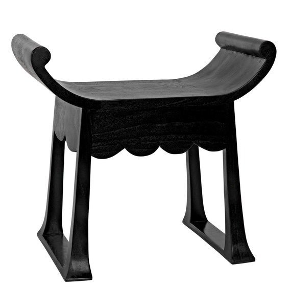
So what sort of interior design trends in side tables should you be looking out for? 'I’m enjoying irregular shapes in addition to standard round,' Justin Charette says. 'A triangle for example can be a fun unexpected table shape that doesn’t take up too much visual space.'
Introduce a mix of styles to avoid a room feeling too one-note. As well as block-y pedestals and storage side tables, use designs that don't eat up so much visual real estate. 'I think tables that have open bases and can add shadows to the room add a lot of depth,' Justin says.
15 editors picks for modern side tables for living rooms
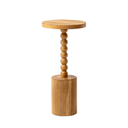
Price: $62.99
This timber-effect side table is a great price at under $65, and it's a clever take on the "bobbin" interior design trend. With a chunkier base, it feels more modern than many bobbin-style tables, but it's paired with a material that will bring warmth to your scheme.
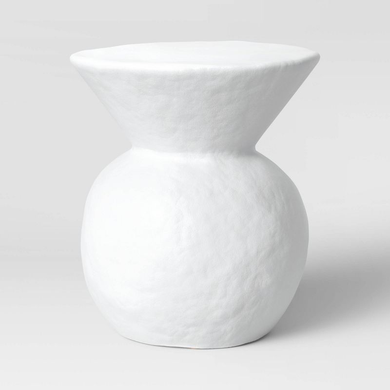
Price: $100
Shea McGee's Threshold collection for Target has a raft of brilliant modern side tables that are pretty budget-conscious. This might be the best end table for minimalists at this price point, and while we might expect it to be made of just fiberglass at $100, it's actually a glazed ceramic finish.
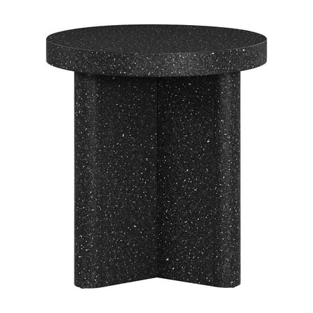
Price: $98
This marble look side table is a surprisingly chic addition to Drew Barymore's range for Walmart. The gentle speckle makes it feel so much more deep and luxurious than a flat, plain finish would. Its magic is in its subtlety.
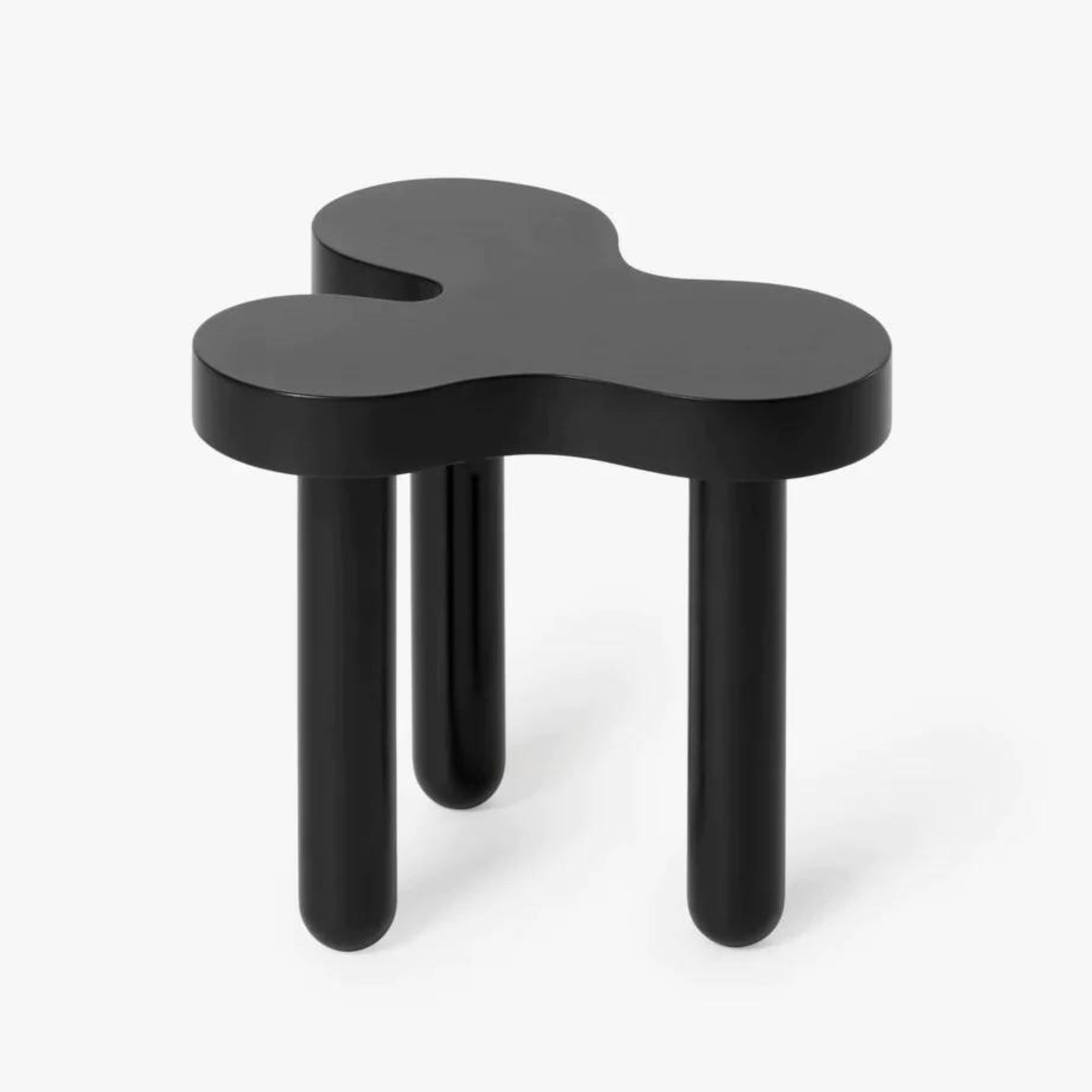
Price: $140
When it comes to cool, modern and arty side tables, I don't think you get more for your money than this "splat" table. Pictured here in Black, it also comes in a variety of bright, vibrant colors if you're looking for a bolder accent piece.
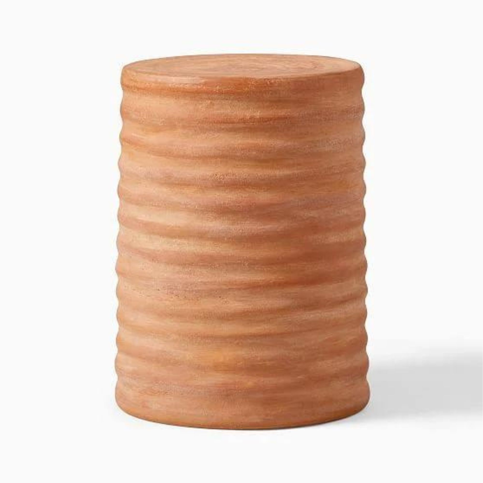
Price: $109.99
This raw terracotta side table from West Elm is a celebration of materiality. It's a beauty that would work wonders in a modern rustic decor scheme, or something a little more minimalist, while the glazed white version has a little more general appeal.
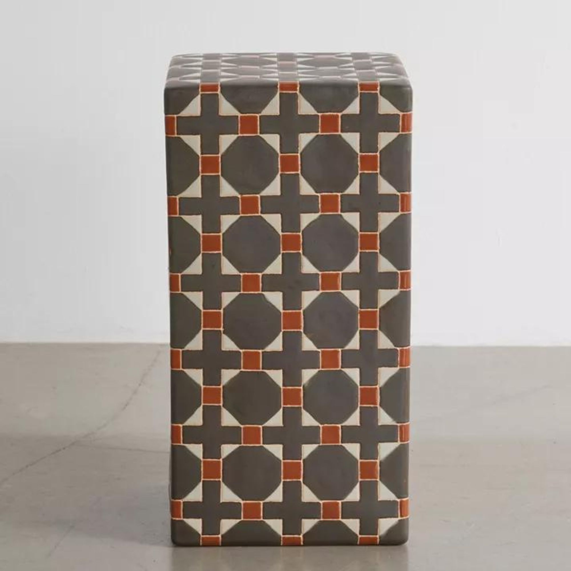
Price: $159
A side table is an interesting way to introduce pattern into a space, too. This ceramic design from Urban Outfitters can also be moved outside in the summer months, meaning one less thing to store away when winter rolls around.
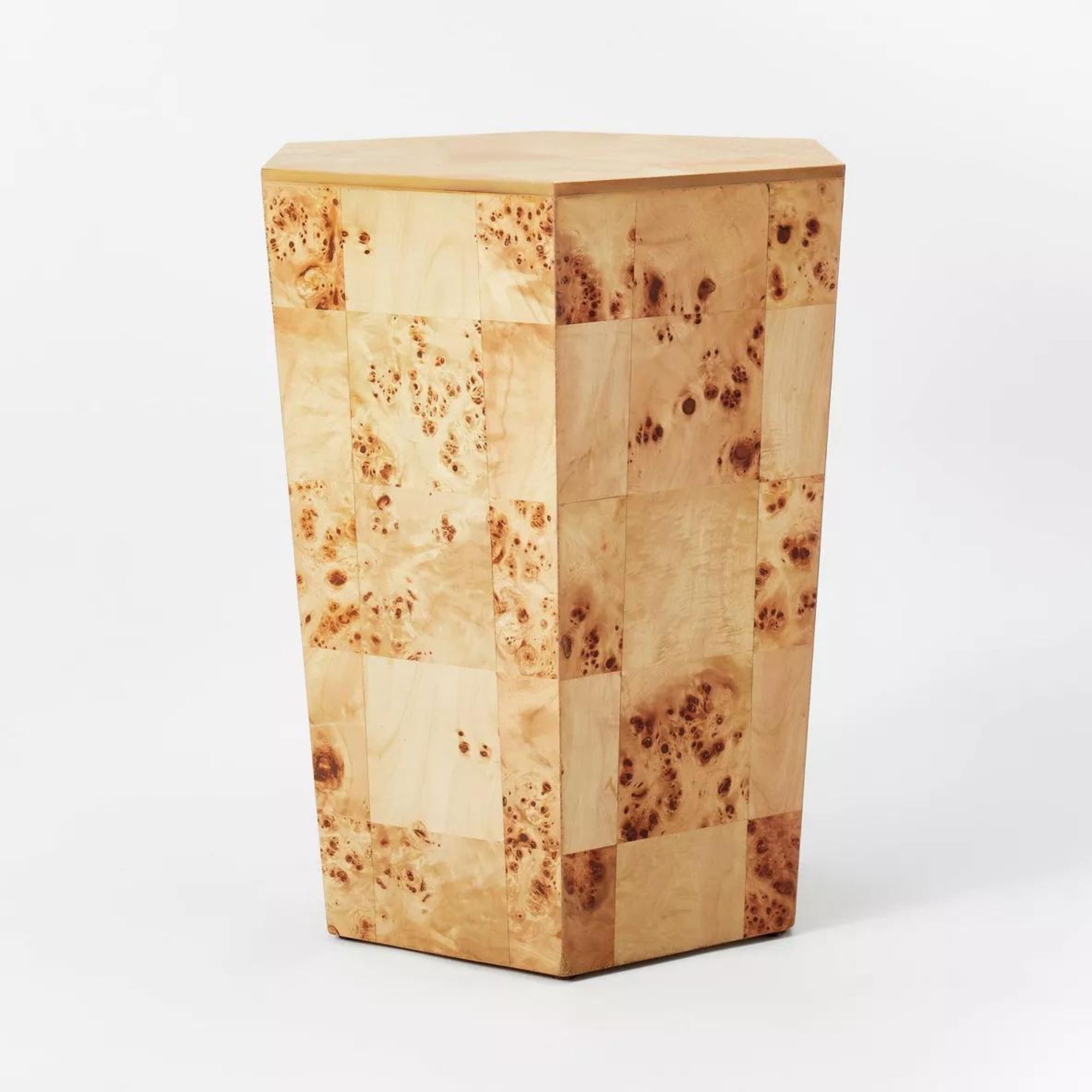
Price: $140
Burled wood furniture is a huge interior design trend right now, but it's often prohibitively expensive to buy. This Target side table is not only a good price, but it's a modern take on the look which feels just right for 2024.
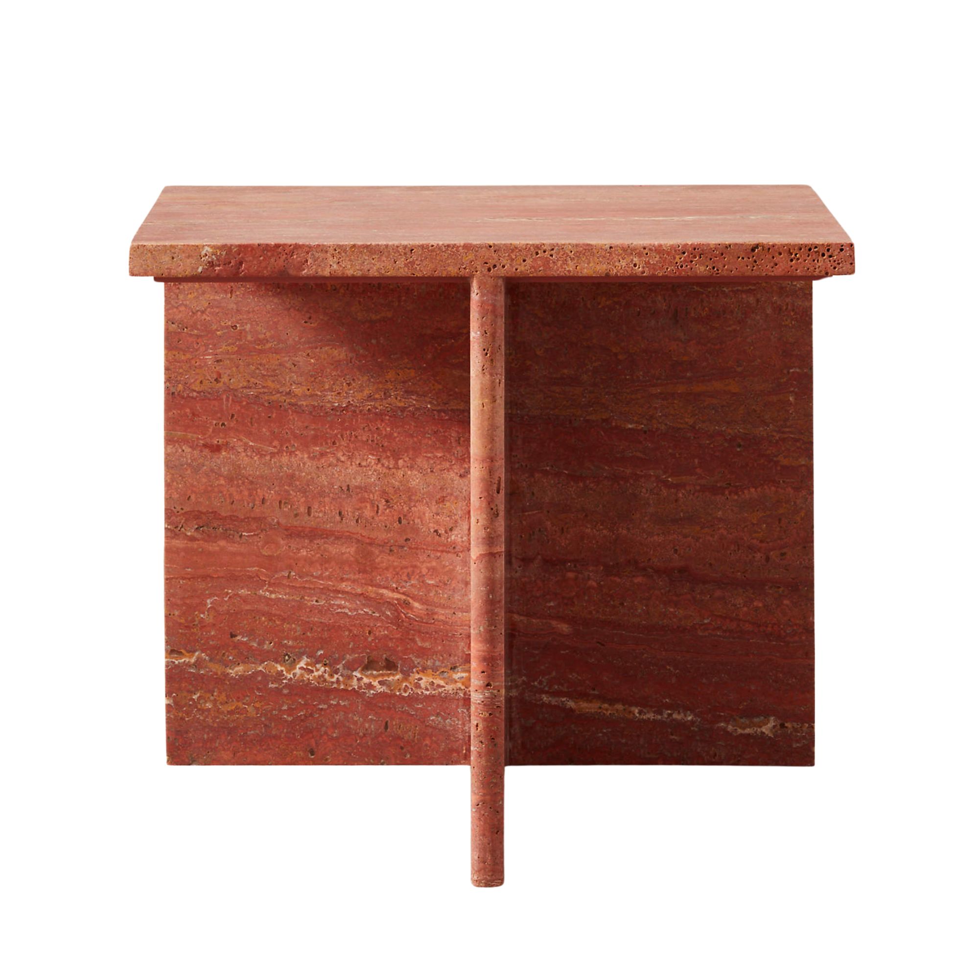
Price: $299
I'm calling it, this red travertine side table might be my favorite piece of furniture right now. There's a viral idea called the Unexpected Red Theory that's having a moment right now, and introducing this piece would be the most elevated way to bring it to your space.
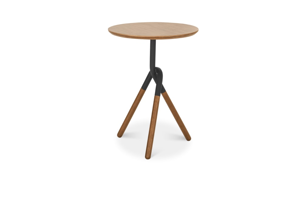
Price: $199
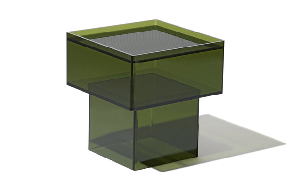
This Castlery side table is the "open" base style you need to add into the mix to make sure your living room isn't overwhelmed. At the same time, it has an interesting profile so that it doesn't just fade into the background.
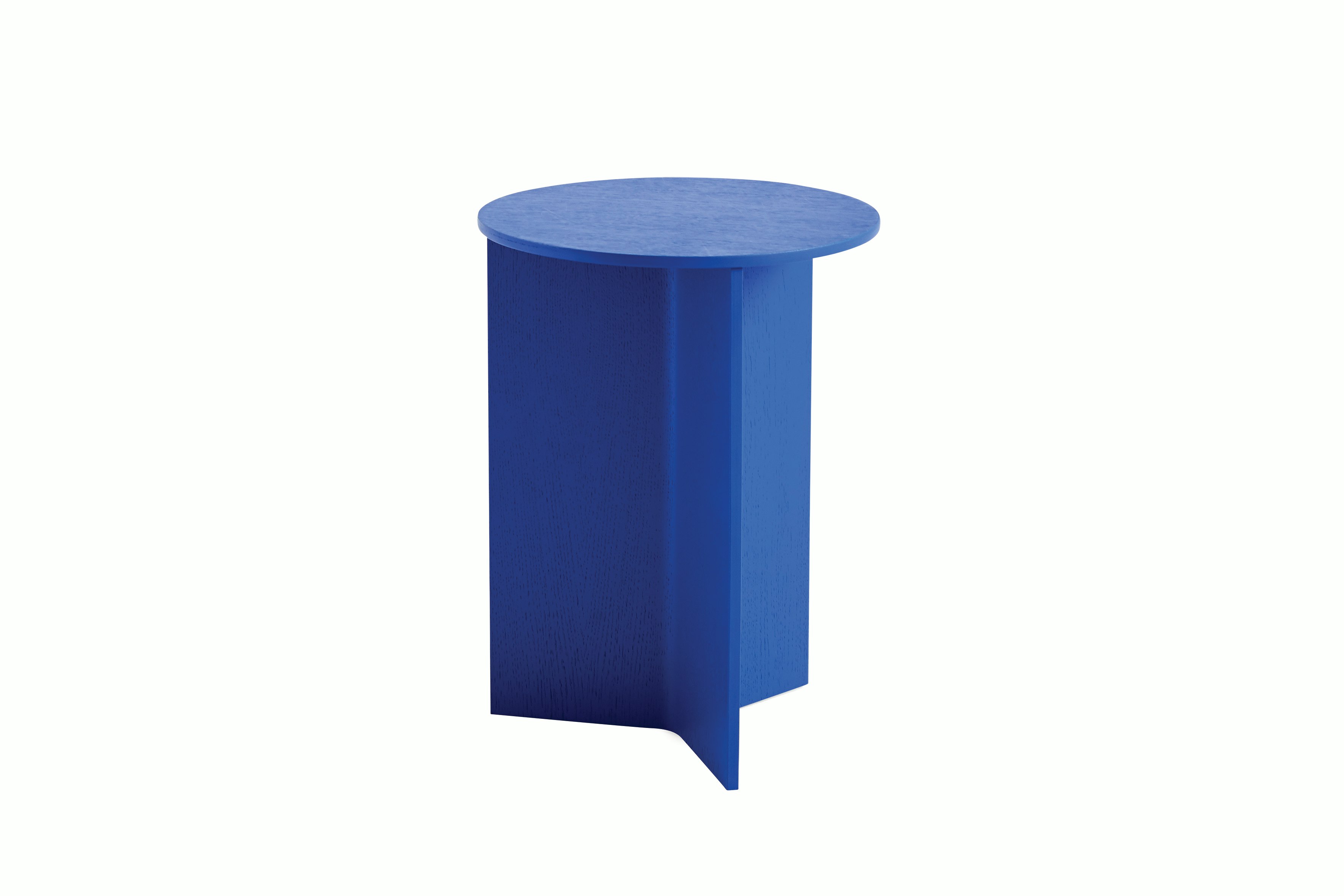
Price: $236
What a great, energetic shade of blue to introduce into a room. The simplicity of the design, with the slight texture of wood grain, make sure this piece feels suitably grown-up, in spite of its vibrant color.
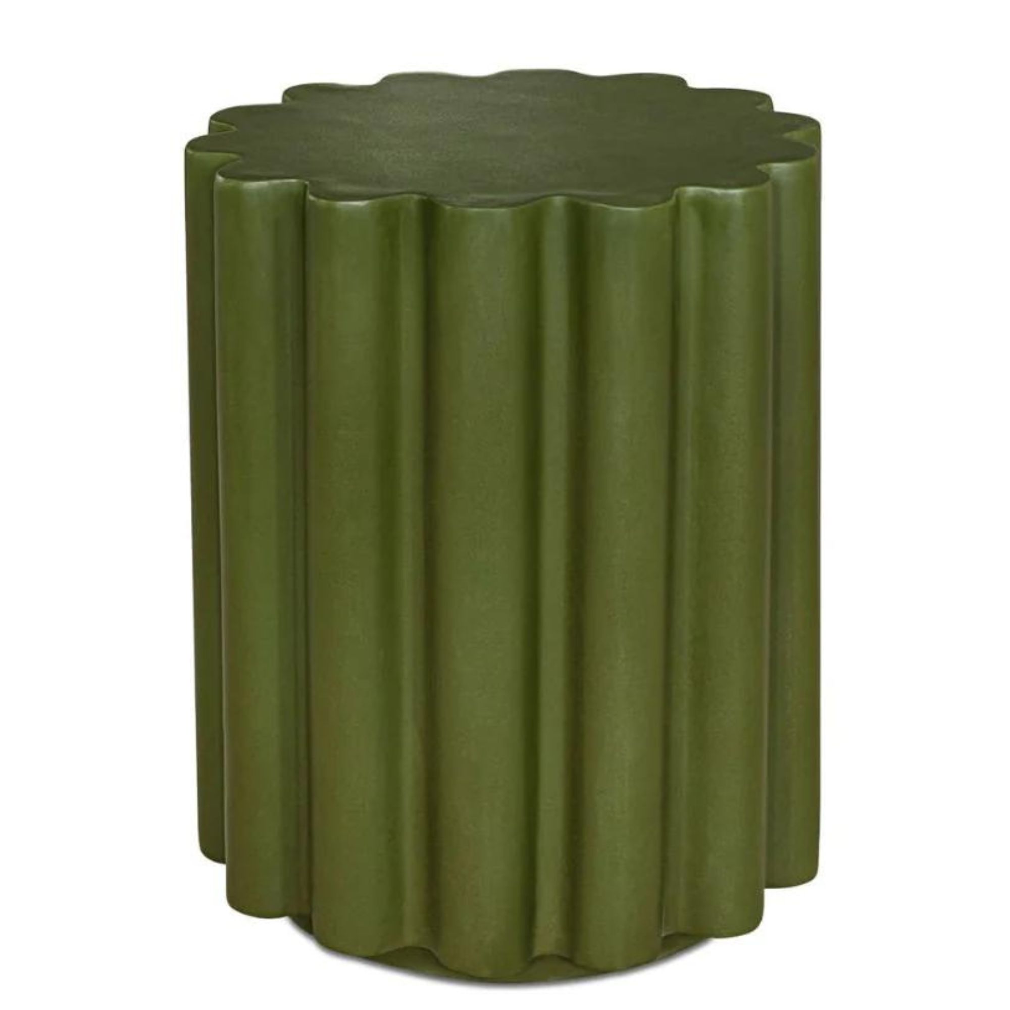
Price: $199
Fluted side tables are no-brainers for adding texture to your living room when a space feels a little flat. This one from Burke Decor wins on two counts, though — it's deep, rich color will add even more layers to your design.
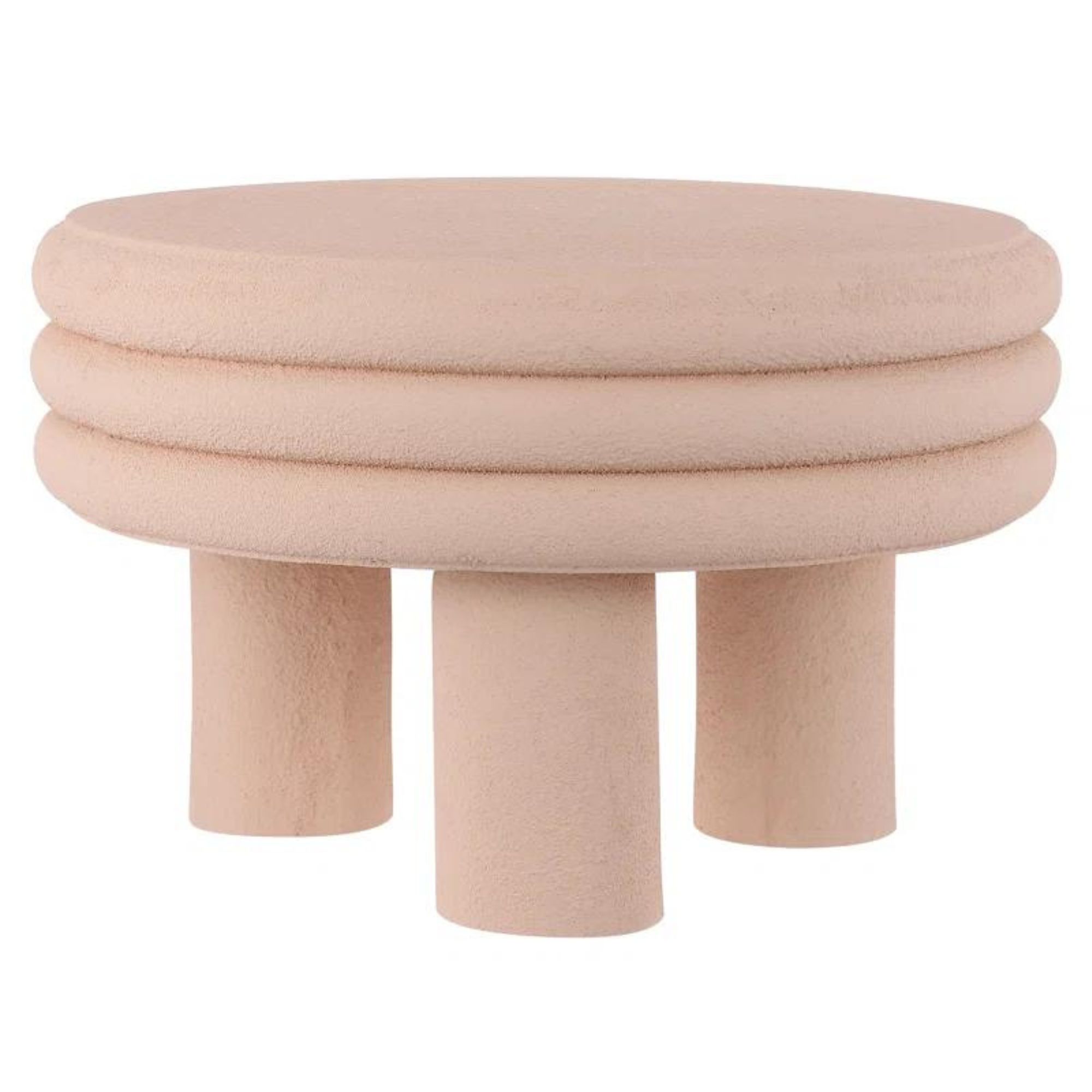
Price: $199
Don't forget to consider a mix of heights in your curated living room scheme, too. This low table in a playful plaster pink is a great addition between a set of armchairs, and comes in a textured finish that's simple but interesting.
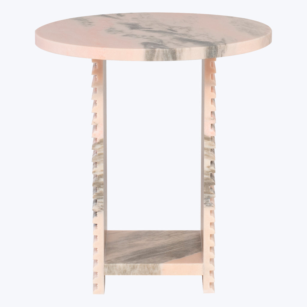
Price: $900
If you're looking for that one wow factor piece for a living room, this pink marble table has to be it. It's not exactly a budget side table, but it's a timeless material that'll become an heirloom in time to come.
Be The First To Know
The Livingetc newsletters are your inside source for what’s shaping interiors now - and what’s next. Discover trend forecasts, smart style ideas, and curated shopping inspiration that brings design to life. Subscribe today and stay ahead of the curve.

Hugh is Livingetc.com’s editor. With 8 years in the interiors industry under his belt, he has the nose for what people want to know about re-decorating their homes. He prides himself as an expert trend forecaster, visiting design fairs, showrooms and keeping an eye out for emerging designers to hone his eye. He joined Livingetc back in 2022 as a content editor, as a long-time reader of the print magazine, before becoming its online editor. Hugh has previously spent time as an editor for a kitchen and bathroom magazine, and has written for “hands-on” home brands such as Homebuilding & Renovating and Grand Designs magazine, so his knowledge of what it takes to create a home goes beyond the surface, too. Though not a trained interior designer, Hugh has cut his design teeth by managing several major interior design projects to date, each for private clients. He's also a keen DIYer — he's done everything from laying his own patio and building an integrated cooker hood from scratch, to undertaking plenty of creative IKEA hacks to help achieve the luxurious look he loves in design, when his budget doesn't always stretch that far.
-
 The Easiest Way to Turn Your Designer Scarf Into Wall Art — No Frame, No Fuss, No Regrets
Because silk this pretty should never stay in a drawer
By Julia Demer Published
-
 Italian Kitchen Trends — 5 Emerging Ideas From the Chicest Italian Designers That I Predict Will Go Global in 2025
Fresh from Milan Design Week, these are the exciting finishes, styles, and innovative materials I can't wait to see in more kitchens this year
By Faiza Saqib Published
-
 Forget Tomato Girl Summer — This Season, We're in for an 'Olive Girl Spring'
From olive-shaped candles to olive-embroidered placemats, all the chicest tables are donning martini olive decor
By Olivia Wolfe Published
-
 Leopard Spots Are Over — Here's Why Tiger Print Is the Next Big Trend in Design
The coolest cat in home design is here, and it’s got claws
By Julia Demer Published
-
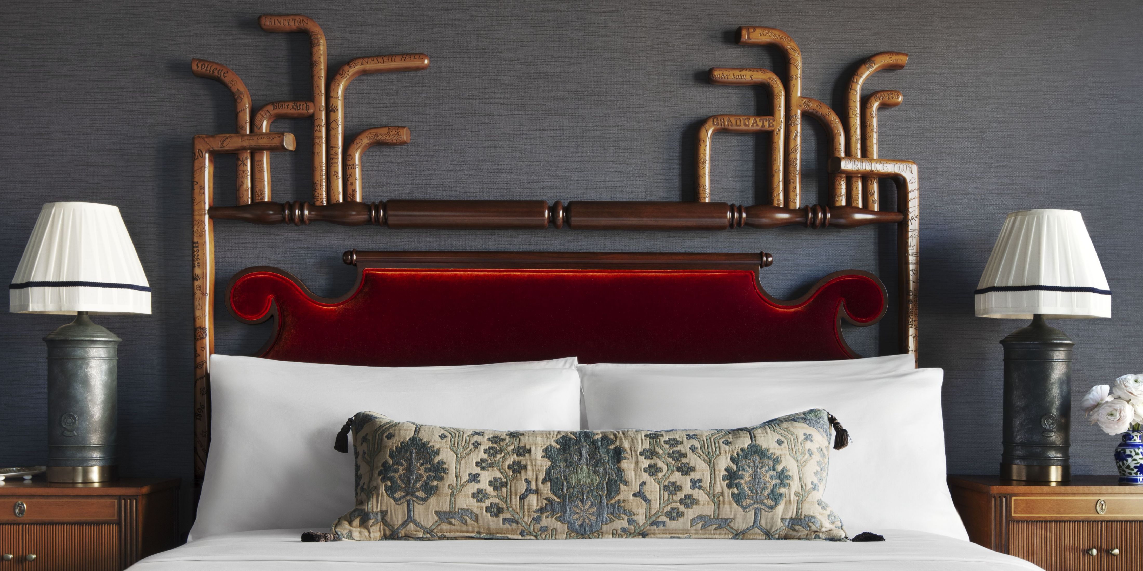 Tassels Are the Resort-Inspired Touch We Can't Escape in 2025 — Shop the Trending “Hotel-Core” Accent
Five-star living is making its way home — one tassel at a time
By Julia Demer Published
-
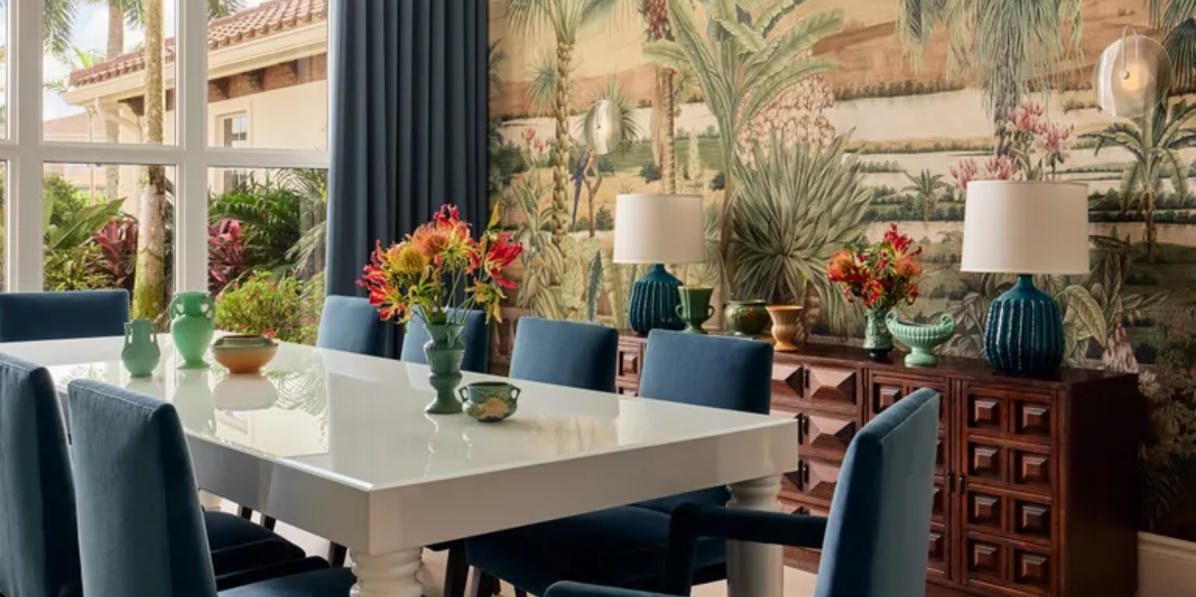 Our Interiors Editor Doesn’t Think Tropical Palm Motifs Can be Stylish, So I Set Out on a Mission to Prove Her Wrong
Tropical is trending — but don’t panic. “Island-core” is kicking the kitsch and trading tiki torches for actual taste
By Julia Demer Published
-
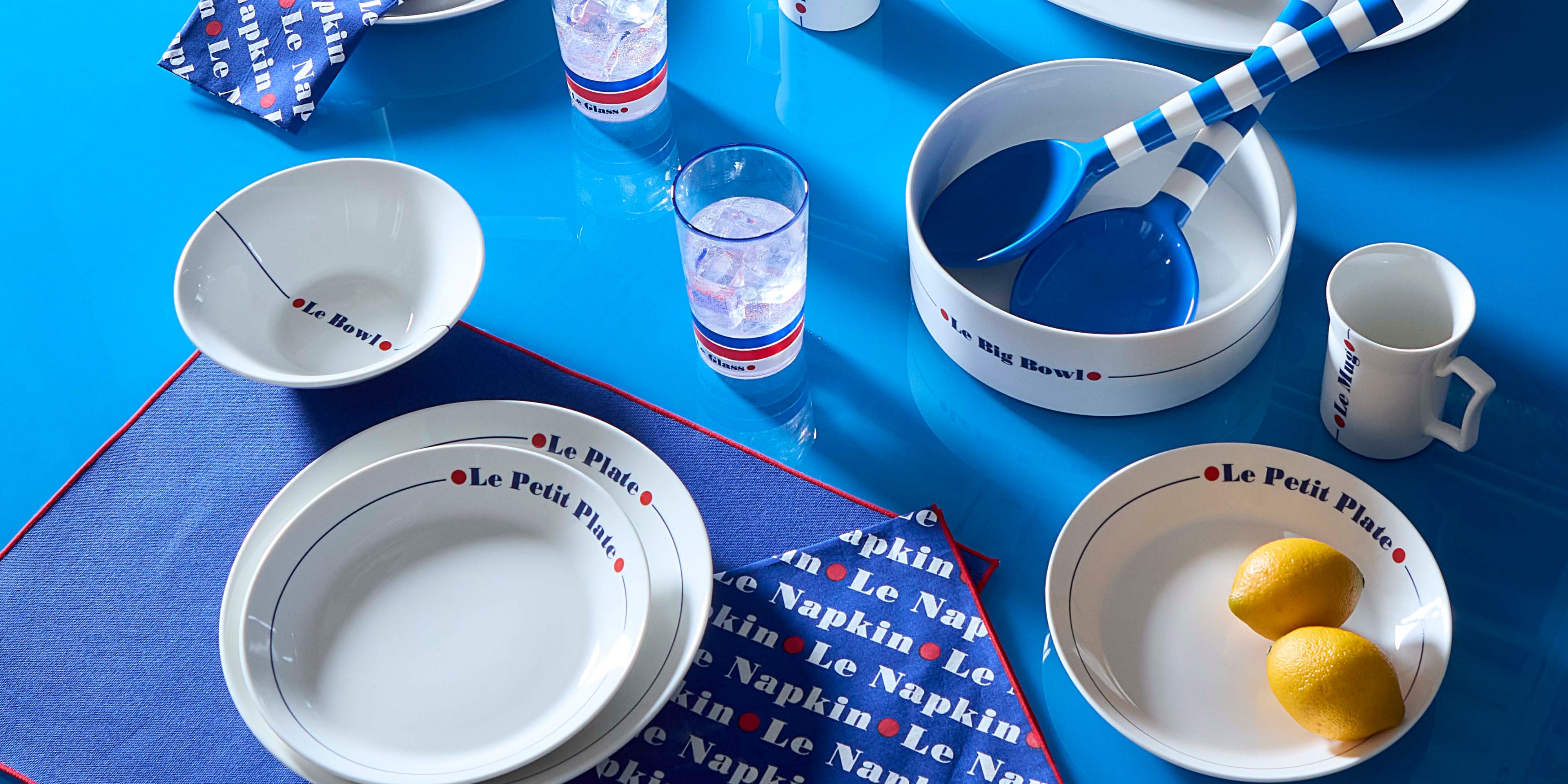 'Bistro Belle' Is the New Coastal Grandmother — And Jonathan Adler’s Newest Dinnerware Collection Pitches It Perfectly
Somewhere between laissez-faire luxury and unabashed cool, summer 2025 takes its cue from the unbothered je ne sais quoi of the Bistro Belle
By Julia Demer Published
-
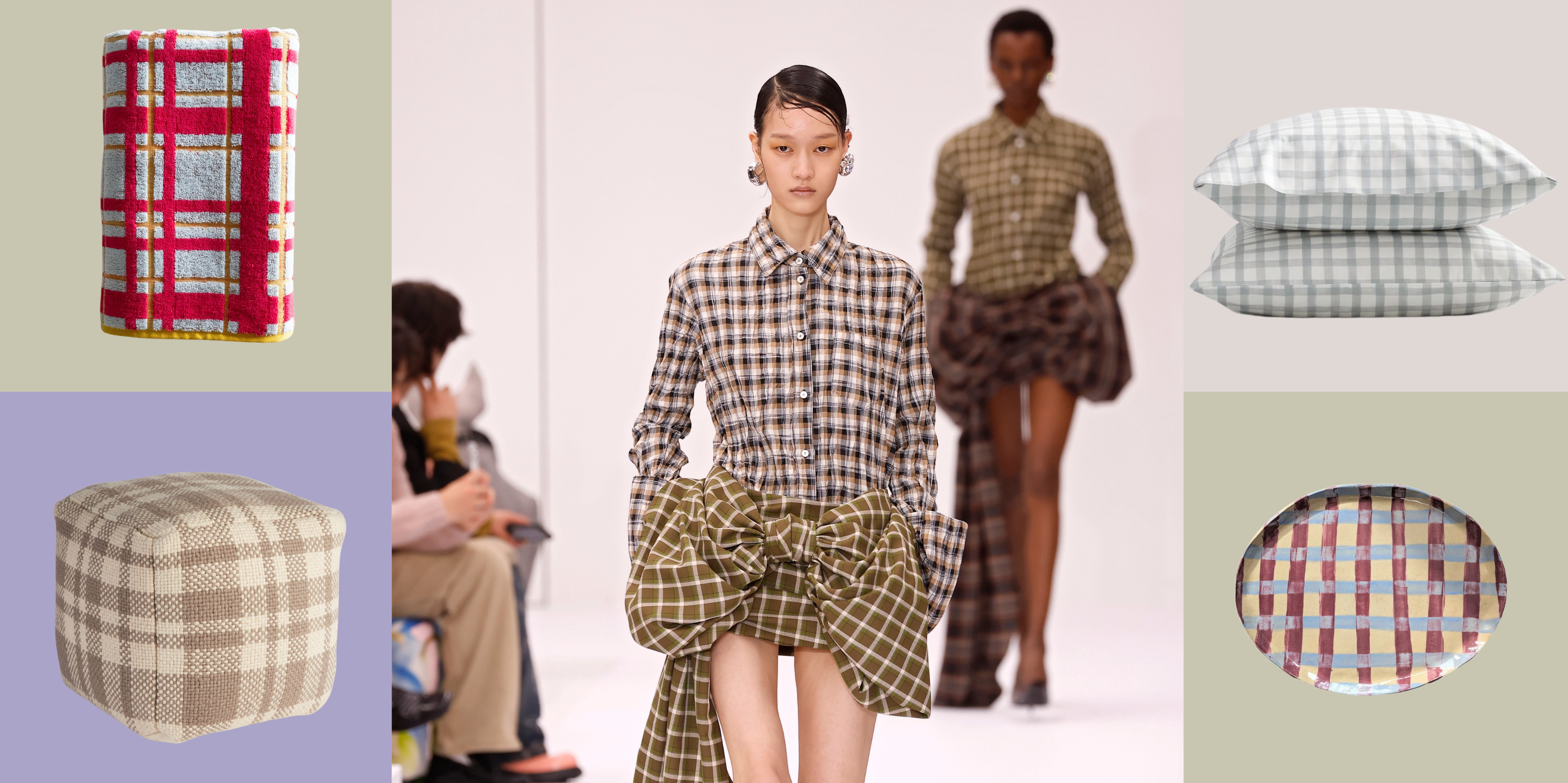 Plaid... for Spring? The Fashion Fave and a 'Fisherman-Core' Component That Works in Your Home All Year Round
As a major fashion trend and an element of the internet's current aesthetic 'fisherman-core', plaid is just the pattern you need to elevate your interior décor this year
By Devin Toolen Published
-
 2025's Oscar-Nominated Movies, but as Interiors — Design Lessons From This Year's Most Stylized Films
Whether you're a film fanatic or design devotee (or both, like me), here's our take on interior styles inspired by the silver screen, and how to shop the looks for your home
By Devin Toolen Published
-
 It's Après-Ski Season — And All I Can Think About Is How to Make My Home Feel Like an Aspen Lodge
With nature as its inspiration, après-ski style is comfortable and inviting, with a hint of luxury. Here are the key design trends for achieving the aesthetic
By Devin Toolen Published
