Best pink paint – 6 rosy shades to suit all styles, as chosen by designers
From rich creamy pinks, pastels to dusty hues, these are some of the best pink paints for your home
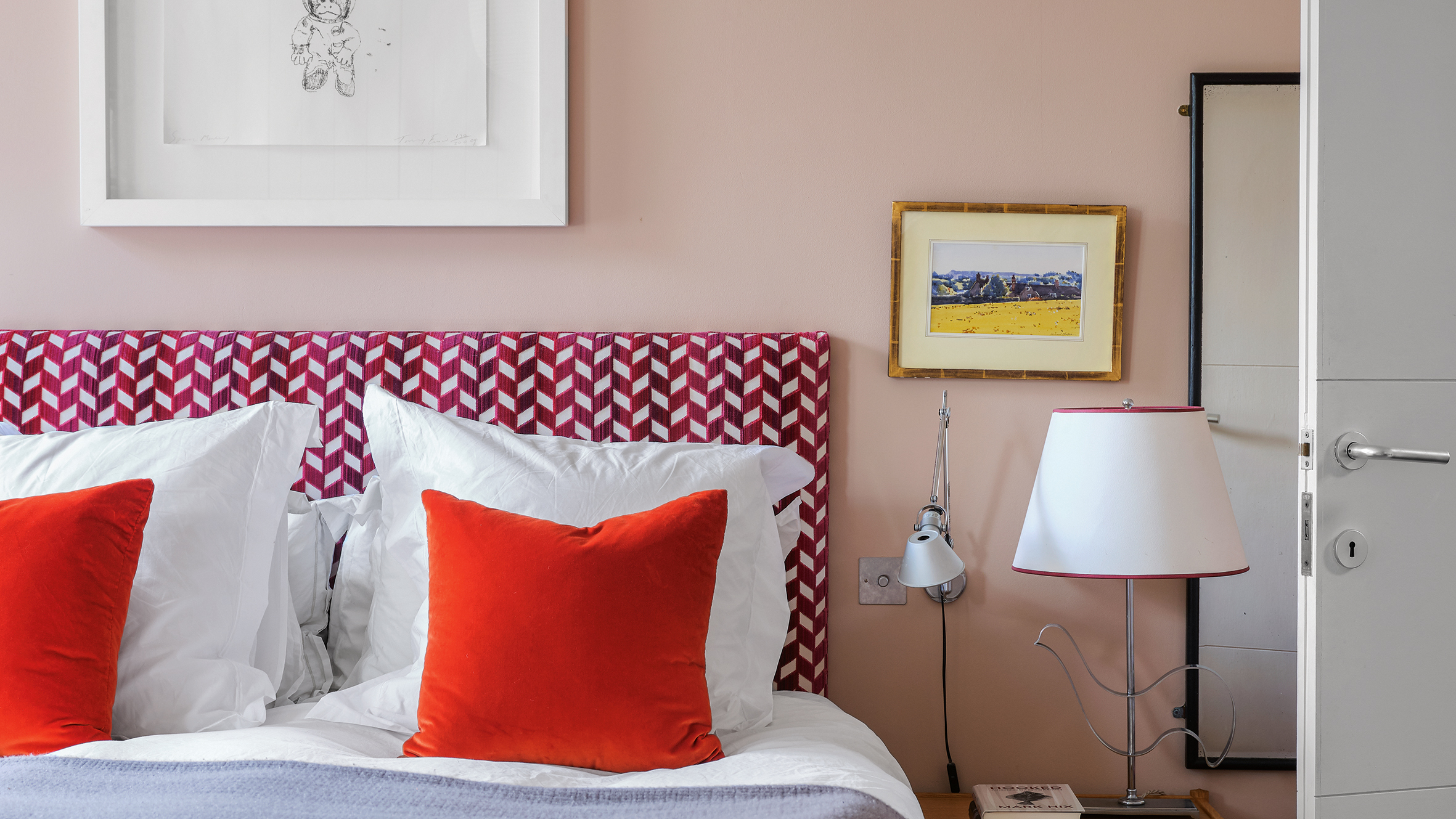

Trying to find the best pink paint, or the best any shade of paint, can be a bit of a minefield. As anyone who has searched for 'pink paint' will know, you are met with literally thousands of options. Ranging from vivid fuchsia to a barely-there almost white baby pink, there are so many variations to choose from.
A refreshing, happy, and bright color, pink is just the hue for when you want to add a little cheer to your place. Color trends go through their ebb and flow but there's no question that pink paint is always having a moment and we all want to bring it into our home in some form. So to make finding the best hue a little less daunting, we asked interior designers for their favorite paint brands and pink shades...
1. Calamine, Farrow & Ball – a soothing pale pink
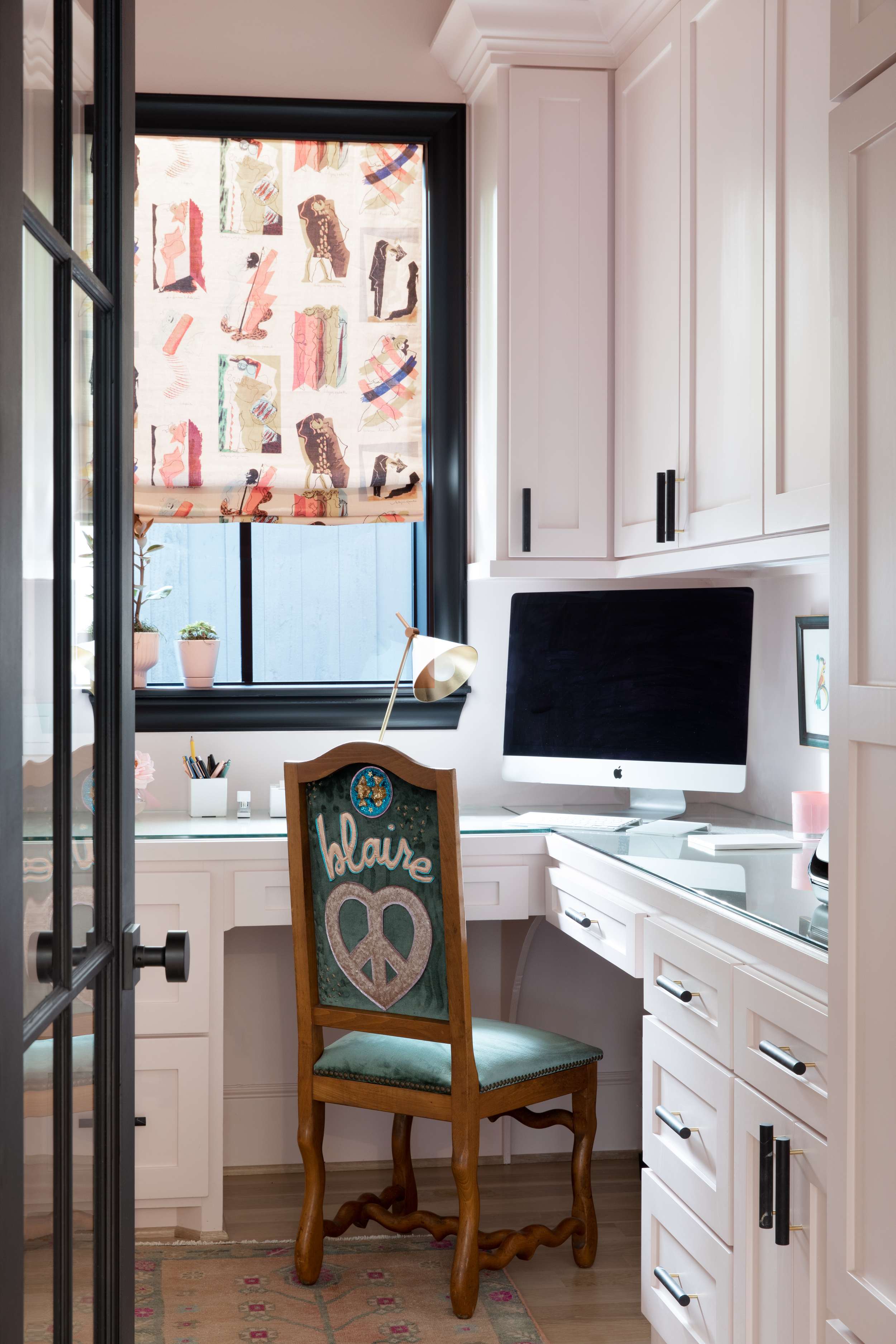
Pink paint has seen a huge resurgence in the last few years, taking over restaurants, stores, and now even homes. If you're looking for specific home office ideas, then this uplifting hue definitely takes the cake. The soothing palette makes for a relaxing space, illuminated with the natural light streaming in from the window. A light undertone of grey prevents this color from looking too sugary and gives the space a delicate touch.
'My favorite pink paint color is Farrow & Ball is Calamine. It reads like a neutral, but is better,' shares designer Mary Patton, who created this small, but perfectly formed sunny pink home office.
2. Malted Milk, Sherwin-Williams – a blue toned light pink

'In this home office, the client wanted a soothing and neutral backdrop with a hint of color. The wallpaper, with soft green and yellow undertones, is paired perfectly alongside the blush pink wainscoting from Sherwin-Williams's Malted Milk, selected for the bottom half of the walls. This subtle pairing completely jazzed up the space and provided just the right amount of visual interest for a home office space,' says Jessica Nelson of Etch Design Group.
For more modern home office ideas, consider layering your pretty pink walls with a statement light or a chandelier that brightens up the color scheme of the room. You could also hang a mirror so the light and the hues of the room bounce around.
3. Dawn, Asian Paints – a grounding deep rose
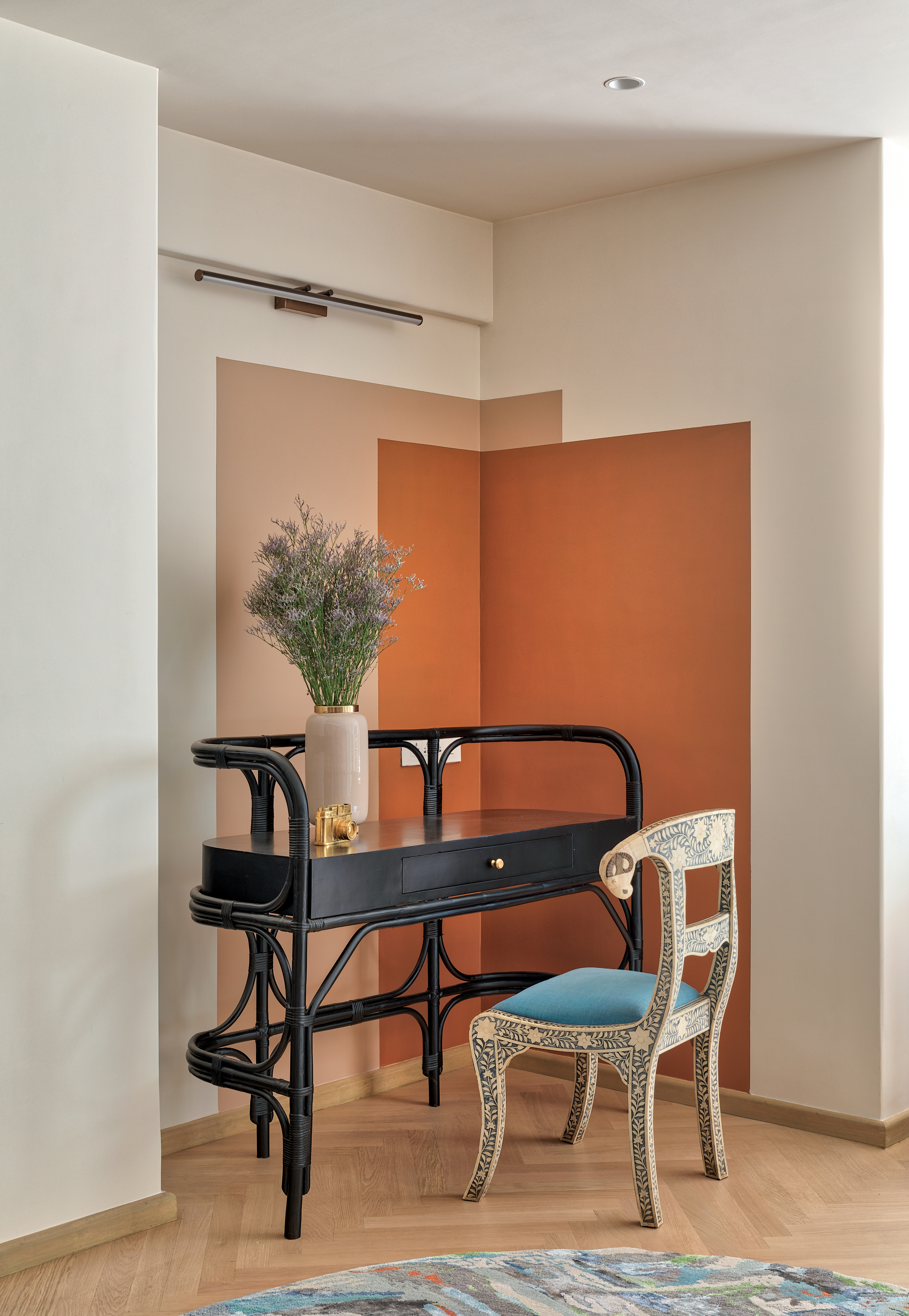
'The wall colors in this space were inspired by a dessert color palette, inspired by Phoenix (Arizona). We worked with color blocking in this corner with Dawn - 0469 over a base wall color called Macadamia-5184 and then overlapped it with the darkest color called Copper Leaf - 0523, all from Asian Paints. By using color blocks and by working with a corner, we added more character to the space and made the entire house look interesting,' says Noorein Kapoor, Creative Director, Noorein Kapoor Design.
Paints can help define corners or elevate them. For interesting paint ideas, take a look at this alcove within which a small reading/working nook exists, lifted with the tone-on-tone wall paint trend. Also notice, wall paints don't need to extend all over the wall or ceiling. Sectioned-off paint works just fine, and the color party of pink is also balanced by the black table and the carved chair.
4. Pink Ground, Farrow & Ball – a dusty palest pink
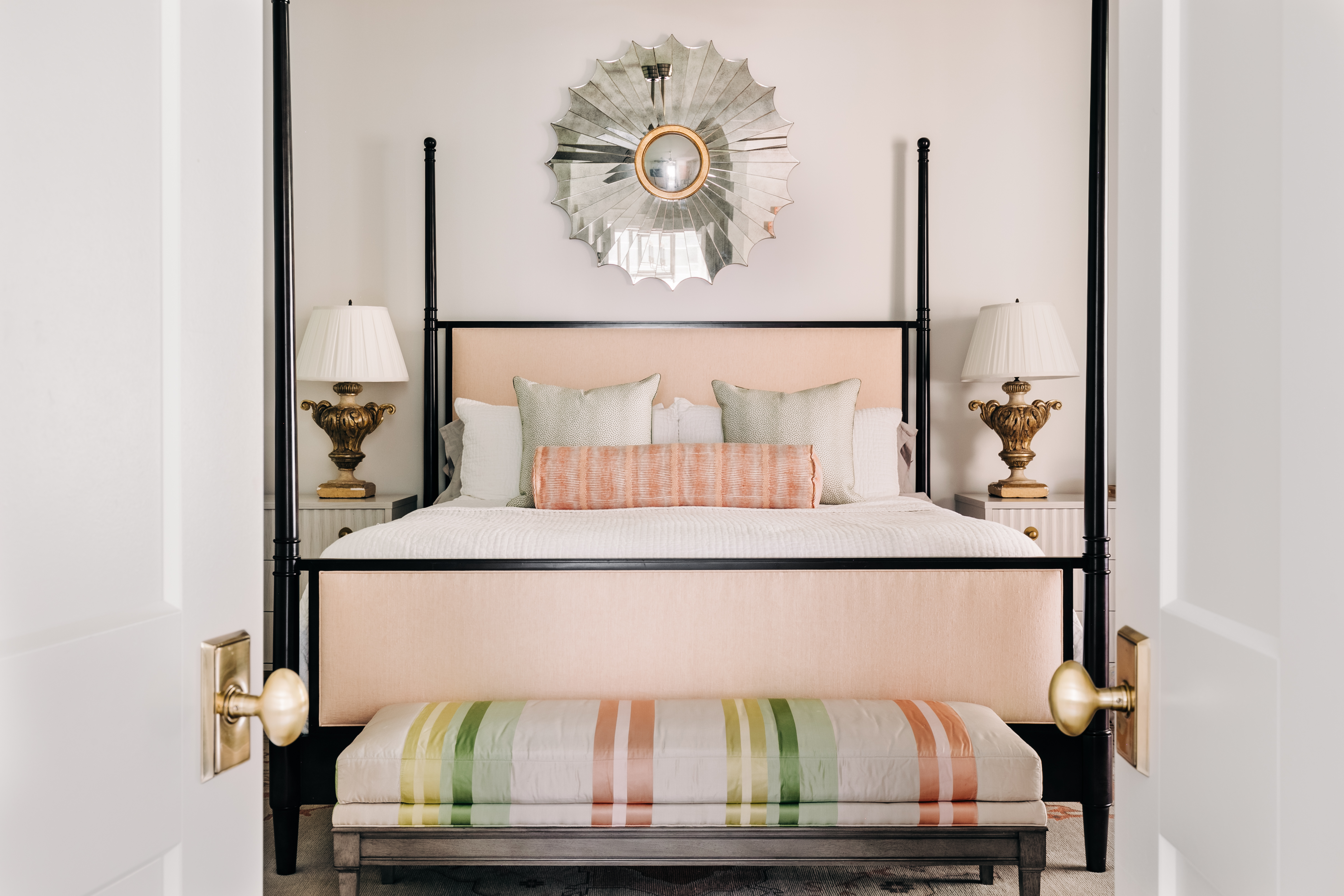
In this barely-there shade of pink, the effect is calm, relaxed and cosy. The peach bedding seamlessly complements the light pink walls, and the starburst wall mirror reflects the soft scheme. The black frames of the bed look particularly sleek against the walls.
'I love this shade of Pink Ground by Farrow & Ball that works so well in the soft-toned bedroom,' says Caroline Brackett, principal designer and owner, Caroline Brackett.
5. Hint of Mauve, Benjamin Moore – a deep purple toned pink
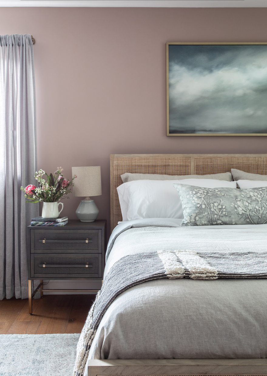
If you're looking for largely neutral bedroom ideas, then this wall paint, which has a hint of mid-brown in it, could be the one. This dusty light pink paint seems more neutral than overly colorful. Against the light wall, the black side table and the large artwork are brightened up, while the crisp white linens are warmed up by the organic headboard.
'I love this mauve color because of its deep and mature shade. I had to find a shade that would work for my clients, something that was not too feminine or too masculine to make this room feel intimate, loving, and warm. I think this particular bedroom color is a perfect match for my clients. The paint color is Hint of Mauve 2097-50by Benjamin Moore,' says interior designer Carmit Oron.
6. Crushed cotton, Dulux – a muted warm mid-pink
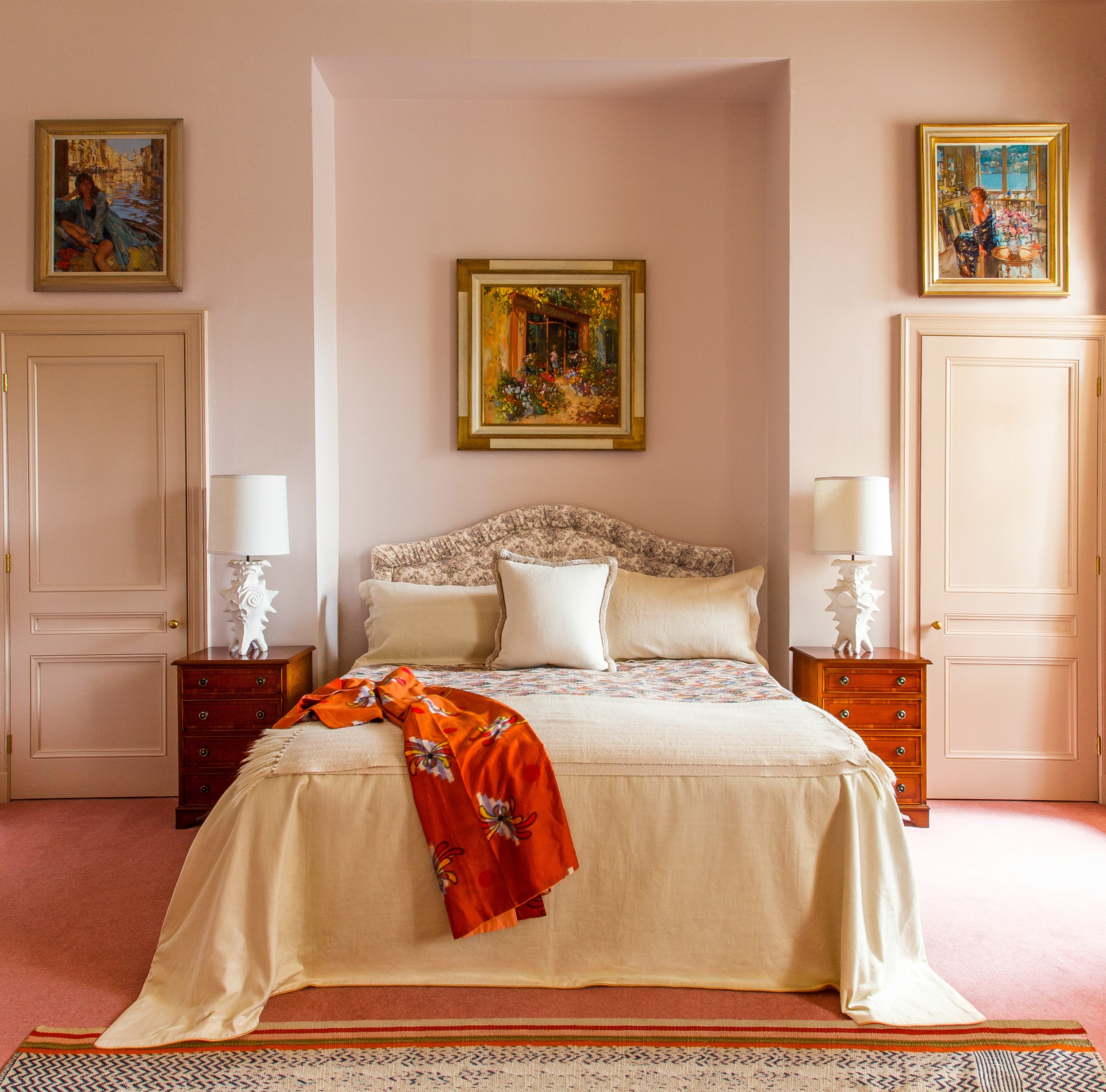
This is one charming pink package! The symmetrical elements create a luxurious bedroom, and aiding the overall look is the muted medium pink that works well in this modern space. There are touches of pink throughout the space; we love the sense of calm this color projects.
'The pink in the bedroom was used to evoke the pleasure of the first light. It is warm, calming, and hopeful. The color is from Dulux Trade Palette 50YR 74/054,' says Natalie Tredgett of Natalie Tredgett Design.
If you have an interior as plush as this, consider adding more softness with silk cushions, hand-knotted rugs and chic taupe upholstery. Also, in a single-color, layered room, jewel or metallic tones work well as surprising pops of colors.
What colors are trending for 2021?
Pink will never go out of style. And, the reasons are many, but before we jump into them, did you know that pink is a color not featured on a traditional painter’s color wheel? That's because it's a hue made from red, yet it has its moniker. It is a beautiful mixture of primary colors, and this is why the hue is flexible and available in several different shades that can mix and match with any interior.
Used in bold hues with rich berry pinks, or subtly in blush pink paint shades, the versatility of the color is undeniable. It transports you to a place of whimsy, positivity, and even poetry. The hue can be used in a bold, bubblegum hue like Farrow & Ball's Calamine hue; for coral, Behr's Pink Mimosa is a lovely shade. The color can even transition to a purple-pink shade, with Benjamin Moore’s Hot Lips. For more ombre tones, Sherwin Williams’ Forward Fuschia, Exuberant Pink, and Vivacious Pink are ideal.
Interior design trends are never complete without colors. Paints not only affect the vibe, look and aesthetic of a space, they also have an influence on the mood of the dweller. This is why they need to be chosen carefully.
Every year paint companies and designers announce the biggest color trends of the year, the colors that will take center stage, and even the different ways paints can be used. Largely, neutrals are still ruling the roost, although people now prefer warmer tones of greys, creams, and whites.
As people are moving more towards natural materials and interiors, earth tones like green and browns are being picked up. Also, sky and ocean blues that remind people of the outdoors are becoming bestsellers. Pastels are going to be it for 2022, in all their glory, especially pinks.
Be The First To Know
The Livingetc newsletters are your inside source for what’s shaping interiors now - and what’s next. Discover trend forecasts, smart style ideas, and curated shopping inspiration that brings design to life. Subscribe today and stay ahead of the curve.

Aditi Sharma Maheshwari started her career at The Address (The Times of India), a tabloid on interiors and art. She wrote profiles of Indian artists, designers, and architects, and covered inspiring houses and commercial properties. After four years, she moved to ELLE DECOR as a senior features writer, where she contributed to the magazine and website, and also worked alongside the events team on India Design ID — the brand’s 10-day, annual design show. She wrote across topics: from designer interviews, and house tours, to new product launches, shopping pages, and reviews. After three years, she was hired as the senior editor at Houzz. The website content focused on practical advice on decorating the home and making design feel more approachable. She created fresh series on budget buys, design hacks, and DIYs, all backed with expert advice. Equipped with sizable knowledge of the industry and with a good network, she moved to Architectural Digest (Conde Nast) as the digital editor. The publication's focus was on high-end design, and her content highlighted A-listers, starchitects, and high-concept products, all customized for an audience that loves and invests in luxury. After a two-year stint, she moved to the UK and was hired at Livingetc as a design editor. She now freelances for a variety of interiors publications.
-
 12 Essentials Every Cool, Collected Spring Host Needs — And You’ll Never Guess Where They’re From
Guests will think you thought of everything, you just knew where to shop
By Julia Demer Published
-
 Smeg Says Teal, and We’re Listening — The Kitchen Shade of the Year Is Here
Designers are already using the soft, sea-glass green everywhere from cabinetry to countertops
By Julia Demer Published