RIPE FOR A REFRESH: HOW TO DECORATE WITH PLUM
‘Plum is undoubtedly a bold colour choice, so not for the faint-hearted,’ says Nelly Hall, brand director at M&L Paints. ‘In colour psychology, it’s often associated with invoking wisdom, calm and creativity, so it would be the perfect choice for a work space, study or library.
In addition to its cerebral links, plum is steeped in the history of wealth and royalty, so it’s ideally suited to creating a statement in an entrance hall or a formal dining room.’
‘Complex in nature, plum shades can look vastly different from one another,’ advises Joa Studholme, colour curator at Farrow & Ball. ‘Such a deep and warming shade is best suited to north-facing rooms to counterbalance the cooler light. If you use plum in a lighter environment, keep it below eye level on cabinetry.’
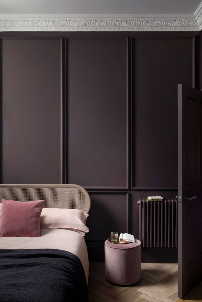
‘The combination of Pontefract on the walls and Eau de Violette on the ceilingproduces a visibly pink undertone, bringing perceptible warmth without the use of any yellow pigment,’ explains Ruth Mottershead, marketing director at Paint & Paper Library.
HOW TO USE PLUM
THE BEST PLUM PAINT COLOURS
BEST FOR COMPLEMENTING WARM SAGE HUES, AS WELL AS COOLER BLUES
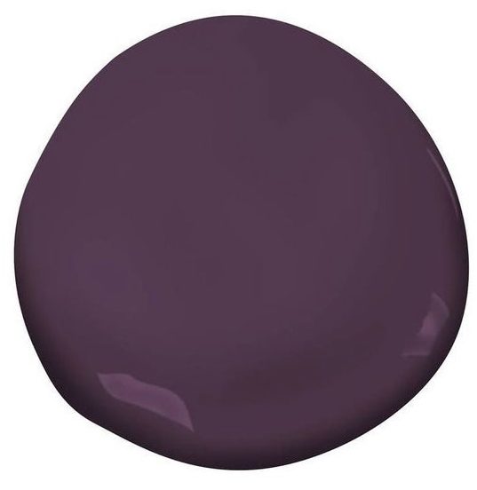
‘Paint all your walls plum and create a luscious cocoon in your bedroom, for instance,’suggests M&L Paints’ Nelly Hall. ‘Blend with neutral shades in your flooring and add splashes of ochre, gold and orange to pop against the deep, warm shade. Opt for velvet in soft furnishings for a cosy, decadent and indulgent feel.’
BEST FOR BOUDOIR-STYLE BEDROOMS IN NEED OF A JEWEL-LIKE PLUM INJECTION

‘For a striking interior, use a plum with fuchsia undertones on a feature wall and team with smart greys and muted neutrals,’ says Rebecca Craig, head of design at Sanderson. ‘Or why not bring a touch of natural vibrancy to the kitchen with rich plum cabinets?’
BEST FOR HIGH-TRAFFIC AREAS, SUCH AS KITCHENS AND BATHROOMS

‘To capture the zeitgeist, pair plum with jewel-toned emeralds and botanical lime greens,’ recommends paint and colour expert Annie Sloan. ‘These two colours are a wonderful foil for one another. To complement and layer the scheme, give a nod to the Seventies with warm lighting and plush upholstery.’
BEST FOR CREATING A COSY VIBE IN NORTH-FACING ROOMS

‘It’s important to use plum in a space where you won’t feel overwhelmed by its presence,’ says Farrow & Ball’s Joa Studholme. ‘Rooms that are used in the evening are ideal, as is the hallway as the shade makes the adjoining areas feel lighter.’
BEST FOR FORMAL DINING AND RECEPTION ROOMS, TO MAKE GUESTS FEEL WARMLY WELCOME

‘In a more grown-up space, choose a plum mixed with chocolate undertones,’ suggests Peter Gomez, head of design at Zoffany. ‘To create drama, envelop the room in this rich colour by painting the ceiling as well as the walls. Layer the space with velvets to add sumptuous texture and reflect light.’
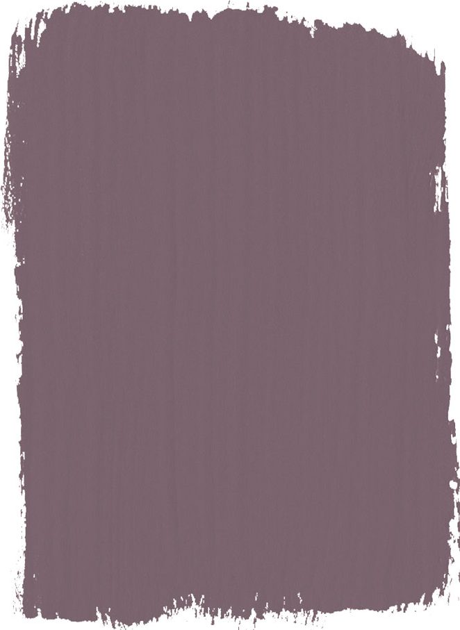
BEST FOR ADDING INSTANT WARMTH TO FURNITURE AND WALLS.
See How to Decorate with Pink.
Be The First To Know
The Livingetc newsletters are your inside source for what’s shaping interiors now - and what’s next. Discover trend forecasts, smart style ideas, and curated shopping inspiration that brings design to life. Subscribe today and stay ahead of the curve.
The homes media brand for early adopters, Livingetc shines a spotlight on the now and the next in design, obsessively covering interior trends, color advice, stylish homeware and modern homes. Celebrating the intersection between fashion and interiors. it's the brand that makes and breaks trends and it draws on its network on leading international luminaries to bring you the very best insight and ideas.
-
 Iridescence Is Chrome’s More Playful, Hard-to-Define Cousin — And You're About to See It Everywhere
This kinetic finish signals a broader shift toward surfaces that move, shimmer, and surprise. Here's where to find it now
By Julia Demer
-
 Biophilic Decluttering — What to Take Out of Your Home (and What to Put in) for a More Natural Home
Try your hand at biophilic decluttering to ground your interiors, connect to the environment, and cure chronic clutter in one go. Here's how.
By Amiya Baratan
-
 Florist Angela Maynard on how to care for dried flowers and how to style them in a modern home
Knowing how to care for dried flowers means you can have stylish arrangements that last for years. Author and florist Angela Maynard shares her tips
By Angela Maynard
-
 11 beige living room ideas that prove beige can be far from boring
Beige living room ideas might sound not sound like the boldest of color schemes but this pared-back palette can be just as striking a brights
By Amy Moorea Wong
-
 How to use color in small living rooms – expert tips for getting the perfect scheme
Bringing color into small living rooms can be tricky, but with the right hues and our top tips, you can make the space look brighter, bigger and just better
By katesleeman
-
 How to choose cool colour combinations for your home
The right colour combinations will look good throughout your home. Dagny Thurmann-Moe of Koi Colour Studio shares the no-go palette pairings and power hues
By Livingetc
-
 Buying a used kitchen could be your savviest design idea - here's what you need to know
Buying an ex-display used kitchen is a way to a high-end home at High Street prices
By Jacky Parker
-
 Home decorating: Tricia Guild's guide to a confident scheme
Home decorating advice from legendary designer Tricia Guild OBE
By Livingetc
-
 How to achieve beautiful paint finishes according to interior designer, Nicola Harding
Beautiful paint finishes transform a room and are easier than you think
By Livingetc
-
 The meaning of style, by interior designer Russell Sage
Acclaimed interior designer Russell Sage talks broken rules, secret ingredients and looking good in any light
By Russell Sage