A beautiful Copenhagen townhouse with vintage-filled interiors
THE PROJECT
The four-storey house had been separated into two apartments which were a series of small, dark rooms that hadn’t been updated in 30 years. The idea was to gut both properties and create a family-friendly modern home, yet respecting the original classic architecture of the house.
WHAT CORA DID
The ground floor was opened up to create a natural flow to the house and to flood the interiors with daylight. Larger windows, new internal walls, ceilings, fireplaces and flooring were installed, along with new plumbing, electrical and heating systems.
KITCHEN
Cora and her partner, Kristian do a lot of entertaining so opening the rooms to allow a better flow was important. She also wanted to create some cosy corners, to make it feel intimate as well.
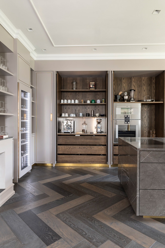
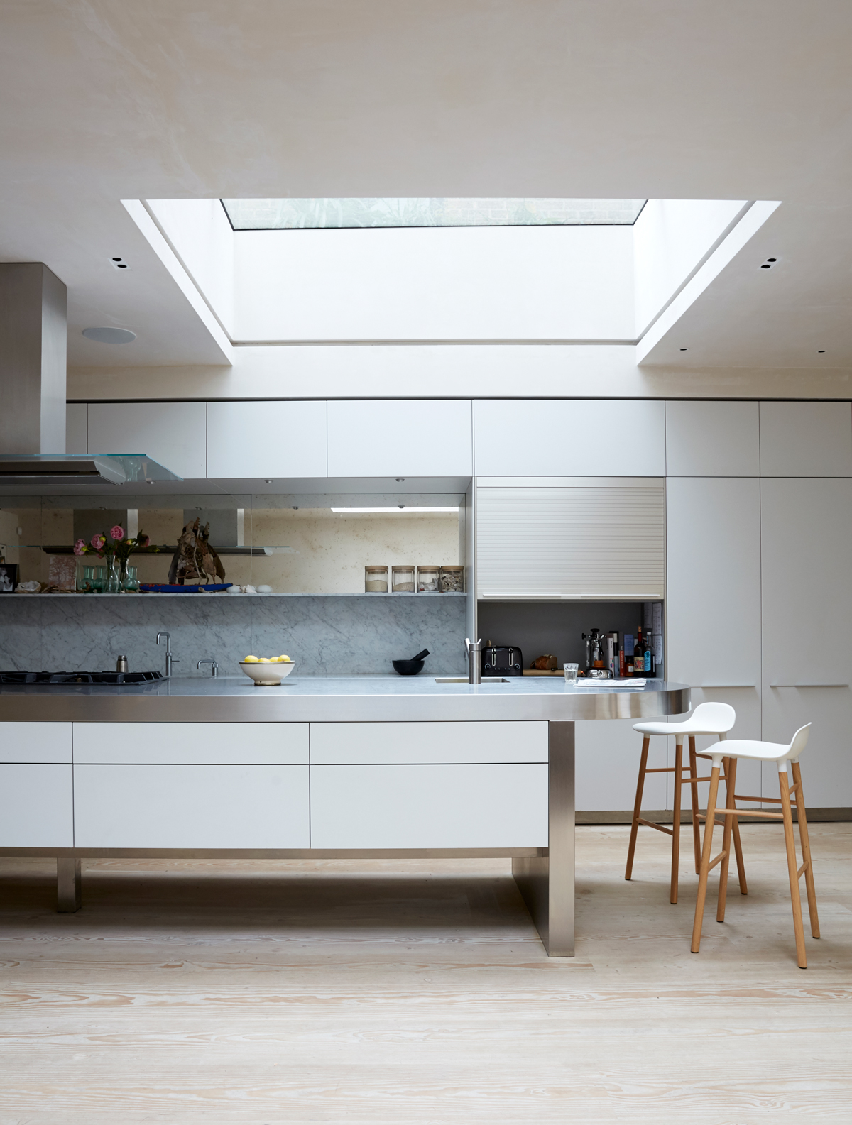
The long wall of kitchen cabinets, painted in a subtle grey, is designed so that the room can be transformed. When the doors are closed it has a clean-lined minimal look. When open, the kitchen comes to life as busy working space, with a bespoke marble island at the centre.
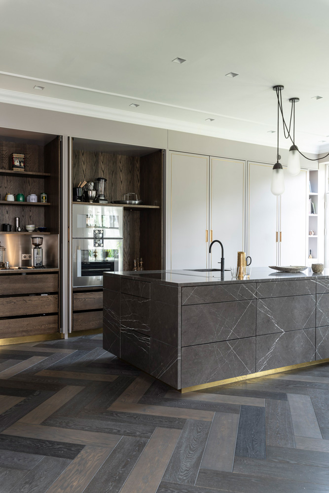
All of the equipment is discreetly hidden behind the cabinets to keep things looking tidy.
DINING ROOM
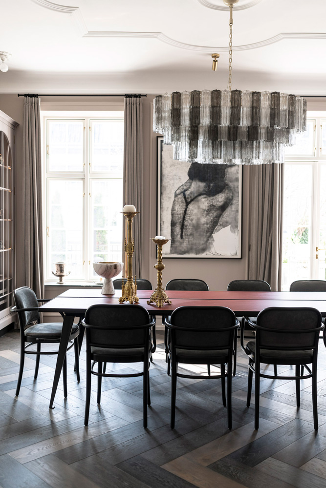
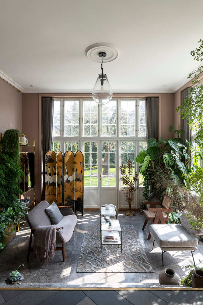
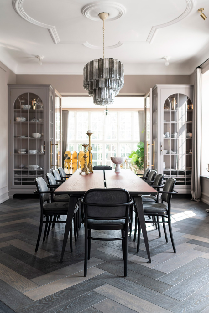
The dining room is connected to the kitchen by an opening in the wall. The rooms are tied together visually by Farrow & Ball's Elephant's Breath.The dining room is also connected to the winter garden and living room with large glass sections and French doors.
Theglass cabinets, which look like they have been in the house forever,are a bespoke design by Cora, made byThyge Nielsenwith door handles fromOchre.
Be The First To Know
The Livingetc newsletters are your inside source for what’s shaping interiors now - and what’s next. Discover trend forecasts, smart style ideas, and curated shopping inspiration that brings design to life. Subscribe today and stay ahead of the curve.
LIVING ROOM
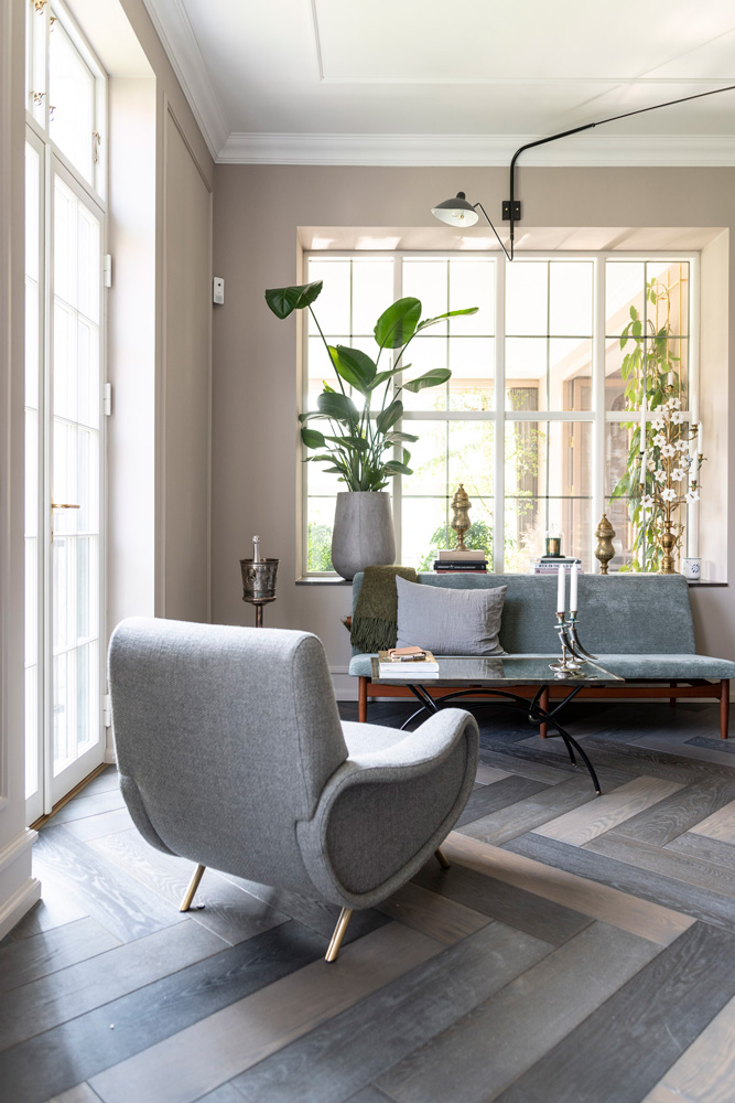
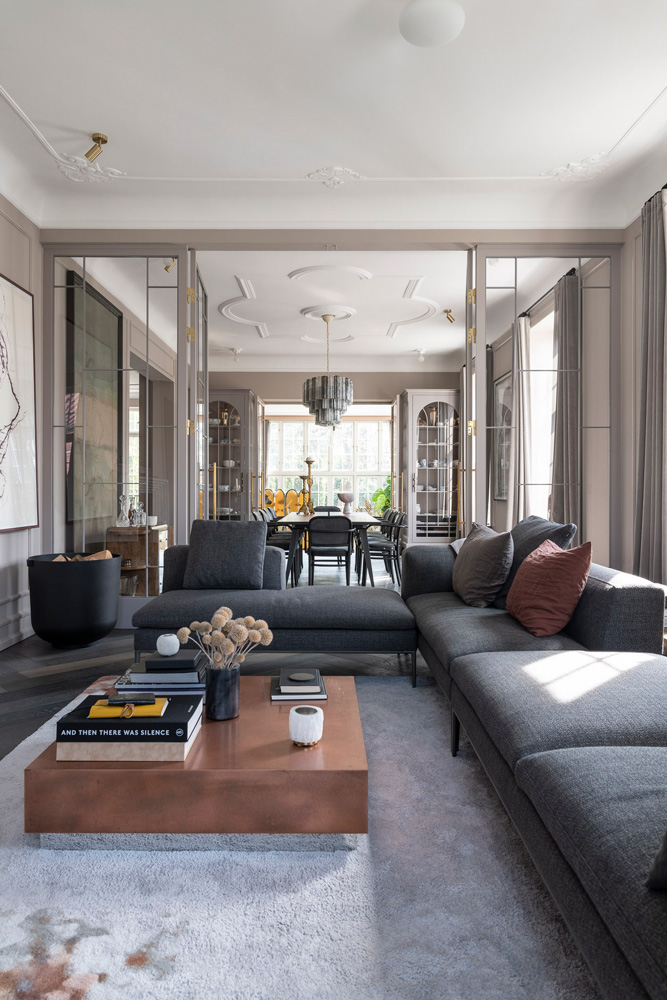
The same parquet flooring and warm grey paint used in the kitchen and dining room continues in the living room, with the addition of a corner sofa corner in a darker grey tone. Skilled masons were brought in to restore and repair beautiful stucco ceilings.
RECEPTION HALL
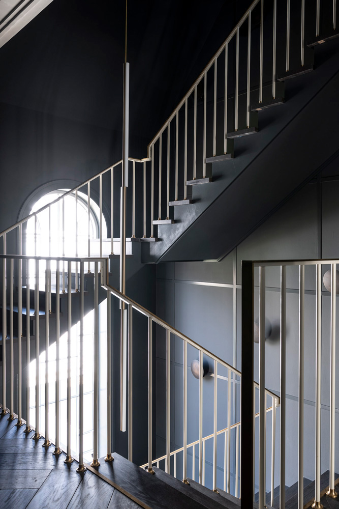
Entering a large classic townhouse requires some grandeur. Cora added a beautiful bespoke staircase zigzagging from the ground floor to the second floor.
MASTER BEDROOM
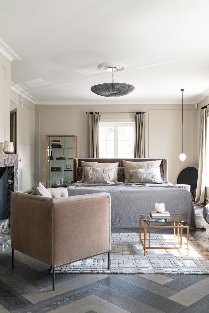
Cora wanted the feel of a hotel suite with beautiful vintage and mid-century design. For cohesion, the soft toned parquet floors are the same as those on the ground floor and are complemented by the textiles and furniture.
master bathroom
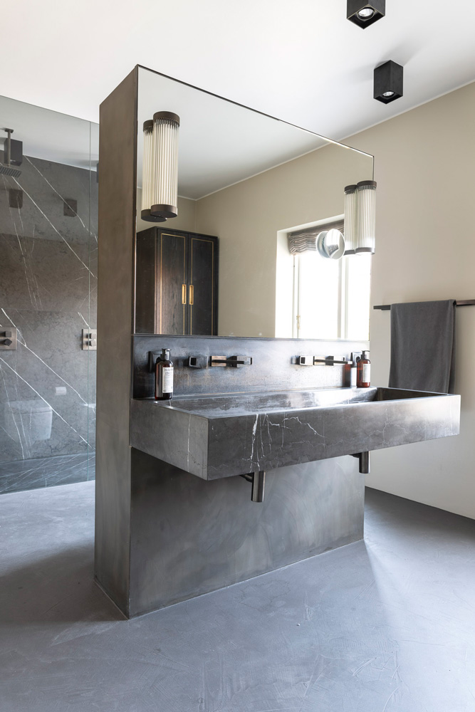
With two doorways in the bathroom (one to the bedroom and one to the hall) wall space was limited. Cora's solution was to create a wall in the centre with a marble double basin on one side and the W.C, and bidet on the other side. The mirror has built-in heat, to prevent it being covered in steam when the double shower is in use.
Find out more about Cora Lucaz's work at suite-07.com
Photography / Martin Kauffman
Want more ideas? See these beautifulmodern homes.
Jacky Parker is a London-based freelance journalist and content creator, specialising in interiors, travel and food. From buying guides and real home case studies to shopping and news pages, she produces a wide range of features for national magazines and SEO content for websites
A long-time contributor to Livingetc, as a member of the team, she regularly reports on the latest trends, speaking to experts and discovering the latest tips. Jacky has also written for other publications such as Homes and Gardens, Ideal Home, Red, Grand Designs, Sunday Times Style and AD, Country Homes and Interiors and ELLE Decoration.
-
 Turns Out the Coolest New Café is Actually In Your Kitchen — Here's How to Steal the Style of TikTok's Latest Trend
Goodbye, over-priced lattes. Hello, home-brewed coffee with friends. TikTok's 'Home Cafe' trend brings stylish cafe culture into the comfort of your own home
By Devin Toolen Published
-
 5 Bathroom Layouts That Look Dated in 2025 — Plus the Alternatives Designers Use Instead for a More Contemporary Space
For a bathroom that feels in line with the times, avoid these layouts and be more intentional with the placement and positioning of your features and fixtures
By Lilith Hudson Published
-
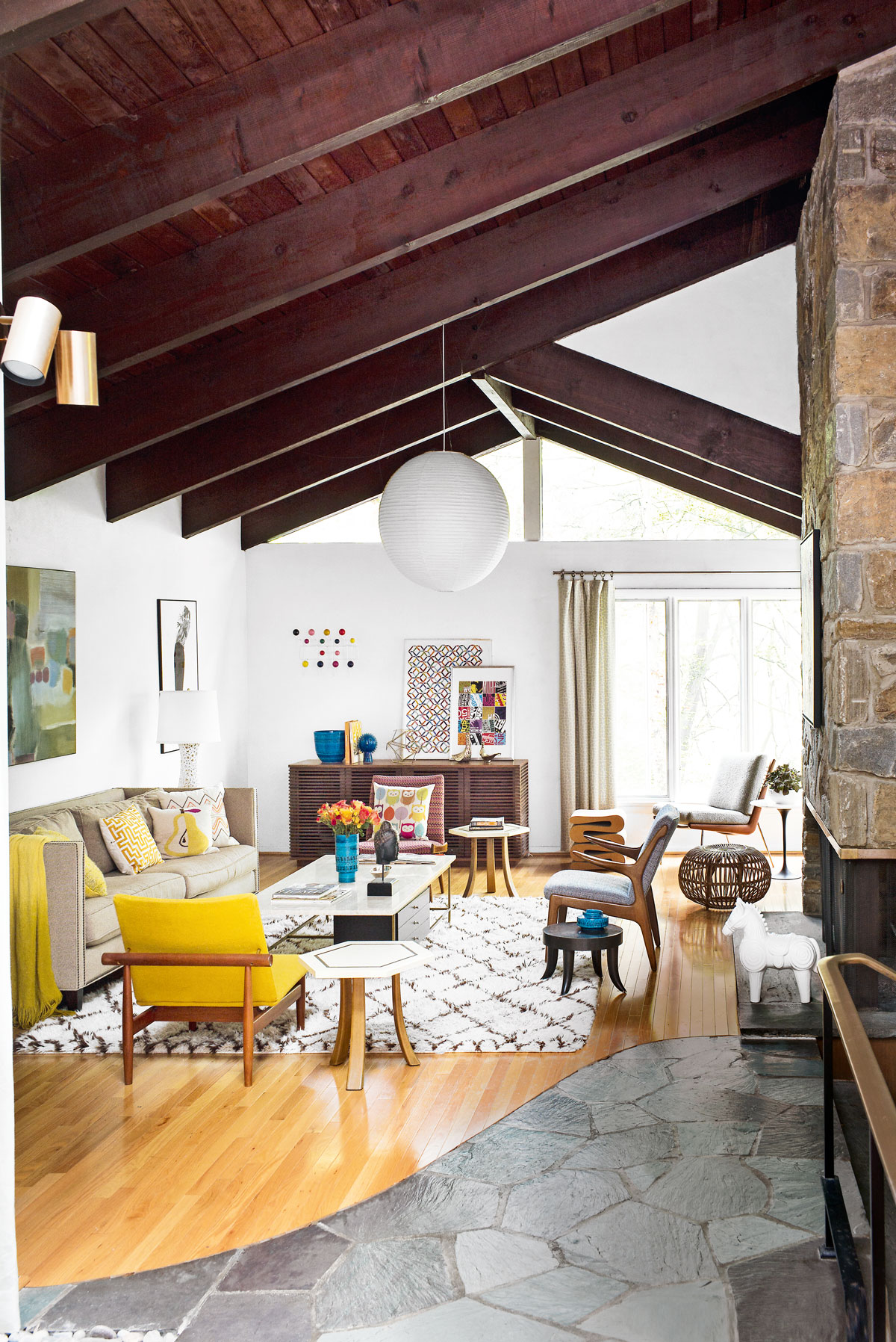 Tour a mid-century house in Philadelphia with a modern take on Mad Men style
This mid-century house in Philadelphia is a modern take on mid-century design and the perfect backdrop for this enviable collection of art and objects
By Livingetc Last updated
-
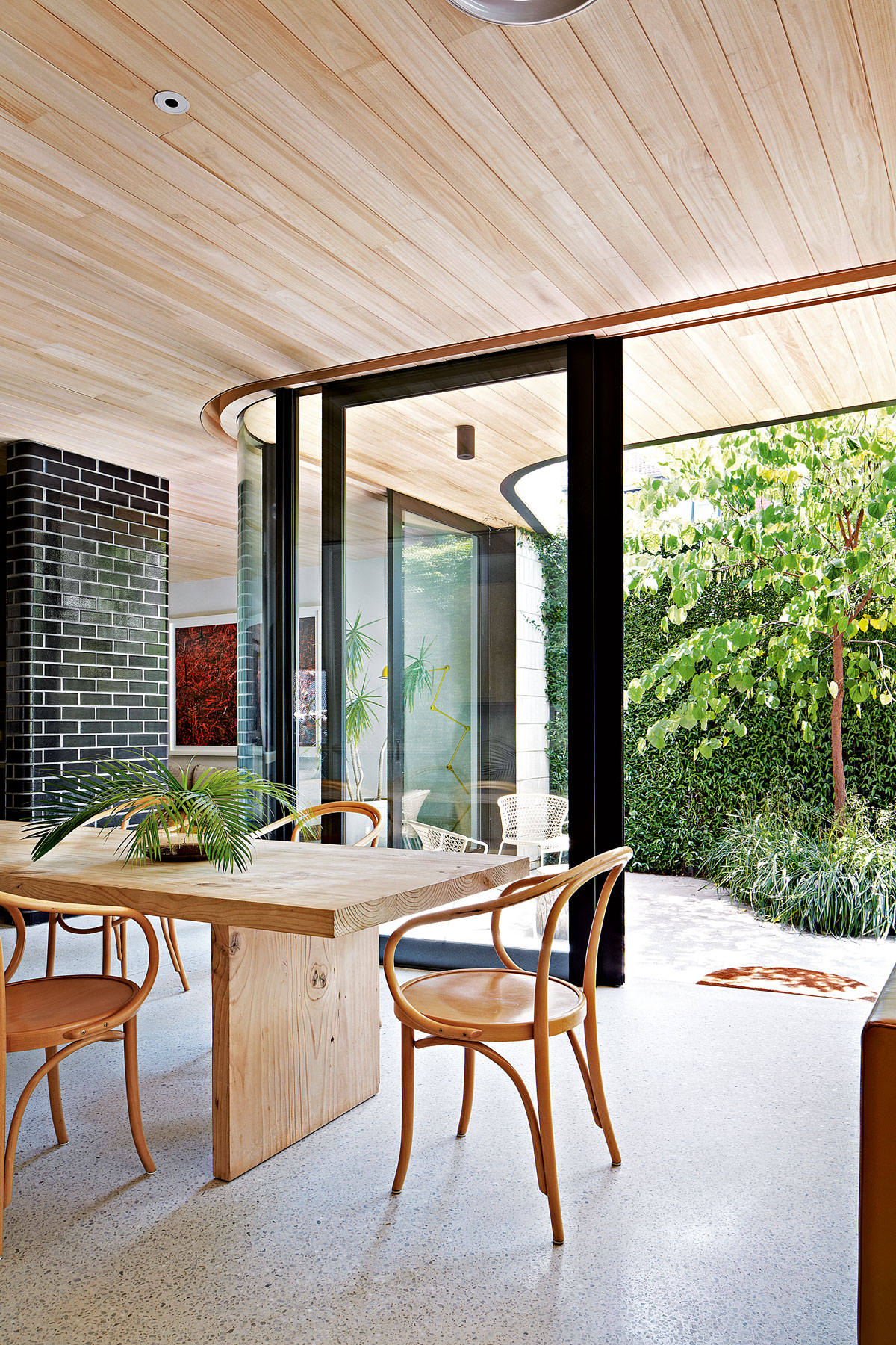 This modern Edwardian house in Melbourne is small but mighty
It may be small, but thanks to its ingenious design, this Edwardian house in Melbourne makes family living a breeze
By Livingetc Last updated
-
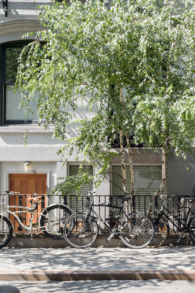 Old meets new in this apartment in New York's East Village - a former community centre built in 1860
The owner of this loft-style apartment in New York's East Village mixes ancient and modern with timeworn pieces, design classics and his own abstract art...
By Livingetc Last updated
-
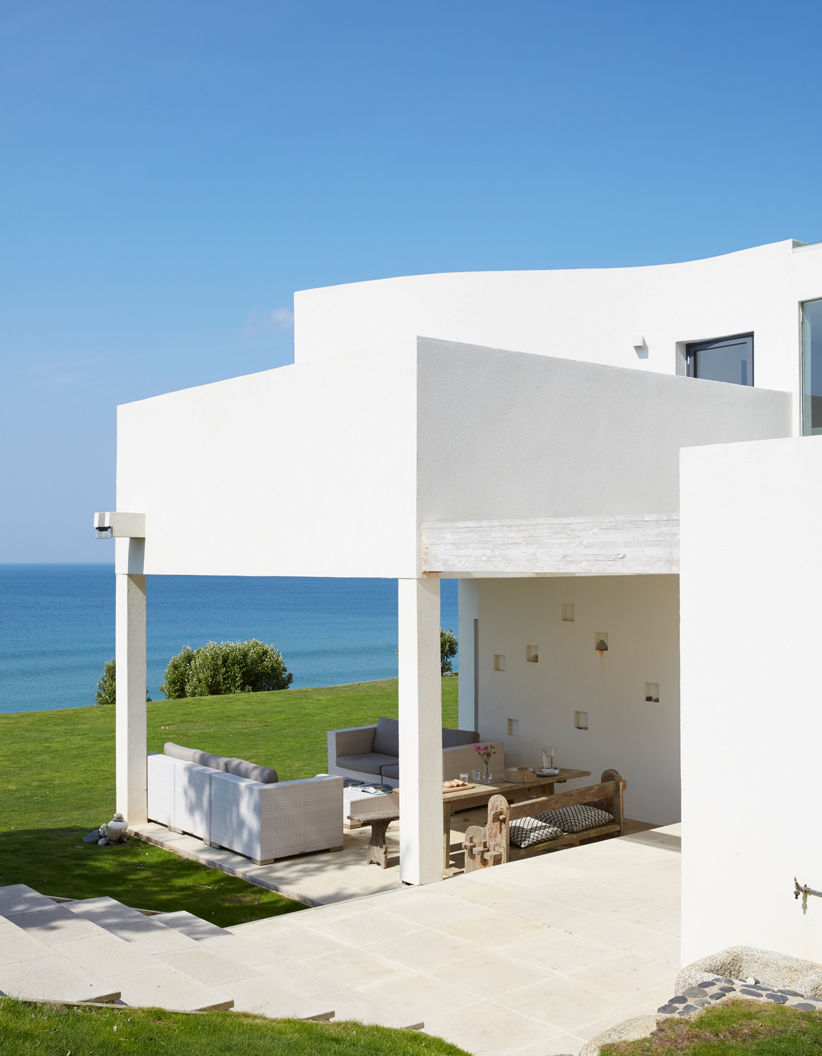 Explore this super-contemporary coastal house in Cornwall
This coastal house in Cornwall is all about drinking in the uninterrupted views of nature at its most raw, most pure…
By Livingetc Last updated
-
 Explore this spacious detached 1900s house in southeast London with stylish modern interiors
Edgy textures, luxe materials and a mix of vintage and bargain buys transformed a blank detached 1900s house in southeast London into a home full of personality.
By Livingetc Last updated
-
 This large house in west London is minimal yet playful
A firefighter’s pole in the kitchen and a slide down the stairs? This house in west London proves minimalism can also be fun.
By Livingetc Last updated
-
 Inside A Clever Garden Room That Doubles As A Chic Guest House
This striking garden room design incorporates a sleeping area, kitchenette, loo and shower, as well as plenty of storage space, making it ideal as both a self-contained guest house or a restful retreat to escape to.
By Lotte Brouwer Published
-
 This light and bright Victorian terrace in west London is relaxed yet stylish
This chic Victorian terrace in west London is full of clever ideas that allow it to evolve.
By Livingetc Last updated