The Livingetc newsletters are your inside source for what’s shaping interiors now - and what’s next. Discover trend forecasts, smart style ideas, and curated shopping inspiration that brings design to life. Subscribe today and stay ahead of the curve.
You are now subscribed
Your newsletter sign-up was successful
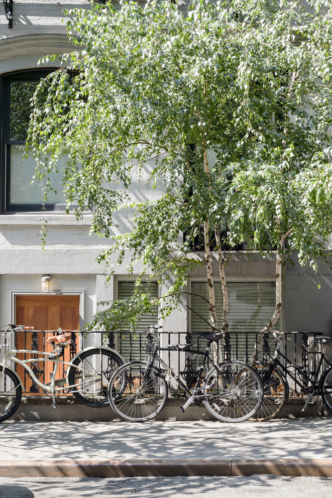
The properTy
The ground and basement levels of a former community centre, built circa1860, in New York’s East Village. The ground floor has a kitchen-diner, living room, office, studio, master bedroom with en suite and dressing room and two WCs. The basement has an atrium, library, TV area, viewing room, guest bedroom with en suite, utility room, shower room, WC and second office.
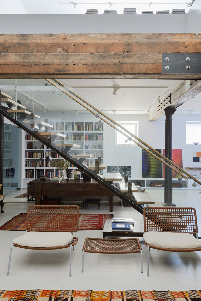
ATRIUM
When its artist owner bought it, this property was being used for storage. Thankfully he commissioned architect and friend, the late Nasser Ahari, to transform it into a home and art studio. Nasser opened up the main floor, anchoring the whole place around a central atrium.
Head down the stairs to the basement and the eight-metre-high atrium can be appreciated in all its grandeur. It took ‘three very full years’ for the project to be completed, during which time bricked-up windows were reopened and light wells sunk on the lower level. The ceiling was also lowered by 60cm to provide soundproofing and to house a complex lighting system.
Article continues belowThe architecture is predominantly crisp and precise, but it’s softened with rugged elements such as the cast-iron columns – painstakingly stripped of 20 layers of paint – exposed brick walls, original joists and the birch ply floor.
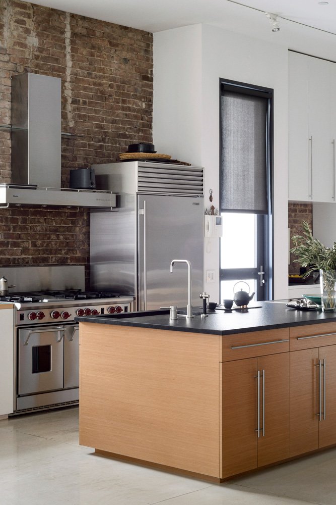
KITCHEN
The main living space on the ground floor, which includes the kitchen-diner, wraps around this well and offers tantalising vistas of a cosy TV and library area below.
Exposed brick acts as a foil to the stainless-steel appliances and white cabinetry. The cedar island provides plenty of preparation space.
From the kitchen, a pair of double doors leads to the owner’s studio and office.
The Livingetc newsletters are your inside source for what’s shaping interiors now - and what’s next. Discover trend forecasts, smart style ideas, and curated shopping inspiration that brings design to life. Subscribe today and stay ahead of the curve.
LIVING ROOM
Found objects make this place a home, such as the painted Afghani chest, which rub shoulders with heavyweight Danish designs.
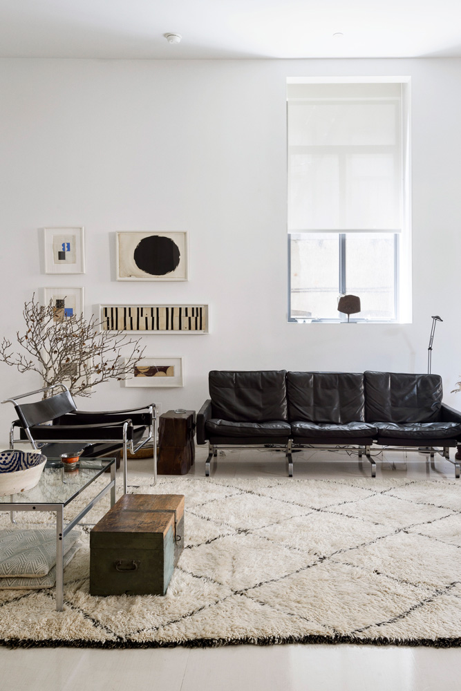
Weathered timber pieces, such asthis bench, offset the pristine architecture. The art, which is mostly by the owner, echoes the predominantly monochrome theme.
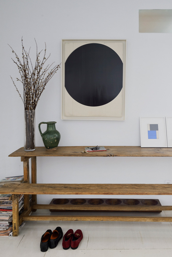
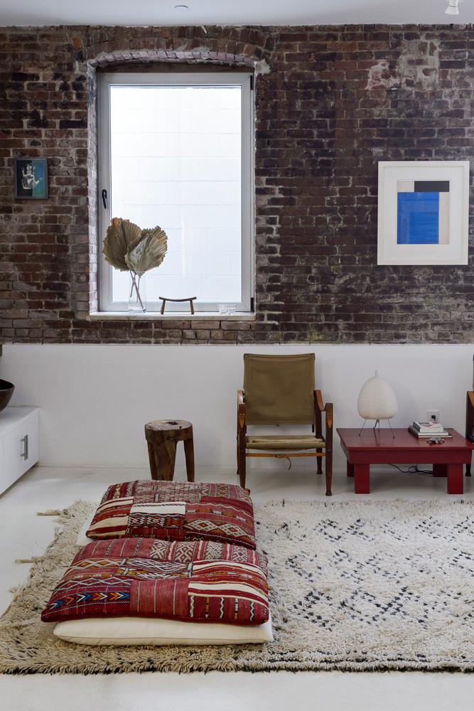
On the floor are tribal rugs and cushions, which invite you to lounge and sprawl.
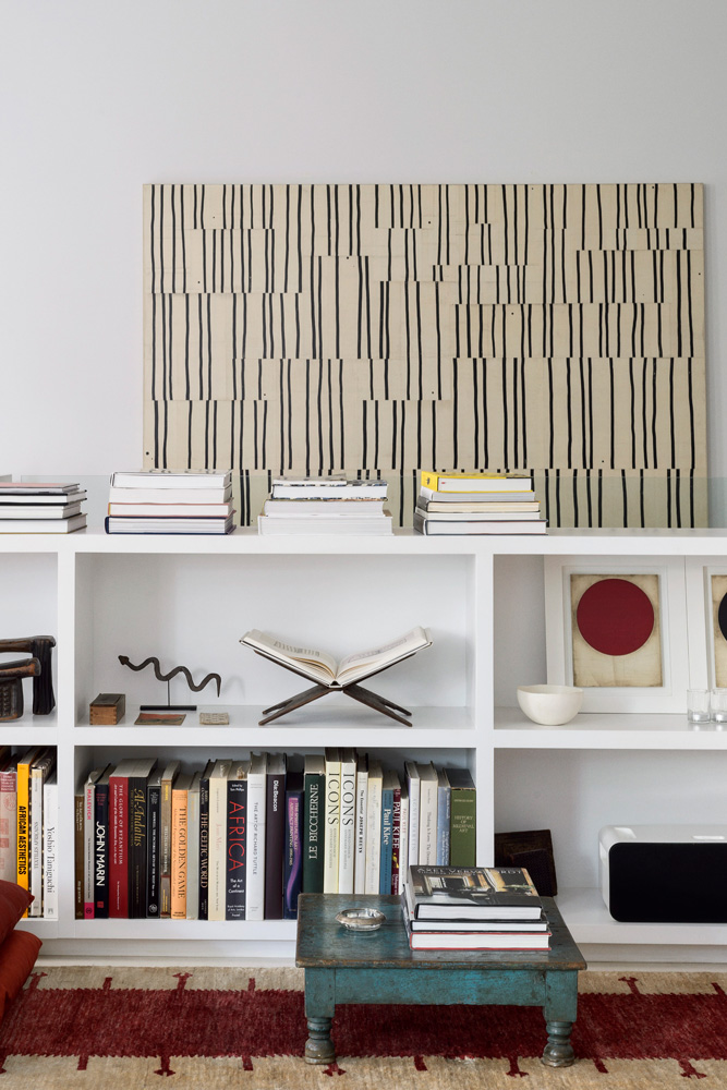
A low bookcase houses just partof the couple’s vast book collection.On the wall hangs one of the owner’s works, a complex painted collage.
BatHroom
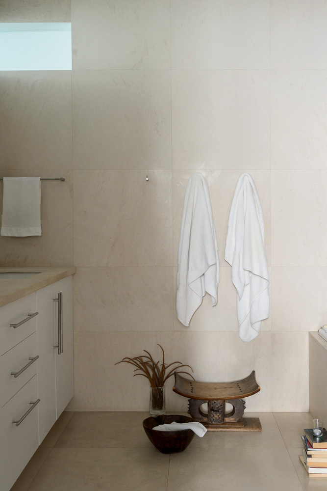
The suite is clad in limestone slabs. The owners say it's like being in a boutique hotel.
Bedroom
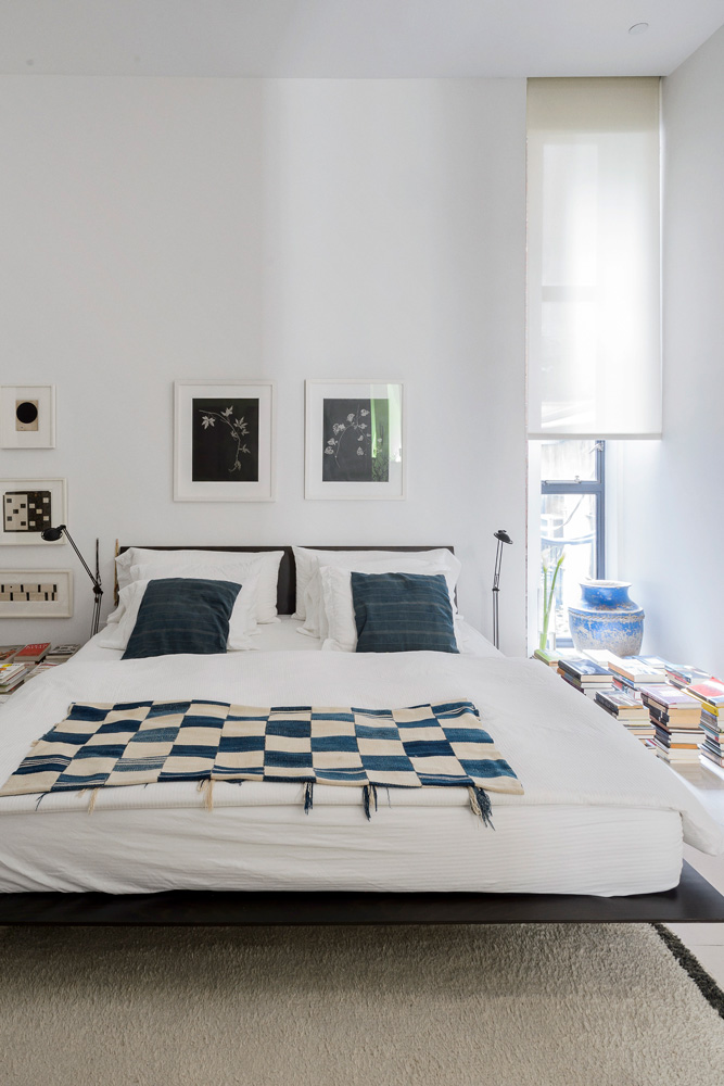
The couple wanted this to be a sanctuary of stillness, so they didn’t build any bookshelves. A weathered pot from New Mexico and a Ghanaian textile (on the bed) add a touch of colour to the space.
See more of the owner's artwork at robertkellystudio.net
Photography / Matthew Williams
Styling / Beth Flatley
Find more inspiringmodern homes here.
The homes media brand for early adopters, Livingetc shines a spotlight on the now and the next in design, obsessively covering interior trends, color advice, stylish homeware and modern homes. Celebrating the intersection between fashion and interiors. it's the brand that makes and breaks trends and it draws on its network on leading international luminaries to bring you the very best insight and ideas.