Bathroom wallpaper ideas – 10 styles to add a ton of color and character
Proof that bathroom wallpaper ideas can work, and look splendid too...

Sure, not so long ago, bathroom wallpaper ideas would have been deemed impractical, reserved only for huge, well-ventilated spaces. However, with innovations in wallpaper design, plus if you do your research, wallpaper in a bathroom is totally doable and a look that you could even DIY in just a weekend.
And it's for that reason, the speedy room transforming ability of wallpaper, that we are such big fans. Not to mention that it can add color, pattern, texture, depth, and character to a bathroom – a room that by its nature is a very practical space and can risk feeling a bit... cold and clinical.
So to inspire you and to prove that wallpaper is a lovely way to decorate a bathroom, we have pulled together all our favorite looks, from whimsical 'bathroom appropriate' prints (fear not they are very subtle and chic) to bold and bright florals.
1. Consider the mood you want to create
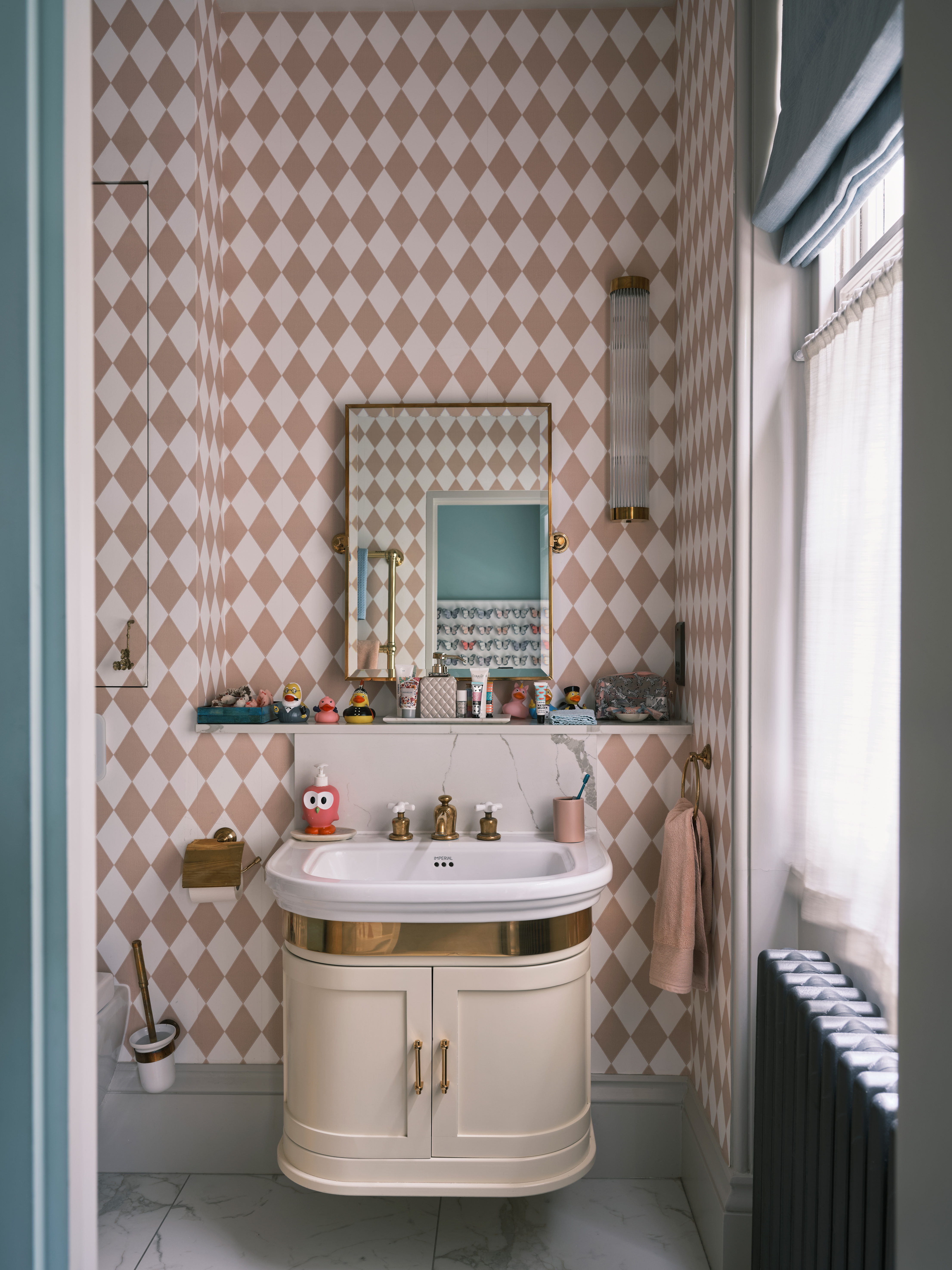
Wallpaper has the ability to totally change the look and feel of a room, and whilst it's not as much of a major decision as choosing your sanitaryware or picking bathroom tiles, spend some time considering what vibe you want your wallpaper to create. Bright and bold? Soft and subtle? Whimsical and playful? Order plenty of swatches and stick them up in your bathroom for a few days so you can get used to the print and see if you can commit.
Lick's Lead Colour Specialist Sam Bramley suggests that, 'bathrooms can be the perfect space to inject and explore color. These little rooms used to be the forgotten room, on autopilot to be white. Thankfully, times have changed and we are steaming ahead with color, threading our colorways into tiles, taps, flooring, fixtures, and wallpaper.
'A good way to look at choosing wallpaper can be by mood, think about how you want your space to make you feel; energizing, refreshing, cozy, warm, calm, light & airy, dark and moody. Picking your mood is a reflection of you and a sure way and a great way towards the perfect color palette and pattern.'
2. Choose vintage prints for an on-trend soft look
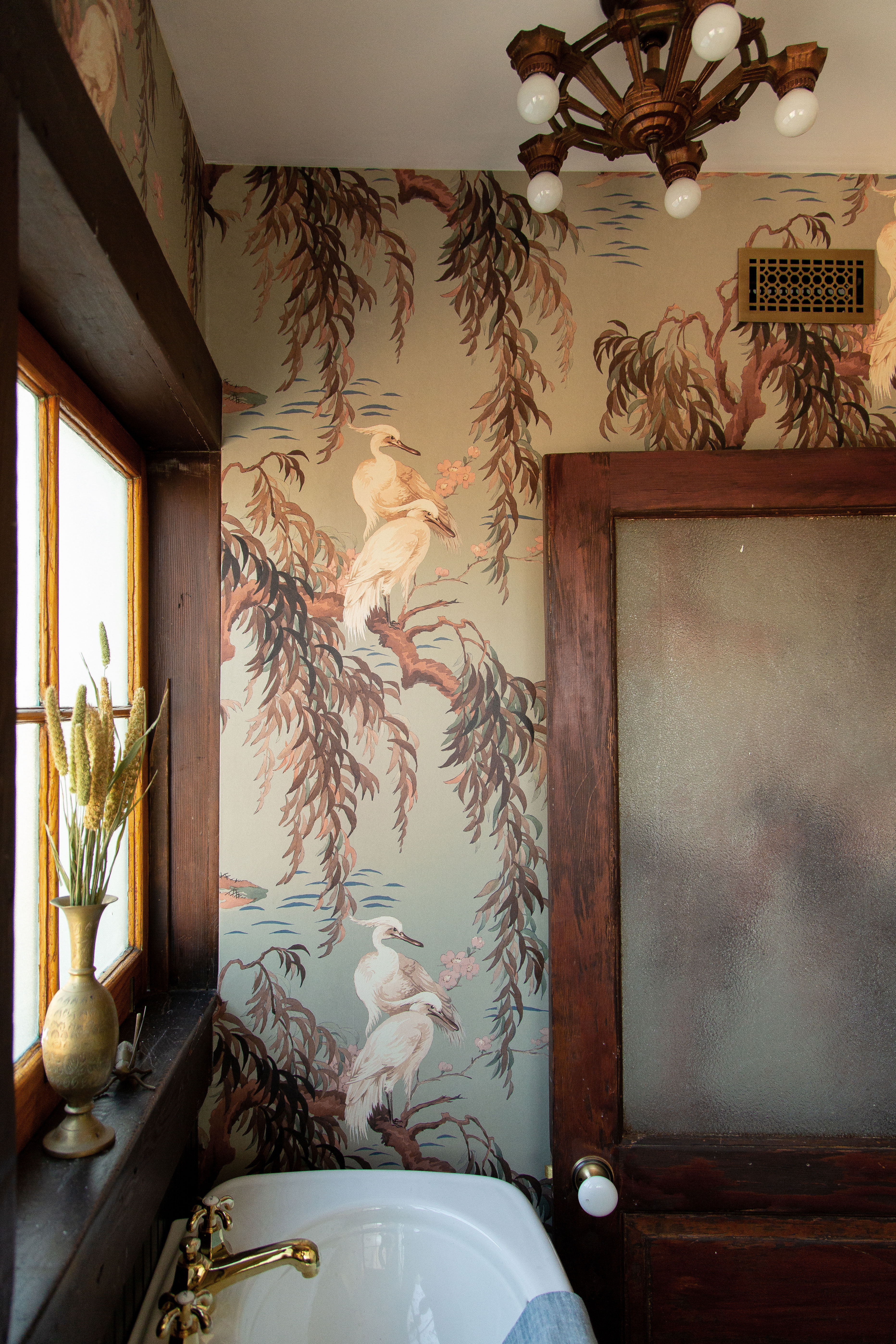
This beautiful, elegant bathroom designed by Jamie Haller really makes a case for traditional, vintage-inspired prints. There's a huge trend right now for design bathrooms that don't feel like bathrooms (more on that in just a sec) and this space definitely channels that trend for softer, cozier bathrooms.
The soft sludgy sage backdrop of the print is a lovely bathroom color too, calming, serene but not quite a neutral. Jamie explains that, 'The original wood windows served as a point of inspiration and perfectly paired with the brown tones of this most beautiful wallpaper from House of Hackney. The cranes felt appropriate as there were lake views off the bathroom.'
'The combination of elements became the most beautiful aspect of this bathroom. Soft muted shades of the nature-inspired print, the patina of old wood, the antique lighting, and the salvage Victorian style door we added to this room created depth and soul in a 1905 Craftsman powder room.'
3. Use wallpaper to make a bathroom feel less like a bathroom
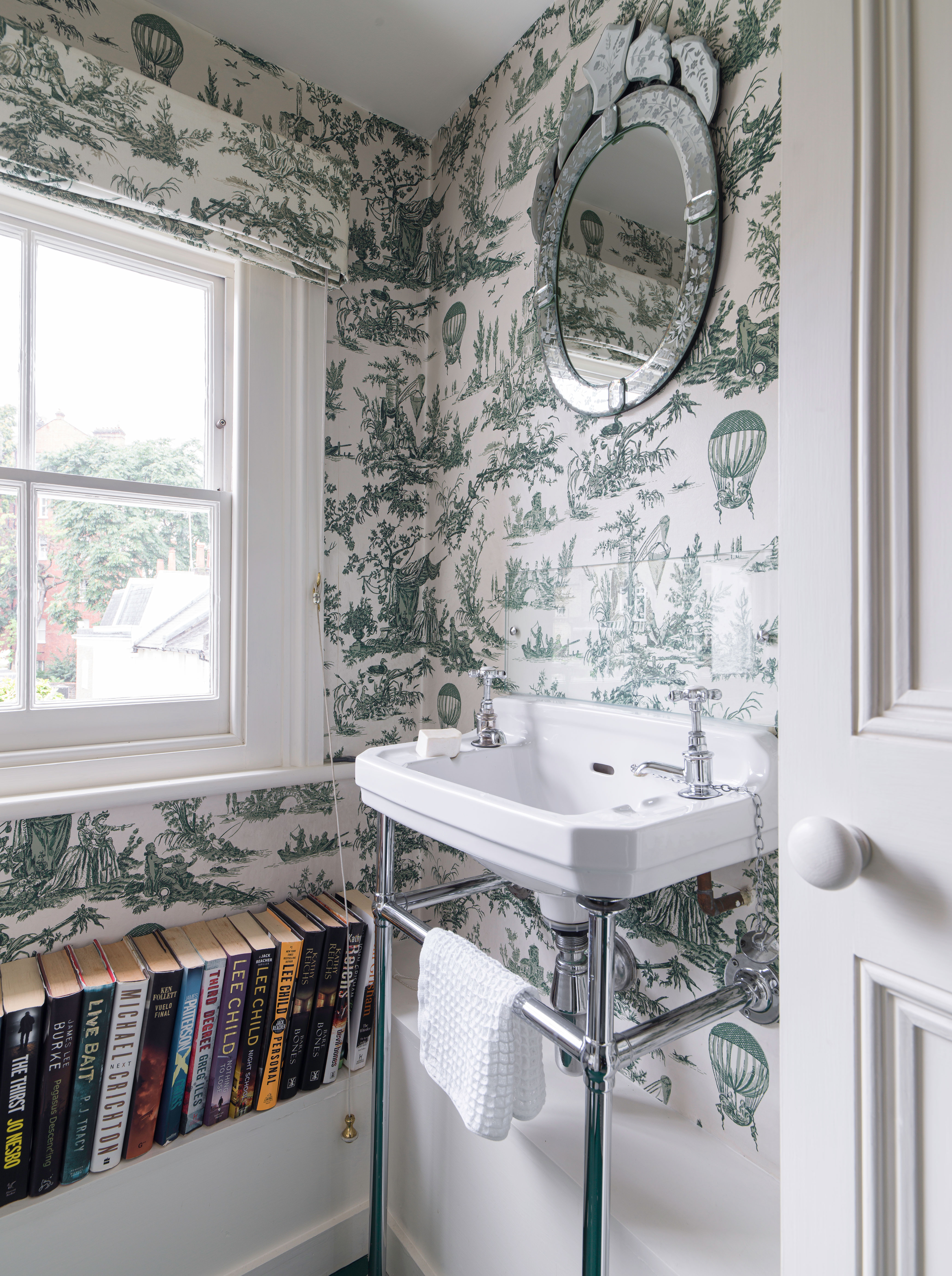
Going back to the whole bathrooms that don't look like bathrooms interior design trend. We are noticing it more and more, practical rooms like kitchens and bathrooms being decorated in the same approach as softer spaces like bedrooms and living rooms. And a bathroom wallpaper is a really easy way to tap into that trend. Wallpaper adds shape, and depth to a room and can soften all the clean lines and hard surfaces of a bathroom.
'Bathroom walls are such a great opportunity to add pattern and color to the space, which is usually full of hard, cold white surfaces.' explains our Deputy Editor and bathrooms enthusiast Busola Evans. 'A standard wallpaper will work well as long as the room is well ventilated but there is also an incredible array of waterproof wallpaper available which can even be installed inside the shower. When it comes to design, I would say go bold and make a statement – it's not the time to be shy and retiring!'
4. Go bold in a small bathroom
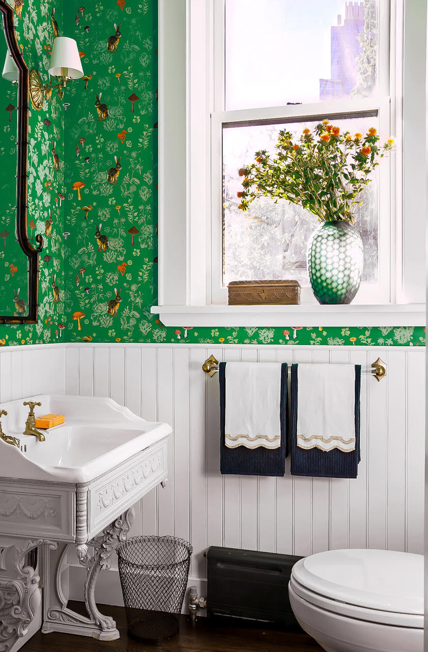
We say it all the time, but the whole 'you should stick to light, neutral colors in a small space' is a total myth. Often going bold with color in a small bathroom can have just as much of a space expanding effect and light hues – and adding pattern on top of that can blur the boundaries of the room even further.
'Go bold!' says interior designer Meg Lavalette. 'A fun wallcovering or a vibrant paint color will go a long way. In smaller rooms, there is less space to layer components which creates visual interest. With the couple of items you need in a small space, it’s more interesting to turn up the dial with color, contrast, scale, or detail.'
Rebecca Drury, Co-Founder, MissPrint agrees that, 'Small rooms such as cloakrooms are ideal for embracing unique style and making a bold statement. Ensuring big impact in small spaces, colorful and patterned wallpaper can help draw the eye and make a small space appear larger as well as brighter.'
5. Consider scale
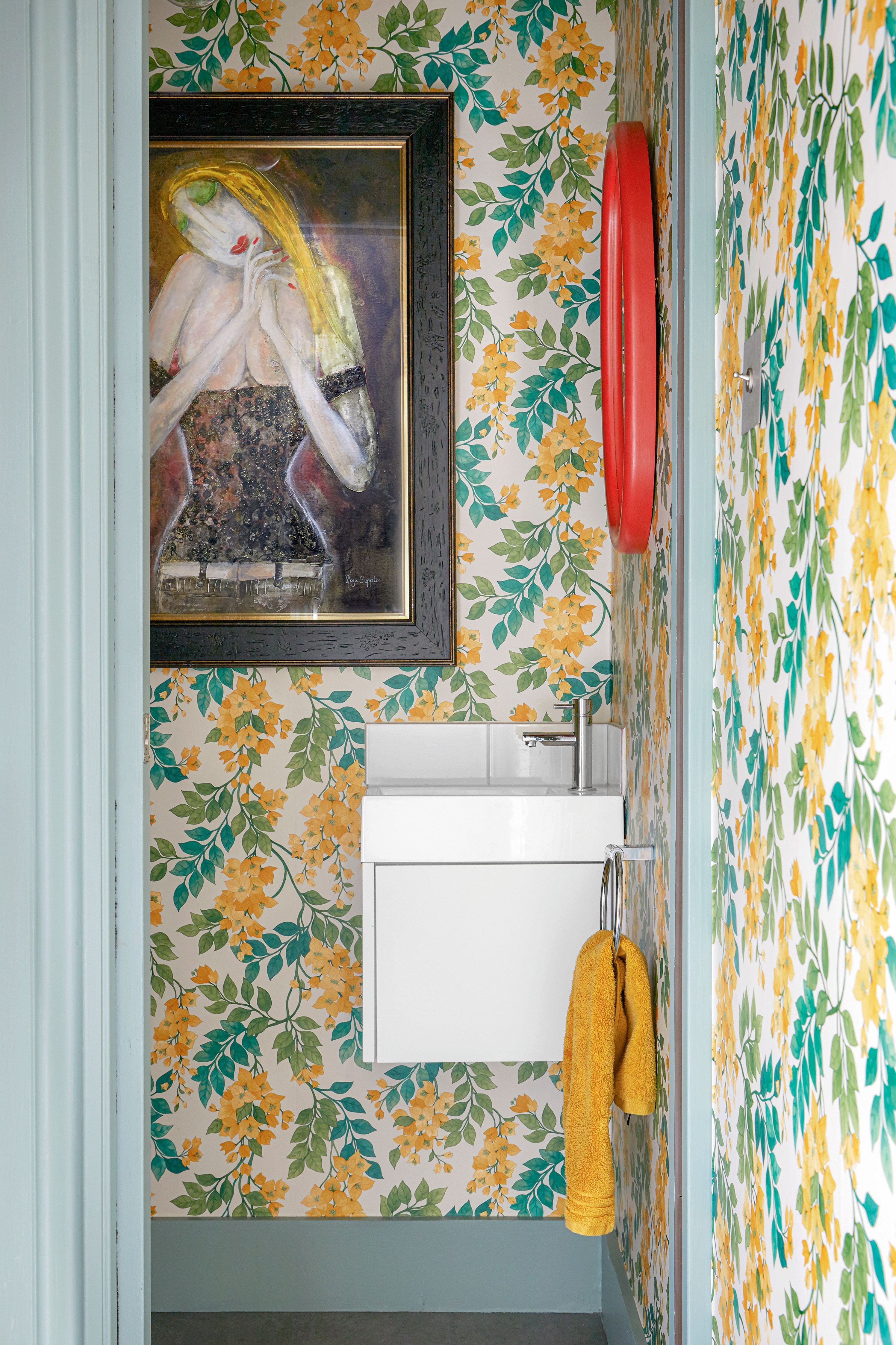
There are no hard and fast rules when it comes to picking the perfect scale for your space, but it generally goes the smaller the room the bigger the print. In a really small bathroom or a powder room, small, busy prints can end up being a bit headache-inducing, so unless you want that kind of whacky kaleidoscope effect (it can look quite cool in some cases) keep the print larger.
'If you’re looking to add discreet design detail, look to smaller prints to deliver a subtle relief to any bathroom.' suggests Patrick O’Donnell, Farrow & Ball Brand Ambassador. 'Large damask prints such as St Antione will add drama and warmth to a bathroom. When we print it, we do so with our water-based paints so a large-scale design will work equally well in a smaller space - making it effortless to coordinate bathroom furniture painted in the same ground color to create the illusion of more space.'
6. Allude to height with paneling and wallpaper
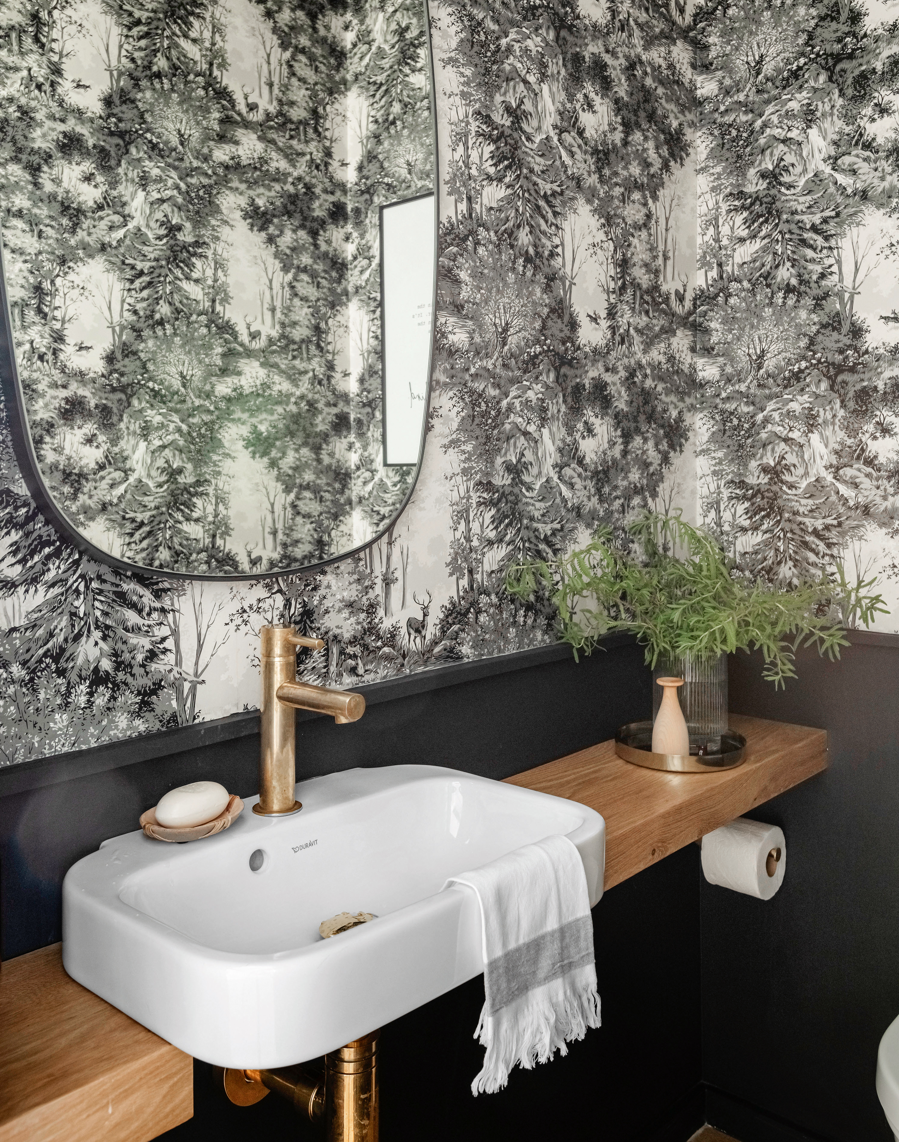
If going all over with a wallpaper is going to be overwhelming in your space consider paring a print with bathroom wall paneling. This is also a great trick for creating the allusion of height, as the split will make the ceiling appear taller.
When it comes to colors we'd recommend keeping it cohesive. Pick out a color from the wallpaper to paint your paneling to link the two. And always go darker on the bottom, as can be seen in this dark bathroom as it will help the room look more spacious and balanced.
7. Choose a calming color scheme
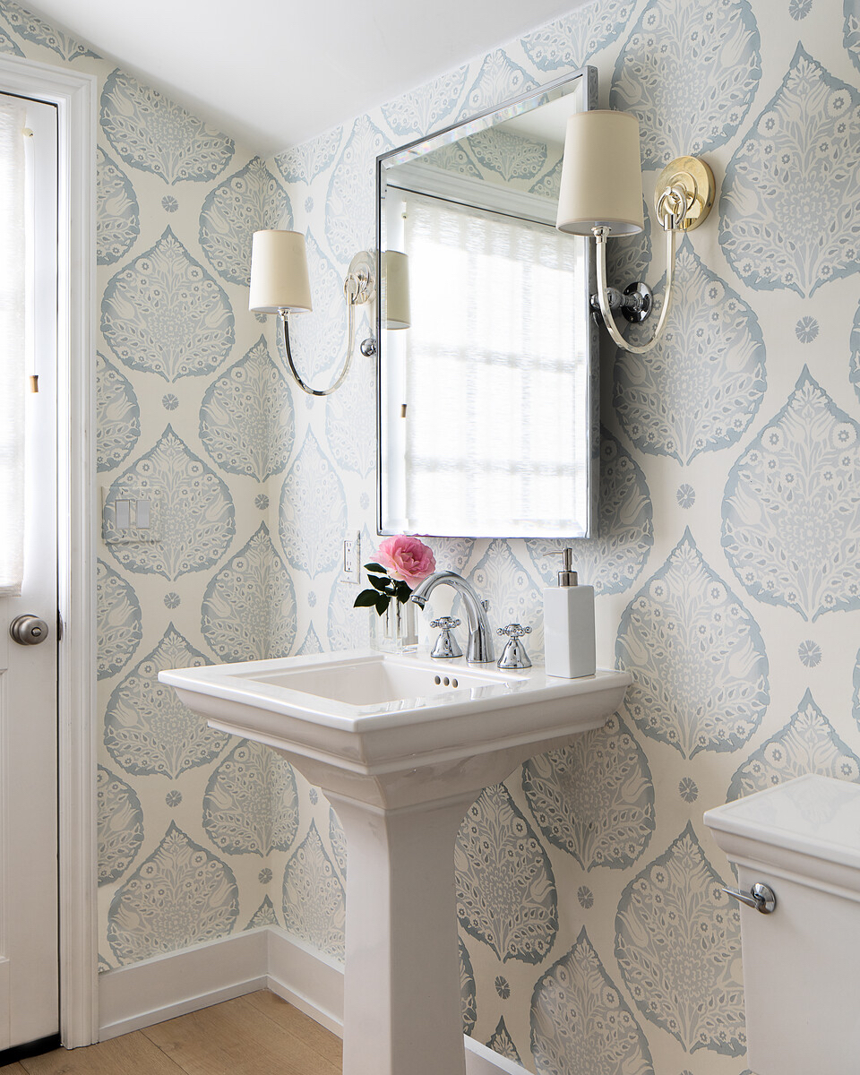
We are aware a lot of our bathroom wallpaper idea so far have been pretty bold, but for those of you who want to create a more calming and serene space, you can still add pattern while keeping things chill. Just opt for large-scale prints that don't overwhelm visually, and choose those classic calming colors like blues and greens.
For this bathroom designed by Kriste Michelini, she explains that 'We wanted to create a soft and dreamy powder room by using a striking wallpaper mixed with classic design elements to stand the test of time.' And we think it does just that.
8. Mix and match walls and floors
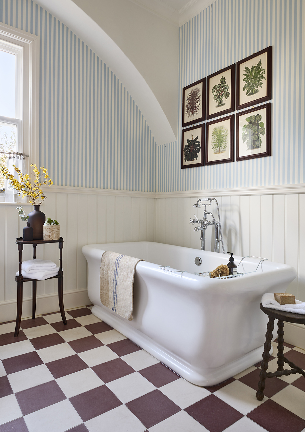
Don't think that going for a bathroom wallpaper means you have to avoid pattern with your bathroom flooring. Mixing and matching patterns always brings character into a room, and it actually needn't be as dramatic as it sounds. This bathroom feels surprisingly calm and neutral despite the clash of checkerboard tiles and striped wallpaper.
The key is to put space between the pattern on your walls and the pattern on the floors. Paneling is an obvious way to do this, creating a break in the pattern and giving the eye something to focus on and the solid block of color balances out bust prints.
9. Pick a quirky 'bathroom' print

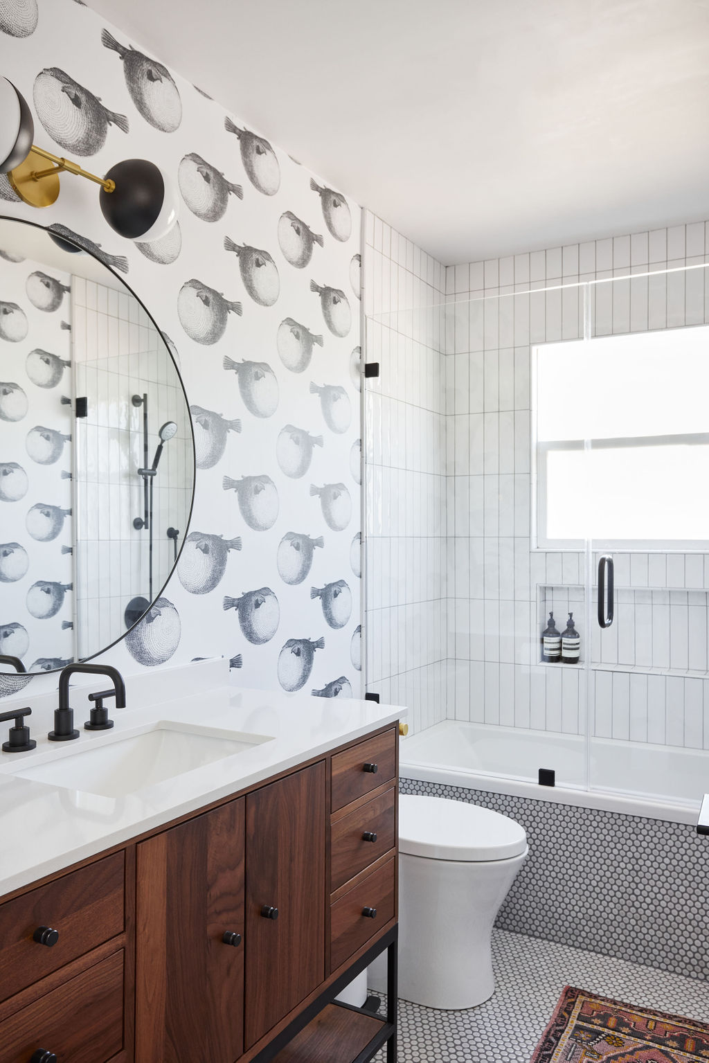
Okay, this is what we meant by whimsical. We aren't talking a full-on under the sea theme, but a playful nod to aquatic life can be done in a stylish way that's fun and chic. Case in point with this space designed by Carmit Oron Interior Design
'I love this wallpaper because of its whimsical touch.' explains Carmit. 'I think the scale of the wallpaper and the tiles works perfectly, and it adds so much interest to the room.' The monochrome scheme keeps it feeling fresh and modern too.
10. Wallpaper the ceiling too
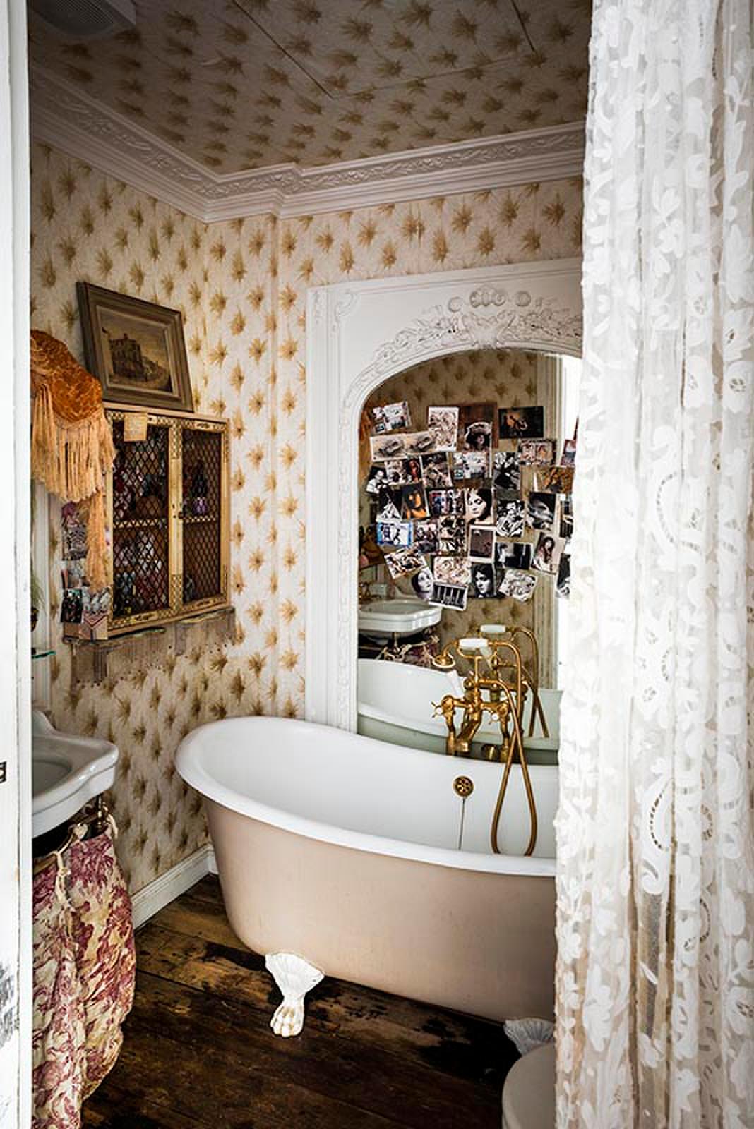
Ceilings finally seem to be getting the attention they deserve, after all they have all the potential of walls and yet they are so often just painted in various shades of beige and ignored. If your space is well ventilated enough, be inspired by this ceiling idea and take the wallpaper up onto the ceilings too to create a cocooning room of pattern.
We know it's a look that won't suit everyone's tastes, but we love how theatrical this bathroom is. The wallpaper is just the start of it, the antique vanity, the lace curtain, the huge ornate mirror, all come together to create a bathroom that feels more like a French bedroom. Bold but actually quite brilliant.
What wallpaper is suitable for bathrooms?
If you choose the right paper, and hang it in the right places and do the prep, wallpaper can be suitable for a bathroom.
Patrick O’Donnell's advice is to 'Make sure you have sufficient ventilation in your bathroom. Whilst our papers have a glaze to protect the print and tolerate the occasional splash, excessive steam from a shower can, over time, degrade the adhesion. For similar reasons, do not paper down to the bath edge but leave a sufficient height (30-40 cm will do) for tiling around the edge of the bath.'
Is wallpaper on trend for bathrooms?
Wallpaper is a huge bathroom trend right now. As designs develop to be more suitable for high-traffic, humid spaces we are seeing wallpapers being used more and more frequently in bathrooms. Plus, they are increasing in popularity as we just become braver in our bathroom decor in general – black and white are no longer to go to and color and pattern taking over the classic neutral hues seen in the bathrooms of the past.
Be The First To Know
The Livingetc newsletters are your inside source for what’s shaping interiors now - and what’s next. Discover trend forecasts, smart style ideas, and curated shopping inspiration that brings design to life. Subscribe today and stay ahead of the curve.

Formerly the Digital Editor of Livingetc, Hebe is currently the Head of Interiors at sister site Homes & Gardens; she has a background in lifestyle and interior journalism and a passion for renovating small spaces. You'll usually find her attempting DIY, whether it's spray painting her whole kitchen, don't try that at home, or ever-changing the wallpaper in her entryway. She loves being able to help others make decisions when decorating their own homes. A couple of years ago she moved from renting to owning her first teeny tiny Edwardian flat in London with her whippet Willow (who yes she chose to match her interiors...) and is already on the lookout for her next project.
-
 Lone Fox's Drew Michael Scott Drops a Vintage Capsule with Joon Loloi (And Some Seriously Good Tips For Thrifting Antiques)
Sourced straight from one of the world's biggest antique shows, Drew shares how to stay sane, cut through the noise, and score what you actually want
By Julia Demer Published
-
 9 Easter Table Decor Ideas to Plan Now for Perfect Tablescapes This Season
From centerpieces and color schemes to tablecloths and seasonal themes, let these designer-approved ideas inspire your table styling this Easter
By Lilith Hudson Published