Crittall-style doors – 20 ideas that prove this timeless trend is here to stay
Fall for the charm of crittall-style doors, windows and room dividers all over again with our gallery of the best ideas
Crittall-style doors have dominated Pinterest boards and Instagram feeds over the last few years and it's easy to see why; they're gorgeous to look at, practical and suit a variety of interior schemes. And they're so much more than just windows and doors, they're also used as walls, rear extensions, room dividers and even shower screens.
But Crittall doors are nothing new. In fact, it was in 1860 that Francis Henry Crittall, an ironmonger in Essex, first used this method to create steel-framed windows. Yet despite being around for nearly 160 years they still feel as contemporary as ever. Metal-framed glazing has never looked so good.
Edgy and versatile, the sturdy, slim-profile frames have the ability to completely transform a space; not just by giving it a cool, modern edge, but also by opening up a space and letting in more light. Crittall-style doors allow you to cleverly partition open areas to create different zones, without compromising on light or space.
Striking but minimalist, the steel-framed grid-like doors complement other all sorts of styles, from mid-century modern to Scandi-style. Plus, Crittall-style doors are also perfect for framing courtyards, gardens and rear extensions, creating a seamless transition between inside and out.
Be inspired by our pick of the best Crittall-style door ideas below...
20 ideas that prove Crittall-style doors aren't a passing fad
1. Team with natural materials
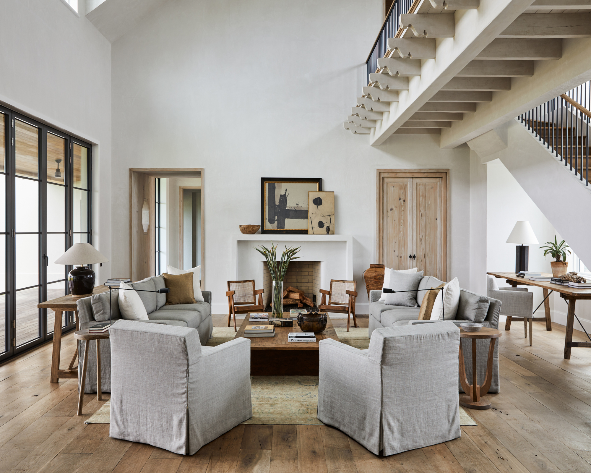
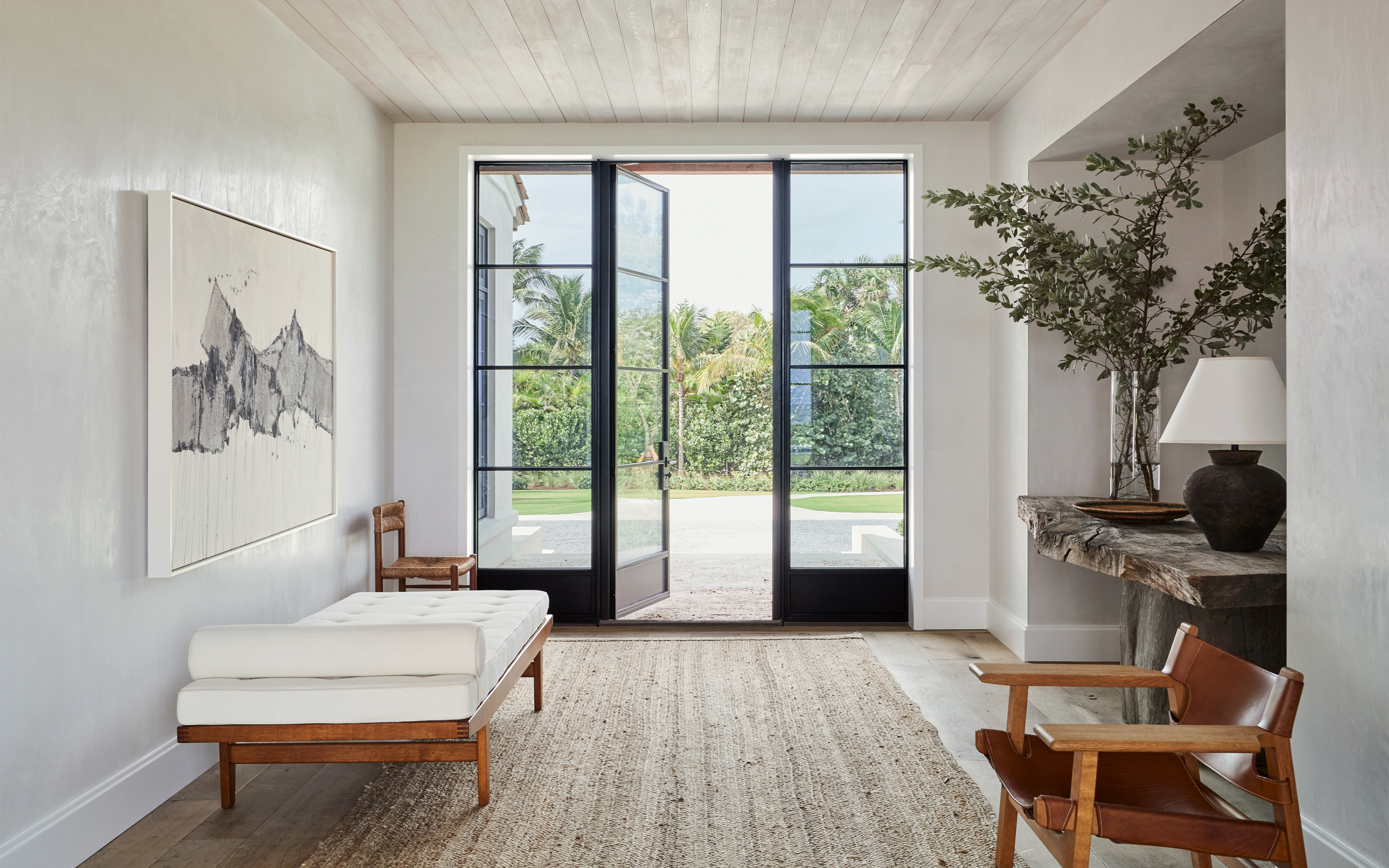
Designed to reflect the striking rawness of the ocean and dunes that surround it, this Florida beach house is a wonderful mix of plaster walls, limed cypress ceilings and raw oak floors that have been chosen to reflect the landscape outside. Instead of choosing distressed wooden doors, the architects picked Crittall-style black doors instead, ensuring the space has a contemporary edge and finish.
‘This home is deeply rooted in classical proportions, but strays from any nod to classical architecture’, says Thomas Melhorn of Thomas Melhorn. ‘More so, it is in response to the physical setting - the genius loci.’
Be The First To Know
The Livingetc newsletters are your inside source for what’s shaping interiors now - and what’s next. Discover trend forecasts, smart style ideas, and curated shopping inspiration that brings design to life. Subscribe today and stay ahead of the curve.
2. Create a timeless design
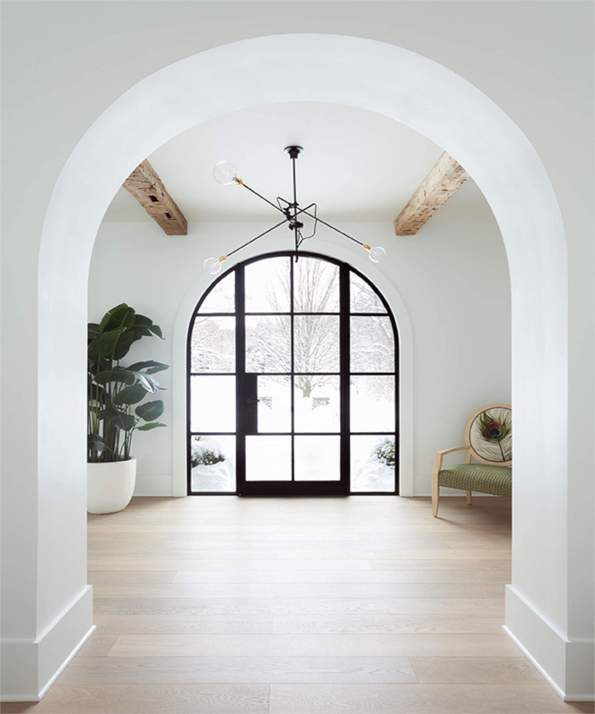
Crittall isn't a new thing. It's been around since the 19th century and it's pretty amazing Crittall and Crittall-style designs still going strong today, which is why they offer such a quality, timeless feel to any space they're installed into, like this London townhouse remodel as well as this Santa Monica-inspired house in Rochester, USA.
'The doors and windows were made by Hope, I chose them because I wanted to bring the outside environment into the home and with the large expanses and large panes, Hope window and door systems were the most functional for the space, as well as beautiful,' says Lyndsay Caleo Karol, creative director at Brooklyn Home Company
'I appreciate that the steel frames are timeless, which is something that we strive for in all of our designs. The space had a tremendous amount of volume, soaring ceilings that I wanted to highlight but also wanted to be mindful of keeping the space feeling cozy and grounded, so I focused on activating the higher areas of the room and ceiling by bringing in texture, with reclaimed ceiling beams and joists, the texture of the windows and letting the beautiful exterior landscape become a backdrop to the interior,' she adds.
3. Continue the flooring underneath
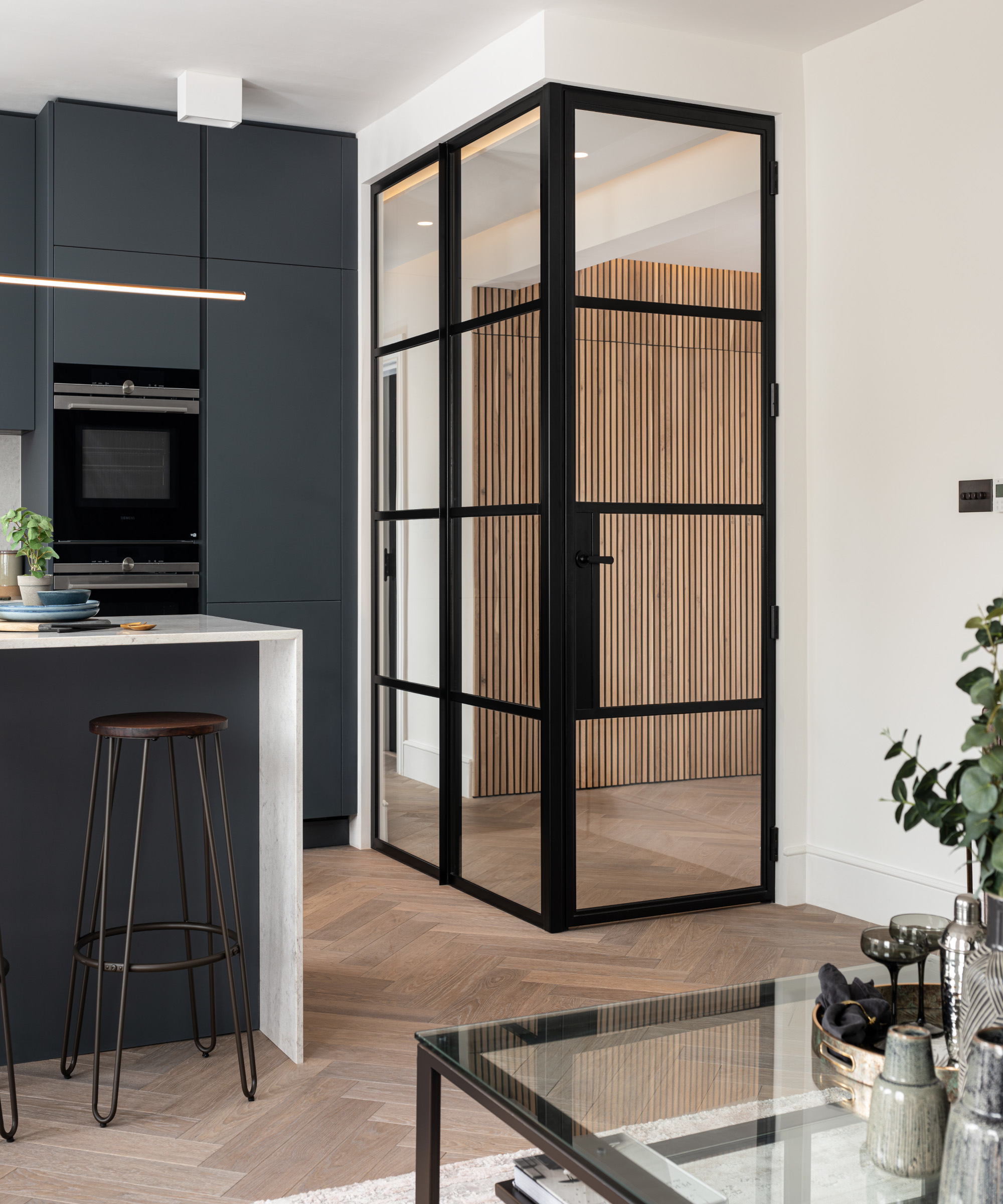
We love the way Crittall-style doors are usually made with clear glass, so when used internally, there's still a feeling of flow, especially when the rooms either side feel similar. They provide a sound barrier and extra privacy without blocking light and the feeling of space, as seen here in this modern apartment as well as this classic Georgian home.
'Crittall doors have been hugely popular in the last few years. Not only are they a stylish and functional room divider, but they allow for more light into a space,' say the experts at Havwoods. 'When it comes to designing a room with Crittall doors, think about how you want the room around it to work together. If you want a level of separation between the two spaces, but you want them to remain cohesive in their design, pair Crittall doors with wood floors that span the length of the two rooms. The natural coloring of the wood looks striking against the black and mirrors the flow of light and movement between the space.'
4. Create a warehouse vibe
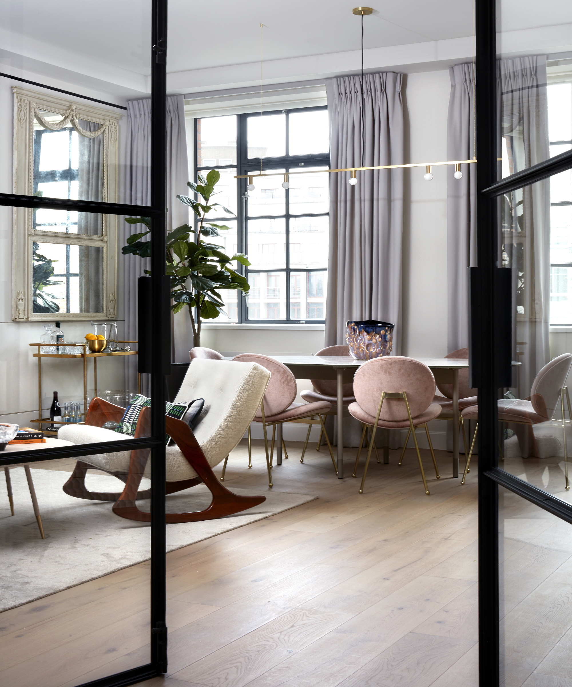
Internal glass doors are a fantastic way to divide up spaces without blocking that all-important light. Plus, Crittall-style doors help add a stylish and contemporary feel to any interior look, whether modern or traditional.
'To achieve the desired contemporary and architectural New York loft-style feel in this Knightsbridge apartment, we maximised the ceiling heights wherever possible and defined the ceilings with minimal shadow gap detailing,' say the experts at K&H Design. 'The introduction of full height Crittall doors from the lobby to the living area maximised the light and airy loft feel, increasing the natural light into a previously dark hallway. The introduction of the crittall doors also brought attention to the existing warehouse-style Crittall windows, keeping the living space cool and contemporary.'
5. Bring in extra light
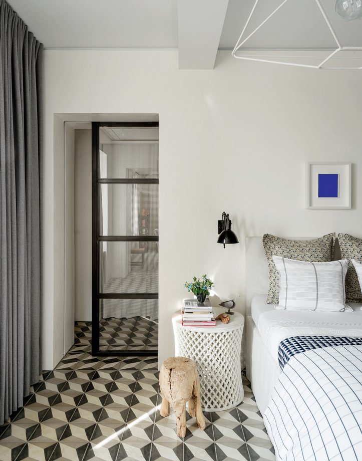
This tucked-away bathroom, deprived of natural light, is separated by a chic glazed steel divide by Space Exploration Design rather than a normal door so it can steal light from the bedroom.
'A personal favourite of mine, Crittall doors are versatile in their use, from partitions to doorways. They are a great solution for zoning larger areas whilst still allow light through, to keep a visibly ‘light’ appearance,' says Poppy Peace, Creative Director, Milc Interiors. 'Their iconic black steel frames collaborate with many styles from minimalist to Scandi and they can create a wonderful eye catching feature in any room, from dining room doors to bathrooms screens whilst still allowing a natural flow through the space.'
6. Take it to the top
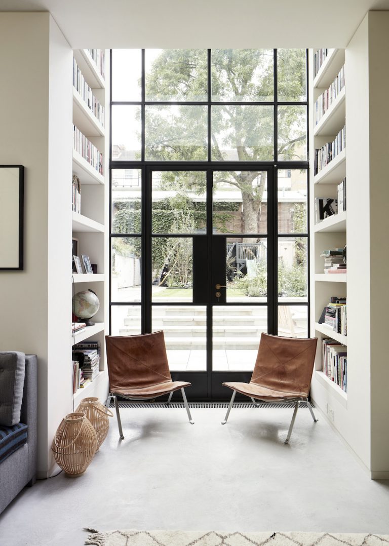
The materials and color palette in this property has been kept very simple. Off-white walls and polished concrete on the floors so the black Crittall windows that stretch from the floor to the ceiling beyond our eyeline, designed by Guy Stansfeld of 23+GS/318 Studio, take centre stage with subtle details highlighted in brass.
7. Use them inside or out
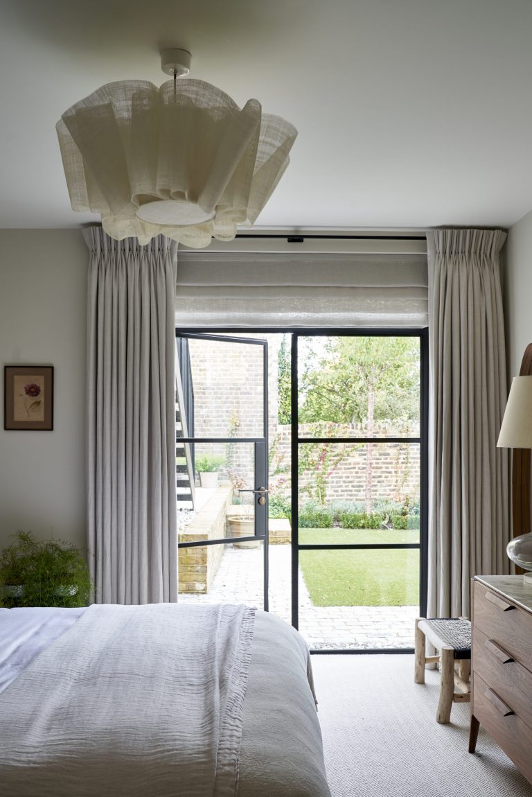
Neutrals create a soft, cosseting vibe instead of a minimalist one. The room connects to the garden via slim-profile Crittall-style glazing that brings in a sleek, contemporary edge to this otherwise very simple and pared-back bedroom.
8. Open up
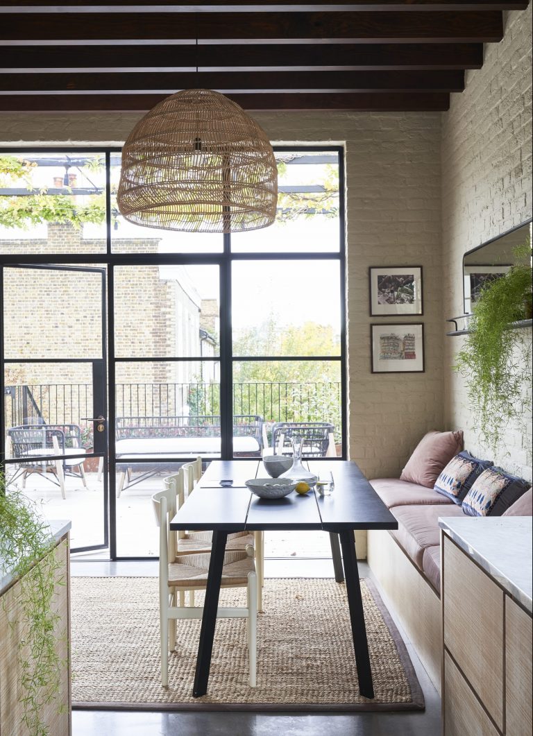
Flow-through spaces, natural tones and contemporary art keep things open and easy in this Crittall door kitchen extension. Everywhere in this home, materials are seen at their simplest and best – from the pitted surface of Victorian brickwork to the sections of smooth concrete in the dining area. This space leads on to a roof terrace, where the family eats in warmer months. Frondy plants and large-scale Crittall glazing add to the feeling of openness.
9. Help zone and define
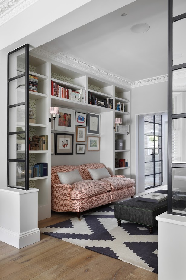
In this gorgeous living space designed by Turner Pocock, small Crittal-style room partitions are enough to separate the different zones, without taking up too much space.
'A perfect combination of modern meets historic design, there are a number of benefits to using Crittall in your interior design scheme,' says Poppy Peace, Creative Director, Milc Interiors. 'Although open-plan living has been hugely popular, using Crittall doors to create zones in your home is an effective way of managing the space and breaking up larger rooms. This is effective in living / dining areas especially as you can still allow for the space to flow, but with distinct areas for cooking and eating.'
10. Mimic a translucent wall
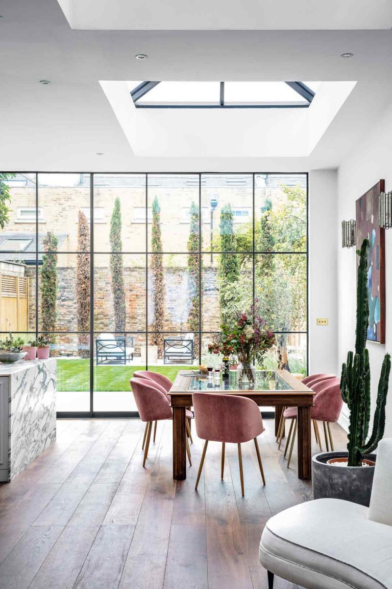
The floor-to-ceiling glazed doors resemble a translucent wall. This serene space is all part of an extension, but thanks to a skilful co-design between the interior architect and interior designer behind The Vada Collective, it feels more like a grand salon. The Glass doors were made by Maxlight.
11. A viewing platform
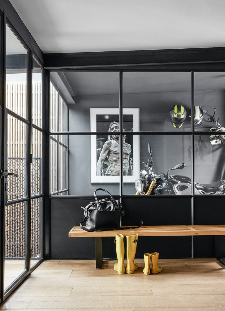
The custom made Crittall doors used here mean that the adjoining garage – housing custom motor bikes – is cleverly transformed into an innovative viewing gallery.
12. Blend into dark walls
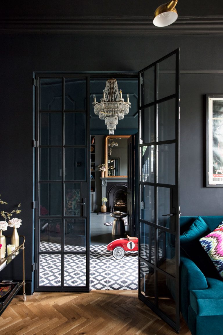
A mix of flooring, including antique parquet, modern screed and traditional tiles, coexists happily with architectural elements, such as the steel and glass doors from Clement Windows.
13. A simple partition
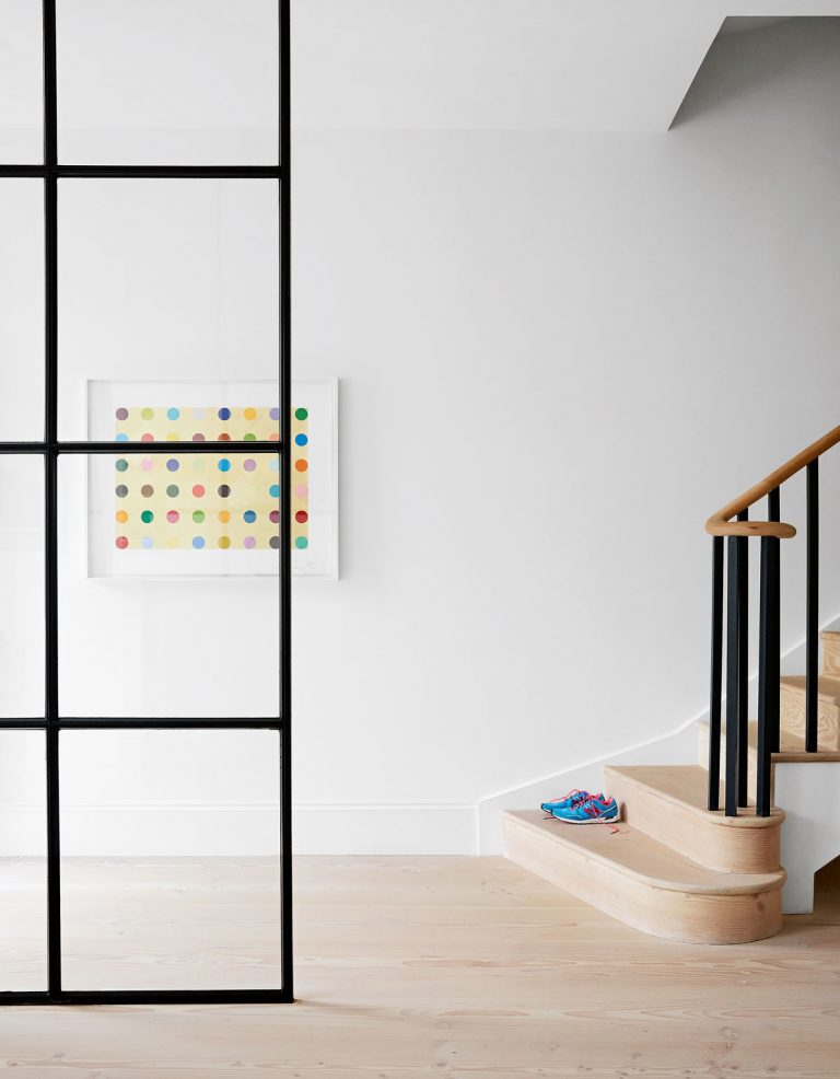
A Crittall partition separates what was formerly a dark hallway from the reception room, while allowing light to flood the space.
Crittall doors can be used as internal partitions and connecting doorways, and they're great for dividing up and zoning spaces. open-plan living allows for more space and light but tearing down all the walls isn't always practical, and sometimes spaces still need to be divided up somehow. Crittall style is perfect here, and people are using these steel-framed partitions to create floor plans that feel both light and inclusive but retain an element of separation.
14. Sneak a peek into a whole room
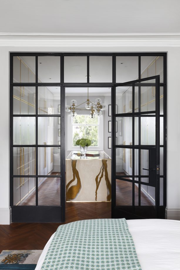
This dreamy, spacious dressing room with beautiful closet door ideas and central island unit is divided from the main bedroom by steel-framed glazing by Govette Windows. By day, it feels like one big space, with a flow of light from the front to the back of the house, but at night, the doors can be closed and the curtains drawn to make this main bedroom quiet and cosy.
15. Up the privacy with ribbed and fluted glass
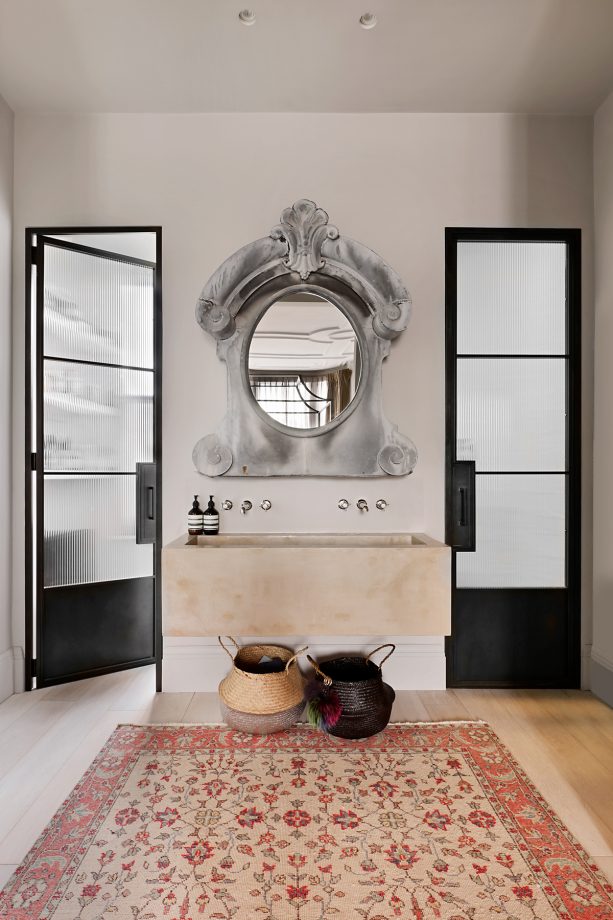
Ribbed glass is the glazing trend of the moment and these fluted glass Crittall internal doors separate the shower and WC from the basin, located in the bedroom. Painting ceilings in the same shade as the walls gives rooms a cohesive, cocooning feel.
16. Mix different eras
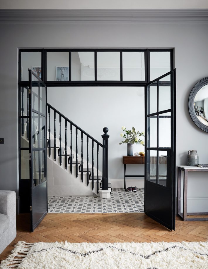
The ground floor spaces in the modern home have been opened up as much as possible, the old doorway replaced by wider, higher steel doors. Dark banisters create a dramatic look to tie in with the steel doors and zigzags up through the house’s core.
17. Inject character into a simple design
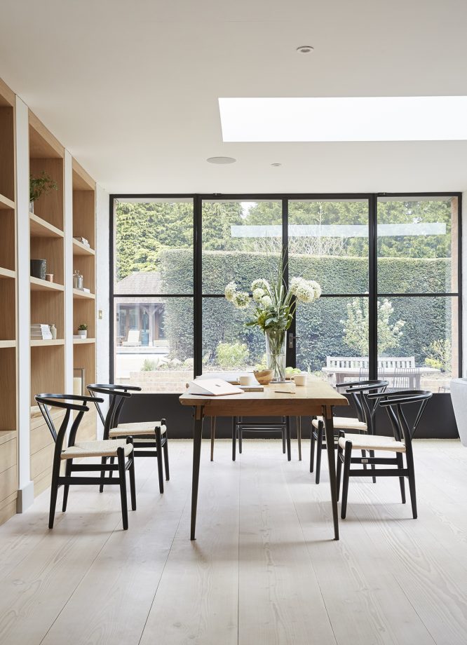
The garden can be viewed through steel-framed windows, adding a cool, industrial edge to this otherwise simple space. The dining area is in the new single storey extension idea, which has opened out the interior, flooding it with light and creating a fluid link between the inside and the garden, where the yew hedge has been scaled back to let in even more light.
18. Make an entrance
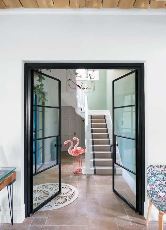
Crittall doors by YES Glazing Solutions open out from the living area to the stairwell, where the La Volière pendant hangs. We love the idea of using Crittall-style doors in and around an entrance hall, which can often be dark and lifeless spaces.
19. Embrace industrial style
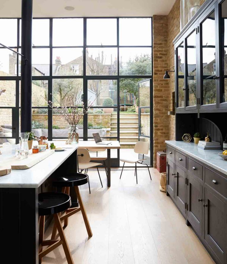
This modern kitchen extension flows onto a terraced seating area with a grassy garden beyond. A love of strong, industrial design is written all over the kitchen, with its exposed brick walls, brass taps, vast steel windows and salvaged supporting pillar.
20. Soften with a window bench
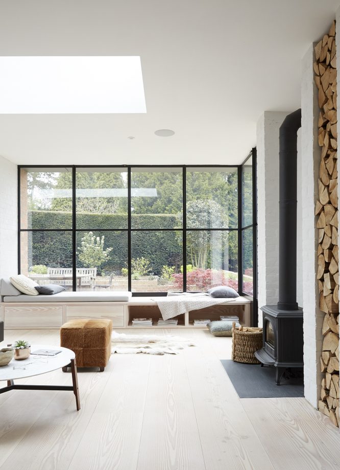
The inside and outside merge in this new extension, where the comfortable window seat is an ideal spot to perch and chat. Furnishings are spare, but not spartan, with pieces – such as the vintage leather sofa and the bench designed by Pinch – chosen for warmth and texture.
What is a Crittall-style door?
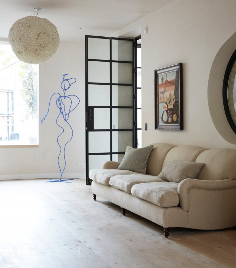
Crittall, or Crittall-style doors are usually black steel or aluminium, slim frames with glass panels. They also tend to have a plate behind the handles, minimalist hinges and deep bottom rails. Virtually all products on the market take these original steel door design hues and mimic them. The Crittall-style doors are often made out of aluminium instead of the original steel, which may not produce the same quality, but it is budget friendly with faster turnarounds. Whether you opt for original Crittall or a copy, they provide a timeless and classic look.
This décor in this living room has an almost powdery softness, given definition with black-framed internal and external glazing.
Why are they called Crittall doors?
Crittall style refers to the black steel frame with glass panels, whereas the name Crittall comes from the Crittall family who originally manufactured the product back in the 19th century in Essex, UK. Even though the family participation has ended, the family name has lived on and become synonymous with the style which has been a trend for the last 150 years.
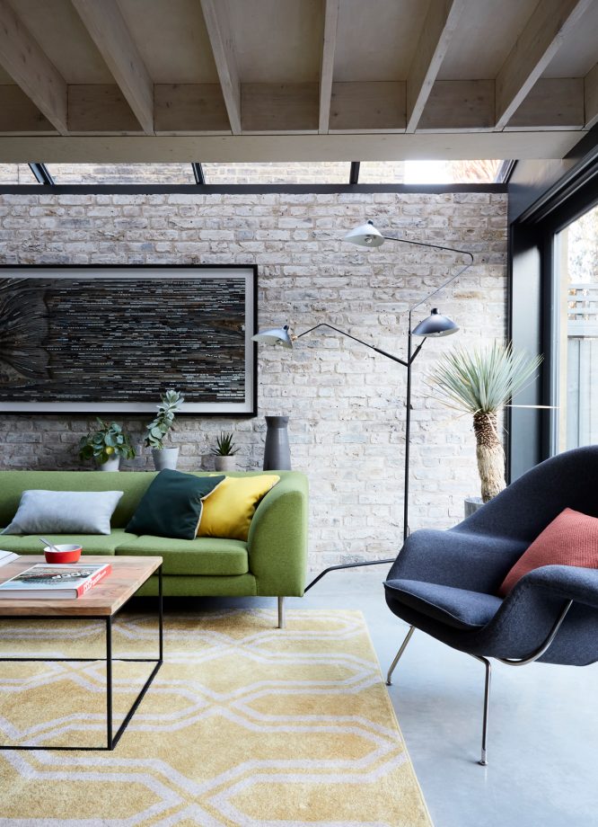
Here, a glazed Crittall-style roof on the side return and a glass floor on the first-floor landing both filters light through to the living area beneath.
Are Crittall-style doors expensive?
The common belief is that Crittall have to be expensive but in reality, it depends entirely on the quality and manufacturer. Authentic steel Crittall doors are costly but aluminium replicas of Crittall doors, although they are not the same quality, they are much more cost-effective and have quicker lead times
Bear in mind that Crittall-style doors which haven’t been galvanised are prone to corrosion and rusting which can lead to cracked glass and distortion
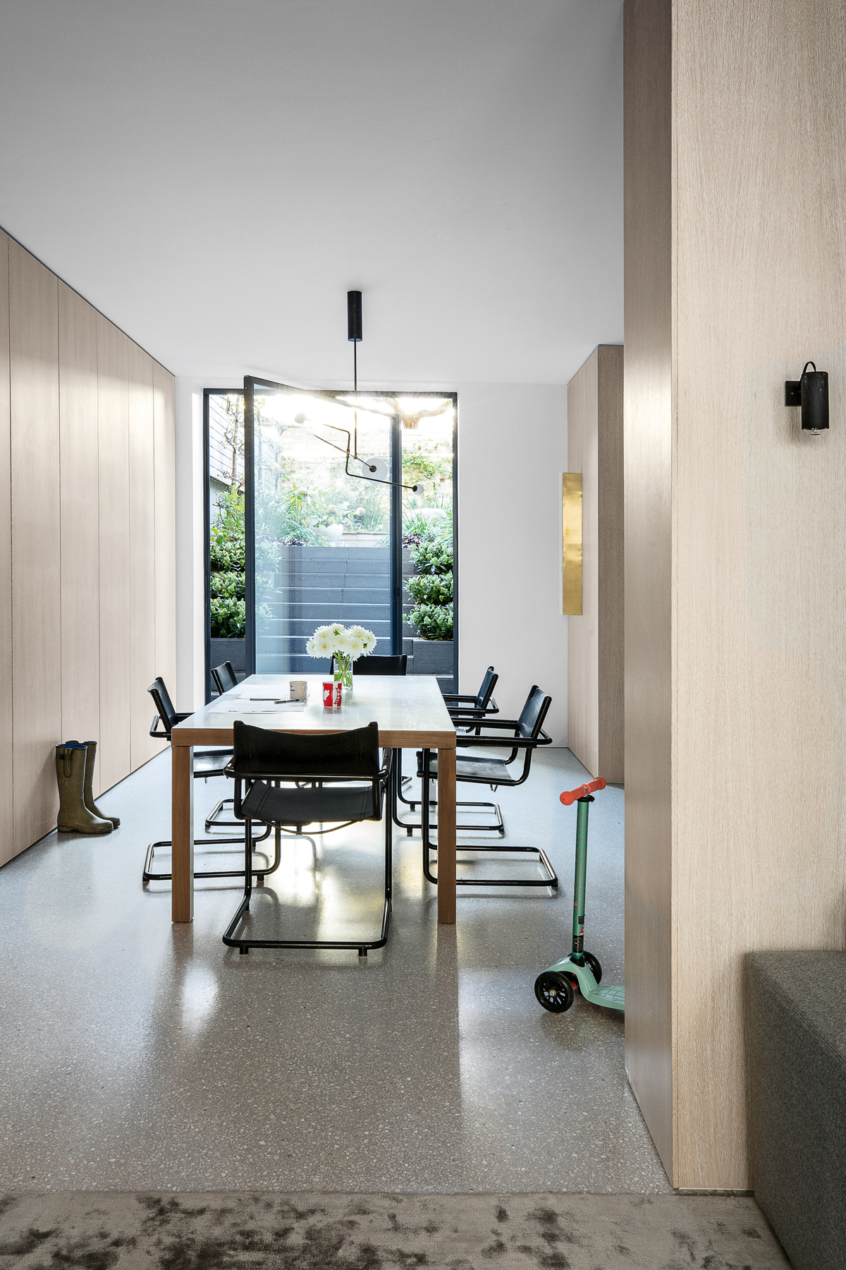
This lower ground floor here is a surprisingly light space, with iconic design shapes set against pale timber cladding and flush cabinetry, black-framed glazing and seamless terrazzo flooring. A pivoting door leads out into the garden and helps provide end-to-end natural light. Toys, games and the stuff of family life are stored in the run of handleless cabinets.
Are Crittal doors a fad?
Are Crittall doors falling out of fashion? Crittall has come back in a big way. These industrial-style doors, windows, and room dividers allow you to zone your space whilst letting in light – and they know how to make a statement. However, Crittall's allure may be under threat, thanks to stylish new alternatives that are taking over our Instagram feeds. But Crittall has stood the test of time since the 1800s, so we don't think they're going anywhere just yet.
This dining room is sectioned off from the bedroom and the rest of the apartment via Crittall doors – with curtains giving essential privacy when needed.

Lotte is the former Digital Editor for Livingetc, having worked on the launch of the website. She has a background in online journalism and writing for SEO, with previous editor roles at Good Living, Good Housekeeping, Country & Townhouse, and BBC Good Food among others, as well as her own successful interiors blog. When she's not busy writing or tracking analytics, she's doing up houses, two of which have features in interior design magazines. She's just finished doing up her house in Wimbledon, and is eyeing up Bath for her next project.
-
 There’s a New Shape in the Garden — Why Whimsical Curves Might Be the Outdoor Furniture Silhouette of the Summer
Powder-coated petals, wavy lines, and a hint of surrealism — this microtrend is blooming, and we’re paying attention
By Julia Demer
-
 10 Yellow Bathroom Ideas That Vitalize Your Mornings and Look Unexpectedly Sophisticated While Doing So
Yellow is a color that by its very nature is energetic and full of life, and these designers have proved it's ideal for a bathroom
By Oonagh Turner
-
 These Hanging Kitchen Baskets Have a Cool, Casual Energy That Give Your Produce Storage Serious Style
There are a couple of popular produce items that just aren't meant to be refrigerated. In that case, this hanging basket display is the perfect alternative.
By Amiya Baratan
-
 The Combination You Weren't Expecting to Love — 8 Blue And Orange Living Room Ideas That Feel Surprisingly Elevated
A blue and orange scheme for living rooms may sound jarring, but these spaces prove they're striking, vibrant, and certainly unforgettable
By Camille Dubuis-Welch
-
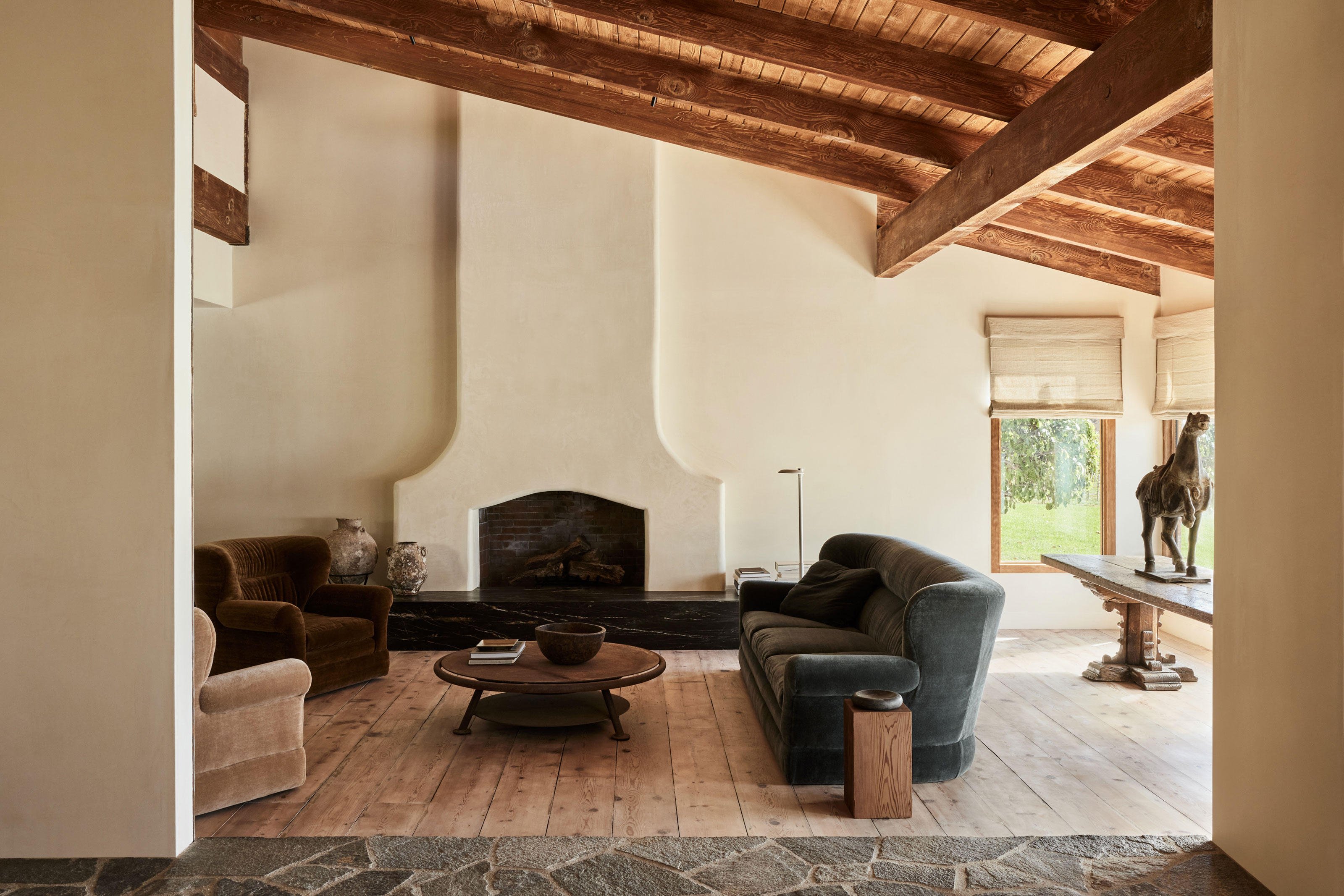 10 Living Rooms With Dark Gray Sofas That Show This Couch Color Is a Real Style Chameleon
Charcoal-colored couches offer the best of both worlds when it comes to style and practicality, and these real rooms prove it
By Luke Arthur Wells
-
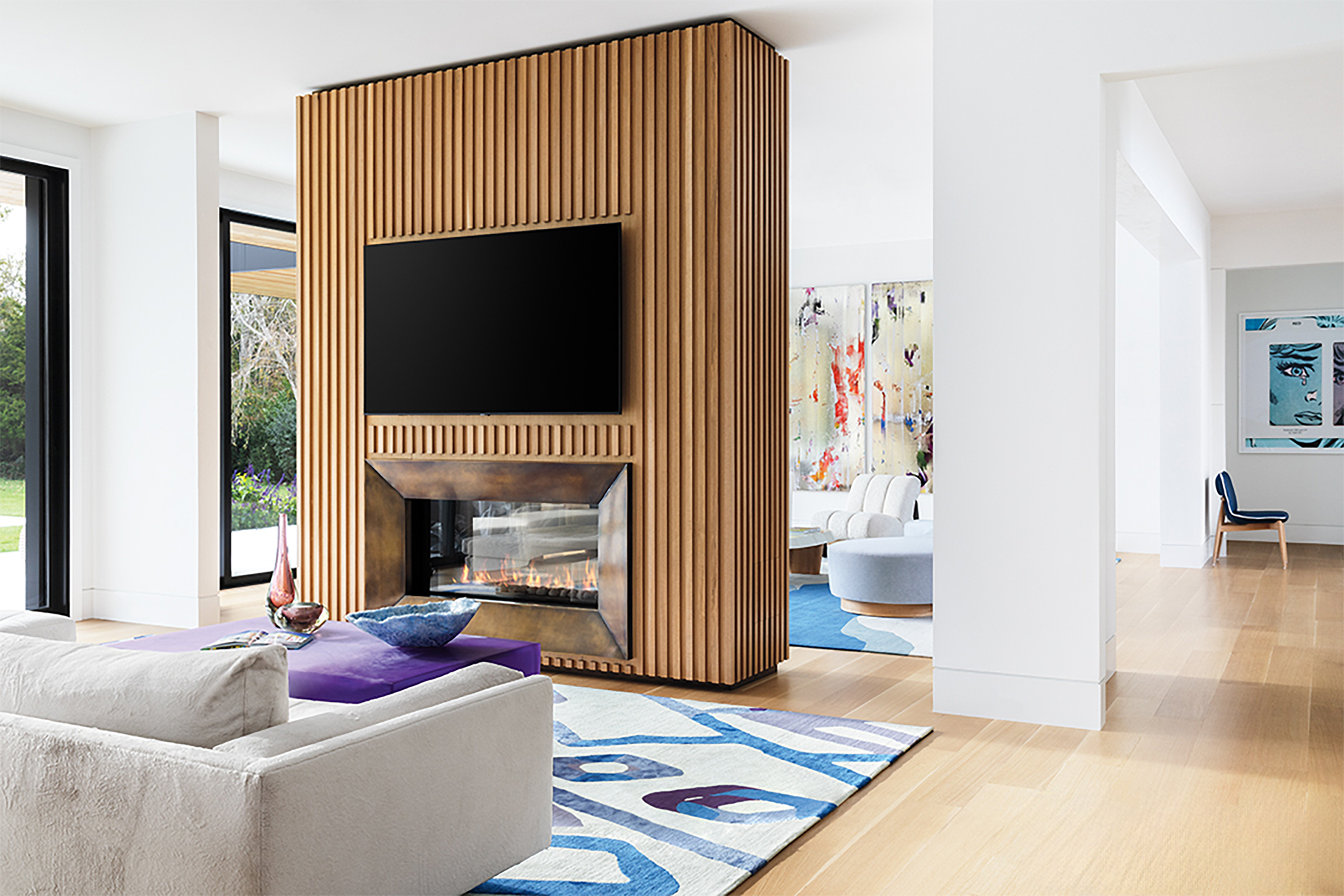 'TV Room Dividers' Are the Living Room Layout Trend That Might Spell the End of True Open Concept
TVs are tricky when it comes to design: you want to be able to see them when you do, and not when you don't. Here, designers offer a clever solution
By Faaizah Shah
-
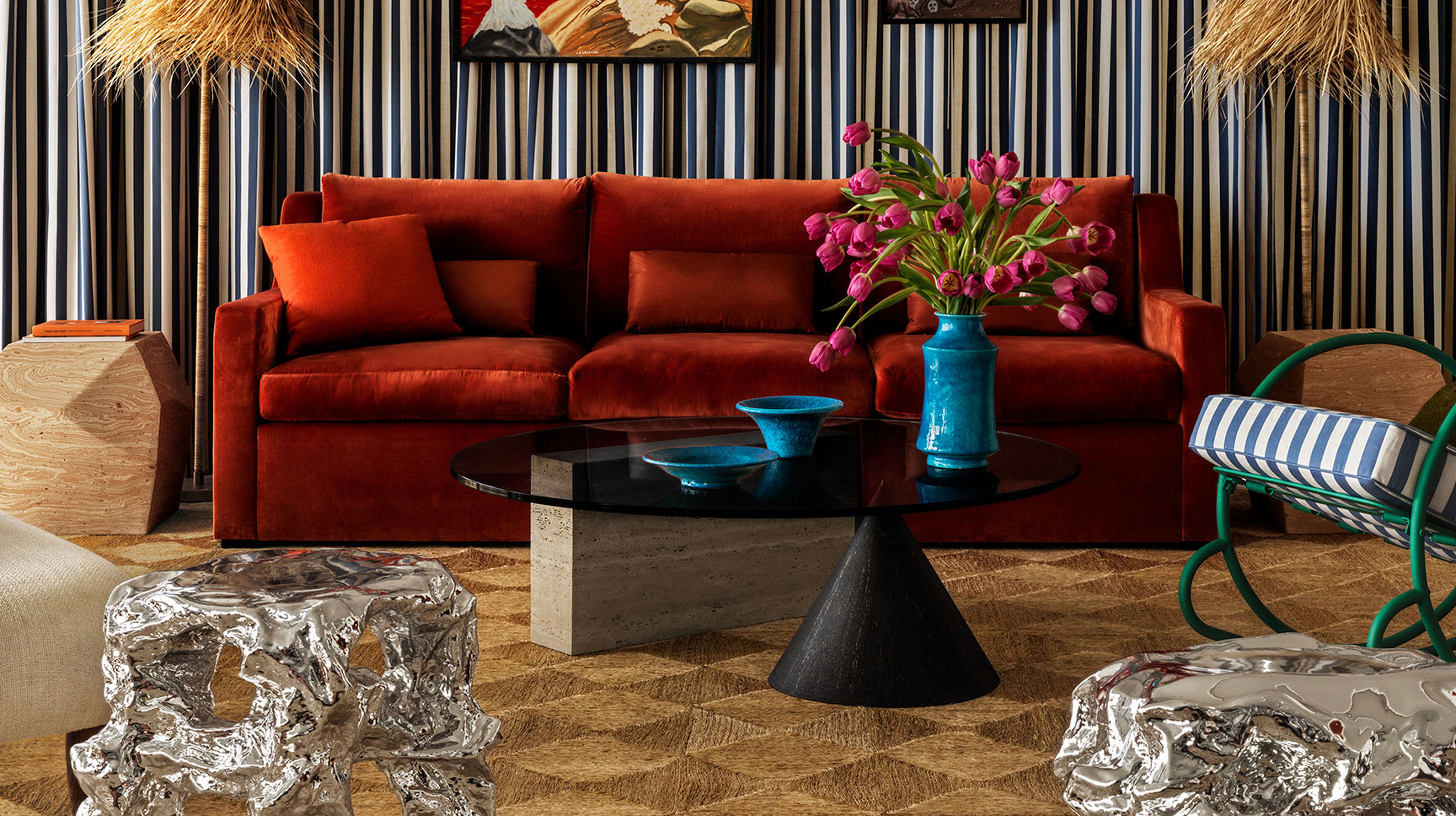 The Future "It" Furniture Designs for 2025 All Share This 80s-Inspired Detail That Feels so Fresh
When it comes to dining tables, coffee tables, benches and more, designers are playing a balancing act with unusual forms and materials
By Luke Arthur Wells
-
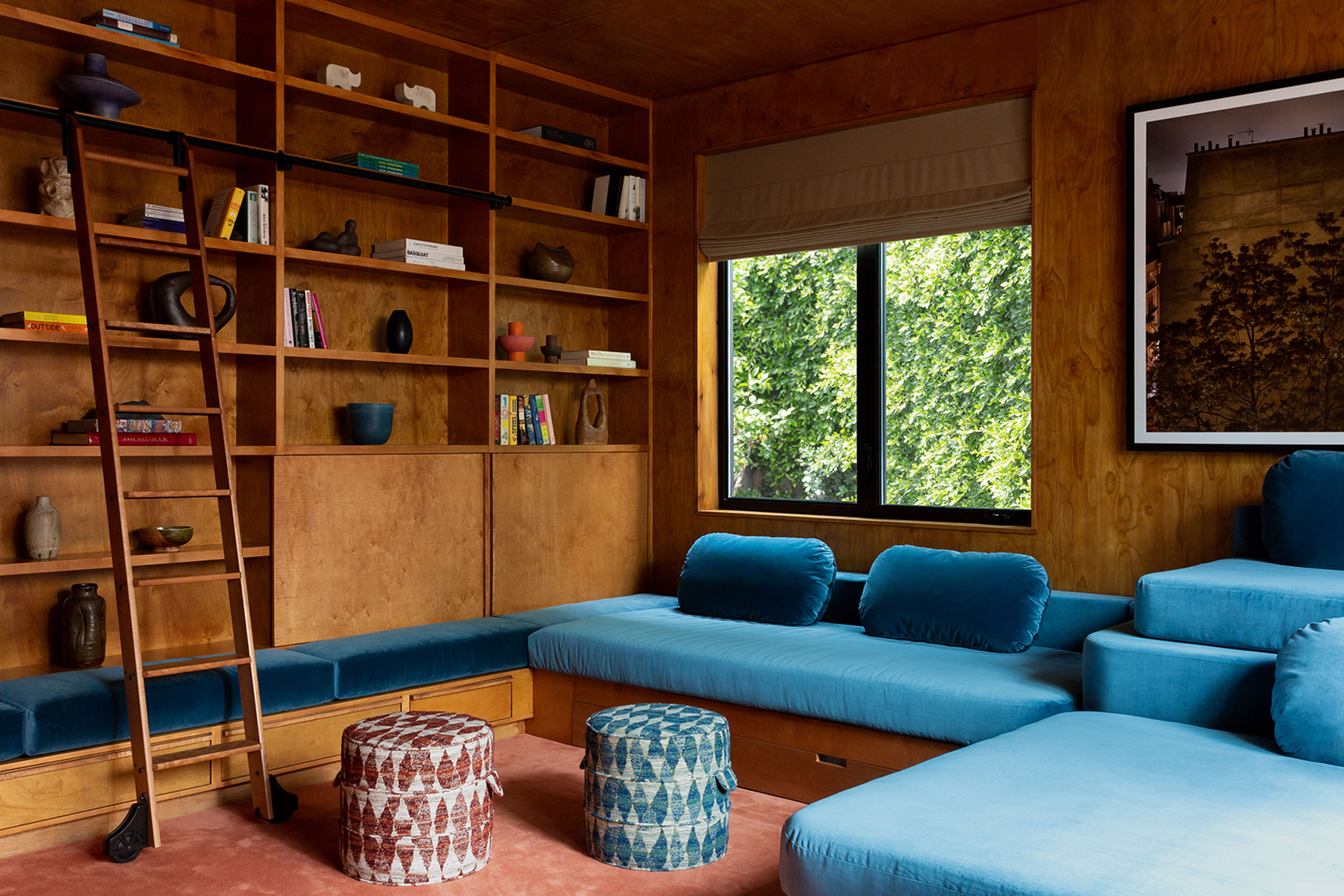 Less Stuffy, Less Formal — How the Big Seating Trends for 2025 All Point in This Uber-Comfortable Direction
Put your feet up, as homes go all in on deep, communal couches, window seats and nooks that make for the dream hang-out spaces
By Luke Arthur Wells
-
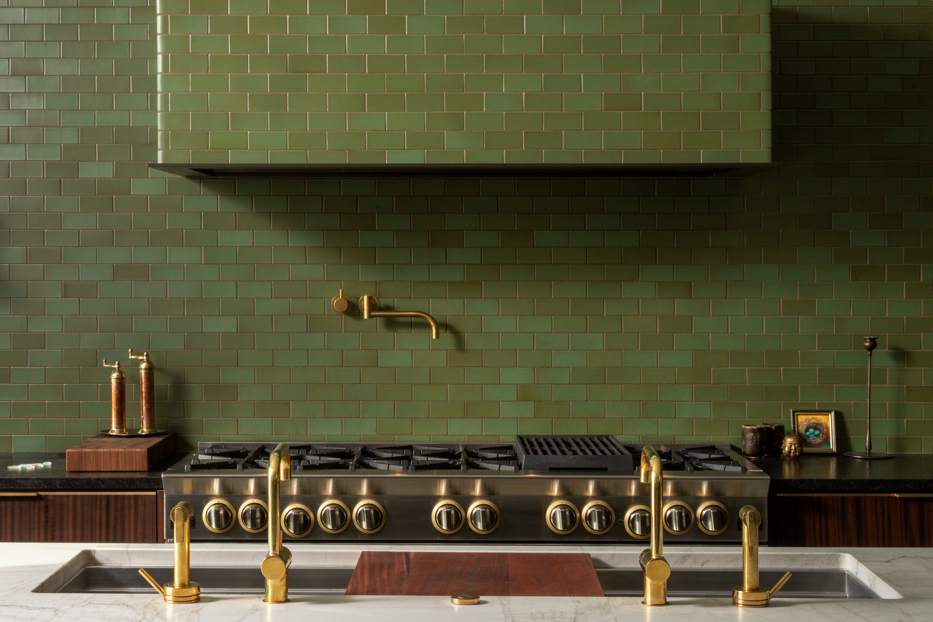 Tiled Range Hoods Are the Trend That'll Make Your Kitchen Look More Expensive — I Love These 6 Examples
This idea takes a basic element of your kitchen design and makes it feel bespoke — and designers swear by it too
By Oonagh Turner
-
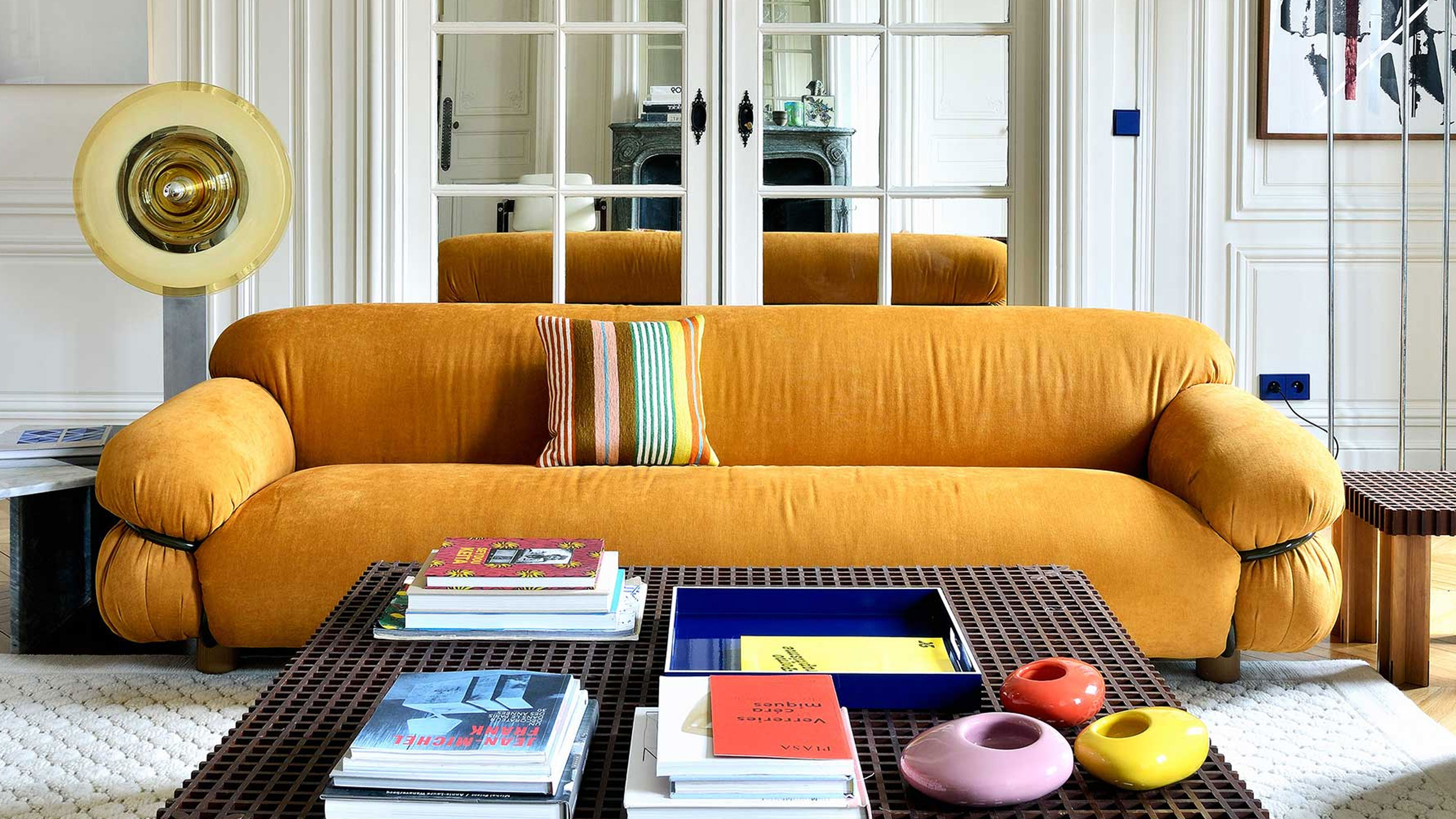 9 Iconic Sofas That Design Savants Should Know by Name, According to the Most Stylish People We Know
From mid-century marvels to spectacular modernist designs, these are the design famous couches interior designers want you to get to know better
By Luke Arthur Wells
