Kitchen Backsplash Ideas — 18 Timeless Designs That Will Suit Every Home
Experts share several ways to perk up this important kitchen detail with color, texture, patterns, and finishes
- 1. Create a graphic-style space with patterned tiles
- 2. Or go for custom-painted tiles
- 3. Consider Zellige tiles
- 4. Choose a terrazzo backsplash
- 5. Lay tiles in interesting patterns
- 6. Choose pretty patterns on the tiles
- 7. Use tonal variation
- 8. Paint the backsplash
- 9. Contrast your kitchen backsplash with hardware
- 10. Style your backsplash unexpectedly
- 11. Clash colors boldly
- 12. Pick a hardwearing material
- 13. Consider a statement tile
- 14. Take the tiles to the ceiling
- 15. Use the backsplash as a shelf
- 16. Go for countersplashes
- 17. Inject a wow-factor with heavily-veined marble
- 18. Add a restaurant-like vibe with stainless steel

Yvette Murrell
There are many elements in the kitchen that add value to the space — the wall paints, appliances, and counters being major contributing factors to the room's practicality and aesthetics — but a surprisingly useful element is the backsplash. This is not just incorporated to take all the heat from the stove or the splashes from the countertop — it can become one of the most noticeable features if you give it the love it deserves.
With the right designs, colors, and patterns, you can make the backsplash the hero of your modern kitchen. Take a look at these ideas offered by top experts.
1. Create a graphic-style space with patterned tiles
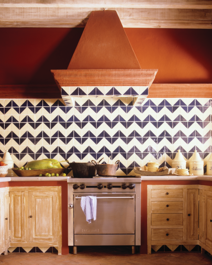
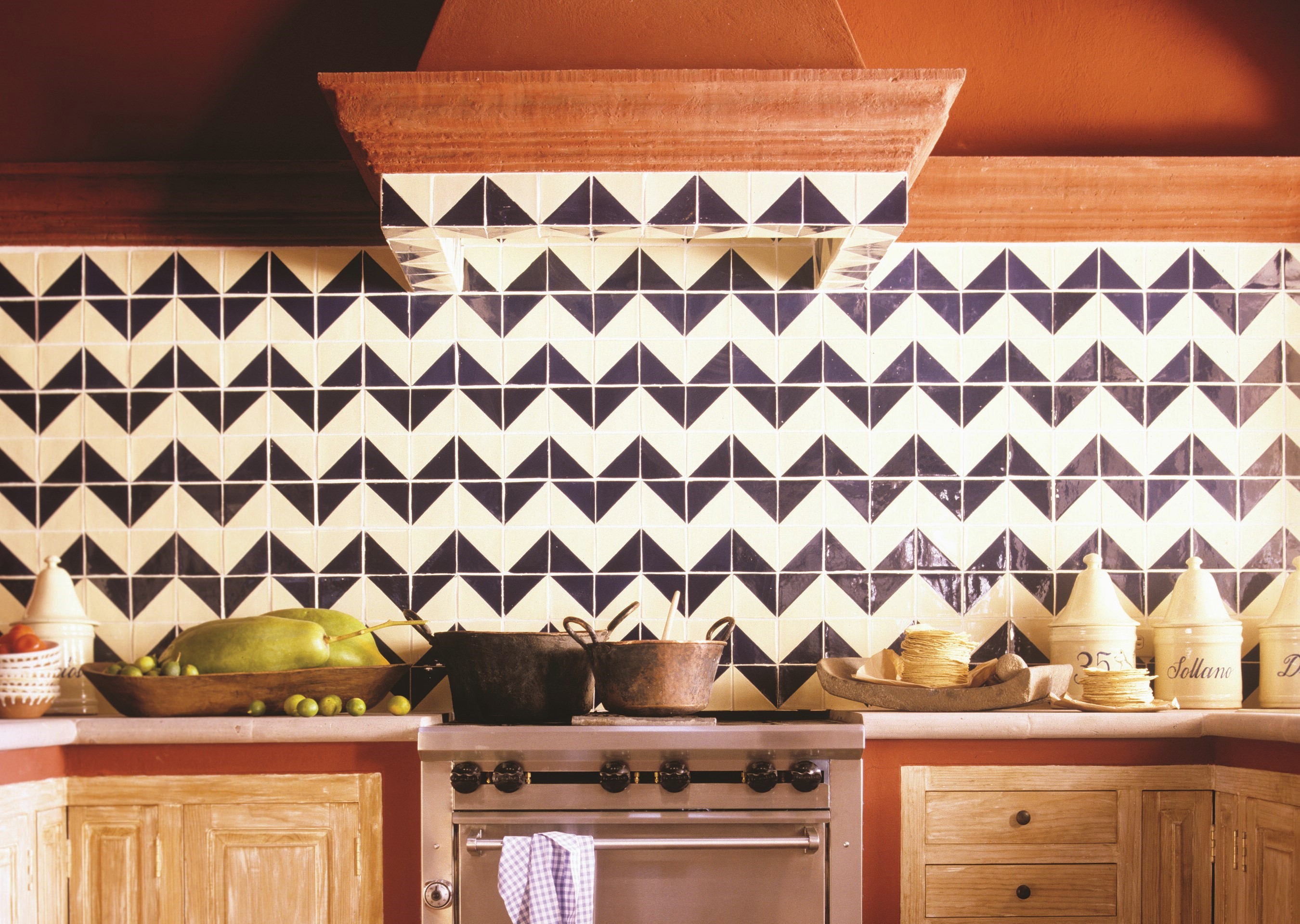
Have a little fun with your kitchen ideas and add bold, graphic backsplash tiles. This small, sleek surface offers the perfect canvas for fresh design ideas. Select statement-making colors and graphics while keeping the bigger kitchen components like cabinets and countertops more subdued.
"I chose this tile because of its strong graphic quality," says Anne Marie Midy, founder of Casamidy. "Its simple geometric zig-zag shape brings energy to the symmetric and classic space. This home is located in San Miguel de Allende and I wanted to work only with materials from the region. This is a classic Dolores Hidalgo tile that one can order in different colors. I chose the blue because it is a timeless tile enamel color and is combined well with the primary red."
2. Or go for custom-painted tiles
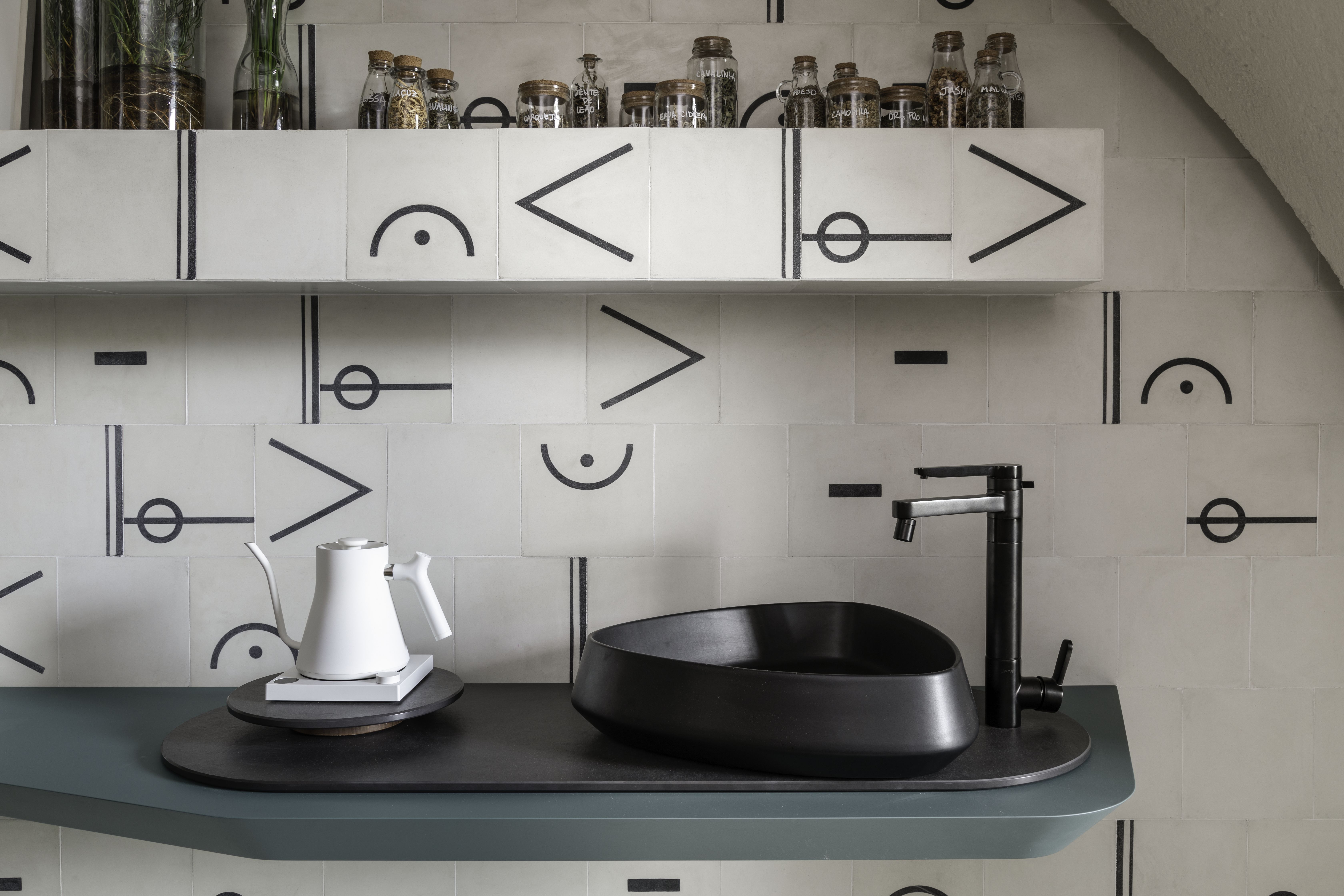
It's not every day you see beautiful, customized kitchen tiles in people's homes. Consider this kitchen backsplash if you want to personalize your home and want every element to tell a story.
In this project architect Ana Sawaia created a space that encourages you to stop and notice.
"The idea was to be surrounded by practical ideas and also with objects that tell us a little about who we are," says Ana. Here, the tiles are painted with musical notes that showcase her interest in the art form. "It is an environment created not just for simple occupancy, but for a more playful way of teaching music. The design is aimed to make us feel good, relaxed, and at ease to the point of slowing down, disconnecting, and finally taking a break."
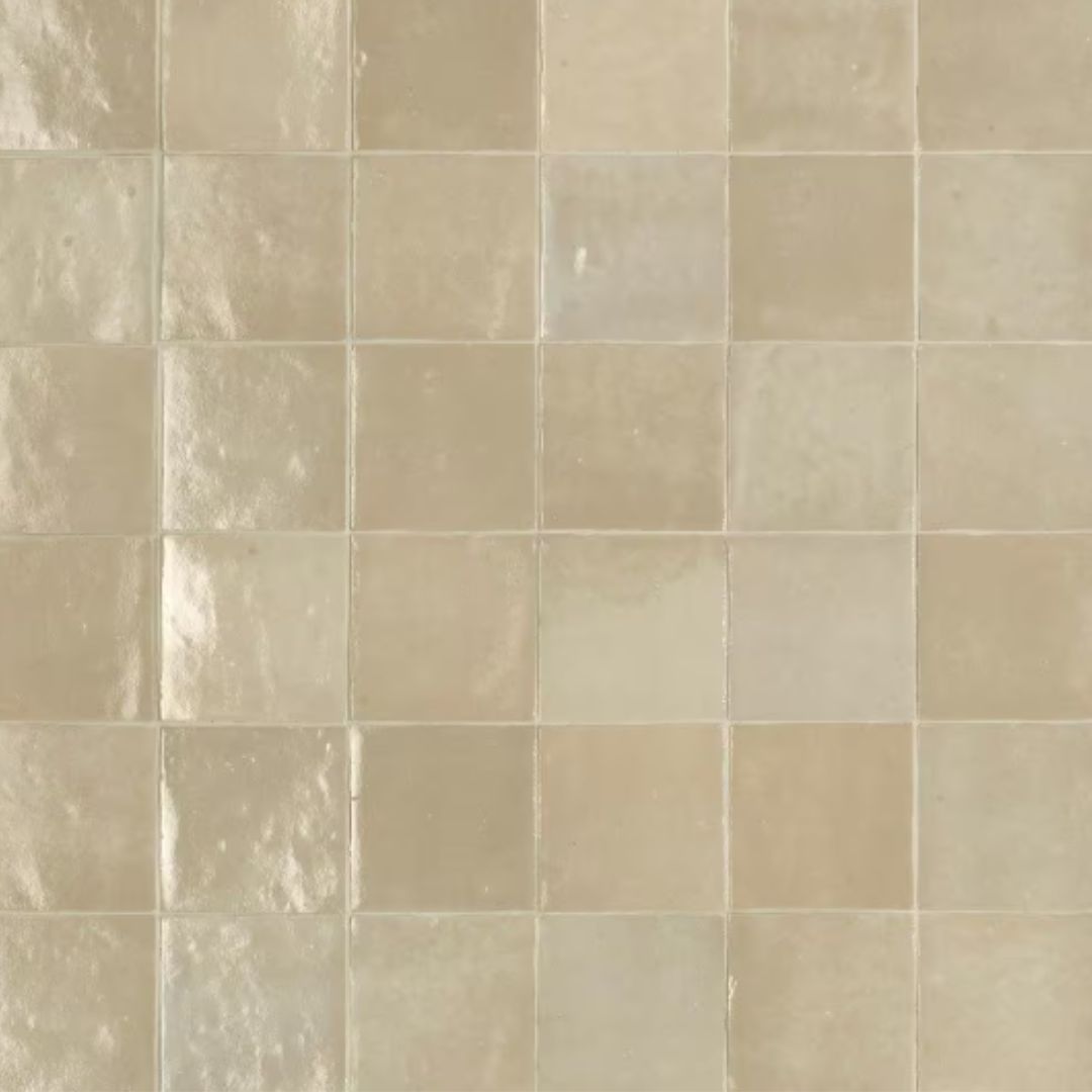
3. Consider Zellige tiles
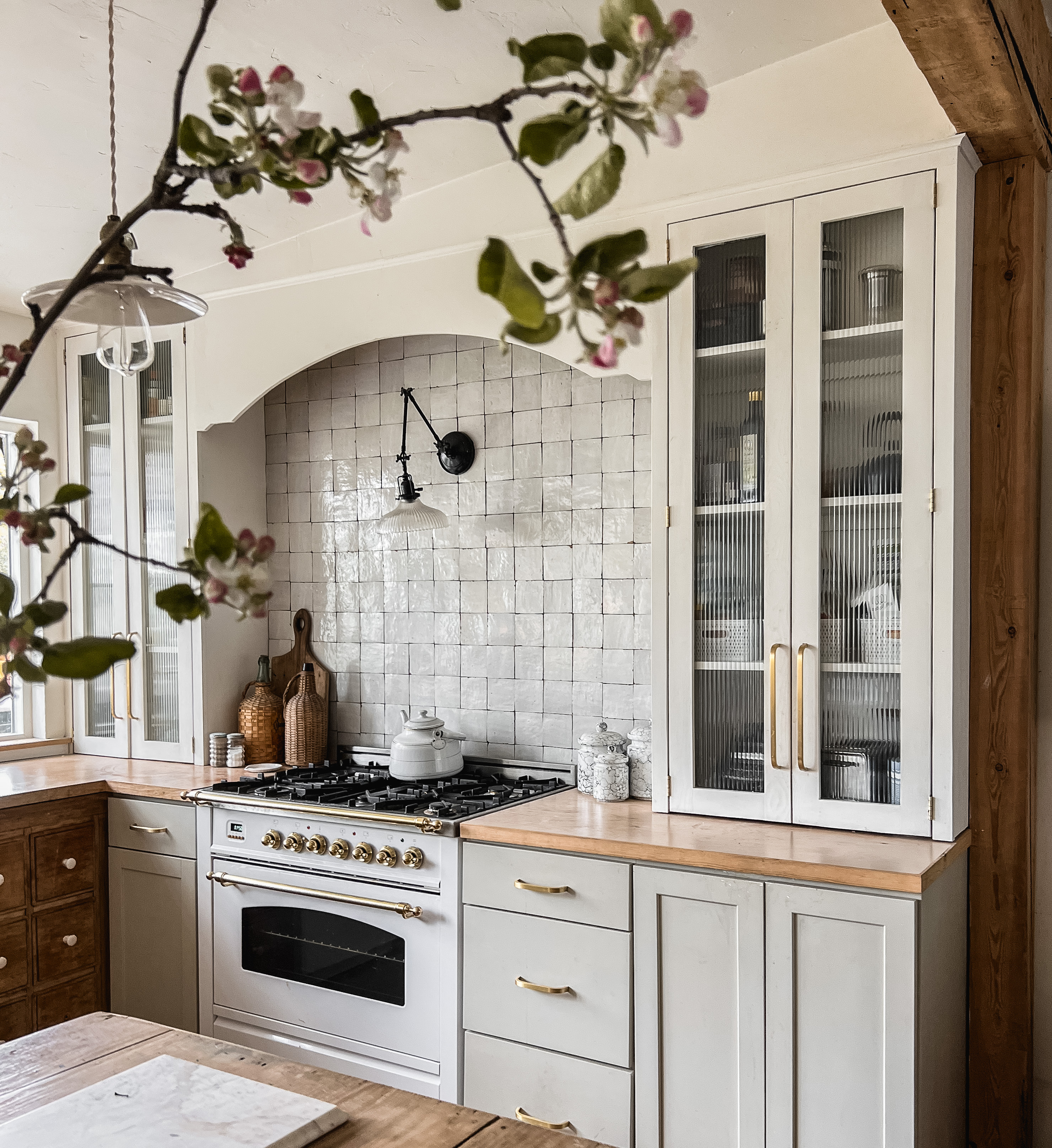
"From the beginning, I wanted the stove alcove to be a focal point in the kitchen, but it needed more texture to feel right," says Jana Roach of Beck & Cap. "Enter Zellige tiles; there’s just something about that handmade, organic vibe. The natural variation in color and the sheen bring a warm, earthy energy into the space. We went with a dry-stack installation because I wanted it to feel seamless and avoid those harsh grout lines. Now, the whole kitchen feels grounded yet elevated at the same time. Honestly, it’s one of the things that brings me the most joy when I walk in."
Lately kitchens with Zellige tiles have become quite a trend. And that's because these are durable, and resistant to heat, and are perfect to be installed above the stove. Also for those who want to remodel a kitchen with eco-friendly materials should consider these tiles as they're made with clay and pigments. They are versatile and available in several colors and designs.
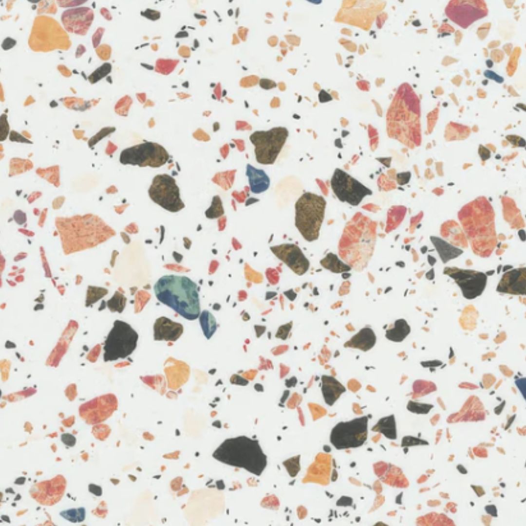
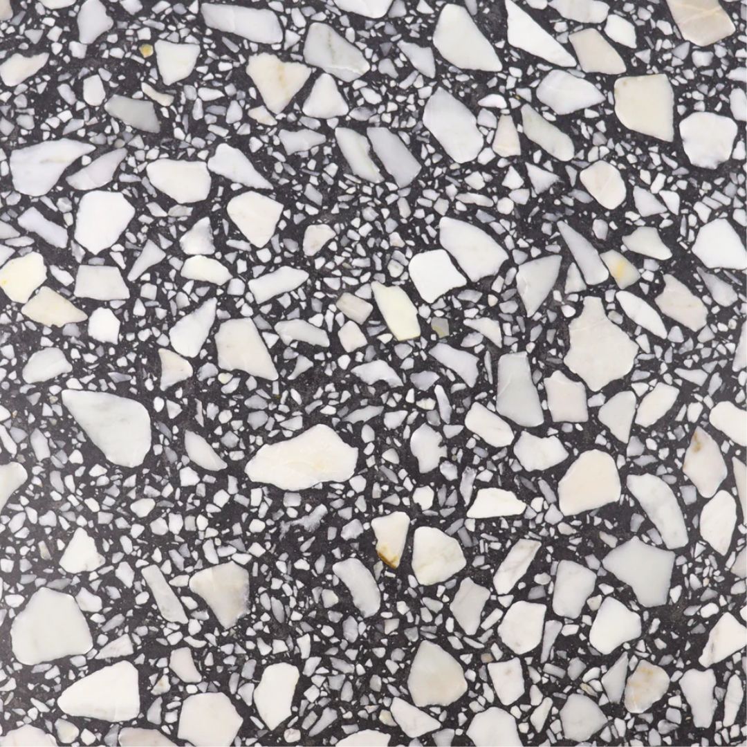
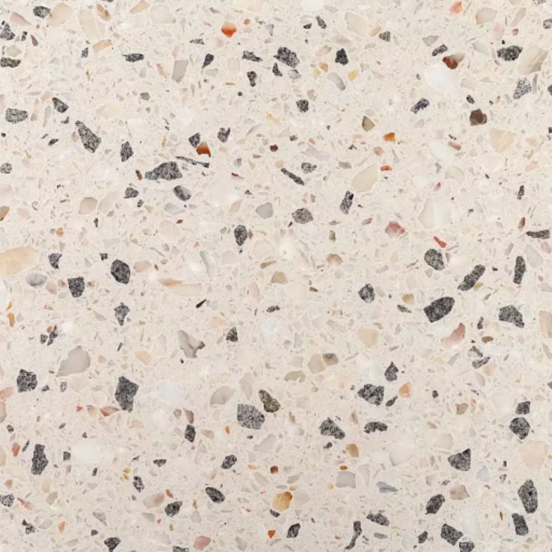
4. Choose a terrazzo backsplash

Want to add subtle kitchen color and movement to the scheme? The beautifully speckled terrazzo kitchen backsplash might be the answer. This stone can feel luxurious and is extremely durable and long-lasting; in fact, it has many qualities similar to quartz. Plus, depending on the retailer, it can be formed to a requested size or shape, rather than having to be cut from a slab.
"The homeowners are both artists," shares Penelope August, founder of Penelope August Studio. "We wanted to create a happy kitchen combining unexpected colors. This terrazzo backsplash was inspired by the furniture of Shiro Kuramata, and custom made using recycled glass chips that the client and I selected."
5. Lay tiles in interesting patterns
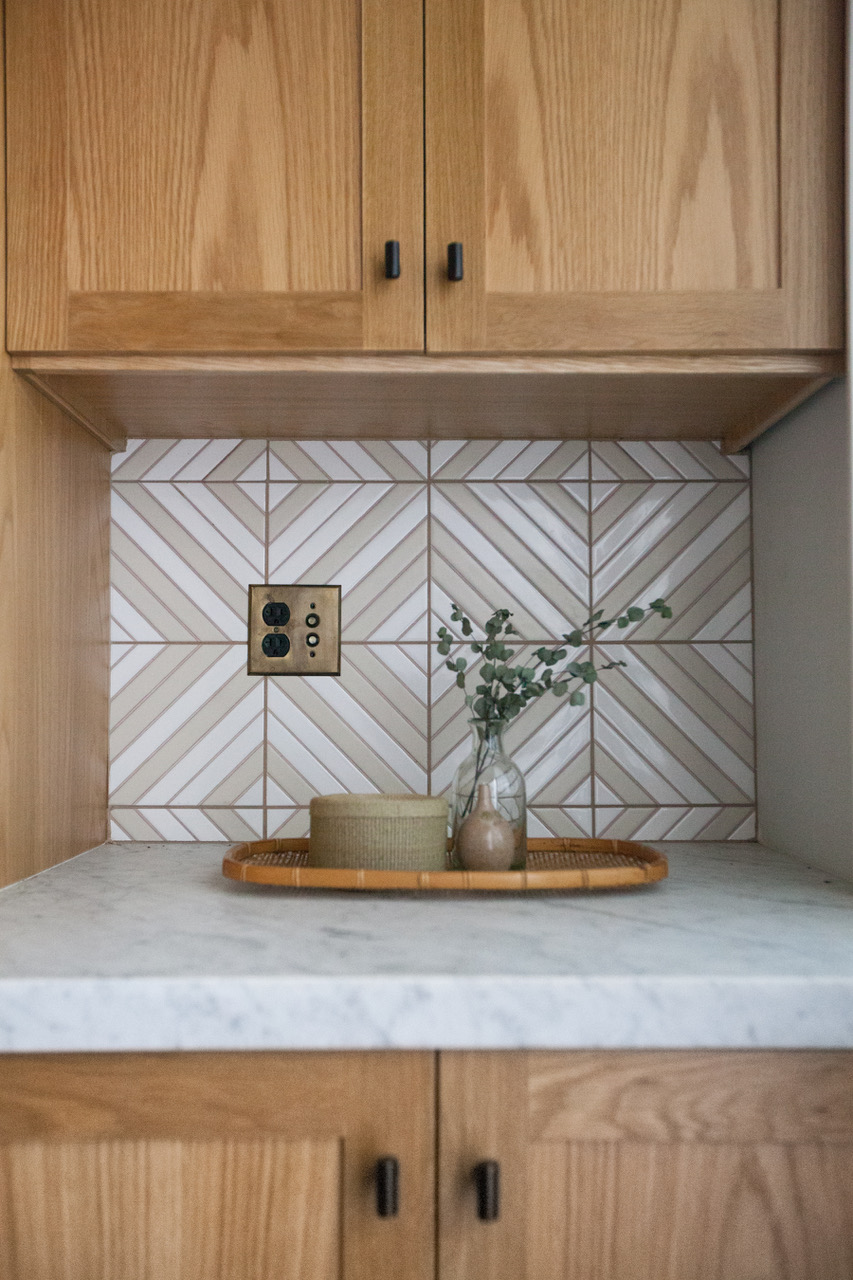
If you've been wondering how to tile a backsplash, the above layout could be a good example.
"This space was in need of a thorough blend of old and new, of traditional and modern," says Jonathan Taylor, lead designer at Taylor + Taylor. "We found this handmade tile from Fireclay that allowed us to specify colors and had no order minimum, which allowed us to vary the pattern in a gentle manner."
6. Choose pretty patterns on the tiles
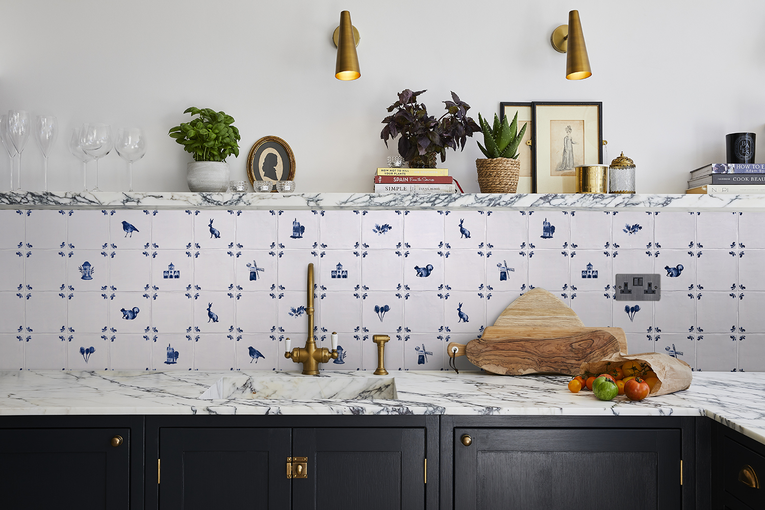
If you're looking to elevate the cookroom, consider adding dainty patterns on tiles that can soften the inevitable hard corners of the countertop and kitchen storage.
"The shapes and colors you choose can make all the difference in turning a room into a place of rest and respite," says designer Minnie Kemp, a big fan of decorative kitchen tiles herself. She favors those made by Wayne Pate in collaboration with bathroom brand Balineum, which also works in kitchens. "For something a little more graphic, they are enduring classics," she says.
7. Use tonal variation
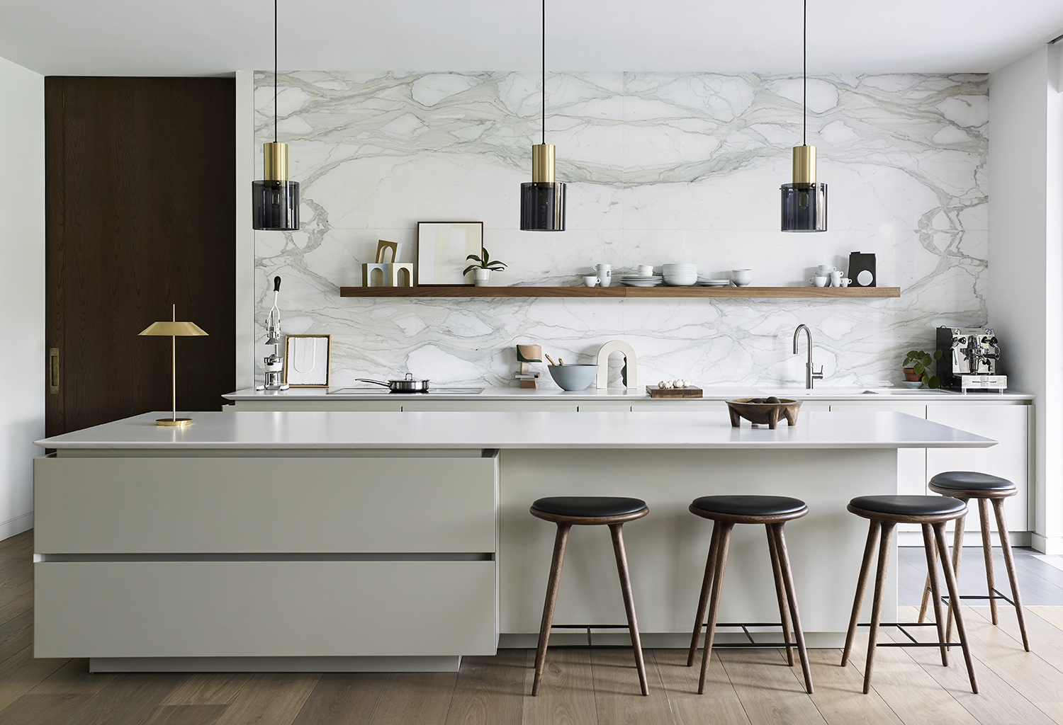
"The star of the show in this kitchen is undoubtedly the backsplash," says Ben Hawkswell of Roundhouse Design. "Early on in the project the owners knew they wanted an amazing stone feature and chose the striking Calacatta marble from a quarry in Italy. The base stone is a very crisp white, similar to the countertops, with marble veining that complements color tones in the pale grey cabinetry. We worked with a specialist marble fabricator to achieve the amazing four-piece book-matching pattern that’s centred perfectly on the wall."
He adds that the subtleties in shift of tone are what stops this kitchen seeming uninteresting. "Tonal variation is key," Ben says. "A total white-out will look flat and bland, but having a matt lacquer on the cabinets and a polish on the backsplash adds a real layer of interest."
8. Paint the backsplash

Wrapping your kitchen in color is a true way to make a design statement, and what better way than to use terracotta, one of the biggest current kitchen trends?
"A hugely versatile color for the kitchen, terracotta is warming and helps create a welcoming environment," says the designer Kelly Wearstler. Here, the cabinets are matched with the backsplash and the ceiling for a look that is truly modern. "I also like to pair it with complementary shades like dusky pink or cerulean blue," Kelly adds. "Or to create a tonal look with it against a backdrop of muted white and cream tones."
9. Contrast your kitchen backsplash with hardware
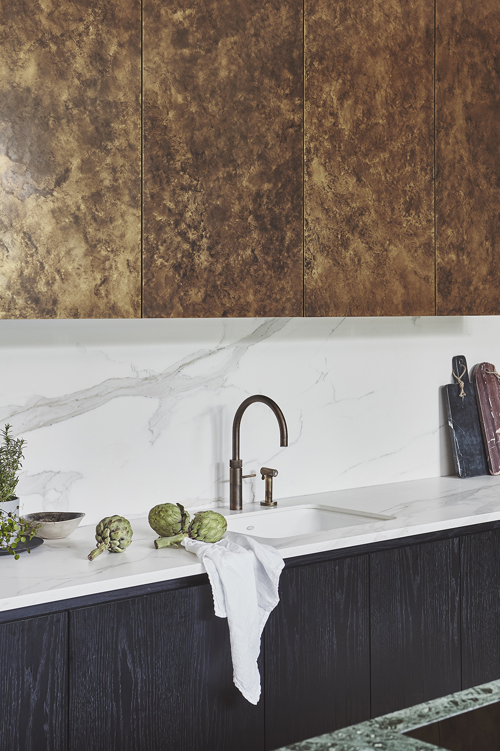
In this kitchen, the aged brass finish of the boiling water faucet is beautifully contrasted with the creamy stone of the backsplash. "The contrast between this vintage, patinated finish and the crisp Neolith sintered stone behind is particularly striking," says Annie Ebenston, lead designer at Blakes London. "The sink, in crisp white enameled cast iron, flows seamlessly with the pale surfaces."
By opting for a pale backsplash, the arch of the tap is able to truly stand out and be a star in its own right.
10. Style your backsplash unexpectedly
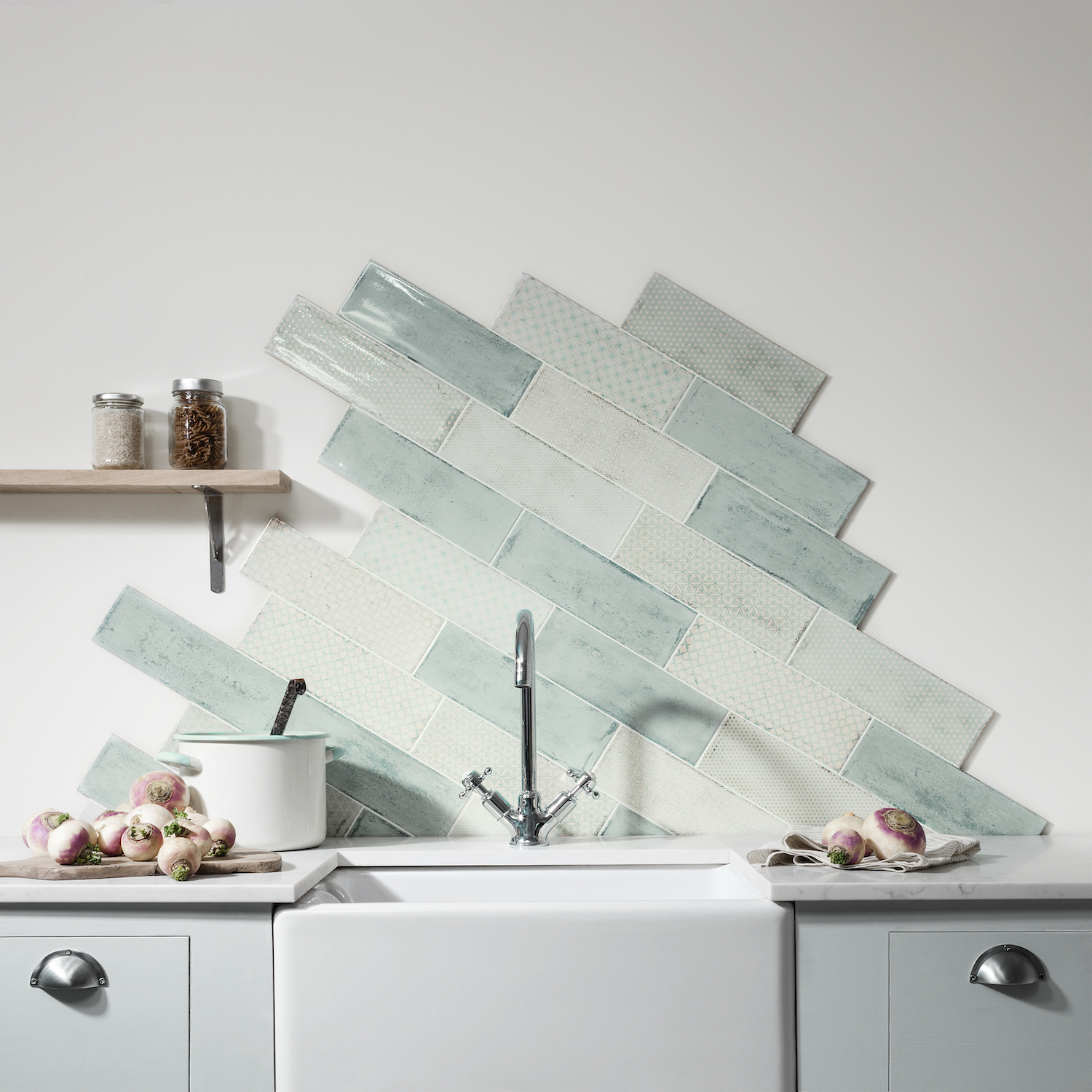
Zig-zag tiles are a big bathroom trend, and they're making their way over to kitchens, too. They feel more elevated than the classic subway placement of straight lines and blocks — subway tiles mostly seem out of style now — and are a lot jauntier and just generally more dynamic.
"A unique placement of your tiles can really draw the eye and make a statement," says Amanda Telford of CTD Tiles. Indeed, spend time playing around with different formations and it’s surprising how many different looks you can create with the same tile. "From vertical to herringbone, you can be really creative with rectangular tiles in a way that’ll really create a beautiful focal point in your kitchen," she adds.
11. Clash colors boldly
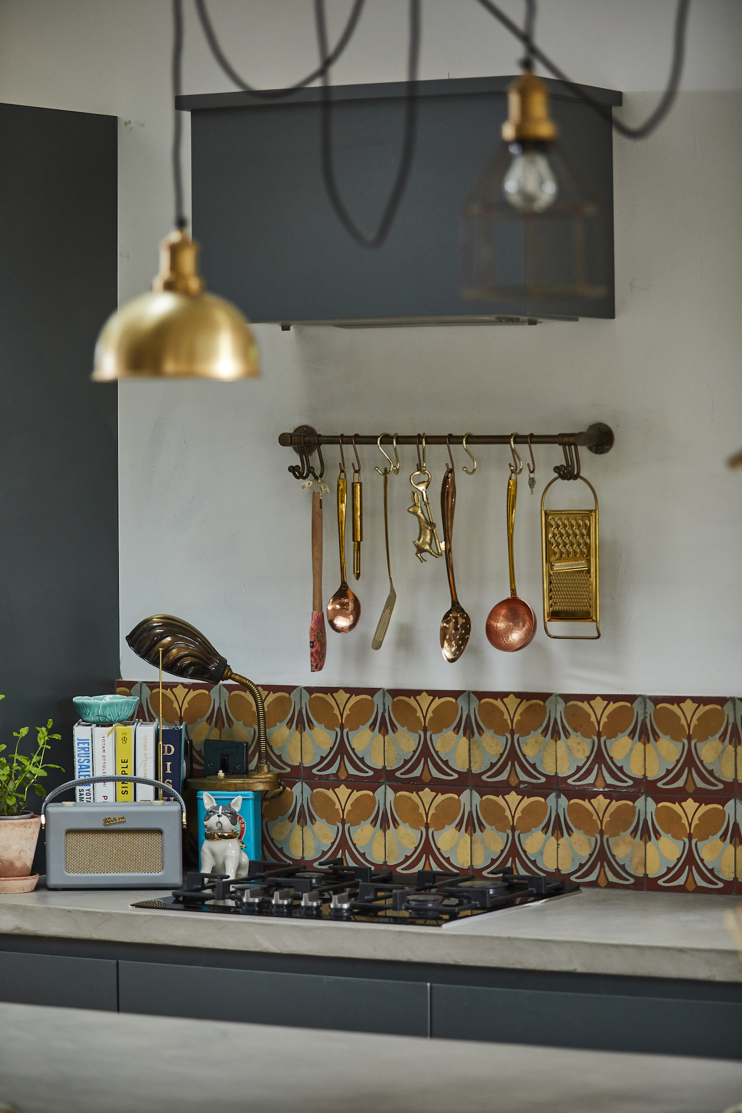
When you're planning a kitchen update, it's important to think about the room's longevity. A modern kitchen backsplash lasts a long time, therefore it's key to make it as versatile as possible so you can update it as your tastes evolve.
"If you opt for a backsplash with multiple colors or shades in it, you can change the look of the room later by matching accessories to one of the shades for a refresh," says Emma Britton, Decorative Glass Designer. "Think about the backsplash as part of the interior scheme with all the colors working together. If there’s one color or tone dominant in the room, it will draw the eye to that shade in the backsplash too."
12. Pick a hardwearing material
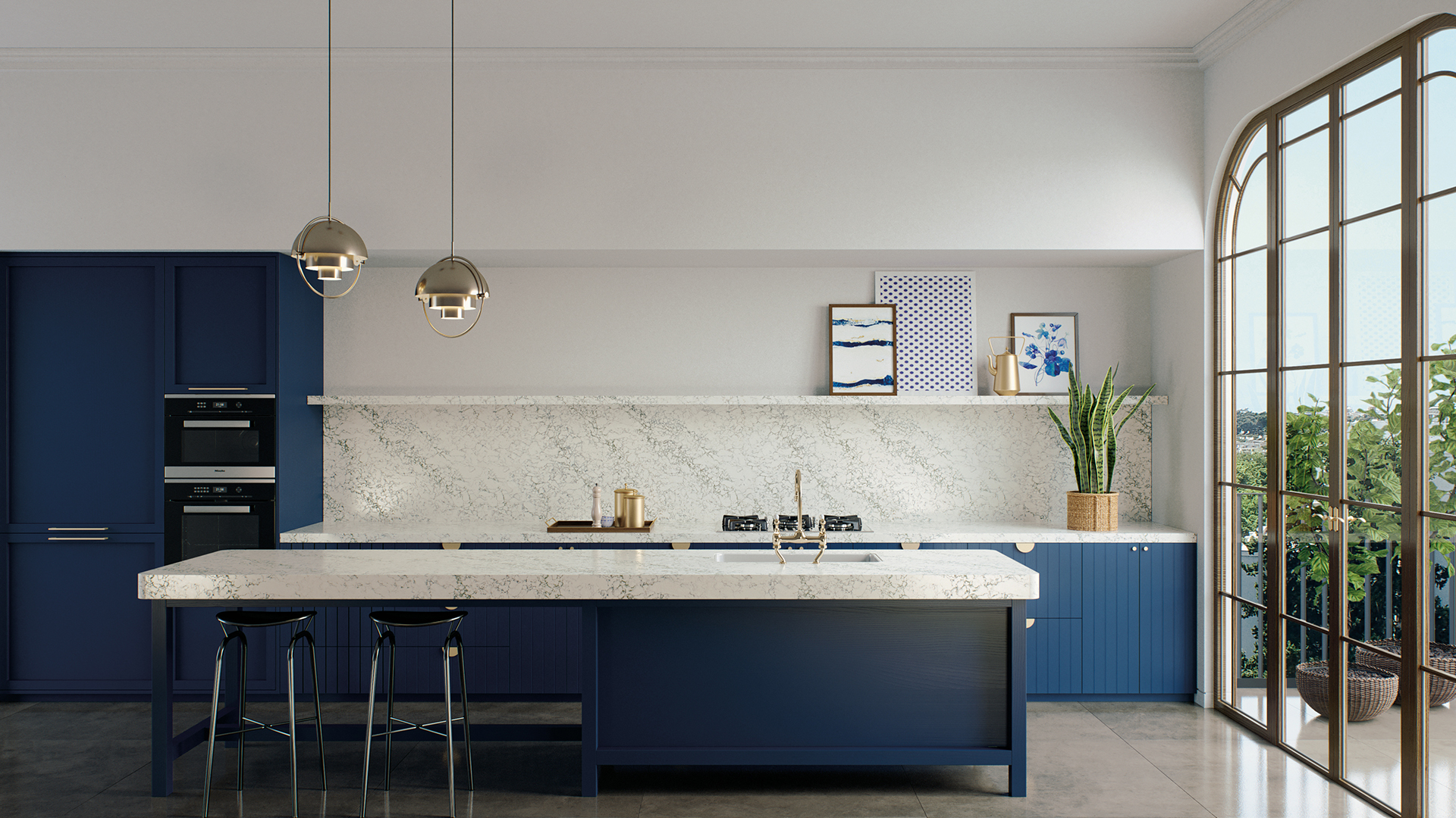
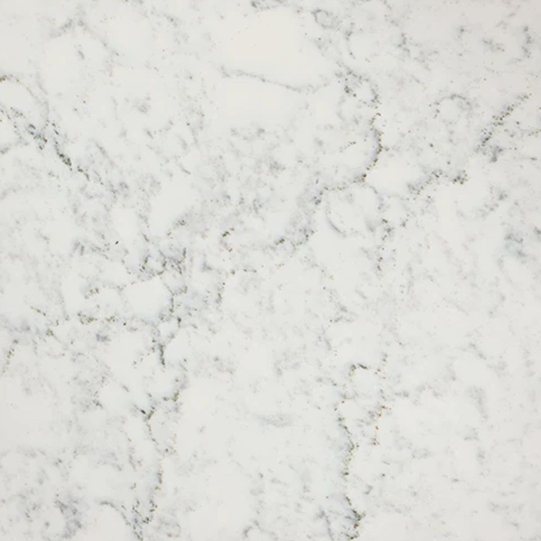
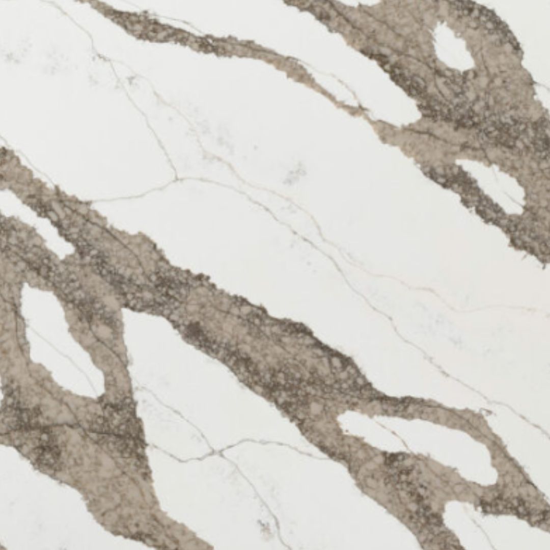
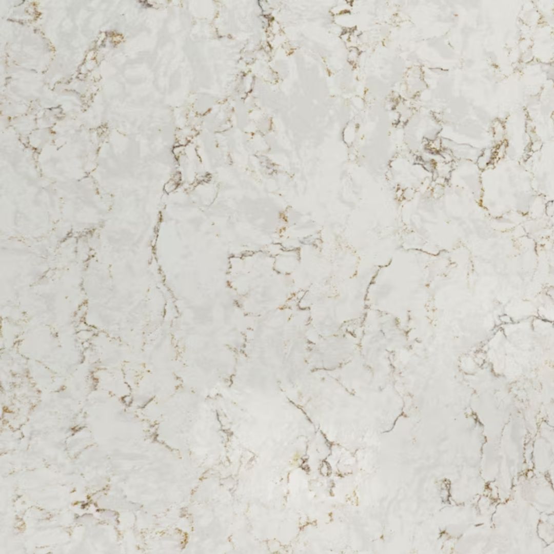
Caesarstone's Whitelight Collection
"While the vertical surface is going to be less at risk of staining than the countertop, if you're the sort of person who worries about every scratch then you may prefer a composite like Caesarstone," says Hayley Robson of Day True. "It has the beautiful color and veining of marble, but is more durable."
Materials like marble, quartz or granite are great for your kitchen countertops and look good behind gas hobs where a naked flame could damage a surface over time.
13. Consider a statement tile
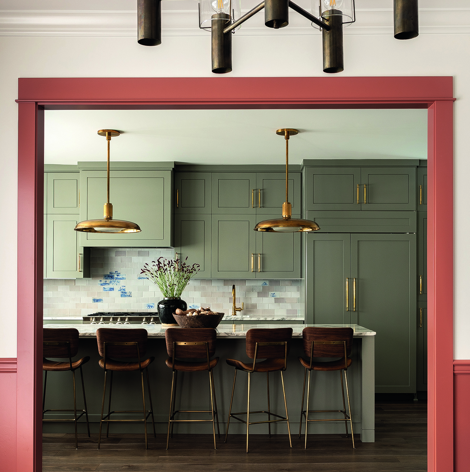
Design by Heidi Caillier
The tiles Heidi Callier used for her kitchen backsplash ideas run across a few colors in the beige spectrum, until you get to a patch of blue above the sink, like the sky bursting through the clouds. It's an innovative approach, like creating a patchwork quilt but with tiles, and is distinct to you and unique, and can help add hits of brightness to your kitchen.
"Warm colors not only create a welcoming atmosphere but are effectively deep neutrals," Heidi says of her green kitchen. "They form the perfect backdrop for whatever table setup you design."
14. Take the tiles to the ceiling
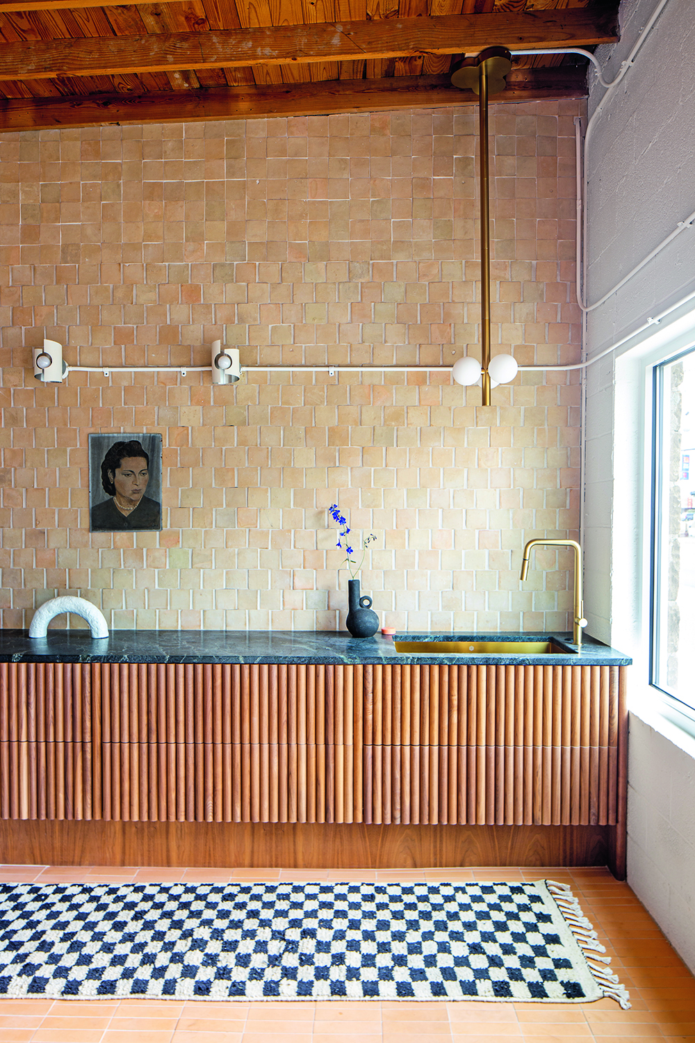
Design by KLH
Whoever said the backsplash had to be compact? If you've found a tile you love enough to want to live with it, why not take it all the way up to the top? This look is a commitment, but really plays into the height of a room, emphasizing the use of space and stopping your eye from seeing shortening lines across the wall.
Here, because the Zeillige tiles are handmade and naturally finished, they have a roughness to them that is very beguiling, creating texture and shadow play as they climb the wall.
15. Use the backsplash as a shelf
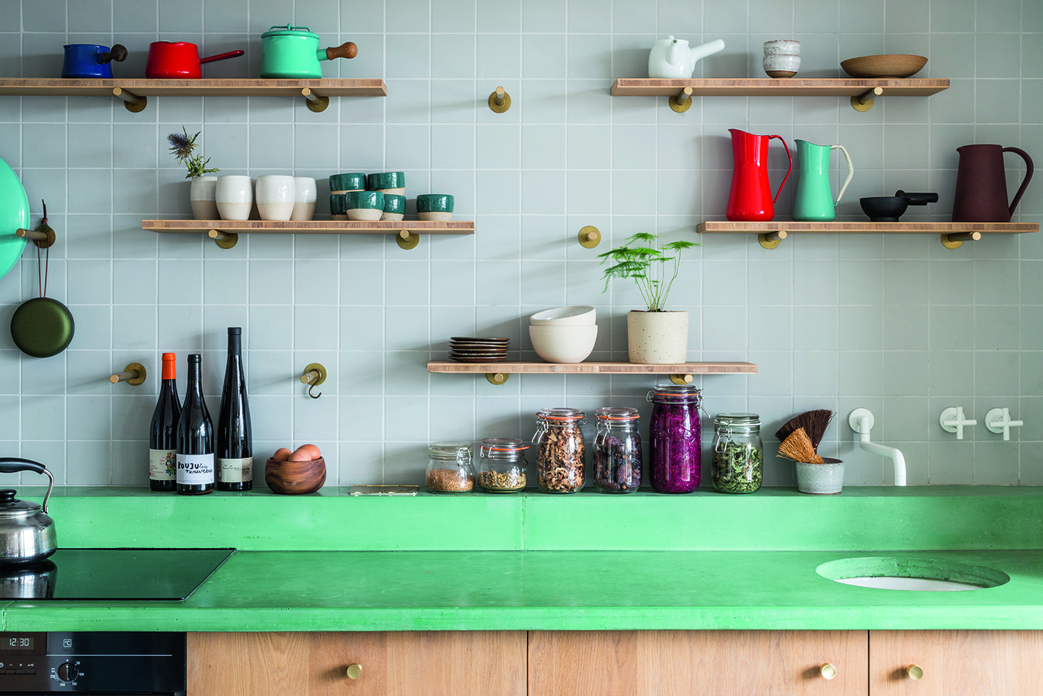
Design by Studio Ben Allen
Architect Ben Allen used colored concrete tinted with oxidised copper to create this hardwearing alternative countertop in his own kitchen. Cleverly, it climbs the wall and creates a little shelf on which to store bottles and ingredients.
Concrete was an inspired choice by Ben, made for its hardwearing durability. "Things like melamine may be more affordable, but once the surface gets damaged, it looks terrible," Ben says. "You then start to feel worse about your surrounding, stop taking care of them, lose pride in your home which can have a negative effect on you."
16. Go for countersplashes
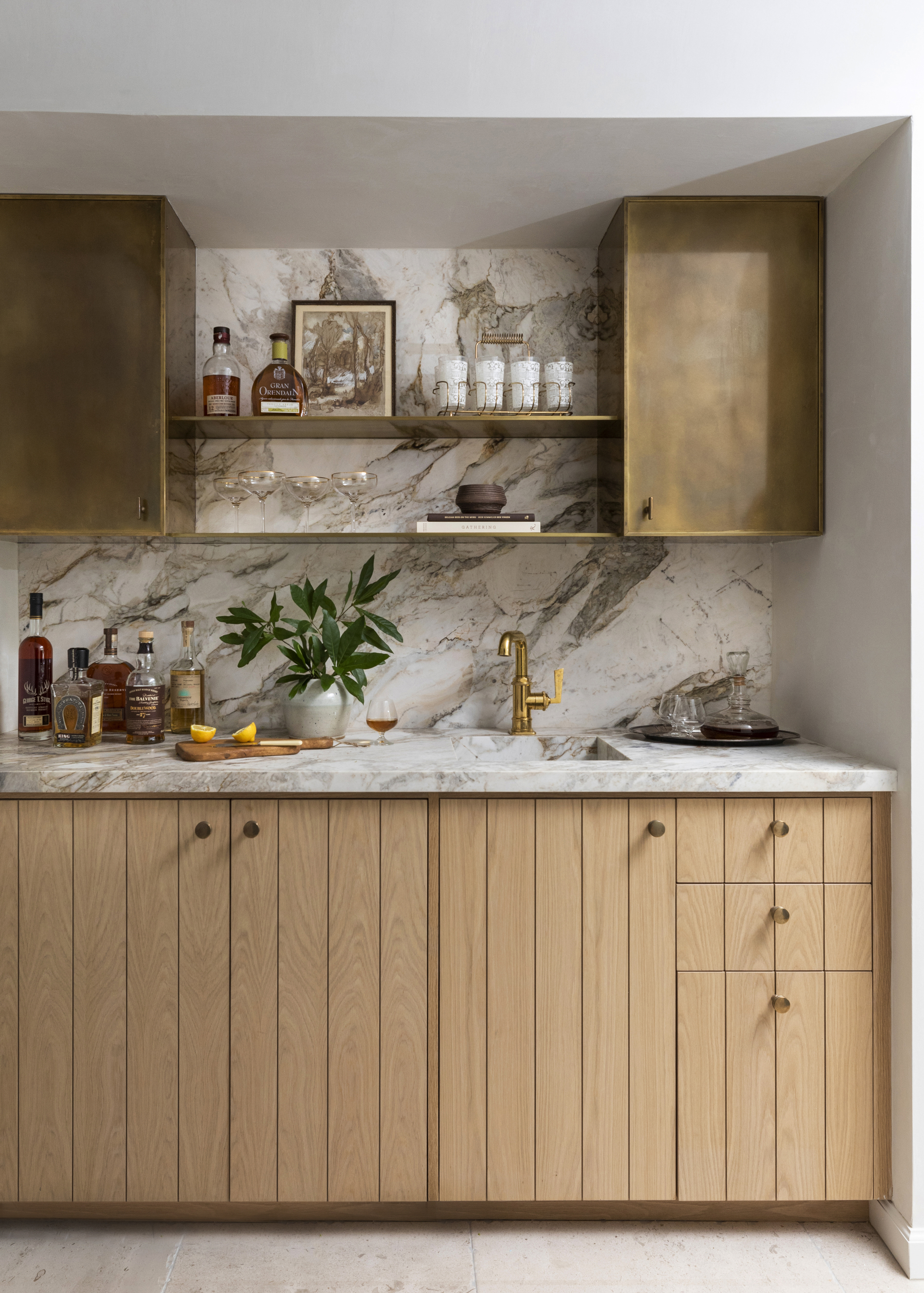
Another enduring style is blurring the boundary between the countertop and the kitchen backsplash. We're calling it the countersplash — where both are made of the same material to create a seamless look that brings a minimalist kitchen vibe and feels harmonious.
"Running the same countertop material up the walls is another technique that will stand the test of time," says interior designer, Kristina Phillips. "I advise my clients to pay attention to the different types of finishes and materials being used, as congruency is always paramount in good design."
It's a look we don't see going anywhere soon. If you want to bring a bit more of a 'trend' feel to your kitchen, add a chef's shelf where your backsplash ends. This can be a great place to display your more aesthetic kitchen essentials like copper pots and pans, chopping boards, or even a few pots for a mini herb garden.
17. Inject a wow-factor with heavily-veined marble
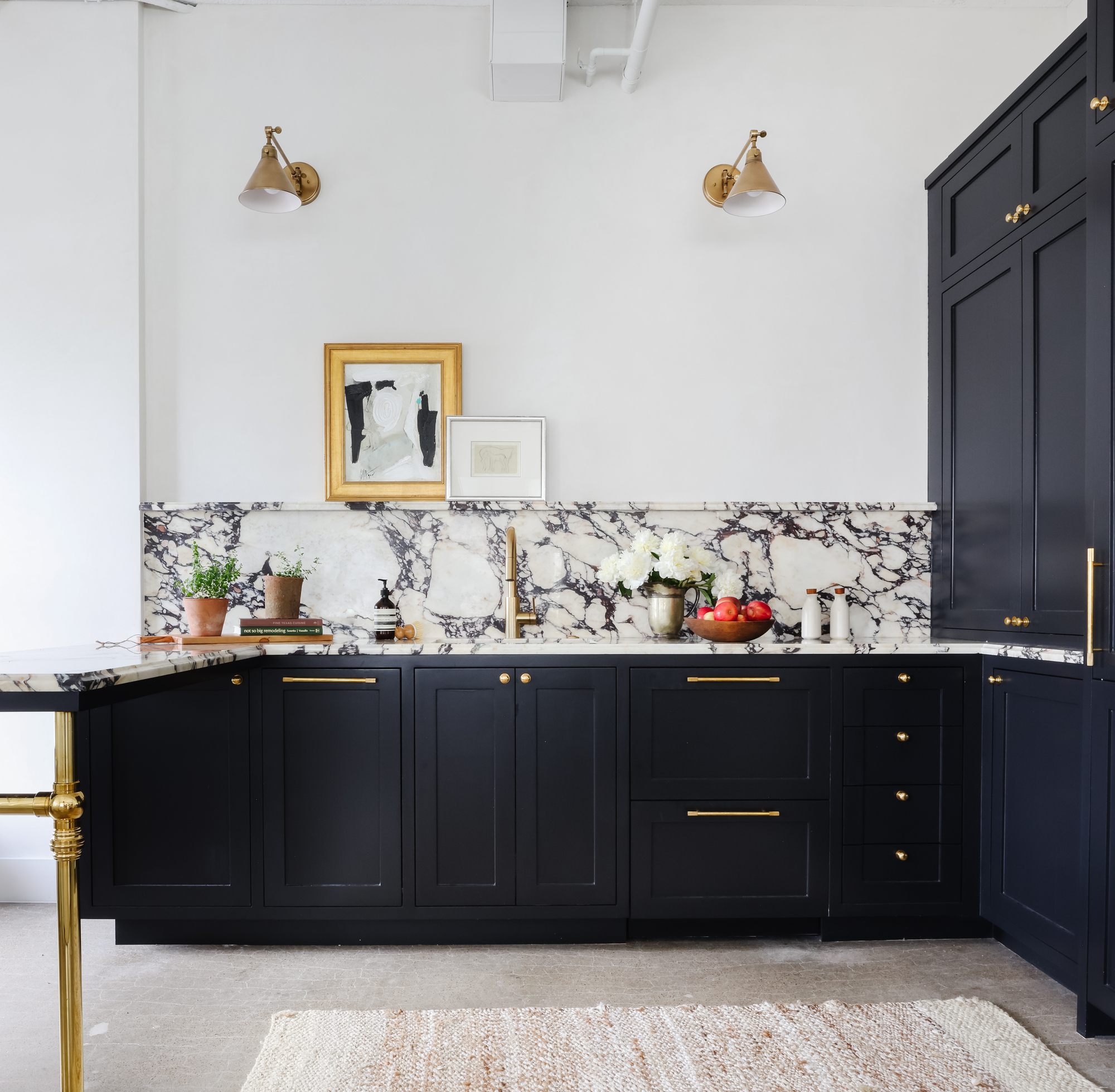
Undoubtedly, natural stone is one of the most popular kitchen backsplash ideas, and its popularity doesn't seem to be waning. Granite, marble, and quartz (an engineered stone made out of stone chips, resins, and pigment) are enduringly stylish, easy to clean, and incredibly durable — they also have a luxurious look that creates a high-end kitchen.
"White or neutral-toned natural stone in heavy veining is the way to go for a timeless look," says Deborah Buelow of Cedar Architecture. "Also choosing simple geometries like rectangles and squares allows the backsplash to be a beautiful backdrop to other kitchen elements that are easier to change out."
"Incorporating the timeless allure of natural materials, such as marble and quartzite, elevates backsplash to ensure gorgeous aesthetics and material longevity," says interior designer Marie Flanigan. "The delicate veining of marble kitchens is always elegant and can seamlessly blend with various design palettes should the style of the kitchen change. Meanwhile, granite is reliably strong and can be worked into various styles or colors."
Quartzite is another material that is made from sandstone and is the perfect choice for a kitchen made to last. "Quartzite, with its robust durability and distinctive textures, is a testament to enduring style, as it also outlasts fleeting trends," says Marie. "Natural stone options are a stunning nod to nature and, as we know, nature never goes out of style."
One downside with natural stone is that they might be a little on the expensive side. Consider what your budget is when it comes to your backsplash. Something natural will be more expensive, but there are other look-a-like options out there that might be a bit more budget-friendly.
18. Add a restaurant-like vibe with stainless steel
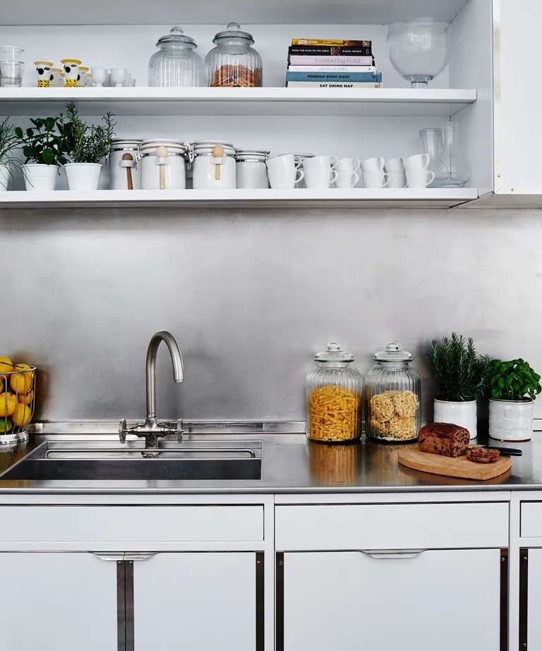
We've noticed a real upward spike in stainless steel kitchens since we first reported on the trend; it seems that it's here to stay and with good reason. With the look and feel of a professional chef's kitchen, it feels luxe and high-end and can help a kitchen feel both modern and classic.
Practically, stainless steel is durable and hygienic — both fantastic qualities for a lasting kitchen. It's hard-wearing and durable, withstanding the rigors of daily use. It can also withstand high temperatures, so you don't need to worry about a hot pan damaging or marking your backsplash. Finally, stainless steel is a budget-friendly option. It brings the sheen of chrome but without the hefty price tag.
Should a backsplash be the same color as the countertop?
One of the most straight-forward kitchen backsplash ideas is to create an extension of your countertop, using the same color and material for both. This creates the appearance of a seamless design, and being the same hard-wearing material as your chosen counter makes it a very practical option for busy kitchens, too. Granite, quartz or made-to-measure engineered countertops such as Corian would work well.
Can a backsplash make my kitchen feel bigger?
Mirrored surfaces help to reflect light around a room and make the space feel bigger, which can be particularly useful in a small kitchen. If you want to ensure a mirrored backsplash blends in with your kitchen, opt for a tinted finish that will complement your countertop and cabinetry.
Is brass good for backsplash?
Metallics have become a popular choice in kitchen design, and they won’t be going away any time soon. While one of the more unusual kitchen backsplash ideas, pure brass and copper surfaces hold antimicrobial properties, which make them a great choice for a working kitchen. Note, however, that they are like flooring and will require polishing and will develop a natural patina over time.
Be The First To Know
The Livingetc newsletters are your inside source for what’s shaping interiors now - and what’s next. Discover trend forecasts, smart style ideas, and curated shopping inspiration that brings design to life. Subscribe today and stay ahead of the curve.

Aditi Sharma Maheshwari started her career at The Address (The Times of India), a tabloid on interiors and art. She wrote profiles of Indian artists, designers, and architects, and covered inspiring houses and commercial properties. After four years, she moved to ELLE DECOR as a senior features writer, where she contributed to the magazine and website, and also worked alongside the events team on India Design ID — the brand’s 10-day, annual design show. She wrote across topics: from designer interviews, and house tours, to new product launches, shopping pages, and reviews. After three years, she was hired as the senior editor at Houzz. The website content focused on practical advice on decorating the home and making design feel more approachable. She created fresh series on budget buys, design hacks, and DIYs, all backed with expert advice. Equipped with sizable knowledge of the industry and with a good network, she moved to Architectural Digest (Conde Nast) as the digital editor. The publication's focus was on high-end design, and her content highlighted A-listers, starchitects, and high-concept products, all customized for an audience that loves and invests in luxury. After a two-year stint, she moved to the UK and was hired at Livingetc as a design editor. She now freelances for a variety of interiors publications.
- Yvette MurrellContributor
-
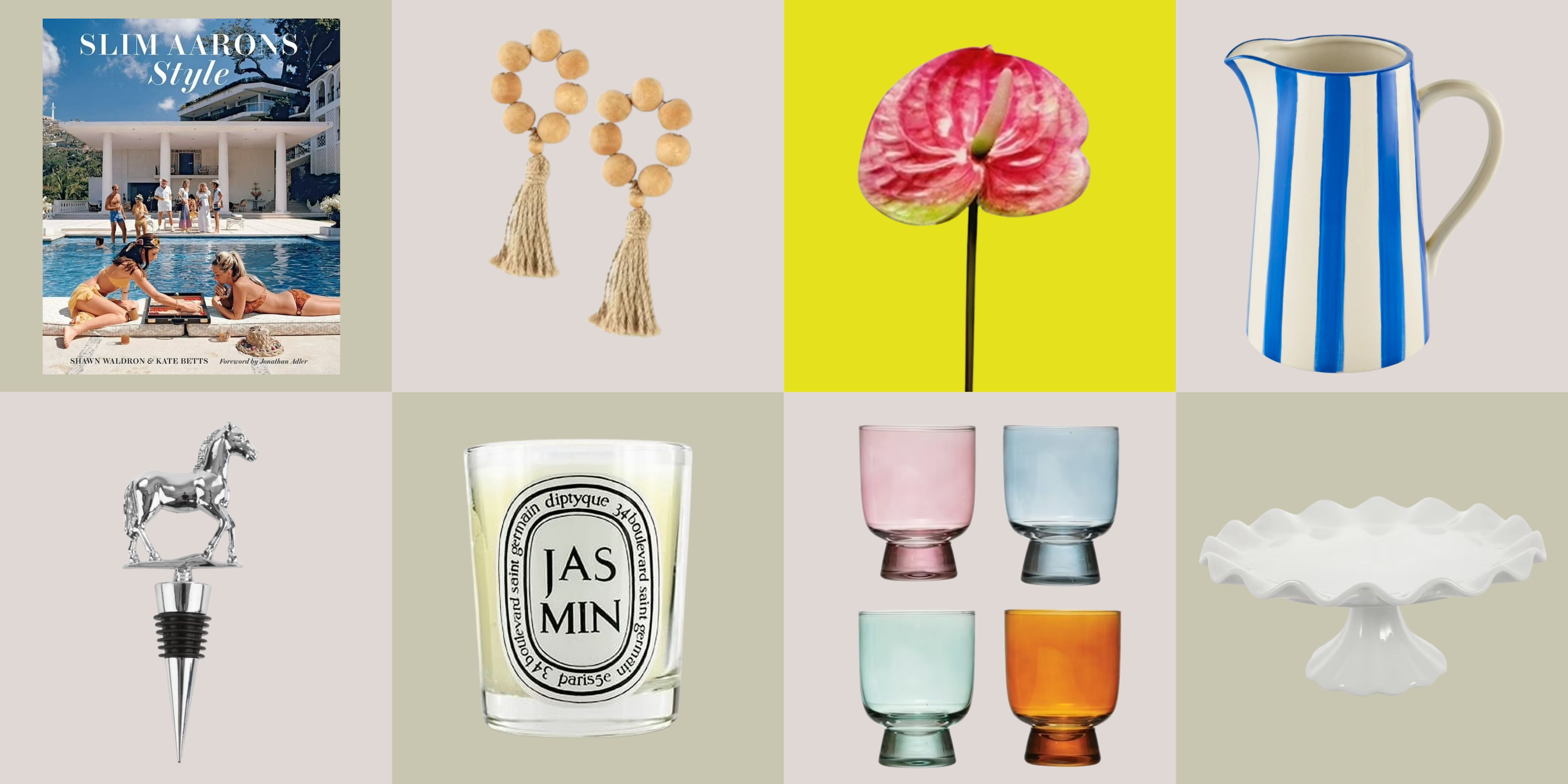 12 Essentials Every Cool, Collected Spring Host Needs — And You’ll Never Guess Where They’re From
Guests will think you thought of everything, you just knew where to shop
By Julia Demer Published
-
 Smeg Says Teal, and We’re Listening — The Kitchen Shade of the Year Is Here
Designers are already using the soft, sea-glass green everywhere from cabinetry to countertops
By Julia Demer Published
-
 Smeg Says Teal, and We’re Listening — The Kitchen Shade of the Year Is Here
Designers are already using the soft, sea-glass green everywhere from cabinetry to countertops
By Julia Demer Published
-
 5 Problems With Boiling Water Taps That No One Ever Talks About — And How to Troubleshoot Them
We got our experts to spill the beans on the truth behind these kitchen staples
By Maya Glantz Published
-
 Does a Kitchen Need to Have a Door? The Pros and Cons (and Regulations) Explained
As popular as open-plan kitchens may be, they aren't for everyone. Our experts break down all the pros and cons of this design style.
By Maya Glantz Published
-
 11 Kitchen Flooring Ideas to Build a Brilliant Renovation Scheme From the Ground Up
Starting with your kitchen's flooring isn't a bad idea when it comes to creating a successful scheme — here are 11 modern ways to do it, and expert advice from interior designers
By Tessa Pearson Published
-
 "I Just Bought a Stand Mixer — Where Can I Store It in My Small Kitchen?" 6 Clever Storage Ideas to Consider
Love your stand mixer, but hate not knowing how to store it? We've got the same problem, but these six expert tips have solved our limited storage problems for good.
By Amiya Baratan Published
-
 Bar Stools vs Counter Stools — The Difference You Need to Know to Avoid Buying the Wrong One for Your Kitchen
You might think they're the same thing, but bar stools and counter stools are subtly different, and knowing how will help you avoid buying the wrong ones
By Maya Glantz Published
-
 10 Kitchen Tap Ideas That Will Upgrade Your Sink — Who'd Have Thought Doing the Dishes Could Look This Good?
From pot fillers to pull-out hoses, these are the kitchen taps that the experts are lusting over right now…
By Lara Sargent Published
-
 16 Kitchen Island Ideas That Feel Pitch Perfect for 2025 Projects
Who would have thought there would be so much inspiration to choose from? Experts share their stylish and most inspiring ideas for kitchen islands
By Faiza Saqib Published
