Kitchen wallpaper ideas – how to add instant color and pattern to your kitchen
These kitchen wallpaper ideas are sure to inspire you to give your space a quick and easy refresh that you can DIY in just a weekend
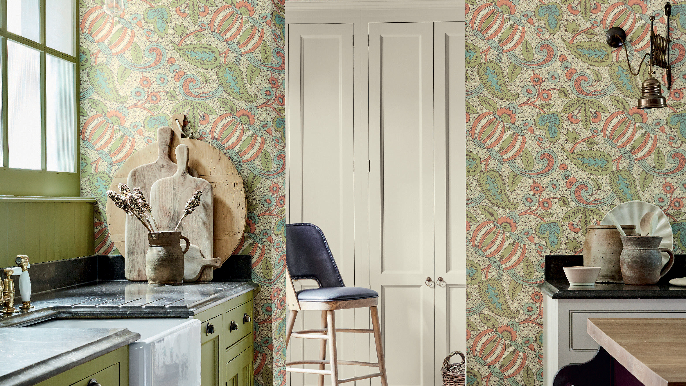

Kitchen wallpaper ideas are having a bit of a moment. While wallpaper was one reserved to softer living areas like sitting rooms and bedrooms, they are now perfectly at home in more practical space. We believe the resurgence of kitchen wallpapers is all linked to that trend to make kitchens feel less like kitchens – we have previously treated kitchen design so differently from say, living room design, with soft furnishing and wall coverings being deemed as impractical.
However, the unkitcheny kitchen is a coveted look for 2022, and bringing in wallpaper is a really easy way to update your current space and embrace this more decorative kitchen trend.
'Kitchens are seeing a revival and seeing new energy when it comes to wallpaper, converting lackluster walls into beautiful masterpieces.' explains Lead Colour Specialist at Lick, Sam Bramley. 'Choose your wallpaper from the heart and consider the color palette within your cabinetry, fixture, and fittings to max out on the best outcome and longevity of its stay. Just remember wallpapers are wanting to be seen, noticed, and admired, so choose with feeling, is it energy, do I want calm, mellow neutrals or colorful dramas that provoke smiles.'
We've pulled together all our favorite kitchen ideas that prove wallpaper can work, and there's something for every shape, size and style...
The best kitchen wallpaper ideas for every style
1. Ditch the feature wall
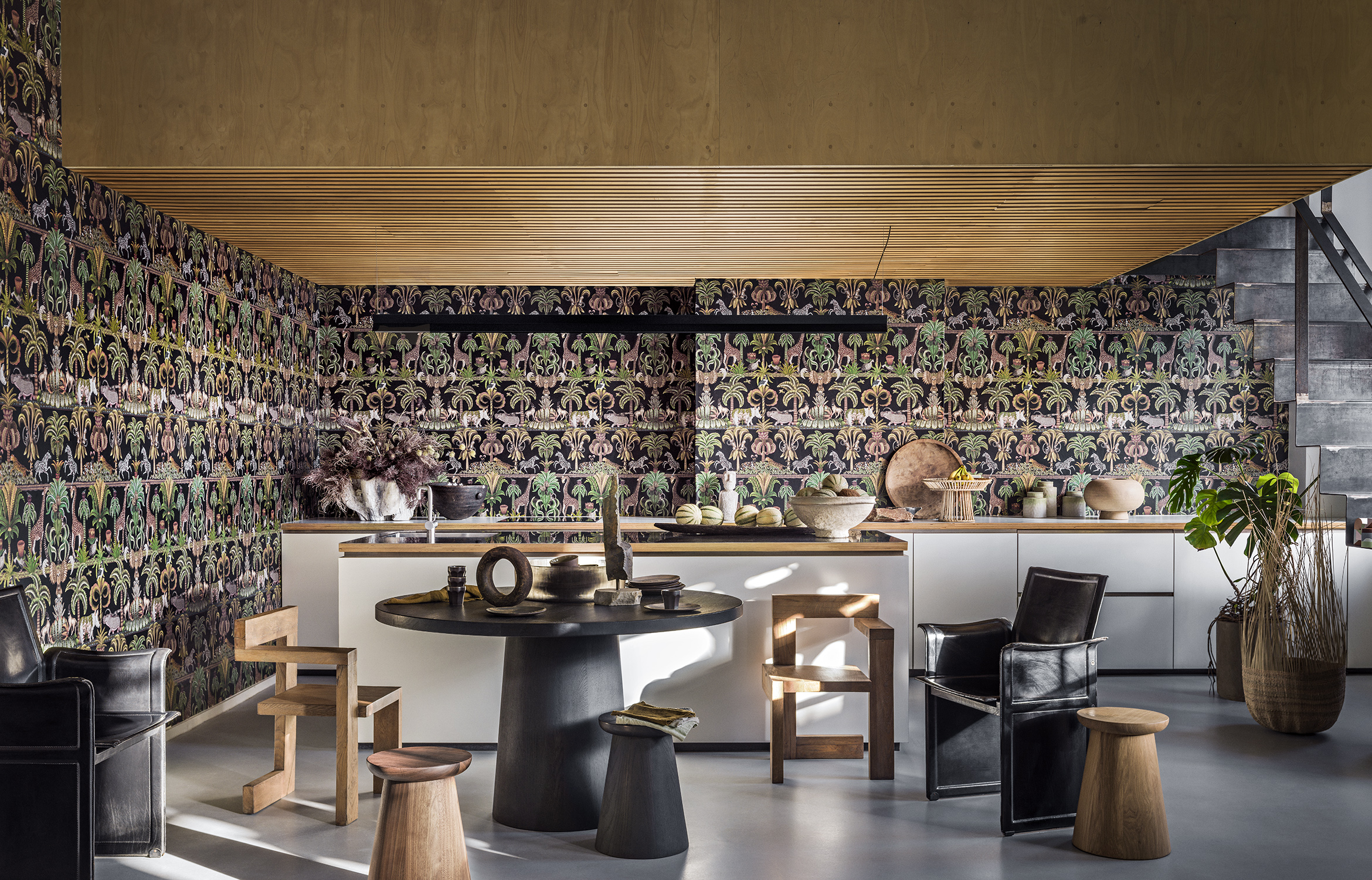
Now there are going to be some feature walls in this gallery, when it comes to wallpaper everyone still loves a feature wall. But personally, we are always of the opinion if you are going to commit to a look, really commit. So if your kitchen can handle it, take wallpaper across every wall to create maximum impact.
This look works especially well if you are forgone wall cabinets, so the pattern can be the real focus and there's no extra visually clutter going on at eye-level. And you can balance out the wallpaper so it feels less maximalist by pairing it with really simple kitchen cabinetry. See how in this space, the really bold Cole & Son wallpaper doesn't overwhelm the space because the clean lines and neutral color palette of the rest of the space counteract the busy print.
2. Use wallpaper to distract from small dimensions
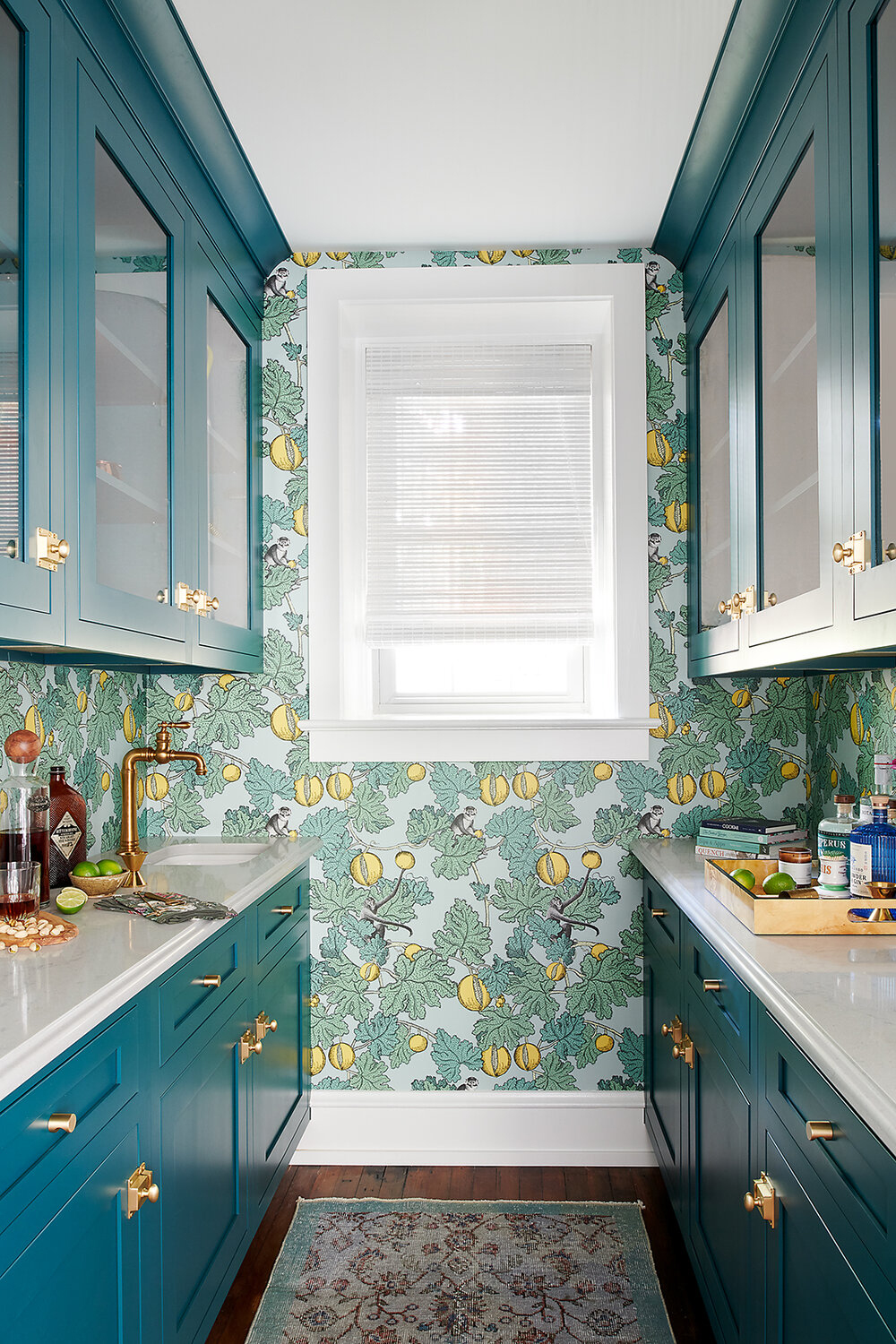
Small spaces so often get treated as if they can't handle anything other than neutral light colors and the subtlest of patterns, however, as this small kitchen designed by Michelle Gage proves, sometimes it pays off to break the rules.
'This space features custom teal cabinetry, at a non-standard size to ensure that it fits in this tight room. This bold color is the perfect complement to the wild wallpaper. This Cole&Son style features yellow pomegranates and funky monkeys – making it a memorable space to mix a drink or two!' explains Michelle.
Using bold prints such as this in smaller rooms can be equally as 'space expanding; as lighter shades, the pattern blurs the edges of the room, making a small kitchen feel bigger in an instant.
3. Use wallpaper to give a kitchen rustic charm
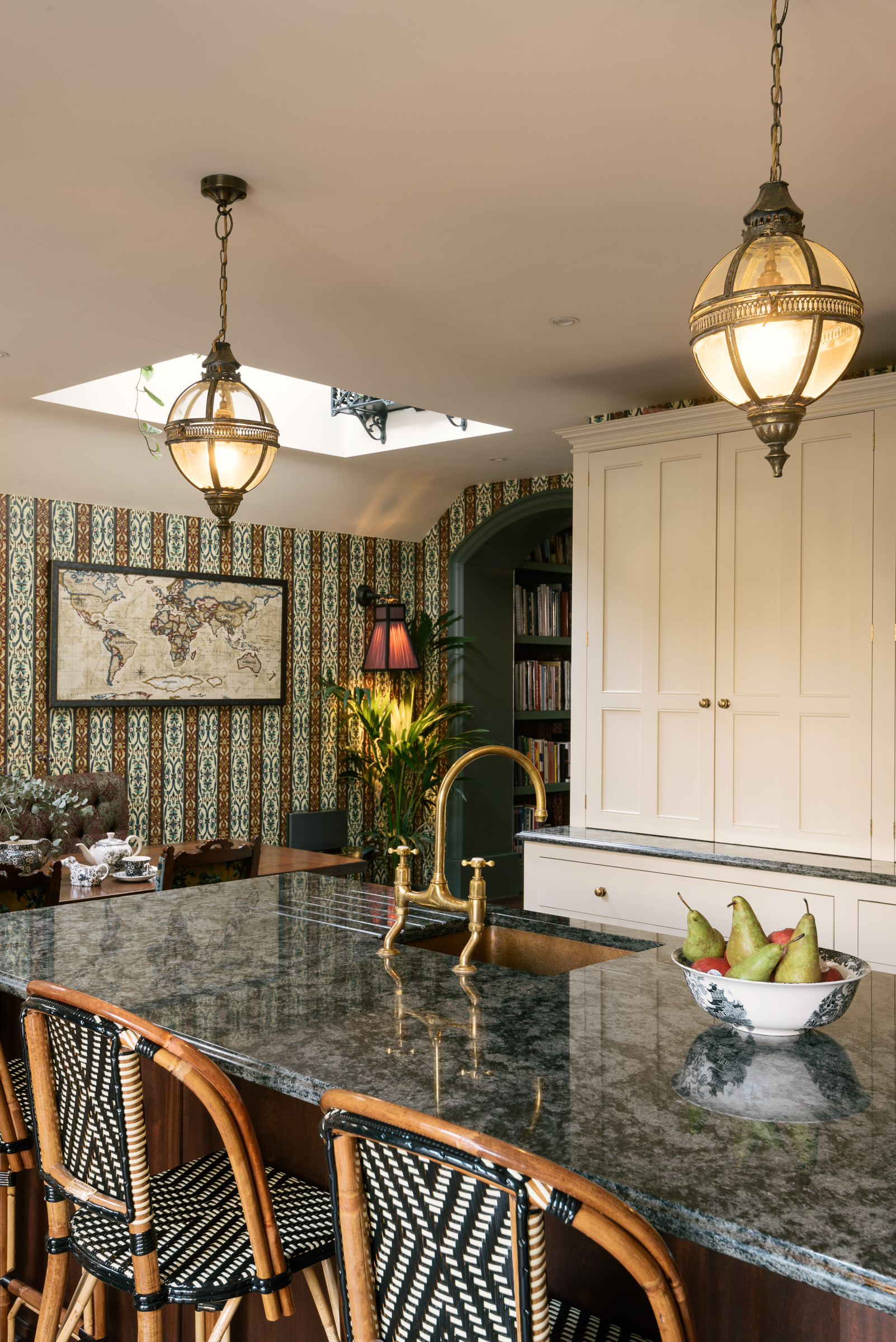
What's lovely about a kitchen wallpaper it's a really easy way to blend styles and add a tone of character to a room. It again links back to this kitchen trend of making these spaces feel more comfortable and comforting.
As Helen Parker, deVOL'sCreative Director explains. 'The kitchen has become even more important than ever over the past year, we are noticing more and more people wanting to add vintage pieces, worn comfy sofas or soft velvet armchairs to make the room feel a little less utilitarian and more lived-in Big tables, low lighting, subtle warm colors and a sense of being cosseted by familiar and beautiful things. Tapestry cushions, faded velvets, vintage lighting and layering of fabrics and wallpapers. It's definitely less of the gadgets and more of the real-life comforts.'
She adds that 'Wallpaper has made a massive comeback and textured wallpapers too. It's a great way to add texture, color, and pattern to large areas of a room.'
5. Allude to height by adding pattern above eye level
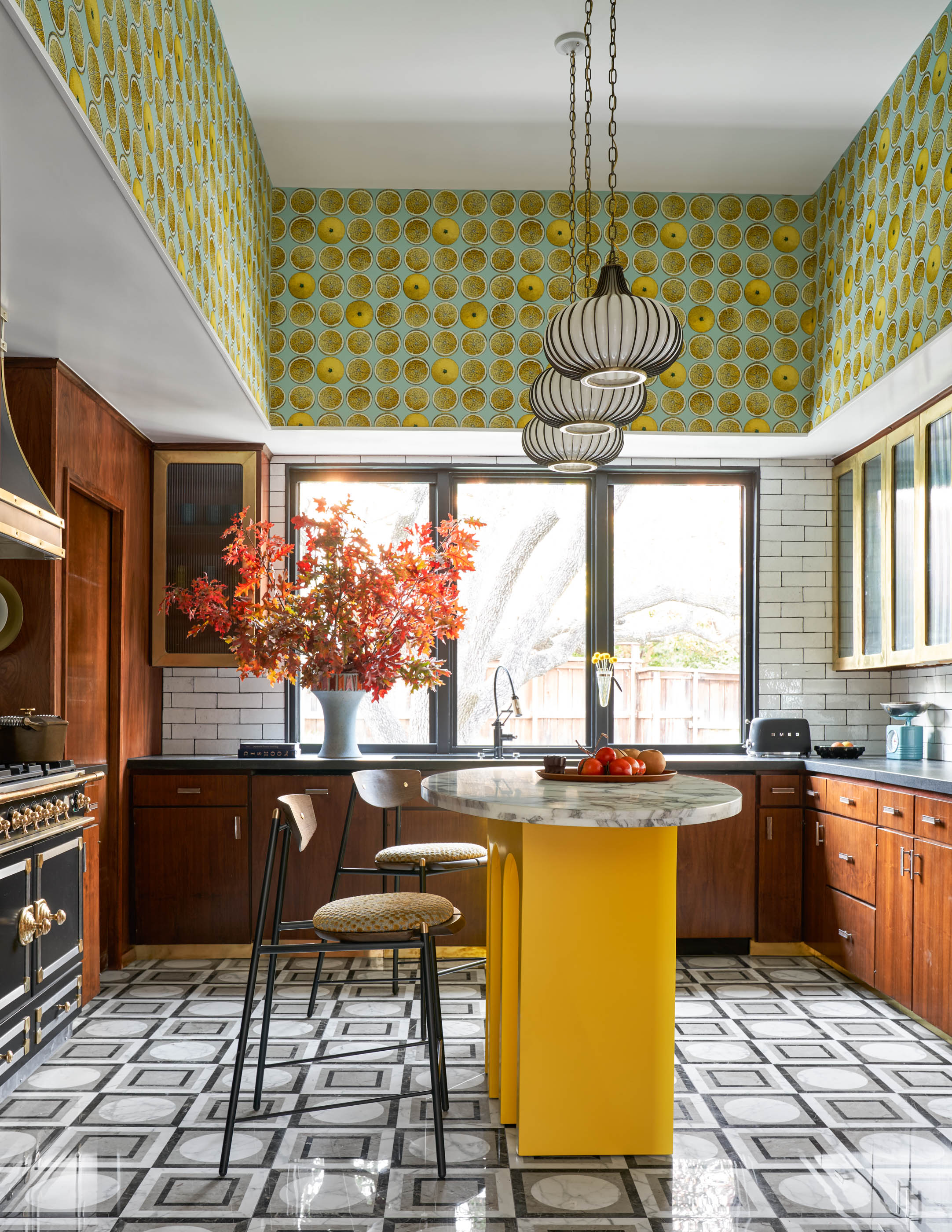
This is such a clever trick for making a small kitchen look bigger, having wallpaper hung above eye level. One, it stops anything feeling too busy as all the pattern is going on away from the main space, and two, it draws the eye upwards making the room feel loftier and airy.
Be inspired by the space designed by Maestri Studio and add a hit of pattern above your wall cabinets. The whole space has a charming 70s cafe vibe, with the retro tiles and curves, plus the warm wooden cabinetry gives almost a mid-century edge. The lemon print wallpaper brings a freshness into the room and creates a more with the yellow kitchen island.
'I had saved and loved this wallpaper for a long time, but never had a spot for it. I wanted it to feel like a 1970s kitchen, so a lot of pattern on pattern and bold color. I went through retro kitchen books to get inspiration and see what would've been done in the '70s, and then put a modern twist on it.' explains Eddie Maestri, Principal Architect, Creative Director, and Owner of Maestri Studio.
6. Consider the practicalities of kitchen wallpaper
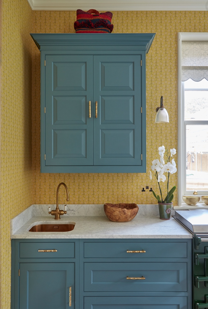
There are practicalities to consider when hanging kitchen wallpaper. By their very nature kitchens are high-traffic, steamy rooms, which often doesn't go well with wallpaper. So consider where would be the best place to hang kitchen wallpaper and where to avoid – anywhere that is going to get wet is a no go, anywhere that gets steamy or risks being splashed by foodstuffs, again probably best to avoid.
However, they are plenty of places kitchen wallpaper can work, as this kitchen designed by Vanrenen GW Designs demonstrates. 'Sarah and I quite often use wallpaper in kitchens, it’s such a dramatic statement and brings in the color and pattern we both love.' explains Louisa Greville Williams, co-founder of Vanrenen GW Designs.
'Obviously, a kitchen environment has issues that need to be considered, condensation being the main one. In that case we would always varnish the paper with a matt varnish to protect it. It’s wise to have this done by an experienced decorator for the best results that will last.' advises Louisa
Can we also just acknowledge how wonderful this blue and yellow kitchen color combination is please? Bright and cheering and yet thanks to the more muted undertones of both colors it doesn't feel too much.
7. Tie together a bold color scheme with kitchen wallpaper
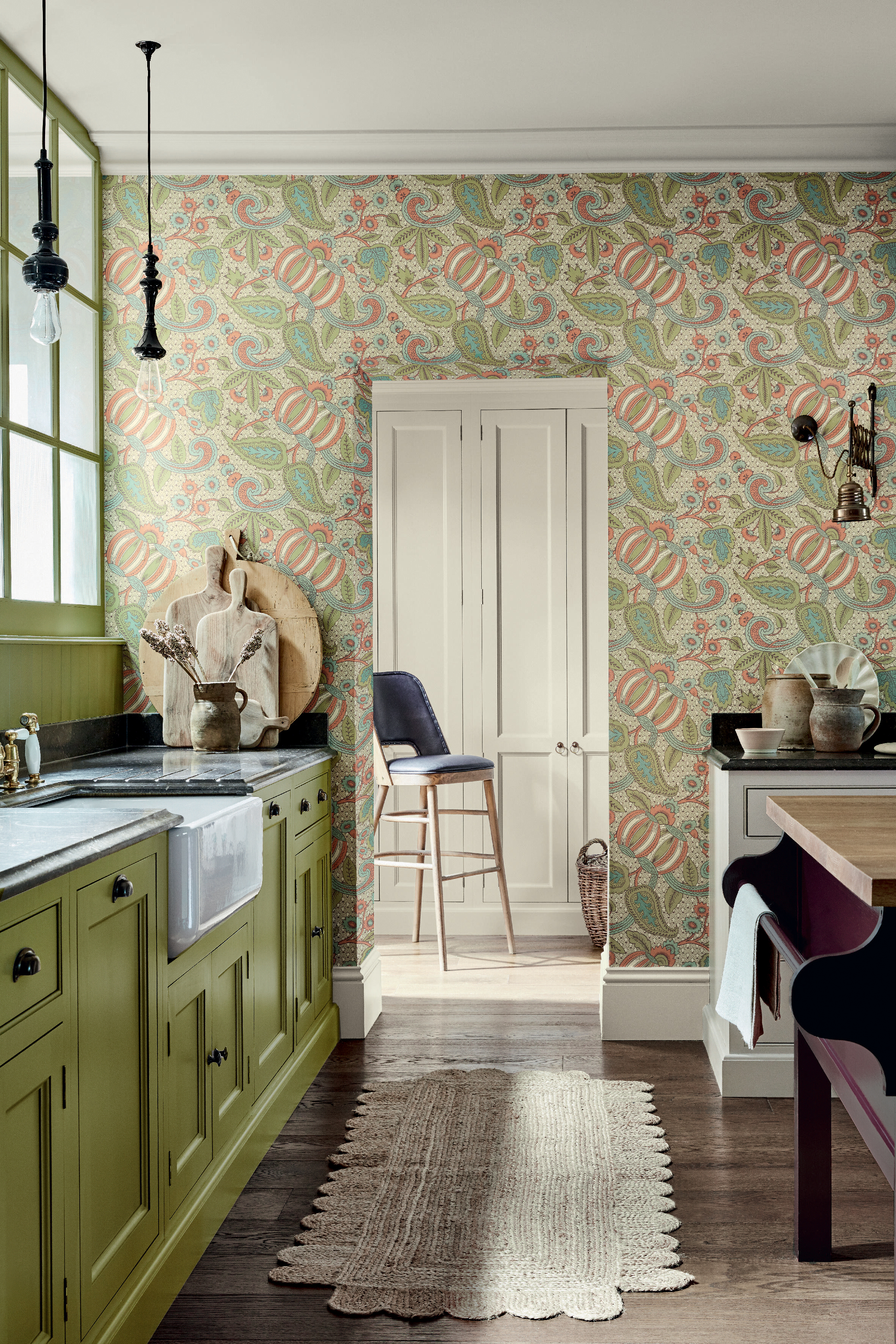
'Don’t be afraid to use strong color and consider a wallpaper design with complementary tones that you can utilize on your kitchen cabinets. This will help you to create a cohesive palette, all Little Greene wallpapers have three suggested coordinating colors to make the color selection process a little simpler.' says Ruth Mottershead, Creative Director at Little Greene.
'Choose a bold wallpaper pattern such as Pomegranate – Bazaar, a rare and early Baroque paisley design which creates a focal point when used on a single wall. For a fresh, vibrant finish that exudes energy, pair with the bright green tone, ‘Citrine’ and ‘Portland Stone Pale’ on surrounding walls to bring balance to the scheme. ‘
8. Use wallpaper to for a quick kitchen makeover
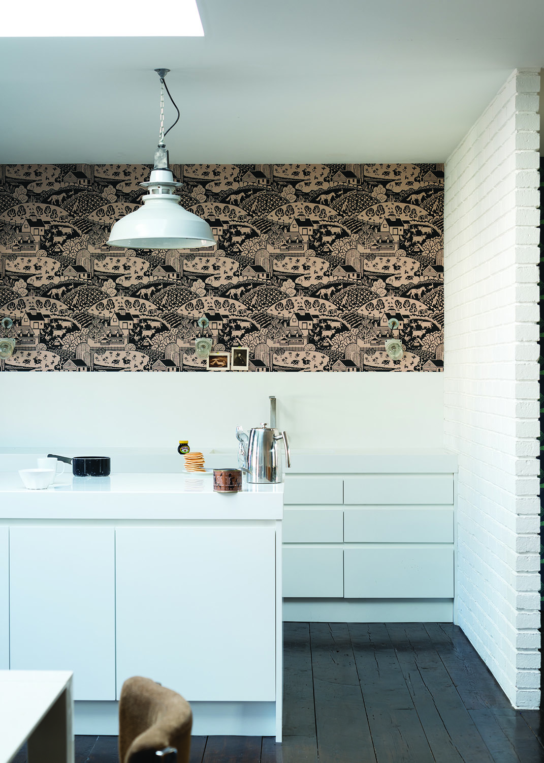
The best thing about wallpaper? It's zero commitment. You can so easily switch it up, changing the whole look of your kitchen in just a few hours. As Ruth says, 'Kitchens are a wonderful space to embrace pattern, wallpapering all four walls is one of the simplest ways to create a dramatic and impactful design change in a space. Wallpaper is simple to apply and can be easily updated, particularly our non-woven designs which are so easy to apply as you paste the wall – an added advantage is that it can be removed from the wall in large pieces when it is time for a refresh.'
We love how in this really minimalist white kitchen the wallpaper prevents it from looking too stark, bringing in depth, texture and adding some softer hues. 'Transform an outdated kitchen by introducing an eye-catching patterned wallpaper. Avoid anything too overpowering, a charming print in calming shades of taupe, off-white, or blush will give an instant and affordable refresh to tired walls – all while keeping the space light and airy.' advise Jen & Mar, Co-Founders of Interior Fox.
9. Combine wallpaper and tiles for practicality
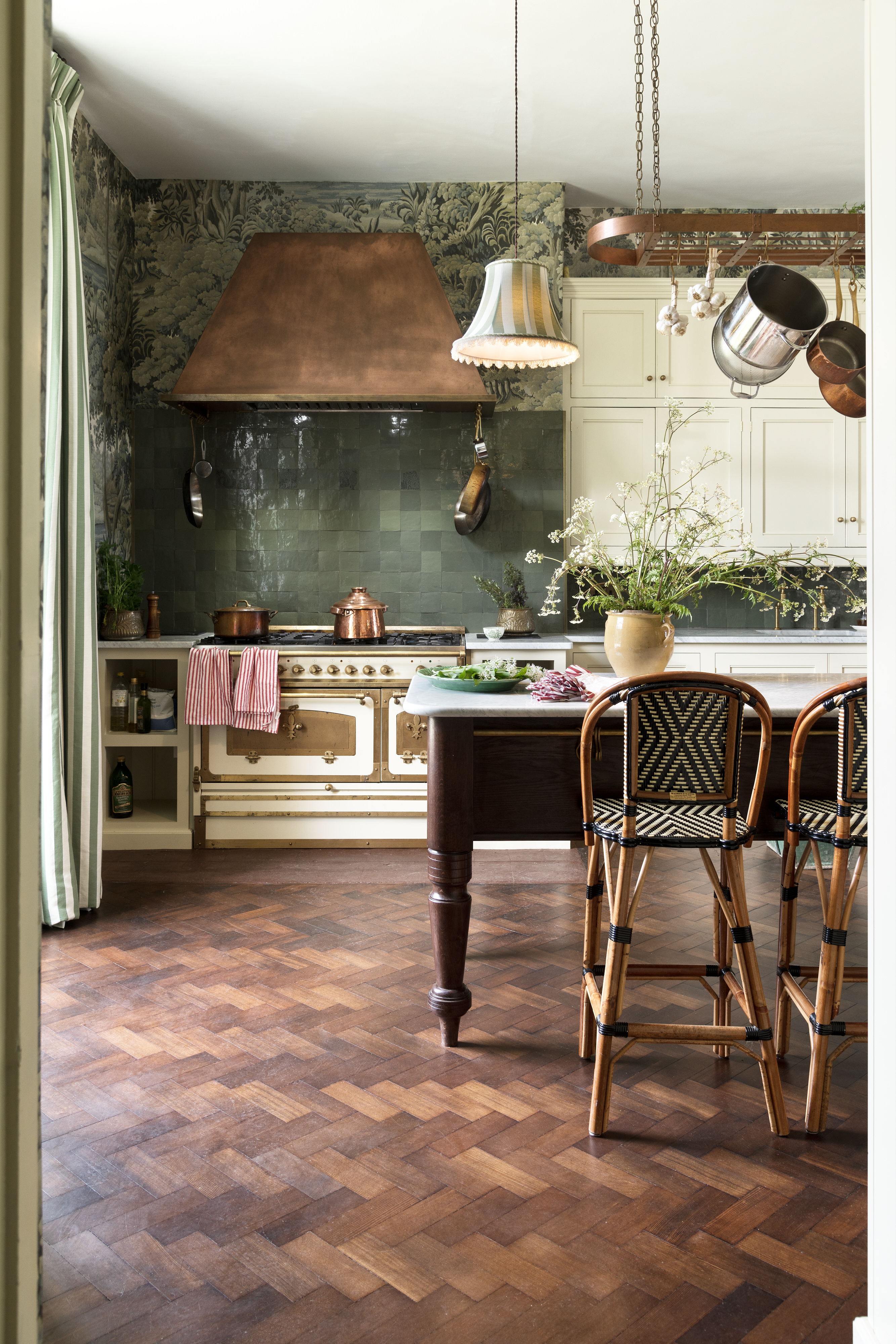
In order to make kitchen wallpaper a more practical choice, pinch this idea from deVOL and cover the majority of the wall in kitchen tiles and wallpaper the rest. The perfect mix of form and function, you still get the benefits of a beautiful print covering the walls but without having to constantly worry about damaging the paper.
Another thing to take from this farmhouse kitchen is the trend for more traditional wallpapers – and not just in rustic spaces like this one either, but in minimalist contemporary homes too. As Natascha Maksimovic, Founder of Natmaks says, Something the design world is currently taking note of are painterly and expressionist wallpapers. Designs and patterns based on original drawings, paintings, and prints convey a personal touch. The details of something hand-painted, like a brushstroke, lend themselves to be soft and delicate but add character and interest.'
What wallpaper is best for kitchens?
Really any wallpaper can work in a kitchen so long as it's hung in the right place so it won't be affected by humidity, water or food splashes. You can now find wallpapers that are specifically designed for kitchens and are wipeable and stain resistant – or you could coat your wallpaper choice in varnish to add a layer of protection.
We'd recommend avoiding woven, fabric based wallpapers or any that have a lot of texture as these will absorb smells and stain easier too, stick with thin, flat papers that ideally have some kind of stain-resistant coating.
Is kitchen wallpaper a good idea?
Yes, as all these gorgeous spaces prove, wallpaper is a good idea in a kitchen it's just about choosing to hang it in the right spot so it works practically.
'There is no area in the kitchen out of bounds when it comes to a dose of pattern and color, just make sure the wallpaper and surfaces are wipeable. However, there are always exceptions. If you’re a messy cook and throw-around turmeric - function needs to park form and the sensible side needs to say no wallpaper in that area. If that’s you, there is always the ceiling.' explains Sam Bramley.
Natascha also adds, 'Don’t be afraid to go bold. The kitchen is the heart of the home so you can create a place of interest and add warmth with colorful or patterned wallpaper. To protect wallpaper in high usage areas you should consider sealing it with dead flat decorator’s varnish. It will also protect the wallpaper from humidity. So no more excuses!'
Be The First To Know
The Livingetc newsletters are your inside source for what’s shaping interiors now - and what’s next. Discover trend forecasts, smart style ideas, and curated shopping inspiration that brings design to life. Subscribe today and stay ahead of the curve.

Formerly the Digital Editor of Livingetc, Hebe is currently the Head of Interiors at sister site Homes & Gardens; she has a background in lifestyle and interior journalism and a passion for renovating small spaces. You'll usually find her attempting DIY, whether it's spray painting her whole kitchen, don't try that at home, or ever-changing the wallpaper in her entryway. She loves being able to help others make decisions when decorating their own homes. A couple of years ago she moved from renting to owning her first teeny tiny Edwardian flat in London with her whippet Willow (who yes she chose to match her interiors...) and is already on the lookout for her next project.
-
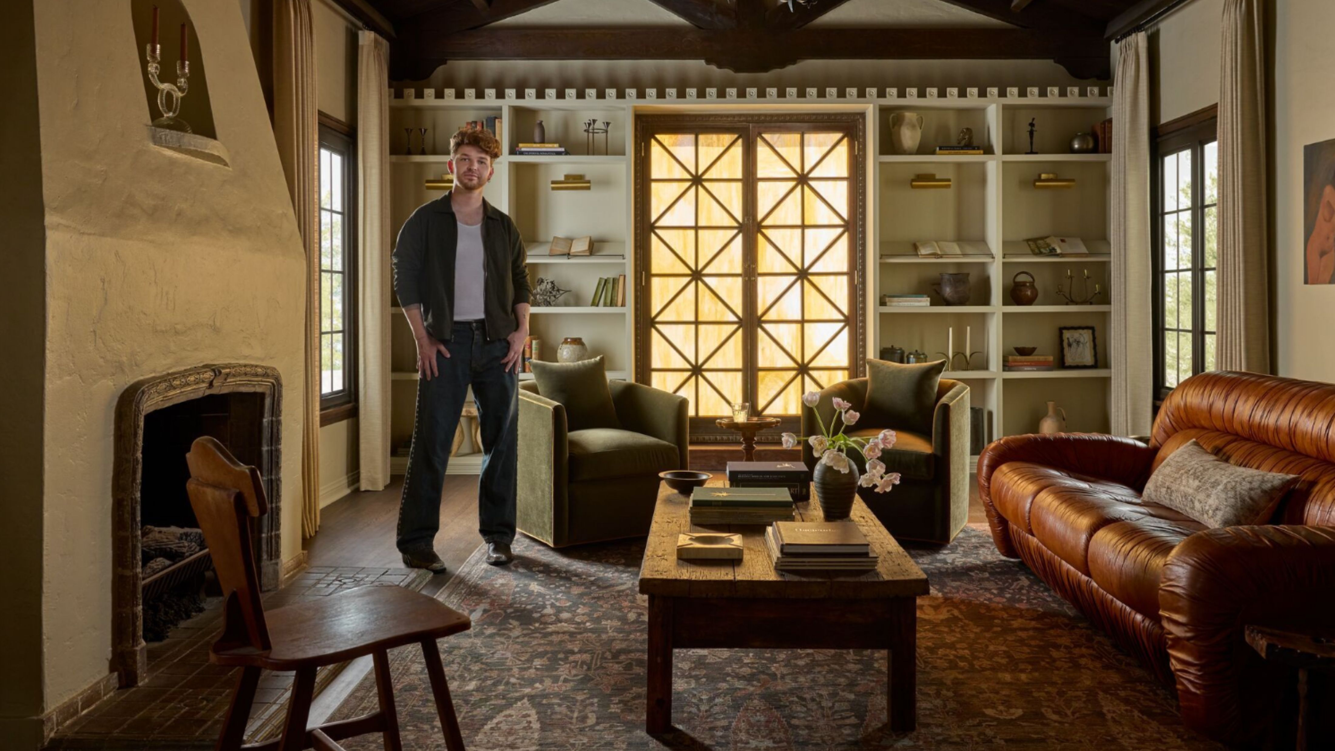 Lone Fox's Drew Michael Scott Drops a Vintage Capsule with Joon Loloi (And Some Seriously Good Tips For Thrifting Antiques)
Sourced straight from one of the world's biggest antique shows, Drew shares how to stay sane, cut through the noise, and score what you actually want
By Julia Demer Published
-
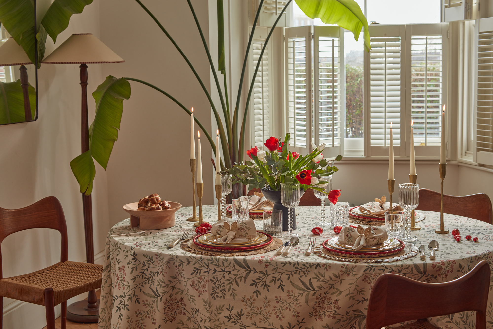 9 Easter Table Decor Ideas to Plan Now for Perfect Tablescapes This Season
From centerpieces and color schemes to tablecloths and seasonal themes, let these designer-approved ideas inspire your table styling this Easter
By Lilith Hudson Published