16 living room wallpaper ideas that'll convince you patterned wallcoverings are the way to go
These brilliant living room wallpaper ideas offer up inspiration for how to apply print, pattern and texture to different areas of your scheme

Hebe Hatton
Deciding on living room wallpaper ideas usually goes one of two ways. You might be ready to jump all-in with pattern, color and print unashamedly, or your approach might be a little more tentative. Wallpaper can, after all, be a dominant design feature in any space, but a living room is where you'll spend a lot of time in the day, so you'll want to stay in-love with your choice for as long as possible.
Yes, there are more subtle wallpaper ideas you could pick, but if you're looking for a modern living room with impact, pattern, print and color is the way to go.
Wallpaper might not be so much of the darling of interior designers now as it once was, but for maximalism-lovers, it is still one of the best ways to bring charm and character through pattern to a room.
For modern ways to use wallpaper in a living room, take inspiration from these creative room schemes and expert advice.
16 ways to embrace living room wallpaper ideas in your design
1. Add pattern to a black and white scheme
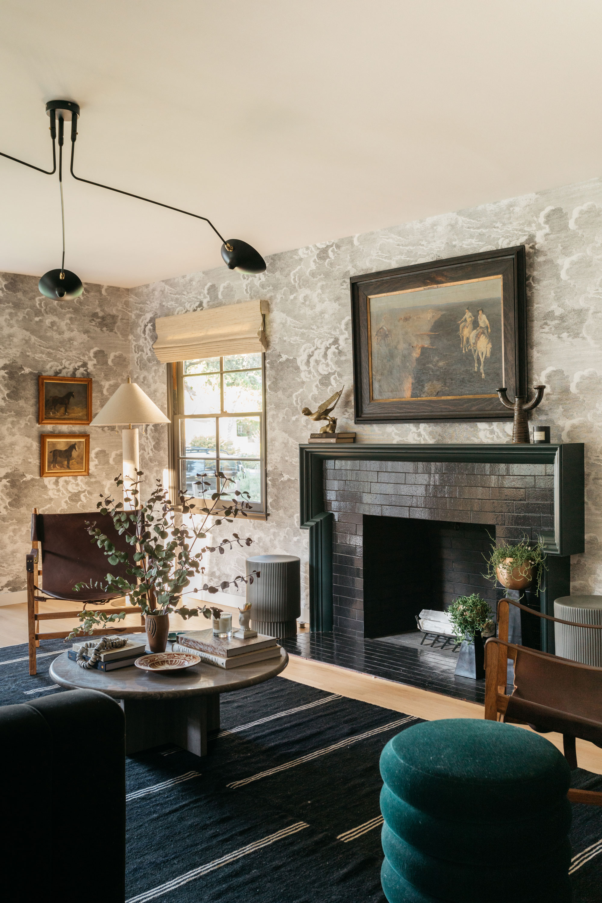
Patterned wallpaper might seem like a bold addition to any room, but in a black and white living room, it can make up for interest lacking through a monochrome palette.
'This room was a large rectangular room with an off-center fireplace and windows that were located at the bottom end of the room,' explains Kirsten Blazek, principal designer of A1000xBetter. 'It was quite difficult to place furniture in this space and because it was so linear it didn’t have a lot of character. The wallpaper was added to give the space an additional layer, offer visual interest to the room, and to distract the eye from the awkward layout.'
Keeping the color palette of this living room wall decor limited was key to ensuring this space felt well-put-together. 'I love using black and white wallpaper as a neutral element in a space,' says Kirsten. 'While this pattern could be deemed as busy, it actually acted as a way to ground the room and make it feel like a more cohesive space.'
2. Go wall-to-wall with living room wallpaper
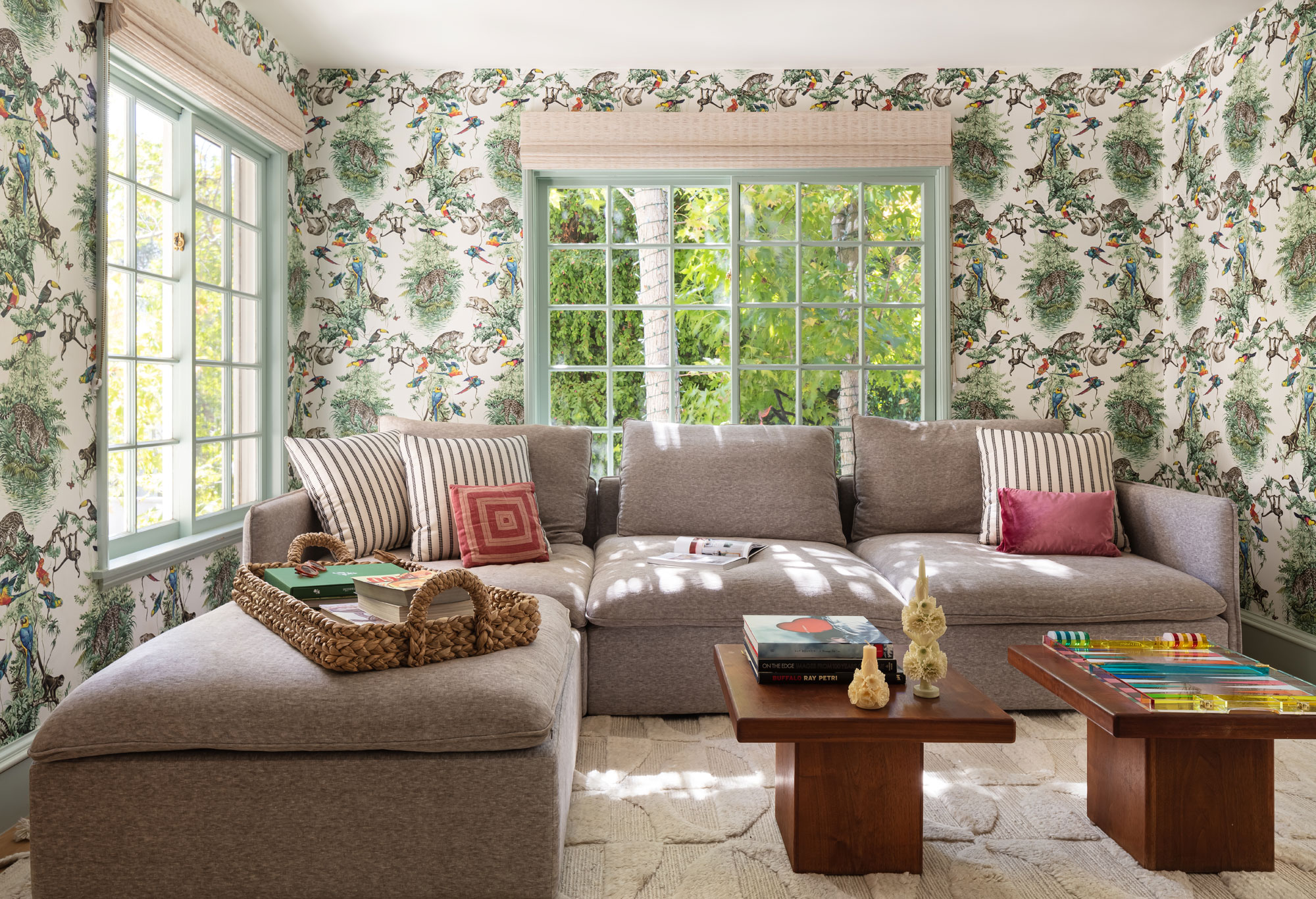
Where once the accent wall was the ultimate interior design trend, modern interior designers tend to go for a more is more approach with wallpaper, even when using a busy design. Using the same wallpaper on every wall makes the room feel cozy and enveloped, and that's before you also consider wallpapering the ceiling.
In the design of this Los Angeles home, LaLa reimagined used a bright, imaginative wallpaper that fits this family snug perfectly, bringing a real sense of fun to the space.
Why not consider a more interesting color for trims and other elements like windows, as in this living room where a soft duck egg blue has been used? In this space, it softens the contrast between the wallpaper and trim, and makes the whole scheme feel even more joyful and considered.
3. Or opt for a modern feature wall

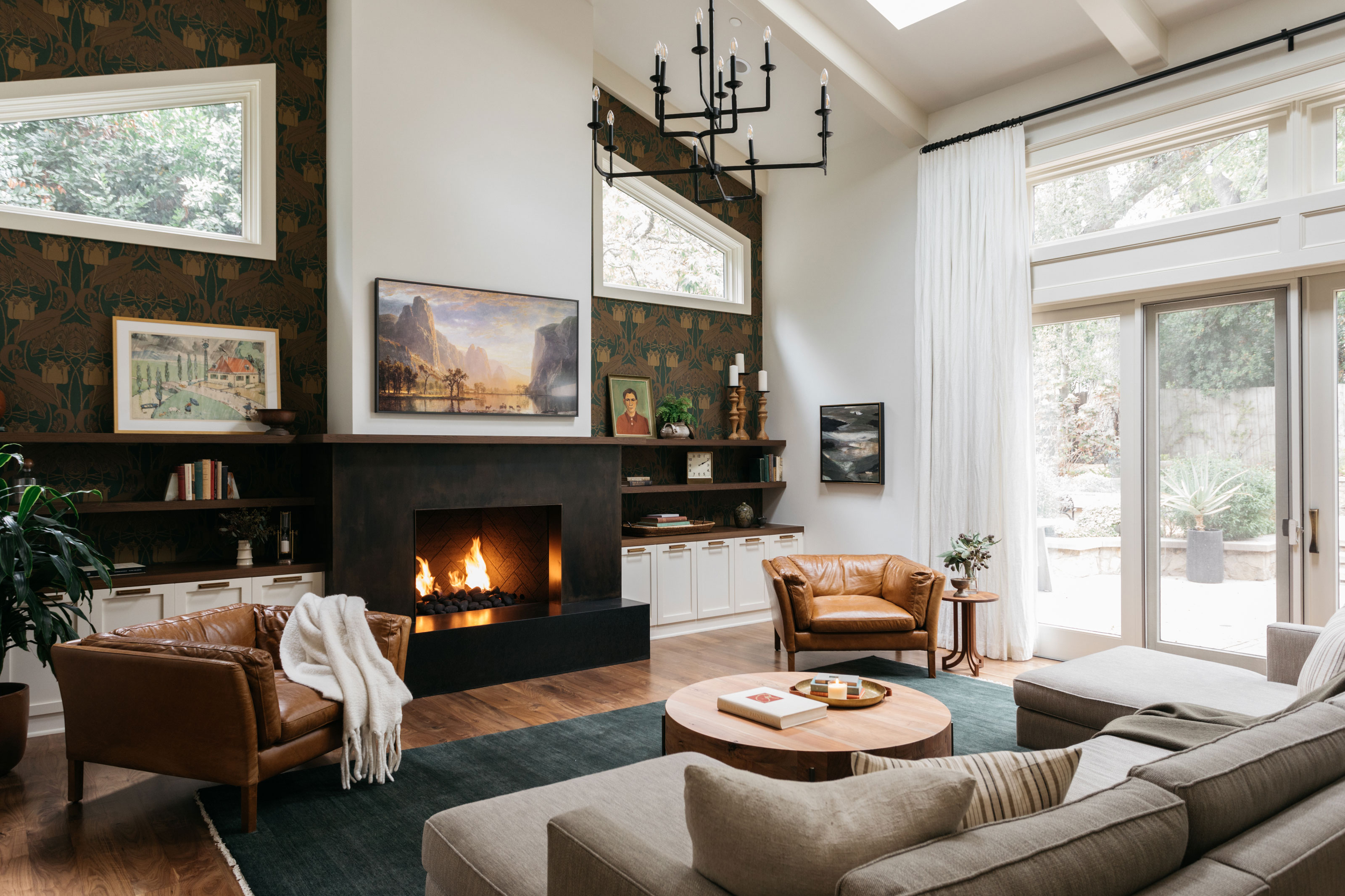
However, sometimes an accent wall can be just what's needed. It can, in some instances, highlight architecture in a way that using wallpaper heavy-handedly would actually disguise.
'We don’t typically love using paint as an accent wall and much prefer to use wallpaper,' says interior designer Kirsten Blazek. 'This room was large with very high ceilings and is open to the kitchen area, so we chose this dramatic wallpaper to highlight this important wall that could be seen from all areas of the downstairs in this open-plan home.;
'By highlighting the wall with a darker wallpaper, and by adding shelving for decor items, we were able to add character to the entire space and give it a cozy feel,' Kirsten says.
4. Choose Mid-century patterns for a retro twist
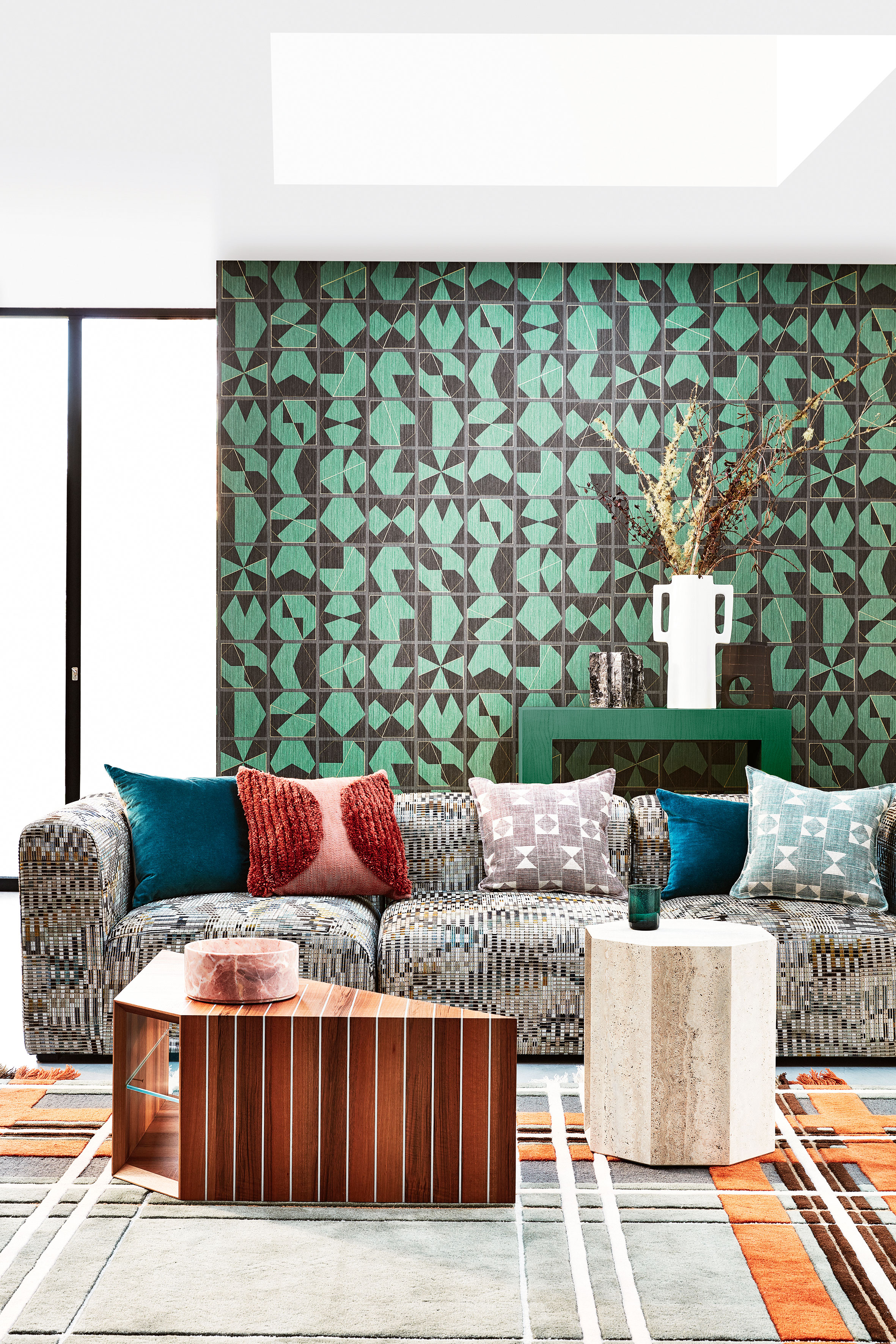
Wallpaper is a guaranteed way to really solidify your living room's overall style (or mix of styles). So choose a pattern that's going to enhance your theme and complete the look. Here, the striking green and black geometric wallpaper nods to the retro, Mid-century vibe of the furniture, patterns, and colors going on in the rest of the space.
5. Wallpaper the alcoves
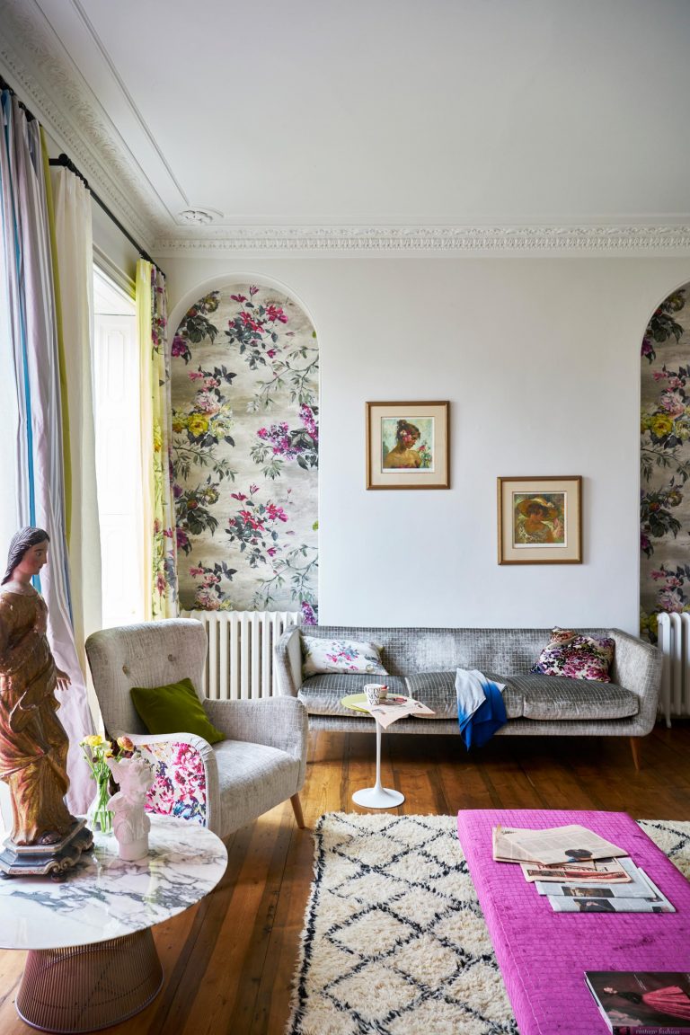
We know that feature walls aren't the huge trend they used to be, but they still sneak in just in new, more stylish forms. For example, rather than wallpapering the fireplace or the main wall, highlight quirky architectural features like alcoves by wallpapering them instead.
The floral print used in this living room could potentially overwhelm the space, but just a hint of pattern in the alcoves creates the perfect feature and ties together the color scheme too.
6. Fake a bookshelf
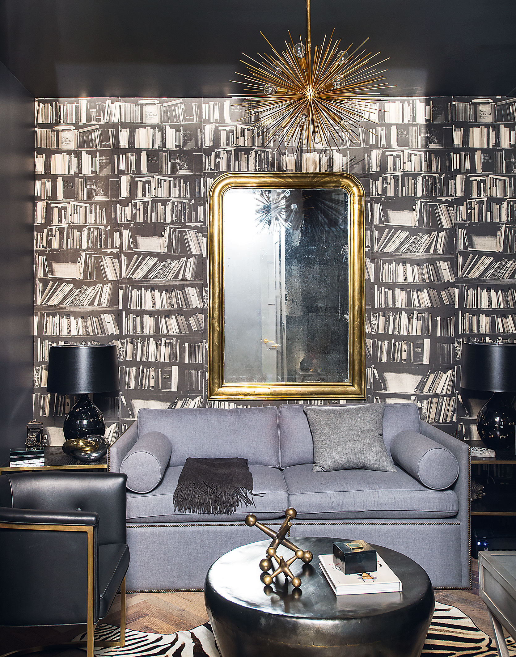
We all know this isn't really a bookshelf, but we still love the texture and interest and quirkiness prints like these bring to a room. Plus they do create a bit of an optical allusion that can work really well in small living rooms, especially when you pair it with fabulous dark walls and ceilings to create a really sophisticated, but cozy, vibe.
7. Opt for a monochrome mural
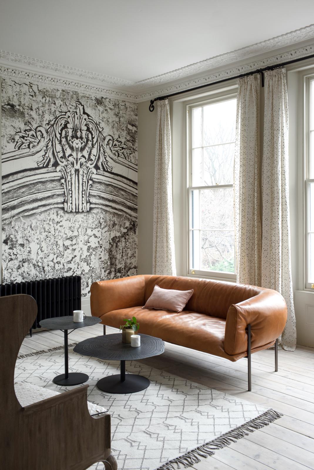
For a really simple, minimalistic look, opt for a mural. As there's no repeat pattern these can feel less busy than wallpaper but still add pattern and interest to the room. In this neutral living room the striking monochrome print adds texture to the very modern room and is a stylish nod to the architectural details of the room.
8. Wallpaper behind shelving
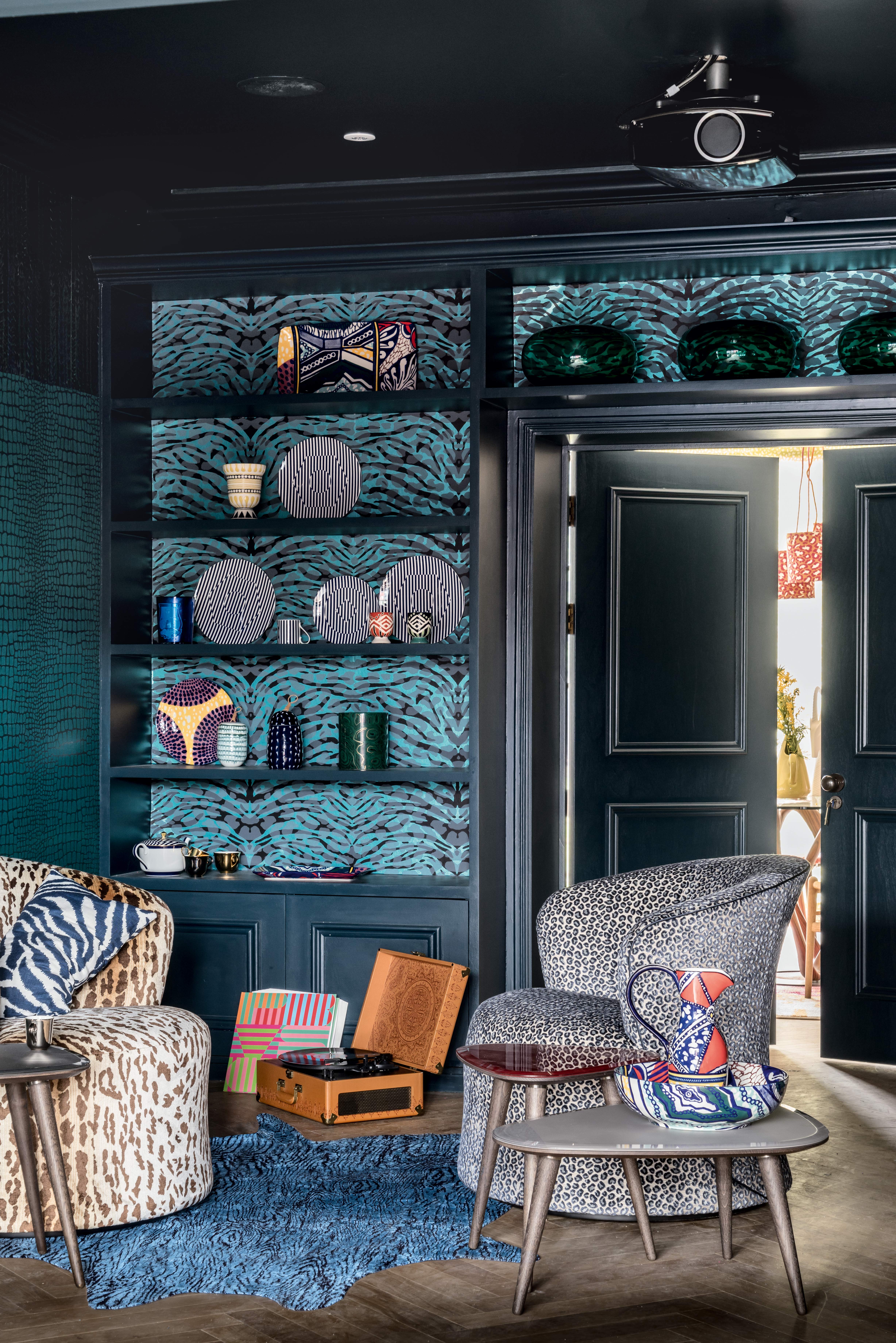
Make shelving really stand out by wallpapering the space behind them. It's a great way to bring in some color and pattern without making it such a focal point in the room, plus it livens up a boring built-in. Again, loving the deep, dramatic colors used in this dark living room too, and we think we now might have to rethink our love/hate relationship with animal print...
9. Add depth to a simple color scheme
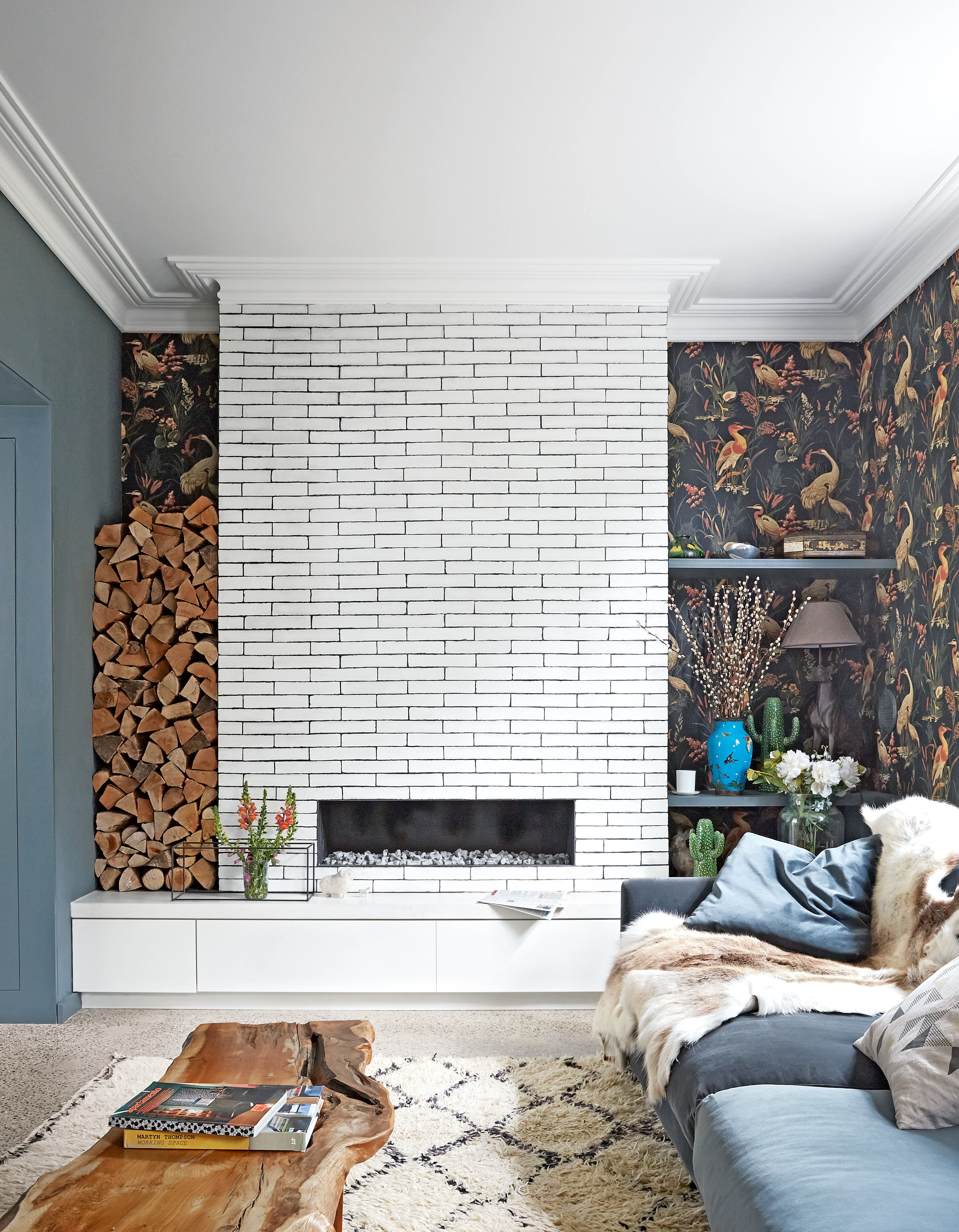
And going for a dark wallpaper doesn't mean the overall scheme of your room has to instantly go gothic. Sometimes darker hues can just add the right amount of depth to an otherwise quite neutral living room, so don't be afraid to try out bolder prints.
See how in this living room, dark grey walls and a dark grey wallpaper mix with white tiles, pale flooring, and lots of natural light, so despite the deeper colors, the room still has an overall neutral look.
10. Make it whimsical
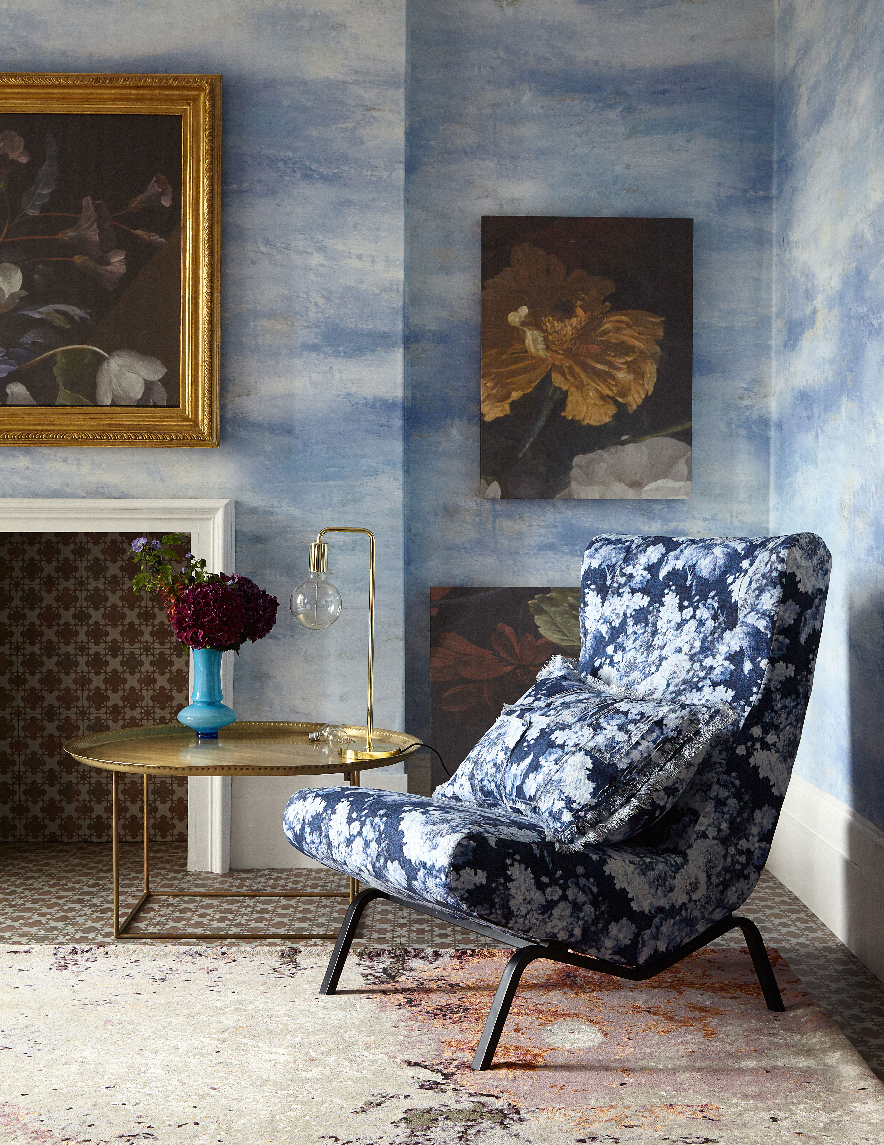
Create an instantly calming scheme that has a slightly fun and whimsical vibe by choosing a cloud print wallpaper. The almost watercolor effect adds such a softness and looks wonderful in a loftier room with high ceilings. Pair with warmer hues like golds and yellows that will really pop against all that blue.
11. High ceilings? Be bold with your living room wallpaper
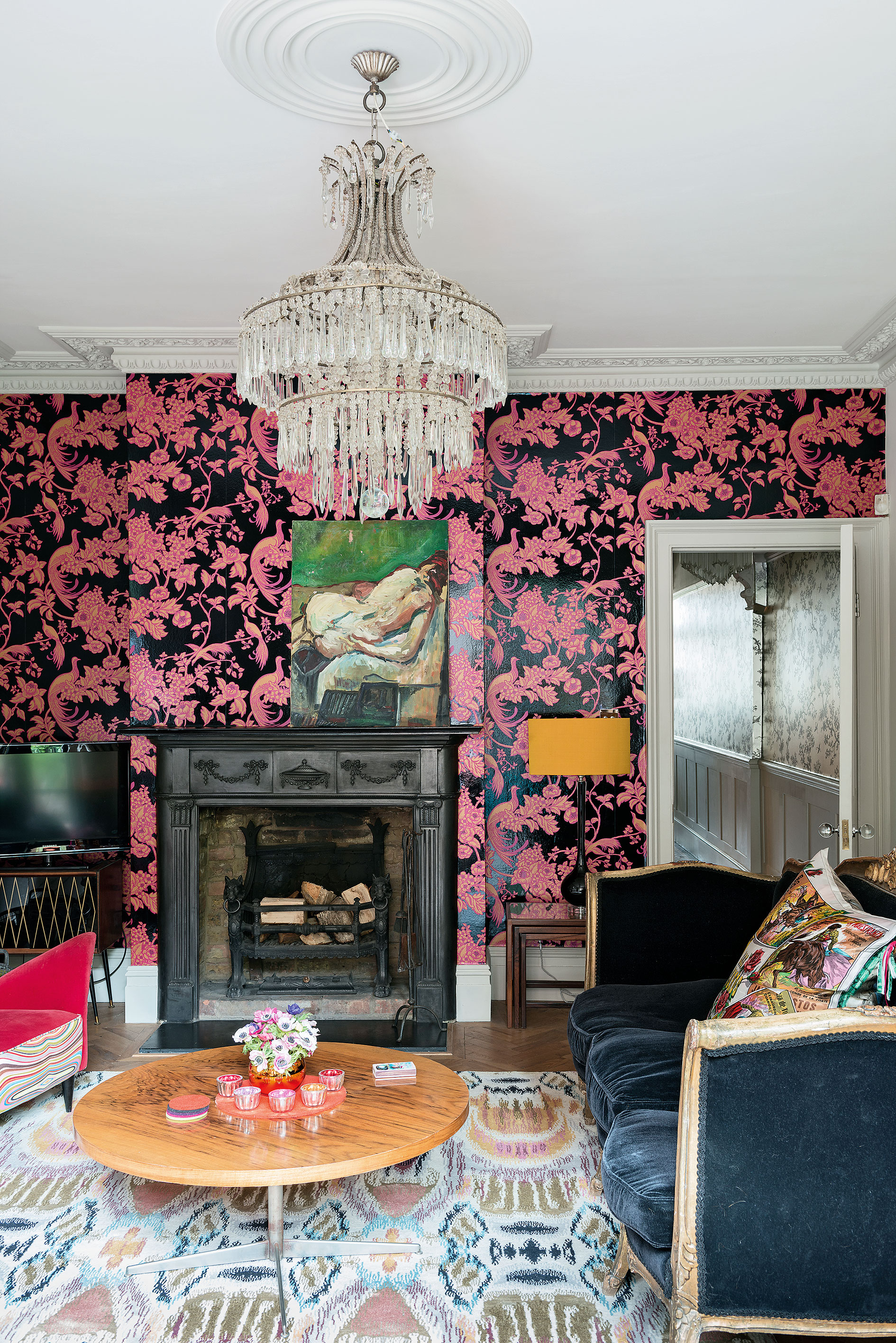
Speaking of high ceilings, if you have been blessed with them you really can be bold with your living room wallpaper. Pick something really dramatic like this gorgeous pink and black combination and either, embrace the trend for maximalism and add in even more pattern and quirky furniture, or opt for a really simple scheme in the rest of the space to let the wallpaper be the focus.
12. Create an eclectic feel by mixing styles
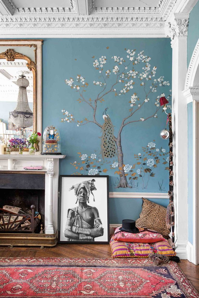
How beautiful is this painted mural? It's subtle but really eye-catching at the same time, and works perfectly with the eclectic mix of styles going on in this living room. It works with the opulent feel of the room, the high ceilings and the gold accent, but it also sits well with the global touches too – adding yet more layers and interest to the room.
13. Mix rich tones with gold for a dramatic look
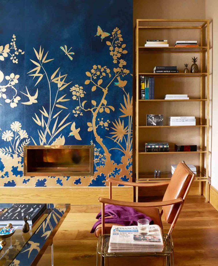
Forget what we said about feature walls for a moment, sometimes there is just a very obvious wall that's calling out to be wallpapered. For example; this chimney breast. The inky blues look especially rich against all the warm tones of the wood and the gold touches add a touch of elegance and luxury.
14. Contrast old and new
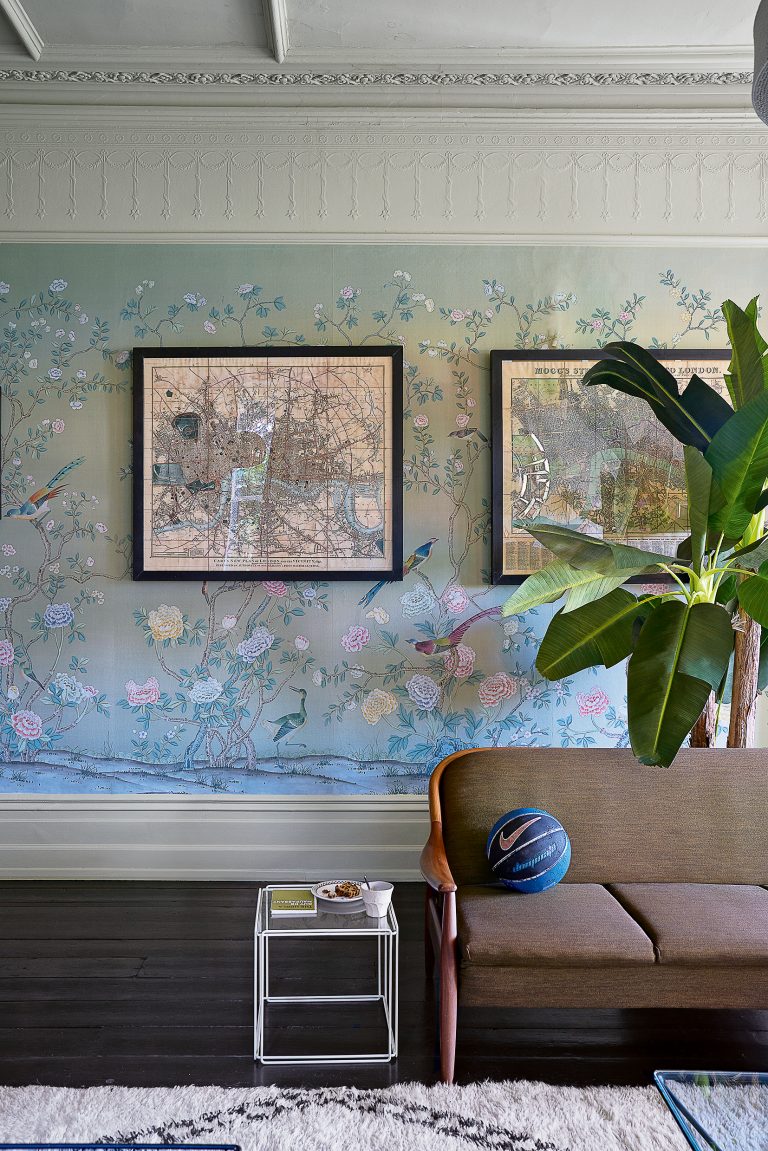
Clashing wallpaper with the style of your living room can create a really stylish modern look. In this living room, the very traditional ornate wallpaper actually came with the property, but rather than paint over it to suit the contemporary furniture, it was left to create the perfect contrast with all the clean lines and Mid-century style of the rest of the space.
15. Mix and match living room wallpapers
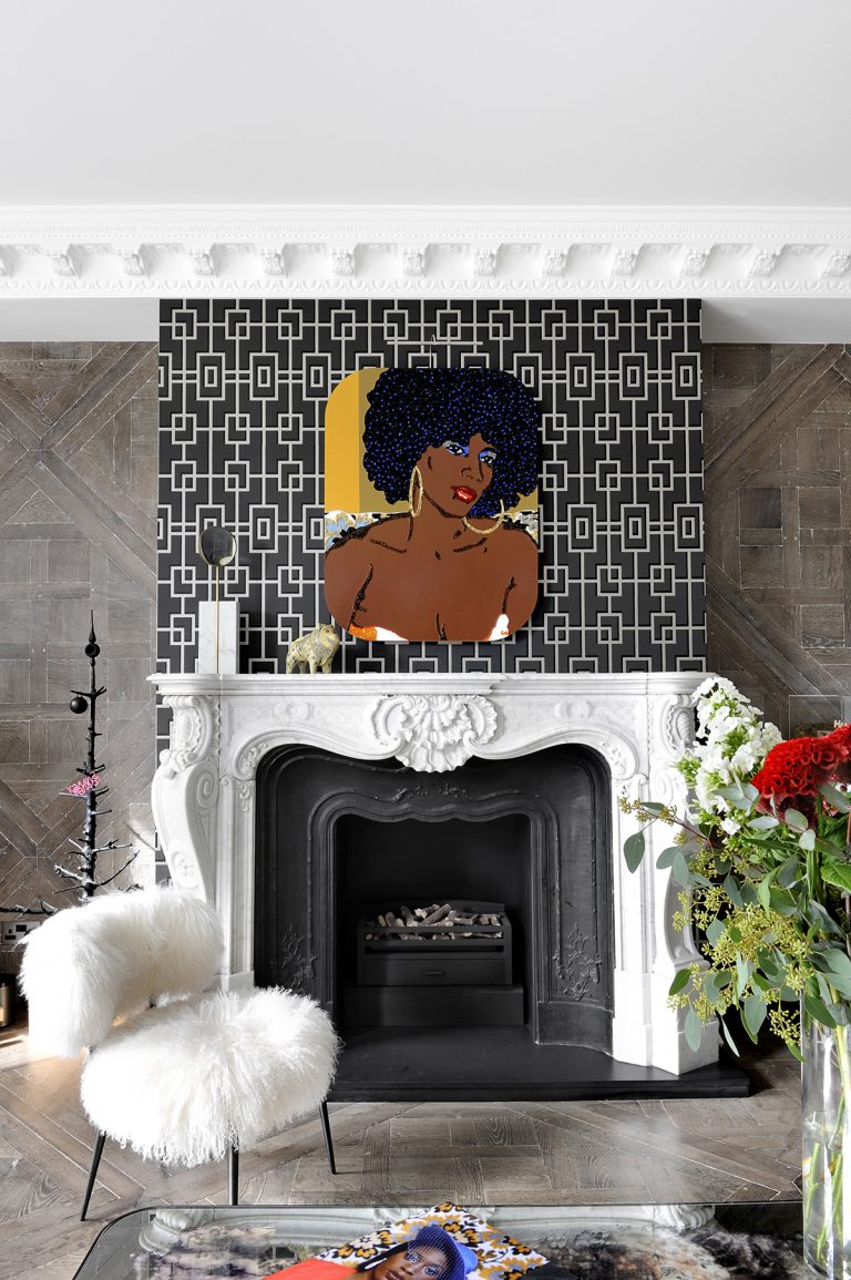
Can't decide between two living room wallpaper ideas? Choose both. This works especially well if you have alcoves – pick one style for the alcoves and another for the chimney breast. We'd recommend going for one style that's going to stand out as being bolder so the two patterns aren't competing for the focal point.
16. Pick a reflective wallpaper
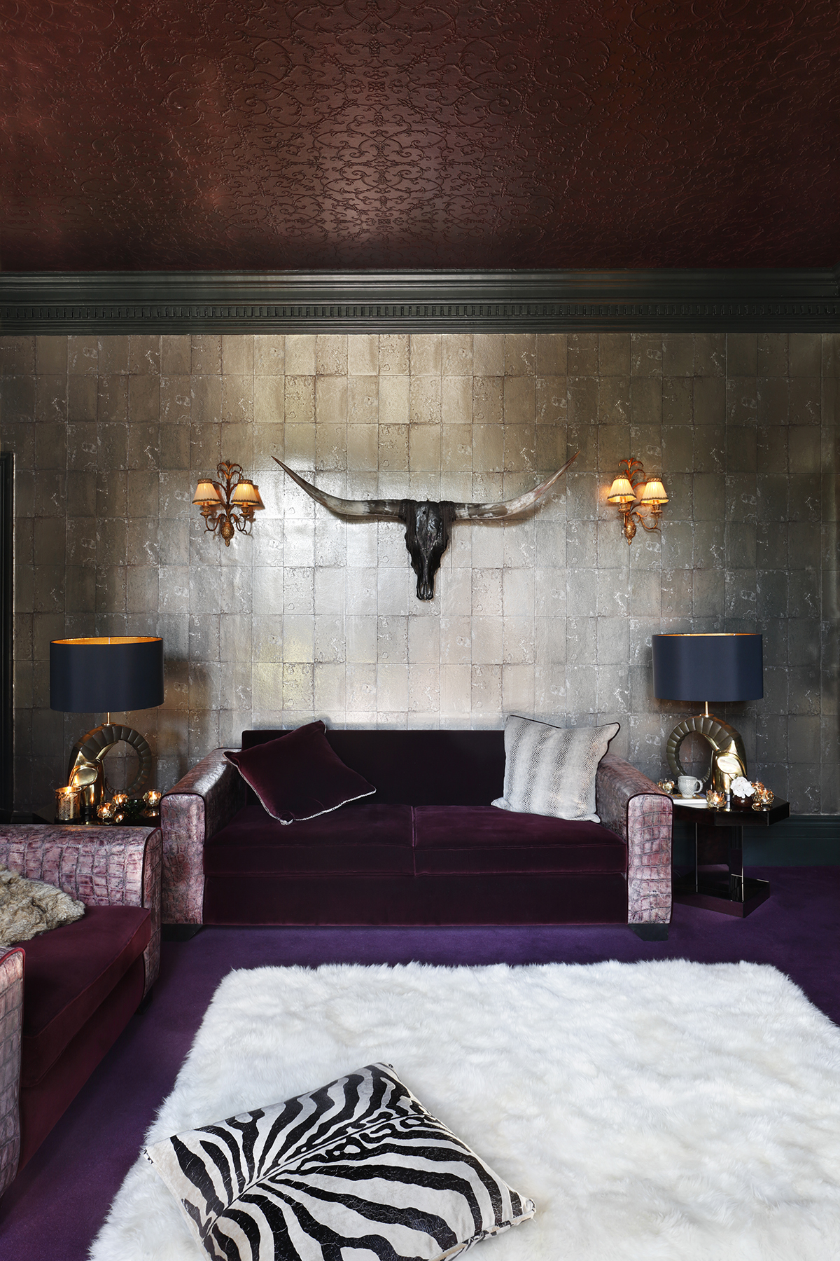
Reflective wallpaper can work wonders in small or dark living rooms, bouncing more light around making them feel bigger and brighter. They are also a good option to mix into a very dark color palette like the one used in this living room to give all those rich deep hues a lift and stop the room feeling oppressive.
Which wallpaper is best for a living room?
The right wallpaper for the living room will be one that suits your personal taste that's also perfectly practical. Choose one that's wipe-clean and easy to maintain while also being the design aesthetic of your choice, whether that's floral, vintage, contemporary, ombre, botanical or tropical.
Patrick O’Donnell, Farrow & Ball Brand Ambassador, says: 'There is no rule of thumb necessarily, but as the living room is likely to be one of the most used in your home, choose something easy to live with that you love.
'Secondly, look at how much art you currently have on your living room walls - you don’t want the paper to distract from the paintings. Also, as wallpaper can be a significant expense, try not to err on achingly hip and consider the longevity of the design- will this look good in 10 years from now?'
Wallpaper designer Annika Reed believes you can't go wrong with botanicals, saying: 'I love inviting the outdoors inside, so greens are great for the living room as they are shown to be restful on the human eye and create a calm and optimistic space.'
How do I choose a living room wallpaper?
'There are so many options it can be intimidating to start. So it’s best to pick a colour and a theme and begin your search that way,' says Annika.
We spend a lot of time in the lounge, so think about how you want to feel in the living room, whether it's relaxed, energised or joyful. Botanicals and florals can create a tranquil yet colourful look that's uplifting as well as relaxing; or you may want to opt for a bold geometric print if you have a love of contemporary design. Tropical prints can lift the feeling of a room with pattern play, while muted tones can be completely calming. Let your personal preference decide, and trust your instincts.
'Firstly, think about the style you are trying to achieve for the whole room,' says Patrick. 'Whether urban, fashionable, or traditional, there are papers to suit all tastes from gothic, dark florals, romantic motifs to elegant graphics. Try creating a digital mood board with all your elements before you commit to wallpaper - it can be expensive to get wrong!'
Should you wallpaper the whole room?
'Whole wallpapered rooms tend to be the most successful as feature walls can alter the perception of room size and space,' says Farrow & Ball's Patrick O'Donnell. 'However, if you do choose a feature wall, make sure to select complementary paint for the remaining walls such as the ground colour or print colour of the wallpaper.'
Annika agrees, saying: 'If you want to wallpaper a room, I think committing to the paper and decorating the whole room is the way to go. It will bring a cohesive and elegant feel to your living room.
'A patterned wall can actually make the space feel bigger and will bring a newfound energy to the room. '
Of course, you don't have to wallpaper the whole room to create a striking look; if you want to simply give a nod to print, try wallpapering the alcoves, or choose a feature wall or smaller space to play with pattern.
Be The First To Know
The Livingetc newsletters are your inside source for what’s shaping interiors now - and what’s next. Discover trend forecasts, smart style ideas, and curated shopping inspiration that brings design to life. Subscribe today and stay ahead of the curve.

Hugh is Livingetc.com’s editor. With 8 years in the interiors industry under his belt, he has the nose for what people want to know about re-decorating their homes. He prides himself as an expert trend forecaster, visiting design fairs, showrooms and keeping an eye out for emerging designers to hone his eye. He joined Livingetc back in 2022 as a content editor, as a long-time reader of the print magazine, before becoming its online editor. Hugh has previously spent time as an editor for a kitchen and bathroom magazine, and has written for “hands-on” home brands such as Homebuilding & Renovating and Grand Designs magazine, so his knowledge of what it takes to create a home goes beyond the surface, too. Though not a trained interior designer, Hugh has cut his design teeth by managing several major interior design projects to date, each for private clients. He's also a keen DIYer — he's done everything from laying his own patio and building an integrated cooker hood from scratch, to undertaking plenty of creative IKEA hacks to help achieve the luxurious look he loves in design, when his budget doesn't always stretch that far.
- Hebe HattonFormer Digital Editor
-
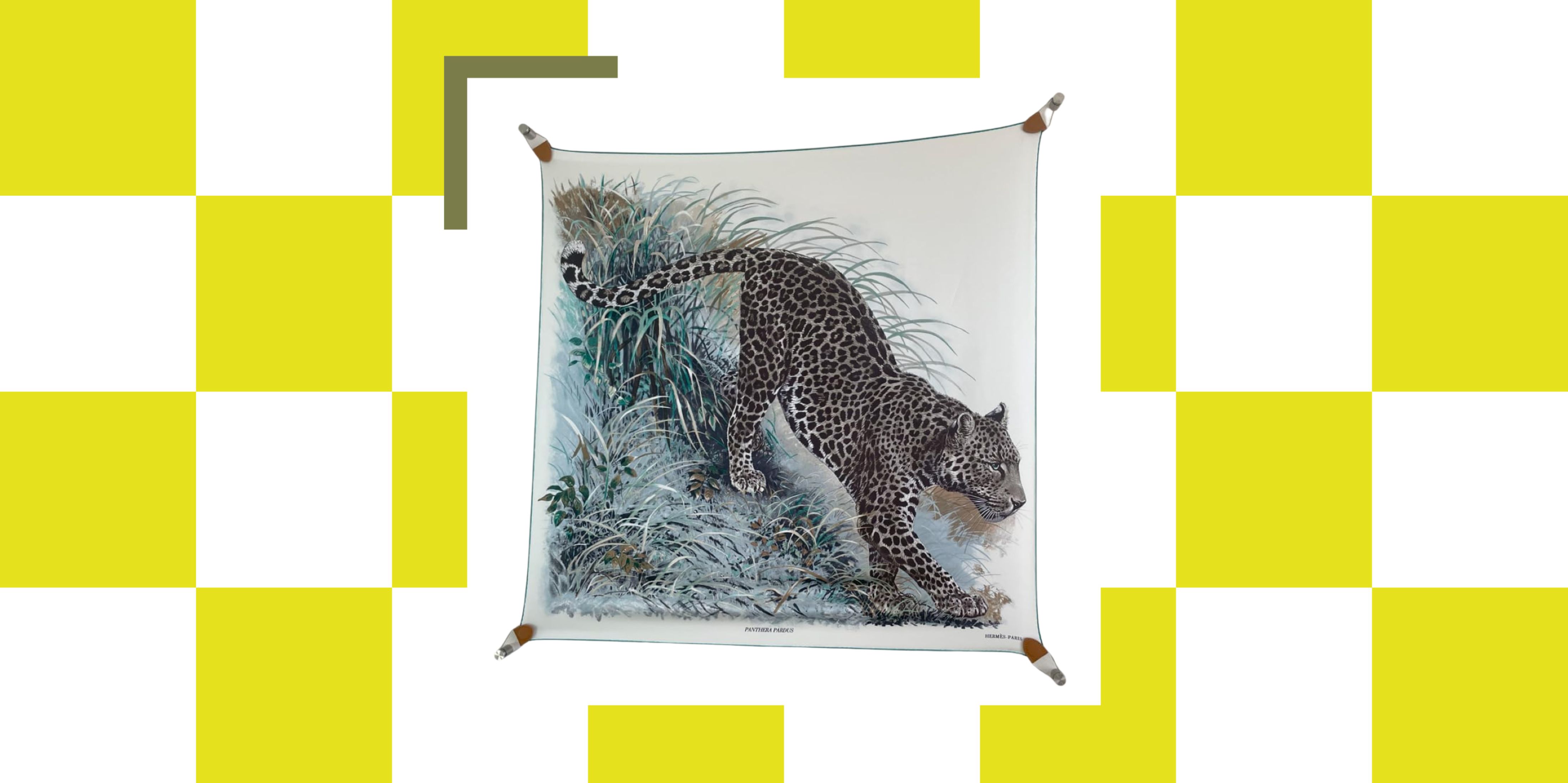 The Easiest Way to Turn Your Designer Scarf Into Wall Art — No Frame, No Fuss, No Regrets
Because silk this pretty should never stay in a drawer
By Julia Demer Published
-
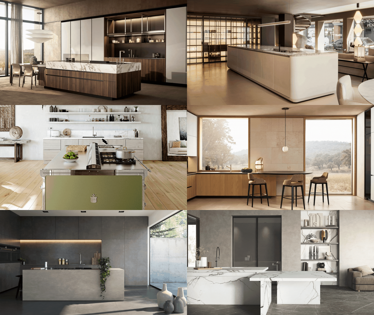 Italian Kitchen Trends — 5 Emerging Ideas From the Chicest Italian Designers That I Predict Will Go Global in 2025
Fresh from Milan Design Week, these are the exciting finishes, styles, and innovative materials I can't wait to see in more kitchens this year
By Faiza Saqib Published
-
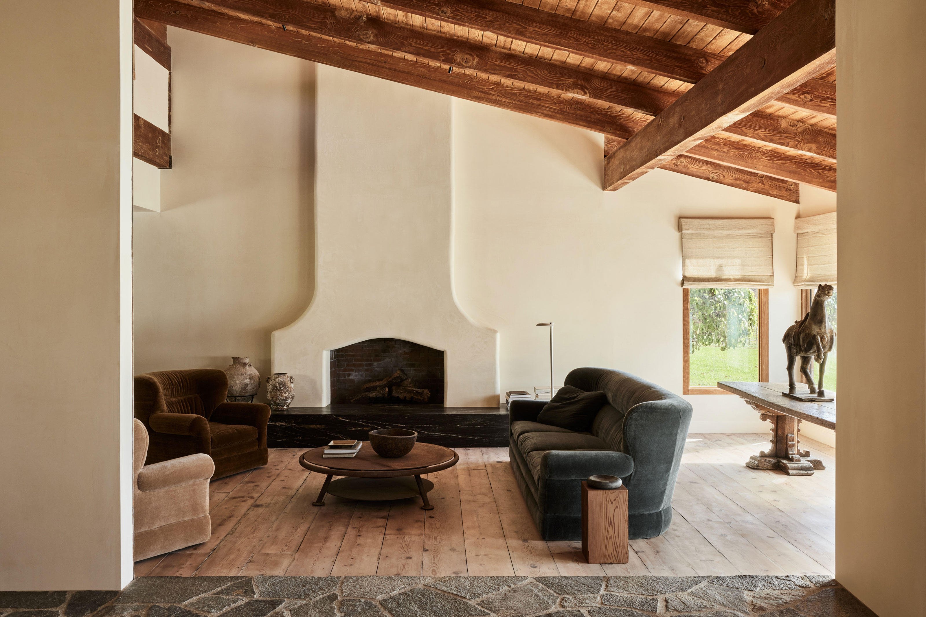 10 Living Rooms With Dark Gray Sofas That Show This Couch Color Is a Real Style Chameleon
Charcoal-colored couches offer the best of both worlds when it comes to style and practicality, and these real rooms prove it
By Luke Arthur Wells Published
-
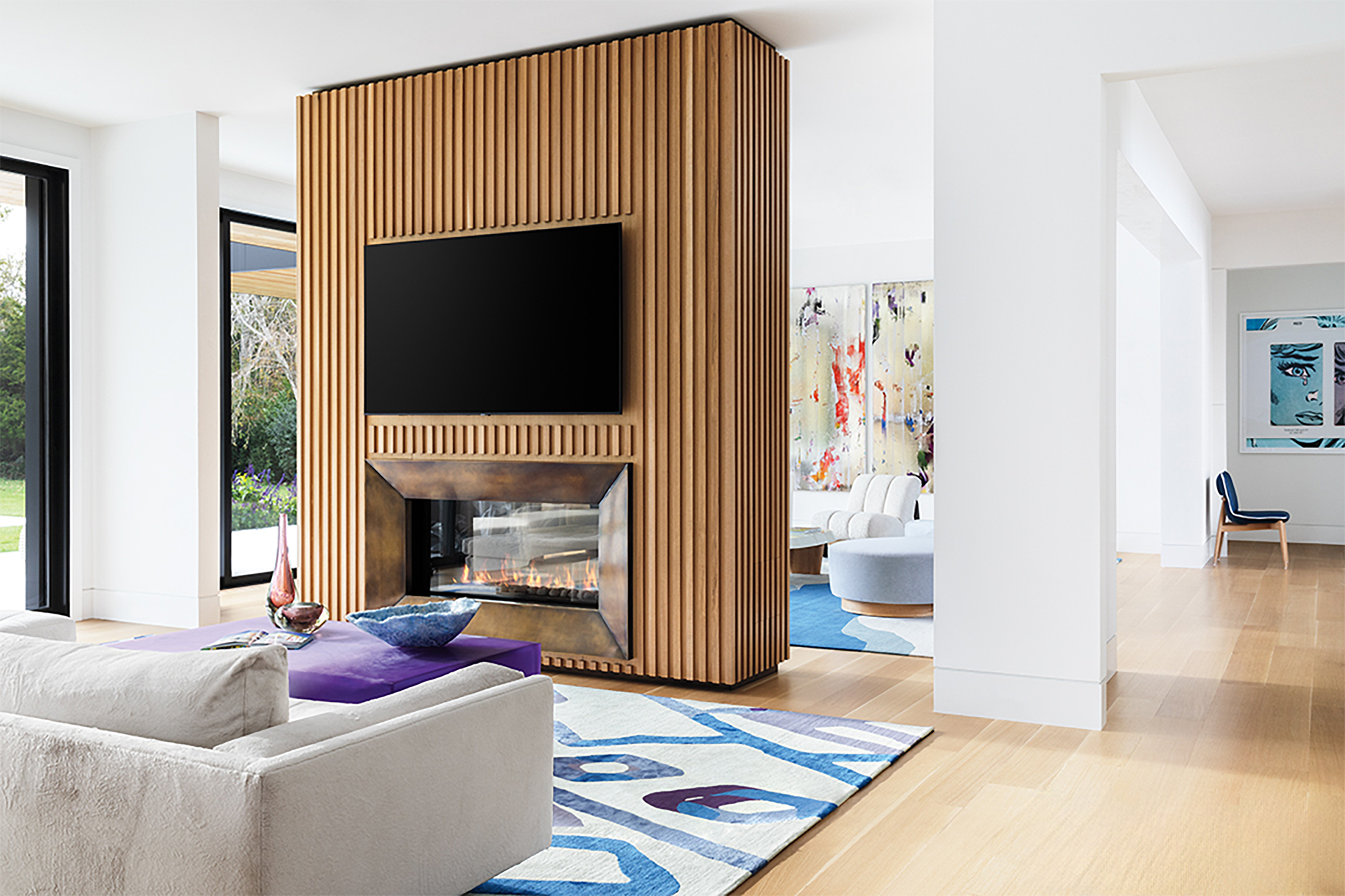 'TV Room Dividers' Are the Living Room Layout Trend That Might Spell the End of True Open Concept
TVs are tricky when it comes to design: you want to be able to see them when you do, and not when you don't. Here, designers offer a clever solution
By Faaizah Shah Published
-
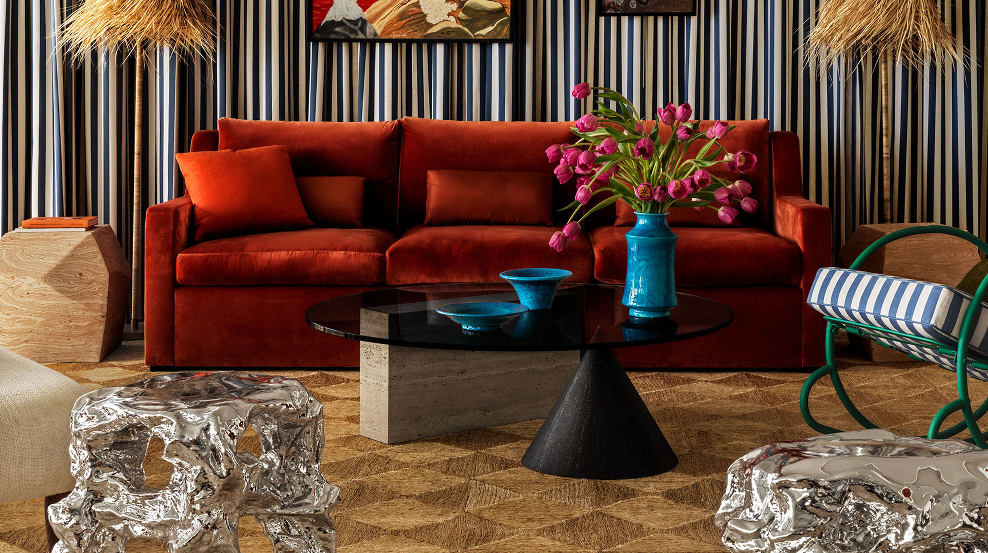 The Future "It" Furniture Designs for 2025 All Share This 80s-Inspired Detail That Feels so Fresh
When it comes to dining tables, coffee tables, benches and more, designers are playing a balancing act with unusual forms and materials
By Luke Arthur Wells Published
-
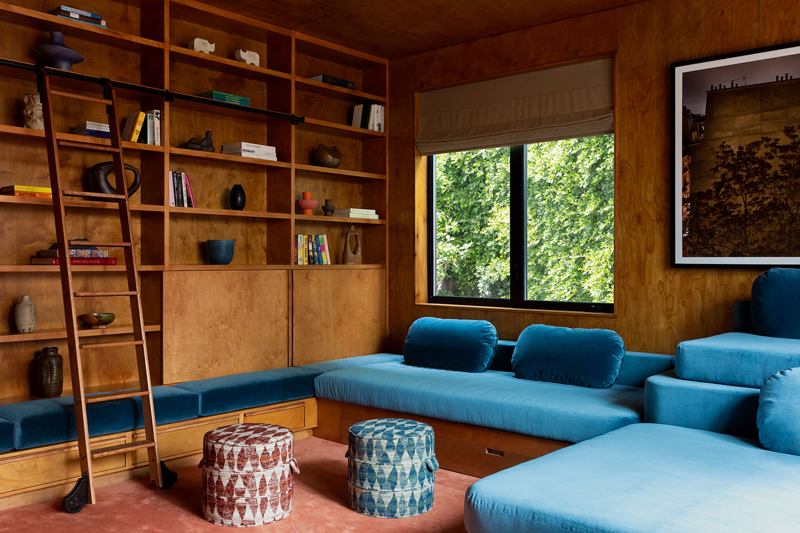 Less Stuffy, Less Formal — How the Big Seating Trends for 2025 All Point in This Uber-Comfortable Direction
Put your feet up, as homes go all in on deep, communal couches, window seats and nooks that make for the dream hang-out spaces
By Luke Arthur Wells Published
-
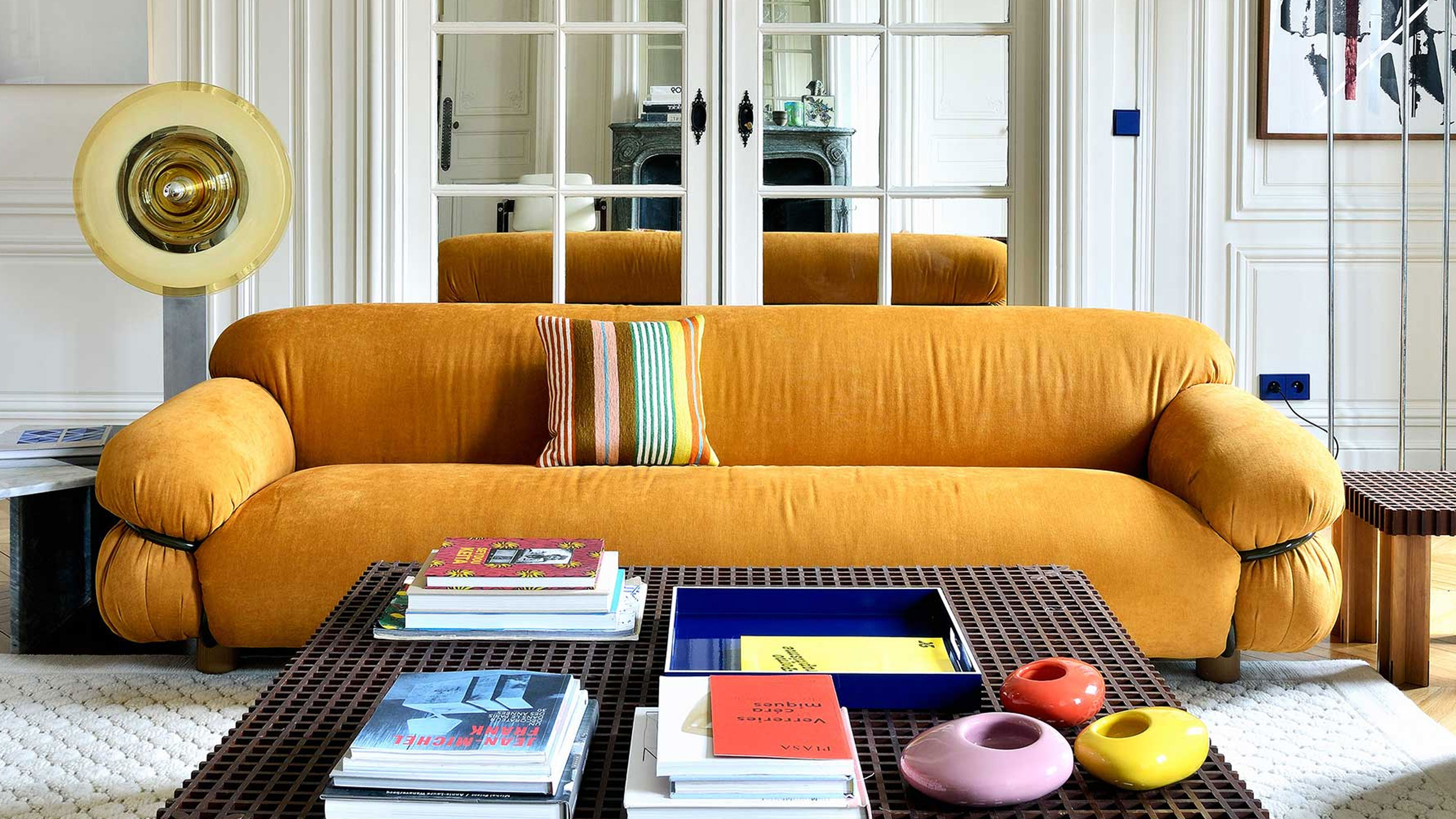 9 Iconic Sofas That Design Savants Should Know by Name, According to the Most Stylish People We Know
From mid-century marvels to spectacular modernist designs, these are the design famous couches interior designers want you to get to know better
By Luke Arthur Wells Published
-
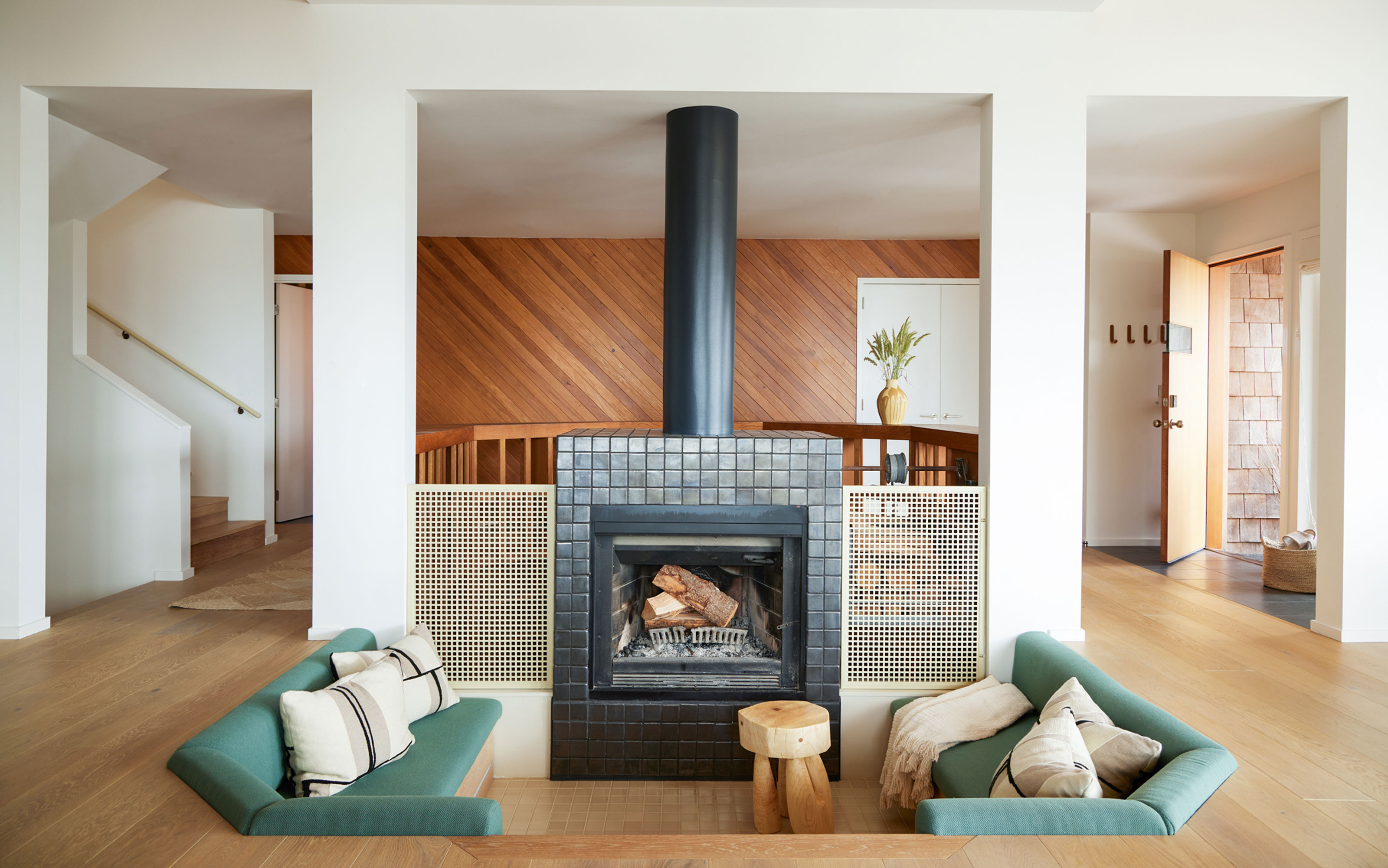 The "Conversation Pit" Is the Mid-Century Seating Revival You'll Spot in the Coolest Architect-Designed Homes
Sunken seating areas (and DIY takes on the trend) are fast-becoming a go-to for designers looking to make better social spaces
By Keith Flanagan Last updated
-
 Fall Living Room Decor Ideas — 14 Ways to Bring the Season to Your Space
Wrap your living room in the colors, textures, and furnishings of fall for a charming way to embrace autumn
By Aditi Sharma Maheshwari Last updated
-
 Coffee Table Trends — 9 Designer Styles That Resonate With the Mood of 2025, and How to Get the Look
These are the designer coffee tables everyone wants in their homes right now, according to the most stylish people we know
By Hugh Metcalf Last updated