Scandinavian kitchen design – inviting cooking spaces with plenty of hygge
Addicted to modern interiors with clean lines and plenty of open space? Get inspired by our Scandinavian kitchen designs
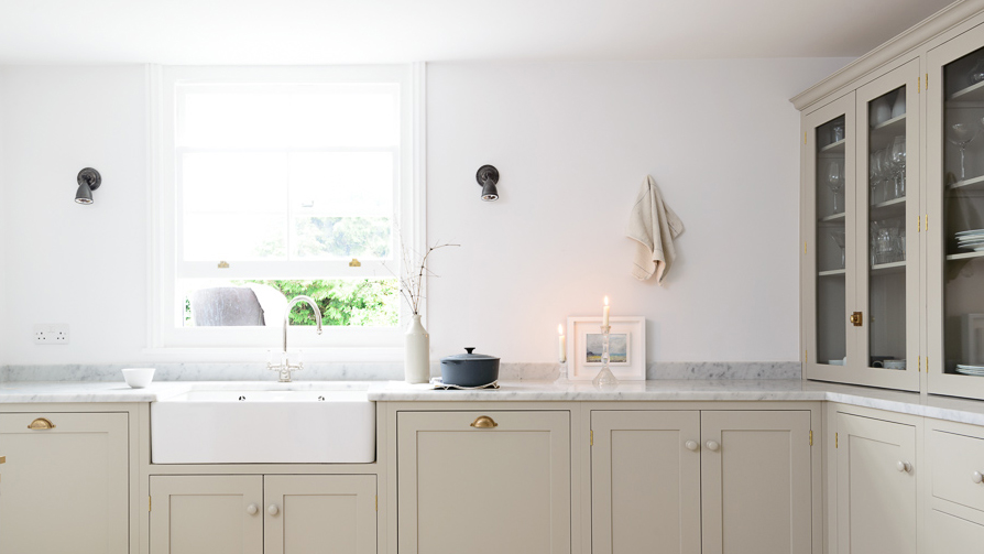

Born out of rough Nordic winters that demand simplicity, efficiency, and a sense of cheerful elegance, Scandinavian kitchen design is all about a seamless blend of form and functionality wrapped in an inviting ambiance. There's something for everyone in this style as it can be warmed up with natural materials and rustic textiles, brightened with crisp whites and minimal furniture, or even weave in vintage items for added hygge.
We love how the style spans aesthetics and especially budgets and an added benefit of simple Scandinavian design is that whenever the urge takes to renovate the kitchen, you won't break the bank. From Scandi luxe to beautiful basics – take a look at our inspiring Scandi kitchen ideas.
1. Work the utility look
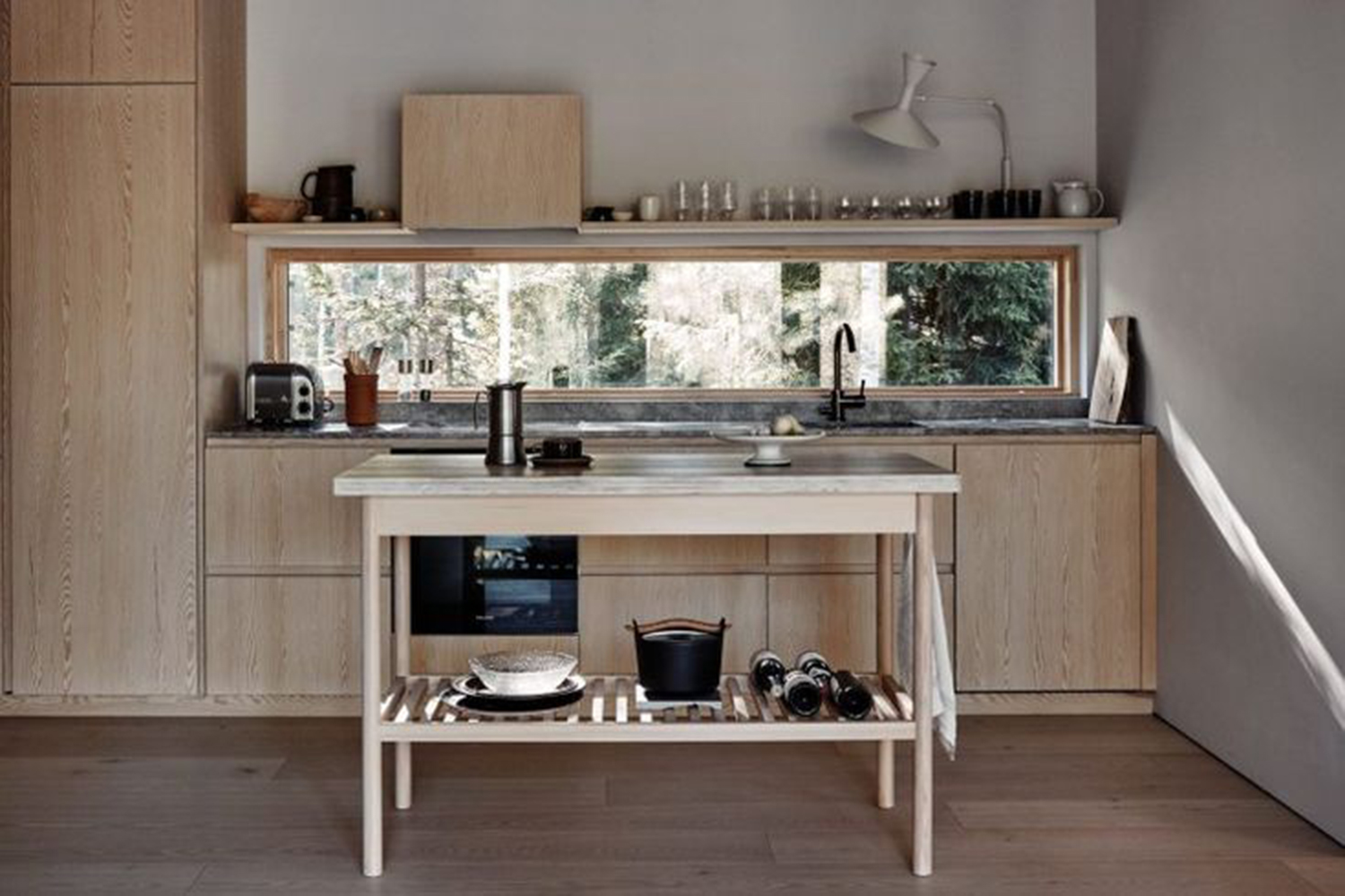
If you have a small kitchen, the utilitarian aesthetics of Scandinavian style work well to make complete use of every inch on offer. Since minimalism, frugality and organization are an inherent part of the style, modular wall-mounted cabinets, sleek floating kitchen shelving ideas, and ergonomic worktops that put efficiency over form make up the core of Nordic-inspired kitchens.
This super basic but beautiful cabin house kitchen puts practicality at the forefront with only the essentials on offer. A simple wood trestle table matches the blonde wood cabinetry and a horizontal picture window ledge doubles as both a striking design element in the space as well as a spot to store daily use items.
2. Add a hint of color
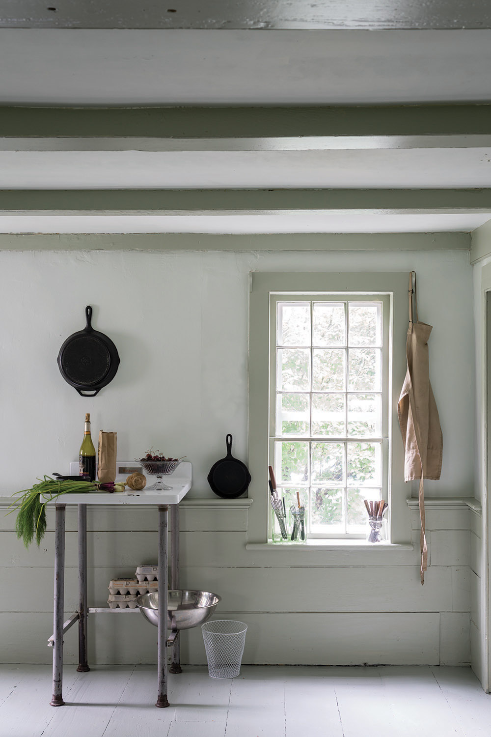
Often bright whites are associated with Scandi interiors but in recent years we have seen a move to delicate kitchen color ideas that emulate the unmistakable clarity of northern light. Farrow and Ball's 'The Nordic Edit' embraces unexpected shades from their core the Farrow & Ball Archive with a special focus colors that correspond to the Nordic landscape and city architecture facades.
Going beyond the whites and greys we might traditionally associate with Scandi design, The Nordic Edit embraces bold and unexpected shades from the core collection of colors and the Farrow & Ball Archive.
3. Create a homely area with rugs
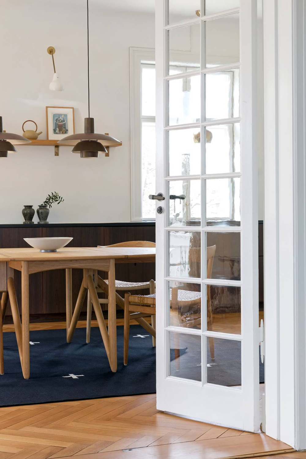
Minimal Scandinavian interiors are the perfect space to weave in textiles in the form of an area rug. Choose a graphic rug to get the clean Scandi look like 'Plus' from Nordic Knots. This contemporary design has a minimalist aesthetic with an artistic touch. The rug brand's ethos is inspired by the nordic light, colors, and landscape
'We wanted to bring something from our home to every home,' says Liza Laserow, Founder of Nordic Knots 'And we realized that at the center for every beautiful Swedish home is a good rug."
4. Bright white and light hues
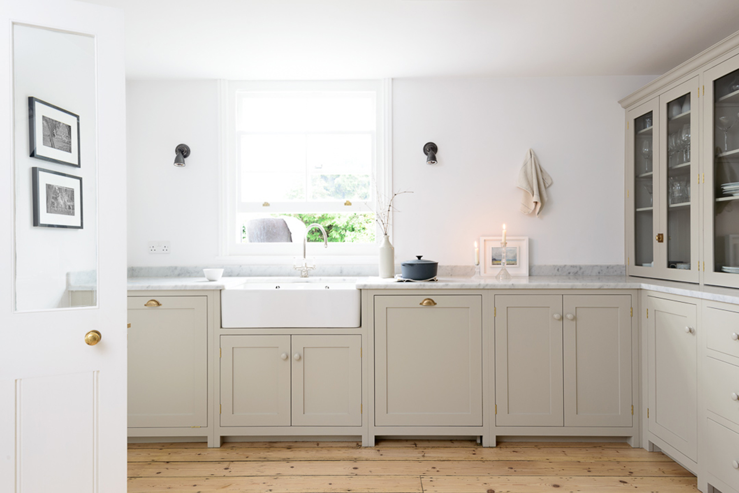
Think of Scandinavian style and the first thing that comes to mind is the color white. The harsh winters that have shaped the style dictated this color choice, as homeowners wanted an interior that was airy, cheerful, and moved away from the chill and gloom outside. A white kitchen is an obvious choice, as it maximizes the available natural light while creating a cocooning feeling.
'Scandinavian interiors have a pared-back style that is centered around clean lines and functionality in the prettiest way,' says Helen Parker, Creative Director at deVOL Kitchens. 'Cool muted colors and wooden floors create an ambiance that is warm and homely without the need for lots of ornamentation.'
5. Smart small space living
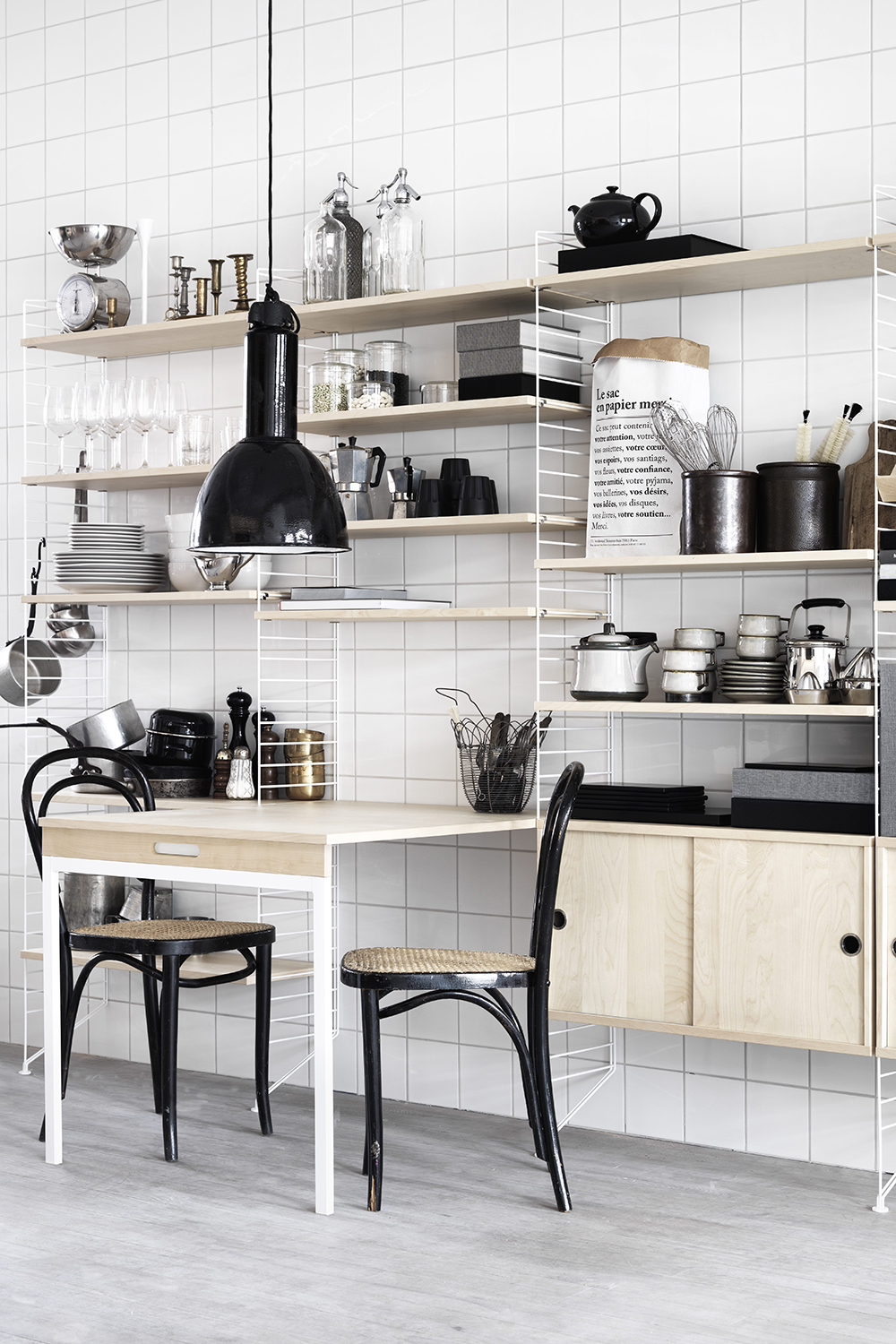
Nordic design is known for its efficiency and utilitarian nature and that is never more present than in their kitchens. String Furniture was designed in 1949 by the Swedish architect Nisse Stringing and is an icon of Scandinavian design.
Stylish, smart, and flexible, this tiny apartment kitchen features an ingenious kitchen storage idea consisting of just three elements – the shelf, the wall panel, and the metal fitting and can be put together in an infinite number of configurations – here it houses all the essentials for a small kitchen and frames a two-seater dining table. Considered character is added to the space with a pair of black cane bentwood chairs and black industrial pendant light.
'What sets String apart is the iconic design and the simplicity in construction, which allows for infinite combinations, ' says Peter Erlandsson, Co-Owner and Director of String Furniture. 'The flexibility ensures that String stays relevant and because the design is timeless it’s enduring in look and feel. Simply put, it’s a classic that will enhance most interiors, whilst being modular enough to fit into many different circumstances and life stages.'
6. Add nature inspired wallpaper
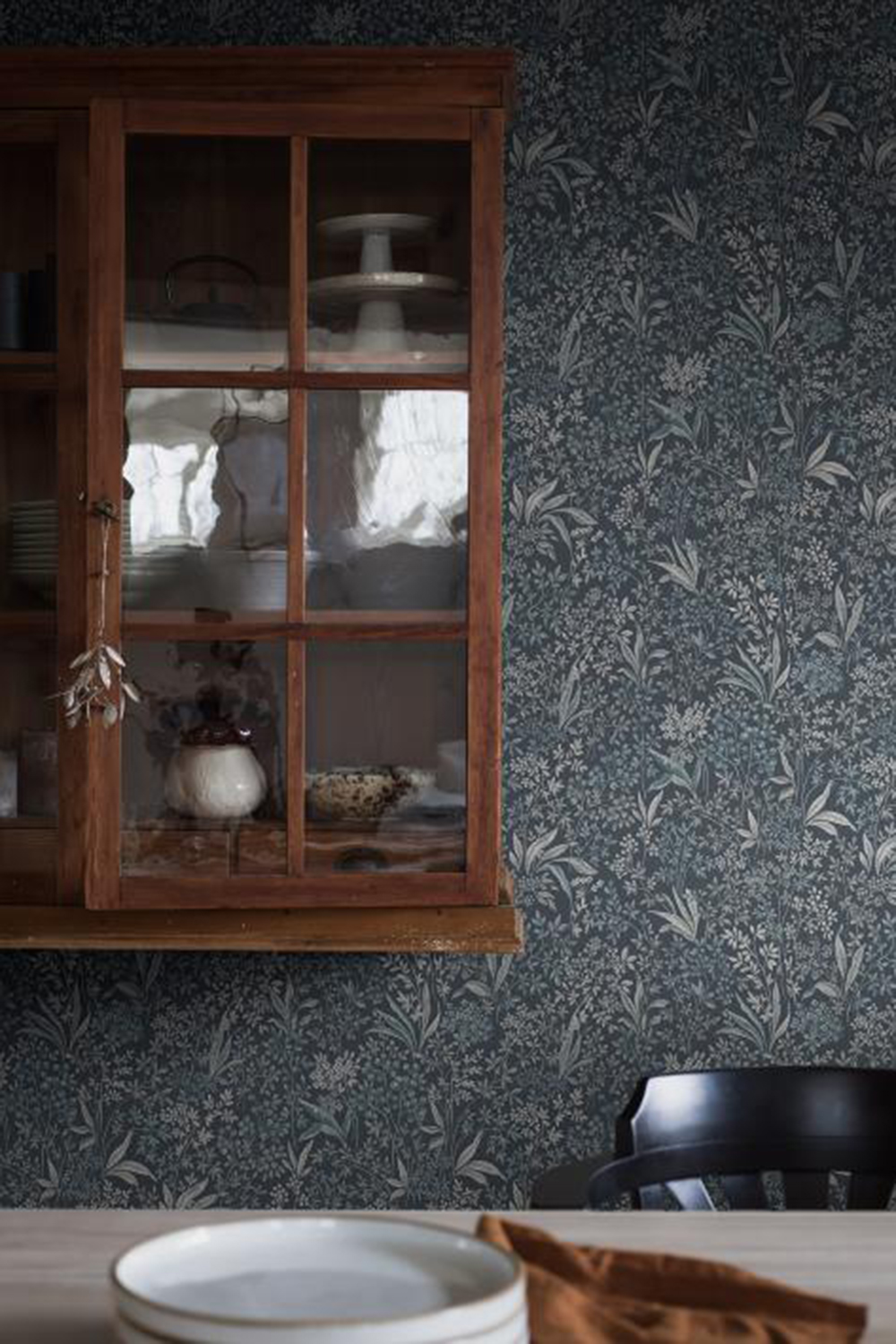
Not just limited to bright and minimal spaces, Scandi spaces are also known for their folk aesthetic, featuring plenty of rustic elements and prints inspired by nature. This richly hued kitchen pairs vintage oak cabinetry with a navy kitchen wallpaper patterned with wildflowers. Nocturne from wallpaper brand Boras Tapeter features a tight floral pattern, hand-painted in both light and dark shades.
7. Add character with raw wood cabinets
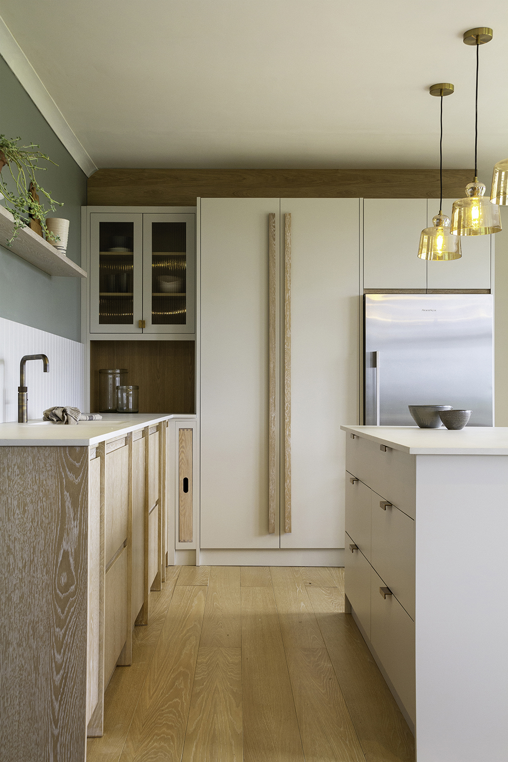
The Scandinavian love of nature is well-known and this is reflected in the home through plenty of untreated wood and natural stone. Plain blonde wood is a cornerstone of Scandinavian design and is a deliberate statement of appreciation for nature’s beauty with natural wood grain always seen.
This wooden kitchen incorporates this natural grain into elements of a modern kitchen through raw wood handles and semi-clad cabinets.
'Here we have married together two different door finishes,' explains Jayne Everett, Design Director of Naked Kitchens. 'Our brushed limed grain oak and our smooth painted finish, along with two different handle styles to create interest whilst maintaining the simplicity that is key to the Scandinavian aesthetic.'
8. Incorporate marble for Scandi luxe
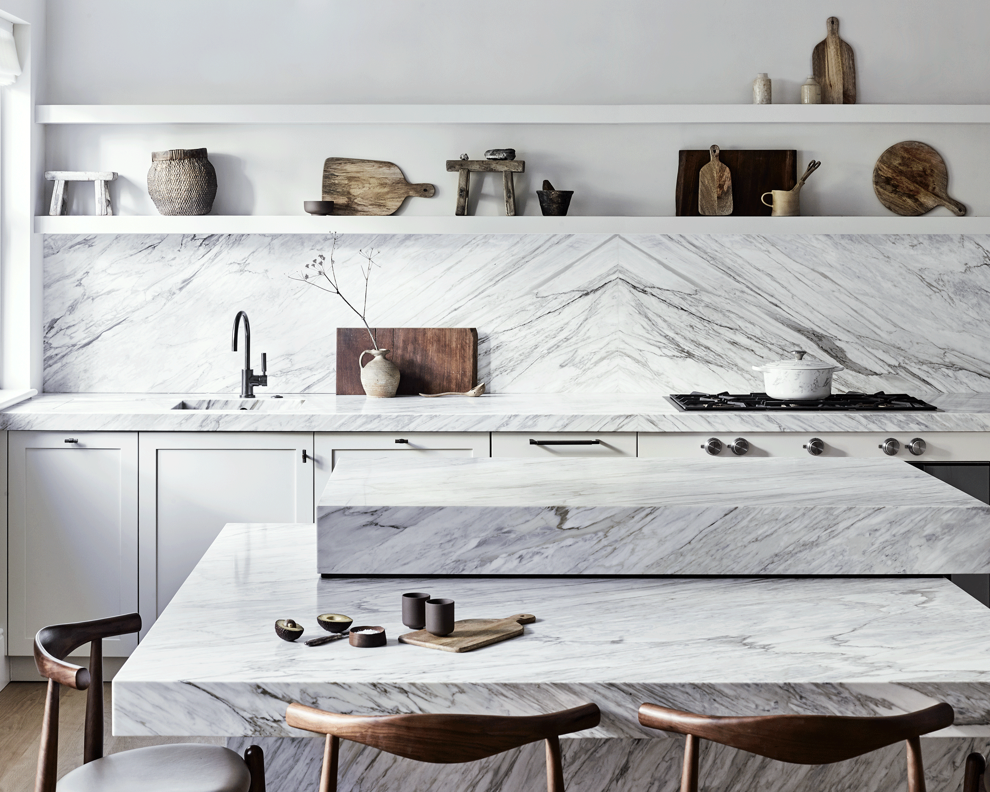
Long-term lovers of Scandinavian design will be pleased to see the emergence of Scandi-luxe where pared-down Scandinavian design acquires a touch of luxury with brass details, copper touches and bright white veined marble.
'The owner of this cottage wanted an elegant Nordic feel,' says Craig Matson, Managing Director at Roundhouse. 'With pale finishes and simple lines. The classic Shaker-style doors were chosen in honor of the property’s period architecture. The marble kitchen splashback helps accentuate the room’s depth and ensures the island doesn’t steal the show. Deciding where to stop the marble was determined by the height of the first shelf. Besides, the owner wanted to fill the shelves with shapely ceramics and rustic treasures, which stand out against a plain backdrop.'
What is a Scandinavian style kitchen?
Creating a Scandinavian-inspired cooking space typically involves layering on accents of warm wood in the forms of cabinetry and flooring, paint colors in pale hues, and a minimalist yet textured backsplash. Sleek stools and scaled-back kitchenware complete this timeless design look.
What is Scandinavian home design?
What Is Scandinavian Design? Scandinavian interior design is a minimalistic style using a blend of textures and soft hues to make sleek, modern décor feel warm and inviting. It emphasizes clean lines, utility, and simple furnishings that are functional, beautiful, and cozy.
Be The First To Know
The Livingetc newsletters are your inside source for what’s shaping interiors now - and what’s next. Discover trend forecasts, smart style ideas, and curated shopping inspiration that brings design to life. Subscribe today and stay ahead of the curve.

Rohini Wahi is Content Editor for Livingetc Online. With a decade-long career in the interiors and design industry working as a journalist for premium lifestyle publications then delving deeper into the business as a trend forecaster, Rohini has amassed a wealth of global design knowledge that informs her work. She loves a period drama and keeps a tidy home.
-
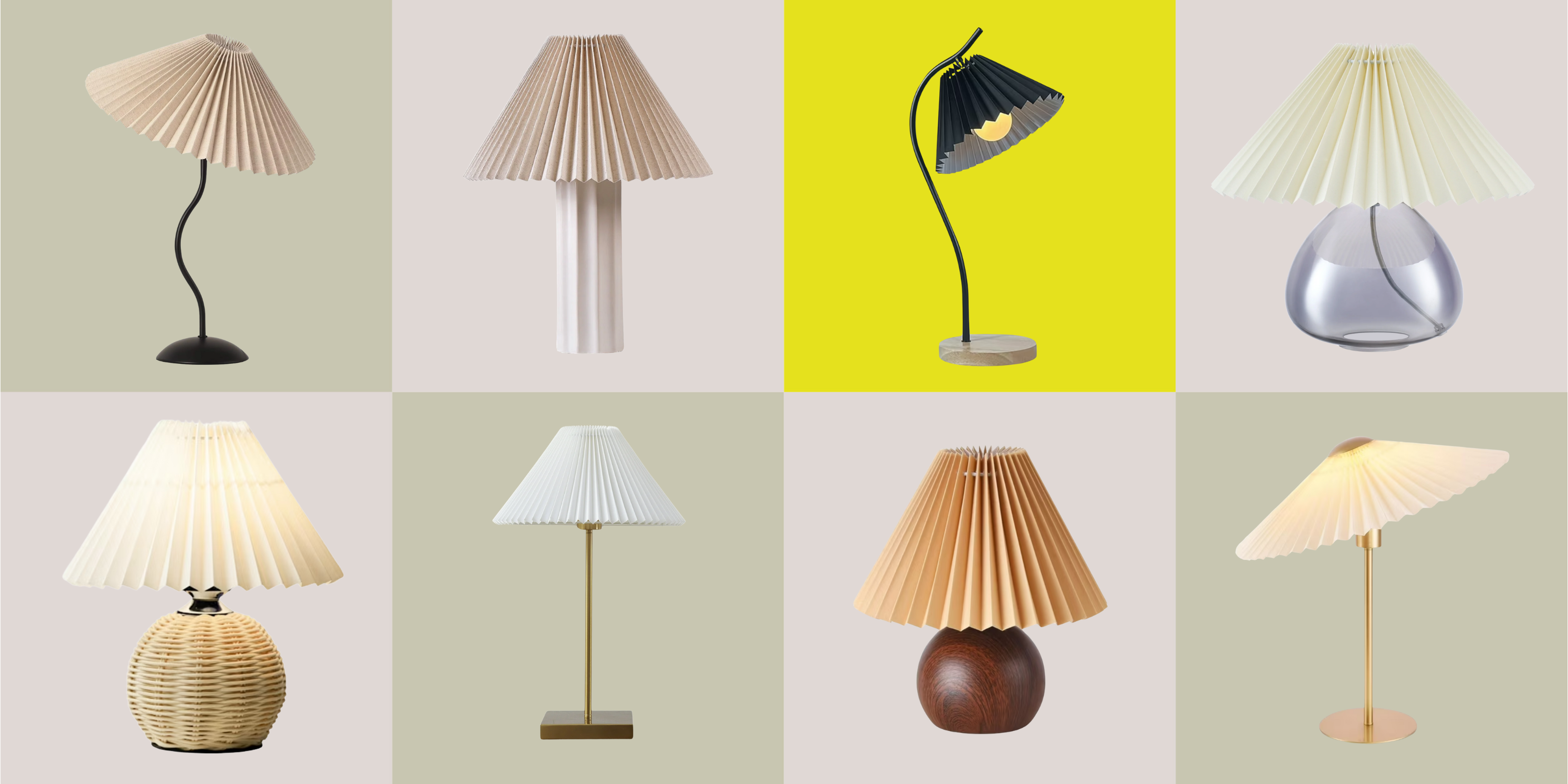 Pleated Lampshades Are the Silhouette of the Season — I've Found 9 For Well Under $100 (You'll Never Guess Where)
Leave it to Walmart to bless us with a collection of stunning pleated lampshades — proving this old-fashioned feature can look fresh and modern
By Devin Toolen
-
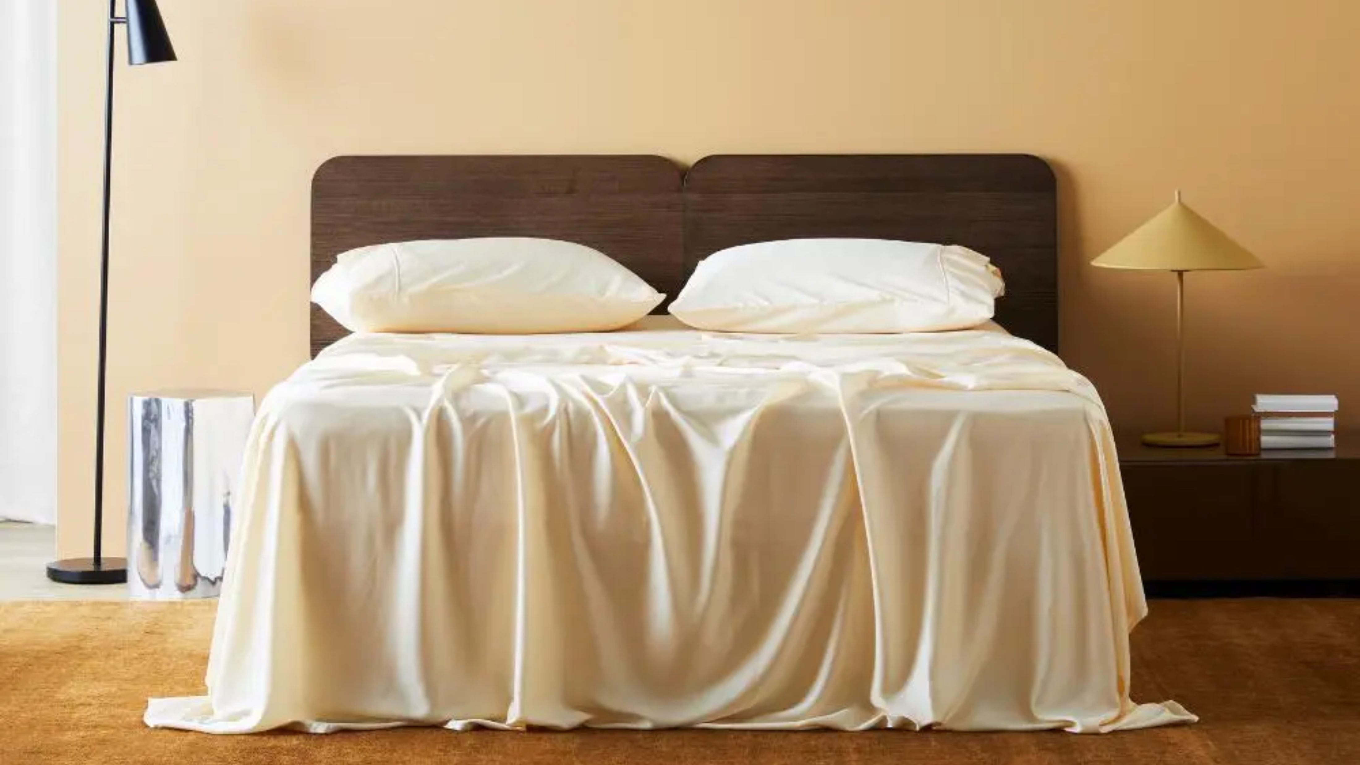 I Found the "Healthiest” Bedding for Earth Month — Why Ettitude Is the Sustainable Sleep Label to Know
Softer than silk and smarter than cotton, Ettitude’s innovative take on bedding delivers luxury with a conscience
By Julia Demer