Before & After: How This Family Home Got A Whole New Look With Just Accessories
A colourful country home gets a completely new look with the help of just a lick of paint, some new furniture and accessories.

Having spent a long time in New York, The Novogratz longed for some space in the countryside. They found a very inexpensive house near a small town in Great Barrington, Massachusetts. The reason they paid so little for the house was because it was in terrible shape, but the design duo thought it had great bones and instantly fell in love with the huge wraparound garden and the gorgeous trees surrounding it.
Though they are constantly moving—renovating and then selling their houses—this home is different. They say they will own this house forever—it’s their family home. And it’s even their design laboratory in many ways; over the two decades they've lived there, they have renovated, revamped, and restyled it many times, growing and evolving with their family.
In their latest book, Novogratz Design Fix: Chic and Stylish Tips for Every Decorating Scenario, they illustrate some of the changes they made to it, so it could evolve with the needs of their family (the couple have seven children together). They created a boot room out of a wasted porch space, they gave each room new lighting and new window treatments, and re-did the attic too. In doing so, they managed to make something old feel new again.
Read Also:Design Project: A Strikingly Colourful Family Home Designed By Novogratz
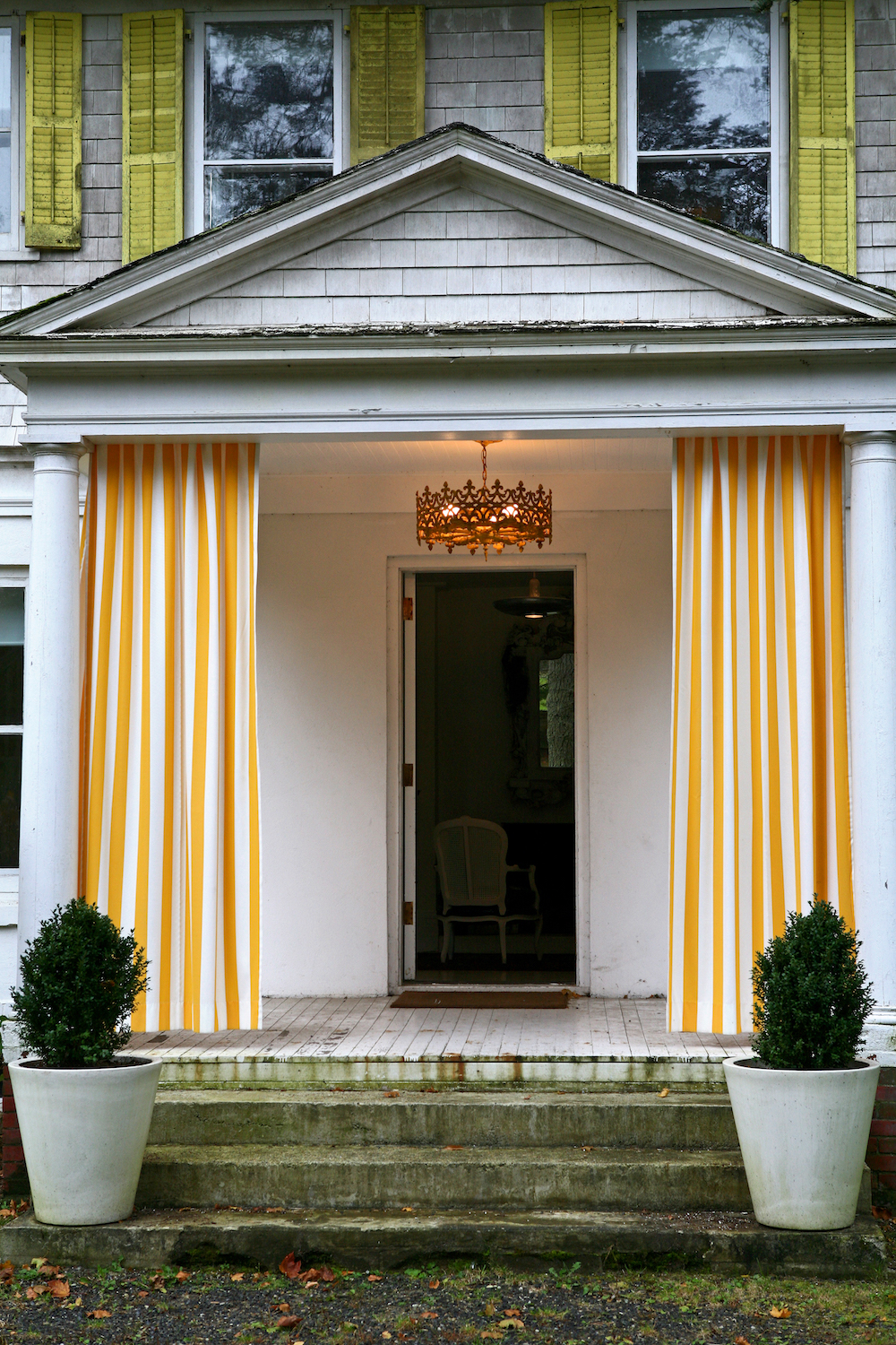
ENTRANCE - BEFORE
Read Also:Before & After: Terraced House in Hackney Gets A Modern Make-Over
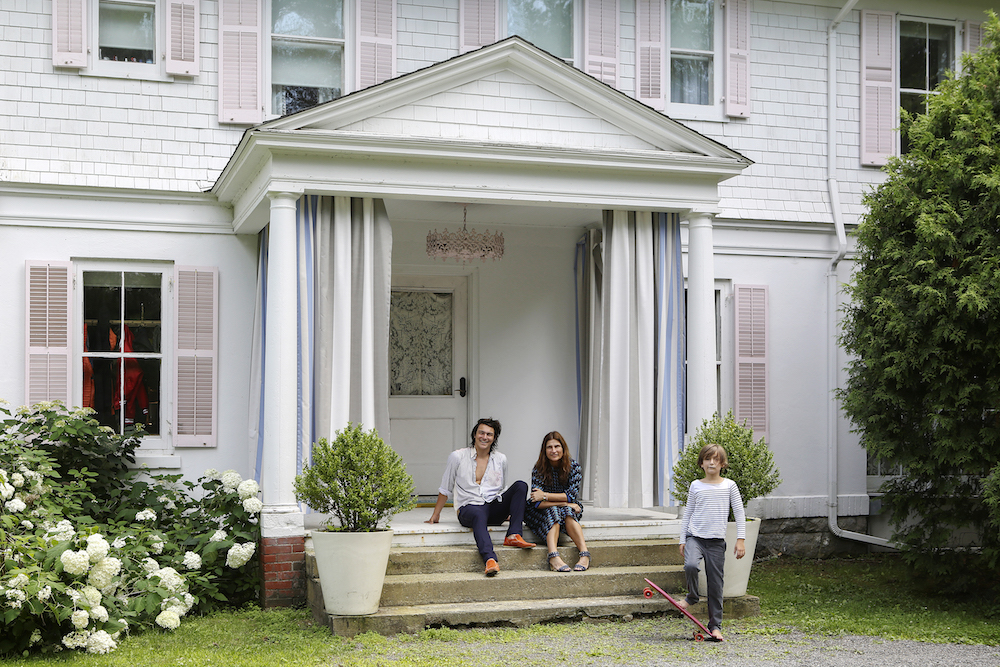
ENTRANCE - AFTER
Be The First To Know
The Livingetc newsletters are your inside source for what’s shaping interiors now - and what’s next. Discover trend forecasts, smart style ideas, and curated shopping inspiration that brings design to life. Subscribe today and stay ahead of the curve.
When the couple bought this house, they had four children – now they have seven. During this time they've repainted most of the rooms at least once and even changed their famed yellow shutters to a pale pink. The chandelier in the porch was painted in the same shade, and the front door to match. Curtains were replaced too, to suit the fresh new scheme.
Read Also:Before & After: How Architects Breathed New Life Into A Dated Victorian Property
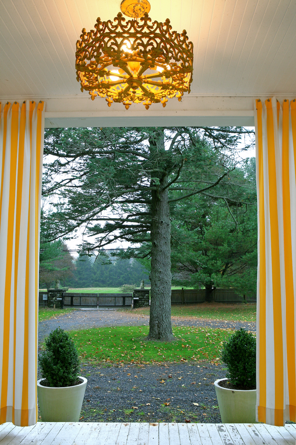
BOOT ROOM - BEFORE
The Novogratz wanted to build a boot room without spending a fortune, finding a way to add it in without having to add an extra roofline. Their front porch was the best place to make this happen.
Before the new boot room was installed, there were many hooks and a freestanding coat rack, neither of which were enough to hold all of their coats and gear (the design duo have seven children together. SEVEN). The hallway got especially chaotic when they had guests, as the coat rack would often collapse under the weight of coats.
Read Also:Chic Utility Room and Boot Room Ideas
BOOT ROOM - AFTER
After many years of thinking about it, they finally built a boot room, which stores all of their ski gear and jackets. They have plans to turn the garage into more sleeping areas because all of the children are getting bigger and one day will have kids of their own.
The boot room is complete with lots of hooks and a bench with open storage. Originally, the front door of the house opened right into the living room, making it feel less formal, and allowing cold air to waft into the house every time someone opened the door. And because there was nowhere else to hang coats and store shoes, boots, and sporting equipment, the living room often resembled the entrance to a store. In other words, a boot room was long overdue.
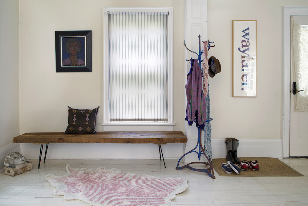
A boot room is a great place to hang coats and store things that you don’t want brought into the house, and to leave shoes in so they don’t bring the outside into the home. It can provide a second means of egress into the house, making it safer, plus it adds a buffer between the home’s interior and the cold weather. Depending on how you style it, it can also make a house more elegant. In this case, it created an entry between the front door and the living area.
Read Also:Chic Hallway Ideas That Make An Entrance
HALLWAY - BEFORE
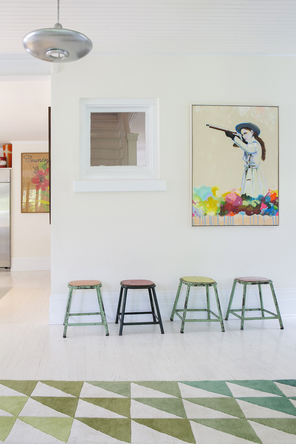
The hallway has undergone some simple changes over the years; a new artwork is the easiest way to add a new look or vibe to a space.
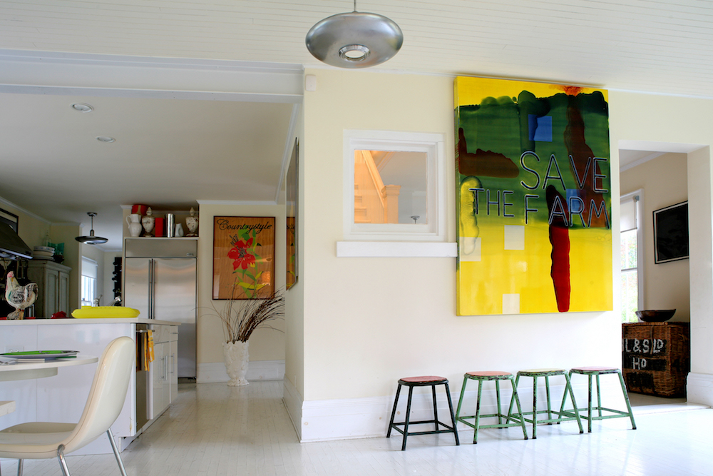
HALLWAY - AFTER
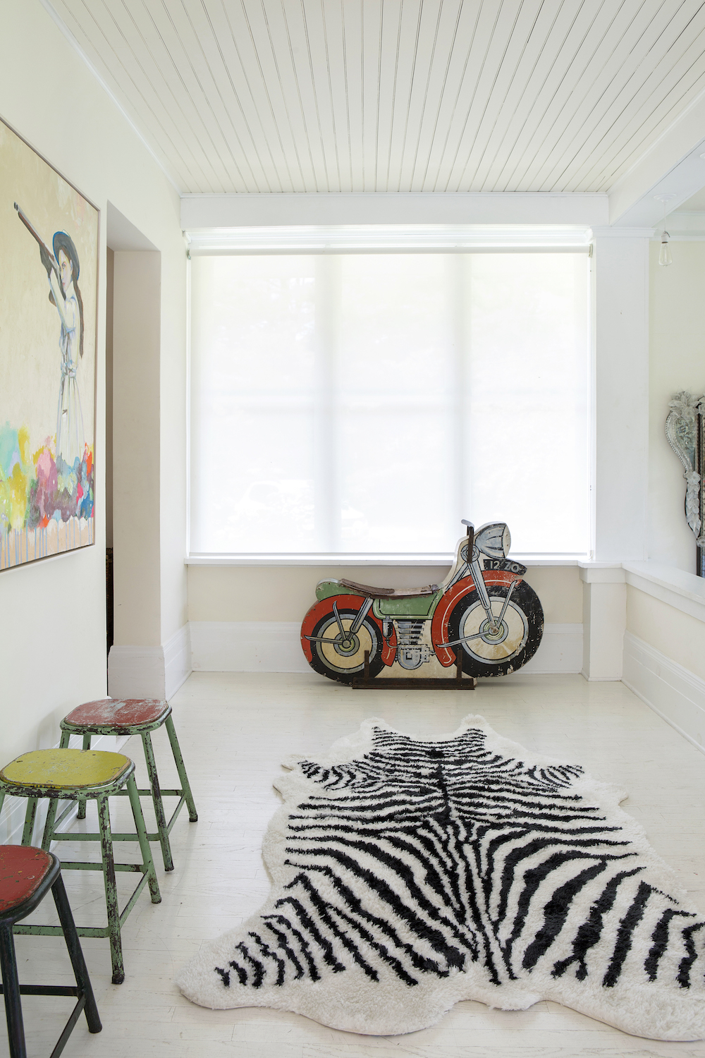
Now the hallway features a few cool and quirky things that the couple have collected over the years. Each one tells a story.
Read Also:Design Project: A Colourful Victorian Terraced House In Crouch End
DINING AREA - BEFORE
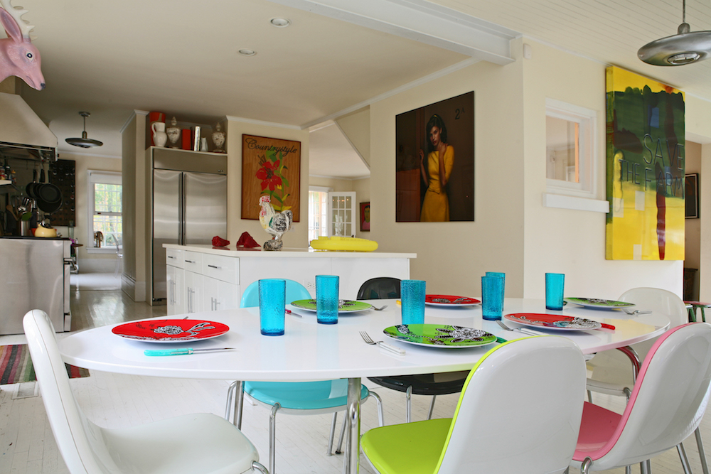
Initially their dining room featured lots of bright, clashing colours against a white backdrop.
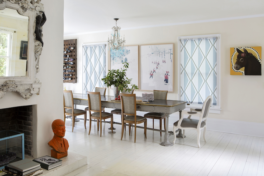
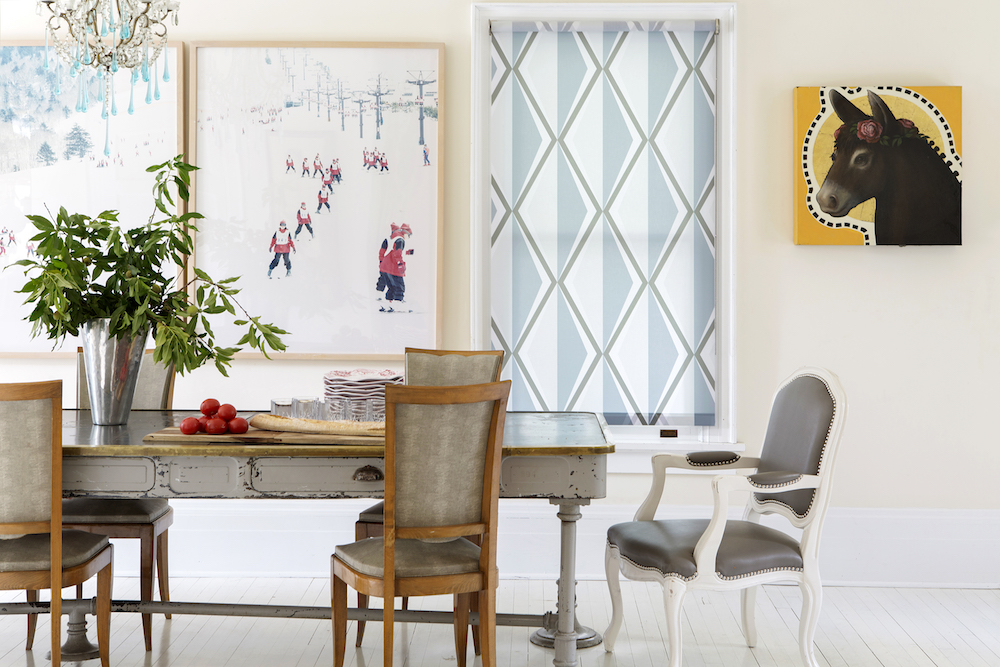
DINING AREA - AFTER
Now that the children have grown up a little, the dining room has a more grown-up and distinctive look to it, owed to a new, sophisticated dining table and dining chairs.
Read Also:Informal and Relaxed, Laid-back Luxe Dining Room Ideas
LIVING AREA - BEFORE
The living room used to feature a similarly bold palette; loud bursts of colours popping against a white background.
Read Also:Paint Ideas From 3 Unexpectedly Colourful New York Town Houses
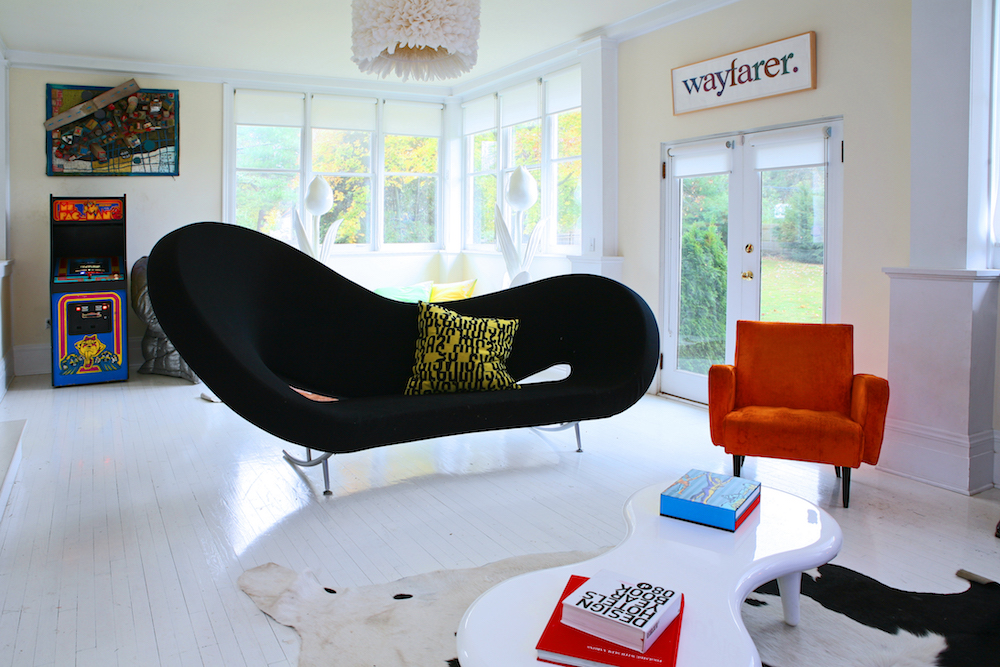
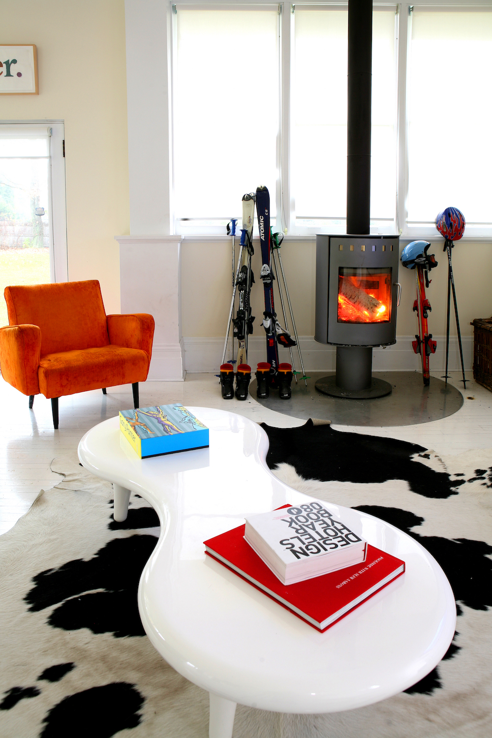
LIVING AREA - AFTER
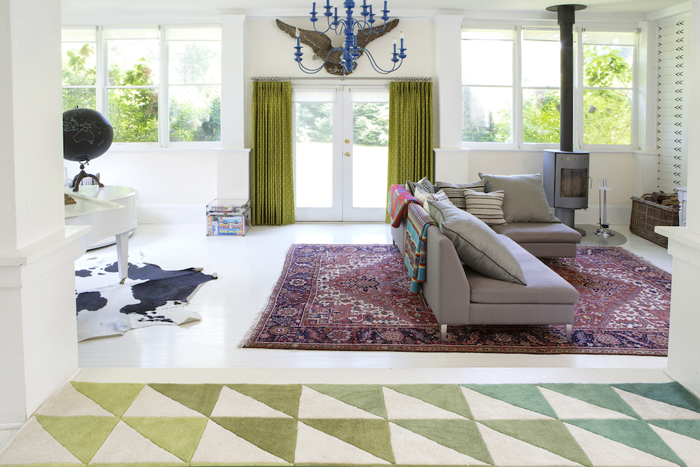
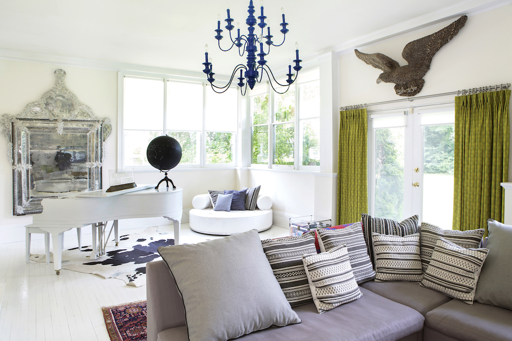
Now the living room features a music space (some of their children are particularly musical, and record their own music), with a vintage turntable and a piano, along with lots of fashion and art books, and a couple of simple but comfortable chairs to read them in.
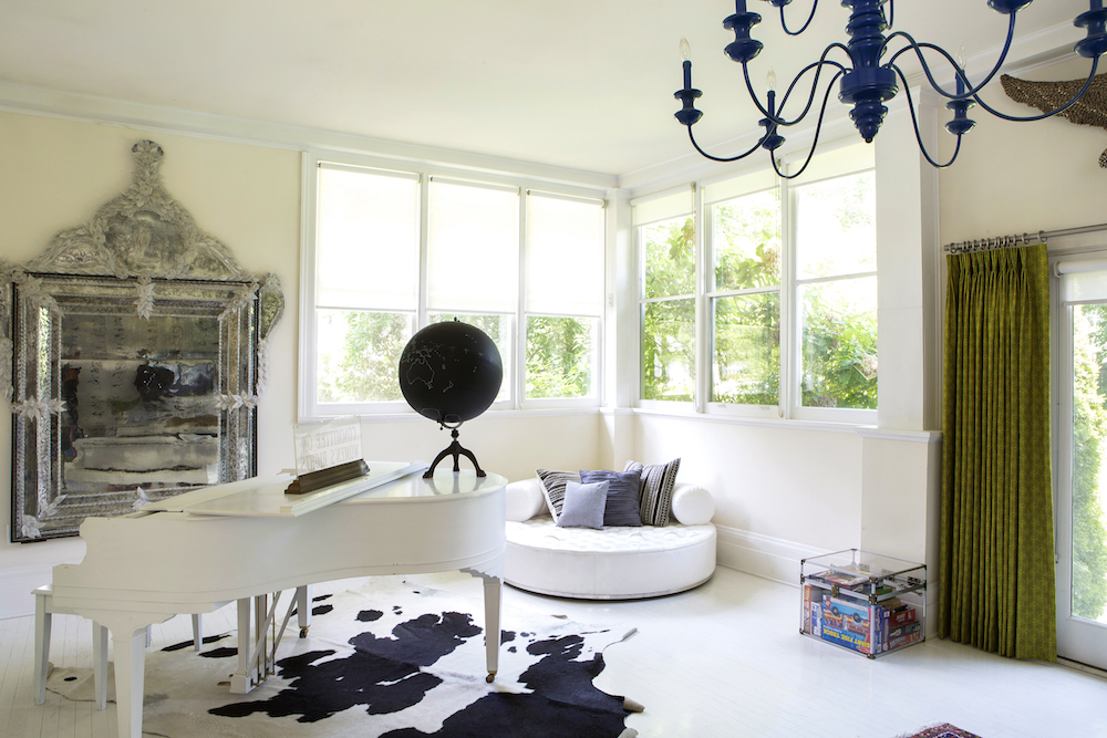
A corner sofa creates a cosy corner too.
Read Also:12 Lessons In Open-Plan Living From 3 Achingly Cool New York Lofts
While much has changed with the house, a few things have and will always remain the same: It’s not and never was precious. It’s well designed with fun art and furniture, but it’s durable, kid-friendly, and extremely cosy.
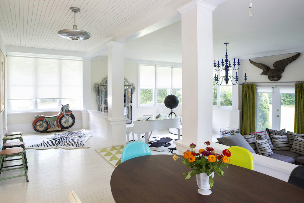
It gets a lot of natural light, and the white floors make it even brighter, and the open floor plan is also a great feature.
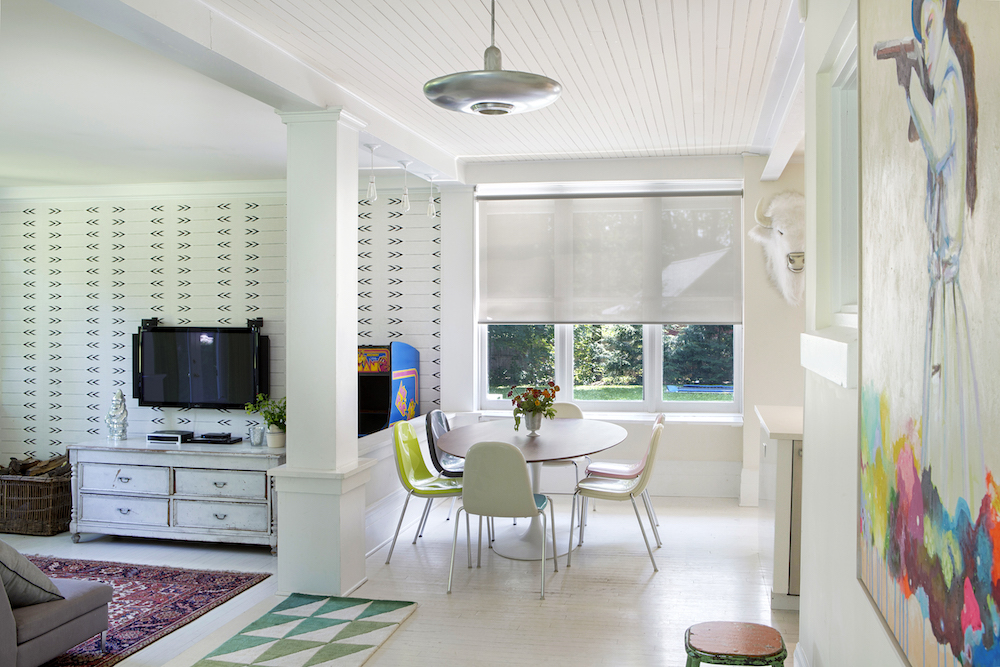
One of the first things the couple did when they started on the first renovation twenty years ago was to knock out the walls. The open space gives the house a loft-like feel. And though the walls and flooring in the main living areas tend to be white, pops of colour abound.
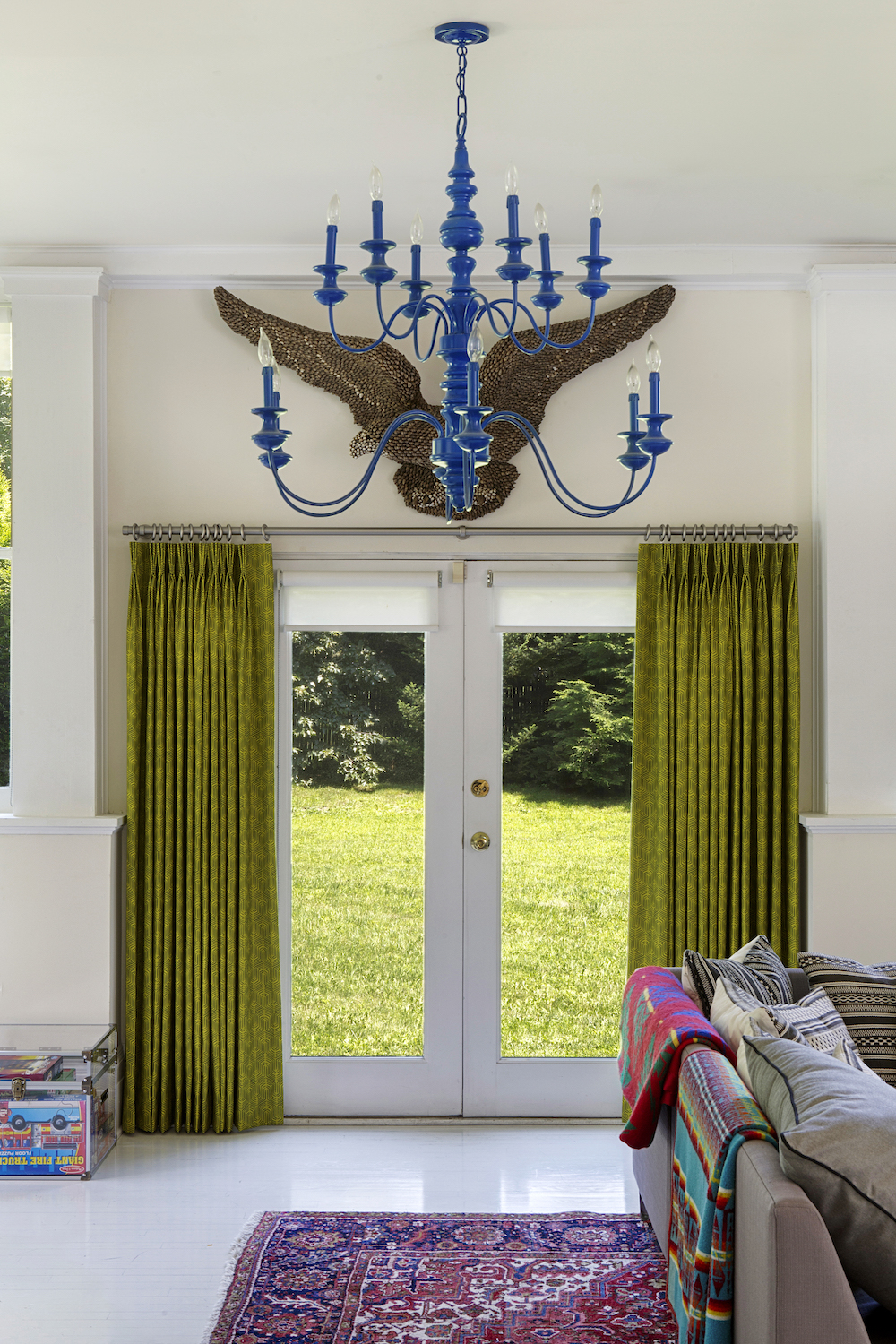
The colours have changed over the years, but there will always be art, interesting textiles, and great furniture that bring colour and happiness to every room in the home.
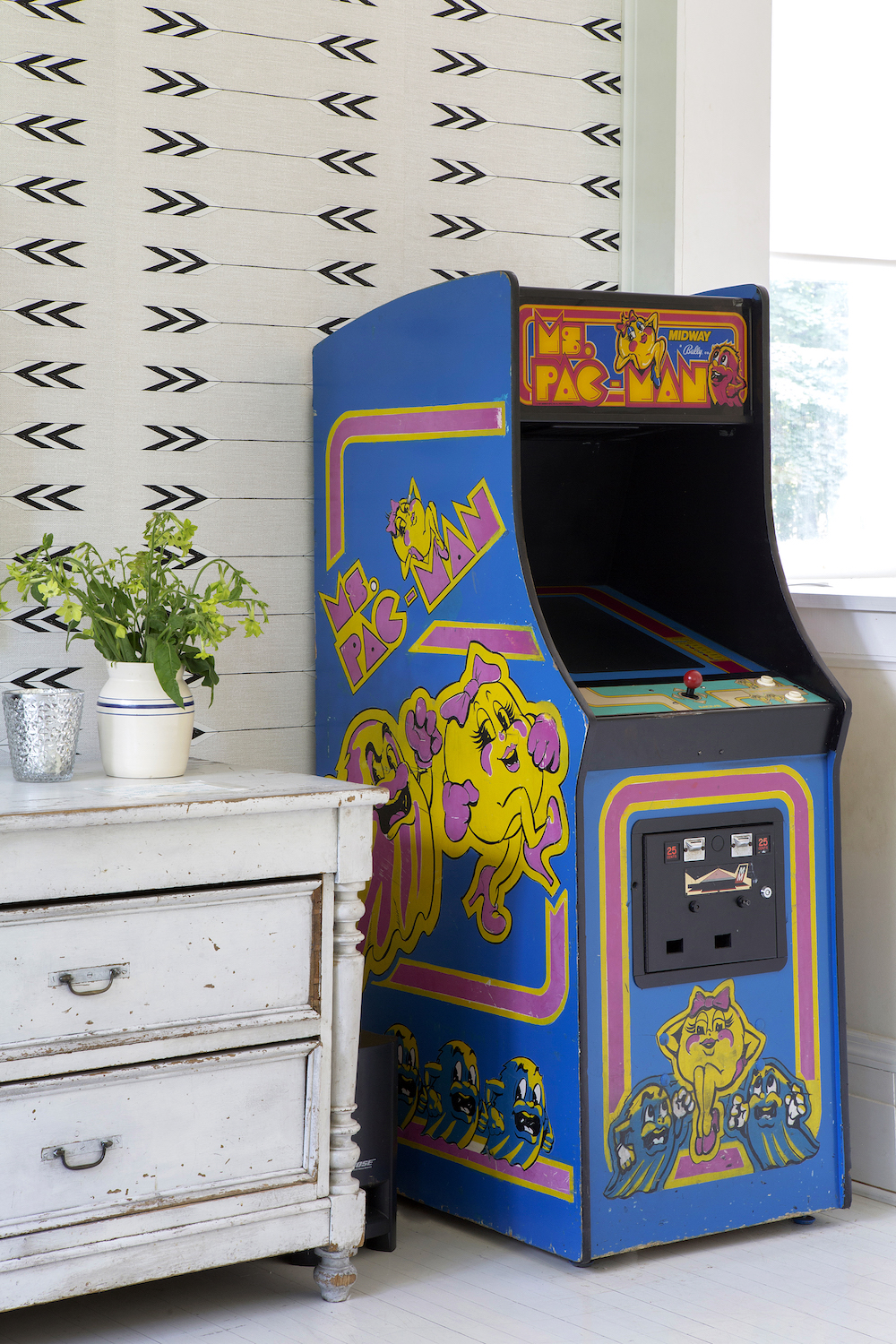
Read Also:Design Project: A New York Brownstone Townhouse With A Light, Open-Plan Interior
SUN ROOM - BEFORE
The sun room at the back of the house was starting to feel like a dated, and tired space.
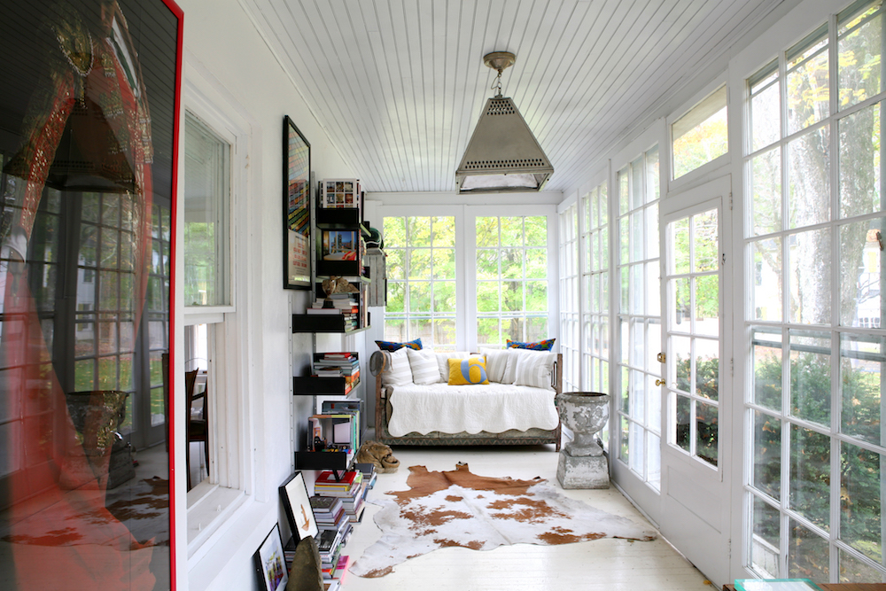
SUN ROOM - AFTER
Keeping furniture the same but just switching up the lighting and accessories gave it a whole new look.
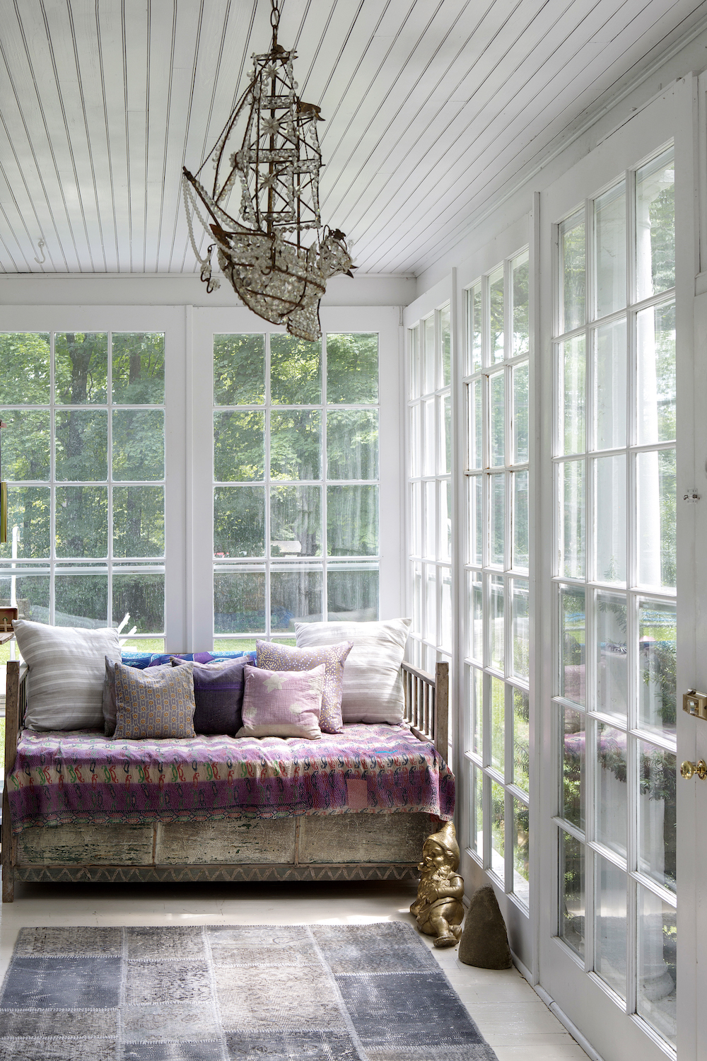
The Novogratz spotted this ship lamp in a magazine, pictured in the home of a famous designer years ago. They loved it and spent the next several years on the hunt for something similar. Finally, in the back of a lighting store in Austin, Texas, they found what they were looking for. It was broken and missing parts, but they were elated anyway. The owner of the store told them that he’d found it in Paris and on his next trip, he’d look for the missing parts. He asked The Novogratz to give him six months. Three years later, he shipped the parts to them. It was worth the wait.
Read Also:Explore An Incredible Open-Plan, Modern Family Home That Brings The Outside In
ATTIC - AFTER
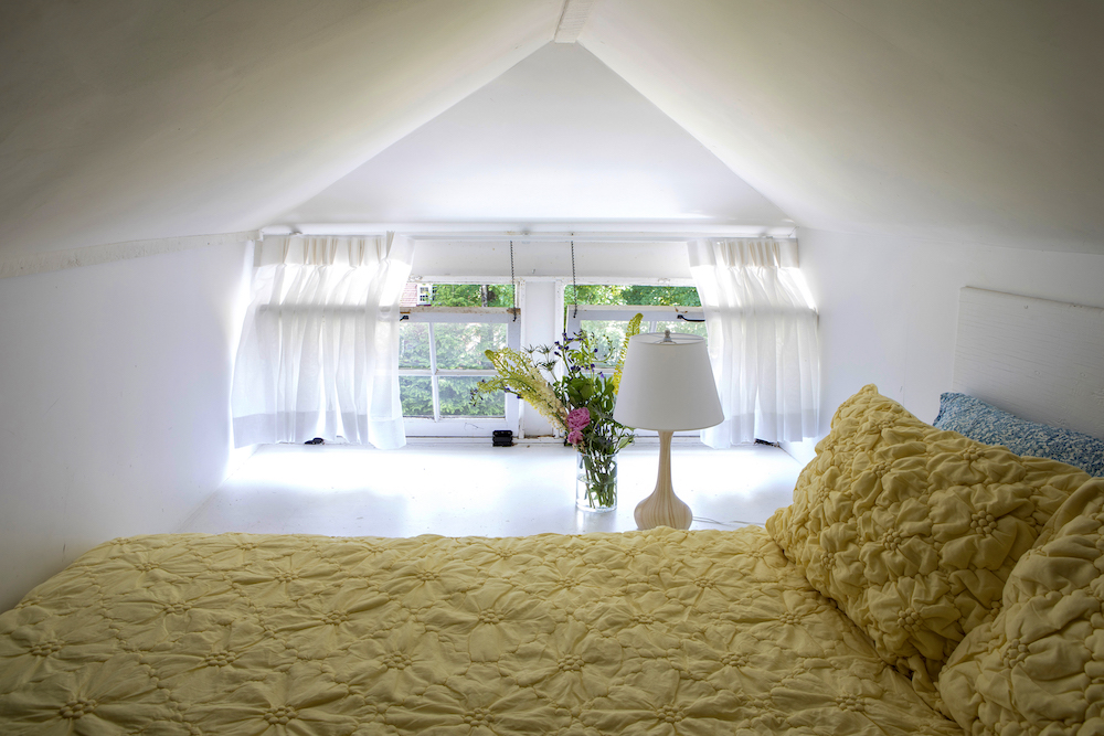
They also turned the simple attic into a fun sleeping loft for the kids and guests.
The aim was to create a functional room in the attic, despite very low ceilings. The Novogratz kept the beams exposed to gain as much space as possible. They also left the electrical boxes exposed and resting on the beams to save headroom (normally there would be dry wall around the electrical box). They painted the entire attic white, including the floors, to make it feel larger and more open.
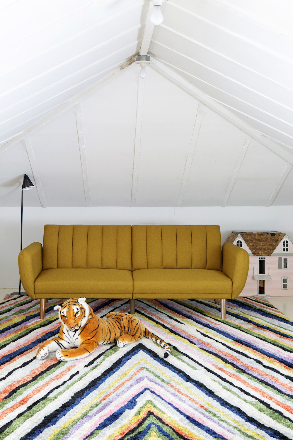
They moved the majority of the kids’ toys and clutter from downstairs to the attic. Their kids now play up there for hours.
The attic also comes in handy for sleepovers; you can fit a lot of kids up there. The sleeping area and seating area are coordinated in shades of gold.
Read Also:This modern attic re-design is full of stylish space saving ideas
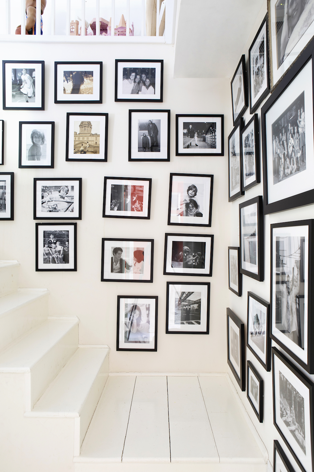
They also replaced the trap door ladder with proper stairs.
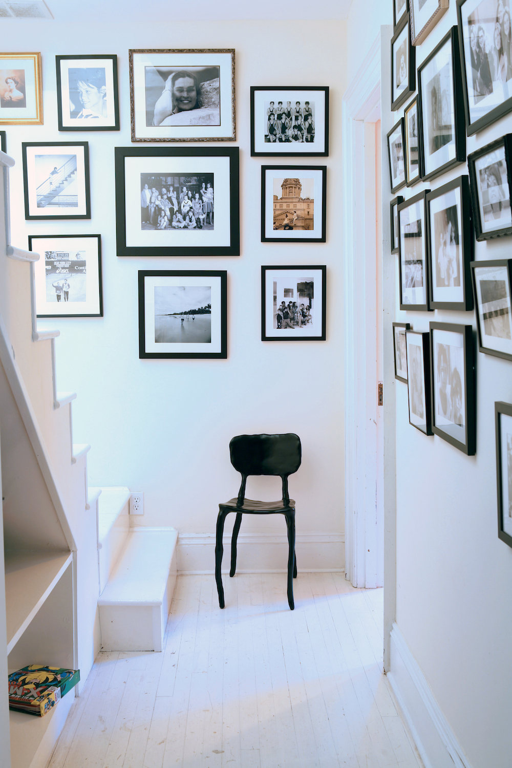
Read Also:Stylish Gallery Wall Ideas
STAIRCASE - AFTER
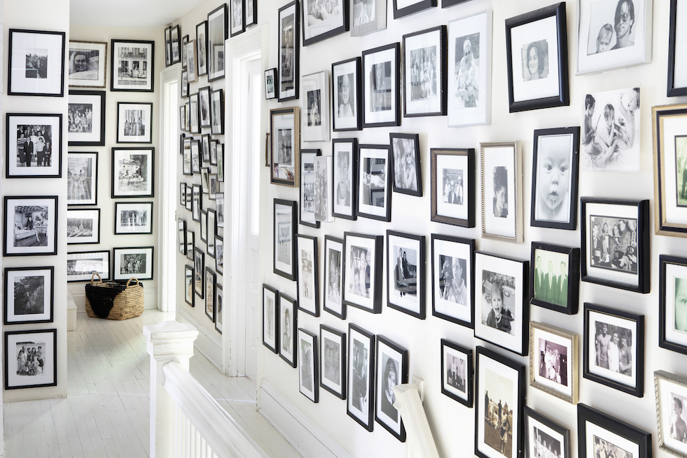
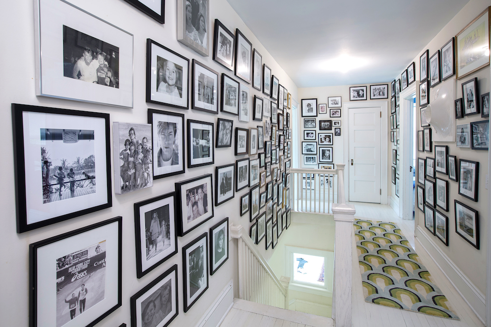
The staircase and second floor hallway is hung top to bottom with family photographs. To make sure the effect wasn’t too cacophonous, The Novogratz converted the images to black and white.
Read Also:Stunning Statement Staircase Ideas
BEDROOMS - BEFORE
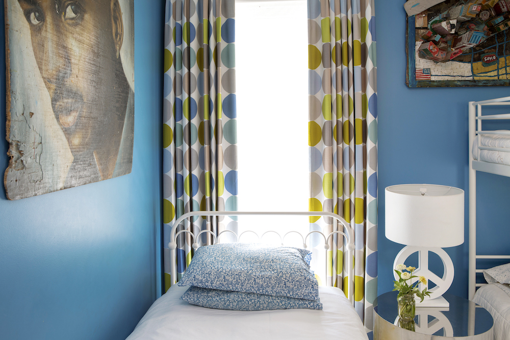
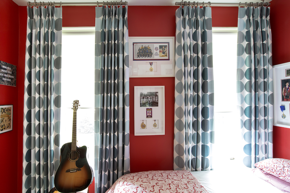
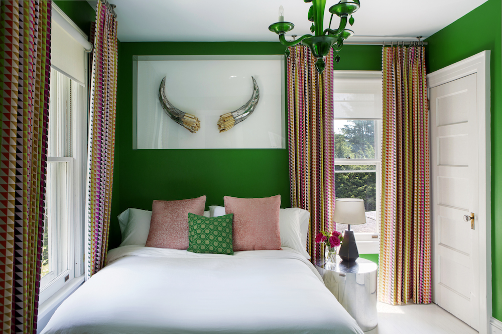
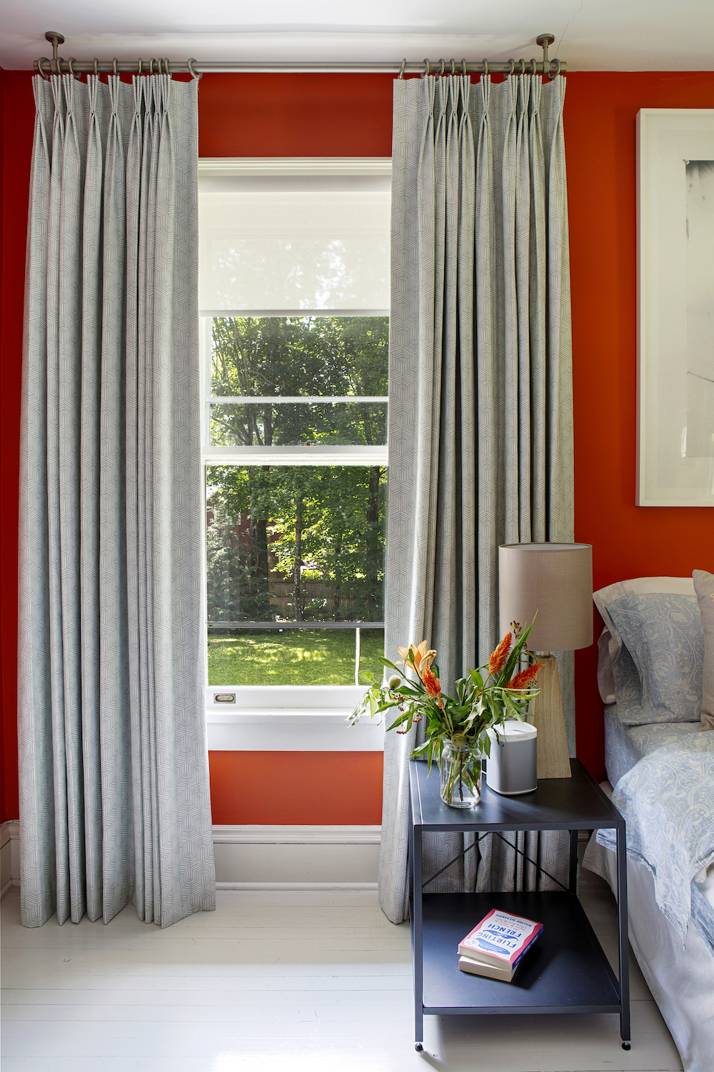
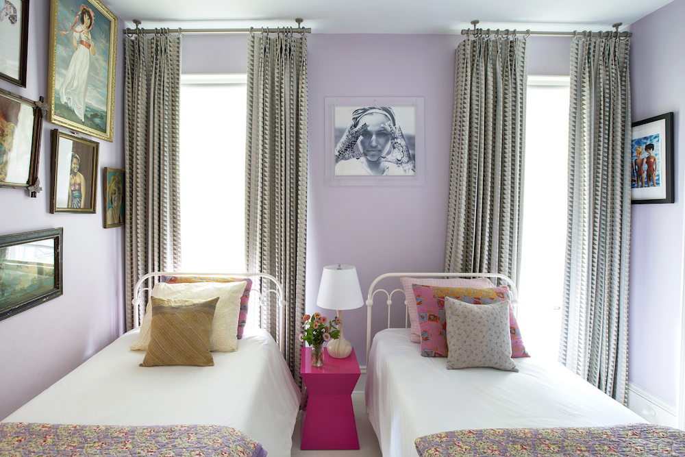
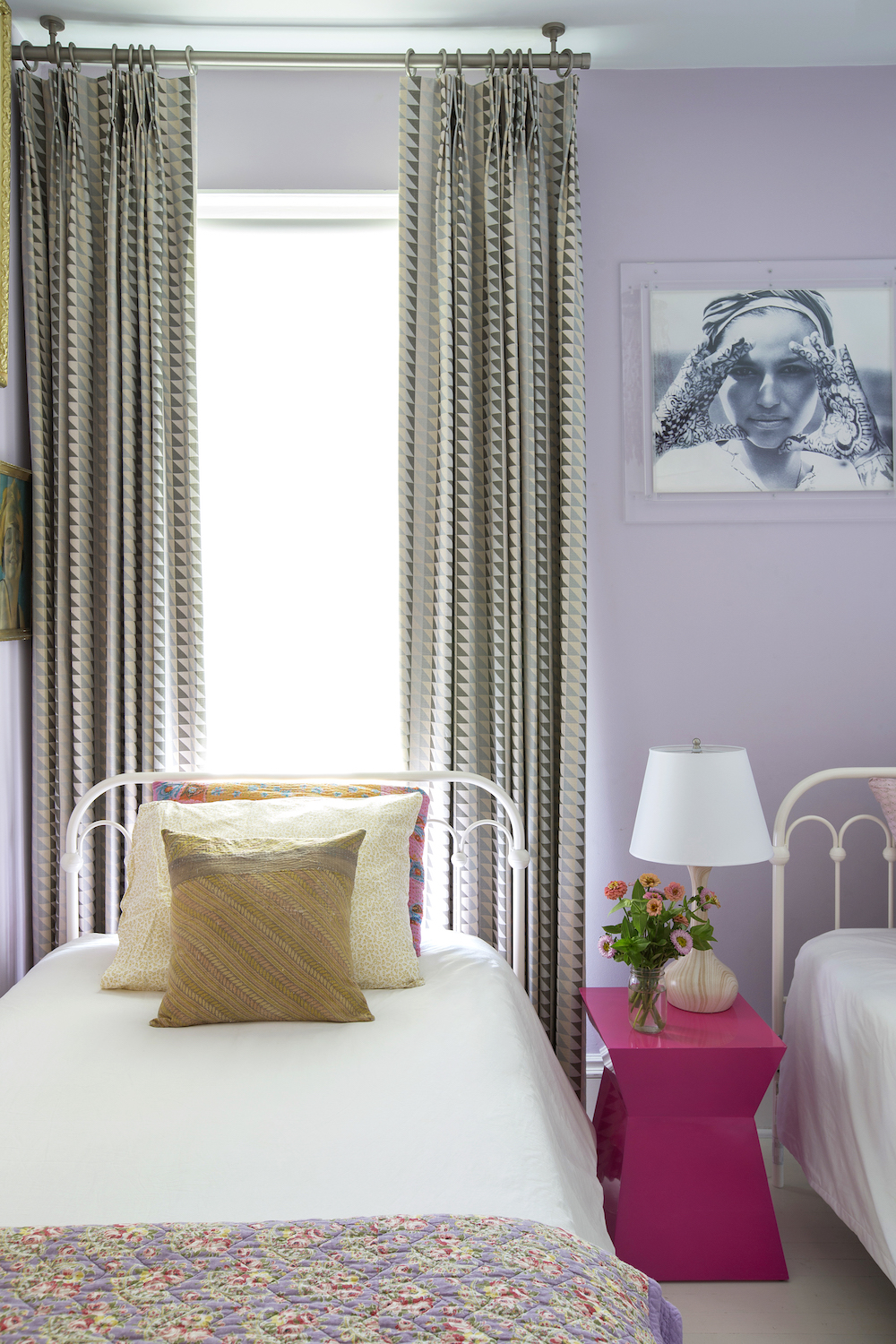
All of the bedrooms have also been refreshed, simply with new curtains and soft furnishings.
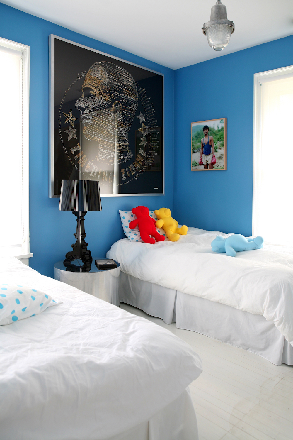
The Novogratz' signature style is to paint the bedroom walls in vibrant colours. And while they were happy with that aspect of the bedrooms, they did want to make some small improvements, which they accomplished by changing the curtains and window shades.
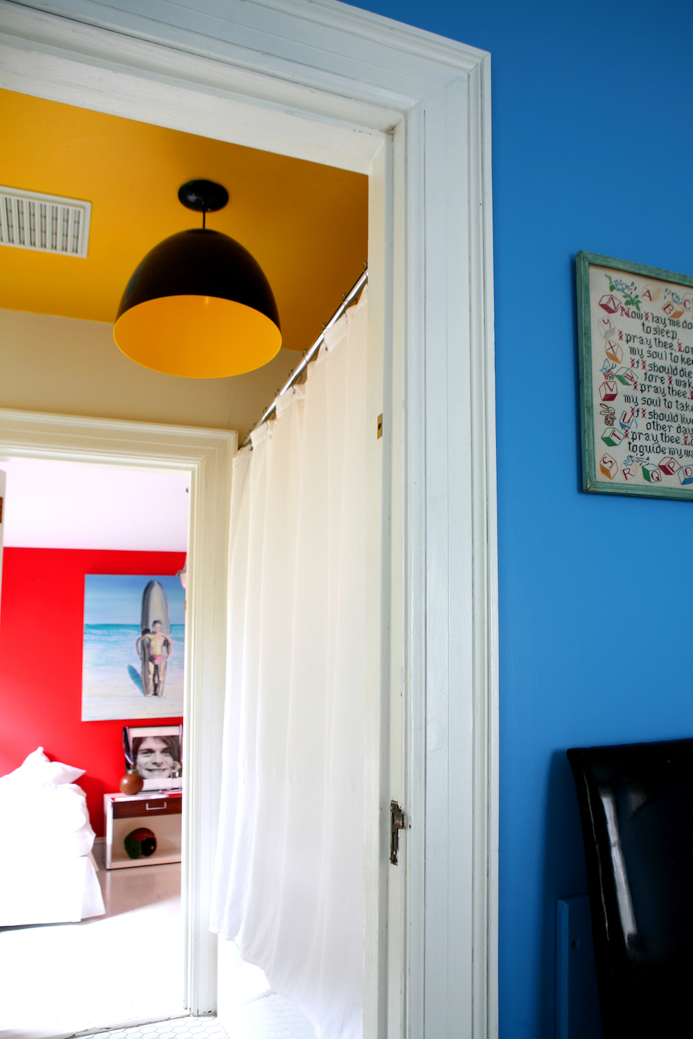
The treatments before were a bit more shabby chic style and so they wanted something more polished.
Read Also:Fun Ideas for Cool Kids' Bedrooms
BEDROOMS - AFTER
They opted for bold patterns that made the rooms look fresh and new.
Read Also:paint colour inspiration: 31 of the best wall paint colours
When it comes to choosing window treatments, The Novogratz suggest asking yourself these questions: Do you have children and how will they use the space? Do you like more formal living spaces or casual? Do you entertain often? 'These questions will help guide you as you choose the style of the shades or window treatments throughout', they explain.
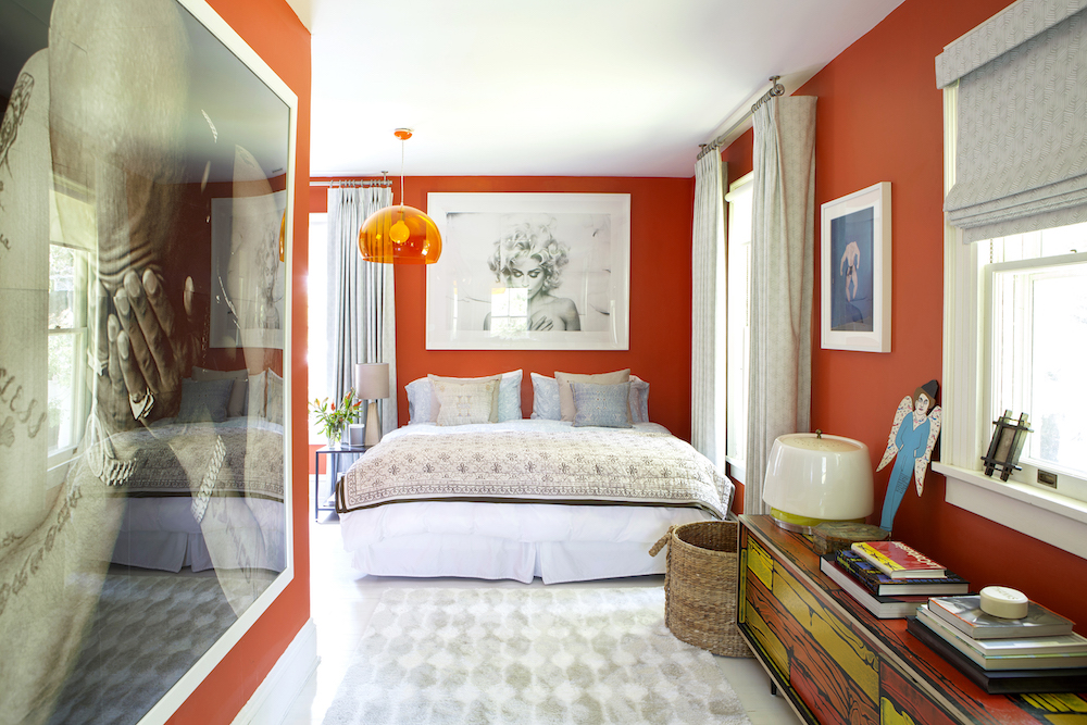
Blackout shades work wonders in the bedroom, but are not necessary in the main living areas. Their final tip on curtains? Every room has a personality. Drapes are better for formal rooms, whereas shades/blinds are great in less formal spaces like the kitchen and kids’ rooms.
Read Also:Summer Curtains And Window Treatment Ideas
As the children grow up, blinds were replaced by drapes for a more elegant look.
Read Also:Sharing Kids Room Ideas
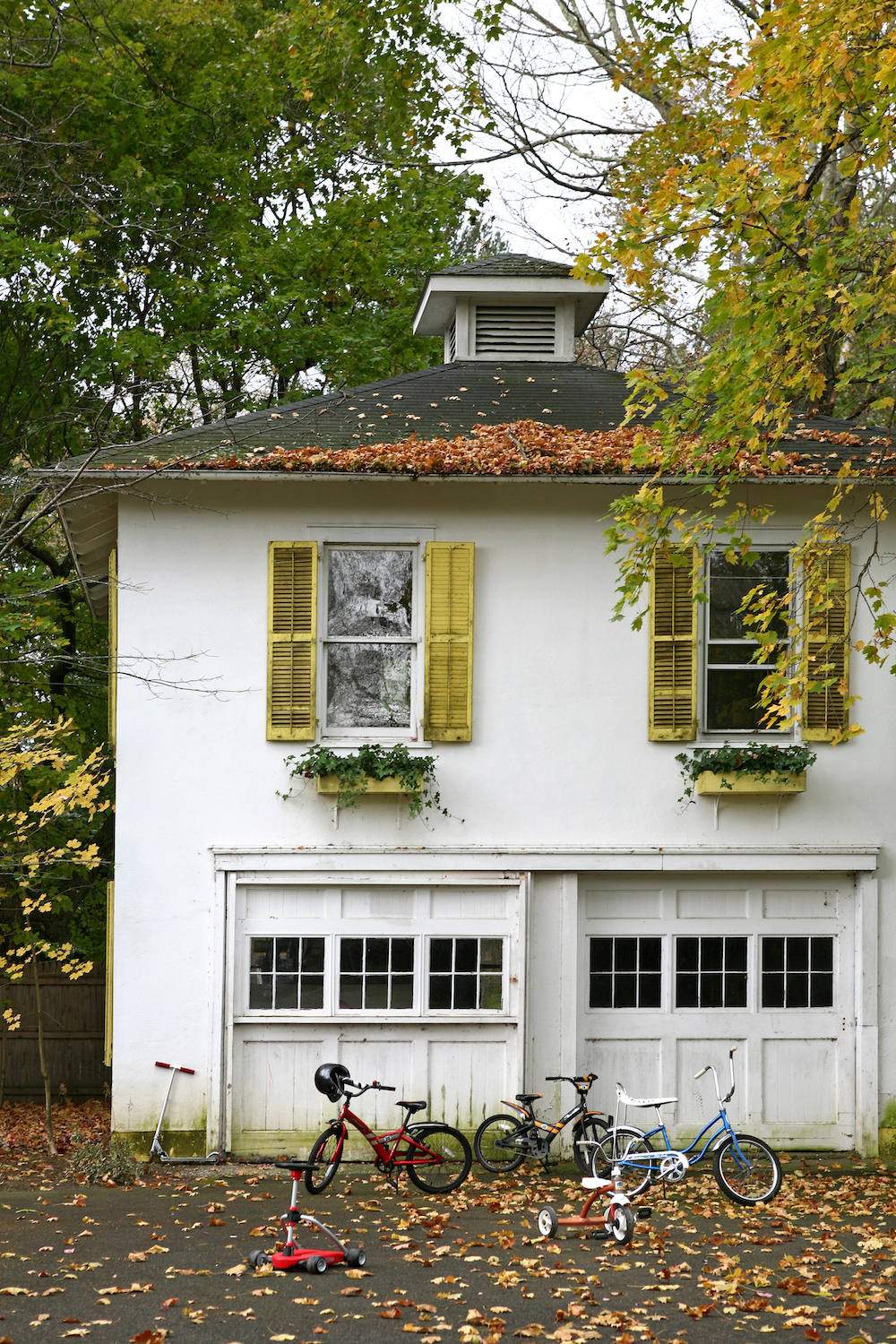
EXTERIOR - BEFORE
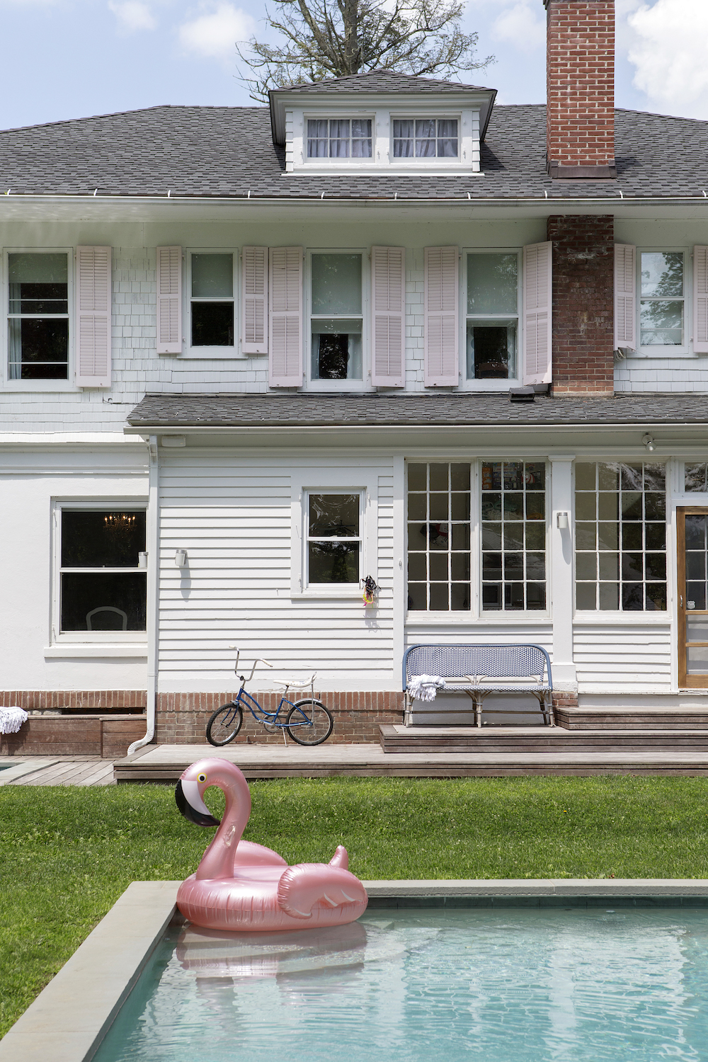
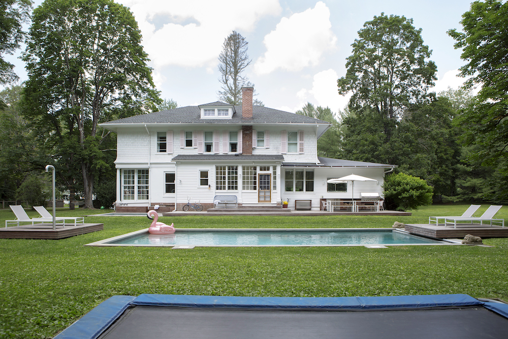
After many years of wear and tear, the exterior was crying out for a refresh.
EXTERIOR - AFTER
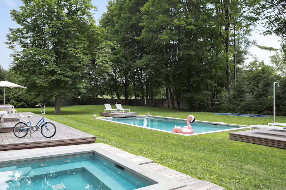
The whole house received a fresh white coat, and the yellow shutters were sanded down and painted a pale pink.
Photography by Costas Picadas

Lotte is the former Digital Editor for Livingetc, having worked on the launch of the website. She has a background in online journalism and writing for SEO, with previous editor roles at Good Living, Good Housekeeping, Country & Townhouse, and BBC Good Food among others, as well as her own successful interiors blog. When she's not busy writing or tracking analytics, she's doing up houses, two of which have features in interior design magazines. She's just finished doing up her house in Wimbledon, and is eyeing up Bath for her next project.
-
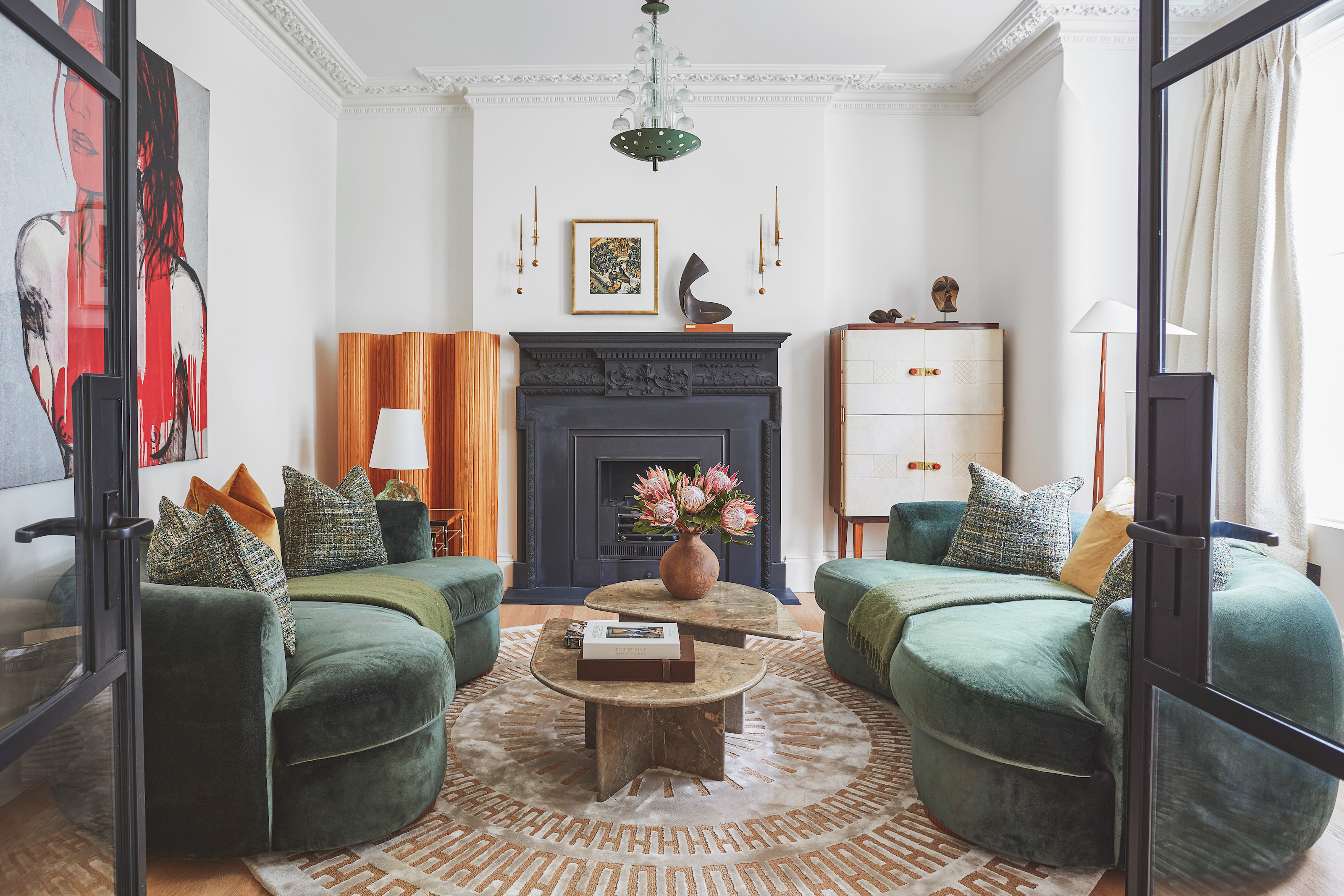 The 'New British' Style? This Victorian London Home Embraces Its Owners' Global Background
Warm timber details, confident color pops, and an uninterrupted connection to the garden are the hallmarks of this relaxed yet design-forward family home
By Emma J Page
-
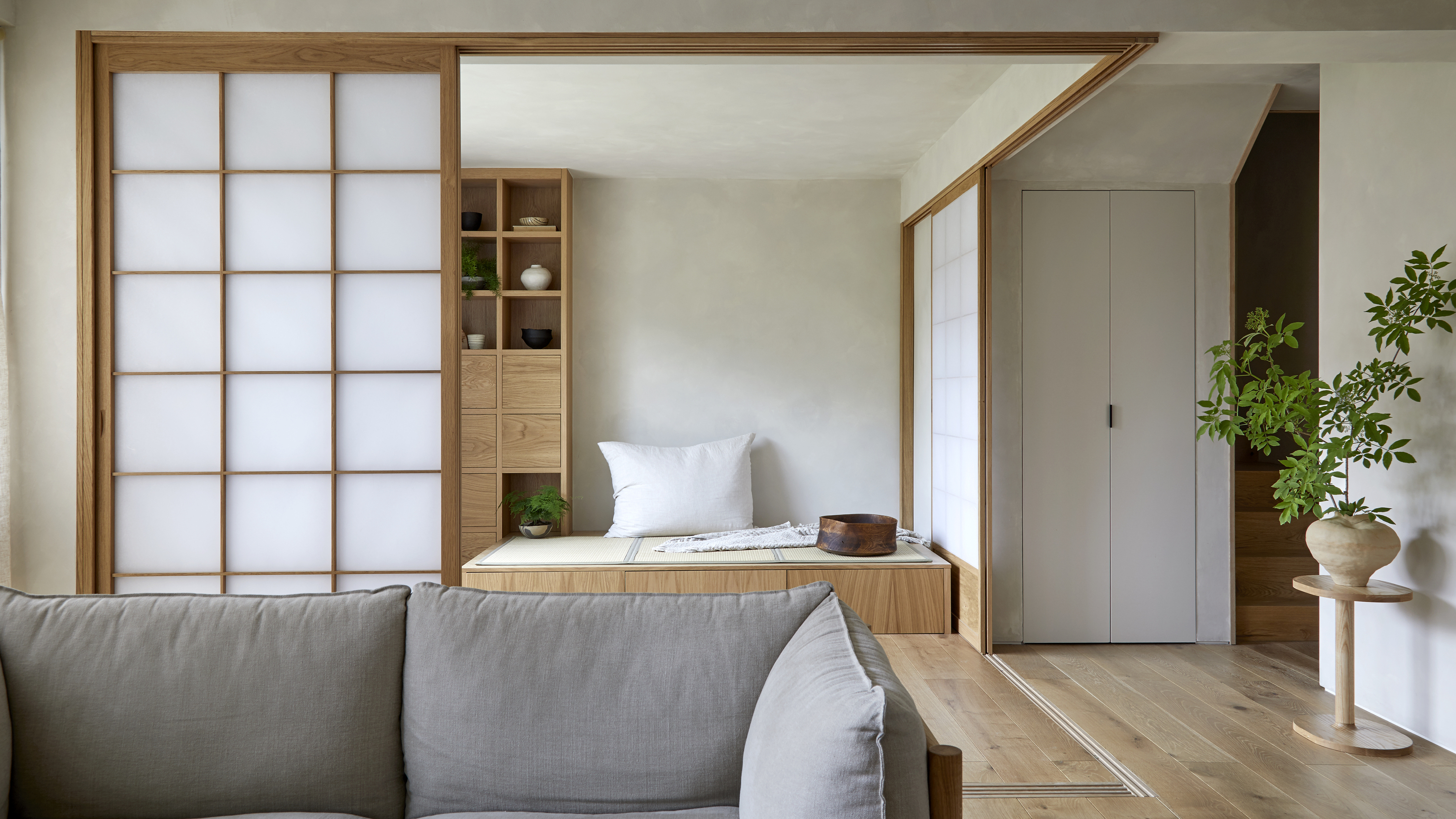 Muji Living Room Ideas — 5 Ways to Harness The Calming Qualities of This Japanese Design Style
Inspired by Japanese "zen" principles, Muji living rooms are all about cultivating a calming, tranquil space that nourishes the soul
By Lilith Hudson
-
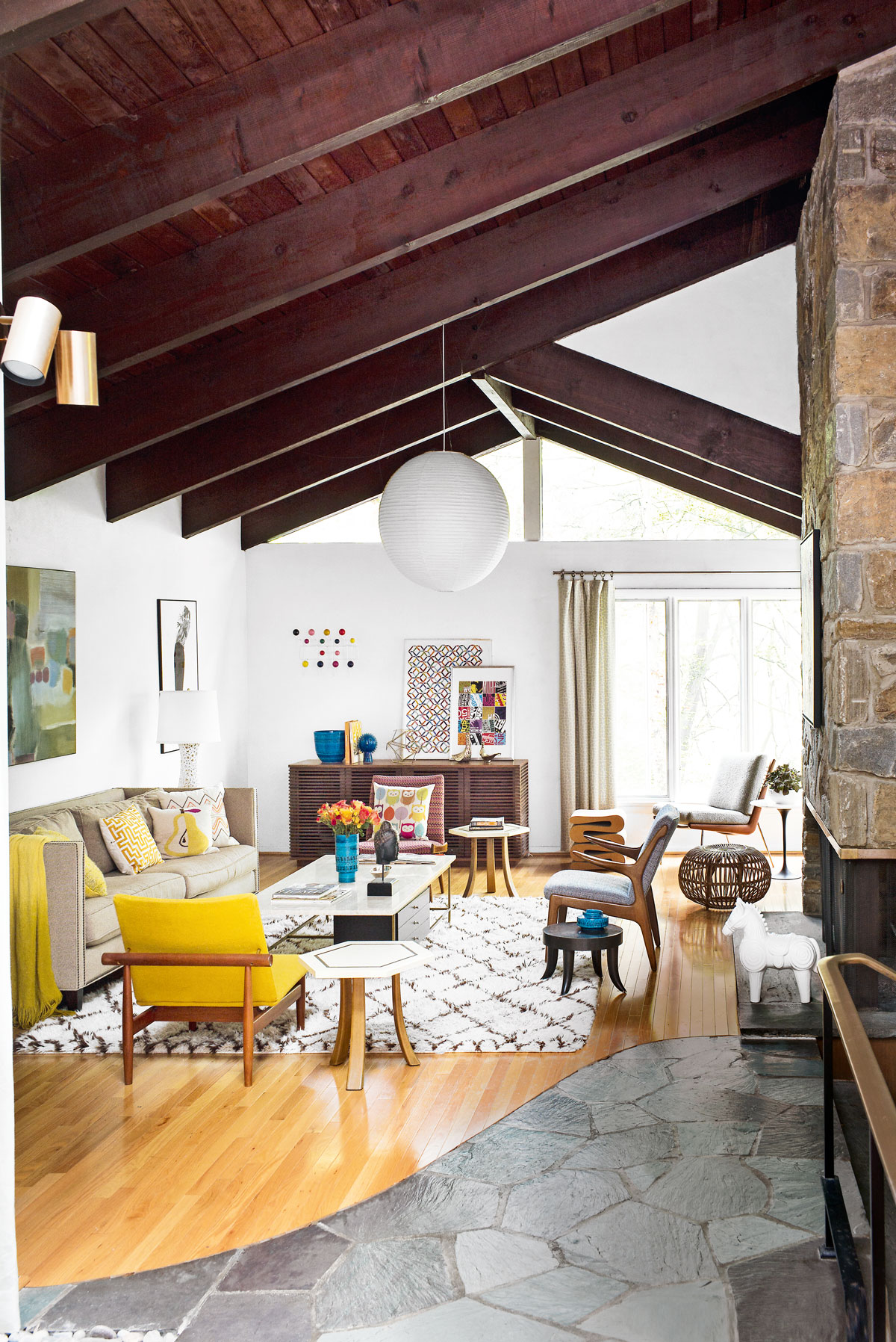 Tour a mid-century house in Philadelphia with a modern take on Mad Men style
This mid-century house in Philadelphia is a modern take on mid-century design and the perfect backdrop for this enviable collection of art and objects
By Livingetc
-
 This modern Edwardian house in Melbourne is small but mighty
It may be small, but thanks to its ingenious design, this Edwardian house in Melbourne makes family living a breeze
By Livingetc
-
 Old meets new in this apartment in New York's East Village - a former community centre built in 1860
The owner of this loft-style apartment in New York's East Village mixes ancient and modern with timeworn pieces, design classics and his own abstract art...
By Livingetc
-
 Explore this super-contemporary coastal house in Cornwall
This coastal house in Cornwall is all about drinking in the uninterrupted views of nature at its most raw, most pure…
By Livingetc
-
 Explore this spacious detached 1900s house in southeast London with stylish modern interiors
Edgy textures, luxe materials and a mix of vintage and bargain buys transformed a blank detached 1900s house in southeast London into a home full of personality.
By Livingetc
-
 This large house in west London is minimal yet playful
A firefighter’s pole in the kitchen and a slide down the stairs? This house in west London proves minimalism can also be fun.
By Livingetc
-
 Inside A Clever Garden Room That Doubles As A Chic Guest House
This striking garden room design incorporates a sleeping area, kitchenette, loo and shower, as well as plenty of storage space, making it ideal as both a self-contained guest house or a restful retreat to escape to.
By Lotte Brouwer
-
 This light and bright Victorian terrace in west London is relaxed yet stylish
This chic Victorian terrace in west London is full of clever ideas that allow it to evolve.
By Livingetc