A light, airy home centred around a gorgeous courtyard garden
With a centre courtyard garden that connects with almost every room of the house, this home oozes California-style indoor/outdoor living...

THE PROPERTY
This airy, open-plan modern home with a gorgeous courtyard garden was designed by Anne Carr Design, and beautifully fuses indoor and outdoor living. With tons of natural light, a mix of natural materials and floor-to-ceiling windows and sliding doors that allow you to enjoy the indoors and the out all at once, it's the epitome of sunny California style.
The house was built in the 1940’s and had only been updated once, but that was in the 1980’s. It was a pinkish coral colour and had a lot of ornate trellis. The previous owners had tried to achieve a Palm Beach look, but it was starting to look cramped and dated. Rooms were very small and choppy, so Anne Carr stripped the property back down to stud walls and started from the ground up to create a light, bright and open space.
See Also: Chic & Stylish Ideas For Small Gardens and50 Stylish Garden Patio Ideas
LIVING ROOM
The owners fell in love with the house because of the courtyard garden which can be accessed from most of the rooms. They have one child still living at home while two are in college. They didn’t want a house so large that it would feel empty when they left home, so the U-shape nature of this home was the perfect solution.
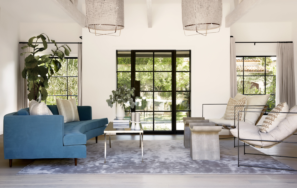
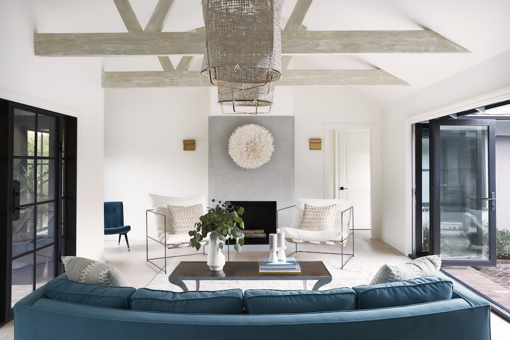
Anne Carr took the house down to the studs because all of the electrical and plumbing needed updating and the windows were not up to code. By doing this, she had the ability to reconfigure all the walls. She took the three old rooms; family room, kitchen and dining room, and made one large space for the new kitchen/family room and then a small dining room. She tells us she doesn't like giving a dining room too much space as most people tend to only use them a few times a year.
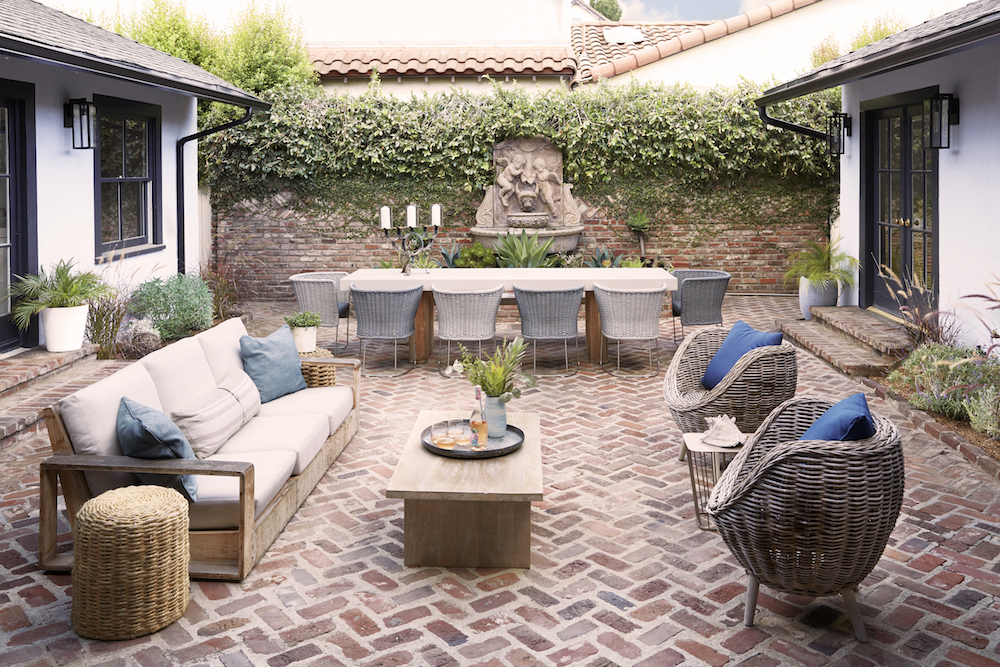
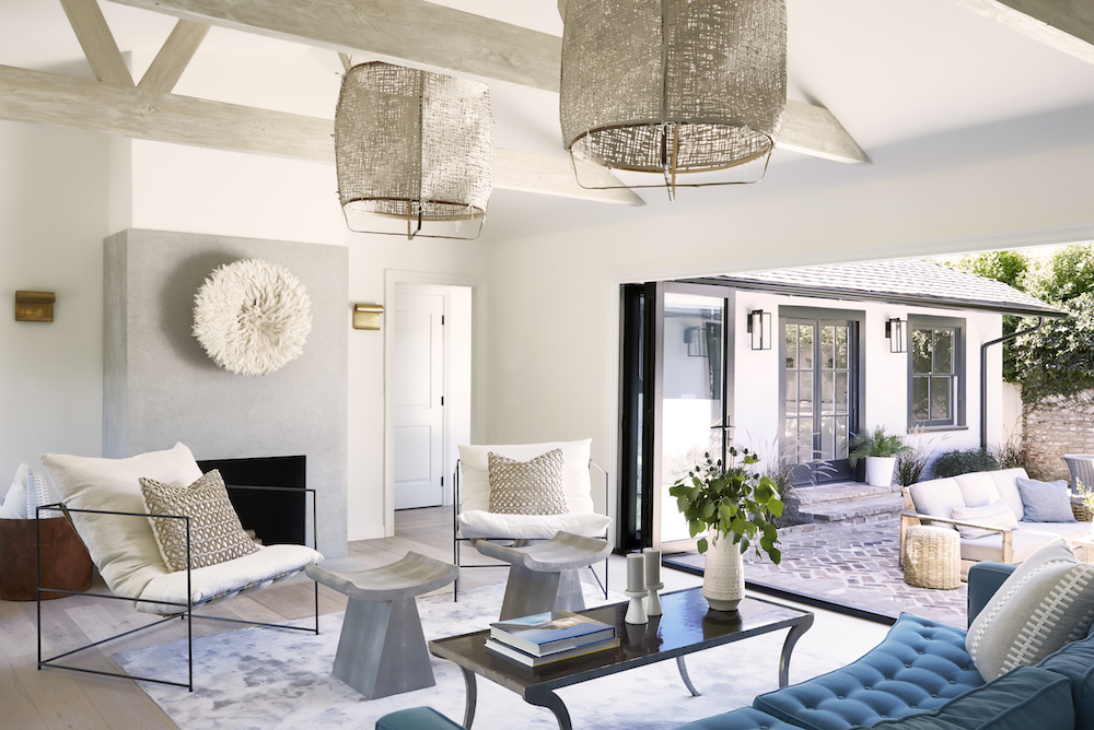
Because the centre courtyard was the main wow-factor, Anne Carr wanted to be able to enter and see the space from most of the rooms, making it a better space for entertaining. She added french doors to three of the rooms that faced the courtyard and then removed the back wall of the living room and replaced it with a 15-foot Fleetwood Door.
KITCHEN
The owners always wanted a wine room, so Anne Carr installed a subzero 30” wine storage with a capacity of 146 bottles. Together with the owners she chose a unique piece of marble for the island – one that you don't see everywhere. Anne found a slab of princess white, which has a lot of colour variation, but she had it leathered, which mutes the colours and really roughs it up.
Be The First To Know
The Livingetc newsletters are your inside source for what’s shaping interiors now - and what’s next. Discover trend forecasts, smart style ideas, and curated shopping inspiration that brings design to life. Subscribe today and stay ahead of the curve.
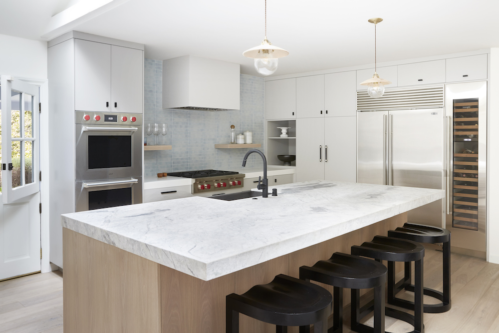
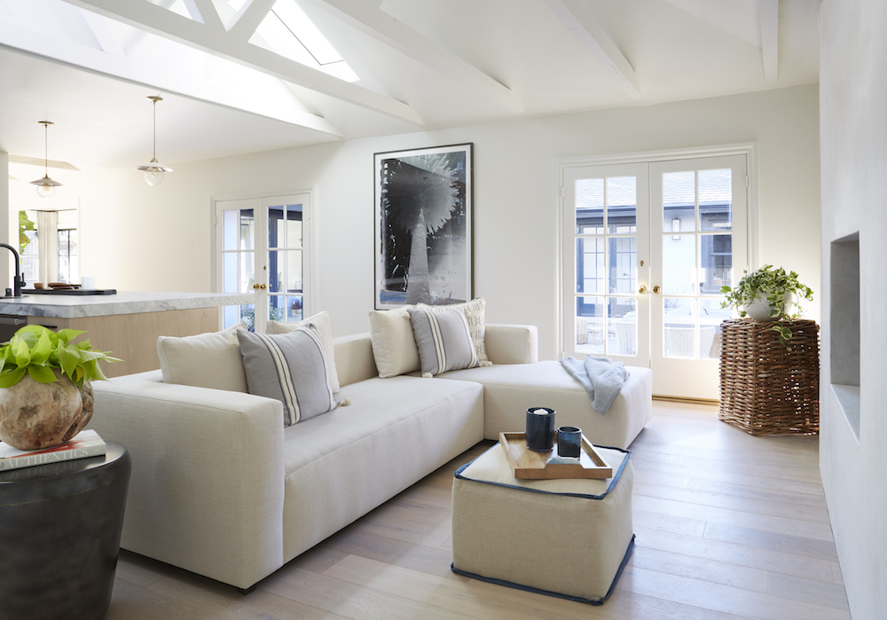
A relaxed, informal lounge area next to the kitchen means this area is a social, lived in space.
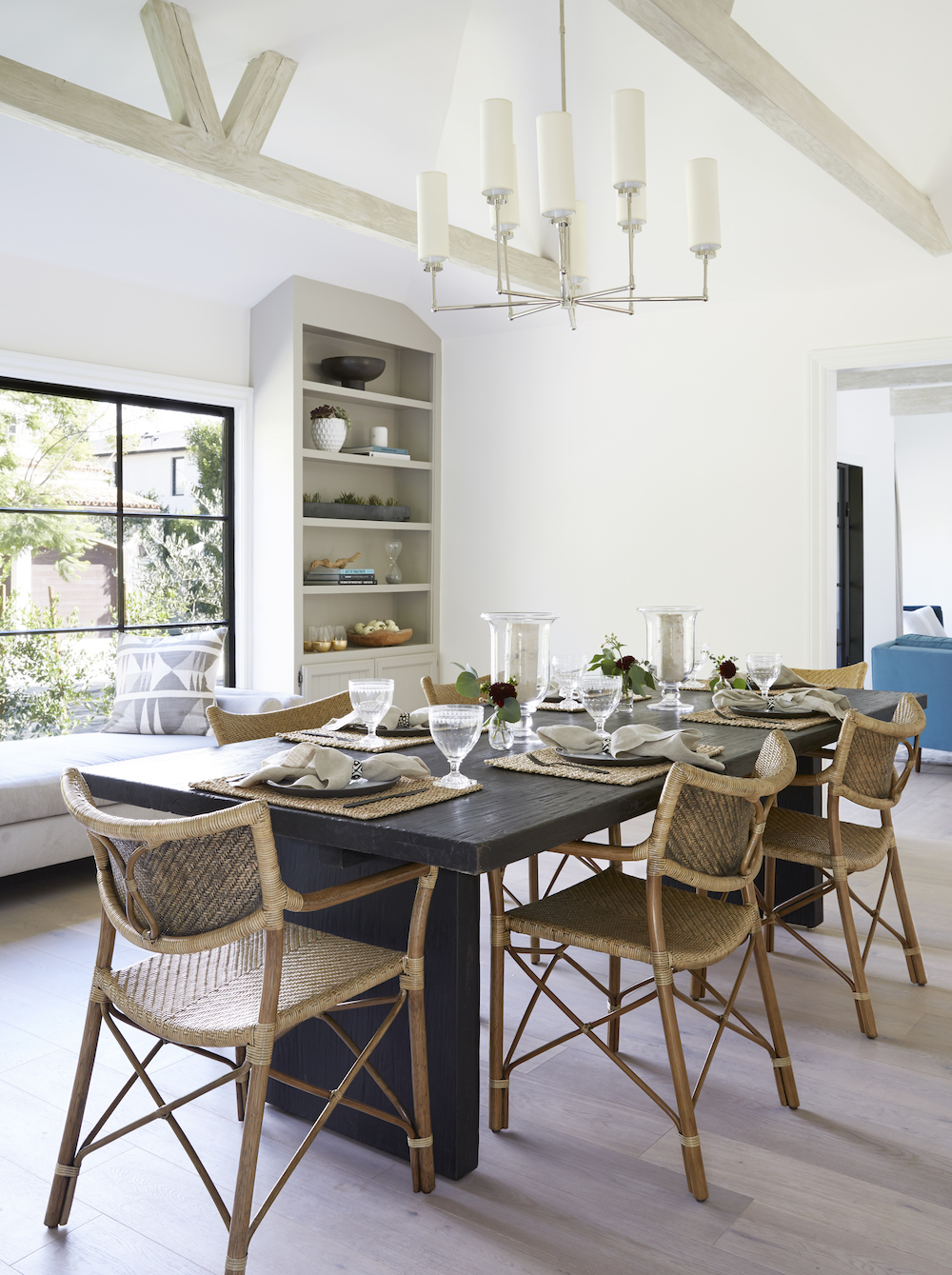
DINING AREA
A dining area sits just off the living room, and is a stunning space to entertain.
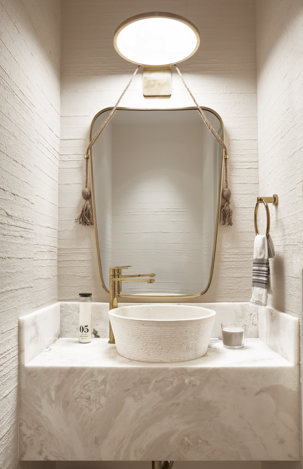
POWDER ROOM
A textured cream wallpaper gives the powder room a muted but textural feel.
MASTER BEDROOM
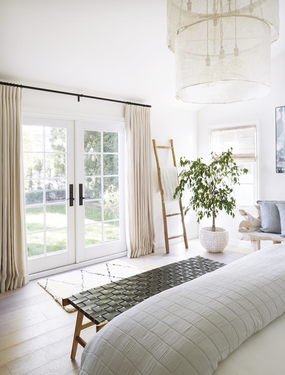
Anne took a bathroom and closet from one of the bedrooms and combined them to make part of the master bedroom suite (a walk-in dressing room and master bathroom) and then added a 500 square foot bedroom with a cathedral ceiling. Anne designed a separate master bedroom wing so that this end could be closed off when the kids have friends over.
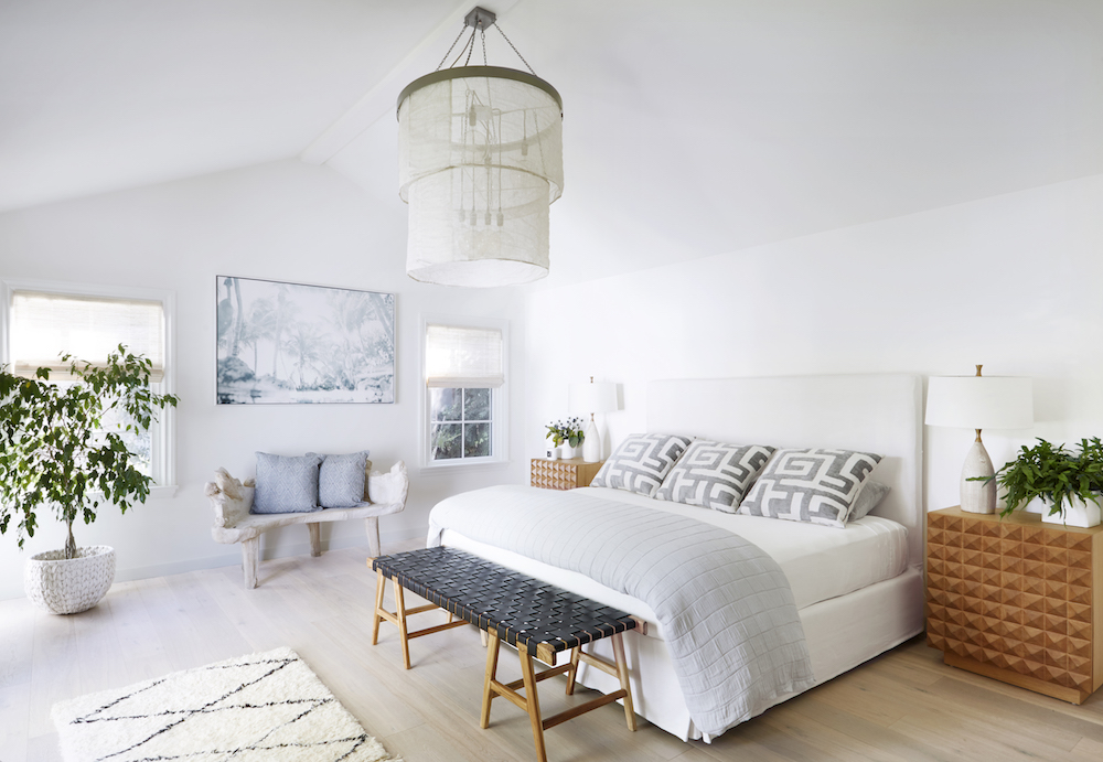
The home is located in Brentwood, very close to Sunset Blvd., so noise was of the utmost concern. Although the house is U-shaped, Anne made sure this master bedroom (and one guest bedroom) were on the side of the house farthest from the busy road, while the family room and kitchen were on the side closer to Sunset.
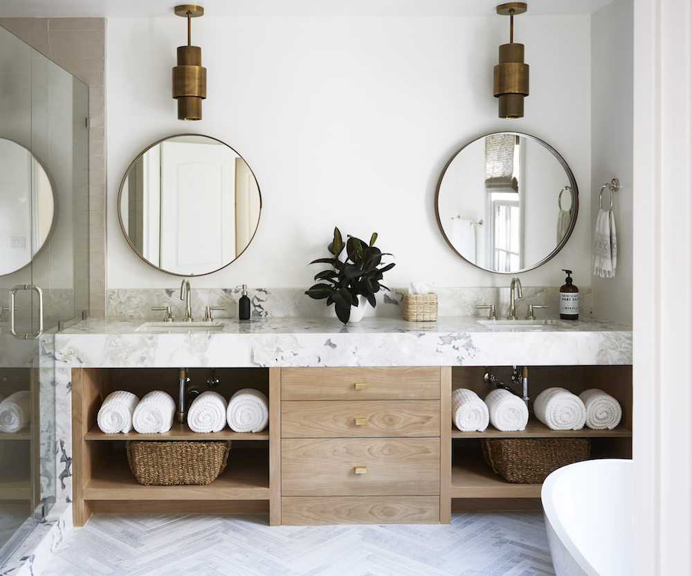
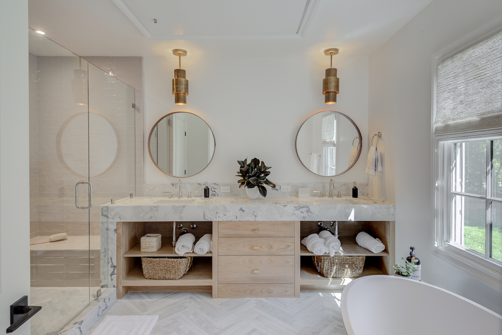
MASTER BATHROOM
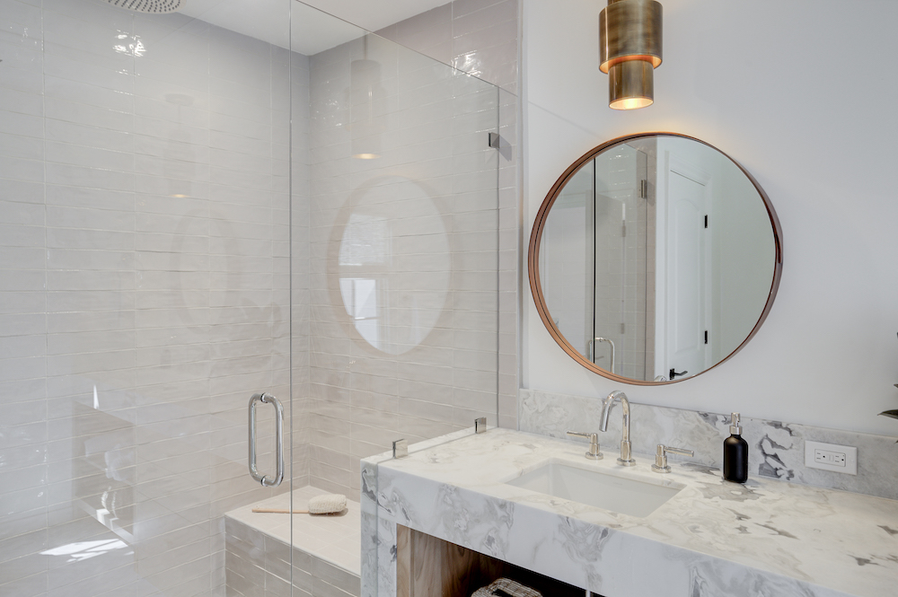
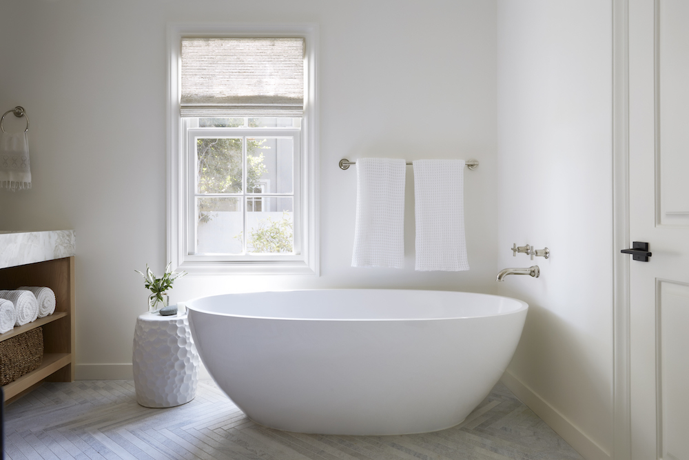
The master bathroom is a strikingly elegant space, with herringbone tiled floors, his 'n' hers basins, a modern freestanding bath and a walk-in shower.
GUEST BEDROOM
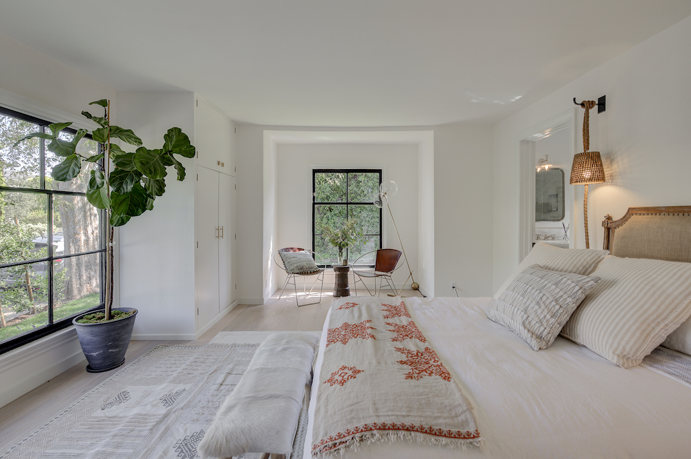
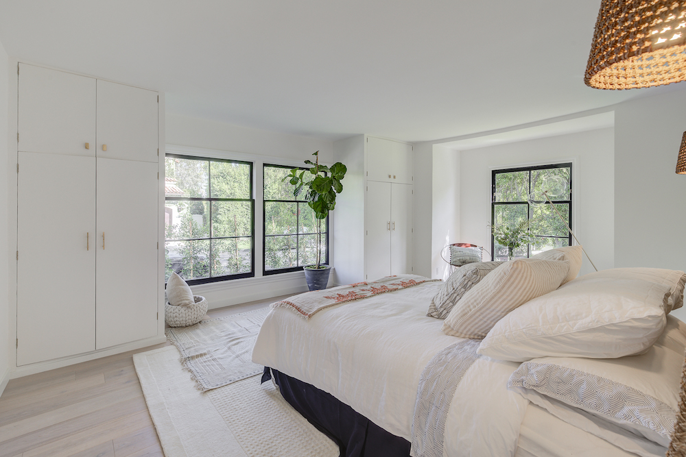
Multiple rugs, a furry bench, upholstered headboard and hanging rope lights all add oodles of texture to this cosy guest bedroom.
COURTYARD GARDEN
Anne added a fountain to the courtyard garden to provide a pleasant and serene sound. For the outdoor furniture she took the same approach as she used for the interiors; she used a mix of materials and furniture from different shops, along with a few vintage pieces, to create a homely ambience. She was adamant to avoid the matchy-matchy look that comes with buying sets of outdoor furniture.

Photography: Zeke Ruelas


Lotte is the former Digital Editor for Livingetc, having worked on the launch of the website. She has a background in online journalism and writing for SEO, with previous editor roles at Good Living, Good Housekeeping, Country & Townhouse, and BBC Good Food among others, as well as her own successful interiors blog. When she's not busy writing or tracking analytics, she's doing up houses, two of which have features in interior design magazines. She's just finished doing up her house in Wimbledon, and is eyeing up Bath for her next project.
-
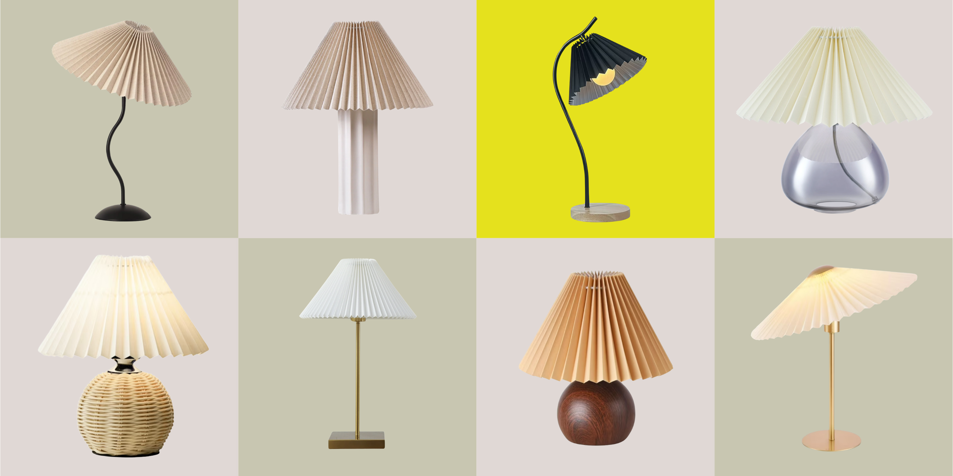 Pleated Lampshades Are the Silhouette of the Season — I've Found 9 For Well Under $100 (You'll Never Guess Where)
Leave it to Walmart to bless us with a collection of stunning pleated lampshades — proving this old-fashioned feature can look fresh and modern
By Devin Toolen
-
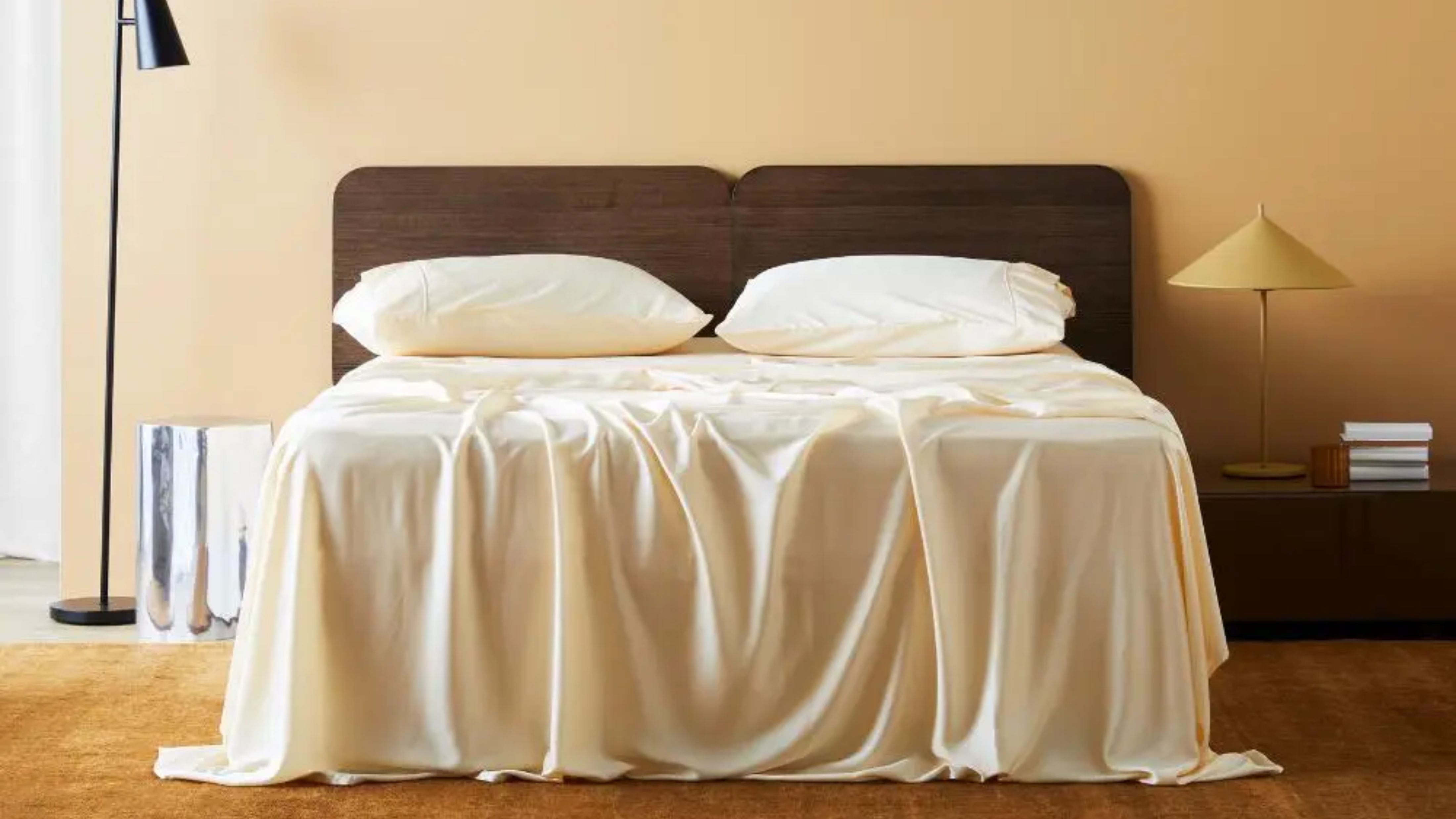 I Found the "Healthiest” Bedding for Earth Month — Why Ettitude Is the Sustainable Sleep Label to Know
Softer than silk and smarter than cotton, Ettitude’s innovative take on bedding delivers luxury with a conscience
By Julia Demer