Industrial Vibe #11
THE PROPERTY
A Victorian semi-detached house in south London. In the basement, there is a family/play room and WC, with steps leading up to the kitchen-diner. The upper-ground floor has a living room, plus a guest bedroom. The master bedroom and en suite are on the floor above and the top floor is home to the children’s bedrooms and a bathroom.
KITCHEN
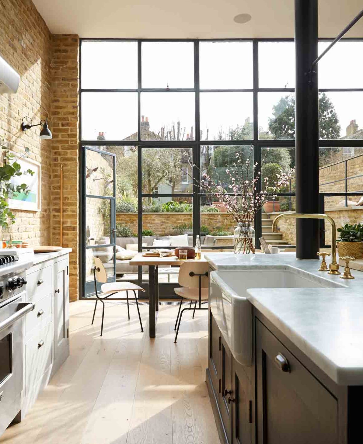
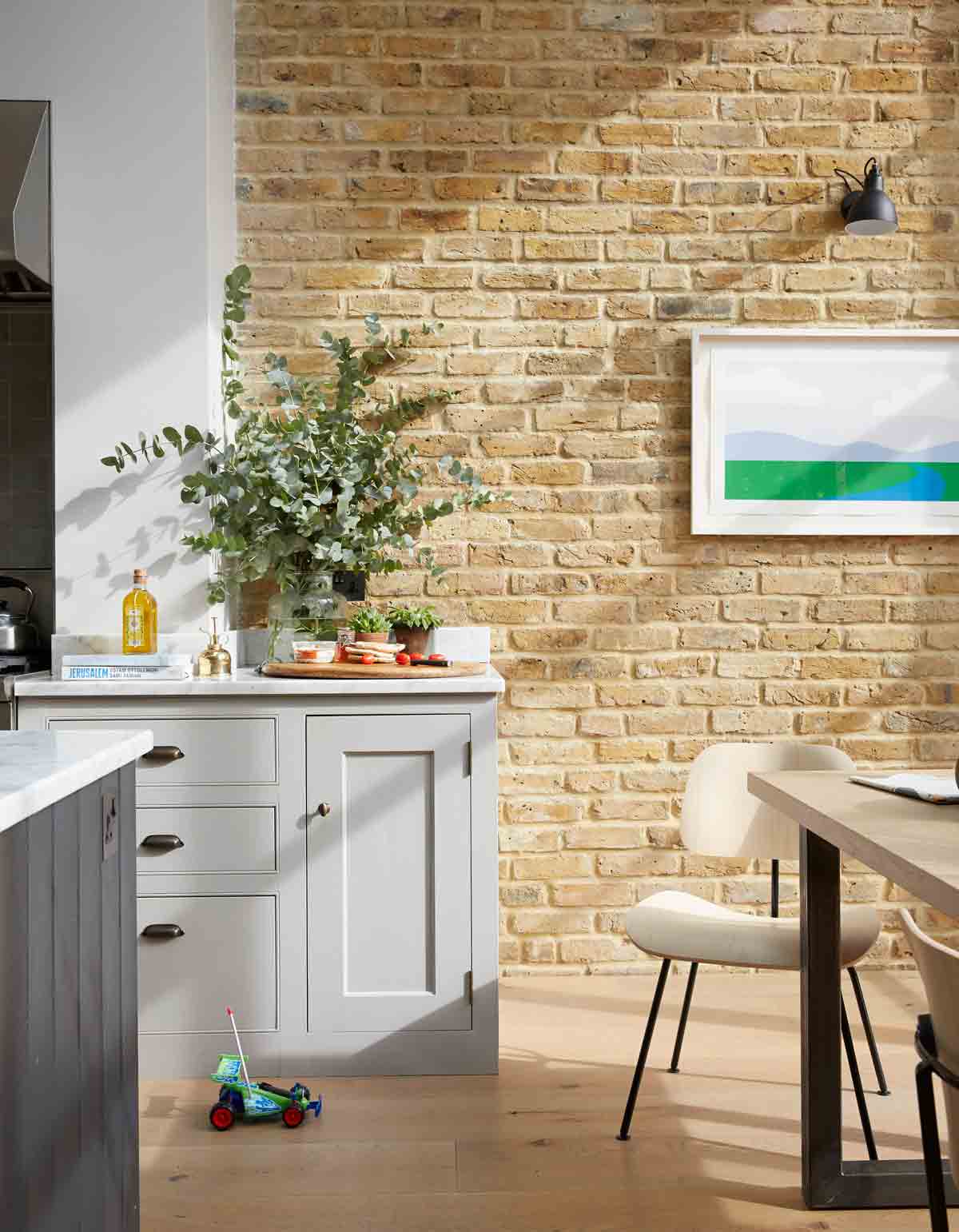
The house was bought in August 2010, and building work started a year later. At the back of the house, a smallish kitchen enjoyed less than impressive views outside. The basement floor is a storey below ground level and there was no connection between the garden and kitchen.Working with Daniel Adeshile at Ade Architecture, the owners extended the kitchen and also raised its floor level, so that it now flows onto a terraced seating area with grassy garden beyond.
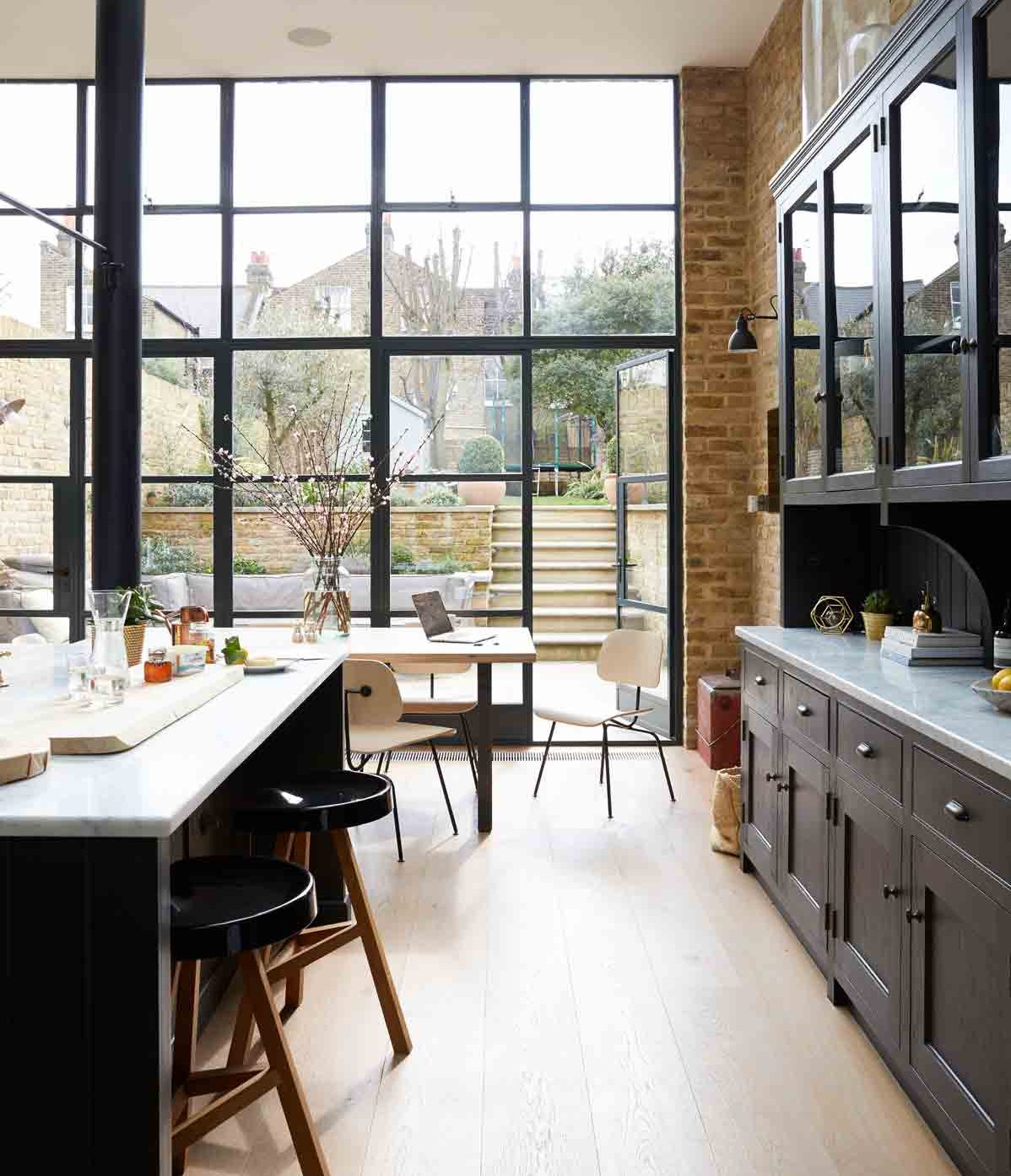
The builders dug out tons of earth – it filled 80 skips.A study on the floor above was sacrificed to create soaring ceiling height too, and the result is a dramatic room which feels part-New York loft, thanks to its exposed brickwork and steel windows, and part-kitchen in an English stately home, complete with super-sized bespoke cabinets.
A love of strong, industrial design is written all over the kitchen, with its exposed brick walls, brass taps, vast steel windows and salvaged supporting pillar.Sourcing the details that underpin the look was a labour of love – the owners would scour salvage yards online for hours – but it paid off. They found the supporting cast-iron column in the kitchen (pictured above), which was originally part of a Yorkshire bandstand.
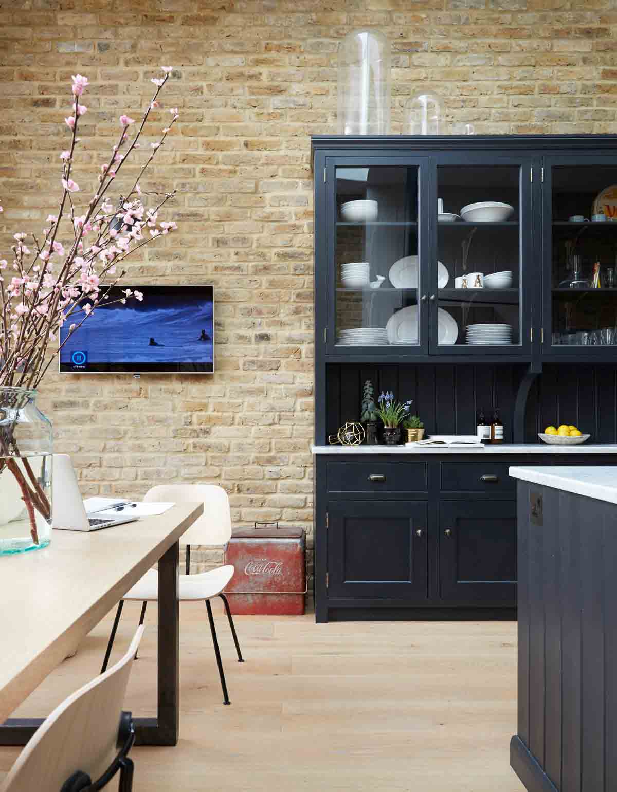
The kitchen cabinets (pictured above) were designed and made to fit the generous dimensions of the space. They could go quite tall because the ceilings are so high. Anything smaller might look a bit lost against this wall.
Exposed brick walls and cool marble are balanced by bespoke units painted in timeless grey. Tools and utensils from Joseph Joseph are dotted around, adding pops of colour.
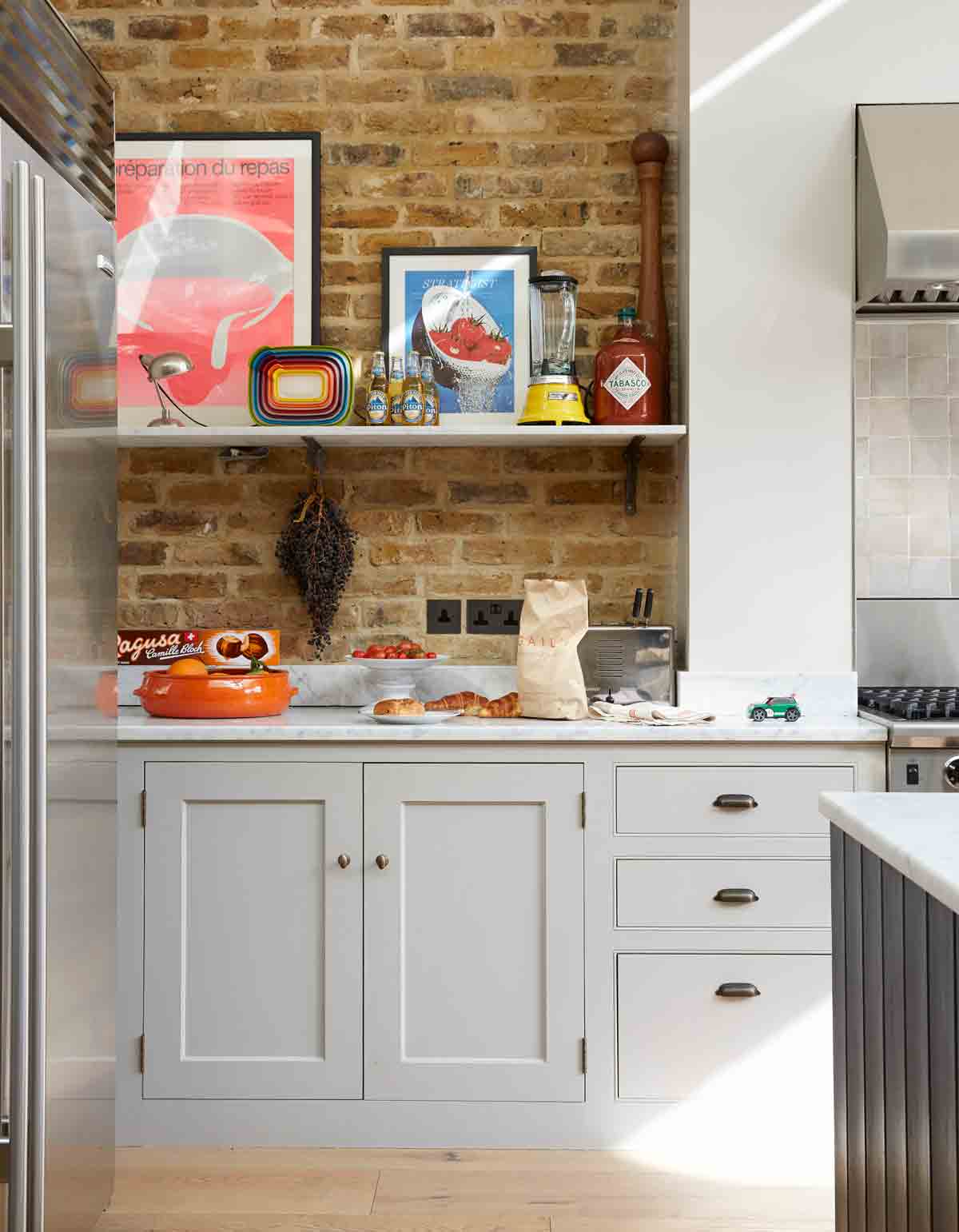
The kitchen combines practicality with great design. Eggshell on the walls gives a nice sheen and is easy to wipe down too.
Be The First To Know
The Livingetc newsletters are your inside source for what’s shaping interiors now - and what’s next. Discover trend forecasts, smart style ideas, and curated shopping inspiration that brings design to life. Subscribe today and stay ahead of the curve.
TERRACE
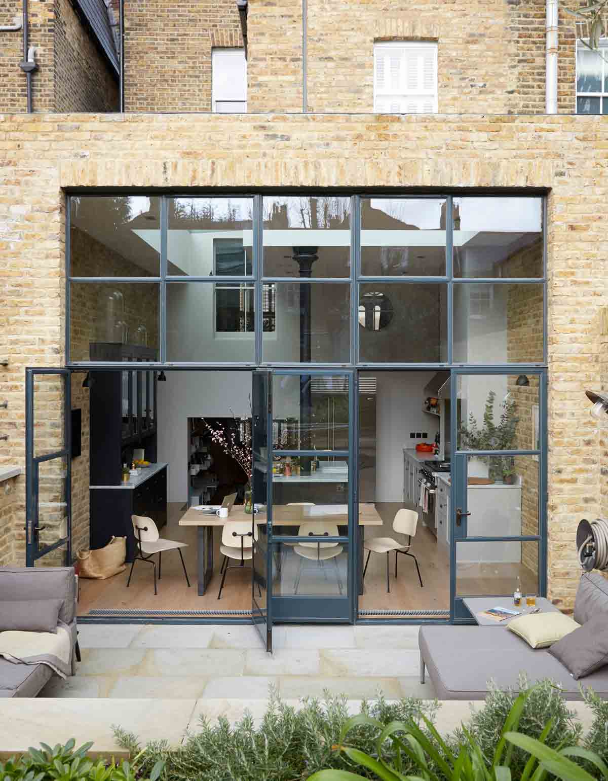
The rear of the house was extended up and out. The builders went back about three metres and up half a storey. A big terrace now creates a seamless connection between inside and out. It is a south-facing sun trap and the family uses it all year round. Tough, weatherproof furniture stays outside all year round.
DOWNSTAIRS LIVING ROOM
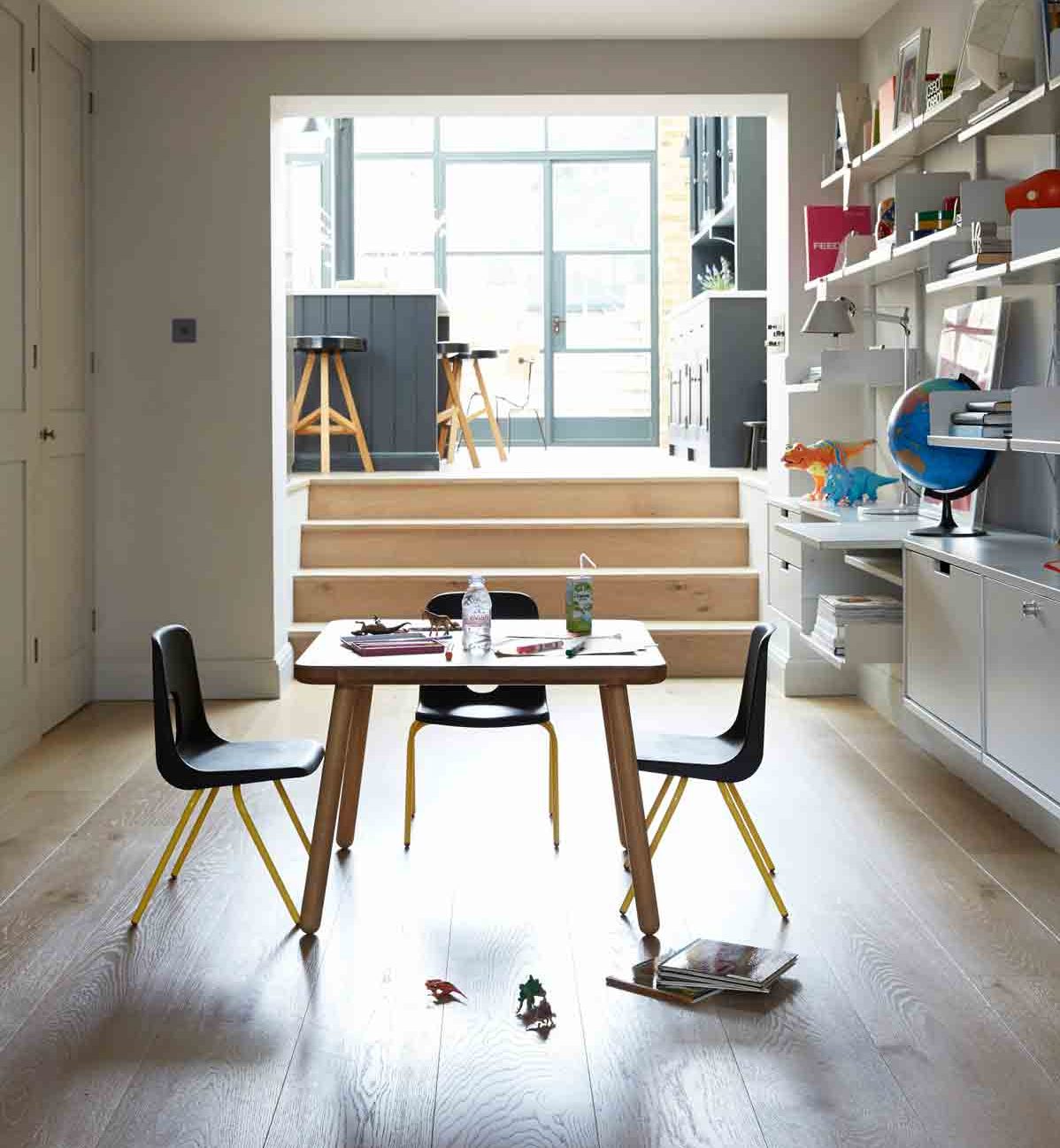
The basement is the heart of family life. The kitchen was originally a storey below ground level, but it was raised during the renovation to create a flowing connection with the garden beyond. In the relaxed play area on the basement floor, contemporary modular shelving lines one wall.
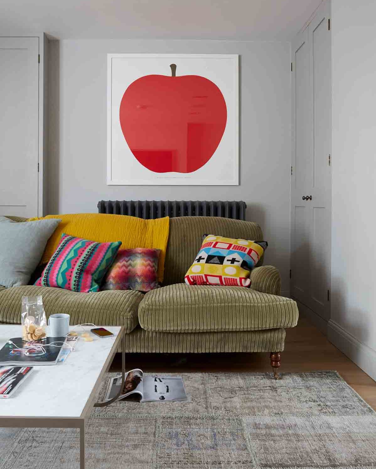
The colour scheme used throughout the house is in full effect here - grey walls punctuated with pops of colour from bright cushions and artwork.
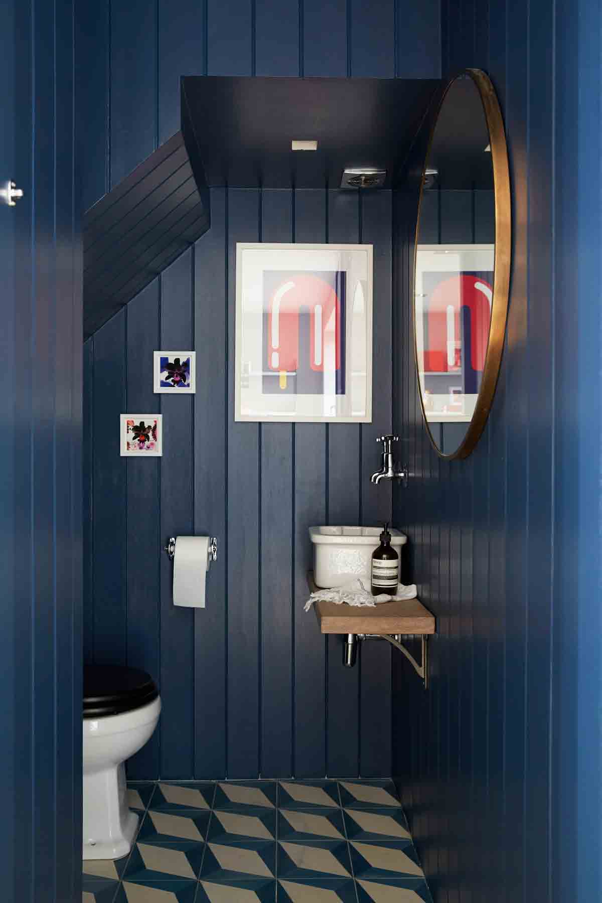
CLOAKROOM
A panelled space, tucked beneath the stairs, the downstairs loo is completely concealed behind a row of doors that look like storage.
UPSTAIRS LIVING ROOM
The marble table is a favourite piece thanks to its contemporary aesthetic and beautiful craftsmanship. It's amazing how something designed in 1969 works so well with the more modern pieces in the room.
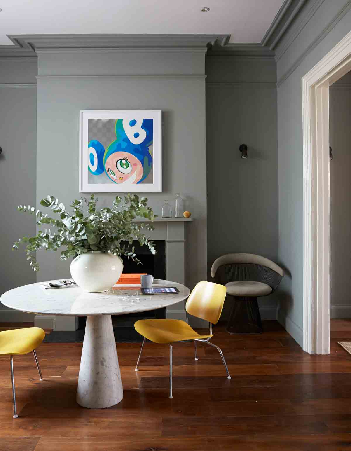
Muted greys are used throughout. These slightly sombre colours have a relaxing effect, but they are mixed in with some brighter shades to add energy to the scheme.
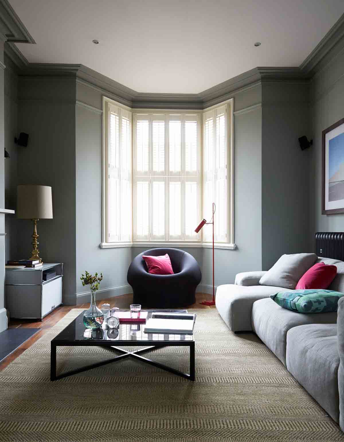
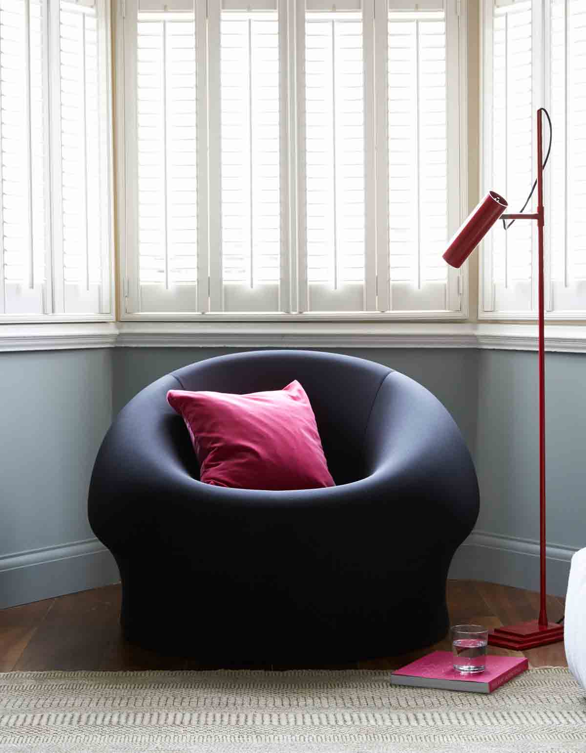
Despite the classic details in this house, contemporary design is also at home here.
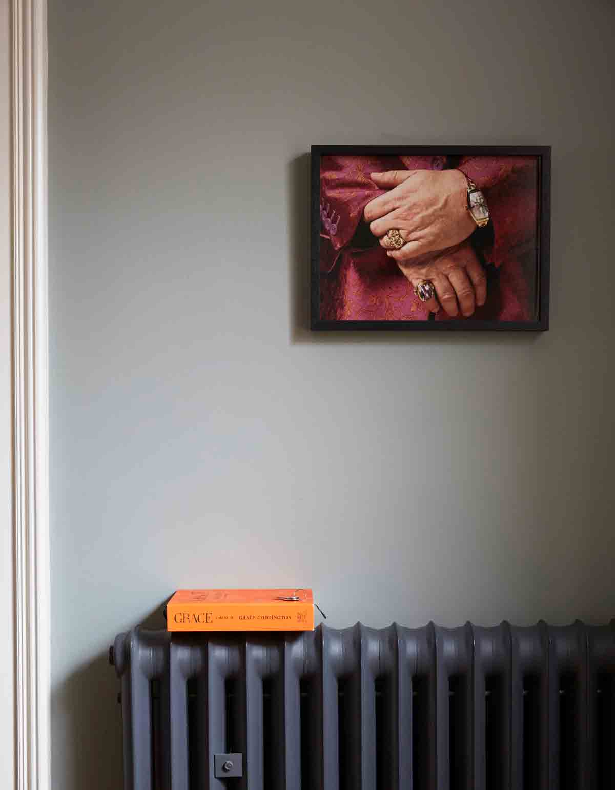
A photograph of Elton John’s hands hangs on the living room wall.
MASTER BEDROOM
The master bedroom floor is an adult haven, complete with luxe marble bathroom. The space feels calm and grown-up, with a palette of dark, sleepy colours.Panelling was built around an existing chimney breast, creating a headboard effect and reinforcing the classic vibe that runs throughout the house.
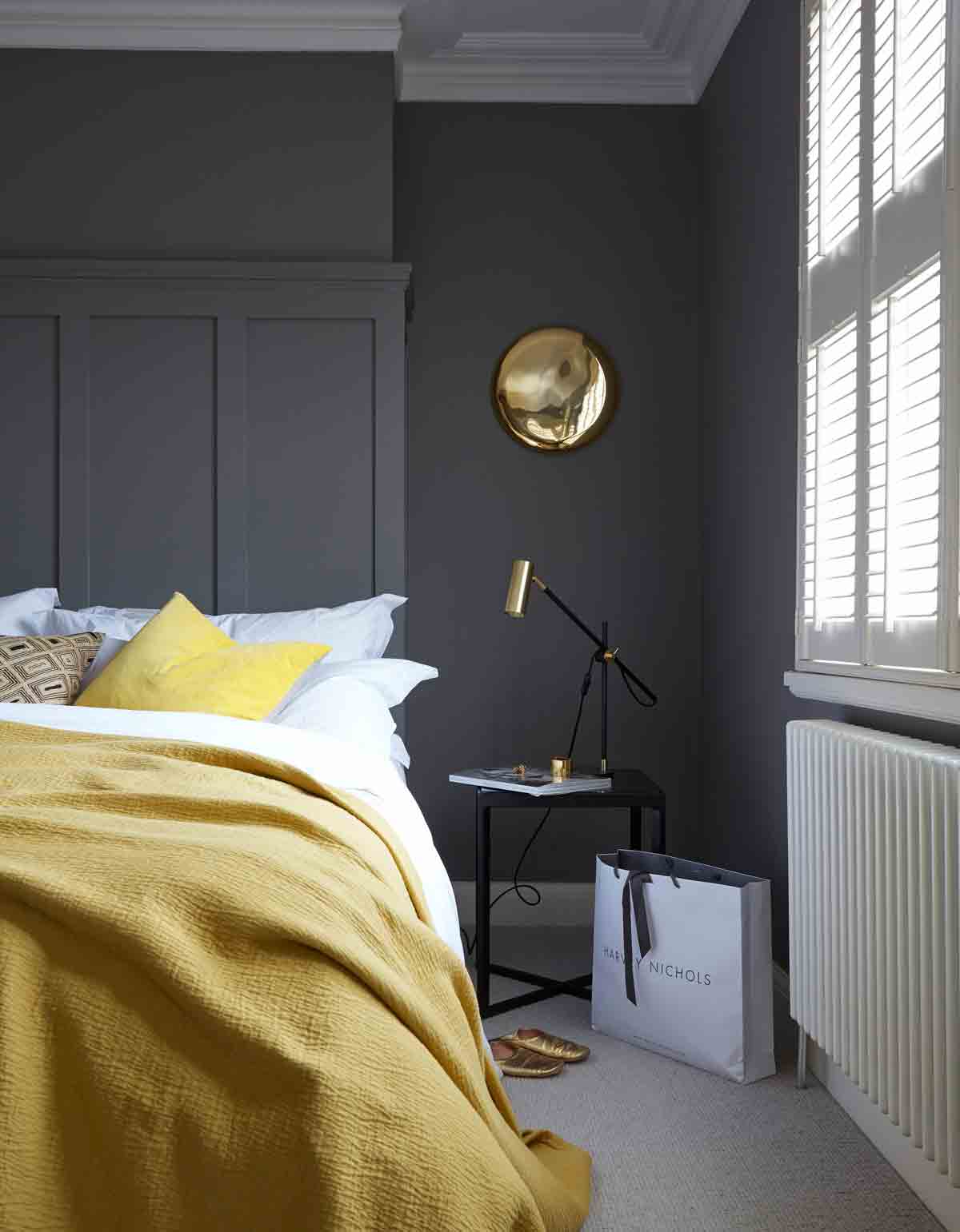
Contemporary pieces are mixed with vintage or salvaged finds.
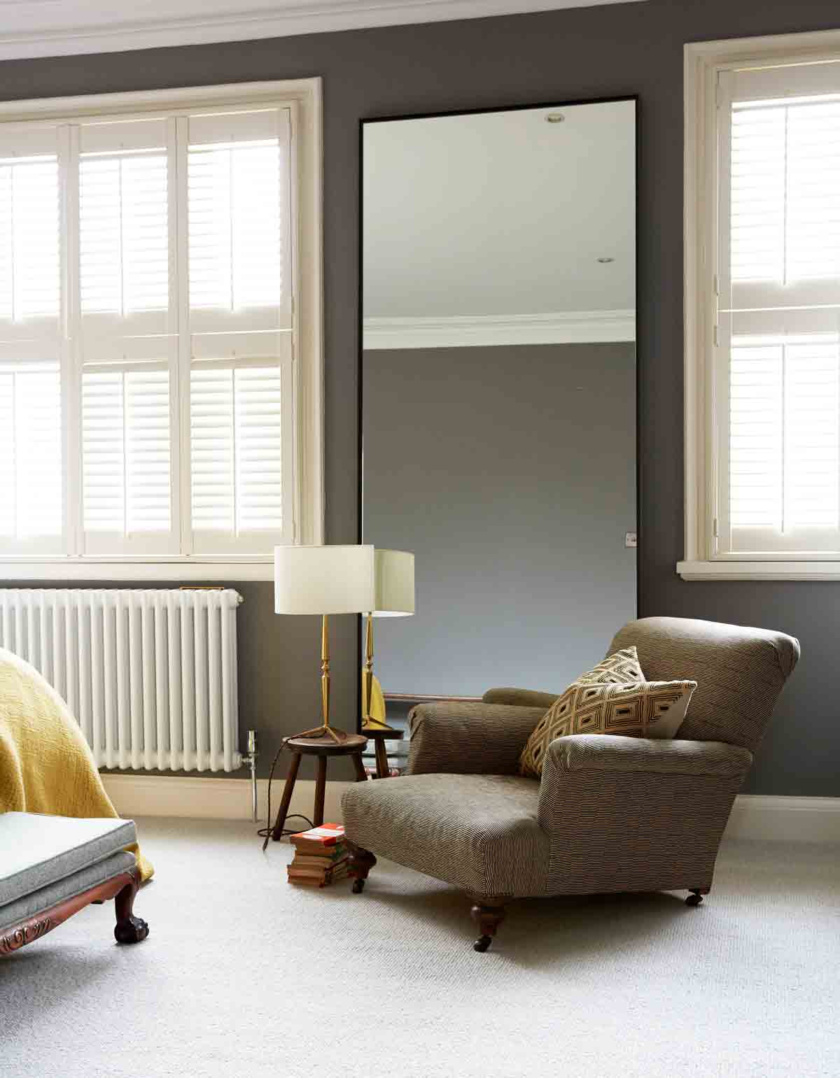
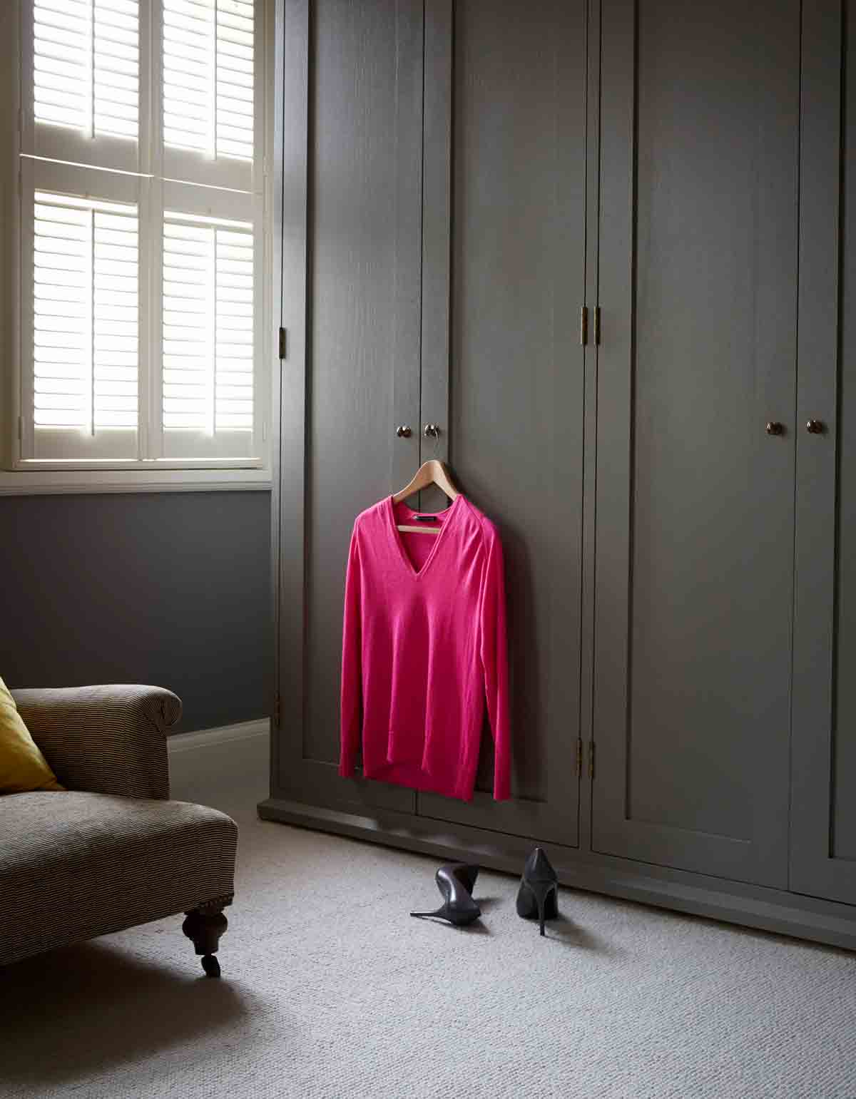
A wall of wardrobes were installed by the builders.
BATHROOM
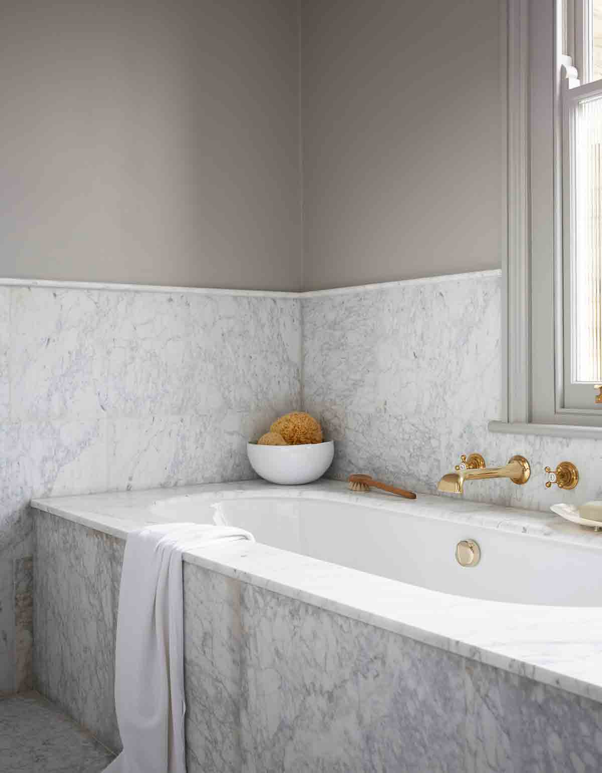
The marble basin was made bespoke. It's warmed up by fittings in warm metal, including a reclaimed radiator, sourced online at a salvage yard, brass taps and shelving and a vintage, metal-framed mirror.
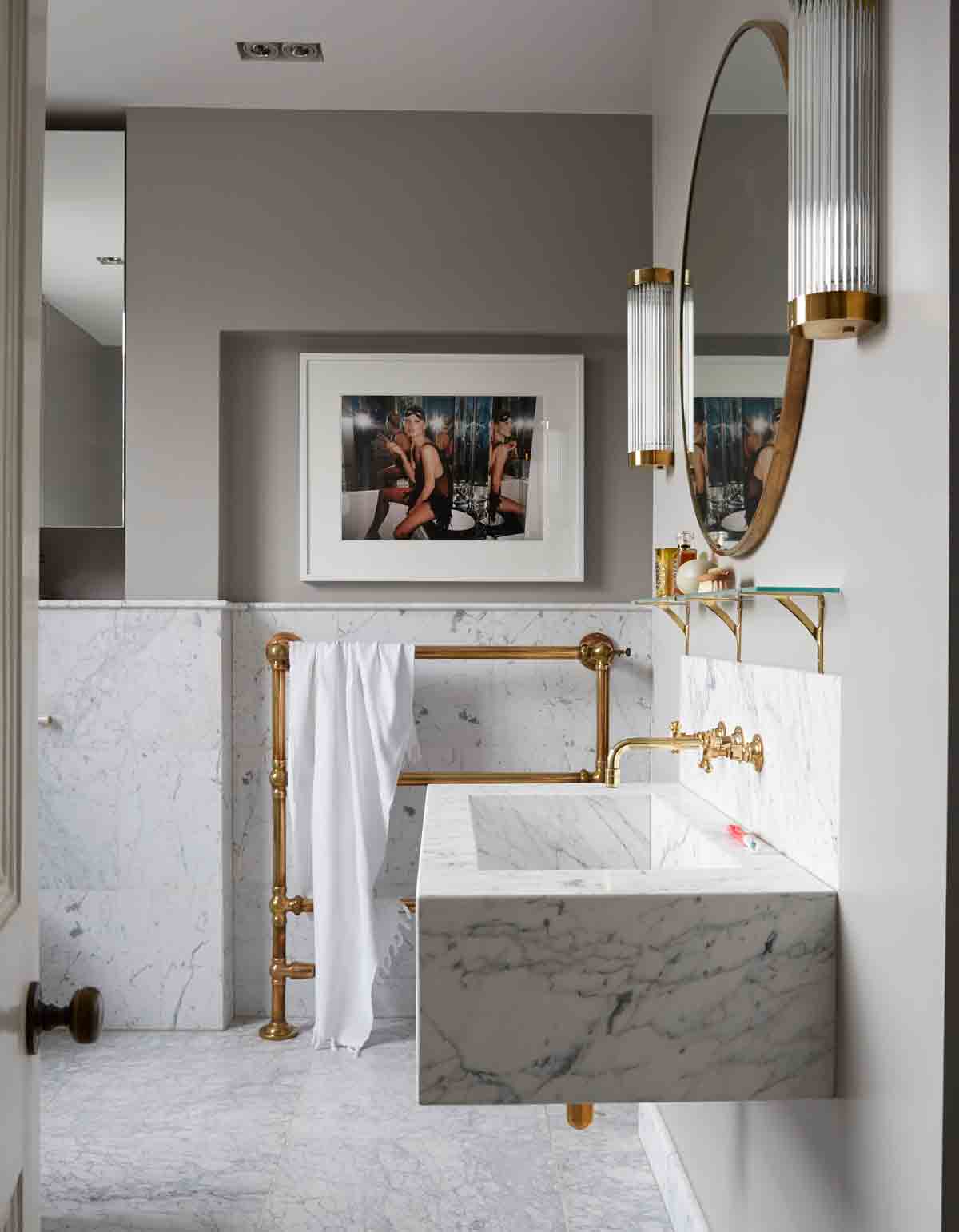
The bathroom was purposefully designed to be somewhere luxurious, devoid of kids’ stuff. Cool marble is teamed with brass taps and fittings.
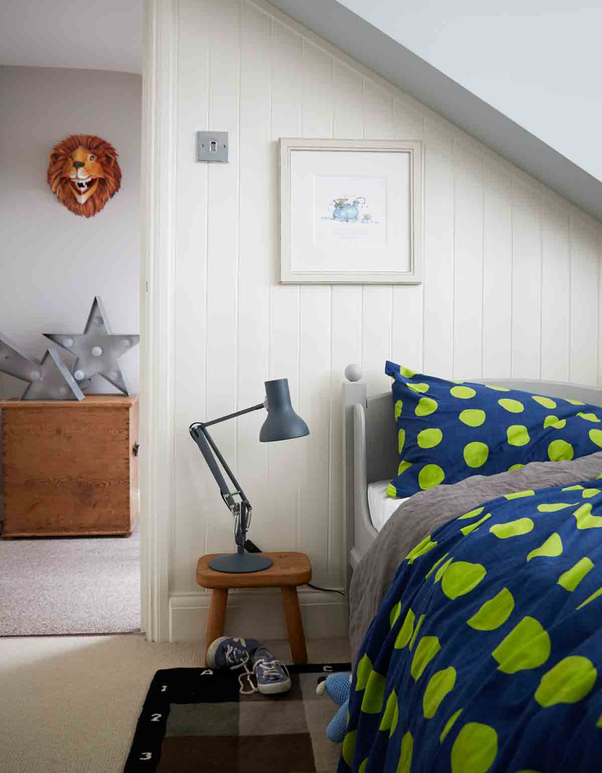
BOYS' ROOM
The top storey is for the children.Tucked away at the top of the house, this boys' room is still decorated in greys. The rug was designed to illustrate carpet colours available at John Lewis, and was not for sale, but the home owners asked to buy it. John Lewis now makes them for retail.
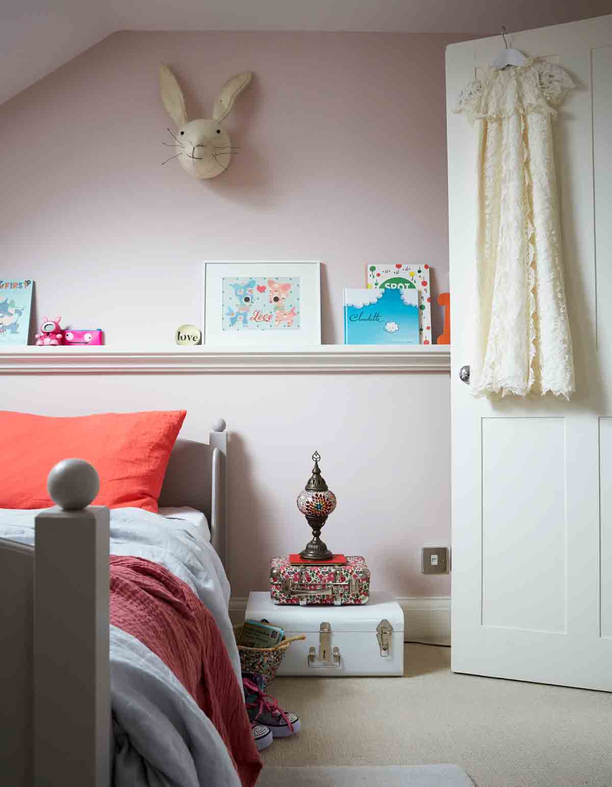
GIRLS' ROOM
A muted, greyish tone from Farrow & Ball was used as a compromise on wished-for pink walls. It’s a nice soft shade that blends with the rest of the house.
The house has just wonWandsworth Council’s 2014 Design Awardfor ‘recognition of its outstanding contribution to design in the Borough of Wandsworth’.Ade Architecture, who worked on it, is at ade-architecture.co.uk.
Photography / Paul Massey
The homes media brand for early adopters, Livingetc shines a spotlight on the now and the next in design, obsessively covering interior trends, color advice, stylish homeware and modern homes. Celebrating the intersection between fashion and interiors. it's the brand that makes and breaks trends and it draws on its network on leading international luminaries to bring you the very best insight and ideas.
-
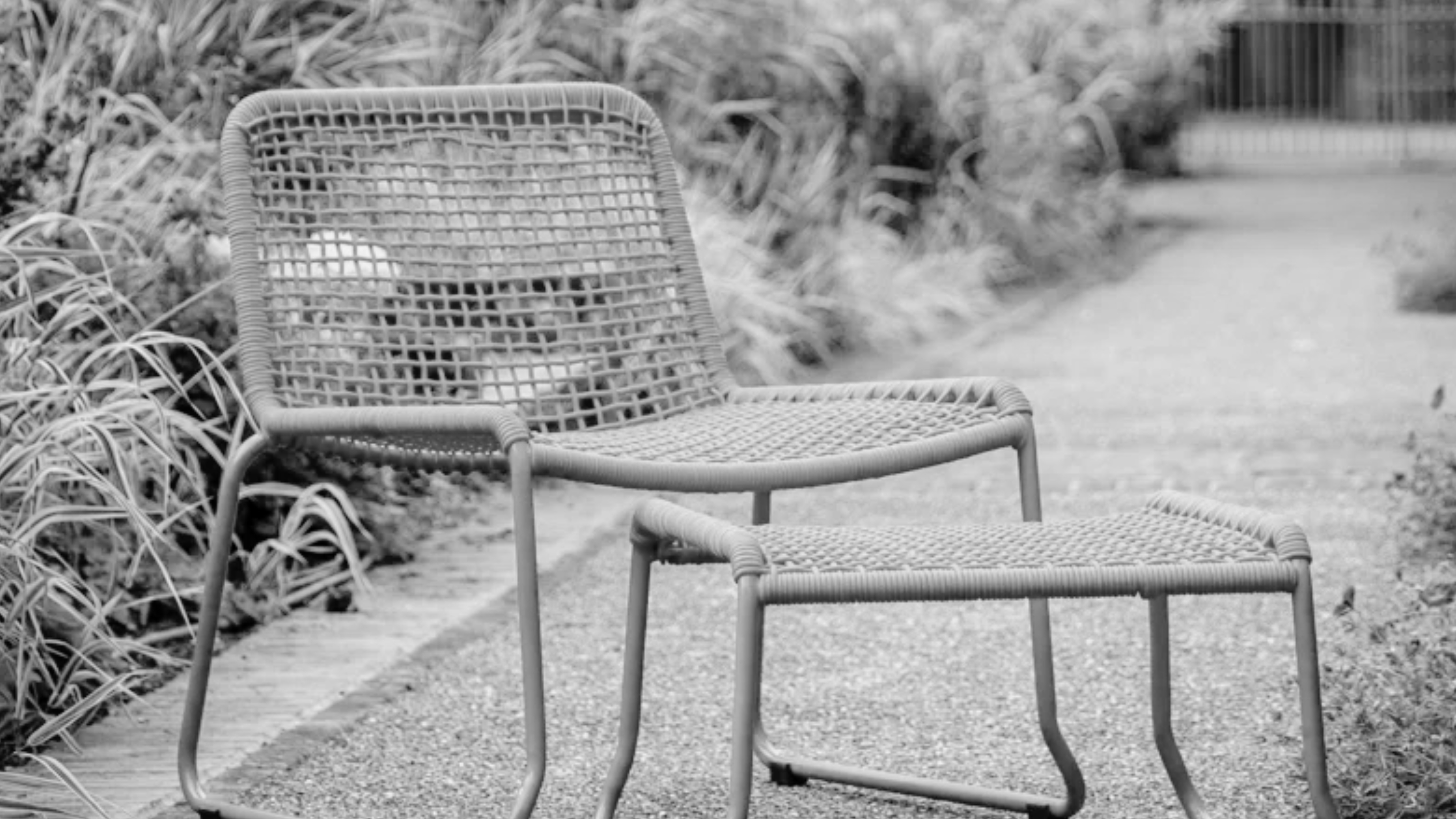 This Outdoor Lounger Is the Color of the Season for Garden Furniture — And It's on Sale This Weekend
This year, it's all about the contrast, and this bright, sunny hue is the perfect foil to your green outdoor spaces
By Hugh Metcalf
-
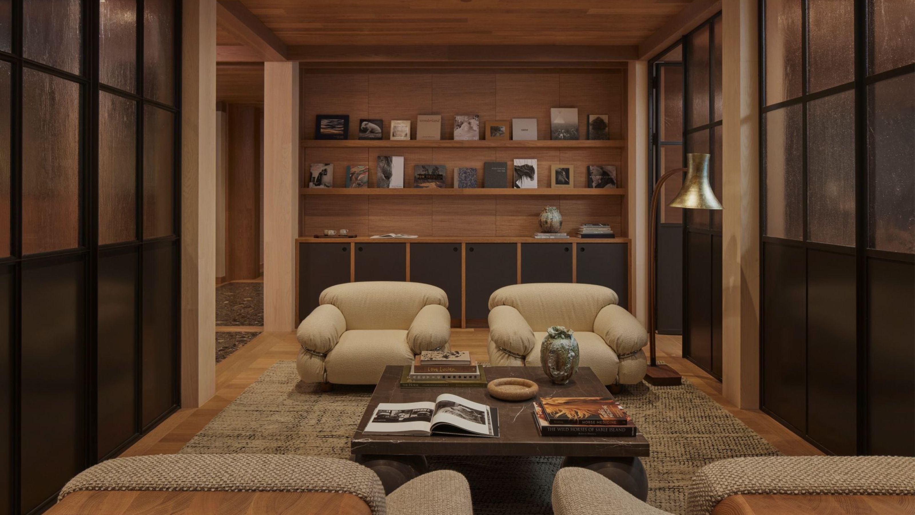 Kelly Wearstler Designed an Animal Hospital Where "Anxiety Just Melts Away", and I'm Taking Notes for My Own Home
The renowned designer's foray into healthcare demonstrates have even the most functional of spaces can still be design-forward
By Devin Toolen
-
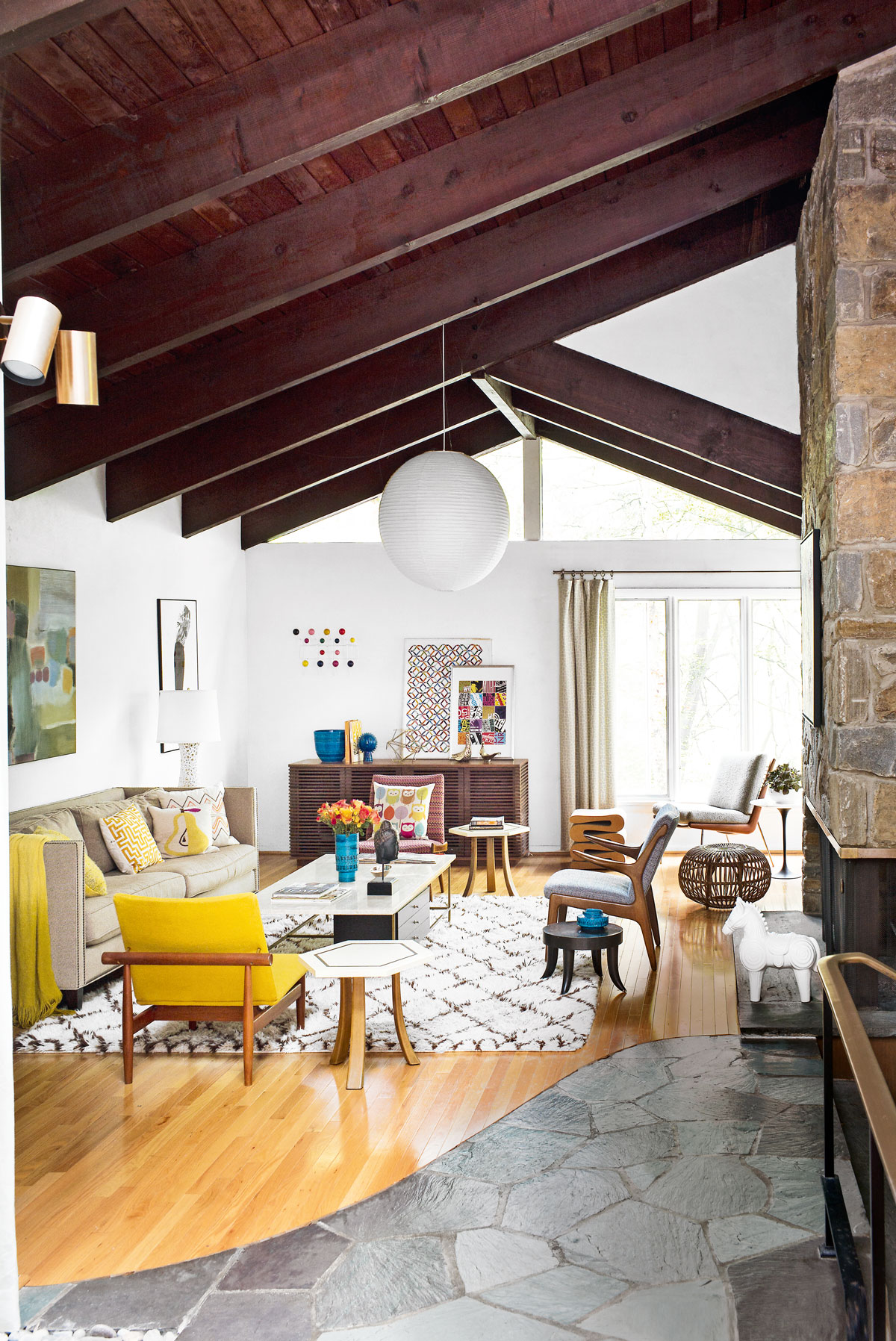 Tour a mid-century house in Philadelphia with a modern take on Mad Men style
This mid-century house in Philadelphia is a modern take on mid-century design and the perfect backdrop for this enviable collection of art and objects
By Livingetc
-
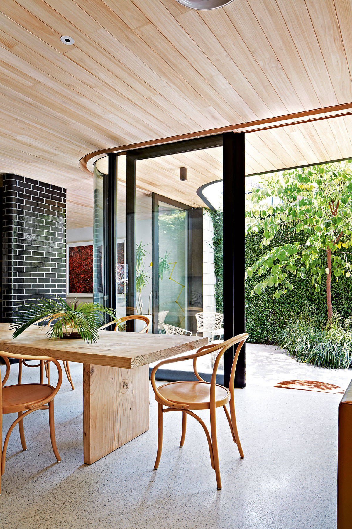 This modern Edwardian house in Melbourne is small but mighty
It may be small, but thanks to its ingenious design, this Edwardian house in Melbourne makes family living a breeze
By Livingetc
-
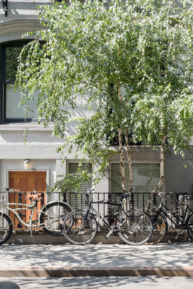 Old meets new in this apartment in New York's East Village - a former community centre built in 1860
The owner of this loft-style apartment in New York's East Village mixes ancient and modern with timeworn pieces, design classics and his own abstract art...
By Livingetc
-
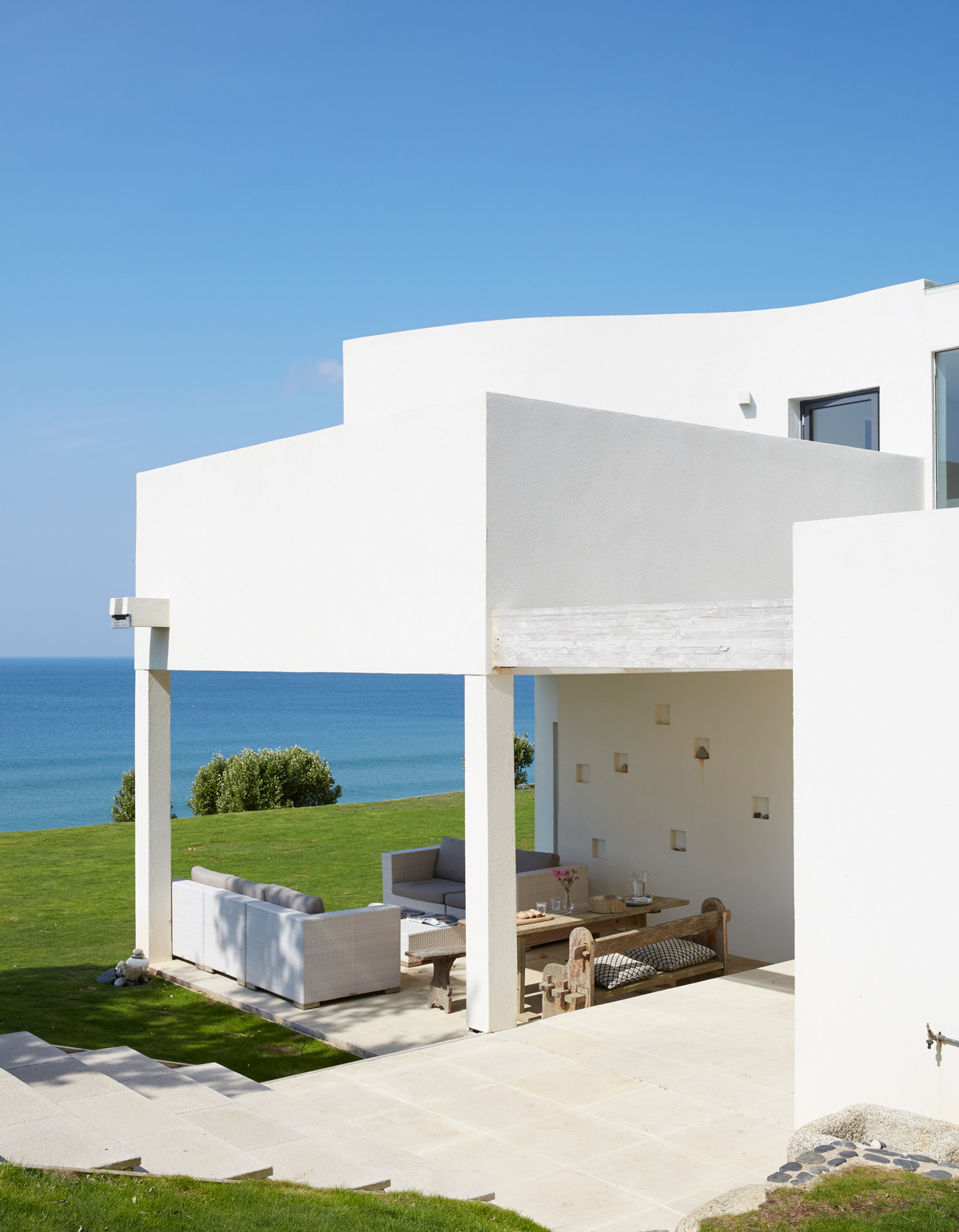 Explore this super-contemporary coastal house in Cornwall
This coastal house in Cornwall is all about drinking in the uninterrupted views of nature at its most raw, most pure…
By Livingetc
-
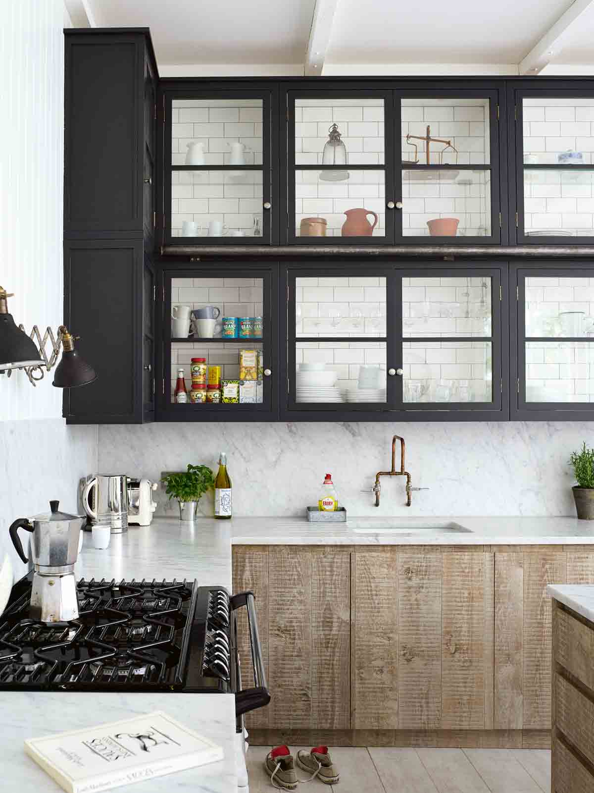 Explore this spacious detached 1900s house in southeast London with stylish modern interiors
Edgy textures, luxe materials and a mix of vintage and bargain buys transformed a blank detached 1900s house in southeast London into a home full of personality.
By Livingetc
-
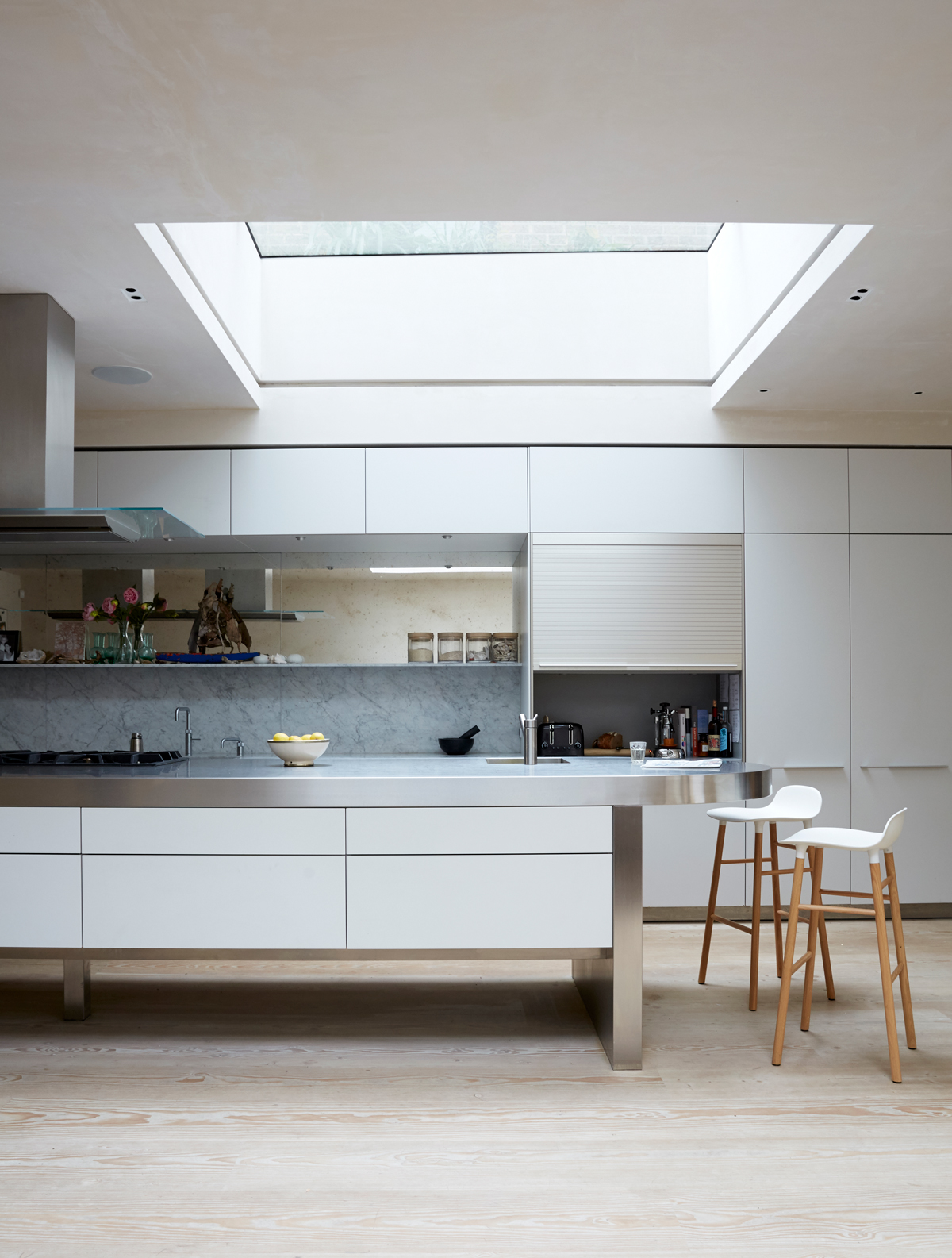 This large house in west London is minimal yet playful
A firefighter’s pole in the kitchen and a slide down the stairs? This house in west London proves minimalism can also be fun.
By Livingetc
-
 Inside A Clever Garden Room That Doubles As A Chic Guest House
This striking garden room design incorporates a sleeping area, kitchenette, loo and shower, as well as plenty of storage space, making it ideal as both a self-contained guest house or a restful retreat to escape to.
By Lotte Brouwer
-
 This light and bright Victorian terrace in west London is relaxed yet stylish
This chic Victorian terrace in west London is full of clever ideas that allow it to evolve.
By Livingetc