New Elegance #10
THE PROPERTY
A Victorian townhouse in north London. There is a kitchen and living room on the ground floor. The family room and dining area are on the lower-ground floor. The main suite and dressing room are on the first floor, with a study and WC on the half-landing. There are three bedrooms and a bathroom on the second floor, with the family bathroom on that half-landing.
Explore more New Elegance style homes
LIVING ROOM
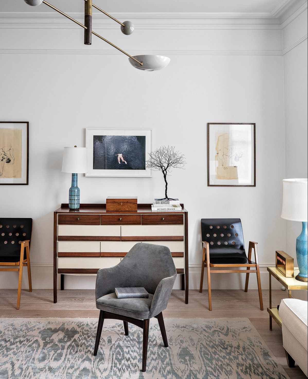
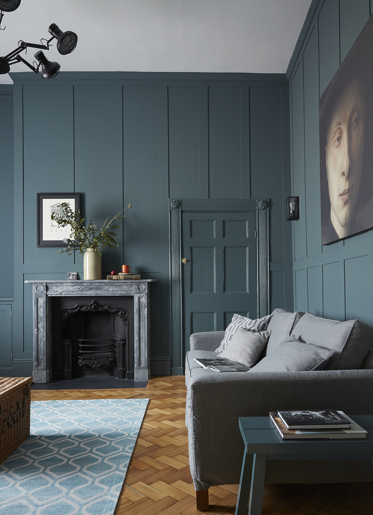
Faithful fans of Victorian style, look away now. Because this north London townhouse breaks all tradition, having stripped out the overbearing fireplaces, terracotta tiles and generally staid aura and replacing it with a style that’s lighter, brighter and a whole lot sharper.
The furniture was painstakingly curated until theright Pierre Jeanneret chairs, the perfect Georgian sofa and the most delicately balanced mid-century Italian pendant came along.The result is spaces that exercise restraint and balance: such as the angles of a chandelier subtly mirrored by an Alexander Calder mobile and the curves of two Martin Eisler armchairs echoed by a pair of Fifties chairs from Golborne Road.
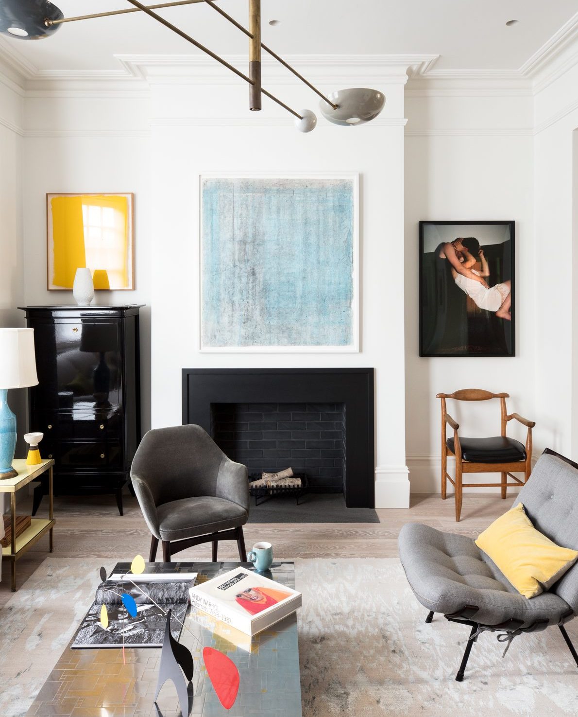
Every room deserves a centrepiece light and this mid-century design is big, beautiful and so poised. It doesn't feel overbearing – it just hovers elegantly.
Without the distracting floridity of period features on the walls, photography by Moby, Nan Goldin and Anne Collier can get top billing.The art and photography collection injects extra dashes of originality into this home.
A vibrant blocky yellow emanates from the Jessica Dickinson artwork (pictured above) in the living room.
Be The First To Know
The Livingetc newsletters are your inside source for what’s shaping interiors now - and what’s next. Discover trend forecasts, smart style ideas, and curated shopping inspiration that brings design to life. Subscribe today and stay ahead of the curve.
FAMILY ROOM
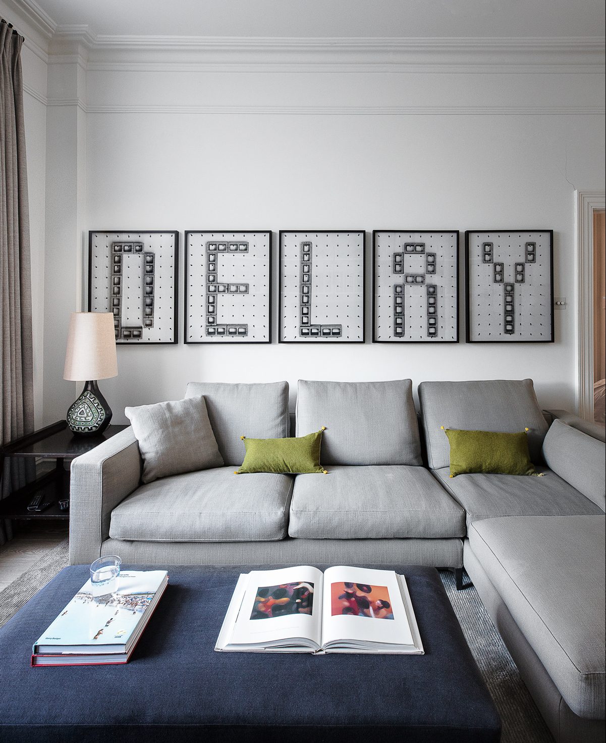
This home is all about clean-cut interiors punctuated with covetable furniture and contemporary art.
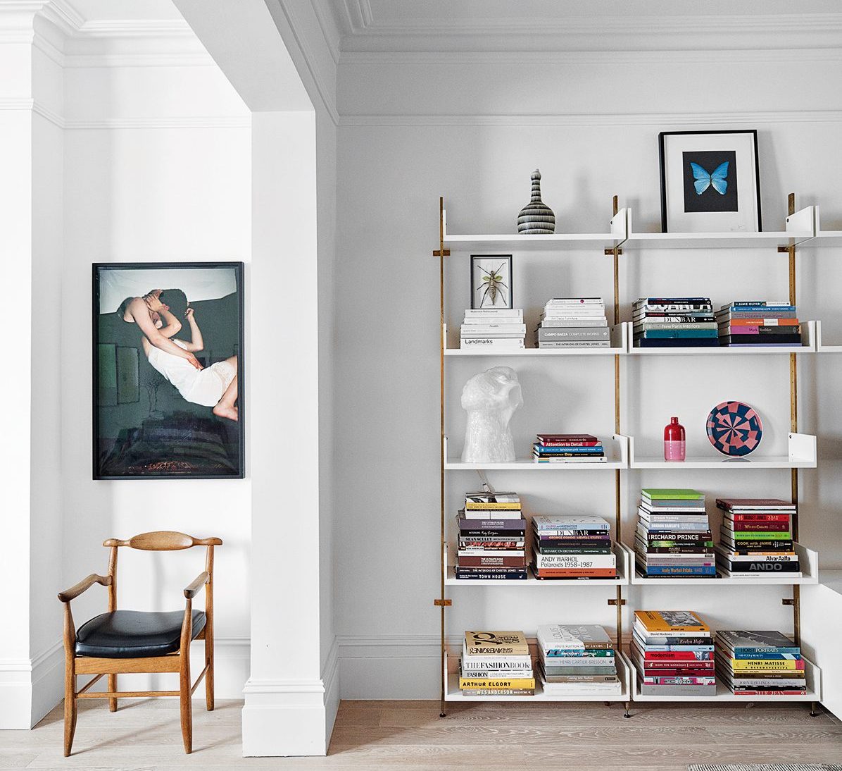
The lazier end of the double-aspect family room mixes luxe seating with conceptual art from LA.
Bespoke ice-white and brass shelving, above, provides storage for the plentiful stacks of art and design books.
DINING AREA
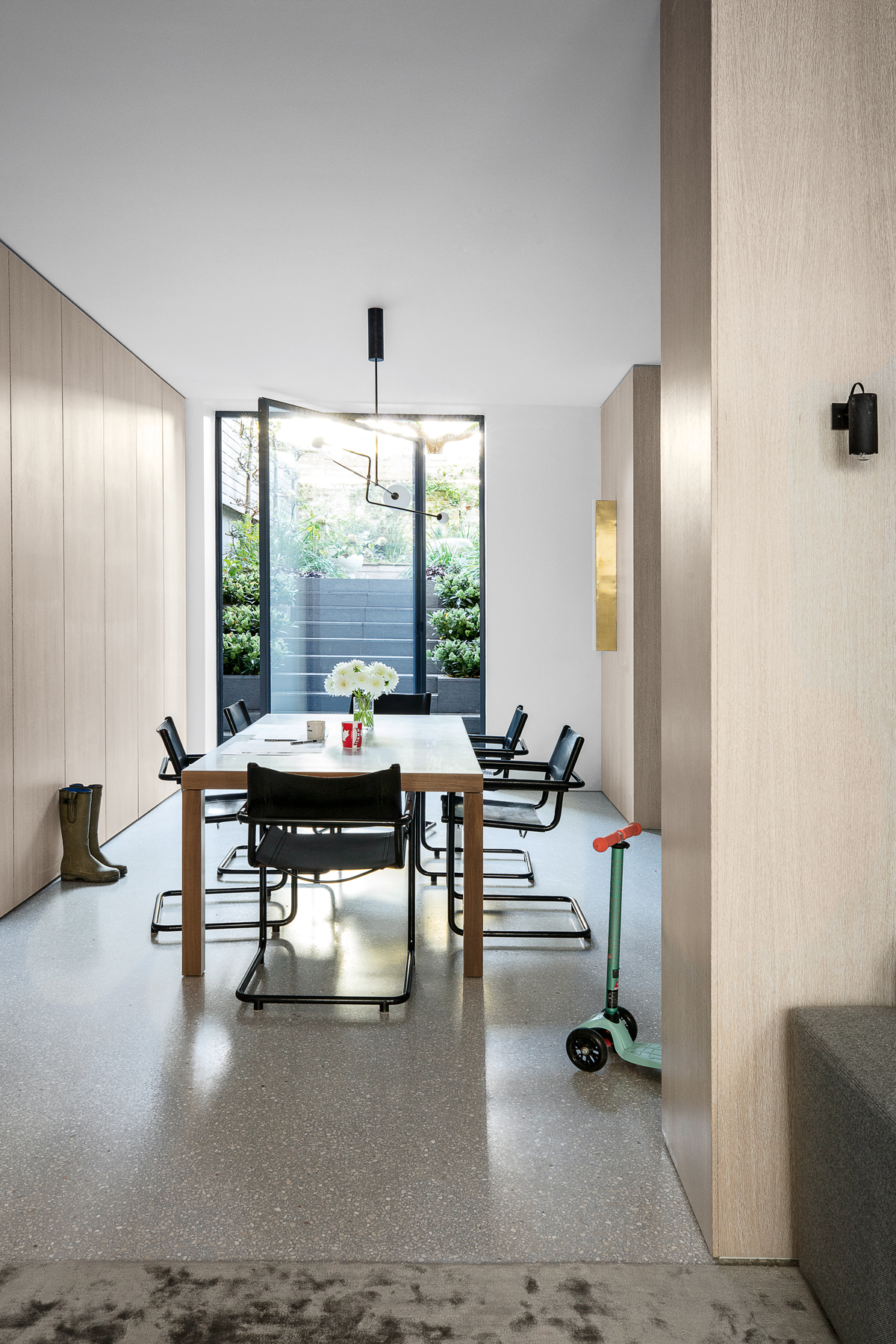
The lower ground floor is a surprisingly light space, with iconic design shapes set against pale timber cladding and flush cabinetry, black-framed glazing and seamless terrazzo flooring.
A pivoting door leads out into the garden and helps provide end-to-end natural light, while designer lights add illumination. Toys, games and the stuff of family life are stored in the run of handleless cabinets.
KITCHEN
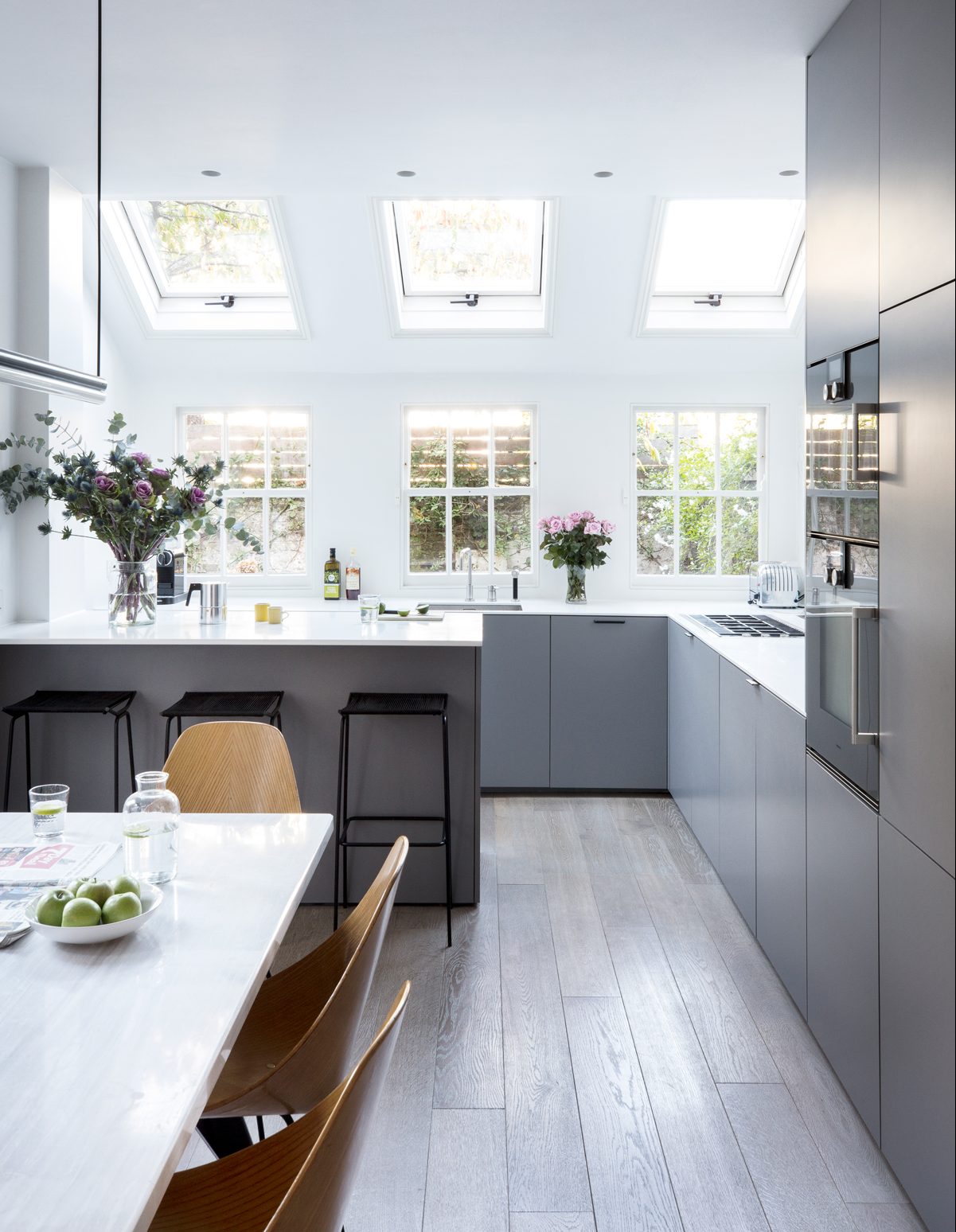
The crisp, streamlined kitchen has a timeless design. And when you get bored of it, it can be simply updated with different handles.
The kitchen table base is by Jean Prouvé, but the kitchen carcasses are by (gasp!) Ikea.The Michael Anastassiades lights in the kitchen (and lower-ground floor) exemplify clean-lined simplicity.
STUDY
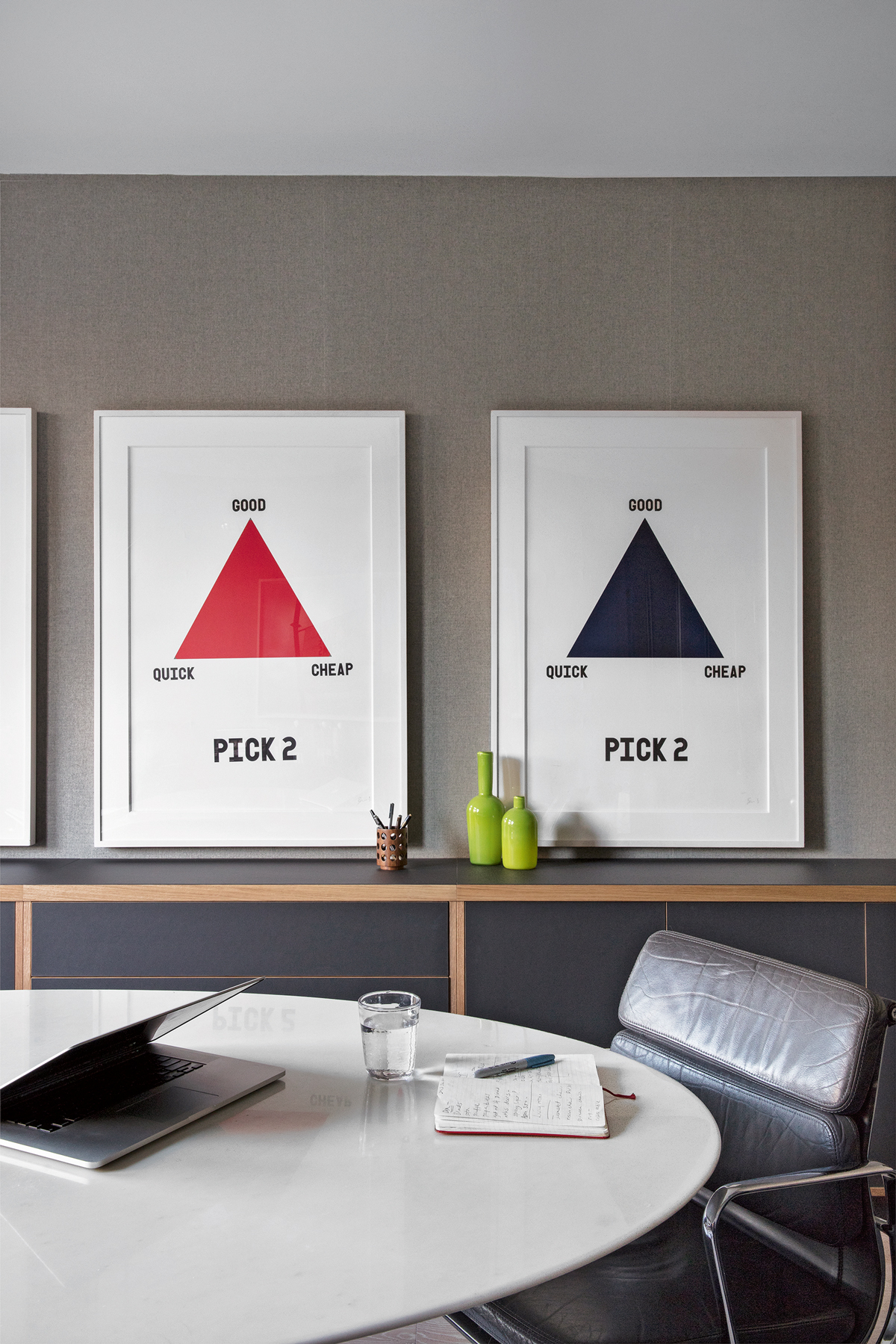
Six of the house’s old fireplaces went, making way for lots of iconic lighting and mid-century shapes.
The original fireplaces were huge and dominated the rooms – if you’ve got a doorway on one wall, a radiator onthe other and a really grand fireplace, it doesn’t leave much scope for redesigning a space. Thesolution? To replace them with surrounds in minimalist black steel and Belgian tiles – and pass on the old ones to neighbours. The result was clean, uninterrupted lines to work with and a good start to neighbourly relations.
HALLWAY
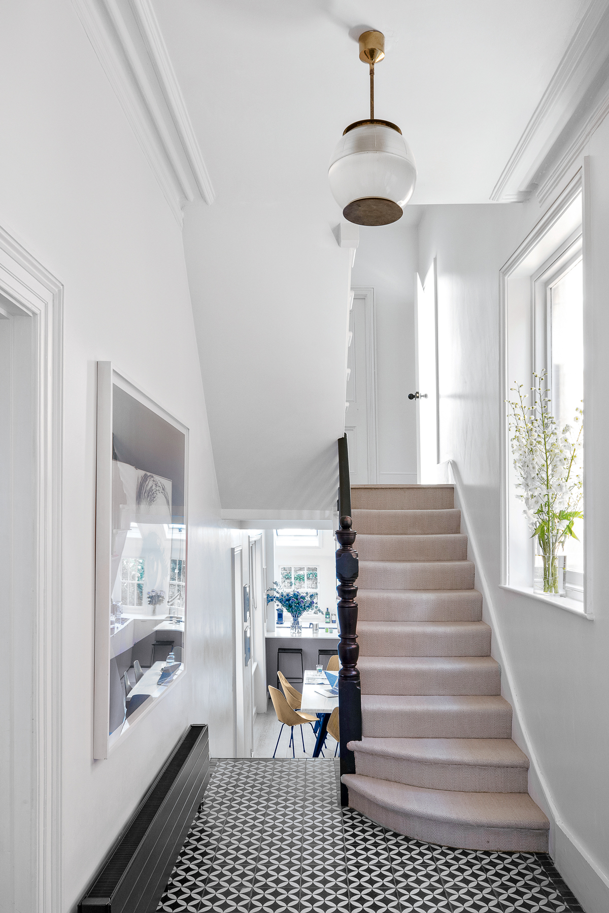
To ease visitors into the more contemporary rooms, the hallway has retained a hint of Victorian style – it’s a transitional space. The old tiles have been kept but covered with new ones – in case the next owner wants to rediscover them.
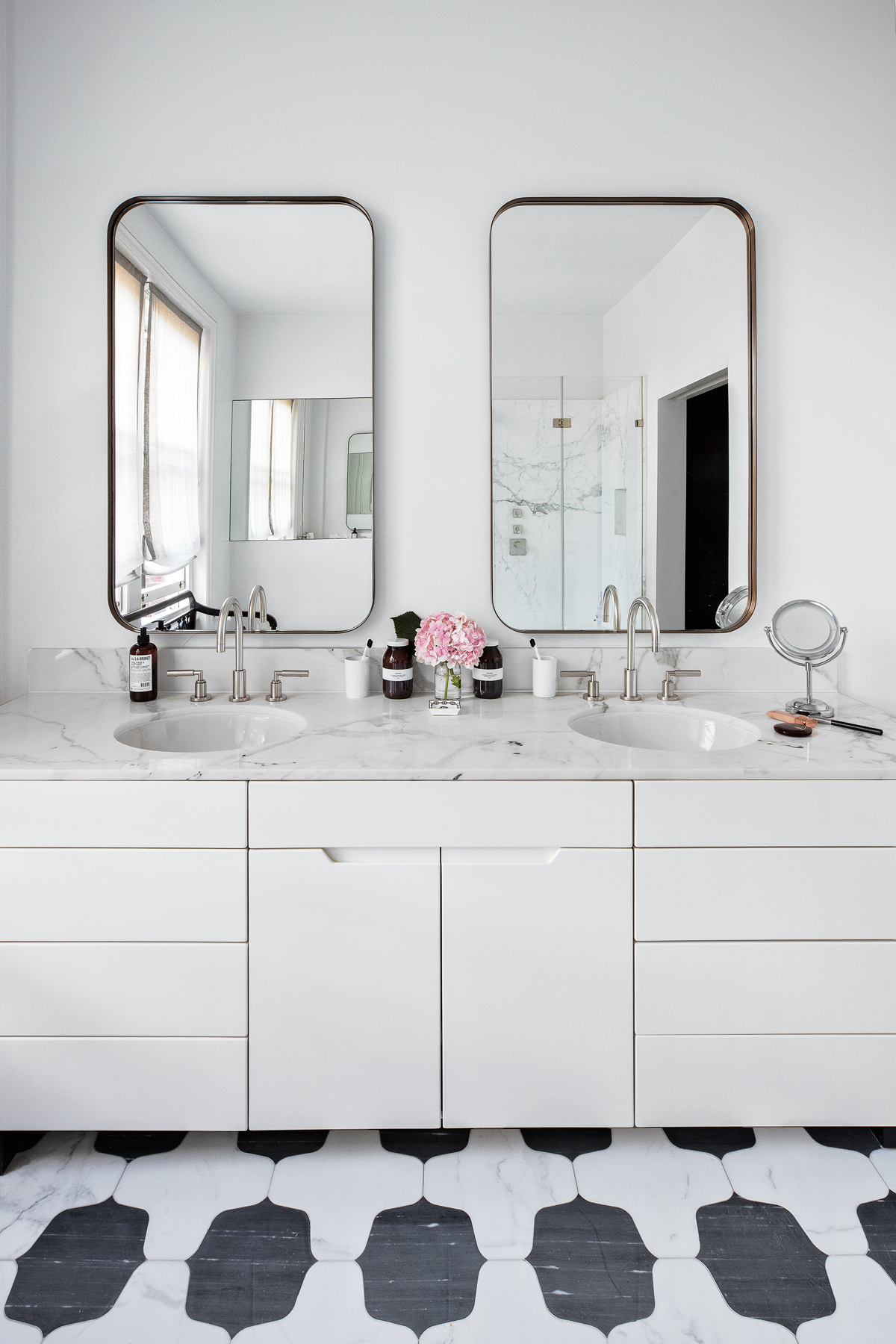
MASTER ENSUITE
Monochrome tiles and Fifties-style mirrors exude the Art Deco glamour of a New York hotel suite.
MASTER BEDROOM
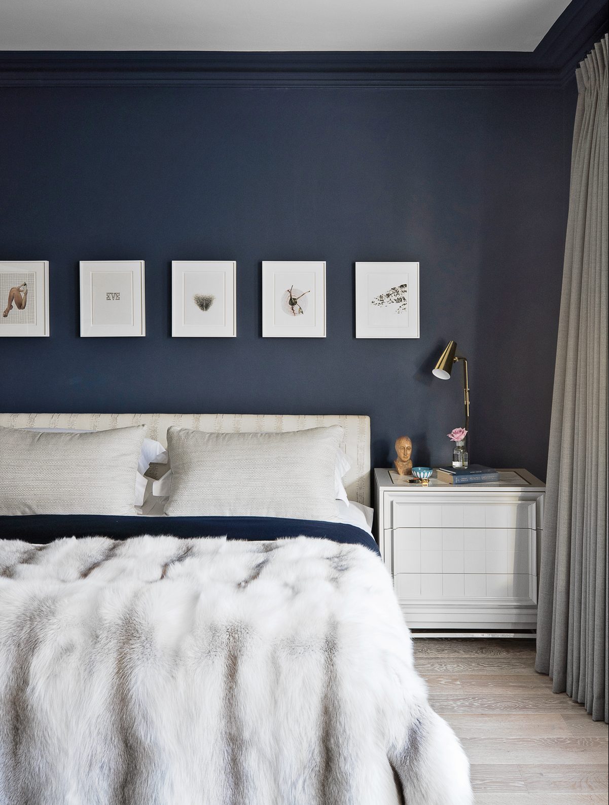
In the bedroom, walls have been painted in deepest blue, the fireplace was reduced to a black steel surround and blackout curtains were hung to create a space that’s cosseting after dark.
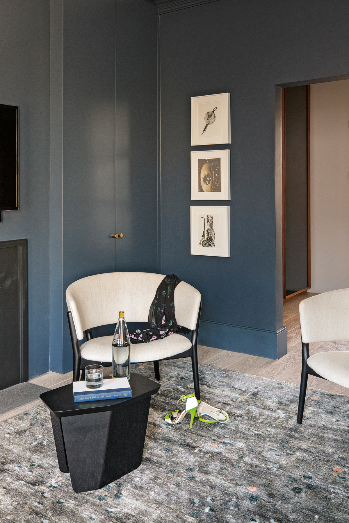
A sumptuous rug makes this corner of the main bedroom a cosy space to unwind in.
Find out more about the design vision at tamzingreenhill.com
Photography ⁄ Paul Raeside
The homes media brand for early adopters, Livingetc shines a spotlight on the now and the next in design, obsessively covering interior trends, color advice, stylish homeware and modern homes. Celebrating the intersection between fashion and interiors. it's the brand that makes and breaks trends and it draws on its network on leading international luminaries to bring you the very best insight and ideas.
-
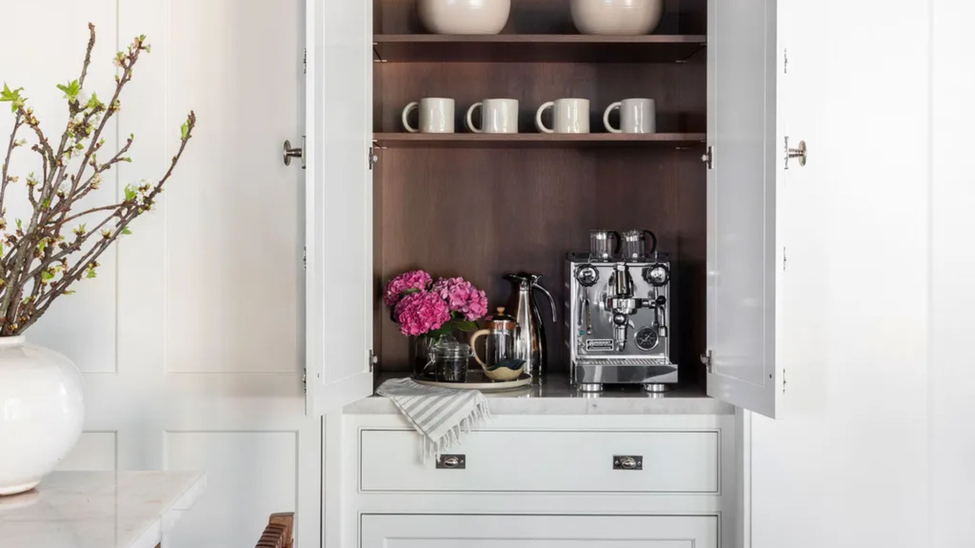 Turns Out the Coolest New Café is Actually In Your Kitchen — Here's How to Steal the Style of TikTok's Latest Trend
Goodbye, over-priced lattes. Hello, home-brewed coffee with friends. TikTok's 'Home Cafe' trend brings stylish cafe culture into the comfort of your own home
By Devin Toolen Published
-
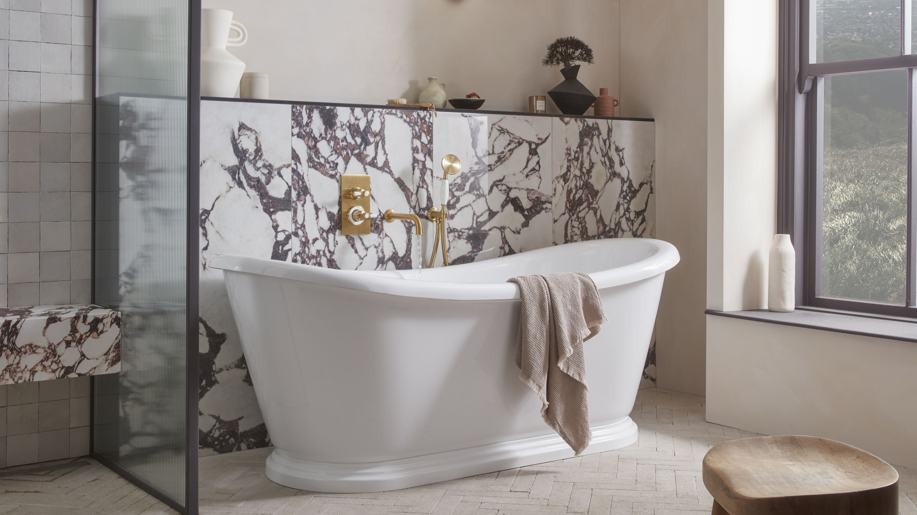 5 Bathroom Layouts That Look Dated in 2025 — Plus the Alternatives Designers Use Instead for a More Contemporary Space
For a bathroom that feels in line with the times, avoid these layouts and be more intentional with the placement and positioning of your features and fixtures
By Lilith Hudson Published
-
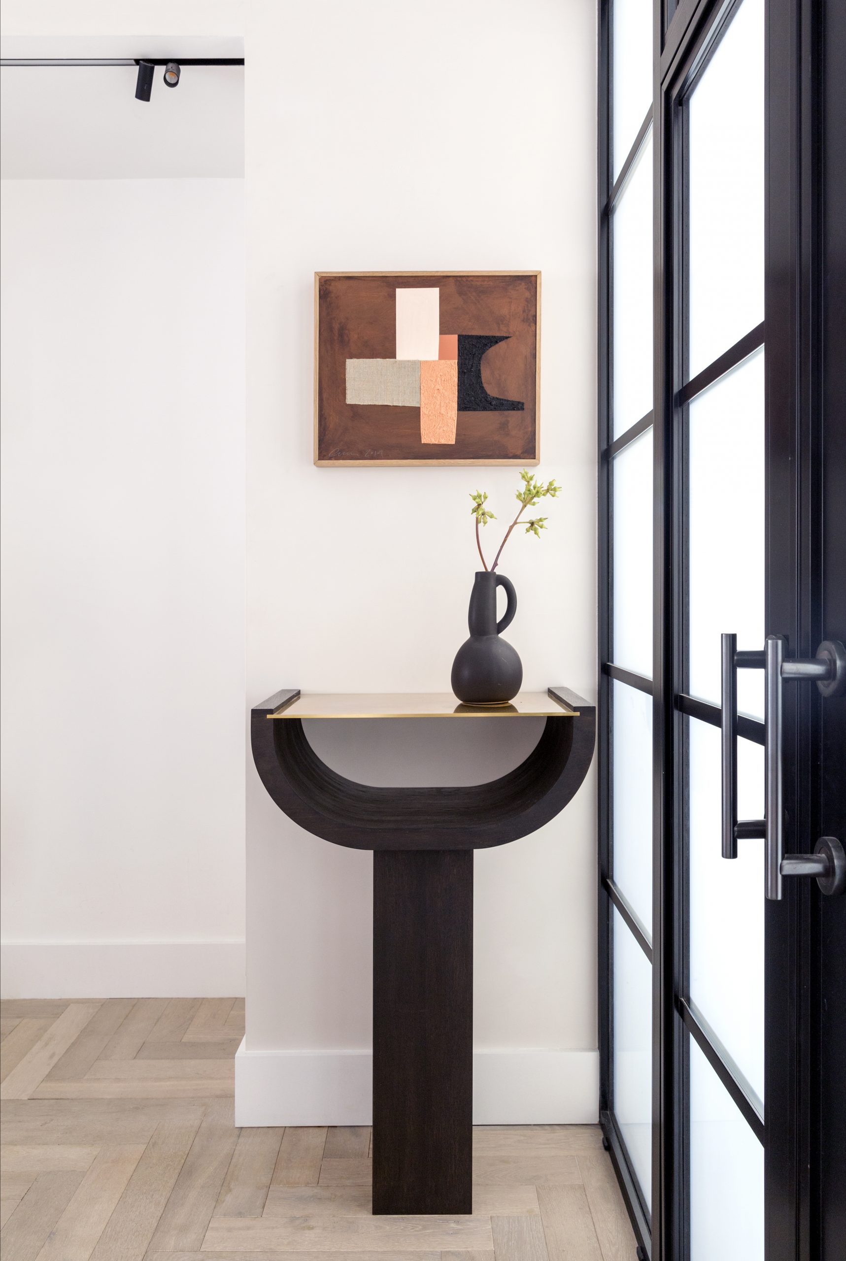 New Elegance 33
By Livingetc Published
-
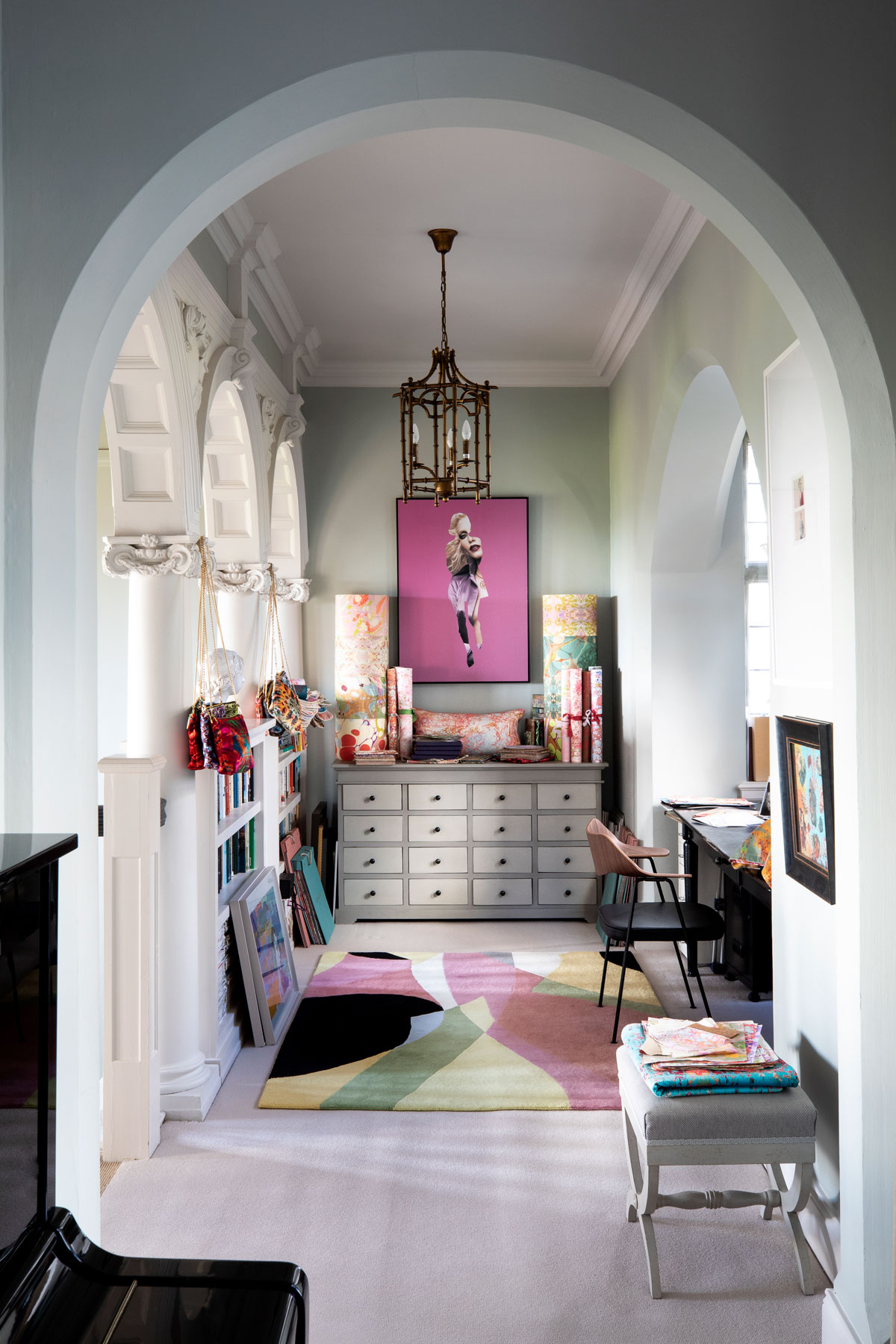 New elegance #28
Designer Susi Bellamy has decorated her Edwardian manor house with a modern mix of hello-there hues and vibrant art
By Livingetc Published
-
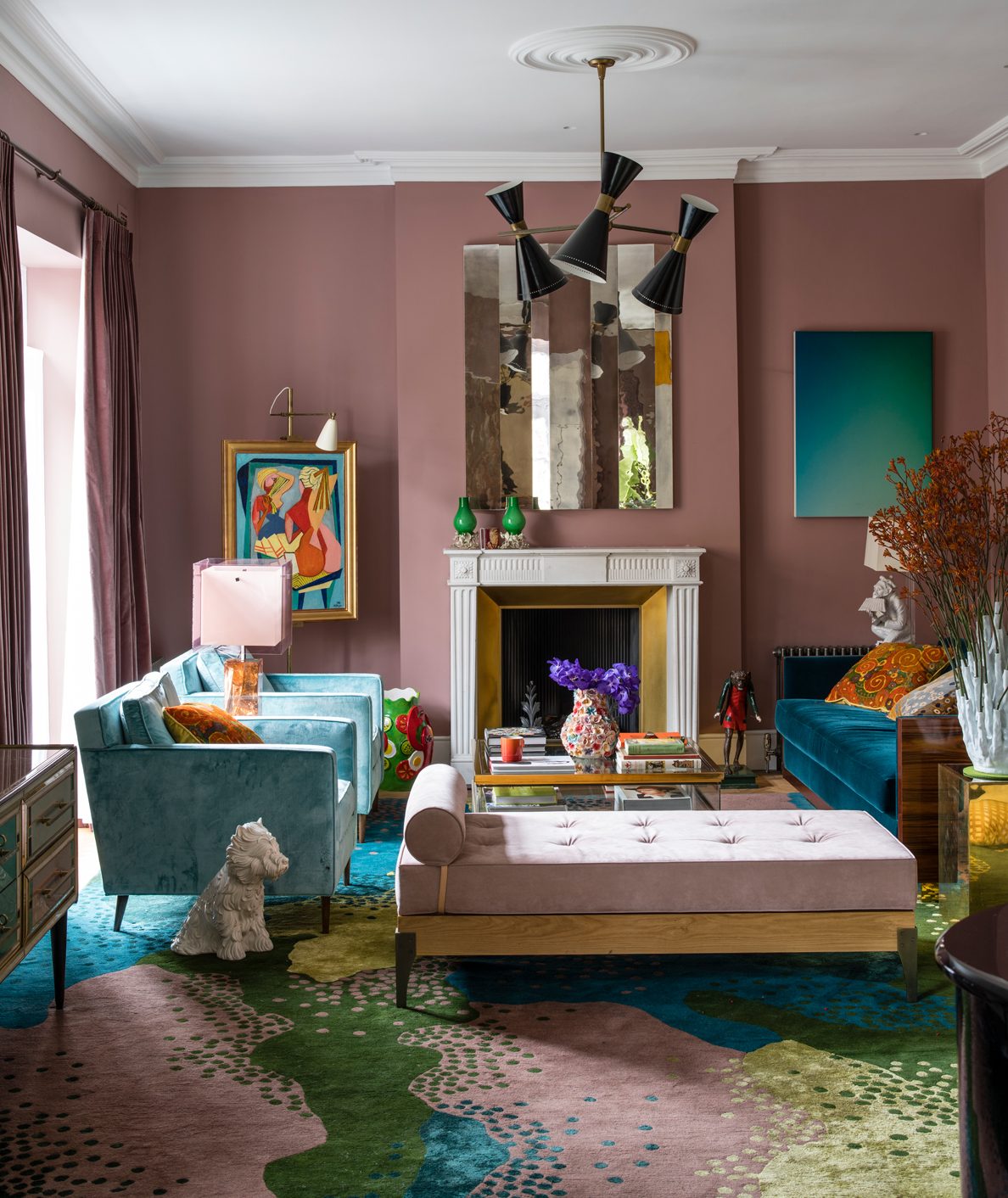 New Elegance #15
Full of sorbet shades and sunshine, this home cleverly combines designer gems with feel-good factors such as quirky art and faux sheep
By Livingetc Published
-
 New Elegance #3
This beautiful period property has been lavished with plenty of TLC to create a home that honours its roots, yet celebrates contemporary design ideas
By Livingetc Published