New Elegance #15
THE PROPERTY
A Victorian three-storey house in north London. The lower-ground floor comprises an open-plan kitchen, living and dining space with a library and gym, plus a courtyard garden. There is a large living room, bar, guest bedroom and bathroom and a cloakroom on the ground floor, with a guest powder room on a landing between the ground and first floors. The main bedroom, bathroom and dressing room are on the top floor.
LIVING ROOM
Filled with colour and texture, there’s so much to tantalise the senses in this 1870s house in a leafy part of north London.
Its unusual proportions – thanks to the house being linked to a neighbouring property during the war to become a printing press and never converted back – have allowed for enviable lateral living not very far from the city centre.
Working with interior designer Peter Mikic, the home owners separated the house into three distinct zones so that every singlesquare inch is used to the max.
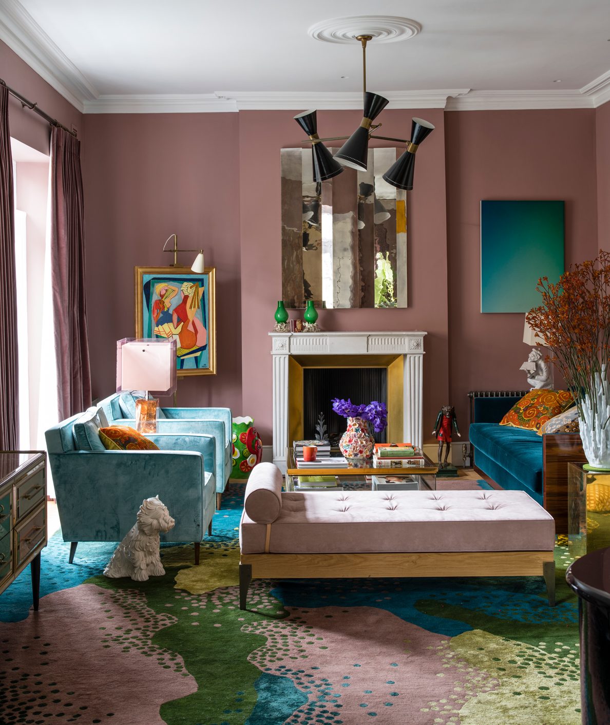
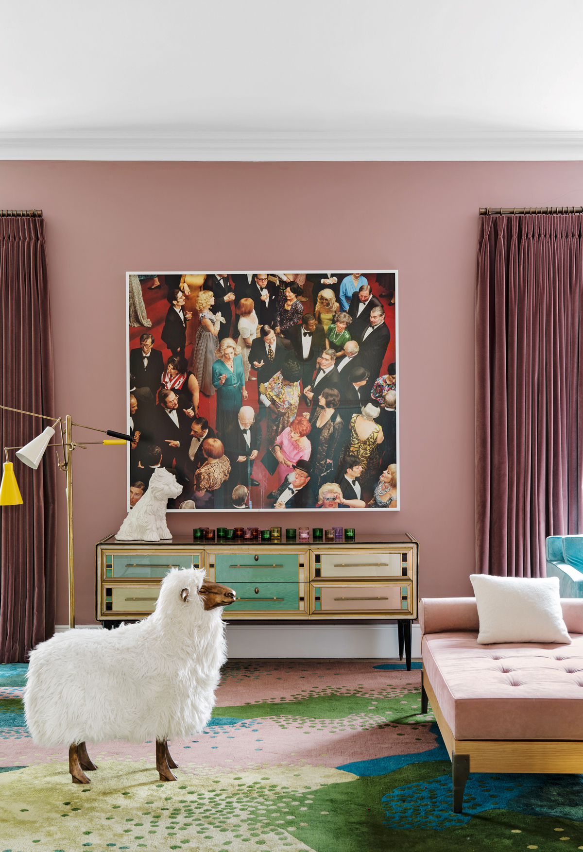
On the ground floor, the colours of the glamorous living roomwere inspired by an Eighties Emanuel Ungaro sideboard. It has influenced the dusky-pink hue of the walls, the velvety shades of the furniture and the kaleidoscope of colours in the bespoke rug.
The house might feel impossibly glamorous, but it’s welcoming too, with lots of fun, humorous touches like a large quirky faux sheep that takes visitors by surprise in the living room and a flea-market painting, bought for next to nothing, which has been so exquisitely framed and displayed, it looks more like an Old Master.
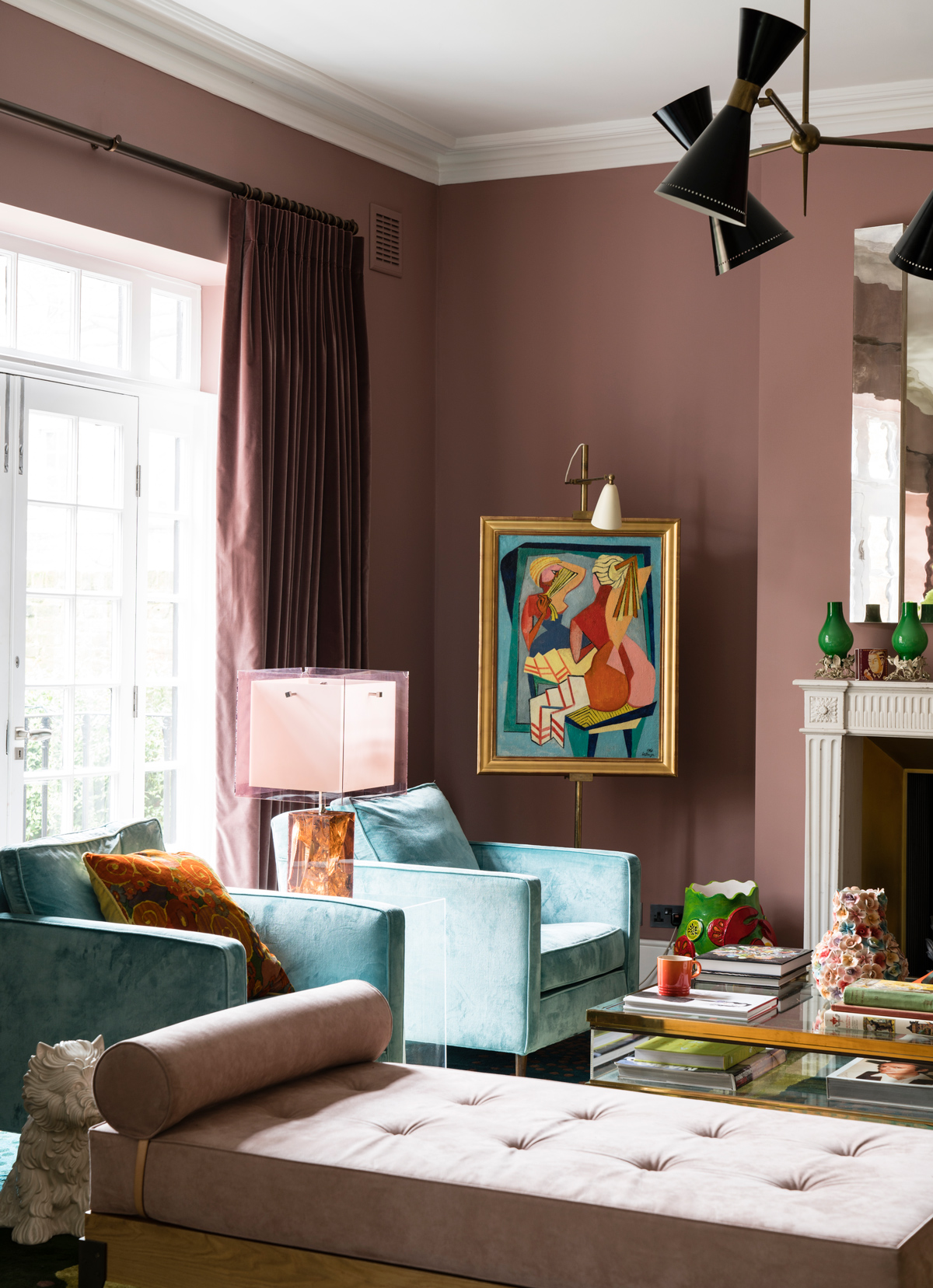
Thedoorway beyond leads to the chic bar.
Be The First To Know
The Livingetc newsletters are your inside source for what’s shaping interiors now - and what’s next. Discover trend forecasts, smart style ideas, and curated shopping inspiration that brings design to life. Subscribe today and stay ahead of the curve.
BAR
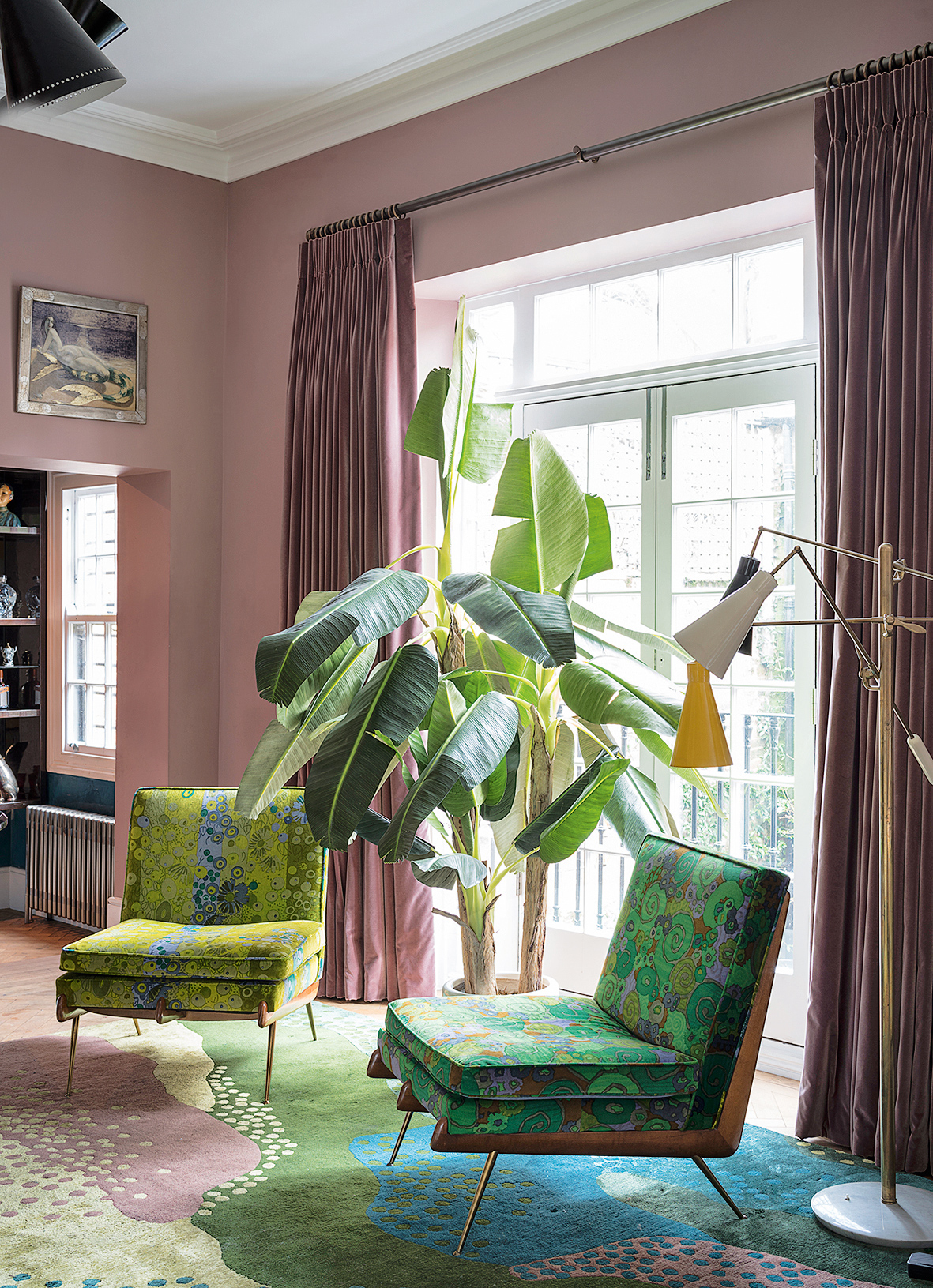
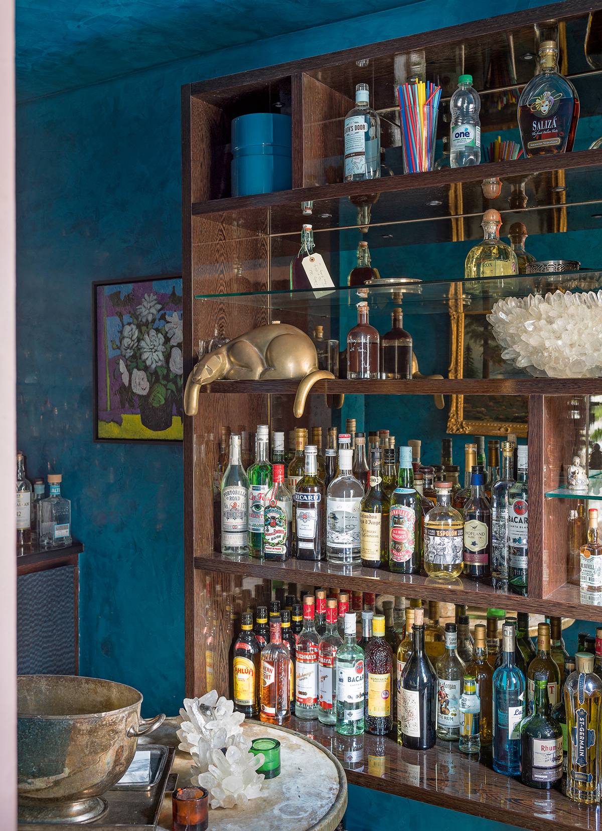
Leading off the living room, this snug was the perfect place to create a chic bar. The previous owner had used it as a stereo room, filled with his CD collection. Now it’s equipped with everything you could ever need for aperitifs and nightcaps.
KITCHEN
The open-plan kitchen and living space onthe lower-ground floor is perfect for relaxed entertaining.
But the kitchen wasn’t always solight-filled – originally, there was just a tiny door and two small windows overlooking another wall, which blocked any view of the outside. Knocking the wall down and replacing it with floor-to-ceiling Crittall windows opening on to a newly landscaped garden (complete with outdoor fireplace) literally doubled the sense of space.
The marble wasfound in Spain, cut from one slab and shipped over in a single piece. It’s amazing for things like rolling out pizzas.

DINING ROOM
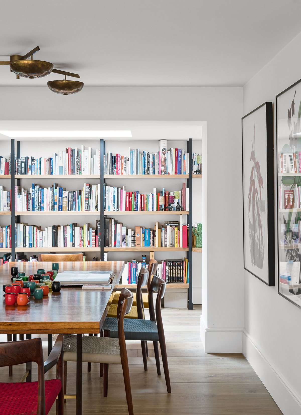
A wall of Crittall-style windows allowslight to stream throughout the entire open-plan basement living area, reaching this inner hallway beyond the dining space.
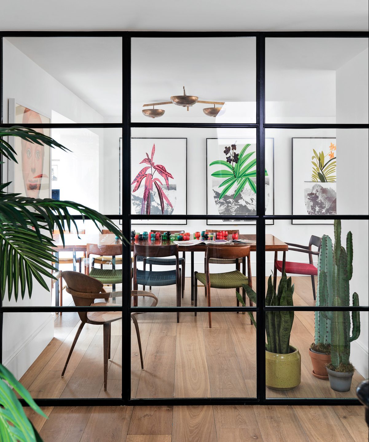
Peter Mikic helped to transform the dining space from the warren of corridors that it used to be.
HALLWAY
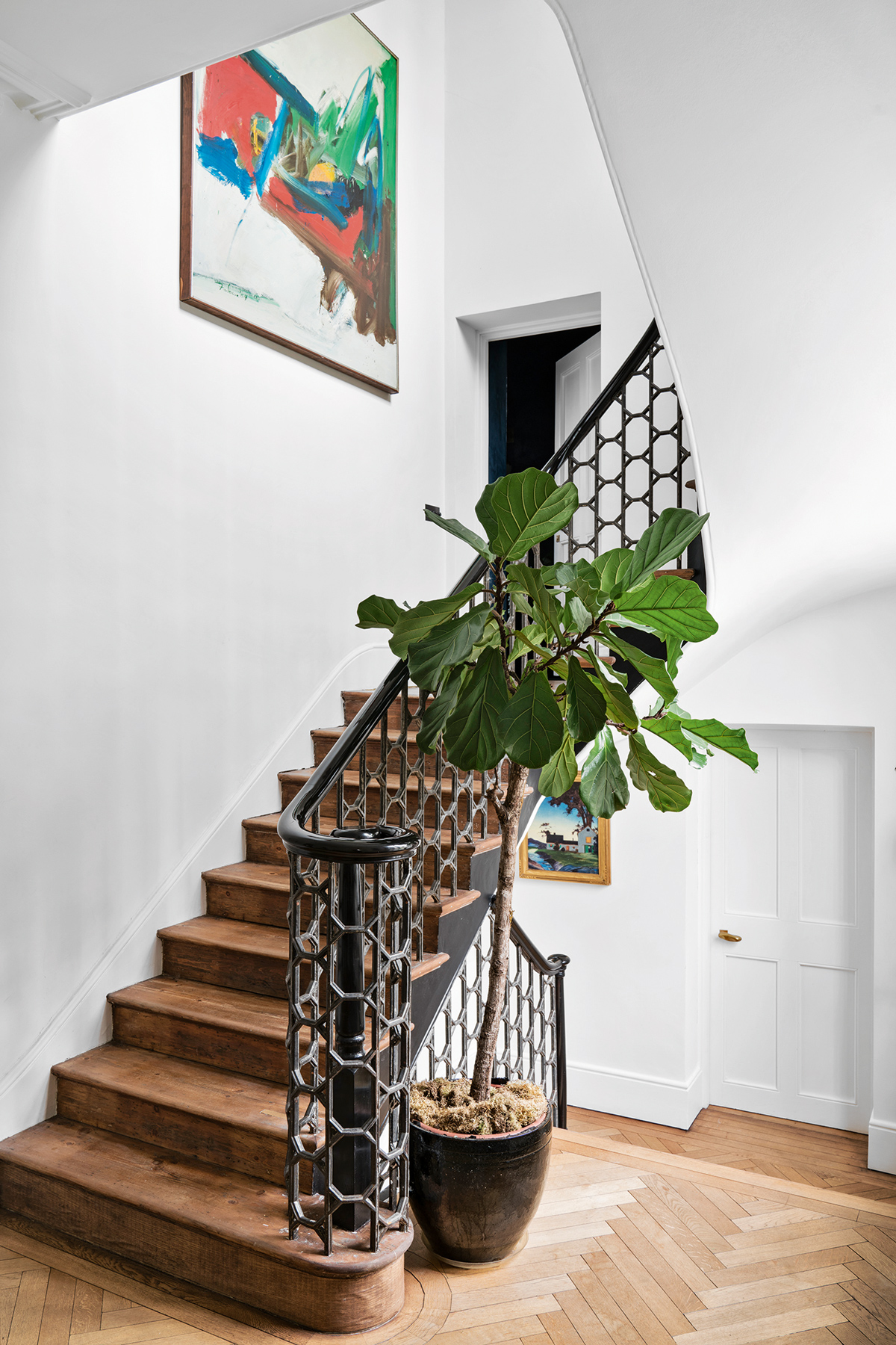
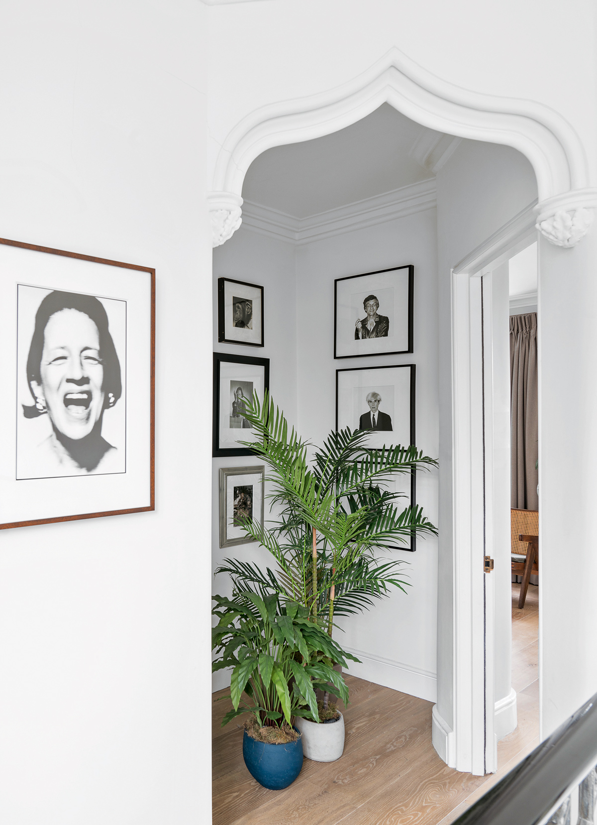
While sticking to the house’s original layout, most of thestructure had to be rebuilt due to the alarming deterioration of the foundations discovered during the renovation. For almost a year, heavy-duty stilts were the only thing preventing the walls from crashing down. Original features such as the cornicing and quirky Moroccan-style arched doorway at the top of the first-floor landing were kept as they were, while the staircase was completely stripped back to theiroriginal black wrought iron.
The mezzanine doors lead to a powder room and cloakroom.
BASEMEMENT LIVING ROOM
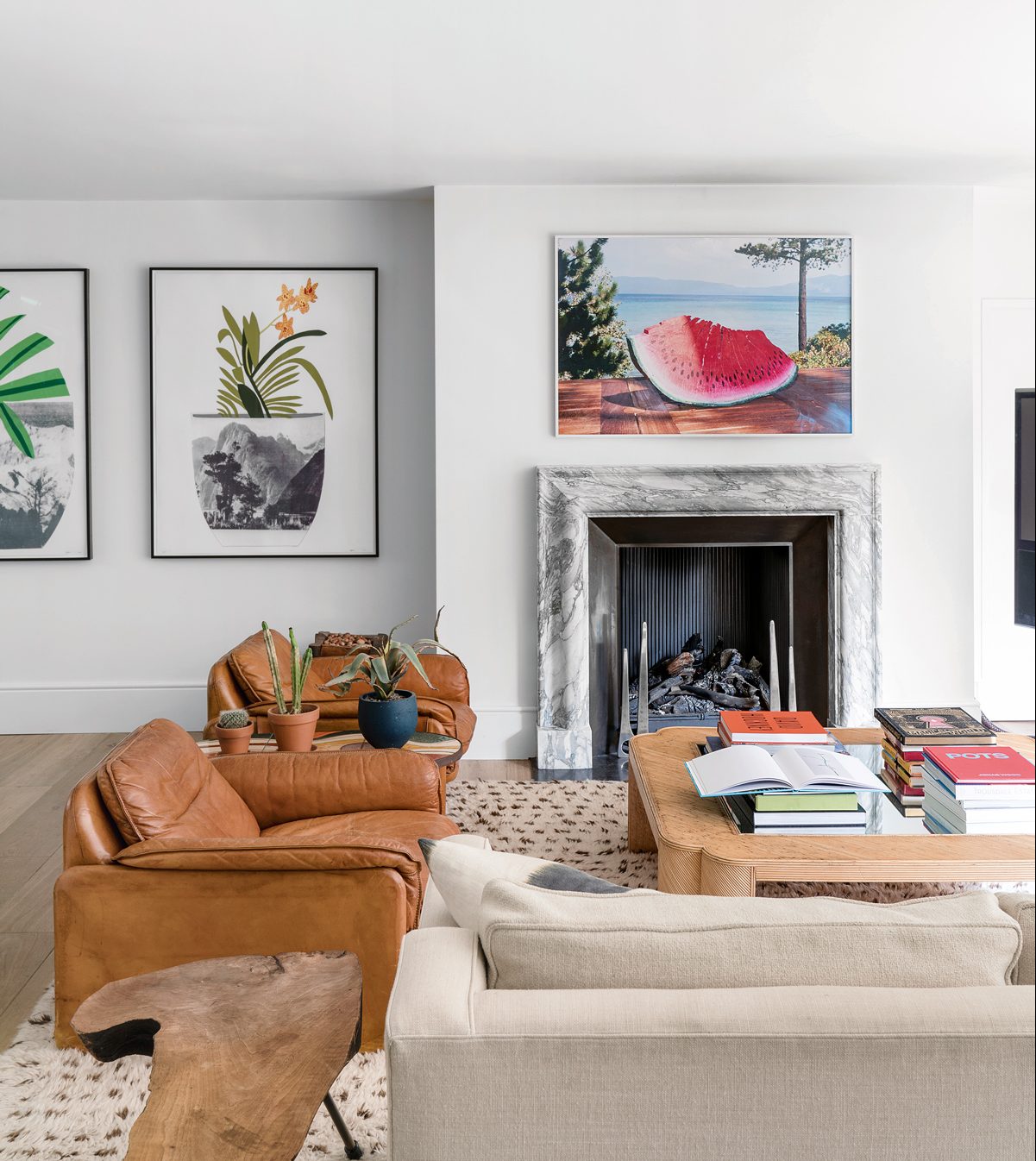
The downstairs living room is more informal, perfect for lounging, playing card games, watching films or listening to music.
LANDING
The Moroccan-style arched doorwayat the top of the stairs was inherited as part of the house.
POWDER ROOM
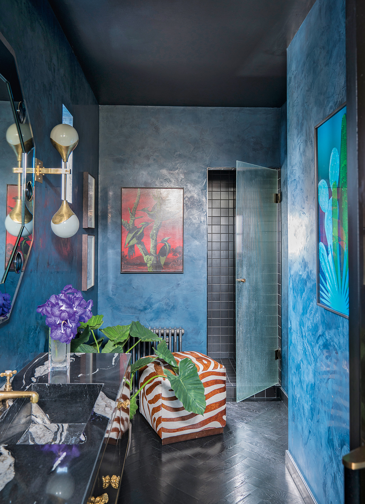
The polished-plaster walls in a deep-seablue really up the ante in here. Blue issuch a flattering colour and also very relaxing, which is what you want for your guests: that they look and feel beautifuland at ease all night long.
MAIN BEDROOM
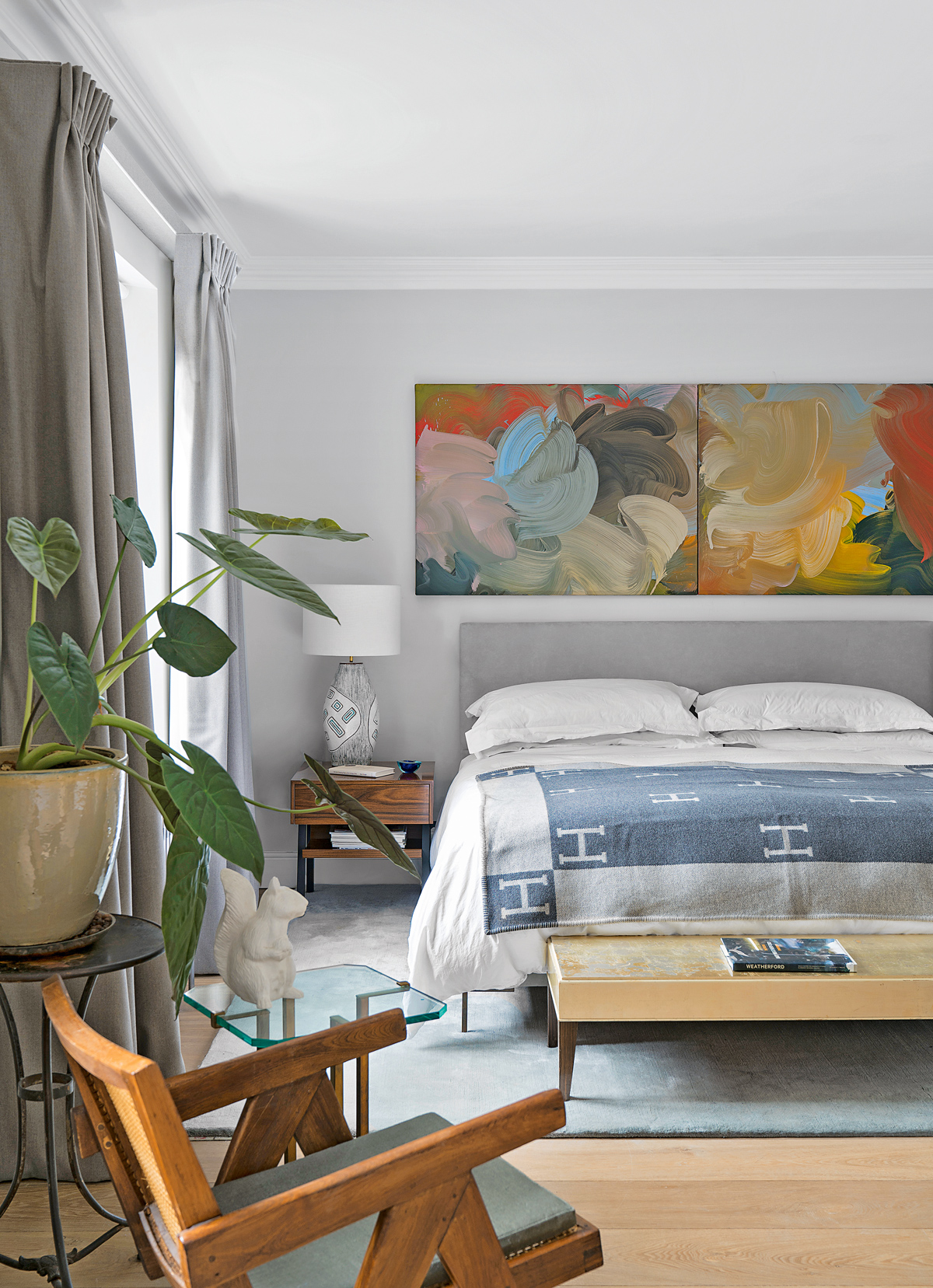
Upstairs, the cool, soothing comfort of the bedroom and main bathroom takes centre stage. Here, abstract artwork blends seamlessly with the subtle hues of the walls.
MAIN BATHROOM
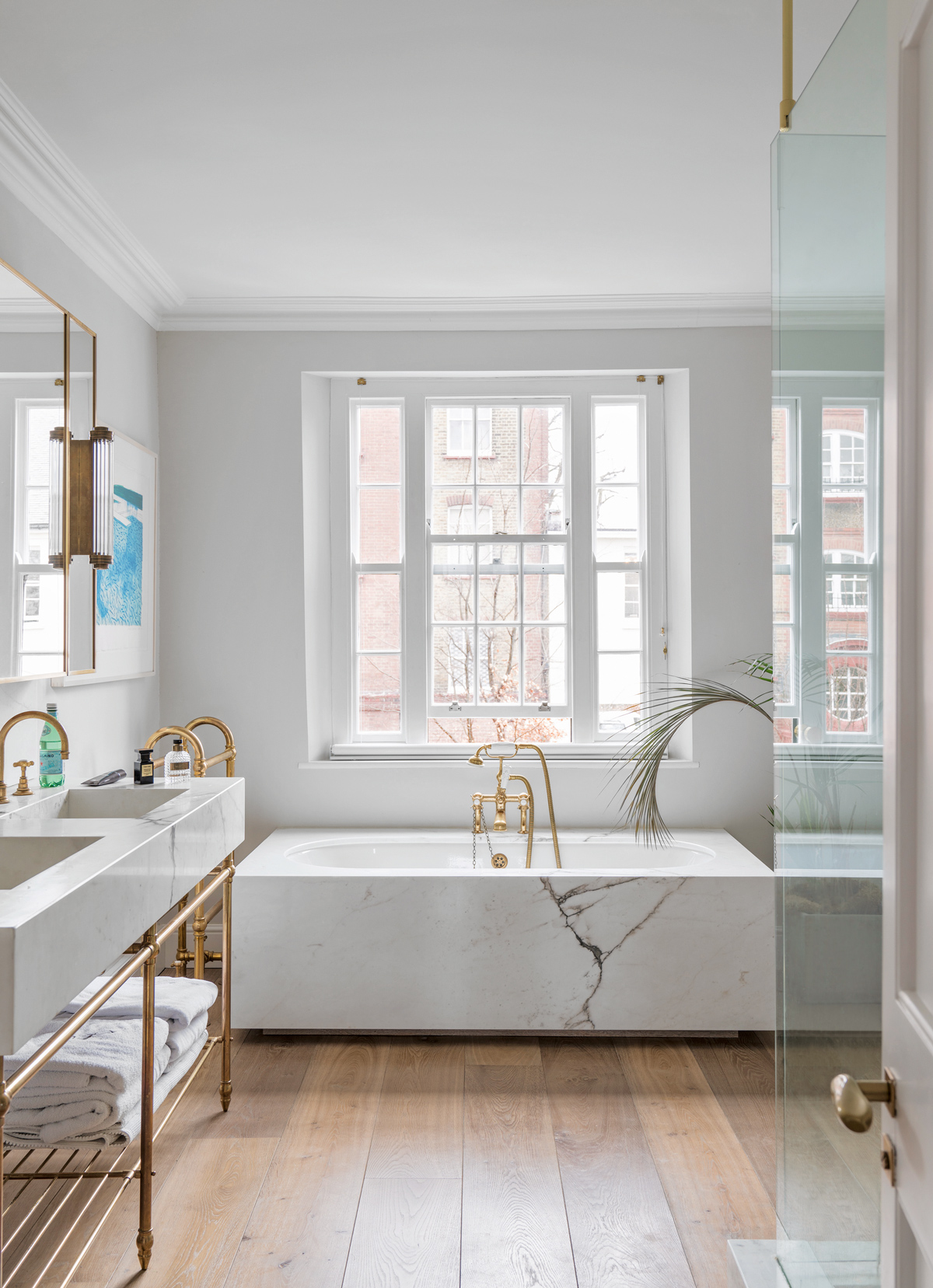
The minimalist mood in here brings a welcome note of calm. All soothing lines and textures, while the veins of the marble are almost hypnotising.It’s the perfect backdrop for the signed Hockney Swimming Pool lithograph.
To see more of Peter Mikic’s work, check outpetermikic.com
Photography ⁄ James Merrell
The homes media brand for early adopters, Livingetc shines a spotlight on the now and the next in design, obsessively covering interior trends, color advice, stylish homeware and modern homes. Celebrating the intersection between fashion and interiors. it's the brand that makes and breaks trends and it draws on its network on leading international luminaries to bring you the very best insight and ideas.
-
 Turns Out the Coolest New Café is Actually In Your Kitchen — Here's How to Steal the Style of TikTok's Latest Trend
Goodbye, over-priced lattes. Hello, home-brewed coffee with friends. TikTok's 'Home Cafe' trend brings stylish cafe culture into the comfort of your own home
By Devin Toolen Published
-
 5 Bathroom Layouts That Look Dated in 2025 — Plus the Alternatives Designers Use Instead for a More Contemporary Space
For a bathroom that feels in line with the times, avoid these layouts and be more intentional with the placement and positioning of your features and fixtures
By Lilith Hudson Published
-
 See inside this Victorian apartment in Battersea with a warm and rustic feel
This pared-back yet personality-packed Victorian apartment in Battersea celebrates the art of easy yet stylish living
By Livingetc Published
-
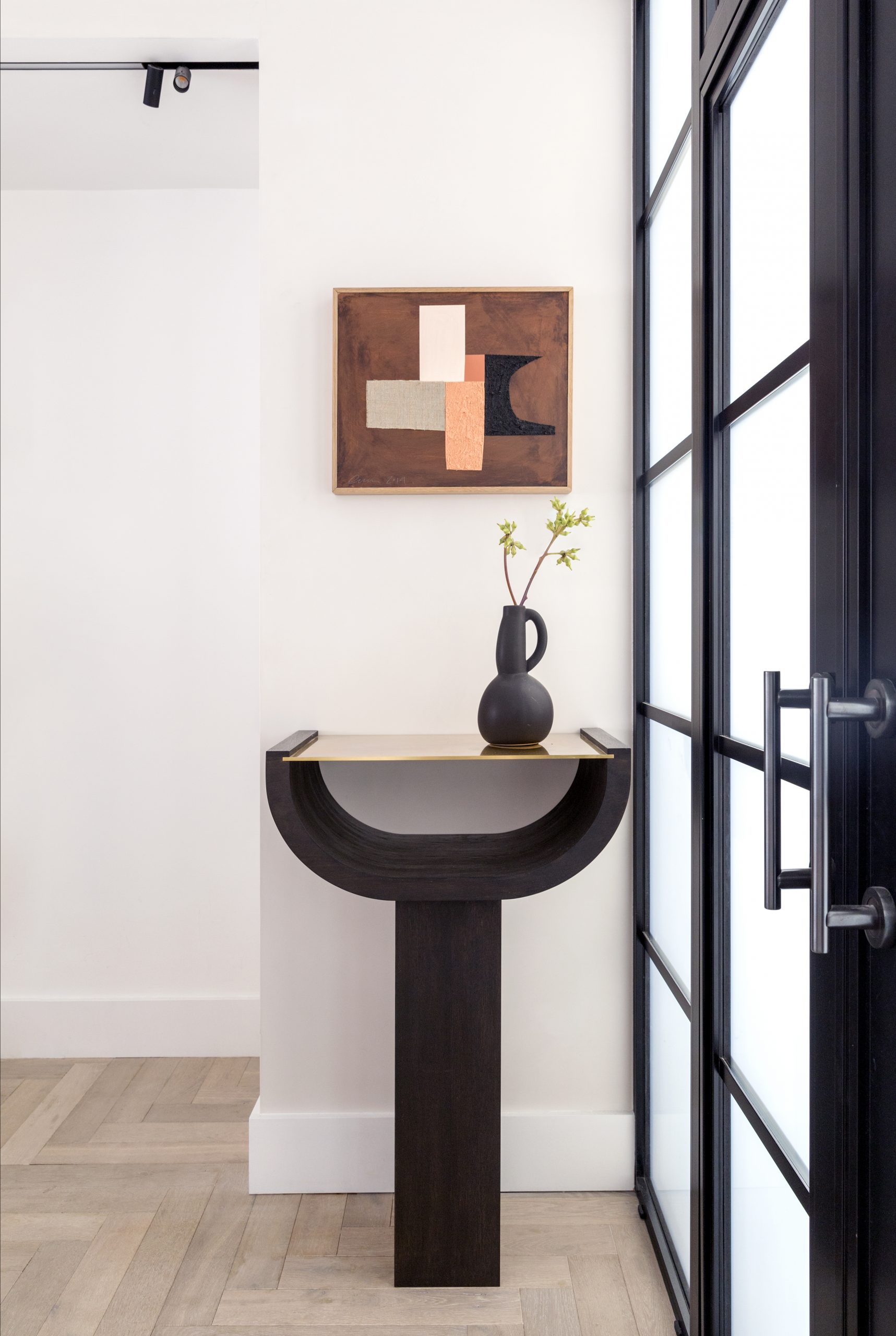 New Elegance 33
By Livingetc Published
-
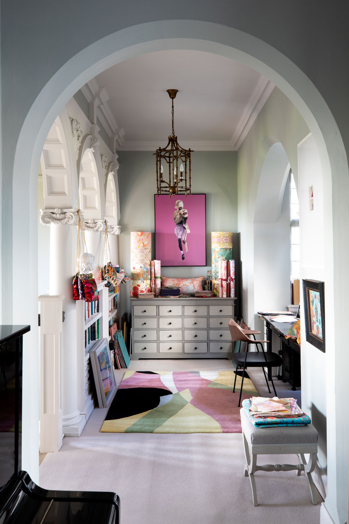 New elegance #28
Designer Susi Bellamy has decorated her Edwardian manor house with a modern mix of hello-there hues and vibrant art
By Livingetc Published
-
URBAN GLAMOUR #47
Jonathan Adler’s uplifting take on modern American glamour has revolutionised interiors – and his Greenwich Village apartment.
By Livingetc Published
-
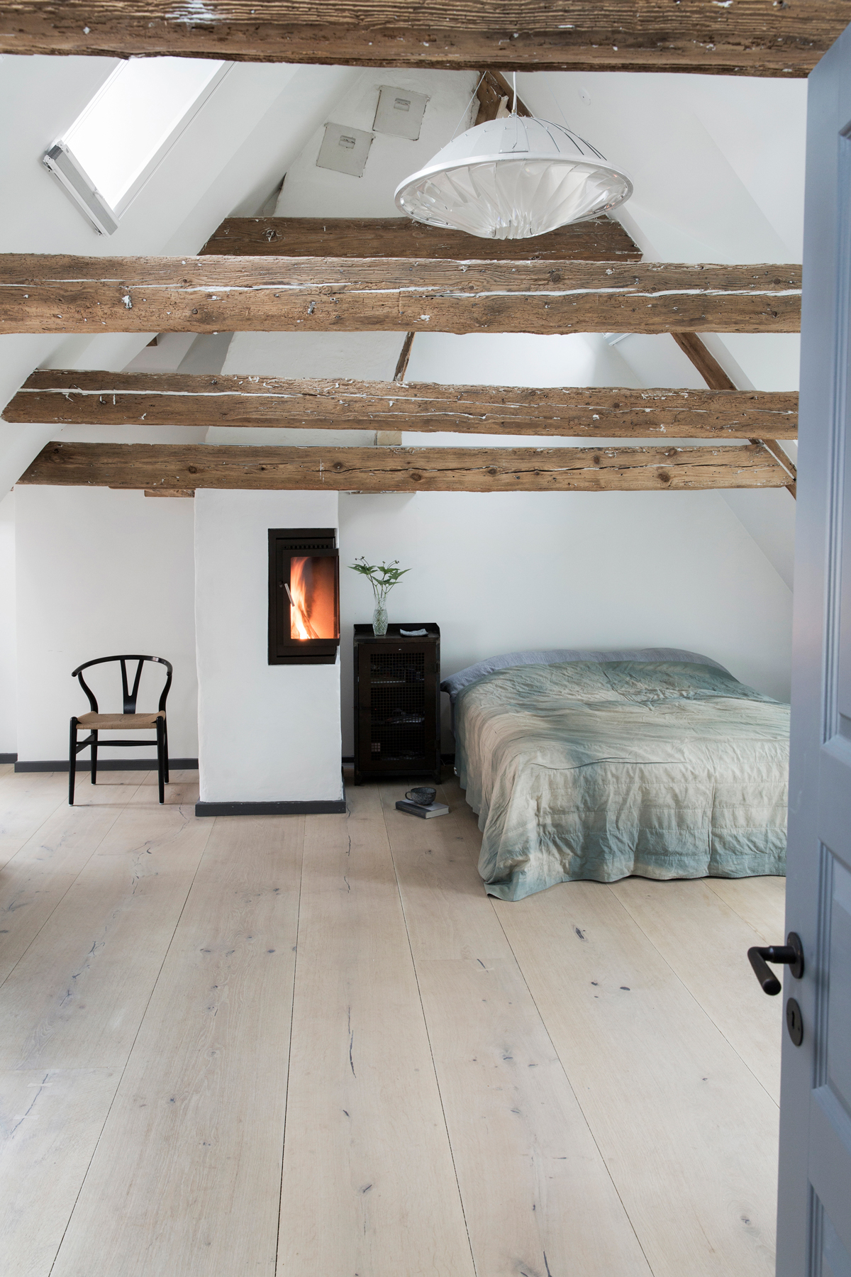 SCANDI COOL #23
Founder and chef of Noma, René Redzepi is renowned for using simple ingredients creatively – a recipe that serves just as well for the house he shares with his wife and three children.
By Livingetc Published
-
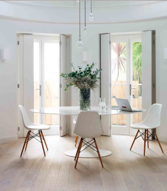 Urban Glamour #20
This Georgian house in north London took nine months to renovate but the result is jaw-dropping.
By Livingetc Published
-
 Urban Glamour #12
With its rock star-meets-manor house mood, this family home is a celebration of luxe grandeur
By Livingetc Published
-
 New Elegance #10
Believe it or not, this clean-cut elegant house used to be a nightmare of swags, tails and ruby red Victoriana
By Livingetc Published