Explore a Victorian semi in southwest London that's elevated with elements of grandeur
With a bucketful of smart decorating tricks, it’s no surprise this once ‘long and thin’ Victorian semi in southwest London is now a super-roomy, stylish family pad.
THE PROPERTY
A Victorian semi in southwest London. The ground floor of this modern home has a reception room, kitchen-diner and cloakroom. The master bedroom suite and kid's bedroom are on the first floor. There are a further three bedrooms, a bathroom and an office on the second floor. Down in the basement there is a media room, guest bedroom and bathroom.
See Also: Tour an elegant Victorian semi in London with a statement kitchen
RECEPTION ROOM
Thanks to a major overhaul, this house has morphed into a serene and elegant home that gives the whole family room to breathe.Creating a sense of space and drama was the key objective. These Victorian semis are often long and thin, so the owners wanted to create the illusion that it was wider and grander than it actually is.
Clever tricks included installing double doors on the ground, basement and first floors.The ground floor was reconfigured so that an old snug and L-shaped kitchen were incorporated to create one large, light space, linked with an opening to the front reception room. Beautiful original details – the Victorian tiled hallway, stained-glass front door and cornicing – were preserved to live on in their new environment.
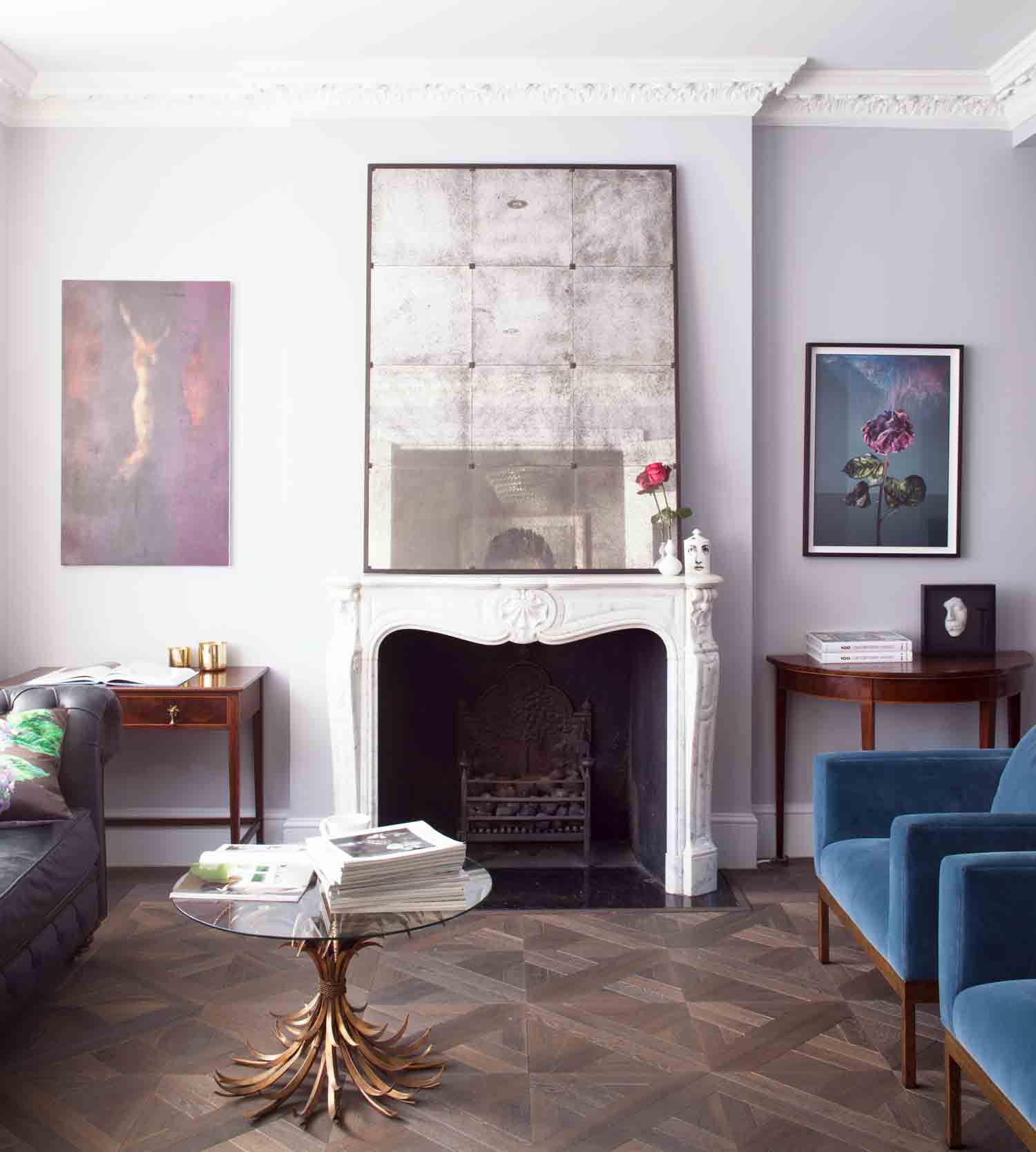
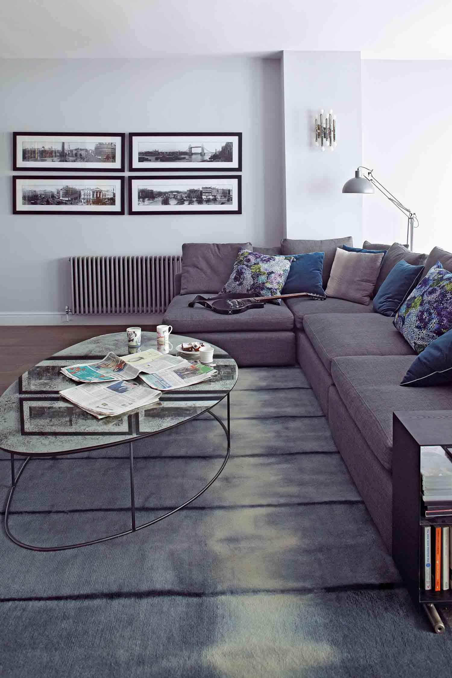
An elegant palette of soft greys and chalky blues unites the rooms and shakes up the period bones of the house with unexpected pops of industrial lightingand edgy art. The style may look upmarket, but there’s plenty of high street mixed in with high end.
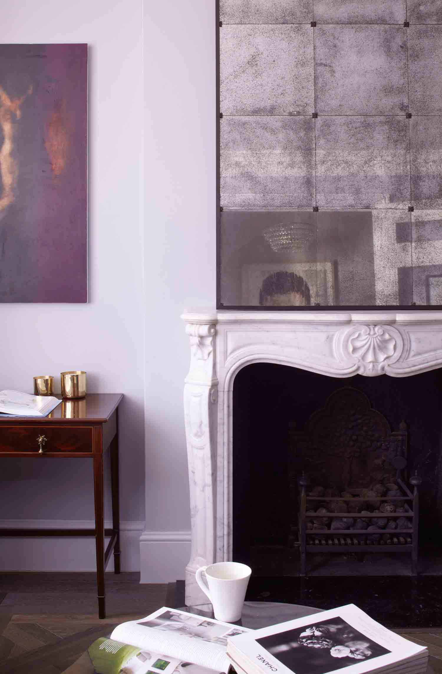
The French Regency-style fireplace, which was inthe house when it was bought, goes nicely with the new parquet.
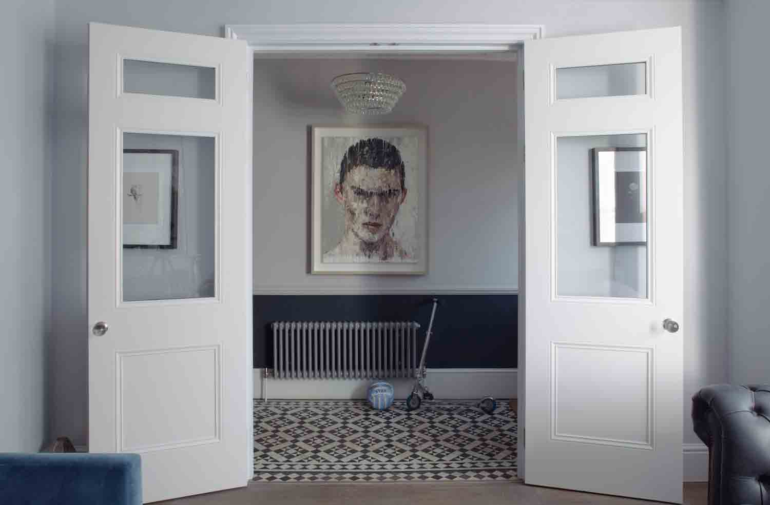
GROUND FLOOR HALLWAY
The narrow hallway was opened up with tall double panelled doors that lead into the reception room. The original Victorian floor tiles have been restored.
Be The First To Know
The Livingetc newsletters are your inside source for what’s shaping interiors now - and what’s next. Discover trend forecasts, smart style ideas, and curated shopping inspiration that brings design to life. Subscribe today and stay ahead of the curve.
Big double doors give the whole house a grander scale.
KITCHEN
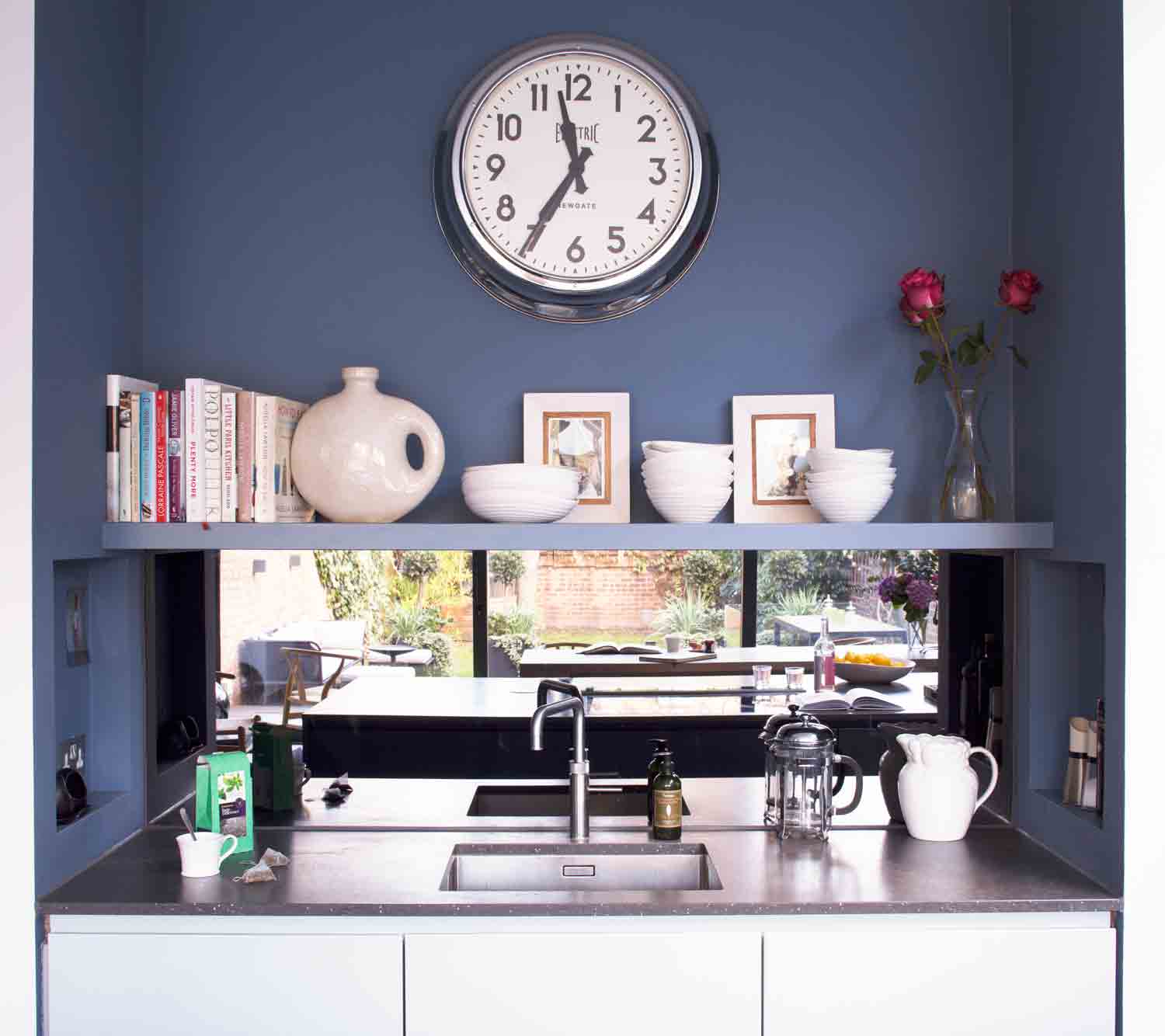
The kitchen is painted blue to set it aside from the rest of the house, but cabinetry was kept white to keep a balance.
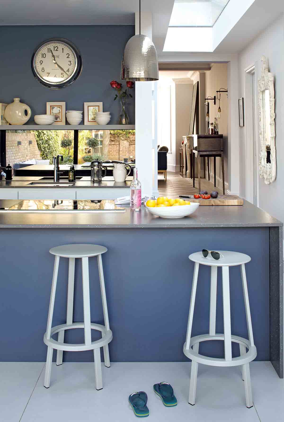
The kitchen sink, built into a recess, keeps the island clutter free… and dry!
See Also: The 15 best modern kitchen ideas - stylish, smart and chic
DINING AREA
Floor-to-ceiling sliding doors add light, width and height in the kitchen and dining area, making the whole space feel like part of the garden.
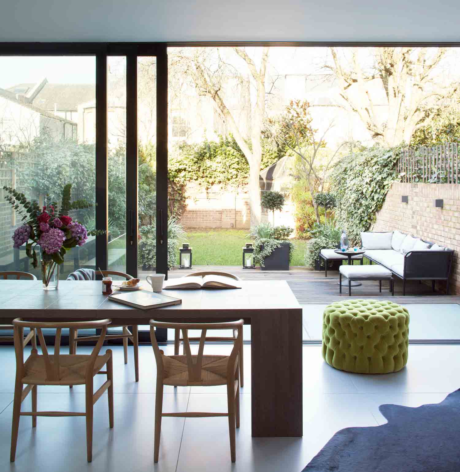
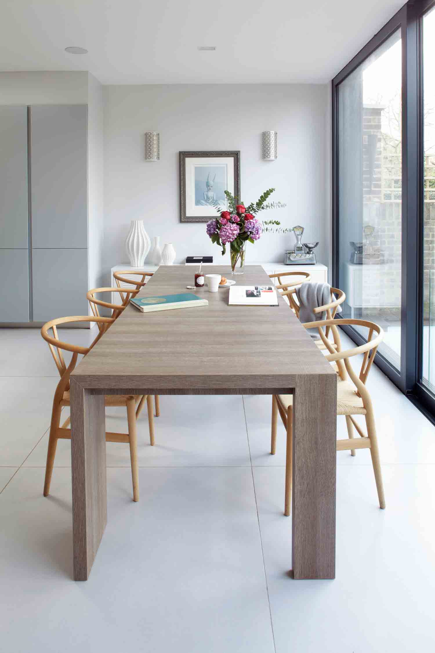
Light wood Wishbone chairs and a modern dining table add to the crisp and bright aesthetic.
BASEMENT HALL
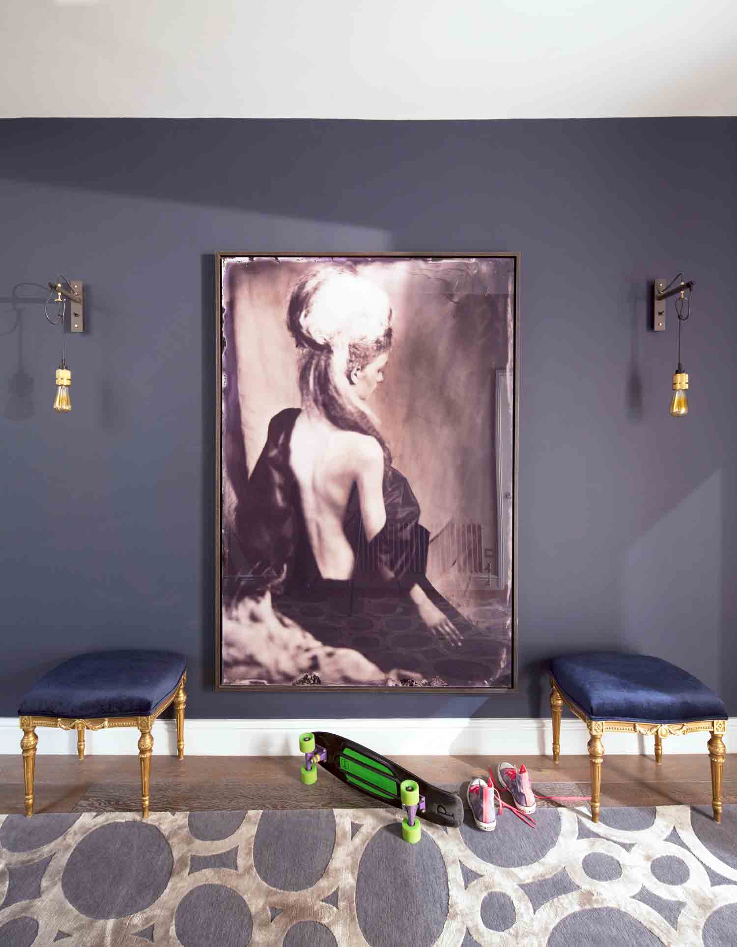
The basement is unusually tall as it’s the same height as the ground floor, and spans the whole width of the house. Its dark grey hallway, theatrically hung with an oversized photograph shipped over from Amsterdam, sets the tone for the rooms.
The walls are purposefully painted dark – it’s often better to go dark than totry to lighten up a space that will never be thatlight in the first place.
MEDIA ROOM
The house now has a massive basement, which is often used as a movie-cum-music room, where the kids entertain their friends.
MASTER BEDROOM
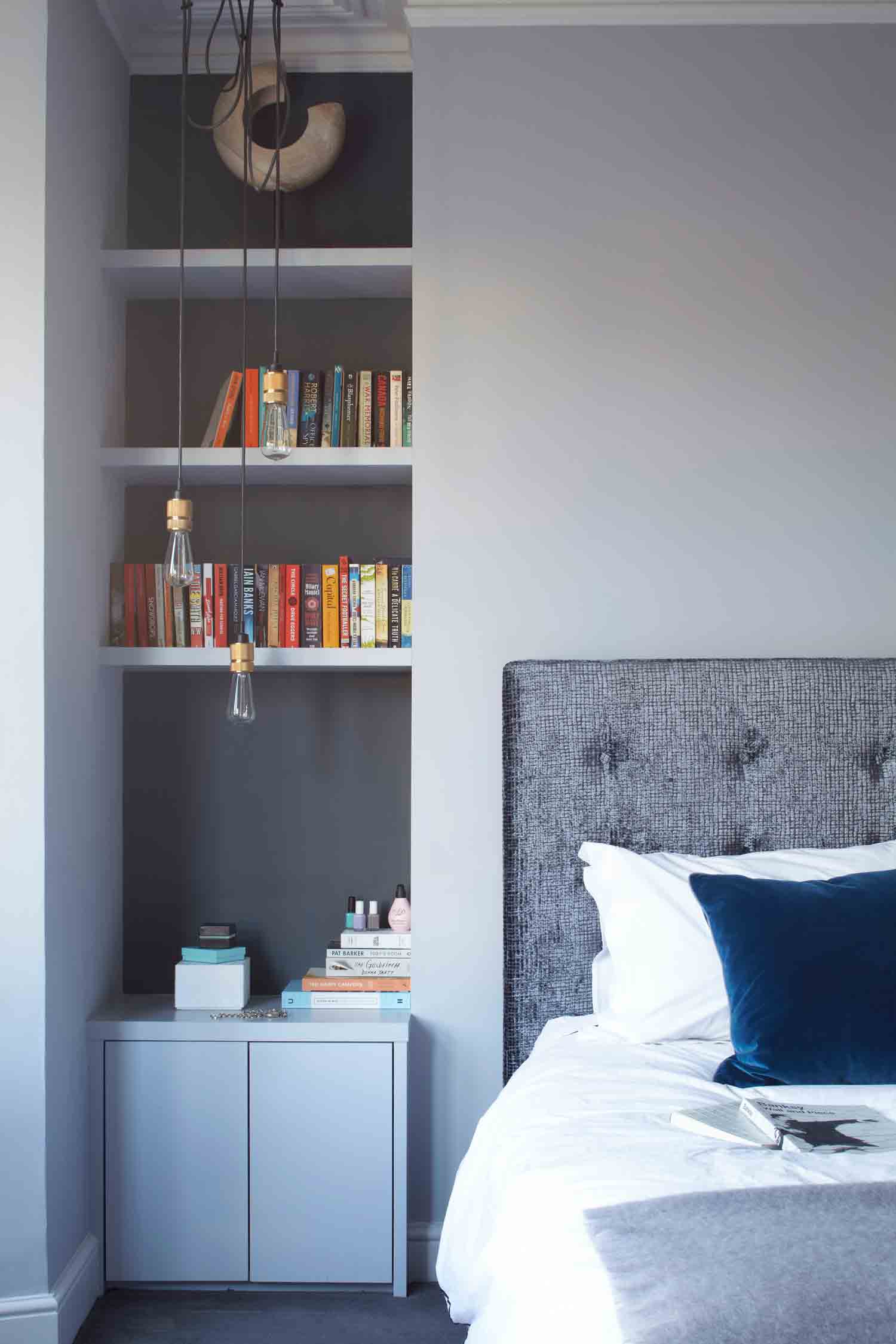
Upstairs, rooms were reconfigured so that the master bedroom is larger, with a dressing room and en-suite bathroom.
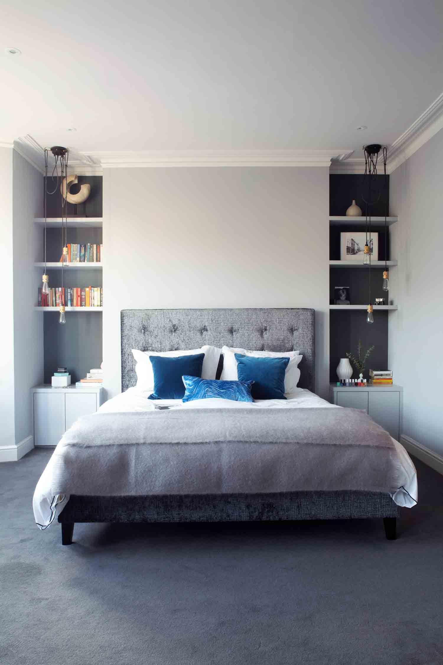
A palette of soft greys and steely blues makes for a peaceful environment.
MASTER ENSUITE
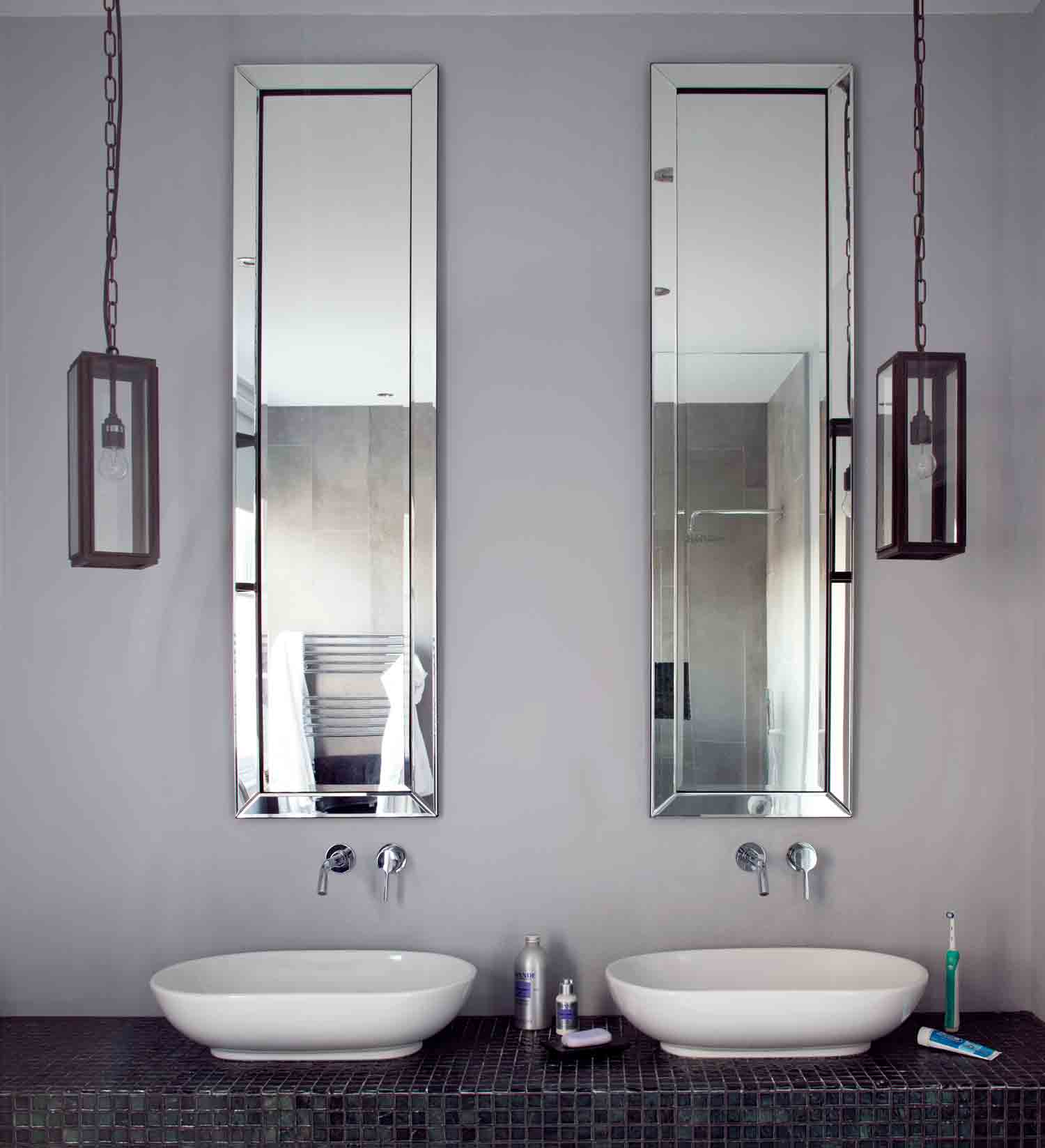
In the master bathroom, unexpected full-length mirrors are set above the basins to take your eye right up to the ceiling.
A luxe freestanding bath invites everyday indulgence in this modern bathroom.
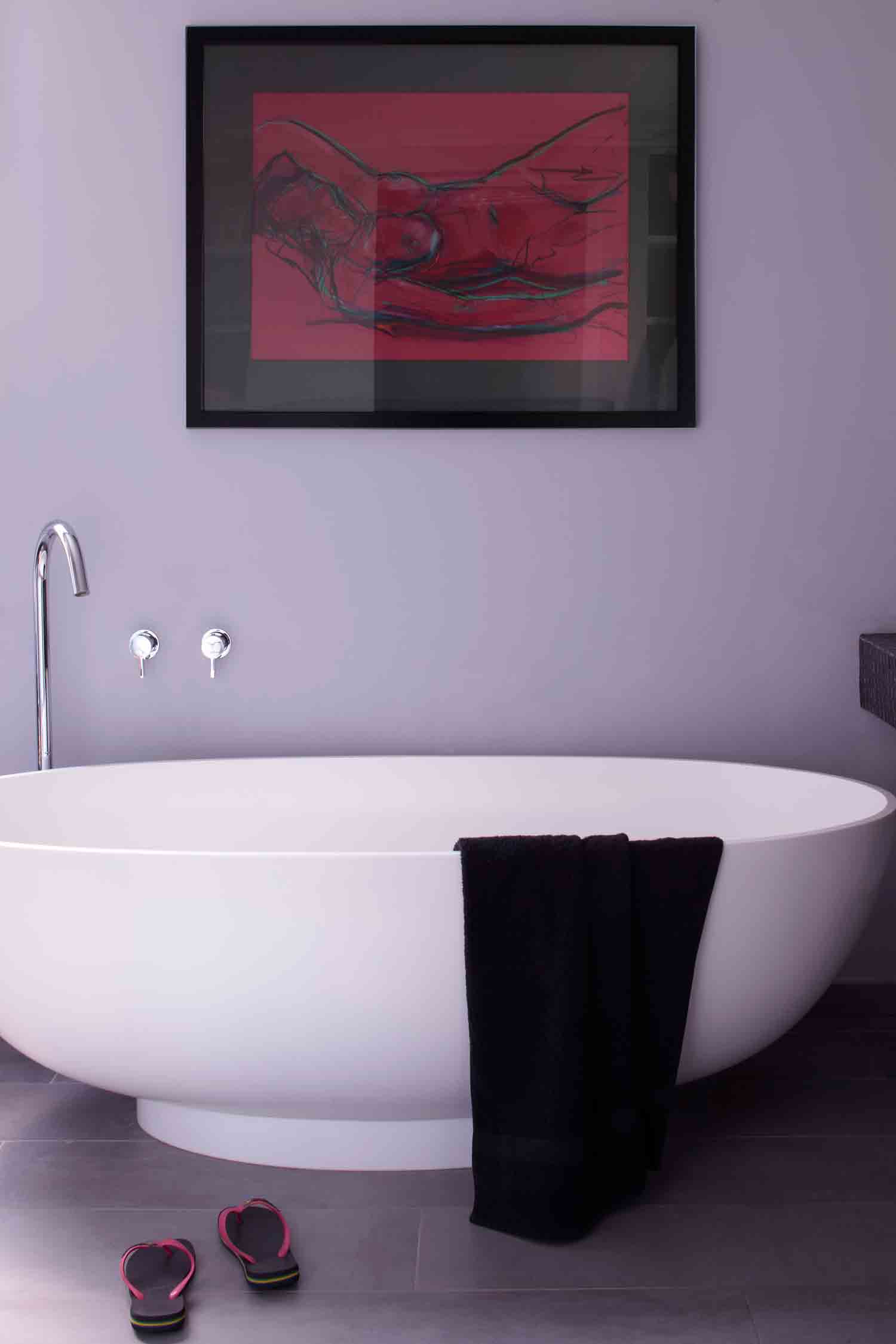
Check out more of thisinterior designer's workat magentapinkinteriors.co.uk
Photography / Logan Irvine-MacDougall
See Also: Master Bedroom Ideas - 31 stunning bedroom schemes
The homes media brand for early adopters, Livingetc shines a spotlight on the now and the next in design, obsessively covering interior trends, color advice, stylish homeware and modern homes. Celebrating the intersection between fashion and interiors. it's the brand that makes and breaks trends and it draws on its network on leading international luminaries to bring you the very best insight and ideas.
-
 These Are the Flower Crowns I’m Wearing This Spring (Spoiler: They’re Actually for My Door)
Coachella confirmed the comeback of flower crowns. At home, they just go by another name: the spring wreath
By Julia Demer
-
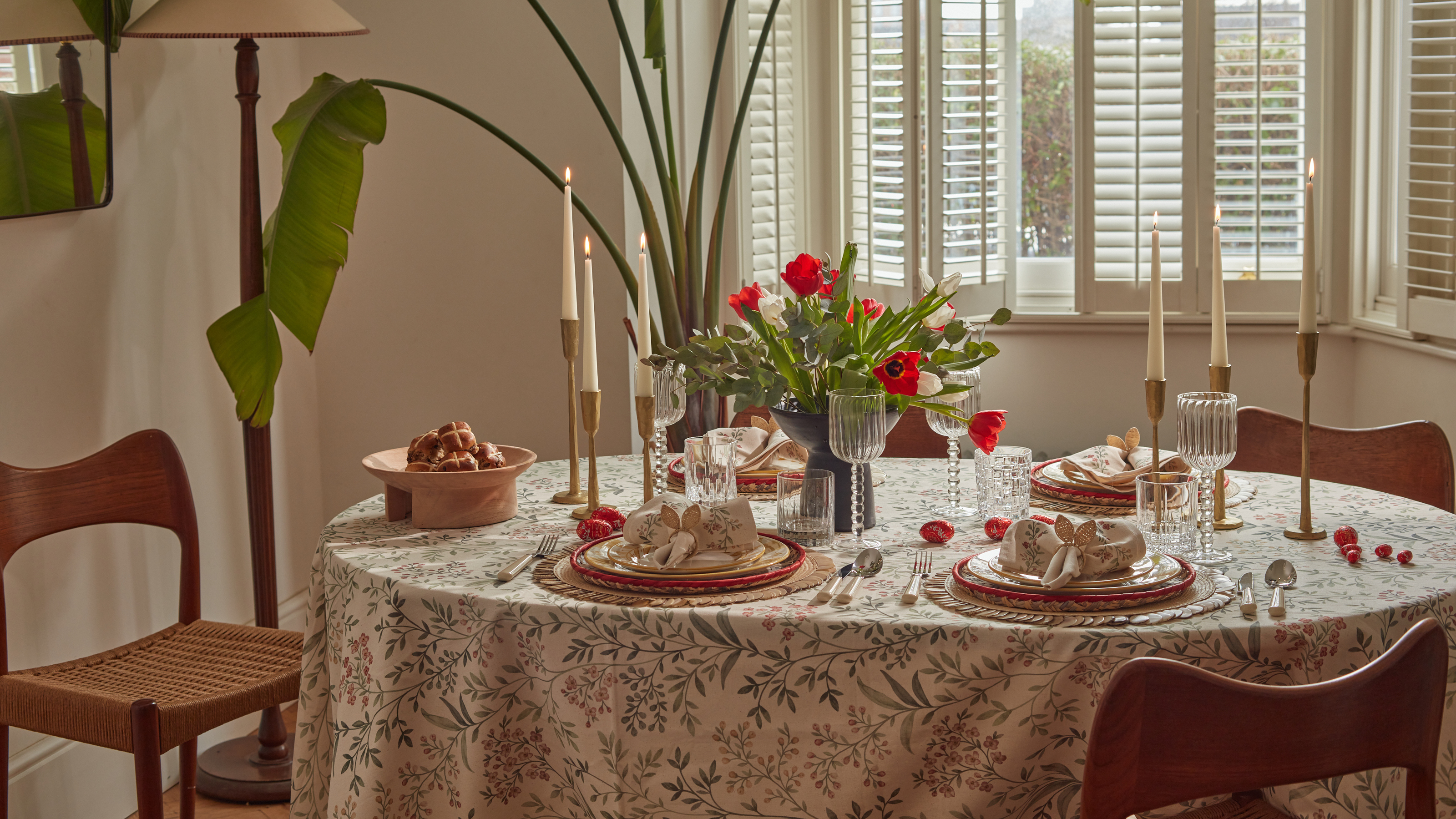 Bunny Ears, Be Gone — 7 Easter Table Styling Mistakes That Will Take Your Setting from Tawdry to Tasteful
From fussy floral displays that disrupt conversation to over-relying on tacky tropes, don't fall victim to these errors when decorating your Easter table
By Lilith Hudson