New Elegance #3
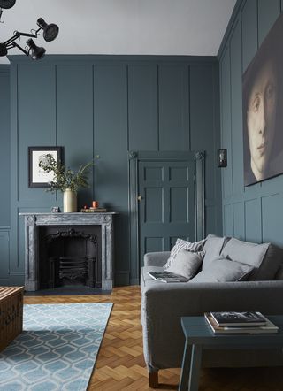
THE PROPERTY
A Georgian house in Newcastle, dating back to 1826. There is a kitchen-diner, snug, laundry room, pantry, wine store and shower room on the ground floor. Upstairs is a living room and library. On the second floor are two bedrooms, a walk-in wardrobe and a bathroom. On the third floor there are two further bedrooms and a shower room. The basement flat is rented out.
Explore more New Elegance style homes
LIBRARY
The library (pictured above) was converted from an upstairs kitchen. Theherringbone flooring was reclaimed from an old school and was taken up piece by piece, relaid in this Georgian home and sanded down. As well as looking good, it also creates a good sound buffer between floors.
Below, Renaissance art is framed by a moody blue backdrop.
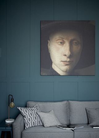
LIVING ROOM
While there are subtle visual flourishes – including contemporary lighting designs by the likes of Marcel Wanders, as well as high-street finds that look as 21st century as can be – the decor is kept largely true to the spirit of the place by avoiding overtly pop flourishes and brash colours. The interior is plush, but sedate, and the attention to detail shows how much the property is loved.
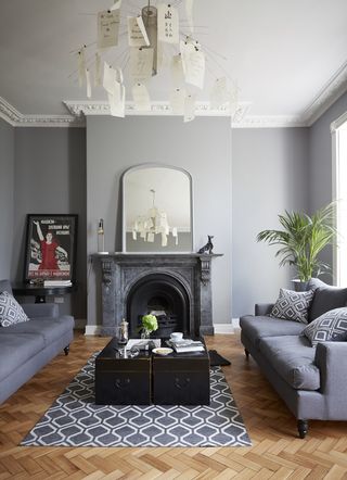
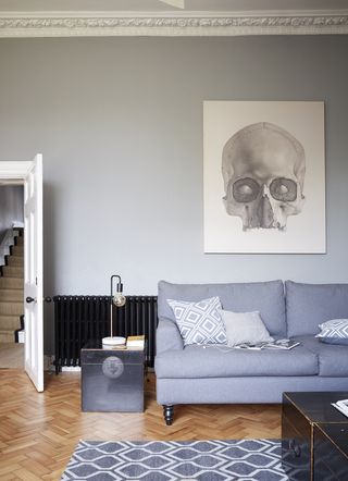
Time has been spent sourcing special, but never ostentatious pieces.A cooler shade of grey marks the point of transition from the upstairs living zones to the utility areas down below.
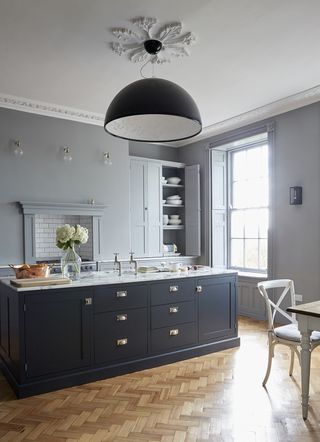
KITCHEN
The cupboards and kitchen island were designed to the owner's specifications.
Be The First To Know
The Livingetc newsletter is your shortcut to the now and the next in home design. Subscribe today to receive a stunning free 200-page book of the best homes from around the world.
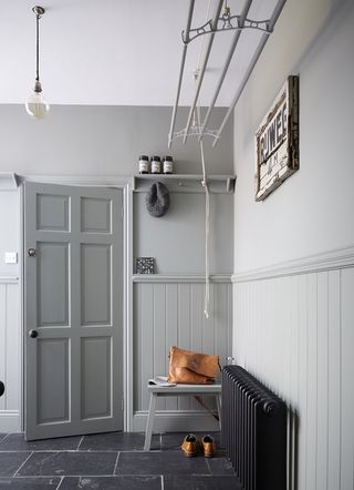
LAUNDRY ROOM
The dryer hanging from the ceiling looks like it may be an original fixture, but it’s something that had been added by the previous residents. It's been painted to match the room and is useful for drying washing.
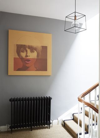
STAIRWELL
The sea grass flooring runs throughout the house and up the staircase.
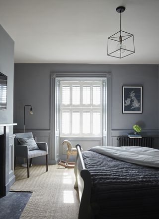
MASTER BEDROOM
The bedroom interiors bring a level of modern luxury to a profoundly historic property. The result is experiential as much as visual.
BATHROOM
The bathroom is painted in Cornforth White by Farrow & Ball – because it’s a great background default, a slightly grey white. Grey, that most Georgian of non-colours, abounds. But it’s chic rather than dour. These lofty spaces can take it.
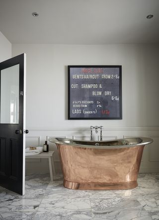
SHOWER ROOM
Thiscustom-designed bathroom was inspiredby the bathrooms at the Dean Street Townhouse in Soho. The tank is directly above it, creating an intense water pressure.

Photography ⁄ Paul Massey
The homes media brand for early adopters, Livingetc shines a spotlight on the now and the next in design, obsessively covering interior trends, color advice, stylish homeware and modern homes. Celebrating the intersection between fashion and interiors. it's the brand that makes and breaks trends and it draws on its network on leading international luminaries to bring you the very best insight and ideas.
-
 The Best Stationery Brands — 9 Labels to Know for a Designer-Approved, Playfully Aesthetic Desk Upgrade
Step up your organization game with these colorful buys for paper goods and design lovers
By Gilda Bruno Published
-
 The Chicest Parisians All Have This Flatware Brand in Their Kitchen Drawers — And It's Massively on Sale Now
Beloved by people in the know, this Sabre flatware sale is one for the books. Shop the French-coded staple for your table and serve yourself a slice of Paris
By Julia Demer Published
-
 New Elegance 33
By Livingetc Published
-
 New elegance #28
Designer Susi Bellamy has decorated her Edwardian manor house with a modern mix of hello-there hues and vibrant art
By Livingetc Published
-
 New Elegance #15
Full of sorbet shades and sunshine, this home cleverly combines designer gems with feel-good factors such as quirky art and faux sheep
By Livingetc Published
-
 New Elegance #10
Believe it or not, this clean-cut elegant house used to be a nightmare of swags, tails and ruby red Victoriana
By Livingetc Published