Inside interior designer Athena Calderone's home - a stunning 1900s Brooklyn brownstone
Interior designer Athena Calderone’s home is a triumph of cool contrasts – a place where curves meet sharp angles, dark balances light and solidity finds its sense of flow...

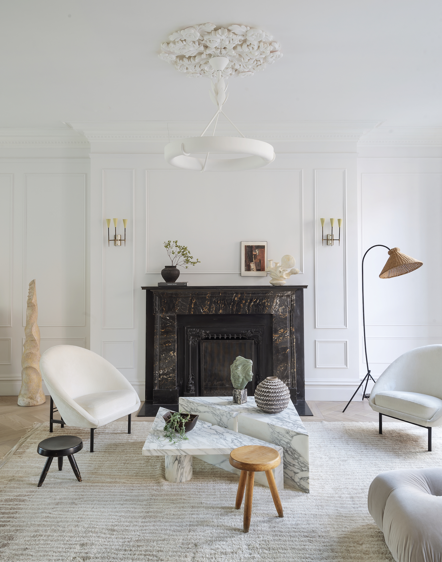
THE PROPERTY
A 1900s brownstone in Cobble Hill, Brooklyn. The upper ground floor of this modern home has an open-plan living room with dining area, the kitchen and a work nook, plus a WC. The first floor has the master suite and Victor’s recording studio. The top floor has Jivan’s bedroom and bathroom, a family room, Athena’s office, a guest bedroom and a laundry.
Athena relishes a challenge: she is the woman behind the lifestyle site eye-swoon.com, a stylist, a cook and a writer (her latest book is Live Beautiful) and the opportunity to push herself as an interior designer came in the shape of this brownstone townhouse. ‘I was itching to work on a home that scared me a bit, where I had the scope to juxtapose traditional architecture with my kind of modernity,’ she explains.
She moved here from a contemporary condo in New York with her husband Victor Calderone, a music producer and DJ, and their son Jivan, 17. Athena was drawn to the house’s combination of ‘grandeur and grit’ and she couldn’t wait to meld together her favourite architectural influences – plus a good dose of Brooklyn attitude.
See Also: Explore A New York Brownstone Townhouse With A Light, Open-Plan Interior
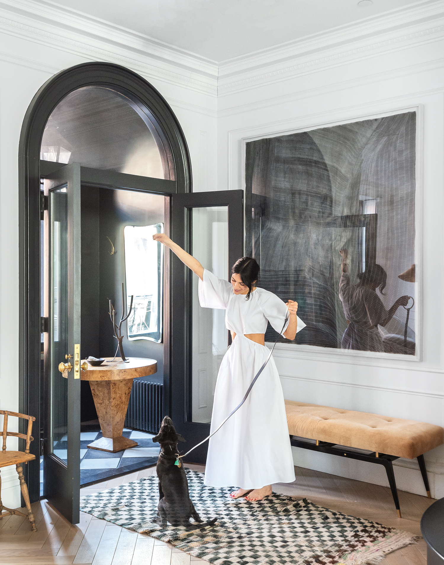
ENTRANCE
An original arched doorway is outlined in crisp black for extra definition, with the vintage wooden furniture adding warmth.
LIVING ROOM
To manage the architectural side of the house’s renovation, Athena called upon Elizabeth Roberts Architects – dubbed ‘the townhouse queen’ by New Yorkers in the know. Athena wanted to open up the entire upper ground floor, also removing the wall between the staircase and the living room.
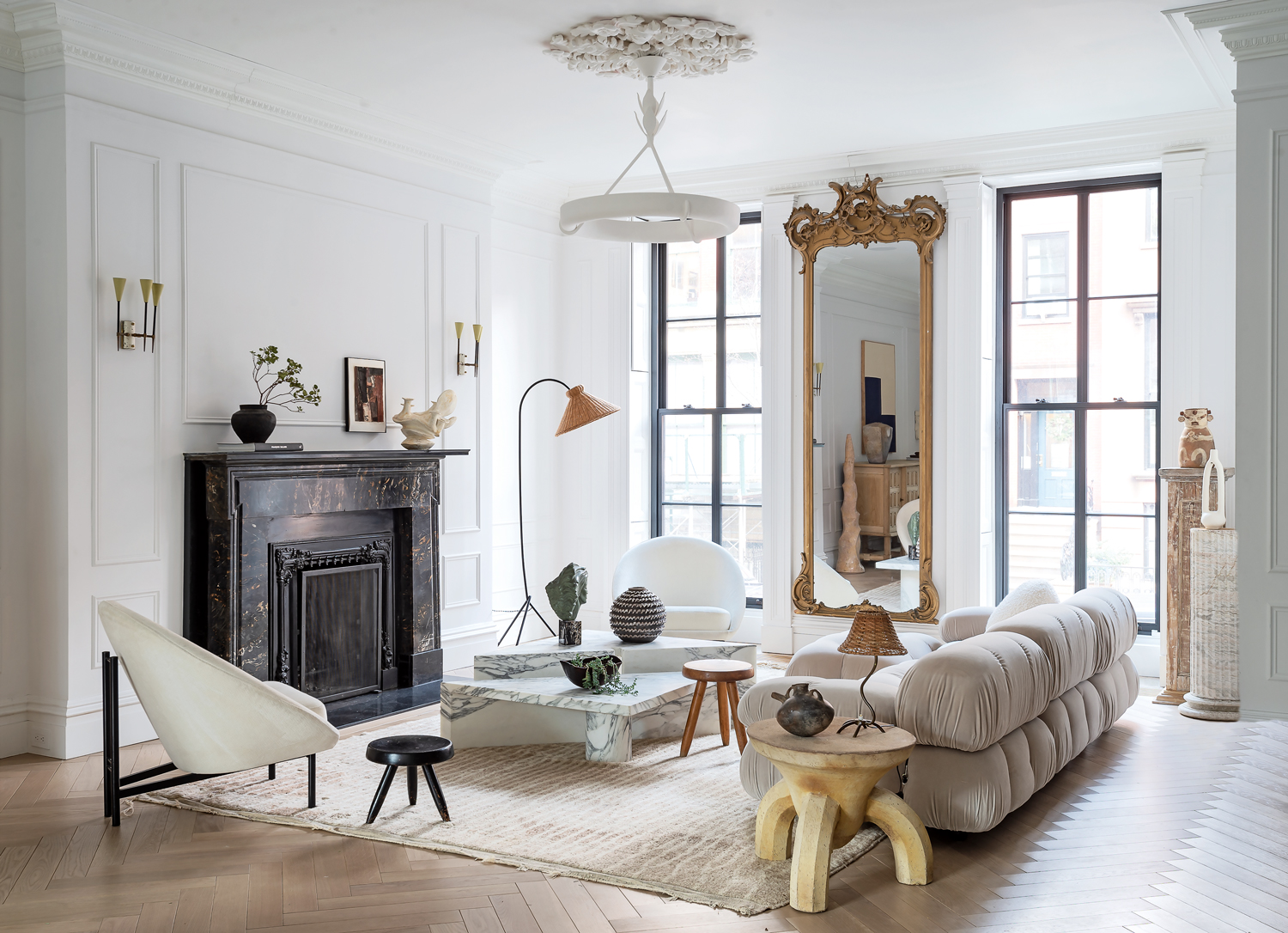
Now, the house’s architectural elements – fireplaces, the staircase, window frames and an arched doorway – stand out in crisp, uncompromising black against walls in palest grey (Wevet by Farrow & Ball). But for Athena, such architectural features are less a centrepiece and more a starting point for her own arrangements. ‘When I think about composition, I always try to break symmetry,’ she says. Yes, seating is drawn together loosely around the fireplace, but the more powerful dynamic comes from the way in which furniture shapes interact – the curves of the Bellini sofa set against the sharp angles of the Apparatus coffee table, for example. ‘When you juxtapose something feminine, soft and curvaceous against something more masculine, hard-lined and bold, you create a certain voltage. Put together, the opposition ends in harmony,’ she says.
Be The First To Know
The Livingetc newsletters are your inside source for what’s shaping interiors now - and what’s next. Discover trend forecasts, smart style ideas, and curated shopping inspiration that brings design to life. Subscribe today and stay ahead of the curve.
The bulbous sofa is contrasted with an angular coffee table; the floridity of an antique mirror with the simplicity of a contemporary chandelier.
See Also: 16 Chic and Elegant Living Room Ideas
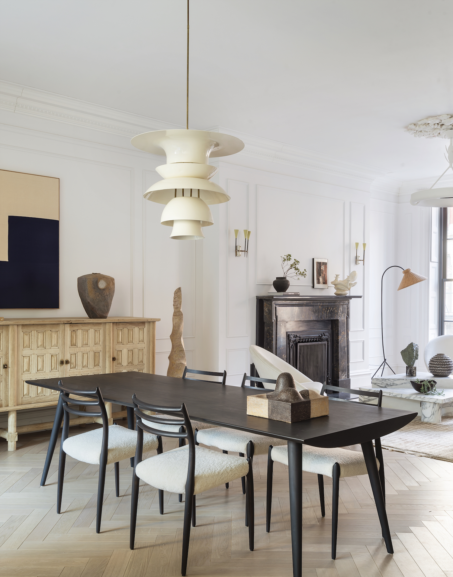
DINING AREA
Dotted throughout Athena Calderone’s Brooklyn townhouse are a myriad of sculptural shapes, from classical busts and organic carvings to pieces of furniture that radiate a similar sense of balance. But for Athena, the interplay of forms is more than ornamental.
It reflects her approach to designing her family home. ‘Form and scale are everything – I am always thinking about how items play against each other and create a kind of magic,’ she says.
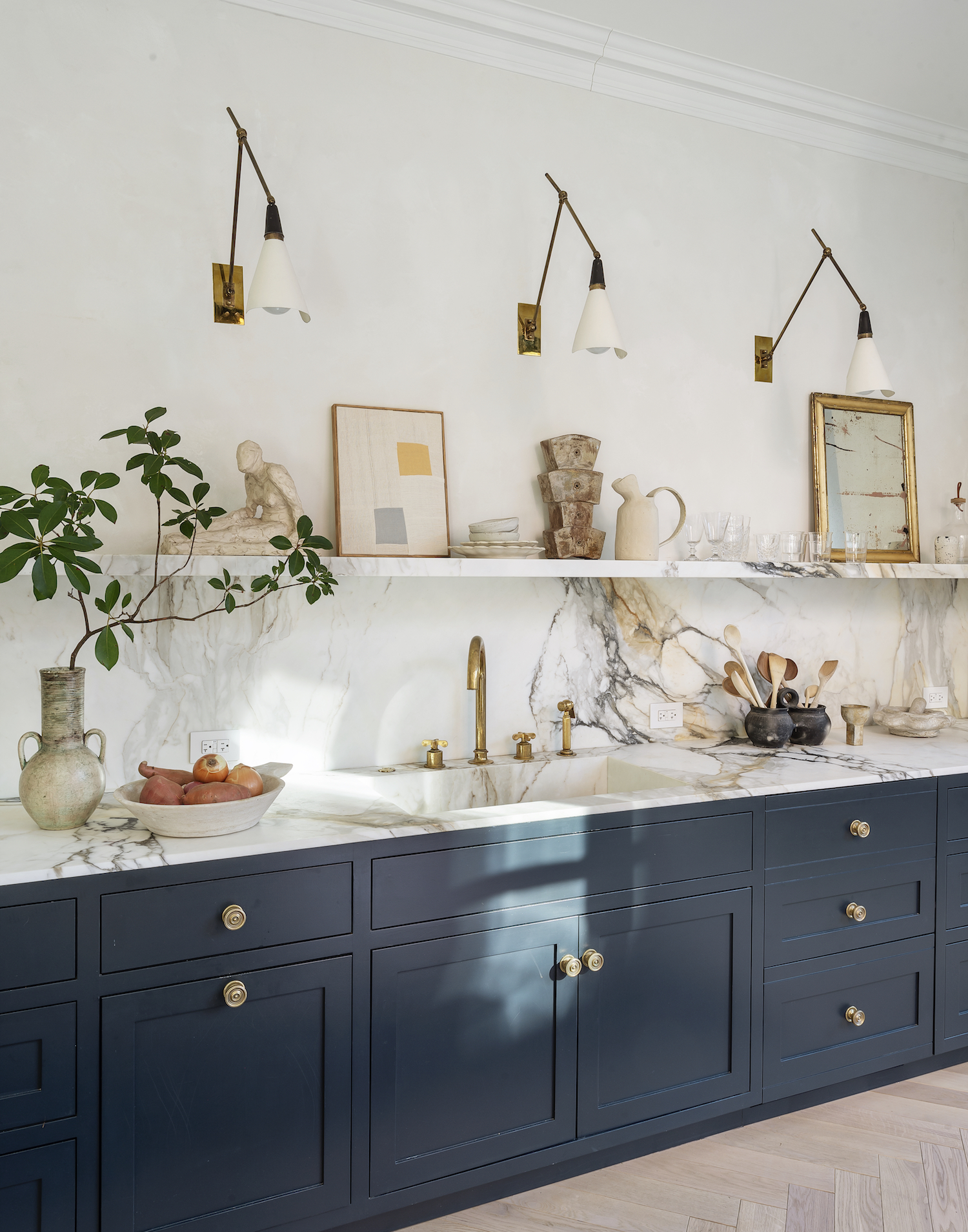
KITCHEN
Athena decided against a pendant over the island. Instead, she fills a vintage vase with seasonal branches to create a focal point. Steel-framed doors open onto the terrace.

WORK NOOK
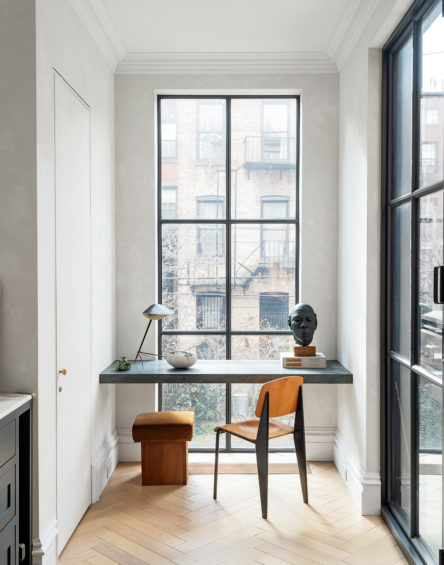
A built-in soapstone desk sits neatly in one corner of the kitchen – and has a classic Brooklyn view to boot.
HOME OFFICE
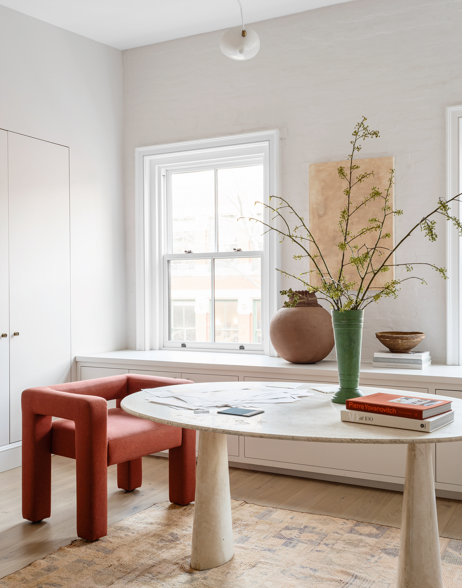
Athena is drawn to furniture forms that feel rooted and sturdy. ‘I look at how something connects to the floor and how chunkier pieces can ground a grouping,’ she says.
STAIRCASE
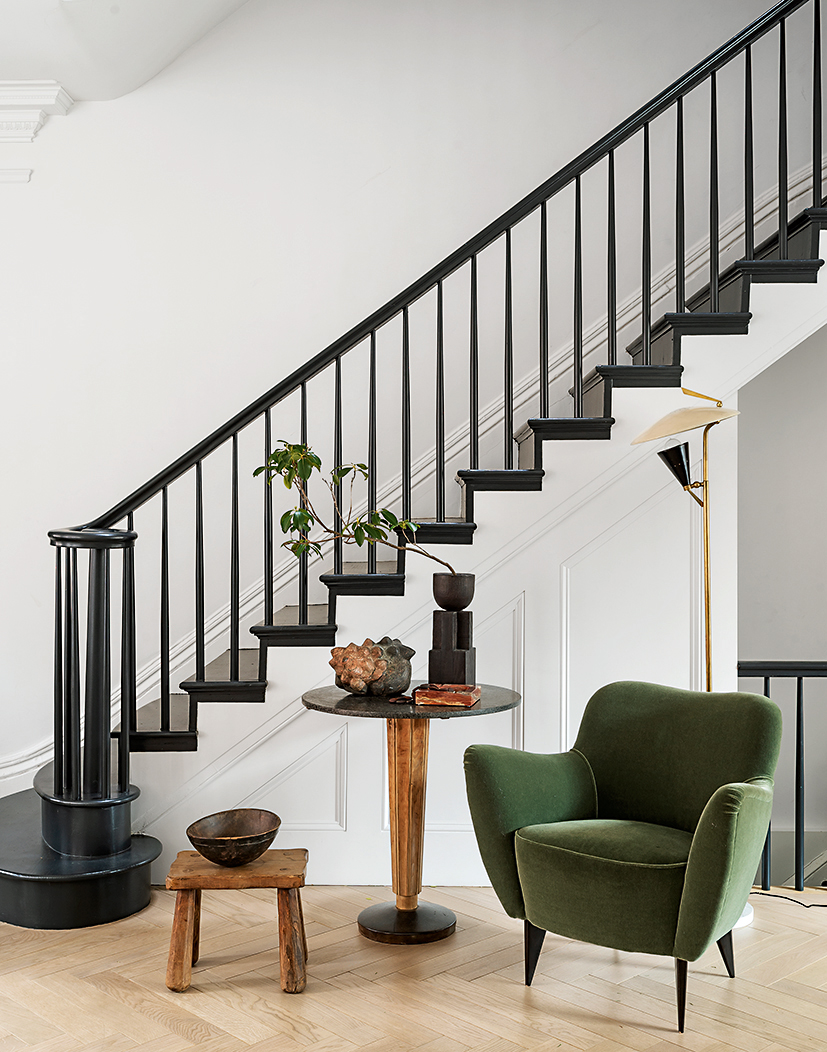
The hallway wall was removed to maximise the feeling of space. A bonus is that it makes a feature of the original staircase. The chair and table are vintage finds.
SNUG
Athena’s near-monochrome palette also helps bring out the quiet drama of her interiors. ‘The contrast of whites and creams against harsher blacks always engages the eye,’ she says. ‘If there’s too much colour or pattern, your eye doesn’t know where to land.’
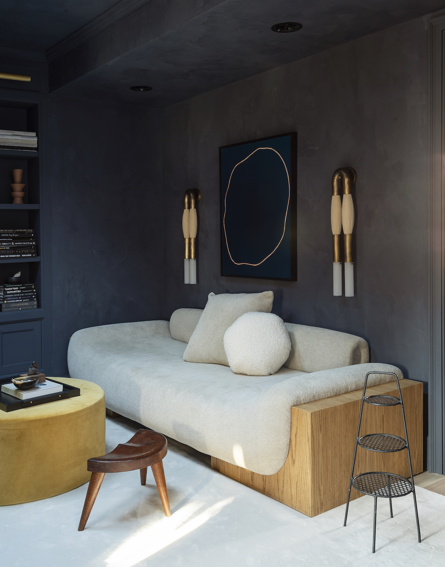
SON'S BEDROOM
She took the same approach for her son's bedroom.
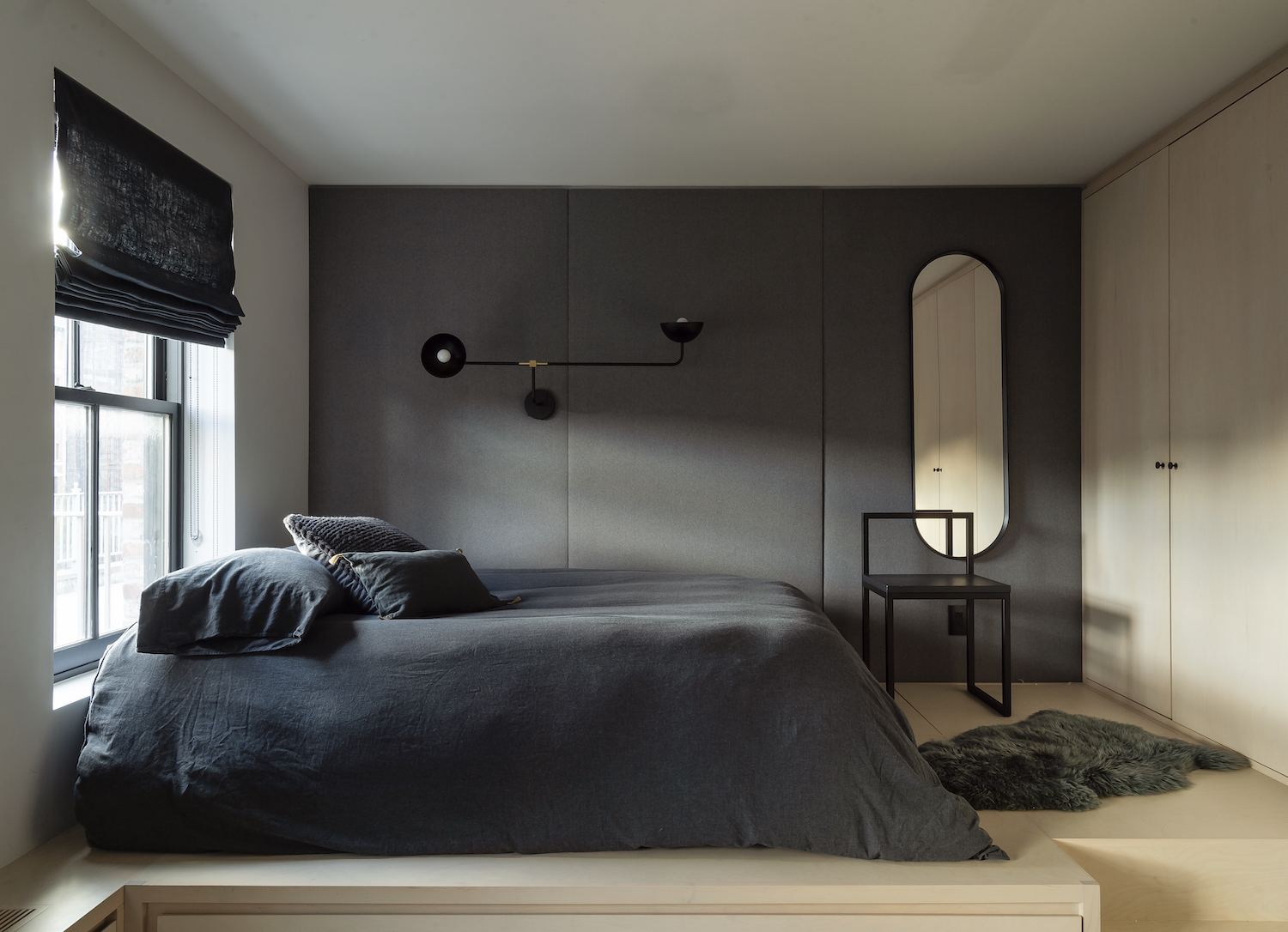
MASTER BEDROOM
Markets and auctions were Athena’s first port of call to find pieces that struck a chord. She loves the voltage that’s created when you juxtapose curves with hard lines.
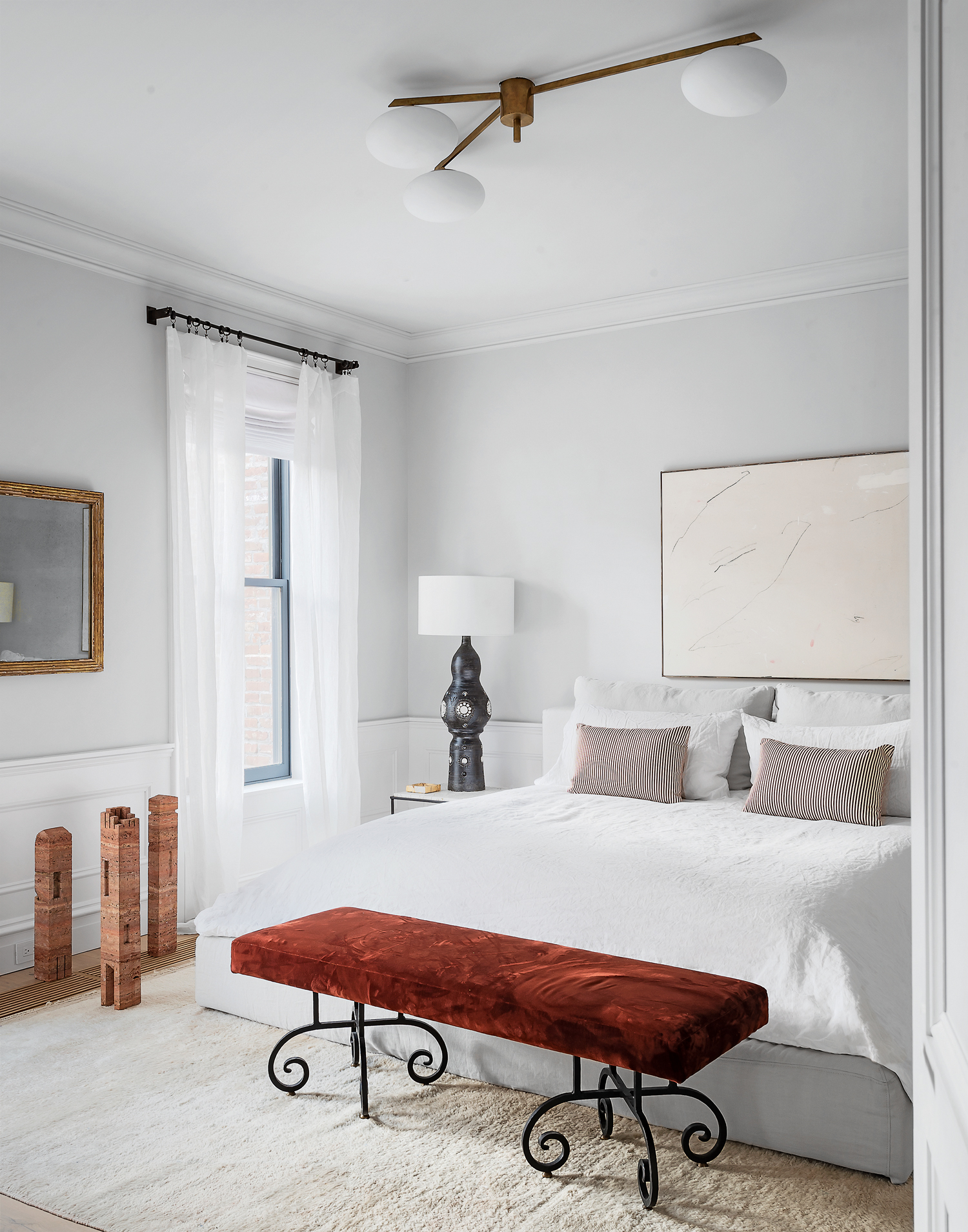
MASTER EN SUITE
Sculptural outlines are set against hand-finished Venetian plaster walls.
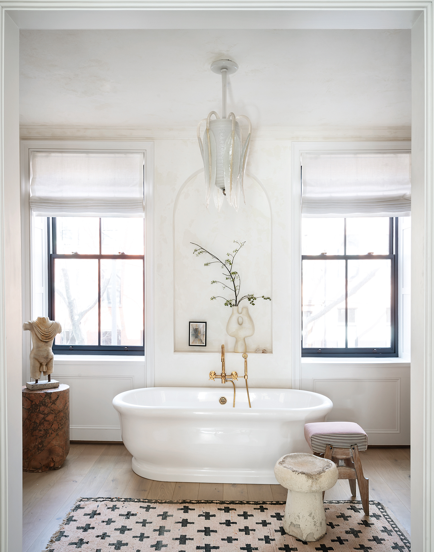
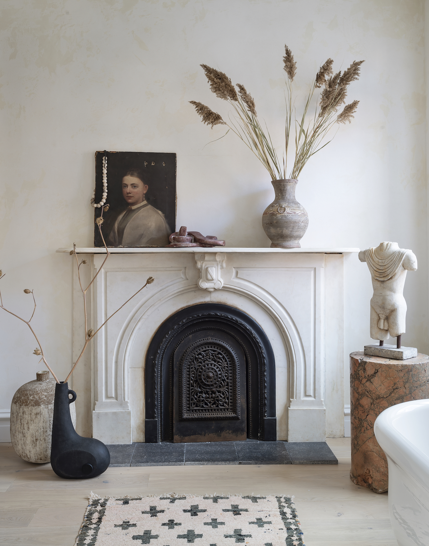
When Athena and Victor left their previous home, they sold all their furniture: ‘Yes, everything – I wanted to start afresh,’ she laughs. But her version of starting anew involved the best of vintage and antique furniture. ‘I was like an animal on the hunt for the right pieces – voracious, calculating and precise,’ she jokes.
This is a serene, balanced home, but the ultimate test of how practical it is recently arrived in the shape of Tuco the rescue puppy. So far, he has a healthy respect for his surroundings. ‘Much as I love him, if Tuco started gnawing on the Adnet sideboard, it would not be OK,’ Athena says with a smile.
Athena is the creator of lifestyle site eye-swoon.com. Her latest book, Live Beautiful (Abrams), is out now
Photography: Matthew Williams
See Also: Master bathroom ideas - 19 stunning design ideas for a dreamy master bathroom

Lotte is the former Digital Editor for Livingetc, having worked on the launch of the website. She has a background in online journalism and writing for SEO, with previous editor roles at Good Living, Good Housekeeping, Country & Townhouse, and BBC Good Food among others, as well as her own successful interiors blog. When she's not busy writing or tracking analytics, she's doing up houses, two of which have features in interior design magazines. She's just finished doing up her house in Wimbledon, and is eyeing up Bath for her next project.
-
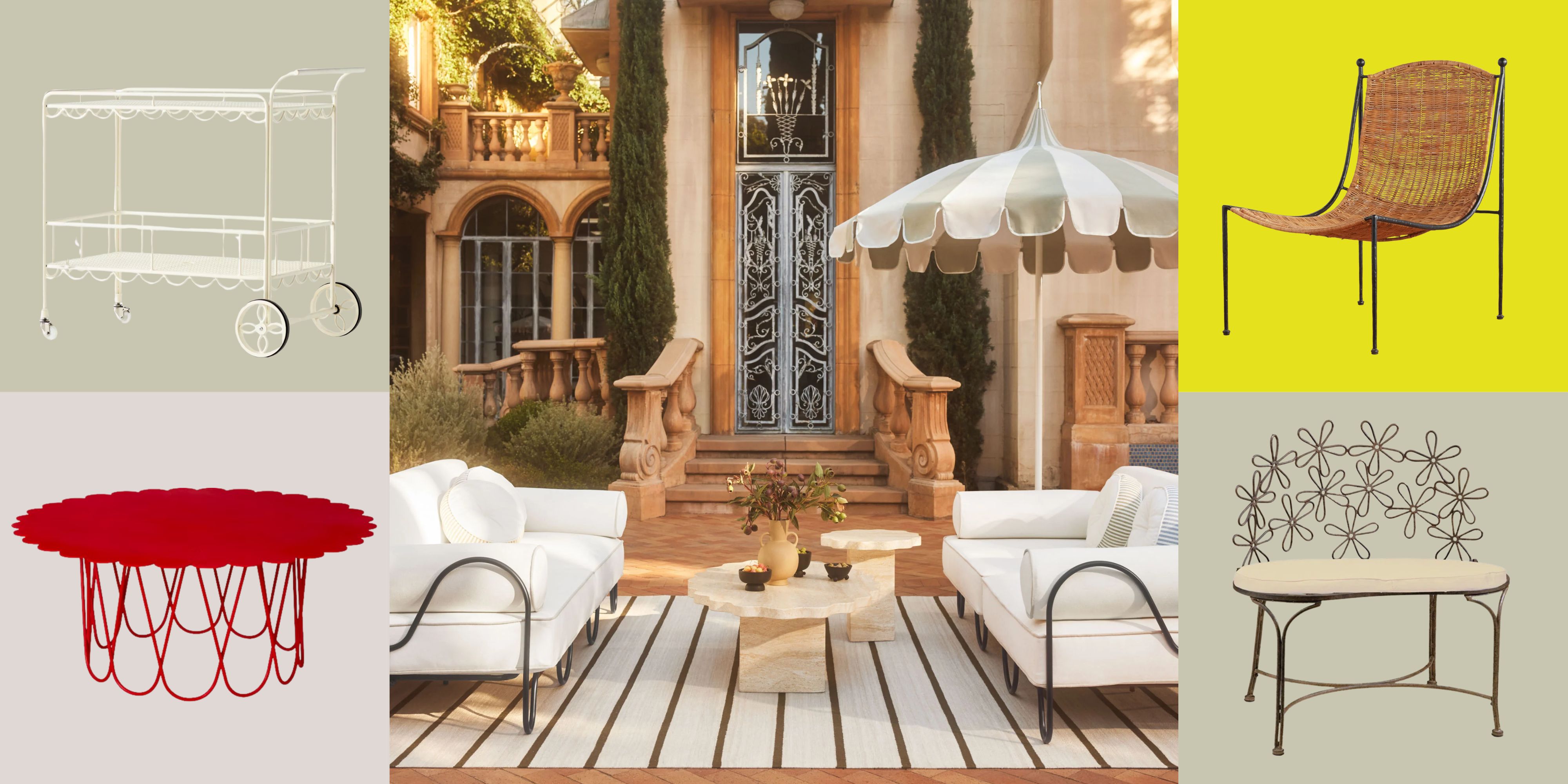 There’s a New Shape in the Garden — Why Whimsical Curves Might Be the Outdoor Furniture Silhouette of the Summer
Powder-coated petals, wavy lines, and a hint of surrealism — this microtrend is blooming, and we’re paying attention
By Julia Demer
-
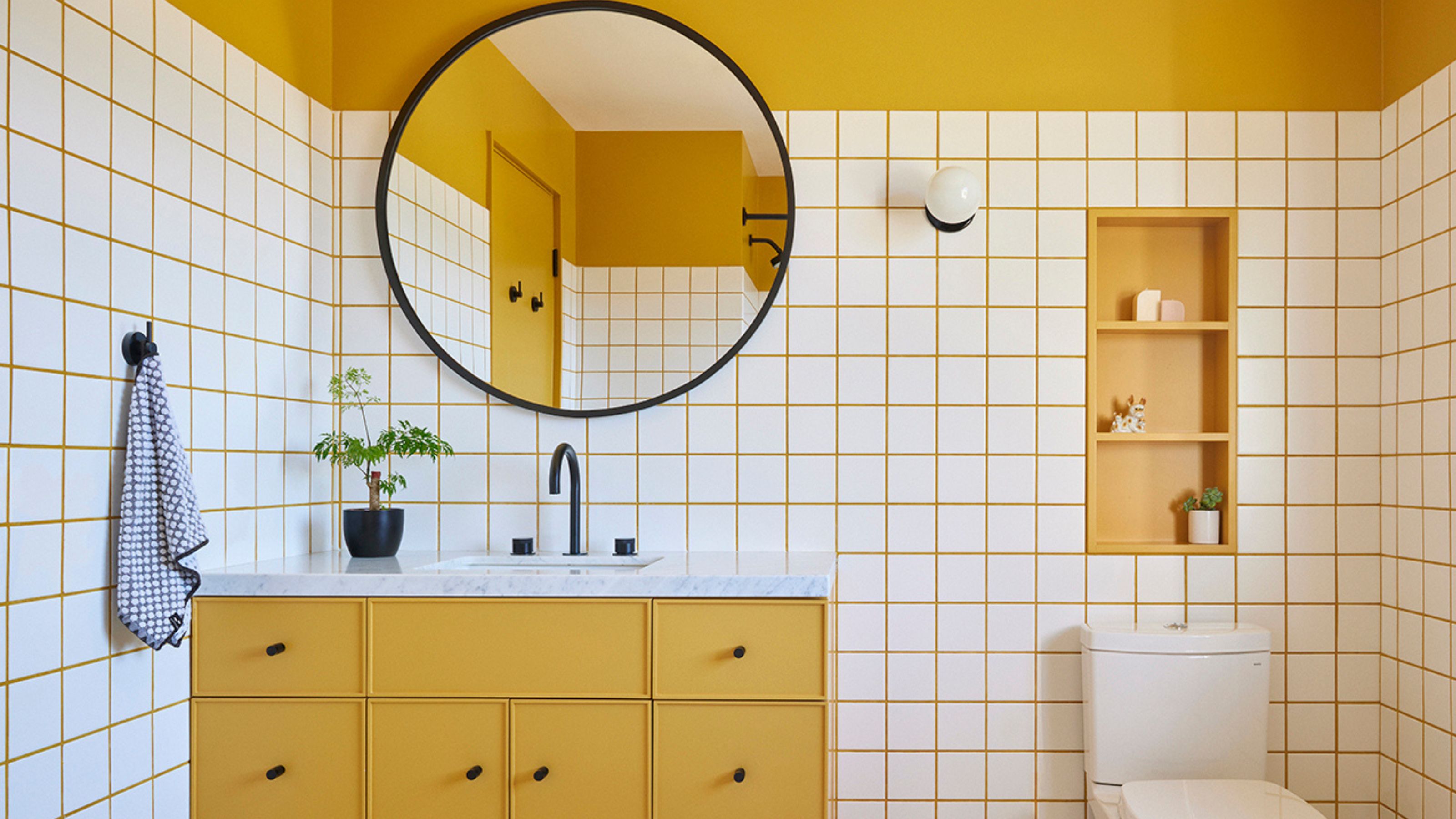 10 Yellow Bathroom Ideas That Vitalize Your Mornings and Look Unexpectedly Sophisticated While Doing So
Yellow is a color that by its very nature is energetic and full of life, and these designers have proved it's ideal for a bathroom
By Oonagh Turner