A Family Home in San Francisco, with views over Golden Gate Bridge
This sprawling family home is filled with natural light, organic materials, a neutral colour palette and lovely, natural textures.

PROJECT
A large 1930s modern home in Presidio Heights in San Francisco, with views over Golden Gate Bridge. The house has an elegant hallway, formal living room, kitchen and dining room, as well as a second family room living space, and a second, more informal kitchen diner that leads to the garden, plus several terraces, then there's a master suit as well as three guest ensuites and several powder rooms. The original interiors and floor plan had remained unchanged since the '30s, which meant that many of the rooms were dark, and the broken up floor plan was unsuited to a modern lifestyle. Interior designer Richard Felix Ashman, who was brought on board to remodel and redesign the property, transformed the property into a modern family home while still keeping a sense of the property's history by keeping the original features and details. As the house was built in a French style (a popular vernacular in 1930s California), Richard wanted the interiors to evoke a feeling of provincial France without resorting to pastiche. The result is a soft, warm interior filled with natural materials, natural light, and a more flowing floor plan.
HALLWAY
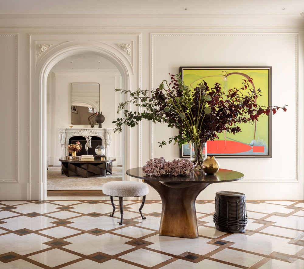
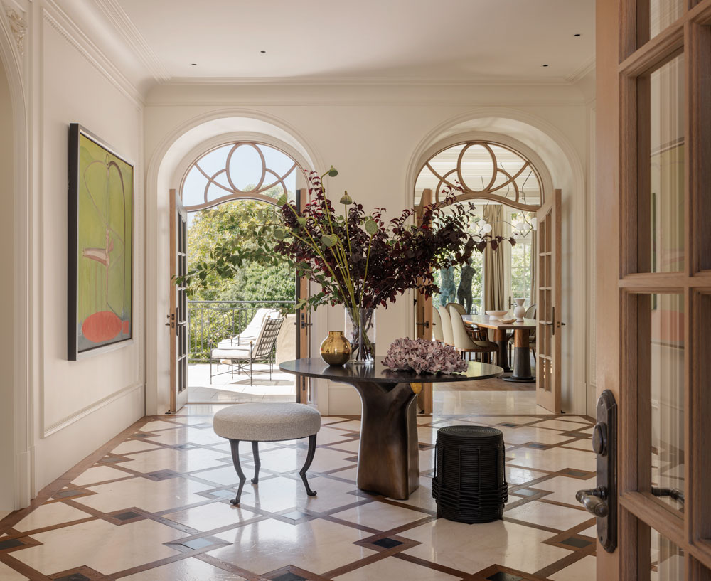
The original entrance hall was dark, void of natural light, so Richard Felix Ashman brought in light from every direction by opening up every side of the original hallway, to allow light to come in from the garden at the back as well as the rooms on either side. A single, sculptural table is the centrepiece to this room. The organic, cast bronze pedestal is topped with a circle of Belgian limestone.
LIVING ROOM
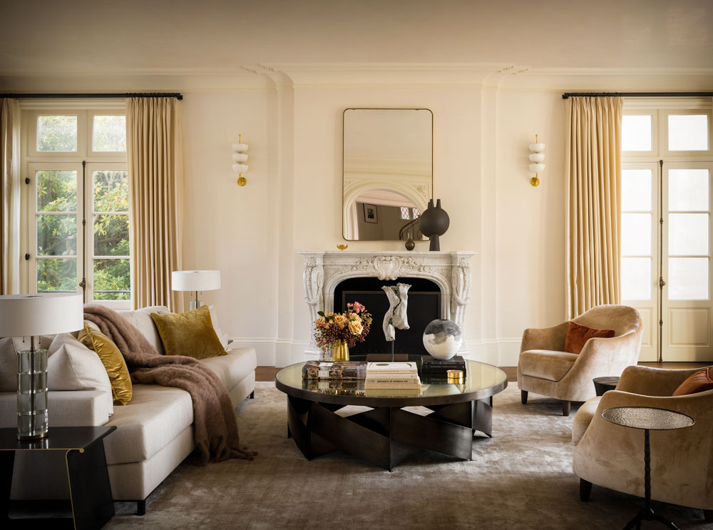
The living room's walls are lined in a white silk cloth, and the ceiling plastered in a white grasello plaster. It was important to have the room bathed in light, be warm-toned and calm. The owners wanted a space that was inviting and not overly formal.
The space is centred with a large bronze cocktail table.
DINING ROOM
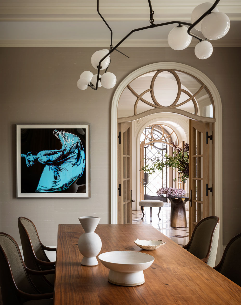
Ruhlman chairs in a subtle green-weave were chosen for their sculptural, curving back. The chandelier was custom designed and fabricated by Lindsay Adelman. Its irregularity is a counterpoint to the rectilinear forms of room and table.
KITCHEN
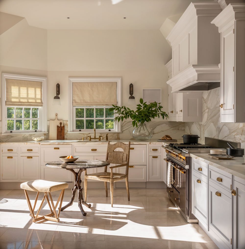
The dining room is connected to the main kitchen via a large archway. The modern kitchen island doubles up as a breakfast bar and serving island for the dining room.
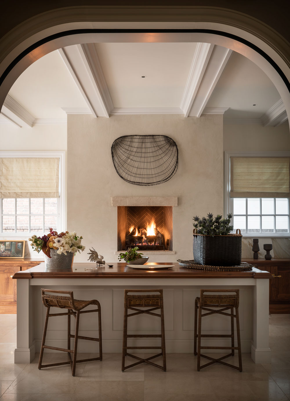
The ceiling beams were added, and flow from the kitchen into the dining space, providing an additional visual link between the two spaces.
Be The First To Know
The Livingetc newsletters are your inside source for what’s shaping interiors now - and what’s next. Discover trend forecasts, smart style ideas, and curated shopping inspiration that brings design to life. Subscribe today and stay ahead of the curve.
TERRACE
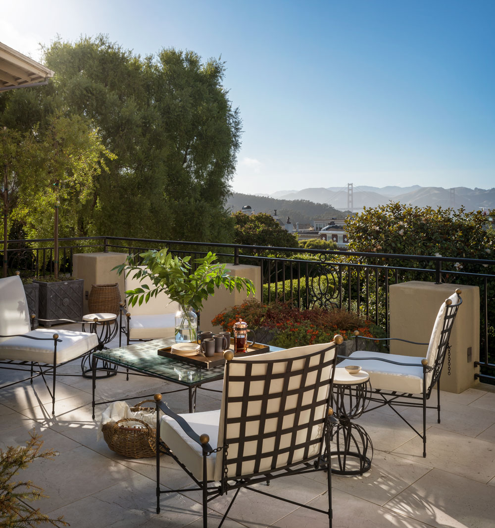
The view across rooftops to the Golden Gate Bridge says it all!
FAMILY ROOM
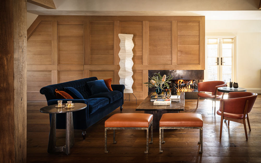
The mansard roof in this old attic space is really a lovely feature and gives this family room its informality.
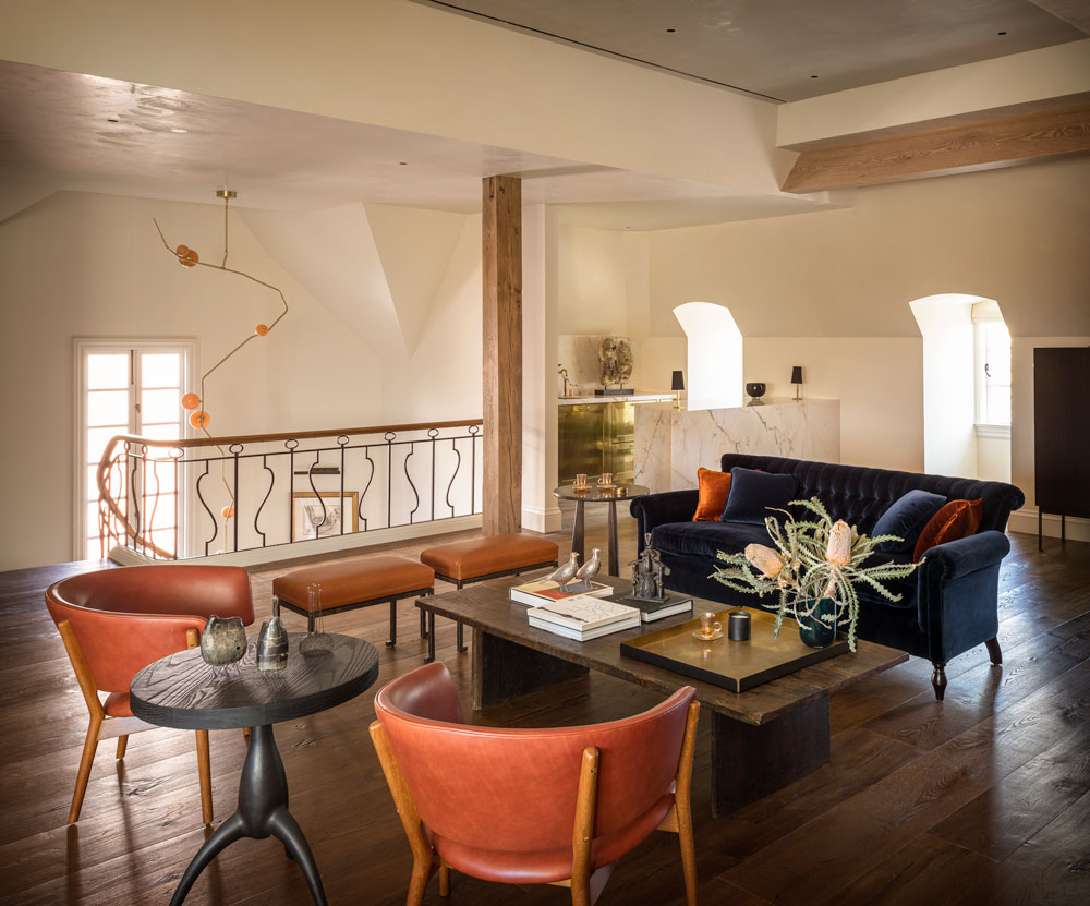
The designer wanted to achieve a clean, loose-fit feel to the room, because the turret and bar are held firmly by the architecture.
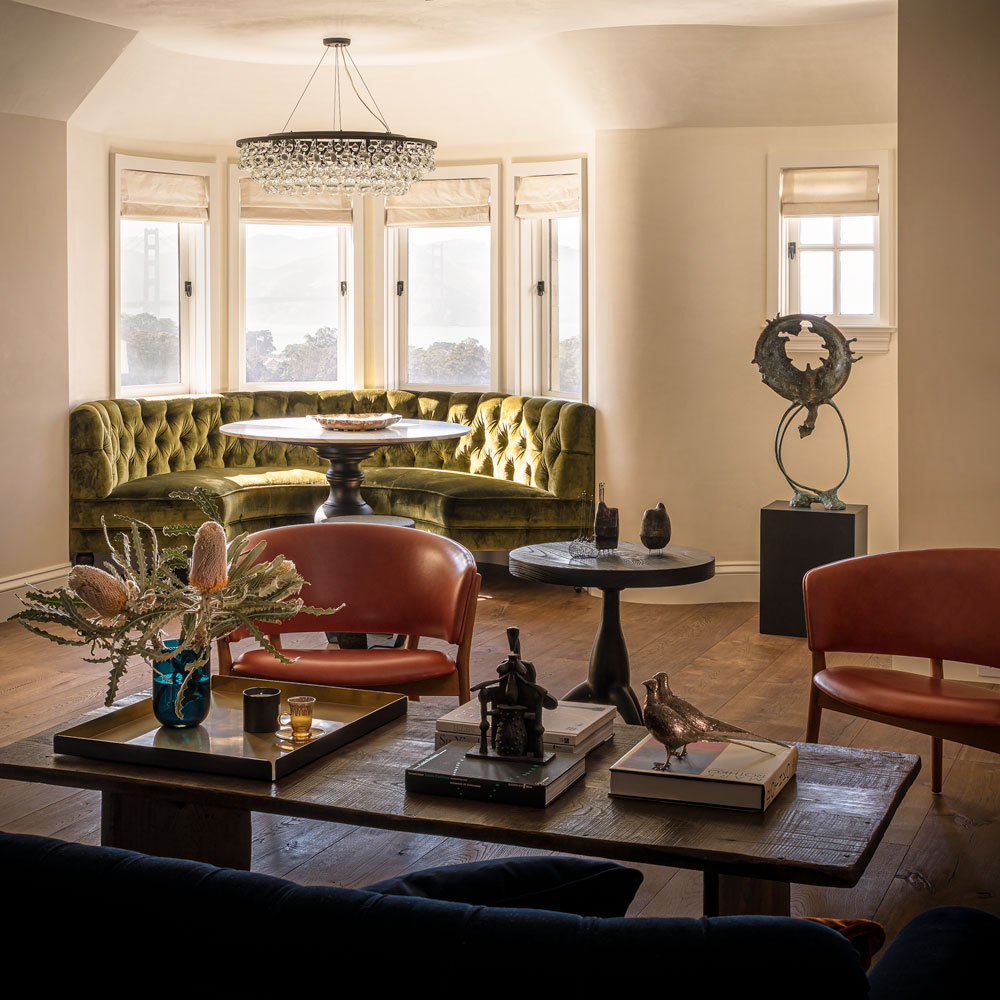
The furniture floats in the middle of the room.
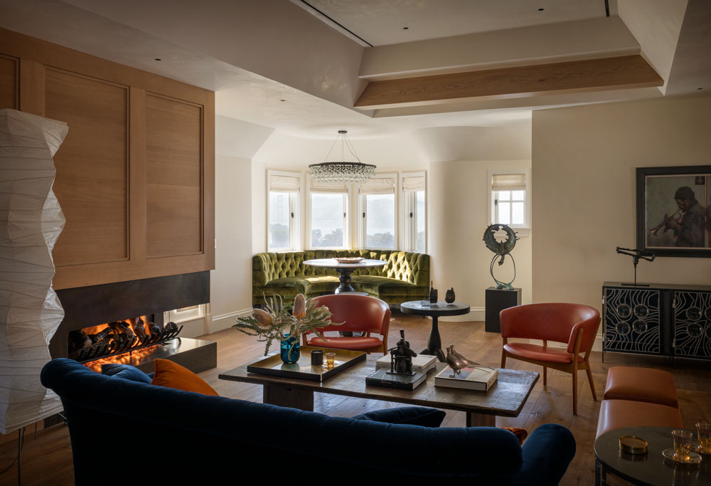
Eliminating rugs allows the furniture to be unanchored and free.
GARDEN ROOM KITCHEN-DINER
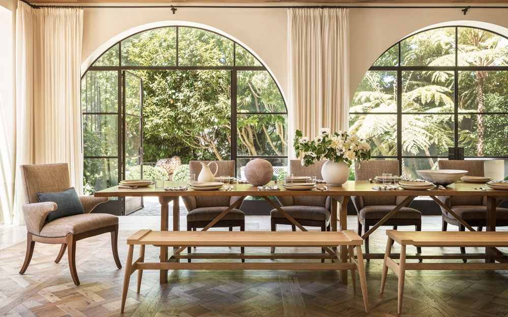
The old basement space was extended and opened. The feeling is of a rural retreat, drawing inspiration from Belgian and French provincial homes.
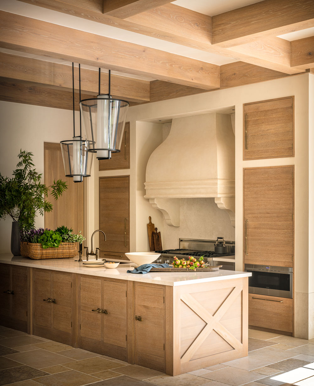
The materials are a classic combination of plaster, oak and limestone, creating a neutral backdrop.
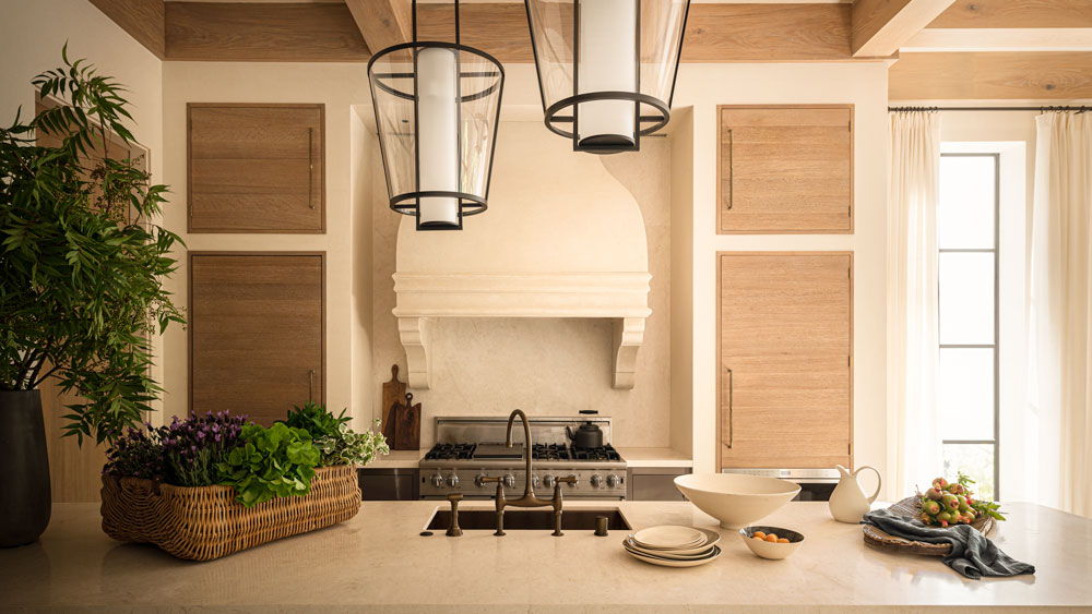
The refectory style dining table acts as the centrepiece.
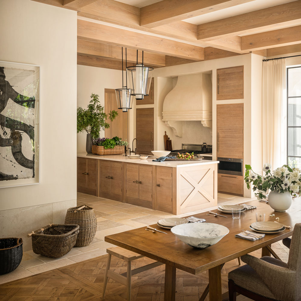
Natural textures in neutral colours create a calm space. There are no metallic finishes anywhere.
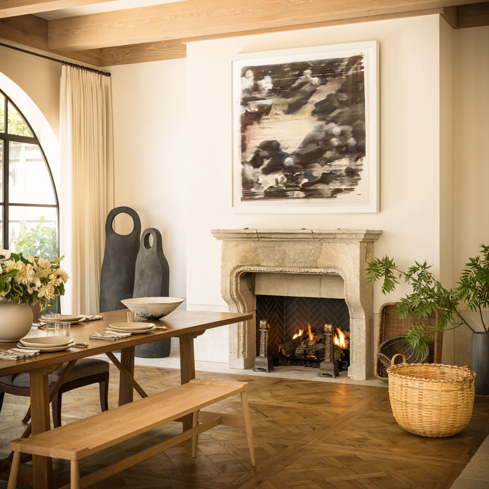
Arched steel windows open on to the garden, where there is a secluded, outdoor living space.
GARDEN
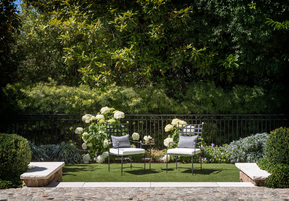
The kitchen-diner extends outside where there is a little terrace, framed by trees and palms.
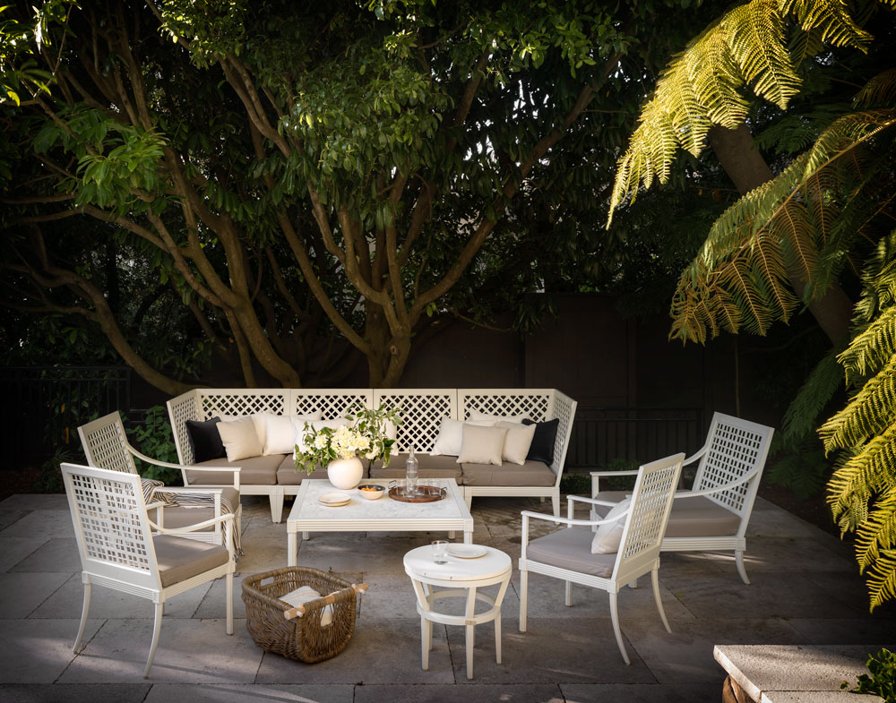
There's also a second seating area.
MASTER BEDROOM
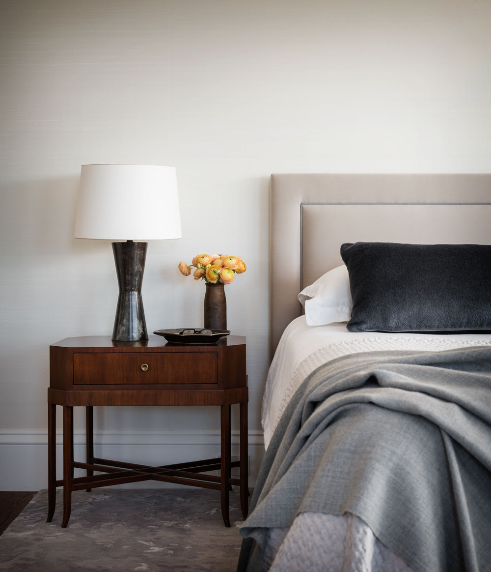
Interior designer Richard Felix Ashman completely remodelled the master suite, building a bedroom where the bathroom used to be, and extending it into a former annex to give the master bedroom its own sitting area.
The bed looks out over Golden Gate Bridge, while the adjoining sitting room is a quiet enclave complete with fireplace.
MASTER BATHROOM
A double-sided vanity island takes centre stage in the master bathroom. Richard Felix Ashman decided to place the vanity in the centre as the walls were all in use; either as a shower, or for the bath, or as the entrance to the dressing room.
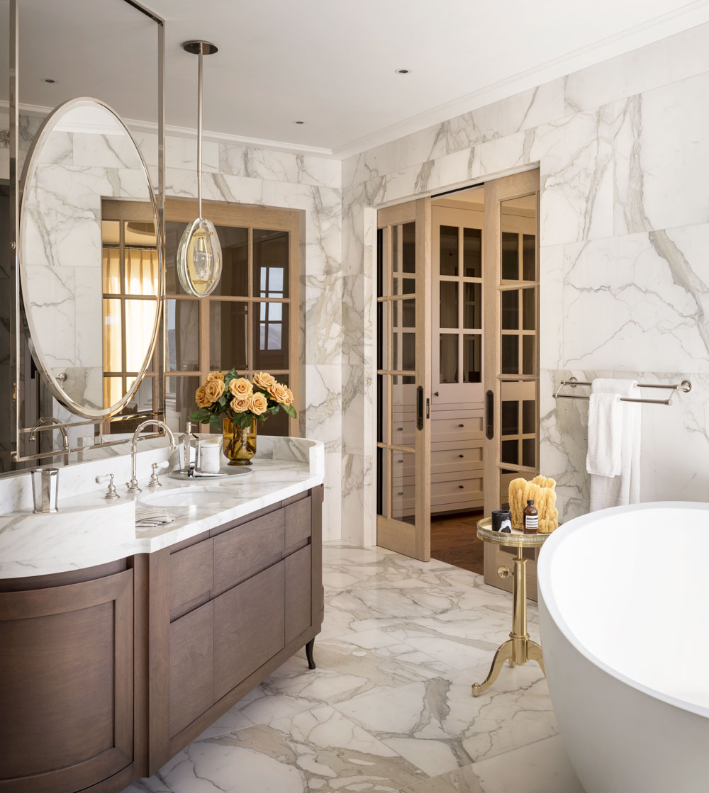
The owners suggested the diagonal angle of the vanity island, which frees the circulation from a rigid grid. The custom hanging mirror is also double sided and flanked by customised pendants, all in polished nickel.
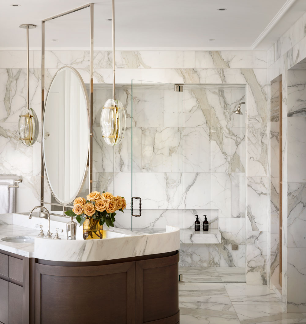
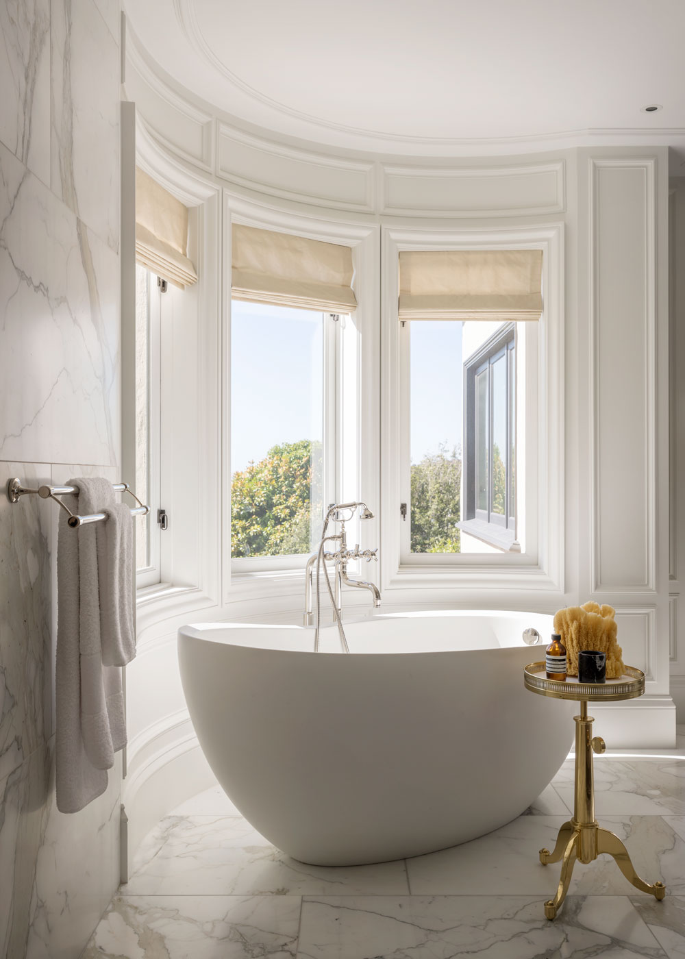
The marble was sourced directly from Italy. The slabs were cut to 24” x 36” and laid randomly, avoiding any repetition.
GUEST BEDROOMS
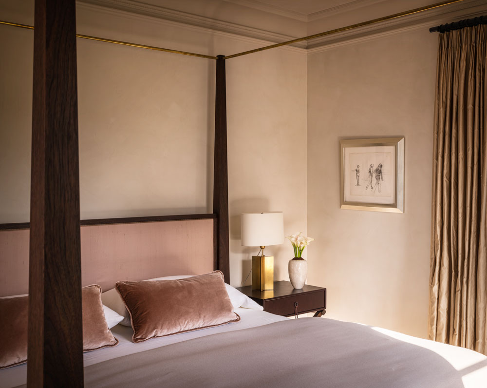
Canopy beds create a room within a room and bring a touch of five-star hospitality to any guest bedroom. Thie 'rose bedroom' is the primary guest room in the home, with views to the south and north, so it seemed the appropriate room to use a four-poster. The walls and ceilings are venetian plaster. The palette is soft blush and old rose.
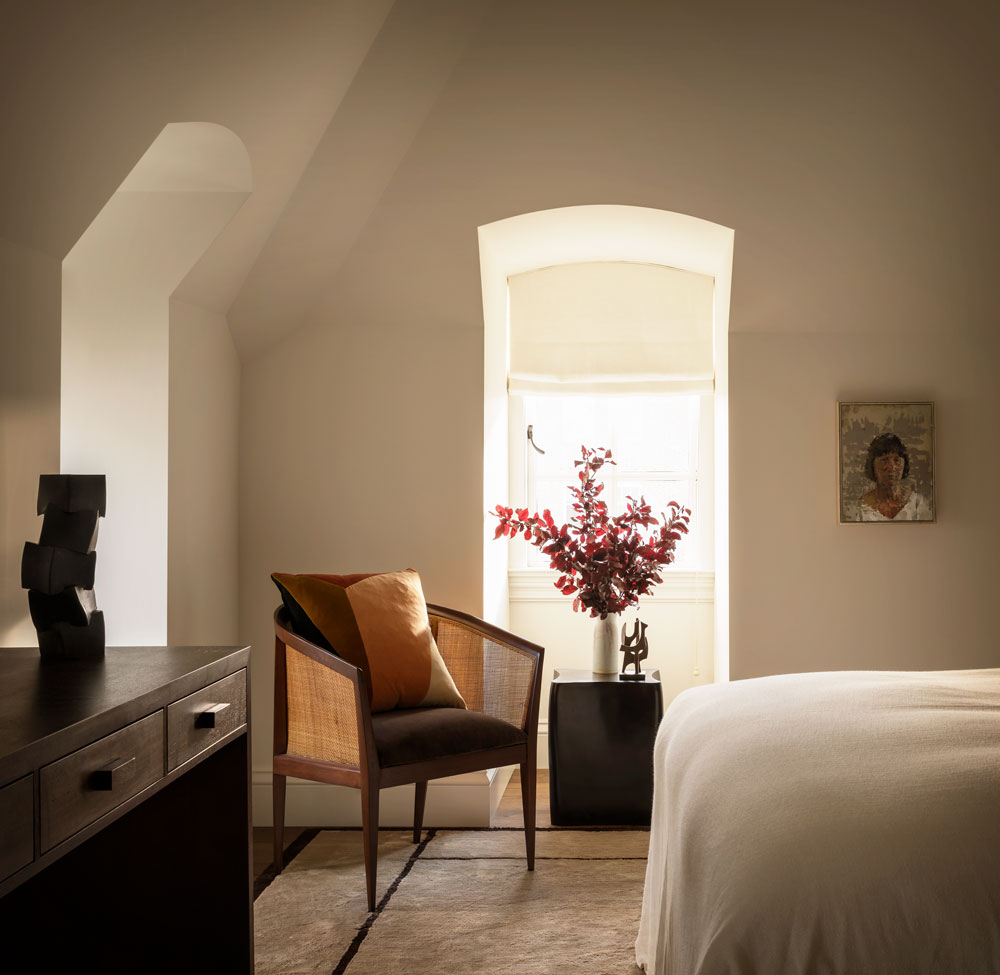
A second guest bedroom in the attic makes the most of an awkward shaped room.
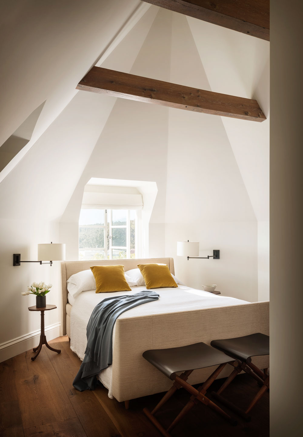
The third guest room is given the same neutral palette.
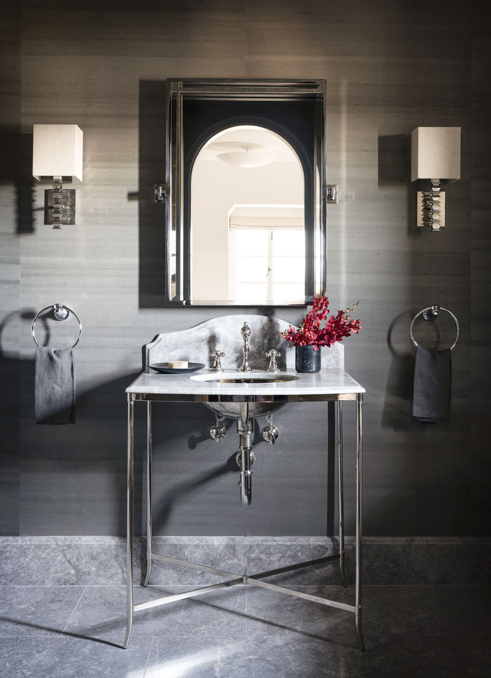
GUEST BATHROOM
The guest bathroom was given a dark, bold wallpaper.
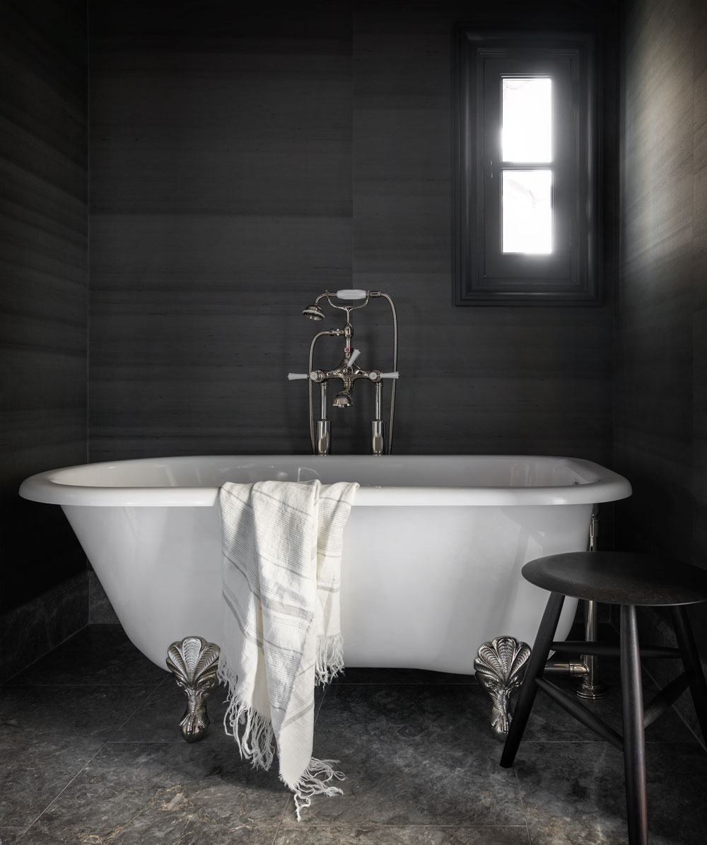
A clawfoot tub is a luxe touch.
Interior design by Richard Felix Ashman.
Photography by Aaron Leitz.

Lotte is the former Digital Editor for Livingetc, having worked on the launch of the website. She has a background in online journalism and writing for SEO, with previous editor roles at Good Living, Good Housekeeping, Country & Townhouse, and BBC Good Food among others, as well as her own successful interiors blog. When she's not busy writing or tracking analytics, she's doing up houses, two of which have features in interior design magazines. She's just finished doing up her house in Wimbledon, and is eyeing up Bath for her next project.
-
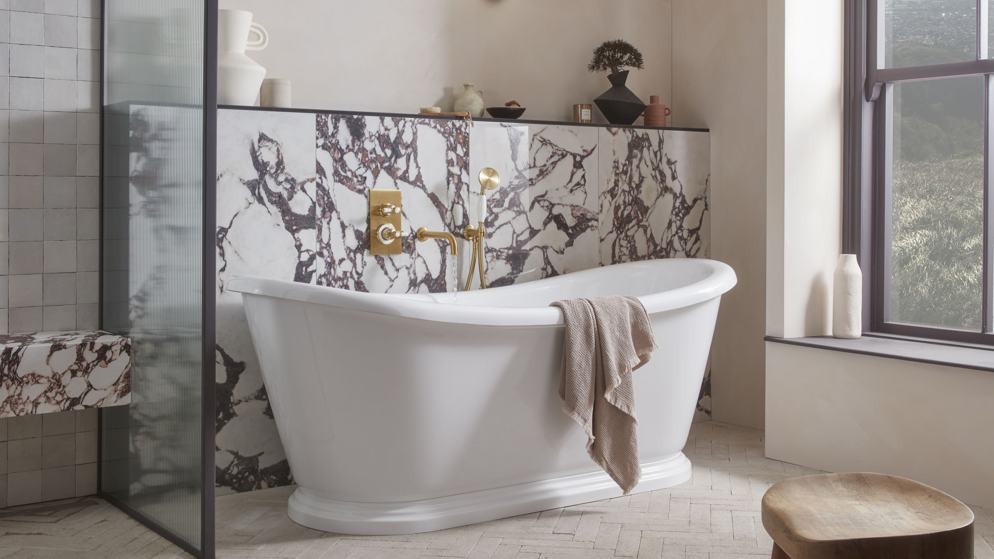 5 Bathroom Layouts That Look Dated in 2025 — Plus the Alternatives Designers Use Instead for a More Contemporary Space
For a bathroom that feels in line with the times, avoid these layouts and be more intentional with the placement and positioning of your features and fixtures
By Lilith Hudson Published
-
 Why Decorating With Mustard Yellow Helps Fill Your Interiors With a Sense of "Confident Calm"
There is so much more to decorating with this turmeric-tinted sauce-wiggled-on-a-hotdog not-quite-yellow shade than meets the eye
By Amy Moorea Wong Published
-
 Tour a mid-century house in Philadelphia with a modern take on Mad Men style
This mid-century house in Philadelphia is a modern take on mid-century design and the perfect backdrop for this enviable collection of art and objects
By Livingetc Last updated
-
 This modern Edwardian house in Melbourne is small but mighty
It may be small, but thanks to its ingenious design, this Edwardian house in Melbourne makes family living a breeze
By Livingetc Last updated
-
 Old meets new in this apartment in New York's East Village - a former community centre built in 1860
The owner of this loft-style apartment in New York's East Village mixes ancient and modern with timeworn pieces, design classics and his own abstract art...
By Livingetc Last updated
-
 Explore this super-contemporary coastal house in Cornwall
This coastal house in Cornwall is all about drinking in the uninterrupted views of nature at its most raw, most pure…
By Livingetc Last updated
-
 Explore this spacious detached 1900s house in southeast London with stylish modern interiors
Edgy textures, luxe materials and a mix of vintage and bargain buys transformed a blank detached 1900s house in southeast London into a home full of personality.
By Livingetc Last updated
-
 This large house in west London is minimal yet playful
A firefighter’s pole in the kitchen and a slide down the stairs? This house in west London proves minimalism can also be fun.
By Livingetc Last updated
-
 Inside A Clever Garden Room That Doubles As A Chic Guest House
This striking garden room design incorporates a sleeping area, kitchenette, loo and shower, as well as plenty of storage space, making it ideal as both a self-contained guest house or a restful retreat to escape to.
By Lotte Brouwer Published
-
 This light and bright Victorian terrace in west London is relaxed yet stylish
This chic Victorian terrace in west London is full of clever ideas that allow it to evolve.
By Livingetc Last updated