Scandi Cool #12
THE PROPERTY
A four-storey Edwardian terrace in west London. In the basement is a living space/bar area, utility room, shower room and guest bedroom. The ground floor comprises a living/dining area, a kitchen/breakfast room and cloakroom. The first floor is home to the master bedroom, the kids' bedrooms and a family bathroom, while in the loft are two further kids' bedrooms and a bathroom.
LIVING SPACE
Since moving to the property, the ownersmore than doubled its volume, turning a two-storey wreck into a four-storey triumph. The entire house was stripped, every chimney breast was removed, the ground floor extended, and both a loft and basement were added. The house went from 130 sq m to 285 sq m – and it took just shy of a year.
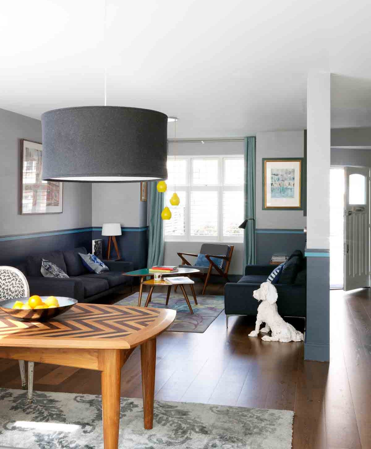
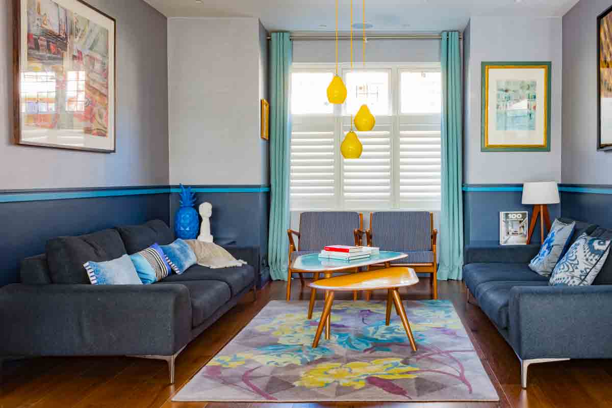
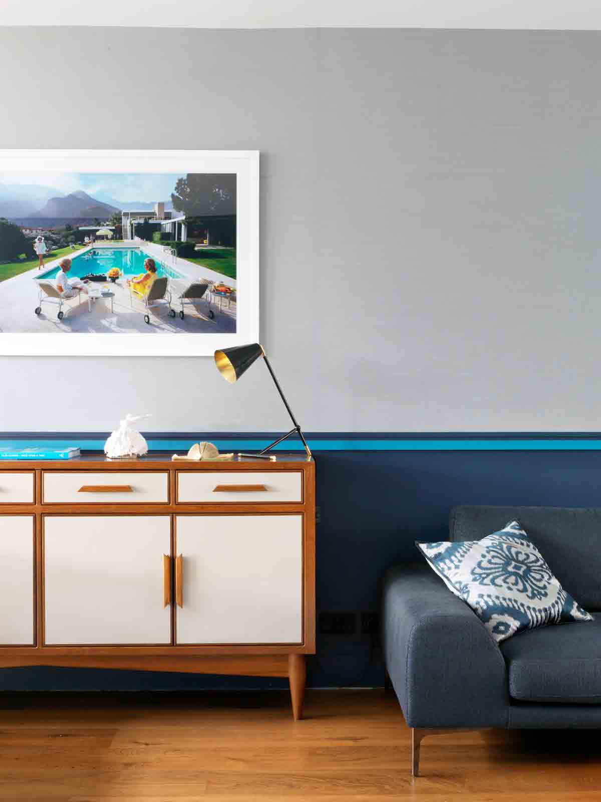
An elegant, clean-lined sofa and fresh colours suit the ground floor living space perfectly. Indigo adds brightness, but to have a room painted all over with it would be too heavy.
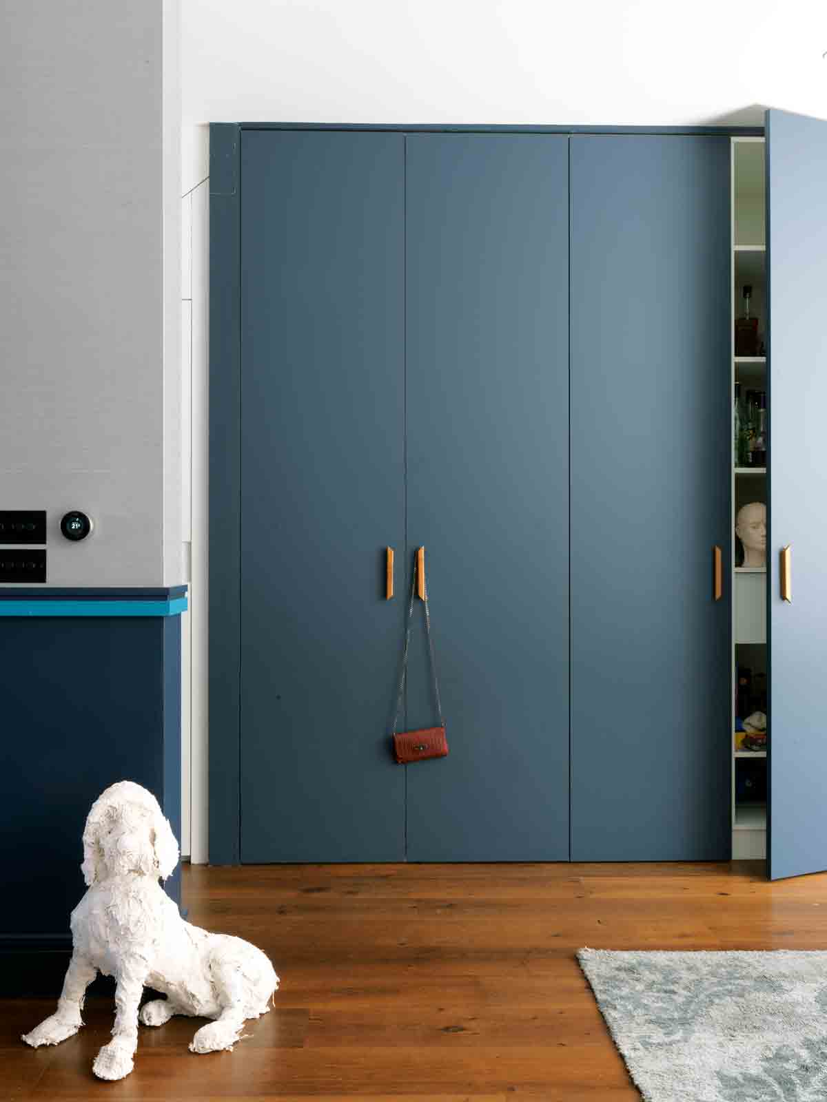
This house is a study in elegant family living, or looking good while being practical too. Storage is essential in a family home, and in this west London space the pièce de résistanceis a bank of six tall cupboards on the ground floor.When space is optimised with well-designed storage, you can tidy up super fast – essential in a bustling household.
Six large built-in cupboards face the dining area opposite. They're used for housing coats, shoes, admin, food storage…
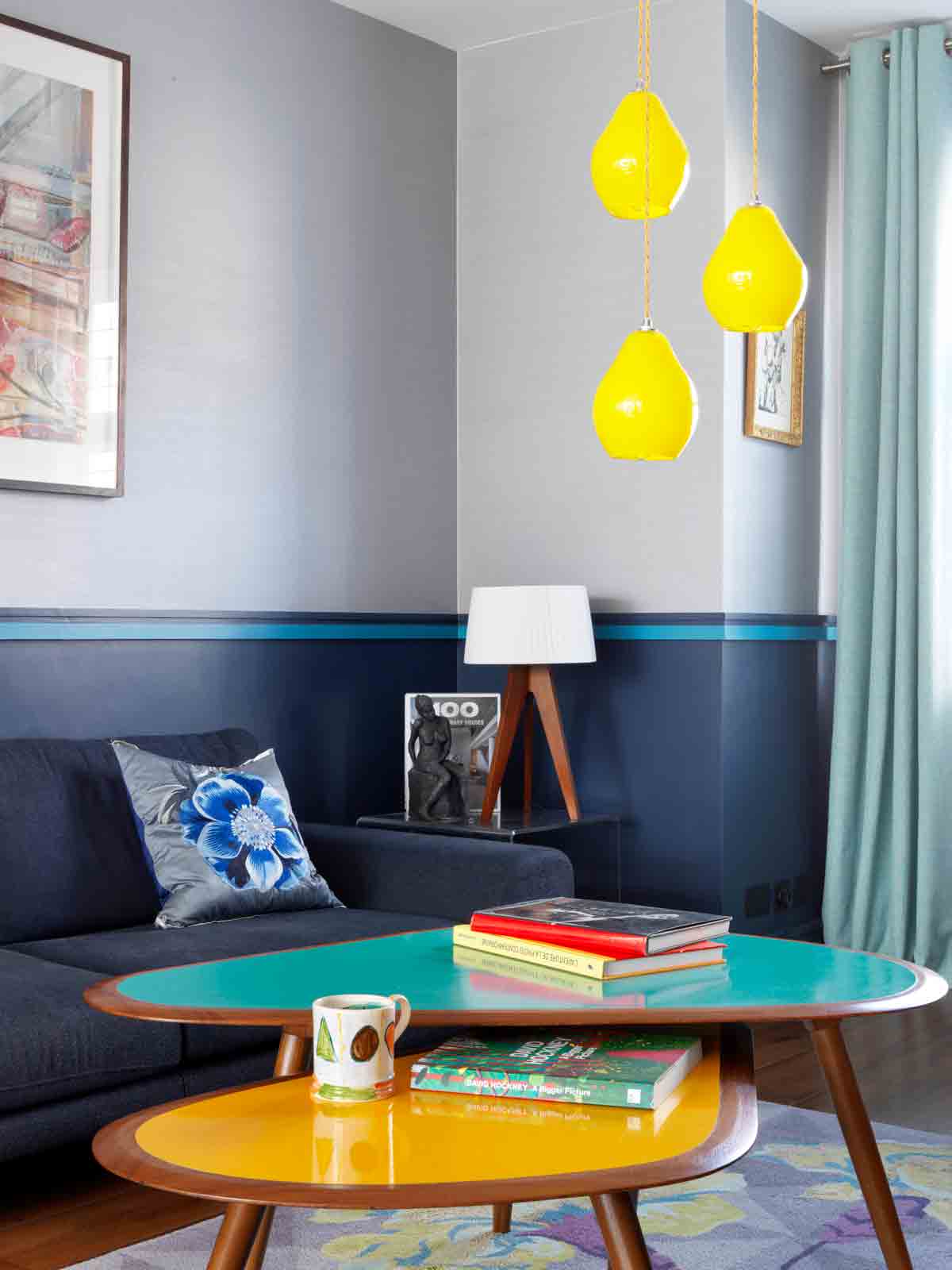
A deep indigo anchors the lower half of the room, with a textured wallpaper above and a strip of blue as a zingy divide. The look was inspired by French interior designer Sarah Lavoine who is known for the way she divides a room with a stripe. The same effect was achieved here by separating a dark shade at the bottom and using textured wallpaper above.
The coffee tables were made bespoke in India. (woodndesign.in). Yellow pendant lights were chosen to complement the blue and yellow in the coffee tables.
Be The First To Know
The Livingetc newsletters are your inside source for what’s shaping interiors now - and what’s next. Discover trend forecasts, smart style ideas, and curated shopping inspiration that brings design to life. Subscribe today and stay ahead of the curve.
Slim Aarons photography has a way of making you feel like you're jumping inside a story.
KITCHEN
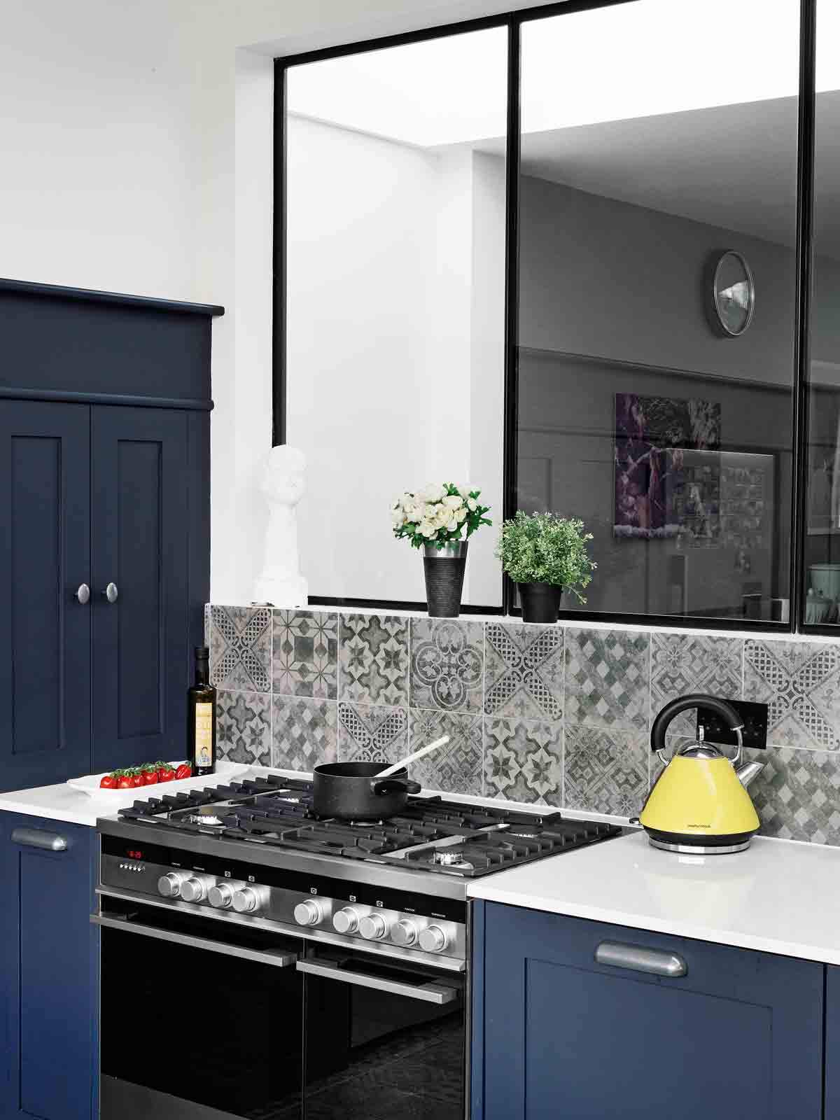
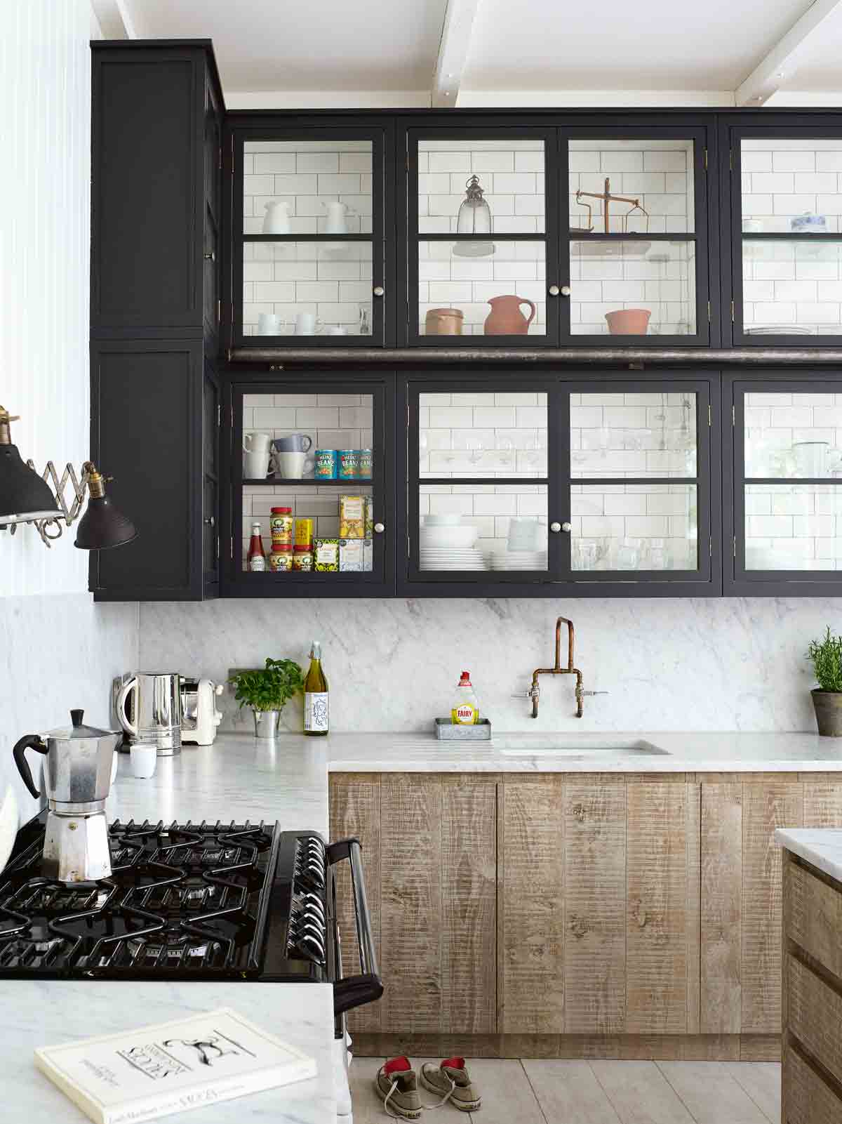
Glass features prominently on the ground floor, with an internal window pulling light from the south-facing garden (pictured top of this page) into the dining and living rooms. It means you can keep an eye on the children while cooking, and enjoy the garden from the living area, without seeing kitchen mess.
The kitchen was made bespoke by the builder. It is painted a deep greyish black and treated with a matt varnish. The tiles have the look of old cement tiles but are actually porcelain.
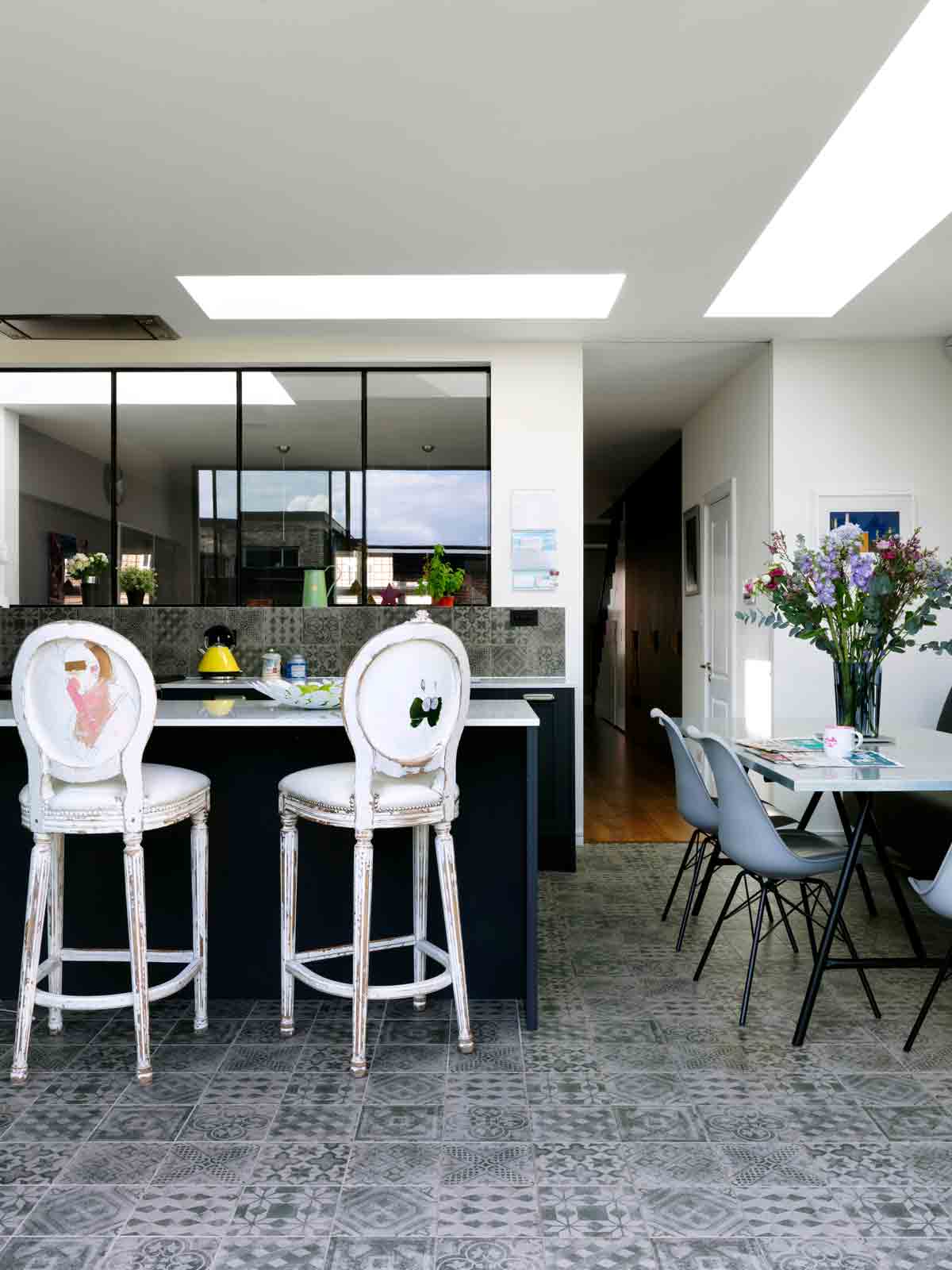
There's a kitchen island / breakfast bar, perfect for hanging around during cooking, or for baking on. The kitchen table and bench is used for everyday breakfast, lunch and dinner.
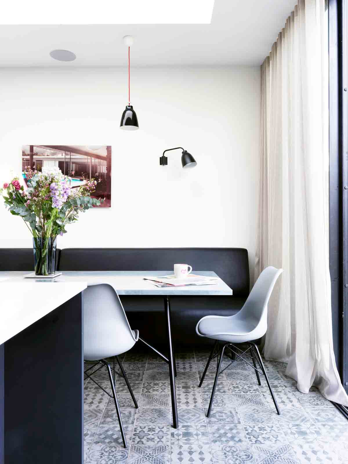
Other practical touches include the bespoke banquette bench in the kitchen, covered in faux leather. It takes up less space than chairs, plus kids can crash around on it, without the worry of any damage being done.The dining bench was designed as space-efficient seating; you need around 90cm behind a chair, so you can pull it out, so with space lacking a bench was installed instead.
DINING AREA
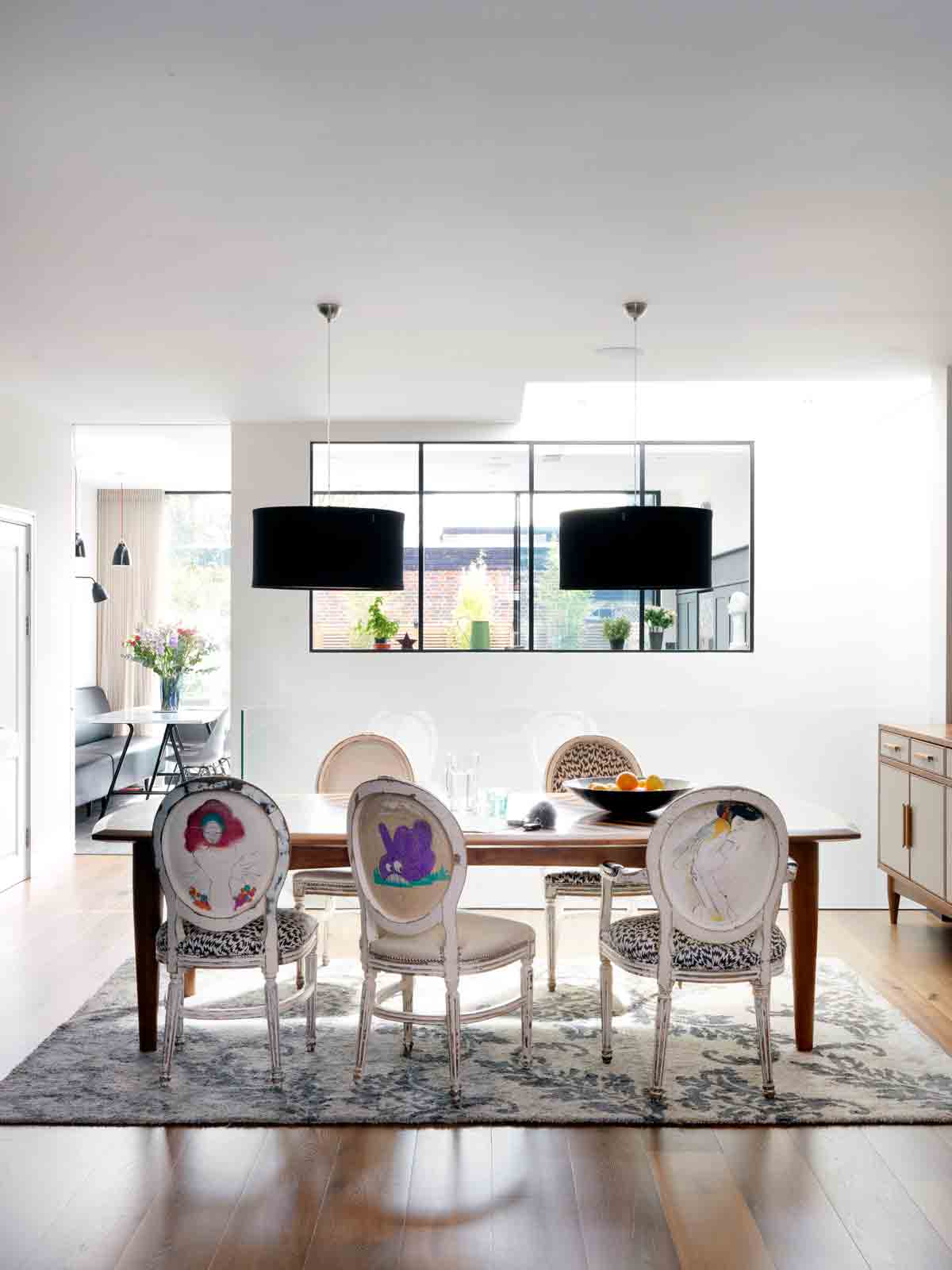
A larger dining table is used for entertaining, while the kitchen table takes care of everyday meals.
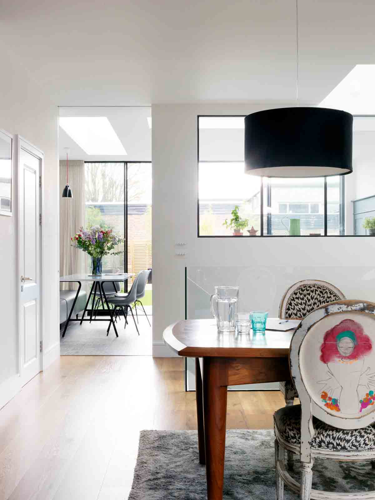
The chairs were from the restaurant Sketch in Mayfair and the owners were lucky to get them in a sale, when they were redesigning the space. The dining table is made from 300-year-old teak from Burma.
BASEMENT
Basement access is often from the front, so you usually have stairs under stairs. In order to help make the basement feel part of the house, the stairs are in the middle of the ground floor and sit on dainty legs with glass balustrades.This was crucial in order to bring in lots of light.
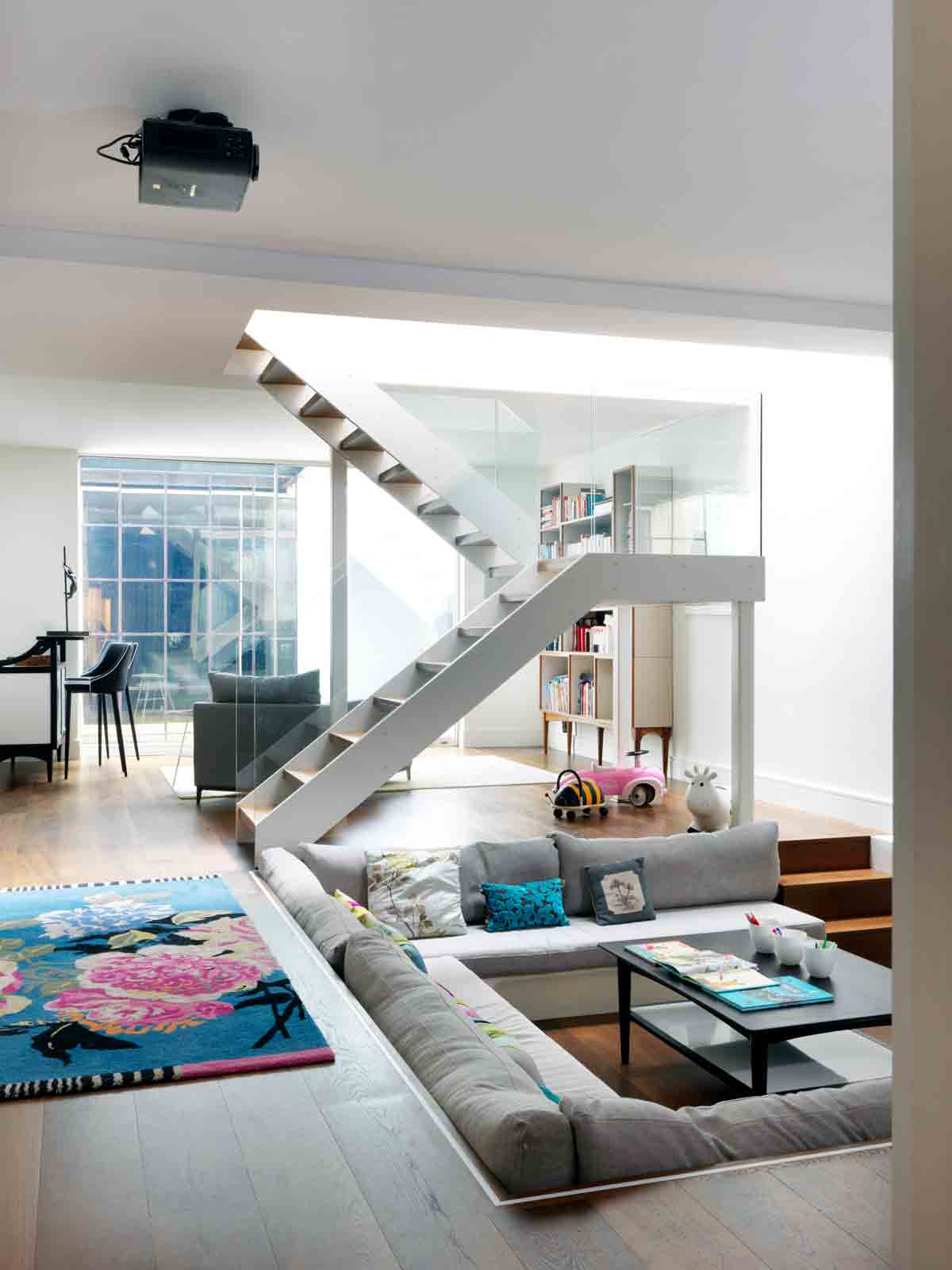
The sunken sofa idea was originally spotted in architect Ian Hogarth’s house. Here the sunken area has become a cinema corner, complete with ceiling projector. As the basement is a big 60 sq m room, this is a great way to make an informal division of the space.
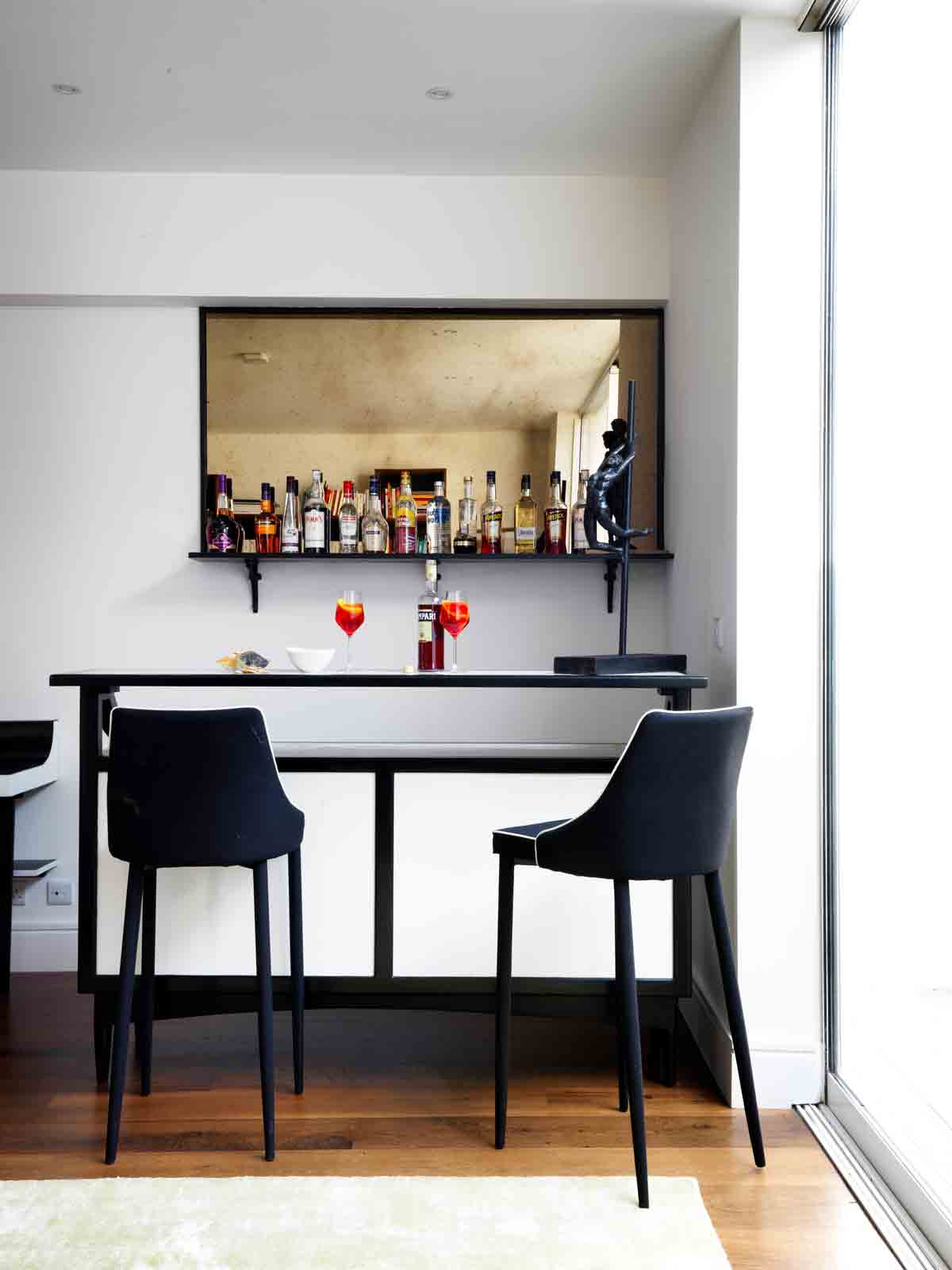
The generous basement is the perfect venue for entertaining. The sunken area can be transformed into a dance floor and there's even a bar.
The bookshelf was originally designed to sit on top of the console on the ground floor, but when wallpaper was chosen the owners knew it wouldn't work.
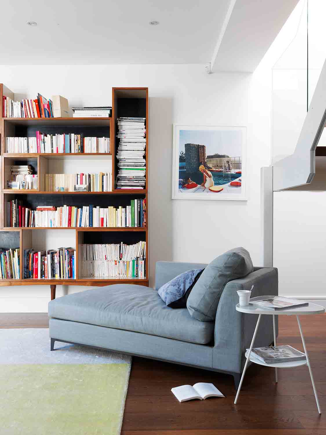
The shelves were given a new pair of legs and it now works really well as a freestanding piece.
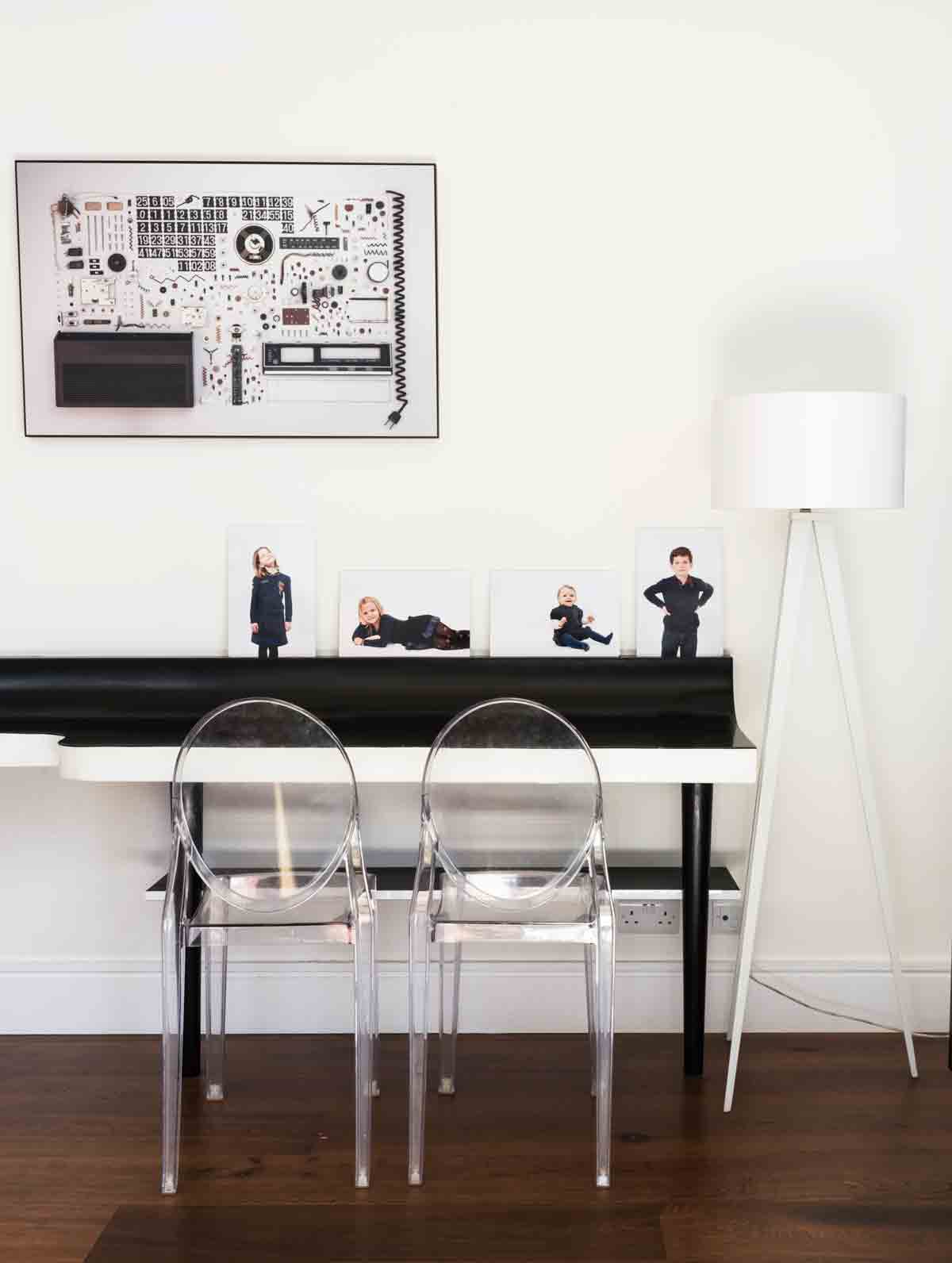
A study corner is perfect for those work-from-home days or for getting much-needed admin done.
MASTER BEDROOM
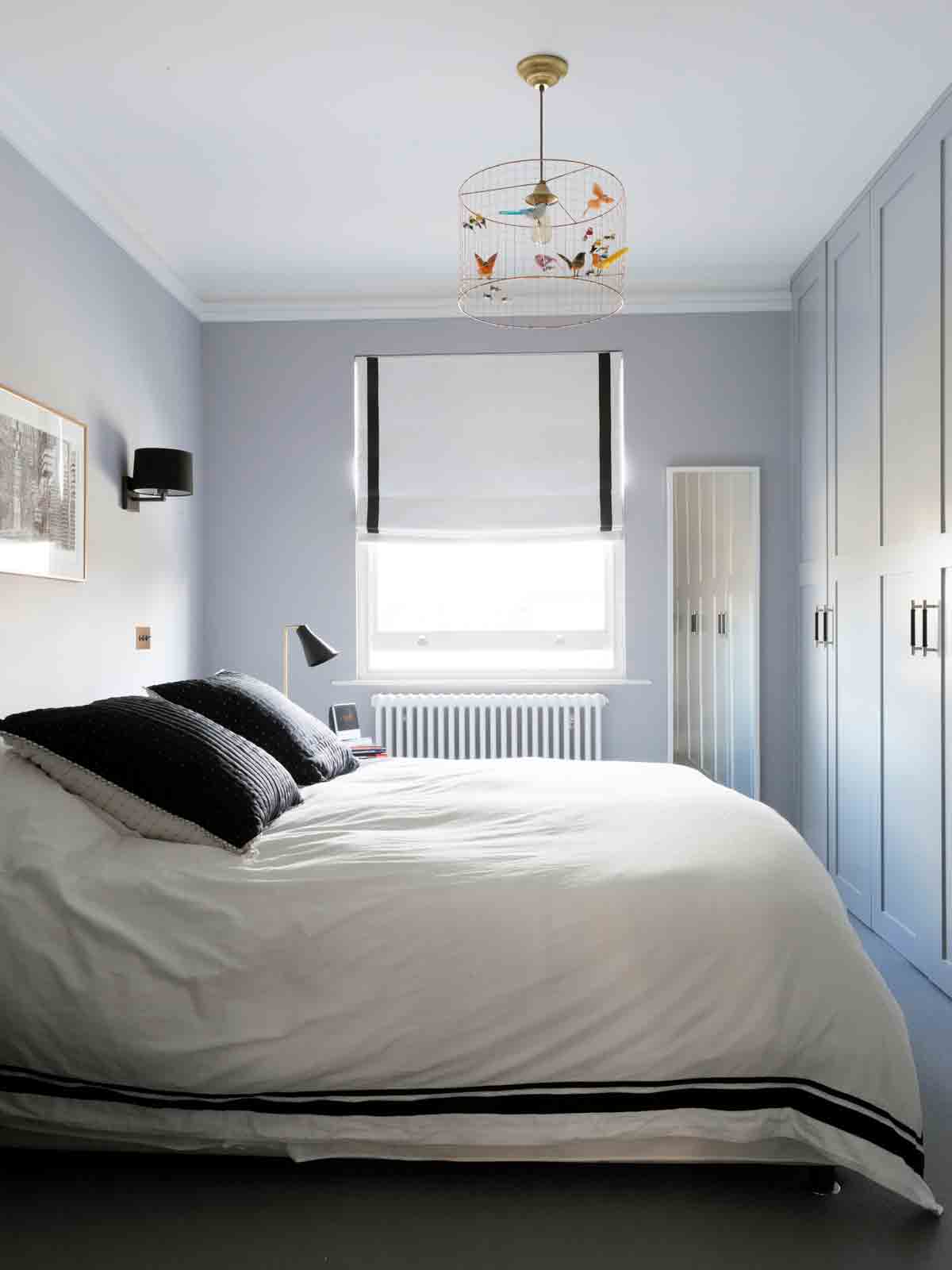
The master bedroom is relatively small in order to make room for all the other bedrooms, but the plan is to extend this room and to give the childrens' rooms bunk beds.
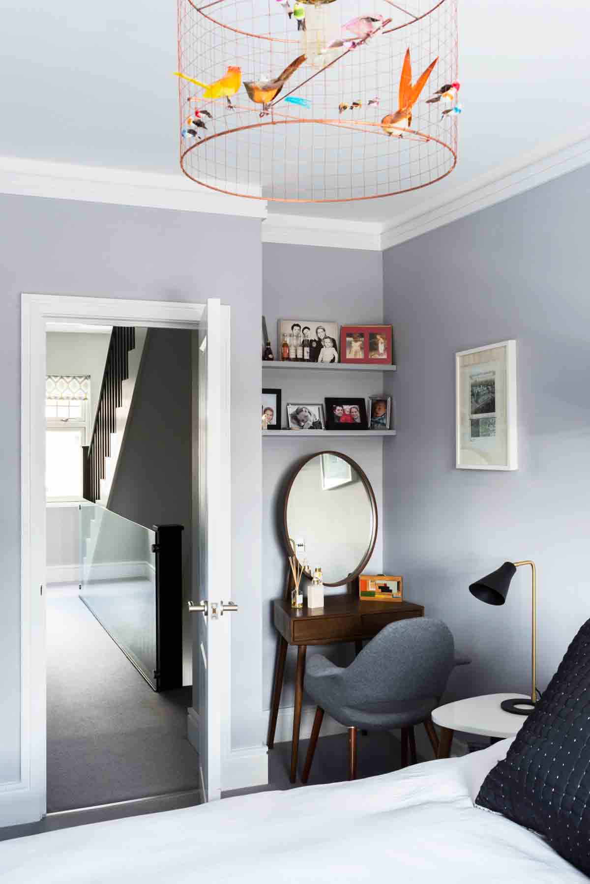
A neat dressing table tucks into an alcove in the master bedroom.
MASTER BATHROOM
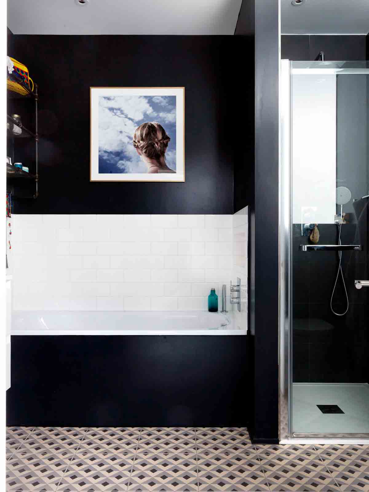
This bathroom has no natural light apart from a frosted glass window onto the landing. It can be a mistake to think you need to paint a dark room in white, it often works well to just embracethe darkness! Dark can be bright and warm.
GIRLS' ROOM
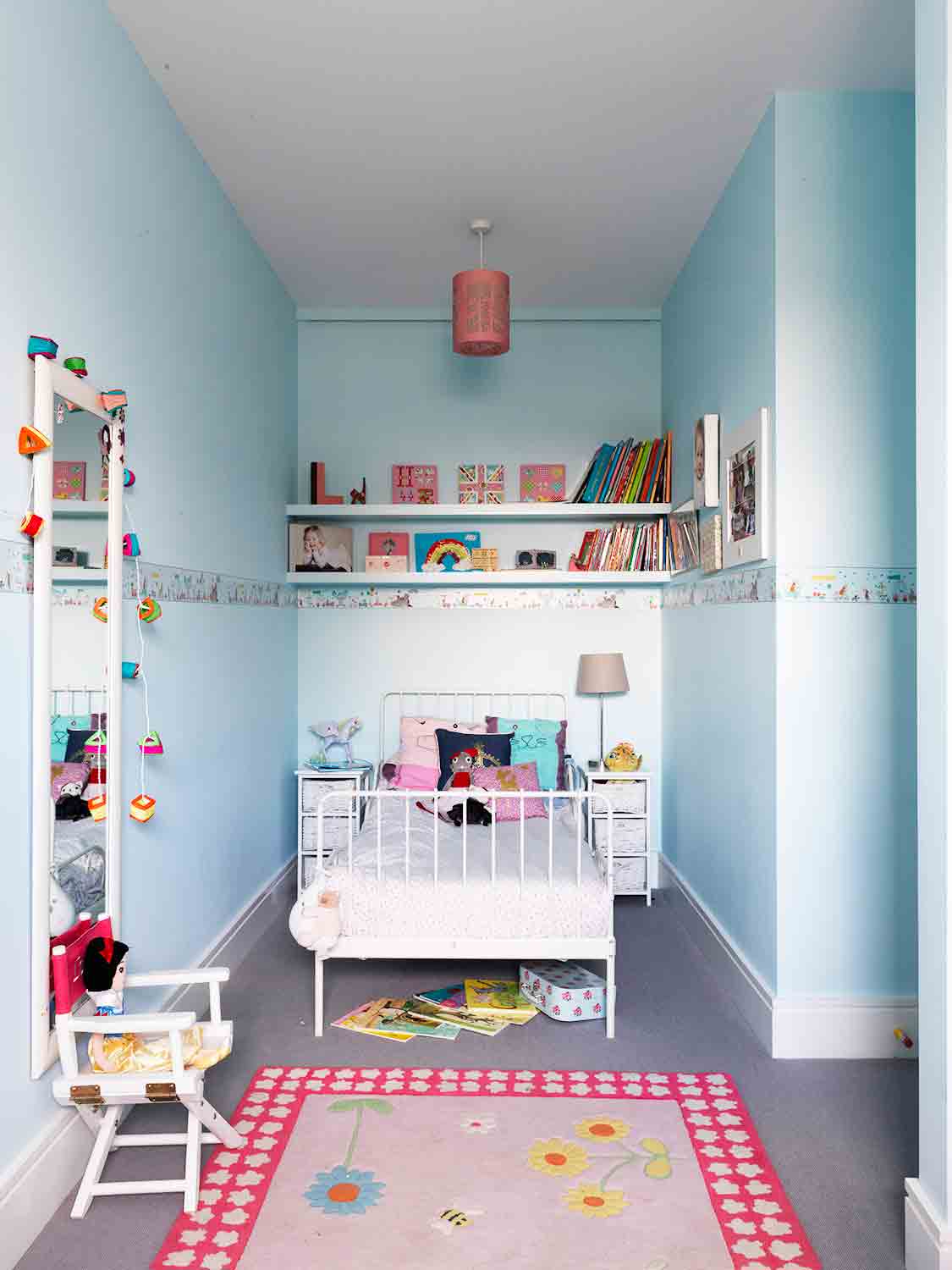
Blue is a great colour in bedrooms. It creates a calming effect, it’s joyful and is a great colour base for all sorts of other colours and accessories.
BOYS' ROOM
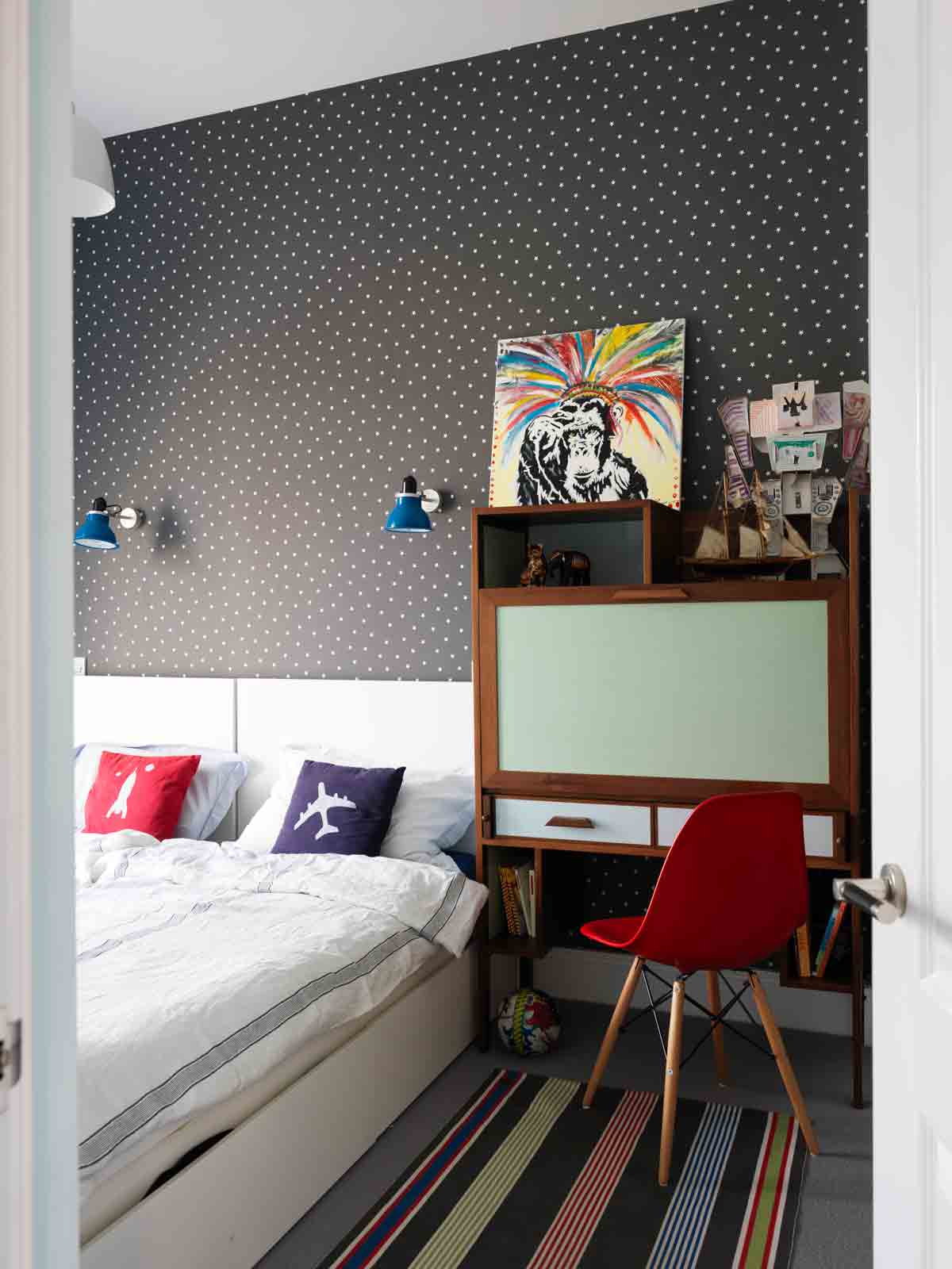
The boy's room boasts a bespoke unit that opens up to become a desk.
Check out more of this interior designer's work at emrdesign.co.uk
Photography Simon Brown
The homes media brand for early adopters, Livingetc shines a spotlight on the now and the next in design, obsessively covering interior trends, color advice, stylish homeware and modern homes. Celebrating the intersection between fashion and interiors. it's the brand that makes and breaks trends and it draws on its network on leading international luminaries to bring you the very best insight and ideas.
-
 The Weighted Blanket That Doesn’t Make You Sweat (and the Eye Mask to Match)
Luxury has weight. And apparently, volcanic minerals
By Julia Demer
-
 What Is Biophilic Interior Design? I'm an Actual Biophilic Designer, and This Is How to Apply It to Your Home
A biophilic designer explains the core principles of this practice, and the easy ways you can apply it to your home's design
By Marianna Popejoy
-
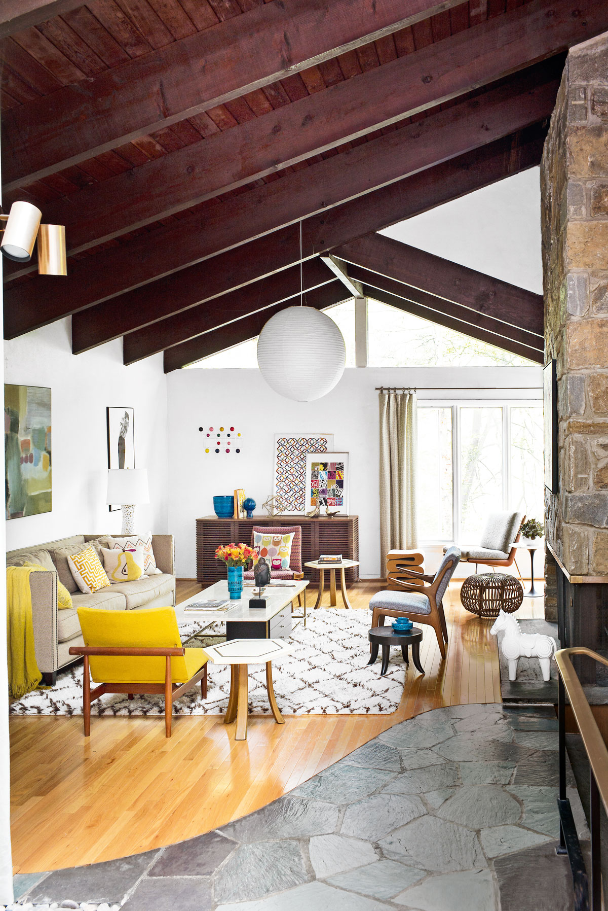 Tour a mid-century house in Philadelphia with a modern take on Mad Men style
This mid-century house in Philadelphia is a modern take on mid-century design and the perfect backdrop for this enviable collection of art and objects
By Livingetc
-
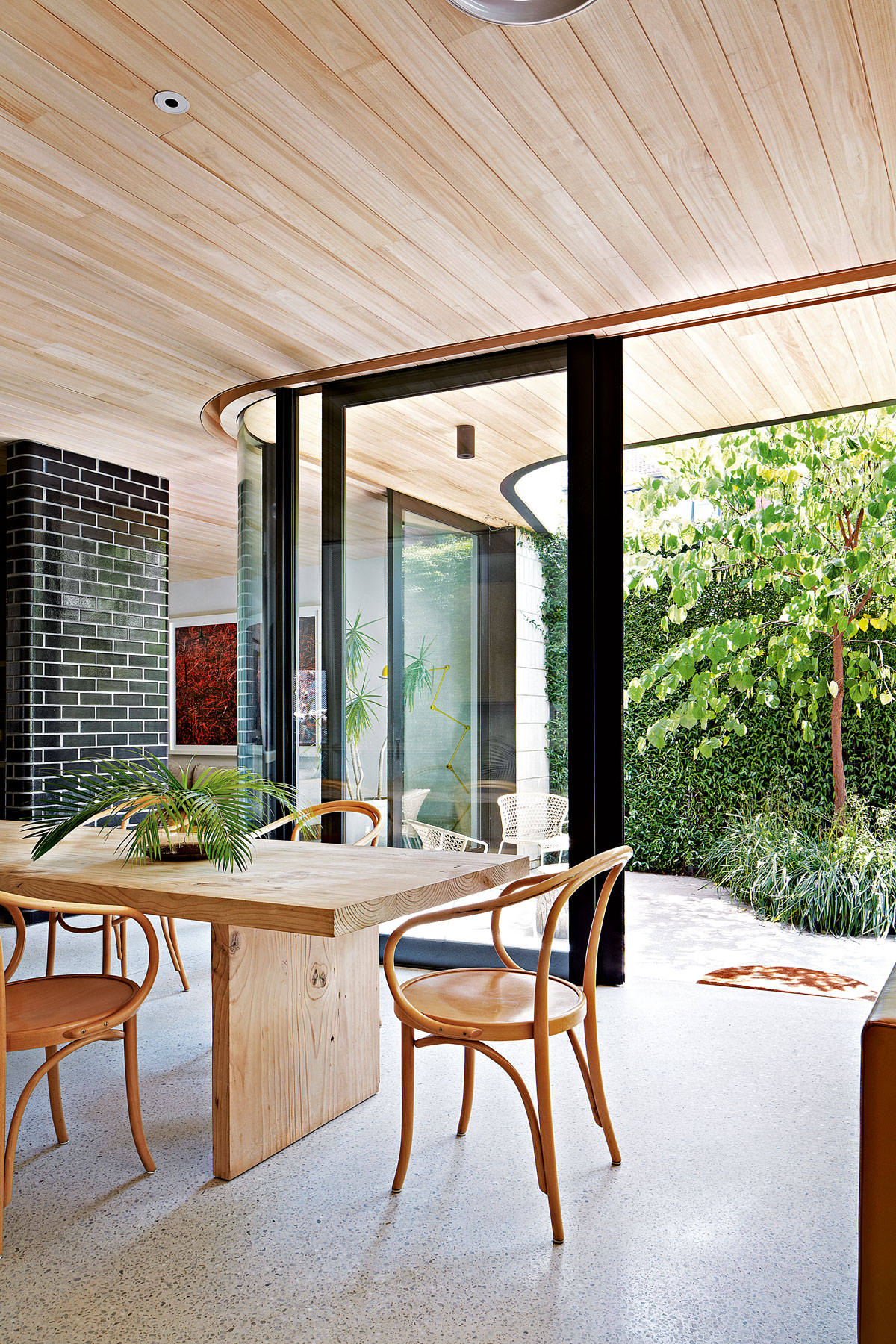 This modern Edwardian house in Melbourne is small but mighty
It may be small, but thanks to its ingenious design, this Edwardian house in Melbourne makes family living a breeze
By Livingetc
-
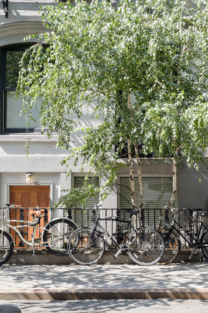 Old meets new in this apartment in New York's East Village - a former community centre built in 1860
The owner of this loft-style apartment in New York's East Village mixes ancient and modern with timeworn pieces, design classics and his own abstract art...
By Livingetc
-
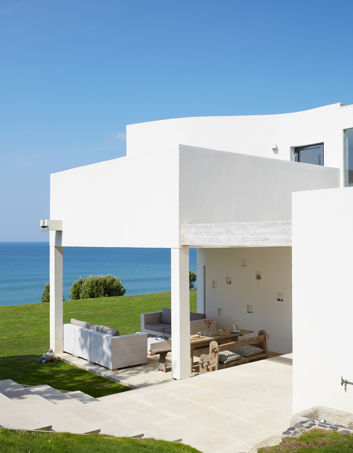 Explore this super-contemporary coastal house in Cornwall
This coastal house in Cornwall is all about drinking in the uninterrupted views of nature at its most raw, most pure…
By Livingetc
-
 Explore this spacious detached 1900s house in southeast London with stylish modern interiors
Edgy textures, luxe materials and a mix of vintage and bargain buys transformed a blank detached 1900s house in southeast London into a home full of personality.
By Livingetc
-
 This large house in west London is minimal yet playful
A firefighter’s pole in the kitchen and a slide down the stairs? This house in west London proves minimalism can also be fun.
By Livingetc
-
 Inside A Clever Garden Room That Doubles As A Chic Guest House
This striking garden room design incorporates a sleeping area, kitchenette, loo and shower, as well as plenty of storage space, making it ideal as both a self-contained guest house or a restful retreat to escape to.
By Lotte Brouwer
-
 This light and bright Victorian terrace in west London is relaxed yet stylish
This chic Victorian terrace in west London is full of clever ideas that allow it to evolve.
By Livingetc