Tour a mid-century house in Philadelphia with a modern take on Mad Men style
This mid-century house in Philadelphia is a modern take on mid-century design and the perfect backdrop for this enviable collection of art and objects
THE PROPERTY
A three-storey mid-century ‘post and beam’ house, situated just outside Philadelphia. The modern home has four bedrooms, three bathrooms, a powder room, three living areas, a kitchen, dining room, home office, sauna and gym, all set on a quarter-acre of land with extensive gardens.
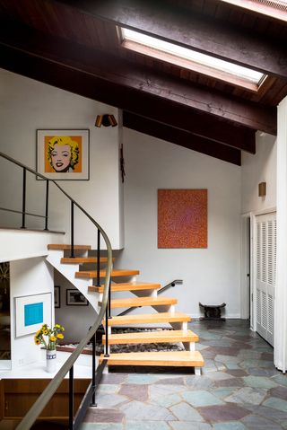
STAIRCASE
This mid-century gem (think Mad Men with maybe a touch of the Brady Bunch house and the house in Ang Lee’s The Ice Storm) is super sophisticated. And while it contains many witty references to the past, it’s absolutely not designed to be a time capsule. It is, however, the perfect backdrop for an impressive collection of vintage furniture, art and ceramics.
The flagstone floor at the bottom of the stairs (pictured top) features a mosaic of blue stones that contrast against the orange artwork. These stairs used to be covered in shag-pile carpet, but the new owners removed it to expose the original oak.
LIVING AREA
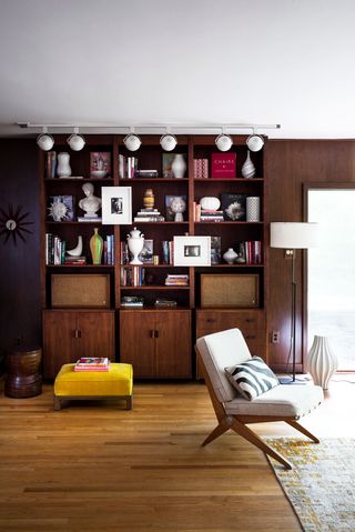
The house, though initially dark and foreboding, still had many original features, from the built-in Sixties bookshelves to wood-clad walls and even an original cedar-wood sauna. The interiors hadn't been in touched in a while – the new owners had torestore the original red oak floors, lighten dark walls, bin the Seventies curtains and, of course, rip up the avocado shag-pile carpets.
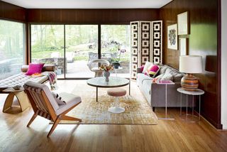
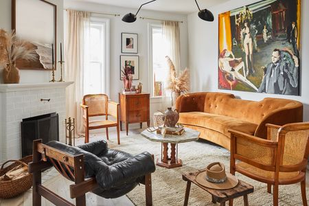
The living room is a mix of mid-century pieces – just about every piece in the room, other than the couch. The coffee table is a Paul McCobb. It’s the exact length of the fireplace and that anchors the room.
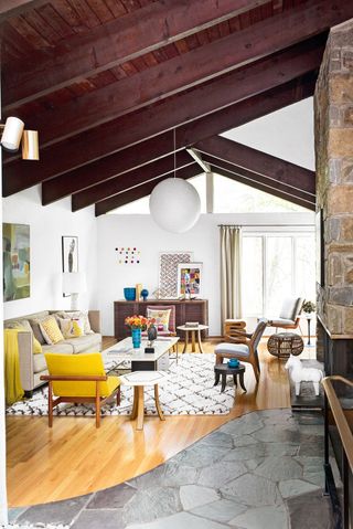
While respecting the past, the new owner's vision was to use the mix of materials, furniture and art to create an interior that was elegant, fresh and modern. Something lighter and brighter than the Sixties and Seventies design mantra, which can sometimes look a bit kitschy.
Be The First To Know
The Livingetc newsletter is your shortcut to the now and the next in home design. Subscribe today to receive a stunning free 200-page book of the best homes from around the world.
Mixing old and new gives these interiors more depth, with high- and low-cost pieces. Good design comes at all different price points. It’s the way you put it together.
See Also: Living room ideas - 24 decorating tricks to inspire
UPSTAIRS HALL
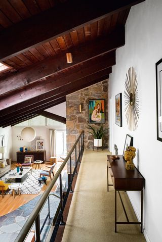
This hall – or catwalk – leads to the master bedroom.
DEN
Mid-century houses are more common on the West Coast and this one was especially unusual as it sits on land with a creek snaking around it. So you feel like you’re away from it all – but you’re really not. The house has been opened up to make the most of the nature views– the plot is full of trees, with lots of birds and wildlife.
But, unlike many modernist homes, it’s not a fishbowl; there's a balance of walls and glass.
The colours in the den were inspired by the artwork on the wall above the sofa by the artist Karel Appel. The dashes of magenta and orange are again a nod to the period of the house. Similarly, furniture is a mixture of old and new.
KITCHEN
The hood over the oven is original. The electric kitchen clock (above the oven) is also an original fixture.
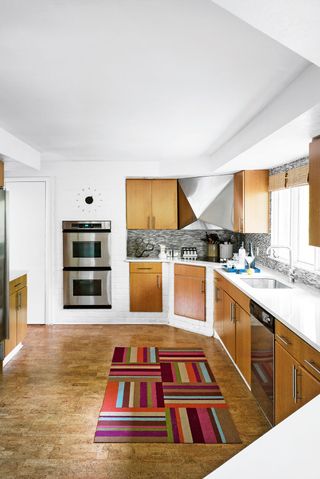
The flooring is cork, which always has a temperature of around 20°C, so when you walk on it, it feels cosy and warm.
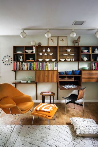
Cook books are arranged along a long wall-mounted wood cabinet.
Splashes of ochre in the upholstery reflect the period of the house.
DINING AREA
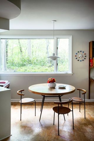
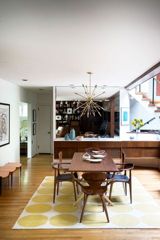
The chairs and the table top are walnut, but the chairs were mixed up to make them feel more casual.
GUEST BEDROOM
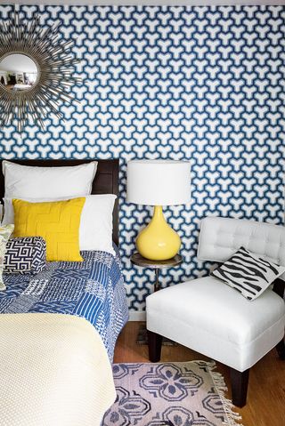
This room is more patterned than most in the house. But in a space such as a guest bedroom, it’s fun.
DESK AREA
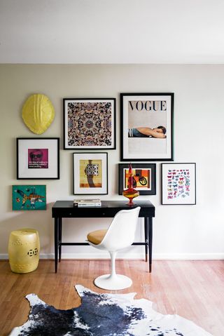
This area is in one of the bedrooms and has a day bed nearby.
MASTER BEDROOM
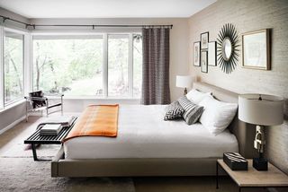
The view from the master bedroom overlooks the creek.
Photography/Paul Raeside
See Also: Master Bedroom Ideas - 31 stunning bedroom schemes
The homes media brand for early adopters, Livingetc shines a spotlight on the now and the next in design, obsessively covering interior trends, color advice, stylish homeware and modern homes. Celebrating the intersection between fashion and interiors. it's the brand that makes and breaks trends and it draws on its network on leading international luminaries to bring you the very best insight and ideas.
-
 Florals *Can* be Groundbreaking, and This Unlikely Collaboration Proves How
Italian fashion house, Moschino, tapped Sanderson’s iconic floral archive for its latest show in Milan
By Julia Demer Published
-
 The "One Amazing Thing" Theory Could Just Be the Secret to Making Your Decorating Budget Go Further (While Making More Impact)
What if we told you designers had found a way to control a project's spend even while elevating the final result? This new trend does just that
By Pip Rich Published
-
 This modern Edwardian house in Melbourne is small but mighty
It may be small, but thanks to its ingenious design, this Edwardian house in Melbourne makes family living a breeze
By Livingetc Last updated
-
 Old meets new in this apartment in New York's East Village - a former community centre built in 1860
The owner of this loft-style apartment in New York's East Village mixes ancient and modern with timeworn pieces, design classics and his own abstract art...
By Livingetc Last updated
-
 Explore this super-contemporary coastal house in Cornwall
This coastal house in Cornwall is all about drinking in the uninterrupted views of nature at its most raw, most pure…
By Livingetc Last updated
-
 Explore this spacious detached 1900s house in southeast London with stylish modern interiors
Edgy textures, luxe materials and a mix of vintage and bargain buys transformed a blank detached 1900s house in southeast London into a home full of personality.
By Livingetc Last updated
-
 This large house in west London is minimal yet playful
A firefighter’s pole in the kitchen and a slide down the stairs? This house in west London proves minimalism can also be fun.
By Livingetc Last updated
-
 Inside A Clever Garden Room That Doubles As A Chic Guest House
This striking garden room design incorporates a sleeping area, kitchenette, loo and shower, as well as plenty of storage space, making it ideal as both a self-contained guest house or a restful retreat to escape to.
By Lotte Brouwer Published
-
 This light and bright Victorian terrace in west London is relaxed yet stylish
This chic Victorian terrace in west London is full of clever ideas that allow it to evolve.
By Livingetc Last updated
-
 A 1920's farmhouse in Canada is brought up to date with modern rustic style and Californian funk
This artist's country home - an epic farmhouse in Canada - is a beautiful balance of rustic style, antiques and modern design pieces
By Lotte Brouwer Last updated