Scandi Cool #1
THE PROPERTY
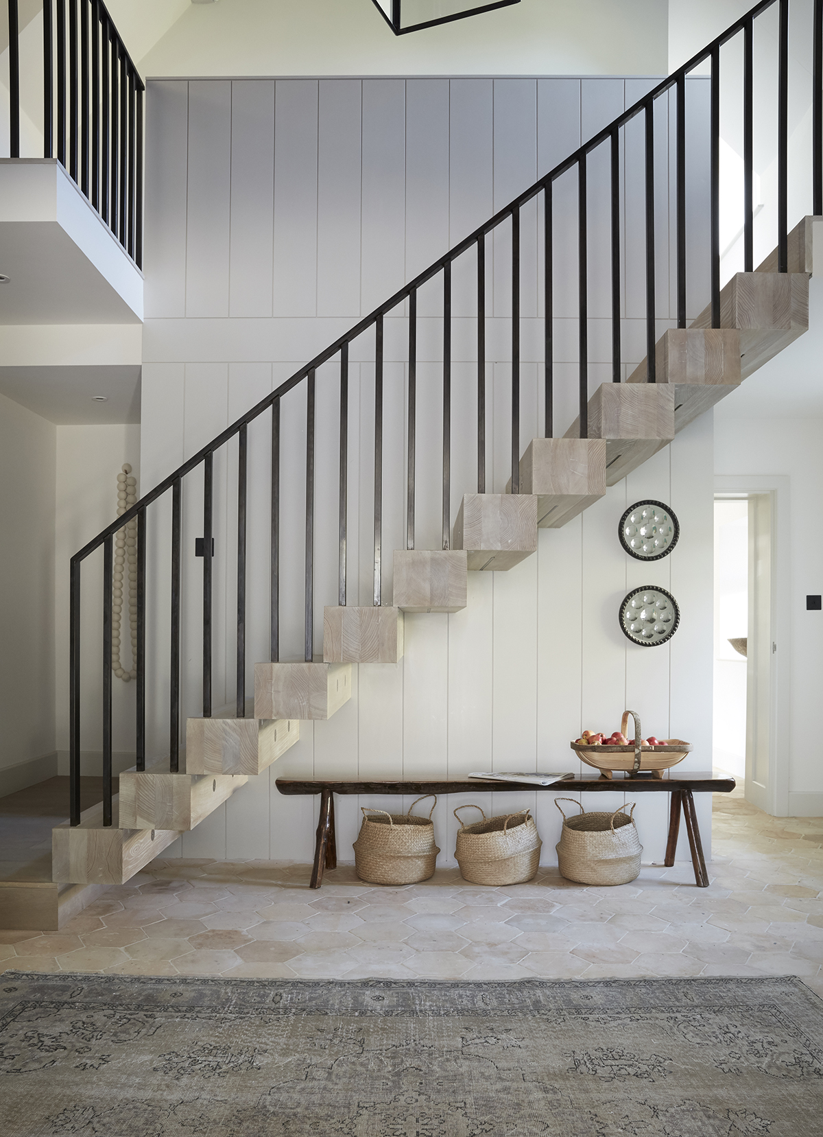
A 17th-century former mill in Gloucestershire, which has been extended over the years to include five bedrooms and four bathrooms upstairs. On the ground floor there is a living room, kitchen, snug, study, utility room and pantry, boot room and cloakroom.
HALLWAY
In the hallway, part of the first floor was removed to create the dramatic double-height entrance, designed by architect Richard Parr. Vertical panelling enhances the sense of scale and reflects the mill’s rural heritage.
See more Scandinavian style homes
KITCHEN
Designed to suit the needs of a large family who are all keen cooks, the kitchen includes a range cooker, deep larder and chalkboard for recipe essentials.The simple scaffolding shelving make it easy for to grab utensils when they're needed.
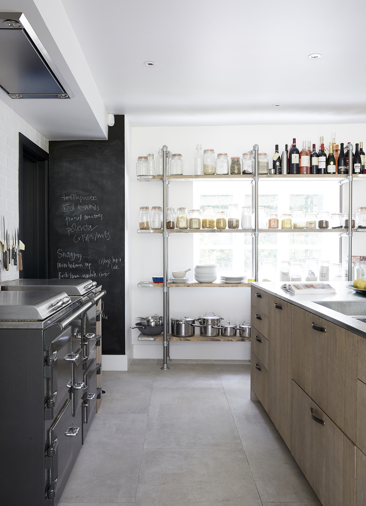
Instead of neutral tones, the large room is punctuated with deep-black doors, which define the white space and lead to the new larder and utility area.
DINING AREA
New windows were installed in the once-dark kitchento bring views of the three-acre garden inside.
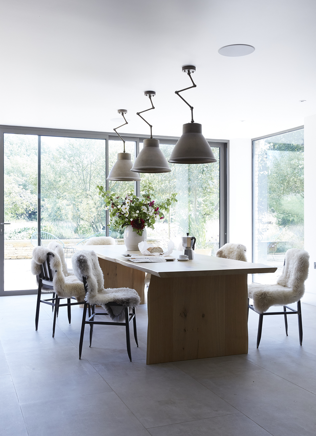
The space is defined by the length of the dining table.
Be The First To Know
The Livingetc newsletters are your inside source for what’s shaping interiors now - and what’s next. Discover trend forecasts, smart style ideas, and curated shopping inspiration that brings design to life. Subscribe today and stay ahead of the curve.
LIVING ROOM
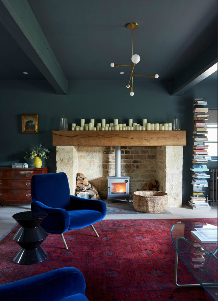
In the sitting room, the original fireplace was restored. The old French windows were removed, replaced with smaller frames to enhance the cosy feel of the space.
STUDY
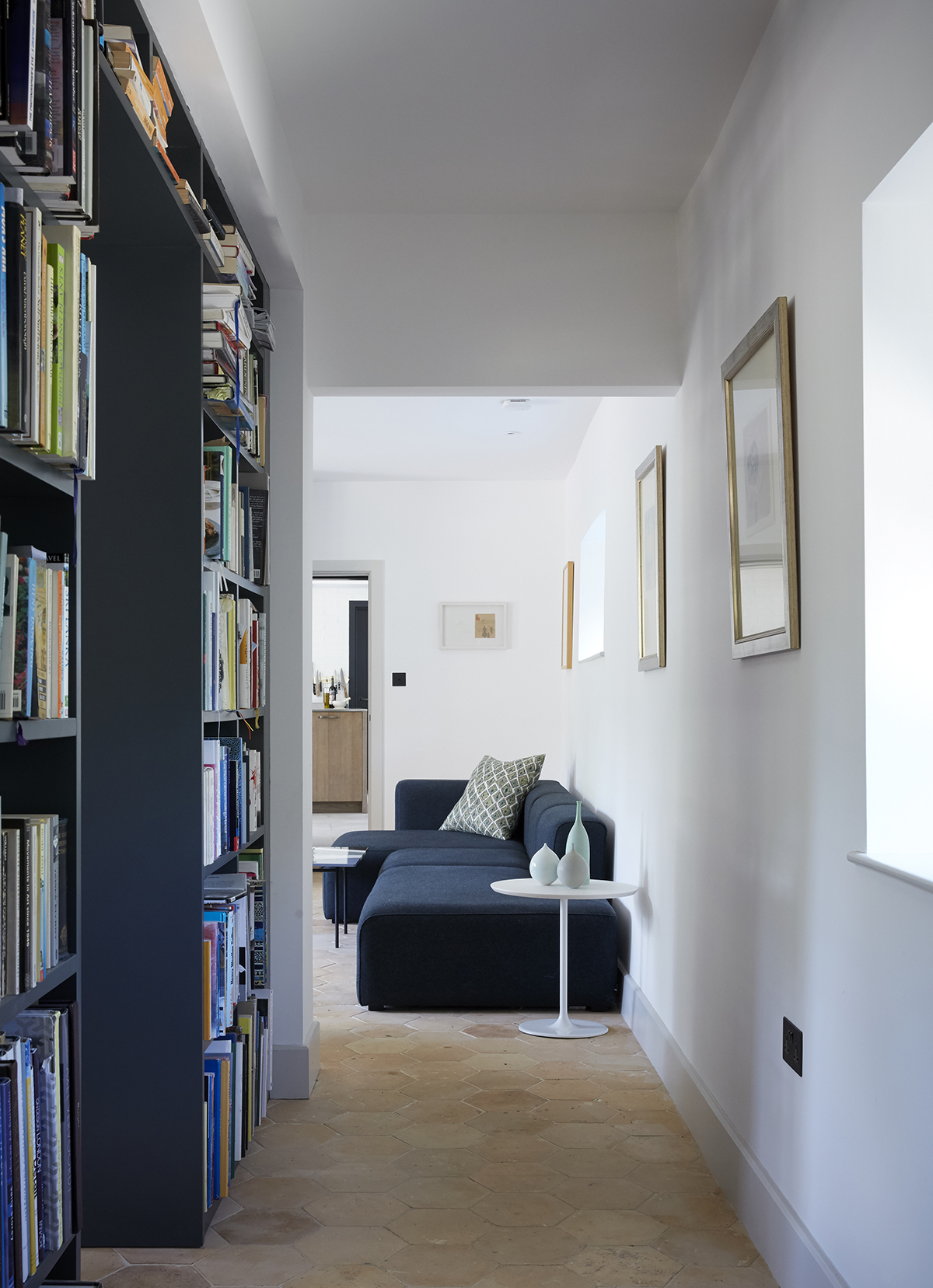
On the ground floor, this set of bookshelves help create a study space and add definition to a once open set of rooms which lead to the kitchen.
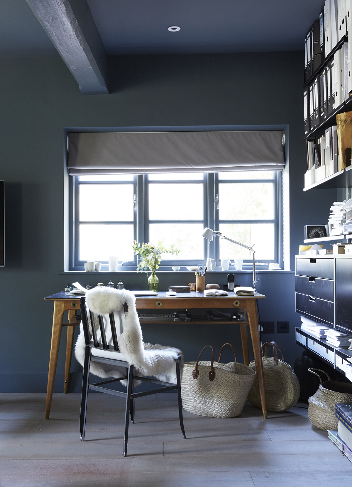
The office is tucked in to a corner of the sitting room where a former UN translator’s desk was chosen for practicality and historical appeal.
SNUG
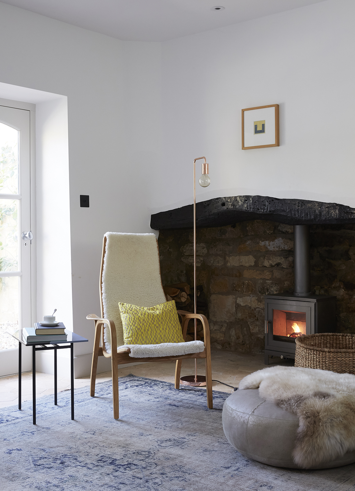
A new log burning stove and partition wall has helped to create a more cosy space.
CLOAKROOM
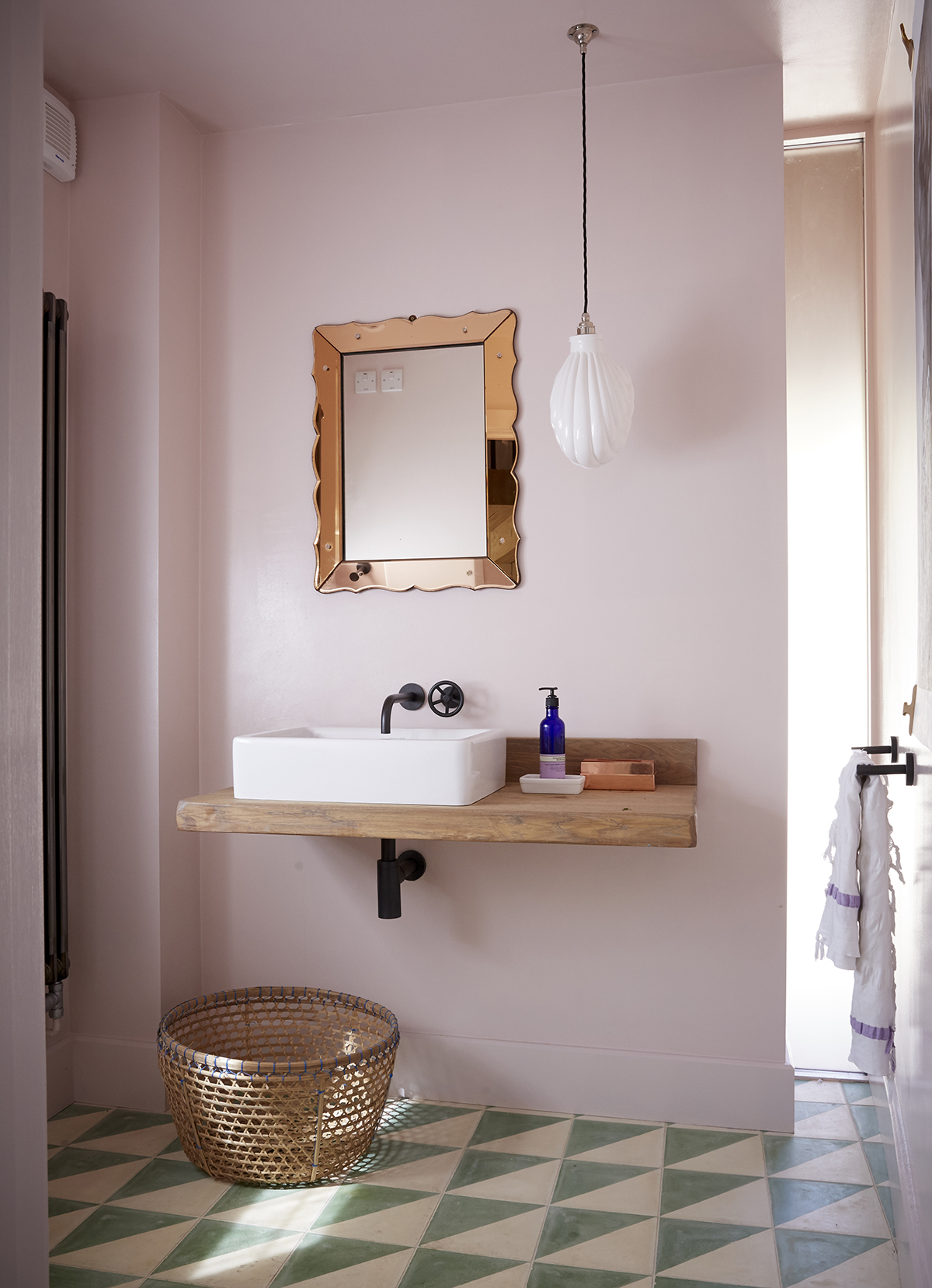
In the downstairs loo, gloss paint and rustic tiles evoke a Moroccan feel.
BEDROOM
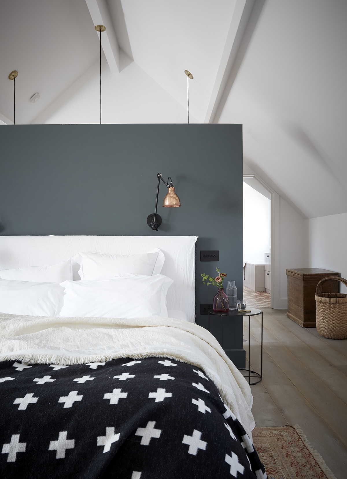
Upstairs, a once-cavernous master bedroom is re-defined with a half wall that screens a dressing room behind while opposite, new windows afford wide views of the quiet countryside.Tucked under the eaves of the house, Farrow & Ball's Wevet white provides just the right hint of pinky undertone for the walls.
BATHROOM
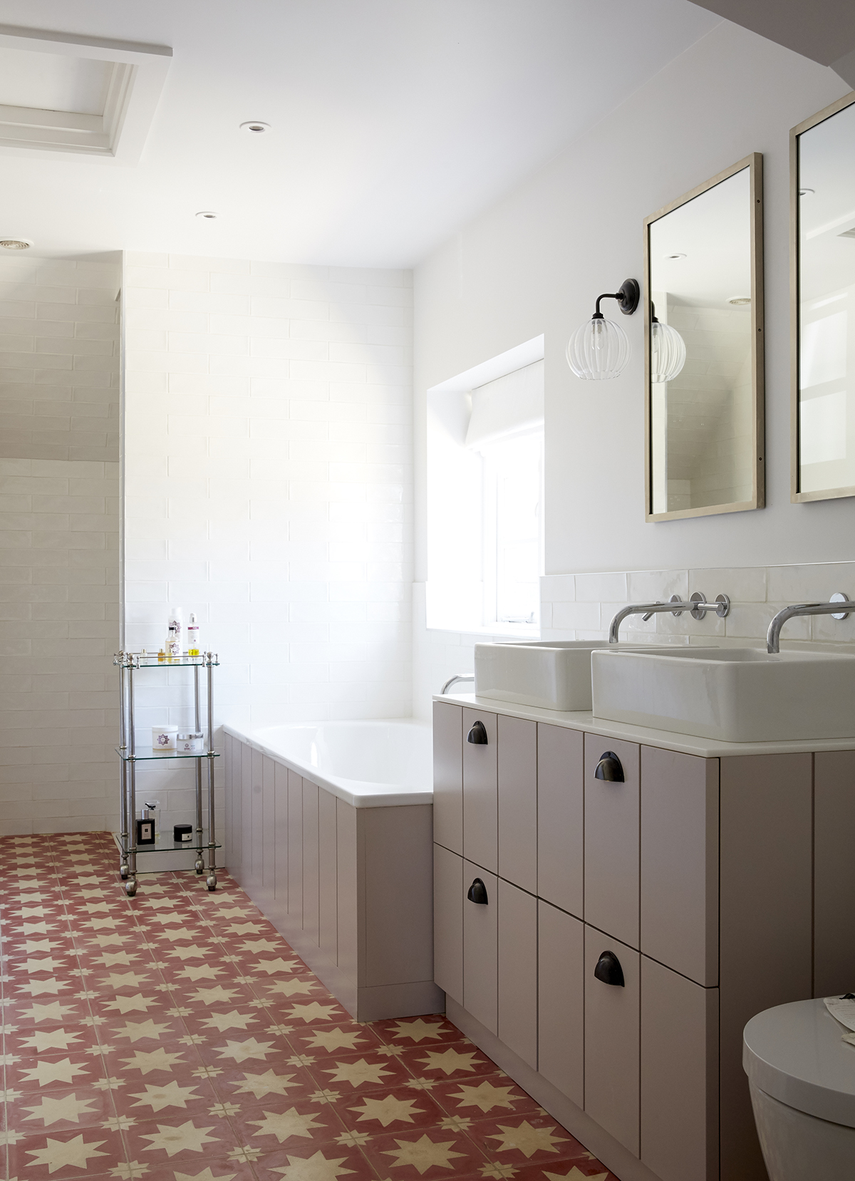
To offset the long, thin shape of the master bathroom, the layout is broken up with a bold mix of tiles and vertical joinery inspired by traditional tongue-and-groove.
Photography ⁄ Paul Massey
The homes media brand for early adopters, Livingetc shines a spotlight on the now and the next in design, obsessively covering interior trends, color advice, stylish homeware and modern homes. Celebrating the intersection between fashion and interiors. it's the brand that makes and breaks trends and it draws on its network on leading international luminaries to bring you the very best insight and ideas.