I Found the World's Best Ski Hotels for Interiors-Driven Travelers — And if You Find Them Breathtaking, It's Not Just the Altitude
Get ready for spring with our curated guide to the most sophisticated and ingeniously designed winter getaways from across the globe
- 1. Eriro. Ehrwald, AUT
- 2. the cōmodo. Bad Gastein, AUT
- 3. Caldera House. Jackson Hole, WY, US
- 4. Bluebird Cady Hill Lodge. Stowe, VT, US
- 5. Grand Hotel Belvedere, A Beaumier Hotel. Wengen, CH
- 6. Experimental Chalet Val D’Isere. Val-d'Isère, FR
- 7. Le 1550. Courchevel, FR
- 8. Holmen Lofoten. Sørvågen, NO
- 9. The Lindis. Ahuriri Valley, NZ
- 10. COMO Alpina Dolomites. Dolomites, IT

You know it's that time of the year when everything, from your daily commute and work life to unexpected rain showers, all of a sudden becomes a bit much. But if you think you are the only one left in despair by the lingering of winter, well, you are in the wrong. That's why I have spent hours researching the best ski hotels in the world for interior design-savvy getawayers — so that you could turn these last few weeks of cold weather into an opportunity to reconnect with the outdoors, blow off some steam, and, of course, soak in the surrounding views from their awe-inspiring rooms (or from their winding slopes, should you be a sporty reader).
What makes these specific stays the best design hotels for a snow-filled retreat? It's simple: not only does our edit of the best ski hotels in the world take into account the reviews and accolades these properties have garnered thanks to their hospitality services, but it even — and especially — values how these destinations incorporate the design of their premises into imaginatively crafted holiday accommodations that are as visibly spectacular as they are designed to respect, magnify, and contribute positively to the environment around them.
From the best ski hotels in the US and the chicest, design-forward chalets in Europe to futuristically envisioned winter retreats in New Zealand, get lost in our selection of the world's best ski hotels below.
1. Eriro. Ehrwald, AUT
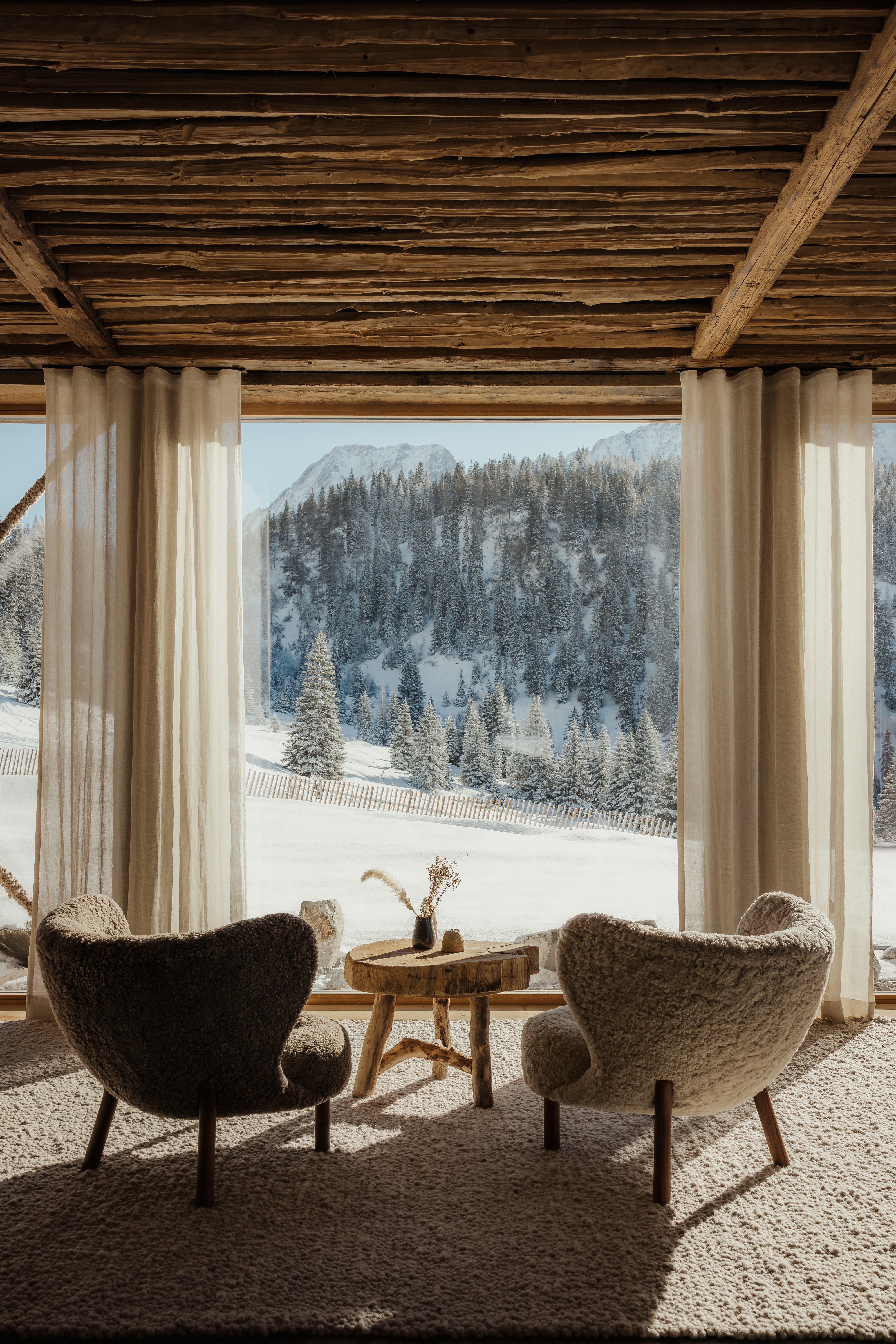
With only nine suites, Ehrwald's Eriro, which is exclusively reachable via cable car, makes the ultimate ski retreat for travelers searching for peace
Ehrwalder Alm 4, 6632 Ehrwald, Austria
In a world dominated by colossal hotel chains, Eriro, the ultimate boutique Alpine hideaway in the Alps, is, quite literally, a breath of fresh air, and one of the best ski hotels in Austria. Composed of nine suites only, each drenched in warm forest wood, stone, and ceramic contemporary furnishings, with sculptural shearling seating embodying its sophisticated vision of coziness, this unusual retreat makes for daydreaming.
Accessible exclusively via cable car, the hotel is nestled on Tyrol's Zugspitze peak, letting postcard views of the nearby mountains in through its floor-to-ceiling windows. The demonstration that Brutalist interiors can be both welcoming, dramatic, and inspiring, Eriro advocates for a return to simplicity in its stripped-back, carefully curated décor, where rustic touches and artful accessories unleash a sense of home. The same earthiness and devotion to the area's origins serve as the protagonists of the stay's restaurant, which reinvents seasonal Tyrolian delicacies, and the numerous slow living experiences bookable on site.
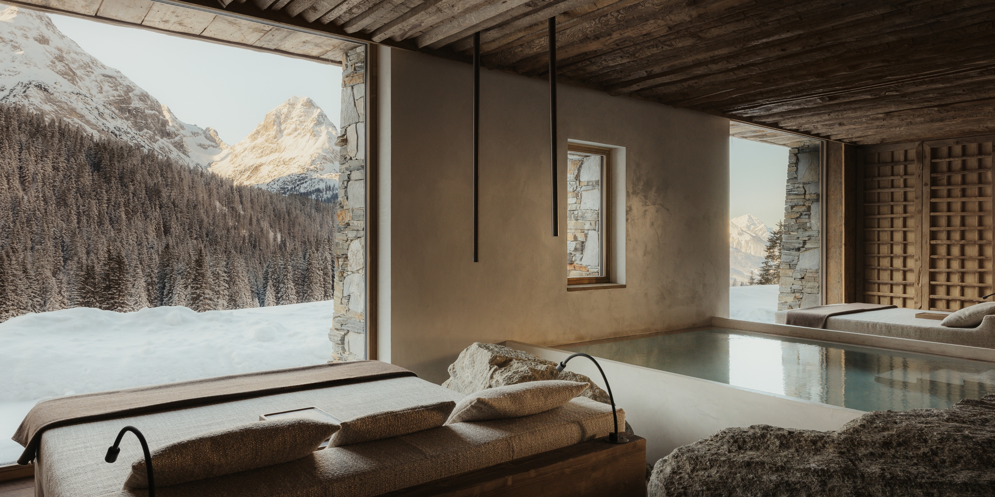
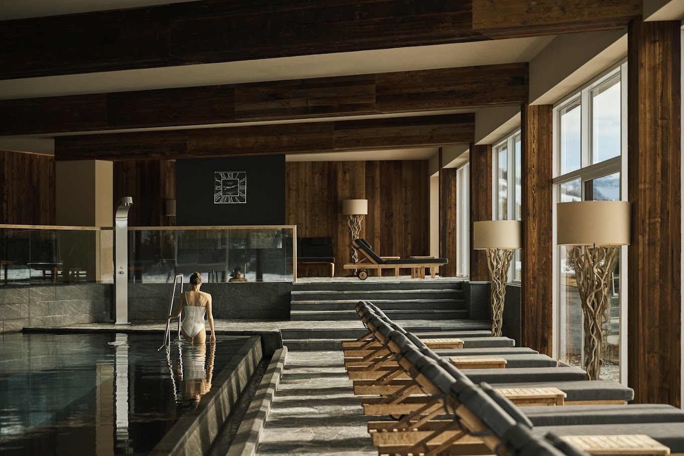
The cherry on top of the cake? Its herbalist and naturalist knowledge-inspired spa (captured in the header of this article), whose Asian influences and textural design put it in line for an entry in our edit of the world's best spas.
Be The First To Know
The Livingetc newsletters are your inside source for what’s shaping interiors now - and what’s next. Discover trend forecasts, smart style ideas, and curated shopping inspiration that brings design to life. Subscribe today and stay ahead of the curve.
2. the cōmodo. Bad Gastein, AUT
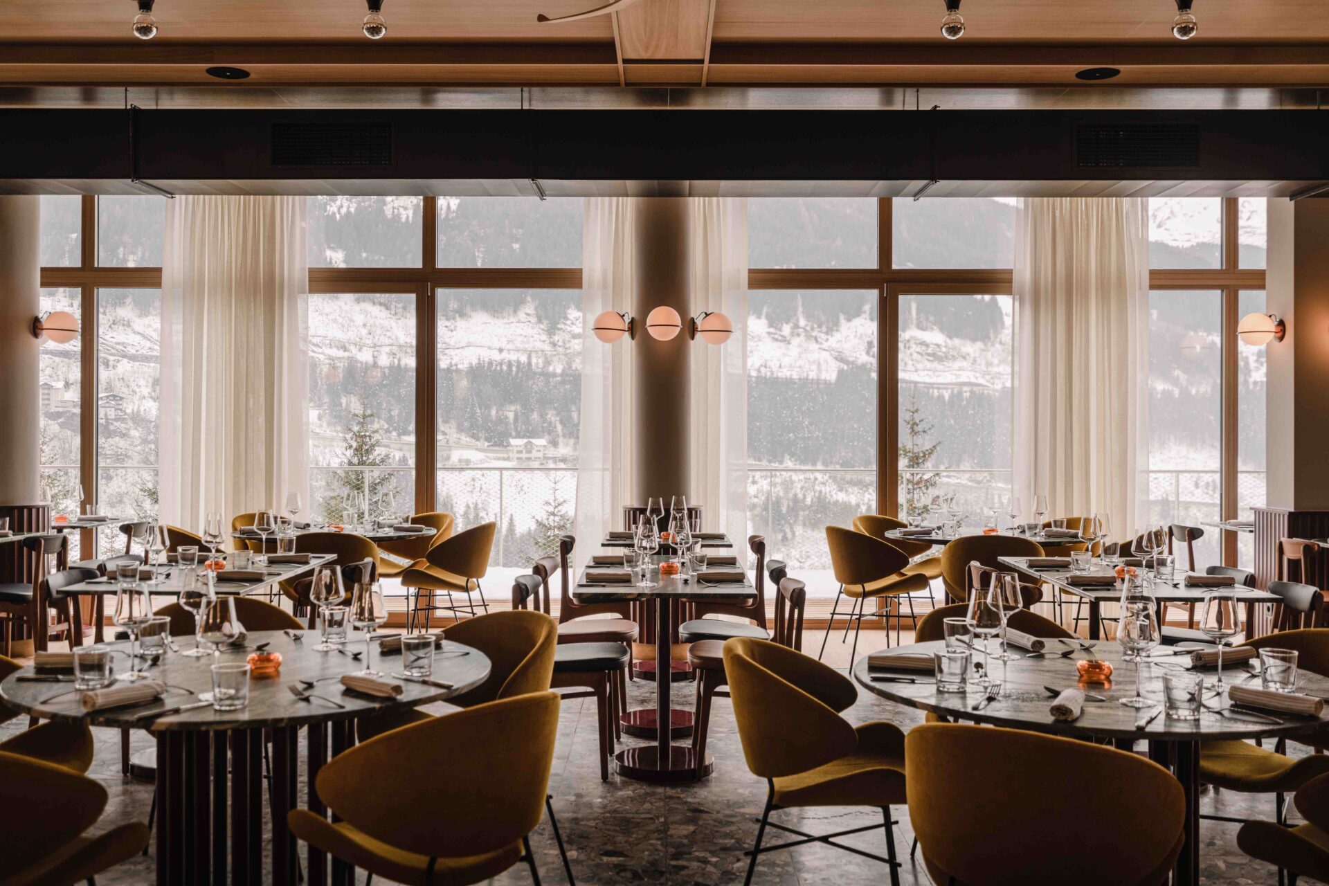
Enjoy the cōmodo's farm-to-table culinary offering and soak in the views of Austria's breathtaking nature at chef Max Jensen's panoramic restaurant.
Kaiserhofstraße 18, 5640 Bad Gastein, Austria
It took me no longer than two seconds to fall for the hip, playfully spirited ambiance of Bad Gastein's the cōmodo, another one of the best ski hotels in Austria for snow lovers in need of a design fix. The brainchild of weStudio's Barbara Elwardt and Piotr Wisniewski, this 70-room getaway prides itself on being "a celebration of art, wellness, and farm-to-table cuisine", and an embodiment of the electrifying essence of Bad Gastein itself, dubbed by many as "the next Berlin".
Housed within an 1881 building, the cōmodo breathes new life into its architecture thanks to its sleek 1960s mid-century modern furniture, refreshed original terrazzo floors, moody bordeaux and bottle-green color scheme, and uplifting Viennese café style references. Dotted with unique artworks and eccentric touches (the spherical Art Deco sconces? I am obsessed), it is as worth a visit for its lively interiors as it is a must for the snowy scenes that fill up its restaurant. Rooms are embellished with unique accent walls and custom-made wallpapers, while the thermal spa is wrapped in high-catching tile murals, stripy beach chairs, and pendant lighting. A joy to explore!
3. Caldera House. Jackson Hole, WY, US
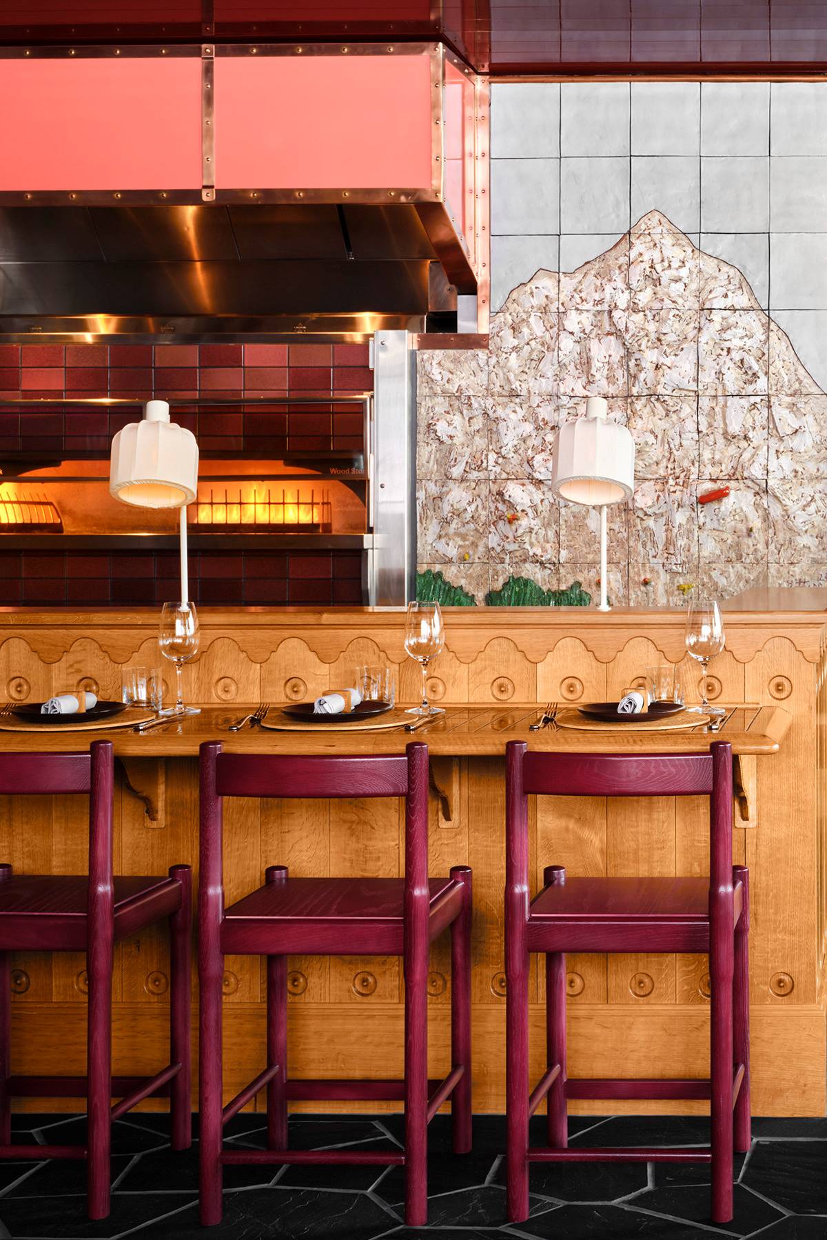
Caldera House's Italian-inspired restaurant, Corsa, puts a playfully eccentric spin on apres ski.
3275 Village Dr, Teton Village, WY 83025, United States
Those of you who have read my recent exploration of the ongoing vintage motels revival know how big of a fan I am of old-style Americana. The 8-suite Caldera House, with its layered, colorful interiors, isn't just one of the best ski hotels in the world (and one of the quirkiest ski hotels in the US), but also a prime example of how retro-fueled destinations can be design-forward, too.
Expanding across six different levels, this soulful Wyoming winter getaway comes courtesy of local studio CLB Architects, whose work on the project strives to "capture the energy of a bustling ski scene at the base of Jackson Hole Mountain Resort while simultaneously creating an oasis of privacy, quiet, and calm". Inspired by the golden age of American skiing, Caldera House combines locally sourced farmer stone with a variety of wood, including cedar, white oak, and walnut, anchoring the stay in its surroundings.
Inside though, it's a perfectly balanced mixture of Western, mid-century, and modern glamour décor to prevail, with leathery couches, cow print rugs, and velvet chairs blending seamlessly with choreographic pendant chandeliers, striking prints, and paneled walls throughout the space. My personal standout? The fanciful, mountain-inspired tiled mural of its Italian restaurant Corsa, alongside its geometrically cut wooden furniture, mesmerizing floors, and mosaic-like walls.
Book your stay at Caldera House.
4. Bluebird Cady Hill Lodge. Stowe, VT, US
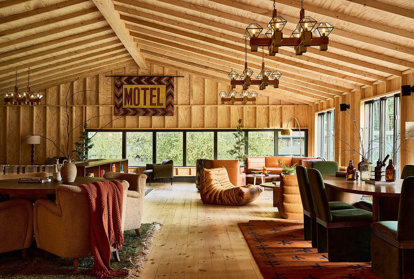
A quintessentially American stay, the Bluebird Cady Hill Lodge blends the laidback comfort of traditional motels with elevated, spirited mid-century interiors.
511 Mountain Rd, Stowe, VT 05672, United States
Not just another recently revamped American vintage motel, the Bluebird Cady Hill Lodge is also one of the best ski hotels for globetrotters with a soft spot for mid-century modern style.
Nestled on the slopes of Mount Mansfield, Vermont's highest mountain, in one of America's best ski resorts, Stowe, it allows vacationers to make the most of the winter months immersed in a one-of-a-kind atmosphere. Compared to other accommodations part of this edit of the best ski hotels in the world, the Bluebird Cady Hill Lodge, with its wood-paneled walls, checkered bedding, and New England style décor, is perhaps closer to your stereotypical idea of a "mountain retreat".
Still, Elder & Ash's recent refurbishing of the property has left plenty of space for authenticity. This is clear in its Tall Timbers Cottage, where hypnotic wallpapers and upholstery and brass accents add an unexpected touch to Cape Code aesthetic, as well as in its communal areas, where modern rustic, modernist, and contemporary influences collide.
Book your stay at Bluebird Cady Hill Lodge.
5. Grand Hotel Belvedere, A Beaumier Hotel. Wengen, CH

At Grand Hotel Belvedere, A Beaumier Hotel's restaurant Waldrand, Asian, Scandinavian, and modernist influences collide in an earthy, cozy environment
Im Gruebi 1440, 3823 Wengen BE, Switzerland
Freshly inaugurated last December, Grand Hotel Belvedere, A Beaumier Hotel has already earned itself a spot on our curated selection of the best ski hotels in the world. How can that be? Blame its whimsically beautiful, intricate interiors.
Located within the Bernese Highlands in Wengen, within close proximity of some of the best ski resorts in Switzerland, thanks to its Wes Anderson-esque, pastel-shaded Art Nouveau architecture, the stay is as magical from the outside as it is inside. Extending across two interconnected buildings, this instantly iconic destination was envisioned by local studio Complete Works, whose time-traveling, daring approach to design and architecture can be felt throughout. Here, communal areas are enriched with pastel-colored textiles in mismatched prints, upholstered seating arranged to facilitate social interaction, painted mural details, and carved wood columns that feel themselves like works of art.
Available at the property are 90 spirited rooms and suites, two restaurants adding new flair to traditional Swiss cuisine, and a soon-to-be-launched, brutalist-style spa powered by beauty trailblazer Susanne Kaufmann. A treat for all senses.
Book your stay at Grand Hotel Belvedere, A Beaumier Hotel.
6. Experimental Chalet Val d'Isère. Val-d'Isère, FR
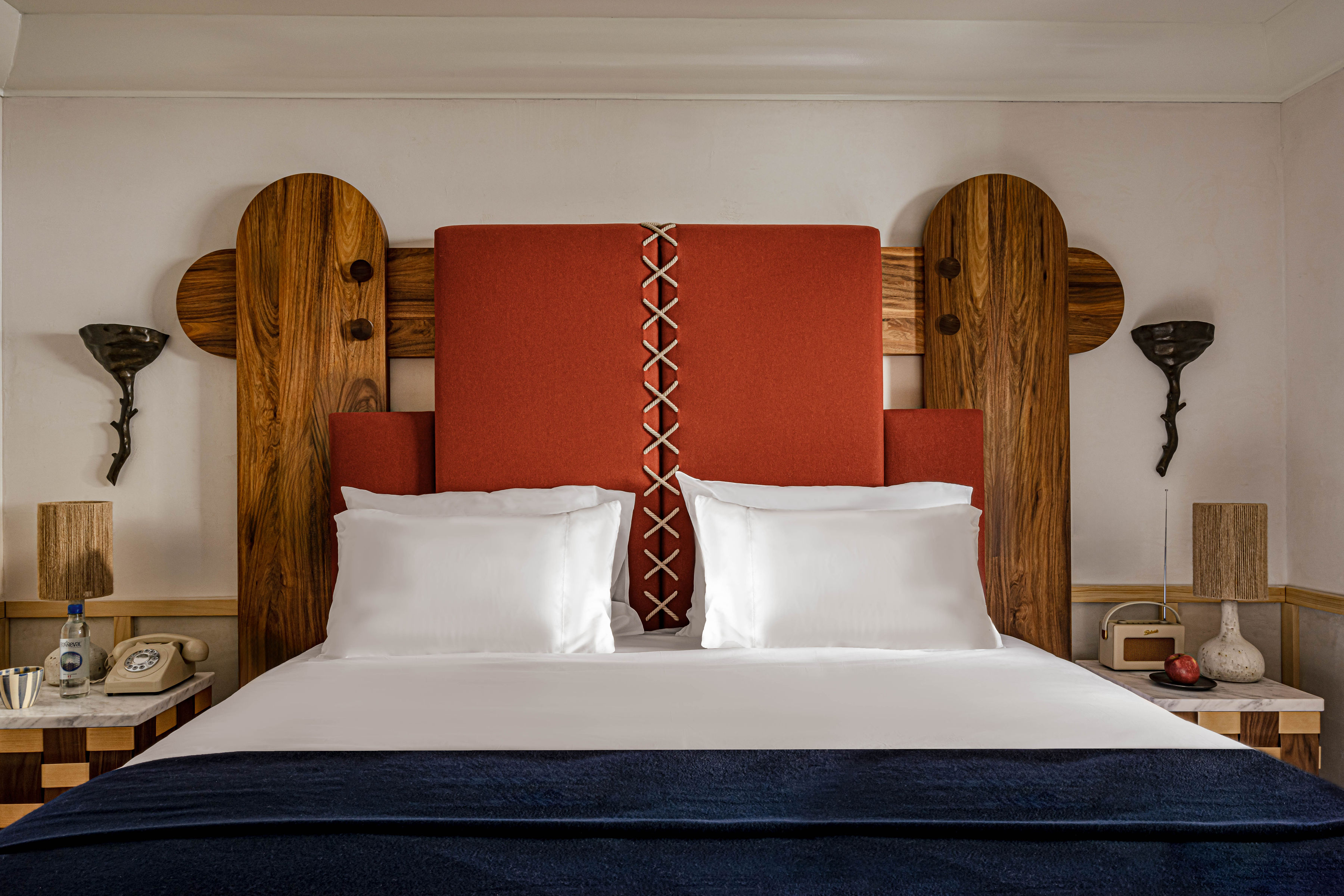
Traditional mountain décor gets a makeover at Experimental Chalet Val d'Isère, where Dorothée Meilichzon's playful, genre-bending eye brings it into the present
101 Rue de la Poste, 73150 Val-d'Isère, France
If the Hedkandi music label (remember them?) did hospitality, it would be the Experimental Group. And now, with Experimental Chalet Val D’Isere, they hit the slopes. Launched at the end of 2024, this playful new hotel is the ski style reinvented — a nod to the coziness of the Alps but with flame red carpets, graphic prints, marble tops, and woven leather chairs.
Put simply, it's as cool as you'd expect for a brand that started out with a cocktail bar hidden in London's Soho, branched out to a beach club in Ibiza and now finds itself here. The hotel is a ski-in/ski-out, meaning you can be on the 300km slopes in less time than it takes to buckle your boots and clip on your lift pass.
Plus, Val d'Isère is on a glacier, which guarantees good snow, even in summer. Of course, there is a spa and a pool almost rivaling the slopes in length, but the hotel will also sort out any activity for you: ice climbing, dog sledding, even paragliding. And all in a day's work.
Book your stay at Experimental Chalet Val D’Isere.
7. Le 1550. Courchevel, FR
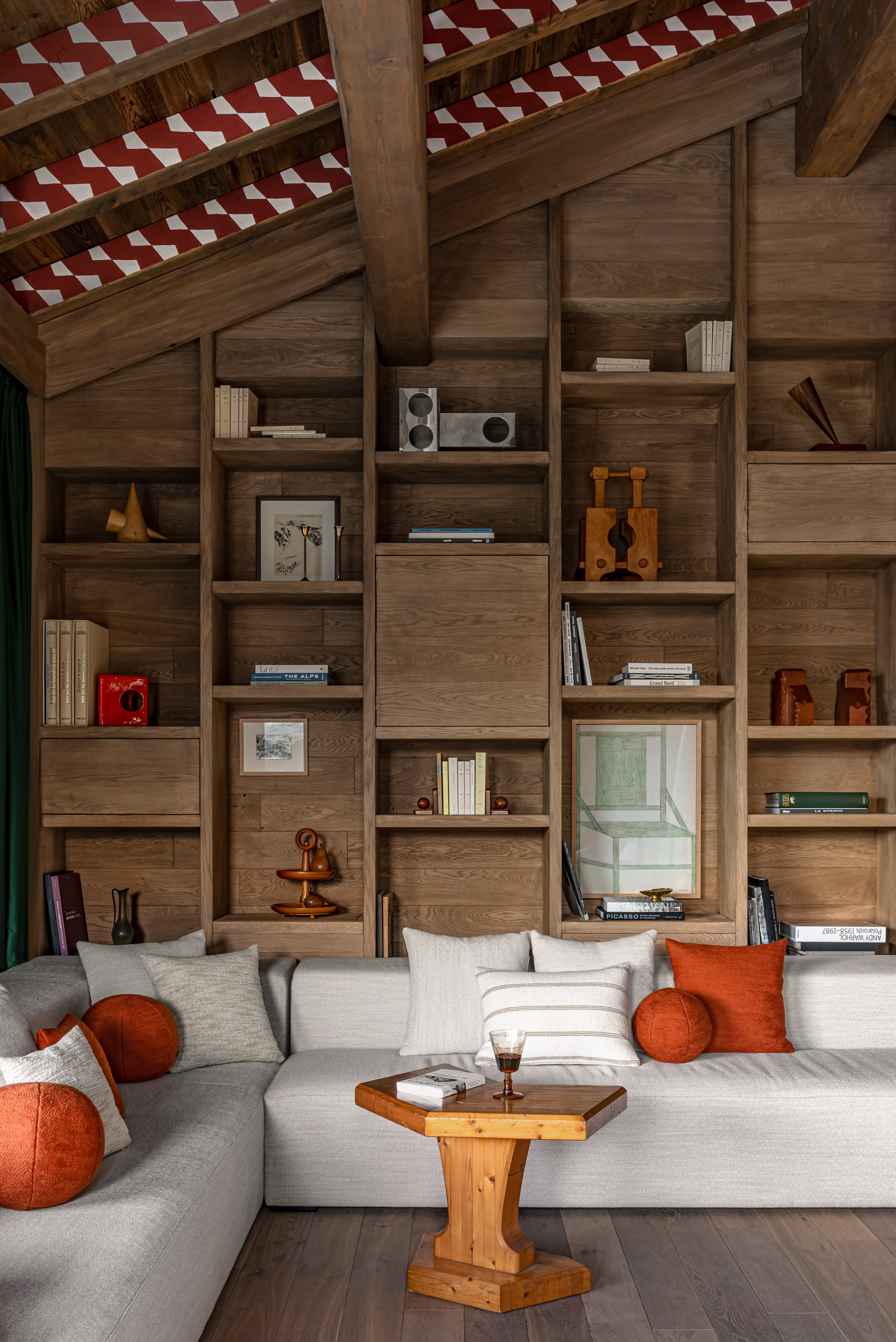
A trove of curiosities and unique collectibles, Le 1550 shies away from traditional hotel's 'cookie-cutter' approach to embrace eclecticism
450 Rte des Brigues, 73120 Courchevel, France
Compared to other holiday stays, mountain retreats are known for honing in on that 'home-away-from-home' feel, but no destination channels the vibrancy and liveliness of contemporary domestic spaces quite like Courchevel's Le 1550. And if you think that makes it ordinary, just wait and see.
Nestled in the tranquil Les Brigues district, this luxurious getaway boasts equal amounts of design inspiration, history, and alpine aesthetics. Designed by Atelier Giffon and interior curator Josephine Fossey, Le 1550 transforms the building's traditional Savoyard architecture into a wunderkammer, shaped by contrasting wood, stone, and glass surfaces and adorned with just as many print, art, and homeware collectibles.
Conceived to heighten a desire for adventure and exploration, the eight-suite Le 1550 invites guests to embark on a multisensory journey unfolding across its scenic indoor swimming pool, outdoor cedarwood hot tub, and treatment rooms, as well as catering for the youngest ones with its on-site cinema and children's playroom. Part of Thibaud Elzière and Robin Michel's Iconic House portfolio, a collection of luxury rentals rooted in a love of art and modernist interiors, the stay makes the ideal nest for culture addicts keen to savor the expansive Les Trois Vallées ski area, with access to ski lifts only 100 meters away.
8. Holmen Lofoten. Sørvågen, NO
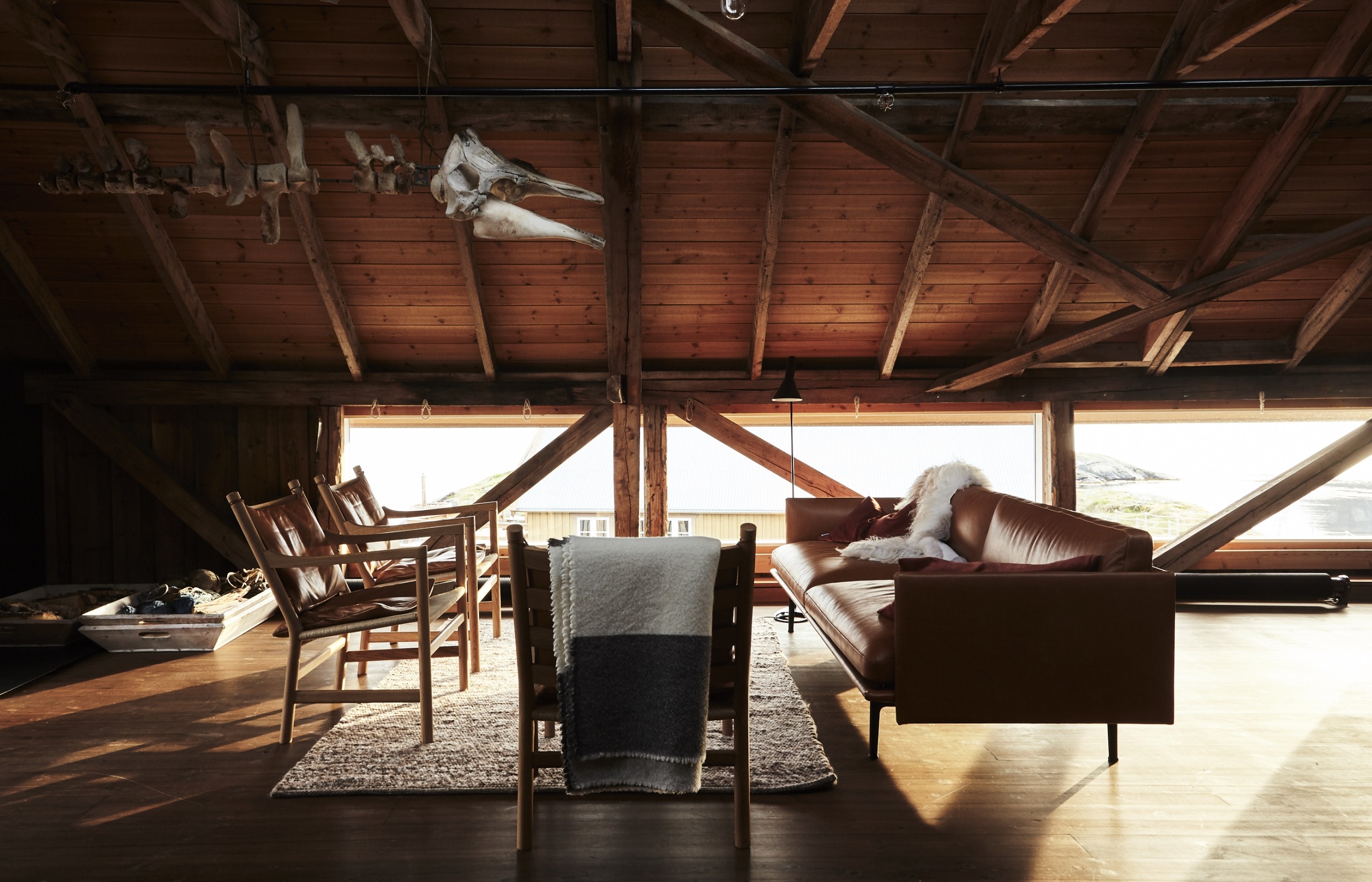
The brainchild of Ingunn Rasmussen, a fisherman's daughter, Holmen Lofoten reflects her connection to Norway's land and sea through its vibrant Western décor
Flathaugen 36, 8392 Sørvågen, Norway
There is something about family-run hotels that makes them immediately distinct, and Holmen Lofoten is no exception. Set up by Ingunn Rasmussen, the daughter of a fisherman, in what was once a small fishing factory complete with cabins, it is a stay steeped in local history.
Having previously accommodated several generations of fishermen, including her father, the building had fallen into decay until Rasmussen bought it to transform it into a holiday destination in 2001. Situated at the outermost edge of the Lofoten Islands, it is a space in eternal transition, as also reflected by its eclectic interiors, which blend Scandinavian design with more traditional or Western influences — and statuesque hints at the local sealife (see picture above for reference).
With 11 rooms and suites in total, each named after the fisherman who used them, it grants visitors the opportunity to discover the islands in a truly unexpected way, becoming one with their community. Head to the waves-facing restaurant to get a taste of their cuisine, or choose one of the numerous activities offered on-site to make your winter getaway into an adventure.
Book your stay at Holmen Lofoten.
9. The Lindis. Ahuriri Valley, NZ

The Lindis might look like a minimalist idyll, but a closer look will reveal the hotel is a functional reinterpretation of the surrounding glacial landscape, its dramatic lines, and hues
1490 Birchwood Road, Ahuriri Valley 9412, New Zealand
Some ski hotels catch your eye because, simply, they don't look quite like anything you have ever seen before; that's what attracted me to the Lindis. Situated in New Zealand's spellbinding Ahuriri Valley, the stay's undulating pavilion, designed as the rest of the destination by Christopher Kelly, mimics the lines of the powerful natural wonders that serve as its backdrop. Bringing them in through the use of organic materials such as spotted gumwood and bluestone, as well as via its purposefully large windows, among the properties included in this list of the best ski hotels in the world, the Lindis must be the most sensational one; and not just for design and architecture aficionados, but also for lovers of the great outdoors.
Ranging from Western decor master and lodge suites complete with sweeping views of the valley to cinematic, three mirrored glass-walled pods tucked away in nature, accommodation at this New Zealand retreat is as immersive as it can get. Locally sourced food, including seasonal ingredients harvested from the lodge's own garden, complements the sojourn alongside a refined wine selection, while a variety of activities — from horseback riding and cycling to stargazing — can be booked at the concierge.
Wary of the impact the hotel can have on the Ahuriri Valley? So are its owners, which is why the lodge is powered by solar and geothermal energy, collecting rainwater and utilizing eco-friendly products to minimize harm and waste.
10. COMO Alpina Dolomites. Dolomites, IT
A design masterpiece, COMO Alpina Dolomites surprises visitors with its wood-drenched, soothing interiors — an unexpected find given its theatrical brutalist façade
Compatsch, 62/3, 39040 Alpe di Siusi BZ, Italy
A masterpiece signed by Bozen-based studio De Biasi & Comploi, from the outside, Seiser Alm's COMO Alpina Dolomites looks like a utopian, brutalist architecture exercise. Sculpted from quartzite and wood in a nod to the area's mineral-rich land, its concentric, indented exterior beautifully conceals the much softer ambiance that awaits guests inside.
Bathing in natural light and built with sustainable materials from the region, the hotel provides an elevated, chic base to explore what Val Gardena, one of the best ski resorts in Italy, has to offer, including its revitalizing après ski leisure.
Housing 60 rooms and suites either reminiscent of the simple, neutral elegance of Japanese style décor or double-drenched in electric red and blue tones, COMO Alpina Dolomites takes quiet luxury to new heights (check out the COMO Suite's reclining bathroom beds in leather and panoramic bathtub to get the full picture). With three restaurants and a stunningly designed spa available on site, it will be hard to find any reasons to step outside.
Book your stay at COMO Alpina Dolomites.
How Did We Pick the Best Ski Hotels in the World?
Every avid Livingetc reader will know the drill at this point: no travel destination is ever complete — or worth exploring — for us unless it brings authentic, contemporary interior design innovation. And that's why, in order to compile this roundup of the best ski hotels in the world, I didn't only look for mountain holiday properties whose services had been awarded accolades by trusted hospitality organizations, as well as being praised by fellow travel publications and individual customers alike, but also paid special attention to the way in which these accommodations celebrated their surroundings in their décor.
The final selection presented in this article thus includes stays that, in my opinion, are the best ski hotels in the world for globetrotters who aren't just after a place to stay, but seek a getaway whose responsibly crafted interiors successfully amplify — and blend with — the beauty of the nature around them. Needless to say, their overall guest experience won't disappoint. Still, if it is more than crackling fireplaces, snow, and ski lifts that you want from your winter break, you have landed in the right place.
We hope this curated deep dive into the best ski hotels in the world, bringing you nothing but the most aesthetic refuges from which to enjoy your time on the slopes, has given you enough options to choose from for your winter getaway. Once your holiday is confirmed, don't forget to browse our must-have travel essentials, which include packing advice on maximizing storage when heading to a cold mountain location. Still stuck for inspiration? See what our community of designers simply can't leave without when booking a vacation, whether off to balmy destinations, global art capitals, or chic winter breaks.

Gilda Bruno is Livingetc's Lifestyle Editor. Before joining the team, she worked as an Editorial Assistant on the print edition of AnOther Magazine and as a freelance Sub-Editor on the Life & Arts desk of the Financial Times. Between 2020 and today, Gilda's arts and culture writing has appeared in a number of books and publications including Apartamento’s Liguria: Recipes & Wanderings Along the Italian Riviera, Sam Wright’s debut monograph The City of the Sun, The British Journal of Photography, DAZED, Document Journal, Elephant, The Face, Family Style, Foam, Il Giornale dell’Arte, HUCK, Hunger, i-D, PAPER, Re-Edition, VICE, Vogue Italia, and WePresent.
-
 These Are the Flower Crowns I’m Wearing This Spring (Spoiler: They’re Actually for My Door)
Coachella confirmed the comeback of flower crowns. At home, they just go by another name: the spring wreath
By Julia Demer
-
 Bunny Ears, Be Gone — 7 Easter Table Styling Mistakes That Will Take Your Setting from Tawdry to Tasteful
From fussy floral displays that disrupt conversation to over-relying on tacky tropes, don't fall victim to these errors when decorating your Easter table
By Lilith Hudson
-
 10 Arrestingly Beautiful Milan Restaurants Locals *Actually* Dine at — Selected for Their Interiors
Brought to you by our community of culture insiders, this edit of the best restaurants in Milan sees authentic Italian food and immersive design unite
By Gilda Bruno
-
 Hidden Trails — TikTok's Favorite Interior Designer, Bilal Rehman, on Houston, the City That Made Him
The Texan design phenomenon shares the places that inspire him most around his home
By Gilda Bruno
-
 I Picked the Best Milan Hotels for Design-Addicted Travelers — And Their Retro-Futuristic Interiors Are a Masterclass in Timeless Sophistication
Our Italian Lifestyle Editor rounds up the best boutique hotels in Milan for travelers who want to get a slice of its covetable, timeless flair
By Gilda Bruno
-
 Can't Leave Without — Packing for Milan Design Week 2025 With Articolo Studios' Creative Director Nicci Kavals
As the Melbourne-based lighting and furniture studio returns to Salone del Mobile's Euroluce fair, its founder picks her ultimate travel must-haves
By Gilda Bruno
-
 Lita Marylebone Review — Mediterranean Radiance Gets a Tantalizing, Animated West End Makeover
Inspired by Southern Europe's traditional chateaux, the Michelin-starred London restaurant puts conviviality front and center through shareable plates and a dynamic, open-plan setting
By Gilda Bruno
-
 Plates London Review — Nature-Inspired, Earthy Dishes and Interiors Put "Warmth" Back Into Michelin-Star Fine Dining
The first-ever vegan restaurant to win the prestigious accolade in the UK, this intimate eatery wows with its menu, and its design
By Gilda Bruno
-
 5 Day Trips From London for an Art and Design-Filled Break From the City — Thanks to a Painstaking Holiday Planner
Celebrate the return of spring with our Lifestyle Editor's curated itineraries to five inspiring destinations to explore 'out of town'
By Gilda Bruno
-
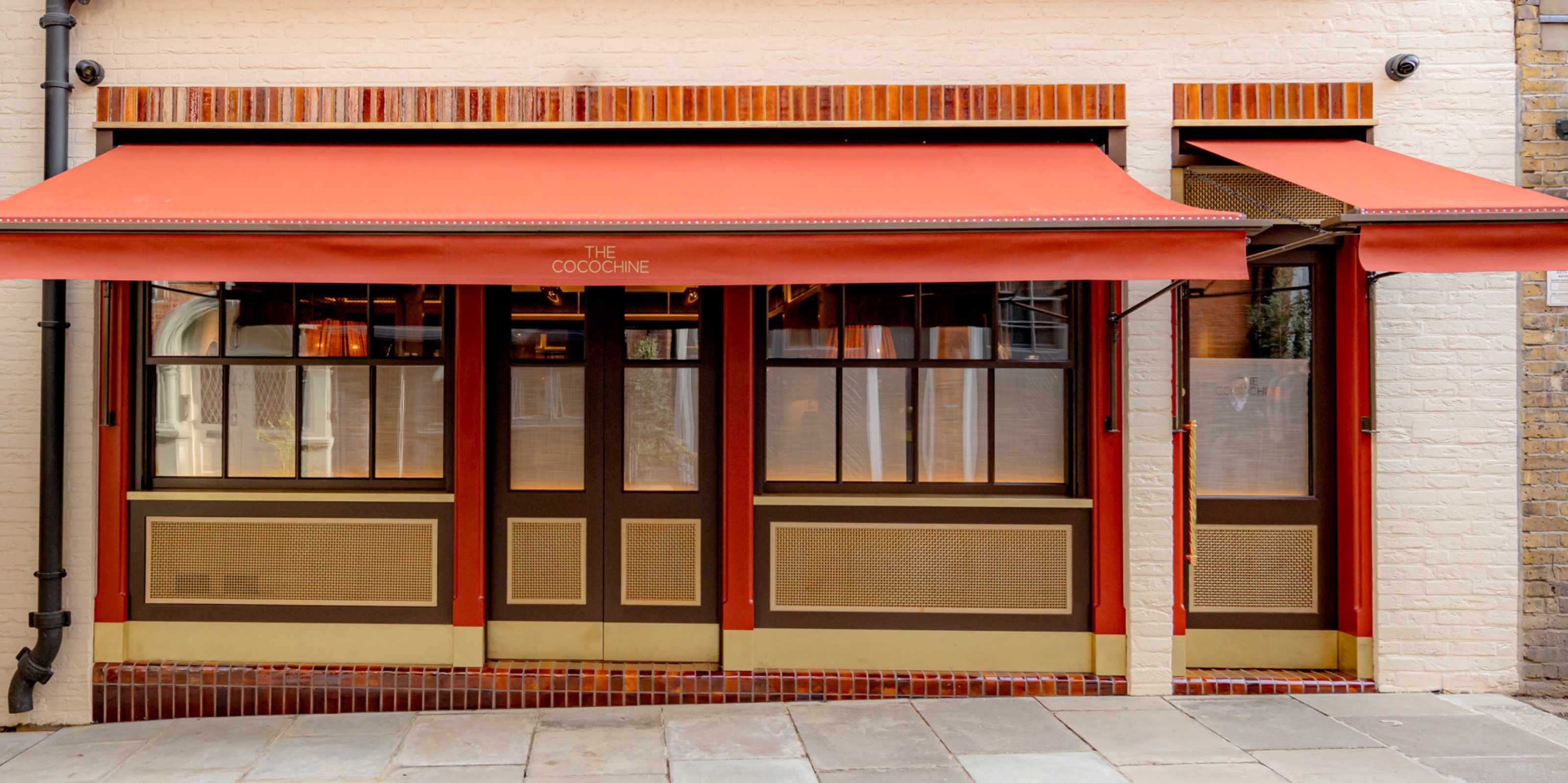 Is Mayfair's The Cocochine the Inspired Restaurant Missing From Your Hotlist?
The brainchild of Hamiltons Gallery owner Tim Jefferies and chef Larry Jayasekara, this hidden-in-plain-sight dining spot elevates gastronomy to an art form — with a little help from its star-studded collection
By Gilda Bruno