The Livingetc newsletters are your inside source for what’s shaping interiors now - and what’s next. Discover trend forecasts, smart style ideas, and curated shopping inspiration that brings design to life. Subscribe today and stay ahead of the curve.
You are now subscribed
Your newsletter sign-up was successful
THE PROPERTY
A terraced house in north London, built in 2012. On the ground floor is a hallway, WC and living-dining area. The kitchen is a few steps below, with a mezzanine TV room above. The first floor houses a guest en-suite bedroom, second guest bedroom, bathroom and office, while the main bedroom and en-suite are on the second floor.
LIVING SPACE
It’s hard to imagine this cosy jewel of a home, which is now filled with warmth and colour, ever being boring, but it was a very different story when it was bought back in 2013. It had the minimal, pure aesthetic of a new build, but for all its contemporary freshness, the house was too open plan to be practical. The dimensions were great, but the reality was just lots of white walls, no storage or shelves and it was lacking in character.
Article continues belowThat is, until interior and architectural designer Daniel Hopwood came on board, and set about coming up with fresh ideas and concepts. His brief was to introducecharacter into a house that was essentially a series of boxy rooms. The main goal was to create a scheme that combined both form and function with edge and personality.
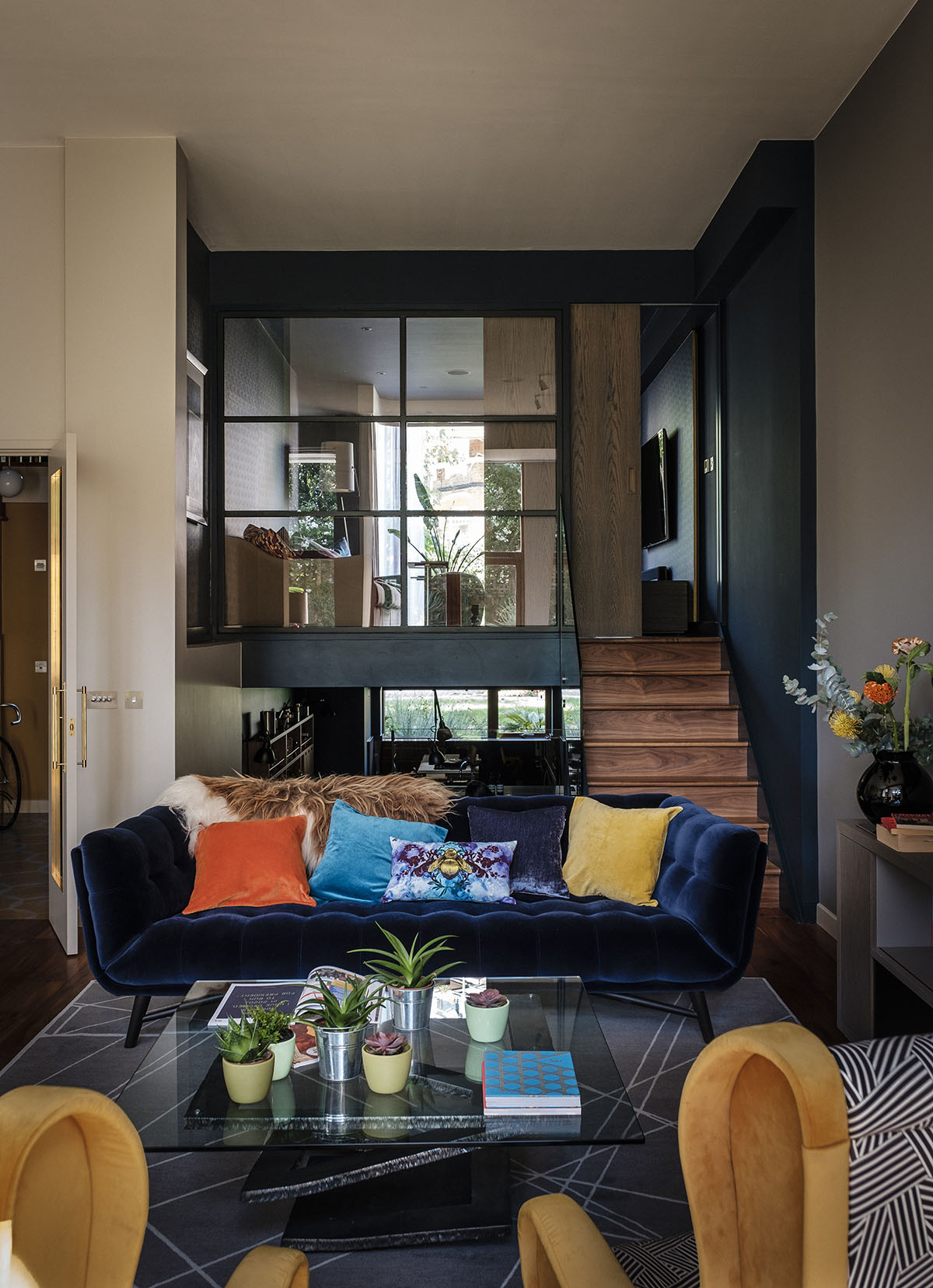
Now, well-planned zoning gives what once was an open-plan house a more generous sense of space, and areas with individual personality.
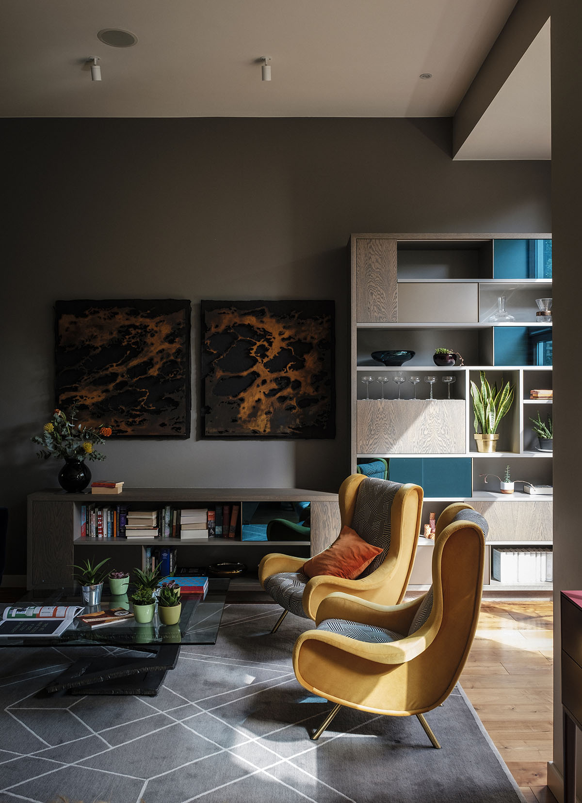
The artwork is by Bob Takes, an artist in Belgium who specialises in steel sculptures.He took a picture of the sea at N13° W80° – a co-ordinate in the Caribbean Sea – and then rendered it in steel. When the light reflects off it at night, it glows and almost looks like it’s on fire.The chairs were picked up in an antiques shop in France and revived by Daniel.
DINING SPACE
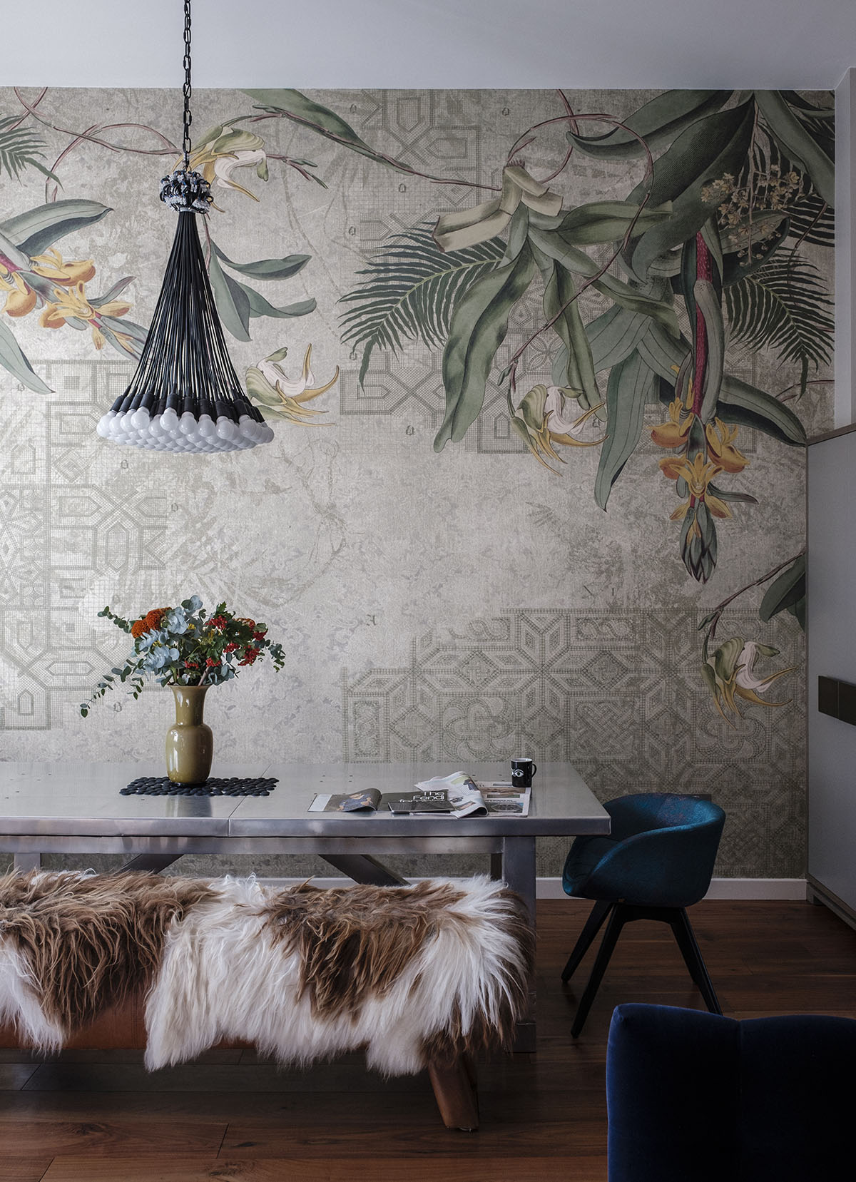
A short flight of steps links the kitchen to the living-dining room and the show-stopping feature in here is a floor-to-ceiling mural from Tres Tintas (pictured top).The brave, show-stopping mural dramatically spans the dining room wall from top to toe, and arrived as five huge panels.
The Livingetc newsletters are your inside source for what’s shaping interiors now - and what’s next. Discover trend forecasts, smart style ideas, and curated shopping inspiration that brings design to life. Subscribe today and stay ahead of the curve.
KITCHEN
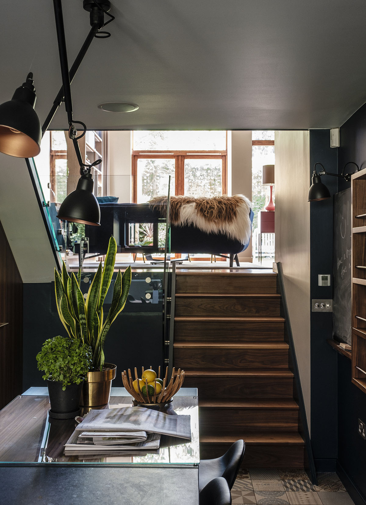
One of Daniel's first suggestions was painting the kitchen dark blue – something which might strike people as a mad idea, as it was a small, poorly-lit area. But Daniel's theory was to“embrace the natural ambience of the space”. Of course, he was right – the midnight blue, coupled with dark bespoke walnut storage and a beautiful-patterned tiled floor makes the space inviting and atmospheric.
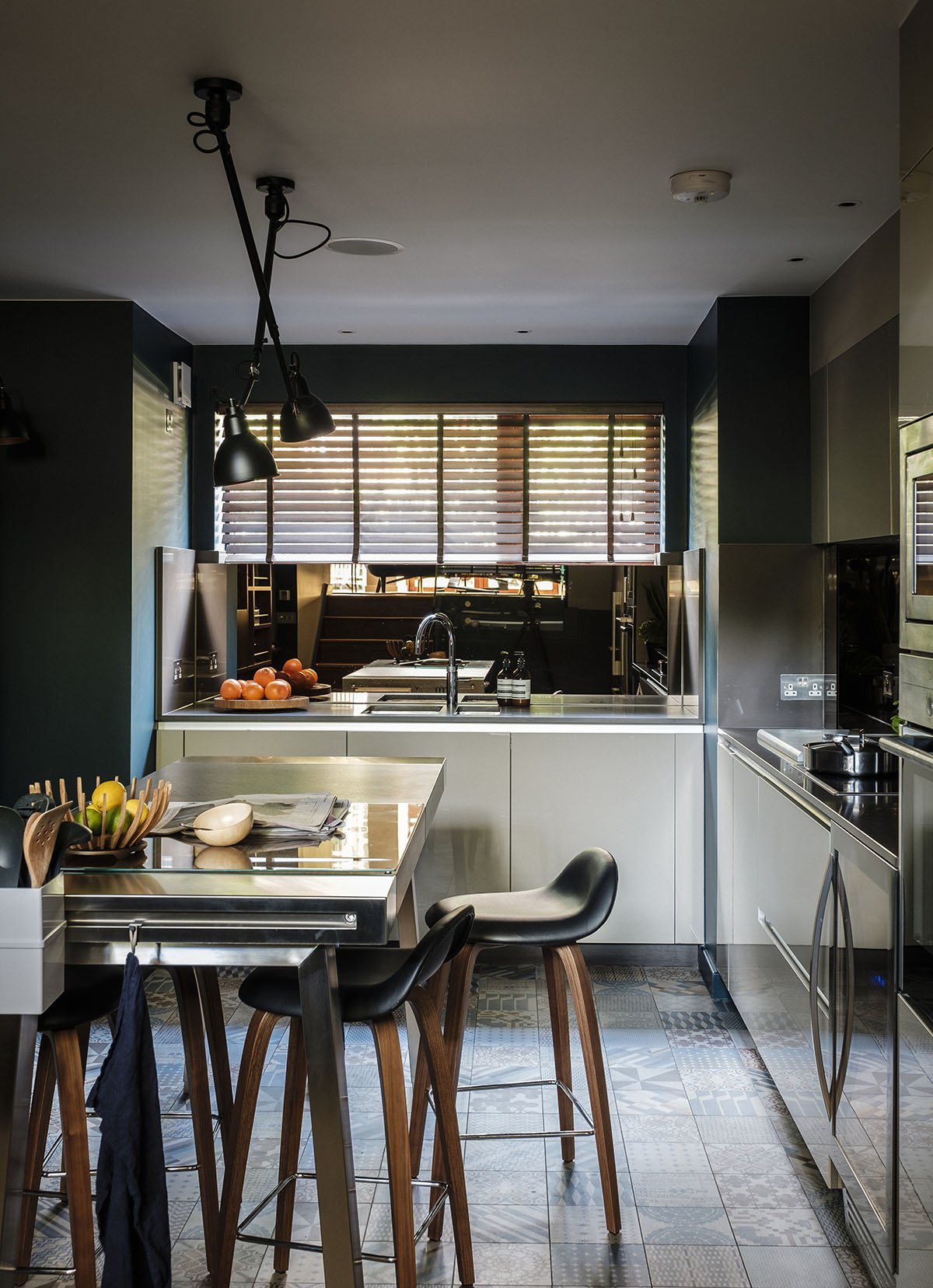
The dark and moody kitchen is full of character thanks to its deep-hued walls, talking-point floor tiles and edgy furniture. It’s as far from ‘developer kitchen’ as you can get.
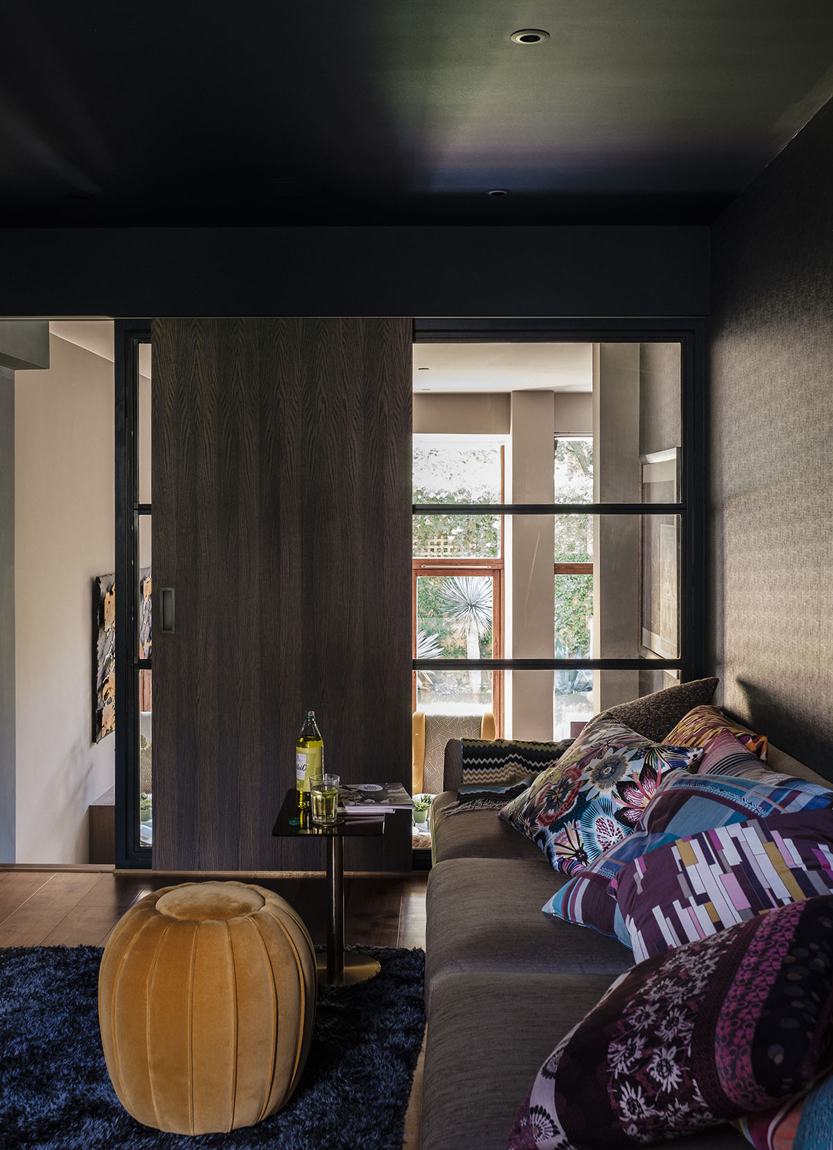
TV ROOM
The TV room was originally a mezzanine overlooking the living room. Daniel closed it off with a grey-stained oak sliding door and interior window, creating a cosy, sound-proofed den.
STAIRWELL
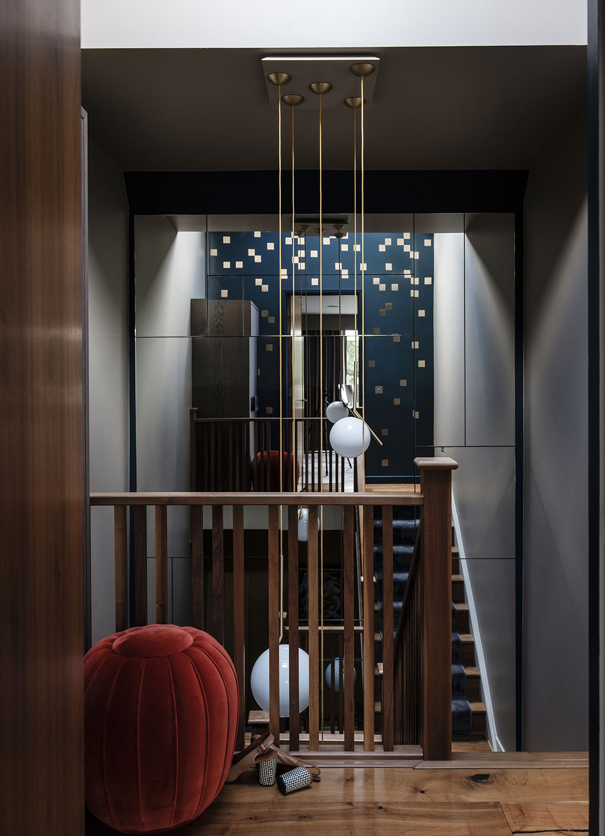
As elsewhere in this house, the upstairs doesn’t squander its tall, skinny footprint. The bedrooms and bathrooms are kitted out in luxe fabric-covered walls, marble finishes and cool artwork. They orbit a staircase that spans four floors and is lit by a chandelier of multiple opaque globes.
The staircase spans four floors and one entire wall, from the bottomto the top of the house, is clad in mirrored tiles for a striking effect.
MASTER BEDROOM
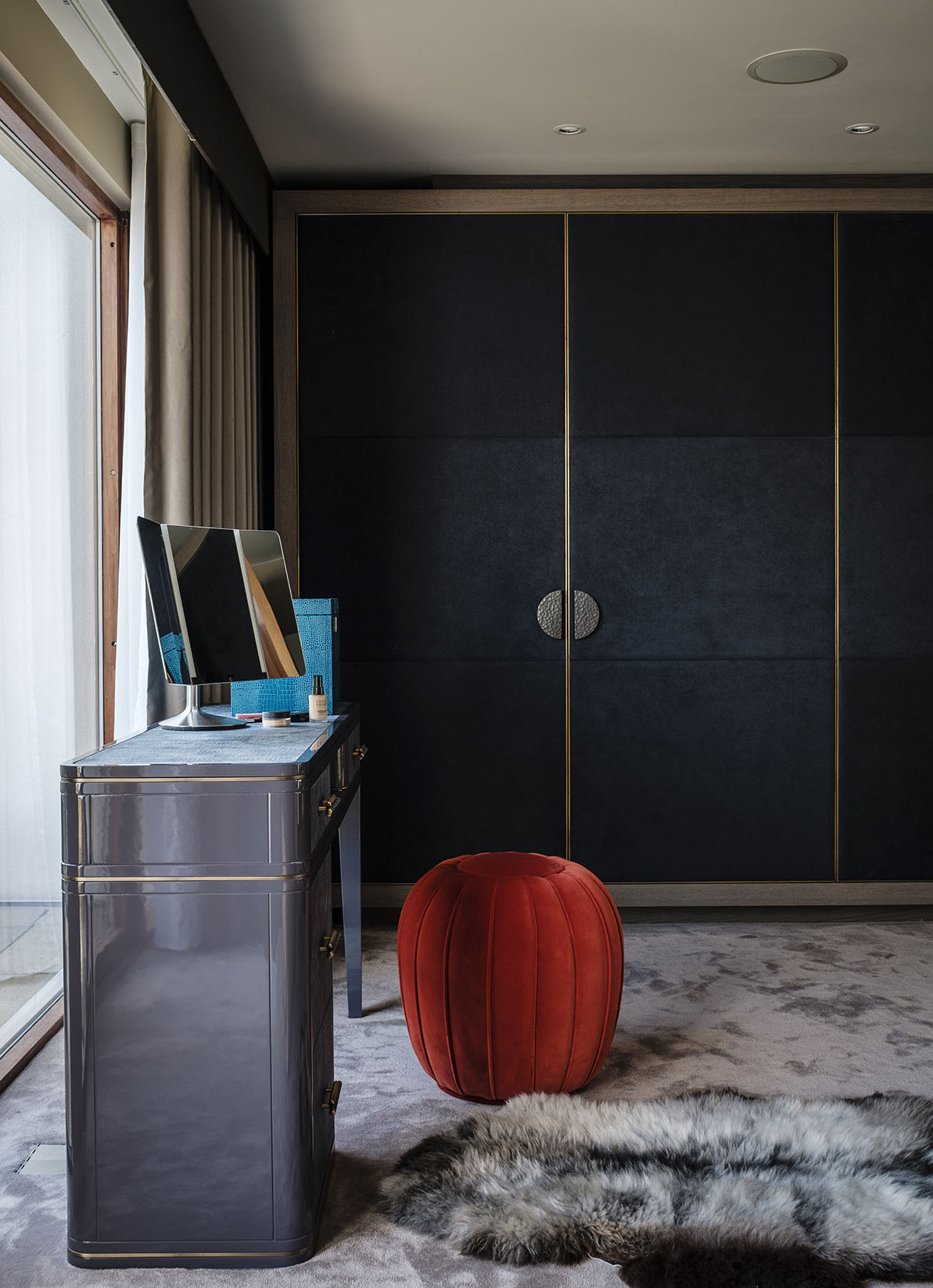
There's a certain sumptuousness to this space, with its rich textures and colours.
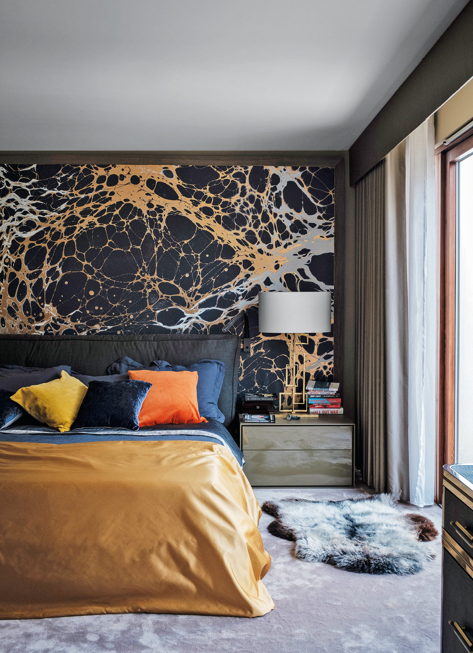
An impressive amount of storage space helps keep it clear of clutter.
GUEST BEDROOM
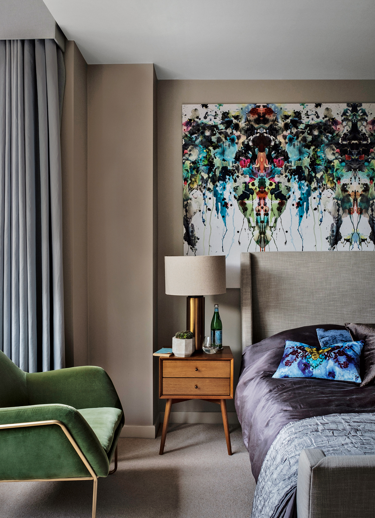
That oh-so-luxe guest bedroom is definitely not an after-thought.It is cleverly conceived with a high-lo approach. Designer fabric isused for a standout wall hanging and luxurious cushions, while thefurniture is well-chosen high-street pieces.The fabric print behind the bed and on the cushion are both by Timorous Beasties.
See more of Daniel Hopwood’s architectural and interior design projects at danielhopwood.com
Photography ⁄ James Merrell
The homes media brand for early adopters, Livingetc shines a spotlight on the now and the next in design, obsessively covering interior trends, color advice, stylish homeware and modern homes. Celebrating the intersection between fashion and interiors. it's the brand that makes and breaks trends and it draws on its network on leading international luminaries to bring you the very best insight and ideas.