This Modern East London Home Is Bursting With Genius Ideas Worth Stealing
You'll want to copy every idea in this architect-designed home, from the broken-plan layout and open sight-lines to the climbing wall and fireman's pole in the kids' bedroom, and clever space-saving ideas in the stairs and play room...

THE PROPERTY
What do you get when an architect couple decide to build a modern home together? A strikingly innovative house with note-worthy space-saving ideas, effortless flow, oodles of daylight and inspiration at every turn. We're not surprised that this modern house took home the Don’t Move Improve award, amongst others.
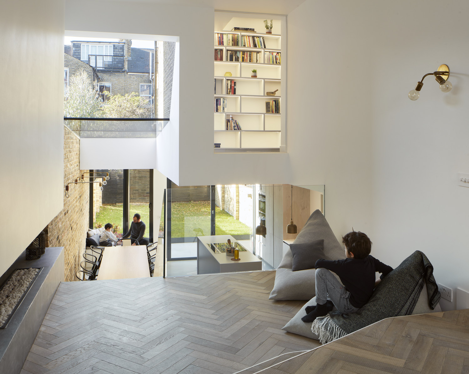
Designed by Ran Ankory and Maya Carni of Scenario Architecture, the property was an opportunity for them to realise their creative visions. This house is their canvas. Located in E5 in Clapton, East London, the couple bought this Victorian terraced house for the opportunity to extend and adapt a larger space for their growing family. They added a glazed rear extension, removed walls and introduced a broken-plan layout with split-levels whereby rooms have a degree of separation, while still being visible to each other.
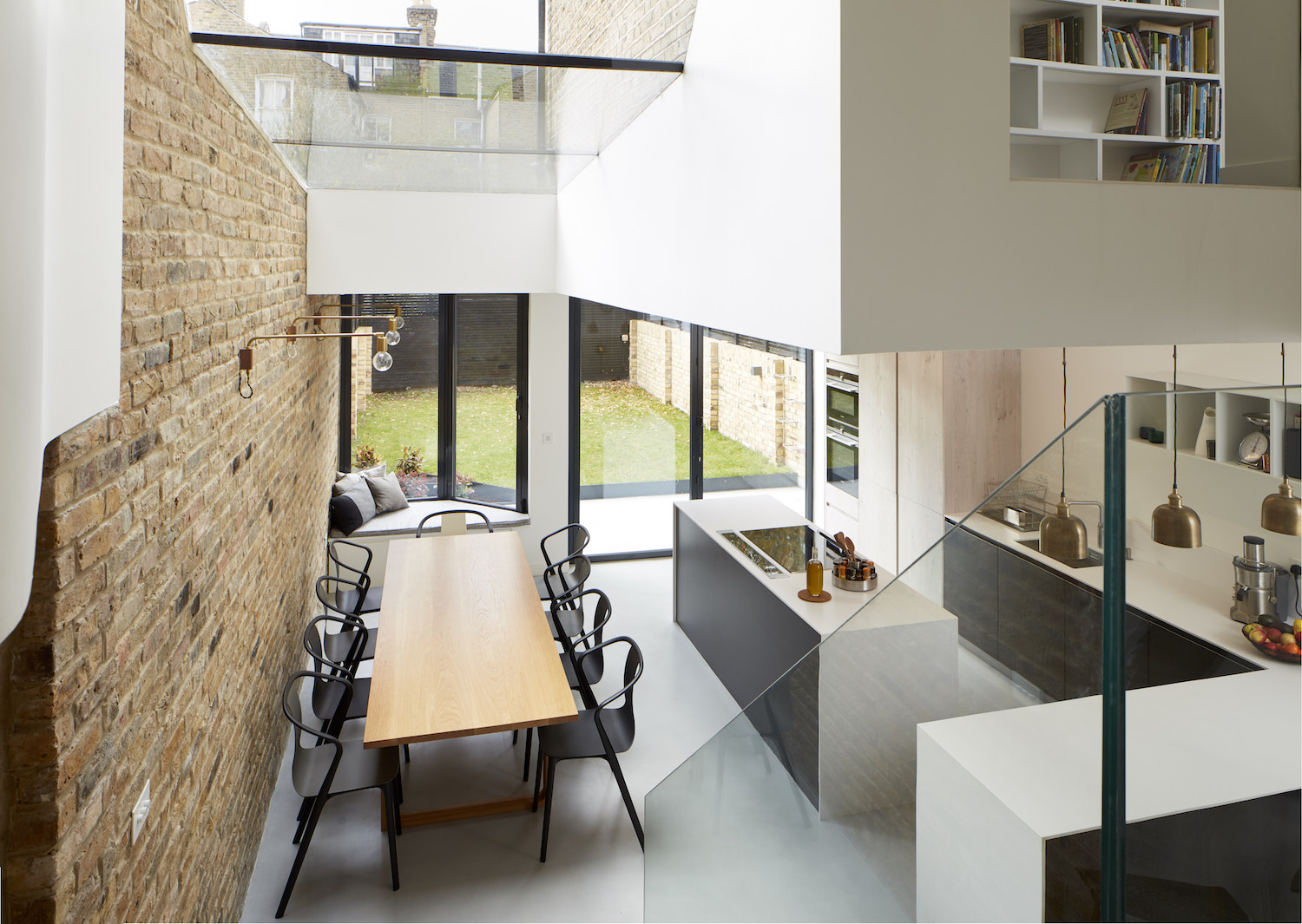
Their main challenge was connecting the main floor physically and visually with the lower ground. They designed an open-plan spatial sequence, encompassing the lounge, dining area and kitchen, and introduced a glass balustrade that creates an uninterrupted visual connection between the two levels.
See Also: A Family Home In Highgate Has Been Reconfigured And Modernised
LIVING ROOM
The Victorian terraced house's existing internal layout included a pair of reception rooms at the front of the house, with no real connection to the basement level. The architects removed walls and introduced a sloping glazed roof that abuts the boundary wall of the adjacent property to create a seamless transition between the ground-floor living areas and a kitchen and dining room below.
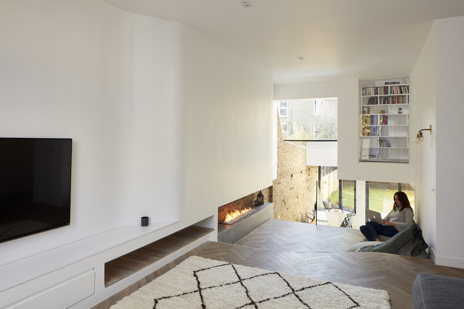
The new layout incorporates a split-level double reception, with a short set of steps connecting the upper area to a more casual area for relaxing in front of a fireplace.
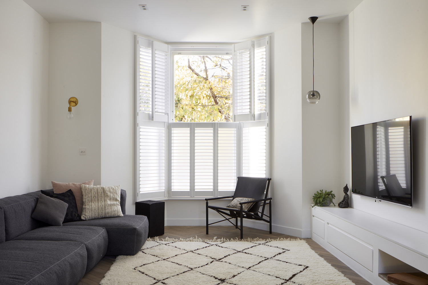
The roof light and rear glazing connect the indoors with the garden beyond, while interior glazing links the lounge with a “floating” library at mezzanine level – which can be seen from the living areas below. Another set of steps lead down to the kitchen and dining room, both visible through the glass balustrade.
See Also:A Light And Airy Family Home In Islington, London
A long and shallow modern fireplace hugs the wall and frames the top step. It makes a show-stopping feature, and adds cosiness too.
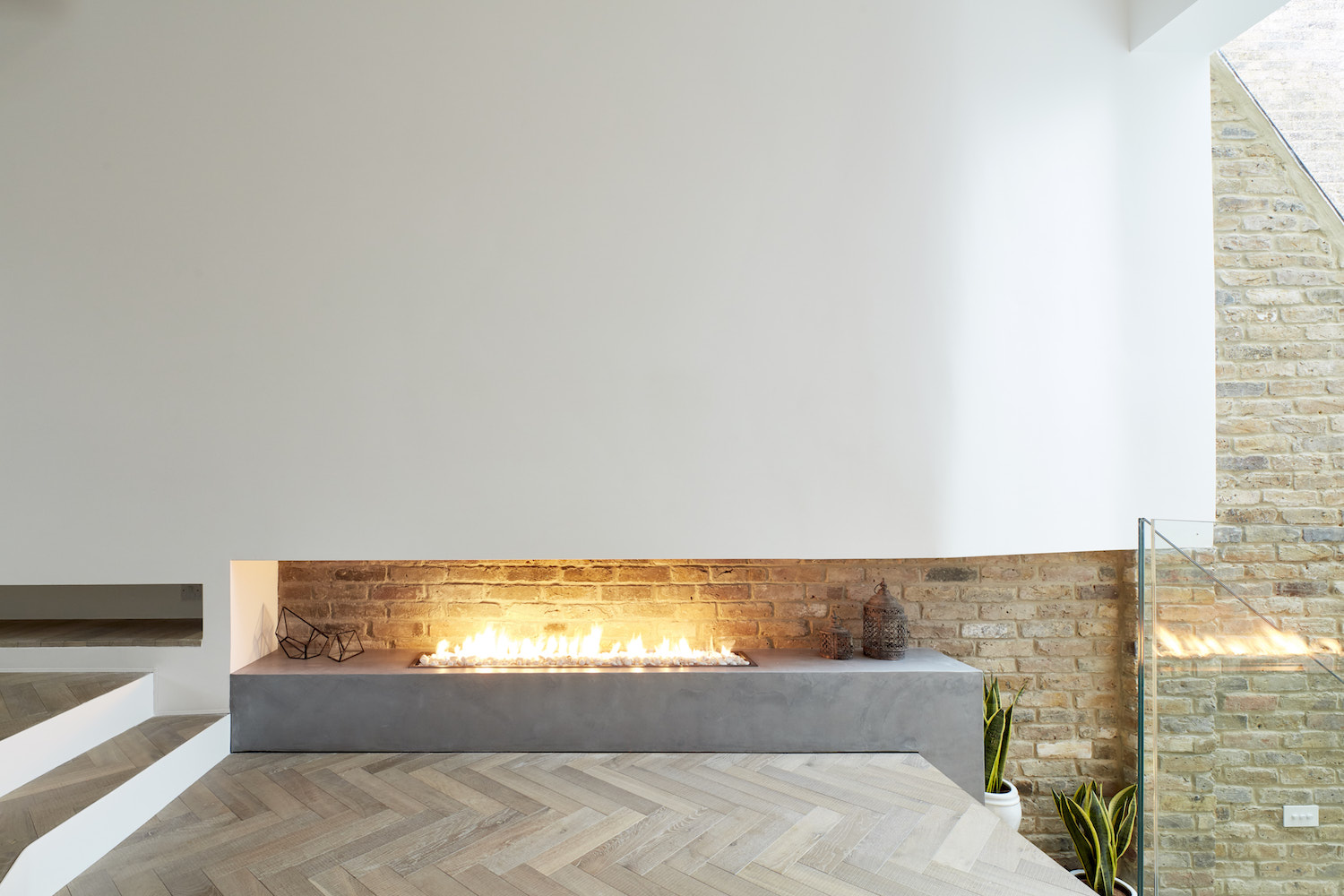
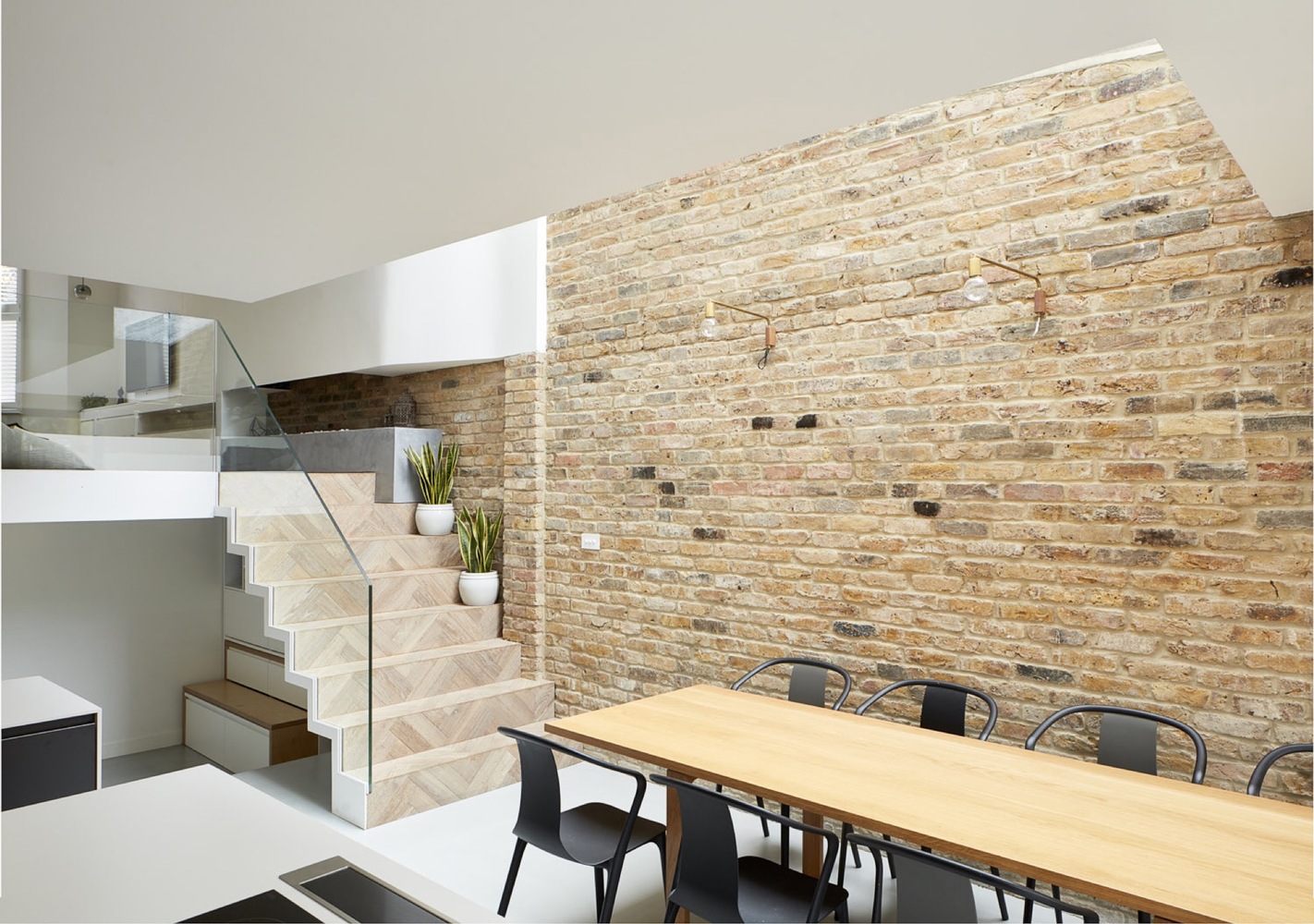
From the parquet-floored living area, a staircase with treads made from the same material descends to the open kitchen and dining space. The glass roof above the stairs enables daylight to filter down to the basement kitchen and dining area.
See Also:Before & After: How Architects Breathed New Life Into A Dated Victorian Property
KITCHEN
This style of broken-plan living is all about the clever use of a space. Distinct zones are created by the use of different floor finishes – like the poured concrete flooring in the kitchen area – as well as other separations such as the split-levels and partitions (for example the glass balustrade). These subtle divides retain the spacious feel that open-plan living provides, but also give a sense of separation, meaning people can have their own space away from each other.
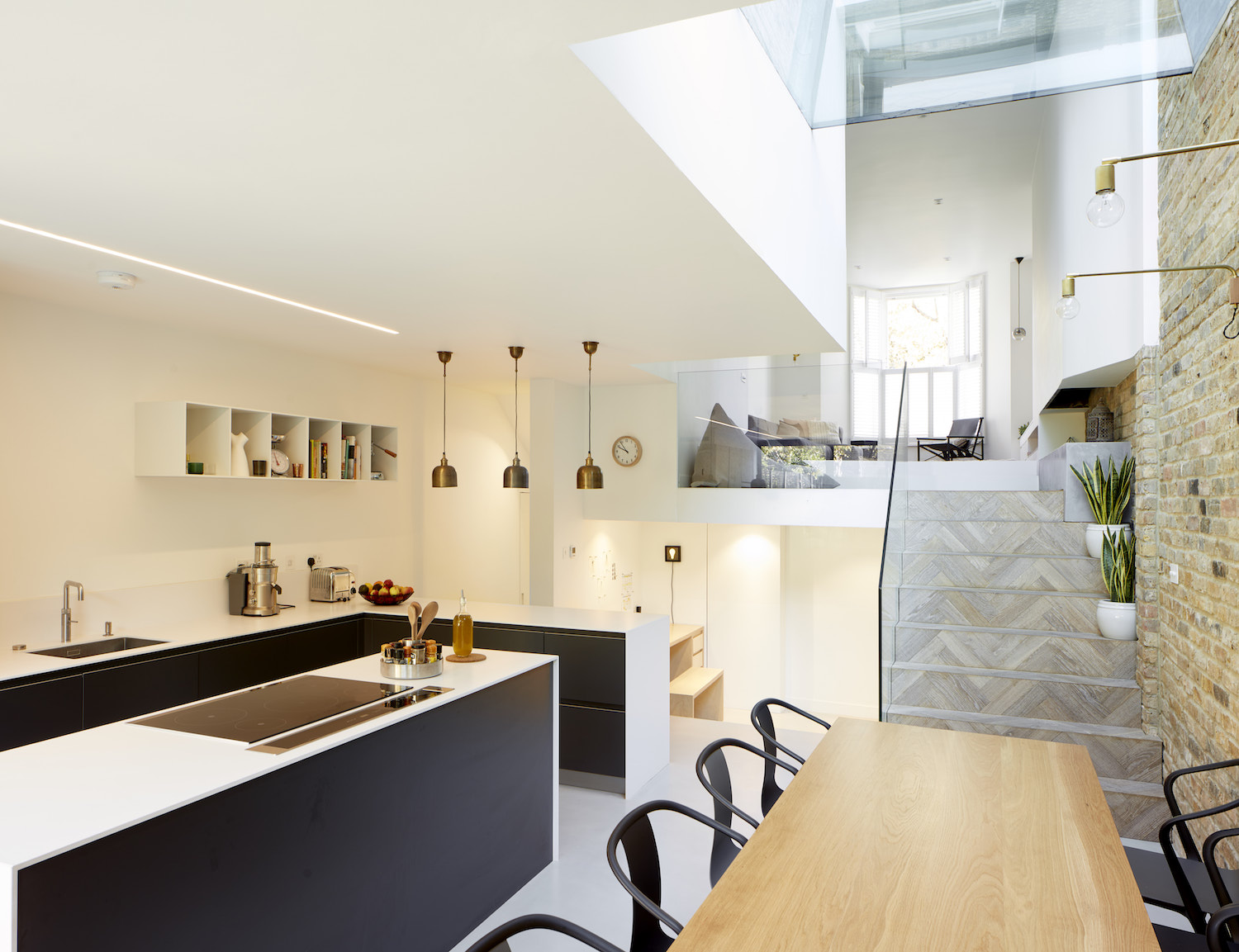
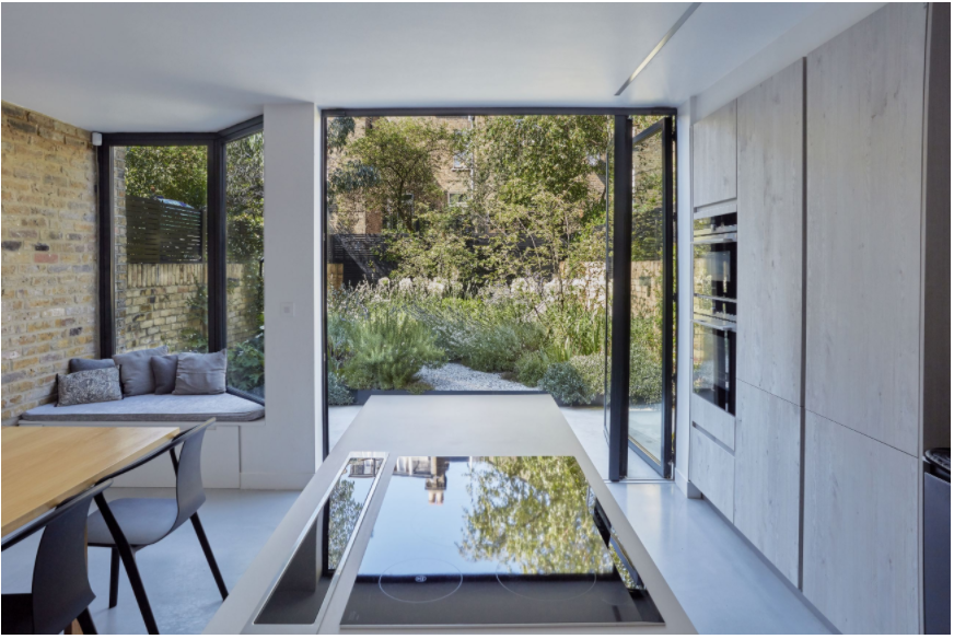
Kitchen storage sits mostly below countertops so that walls are left relatively free, helping to make this space retain a feeling of spaciousness.
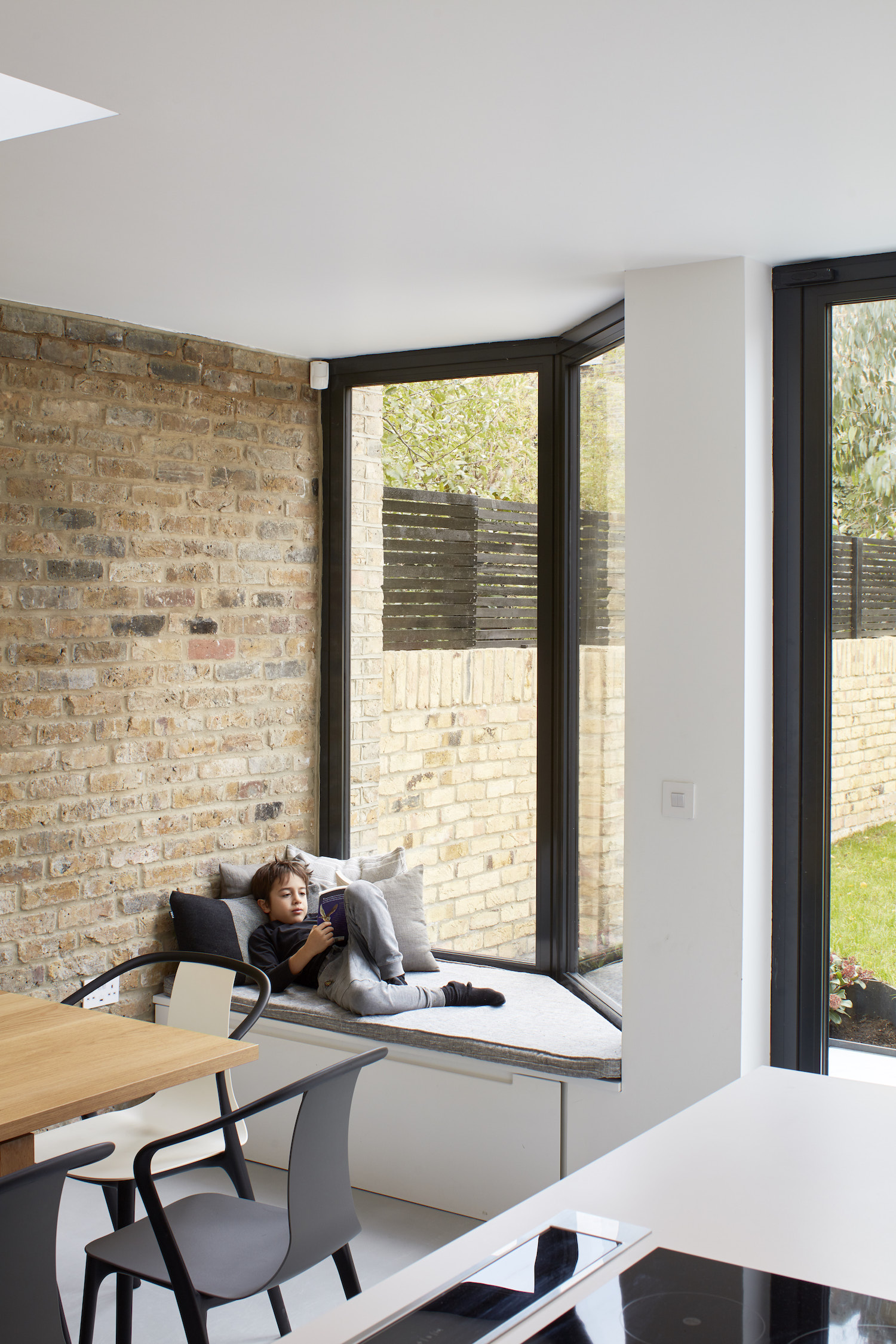
A new bay window in the kitchen created the perfect pocket for a cosy window seat with built-in storage.
See Also:Explore A Light-Filled Family Home In London's Holland Park
Full-height folding glass door add to the natural lighting and provide a direct connection with the garden.
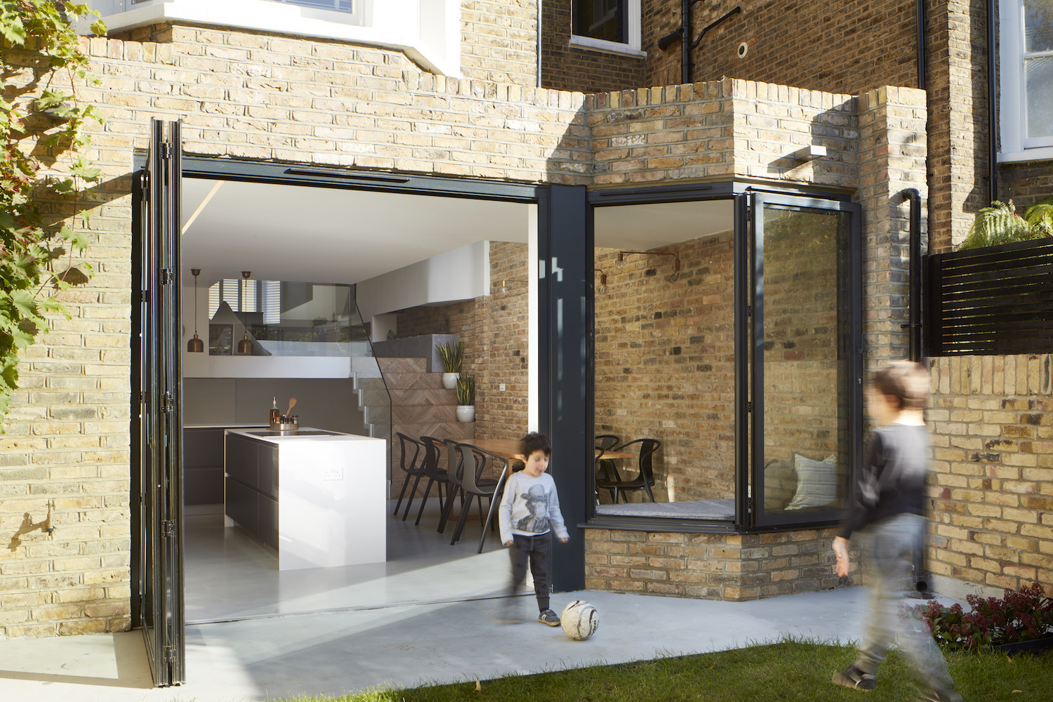
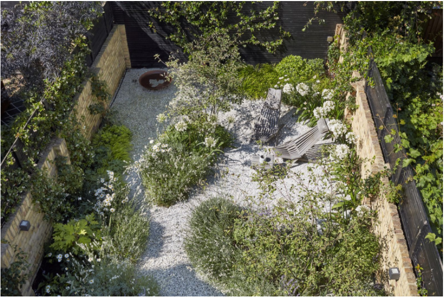
The kitchen now opens to a newly landscaped gravel garden, achieved after some of the above photos were taken.
See Also:50 Stylish Garden Patio Ideas
Wall lights above the dining table are a clever way of illuminating this space at night, as a pendant light would not have been possible with the sky light above, and a floor lamp would have interrupted the flow of movement needed to walk around the table.
PLAY AREA
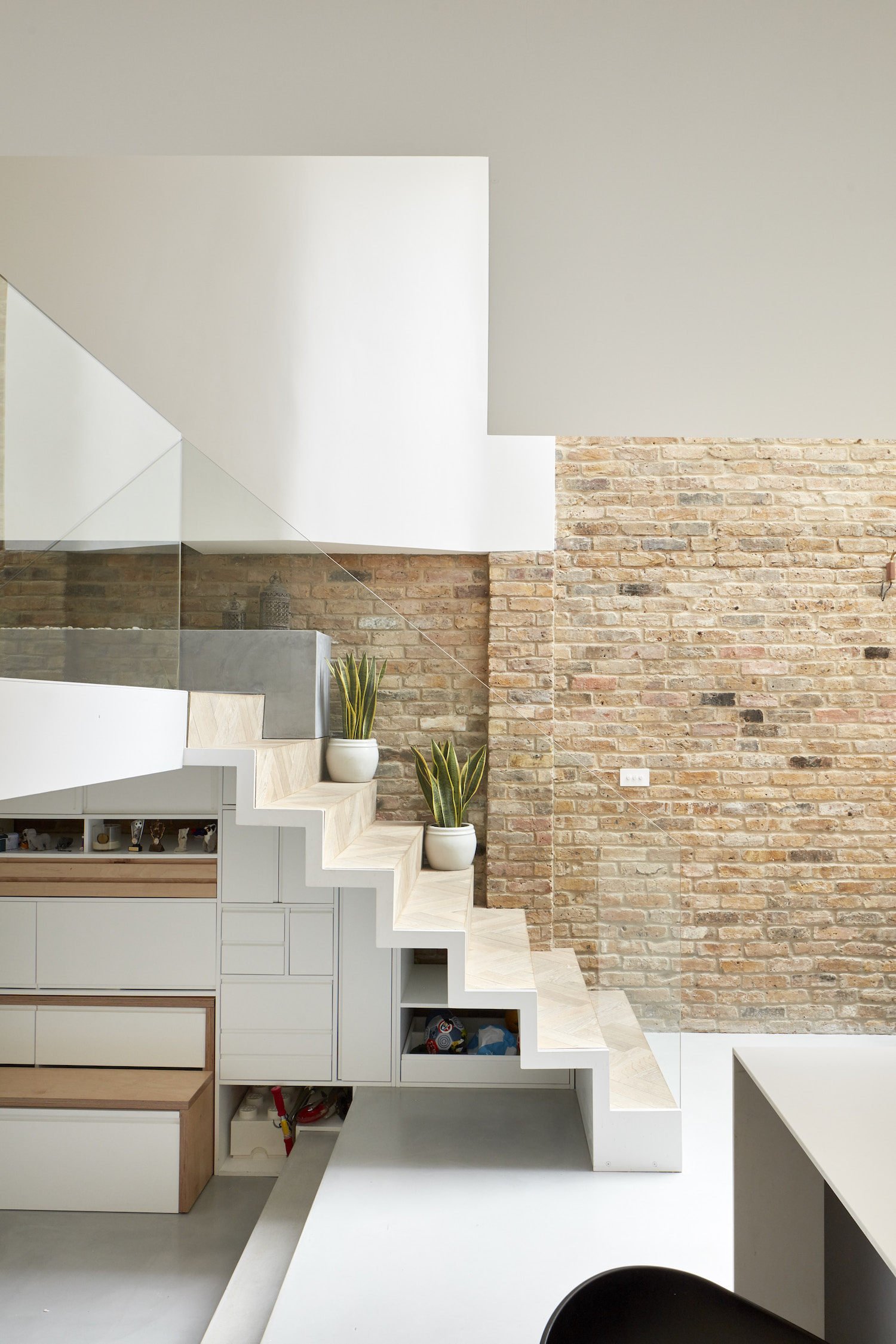
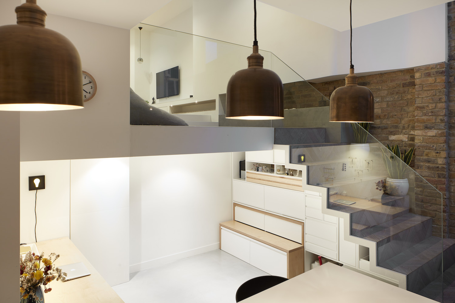
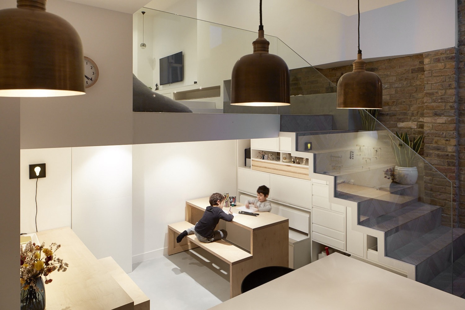
Conscious effort was made to use every available space the house had to offer. This included using spaces under the stairs, in the eaves, in hallways and limited height areas. Storage pockets were cleverly added under the stairs, and continue along the wall.
See Also:Stunning Statement Staircase Ideas
This recessed area has a low ceiling height due to the lowering of the reception area above, but it works perfectly as a playroom or homework area for the kids, who can play here while Mum or Dad are busy in the kitchen.
See Also:Wonderfully Fun Kids Play Room Ideas
The best thing about this space? The architects custom-built apull-out table and bench for drawing or doing homework, which perfectly slots back into the wall between the drawers. Genius.
See Also:Kids Office Ideas: Stylish Desk Areas & Homework Nooks For Kids
LANDING
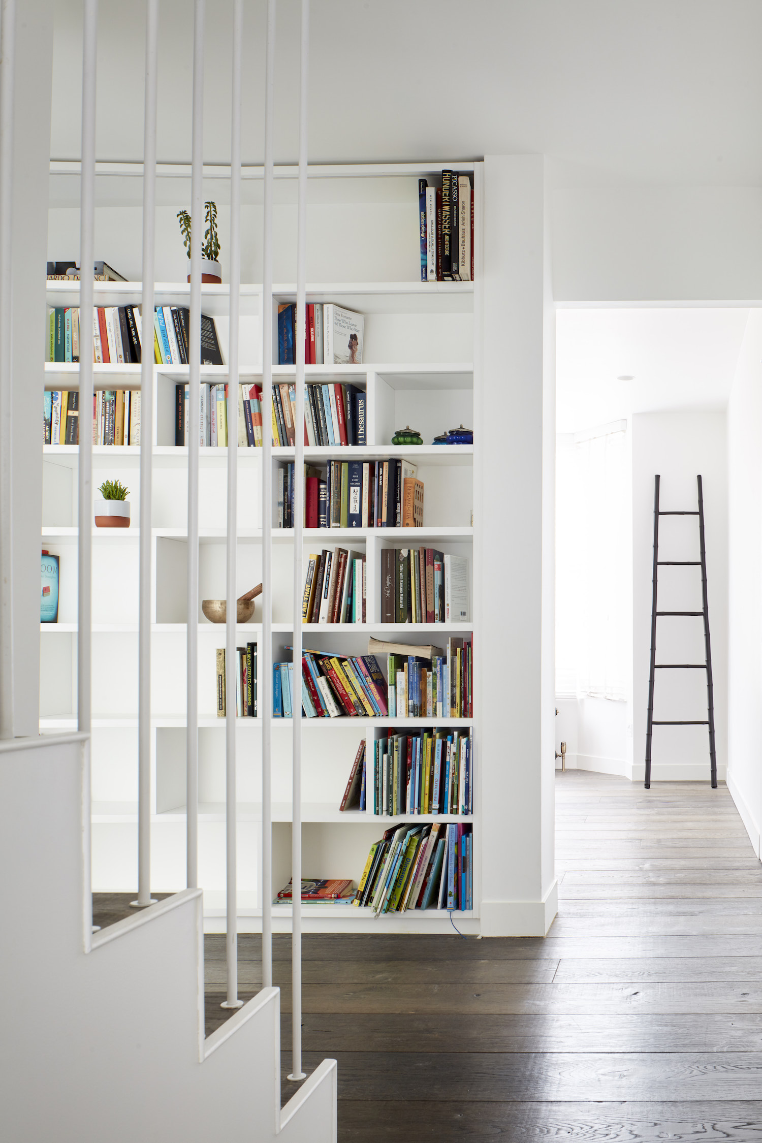
A library space was integrated into a room alongside the stairs that lead up to the bedroom levels. It projects out over the basement and can be seen through the floor-to-ceiling glass window from the living areas below.
KIDS ROOM
The fun didn't stop there. The architects incorporated lots more great ideas in the kids' room too. They combined the bedroom with the eaves space above it to create one extra tall space with a mezzanine level that can be accessed via a climbing wall, thus making a secret hangout spot for the kids. Tall poles keep things safe and prevent them from falling, while a cool fireman's pole offers a fun way down.
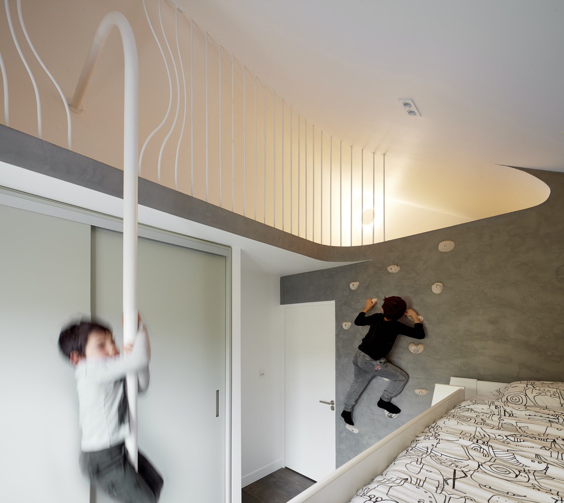
What more could growing boys ask for?
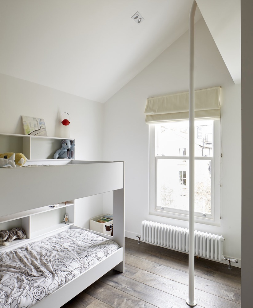
See Also:Fun Ideas for Cool Kids' Bedrooms,Sharing Kids Room Ideas andBoys' bedroom ideas
Photography: Matt Clayton
Be The First To Know
The Livingetc newsletters are your inside source for what’s shaping interiors now - and what’s next. Discover trend forecasts, smart style ideas, and curated shopping inspiration that brings design to life. Subscribe today and stay ahead of the curve.

Lotte is the former Digital Editor for Livingetc, having worked on the launch of the website. She has a background in online journalism and writing for SEO, with previous editor roles at Good Living, Good Housekeeping, Country & Townhouse, and BBC Good Food among others, as well as her own successful interiors blog. When she's not busy writing or tracking analytics, she's doing up houses, two of which have features in interior design magazines. She's just finished doing up her house in Wimbledon, and is eyeing up Bath for her next project.
-
 Turns Out the Coolest New Café is Actually In Your Kitchen — Here's How to Steal the Style of TikTok's Latest Trend
Goodbye, over-priced lattes. Hello, home-brewed coffee with friends. TikTok's 'Home Cafe' trend brings stylish cafe culture into the comfort of your own home
By Devin Toolen Published
-
 5 Bathroom Layouts That Look Dated in 2025 — Plus the Alternatives Designers Use Instead for a More Contemporary Space
For a bathroom that feels in line with the times, avoid these layouts and be more intentional with the placement and positioning of your features and fixtures
By Lilith Hudson Published
-
 Tour a mid-century house in Philadelphia with a modern take on Mad Men style
This mid-century house in Philadelphia is a modern take on mid-century design and the perfect backdrop for this enviable collection of art and objects
By Livingetc Last updated
-
 This modern Edwardian house in Melbourne is small but mighty
It may be small, but thanks to its ingenious design, this Edwardian house in Melbourne makes family living a breeze
By Livingetc Last updated
-
 Old meets new in this apartment in New York's East Village - a former community centre built in 1860
The owner of this loft-style apartment in New York's East Village mixes ancient and modern with timeworn pieces, design classics and his own abstract art...
By Livingetc Last updated
-
 Explore this super-contemporary coastal house in Cornwall
This coastal house in Cornwall is all about drinking in the uninterrupted views of nature at its most raw, most pure…
By Livingetc Last updated
-
 Explore this spacious detached 1900s house in southeast London with stylish modern interiors
Edgy textures, luxe materials and a mix of vintage and bargain buys transformed a blank detached 1900s house in southeast London into a home full of personality.
By Livingetc Last updated
-
 This large house in west London is minimal yet playful
A firefighter’s pole in the kitchen and a slide down the stairs? This house in west London proves minimalism can also be fun.
By Livingetc Last updated
-
 Inside A Clever Garden Room That Doubles As A Chic Guest House
This striking garden room design incorporates a sleeping area, kitchenette, loo and shower, as well as plenty of storage space, making it ideal as both a self-contained guest house or a restful retreat to escape to.
By Lotte Brouwer Published
-
 This light and bright Victorian terrace in west London is relaxed yet stylish
This chic Victorian terrace in west London is full of clever ideas that allow it to evolve.
By Livingetc Last updated