The Livingetc newsletters are your inside source for what’s shaping interiors now - and what’s next. Discover trend forecasts, smart style ideas, and curated shopping inspiration that brings design to life. Subscribe today and stay ahead of the curve.
You are now subscribed
Your newsletter sign-up was successful
The property
A two-storey apartment in Greenwich Village, New York. The entrance floor has a living room, TV den, kitchen, dining room, office, guest bedroom and two bathrooms. Upstairs, there’s a master suite, with bedroom, bathroom and closets.
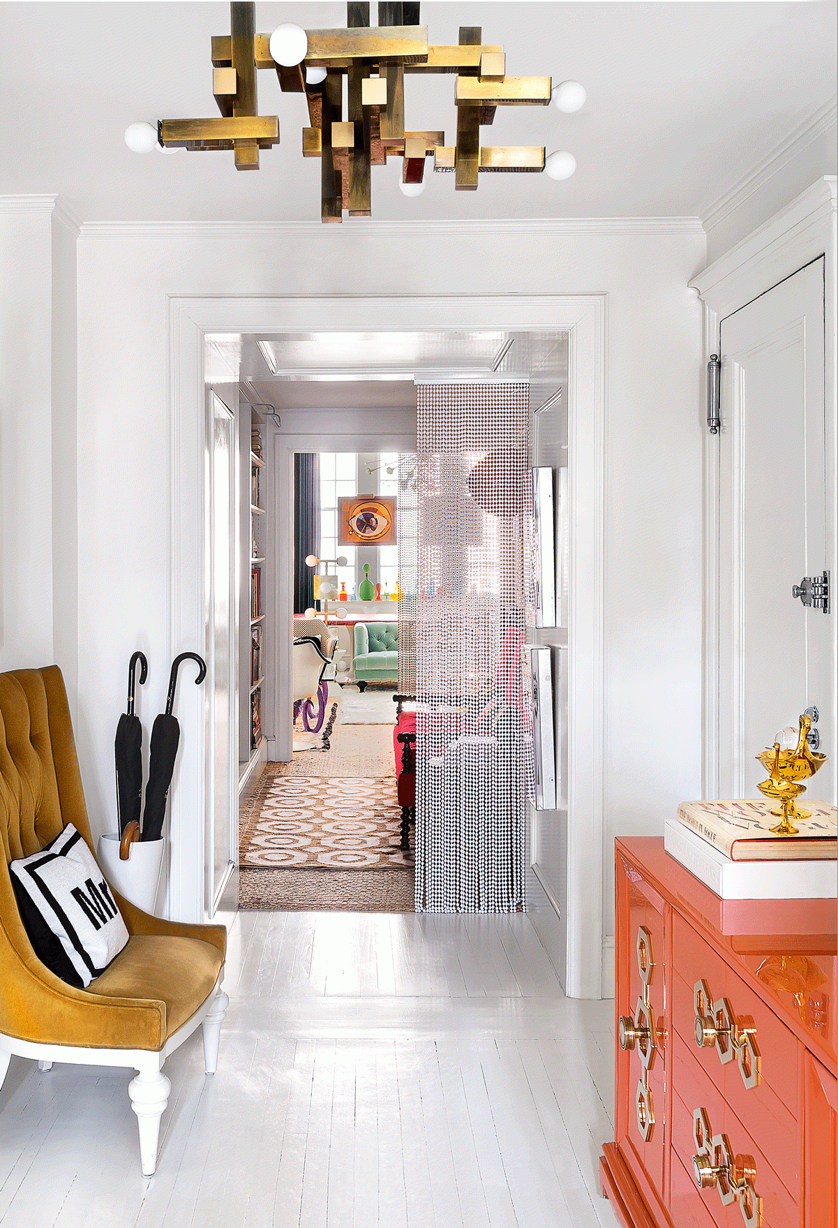
Hallway
The entrance to the apartment provides a sneak glimpse of what’s to come: eclectic furnishings, statement lighting and bold colours set against an all-white background.
The man synonymous with a new kind of American glamour – refined, luxe, yet tongue-in-cheek risqué (those Prozac-labelled cookie jars and embroidered ‘Lust’ cushions) – is not renowned for his restrained aesthetic.
Article continues belowYet there’s the heart of a minimalist quietly beating beneath his brash, bold statements as he explains that when he designs objects, he makes them as pared down as possible.
Dining room
The couple's apartment has been created from knocking together two adjoining flats to form a2,500 square foot living space.
Its furnishings may be bright but the walls, ceilings and floors are white. The ‘wowzer’ lights draw the eye up to the ornate vaulted ceilings while super-long drapes emphasise the tall, elegant windows.
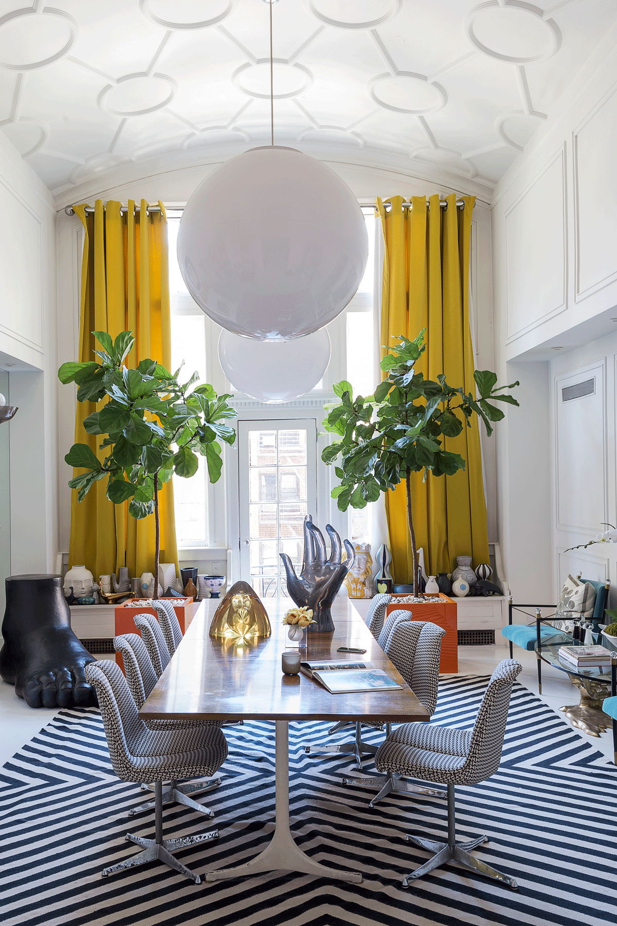
A giant foot adds a grounded touch to this lofty space, which was formerly a living room before the two apartments were joined. It'swhereJonathan and husband, Simon Doonan eat breakfast every morning.
The Livingetc newsletters are your inside source for what’s shaping interiors now - and what’s next. Discover trend forecasts, smart style ideas, and curated shopping inspiration that brings design to life. Subscribe today and stay ahead of the curve.
Jonathan often moves things around or brings home a new chair to check the seat is at the right height. As a designer he says he needs to live with his products, to sit on the furniture and touch the ceramics. It could all look different again next week.
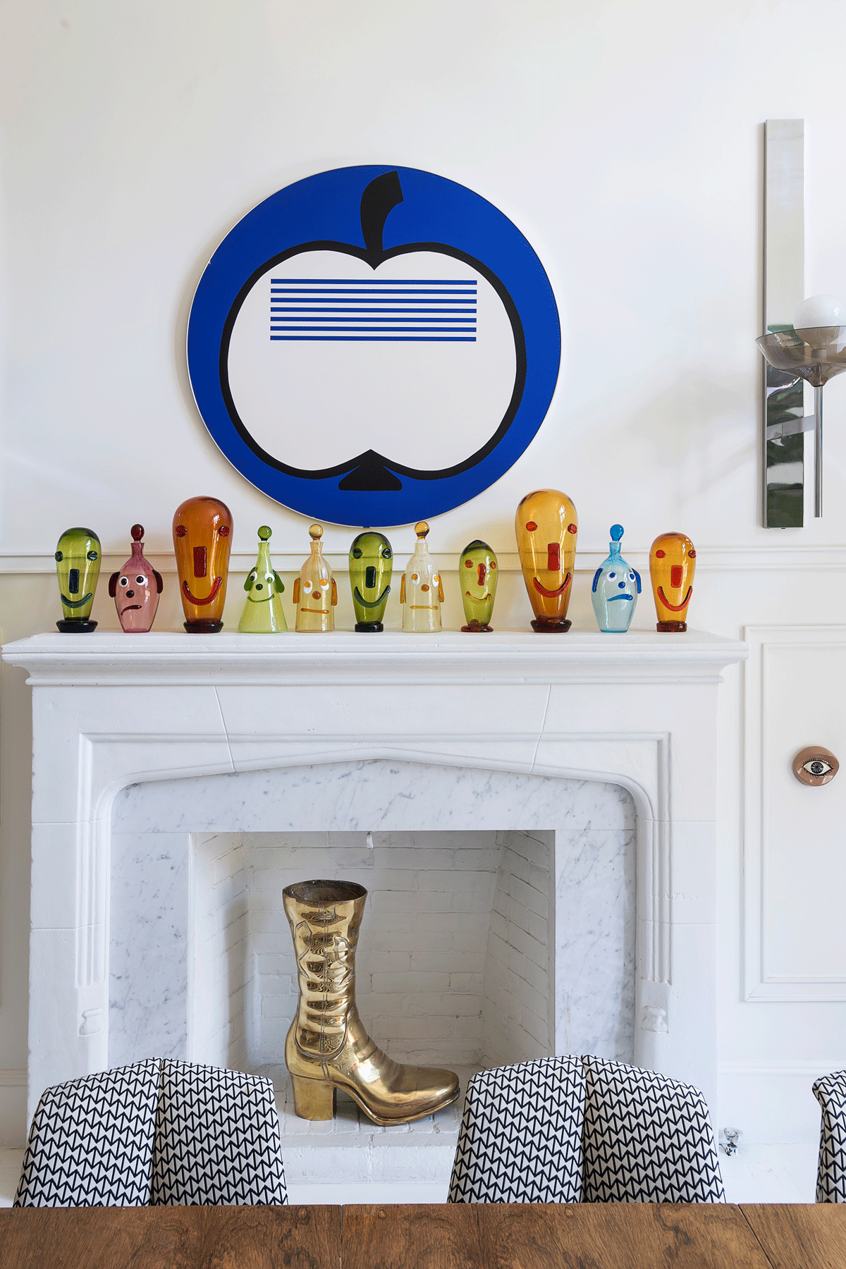
By New York standards, the apartment is big but the couple have used every inch of it. This includes the margins of the main spaces, like this careful arrangement on one side of the dining room. The result: every casual glance turns into a must-see moment.
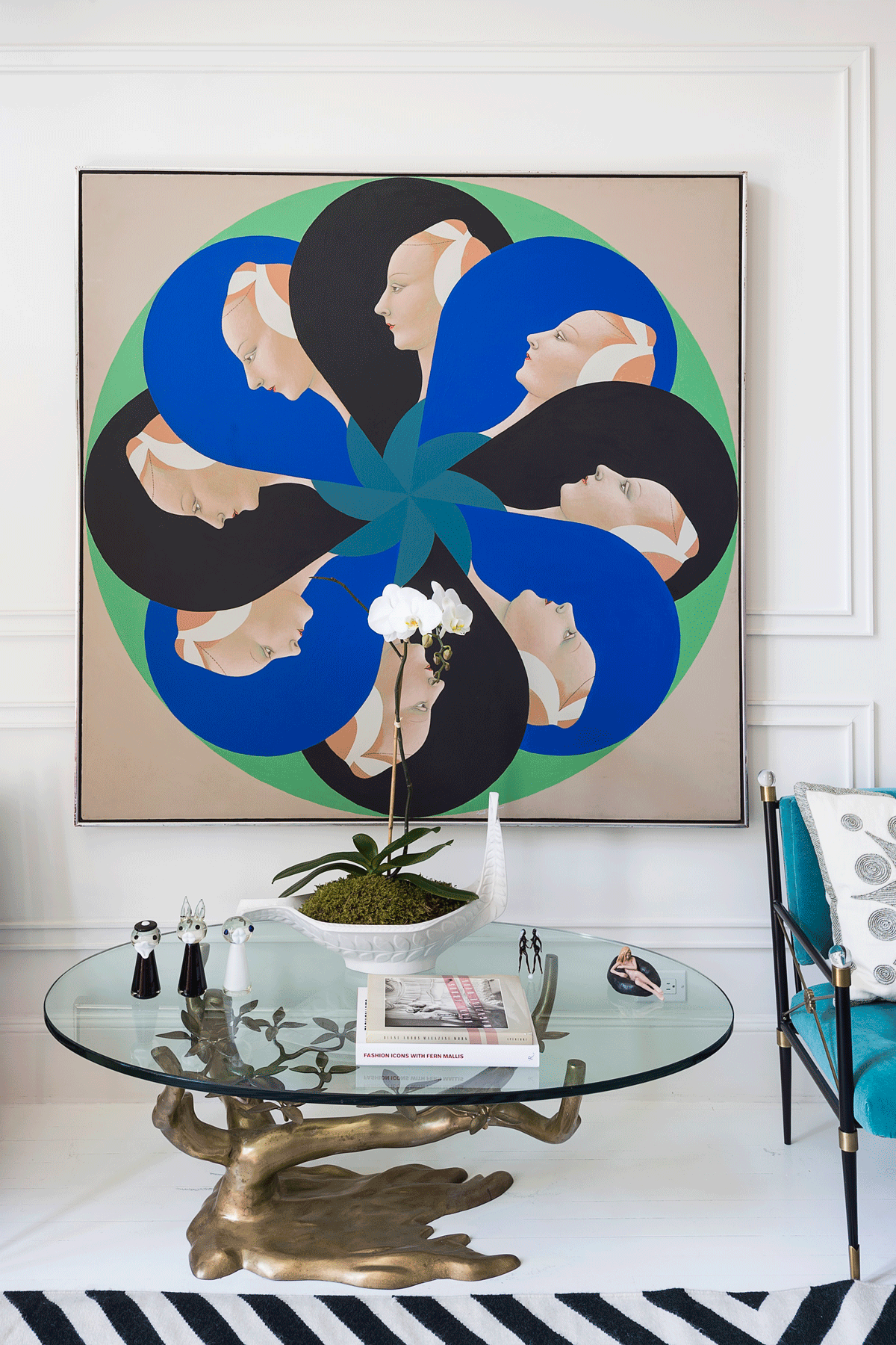
Living room
What makes Jonathan's ‘unbridled, eclectic’ style work? The quiet rigour of a restricted colour palette (blue, green, orange) and the repetition of key motifs (here’s looking at you…).The pared-back, all-white décor lets the furnishings shout out loud.
The couple go to the living room every day for their regular game of Ping Pong.
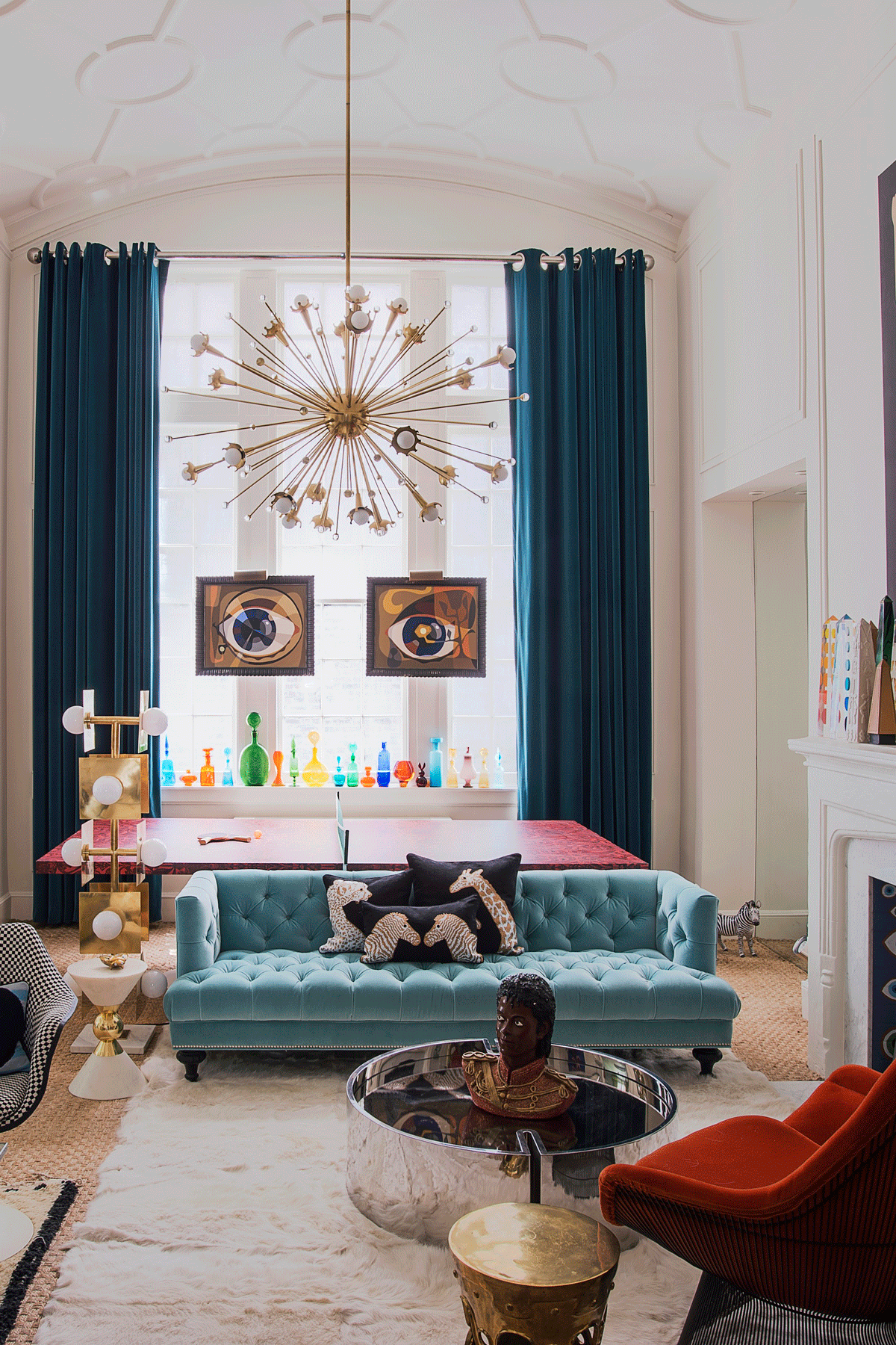
The Ed Paschke painting was originally commissioned for the Playboy Mansion. Now it overlooks this playful corner of the living room, complete with Mod-style cushions and a table supported by ram’s heads.
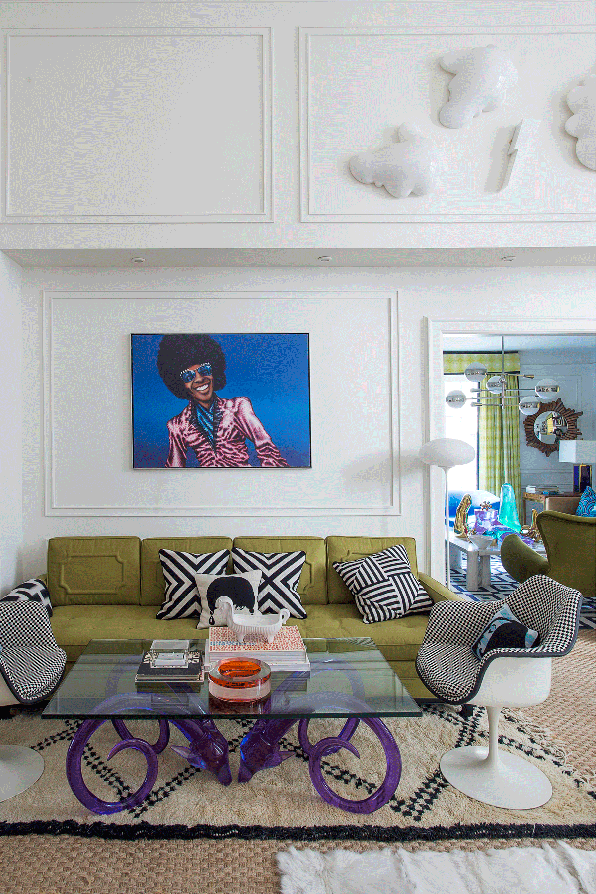
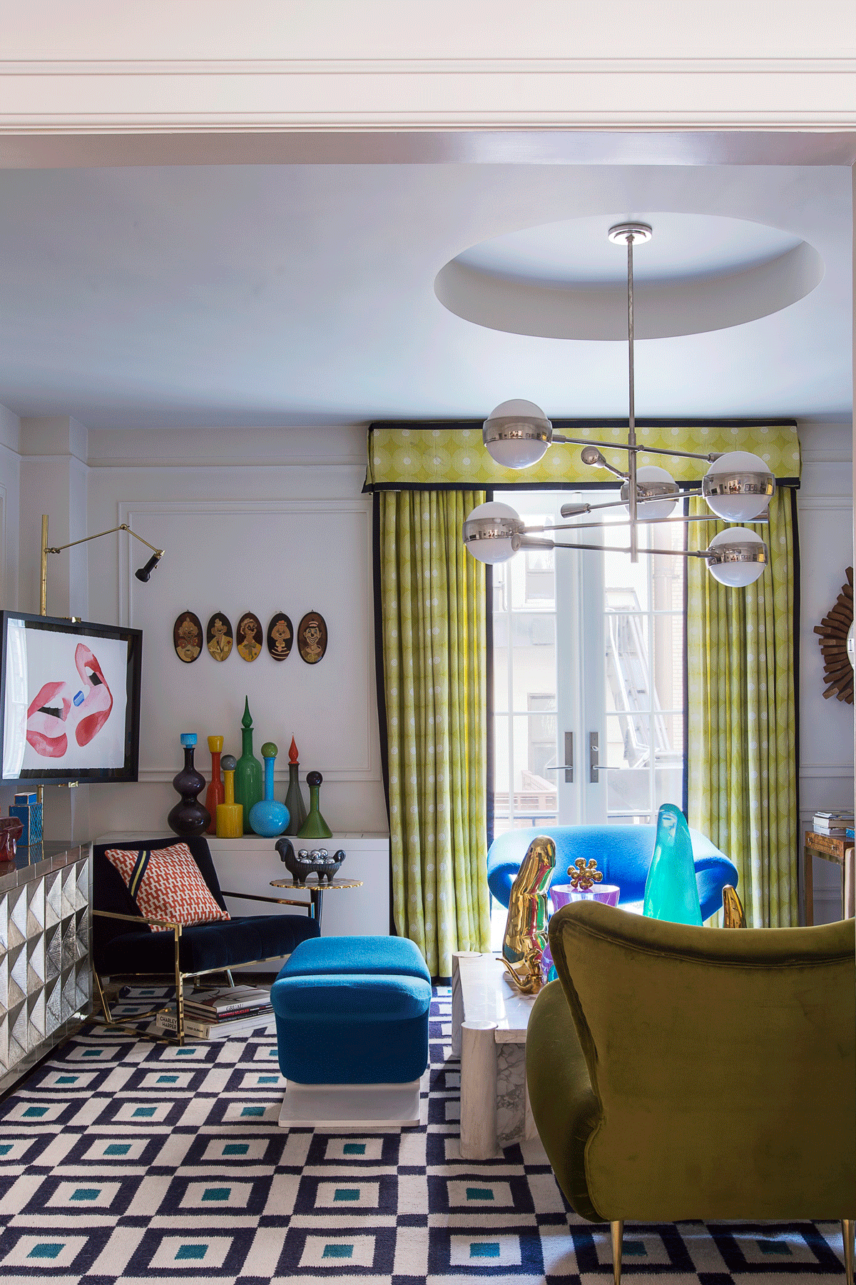
The Jonathan Adler palette is a slightly out-of-whack mix of burnt umber and chartreuse, Jaffa orange and celestial blue.
It’s the clarity and tonality of these shades that hang the look together – colours picked up and repeated from room to room, zigzags and houndstooth checks adding a Mod touch to monochrome.
Tongue-in-cheek styling gets a giggle out of the glamorous setting, while flashes of brass, chrome and Lucite to add a gleam to the luxe surfaces.
Bathroom
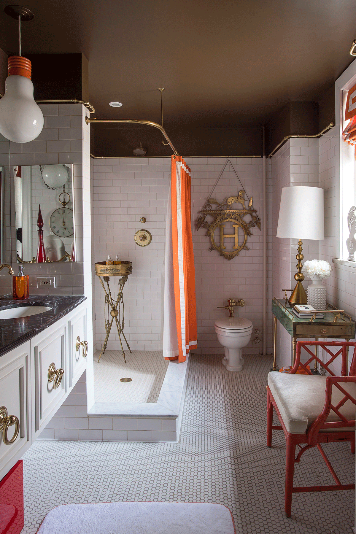
Jonathan has always loved the throw-it-togetherness of English decorating and feels that’s what this bathroom has. The brass H hung on the wall is a vintage Hermés display from Barneys New York.
Bedroom
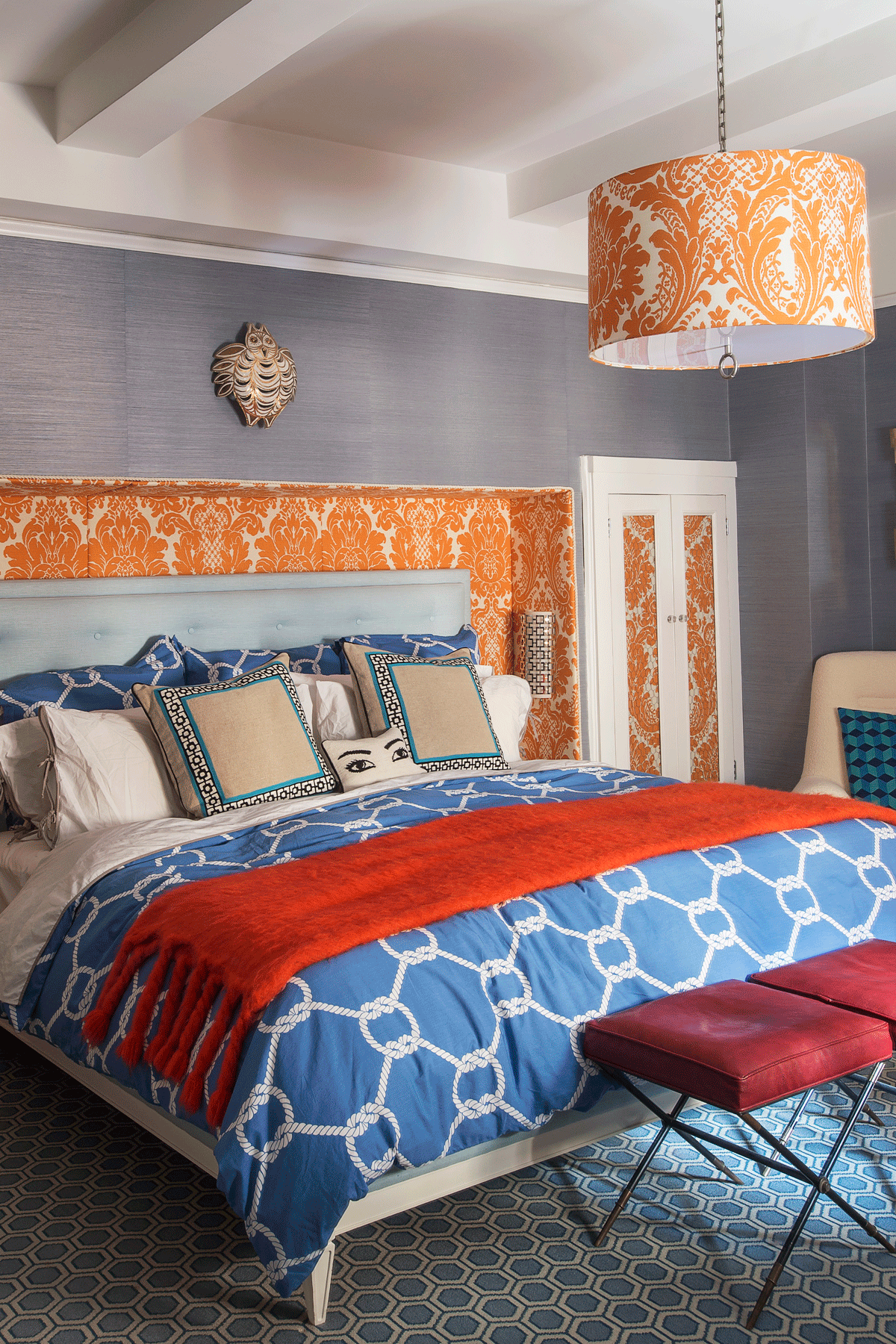
Jonathan's mix-and-match style turns the usual bed-linen-headboard combo into something completely out of the ordinary, with nautical rope motifs vying for attention with baroque fabric.
Photography / Matthew Williams
Styling / Alexa Hotz
Find out more about Jonathan Adlerhere.
To shop for Jonathan Adler's designs, visit uk.jonathanadler.com
The homes media brand for early adopters, Livingetc shines a spotlight on the now and the next in design, obsessively covering interior trends, color advice, stylish homeware and modern homes. Celebrating the intersection between fashion and interiors. it's the brand that makes and breaks trends and it draws on its network on leading international luminaries to bring you the very best insight and ideas.