See inside this converted church in north London that blends modern rustic with understated glamour
Thanks to a few modern finishes, this converted church in north London is perfect for 21st-century living
The property
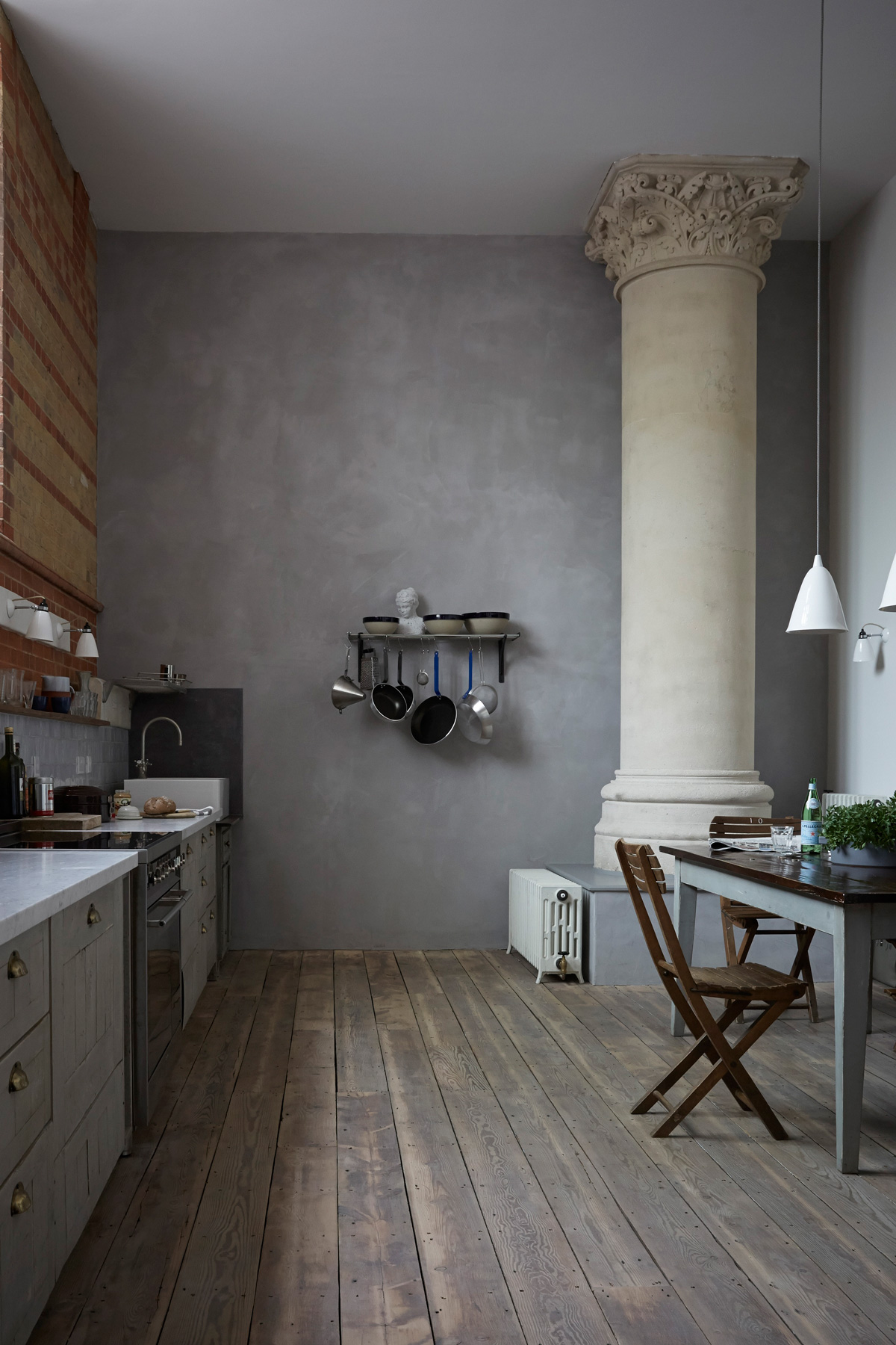
A four-bedroom, three-storey flat in a converted church in north London that dates back to the 1890s. The lower-ground floor of this modern home has a kitchen-diner, snug/living room, playroom and utility room.On the ground floor, there is a bedroom and wet room. On the first floor are three bedrooms, including the master bedroom, and an en-suite bathroom.
See more cool modern homes for ultimate interiors inspiration
KITCHEN
Choosing a home always involves compiling a pick ’n’ mix list of requirements... Has it got enough bedrooms? Tick. More than one bathroom? Tick. Is it in an area we like? Tick. So, seven years ago, when the owners of this place were looking for somewhere to settle with their growing family, living in a church wasn’t at the top of their agenda.
The couple had initially ignored this flat, because it wasn’t a house. The hulking Victorian church had been converted into 11 apartments in 2000, and although the chosen flat’s expansive ceilings and original features (such as two mammoth stone pillars in the kitchen) provided striking details, the use of dark wood and new orange bricks in the lower section of the walls created a depressing vibe. However, being in the late stages of pregnancy pressed the couple to make a snappy decision.
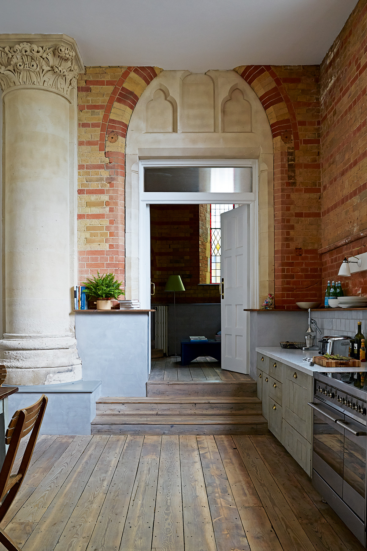
Four years later, they started a major refurbishment and, asa result, they enlisted the help of interior designer Mark Lewis. He suggested toning down the orange brick and losing the modern radiators and chestnut- coloured doors. The clever conversion melds magnificent original features with practical family living.
Interior designer Mark Lewis wanted to nudge the conversion back to its origins. That meant a raw feel to the walls, traditional flooring and recycled fittings. A lime plaster, with a mid-grey pigment, adds a fittingly dramatic backdrop for the original carved stone church column.
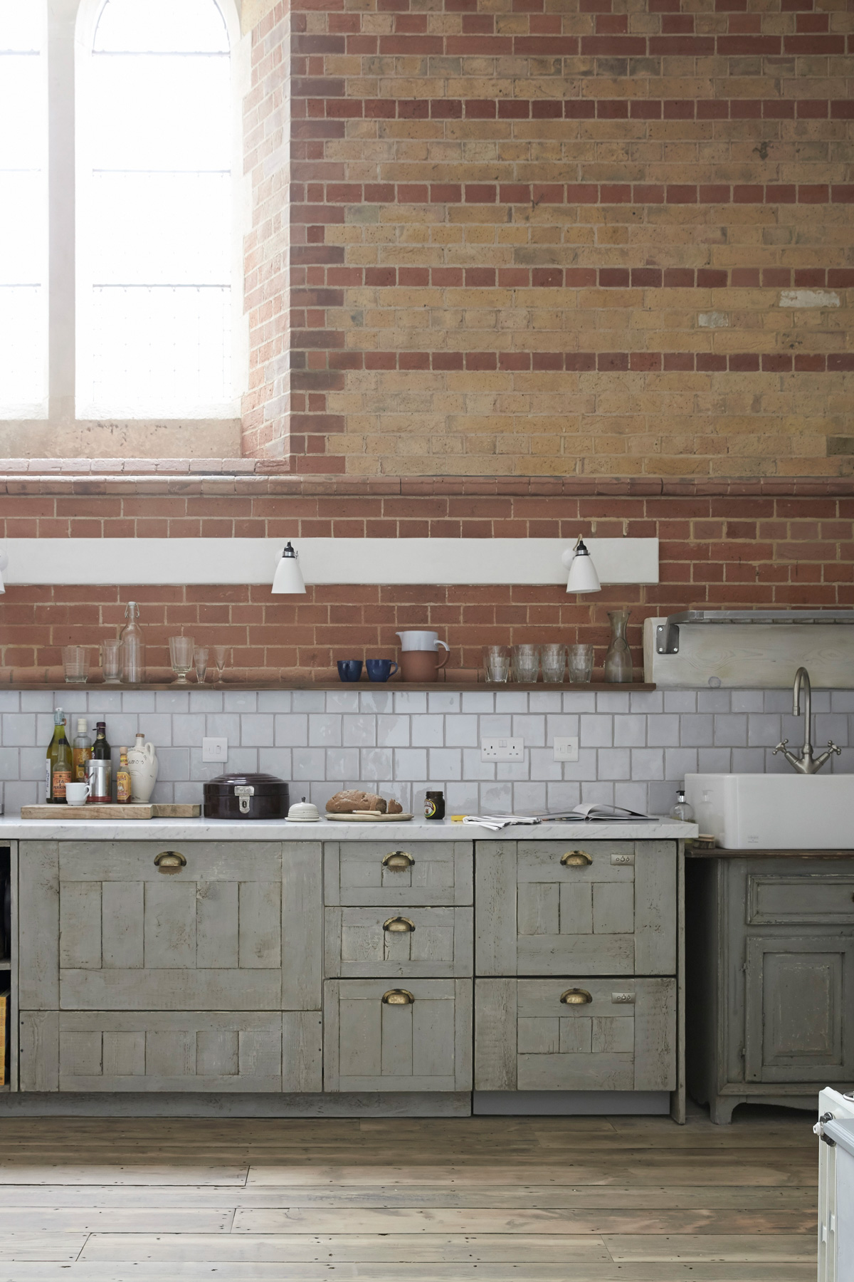
Every door was changed to a classic white design and when Mark added a grey lime render to some of the walls, the atmosphere was transformed. The original brickwork looked beautiful, the stained glass stood out and the stone masonry came into its own.
Be The First To Know
The Livingetc newsletters are your inside source for what’s shaping interiors now - and what’s next. Discover trend forecasts, smart style ideas, and curated shopping inspiration that brings design to life. Subscribe today and stay ahead of the curve.
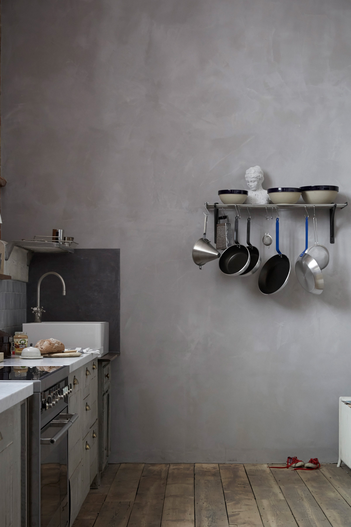
See Also: The 15 best modern kitchen ideas - stylish, smart and chic
DINING AREA
Mark also suggested rejigging the layout of the downstairs space. So the bold move was made to take the kitchen into the main room, turn the old kitchen into a child- friendly den and give the couple their own snug.
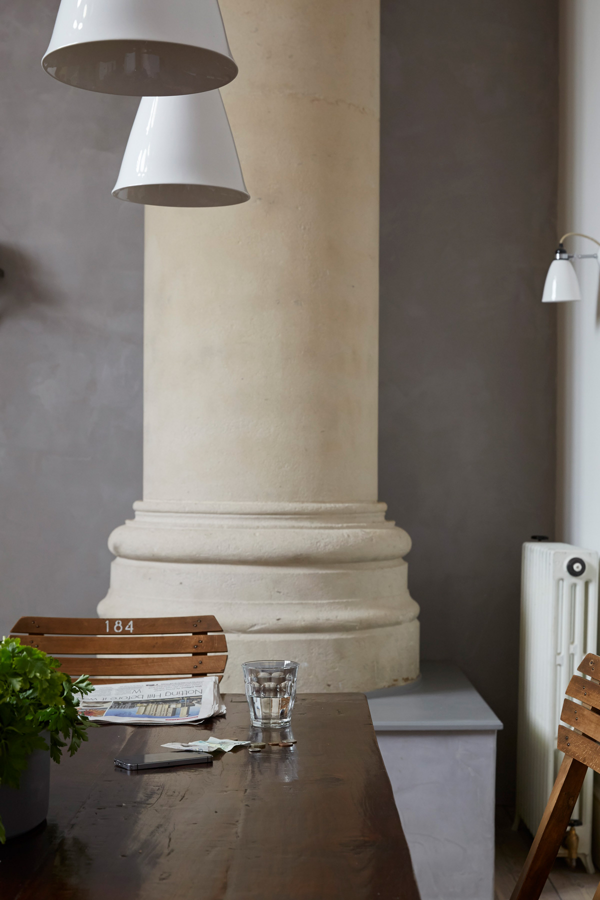
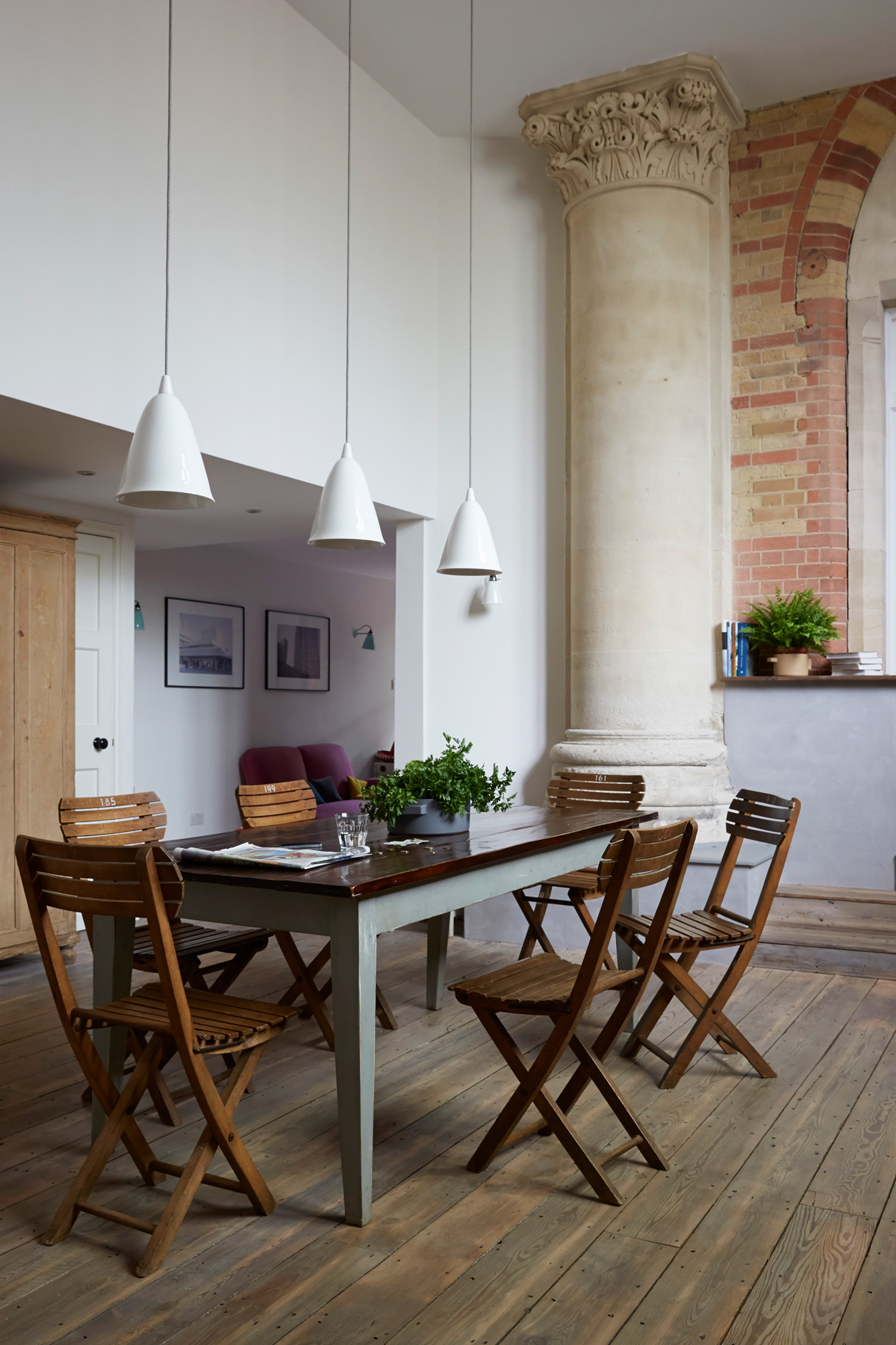
This space is now part of the new open-plan kitchen. The owners had originally bought dark wood furniture for the flat, but Mark suggested painting the table togive it a lighter, more contemporary finish, which also works well withthe lime render on the walls.
UTILITY ROOM
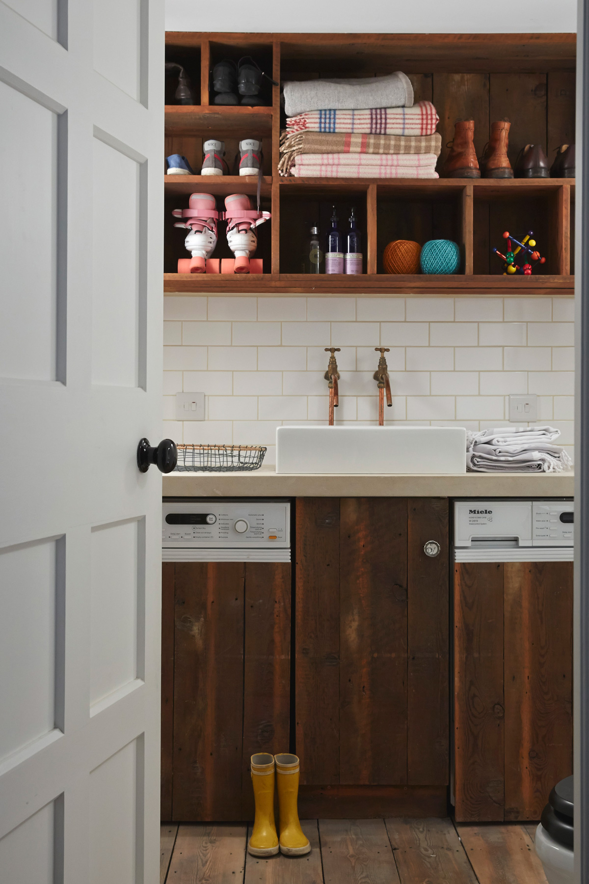
With four kids in the family, this room gets a lot of use.
SNUG
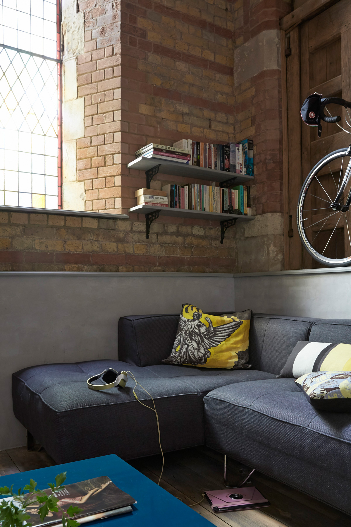
A snug for the grown-ups (which was previously a big-cupboard-cum- dumping ground) leads off the large kitchen/dining area. This is where the owners retreat to read the paper, watch TV or simply get some ‘space’.
MASTER BEDROOM
This is a haven right at the top of the flat, with light streaming through the roof window.
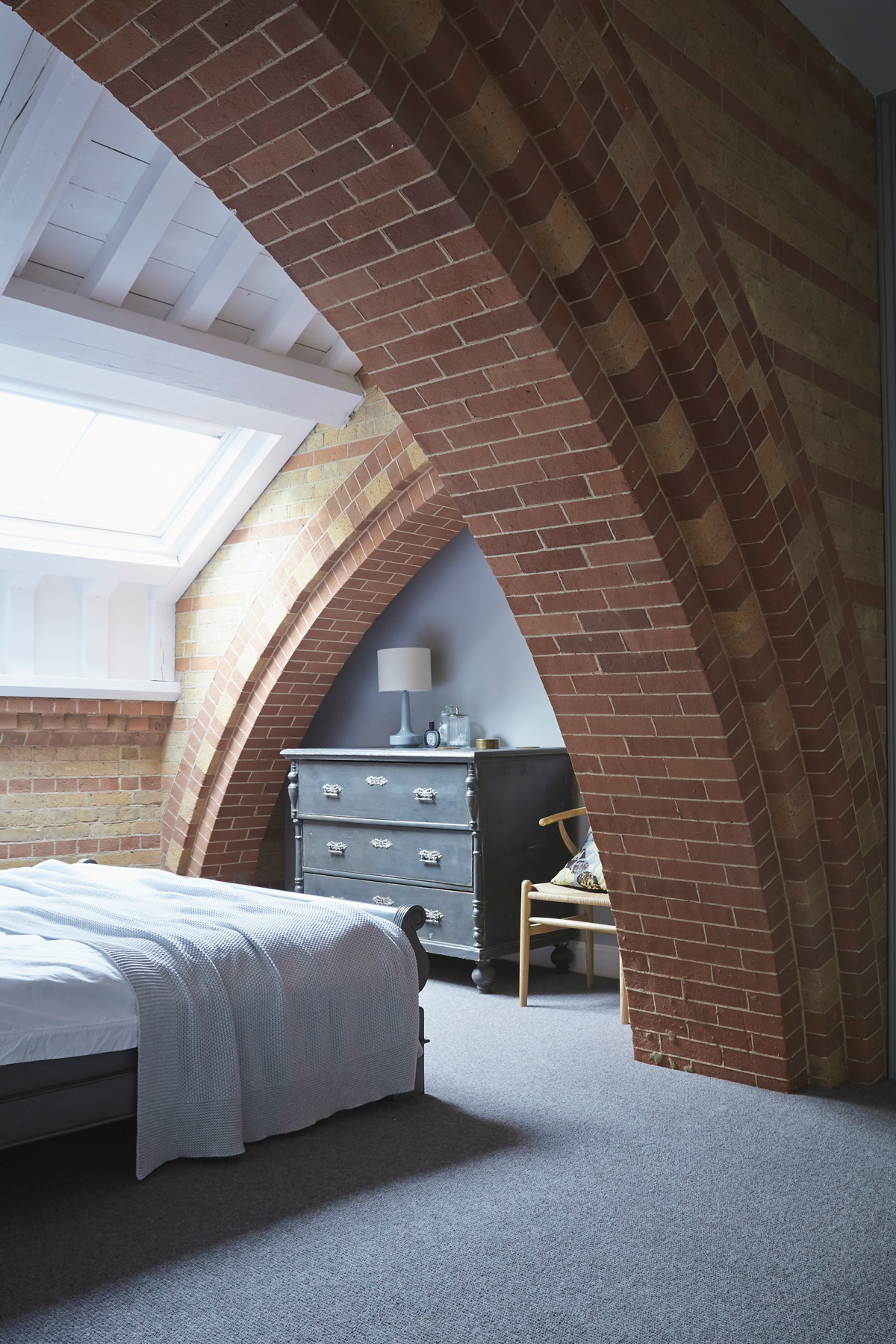
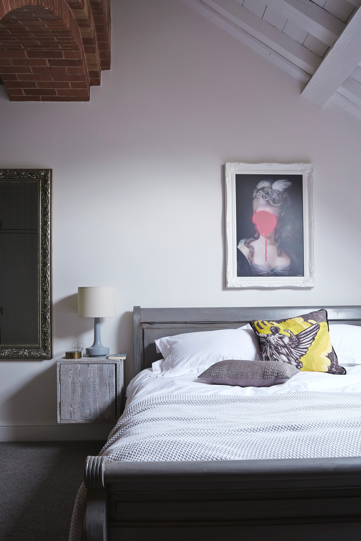
Interior designer, Mark, painted the couple's bed to give it a more modern look.
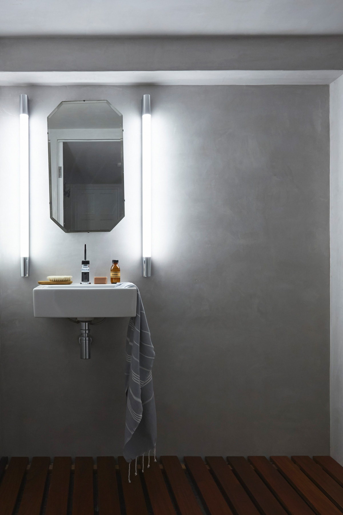
WET ROOM
The waterproof tadelakt finish on the walls is a traditional Moroccan polished plaster used in riads.
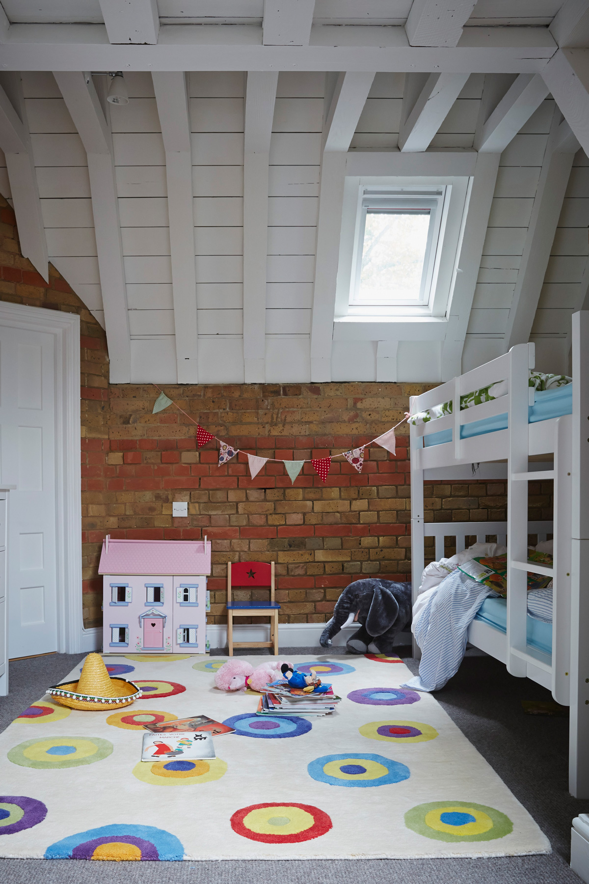
CHILDRENS' ROOM
The simple white furniture and painted ceiling beams and doorway help make this room look light and airy.
See Mark’s work at marklewisinteriordesign.com
Photography / Paul Massey
See Also: Kids room ideas - 45 fresh ideas for a modern yet whimsical kids bedroom
The homes media brand for early adopters, Livingetc shines a spotlight on the now and the next in design, obsessively covering interior trends, color advice, stylish homeware and modern homes. Celebrating the intersection between fashion and interiors. it's the brand that makes and breaks trends and it draws on its network on leading international luminaries to bring you the very best insight and ideas.
-
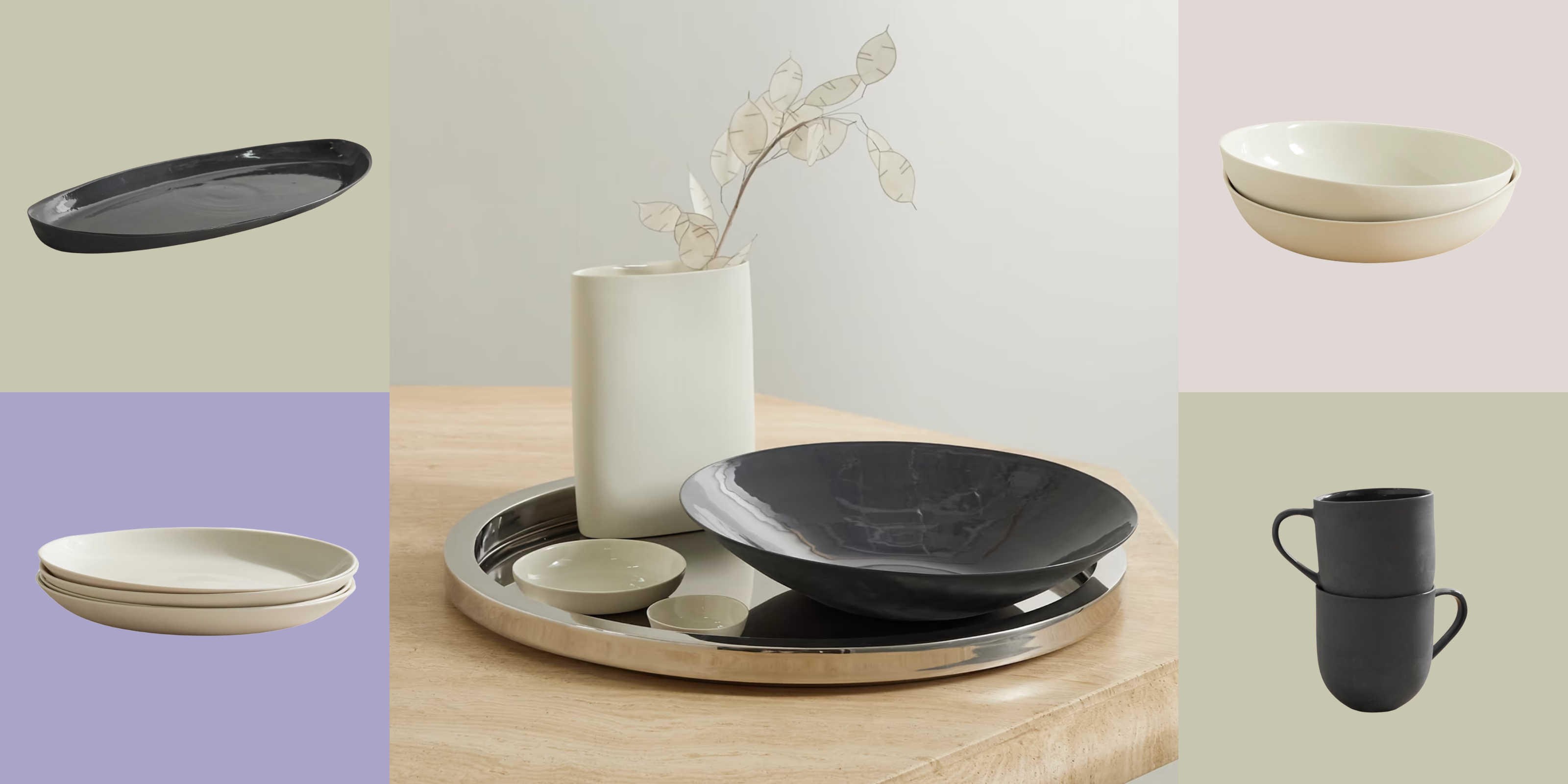 Turns Out, Sustainable Design Can Be Chic, and Net-a-Porter's 'Net Sustain' Curation Is Proof — Here's What I'm Shopping
From the Net Sustain collection, Mud Australia's homeware is not only design-oriented, but eco-focused, too
By Devin Toolen
-
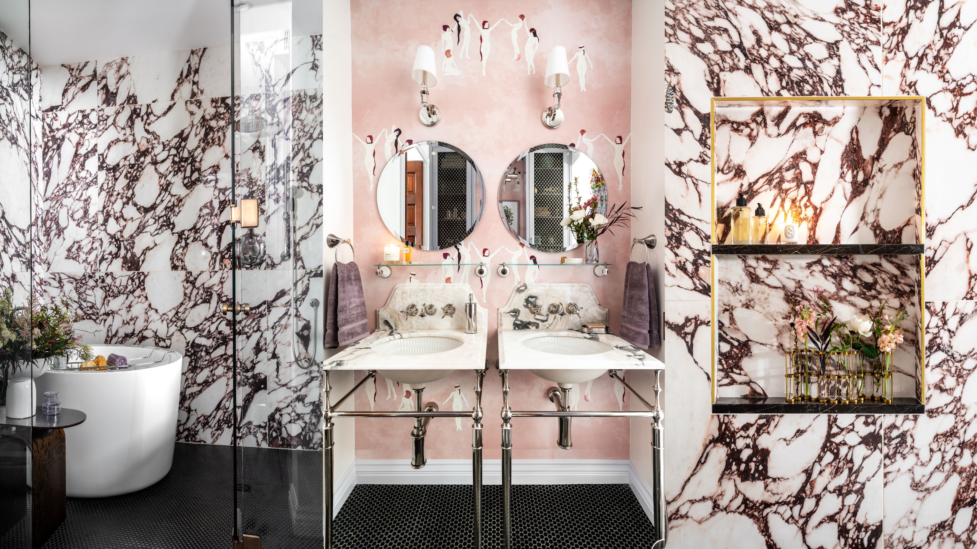 Before and After — How This Jewel-Box Bathroom Made the Most of Its Proportions With Maximalist Design and a 'Soaking Tub'
This design offers a masterclass on creating a luxurious bathroom that is equally playful and elegant.
By Maya Glantz