Discover the contemporary update that honors the bones of this Victorian terraced home in London
Imbued with bold but harmonious hues was the design mantra behind this gorgeous Victorian renovation
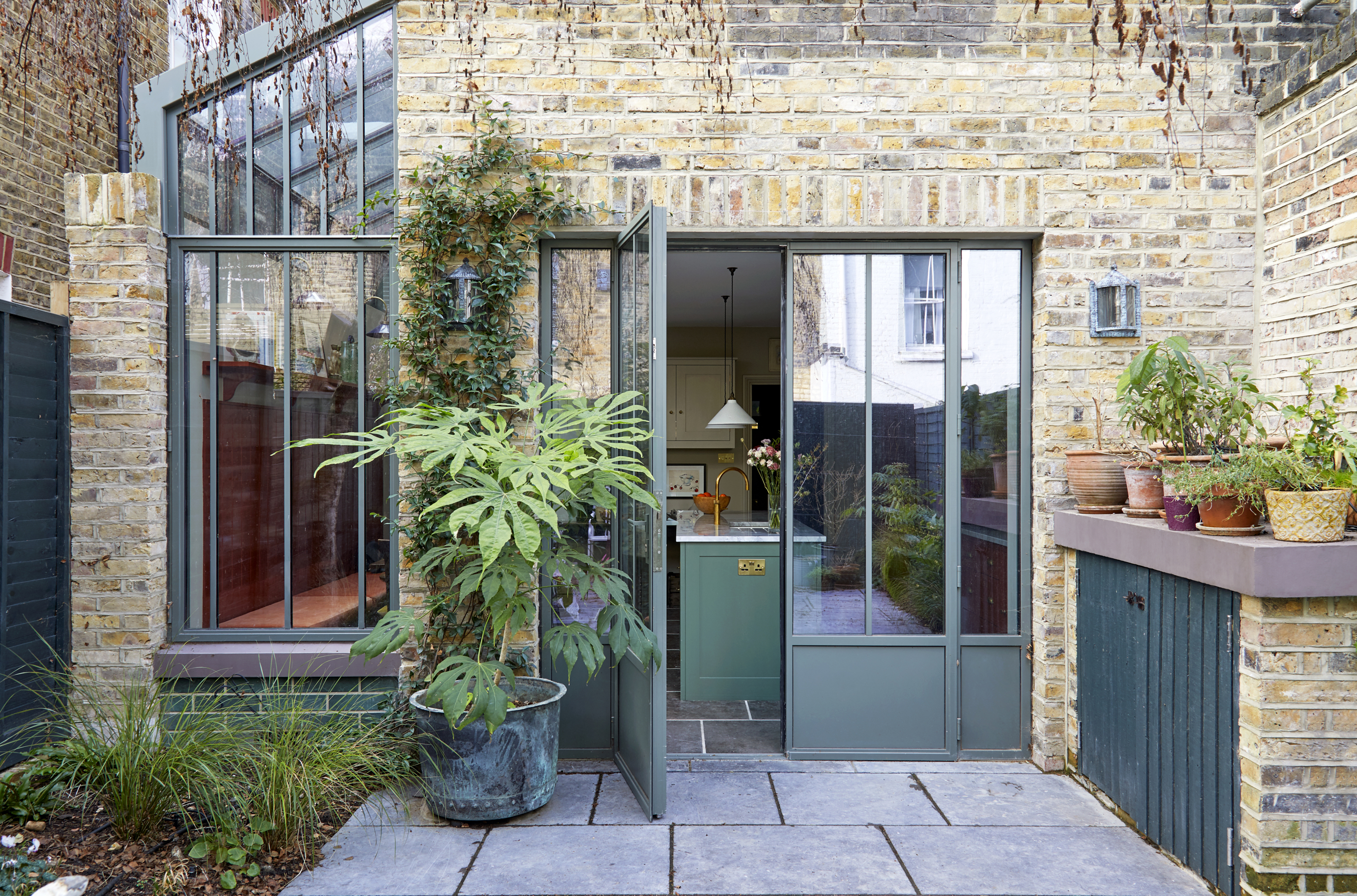
This Victorian terraced modern house in south-west London features three floors plus a loft extension. On the ground floor is a living room, play room and large kitchen dining room that opens onto the garden, plus a powder room. On the first floor is a study, girl’s bedroom, nursery and a family bathroom. The top floor holds the spare bedroom, a bathroom, plus, in the loft extension, the main bedroom with an en suite shower room.
‘It was always John’s dream to design a tailor-made family home for us,’ says homeowner Anna Ferguson, talking about her consultant dermatologist husband, who has been passionate about interiors all his life. Says John: ‘I grew up in Scotland with a mum who made our house beautiful partly due to the influence of the Swedish artist Carl Larsson who she loved. My grandparents lived near Dundee and had many ties to the local artists so I think an appreciation of art, colour and design is in my DNA.’
Before they had children - three girls, Audrey May, now seven, Margaux, five and Dittany four months, he and Anna, who works in finance, lived in rented properties where they had to compromise on design. So when it came to the revamp of their first home owned together, a Victorian terrace in south London, they were excited about having a place to put their stamp.
Living room
The couple bought it in 2015, in quite a dilapidated state (the washing machine and tumble drier were in the old outside loo) and garden was a mud pit, ‘but it had a weeping birch tree which was one of the things that attracted us to the house,’ says John.
After some initial refurbishments to make the ground floor liveable, they researched ideas and saved for a major refurbishment, calling in architect Billy Sinclair of Sinclair Studios. ‘Billy was recommended by a friend and very good at understanding what we wanted and being able to work with our ideas,’ says John. Unfortunately work commenced just before lockdown in 2020 which meant it dragged on for a year, rather than the planned six months.
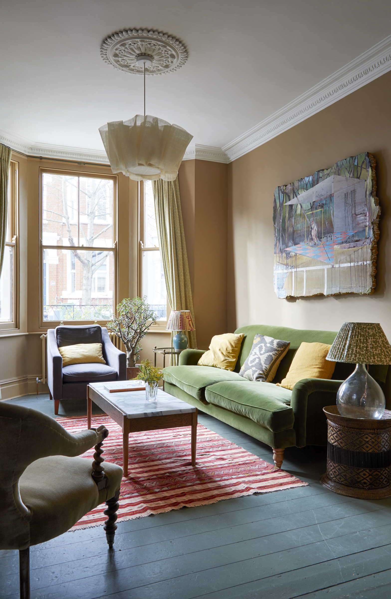
'Our main criteria was to make this room a cozy haven with warm colors and textures. There is a wood burning stove here too,' they said.
Kitchen diner
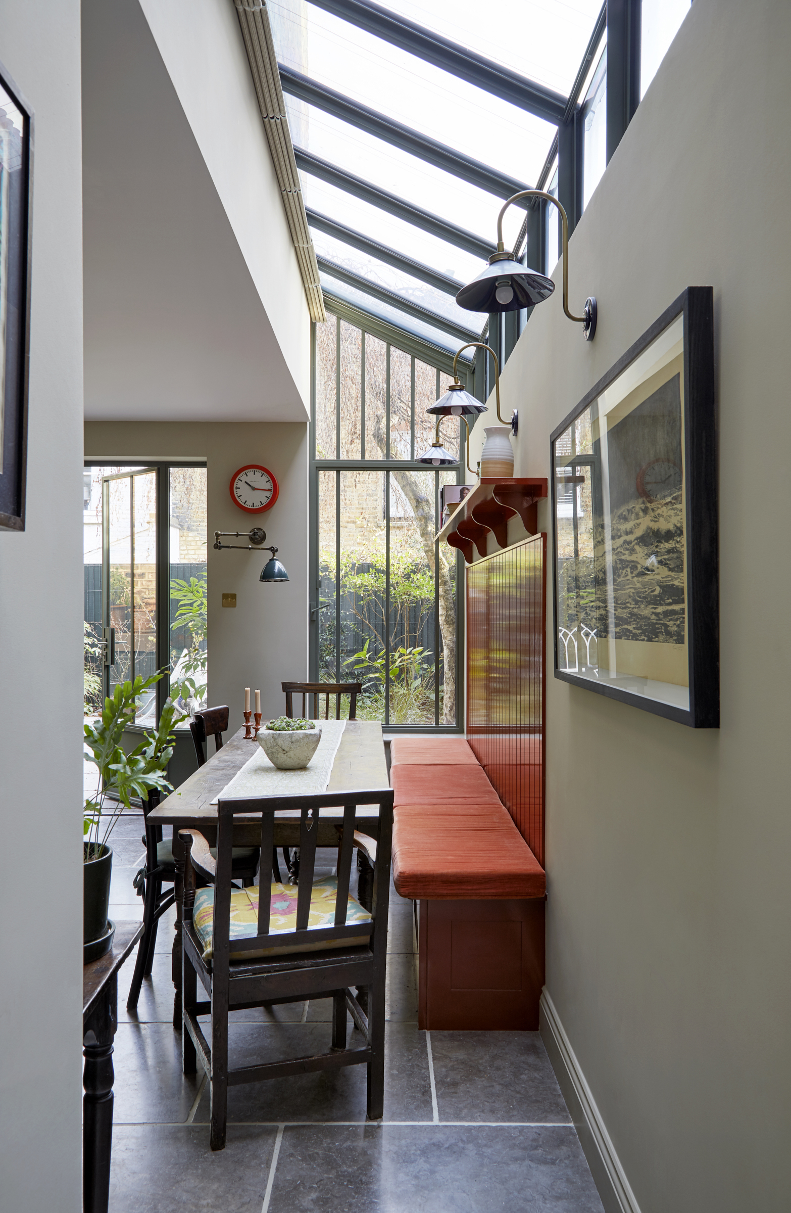
The couple’s idea was for a modern update with a modern extension idea, loft conversion and colorful interior, that enhanced the original Victorian bones of the house. ‘I wanted to avoid the side return extension jarring and looking like a glass box add-on, but rather an integral part of the house,’ says John.
Be The First To Know
The Livingetc newsletters are your inside source for what’s shaping interiors now - and what’s next. Discover trend forecasts, smart style ideas, and curated shopping inspiration that brings design to life. Subscribe today and stay ahead of the curve.
To this end he used panels of glass, metal-edged in a garden-green shade to unite the inside and outside, rather than large clear panes. ‘I found a particular image of a botanical garden in Geneva with a nice pattern of glazing with metal framed windows quite pretty, and I thought it was a reasonable template for us to copy.’
'Our plan was to create a light, yet warm and colorful kitchen that worked for both entertaining and family life,' he adds. 'We wanted it to feel a bit like a Victorian glasshouse – this is where our inspiration for the doors and windows came from.'
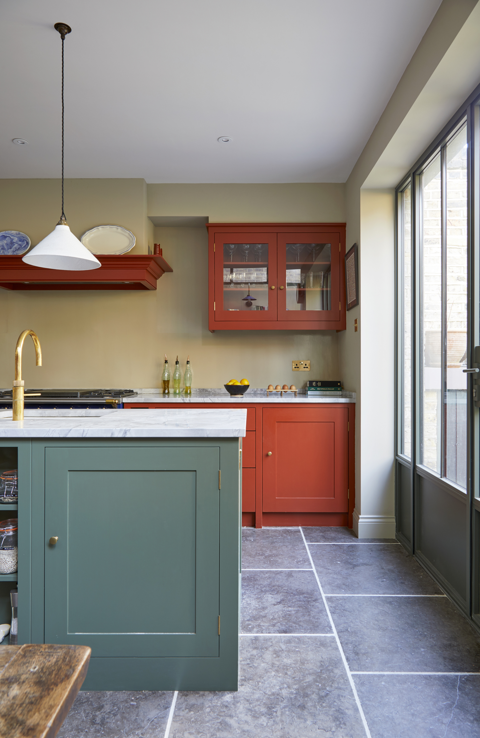
They chose Plain English, along with their off-the-shelf brand, British Standard for their kitchen and used their colors as much as possible. ‘They have good, curated color palettes and we borrowed from the work they had done,’ says Anna. ‘It was a great help in establishing shades that work together.’
The wall above the worktop is painted in wipeable gloss which saved the cost of tiles or a backsplash while open shelving in the kitchen island idea is great for storage jars, but the couple opted to have cupboards that hide clutter too.
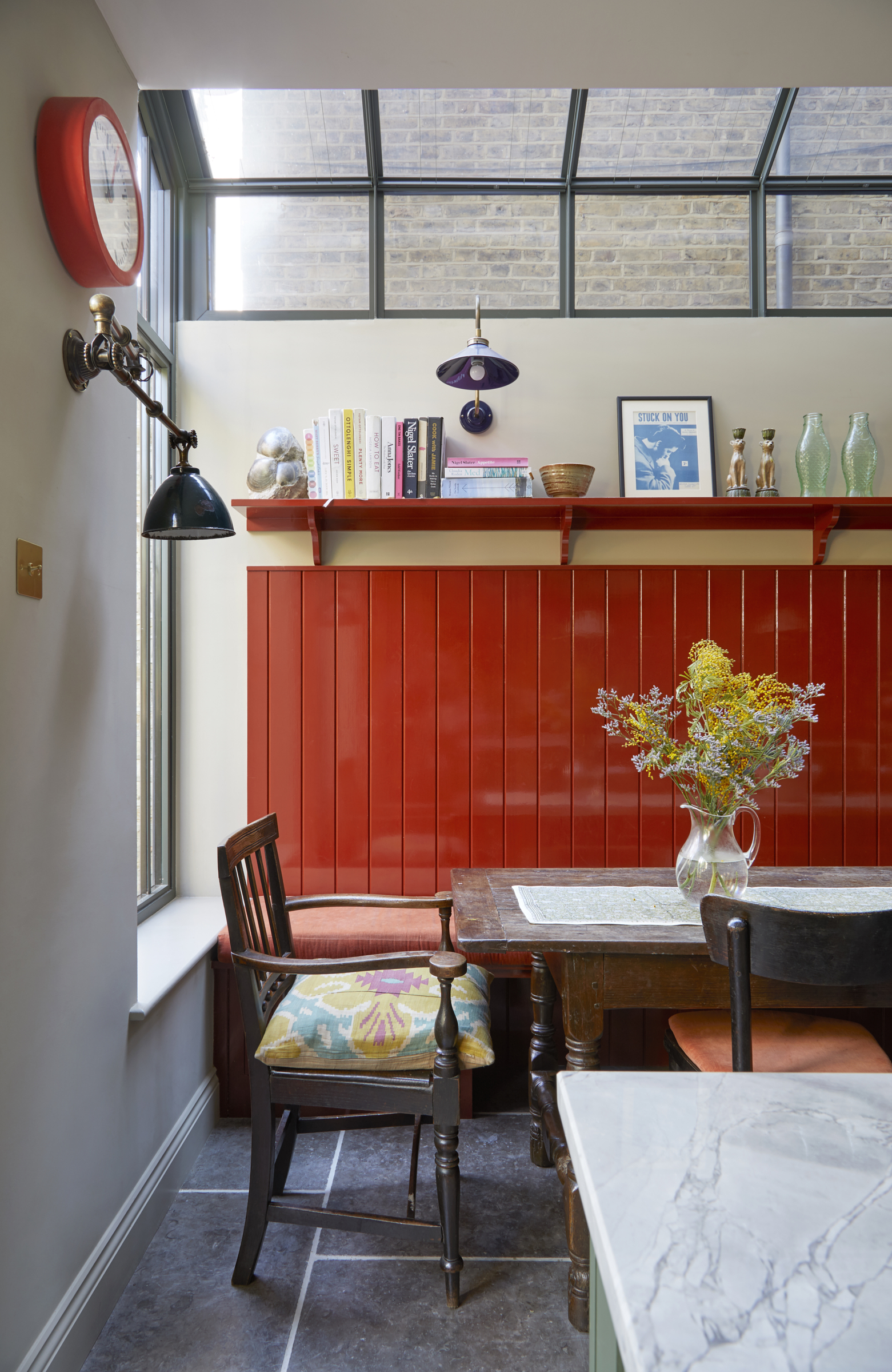
The panelling by the dining table is both practical to protect the wall and also makes a dramatic focal point.
Entrance hall
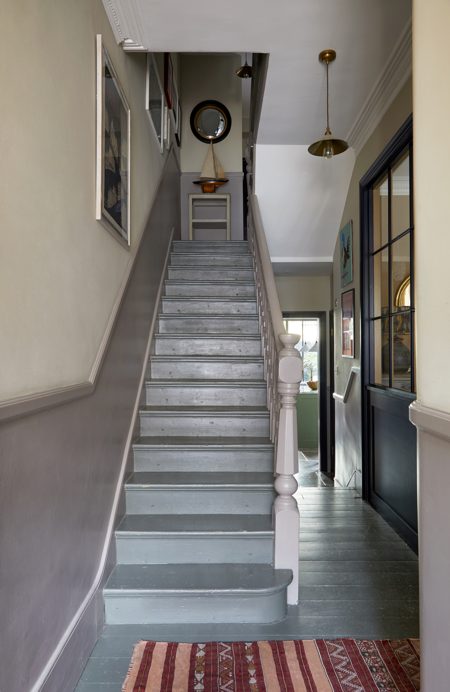
To make their quite dark house as light as possible they installed an interior window between the playroom and the stunning entrance hall idea and when it came to the color scheme they weren’t afraid to go bold. ‘We tried to ensure that colors were complementary even though they were strong choices, we didn’t want them to clash too much,’ says John.
'We were conscious that the hall colors would run to the top of the house, and so chose a three color palette that was fairly neutral and one that we felt would work with all the rooms.'
Main bedroom
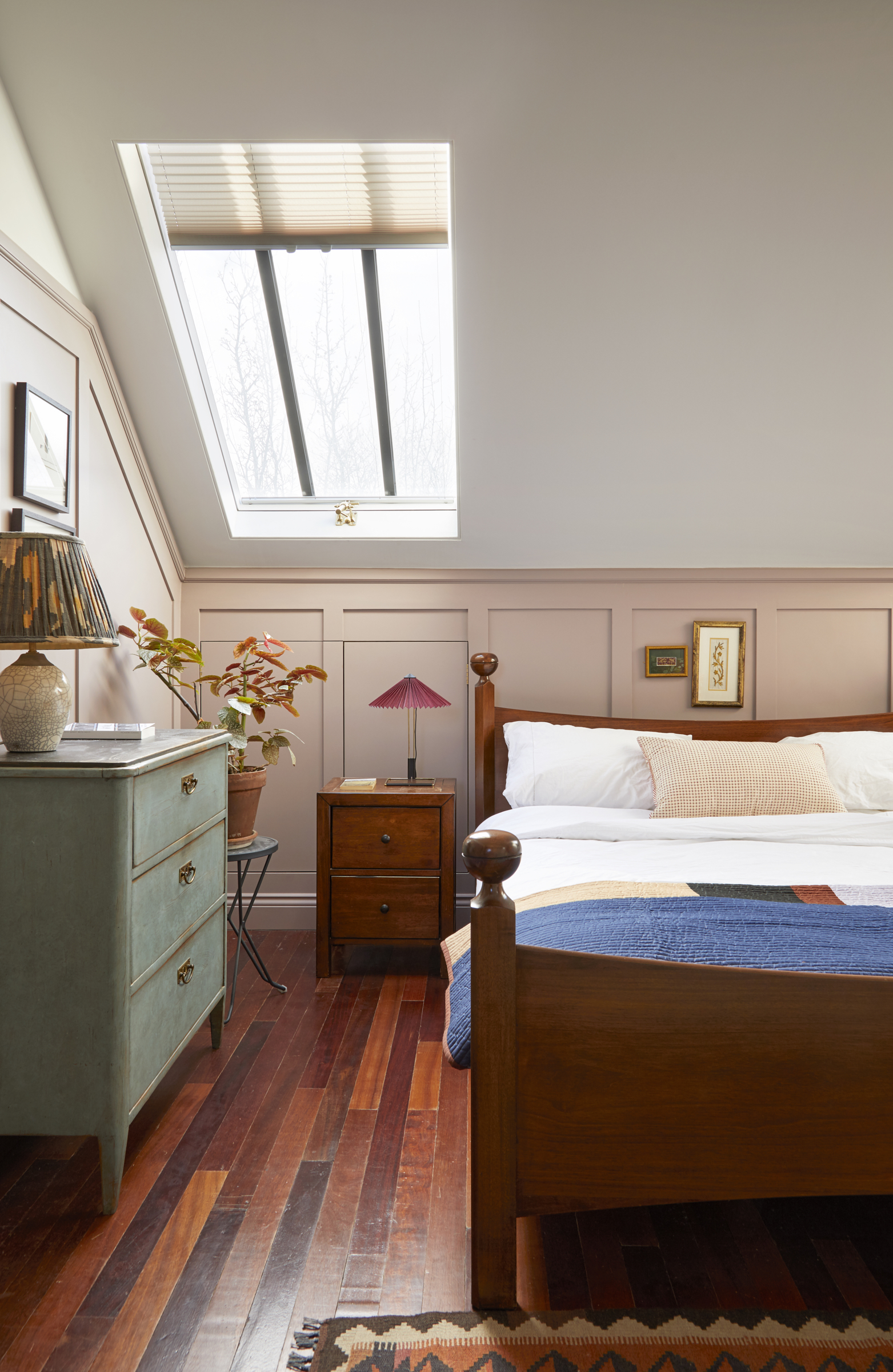
This neutral bedroom idea, at the top of the house, was designed to be a sanctuary, with lots of light and not overlooked, and away from the bustle below.
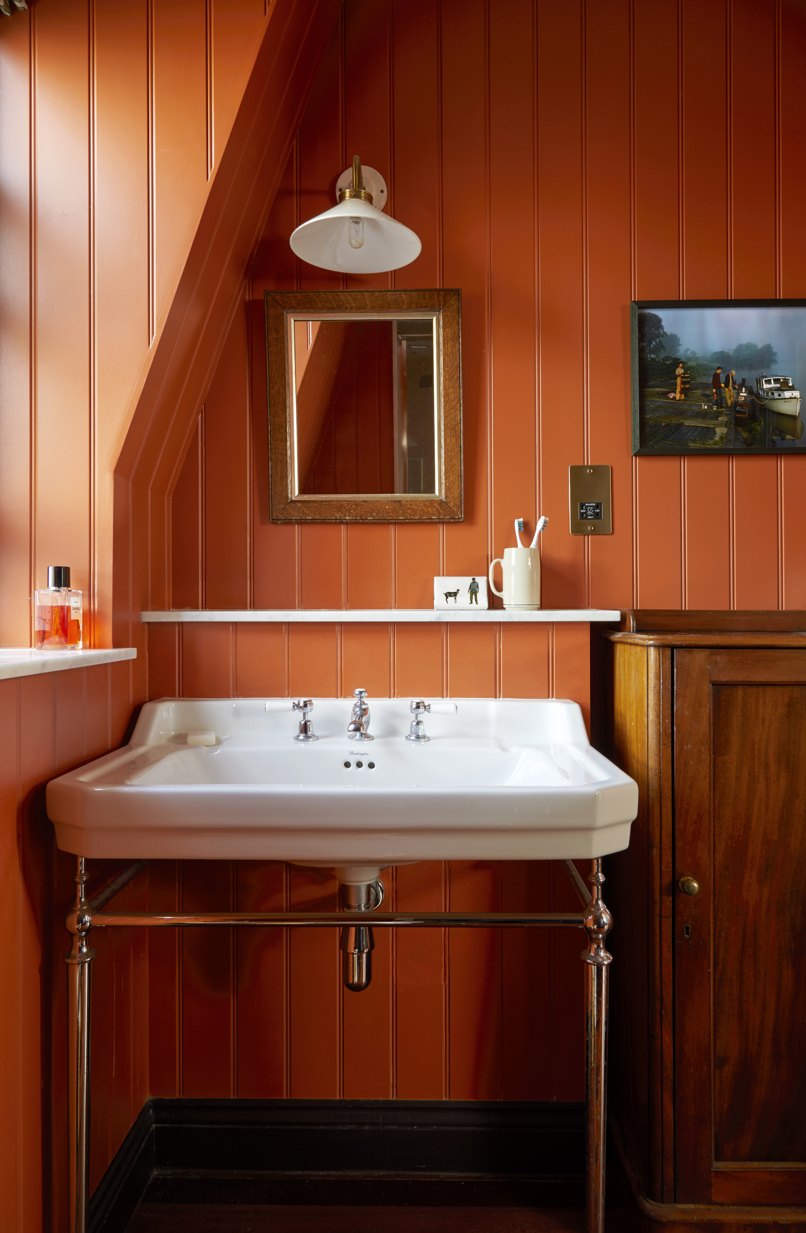
'This room reminds us of bathrooms in an old lodge we stay in on the west coast of Scotland,' the couple remembers. 'Which had lovely original panelling and antique furniture.'
Study
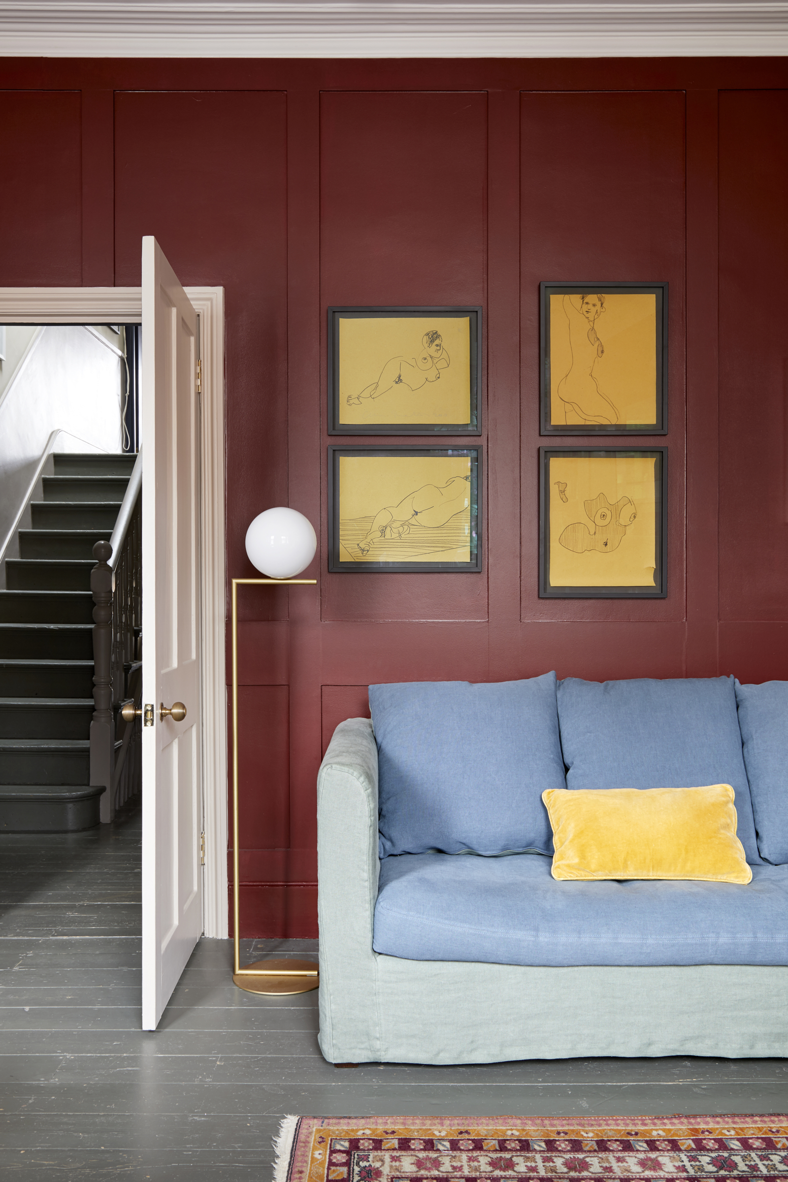
The pair transformed this room from a bedroom to an upstairs sitting room/study in order to escape from the children’s chaos downstairs. 'It is a lovely place to sit in the evening light,' he says.
Family bathroom
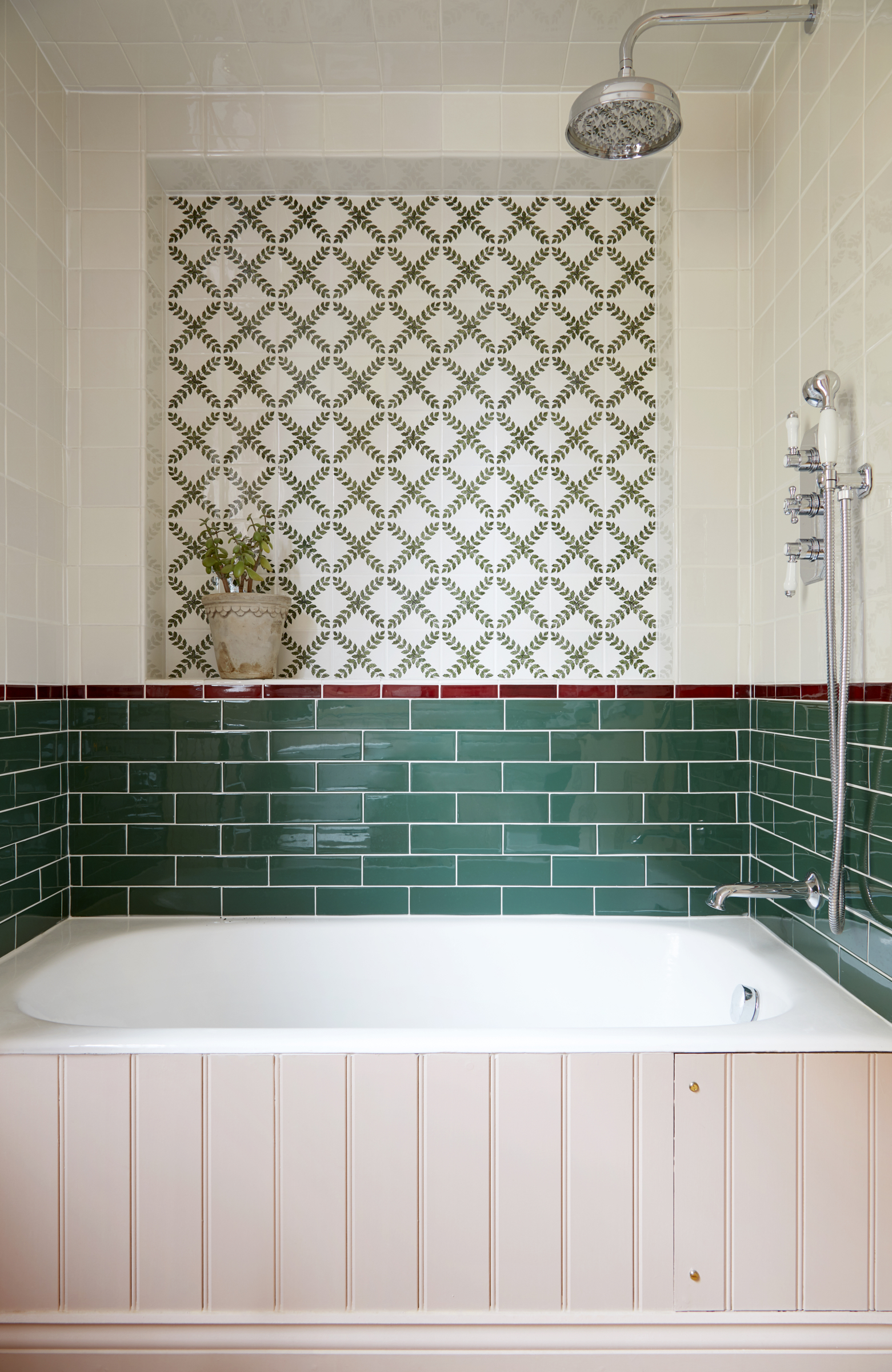
'We love Sarah Balineum’s tiles and wanted to incorporate them somewhere in the house and felt this color combination works for now but also when they are older,' says John. 'We didn’t want to be stuck with a ‘kids bathroom’'
Girls bedroom
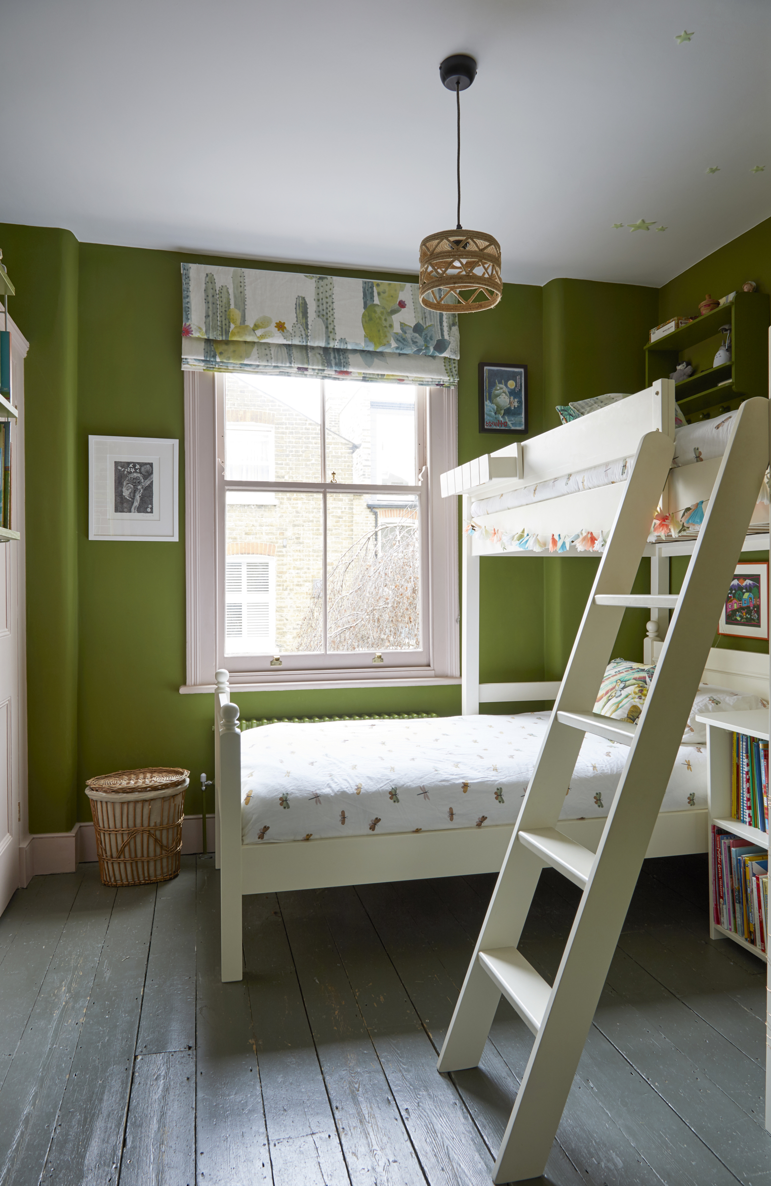
'We wanted to create a girl’s bedroom without using too much pink!' the couple adds. 'We think the room is fun, playful and cozy.'
Designing and decorating their home has been an interesting learning curve for the couple who discovered that sometimes it’s fine to break the rules. ‘I found that you can purchase some items of furniture because you love them, and then make sure the room fits them - which is what we did with the kitchen table,’ says John. It may sound counter-intuitive but so long as you alert the architect and the builder it can work.’
And by going with their hearts the couple have created a harmonious home that perfectly suits their growing family.
See more: This dated Edwardian home has been cleverly transformed into a vibrant and practical living space
A legendary houses editor, Mary Weaver held the job of Homes Editor on Livingetc for over a decade. She set the aesthetic for which the brand has become known. She is now a freelance stylist, art director and writer, regularly contributing to Livingetc and overseeing the brand's successful House Tours franchises of live and webinar events.
-
 These Are the Flower Crowns I’m Wearing This Spring (Spoiler: They’re Actually for My Door)
Coachella confirmed the comeback of flower crowns. At home, they just go by another name: the spring wreath
By Julia Demer
-
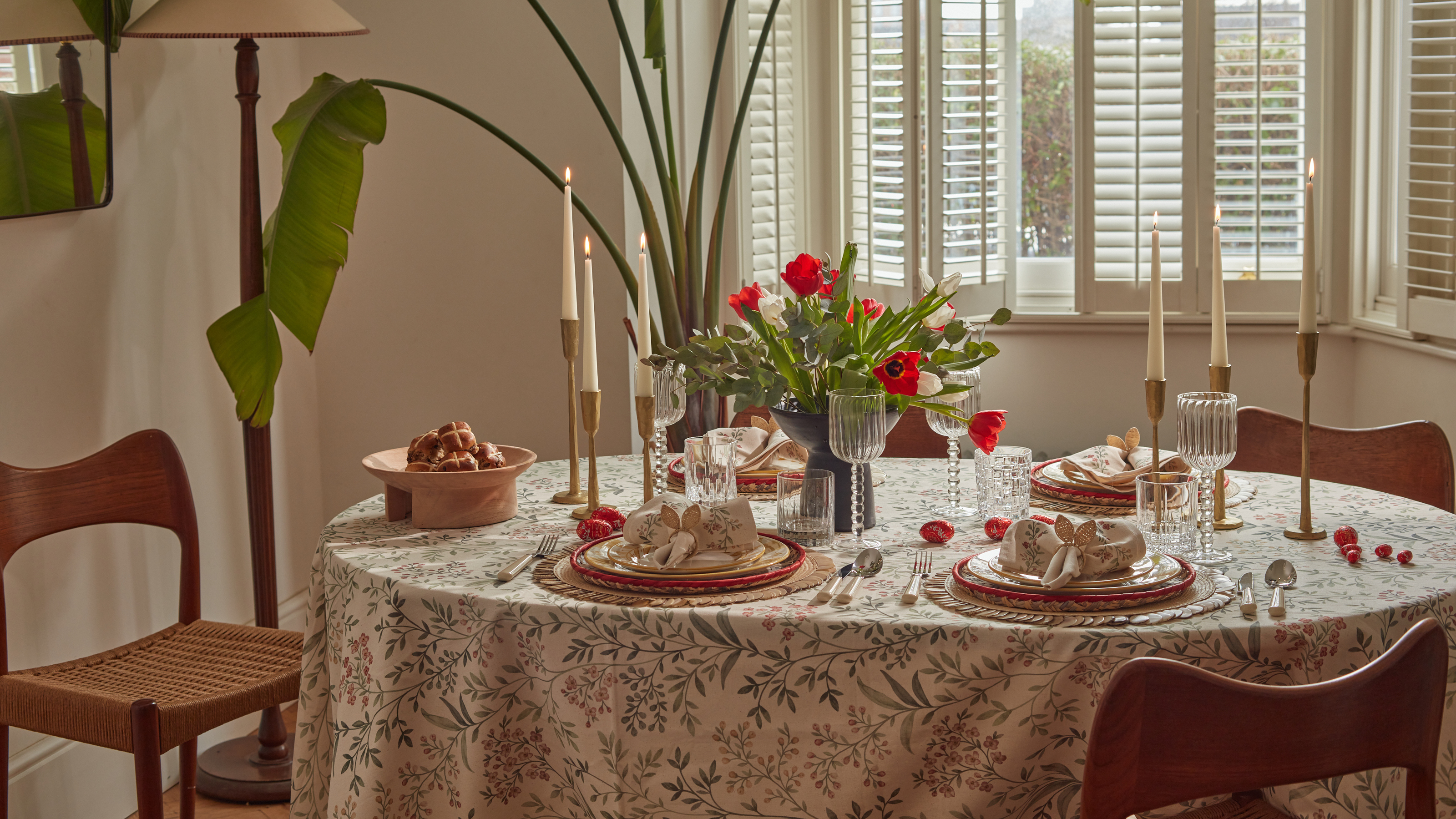 Bunny Ears, Be Gone — 7 Easter Table Styling Mistakes That Will Take Your Setting from Tawdry to Tasteful
From fussy floral displays that disrupt conversation to over-relying on tacky tropes, don't fall victim to these errors when decorating your Easter table
By Lilith Hudson