Designer Profile: Alexander Waterworth
HOW DID YOU GET INTO THE INTERIORS BUSINESS? After showcasing a piece of furniture – something for a restricted space that could turn from a two-seater lounger and coffee table into two benches and a dining table – as my final-year graduate project at the New Designers exhibition in London in 2002, someone kindly recommended me to architect Martin Brudnizki to help design his own-brand furniture collection.
SO WAS THIS YOUR BIG BREAK?
From working on furniture for Martin, I suddenly found I was designing bespoke pieces for restaurants such as Scott’s and managing private residential projects. Martin taught me the importance of getting the smallest details right. Doing my own thing has allowed me to push the boundaries creatively and collaborate with a team of young designers who make me laugh. This really is what gets me out of bed in the morning.
CAN YOU SUM UP YOUR APPROACH?
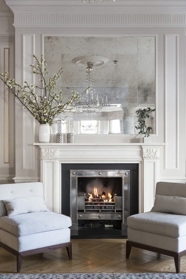
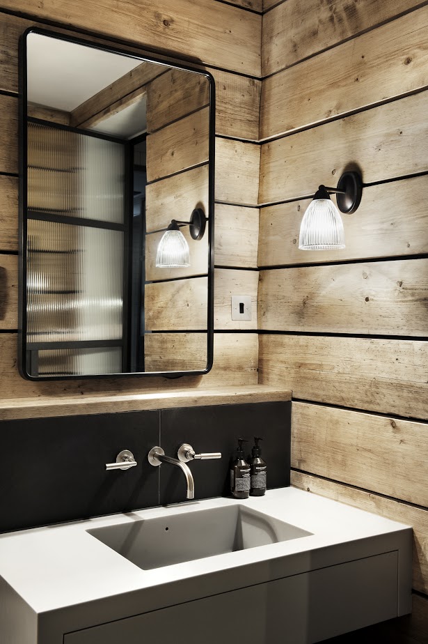
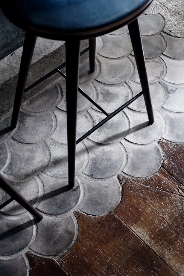
Our aim is to create homely spaces that people feel instantly connected to. We like to mix rough with smooth, so combining textured materials such as wood, concrete and tiles with pattern and interesting lighting to add depth and warmth to a room. My favourite part of any project is sourcing really beautiful, but functional vintage furniture. These pieces bring an easy elegance and create a space that people find welcoming and comforting.
DO YOU HAVE ANY BUYING ADVICE?
I would never purchase an antique on the basis of an online image; it’s vital to see it in person, to ensure it has a good weight if it’s a chair and good joinery for a table. It doesn’t matter if pieces are a little chipped – that just lends character. I never worry too much about the vintage pieces we use coming from the same family, just as long as they share a similar visual language. For new pieces, with a similar high-quality, crafted aesthetic, I work with Rough Living and Matthew Cox. I also like the lived-in feel of Rose & Grey’s leather Chesterfields. West Elm has some lovely products too – I’m keen on its mirrors and mid-century-style sideboards.
Be The First To Know
The Livingetc newsletters are your inside source for what’s shaping interiors now - and what’s next. Discover trend forecasts, smart style ideas, and curated shopping inspiration that brings design to life. Subscribe today and stay ahead of the curve.
WHAT’S BEEN A FAVOURITE PROJECT?
The Musket Room in Manhattan’s NoLIta district – its vibe is relaxed rustic, but with sophisticated touches, such as gorgeous Moore & Giles leather for the banquettes.
WHERE’S THE HEART OF YOUR HOME?
The dining room. My house revolves around food, so a good table is somewhere enjoyable to sit, share and appreciate one another. I say take a leaf from restaurant design and use low-level lighting and comfortable seating to allow the food and company to be the focus.
HOW DO YOU BALANCE ARCHITECTURAL DETAILS AND FURNISHINGS?
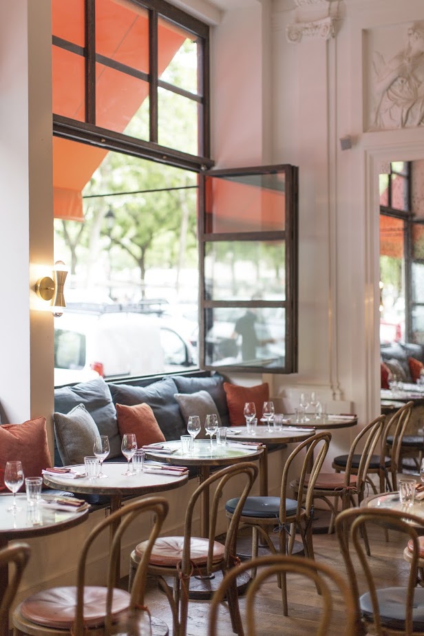
If the bones of a room are minimal, you can play with layers of pattern and colour, but for somewhere like the villa in Puglia we recently worked on, with its 17th-century detailing, we kept the furniture very pared back. At Hally’s café in London, we went for a Californian vibe, but the whitewashed raw brick and simple wood-panelled walls felt a bit bland, so we dip-dyed the tops of bentwood chairs in pretty colours and used patterned fabric for cushions to give it a lift.
WOOD SEEMS TO FEATURE A LOT IN YOUR WORK…
I’m obsessed with rough, unfinished wood – I think it stems from my childhood and growing up in a house filled with highly polished mahogany. I was terrified of marking anything. Wood lends soul to a home, with all its imperfections and scratches. I like to use different timber finishes together, such as a rich, unwaxed walnut floor with grainy oak cupboard door fronts in a kitchen.

HOW ELSE DO YOU BUILD UP DEPTH AND INTEREST?
Tiles in different shapes, widths and sizes work well together – a favourite supplier is Focus Ceramics – and I like to choose designs with a mottled, handmade feel (even if they’re brand new) as they have more depth. Painting walls with a brush rather than a roller also gives extra texture. The size of floorboards can really affect a room’s mood too – really thin boards give more contrast to a room so you need very little else; wide boards bring less attention to the floor. Favourite suppliers include Schotten & Hansen and Marmorea.
DO YOU HAVE ANY PAINT COLOURS YOU PARTICULARLY RECOMMEND?
I’ve just painted my living room in Farrow & Ball’s Green Smoke. It’s very cosy. For a lighter neutral, I love Farrow & Ball’s Pointing. It’s warm, elegant and clean, plus there’s a comforting way it glows with electric light.
AND WHAT ABOUT LIGHTING BUYS?
A current favourite is the Cloud light by Apparatus Studio, which we used at Ober Mamma in Paris. We also recently used a metalworker to create bespoke shapes for us, which we then had an electrician wire up as lights. Statement lighting makes a space feel unique.
FINALLY, WHERE’S BEST TO GO TO EXPERIENCE YOUR STYLE?
We’ve just finished a restaurant for Michelin-starred chef Günter Seeger in New York – an interesting juxtaposition of a cosy, rustic restaurant feel with a fine dining experience in the Meatpacking District – and are soon to open the Mamma Primi restaurant in Paris’s 17th arrondissement, combining fun Italian food in an elegant, intimate space. We’re also working on a second Clove Club here in London and a wine bar for Château Margaux in Marylebone.
The homes media brand for early adopters, Livingetc shines a spotlight on the now and the next in design, obsessively covering interior trends, color advice, stylish homeware and modern homes. Celebrating the intersection between fashion and interiors. it's the brand that makes and breaks trends and it draws on its network on leading international luminaries to bring you the very best insight and ideas.
-
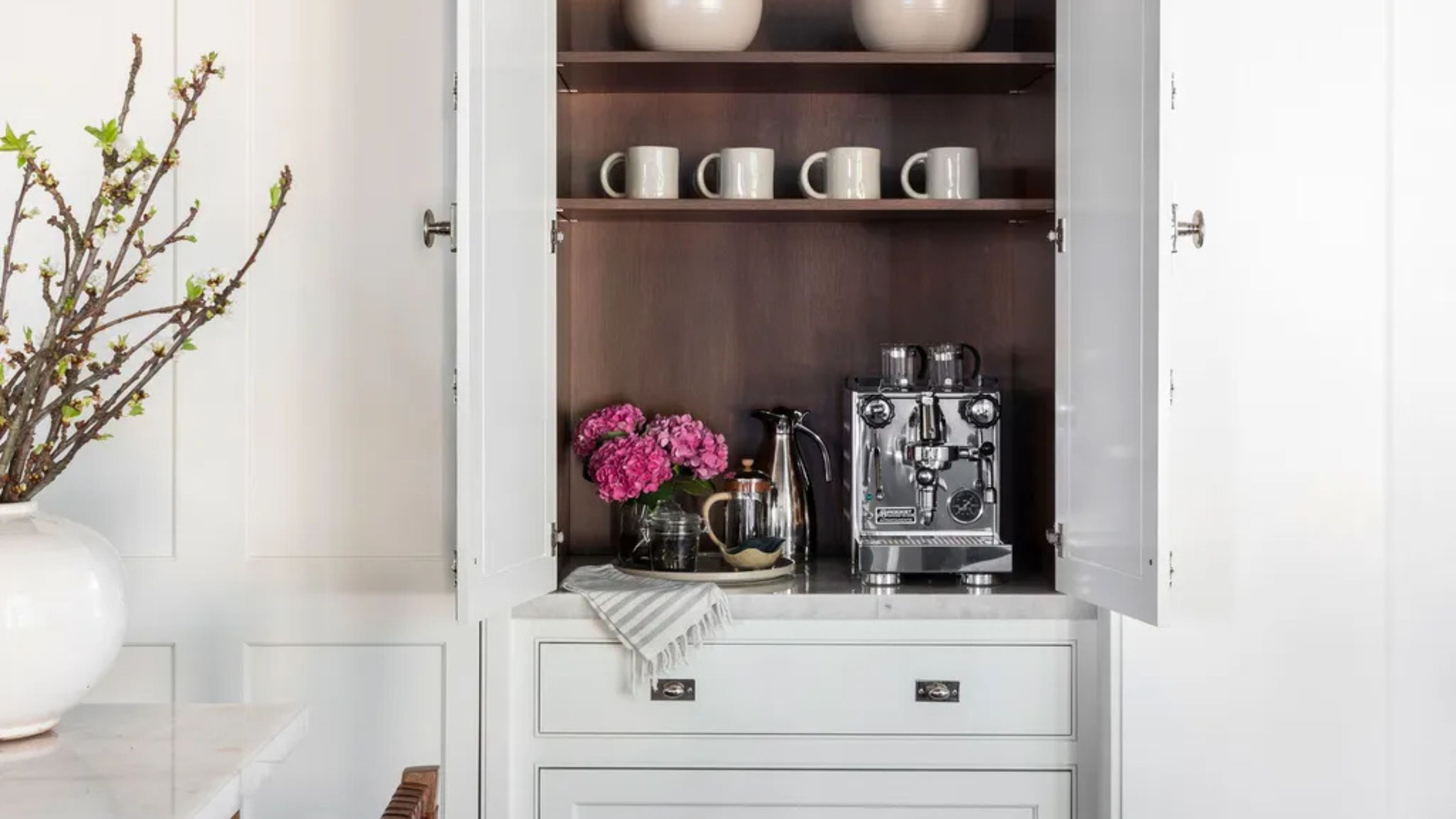 Turns Out the Coolest New Café is Actually In Your Kitchen — Here's How to Steal the Style of TikTok's Latest Trend
Goodbye, over-priced lattes. Hello, home-brewed coffee with friends. TikTok's 'Home Cafe' trend brings stylish cafe culture into the comfort of your own home
By Devin Toolen Published
-
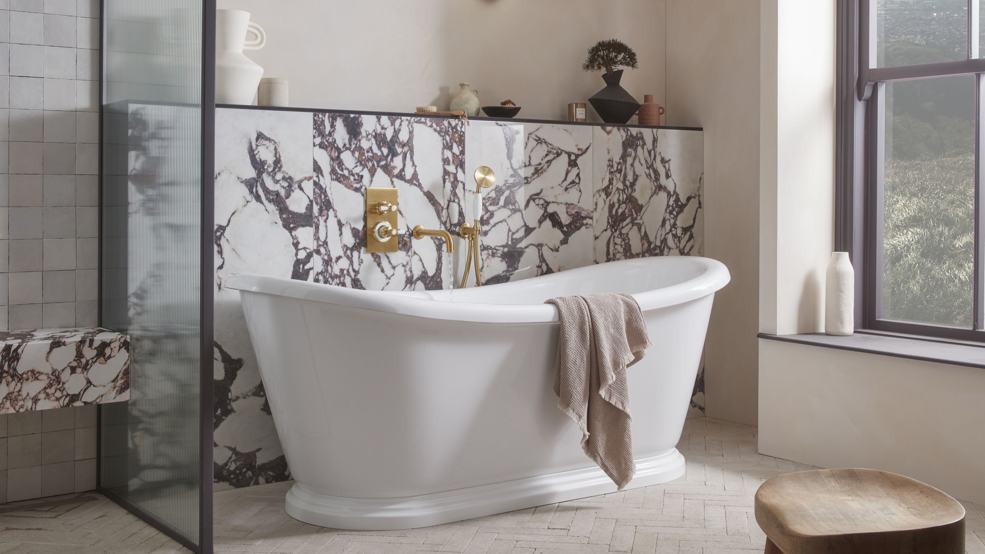 5 Bathroom Layouts That Look Dated in 2025 — Plus the Alternatives Designers Use Instead for a More Contemporary Space
For a bathroom that feels in line with the times, avoid these layouts and be more intentional with the placement and positioning of your features and fixtures
By Lilith Hudson Published