Interiors insights from Ashley Hicks
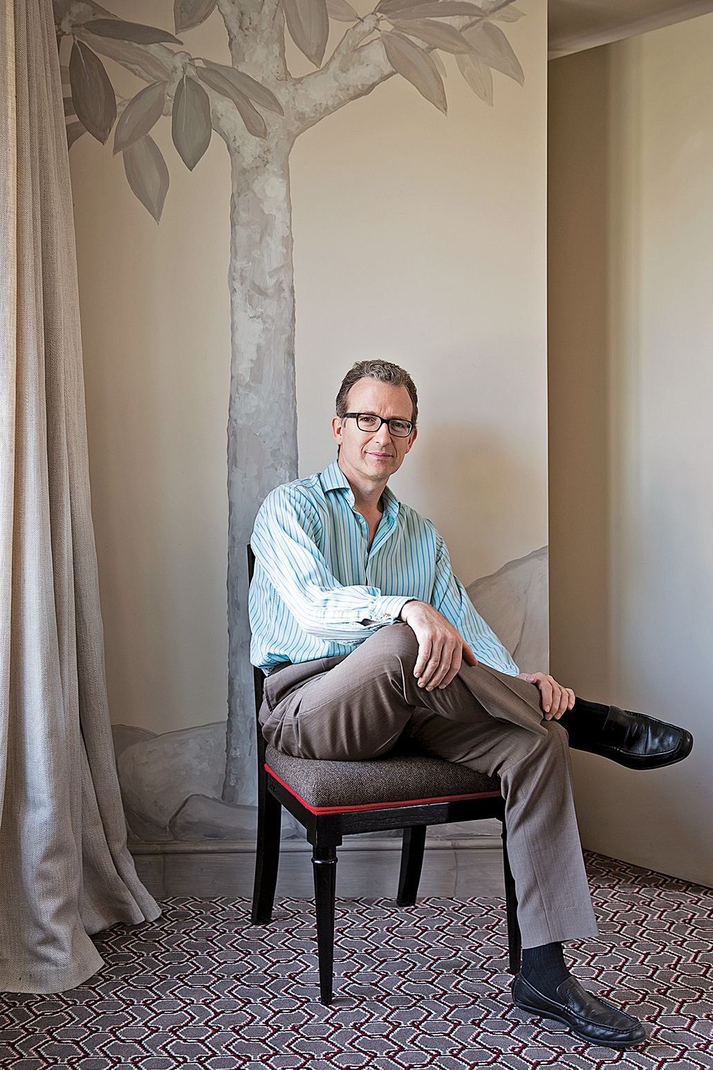
Being the interior-designer son of one of the most celebrated decorators of the 20th century was always going to be a little tough. Ashley Hicks readily admits that people often say, ‘Oh, hello David,’ when first greeting him, but he’s happy to be associated with his dad’s legacy – though his own style has a very different signature.
We caught up with Ashley at his London pad, a flat in the famous 19th-century Albany apartment block in Piccadilly. The place used to belong to his father, but he’s put his own stamp on it.
Tell us about the Albany.
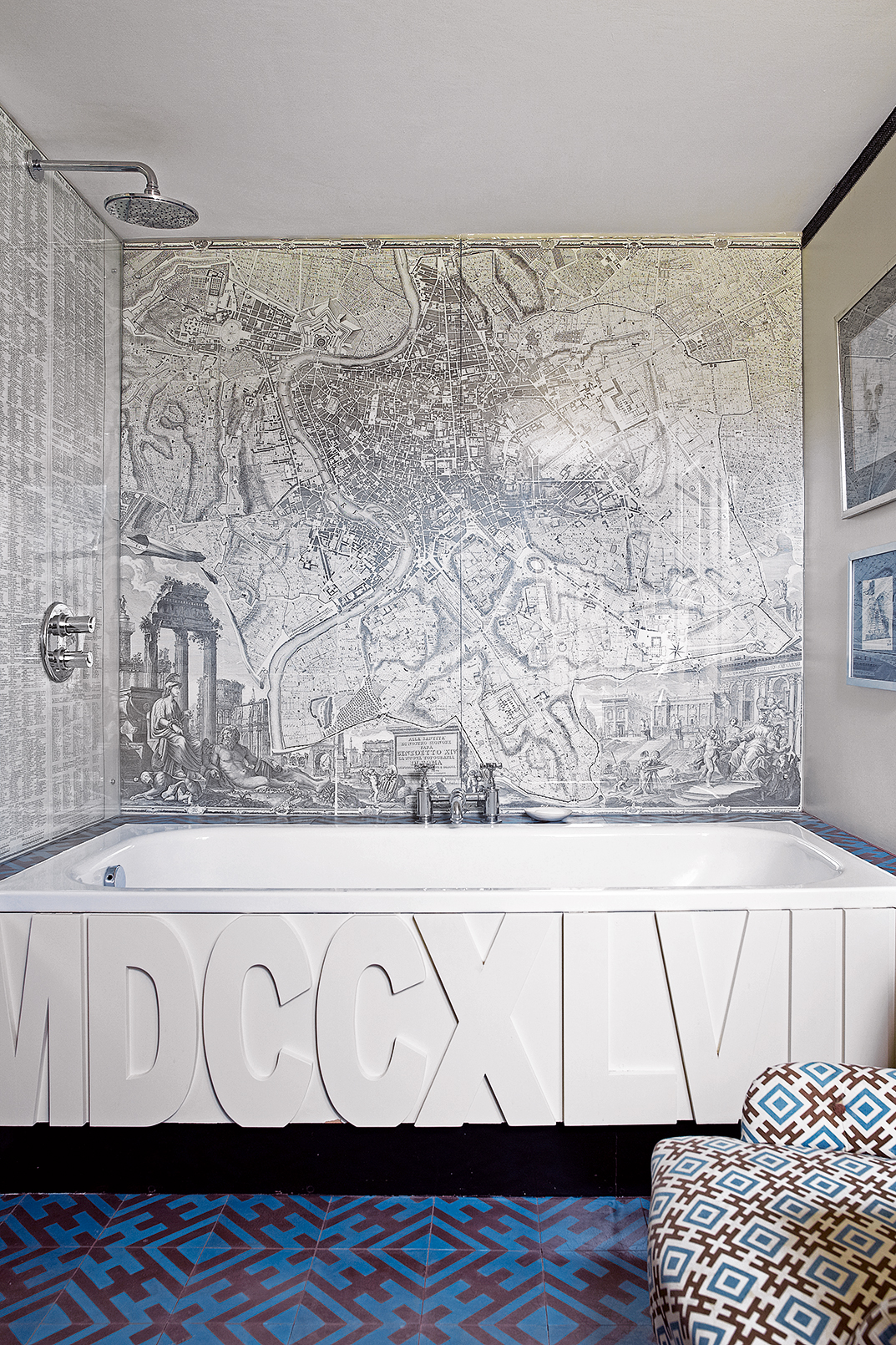
The apartment block was really designed to be inexpensive flats for young bachelor sons of Lords. When I moved in a few years ago,I covered the living spaces in hessian and painted a mural on top. Raffia wallpapers, which I love, are super-expensive and a nightmare to hang, so hessian was a great alternative.
I was also inspired by Marcel Proust’s writing room. He covered it in cork because he didn’t want the sound of the city interrupting his work – and I fancied a cocoon of cork for myself! So I’ve clad the hallway in cork tiles and painted a pattern on them, then put gilded mouldings on top to create a panel effect.
How do you approach your interiors projects?
I always start with the building’s existingstructure and the floor plan; I trained as an architect at the AA School of Architecture, so these elements are quite important to me. It’s a good idea to put the furniture as close to the walls as possible to maximise the space – it’s a disaster to be huddled in the middle of a room like you’re on some sort of island.
Be The First To Know
The Livingetc newsletters are your inside source for what’s shaping interiors now - and what’s next. Discover trend forecasts, smart style ideas, and curated shopping inspiration that brings design to life. Subscribe today and stay ahead of the curve.
The proportions of furniture can also make a huge difference to one’s visual enjoyment of the room. Pieces with enormous curves such as Chesterfield-style sofas or modern furniture that’s the wrong scale can really upset the balance.
Which interiors piece would you splash out on?
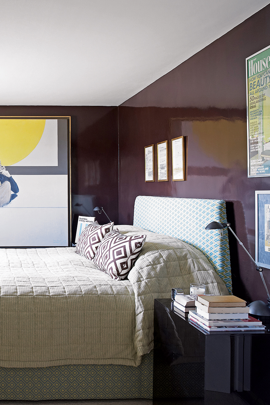
For me, it would be a really nice sofa. It’s expensive, but it makes all the difference – especially as I’m a real sofa-dweller. However, it’s best to avoid all- feather seat cushions. It’s really luxurious, but from the moment you sit down, it just looks awful. In my own sofa, I’ve used foam padding wrapped in feathers so it still feels comfortable, but keeps its shape.
What other style tips do you suggest?
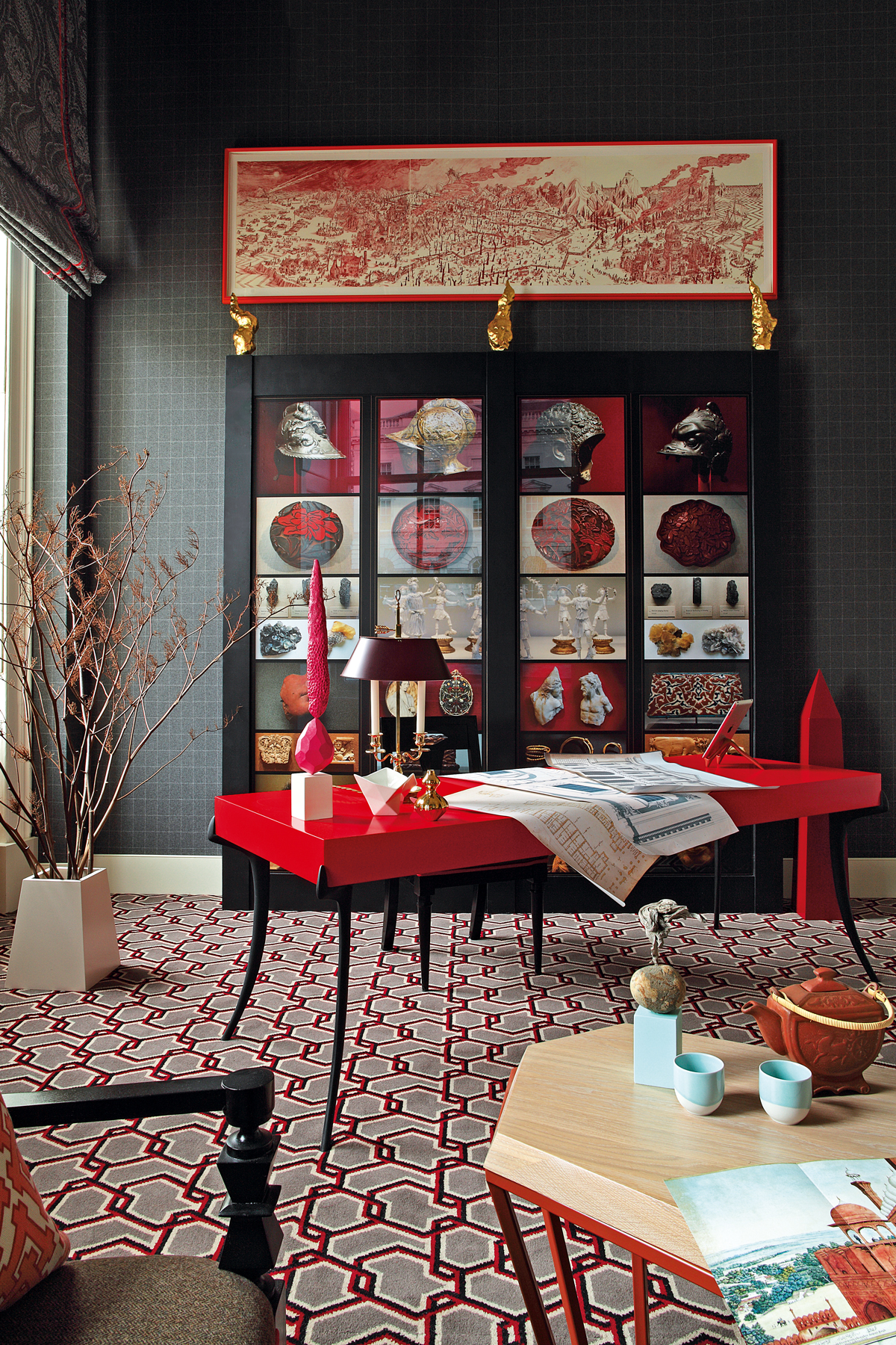
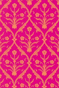
When it comes to pattern, vary the scale. I find small, subtle patterns can be treated more like a texture. It’s nice to mix it up and have something very modern paired with older designs. At home, I have a bold geometric carpet and an upholstery fabric that’s a 14th-century pattern from the V&A archives.
Have you always had a flair for design?
When I was 15, I decorated my bedroom in our Oxfordshire farmhouse. It had black walls and ceiling and black carpet, and all the furniture was white, so it was completely monochrome. My dad thought it was good, but odd.
How does your style differ from your dad’s?
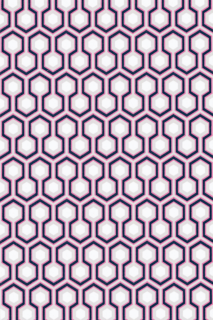
I consciously try to depart from my father’s style in my own work. For example, my Chainmail carpet design for Alternative Flooring is a bold geometric pattern like his, but it’s also asymmetric, with a trompe l’oeil style of shading, which he would have been absolutely against.
However, I still do designs for the David Hicks by Ashley Hicks collection such as carpets, tiles and fabric. My dad was keen on using one fabric on everything in a room, which looked marvellous in photos, but a little unfriendly in person. It’s a bit like how everyone loves a man in uniform in theory, but, in reality, they’re a bit intimidating!
Where do you find inspiration?
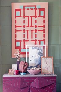
My daughter always says I want to live in a museum, which I absolutely do. There are quite a lot of historical references in my work and I love visiting museums and heritage properties.
You’ve also designed a furniture range – howdid you get into that?
I started designing pieces back in 1997 for theGem Palace in Jaipur. My first design was a takeon the Klismos chair – basically, an Ancient Greek easy chair – which was built by some local village carpenters. I had a little company called Jantar Mantar, which was the nickname for the Jaipur Observatory – but it also can mean something like ‘abracadabra’ in Hindi, which the carpenters found very amusing! My personal favourite piece is the X-Frame ottoman, which I’ve put in my London flat.
What’s your favourite interior space that your father designed?
When I came to London as a child, we stayed in his house in St Leonard’s Terrace inChelsea. He dedicated the wholetop floor to one big bathroom-cum-dressing room for himself andthere was a bed in there I usedto sleep on. The entire roomwas covered in khaki tweed andthe floor was made up ofplywood tiles. To me, it wasextremely beautiful.
Find out more about Ashley’s workat ashleyhicks.com, or follow himon Instagram @ashleyhicks1970
The homes media brand for early adopters, Livingetc shines a spotlight on the now and the next in design, obsessively covering interior trends, color advice, stylish homeware and modern homes. Celebrating the intersection between fashion and interiors. it's the brand that makes and breaks trends and it draws on its network on leading international luminaries to bring you the very best insight and ideas.
-
 Italian Kitchen Trends — 5 Emerging Ideas From the Chicest Italian Designers That I Predict Will Go Global in 2025
Fresh from Milan Design Week, these are the exciting finishes, styles, and innovative materials I can't wait to see in more kitchens this year
By Faiza Saqib Published
-
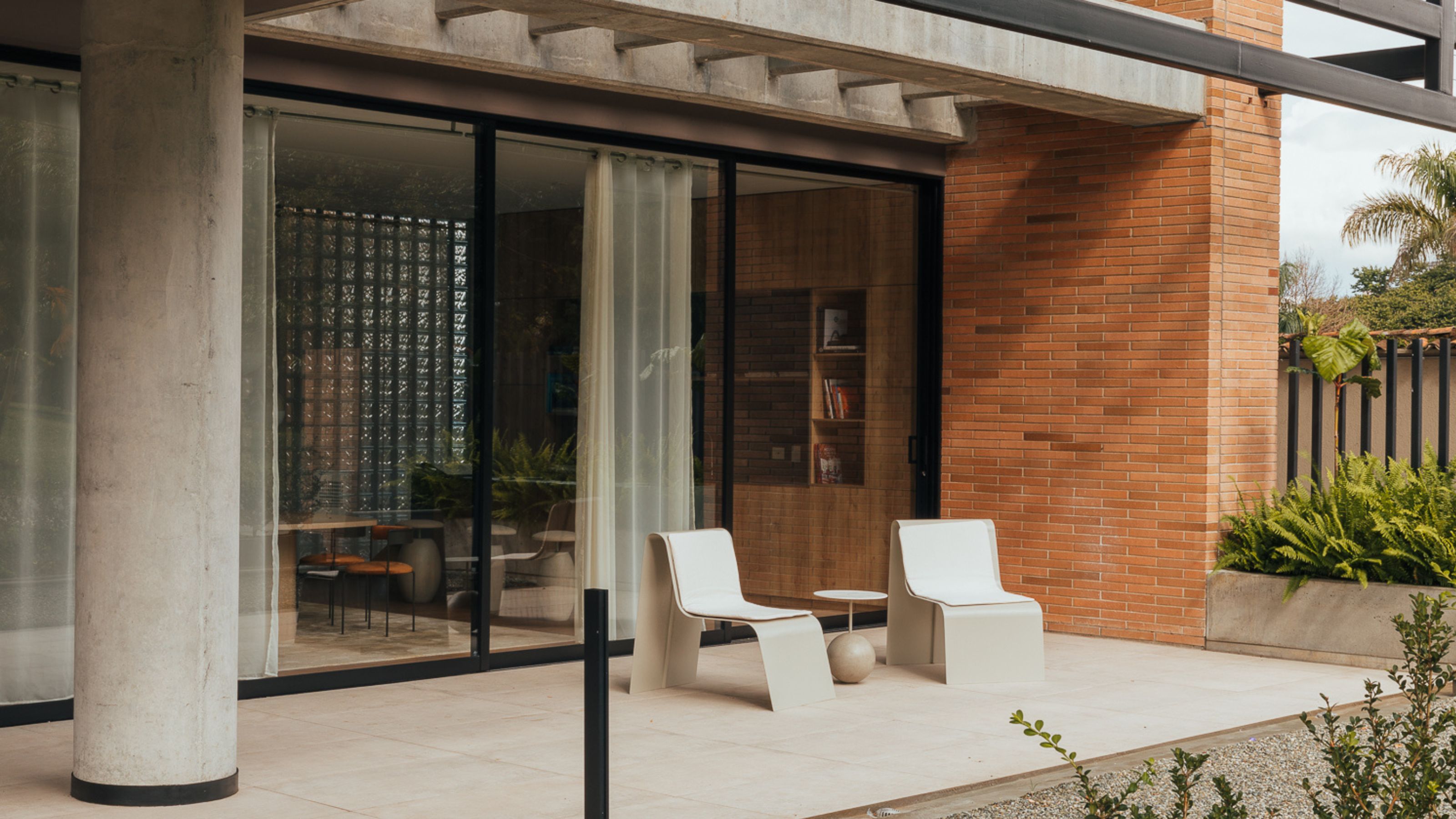 Small Patio Ideas — 8 Clever Ways to Style Up Even the Tiniest of Outdoor Spaces
If you're dreaming of turning your small patio into a dream space the right combination of practical and creative ideas will help you max up its potential
By Sarah Wilson Published