Maximalism in interior design explained
Maximalism is so much more than just more is more. Our experts decode this movement in modern interior design
To understand maximalism in interior design, the word itself contains a salient clue: decorate to the max. Of late, maximalist interiors have burst onto our feeds with a vengeance, like a proclamation that less isn’t more, it’s lackluster.
What is it, exactly? You can’t miss a maximalist interior. They bloom with layers of texture, print, color, and meaningful objects. Modern interior design interprets this as a hyper-personal space raucous with pattern and personality, often appearing on the edge of chaos, which can make them borderline cheeky. Picture an eclectic country home stuffed with updated chintz, like patterned wallpaper and curtains (maximalists aren’t afraid of an animal print, particularly leopard spots, and explosions of florals from wall to wall) in harmony with a trove of art and objects.
The shape of the conversation around maximalism is a bit of a statement — you can’t speak of maximalism without considering its preternaturally slick opposite, minimalism. In many ways, maximalism is a rejection of the latter.
And while maximalism doesn’t hold back, pulling it all together requires a heavy, deft hand. Here’s everything you need to know.
Maximalism in interior design explained
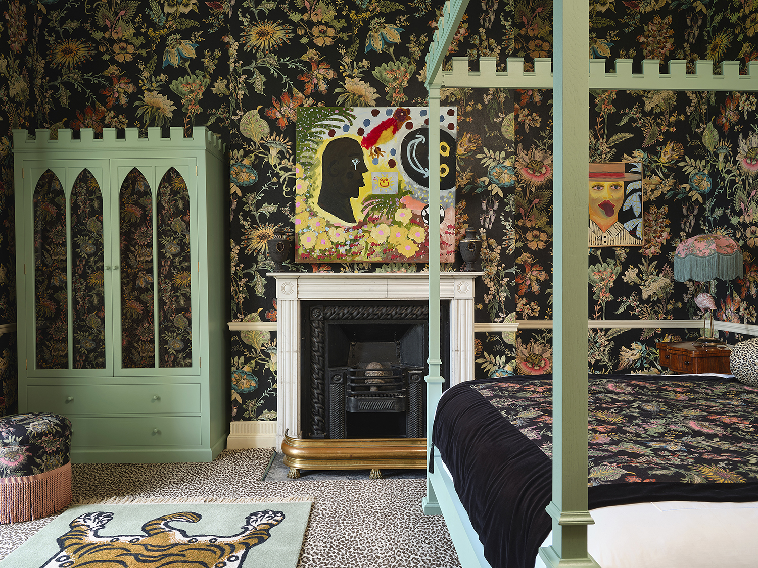
Design by House of Hackney
WHAT IS MAXIMALISM?
Although maximalism doesn’t have a tidy definition, its core elements are abundant: pattern, color, and texture.
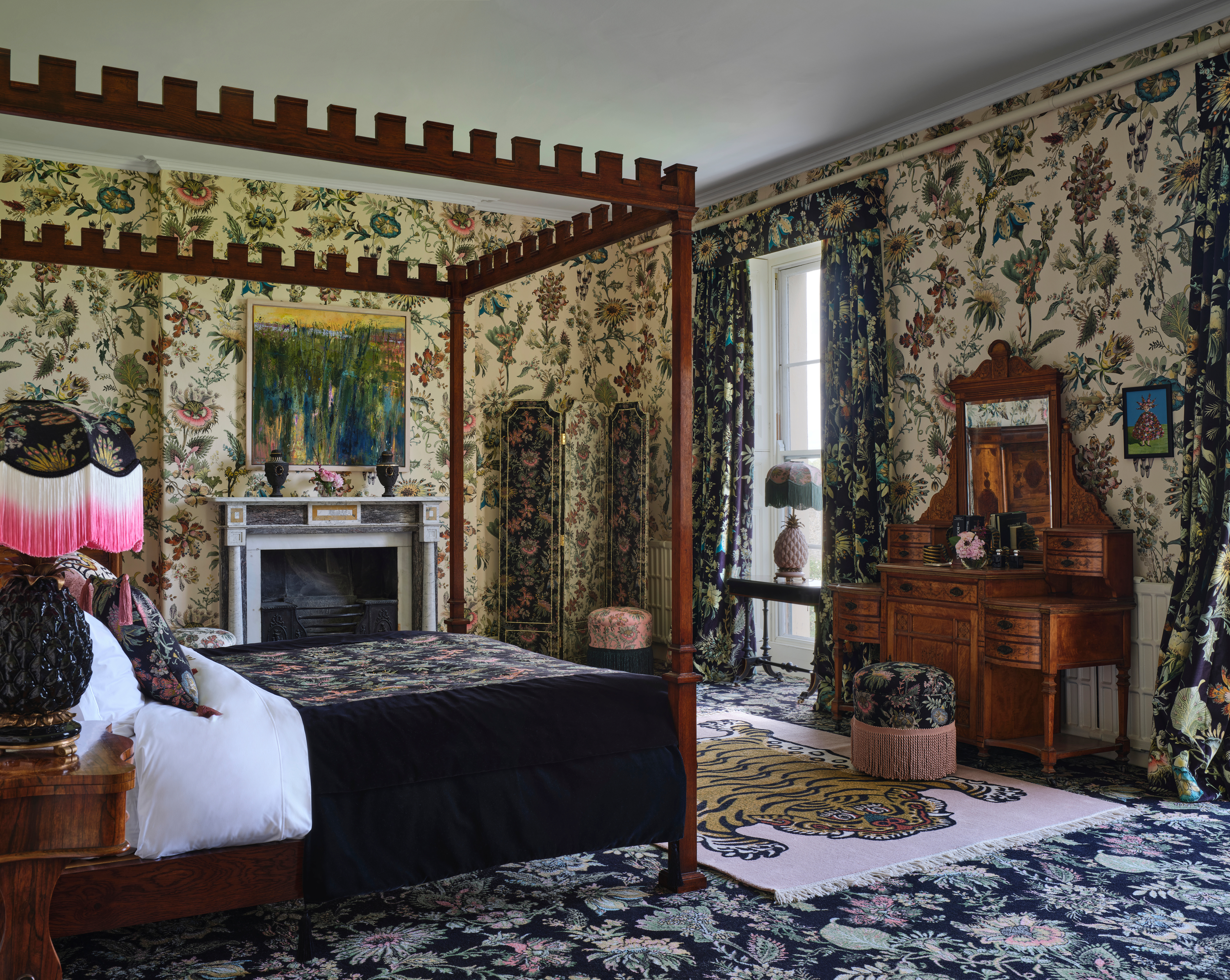
“The key to maximalism is that there really are no rules – it celebrates a freedom of self-expression and the joy of an interior filled with colour, pattern, and life,” explains Frieda Gormley of House of Hackney, a British design house with a showroom in New York. Her modern bedrooms ideas above include running wild with pattern and print across the walls, floor and bed itself, and her studio’s Palmeral wallpaper, created in 2012, was a precursor to the modern maximalism we see today.
A maximalist space doesn’t hold back. It’s filled to the brim with precious bits and bobs. Textbook examples criss-cross different eras and are full of bold color and updated chintz (chiefly British, this decor often has an English accent). Juxtaposing anything from French-patterned wallpaper and animal prints to vintage furniture and art. Expect layers of decor and deeply personal objects that feel collected over time — interiors that tell a story.
Be The First To Know
The Livingetc newsletters are your inside source for what’s shaping interiors now - and what’s next. Discover trend forecasts, smart style ideas, and curated shopping inspiration that brings design to life. Subscribe today and stay ahead of the curve.
“A lot of people see it as clutter,” says the illustrious Swedish designer Martin Brudnizki, who works out of London and New York. “Personally I see it as a collection of emotions and memories.”
In 2018, Brudnizki led the lavish revamp of Annabel’s in Mayfair, below, something of a cultural reset that burst at the seams with maximalist material (trims, fringes, tassels!), a cacophony of floral pattern, and a joyful pink loo with swoon-worthy gilded swan taps. “I find it comforting sitting in an interior made up of pattern as you are essentially camouflaged, hiding in a deep comfortable armchair as opposed to poised on a spindly chair in a bright white room with nowhere to go,” adds Brudnizki.
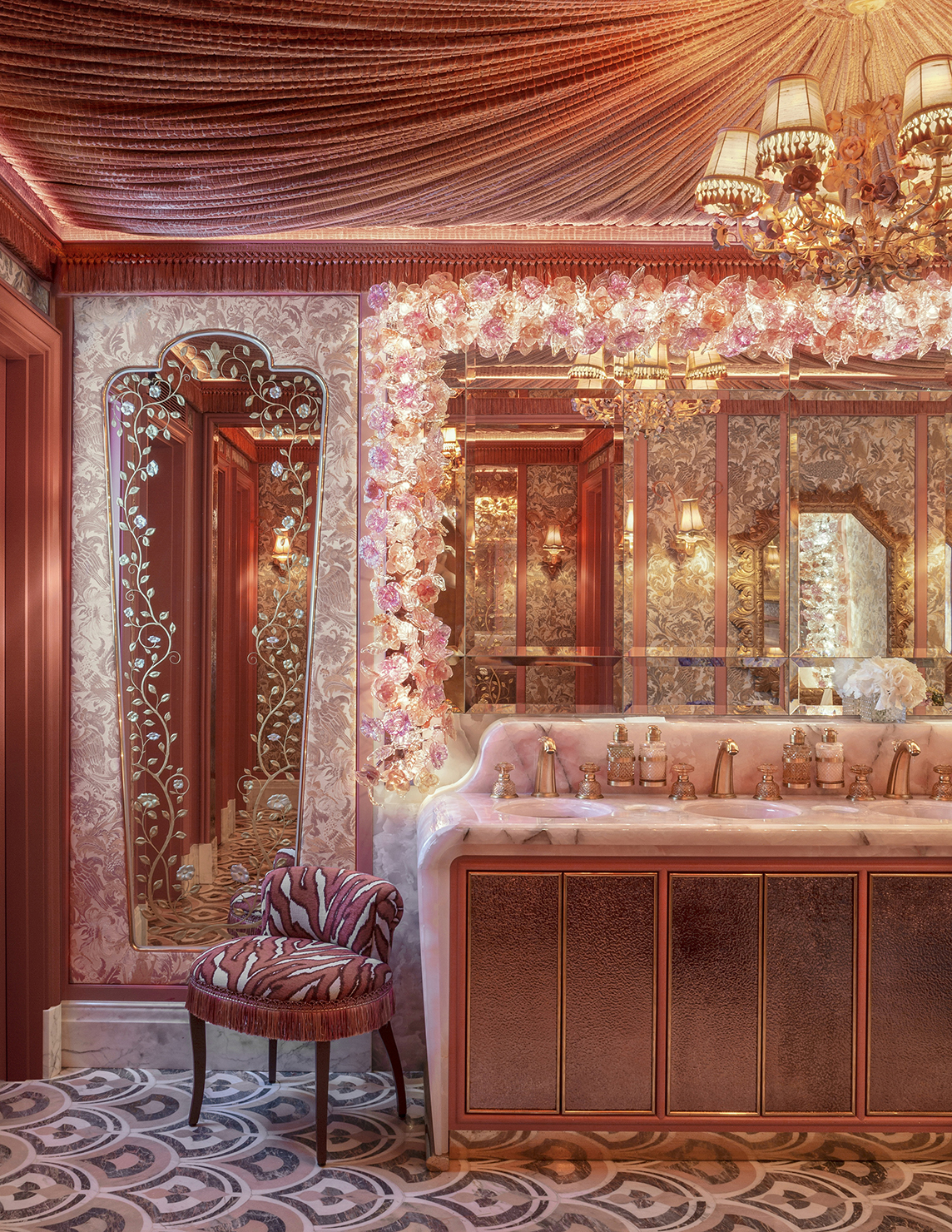
Annabel's in Mayfair, designed by Martin Brudnizki
WHAT DOES IT MEAN TO BE A MAXIMALIST?

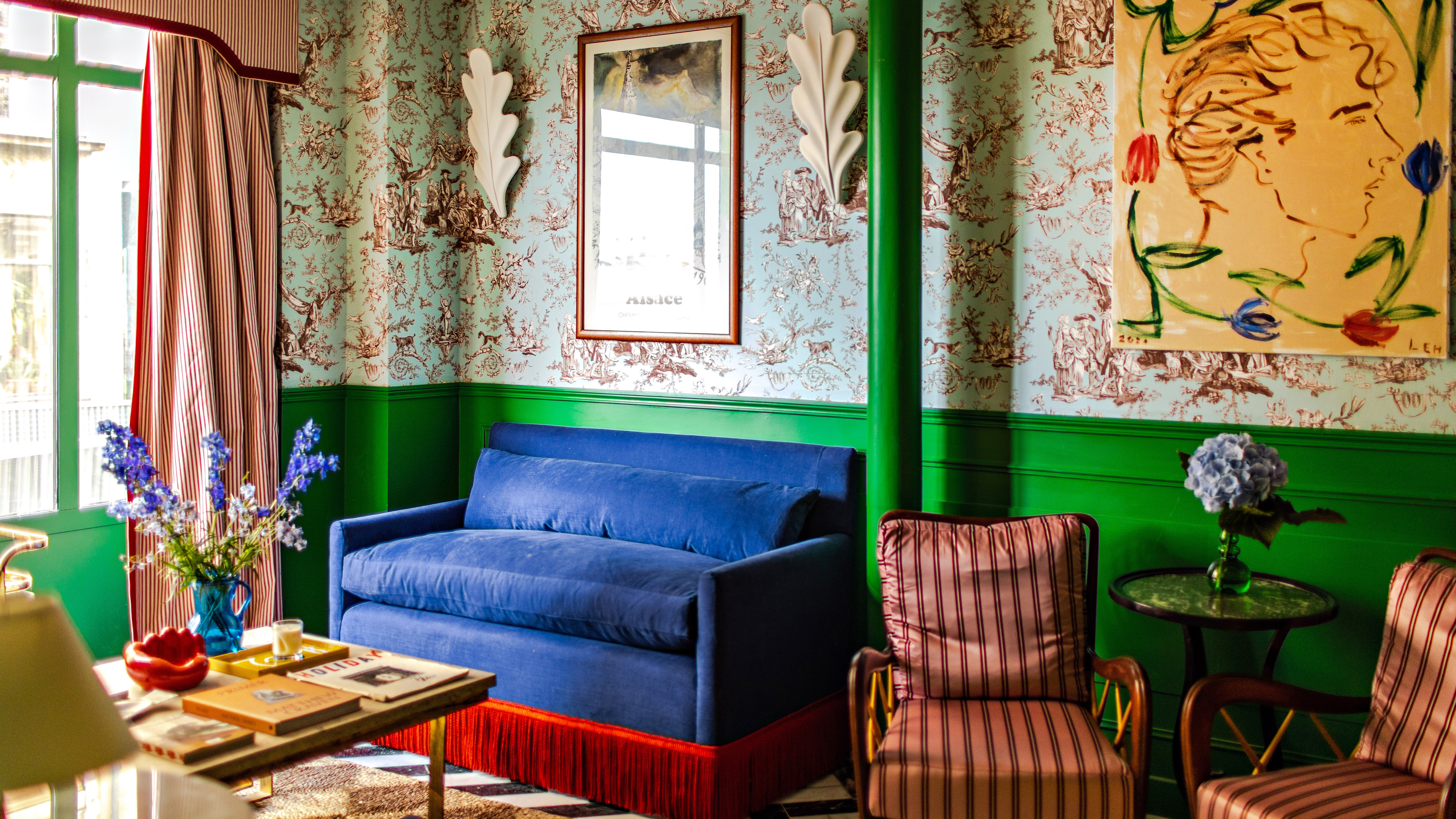
Hôtel Les Deux Gares in Paris designed by Luke Edward Hall
“It’s very romantic, a bit nostalgic and very optimistic,” said Luke Edward Hall, among today’s maximalist stars, when he described his style to us back in 2018. “I think you should be able to live with beautiful things every day – I like an element of the handcrafted in everything I do.”
In Hall’s latest project, the new Hôtel Les Deux Gares in Paris’ 10th arrondissement, you’ll find a masterful blend of maximalist styles featuring vintage French posters and toile de Jouy wallpaper to bright green wainscotting and leopard print sofas — bursting with British charm, these modern bedroom ideas and quirky interiors make you smile.
In this way, maximalists can be somewhat sentimental; the layers found in their interiors are full of personality and story.
“I like to think less about maximalism and more about romanticism,” says Martin Brudnizki. “For me, it is more about conjuring a feeling of glamour mixed with comfort. The various different layers we can use in our interiors should reflect our personality. It doesn’t have to be a million different aspects clashing at once but it does have to transport you into your own world and importantly you need to commit to what you love most.”
You know that quote, “before you leave the house, look in the mirror and take one thing off,” Coco Chanel’s famous mantra? The maximalist would tell you to keep it on, or better yet, add another layer — the more accessories, the better.
WHERE DID MAXIMALISM COME FROM?
Although it’s making a splash on our feeds today, maximalism as a reference dates back to the 19th century.
“Maximalism has been around for decades, starting with the Victorians, who famously loved collecting exquisite objects, and the grande dames of 20th century decorating — most notably Madeleine Castaing, whose penchant for eclectic furnishings and unexpected palettes helped to pave the way for modern maximalism,” explains Frieda Gormley of House of Hackney, who is one of the reasons maximalism is a key part of wallpaper trends today.
The Victorians were eclectic at heart, known for their busy interiors (heavy upholstery, rich colors, and decor galore) while Castaing, the iconic French decorator who enamored the 1940s design world, embraced eclecticism with a touch of tailoring, working with signature colors and plenty of patterns (in her own country house, a leopard print carpet stretched from wall-to-wall).
“But the current incarnation really started as a reaction against the minimalist interiors trend of the 2000’s — a time when it was all magnolia walls and clean-lined furniture.” This makes the nascent rise in maximalism something of a clapback to the minimalism of the past decade or so; it’s a playful, ‘all in’ type of decor that puts every chip on the table.
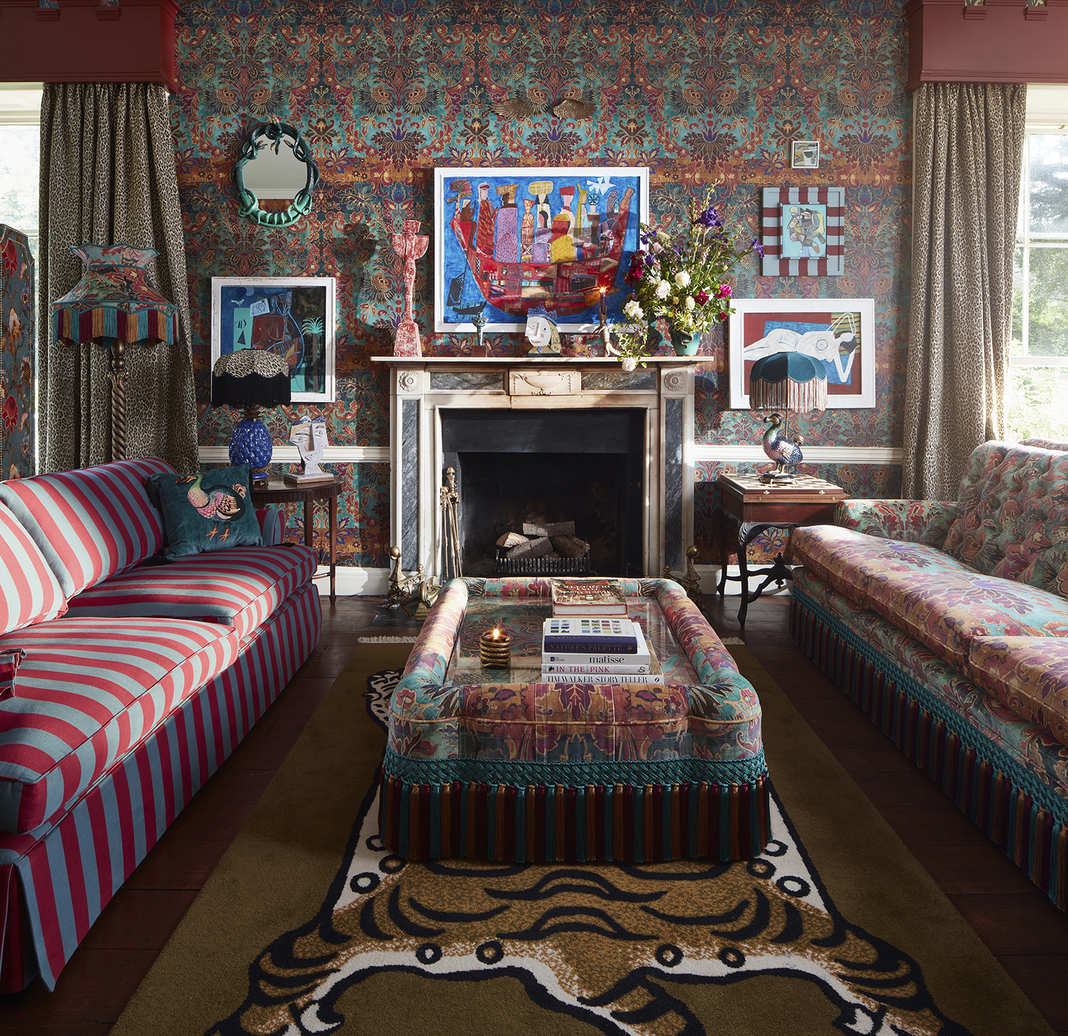
Living room designed by House of Hackney
WHAT IS NEW MAXIMALISM?
The latest maximalist designs are varied if not one-of-a-kind. And yet, like industrial interior design, they do follow a certain rubric, it's just that their rubric is that they break all the rules.
“If we’re looking at an interior without rules and essentially a curation of furniture, colours, art that you love, then there are more opportunities now than historically, and more references to inspire you and include within your house,” Martin Brudnizki. “Our interiors now have the potential to be busier, which is a reflection of our access to culture.”
In this way, new maximalism has a little more room to maneuver, more agency to layer references and styles.
“The ‘new maximalism’ we champion at House of Hackney revolves around maximum colour, painterly prints and rich textures—but it’s not about lots of ‘stuff,’ which it had often been in the past,” explains Frieda Gormley. “We want only to be surrounded by things that have a purpose, that have been created for both their beauty and their meaning. So we say never hold back with the personal objects, mementos, pictures and paintings that evoke a memory or a story, as those are the things that transform a house into a home.”
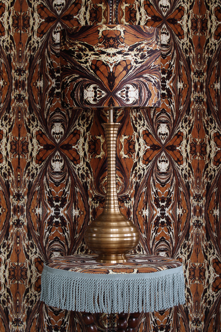
Lampshade amd matching fabric designed by Susi Bellamy
WHAT DO PEOPLE GET WRONG ABOUT MAXIMALISM?
Sure, maximalism means abundant decor. But that doesn’t mean today’s maximalists advocate overconsumption; the decor is meant to hold value, to show signs of life and personality.
“The biggest misconception is that maximalism is about acquiring a lot of possessions or disposable things, when really the ‘new maximalism’ advocates investing in timeless furniture and accessories that you can treasure forever,” says Frieda Gormley of House of Hackney. It's no surprise that the bedroom wallpaper ideas she's turned to for the picture below includes a lot of pattern, but it's still an edited selection. “In our house, we strive to live in a mindful way, decorating with just a few well-made and carefully chosen pieces – with the maximalist touch coming through in bold prints and the layering of textures.”
IS MINIMALISM GOING OUT OF STYLE?
Certainly, minimalism is going out of style today, or at least facing a reckoning. “I think people have begun to realise that there is no joy to be found in grey wall!” says Frieda Gormley of House of Hackney, clearly not a fan of beige living room ideas. “So whilst we do champion the minimalist idea of buying less and instead investing in good-quality designs, over the last few years we have seen more and more people move away from minimalism and instead embrace the magic of colour and pattern.”
Evocative and lively interiors are in, surely, but that’s just the point — there’s room for a healthy mix of periods and styles.
“I think we need to be really careful when we talk about what has been and will be that we don’t reduce time into a history of neat categorizations and understand that at any one point there has always and will always be different styles and aesthetics at play,” says Martin Brudnizki. “You hear a lot about trends in maximalism as a reaction to minimalism. However in my opinion, if there has been one objective that has remained constant over the last century it is a desire for glamour.”
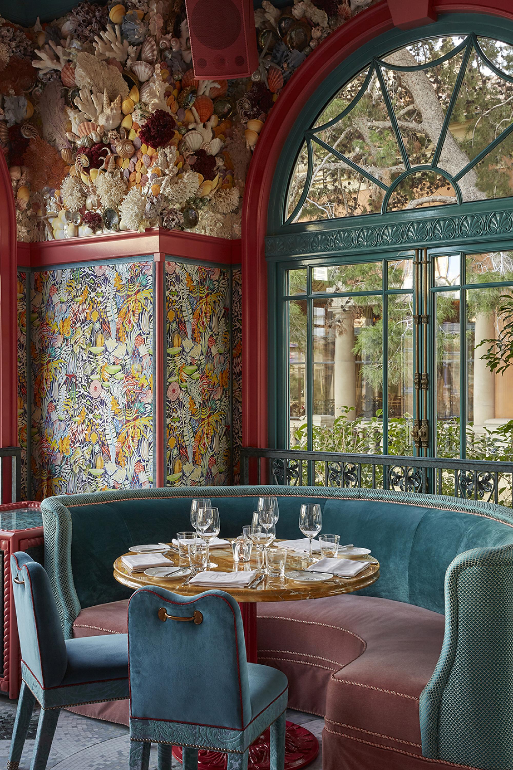
Interior by Martin Brudnizki of The Mayfair Club at Bellagio Hotel and Casino
HOW TO MAKE A MAXIMALIST ROOM FEEL CURATED
The expertly layered decor in maximalist interiors belies just how tricky pulling off one of these rooms can be. Although they reject the disciplined approach of minimalism, curating a maximalist room still requires a steady hand.
“The secret is to work in a cohesive palette,” says Frieda Gormley. “By coordinating colours you’ll bring a sense of harmony to a room, which is so important.” At one of House Of Hackney’s latest projects, the Castle of Trematon in Cornwall, the interiors harmonize with the surroundings: wildly beautiful gardens and woodland. Coordinating with the outdoors, they folded botanical beauty into every square inch, coating rooms in the studio’s nature-inspired prints.
“We always encourage wallpapering all four walls – and, if you’re feeling really bold, [take] the print onto the ceiling too, which is what we did with a few of the guest bedrooms,” says Gormley. Pushing their guest bedroom ideas to the max, the studio hung artwork right overtop of wallpaper, adding another daring layer to create an overall enchanting mood.
Another way to make a maximalist room feel curated is by introducing a statement piece, like a tightly curated cabinet.
"The best way to make a maximalist room feel curated is to display a collection of decor in a glass-fronted cabinet,” recommends Jeffrey Wilkes, the founding principle of Kuala Lumpur-based interior design firm DESIGNWILKES. “My advice is to upholster the back of the cabinet in a color or textured silk and then arrange the decor in a skyline fashion. Make sure the cabinet is well-lit, yet soft. The best part is that you can always add different items to the cabinet. Think of it as the New York skyline and each object is another building, layer upon layer. The cabinet becomes a focus of the room and lends an air of importance."

Design by House of Hackney
Keith Flanagan is a New York based journalist specialising in design, food and travel. He has been an editor at Time Out New York, and has written for such publications as Architectural Digest, Conde Nast Traveller, Food 52 and USA Today. He regularly contributes to Livingetc, reporting on design trends and offering insight from the biggest names in the US. His intelligent approach to interiors also sees him as an expert in explaining the different disciplines in design.
-
 Bouclé vs Corduroy — The Difference Between The Textured Fabrics That Have Captured Our Collective Attention Lately
For years, bouclé has captivated the interior design scene. But corduroy might be giving the quiet luxury fabric a run for its money
By Devin Toolen
-
 The 70s Are Back, Baby, but Not All Trends From the Decade Deserve a Revival — Here's the Looks to Avoid That Will Just Date Your Home
From an overwhelming use of orange to toilet carpets (eww!), designers reveal which 70s interior trends are best kept in the past
By Devin Toolen