HOW TO DO COLOUR AND PATTERN WITH DESIGNER INDIA MAHDAVI

For someone who started out as an architecture student, but wanted to make films, India Mahdavi has found her calling in a roundabout way. Eighteen years after setting up her interior design studio, she has no regrets.
With her playful use of colour and witty feminine style, it’s no wonder the likes of Claridge’s and The Connaught knock on her door when they want to inject a bit of fun into their hotels.
What influences your designs?
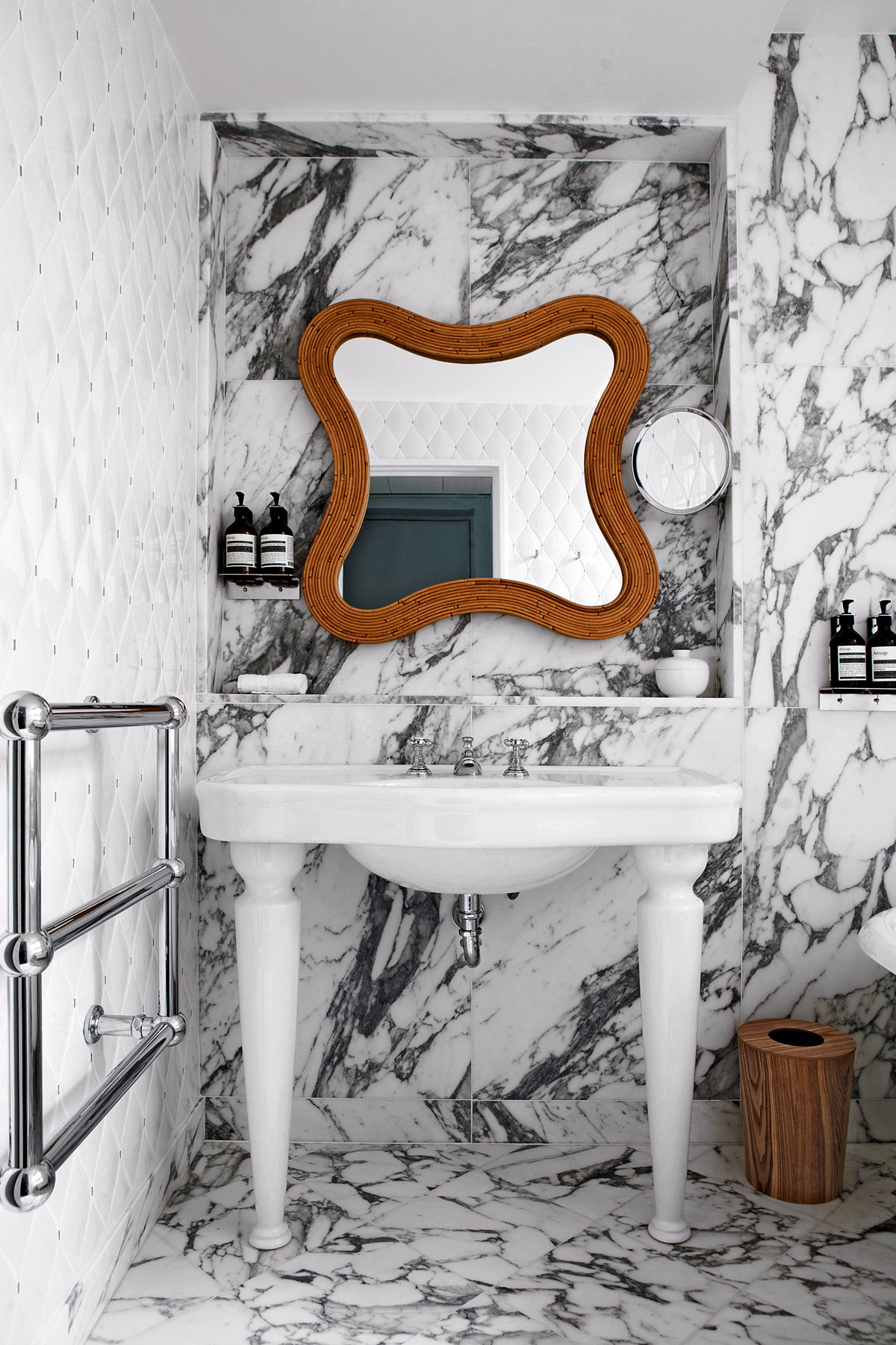
I work a lot with my memory. My use of colour harks back to my childhood, especially the late Sixties, early Seventies when I lived in Cambridge, Massachusetts. There were lots of these powerful, poppy colours that always struck me as very joyful and that’s reflected in my work. My interiors and pieces often have something whimsical and playful about them.
So how do you use colour in your interiors?
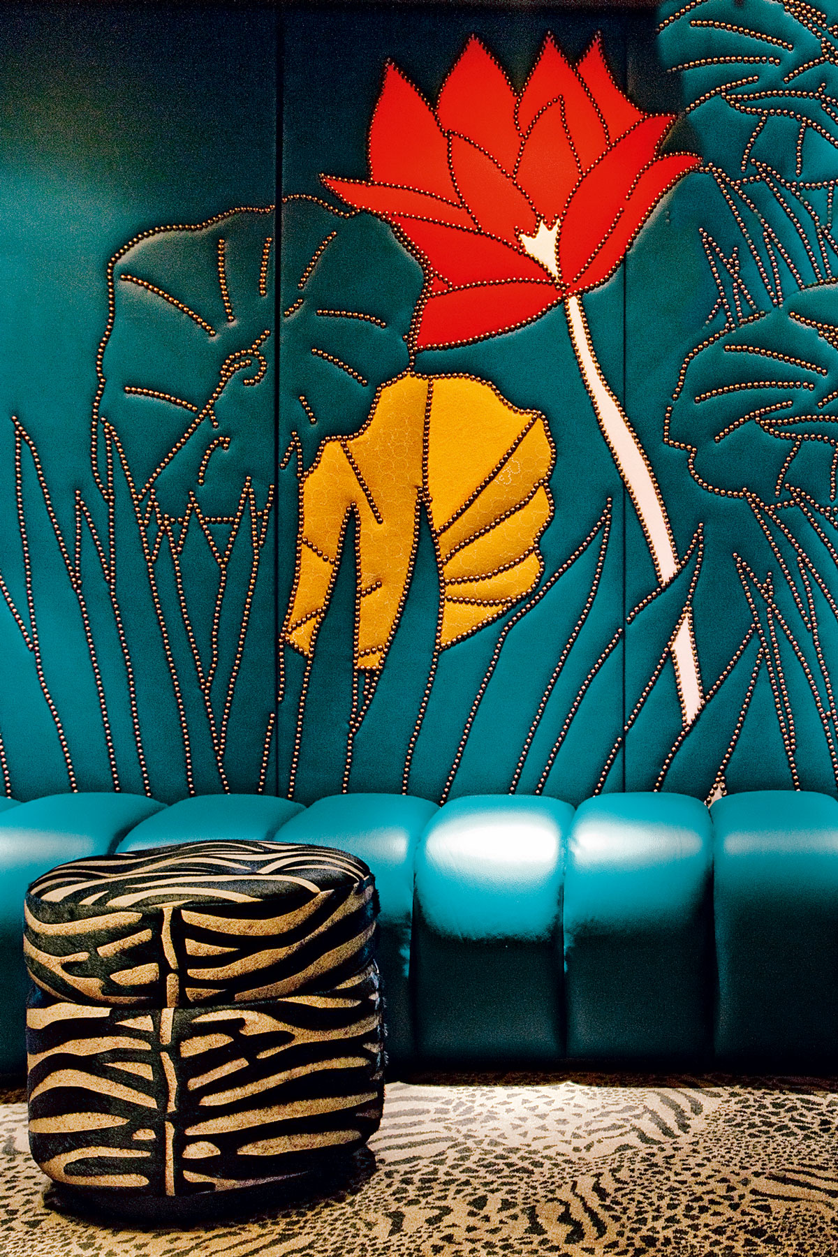
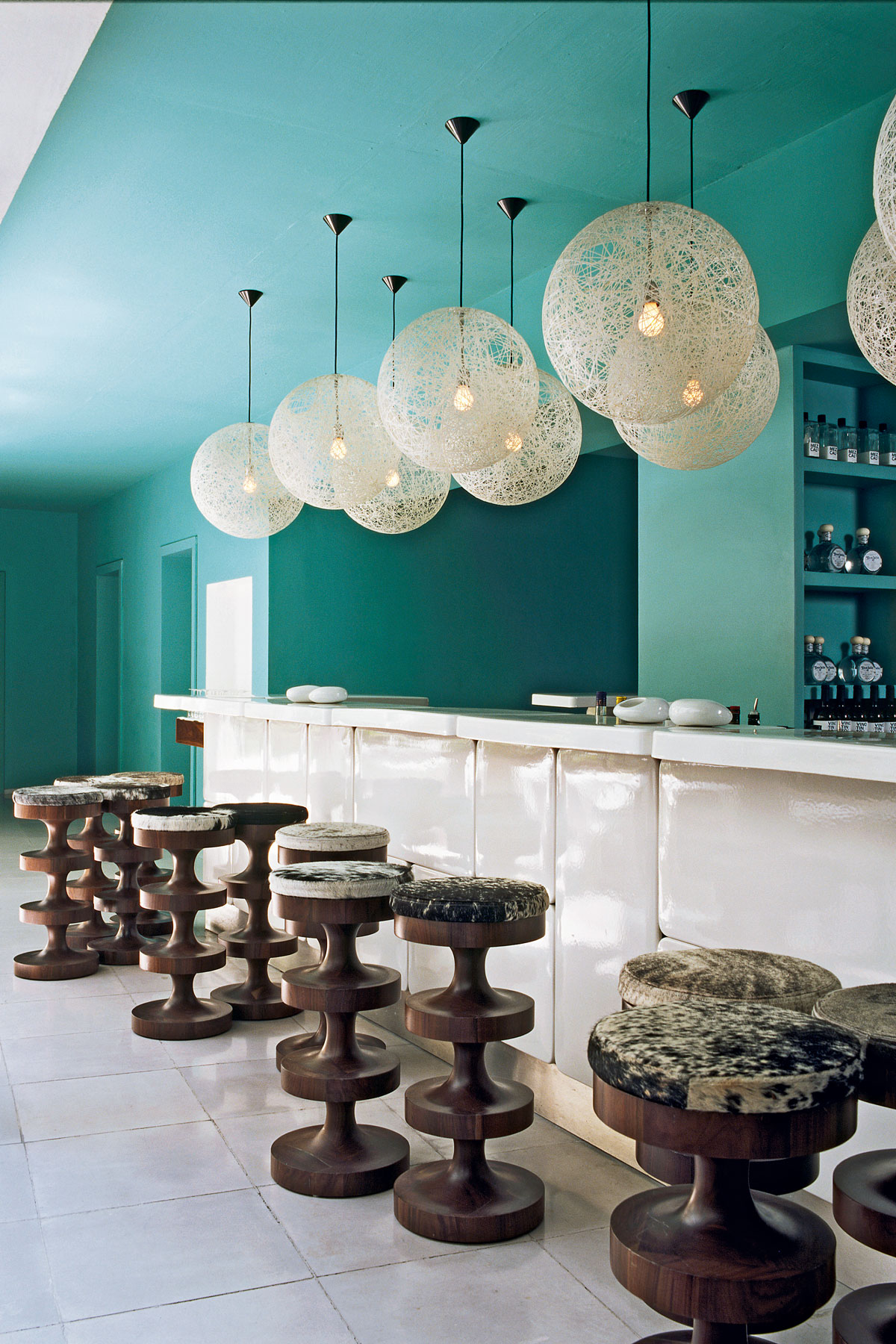
I think of colour as an identifier of a space. It’s like when you take a photo and you remember that place because of a strong association – for me, that’s colour. For example, pink will come to mind for many when they think of my interior for The Gallery Restaurant at Sketch in Mayfair, or turquoise if they have visited the Condesa DF hotel in Mexico.
As for introducing colour in the home, I think you have to use at least three or four shades. If you choose just two, it’s like ‘yes, no, yes, no’ and that’s kind of boring.
What’s the key to a successful interior?
I always say a home is like a wardrobe – it should never stay static. Look at the fashion industry, for example. You renew your wardrobe every season, adding new things to wear with existing staples and I think a home should be like that.
Move things around, swap your artwork and add accessories, so you’re always surprised – in a good way. It keeps things dynamic. When I do private commissions, I think of them as 3-D portraits because the interior should reflect a homeowner.
Is that something you do in your own home?
Yes! I’m always changing things round and repainting, but there are always pieces that I keep. I’ve got a lot of my own prototypes at home, such as the Lollipop floor lamp and Jelly Pea sofa. It’s all about building layers. I hate the word ‘eclectic’, but I suppose my apartment is a bit of a mix and very relaxed.
When you step inside, you can sense that it’s been put together in an unusual way, but it doesn’t look over-designed – I love my piles of books, for example.
Any tips or tricks for using pattern?
I’d advise getting the biggest samples possible, so that you can view them all together to see how they look. One great trick when you’re a bit stuck is to take a photo of your space. It helps to take a step back and you’ll start to see what you couldn’t read before.
I’m really into patterned cement tiles – I've designed a collection of these for Bisazza. They’re inspired by the Pop and Seventies eras, with surprising colour combinations and graphic motifs.
Your interior for Sketch has a very strong identity. What inspired that look?
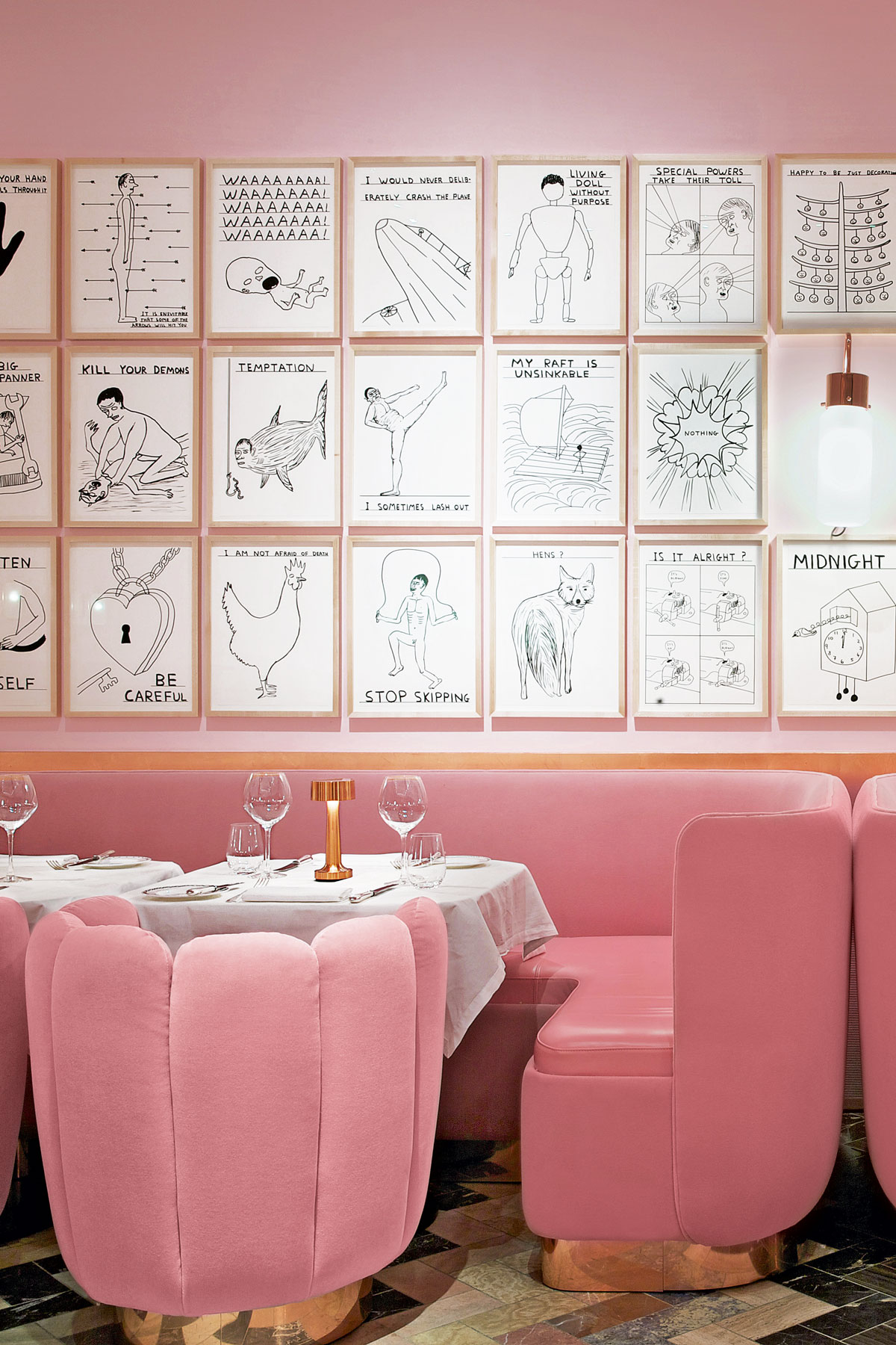
Sketch was a very specific project because I needed to address the overwhelming space – it was already very masculine, high and dominating. I wanted to counterbalance the witty wall graphics by artist David Shrigley with something cute and comfortable. So I introduced a Hollywood-glamour feel, with the pink and copper palette adding warmth and sensuality. On the opening night, it seemed like all the guests had a three-day tan – everyone looked beautiful and glowing.
You mention balancing masculine propertieswith feminine. Is that key to your work?
I mention this a lot in my book Home Chic: Decorating with Style, actually. Whatever’sround, soft and sensual, I’d describe asfeminine and anything geometric and made from hard materials is more masculine. For instance, my Oliver sofa has a structured,square shape, which is very masculine, soI’ve covered it in bright velvet for a softer feel.
What made you produce your own furniture?
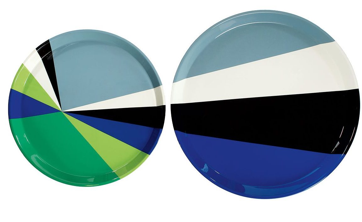
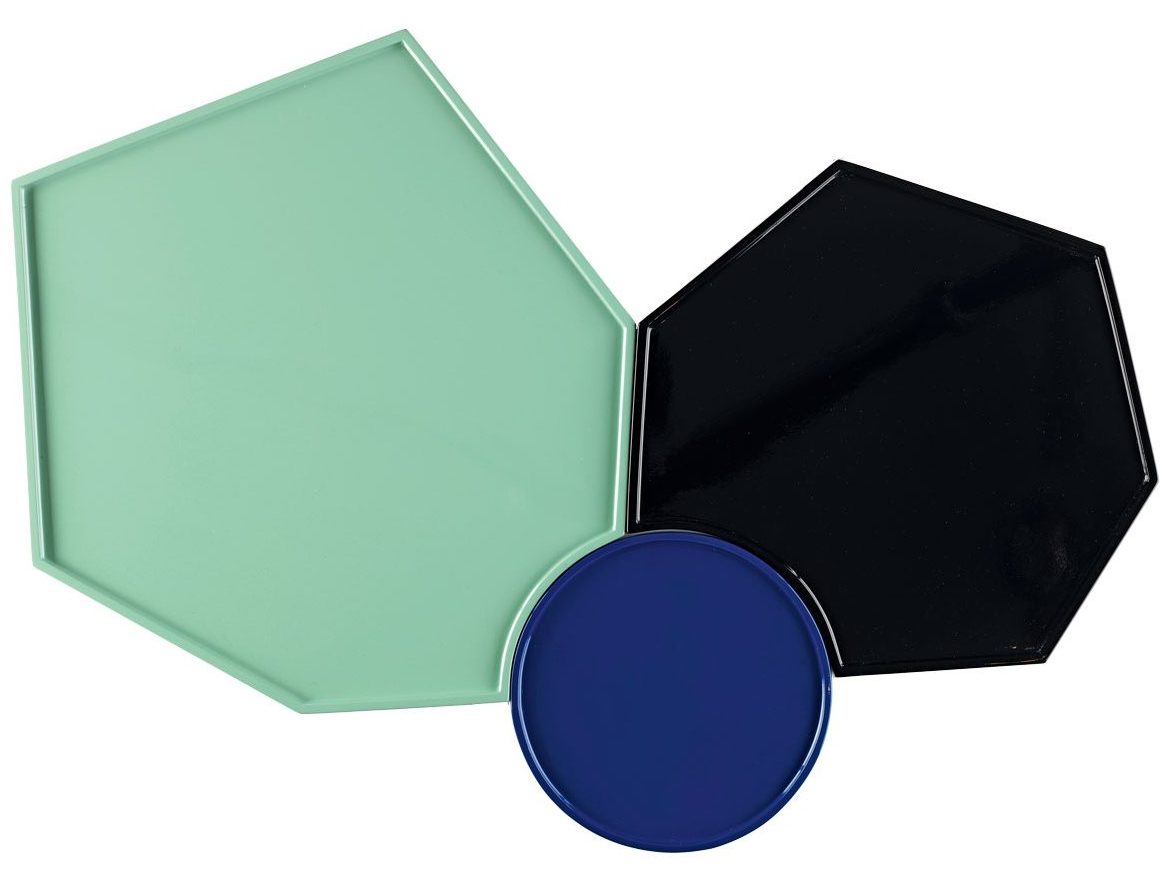
When I started my company nearly 18 yearsago, the market wasn’t what it is today. Now,it’s booming and there are so many exciting designers – I love the work of Ronan and Erwan Bouroullec, Paola Navone, Patricia Urquiola – but back then, there were very few go-to brands apart from the slick Italian companies that were around in the Eighties. So it seemed easier to design pieces that would give your spaces identity and spirit.
Which pieces best represent your style?
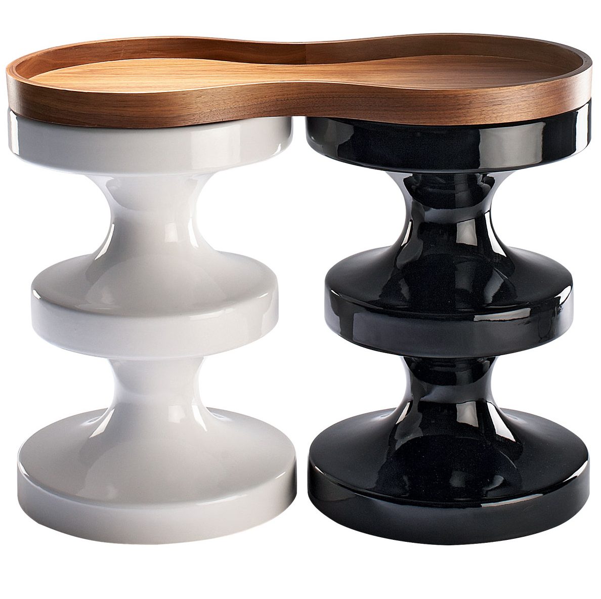
I think there are two signature pieces. There’s the Bishop stool, which is a friendly piece – it can be used as a side table, indoors or outdoors, it comes in a range of colours and has its own accessories. It’s probably my bestseller. Then there’s the Bluff, a wood and lacquer coffee table that’s very sensual and playful. It has a modular top that can be switched around.
For more information, visit india-mahdavi.com
Be The First To Know
The Livingetc newsletters are your inside source for what’s shaping interiors now - and what’s next. Discover trend forecasts, smart style ideas, and curated shopping inspiration that brings design to life. Subscribe today and stay ahead of the curve.
The homes media brand for early adopters, Livingetc shines a spotlight on the now and the next in design, obsessively covering interior trends, color advice, stylish homeware and modern homes. Celebrating the intersection between fashion and interiors. it's the brand that makes and breaks trends and it draws on its network on leading international luminaries to bring you the very best insight and ideas.
-
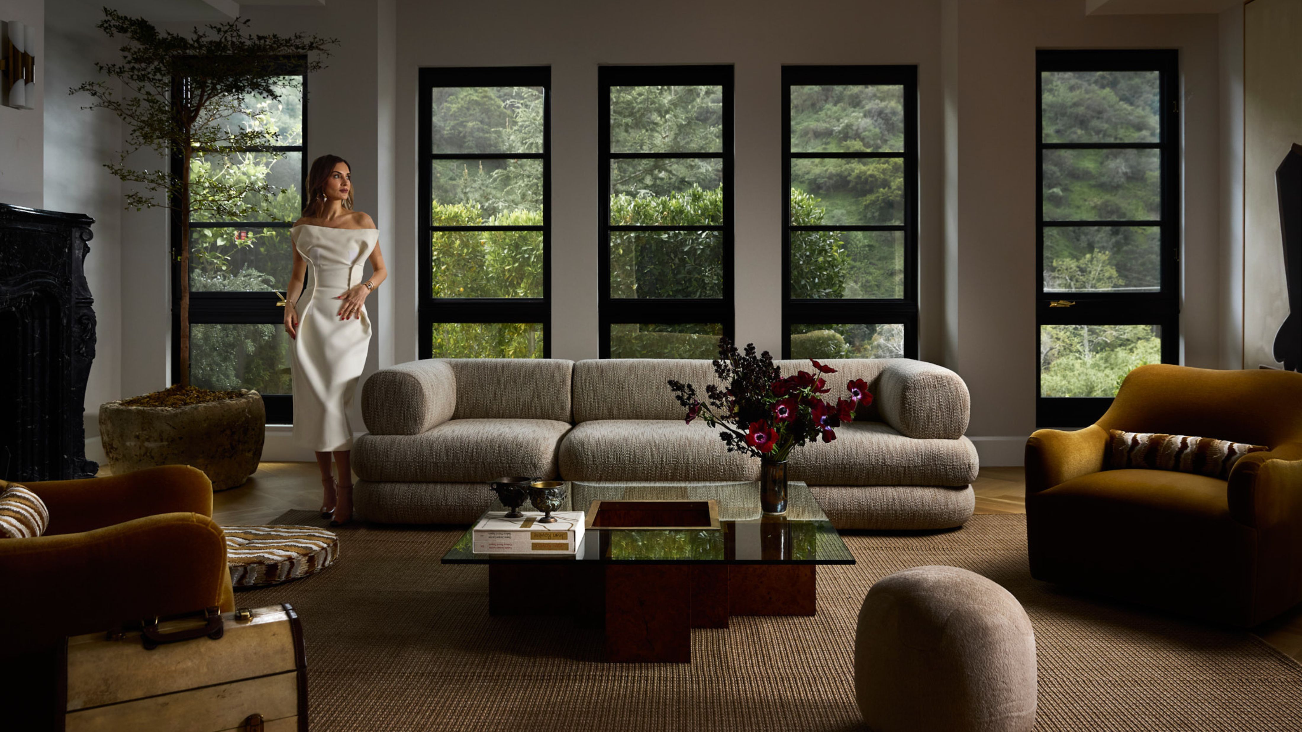 Nina Takesh’s Latest Foray Is Furniture — A Sculptural, French-Inspired Debut That’s All About the Edit
Furniture with fluency. In her first standalone collection, Nina Takesh translates a life of layered influence into sculptural forms made for real life
-
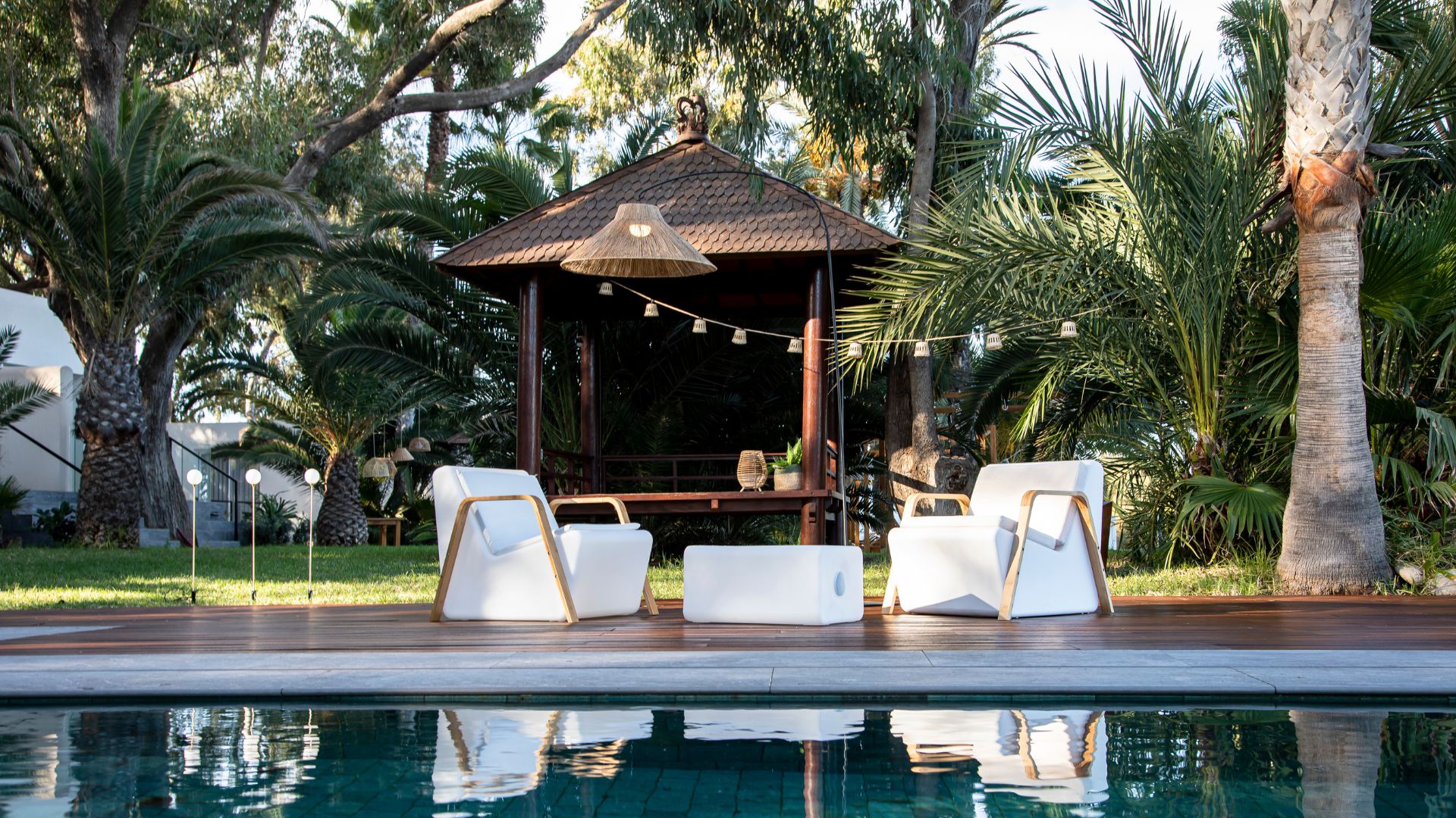 Newgarden’s Outdoor Lighting Collection Is the Perfect Range to Illuminate Your Spring Garden for Relaxing Evenings Outdoors
If you’re looking for soft, ambient lighting to breathe life into a garden after dark, Newgarden’s new range will be your first and final stop