DESIGNER PROFILE: ANDY MARTIN
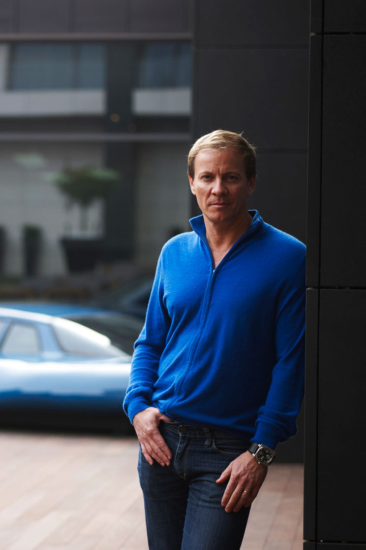
Australian-born, London-based architect Andy Martin rose to acclaim with his work for Oliver Peyton on restaurants such as Mash and Isola. He established his multi-disciplinary practice AMA in 2000 and has since designed houses for the likes of Noel Gallagher and Olga Polizzi, shop interiors for Savile Row tailor Richard James, and worked on the interiors for restaurants such as Barrafina, Chotto Matte and Quo Vadis. Here he shares his approach to creating interesting, dynamic spaces.
WHAT FIRST DREW YOU TO ARCHITECTURE?
I actually wanted to be an artist – I spent my late teens underneath our house on the northern beaches of Sydney shaping surfboards and making stuff, dreaming of being a sculptor. Reluctantly, I enrolled into architecture at the University of Technology Sydney, failed a semester in my first year, but by the second – when we started building models – something clicked and the creative, mindful part came together with the practical side and I fell in love with it.
WHAT WERE YOUR FIRST BIG BREAKS?
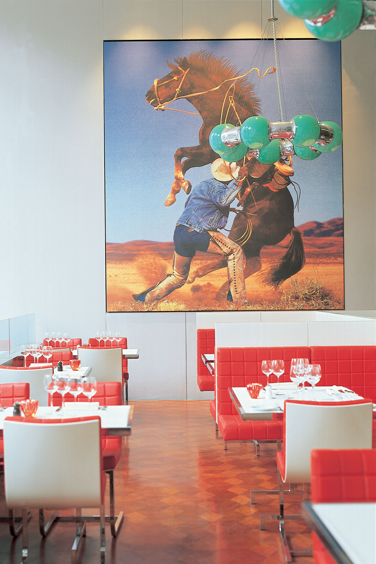
Architect Will Alsop came to lecture in Sydney and encouraged me to return with him to London to work and study under him for a year at the AA. Then, in the early Nineties, I worked with Marc Newson in Paris, which led to collaborating on projects such as Oliver Peyton’s Mash in Manchester then London, and then Isola in Knightsbridge.
CAN YOU SUM UP YOUR LOOK?
My projects have an underlying calm from smooth, clean lines and a softness from finishes such as the chalkiness of eikó’s paints. I like to include details that create a visual experience without being too jarring or gimmicky. Even if I’m using colour, the palette will work together harmoniously. I don’t like any one thing to shout out too much.
Be The First To Know
The Livingetc newsletters are your inside source for what’s shaping interiors now - and what’s next. Discover trend forecasts, smart style ideas, and curated shopping inspiration that brings design to life. Subscribe today and stay ahead of the curve.
HOW DO YOU APPROACH A NEW PROJECT?
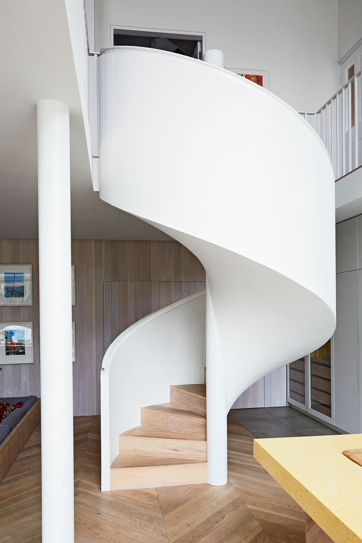
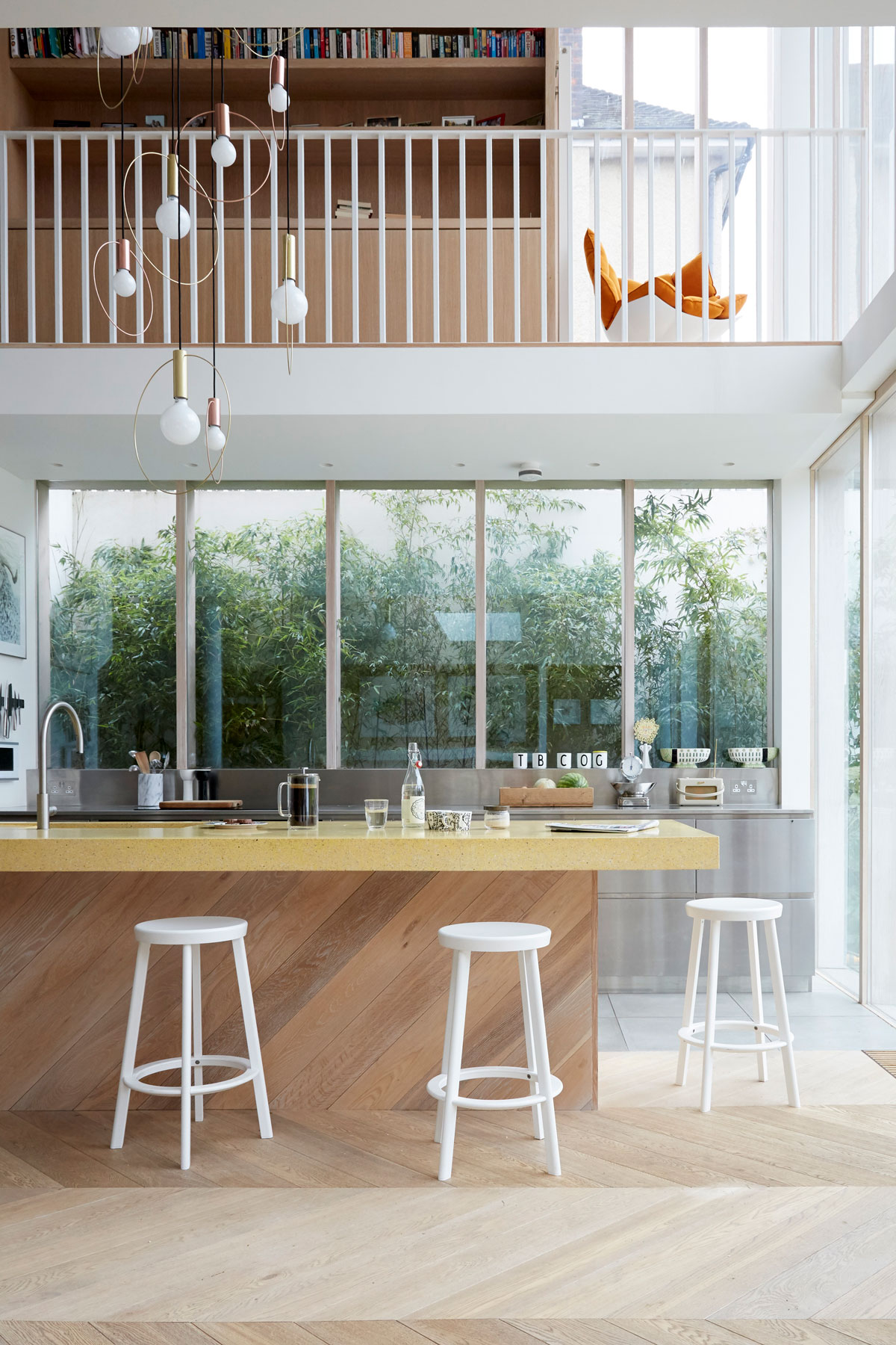
I think about how someone will walk through an interior – I like spaces that feel dynamic and not just rooms that go nowhere. For me, it’s about creating movement through the house, and driving people from light to dark spaces, so a quieter space might be a darker passage from which you emerge into a naturally lighter, more stimulating space. Large glass partitions that run through the height of the house are a great way to create mystery and anticipation.
SO CONNECTING DIFFERENT SPACES IS IMPORTANT?
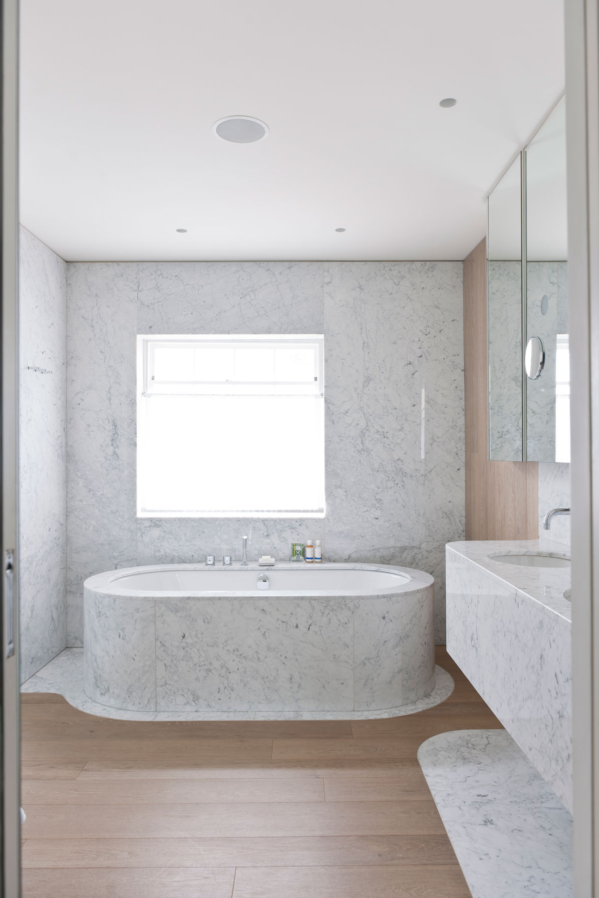
I design spaces so that each one feels connected to the next – there’s always a reason for a colour or a finish because it will link to other rooms in the house, like flowing the same timber floor throughout. I’m a little nervous of corners too – super matt surfaces really help to soften angles and makes corners disappear.
DO YOU LIKE TO WORK WITH UNUSUAL FINISHES?
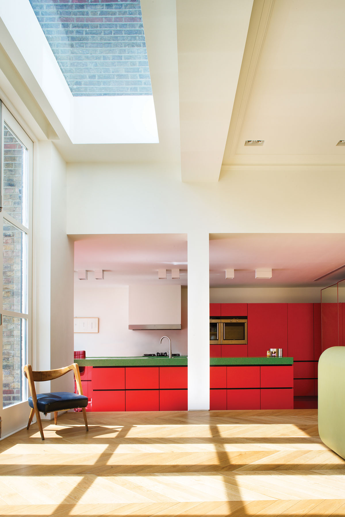
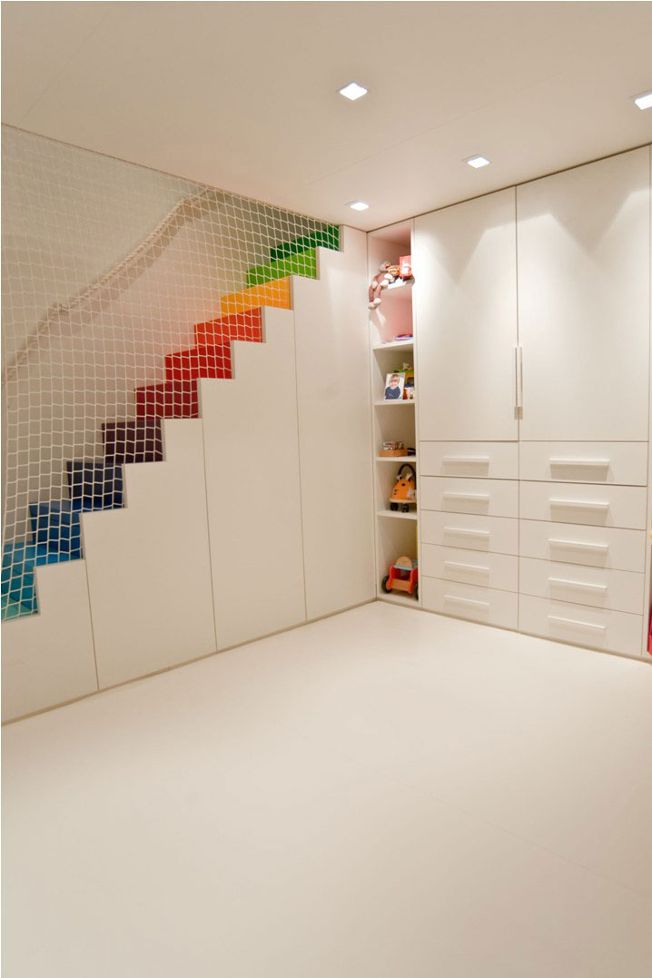
I like to work with everyday materials in an unusual way to help sculpt a space. For example, I’d use exposed brick on a floor and then extend it so it wrapped up the wall and ceiling too, not use it just as a feature wall. I don’t use material merely for decoration’s sake – I use them to mould the sense of space. Recently, I designed a house for Oliver Peyton where there a block of colour in every room, but applied in unexpected ways: tiled blocks in the bathrooms, a bank of coloured cupboards in the living room or bedroom, a red floor that flows up to the kitchen island.
SO YOUR SCHEMES ARE QUITE PLAYFUL?
I like to have a sense of fun with what I’m doing, thinking of ways to make rooms eventful and interesting in a house you live in every day. Connecting inside and outside is important too – long windows on landings or skylights in stairwells mean you don’t have to go outside to enjoy the view. My dream is to own Allessandro Becchi’s Anfibio couch (which folds out to be a bed) so I can lie under the skylight in my kitchen and listen to therain fall on the roof.
WHAT ARE YOUR GO-TO PIECES FOR A PROJECT?
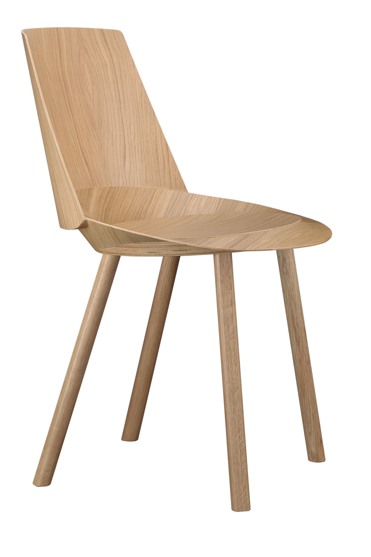
Viaduct for furniture – a favourite find is Stefan Diez’s Houdini chairs. Sleek, minimal brassware by CEA (ceadesign.it) and lighting from Atrium – I like to use adjustable, directional lighting such as Flos’s Find Me by Jorge Herrera to give a space flexibility. Designing my own pieces is a big part of what I do too – my California Sunshine collection of block-cast polyester resin pieces, stained with pigment, was designed to capture the way light moves through a space during the day.
HOW DO YOU MAKE SMALL SPACES FEEL BIGGER?
I like tall doors and windows – I carry them full height, from floor to ceiling, because it leads the eye upwards and gives height to a room. A really small room with really high wardrobe doors suddenly feels twice as big. Avoiding architraves, skirting boards and cornicing in a modern build also creates a third more volume in a room (obviously not something you can do with a period house).
TELL US ABOUT YOUR OWN HOME?
I call it the Ugly House because it was rundown and not particularly attractive, but it had potential. We wanted to be very eco – solar panels, grass roofs on the top of the sauna we’ve built in the garden, recycled timbers for walls and floors and bricks from other projects. And we have a swimming pool, using surplus energy from the central heating system for the river-flow simulator.
HOW DOES DESIGNING A RESTAURANT DIFFER TO A HOUSE?
I can be much more experimental in a restaurant, experimenting with new finishes or approaches, like using parquet timber for not just floors but walls and ceilings too. I can then translate these into my domestic practice. It’s key though for any home I design that it complements its geographical location and the personality of the owners more than it does my ambition of new ideas.
AMA, andymartinarchitecture.com
The homes media brand for early adopters, Livingetc shines a spotlight on the now and the next in design, obsessively covering interior trends, color advice, stylish homeware and modern homes. Celebrating the intersection between fashion and interiors. it's the brand that makes and breaks trends and it draws on its network on leading international luminaries to bring you the very best insight and ideas.
-
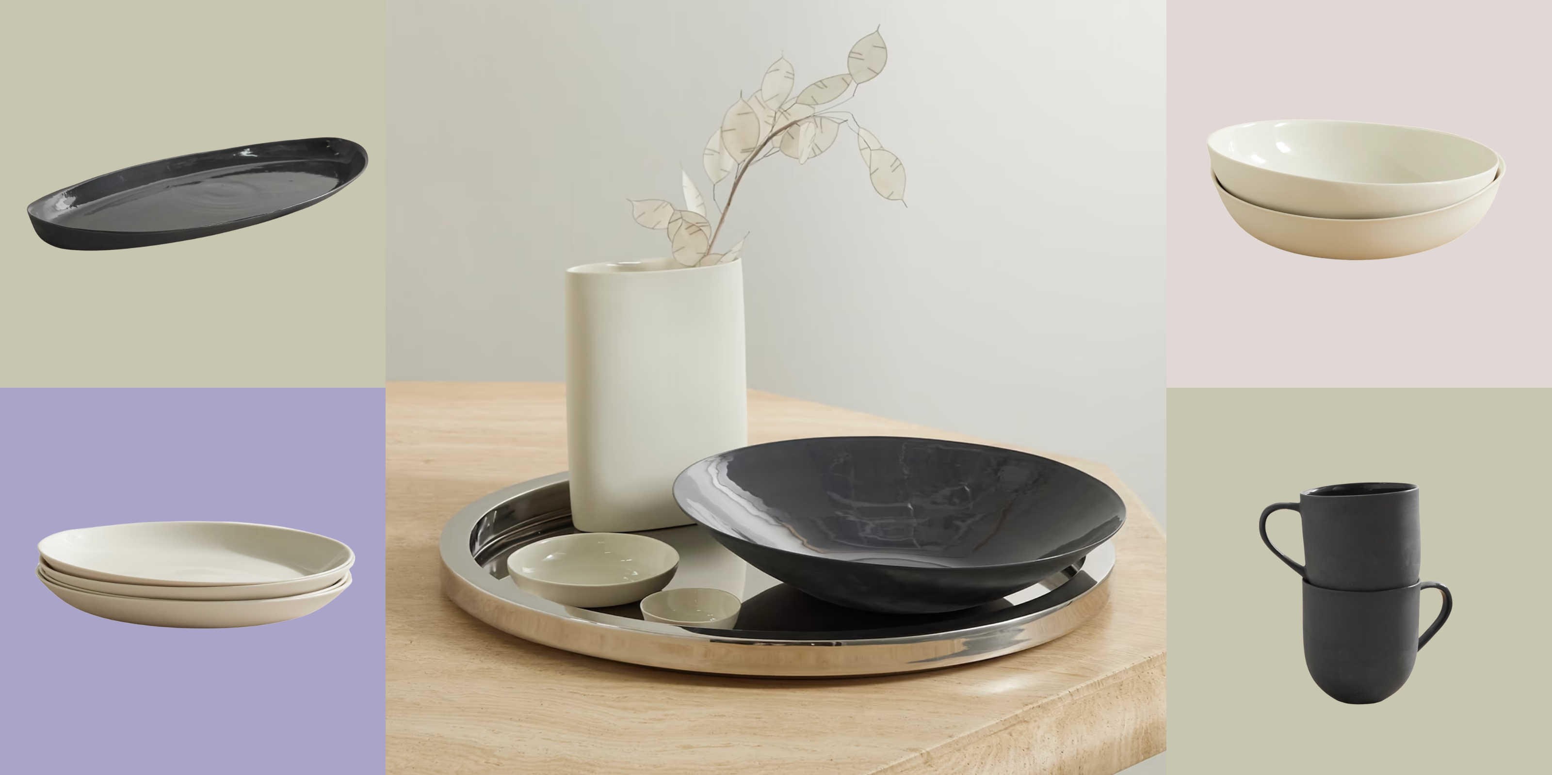 Turns Out, Sustainable Design Can Be Chic, and Net-a-Porter's 'Net Sustain' Curation Is Proof — Here's What I'm Shopping
From the Net Sustain collection, Mud Australia's homeware is not only design-oriented, but eco-focused, too
By Devin Toolen
-
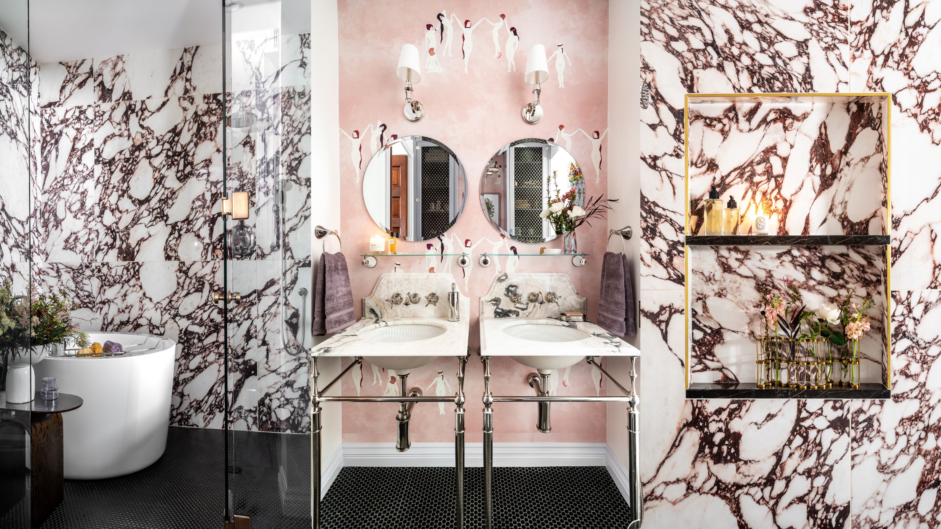 Before and After — How This Jewel-Box Bathroom Made the Most of Its Proportions With Maximalist Design and a 'Soaking Tub'
This design offers a masterclass on creating a luxurious bathroom that is equally playful and elegant.
By Maya Glantz