Designer Profile: Anna Burles
She has more than her fair share of talents: Anna Burles worked in publishing and as a reporter before turning her clever stylist’s eye to interiors, establishing design studio Run for the Hills with her graphic-designer husband Chris Trotman, eight years ago. They have become a one-stop creative shop for some of London’s hottest restaurants and bars, as well as designing elegant private homes (A-list clients include Ellie Goulding) and the Houzz of 2018 showcase for upcoming design trends. Here are Anna’s inspirations…
WHEN DID THE INTERIORS BUG BITE?
After a background in publishing and radio reporting, along with a journalism degree at what’s now the London School of Communication, I wanted to do something more visual.I worked for the guerrilla marketing firm Diabolical Liberties, doing quirky pop-ups and installations for brands like Adidas and Topshop, which then turned into event designing.
HOW DID YOU MOVE INTO INTERIOR DESIGN?
I loved the interior styling side of event design, so I decided to study part time at the KLC School of Design while I was stillworking full time. After that, I interned for some restaurant interior design practices (one only paid me £10 a day!) until I landed my first gig designing the interiors of an advertising agency. They chose me because I’d worked in one as a creative director, so they thought I’d ‘get’ them a bit more.
WHAT'S YOUR SIGNATURE STYLE?
There’s an underlying thread of artfully juxtaposing vintage and antique classics with next-generation design. I would never specify all-new pieces for a room. I love to break the rules, but it’s also essential to work to the tastes of my clients, so one project might be zen and pared back, another might be full-on boho, or quite industrial and raw.
Be The First To Know
The Livingetc newsletters are your inside source for what’s shaping interiors now - and what’s next. Discover trend forecasts, smart style ideas, and curated shopping inspiration that brings design to life. Subscribe today and stay ahead of the curve.
WHAT'S YOUR STARTING POINT?
I pick quirky pieces that tell a story, create a talking point and lend humour to a space. For example, I sourced a large wooden architectural model that would have been used in the 18th century to explain a proposal to a client – it now hangs on the wall of a client’s kitchen and it helped determine the other elements in the room’s design.
YOU LOVE VINTAGE – ANY FAVOURITE ERAS?
I love Art Deco and mid-century, but also brutalist and modernist design. Well-worn, well-loved pieces excite me the most. Websites such as Pamono or Vinterior are great sources, but mostly, I love hunting down wonderful objects, props and accessories from markets and antiques fairs. I’m happy getting up at 5am to snap up the best bits at a market. It’s those one-off pieces that make a scheme truly unique.
HOW DO YOU LIKE TO MAKE A STATEMENT?
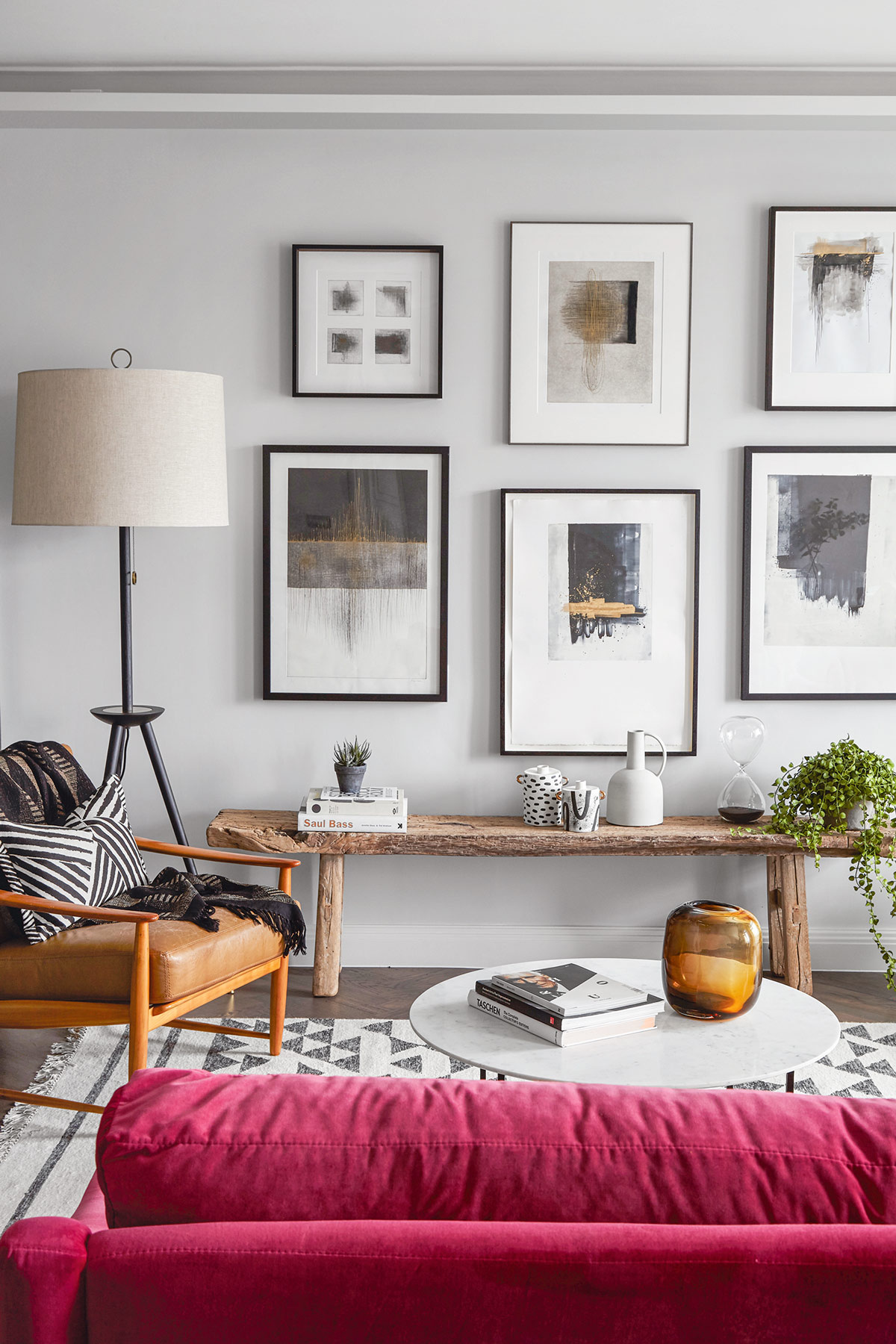
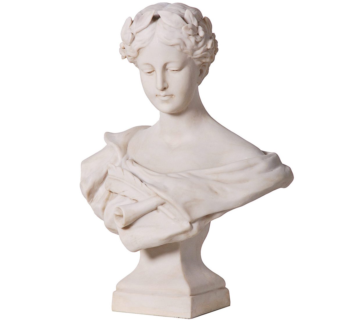
Some pieces need to stand on their own and be admired – like a beautiful vintage rocking chair we recently sourced from Belgium, which we placed in a hallway next to a side table and reading light. We do a lot of art sourcing too and I love unusual accessories like torso and head sculptures.
DO YOU HAVE A GO-TO PAINT PALETTE?
Rich, moody hues like Farrow & Ball’s Stiffkey Blue, Dove Tale, Purbeck Stone, Calamine, Peignoir, Black Blue; and Paint & Paper Library’s Plimsoll, the deepest, inkiest midnight blue (I’m currently using this shade to paint the front doors and all of the woodwork, including the kitchen, in an industrial loft).

WHAT'S A FAVOURITE FABRIC?
Our go-to for velvet is the Varese range from Designers Guild – gorgeous shades and good-value quality. I love the way Ines Cole uses it to upholster vintage library chairs.
ANY OTHER FAVOURITE MATERIALS?
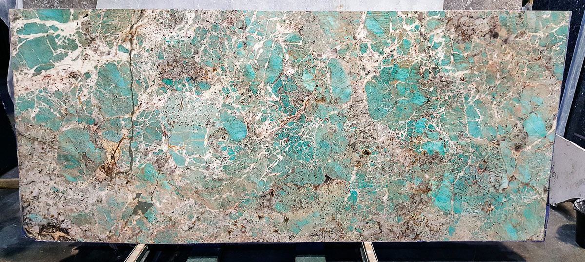
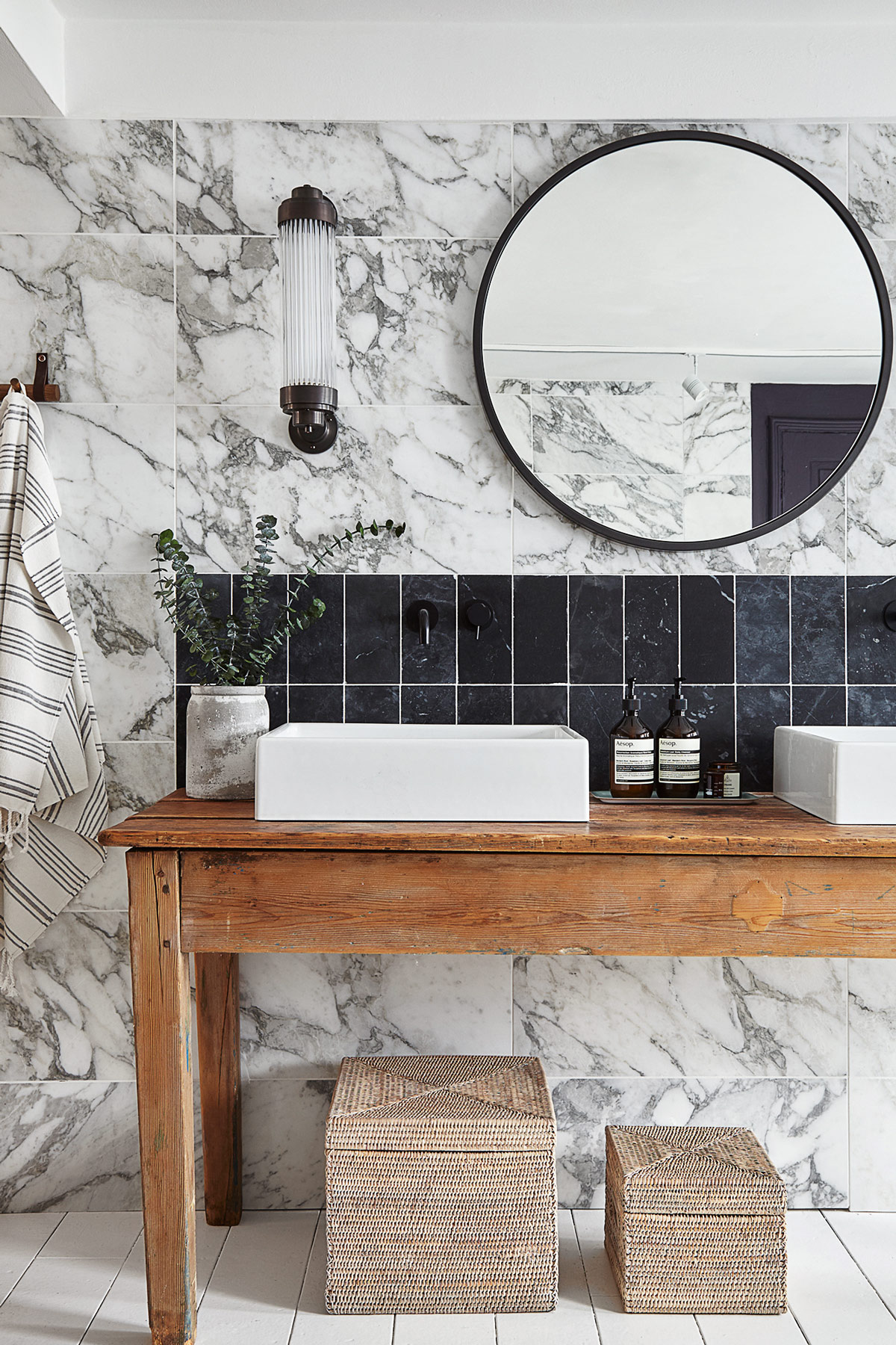
I like to blend metallics with natural marble. Instead of a simple white Carrara, I like to pick one-off, show-stopping slabs in vibrant hues like blue, green, or black, direct from a supplier like Stone World to ensure I won’t see it anywhere else. I use stone for table tops or bathroom vanity units and for kitchen worktops and splashbacks.
HOW DO YOU BRING TEXTURE INTO A SPACE?
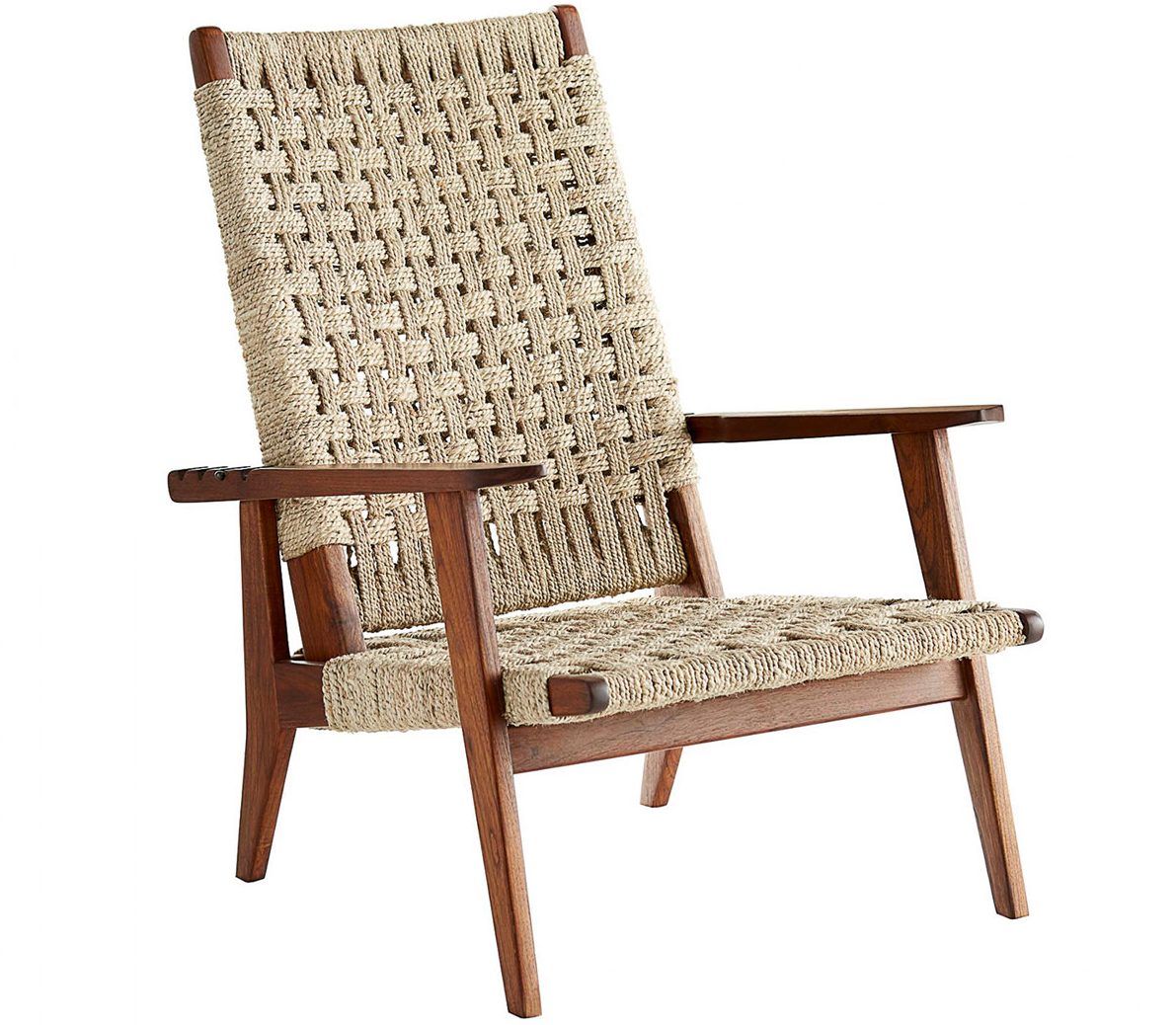
Along with vintage and reclaimed wood, I’m passionate about live edge wood – it works well for shelves and worktops, and we work with Revive Joinery on super-large live edge wood tables. I like the subtle twist of rattan used in a very tailored, luxurious way, such as on a beautiful dining chairor mirror frame. I like distressed, edgy, inky prints too: for wallpapers, Feathr and Ella Doran; for fabrics, Black Edition; for antiqued glass, Studio Peascod.
WHAT ABOUT LIGHTING?
Modern lighting with a vintage feel – the Bert Frank Revolve pendant is perfect for providing moody, intimate pools over dining tables and kitchen islands. Fixtures by Felix Lighting Specialists are beautifully made and work in every space.
HOW ELSE DO YOU MAKE A SPACE FEEL UNIQUE?
Art and objects speak a thousand words. For some clients, we even source things like cutlery and plates for the dinner table. (We’ve also designed Christmas trees!) Clever tricks like moving the art around the house, putting something awayfor a while before bringing it back out again, or changinga few key accessories always make a home feel new again.
WHAT DO YOU SPEND YOUR MONEY ON?
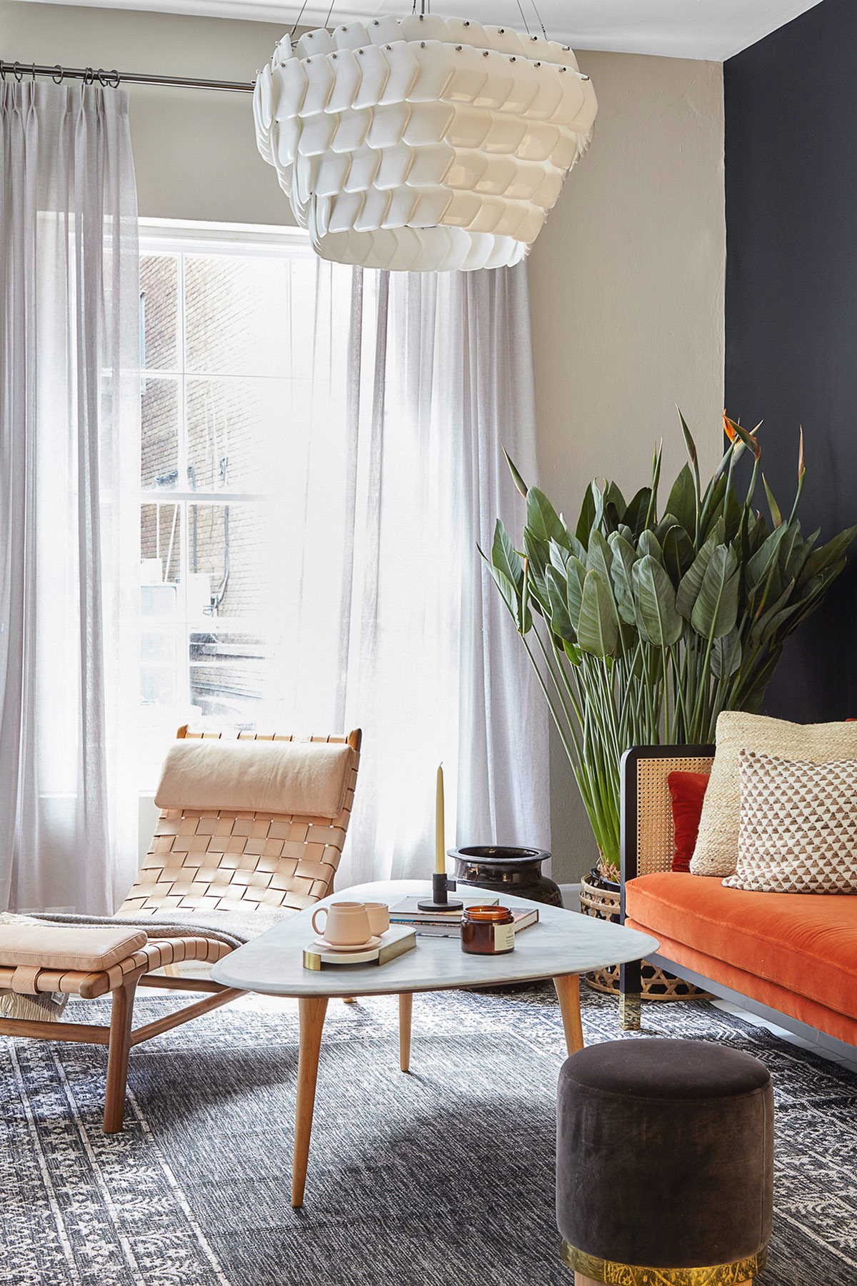
Invest in furniture, lighting and art – and gorgeous flooring and beautiful tiles. We like Smink Things’ artisan tiles,which are full of character and variation. They come in lots of colourways to mix and match to make our own designs. You can save on rugs, bedding, secondary lighting and accessories from great high-street stores like Anthropologie.
HOW ABOUT STORAGE?
Home needs to be beautiful but super-practical – in one Islington townhouse, we concealed storage in a fake wall of panelling behind the headboard in a bedroom and hid away all the power points for charging gadgets, so only the nice bits like books and vases of flowers sit on the bedside tables.
HOW IS DESIGNING A HOME DIFFERENT TO A BAR OR A RESTAURANT?
Home is about layering detail upon detail – throws, cushions, drapes, rugs to feel cosy underneath your toes when you get out of bed. With a commercial project, you focus on durability in micro detail, anticipating every bump and scrape.
WHAT DOES HOME MEAN TO YOU?
Home is my haven. It’s not just comfortable and welcoming, but also creatively inspiring. My home is full of personality and interest and offers the perfect testing ground for props or accessories before they make their way to the studio.
WHAT'S UP NEXT?
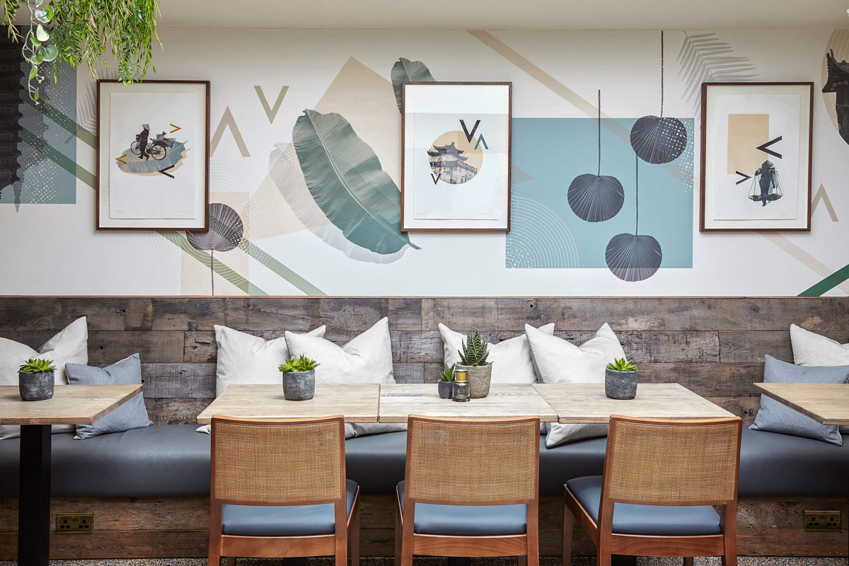
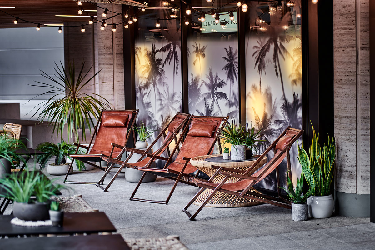
We’ve just finished a lovely, light-filled apartment in an Art Deco building in Regent’s Park and we’re working on a loft apartment in New York and a Georgian townhouse in Soho. We’re also working on lots of London restaurants – including a Kricket bar next to the new White City House, a cool Vietnamese restaurant in Notting Hill called MAM, spaces for Hawaiian sushi brand Island Poké and Claw’s urban seafood restaurant just off Carnaby Street.
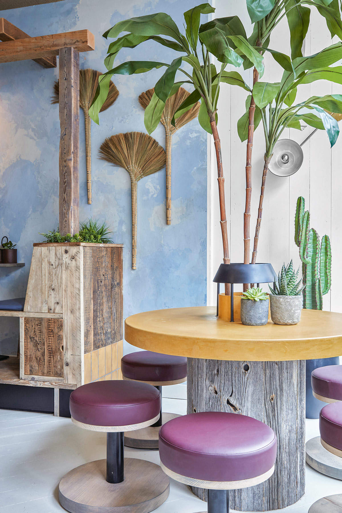
For more info, check out runforthehills.com
The homes media brand for early adopters, Livingetc shines a spotlight on the now and the next in design, obsessively covering interior trends, color advice, stylish homeware and modern homes. Celebrating the intersection between fashion and interiors. it's the brand that makes and breaks trends and it draws on its network on leading international luminaries to bring you the very best insight and ideas.
-
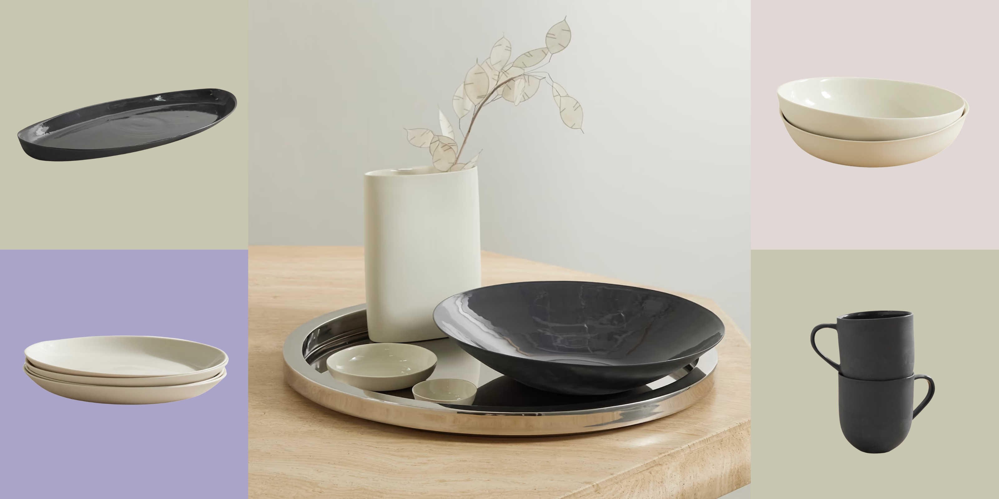 Turns Out, Sustainable Design Can Be Chic, and Net-a-Porter's 'Net Sustain' Curation Is Proof — Here's What I'm Shopping
From the Net Sustain collection, Mud Australia's homeware is not only design-oriented, but eco-focused, too
By Devin Toolen
-
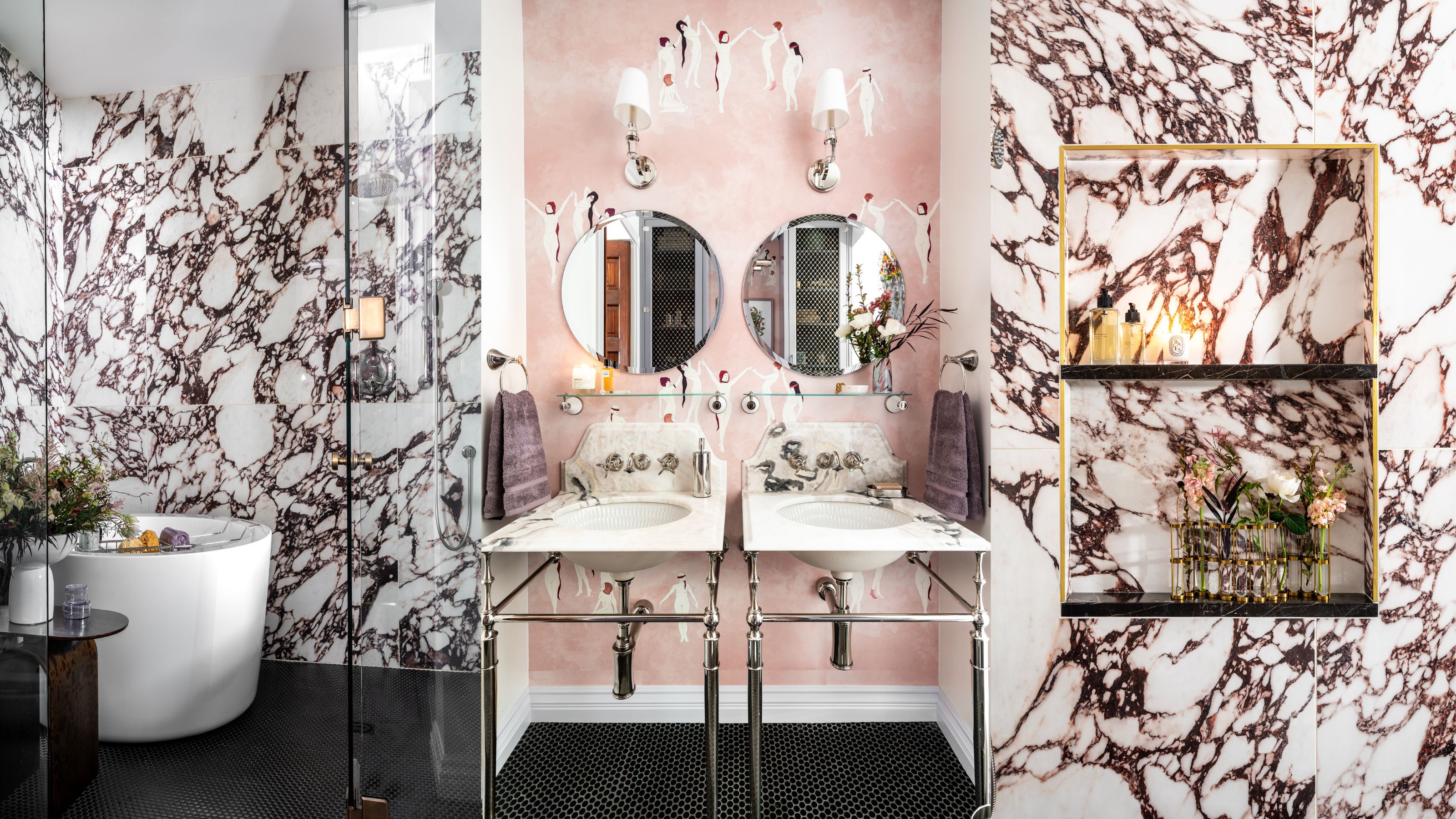 Before and After — How This Jewel-Box Bathroom Made the Most of Its Proportions With Maximalist Design and a 'Soaking Tub'
This design offers a masterclass on creating a luxurious bathroom that is equally playful and elegant.
By Maya Glantz