Designer Profile: Lucy Barlow
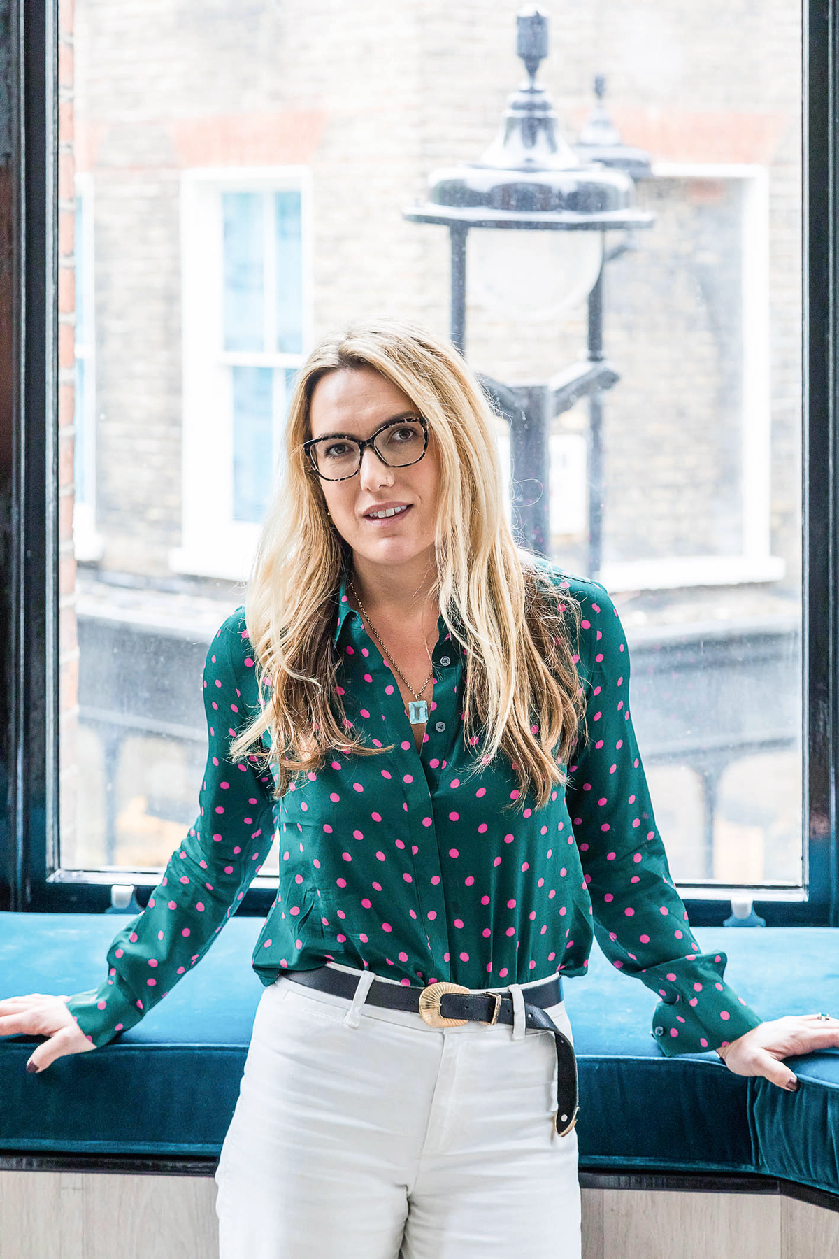
At just 32, Lucy Barlow is one of London’s rising interior design talents, working alongside her lighting specialist and cinematographer brother Max as Barlow & Barlow. With projects such as sleek offices for a music company, funky luxe houses for movers and shakers in fashion, film and PR and glamorous apartments for a new development in Gatti House on the Strand, she’s becoming known for her eclectic meets modern style. Here, she shares her design inspirations…
HOW DID YOU GET STARTED?
I had always wanted to be a fashion designer, but after a foundation year at the London College of Fashion, I fell out of love with it and went travelling. On my return, I realised interiors might satisfy my desire to do something with design, so in 2009, I studied at the Inchbald School of Design for a year.
WHAT WAS YOUR FIRST BIG BREAK?
After graduation, I worked with the interior decorator MarkGillette in the north of England for two years, working on a variety of large-scale country houses around the UK. It was a huge learning curve and I loved every minute of it, but I missed London, so I moved back to work with designers like Fiona Barratt-Campbell. A property developer then asked me to work on four apartments in a Grade II-listed building on the Strand.
WHEN DID YOU START YOUR OWN DESIGN PRACTICE?
Max and I set up Barlow & Barlow in 2013 – he’d previously worked on large-scale ambient schemes for big parties, including the Queen’s 80th birthday, before working with specialist John Cullen Lighting. We work both together and independently, depending on the project.
Be The First To Know
The Livingetc newsletters are your inside source for what’s shaping interiors now - and what’s next. Discover trend forecasts, smart style ideas, and curated shopping inspiration that brings design to life. Subscribe today and stay ahead of the curve.
DESCRIBE YOUR STYLE.
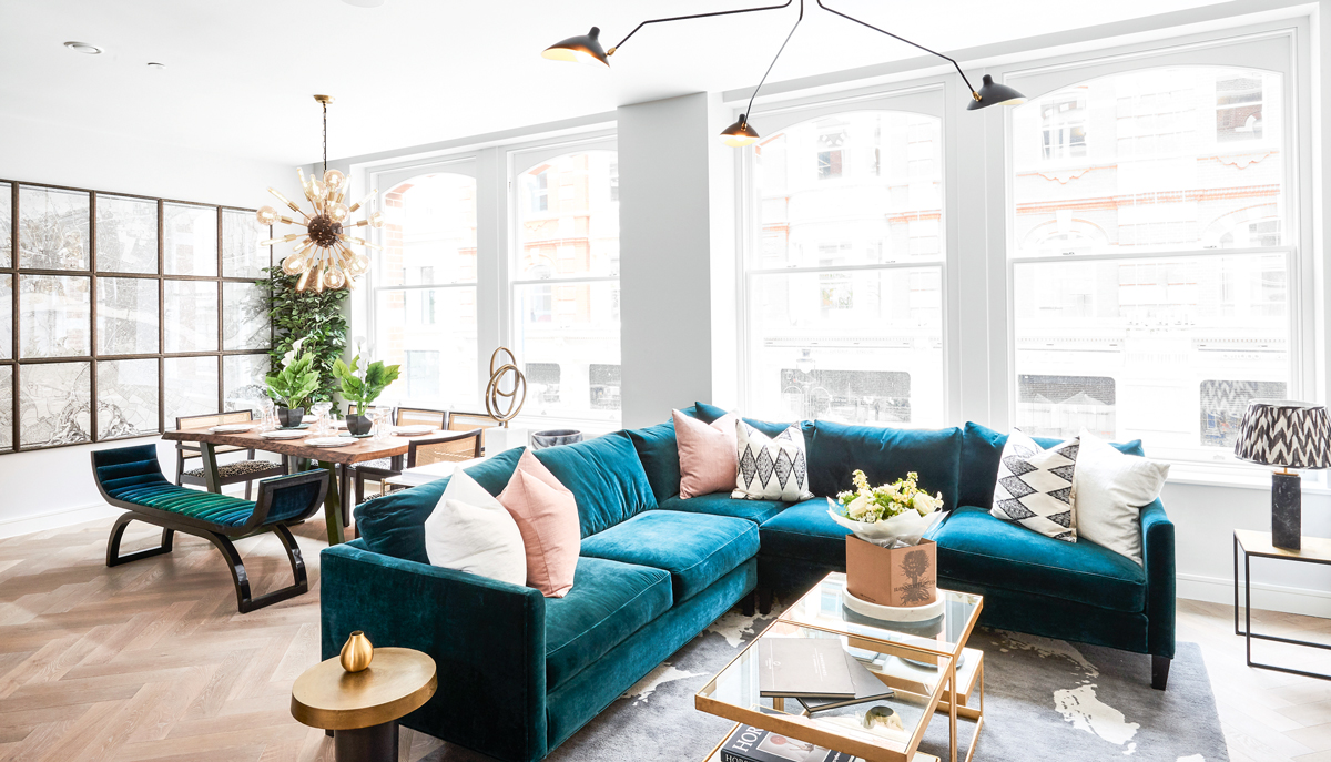
I’m a maximalist. I like creating spaces full of interest, where everywhere you look, the more you see. But where the more traditional English interior approach is layering rooms with furniture, antiques and art, collected over generations, my approach is slightly less full-on and slightly quirkier. It’s a total mix – I can happily team antique and vintage pieces together, a trad rug with an Axel Vervoordt sofa. I guess you can say I’m a traditional modernist (or maybe a modern traditionalist).
HOW DO YOU STRUCTURE SPACES?
I love architectural features – cornices, architraves – so I big them up wherever I can. I like differentiating between rooms when dealing with open-plan living – even if it’s just witha doorway but no door in it or a wall of Crittall windows to create a transparent divide. I like the idea of travelling from one room to another room and the feeling that if you’re having a dinner party, it’s not in your whole flat.
WHAT'S YOUR FAVOURITE COLOUR PALETTE?
I use shades of soft grey, putty and soft salmon, like Farrow & Ball’s Setting Plaster, because they’re warmer than white, they work in almost every room and make a great backdrop for art.
HOW DO YOU PLAY WITH LIGHTING IN A SPACE?
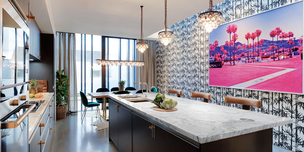
Pendant lights, like Thomas O’Brien’s Hicks ball lights, or chandeliers hung at intervals along a ceiling can help create zones within a room. I love lots of lamps – I like the sculptural bases by Vaughan. Lampshades are a great way to bring patterninto a room – from the Japanese, Indian and marbled paper shades by Rosi de Ruig to Pooky’s vast collection.
ANY FAVOURITE MATERIALS?
Carrara marble cut into tiles, rather than as one big expensive and complicated piece, lends great texture to a bathroom nook or kitchen splashback. I take it the whole way to the ceiling to make a real statement. Mirroring the underside of a kitchen island adds interest and reflection. I like woods with a beautiful grain, but more finished than the reclaimed look you find in a hip pop-up restaurant or bar. At home, it’s better without the pockmarks. You don’t want to feel like you’re going to get a splinter at home, do you?
HOW ABOUT SOFT FURNISHINGS?
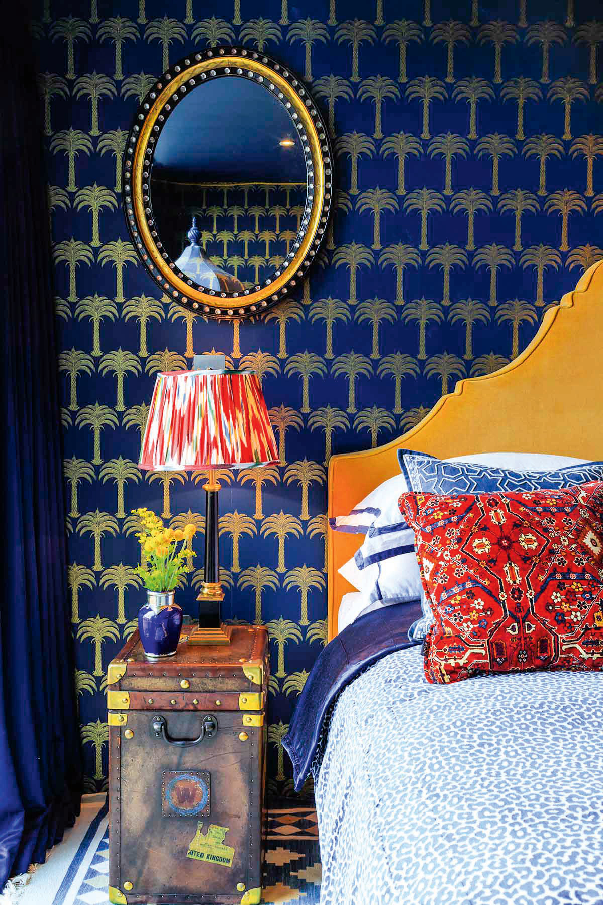
When it’s too expensive to do entire curtains in a statement pattern, I use it as a border instead – it still creates impact without costing a fortune. Favourites prints include Beata Heuman’s Marbleized velvets, fabrics and wallpapers by House of Hackney and Celerie Kemble for Schumacher, and anything by Pierre Frey.
DO YOU HAVE ANY SIGNATURE TOUCHES?
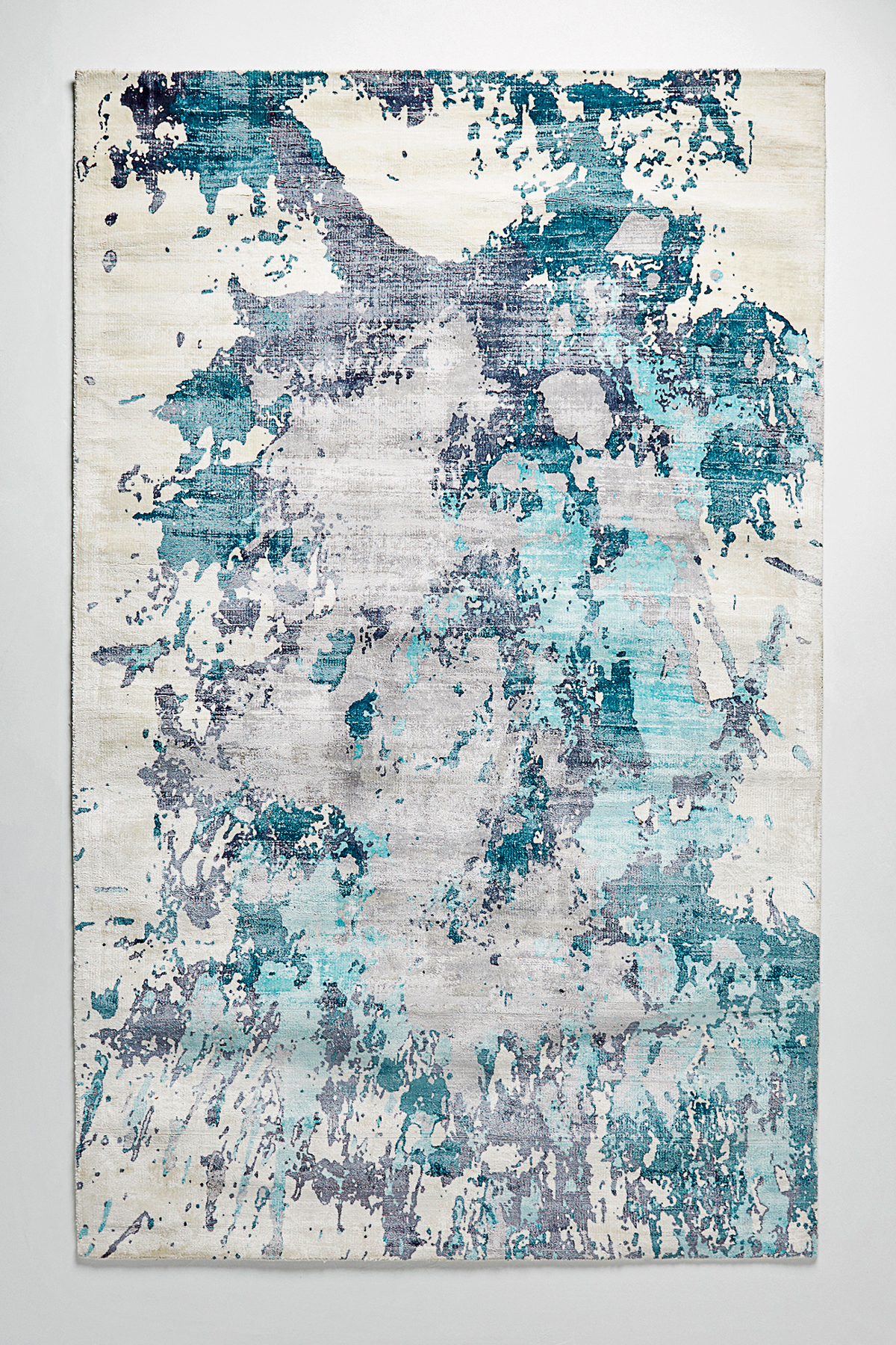
I like doing one unexpected thing in a room to make it feel vibrant. Like extending the pattern on a headboard through to the valance in a bedroom; bringing in abstract pattern through a rug from Anthropologie, Christopher Farr or The Rug Company; or lending fun to a cloakroom witha decorative porcelain basin from the London Basin Company. And I try to squeeze leopard print into every scheme – like Brunschwig & Fils’s Amur Leopard in Brown or Scarlet – even if it’s just a cushion or seat pad.
ANY INTERESTING PAINT TECHNIQUES?
Teaming an off-white wall with architraves and radiators painted in a bold gloss gives a room great definition, but feels young and fun too. Glossy, lacquered finishes satisfy my love of anything shiny and bright. You don’t have to paint small spaces white to look bigger – I recently lacquered a hallwaywith no natural light) in a dark chocolatey brown and it looks gorgeous, making a feature of an otherwise dead space.
WHAT DOES HOME MEAN TO YOU?
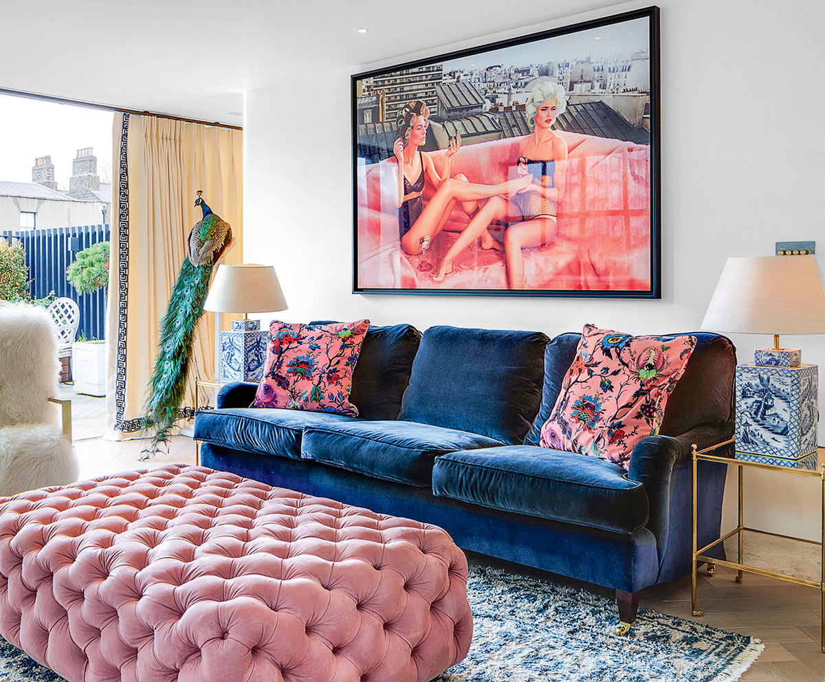
Home is the most important thing in our lives –it’s where we go to feel better when we’re sad, it’s where we celebrate and relax. I love to laugh – I don’t take myself or anything too seriously and the same with a house. I like a bit of quirkiness and humour, not to the point it’s a novelty, but somewhere that makes you feel relaxed, happy and light about life. I want to create happy spaces.
WHAT'S UP NEXT?
We’re working on our own affordable collection of accessories, including handmade ceramic lamp bases, in soft organic shapes and delicious glazes, created exclusively with a Finnish artisan I found through Etsy. I’m having some brightly coloured rattan pendant shades being woven in South Africa and some Madagascan raffia being made into stools. Design projects include a big house in Notting Hill, five villas in Marbella, plus there’s a restaurant and a designer shop in the pipeline.
ANY LAST WORDS OF DESIGN ADVICE?
Always go bolder than you think you should – bold interiors are the ones people love the most.
For more info, check out barlowandbarlow.com
The homes media brand for early adopters, Livingetc shines a spotlight on the now and the next in design, obsessively covering interior trends, color advice, stylish homeware and modern homes. Celebrating the intersection between fashion and interiors. it's the brand that makes and breaks trends and it draws on its network on leading international luminaries to bring you the very best insight and ideas.
-
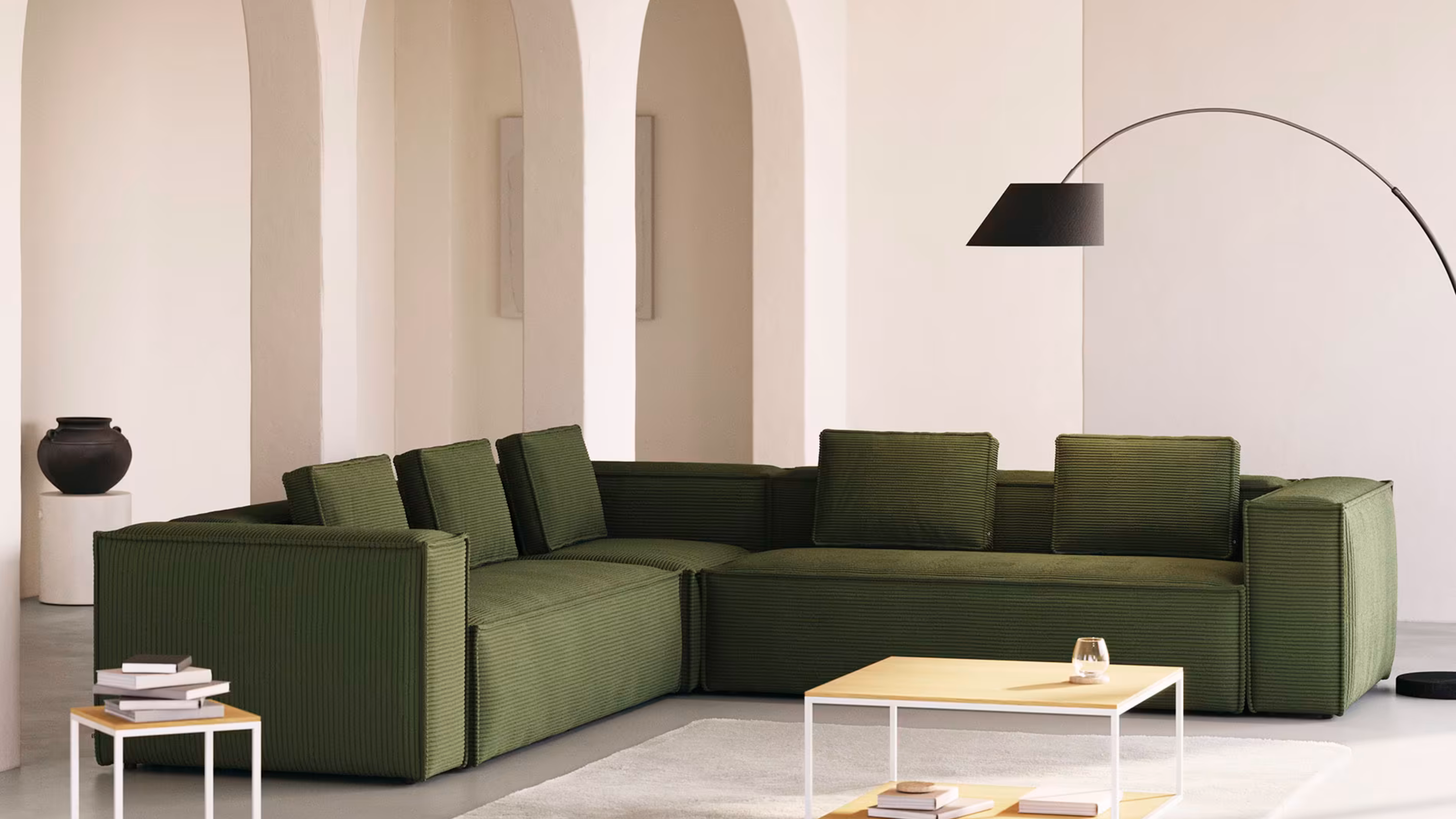 Bouclé vs Corduroy — The Difference Between The Textured Fabrics That Have Captured Our Collective Attention Lately
For years, bouclé has captivated the interior design scene. But corduroy might be giving the quiet luxury fabric a run for its money
By Devin Toolen
-
 The 70s Are Back, Baby, but Not All Trends From the Decade Deserve a Revival — Here's the Looks to Avoid That Will Just Date Your Home
From an overwhelming use of orange to toilet carpets (eww!), designers reveal which 70s interior trends are best kept in the past
By Devin Toolen